26. ML_MODEL_SELECTOR Worker
26.1. ML_MODEL_SELECTOR Worker
Overview
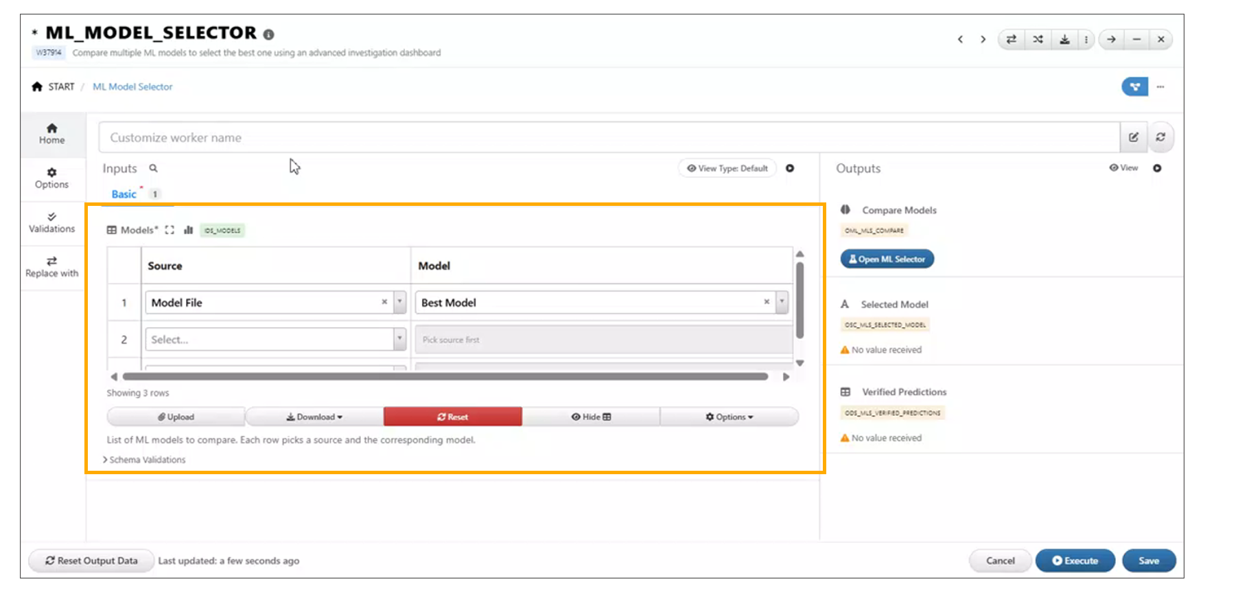
The ML_MODEL_SELECTOR worker is a newly added component under Shapes in Workflows. It enables users to compare multiple available machine learning models directly within a workflow.
The worker provides an ML Model Investigation tab, where users can analyze model performance using a ranking table and visualizations based on training data, helping in selecting the most suitable model for a given use case.
Key Features
- Model Comparison Capability Allows evaluation of multiple ML models within a single workflow.
- ML Model Investigation Tab Dedicated interface for analyzing model performance and behavior.
- Ranking Table Displays models ranked based on performance metrics for easy comparison.
- Training Data Visualizations Provides visual insights into model performance using training datasets.
- Seamless Workflow Integration Easily connects with existing ML pipelines and data sources.
Usage
- Open the Workflow canvas.
- Navigate to the Shapes panel.
- Add the
ML_MODEL_SELECTORworker to the canvas. - Connect inputs such as training data and model configurations.
- Run the workflow.
- Open the ML Model Investigation tab to:
- View the ranking table of models
- Analyze visualizations of training data
- Compare model performance metrics
26.2. ML_MODEL_SELECTOR: Flexible Output Comparison
Overview
The *ML_MODEL_SELECTOR worker now enables output comparison with greater flexibility.
Users can view comparison results as long as at least one model is selected, removing
the previous requirement of selecting two or more rows.
Key Changes
- Single Model Support - Comparison outputs are generated even when only one model is selected.
- Removed Minimum Selection Constraint - No longer requires two or more rows to trigger comparison.
- Consistent Output View - Maintains the same comparison layout regardless of the number of selected models.
Dataset Inputs
26.3. ML Model Investigation Models Toggle
The ML Model Investigation feature now includes a Models toggle in the header, providing users with enhanced control over model comparison management.
This update allows users to easily view all models included in the comparison, add new models, and manage existing ones through edit and delete actions.
Key Features
- Models Toggle in Header Provides quick access to view and manage all models included in the comparison.
- View All Models Displays the complete list of models currently part of the investigation.
- Add New Models Enables users to include additional models in the comparison using the + icon.
- Edit Models Allows modification of existing model configurations directly from the toggle panel.
- Delete Models Provides the ability to remove models from the comparison.
Usage
- Open the ML Model Investigation tab.
- Locate the Models toggle in the header.
- Click the toggle to open the models panel.
- Perform desired actions:
- Click the + icon to add a new model
- Select an existing model to edit its configuration
- Use the delete option to remove a model from the comparison
- The comparison table and visualizations update dynamically based on the selected models.
Models Selection in Sidebar
In the ML Model Investigation module, models listed in the sidebar are now selectable, enabling more interactive and flexible analysis.
When one or more models are selected, a floating action bar appears, providing the following options:
- Include: Focus the analysis only on the selected models.
- Exclude: Remove the selected models from the current analysis view.
This enhancement allows users to quickly refine the set of models under investigation, improving efficiency when comparing or filtering model results.
Models Selection in Sidebar
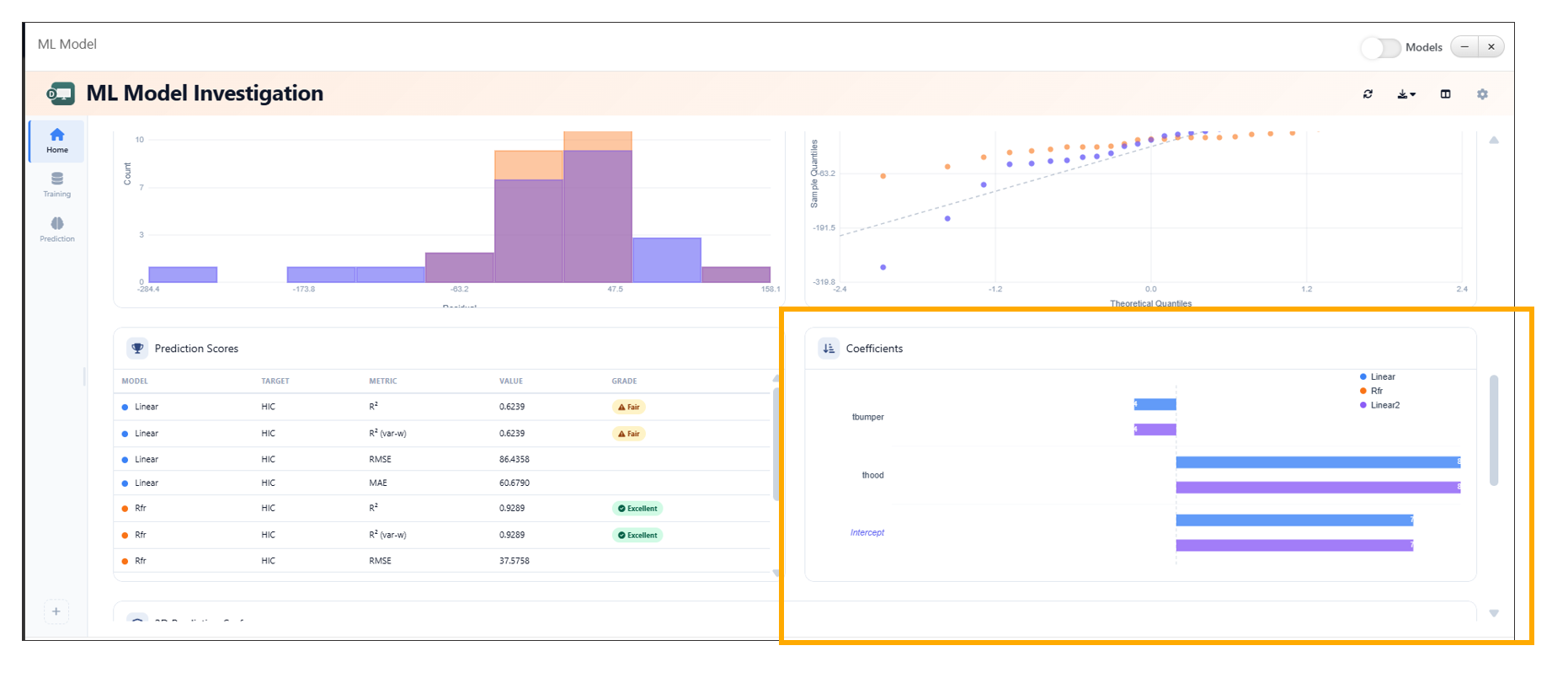
26.4. Coefficients Widget Enhancement in ML Investigation
The Coefficients widget in the ML Investigation tab has been enhanced to provide a more intuitive and interactive visualization of model variables. It now displays coefficients per model using color-coded bars, improving interpretability and comparison across models.
Additional enhancements such as intercept separation, hover highlights, and grouped bar comparisons further enrich the analysis experience.
Key Features
- Color-Coded Bars Visualizes model coefficients using distinct colors for better differentiation.
- Per-Model Visualization Displays variables and their corresponding coefficients for each model.
- Intercept Separation Clearly distinguishes intercept values from other variable coefficients.
- Hover Highlights Highlights bars on hover to improve readability and focus.
- Grouped Bar Comparison Enables side-by-side comparison of coefficients across multiple models.
Usage
- Open the ML Investigation tab.
- Navigate to the Coefficients widget.
- Select or view multiple models.
- Analyze:
- Variable importance via color-coded bars
- Intercept values separately
- Grouped bars for cross-model comparison
- Hover over bars to view detailed highlights and insights.
Coefficients Widget
26.5. ML Model Investigation Baseline Comparison
The ML Model Investigation feature now supports setting a model as a baseline using the Set as Baseline option available in the table context menu. This enhancement enables users to compare model performance relative to a selected baseline model.
The Baseline Comparison view provides clear visual indicators of performance differences, including percentage changes, directional arrows, and color-coded deltas.
Key Features
- Set as Baseline Option Allows users to designate any model as the baseline directly from the table context menu.
- Baseline Comparison View Displays performance differences of all models relative to the selected baseline.
- Percentage Difference Indicators Shows percentage change for each metric compared to the baseline.
- Directional Arrows Uses up and down arrows to indicate performance improvement or decline.
- Color-Coded Deltas - Green → Positive improvement over baseline - Red → Negative decline compared to baseline
- Baseline Badge Highlights the selected baseline model with a visible badge in the table.
26.6. ML_MODEL_SELECTOR Outputs
The ML_MODEL_SELECTOR worker in Workflows has been enhanced to provide two new outputs: Selected Model and Verified Predictions. These outputs enable seamless integration of model selection results into downstream workflow steps.
The Selected Model is determined directly from the ranking table using the context menu, while Verified Predictions are generated from the model’s predicted values.
Key Features
- Selected Model Output Outputs the model chosen by the user from the ranking table.
- Ranking Table Integration Allows users to select a model via the context menu within the ranking table.
- Verified Predictions Output Provides predictions generated from the selected model.
- Dynamic Updates Outputs are automatically updated based on the selected model and its predictions.
Usage
- Add the
ML_MODEL_SELECTORworker to the workflow. - Connect training data and model configurations.
- Execute the workflow.
- Open the ML Model Investigation tab.
- In the ranking table:
- Right-click on a model
- Select the desired option to mark it as the selected model
- Access outputs:
- Selected Model → Available for downstream workflow connections
- Verified Predictions → Contains predicted values from the selected model
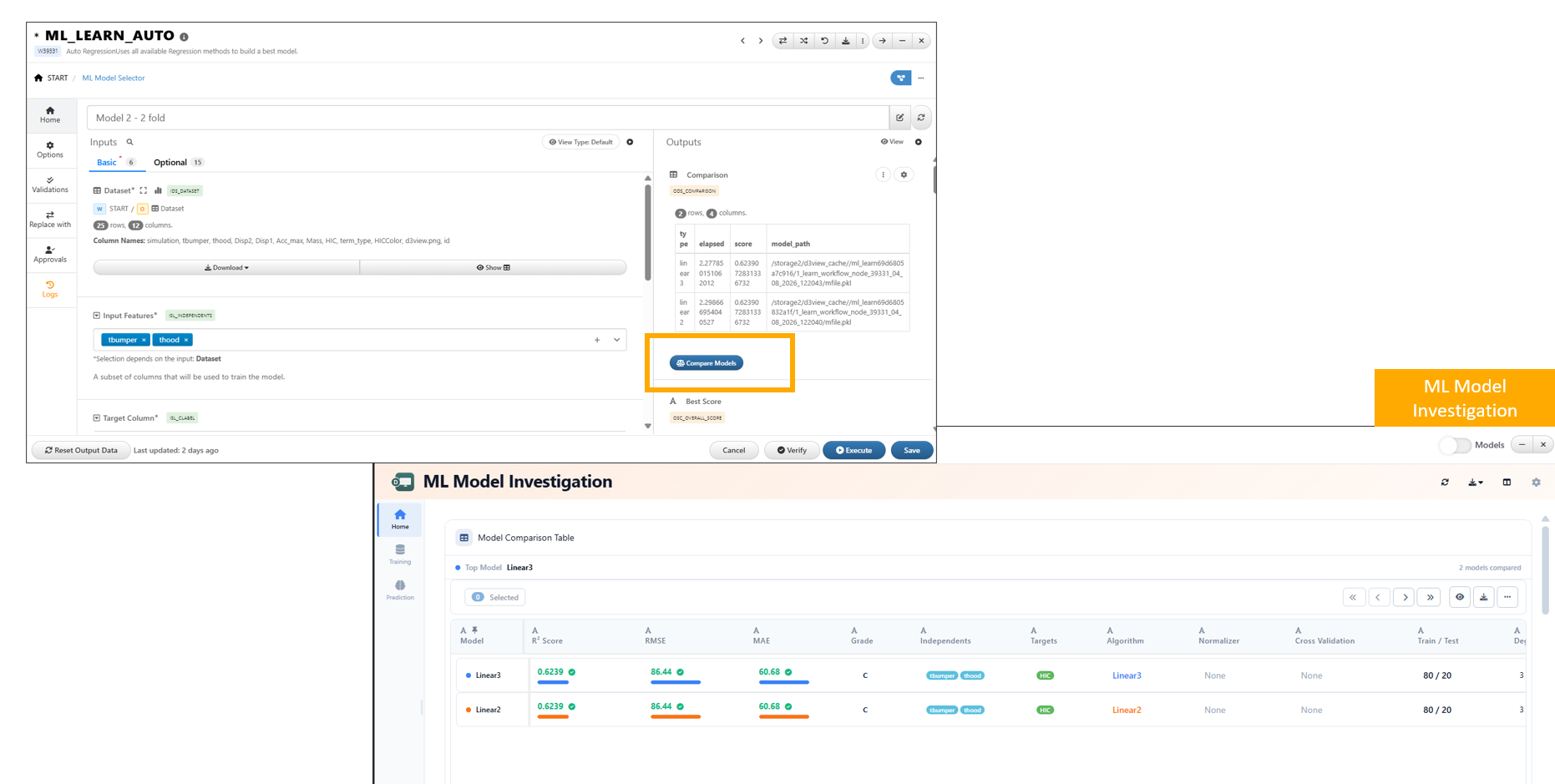
26.7. Compare Models Button for Dataset Outputs
A new Compare Models button is now available for dataset outputs that contain a model_path column. This feature enables quick access to model comparison capabilities directly from dataset results.
By leveraging the model_path information, users can seamlessly launch model comparison workflows without manually configuring inputs.
Key Features
- Automatic Availability
The Compare Models button appears when a dataset includes a
model_pathcolumn. - Direct Model Comparison Access Allows users to initiate model comparison directly from dataset outputs.
- Seamless Integration Connects dataset outputs with model comparison tools such as the ML Model Investigation interface.
- Reduced Manual Setup Eliminates the need to manually gather and configure model paths for comparison.
Compare Models button
26.8. Prediction View Toggle
In ML Model Investigation, the Prediction tab now supports switching between Modern and Classic views directly from the ellipsis menu.
Key Features
- Dual View Support Switch between Modern and Classic views within the Prediction tab.
- Quick Access via Ellipsis Menu The view toggle is conveniently accessible from the ellipsis (…) menu.
- Seamless Switching Users can switch views without disrupting their analysis.
- User Preference Flexibility Enables users to work in their preferred interface style.
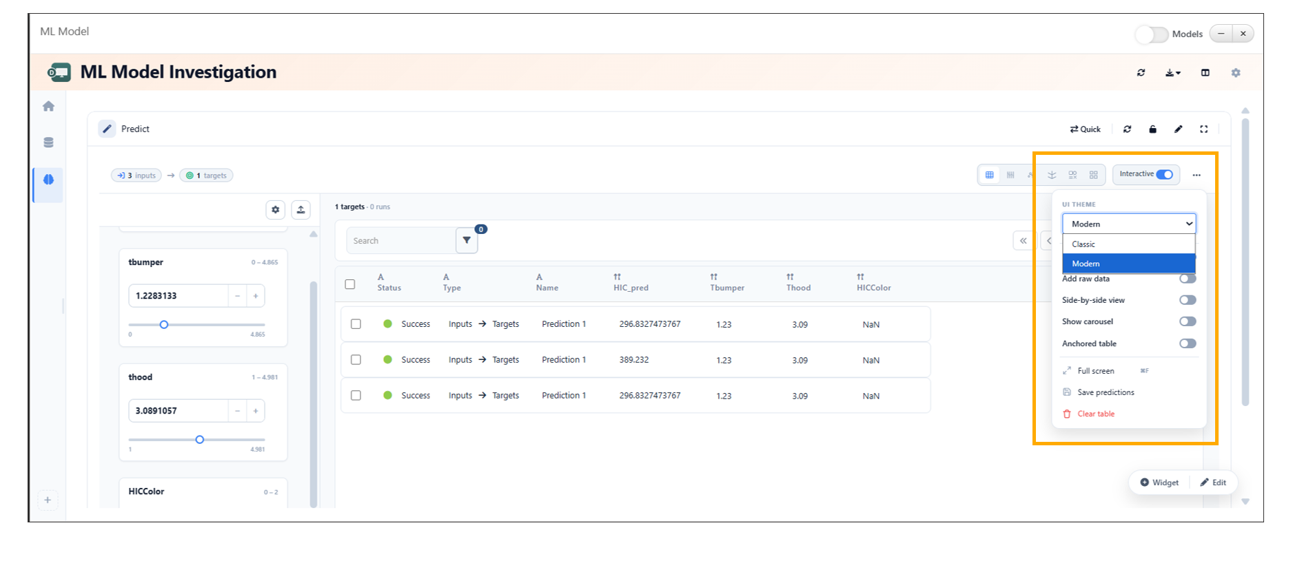
Prediction View Toggle
26.9. Enhanced 3D Prediction Surface Visualization
In ML Model Investigation, the 3D Prediction Surface visualization now displays model surfaces along with raw data and includes legends for better interpretability.
Key Features
- Combined Visualization Displays model prediction surfaces together with raw data points in the same 3D view.
- Improved Insight Enables better comparison between predicted surfaces and actual data.
- Legend Support Includes legends to clearly distinguish between model surfaces and raw data.
- Enhanced Clarity Improves understanding of model behavior across input variables.
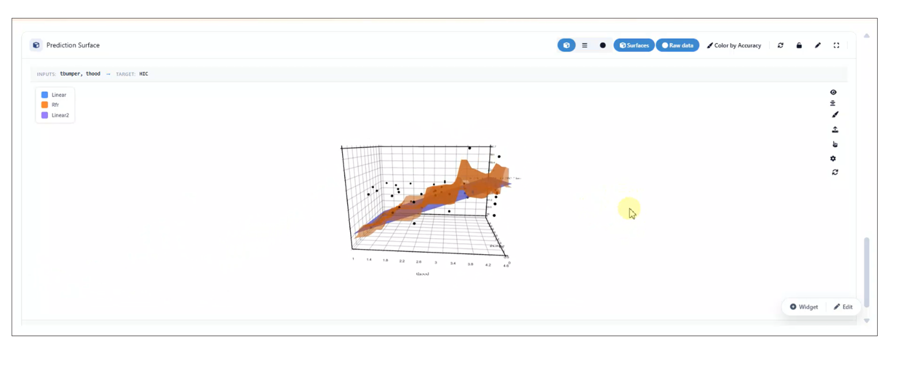
Enhanced 3D Prediction Surface Visualization
The 3D surface export functionality in the ML Model Reporter has been enhanced to improve visualization consistency.
Key Updates:
- The complete 3D surface container is now included during export.
- Left-axis blocks are exported along with the surface data.
- Ensures consistent and accurate representation of visual elements in exported outputs.
Left-axis blocks
26.10. Color by Accuracy Toggle in 3D Prediction Surface
In ML Model Investigation, a Color by Accuracy toggle has been added to the 3D Prediction Surface widget, enabling users to visualize model accuracy directly on the surface.
Key Features
- Accuracy-Based Coloring Colors the prediction surface based on model accuracy values.
- Interactive Toggle Users can enable or disable the Color by Accuracy option as needed.
- Enhanced Insight Helps quickly identify regions of high and low model accuracy.
- Improved Visualization Provides an intuitive way to assess model performance across the surface.
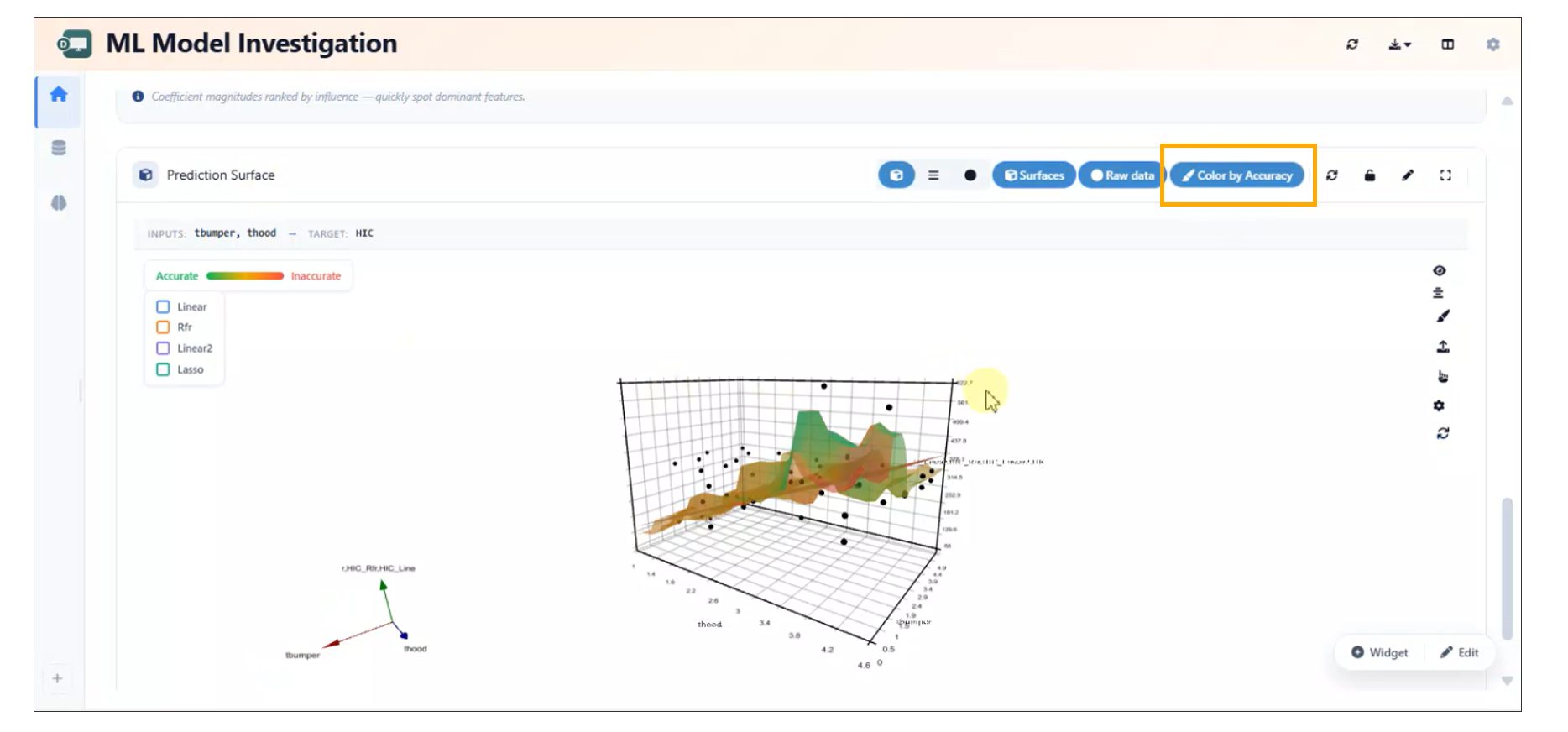
Color by Accuracy
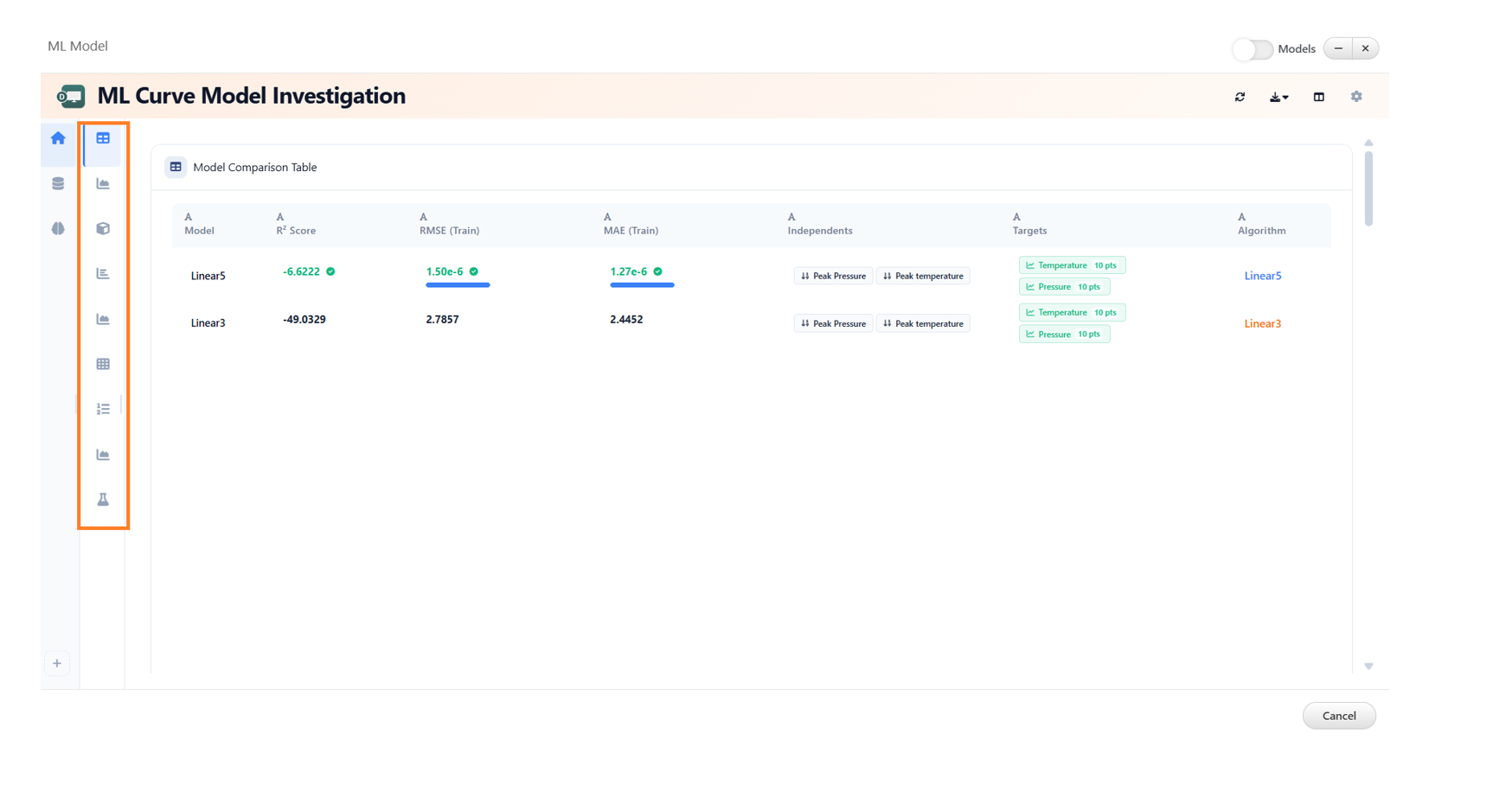
26.11. ML Curve Model Investigation
The ML Curve Model Investigation feature now includes enhanced analytics capabilities, providing a comprehensive set of widgets for in-depth model evaluation and comparison.
New Widgets
The following widgets are available to support detailed analysis:
- Model Comparison Table Displays a side-by-side comparison of multiple models based on key evaluation metrics.
- Actual vs Predicted Visualizes the relationship between actual values and model predictions to assess accuracy.
- Prediction Accuracy Map Provides a spatial or distribution-based view of prediction accuracy across data points.
- Prediction Surface Illustrates the model’s prediction landscape for better understanding of trends and patterns.
- Per-point R² (Curves) Shows R² values at an individual curve level for granular performance insights.
- Mean Curve Represents the average trend across multiple curves for baseline comparison.
- Prediction Scores Summarizes key scoring metrics used to evaluate model performance.
- Model Precision Highlights the precision of model predictions across different conditions or datasets.
- Cross-Validation Summary Provides an overview of model robustness and generalization through cross-validation results.
Benefits
- Enables comprehensive evaluation of machine learning curve models.
- Facilitates easier comparison between multiple models.
- Provides both high-level summaries and detailed, point-level insights.
- Improves decision-making with advanced visualization and metrics.
26.12. ML Model Curve Investigation Per-point R^2
Overview
In ML Model Curve Investigation, Per-point \(R^2\) values are now displayed as line plots by default to provide clearer trend visualization across curve points.
Users can also switch the visualization to a bar chart view using the available header options, enabling flexible analysis and comparison of Per-point \(R^2\) metrics.
Key Features
- Per-point \(R^2\) values are displayed as line plots by default
- Added support for switching between line plot and bar chart visualizations
- Visualization mode can be changed directly from the header options
- Improves analytical flexibility for curve investigation workflows
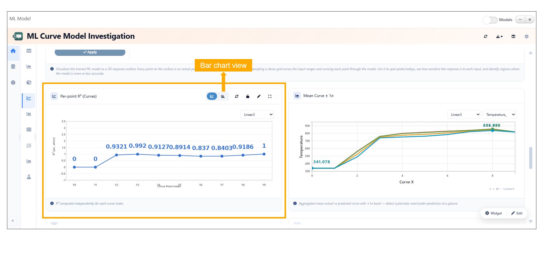
ML Model Curve Investigation Per-point R^2
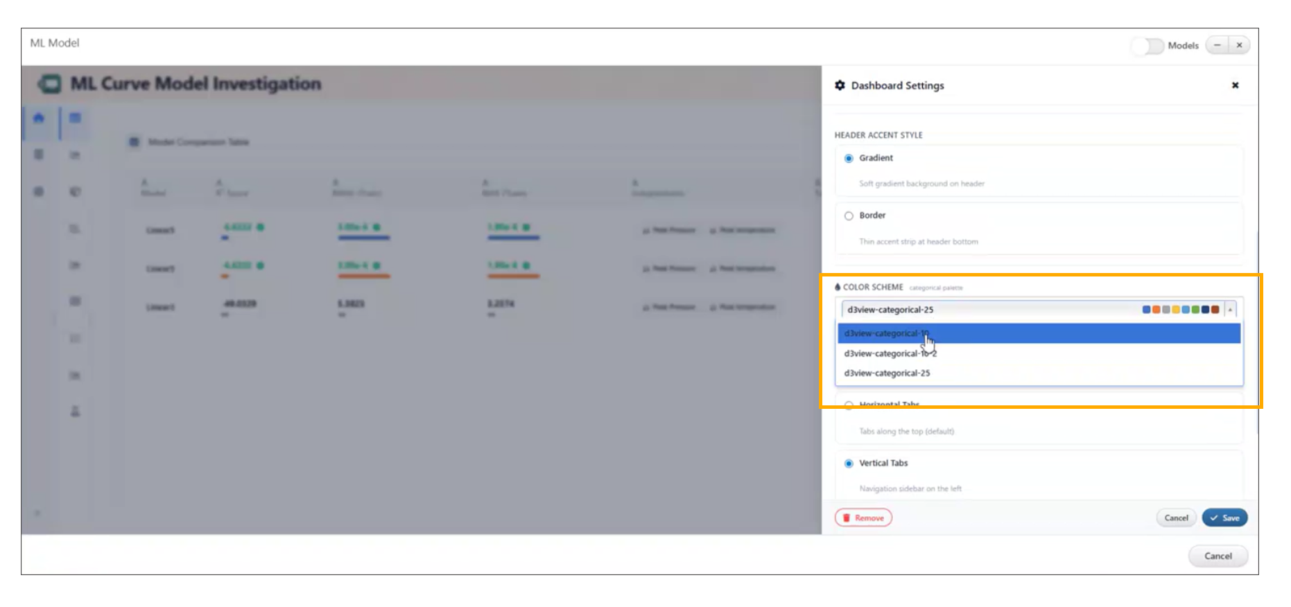
26.13. ML Dashboard: Curve ML Model Preset Layout Update
Overview
The Curve ML Model preset layout in the ML Dashboard has been reorganized to improve usability, clarity, and overall workflow efficiency.
Key Enhancements
- Reorganized the layout of Curve ML Model presets.
- Improved structure for easier navigation and selection.
- Enhanced visual clarity and grouping of preset options.
Layout Improvements
- Logical grouping of related presets for better discoverability.
- Cleaner arrangement to reduce visual clutter.
- Improved alignment and spacing for a more intuitive interface.
User Experience
- Simplifies the process of selecting appropriate ML model presets.
- Reduces time spent searching for relevant configurations.
- Provides a more consistent and streamlined ML workflow.
ML Curve Model
26.14. ML Dashboard: Axis Labels for Analytical Widgets
Overview
Axis labels have been added to key analytical widgets in the ML Dashboard to improve clarity and interpretability of visualized data.
Key Enhancements
- Added axis labels to the following widgets: - Mean Band - Per-Point R² - Prediction Scores
- Improved readability and understanding of plotted data.
- Enhanced consistency across ML visualizations.
Widget Improvements
- Mean Band Axis labels clarify the relationship between input variables and prediction ranges.
- Per-Point R² Labels help interpret model performance at an individual data point level.
- Prediction Scores Clear axis definitions improve understanding of scoring distributions and trends.
Benefits
- Better data interpretation and reduced ambiguity.
- Improved consistency across visualization components.
- Enhanced user experience for ML analysis workflows.
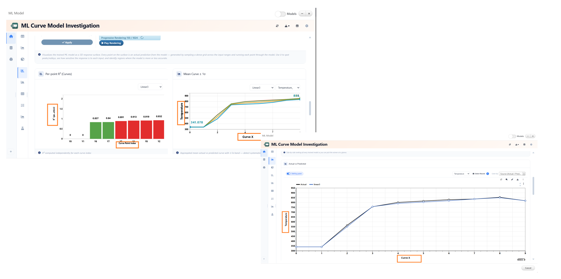
ML Curve Model widgets
26.15. ML Dashboard: Collapsible Sidebar with Multi-Select
Overview
The ML Dashboard now includes a collapsible left sidebar designed to improve usability and streamline interactions with curve points.
Key Features
- Collapsible Sidebar - Easily expand or collapse the left panel to maximize workspace.
- Tile-Based Multi-Select - Curve points are displayed as selectable tiles for intuitive interaction.
- Multiple Selection Methods - Ctrl/Cmd + Click: Select or deselect individual tiles. - Drag Selection: Click and drag to select multiple tiles in one action.
- Batch Update Support - Use the Apply button to perform updates on all selected curve points at once.
ML Multiselect
26.17. ML Curve Model Investigation: 3D Ribbon/Terrain View
Overview
The Actual vs Predicted widget in ML Curve Model Investigation now features a 3D ribbon/terrain view, providing a more immersive and insightful visualization of model performance.
Key Features
- 3D Ribbon/Terrain Visualization - Displays Actual vs Predicted data in a 3D surface-style view for enhanced analysis.
- Layer Controls Panel - Located on the left side for easy interaction with visualization layers.
- Toggleable Visualization Layers - Error Bands: Visualize deviations between actual and predicted values. - Vertical Bands: Highlight distribution across selected dimensions. - Color-by Bands: Apply color mapping based on selected parameters.
26.18. ML Curve Model Investigation: Shape By and Prediction Bands
Overview
The ML Curve Model Investigation now enhances prediction visualization by introducing a Shape By setting alongside prediction accuracy color bands in the curve plot.
Key Features
Shape By Control - Assigns different marker shapes based on categorical columns. - Enables clearer differentiation of data points within the same plot.
Color By Enhancement - Works in conjunction with Shape By for multi-dimensional visualization. - Applies color encoding based on selected categorical variables.
Prediction Accuracy Color Bands - Visualizes prediction quality through color-coded bands. - Helps quickly identify regions of high and low accuracy.
Categorical Support - Both Shape By and Color By controls support categorical columns
for richer data segmentation.
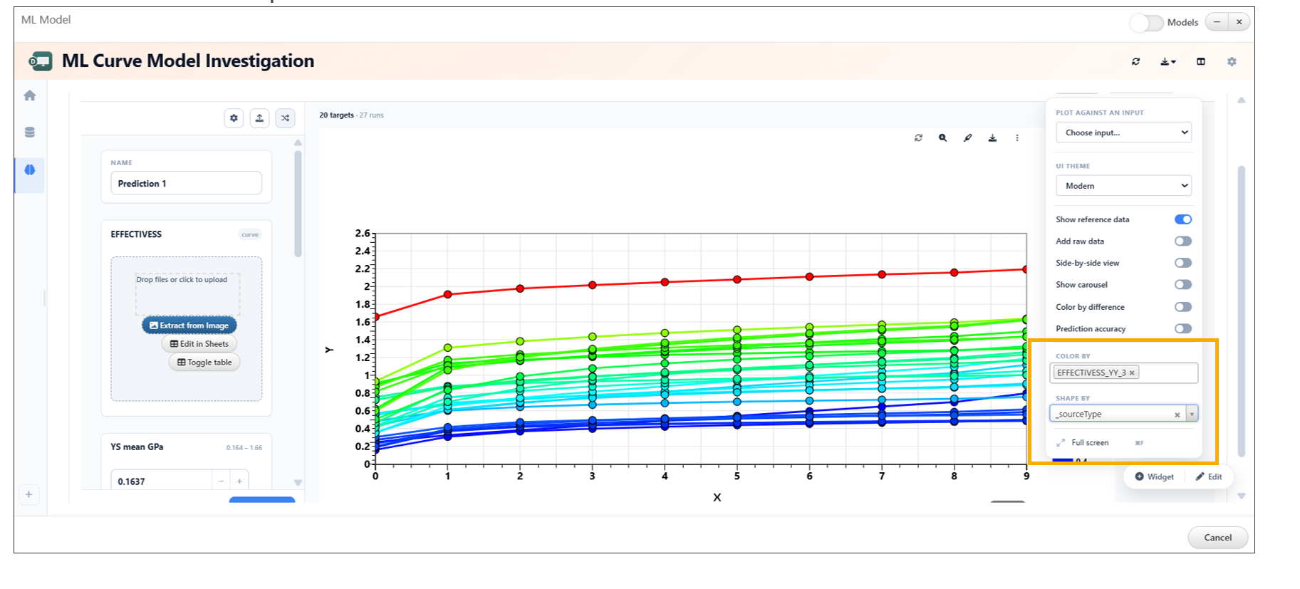
Prediction Bands
26.19. ML Curve Model Investigation: Model Color Customization
The ML Curve Model Investigation feature now allows users to update model colors directly from the settings, improving visualization and clarity when comparing multiple models.
Overview
This enhancement provides greater control over how models are displayed in visualizations. Users can now assign custom colors to different models, making it easier to distinguish between them and interpret results effectively.
Key Features
- Customize model colors directly from settings
- Improve visual differentiation between multiple models
- Enhance readability of plots and comparisons
- Apply changes instantly within the visualization
How to Use
- Open the ML Curve Model Investigation view.
- Navigate to the settings panel.
- Locate the model color configuration options.
- Select or update colors for each model.
- Changes will be reflected immediately in the visualization.
Model Color Customization
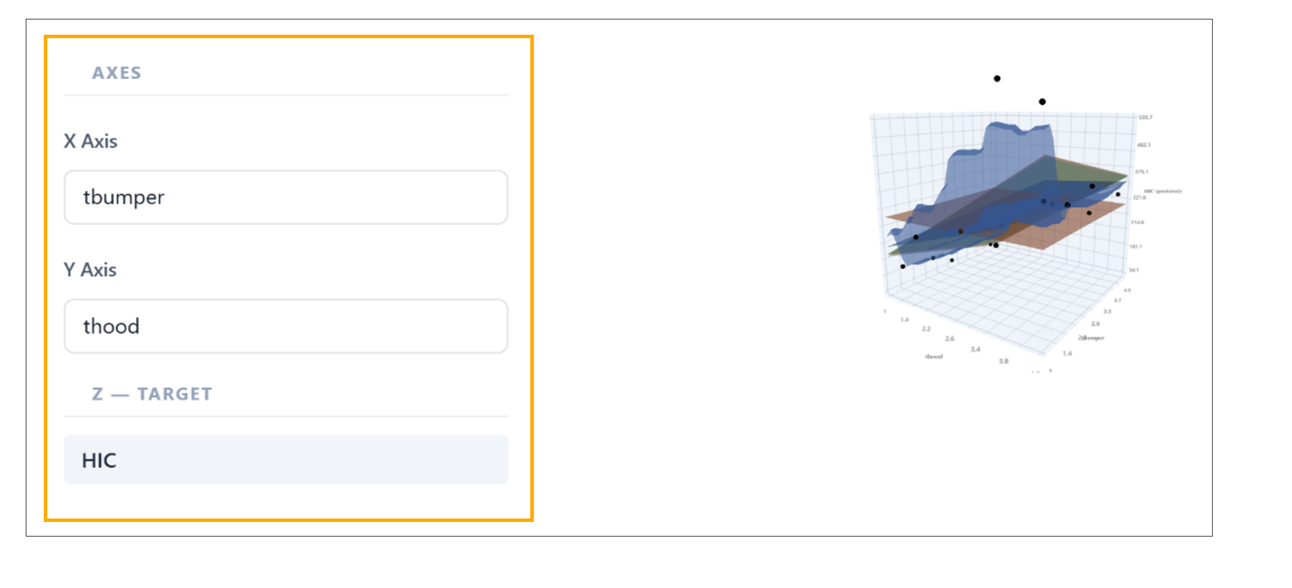
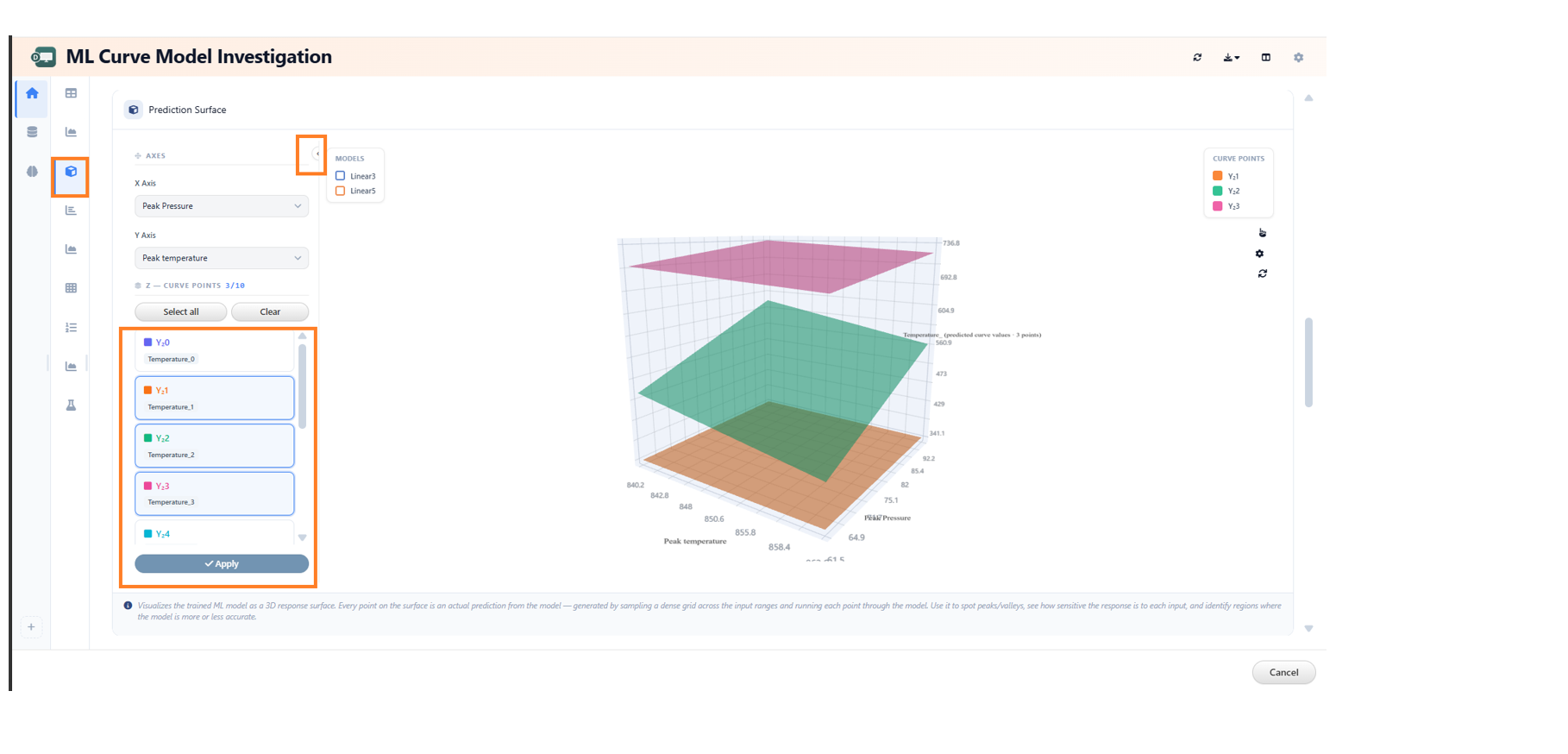
26.20. ML Model Investigation: Conditional Z Target Dropdown
In the ML Model Investigation, the Prediction Surface now displays the Z target dropdown only when working with multi-target scalar models.
Overview
This enhancement improves the usability of the Prediction Surface by conditionally displaying the Z target selection option. The dropdown is shown only when it is relevant—specifically for multi-target scalar models—reducing unnecessary UI elements for simpler model types.
Key Features
- Z target dropdown appears only for multi-target scalar models
- Cleaner and more context-aware user interface
- Reduces confusion by hiding irrelevant options
- Improves focus during model analysis
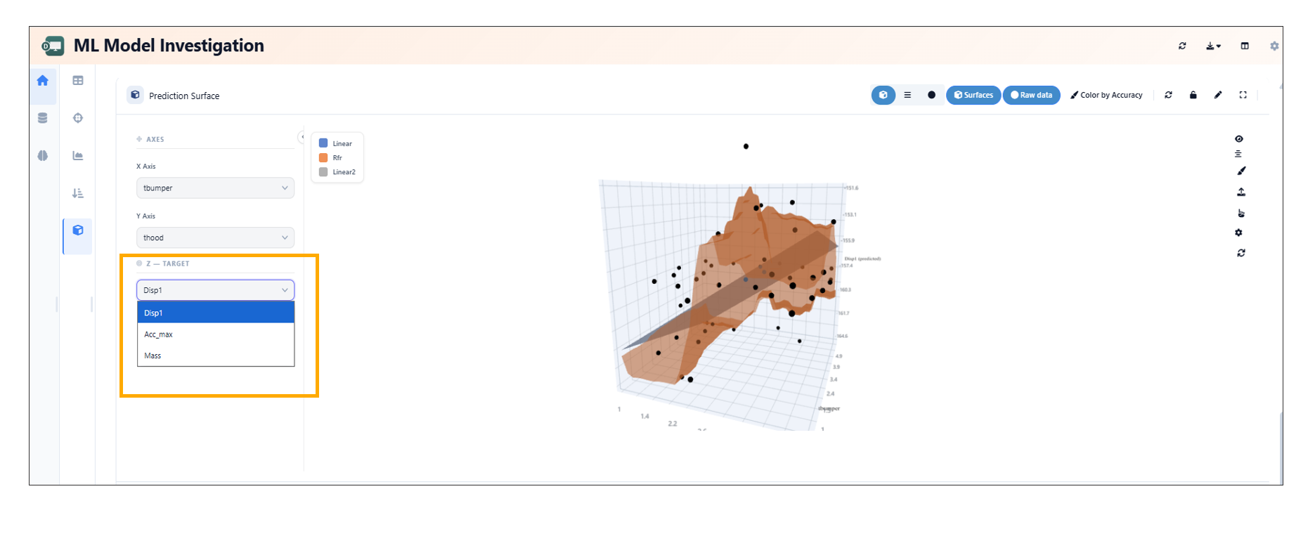
Conditional Z Target Dropdown
26.21. Interactive Analysis and Streamgraph Enhancements
Overview
Enhancements have been introduced to improve data interaction and visualization capabilities within Simlytiks. These include interactive point selection and advanced streamgraph comparison features with reference curves and deviation bands.
Key Enhancements
- Added interactive point selection for improved data exploration.
- Enhanced streamgraph comparisons with reference curves.
- Introduced deviation bands for better visualization of variations.
- Improved analytical clarity and user interaction.
Interactive Point Selection
- Enables users to select specific data points directly within visualizations.
- Facilitates deeper analysis and precise data inspection.
- Improves overall interactivity and user engagement.
Streamgraph Comparison Enhancements
- Added support for reference curves to compare baseline or expected trends.
- Introduced deviation bands to highlight variations from the reference.
- Enhances the ability to analyze differences and patterns effectively.
ML_MODEL_REPORTER Worker
The ML_MODEL_REPORTER worker generates comprehensive evaluation and performance reports for trained machine learning models. A new monitoring feature has been introduced to ensure stable execution during complex reporting tasks.
26.22. Watchdog Option
The Options tab now includes a Watchdog setting. This feature functions as an automated process monitor, preventing stuck execution loops and optimizing resource utilization when evaluating heavy machine learning models or processing large validation datasets.
Key Functions
- Process Monitoring: Actively tracks the execution status of reporting subroutines (such as generating feature importance plots, confusion matrices, or high-dimensional data projections).
- Timeout Prevention: Automatically intercepts, flags, or terminates tasks that hang or exceed reasonable compute thresholds, freeing up system resources for subsequent pipeline workers.
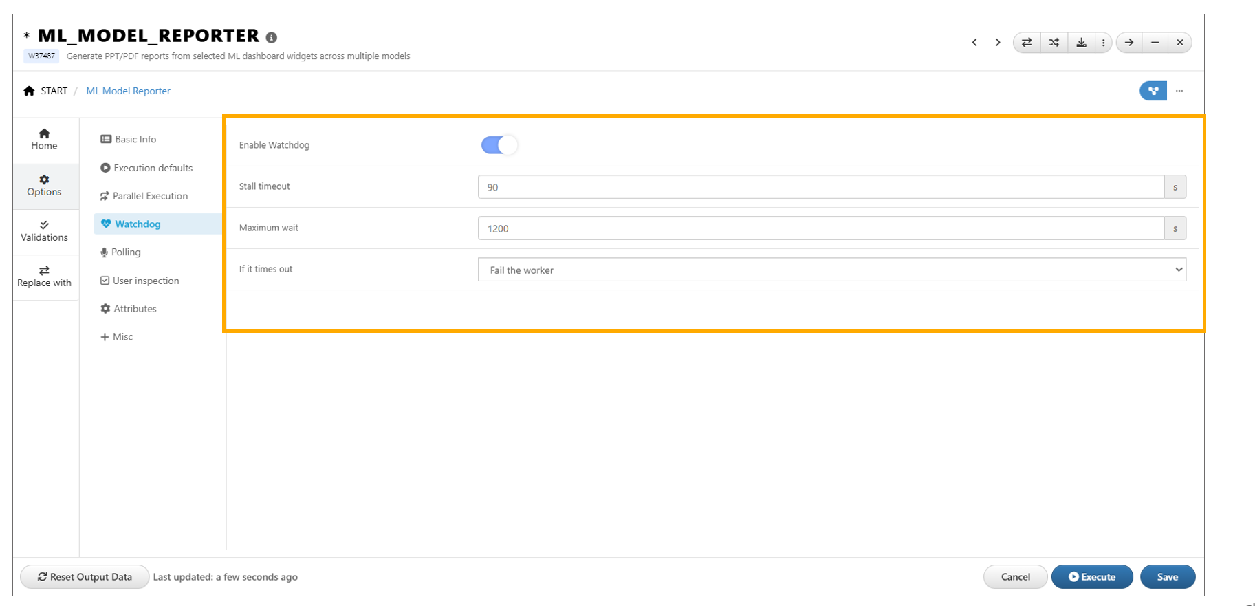
ML_MODEL_REPORTER