6.  Charts
In Simlytiks, charts and graphs are organized as visualizations. With 40+ rich, interactive visualization options, or individual data explorations, we can transform our data into visual expressions that make it easier to understand and compare.
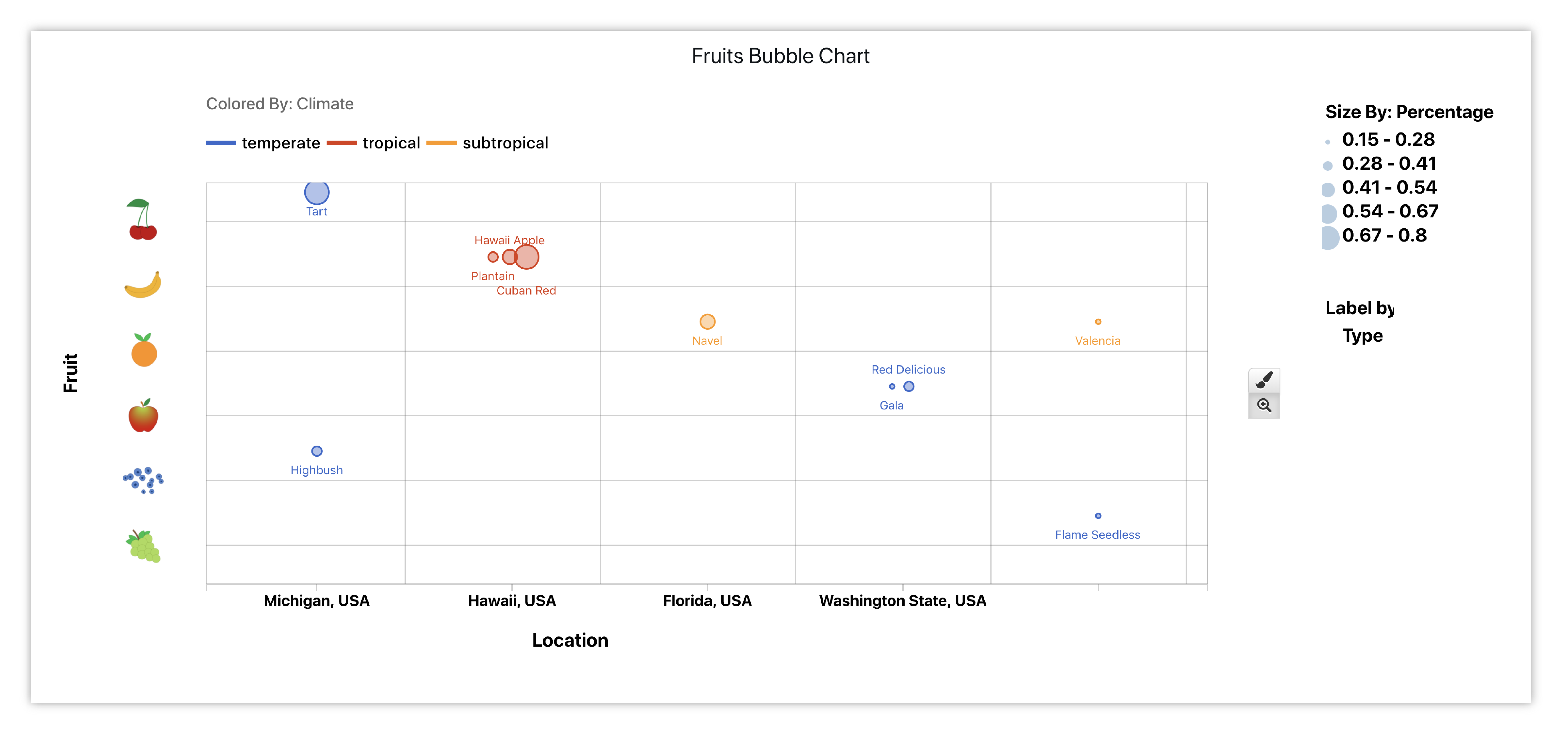
Finished Fruits Bubble Chart
6.1. Visualizers
Visualizers can be found underneath the Visualization Menu. Each visualizer has a designated icon, a main placeholder and a specific placeholder for each option. Here are some basic Simlytiks’ visualizers and their functions:
| Icon | Name | Function | Placeholder |
|---|---|---|---|
|
Table |
|

|

|
Box Plot |
|

|

|
Curve Plot |
|

|

|
Gallery |
|

|

|
Parallel Coord. |
|

|

|
Line Chart |
|

|

|
Donut Chart |
|

|
|
Scatter Plot |
|

|
|
Bar Chart |
|

|

|
Multi-line Chart |
|

|
The below image showcases the icons for all the charts available in the application. We’ll go over how to learn more about each chart in the application in the next subsection.
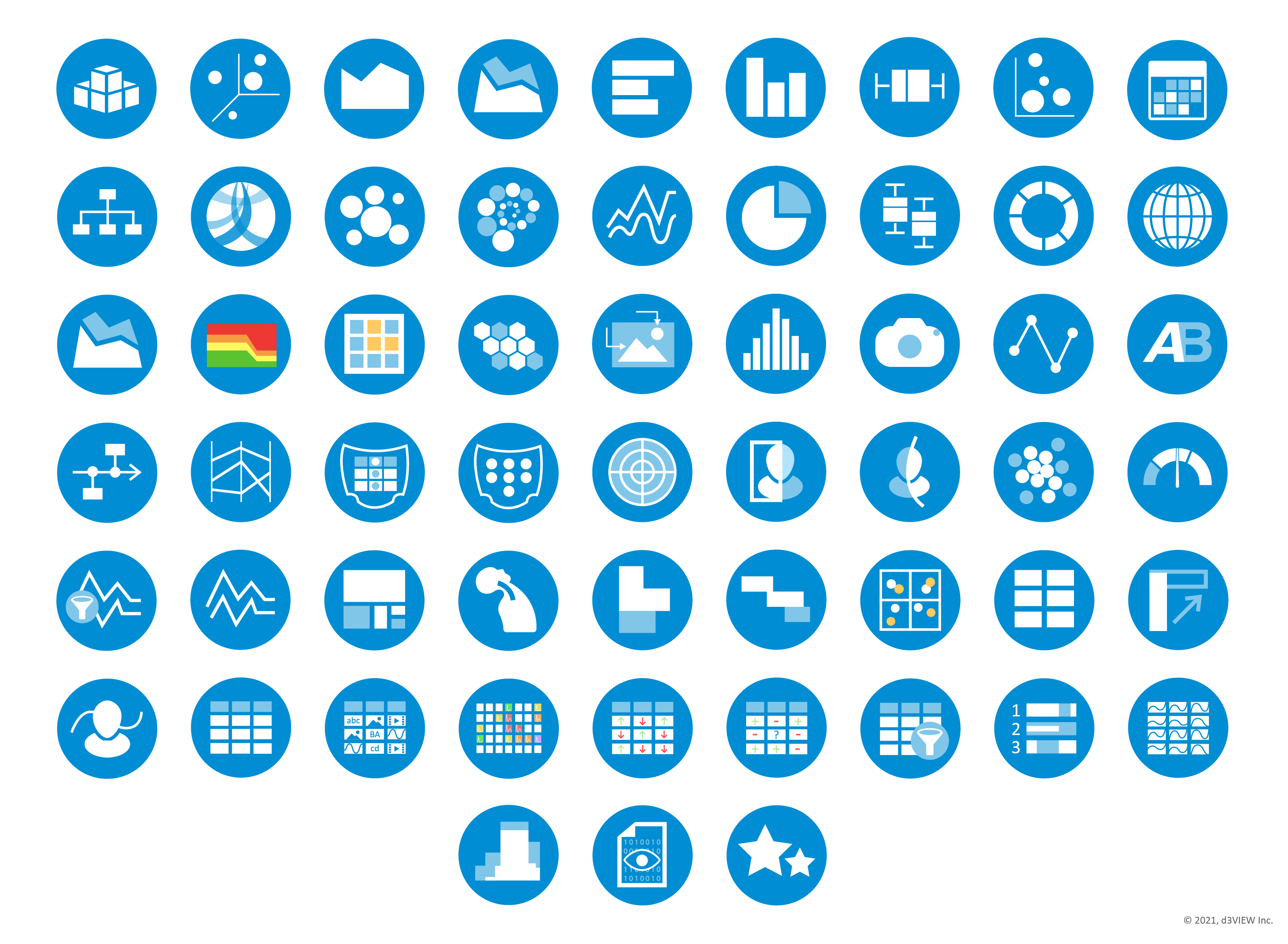
Figure 1: 40+ Rich, Interactive Visualizers
6.2. Adding Charts
To create charts, we’ll be using the visualization menu and quick links to add them to our dashboard pages. There are three main ways to choose visualizations for our pages.
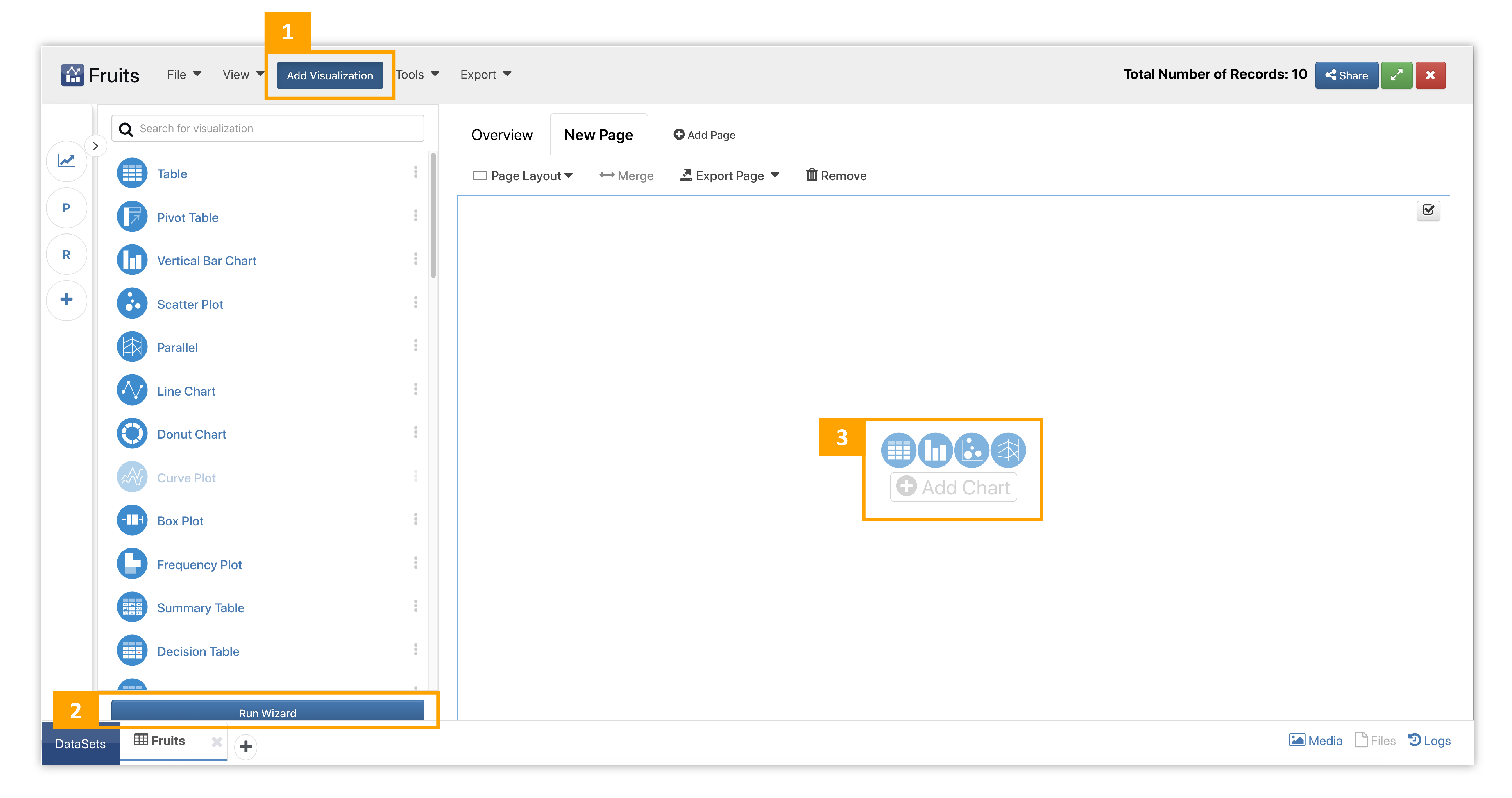
Figure 2: Adding Visualizations
- Click on Add Visualization. This menu is located in the top bar commands. Hover over visualizations to view their basic placeholders and descriptions.
- Click on Run Wizard. The wizard allows us to explore and set up charts in a separate window. We can review the library of visualizers in the first step and explore how they look in the second before committing to adding them in the last step. To access it, click on the button at them bottom of the visualization menu.
- Click on chart icons or Add Chart. Use the quick or direct links to add directly to that page section.
Watch the video below to see how to execute the above ways of adding charts to pages.
Each chart has detailed placeholders to help illustrate what it does. Hover over chart options (i) to view more specific placeholders. Here is an example of how placeholder images with appear:
We can add inputs by dragging and dropping data columns from the left panel of Responses or choosing them in the drop-down menu that appears when clicking in the input box. Once we indicate required inputs, we’ll see a preview of our chart. We can use the real-time preview to explore options and choose exactly how we want our chart visualized before accepting it. Watch the following video to see how it’s done.
Guide Steps
Charts with multiple options for setting up now have guide steps for basic understanding. Find this option under guide me when adding a visualization to a page layout.
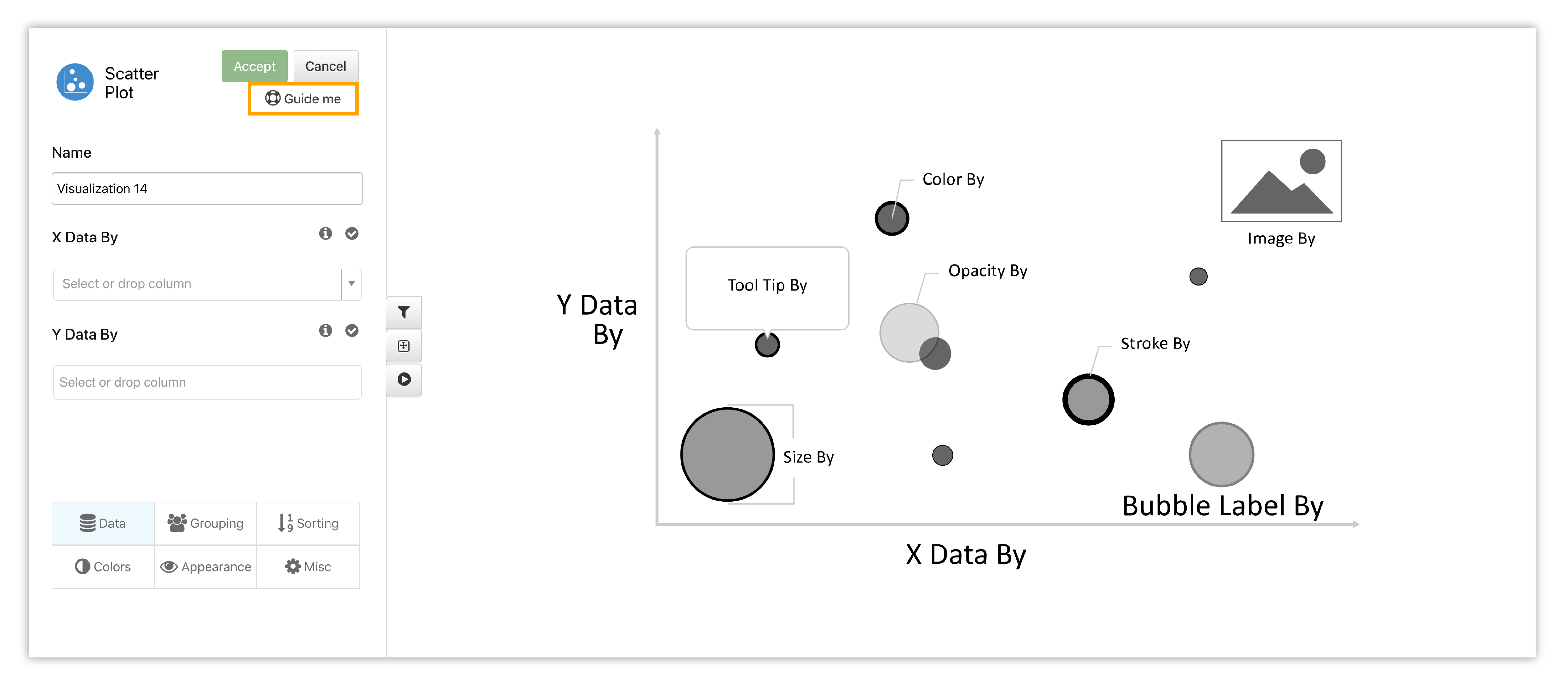
Figure 3: Guide Steps for Setting Up a Chart
The guide will take us through up to 5 steps to help us render a basic chart. Here is an example of the guide for bubble chart:
6.3. Editing Charts
There are two main ways to edit charts, one of which is only available for a couple of them.
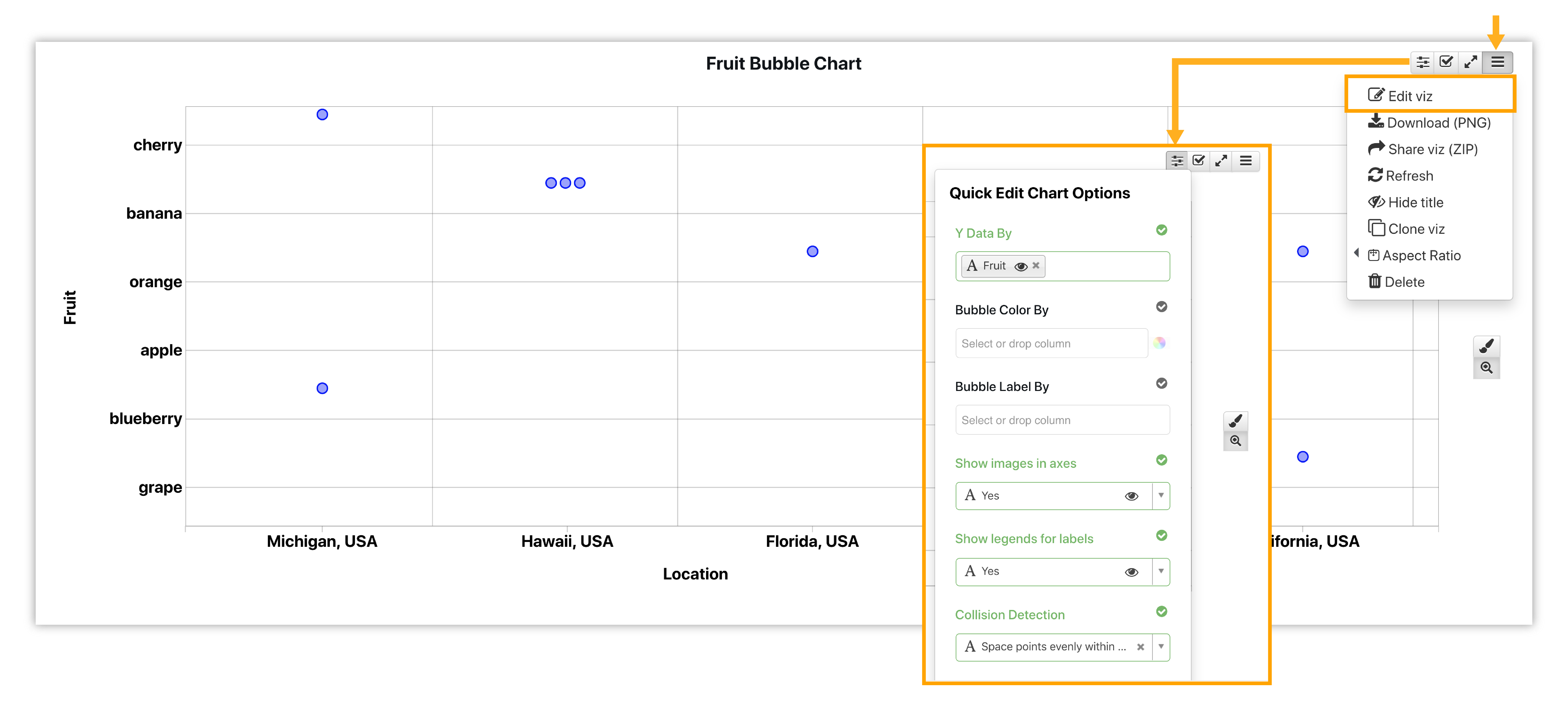
Figure 4: Editing Visualizations
- Quick Edit: This option is available for vertical bar chart and bubble chart.
- Edit Viz: This option takes us back to our initial inputs page to edit them.
Titles & Axes
We have the option to update the chart title, axis titles and axis ticks simply by clicking on their locations in the chart. The following video shows how this is done:
Quick Edit
The quick edit option is available for bar charts and bubble chart to change main inputs such as x data, y data and label by. To open the quick edit drop-down, click on the parameter icon in the top right corner of the chart area. Watch the video below to see a quick editing example for Bubble Chart:
Quick edit options will be available for more charts in the future.
Label Editor
Click on a Label to edit it. The label editor also supports variables.
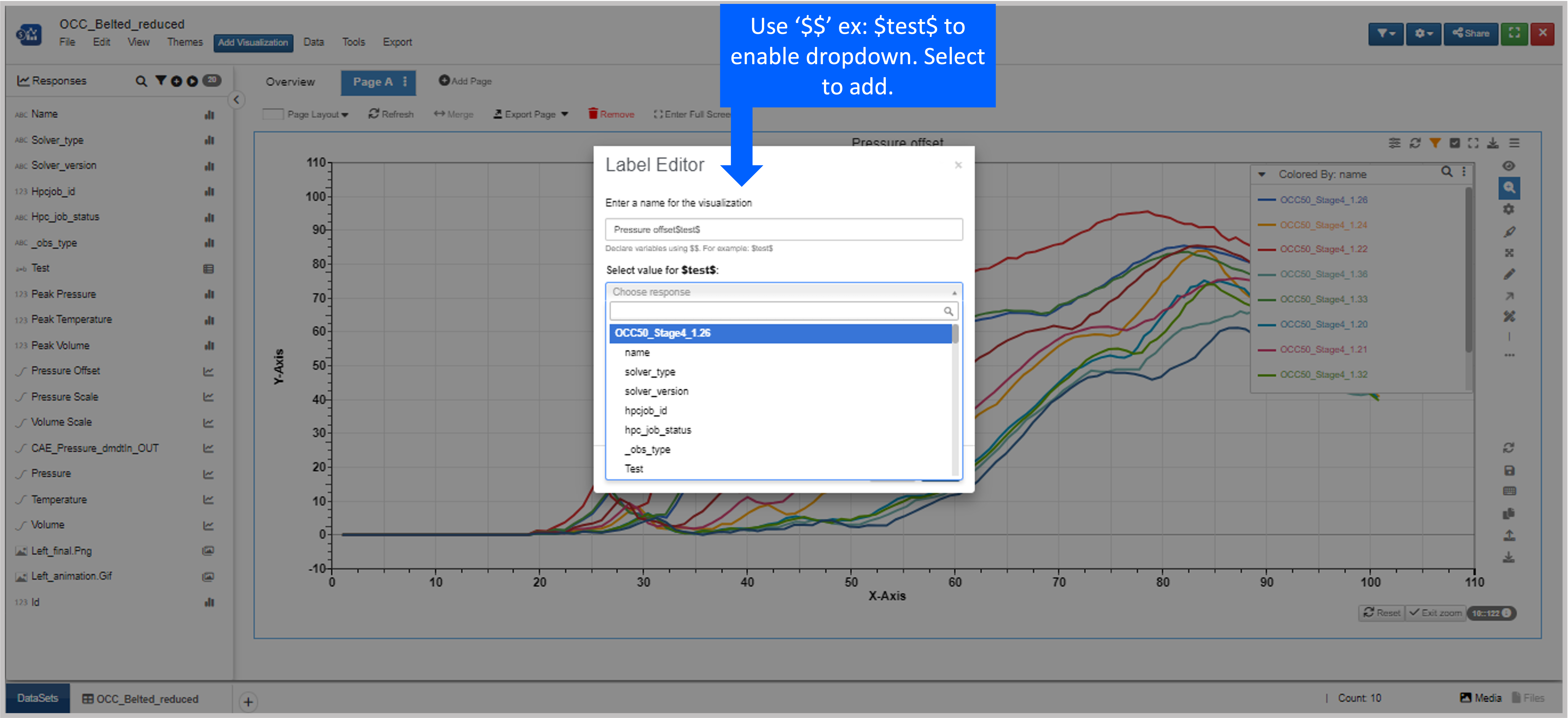
Figure 5: Label Editor
6.4. Bubble Chart Options
Bubble Chart (or Scatter Plot) has a variety of unique capabilities for exploring data. Here are a few important customizations and options.
Bounding Boxes
Under the appearance tab when editing your bubble chart, you can choose to create bounding boxes around specific nodes and color them respectively.
The bounding boxes adjust accordingly when editing node placements on the chart.
Remove Outliers
Bubble chart has an option under right-click to remove outlier nodes for a more balanced and contained chart. Newton Curve Plotter also has this option. Learn about it here.
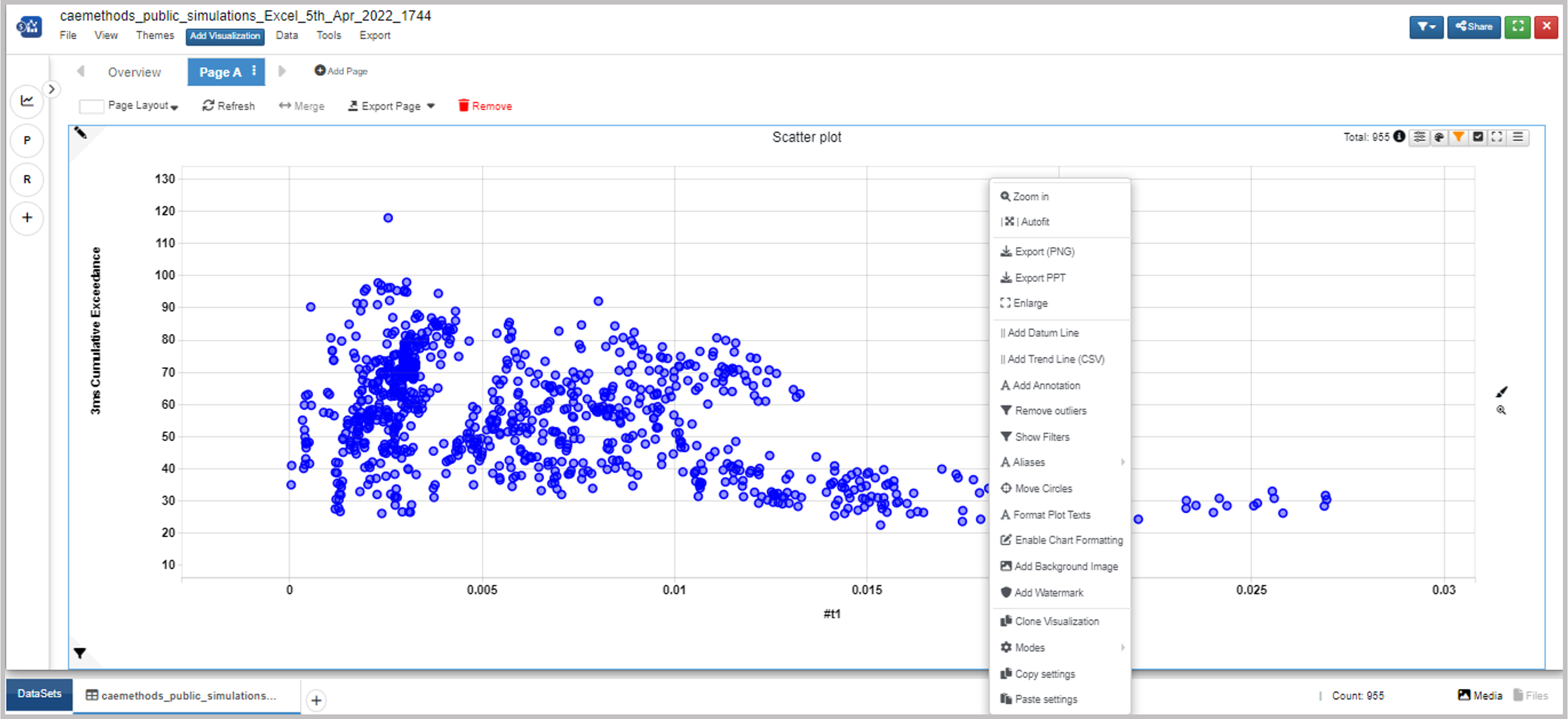
Figure 6: Remove Outliers
Multiple X and Y Data
When we have numerical values for an existing scatter plot, we can choose multiple X and Y data creating a must-scatter plot.
Label Visibility
When we have multiple labels on our bubble charts (via the Appearance tab when editing the chart), we can turn them on our off for individual nodes by clicking on the respected node.
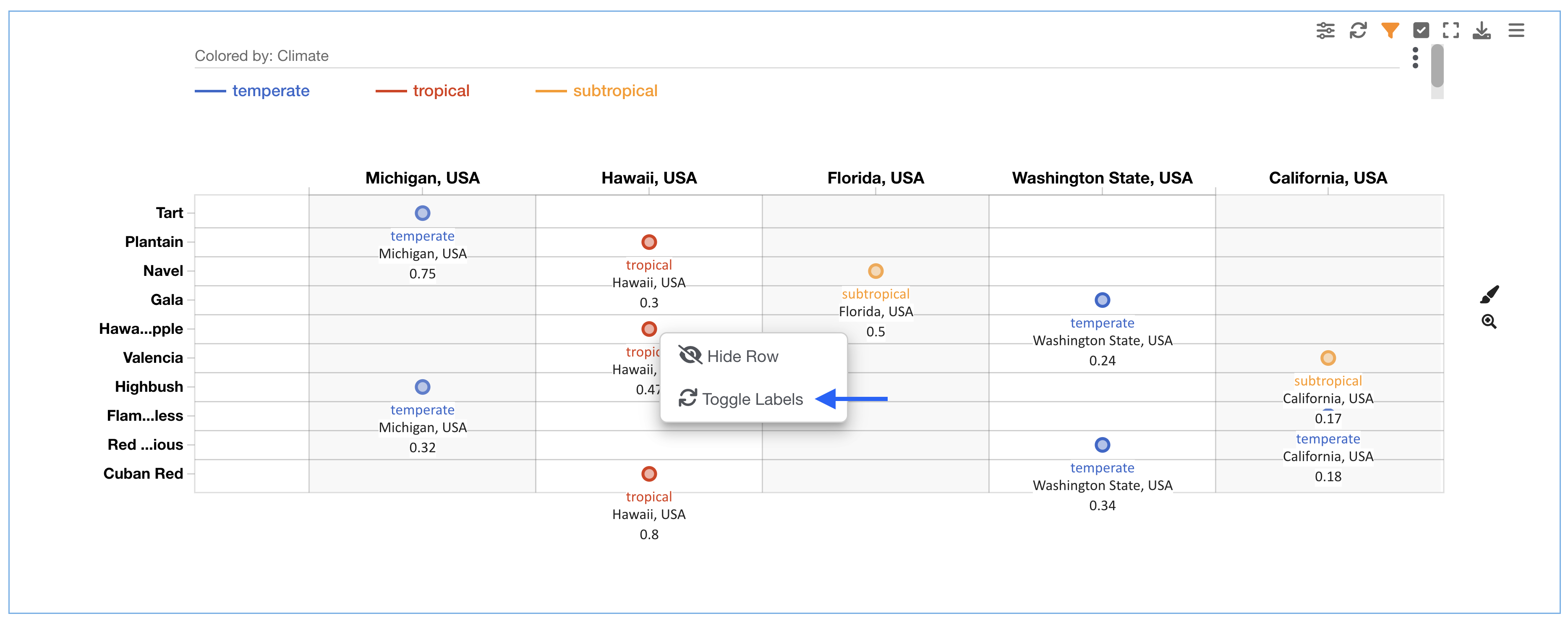
Figure 7: Editing Label Visibility
Watch the following video to see it in action as well as how to reset the visibility (chart right-click).
6.5. 3d Scatter Plot
The 3D version of Bubble Chart, 3D Scatter Plot, allows you to nodes in a 3D space with a 3D-surface plot option.
It has a matrix type edit panel within dynamic settings for ease of editing.
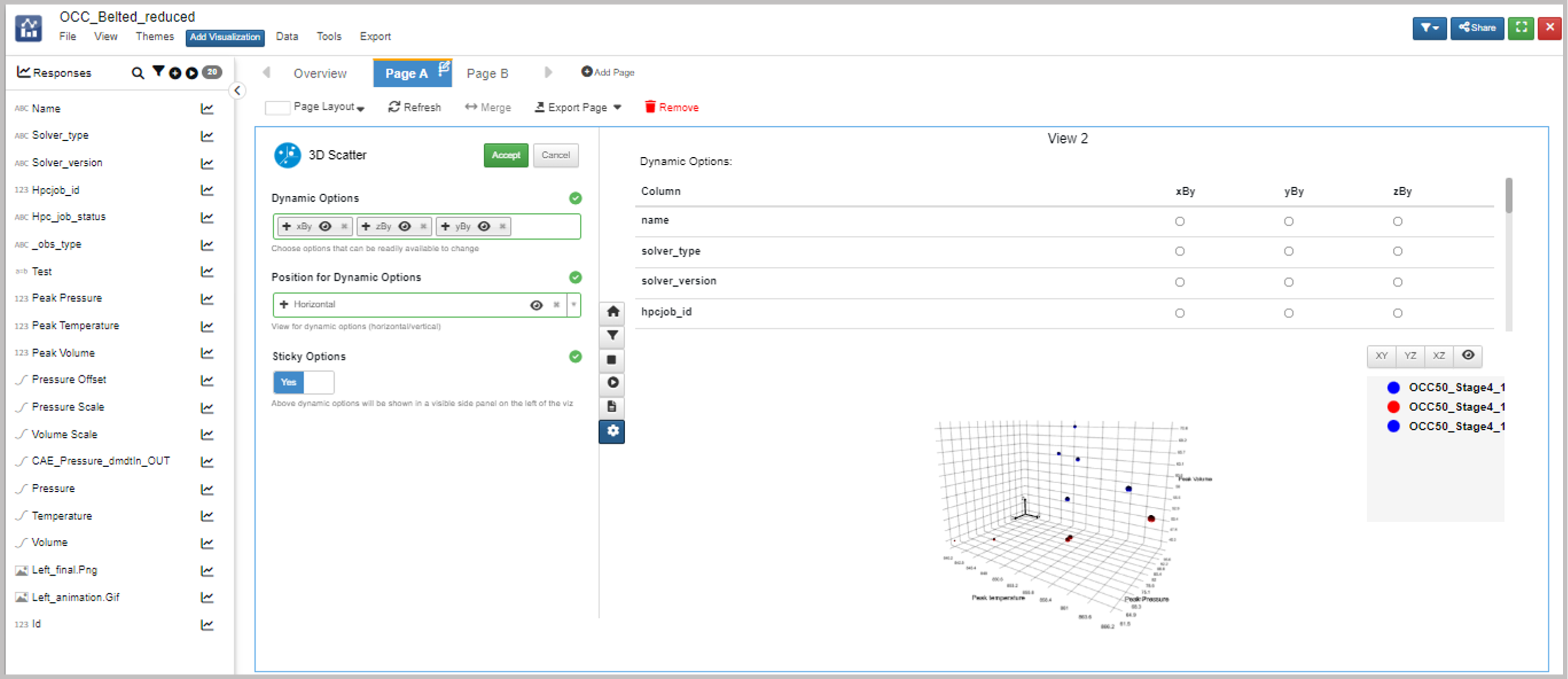
Figure 8: Matrix Type Edit Panel
6.6. Data Classifier
Data Classifier is Simlytiks’ Machine Learning visualizer that can predict data from one column into another.
Here is a video example of the chart:
6.7. Geo Map
Simlytiks’ Geo Map visualizer, new-and-improved with a built-in world map, takes location-based data and uses it to create a data map.
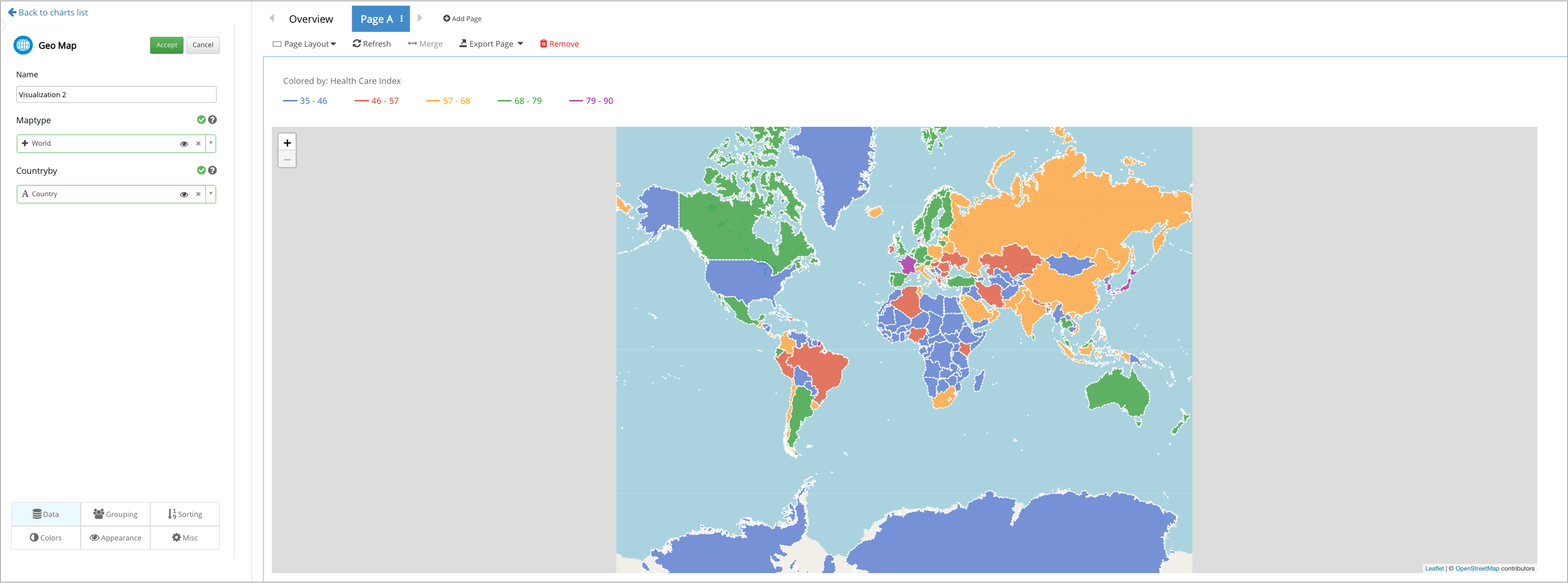
Figure 9: Geo Map Visualizer
6.8. Summary Table
Summary table supports all types of data in its cell in order to create a customized summary of the dataset.
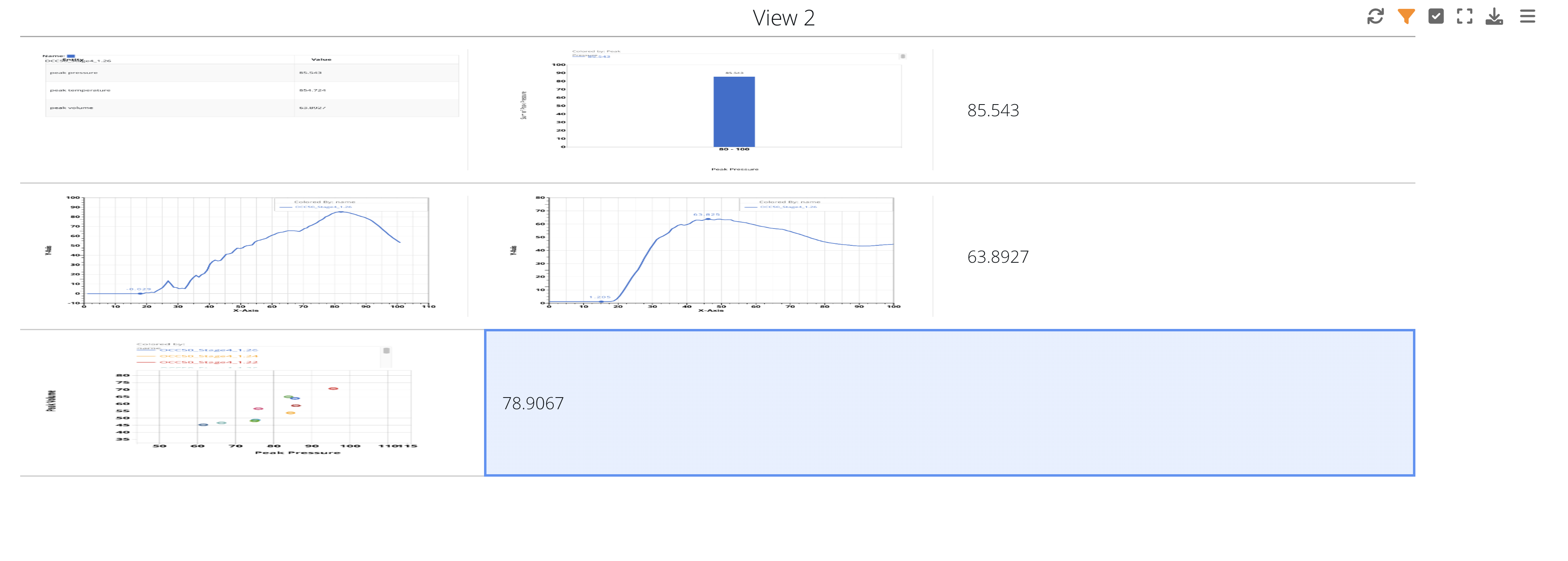
Figure 10: Summary Table Visualizer
Add responses, specific data, curves, images and other types of data to the summary table’s cells.
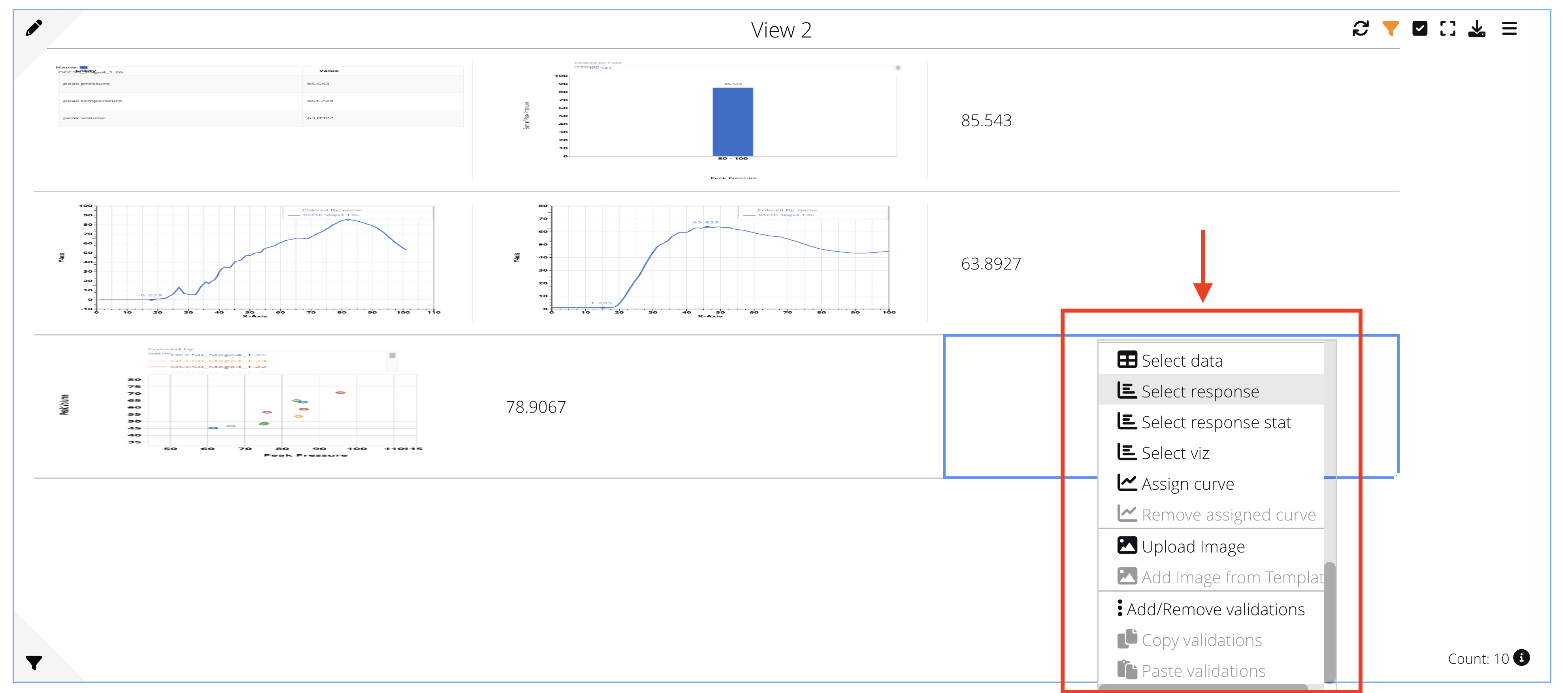
Figure 11: Add to Summary Table Cells
NEW as of June 10, 2022: Export merged calls from the Summary Table into a PPT table.
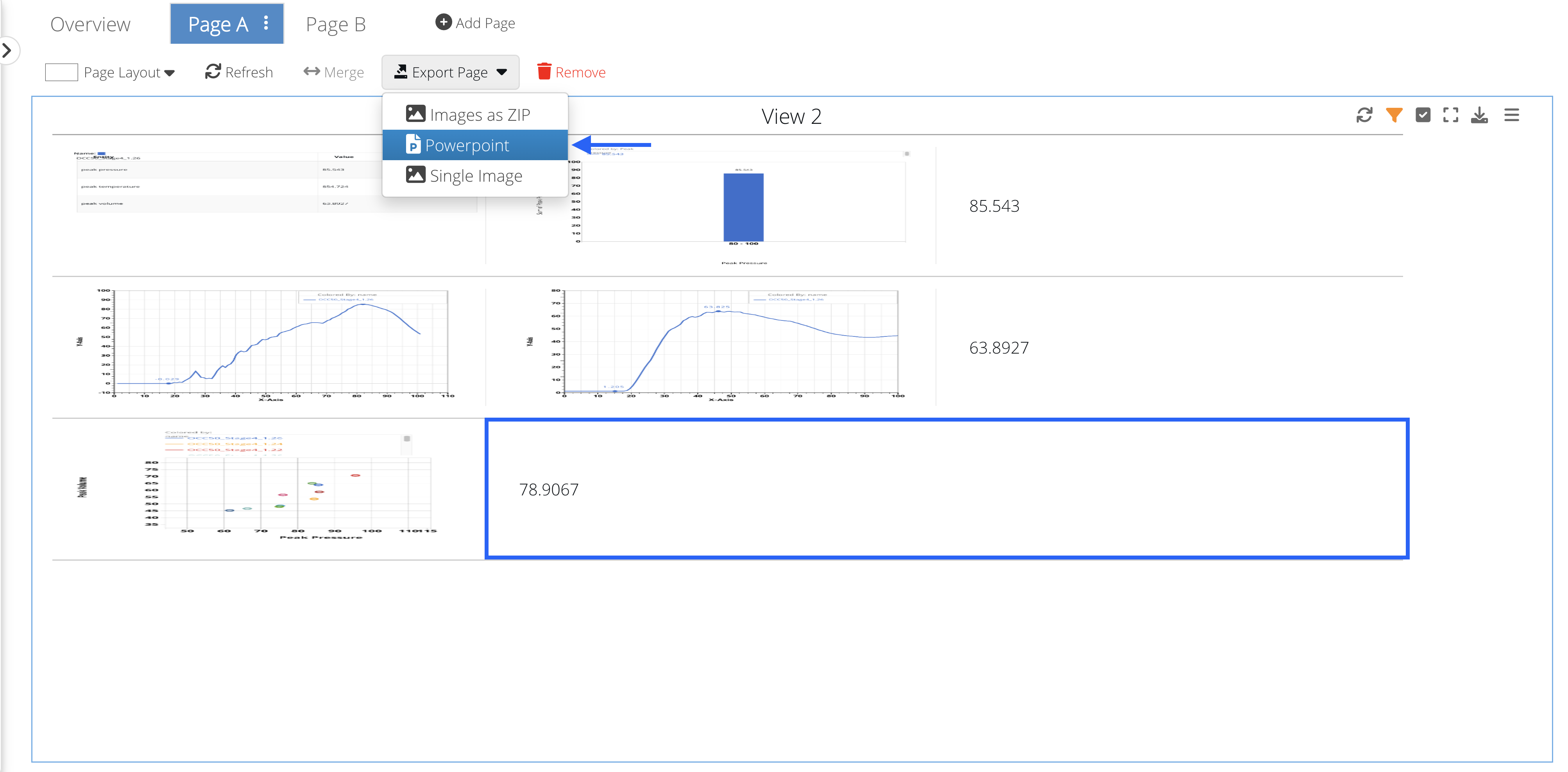
Figure 10: Merged Summary Table Cells