4.  Viewing & Organizing Data
For this section, we’ll be going over how to view our data after we import it into Simlytiks
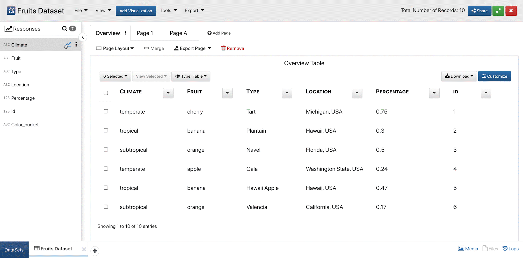
Viewing Fruit Dataset Data Columns
4.1. Our Dataset
For this tutorial, we’ll be exploring this simple dataset on fruits.
| Climate | Fruit | Type | Location | Percentage |
|---|---|---|---|---|
| temperate | cherry | Tart | Michigan, USA | 0.75 |
| tropical | banana | Plantain | Hawaii, USA | 0.3 |
| subtropical | orange | Navel | Florida, USA | 0.5 |
| temperate | apple | Gala | Washington State, USA | 0.24 |
| tropical | banana | Hawaii Apple | Hawaii, USA | 0.47 |
| subtropical | orange | Valencia | California, USA | 0.17 |
| temperate | blueberry | Highbush | Michigan, USA | 0.32 |
| temperate | grape | Flame Seedless | California, USA | 0.18 |
| temperate | apple | Red Delicious | Washington State, USA | 0.34 |
| tropical | banana | Cuban Red | Hawaii, USA | 0.8 |
Once we import our data, we can view it as a dataset on Simlytiks and organize it however we like. Initially, Simlytiks organizes the data into data columns (responses) and presents an overview table as the first page in the dashboard.
4.2. Simlytiks Views
Simlytiks interface can be viewed in three different ways: Modern, Classic and Slides. Modern View keeps the pages panel as tabs at the top of the page with just responses in the left-side panel; Classic contains them as a tree folder structure in the left-side panel above responses; while, Slides shows them as mini page previews in the left-side panel without responses shown by default.
Modern View
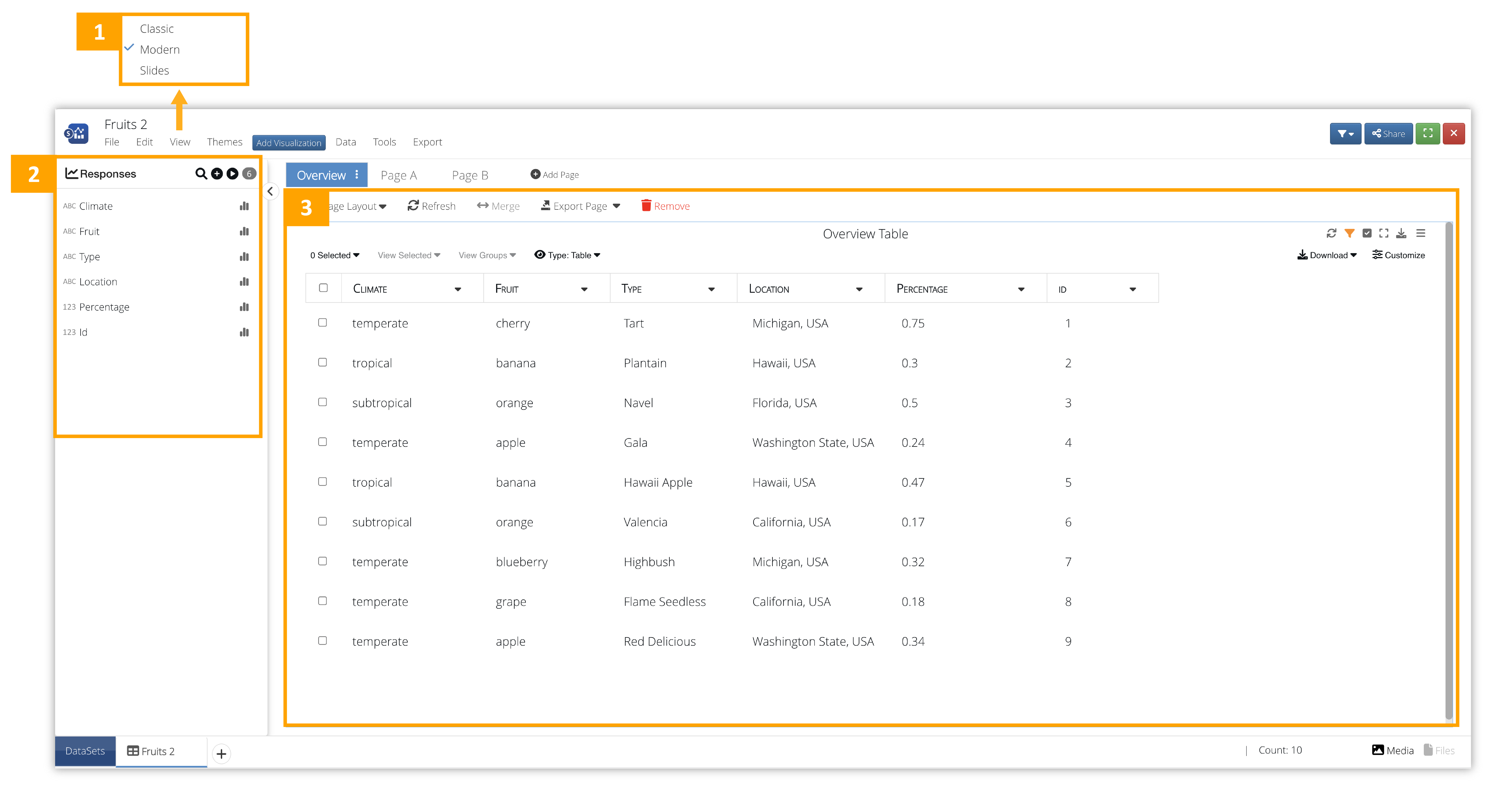
Figure 1: Modern View
- View: Change the user interface style. This is the Modern View.
- Response Panel: This shows all our data columns.
- Overview Table: This is an overview table of all our data.
Modern View also has the option to view all the responses in the dataset by clicking on play button.
Here is a video showing how it works:
Classic View
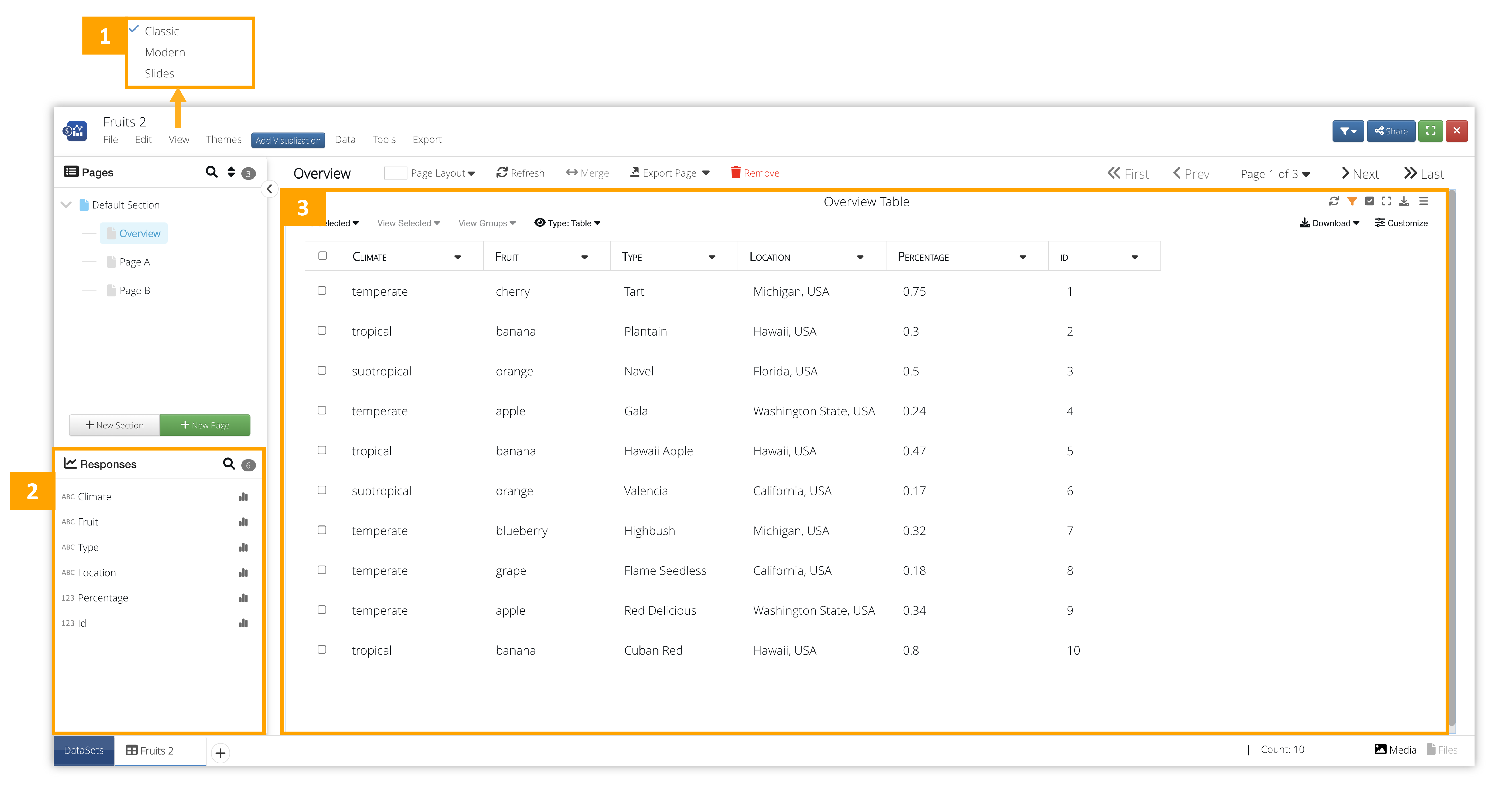
Figure 2: Classic View
- View: Change the user interface style. This is the Classic View.
- Response Panel: This shows all our data columns.
- Overview Table: This is an overview table of all our data.
Slides View
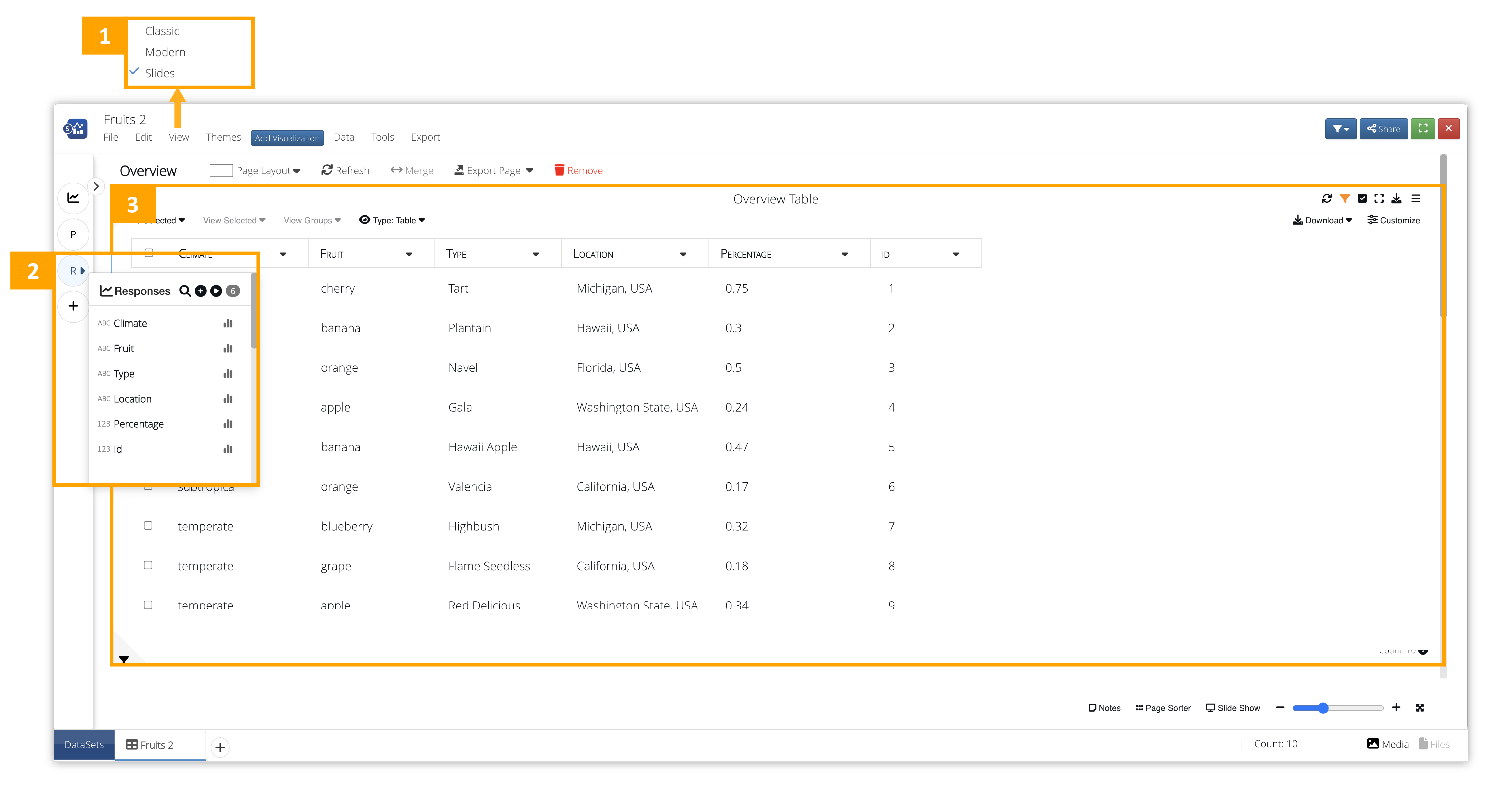
Figure 2: Slides View
- View: Change the user interface style. This is the Slides View.
- Response Panel: This shows all our data columns.
- Overview Table: This is an overview table of all our data.
4.3. Overview Table
The initial overview table presents our full dataset with all its columns and rows, unless we have a large dataset with a lot of records. These bigger datasets will instead be presented in a summary view instead of a table as shown in the image below:
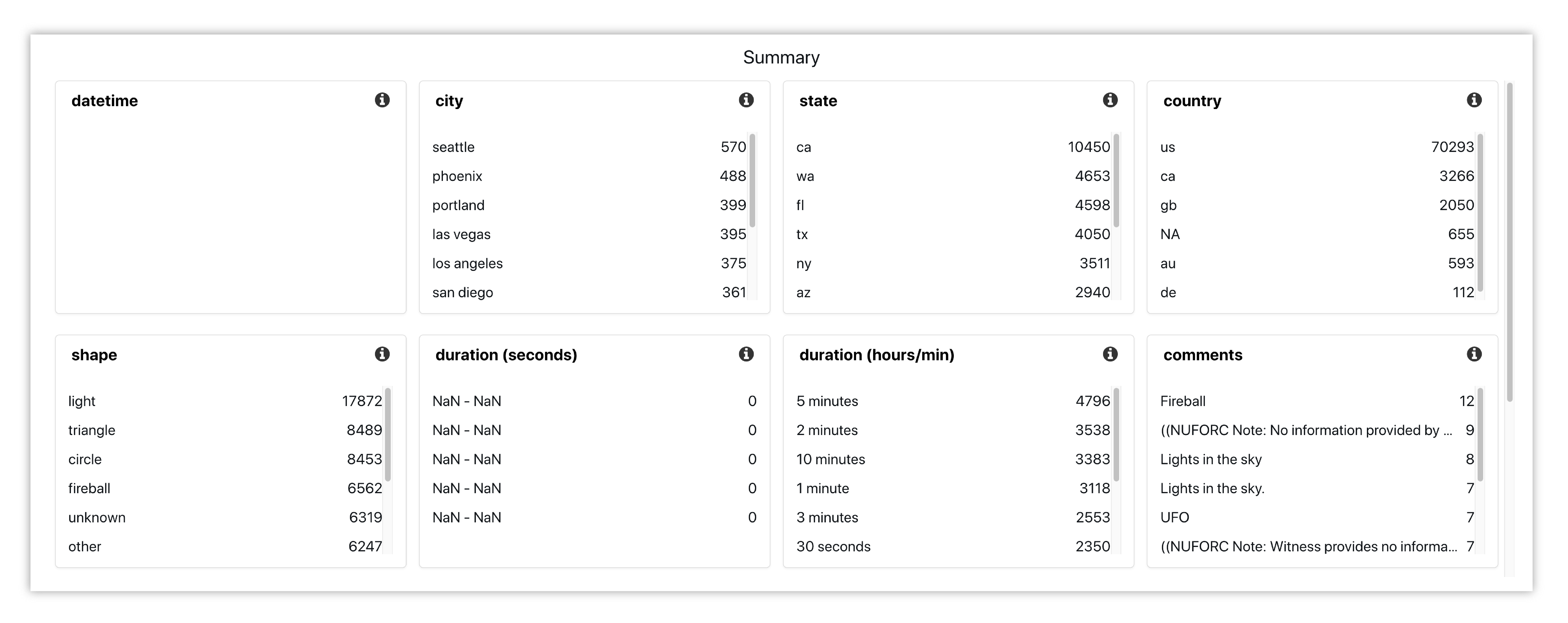
Figure 4: Summary Overview
We can change the view, download and customize our overview table.
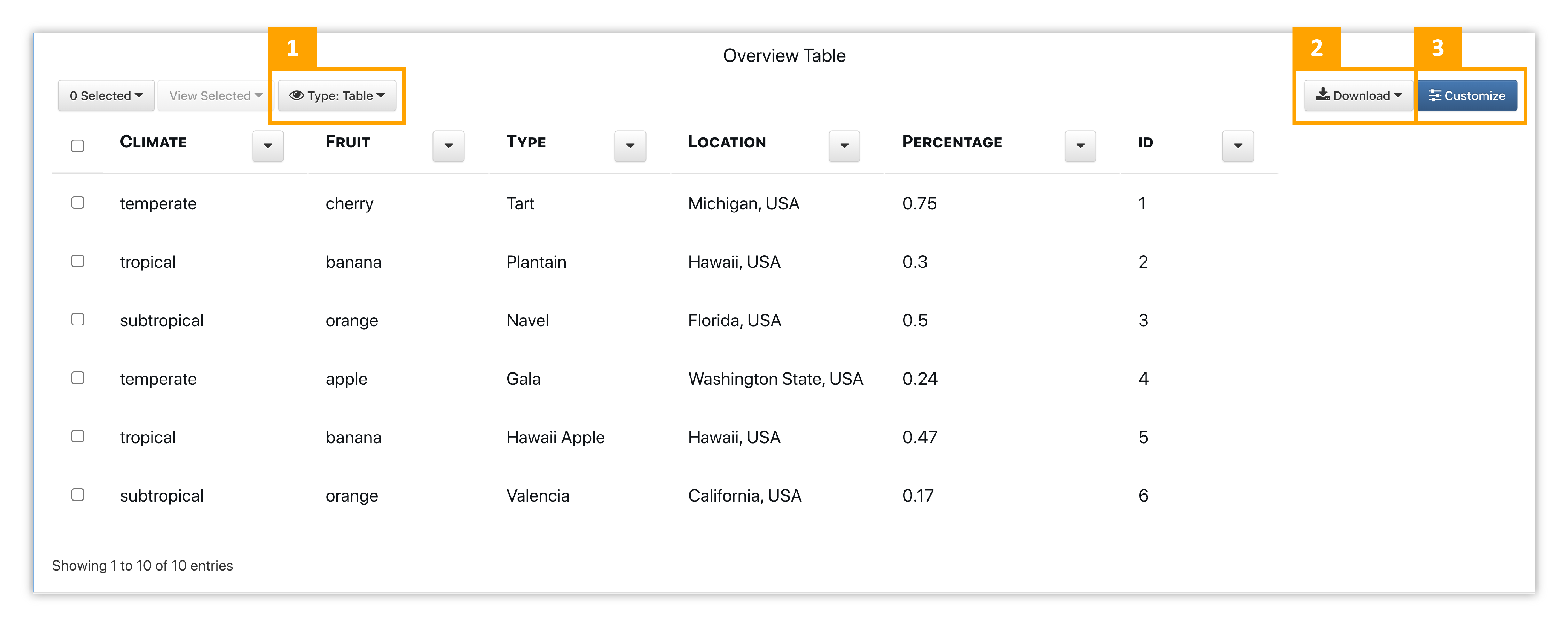
Figure 5: Overview Table
- View Type: Change the visualization of the table to view the data in a different way.
- Download: Export the table via CSV, PPT, PNG, JSON, ZIP, text or copy it to clipboard.
- Customize: Change aspects such as font size and weight, and reorder columns.
Check out this video showing how to work with the table.
Pages Full Screen
Click on the full screen view option at the top of a page to get an expanded view of it.
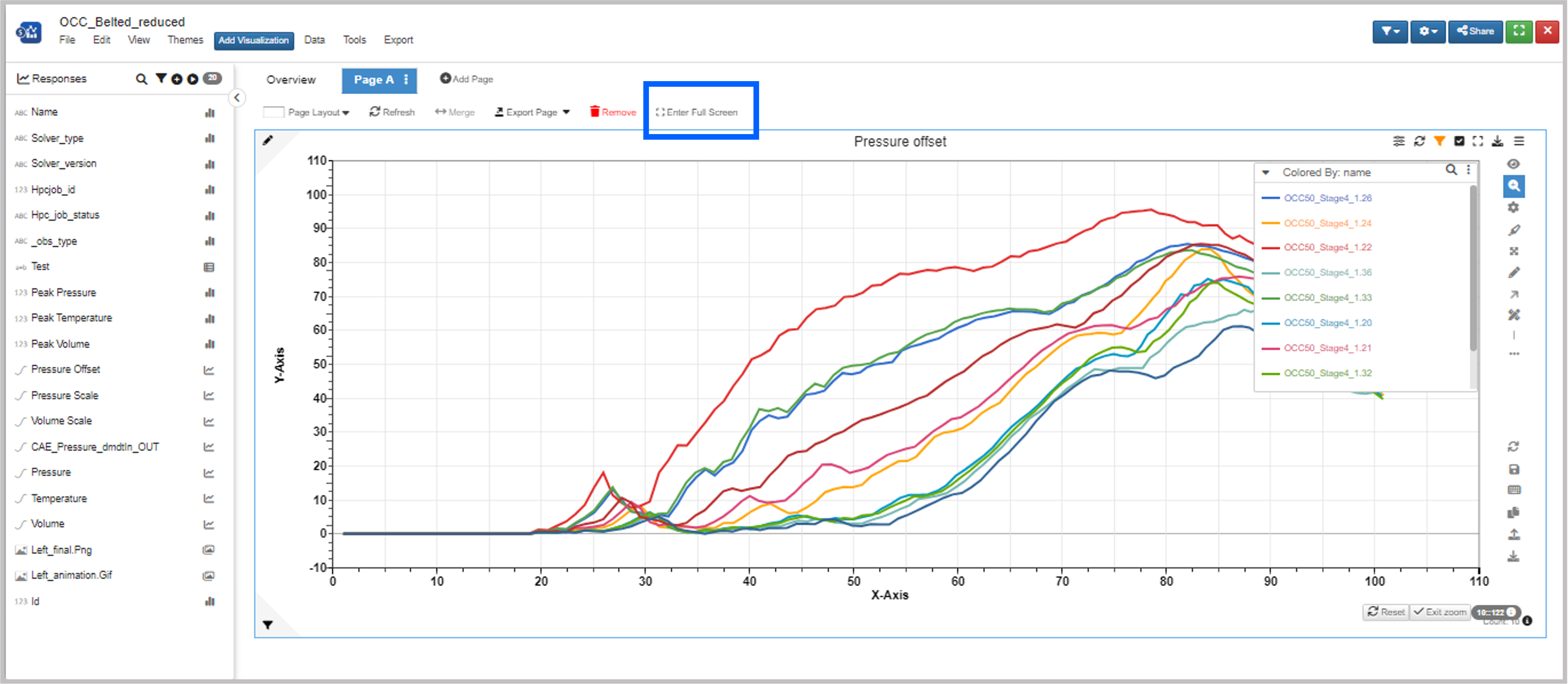
Figure 6: Overview Table
4.4. Data Columns
Simlytiks finds data columns from the data source and organizes it into responses. The icon next to each data column indicates its value type. Read the Value Types section to learn more about them.
We can view data columns as charts by clicking on the curve icon that appears when hovering over it with our mouse as shown in the clip below. Once the window opens for viewing a response, we can navigate between all responses using the respected buttons at the top right.
NEW as of February 1, 2022: Responses sidebar has a context menu to preview and add bin columns in the responses list.
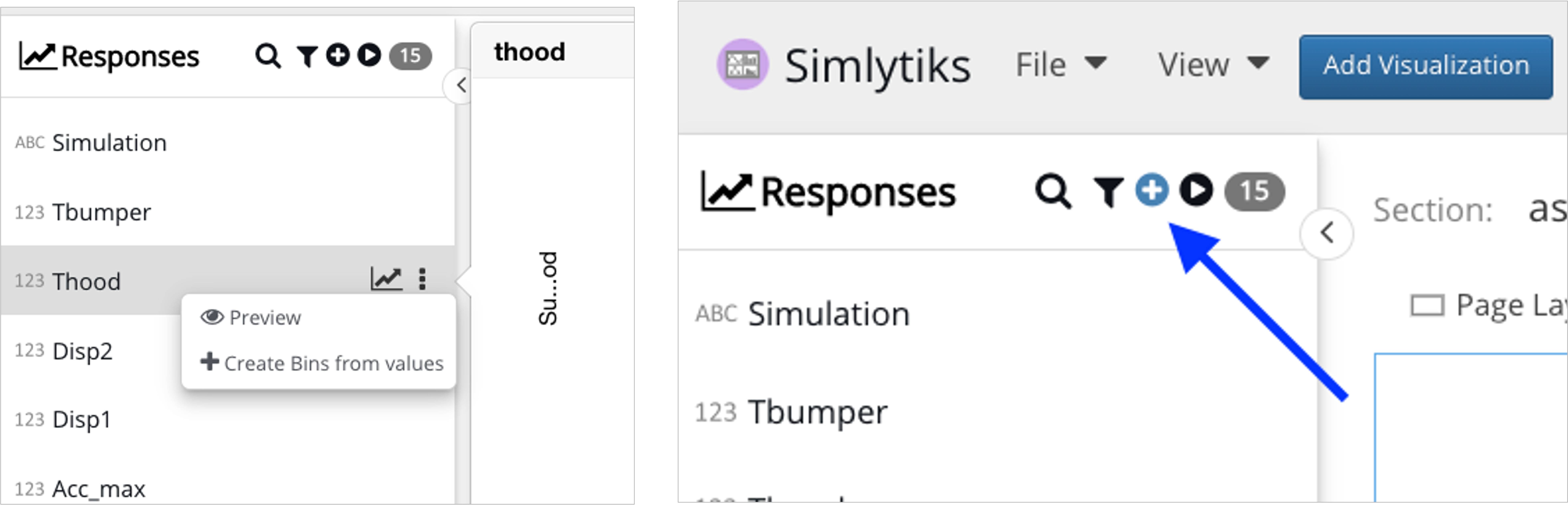
Figure 7: Responses Context Menu
We’ll build our exploration by creating new pages and adding charts to them, using our data columns as chart inputs. Jump ahead to learn about charts here and pages here.
Here is an example of two basic charts on a page for our dataset.
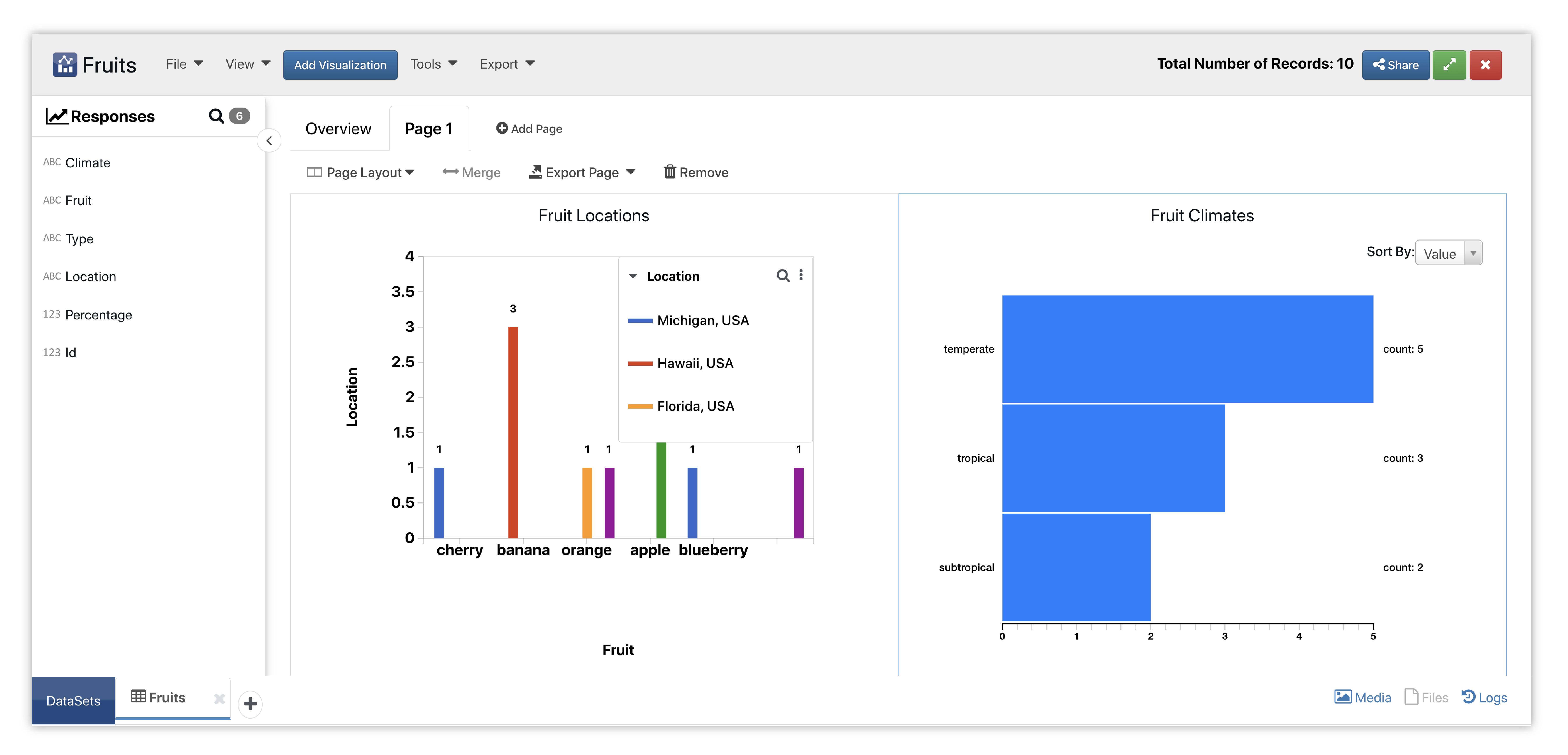
Figure 8: Basic Charts
4.5. Data Options
Filtering Data
Global dataset filtering can be found at the top right corner of the page next to the settings button. You can also update specific filters under the Tools menu.
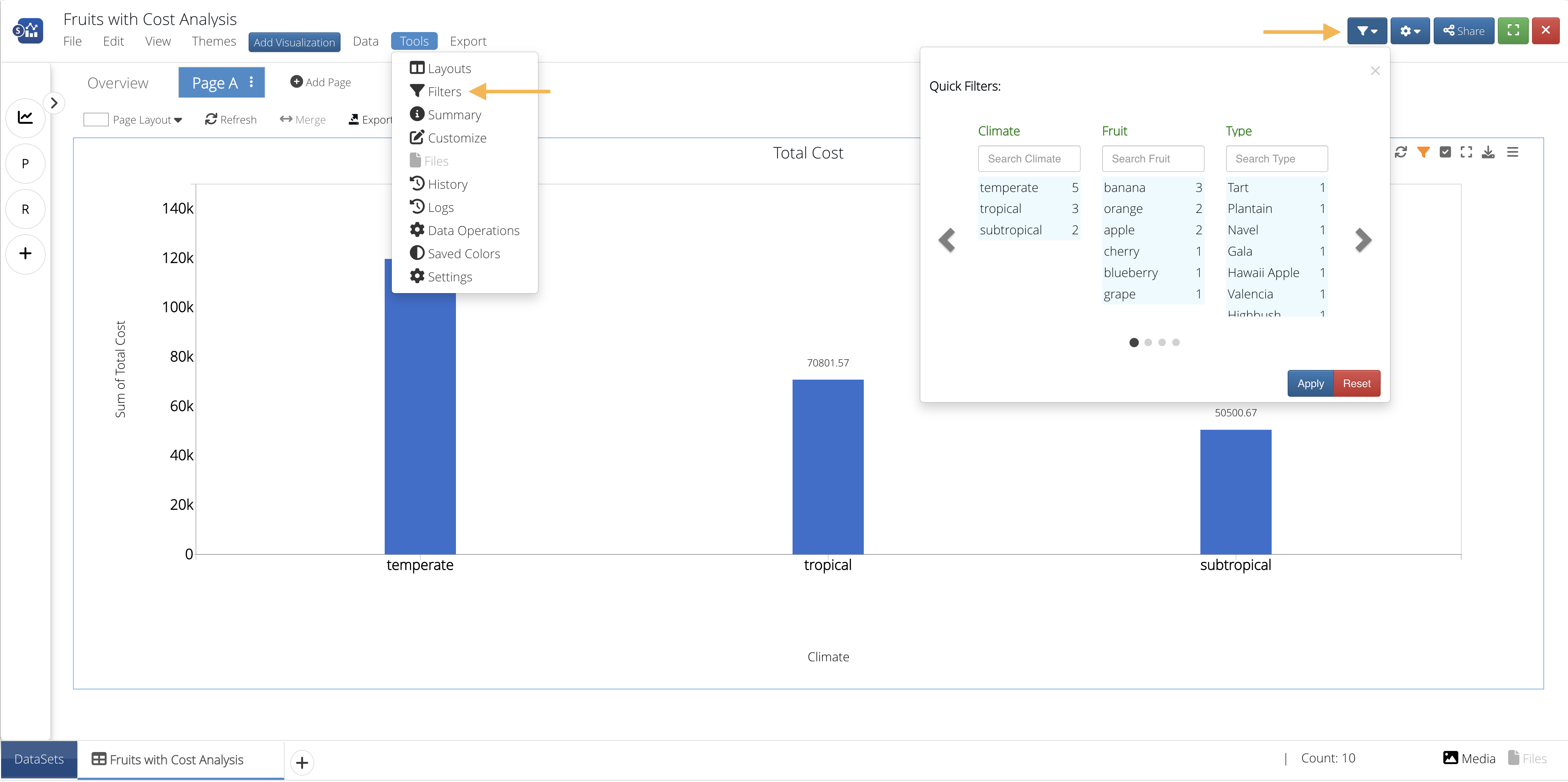
Figure 9: Dataset Filtering
Grouping Data
Under Tools -> Customize -> Groups, you can create and auto-create custom groups within a data column and specify colors for each.
There is also an option to bin data under Tools > Data Operations. Just use the “Add Column By Binning” transformation to create your new binned data column.

Figure 10: Add Column By Binning
4.6. Tools
There are different tools available for organizing and editing the dataset.
Dataset Settings
Settings under the Tools dropdown helps in configuring basics like layout, names, color schemes and page settings.
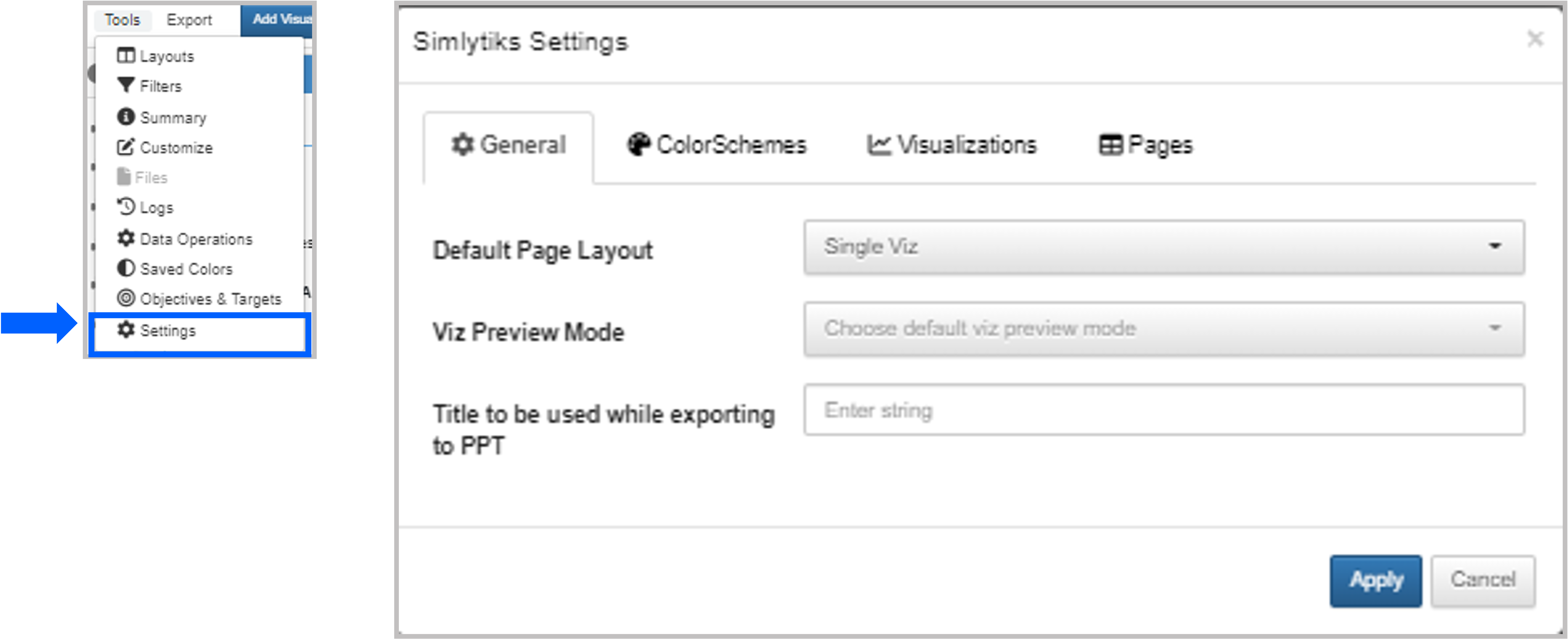
Figure 11: Dataset Settings
Objectives & Targets
Under the Tools dropdown, choose Objectives & Targets to help trigger particular data for the dataset.
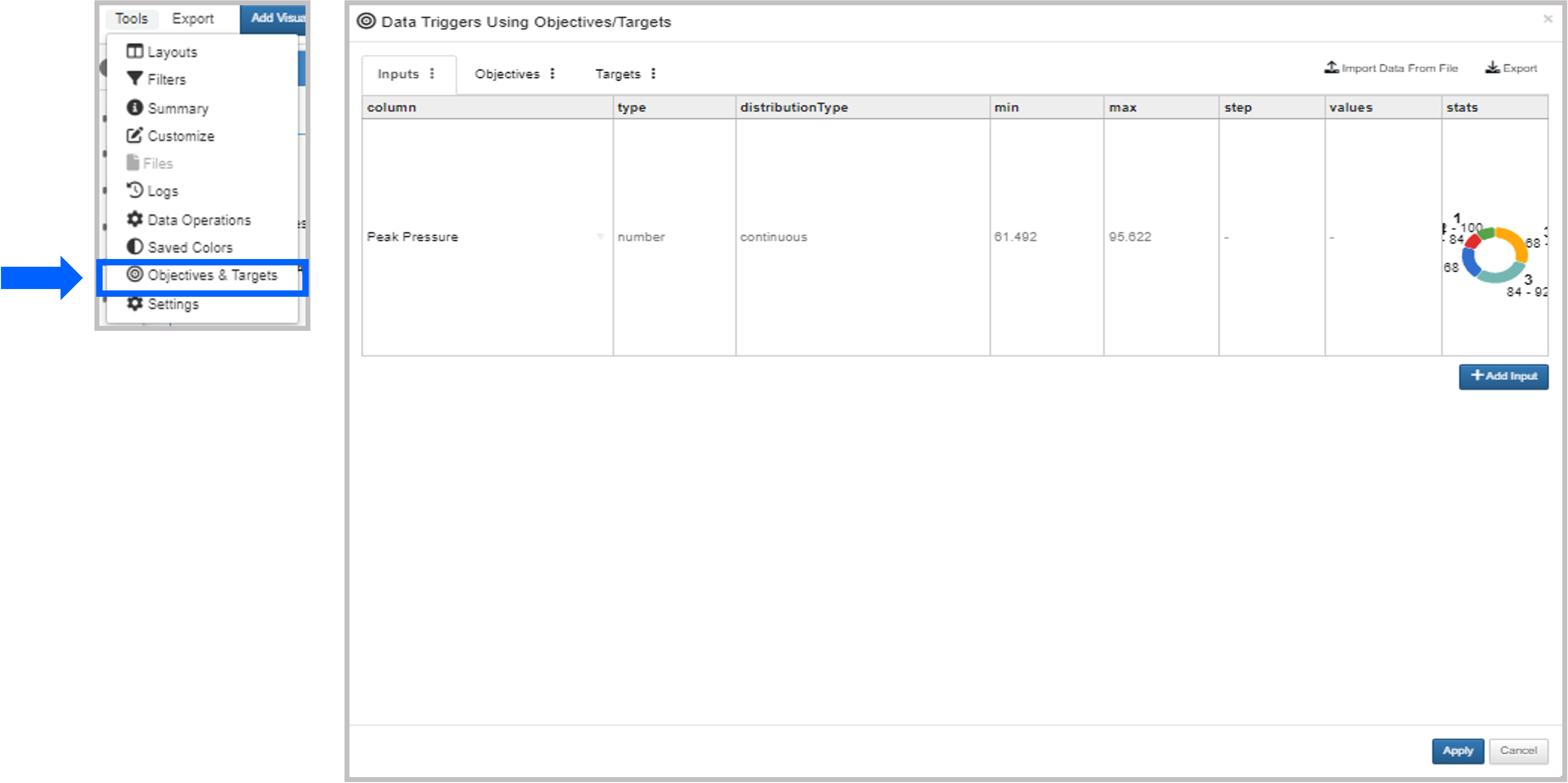
Figure 12: Objectives & Targets