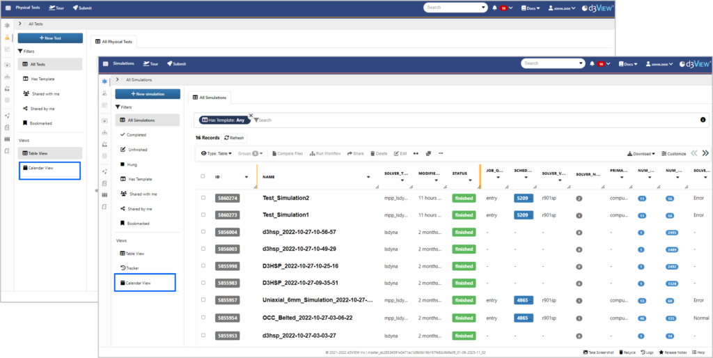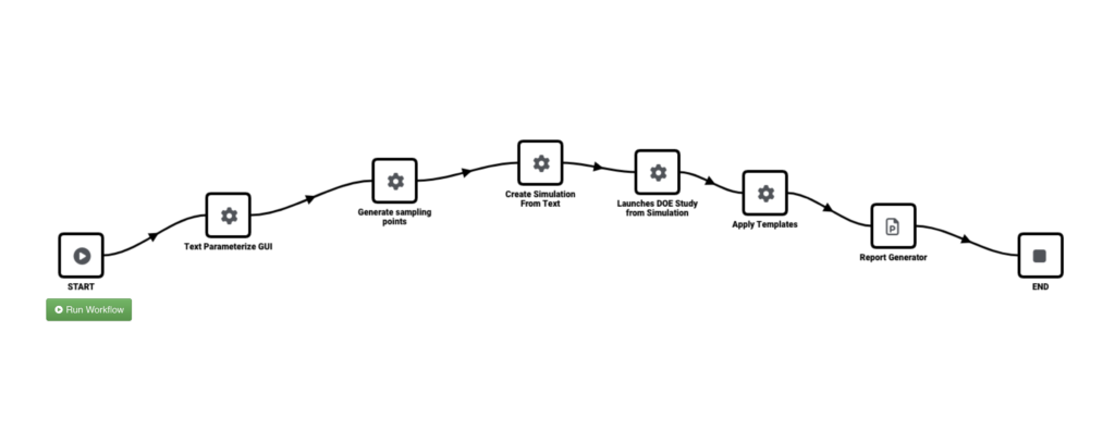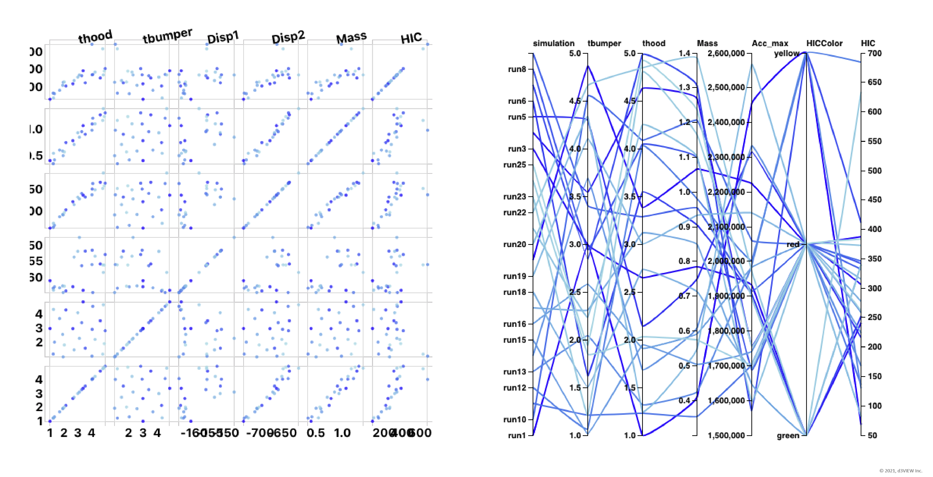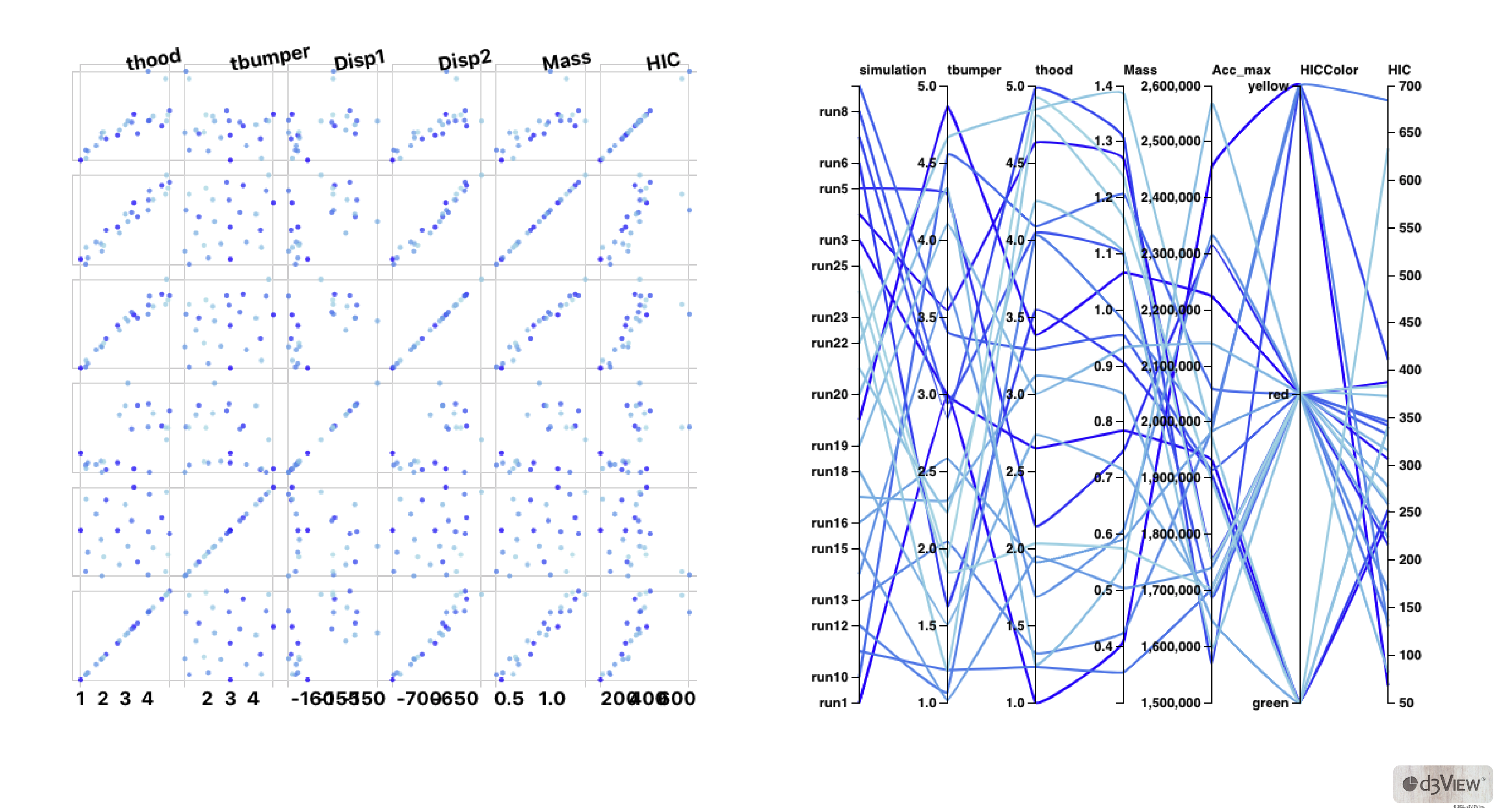
In virtual product development, a single pane of glass view to track evolutionary changes across all domains in both input (variables) and its corresponding output (results) is critical for decision-making. There are two broad categories of designs that are frequently evaluated – A) Machine Generated Designs (MGD) and B) Human Generated Designs ( HGD). MGD data visualization involves the viewing of a group of data such as sequential domain-reduction and is usually viewed using traditional methods such as Table View, Parallel Chart, etc to study the influence of the (inputs) variables on the outputs (results). Simlytiks, a data-visualization application in d3VIEW, has been facilitating the visualization of DOE and sequential DOE for a number of years and is well-accepted in the industry for large amounts of data (see example). However, visualization of HGD is non-trivial since the inputs are dynamic and are often associated with a dynamic timeline and outputs. In all or most companies, the tracker information is maintained by engineers using a NAS-available Excel file using traditional methods of entry and limited visualizations.
A few months ago, we started to look at this problem and designed a solution, with minimal overhead to the engineer, and created the Simulation Tracker that now encompasses both MGD and HGD tracker visualizations.
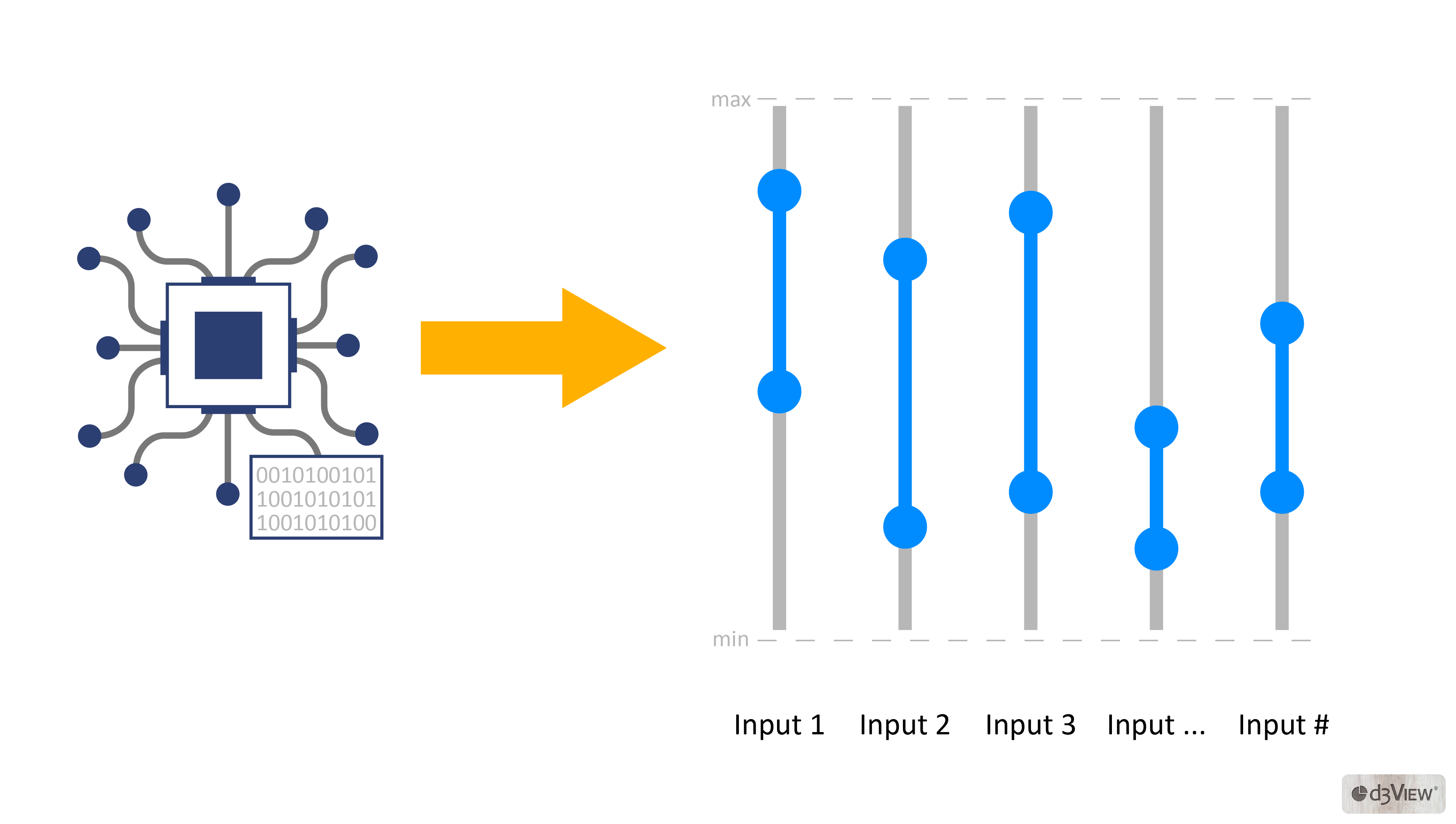
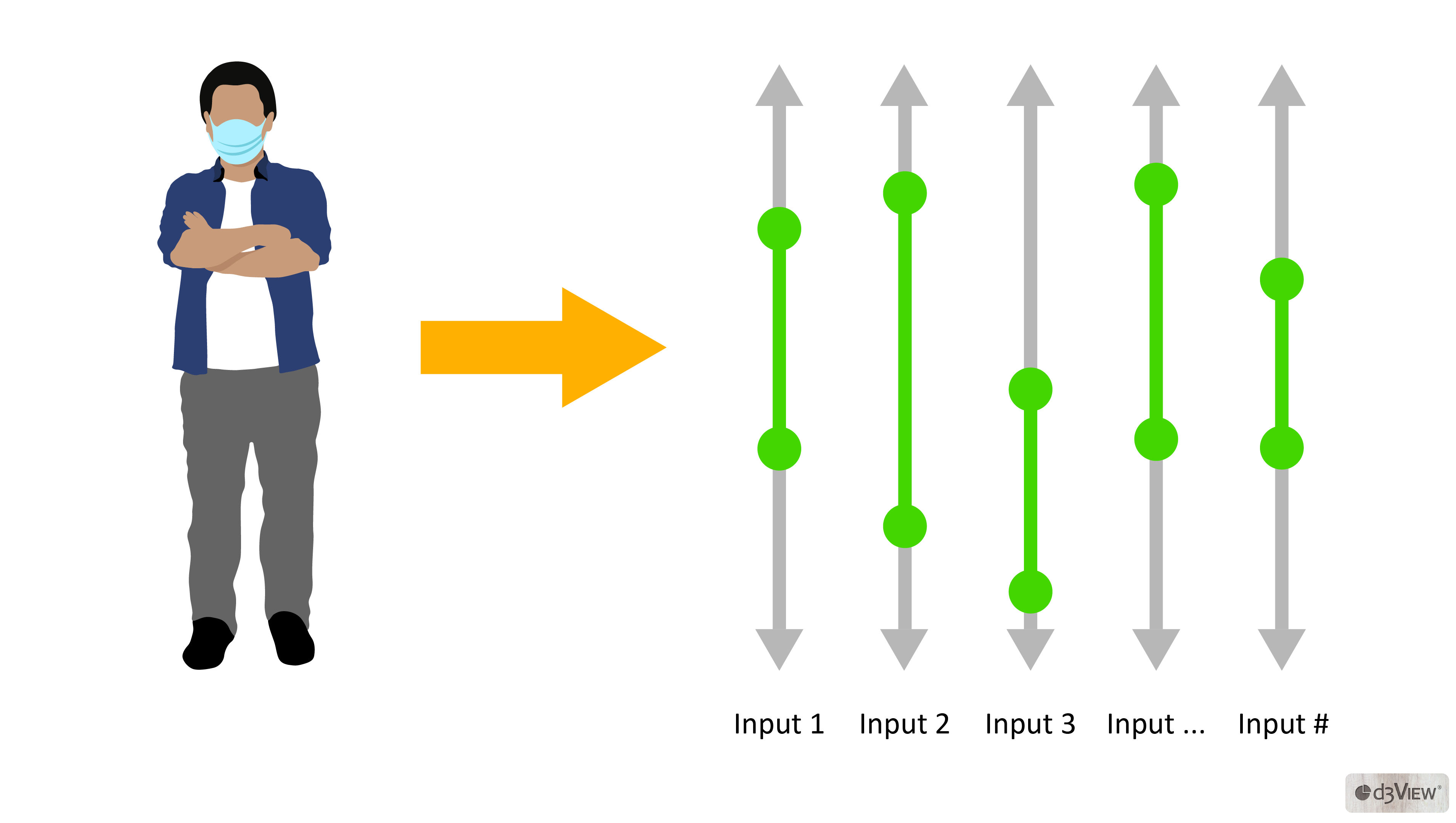
d3VIEW‘s Simulation Tracker-Visualizer allows collaborative authoring and analytics of inputs and outputs with timeline support to provide a comprehensive view of the design evolution with insights to know if the design is heading in the desired direction. Every customer can now take advantage of this with minimal overhead and use analytics that provides in-depth design information.
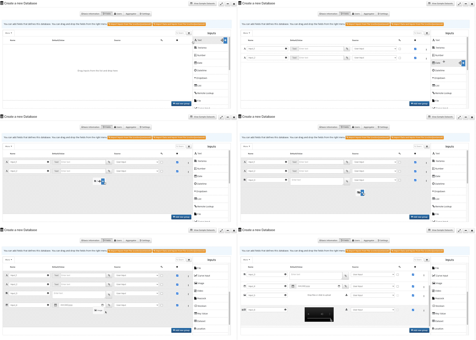
The tracker database can remain in Excel format or be authored in d3VIEW’s scientific database. The scientific database in d3VIEW supports storage of text and numbers along with other data types such as curves, images, movies and documents. In addition, the scientific database can be created using a powerful UI with no need for code and includes permission based user access control. Below is an image that illustrates how a scientific database is created and populated. (Gif below that shows the creation and addition of records).
1. Tree Visualizer as a Simulation Tracker
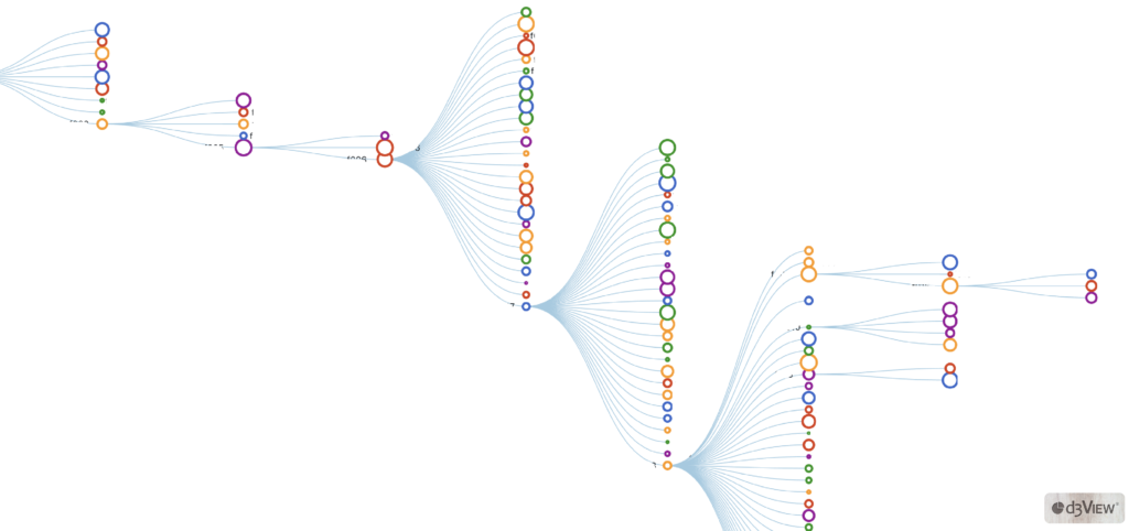
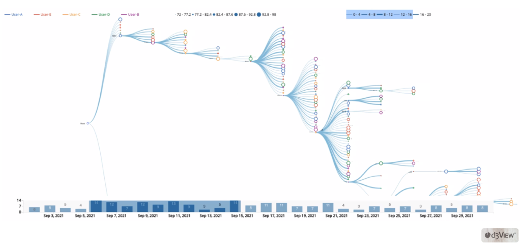
The tracker uses the collapsible tree visualizer in Simlytiks which displays parent-child relationships based on data chosen for primary keys and parent IDs.
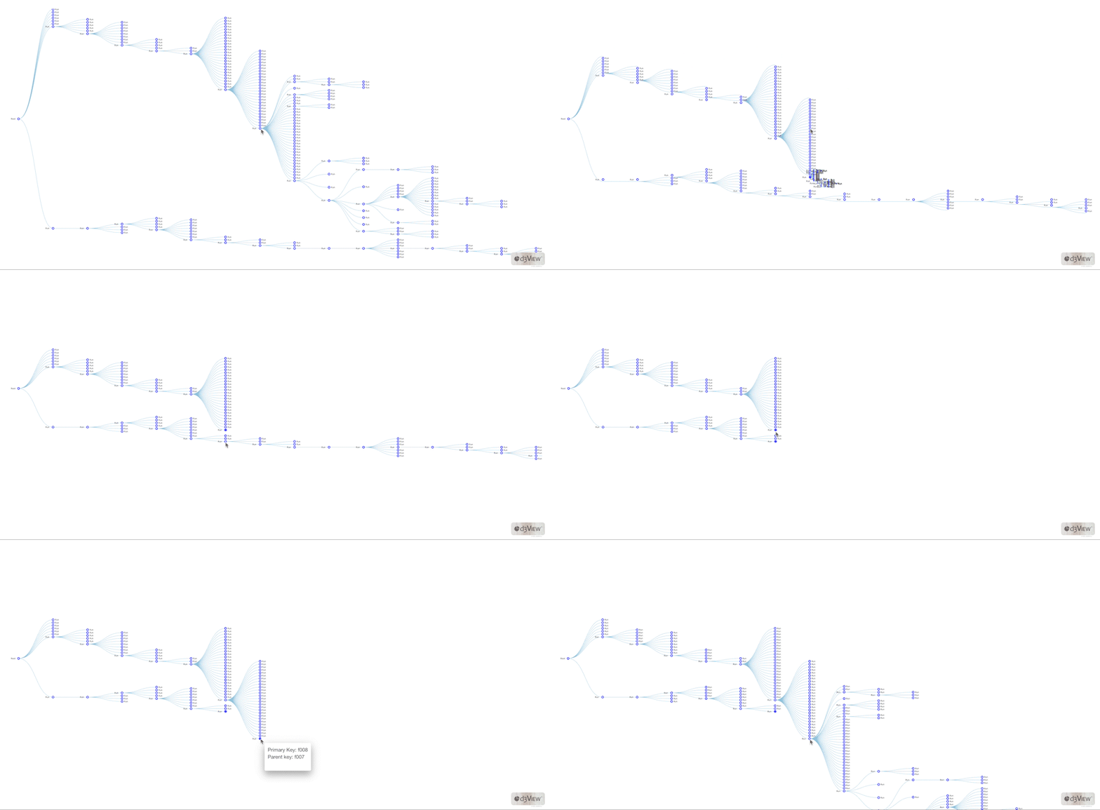
To render the visualization correctly, we would add the runs as our keys and the base model as our parent.
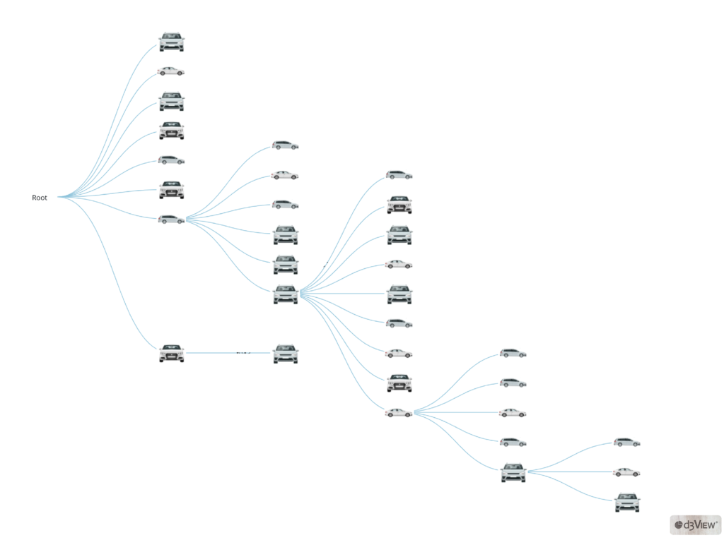
Features for customization include replacing images for the nodes, indicating data for the tooltip (the information blurb on hover), deciding how to label the nodes, coloring or sizing the nodes based on data, and enabling tracking. When we right-click on any node, we can view its ancestors and record details.
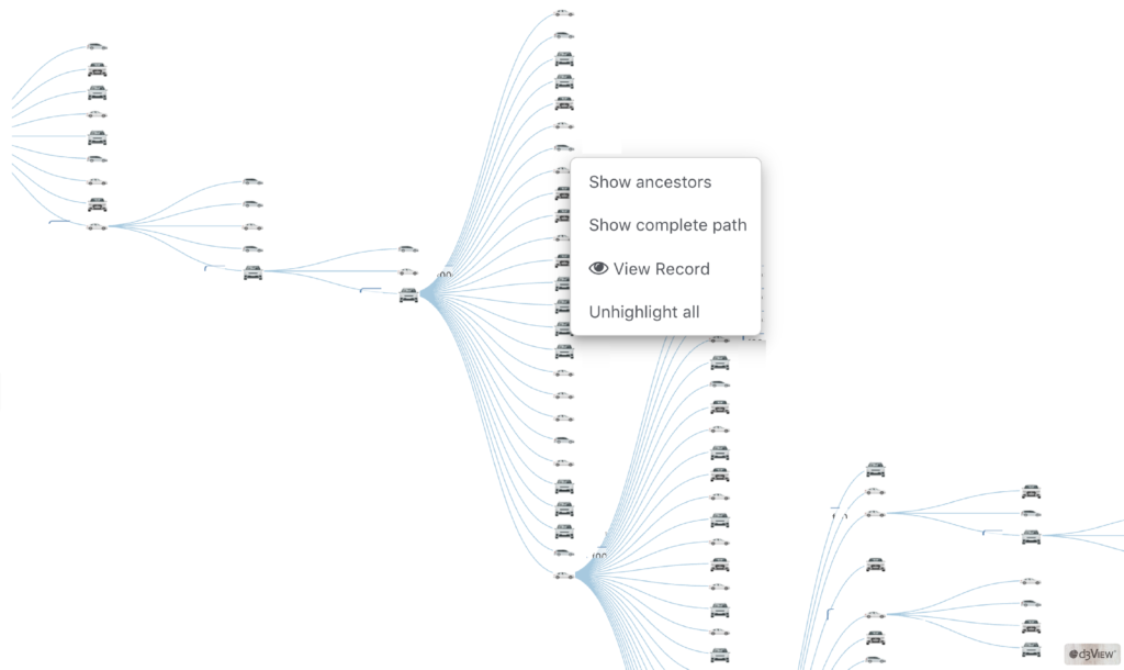
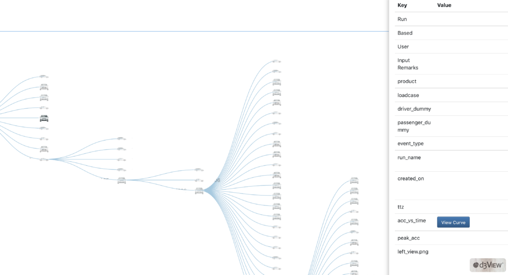
Choosing to “View Record” upon right-clicking an individual run will present key information on the simulation such as its base, event type, input remarks and date created.
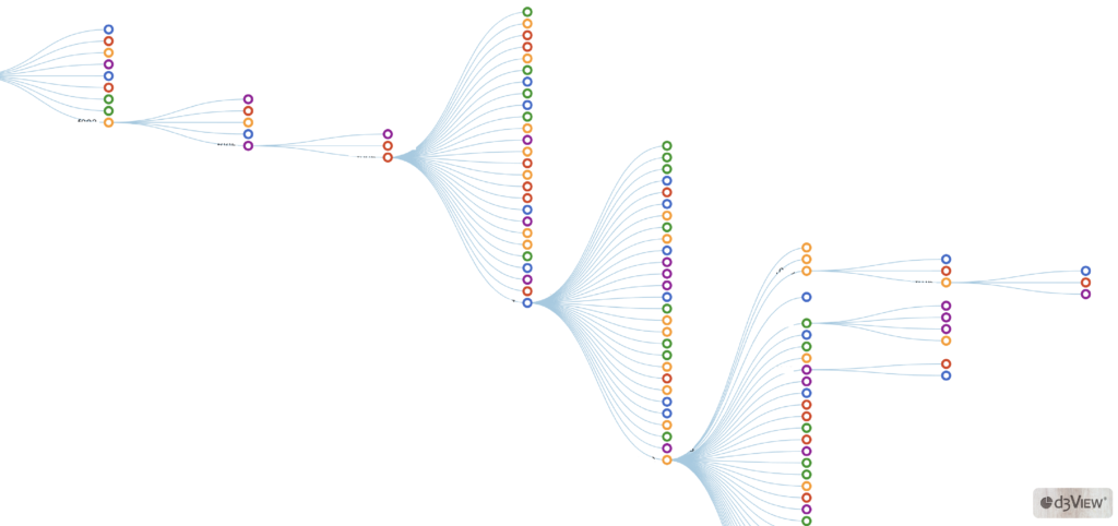
Instead of using an image for the runs, we can choose to keep the default circles and pick data to determine their colors.
We also have the option to choose data for our node sizes.
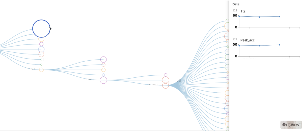
Finally, one of its most useful features, the Simulation Tracker can visualize changes in values over time for a given node based on its parent. When we enable tracking, we choose these attributes which present in a line chart under the tracking tab when viewing a run’s record.
2. Network Graph Based Simulation Tracker
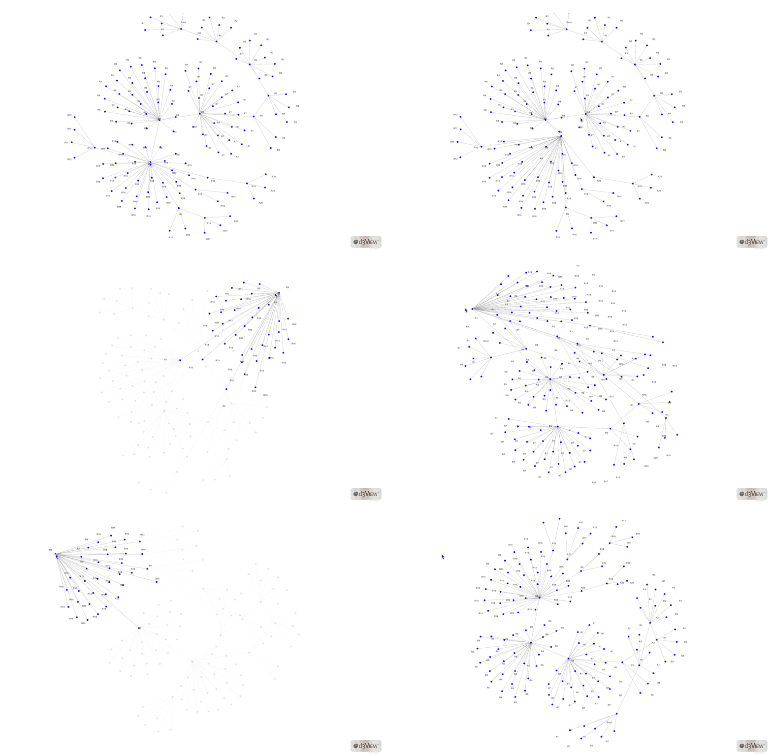
Simlytiks newest addition to its chart library, the force directed graph, connects parents and child nodes like the tree visualizer but in a different way. This graph presents connections with less order but supports a more interactive viewing.
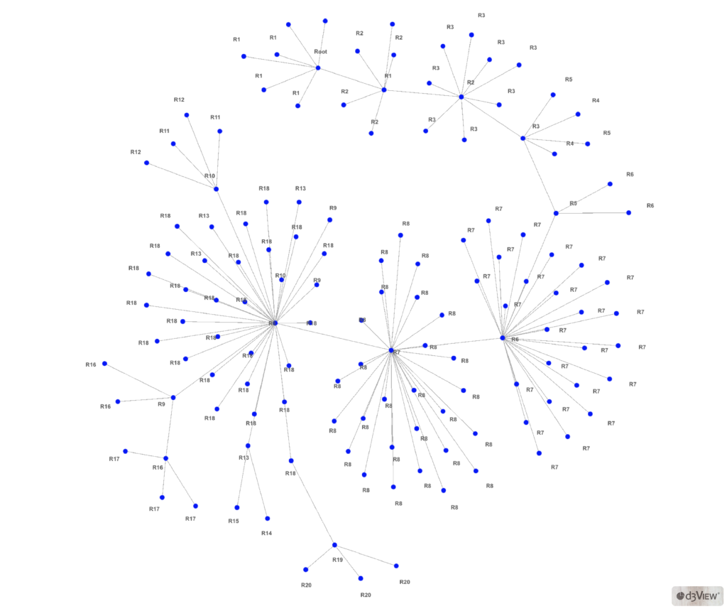
The graph looks like an interconnected network, with parent nodes and child nodes on the same plane. You can grab a point and move it around the canvas to explore its relations. Or, hover over the node to highlight its immediate connections.
3. Multi-variable Timeline Based Tracker Visualizer
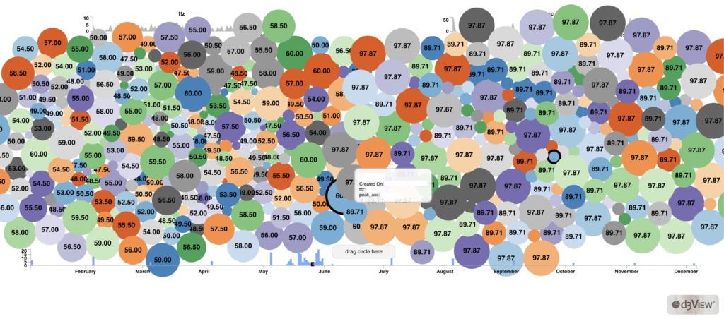
Simlytiks’ new-and-improved circle chart creates an interactive canvas of nodes based on simulation data to help with tracking. Important data columns produced from simulations can be chosen simultaneously for these interactive circles to compare. Hover over a node to view its value and run information. Timeline and value summaries can be found at the top and bottom of the circles.
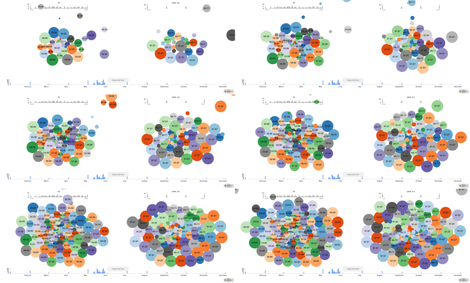
Circle Chart also has an animation feature which presents a rainfall of nodes onto to canvas based on the timeline. This way, we can visually review how simulation data changes over time.
4. Scatter Plot Based Tracker Visualizer
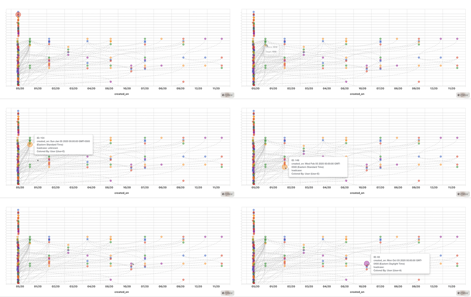
One of Simlytiks’ basic visualizers, scatter plot or bubble chart, contains grouping features which enables tracking. When adding parent-child relationships for the nodes or bubbles, this chart will create dashed, connective lines from simulation run to simulation run.
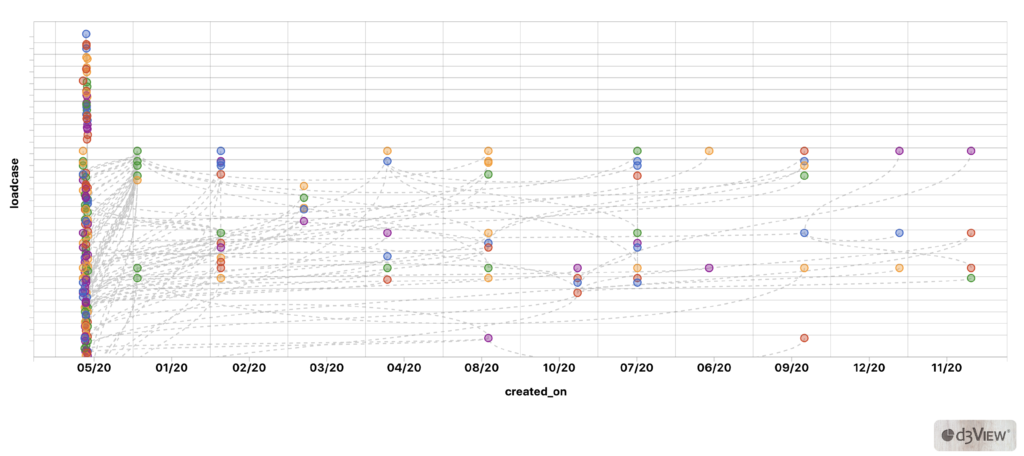
Once our bubble chart is set up with a timeline (x) of the runs based on some data (y), we can hover over any node to view more information.
We hope that these interactive charts designed for easier and quicker simulation tracking will greatly benefit many users as d3VIEW continually innovates to help accelerate virtual product development.
Want to see these graphs in action? Request a demo.
Co-written by Suri Bala.