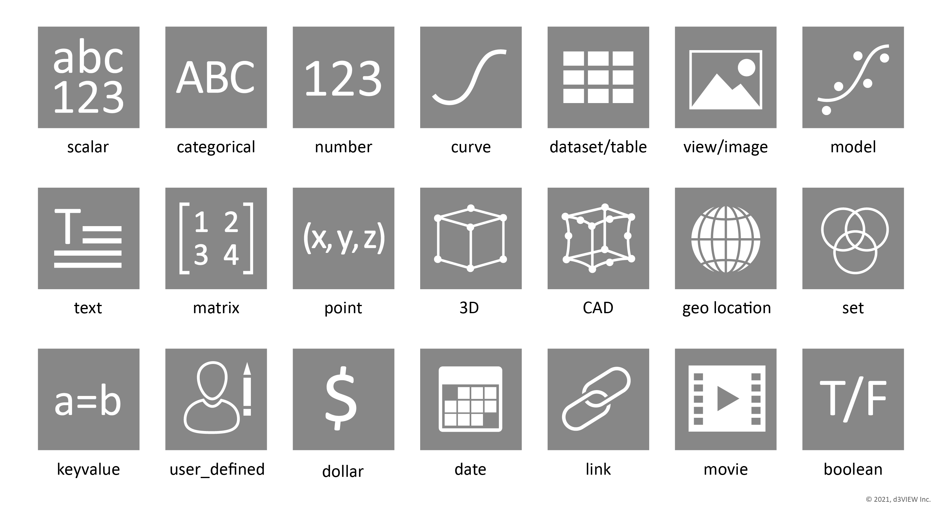
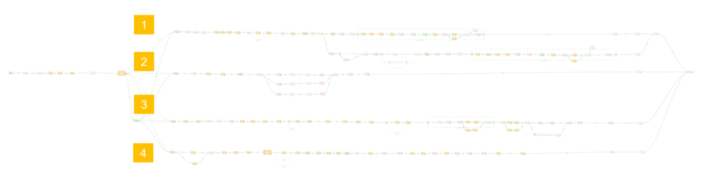
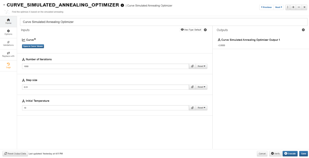
As a data-to-decision platform, d3VIEW supports a wide-variety of data. Let us see how Simlytiks, d3VIEW’s data visualization application, helps in visualizing non-scientific data.
Data types supported in d3VIEW
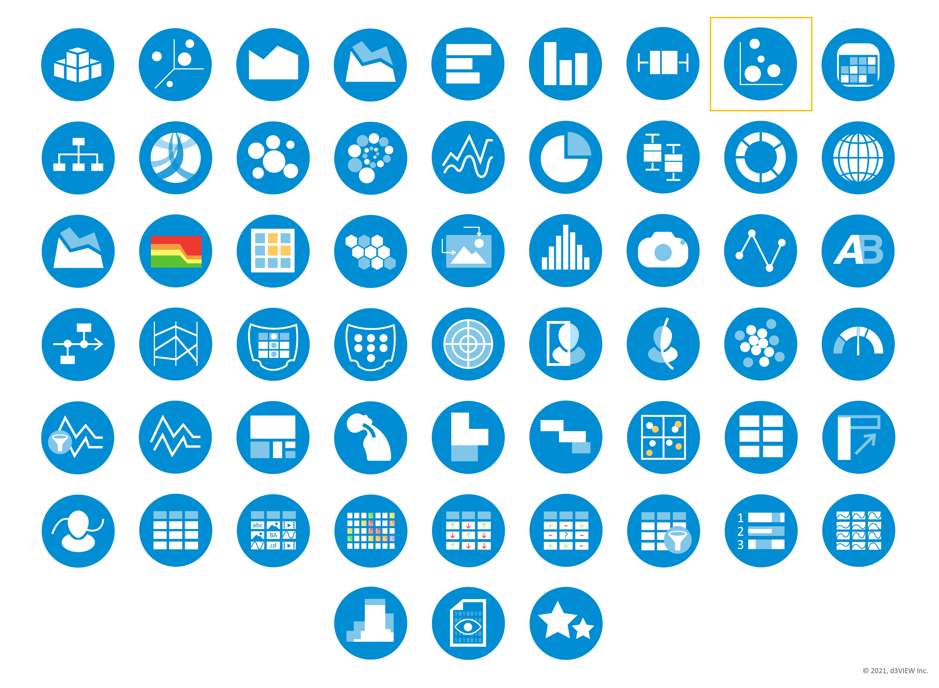
Current visualizers in Simlytiks® with bubble chart highlighted.
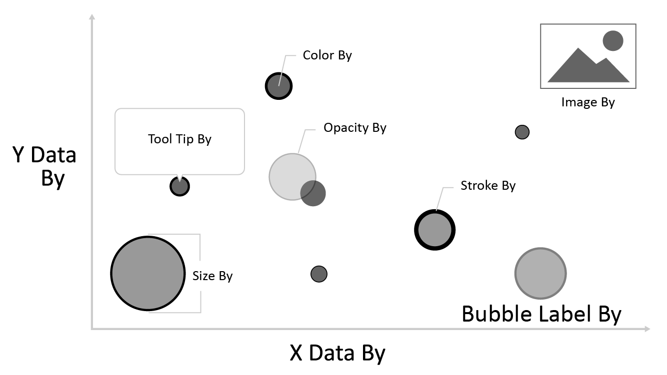
Leading the way in this enhancement is Simlytiks’ Bubble Chart visualization, which effortlessly harmonizes with simple data, as well as scientific data, to create smooth comprehension. Bubble Chart supports more than just data in the x and y, with options like color-coding nodes or varying opacity based on particular column data.
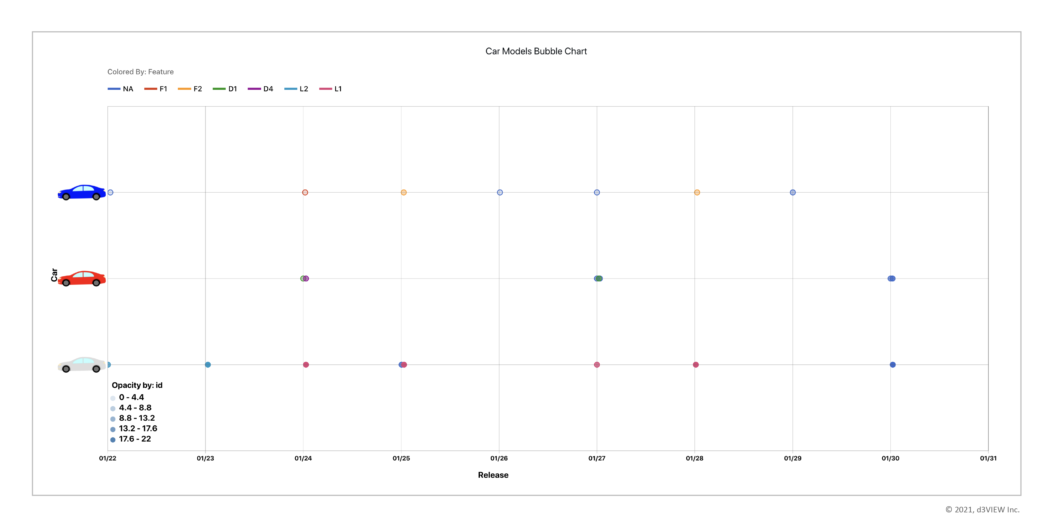
This bubble chart shows four simple data columns plotted as x, y, color and opacity values. Car models are shown as media images on the y axis, while release dates are shown in the x axis. Bubbles colors refer to car features with its legend at the top, and bubble opacity indicates the id with its legend at the bottom.
Let’s go through a step-by-step image guide on how to create this bubble chart with simple data. We’ll also review some more options available in the visualization. To start, import the data into Simlytiks®, create a new page and choose Scatter Plot under the visualization menu.
Bubble Chart will show a placeholder preview image like the one above before we start adding data. Once we add at least an x and y, we’ll be able to see a preview of our visualization.
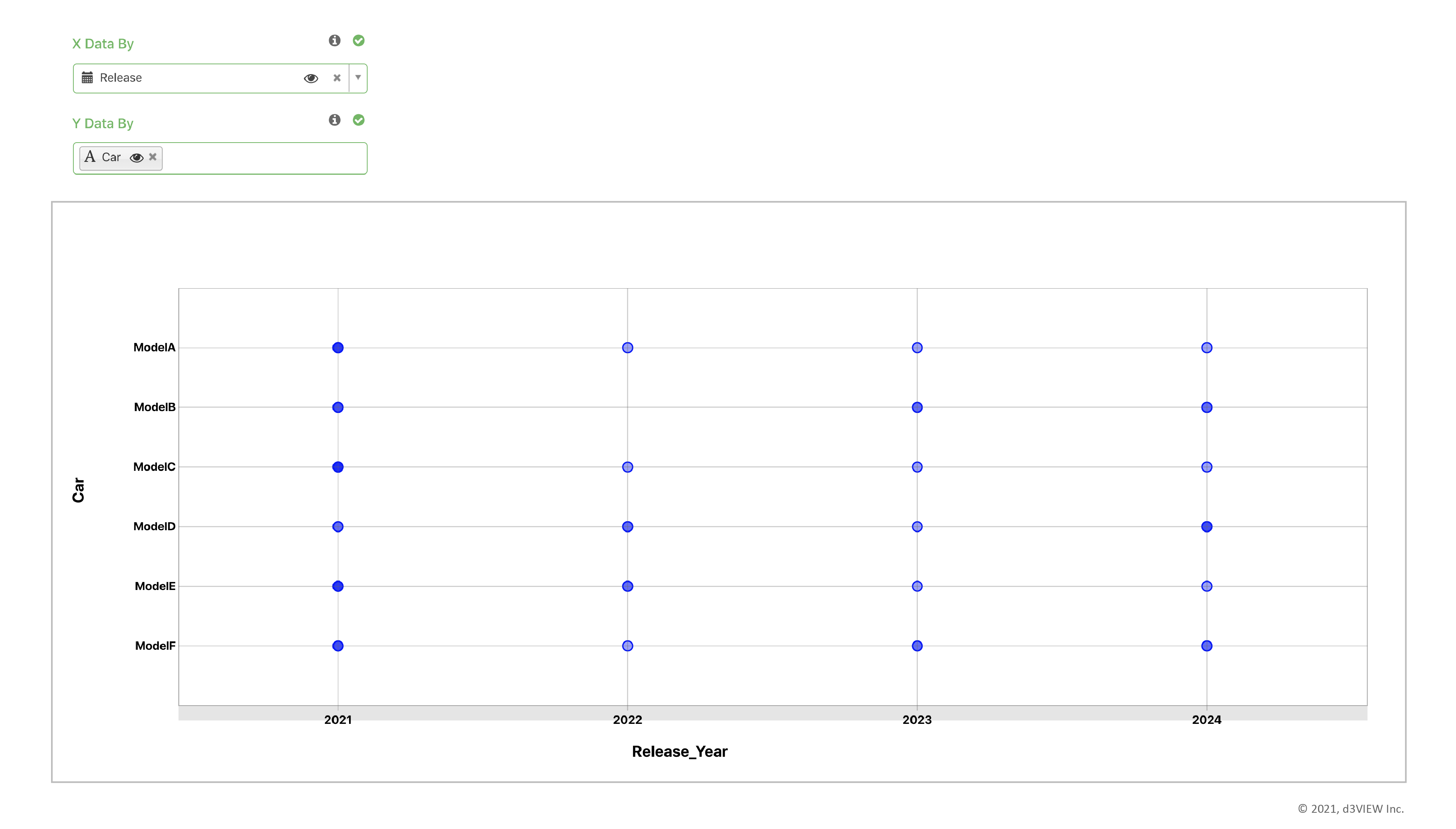
1. Choose X and Y data.
We chose Release Date for our X and Car (model) for our Y. We can now see a preview of our scatter plot.
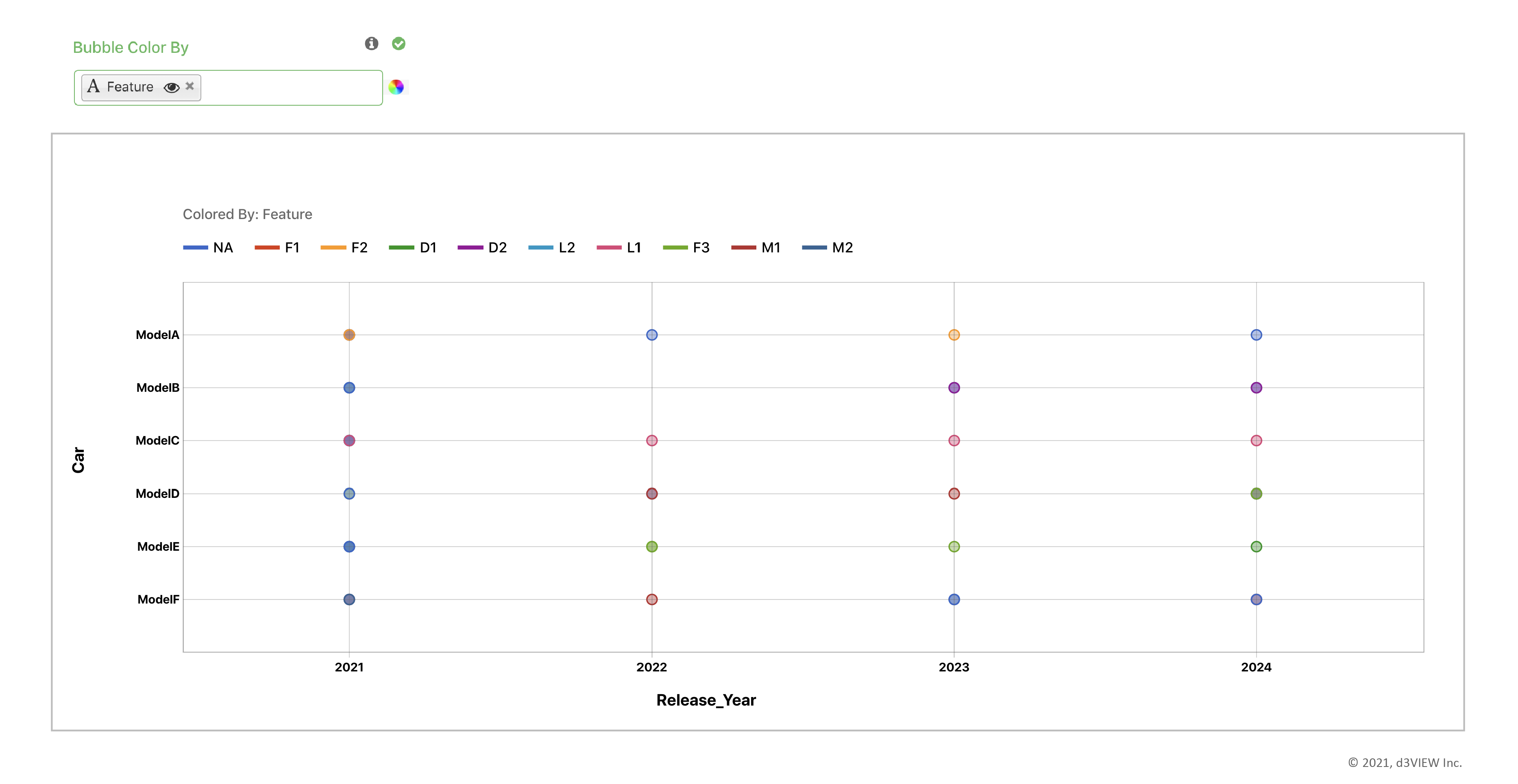
2. Choose color by data.
We chose feature for our color by. A legend of the feature colors is presented at the top.
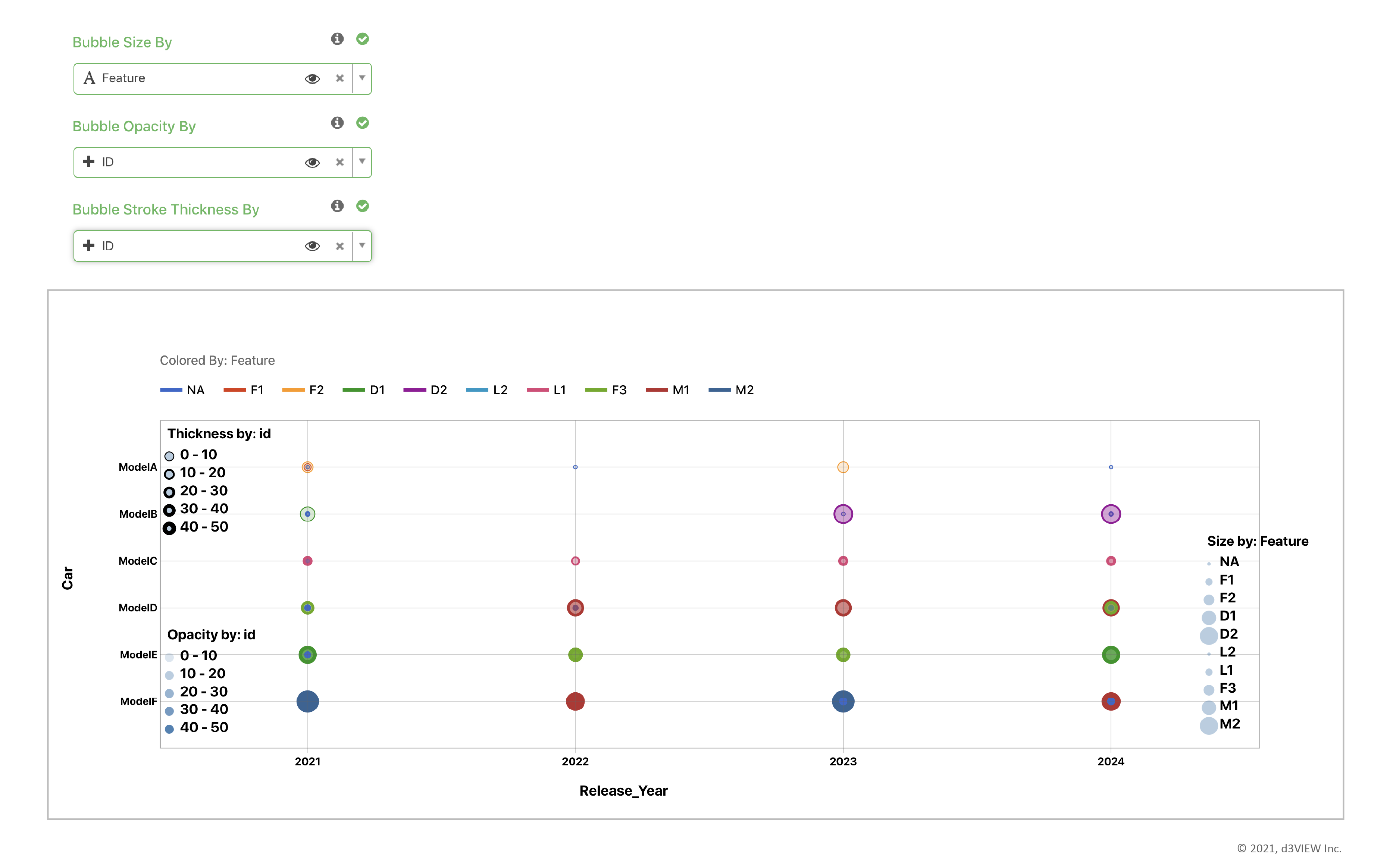
3. Choose other appearance data specifications.
Here, we’ve chosen feature for bubble size and id for bubble opacity and stroke thickness, which are just a few of the available bubble chart customizations.
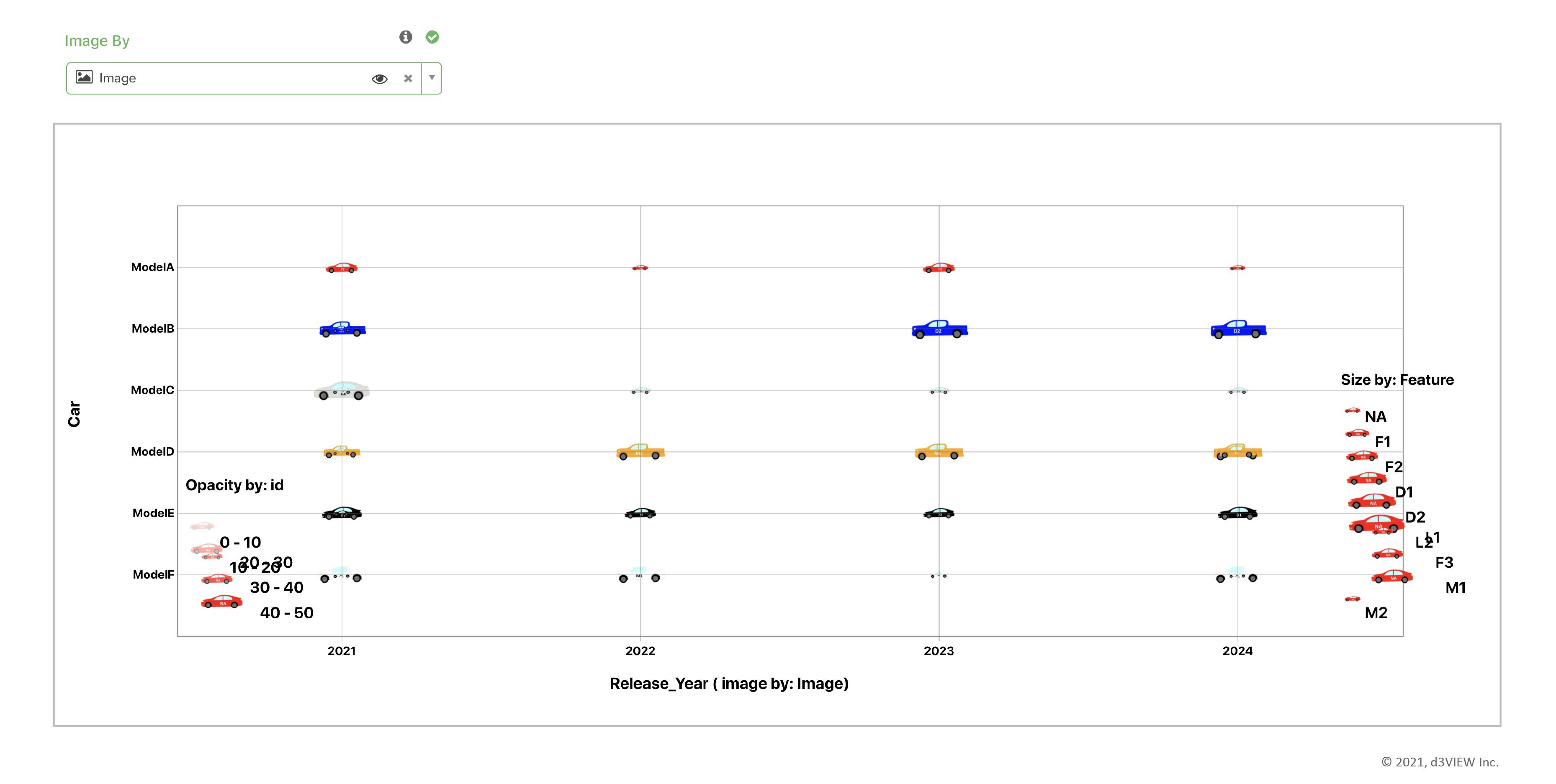
4. Choose image by data.
Since out dataset contains images for each row, we included them as our bubble chart image by. This turns the nodes into the dataset images, eliminating the need for color. Instead, we kept feature as our data for size by.
5.1. Add media to dataset.
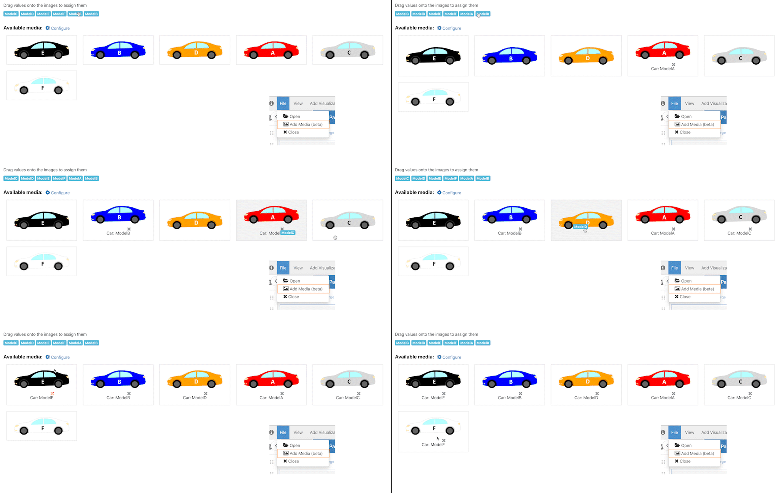
Under the File Menu, choose Add Media and select local files in the upload window. Then, we’ll choose a data column, drag-and-drop values to attach to the images.
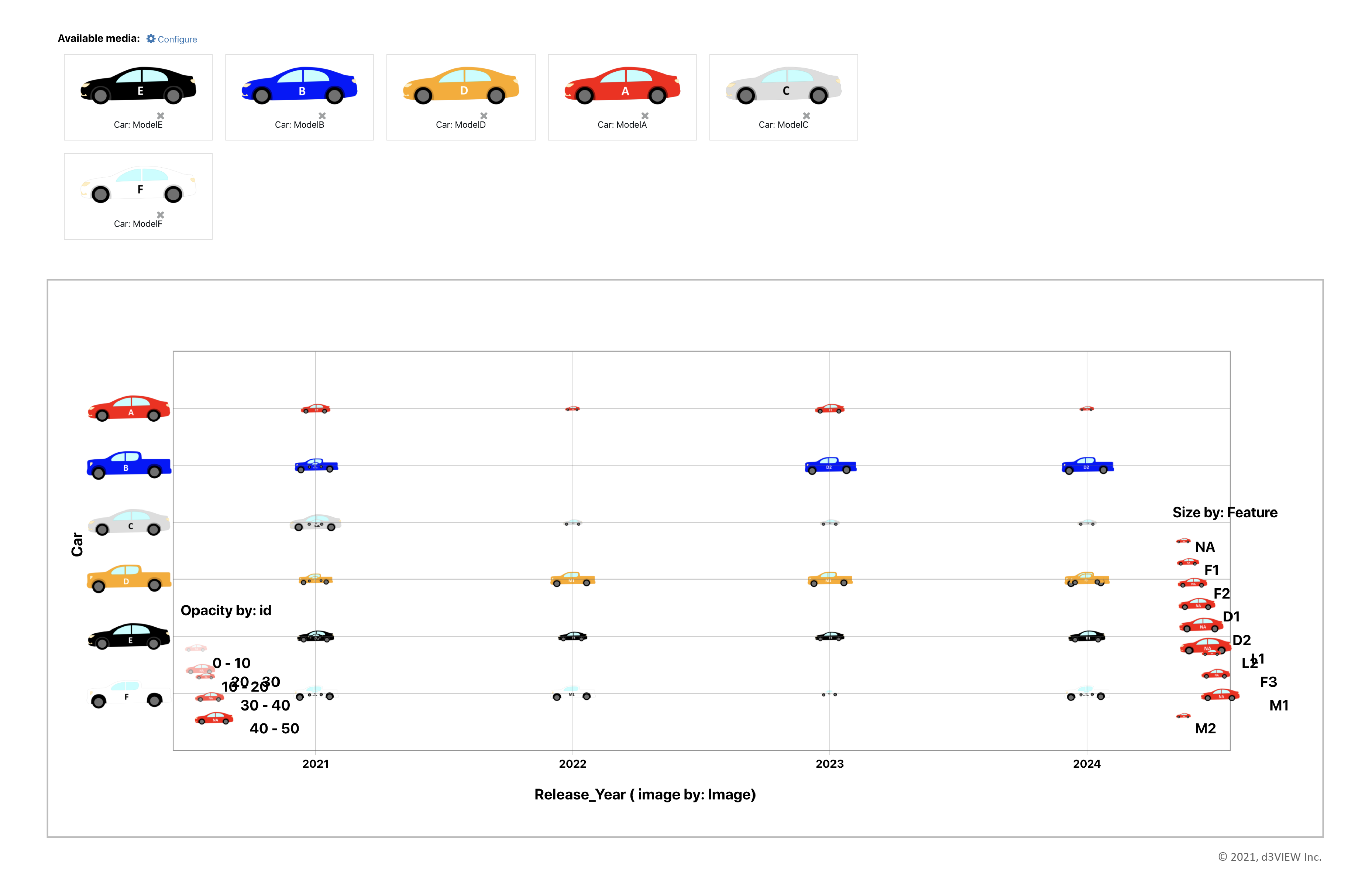
5.2. Our added media will now show up as our Y value labels.
Y axis now shows car model images as values.
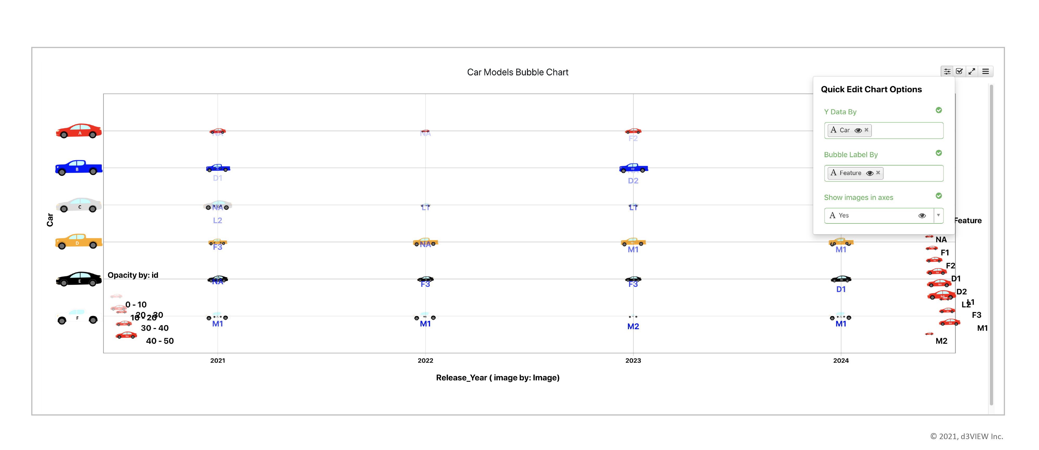
6. Finally, we can choose to quickly edit main components of our visualization using the menu at the top right.
Here, we’ve added feature labels for our nodes.
More Possibilities…
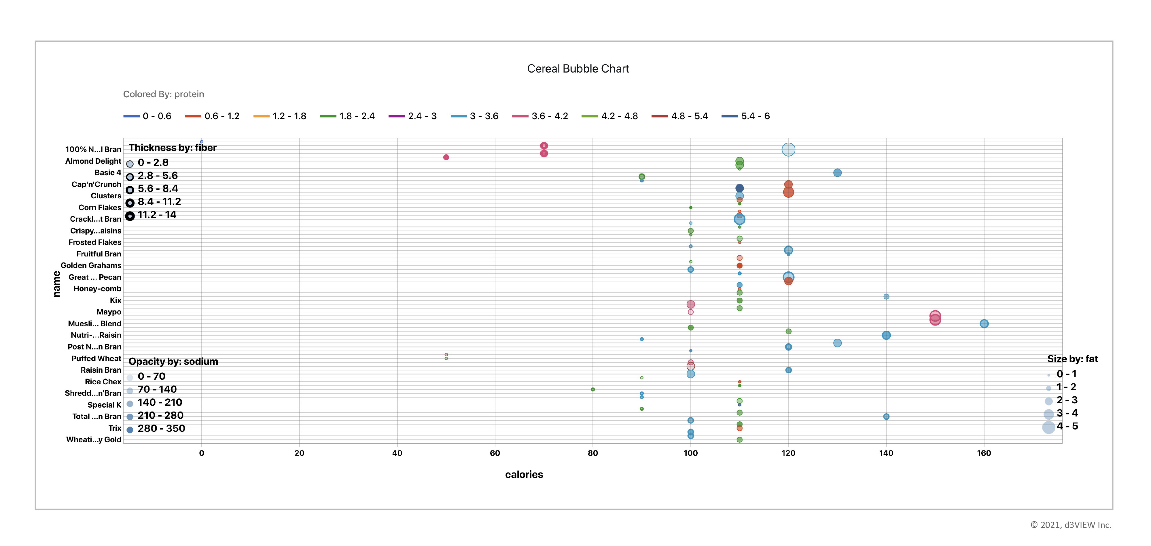
Simlytiks® doesn’t just visualize automotive data well. It can work with data from any industry. The following are two more examples of simple data visualized as a bubble chart.
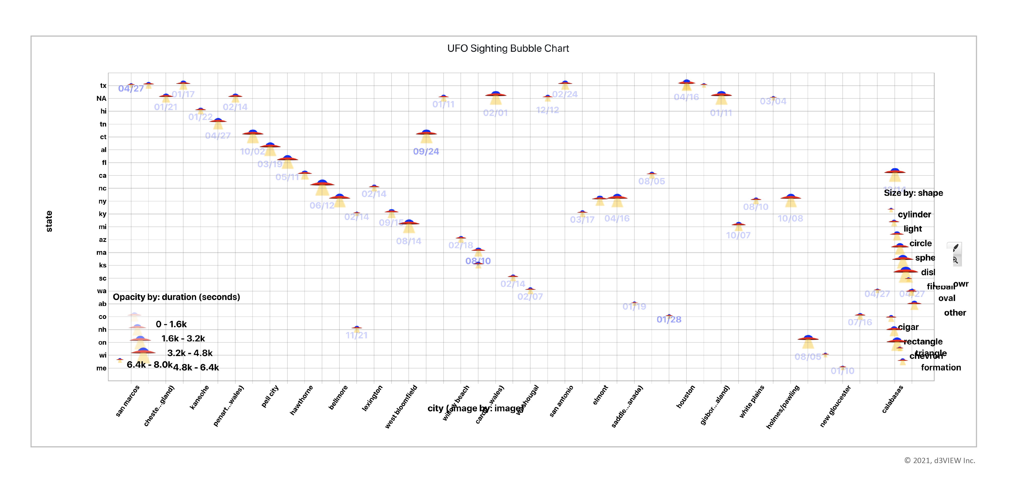
This bubble chart shows nutritional facts about different breakfast cereals.This bubble chart shows location and duration of UFO sitings around the US with custom UFO icon nodes.
If you’re interested in seeing non-scientific data visualized in different ways than above, please request a demo by contacting us.