24. Simulated Annealing with Polynomial Regression
Simulated annealing is an optimization method to find the global optimum of the objective function. It is inspired by the process of metal annealing which heats the metal to a very high level and cools down in a controlled manner. In the SA algorithm, a random point is selected to start with. A new point is proposed at each iteration by making small changes to the current point. The point is then evaluated by the objective function to get a score (energy, cost) so that it can be compared to the previous point. If the new point has a better score, it will be accepted; Otherwise, it is accepted with a certain probability determined by the probability distribution. This probability distribution is determined by a parameter called the “temperature”. It decreases gradually at each iteration.
The idea behind the temperature parameter is that at higher temperatures, the algorithm is more likely to accept solutions that are worse than the current solution. This allows the algorithm to explore a wider range of solutions and avoid getting stuck in local minima. As the temperature decreases, the algorithm becomes more conservative and is less likely to accept worse solutions, which helps it converge towards the global optimum.
24.1. Polynomial Regression
SA algorithm works nicely with an objective function. When a dataset is provided, we could build a model first and use the model as an objective function.
Polynomial regression fits a polynomial curve of certain degree to the given data points. When the degree is one, it becomes linear regression. Polynomial regression can be useful in cases where the relationship between the independent variable and the dependent variable is not linear, which is usually the case. By using a higher-degree polynomial, we can capture more complex relationships between the variables.
24.2. Adaptive model-fitting
For every 100th iteration, we stop and “zoom in” to the region centered at the current best point we obtained and run the SA algorithm there locally. We compare the optimum value from this local region and compare it to the best point and update the global best point when necessary. This procedure is activated when the “shrink_factor” is between 0 and 1 (exclusive). It shrinks the range for each variable from the original domain to a certain percentage (value of the parameter shrink_factor) centered at the current global best point. When the new reduced domain is determined, we run the SA algorithm on this region to find the optimum. This will generate a new polynomial regression model with the same parameters on a smaller domain. It will depict a more accurate local surface that can be used as the objective function.
24.3. Estimated prediction error
When we make predictions using the trained model on new dataset, it may be of our interest to have an idea on how close the predicted values are to the true values. Since we don’t know the true value of new points, we can’t have an exact calculation of the errors. Cross validation can help to evaluate how the model performs on a large scale. It doesn’t help on the level of single points. What we can do is to find the nearest points based on the known feature values of the new point and use the prediction errors of these nearest points as an estimate of the prediction error of the new point.
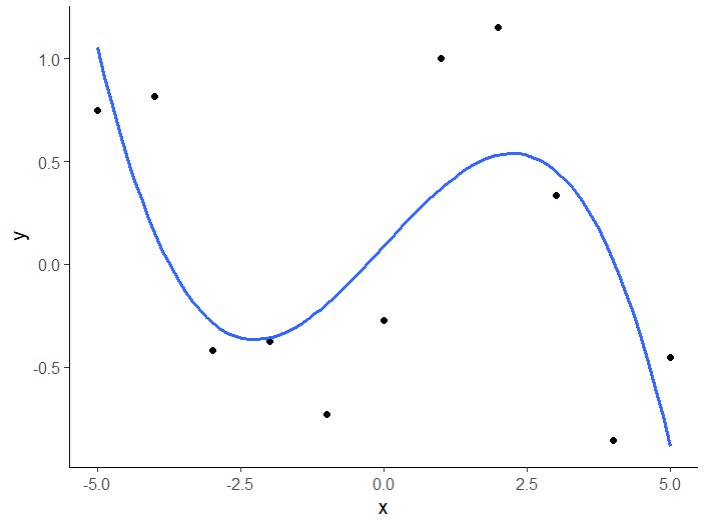
Data points (black) with the fitted model (blue curve)
Given the trained model is accurate enough, we can assume that the new points will be located around the known points and thus it is reasonable to use their prediction error as an estimate.
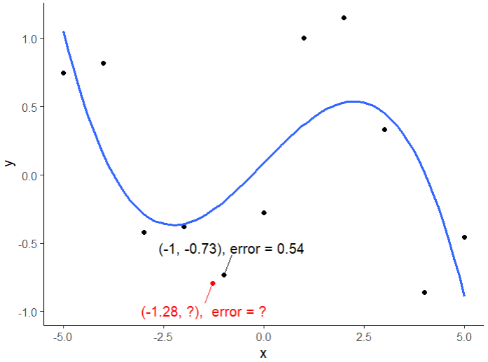
Given a new point (red) knowing its x value, we can find the nearest point from the input dataset and use the prediction error of that point as an estimate of the new point. In this case, we can approximate the error for the new point (red) to be 0.54 as its nearest neighbor.
Applying this idea to all the new points, we can have a full picture of the error estimates for each new point. Since we are missing information from an additional dimension, the estimated errors are not 100% accurate. But it is good enough to be used as an estimate to provides an idea of how close we are.
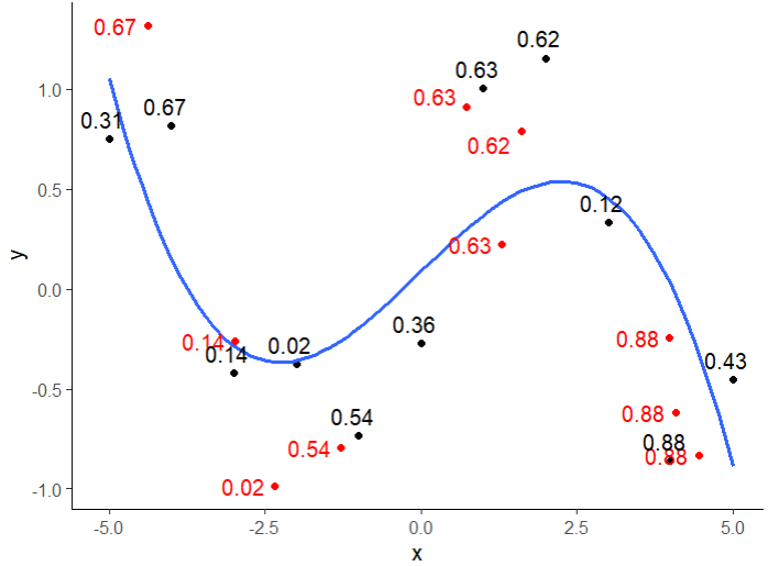
Prediction errors for new points (red) are estimated using the prediction error of their nearest neighbor (black) found by the x values.
24.4. The Dataset_simulated_annealing_optimizer worker on d3VIEW Workflow
In d3VIEW Workflow, there is a worker “dataset_simulated_annealing_optimizer” to perform the SA optimization.
Create a new workflow and add the worker.
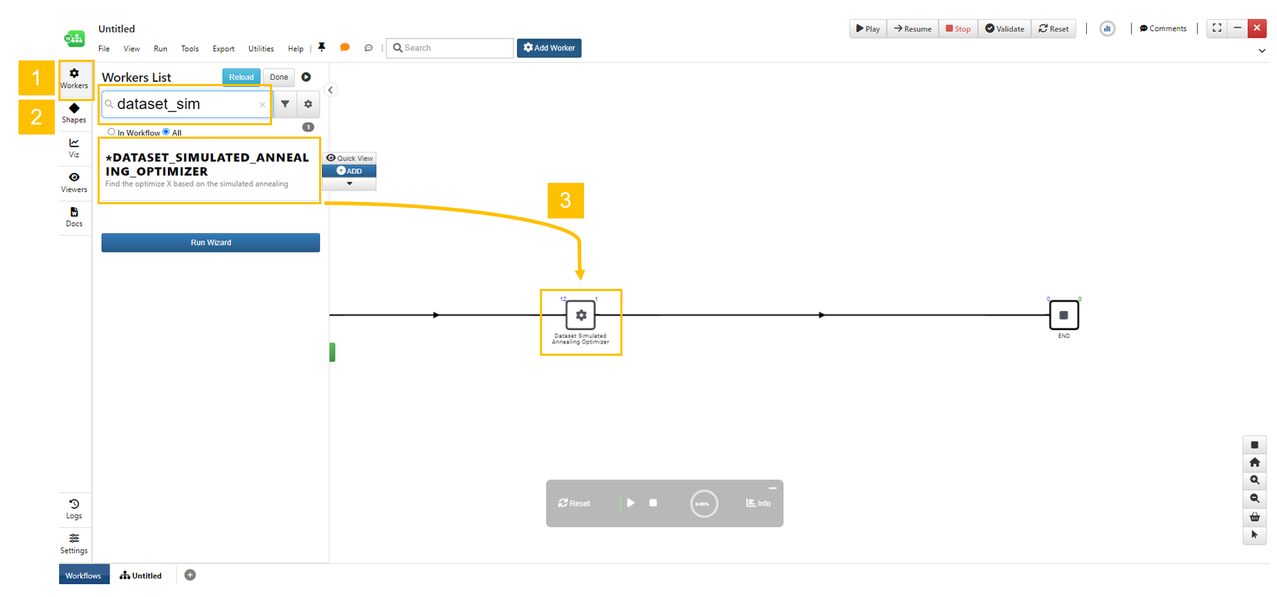
Click the workers “gear” icon to show the worker list. Search the worker by the name. Drag and drop the worker to the canvas on the edge.
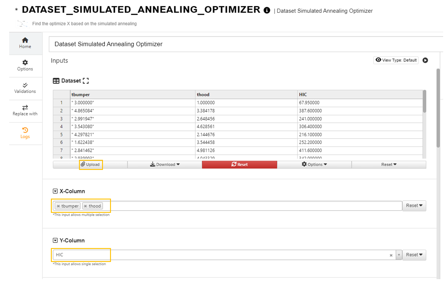
Click to upload the dataset and choose X and Y columns.
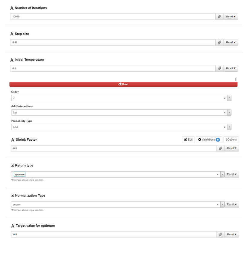
Choose the values for the tuning parameters.
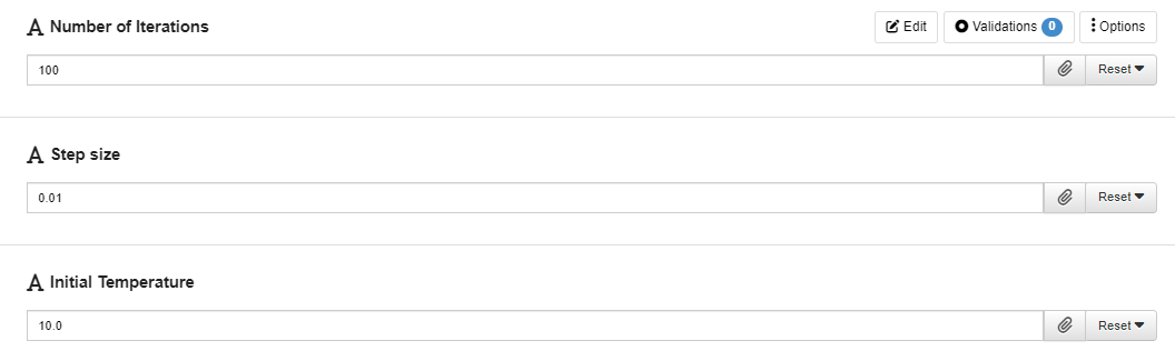
The parameters “iterations”, “step_size” and “initial_temp” controls the process of the SA algorithm. Their values may need to be carefully tuned as performance of the SA algorithm on different datasets vary.
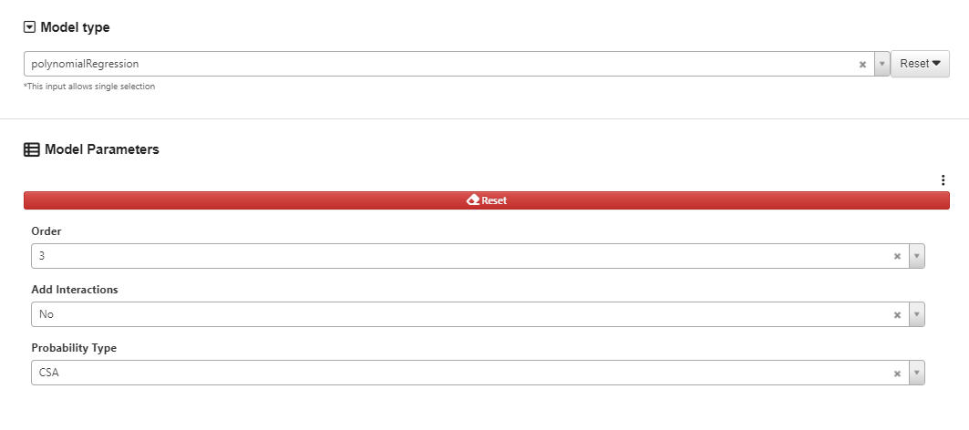
Choose the order for the polynomial regression we want to fit.
Choose the value for “nearest_n” parameter which is used for obtaining estimated prediction error.
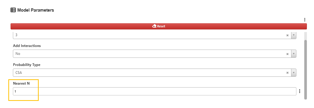
“Nearest N” specifies the number of nearest points to be used for estimating the errors. For value greater than 1, an average of the errors from the nearest selected number of points will be provided in the output. A value of 0 will not activate this feature.
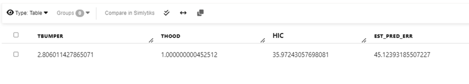
Sample output with estimated prediction error using HIC dataset.
Choose normalization type.
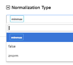
The default normalization method is “minmax” normalization, which normalizes each variable to a range of 0 and 1. Standardization normalization is also available (“znorm”). If we want to skip normalization, we can choose “false”.
Choose what to return in the output.
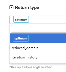
By default, the worker returns the optimum point from the optimization process. We can also let it return the domain information (reduced domain if the shrink_factor is between 0 and 1) or the tracking history of the best point at each iteration, by selecting the “return_type”. When normalization is specified, the output will be shown in the original scale without normalization.
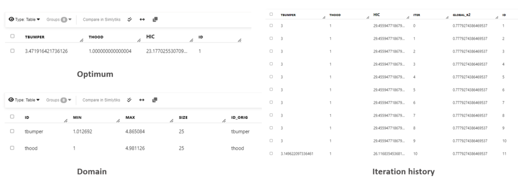
Sample output for different “return_type” using HIC dataset
Set the “target_value”.
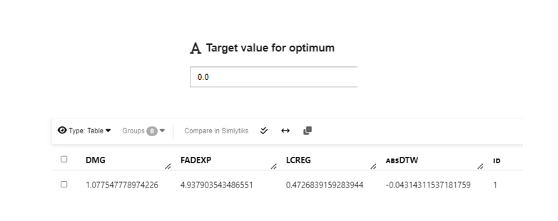
The “target_value” parameter controls to which value the optimization converges to. In many applications, the feature we are interested in optimizing is bounded (e.g, greater or equal to zero). When we are comparing the performance of the “best point” we found during the optimization, we compare the absolute value of the difference between the value we found and the “target_value”. In this way, We can use the “target_value’ parameter to limit our search so that the optimized target Y value will be closed to the “target_value”. Therefore, when we set “target_value” to be 0, we can ignore the negative signs in the output. When the “target_value” is set to be 0, we can ignore the negative sign in the output Y value.
24.5. Example
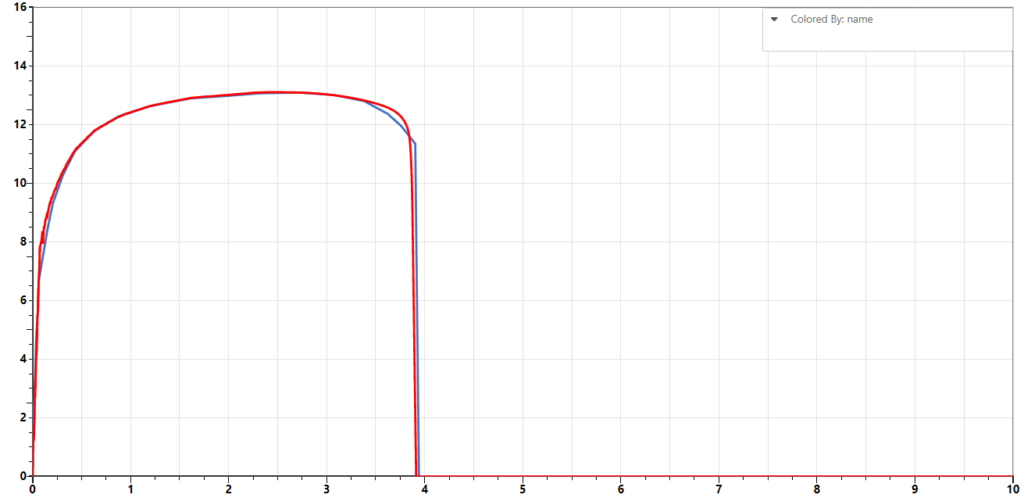
The following dataset provide parameters for generating the Force-deflection curves. The DTW values is a measure how far each simulation curve from the test curve.
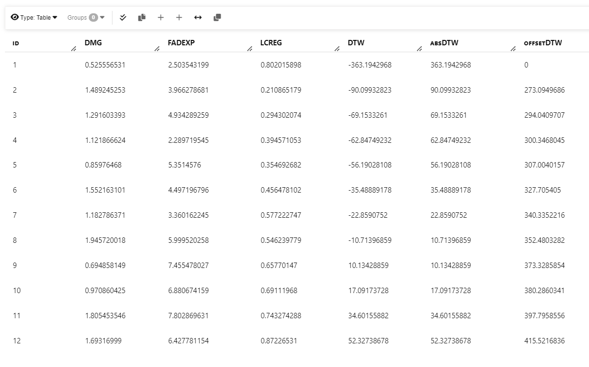
Input dataset. The goal is to find the parameters to minimize DTW value.
We upload this dataset to d3VIEW and select the columns that are input and target.
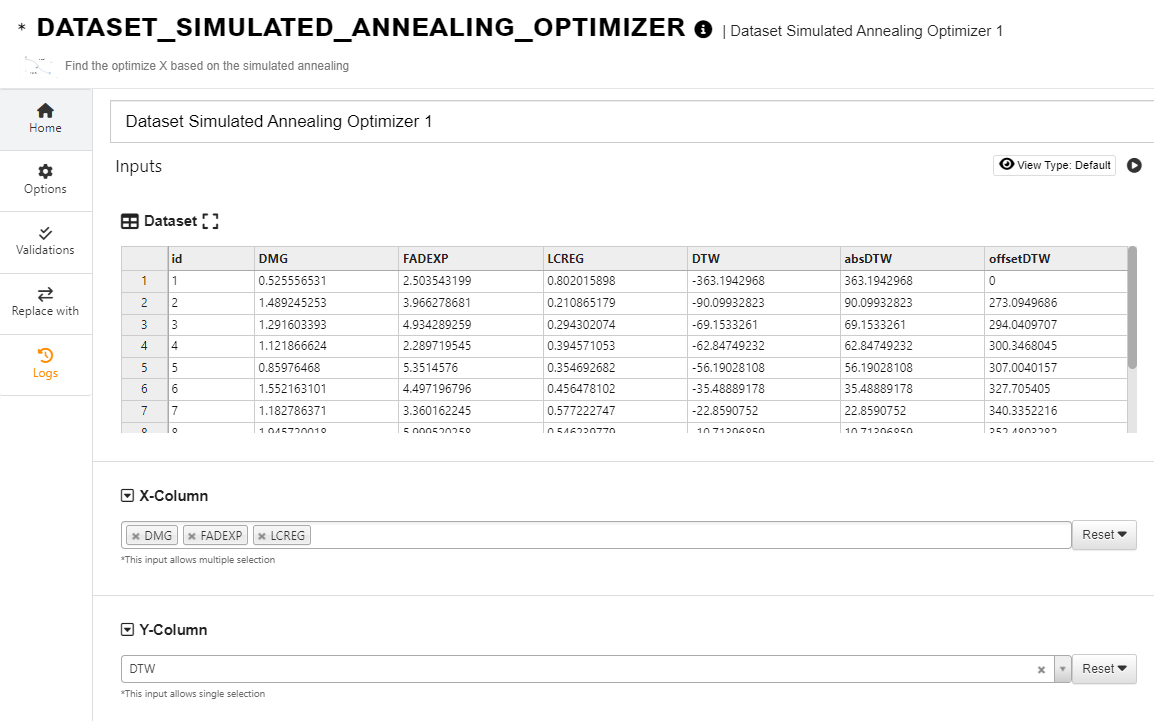
By tweaking the parameters, we can find a set of values that returns some good outcomes.
And we got the values for each input variables that minimizes the DTW value.

Using the parameters returned, we can run some simulations and compare the simulation curves to the test curve. We can see that the sample curve generated from simulation with the optimized parameters (red) is very close to the test curve (blue).