14. Dashboard Layout
Under the layouts tab in a page, the Dashboard option allows you to create custom dynamic layouts of your data using basic widgets like headings (1), data filters and aggregators (2) and charts (3).
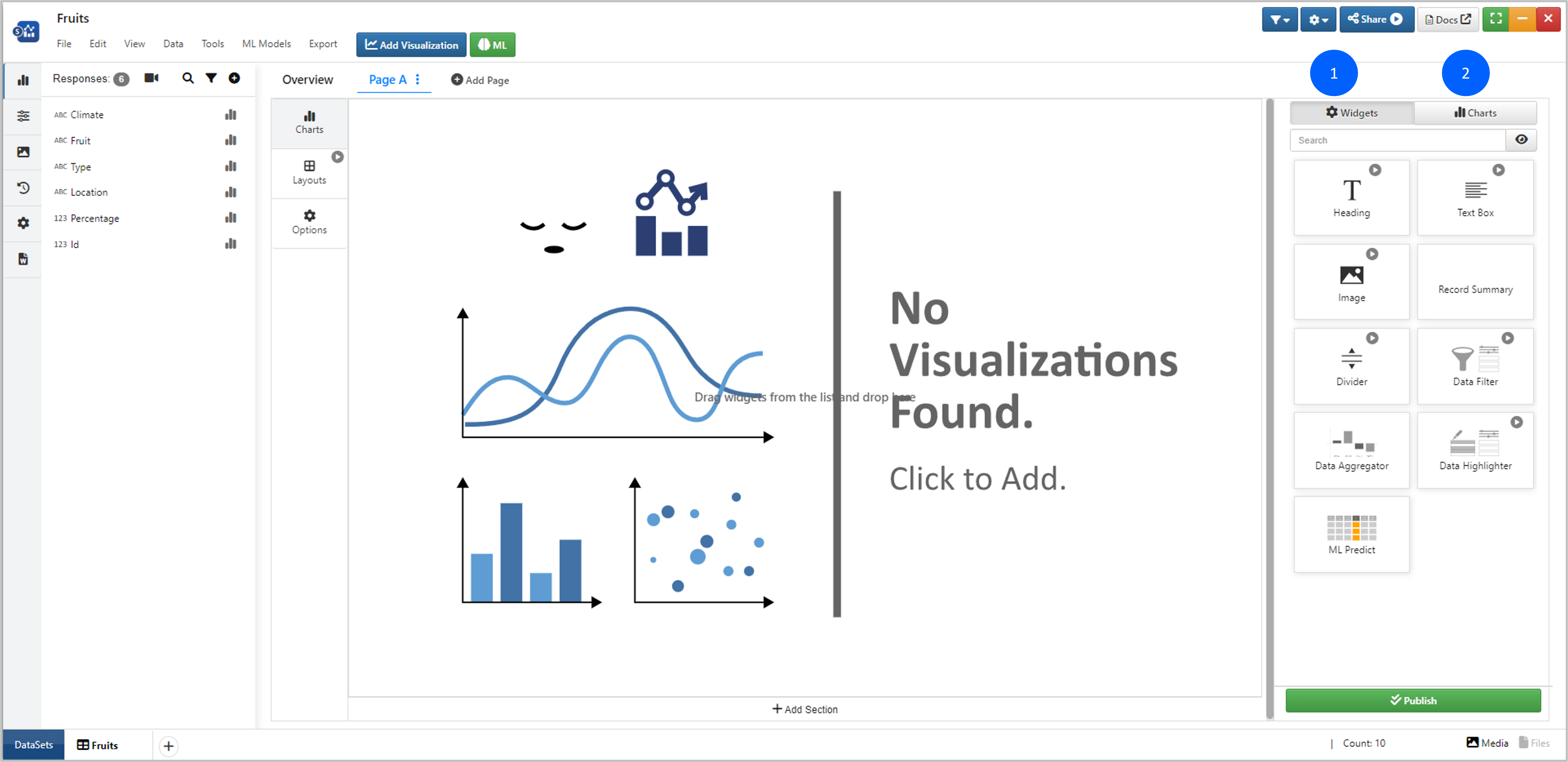
Figure 1: Dashboard Layout
Adding, Moving and Resizing Widgets
Drag-and-drop a widget anywhere on the canvas to get started.
Click on the row of dots icon at the top of the edit box or click outside of a widget on the canvas to see all available widgets again.
Hover over a widget box until you see the drag icon, then click-and-drag to move the widget around the canvas.
Hover over the bottom right corner a widget box until you see the sizing arrow icons, then click-and-drag to resize the widget width, length or both.
Basic Widgets
Basic widgets help with making your dashboard report oriented. Add a heading, a text box, an image or a divider. Let’s go over each.
Heading
Create custom titles for any part of your dashboard using the Headings widget. Drag-and-drop the widget anywhere onto the canvas to get started.
Figure 2: Drag-and-Drop Heading
Edit the heading text in the first tab which includes basic text and paragraph formatting like weight, decoration and alignment.
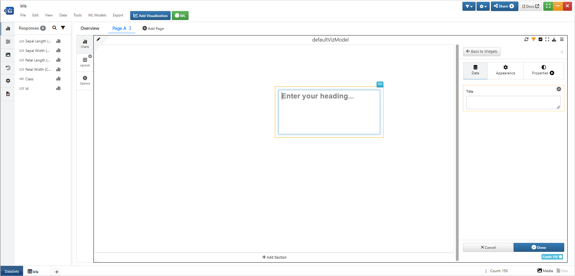
Figure 3: Edit Tab
Watch the following video to see how it’s done:
When widget is dragged and dropped onto the viz container and if Cancel button is clicked WITHOUT saving the widget, an alert now pops up asking the user to confirm cancellation.
Text Box
Add custom paragraphs or comments using the Text Box widget. Drag-and-drop the widget anywhere onto the canvas to get started.
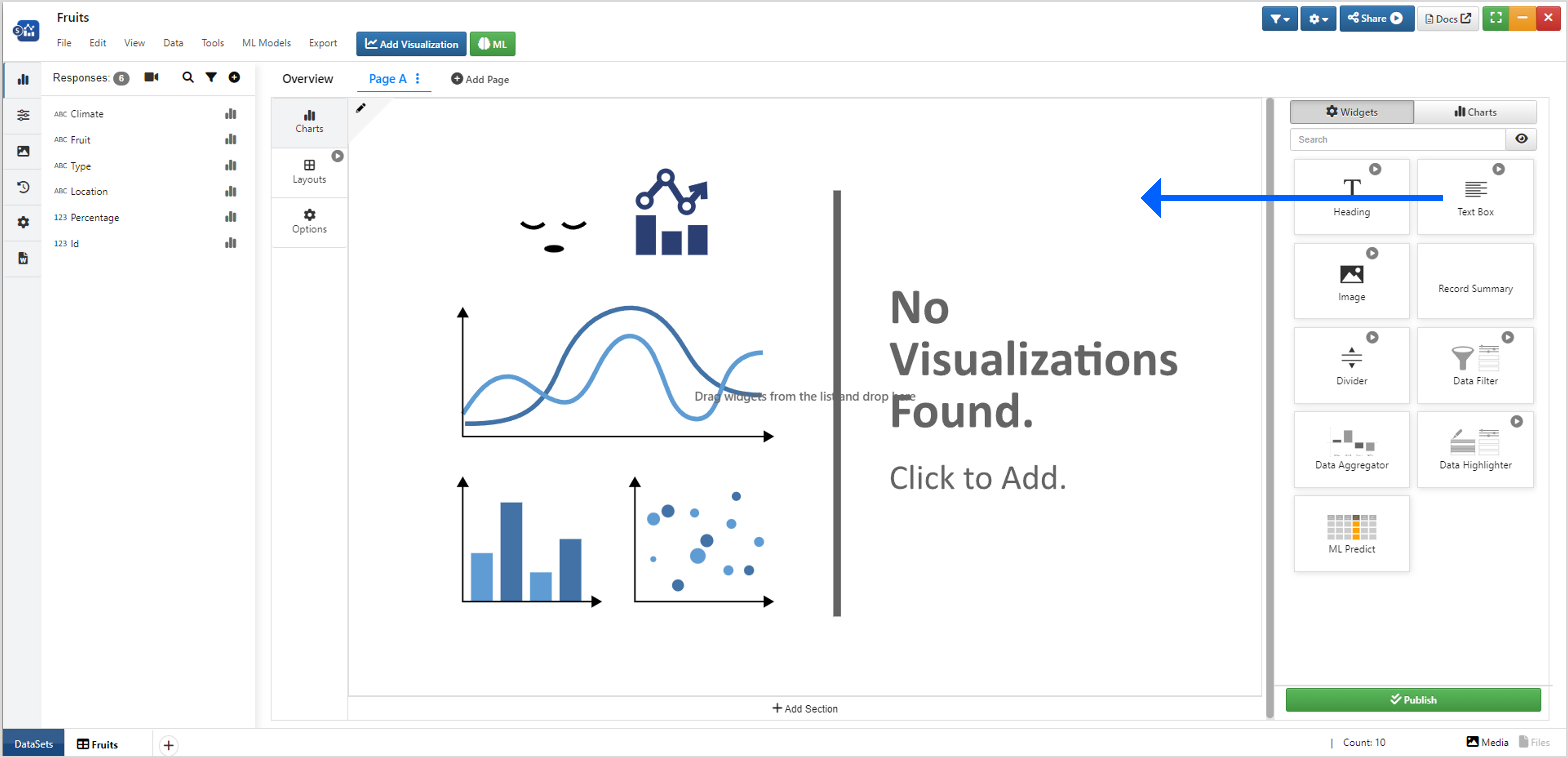
Figure 4: Drag-and-Drop Text Box
Edit the text in the first tab which includes basic text and paragraph formatting like weight, decoration and alignment.
Figure 5: Edit Tab
Watch the following video to see how it’s done:
Image
Upload any image for your dashboard using the Image widget. Drag-and-drop the widget anywhere onto the canvas to get started.
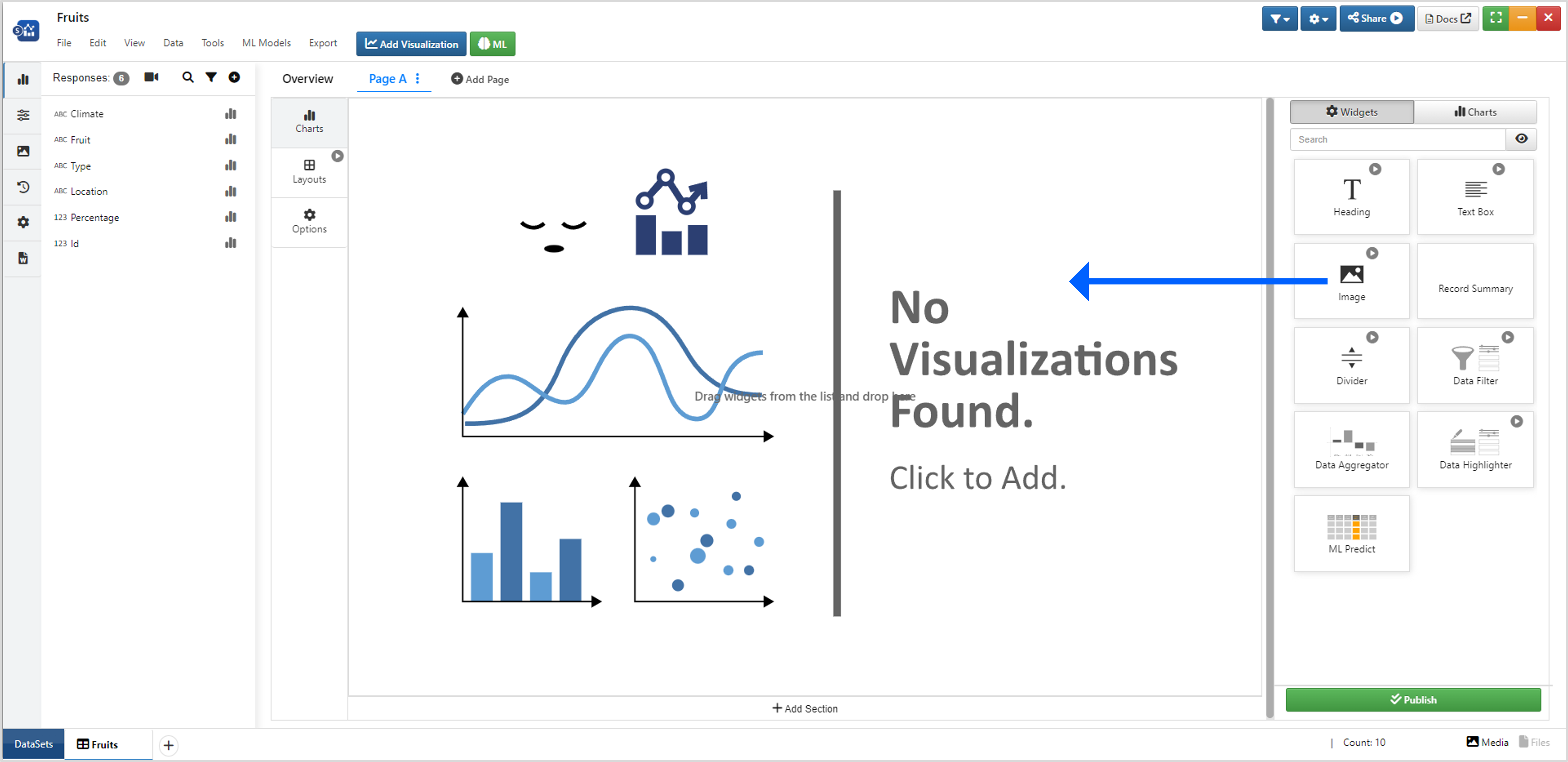
Figure 6: Drag-and-Drop Image
In the Edit tab, upload your own image or choose from the Simlytiks media library (click on the input box to view all).
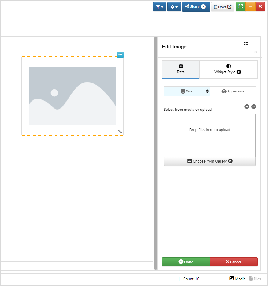
Figure 7: Edit Tab
Watch the following video to see how it’s done:
Divider
Place dividers into your dashboard to create sections for grouping elements. Drag-and-drop the widget anywhere onto the canvas to get started.
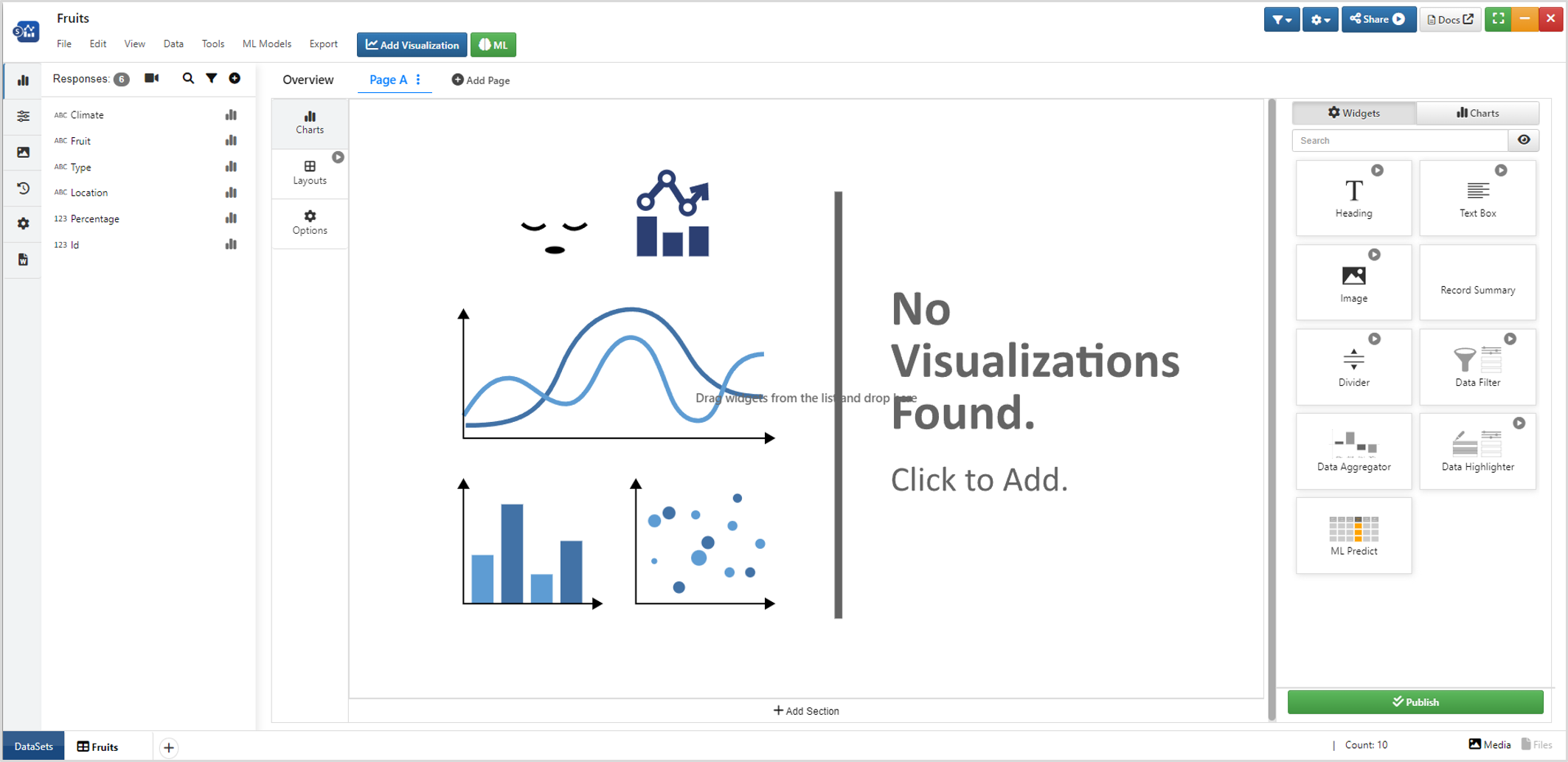
Figure 8: Drag-and-Drop Divider
In the Edit tab, choose to view the divider as horizontal or vertical and specify the width and color of the line.
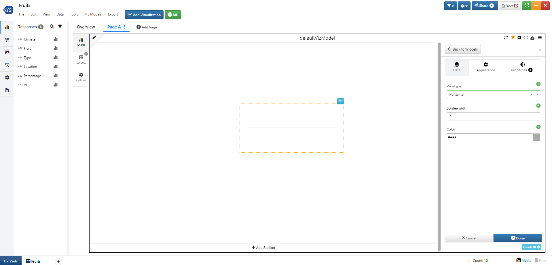
Figure 9: Edit Tab
Watch the following video to see how it’s done:
We can clone widgets by maintaining their aspect ratio and styling as it is using the Clone option available in the widget context menu (1). Cloned widget (2) This applies to all the widgets in the list.
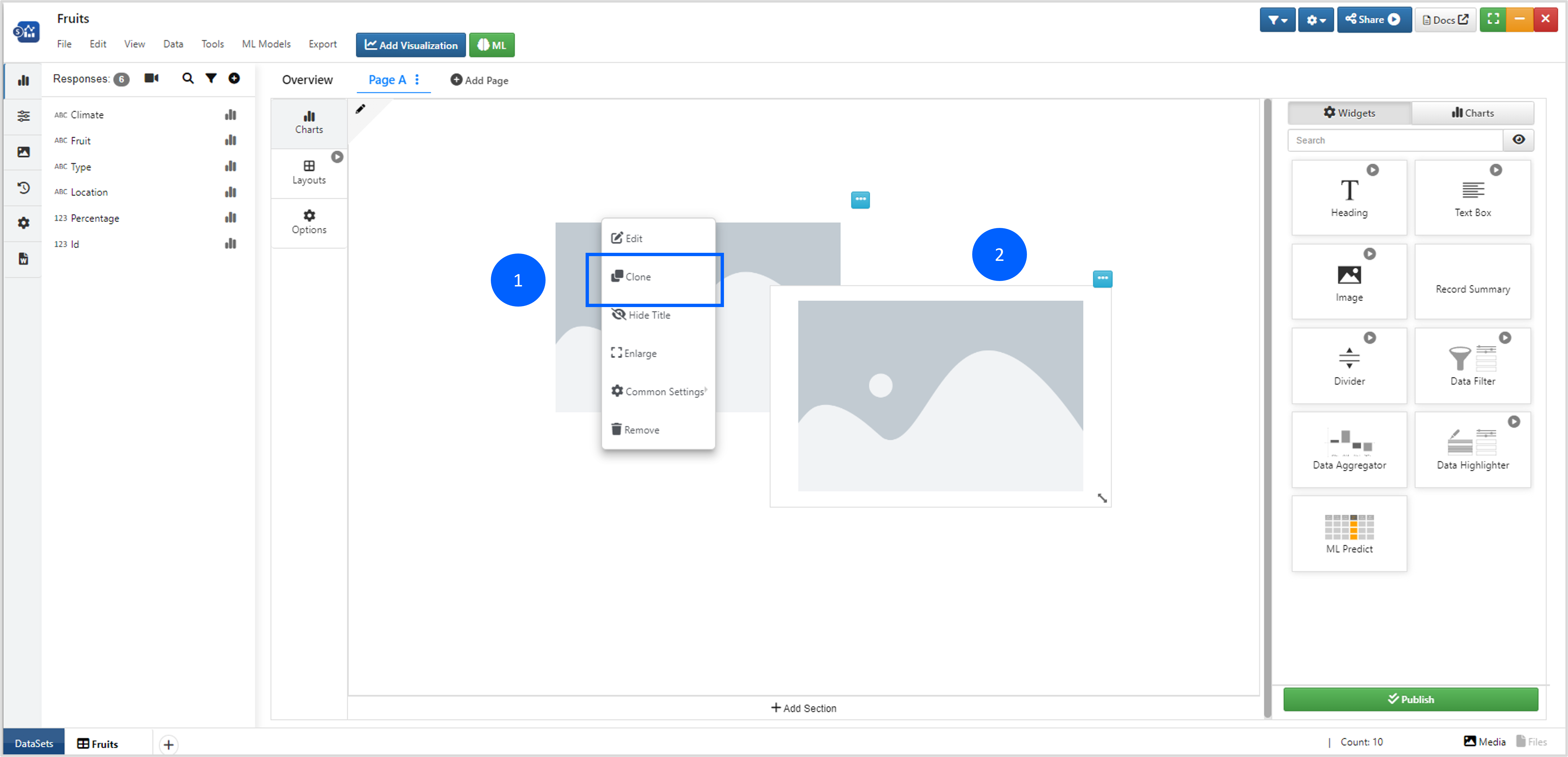
Figure 10: Clone Widget
Watch the following video to see how it’s done:
Filters and Aggregators
The second section has three unique visualizers for filtering, highlighting and aggregating data.
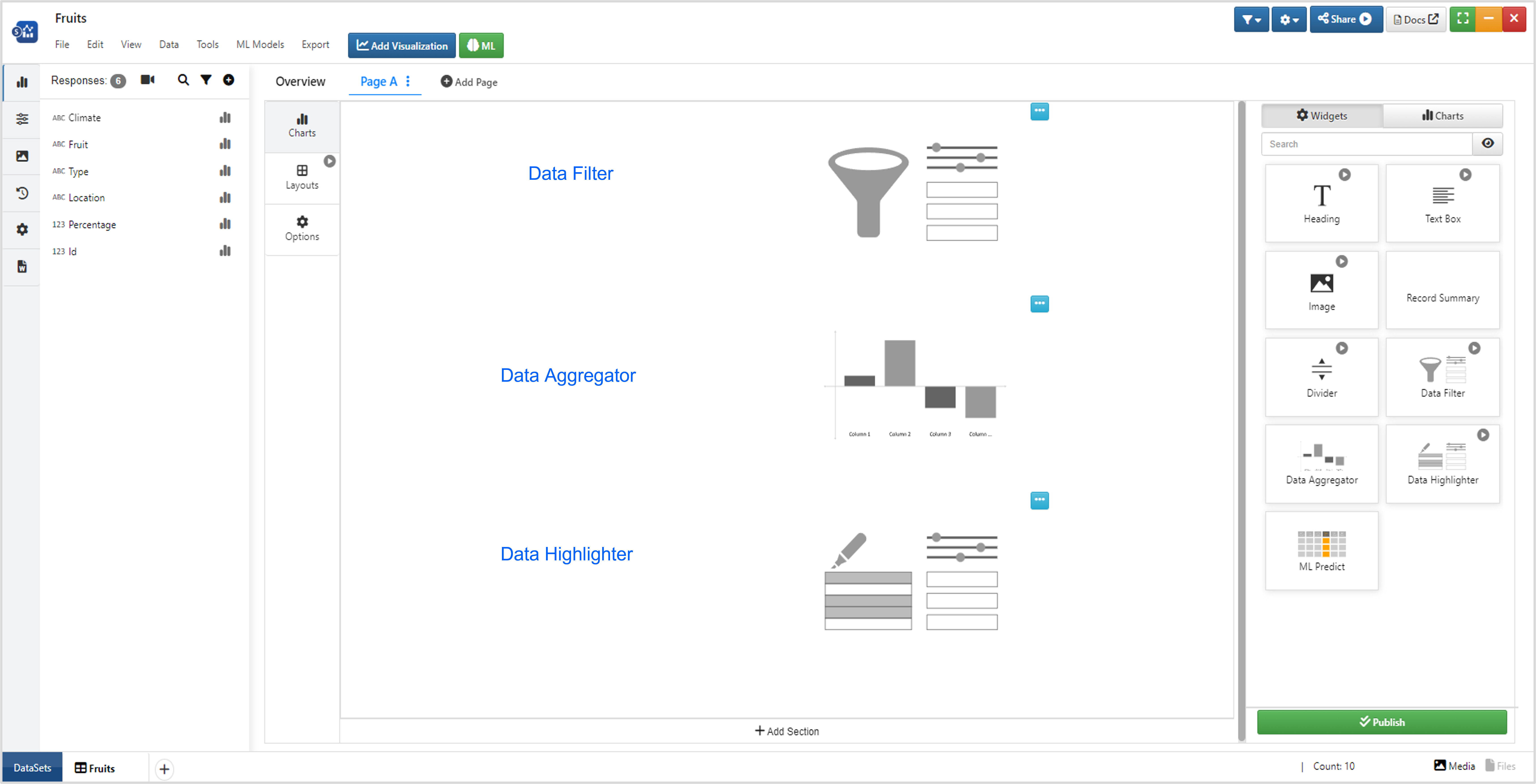
Figure 11: Filters and Aggregators
These options create dynamic dashboards by linking up with each other and other charts (skip to this section to learn more).
Data Filter
Data Filter allows us to filter out data in any of our dashboard charts. Here is how to set up the data filter widget.
Data Highlighter
Data Highlighter allows us to highlight data in any of our dashboard charts. Here is how to set up the data highlighter widget.
Carousel view type in Data highlighter in Dashboard now has carousel controls on left and right
:sup: Data Highlighter View
Data Aggregator
Data Aggregator shows key values based on the data column pick. For example, choosing a numerical column such as sepal length in the Iris dataset presents us with specifications about the sepal length in the dataset such as sepal length average and median.
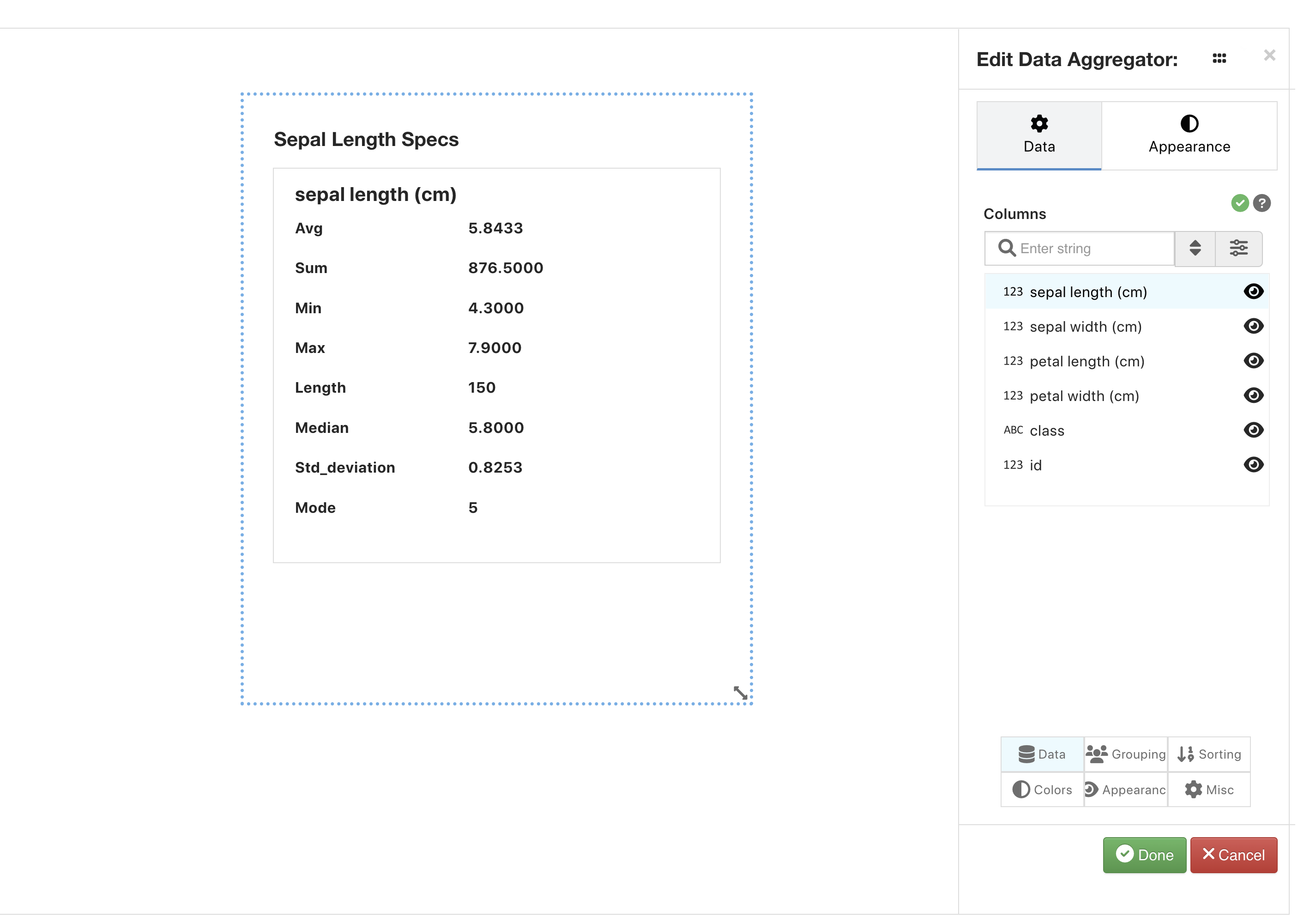
Figure 12: Data Aggregator
The Data Aggregator widget in Dashboard has new options such as Orientation, Wrap, Horizontal align, Vertical align in its Appearance tab.
Visualizers
Just like on normal Simlytiks page layouts we can add visualizers, we can also add them in our dashboard, just as widgets instead.
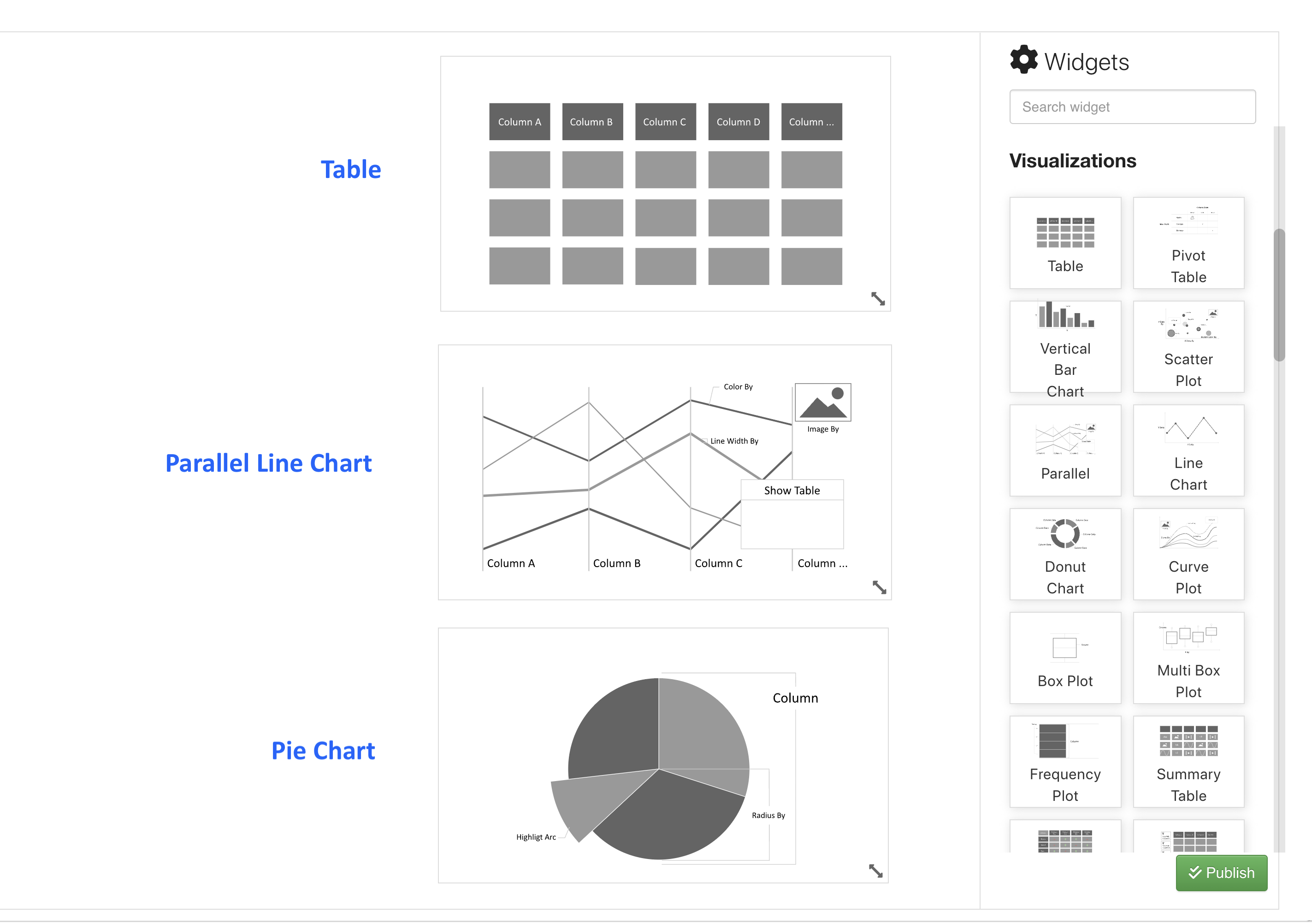
Figure 13: Widget Visualizers
This way, we can customize them in accordance with our dashboard. The following is a video example of adding the parallel line chart widget.
For more detailed view of the desired widget, click “Enlarge” in the right context menu (1). To return back to dashboard view, click on “Compress” in the right context menu (2).
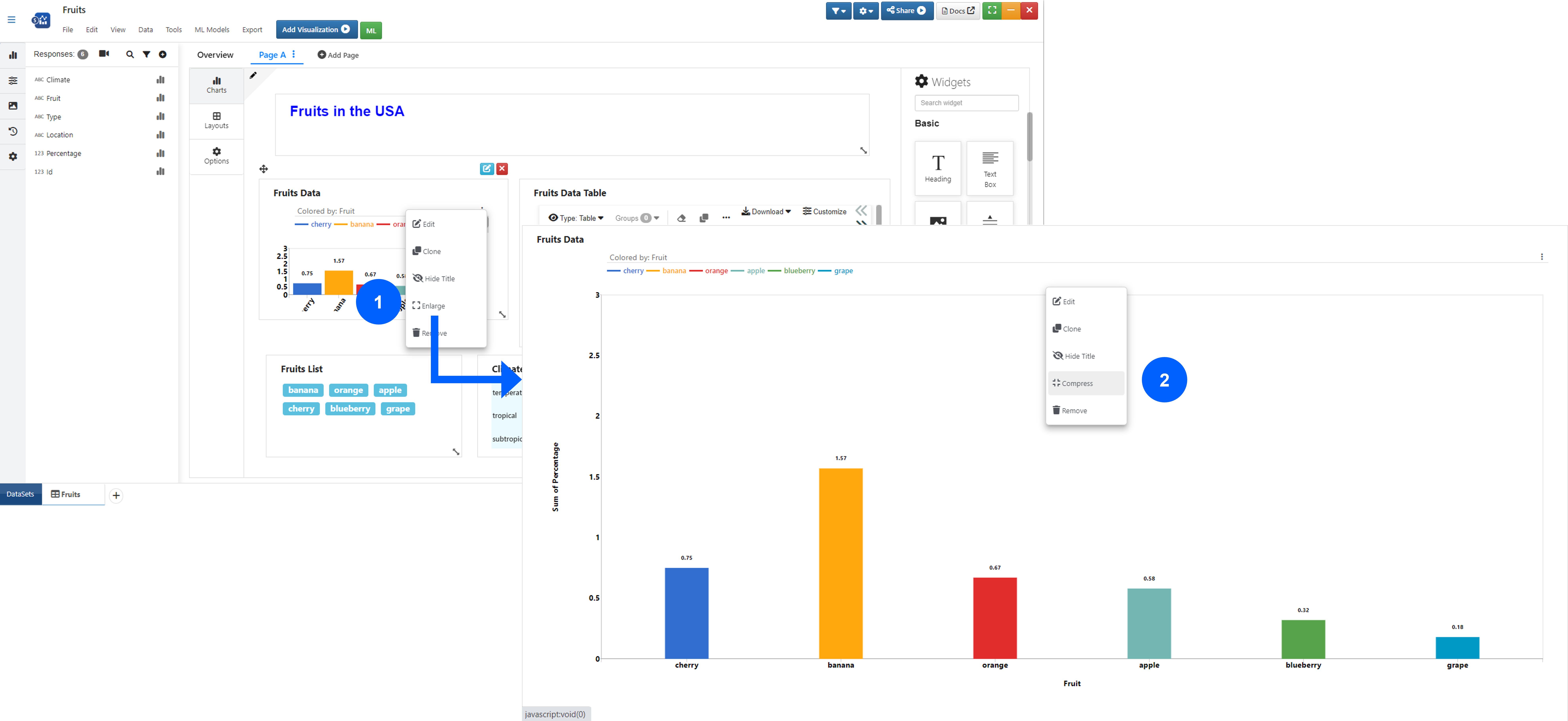
Figure 14: Enlarge Widget
Watch the following video to see how it’s done:
We can hide or show widget titles based on user requirements. Click Hide Title in the right context menu to hide (1) and select Show Title to display it again (2).
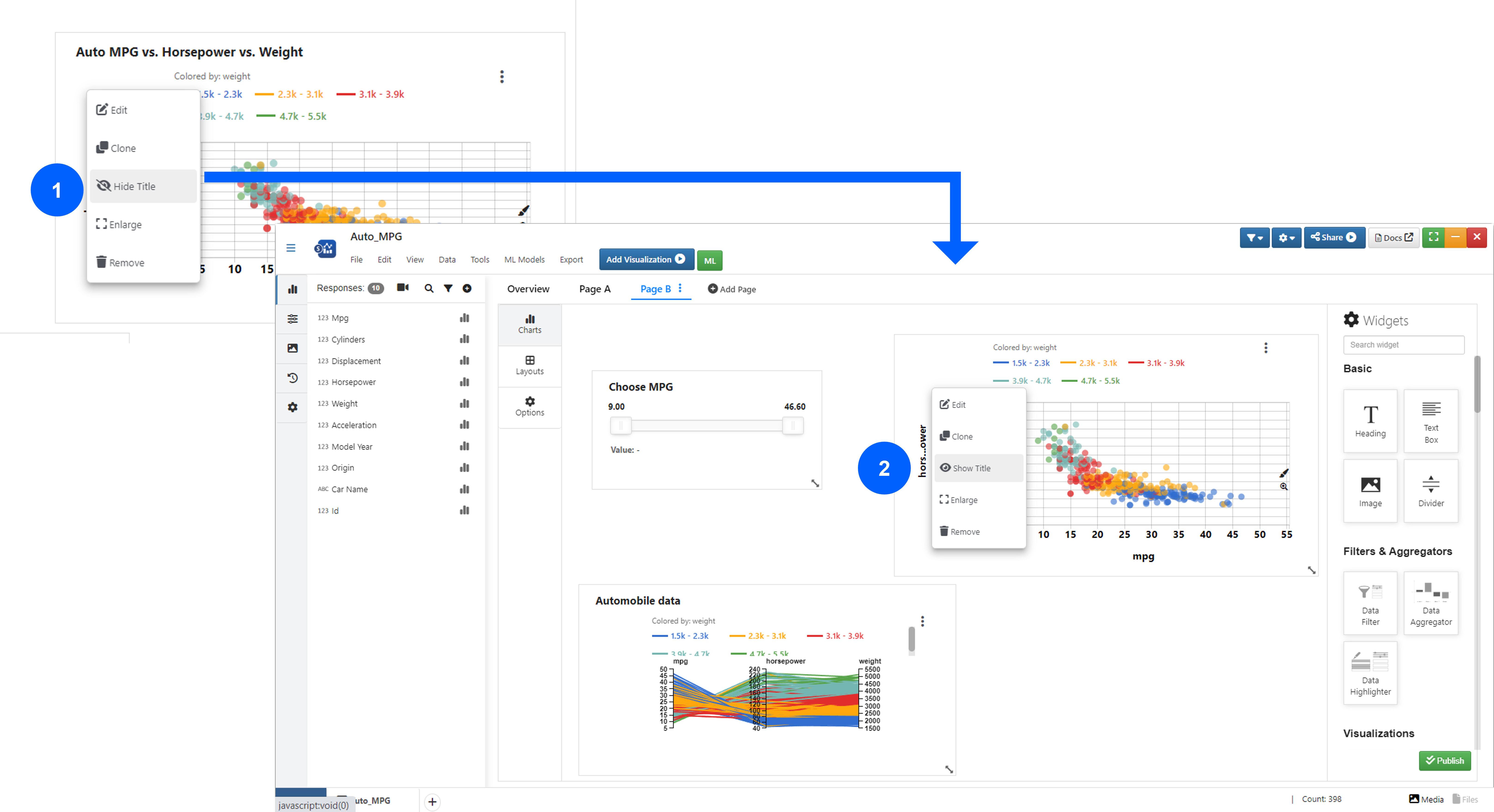
Figure 15: Toggle Widget Title
Watch the following video to see how it’s done:
To view all the highlighted values at the top of the data highlighter, set “Move Highlighted Items to Top” to “Yes.”
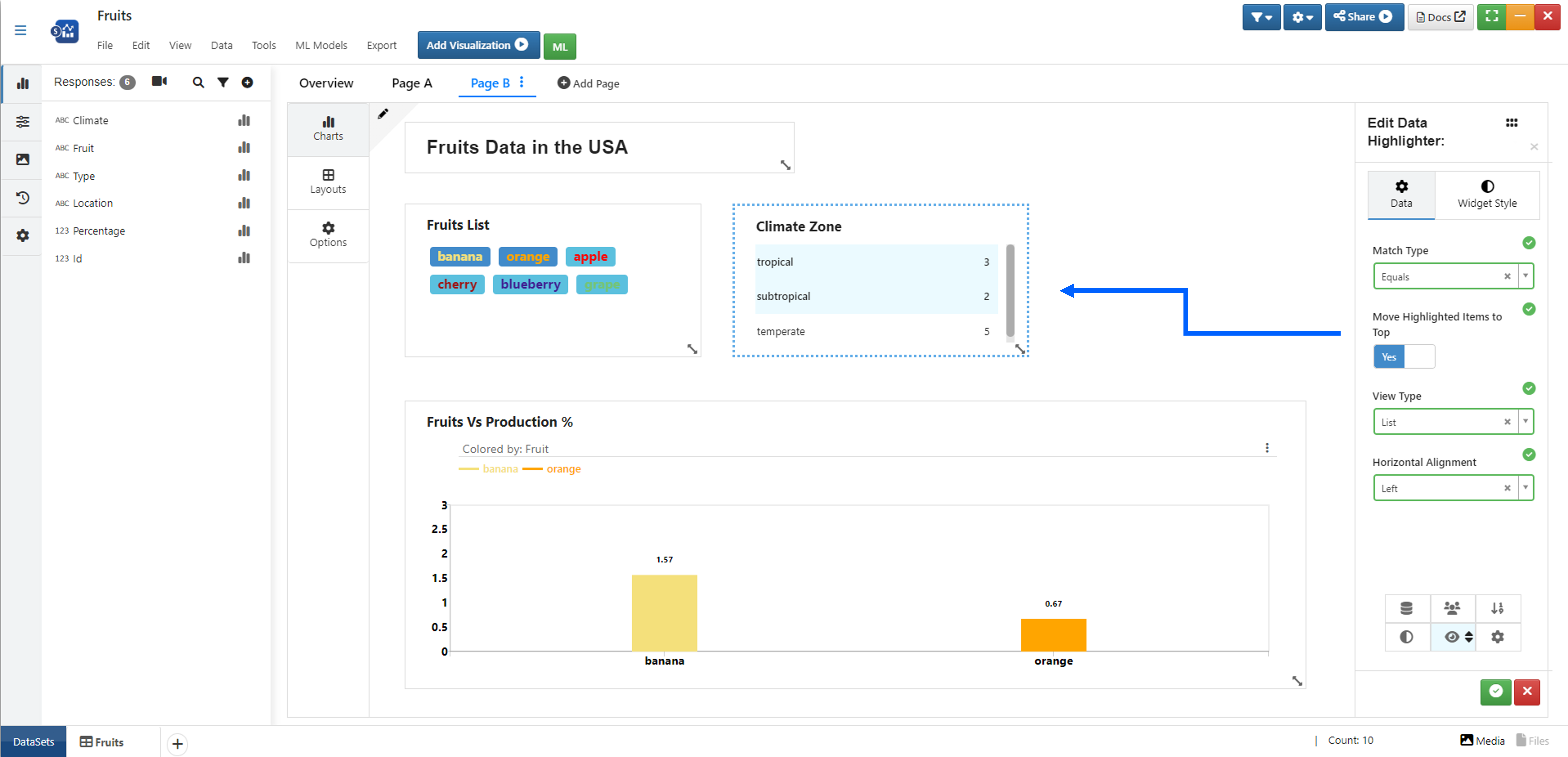
Figure 16: Show Highlighted Items at the Top
You can view dashboard widgets in List, Carousel, Grid and Tab views.
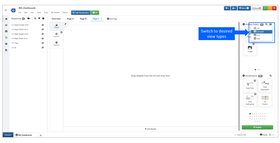
Views for Widgets
Watch the following video to see how it’s done:
Click here to review more visualizers (skip to this section to learn more).
Editing Widget Style
All widgets can be styled similarly in the second tab called “Widget Style”.
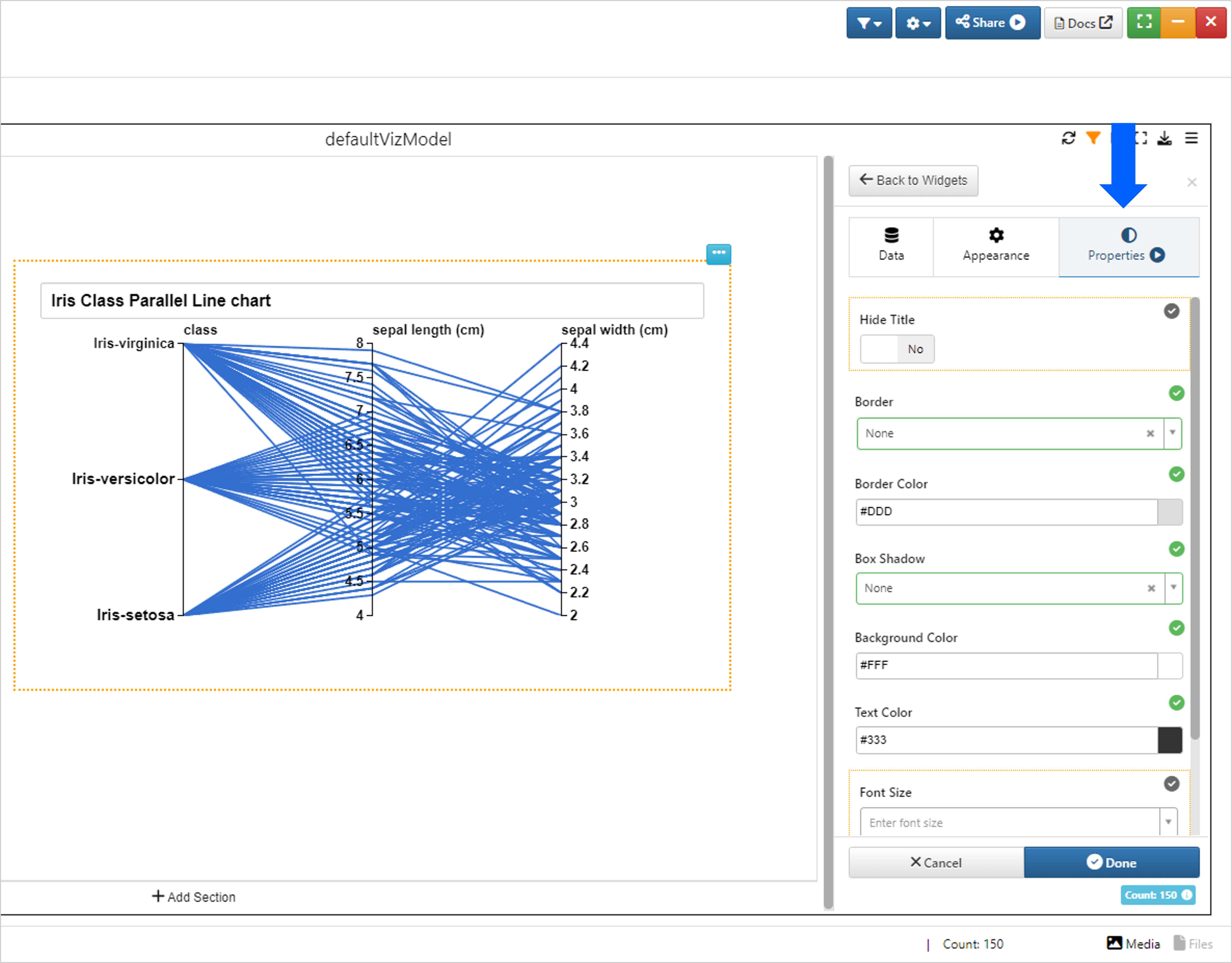
Figure 17: Edit Widget Style
Alter the appearance of the text and box such as changing the box shadow, background color or text color.
Dynamic Data Linking
Once we’ve added our visualizers, we can use our data filters and highlighters as tools for dynamically showing aspects of our data.
In the following image, we’ve added a parallel line chart to the right showing the relationship between sepal and petal width and length with Iris flower class. The data filter widget to the left shows filtered sepal length which is reflected in the parallel line chart.
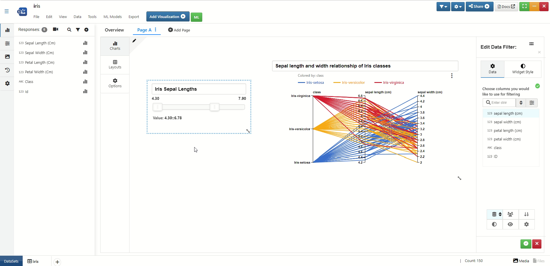
Figure 18: Sepal Length Dynamic Data Linking
The following video shows how the dynamic linking looks for the sepal width in real time.
In the following image, we have the same parallel line chart filtered to reflect the chosen Iris classes in the data filter widget to the left.
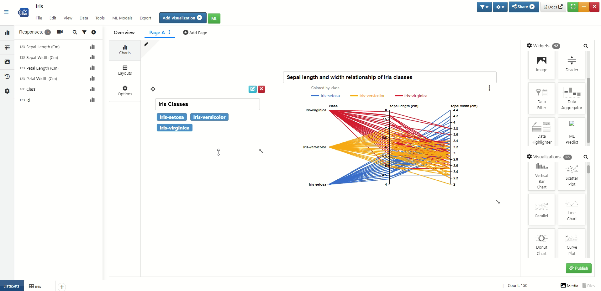
Figure 19: Iris Class Dynamic Data Linking
The following video shows how the dynamic linking looks for the Iris class in real time.
Guide Tour for Dashboard widgets
Guide Tour messages can be added to all the widgets in Dashboard in the Tour Guide tab, with a text area button on the widget top right or right click and Change Guide message option for Dashboard.
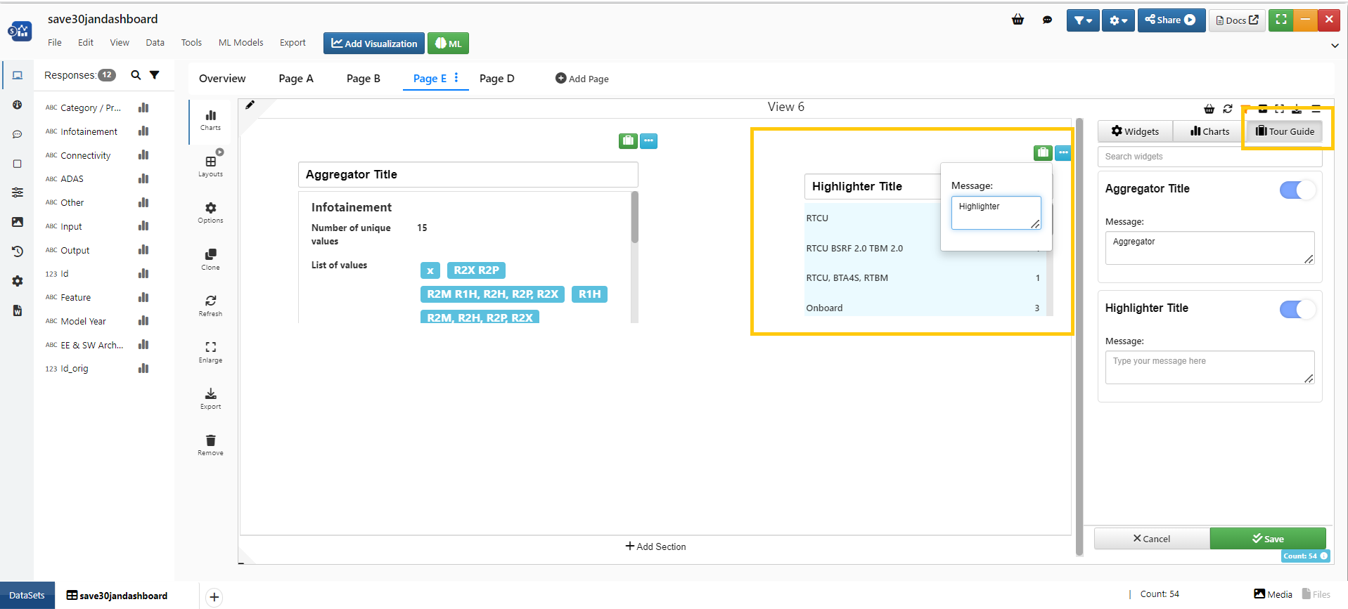
Guide Tour for Dashboard widgets
We now have new option Guide me in Dashboard view which help us to guide the Dashboard widgets.
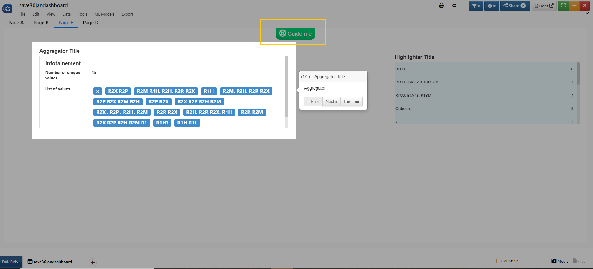
Guide me
Dashboard Examples
The following are some examples of customized Simlytiks dashboards for different datasets.
Iris Class
This dashboard shows the relationship between Iris class and petal and sepal dimensions using data filter, image, heading, parallel line chart, donut chart and stacked area chart.
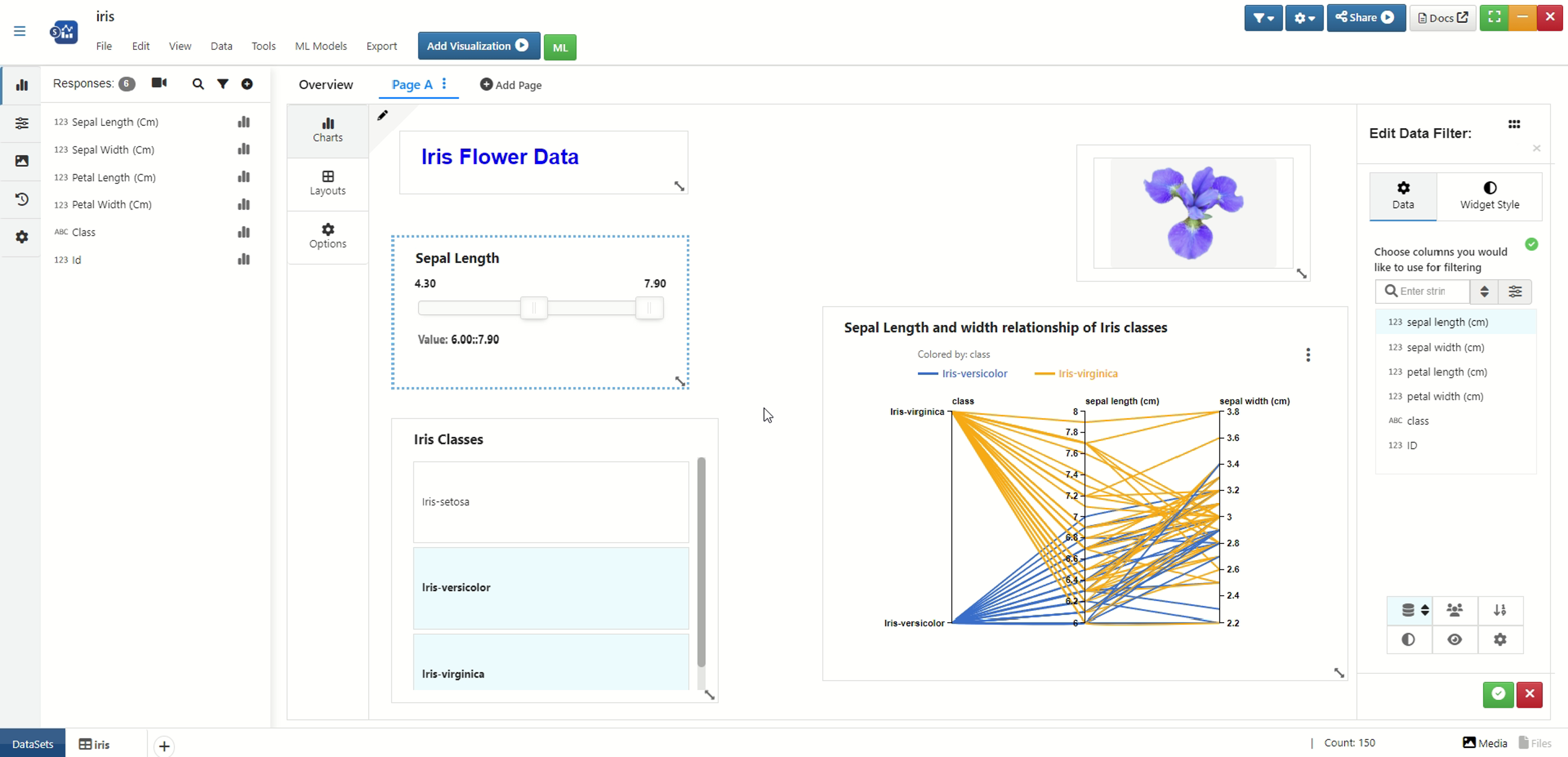
Figure 20: Iris Class Dashboard
The following video demonstrates the dynamic linking for this dashboard example.
Auto MPG
This dashboard shows the relationship between Automobile MPG, horsepower and weight using data filter, image, heading, parallel line chart, and scatter plot.
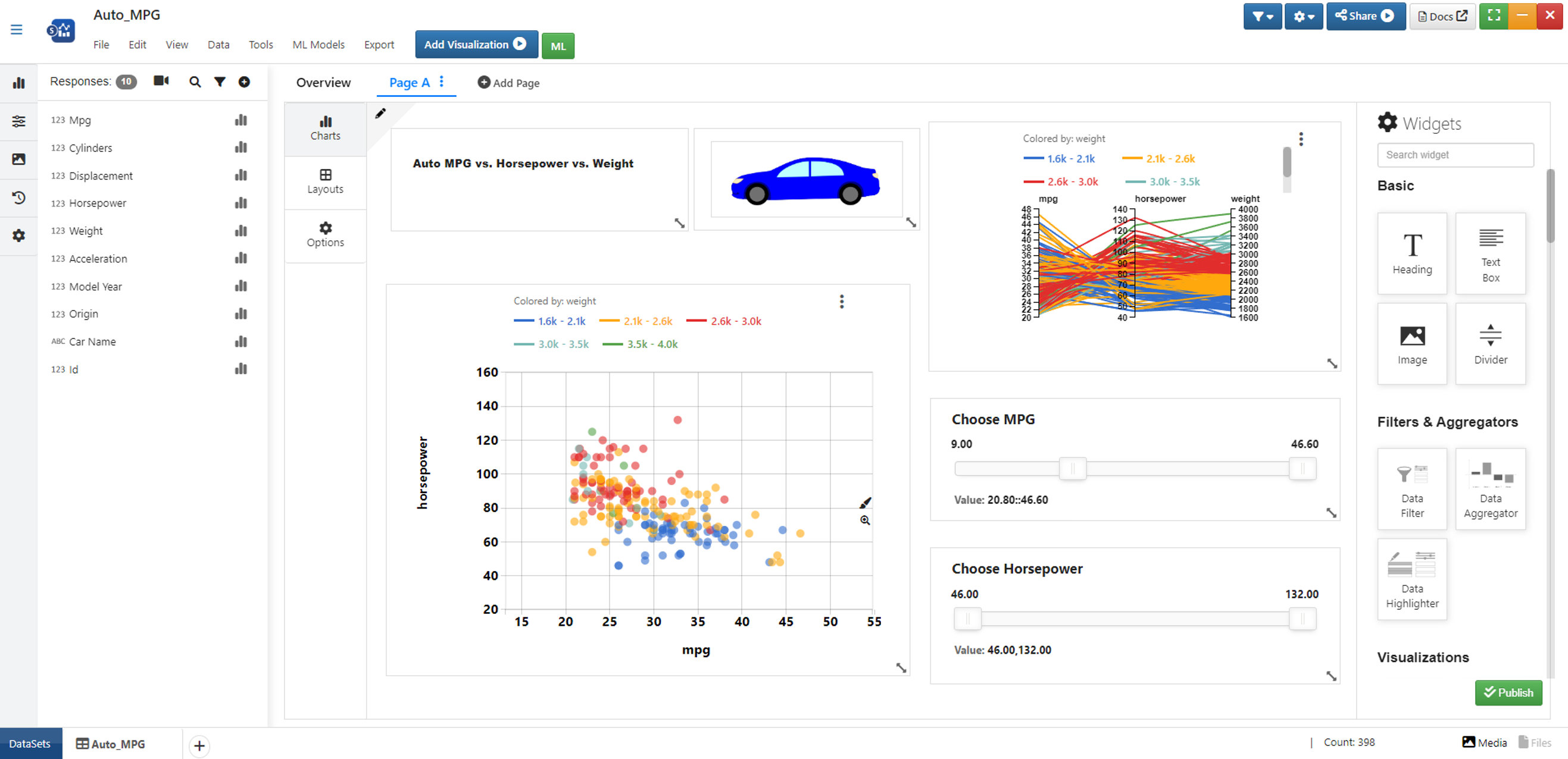
Figure 21: Auto MPG Dashboard
The following video demonstrates the dynamic linking for this dashboard example.
World Happiness
This dashboard shows how different standard of living determines the happiness score of countries using ranking table, histogram, data aggregator and data filter.
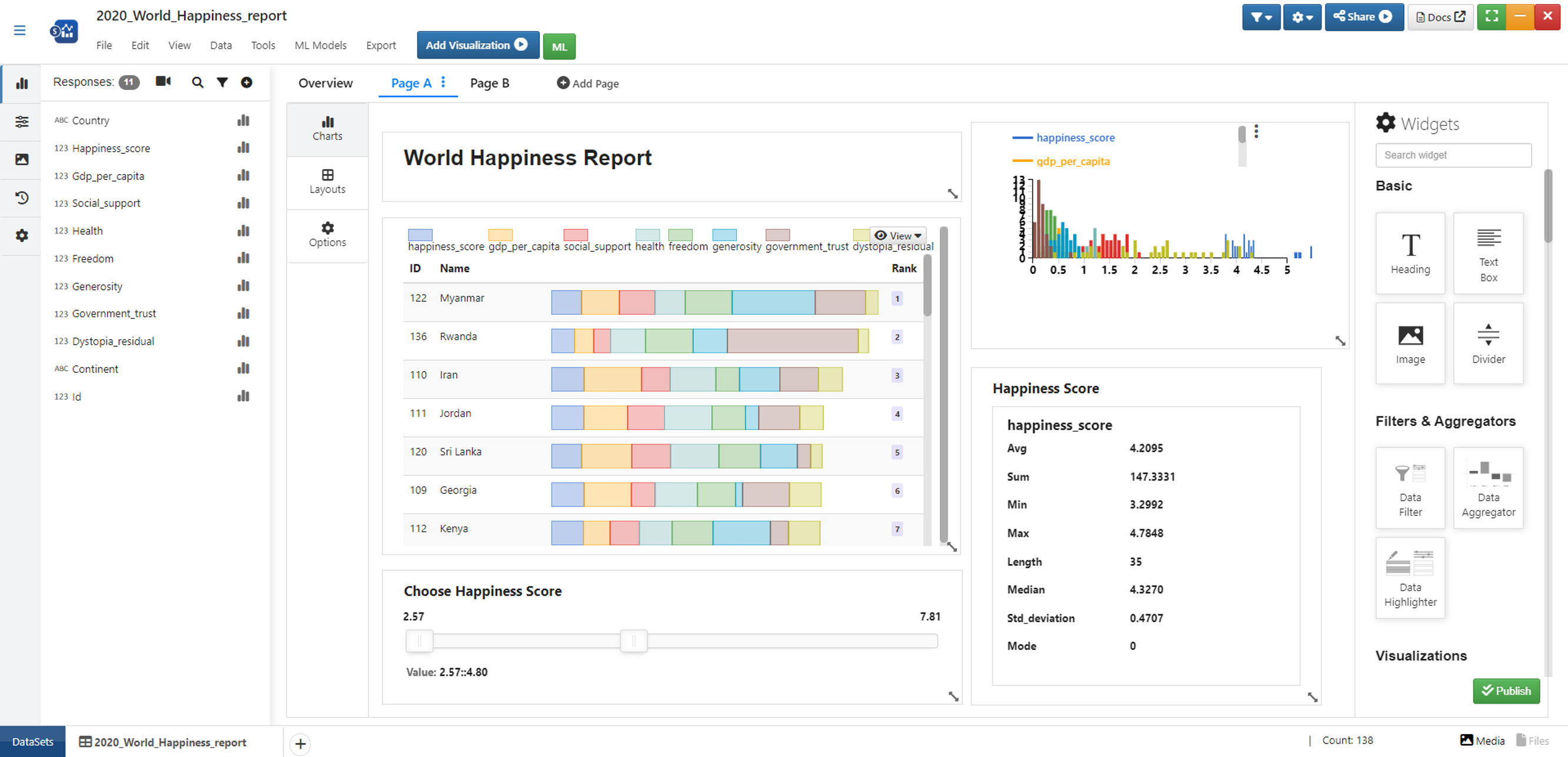
Figure 22: World Happiness Dashboard
The following video demonstrates the dynamic linking for this dashboard example.
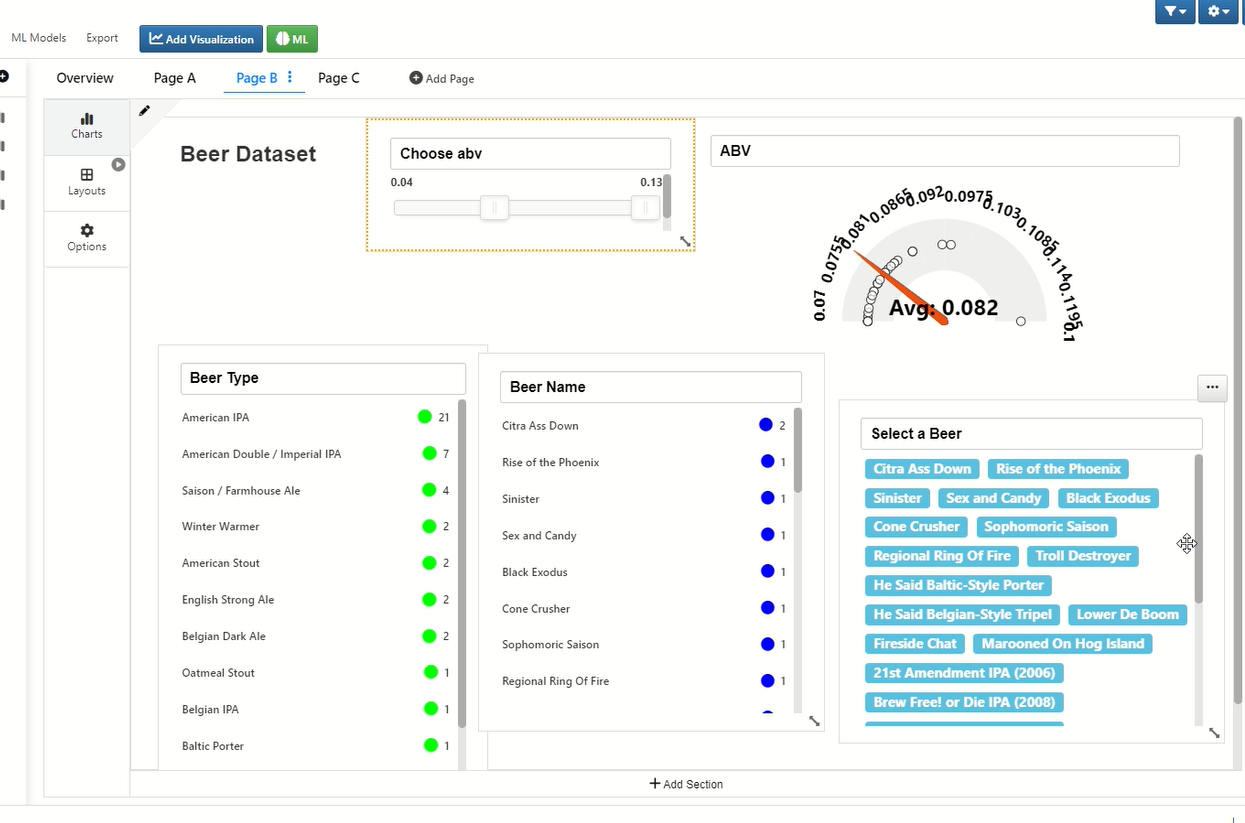
Beers
This dashboard shows how ABV values relate to different beers and beer styles using data filter, data highlighter and gauge.
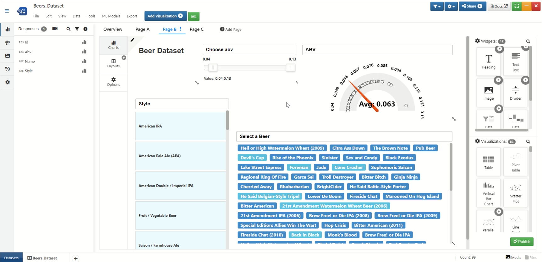
Figure 23: Beers Dashboard
The following video demonstrates the dynamic linking for this dashboard example.
The default view which is the modern view can be changed to dashboard view for viewing dashboards that were created for a given dataset. Click on Dashboard in the view dropdown menu (1) to view all the dashboards. To return to page view again, go to the view dropdown and select any desired view type (2).
Figure 24: Edit Dashboards View
Watch the following video to see how it’s done:
The data highlighter display type can be changed from background color to colored bubble type by setting the color for the column and selecting “Colored Bubble” in the “Selection Display Type” field for the highlighter.
Figure 25: Data Highlighter Colored Bubble Display Type
Watch the following video to see how it’s done:
Multiple sections can be added within a dashboard page by clicking on “Add Section” and the new section can be personalized with new widgets. These widgets can be deleted at any time by clicking on the “x” available towards the right top; also, scroll the page to view all the sections.
Figure 26: Multiple Sections in a Dashboard page
Watch the following video to see how it’s done:
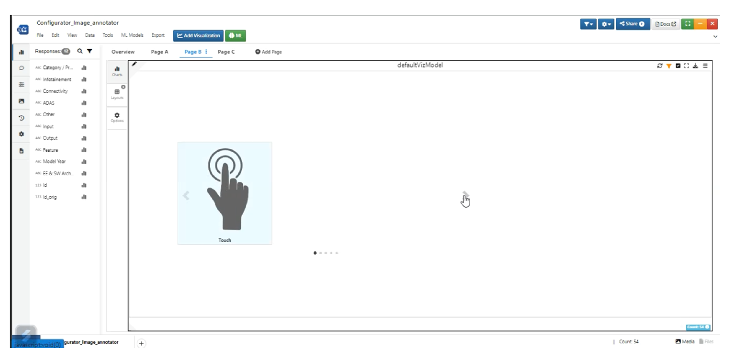
Image annotator selection display type can be changed from background color to colored bubble type by setting color for the column and selecting Colored Bubble as input for the “Select Annotation Display Type” field for the highlighter.
Figure 27: Annotation Display Type
Watch the following video to see how it’s done:
Widgets list view type in dashboard page can be changes based on user requirement. To do this, click on the eye icon and switch to the desired view.
Figure 28: Widgets List View Types
Watch the following video to see how it’s done:
“Show Only Selected Data” and “Move Highlighted Items to Top” are enabled by default to show only filtered data and move them to the top.
Figure : Show only selected data at the top in Data Highlighter
To facilitate data interaction across multiple pages of visualization, it is now converted from a stand-alone to an interactive visualizer.
Figure 29: Dashboard Visualization
Added Built-in margin for dashboard widgets to separate them out.
Built-in margin
Filter Data within data to make it act like a filter to show only highlighted data and set Show only Highlighted to Yes by default.
Show only Highlighted
Count is updated when a delimiter is used in Data highlighter.
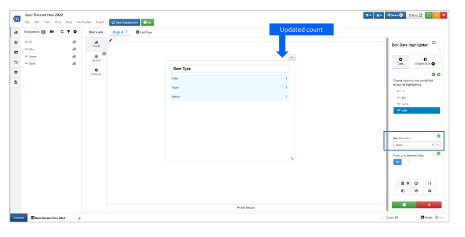
Delimiter
Filters brushed
New option is added in dashboard to use original data for its list filtering or use the brushed data based on other filters in Simlytiks.
Watch the following video to see how it’s done:
Dashboard view
All the Dashboard pages created in the Simlytiks dataset can be viewed seperately in Dashboard view. This Dashboard view is available in Views tab in Simlytiks page.
Below screenshots are shows 1) Example of a dashboard page and 2) Dashboard view location in Simlytiks page.
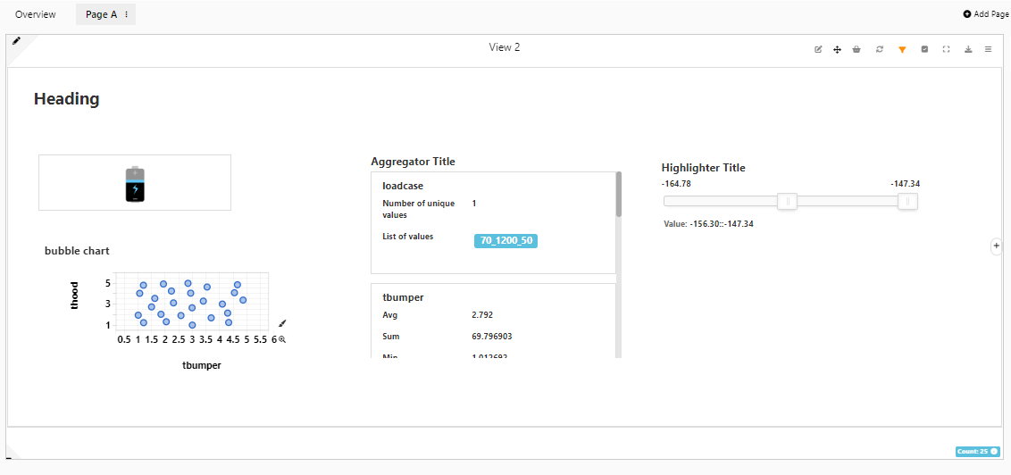
Dashboard Example
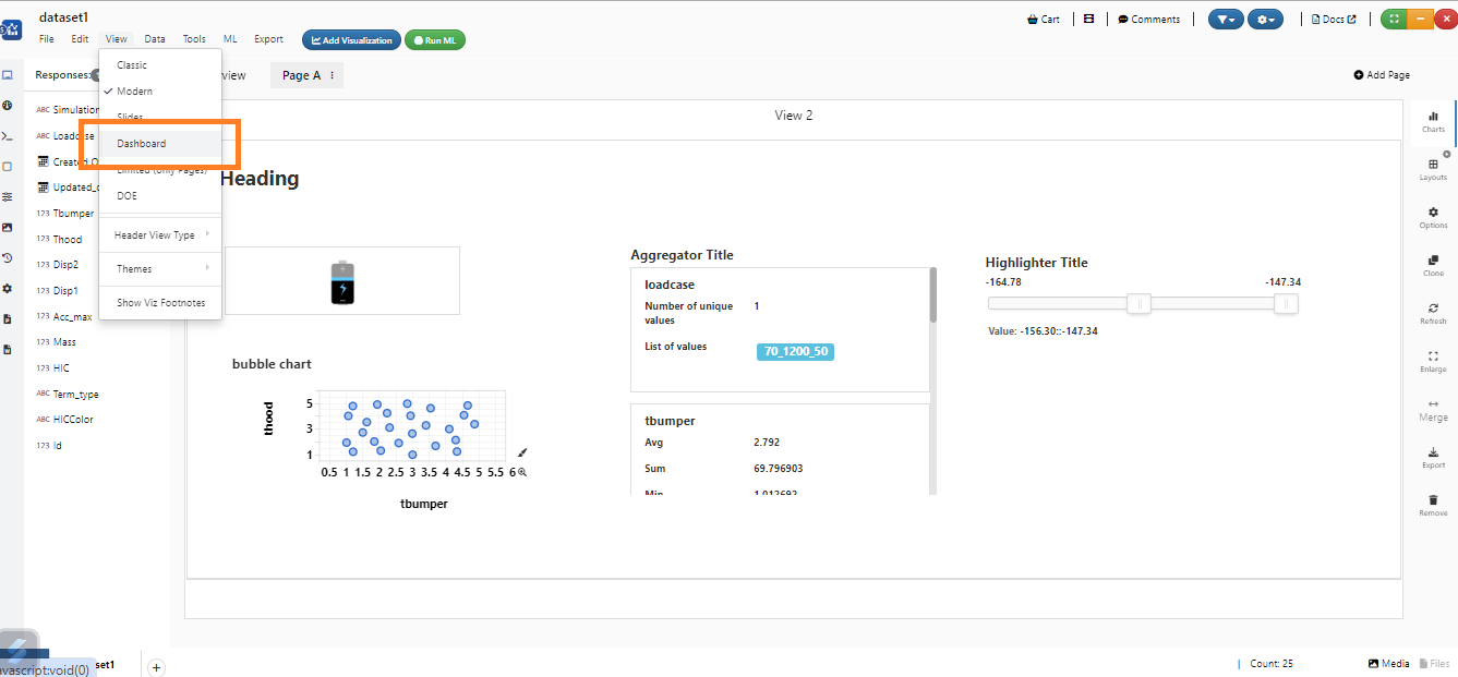
Dashboard View
All the Dashboard pages available in the Simlytiks will be available in the Dashboard view. Below video shows how to view Dashboard pages in Dashboard view.
Dashboard visualization can be exported and imported in edit view and visualization view.
Data filters in Dashboard visualization will support date and datetime columns that can be verified in Dashboard page.
Newton plots in Dashboard visualization when enlarged will show the units and quantities in the axes of the plots
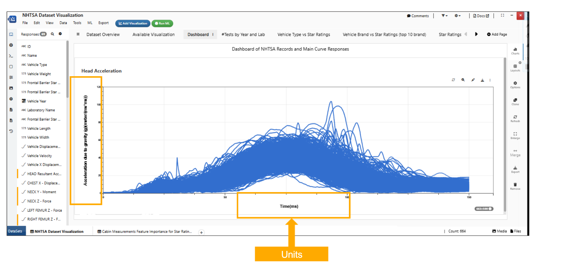
Newton units
Curve plots in Dashboard visualization will now have a new option to ‘Show all curves on enlarge’ which will show all the available curves when visualization is enlarged.
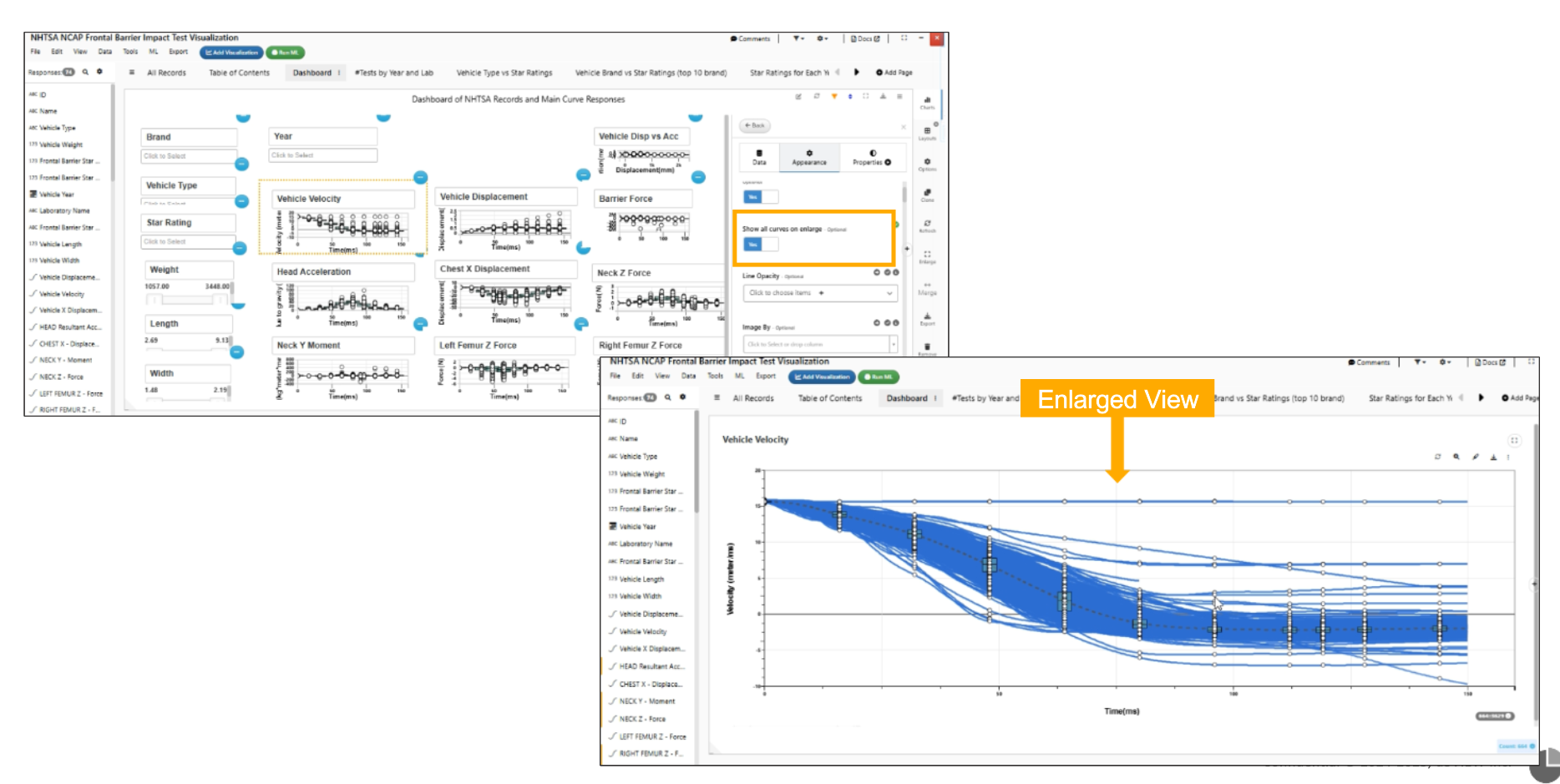
Show all curves on enlarge