1.  Overview
Simlytiks deciphers data and transforms it into rich interactive visualizations – such as bar charts, scatter plots, heat maps, area charts, etc. –, thereby increasing comprehension of information for making better decisions. Simlytiks offers a wide array of options and features to explore data, visualize in multiple ways, save favorite visualizations, compare, and share these visualizations to collaborate with other team members.
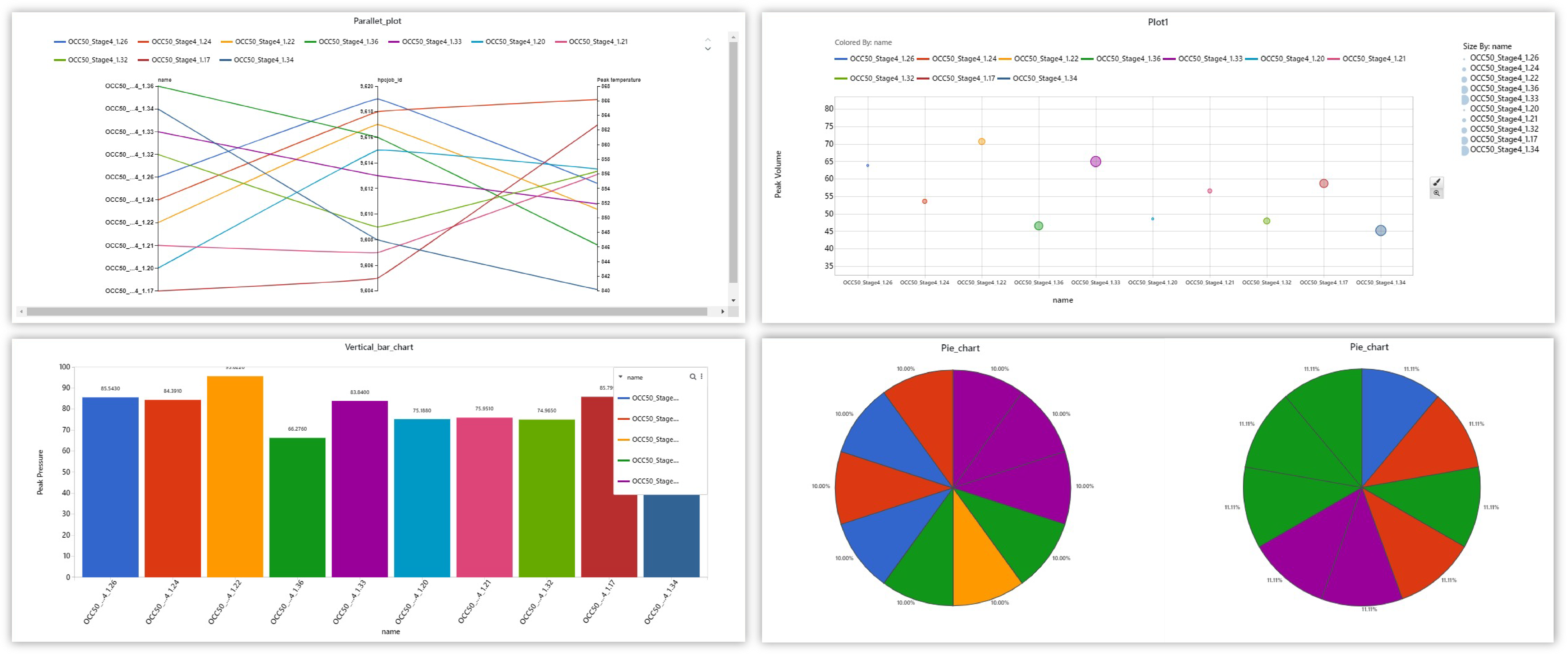
Simlytiks Chart Examples
Watch the following video for an overview the application and its capabilities:
Featured Benefits:
- Explore generic & scientific datasets. Simlytiks makes data exploration accessible for everyone.
- Choose from over 12+ dashboard page layouts to detail, customize and organize chart comparisons and explorations.
- Create 50+ types of charts to explore and visualize data for deeper insights.
- Use various tools and options to edit and view visualizations for customizing and enhancing the exploration.
- Save and export datasets, page and visualizations in a variety of ways including a built-in PowerPoint builder.
- Share Simlytiks Dashboards as public links to collaborate and explore with anyone.
What Will Be Covered:
- Data Sources: Learn about supported data types.
- Importing Data: Learn how to upload data in the four main ways.
- Viewing Data: Learn the basics of viewing data.
- Adding Media: Learn how to add and assign media to data, and how to use media for charts.
- Charts: Learn how to create and edit charts for dashboard pages.
- Chart Examples: Learn how to create a few specific charts with different example datasets
- Dashboard Pages: Learn how to add and edit pages for the dashboard.
- Filters and Highlighters: Learn how to filter charts and datasets in three main ways.
- Data Drilling: Learn how to create and explore charts with data drilling options.
- Crash Safety Charts: Learn about how Simlytiks supports crash and safety exploration with dedicated charts.
- Sharing & Saving : Learn how to download charts, pages and datasets, how share the exploration and how to save the dashboard.
Accessing the Application
Click on the Simlytiks logo under the Application Menu to access the application. The App Menu can be accessed under the table header icon in the left upper corner of the page. Click the icon to open, and click it again too close.
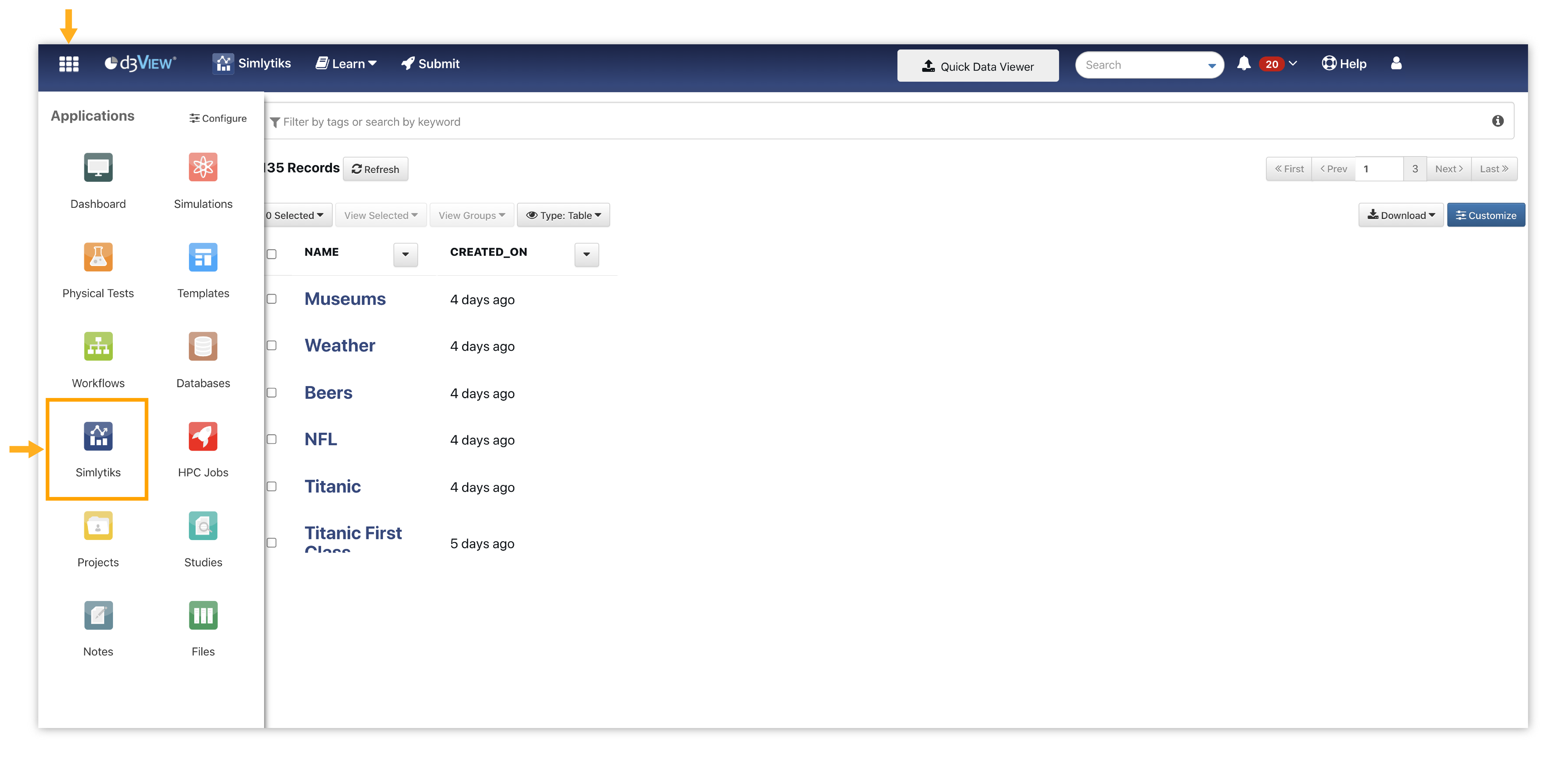
Accessing Simlytiks
Overview Table
In Simlytiks overview data table, We can add rows above and below and we can also copy paste rows
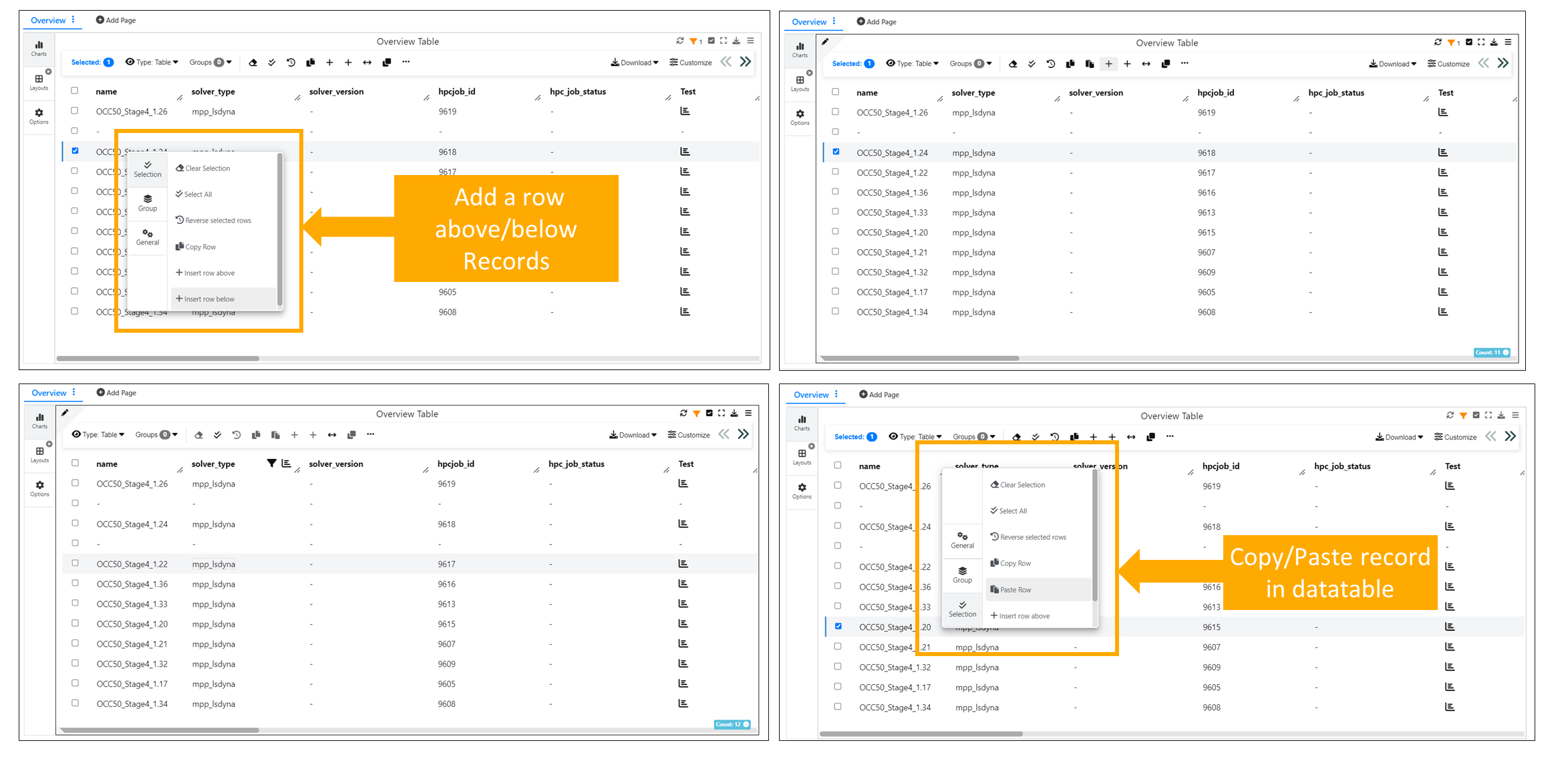
Overview Table
Remove row option is available for Simlytiks overview data table.
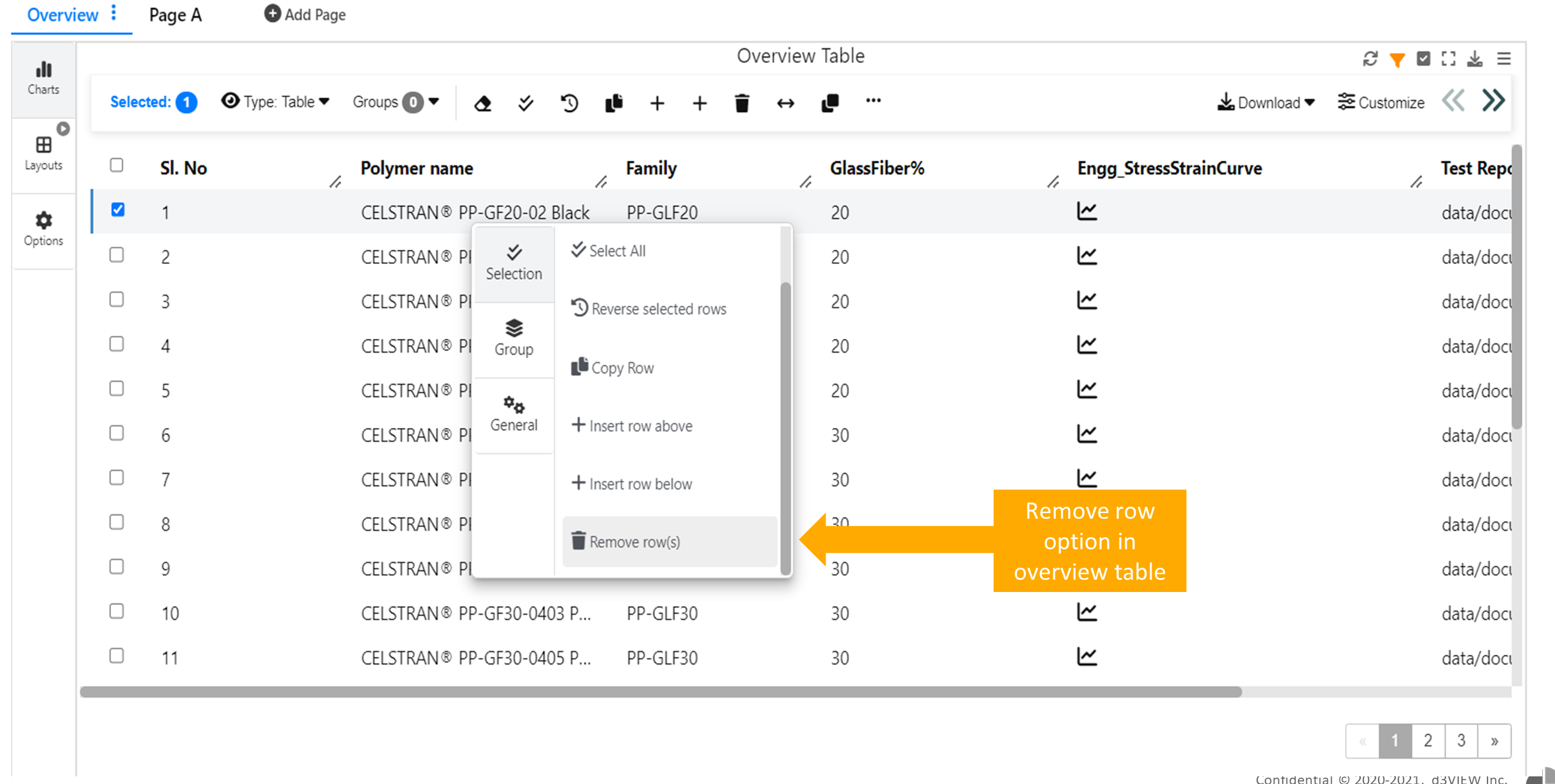
Overview Table
Overview table in Simlytiks is now replaced with new Data Profiler which has Data summary, Data distribution and Relationships.
Data Profiler
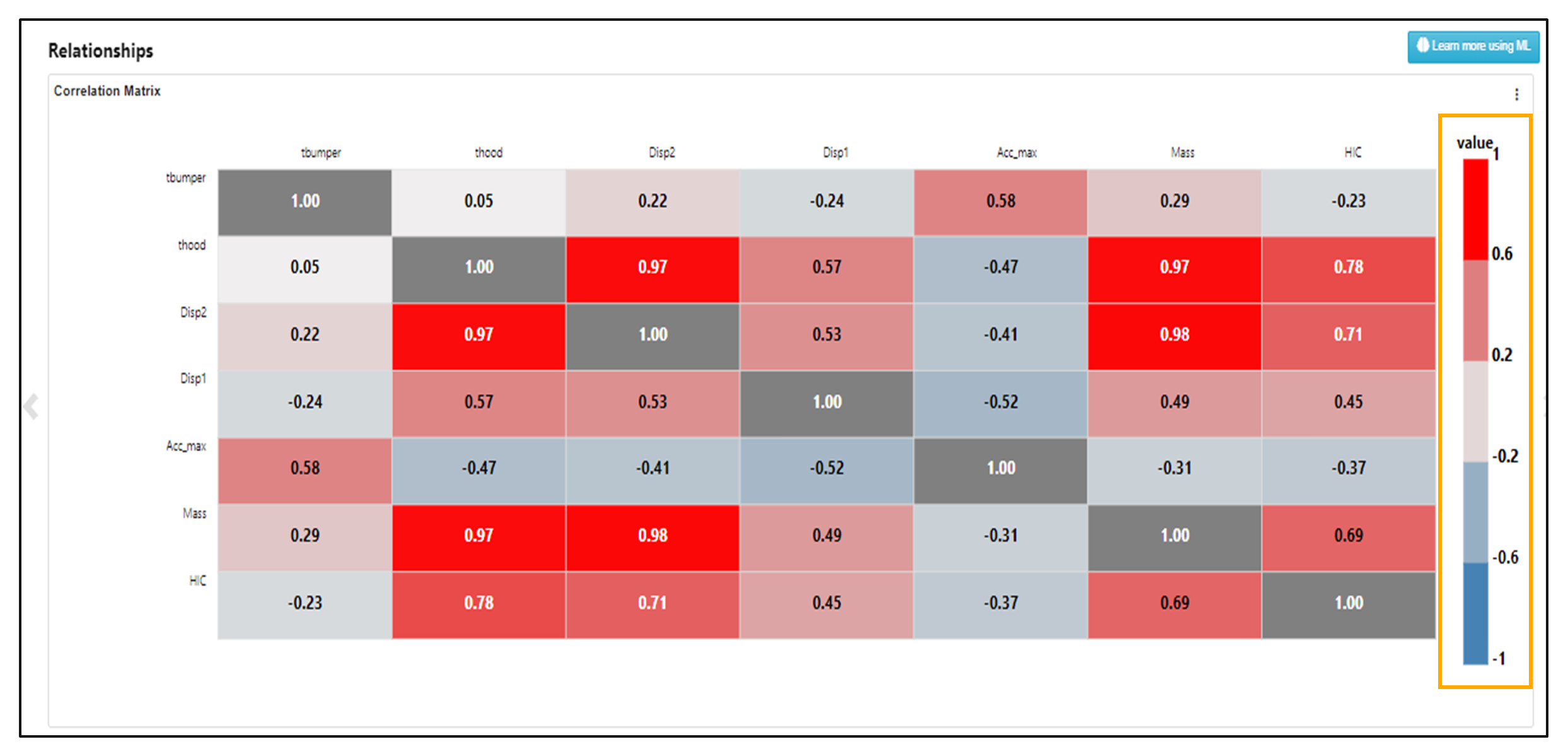
New feature Data profiler is added to Simlytiks which includes Data Summary Schema, Data distribution and frequency and Relationships
Now we have new mosaic view support for Image Gallery in Data profiler.
Heatmap in Data profiler shows scatterplot when we click on the values
We see cross plot matrix when we click on Heatmap cells in Data profiler and we have option to switch between scatterplot and QQ plot.
Coloring of a cross plot in data profiler will always be between 3 colors and ignore numerical binning.
:sup: Coloring cross plot