9.  Charts
In Simlytiks, charts and graphs are organized as visualizations. With 40+ rich, interactive visualization options, or individual data explorations, we can transform our data into visual expressions that make it easier to understand and compare.
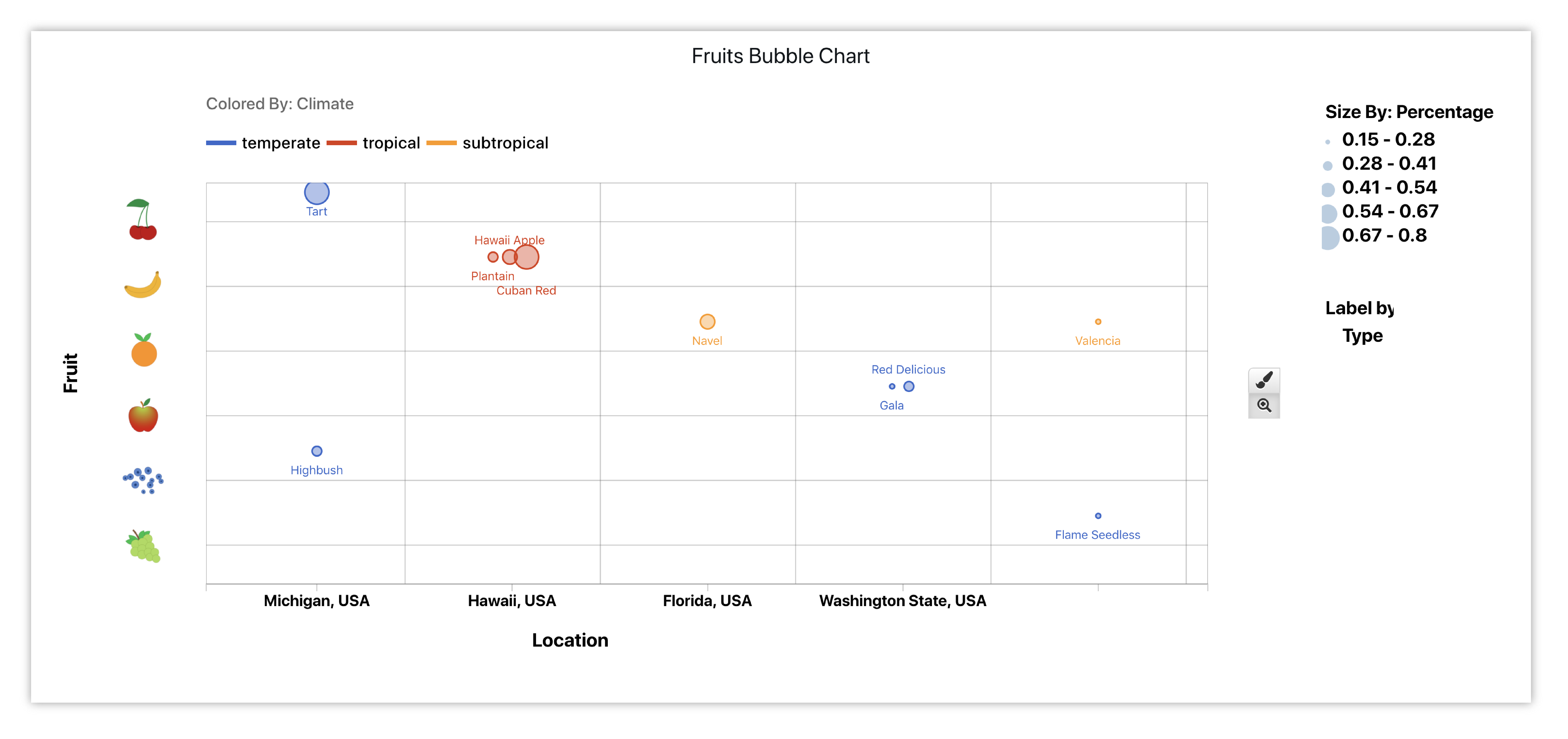
Finished Fruits Bubble Chart
Visualizers
Visualizers can be found underneath the Visualization Menu. Each visualizer has a designated icon, a main placeholder and a specific placeholder for each option. Here are some basic Simlytiks’ visualizers and their functions:
| Icon | Name | Function | Placeholder |
|---|---|---|---|
|
Table |
|

|

|
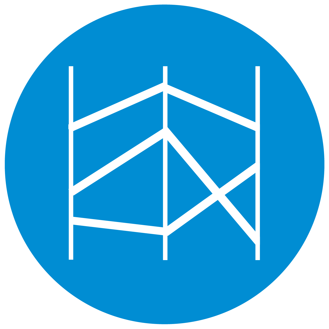
Box Plot |
|

|
|
Curve Plot |
|

|

|
Gallery |
|

|
|
Parallel Coord. |
|

|

|
Line Chart |
|

|

|
Donut Chart |
|

|
|
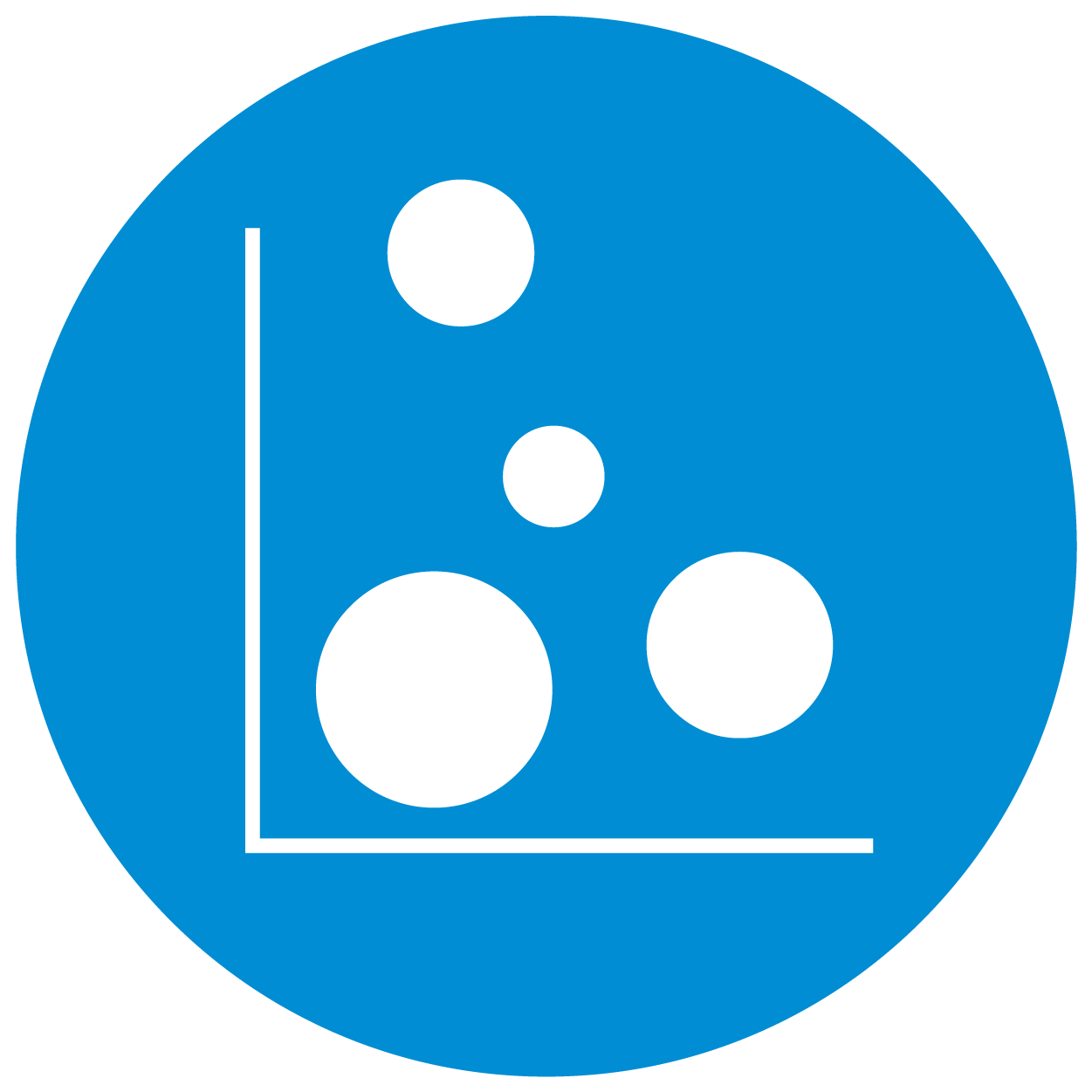
Scatter Plot |
|

|
|
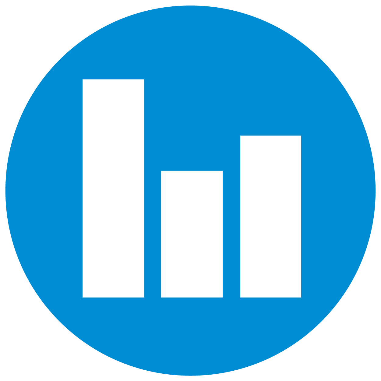
Bar Chart |
|

|

|
Multi-line Chart |
|

|
The below image showcases the icons for all the charts available in the application. We’ll go over how to learn more about each chart in the application in the next subsection.
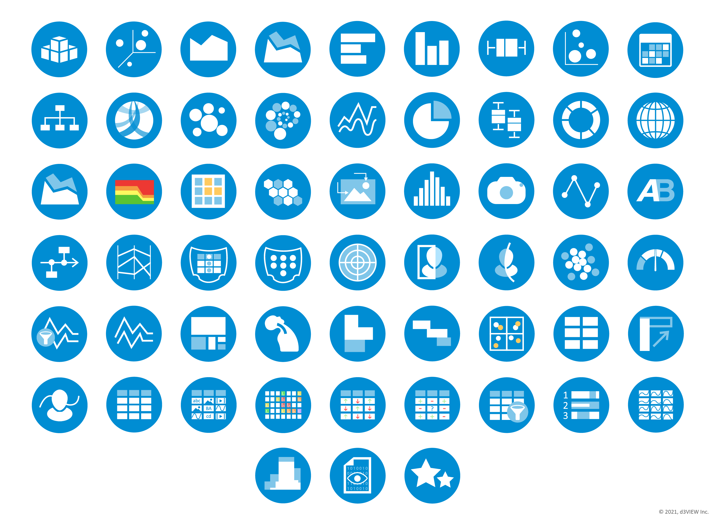
Figure 1: 40+ Rich, Interactive Visualizers
Adding Charts
The most common way to add a chart to a page section is through the visualizer menu. The following video goes through the basic process of adding a visualization this way. Make sure to read on for more ways to set up a chart.
Ways to Add Charts and Data
There are three main ways to choose visualizations for our pages.
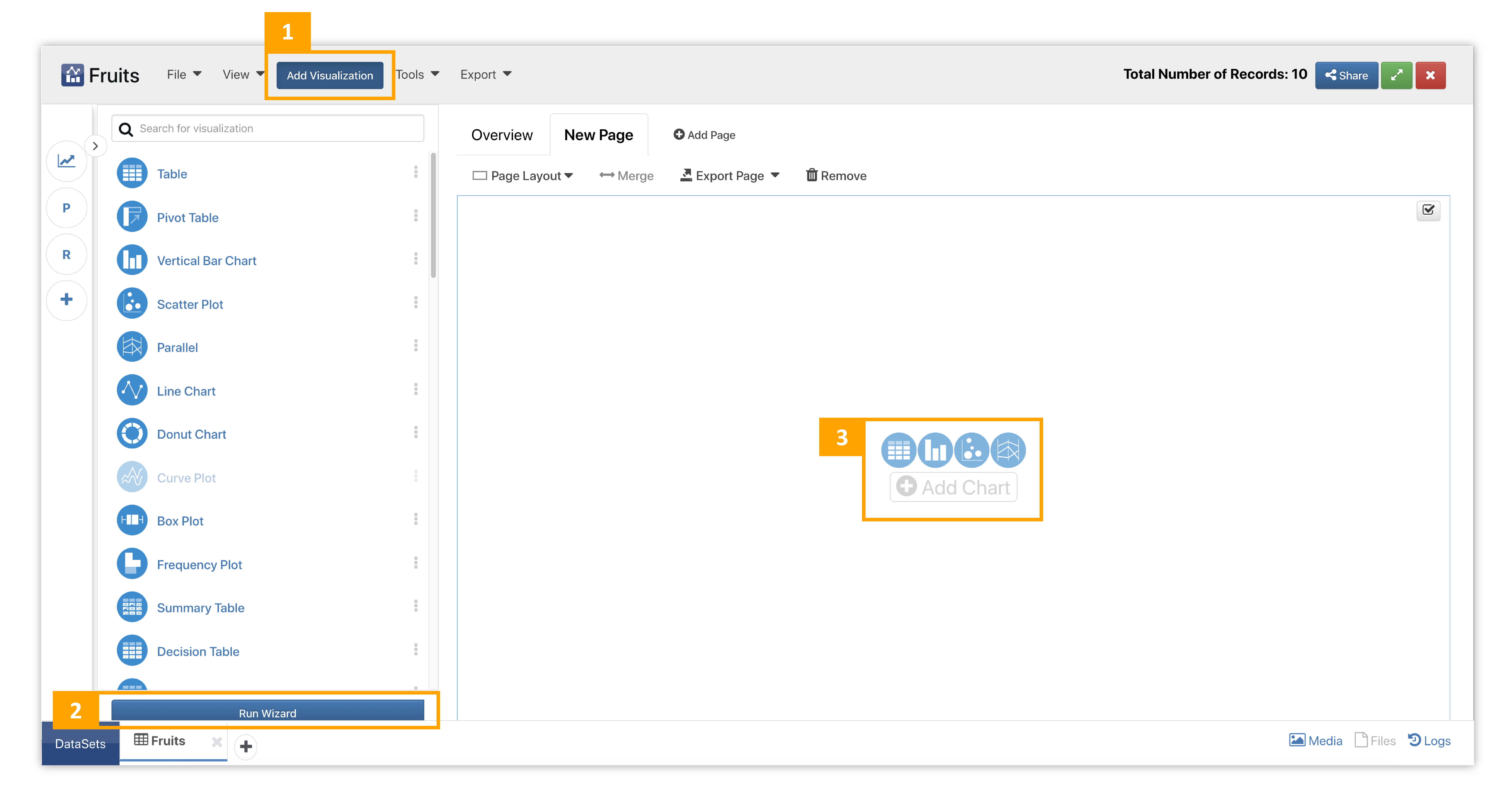
Figure 2: Adding Visualizations
- Click on Add Visualization. This menu is located in the top bar commands. Hover over visualizations to view their basic placeholders and descriptions.
- Click on Run Wizard. The wizard allows us to explore and set up charts in a separate window. We can review the library of visualizers in the first step and explore how they look in the second before committing to adding them in the last step. To access it, click on the button at them bottom of the visualization menu.
- Click on chart icons or Add Chart. Use the quick or direct links to add directly to that page section.
Watch the video below to see how to execute the above ways of adding charts to pages.
Each chart has detailed placeholders to help illustrate what it does. Hover over chart options (i) to view more specific placeholders. Here is an example of how placeholder images with appear:
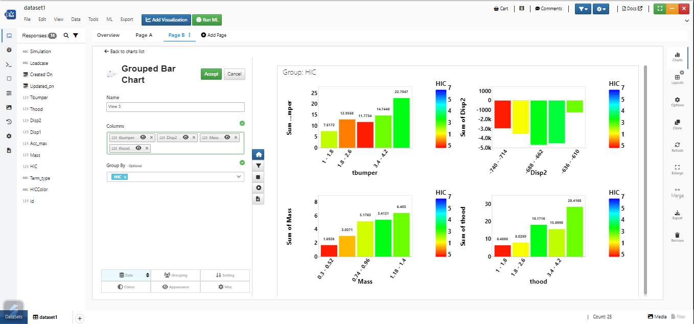
We can add inputs by dragging and dropping data columns from the left panel of Responses or choosing them in the drop-down menu that appears when clicking in the input box. Once we indicate required inputs, we’ll see a preview of our chart. We can use the real-time preview to explore options and choose exactly how we want our chart visualized before accepting it. Watch the following video to see how it’s done.
Guide Steps
Charts with multiple options for setting up now have guide steps for basic understanding. Find this option under guide me when adding a visualization to a page layout.
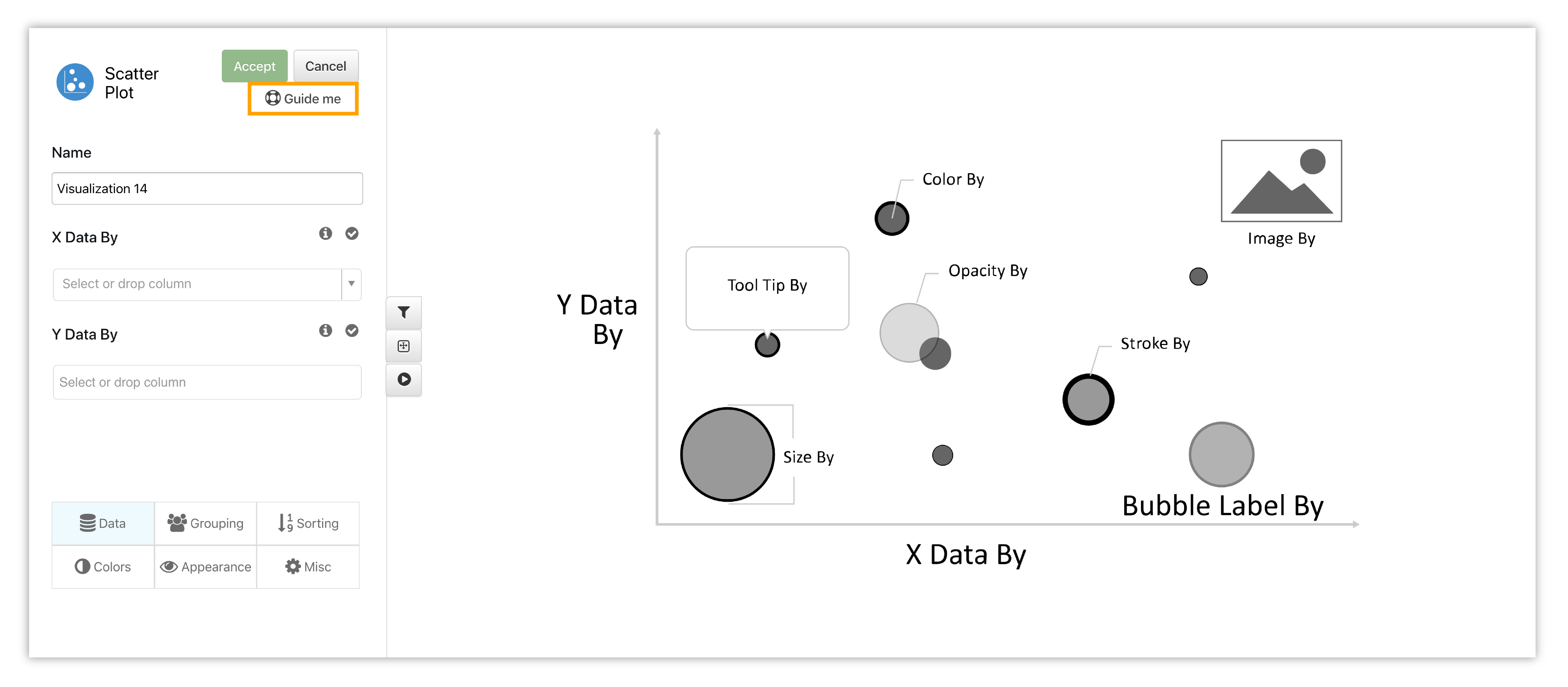
Figure 3: Guide Steps for Setting Up a Chart
The guide will take us through up to 5 steps to help us render a basic chart. Here is an example of the guide for bubble chart:
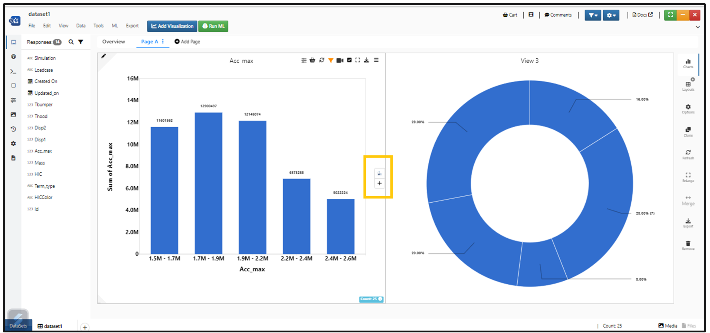
Editing Charts
The ‘Edit Chart’ visualization option is available in the top right options for all visualizations in Simlytiks.
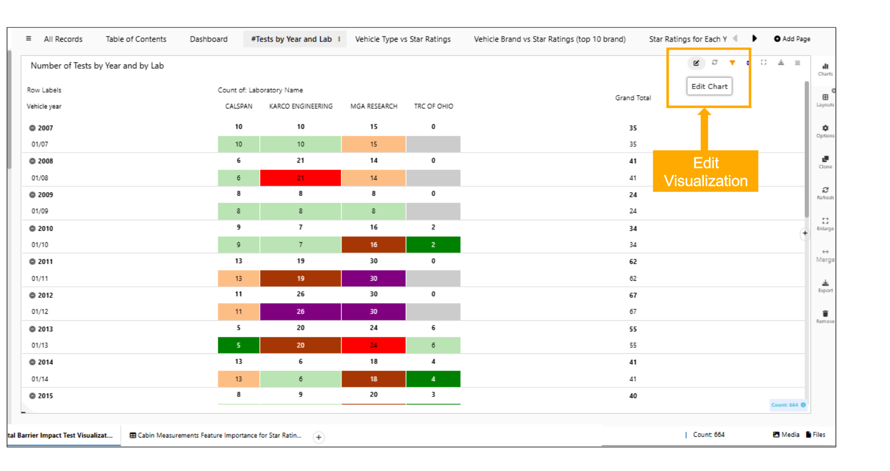
Editing Visualizations
The Edit viz option can be placed either on left side or on right side of the container using Tools-> settings -> Viz preview placement option in Simlytiks.
There are two main ways to edit charts, one of which is only available for a couple of them.
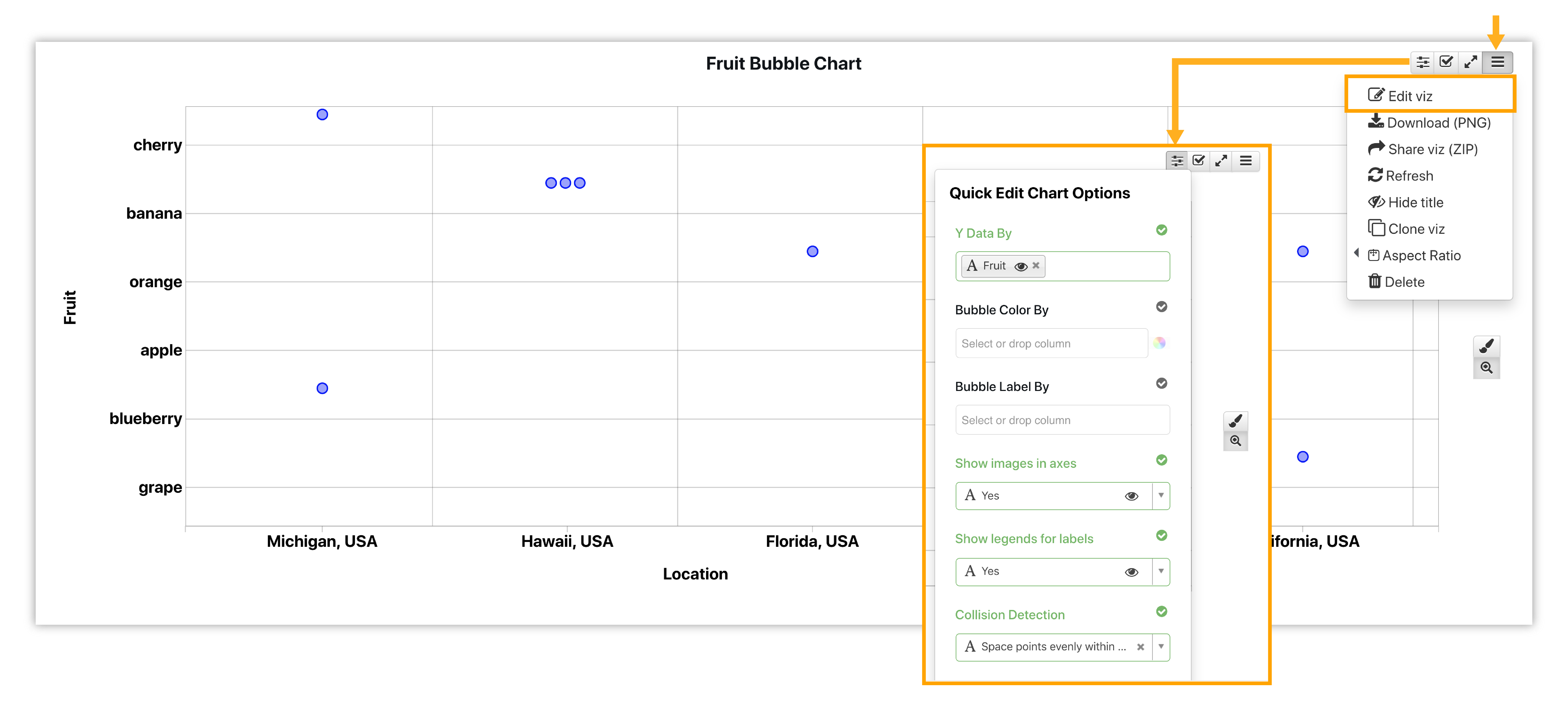
Figure 4: Editing Visualizations
- Quick Edit: This option is available for vertical bar chart and bubble chart.
- Edit Viz: This option takes us back to our initial inputs page to edit them.
Titles & Axes
We have the option to update the chart title, axis titles and axis ticks simply by clicking on their locations in the chart. The following video shows how this is done:
Quick Edit
The quick edit option is available for bar charts and bubble chart to change main inputs such as x data, y data and label by. To open the quick edit drop-down, click on the parameter icon in the top right corner of the chart area. Watch the video below to see a quick editing example for Bubble Chart:
Quick edit options will be available for more charts in the future.
Label Editor
Click on a Label to edit it. The label editor also supports variables.
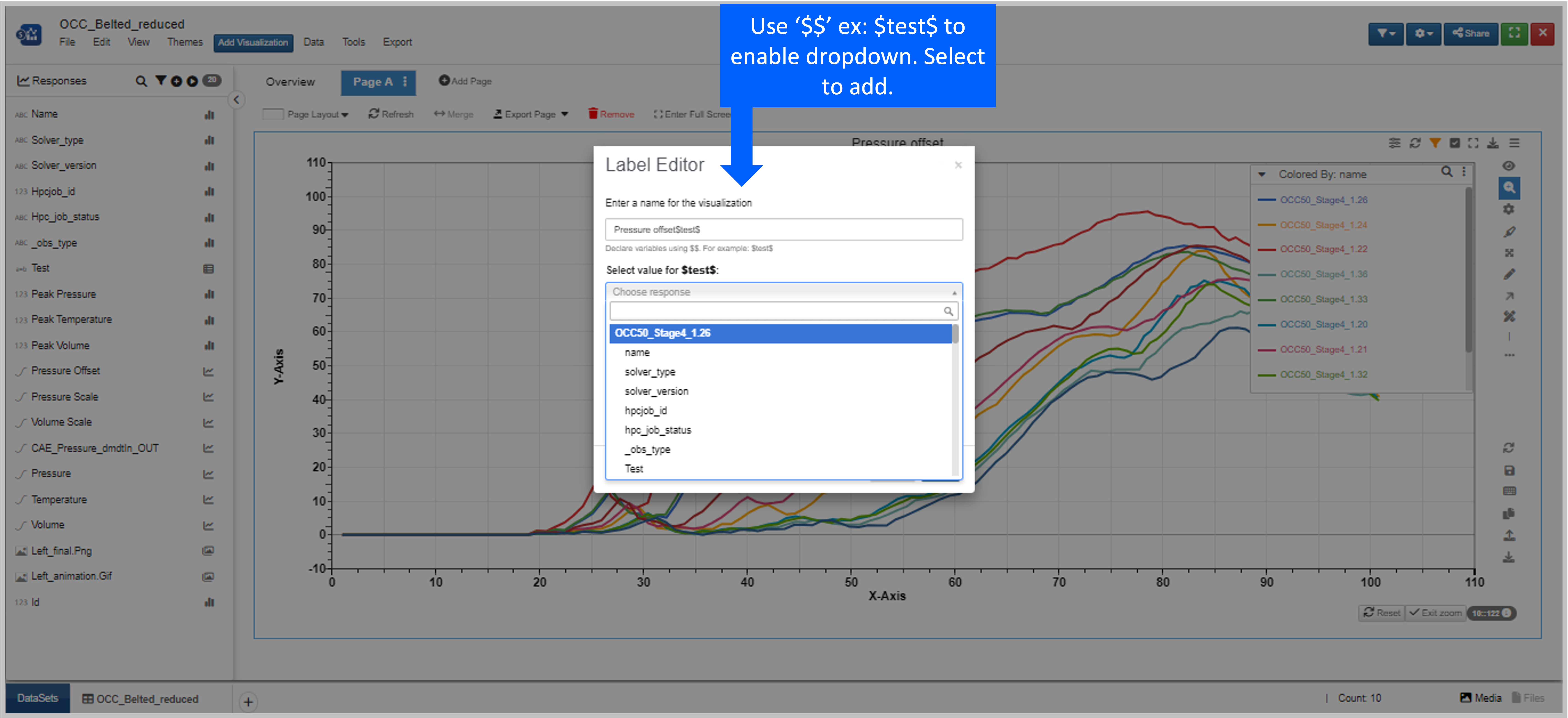
Figure 5: Label Editor
Numerical Color Scales
When we color data based on a numerical column in a chart, we have the option to choose from a variety of preset color scales. Check out the following video to see how it works:
When a numerical column is color input, you have the option to set colors by selecting a color palette from the dropdown.
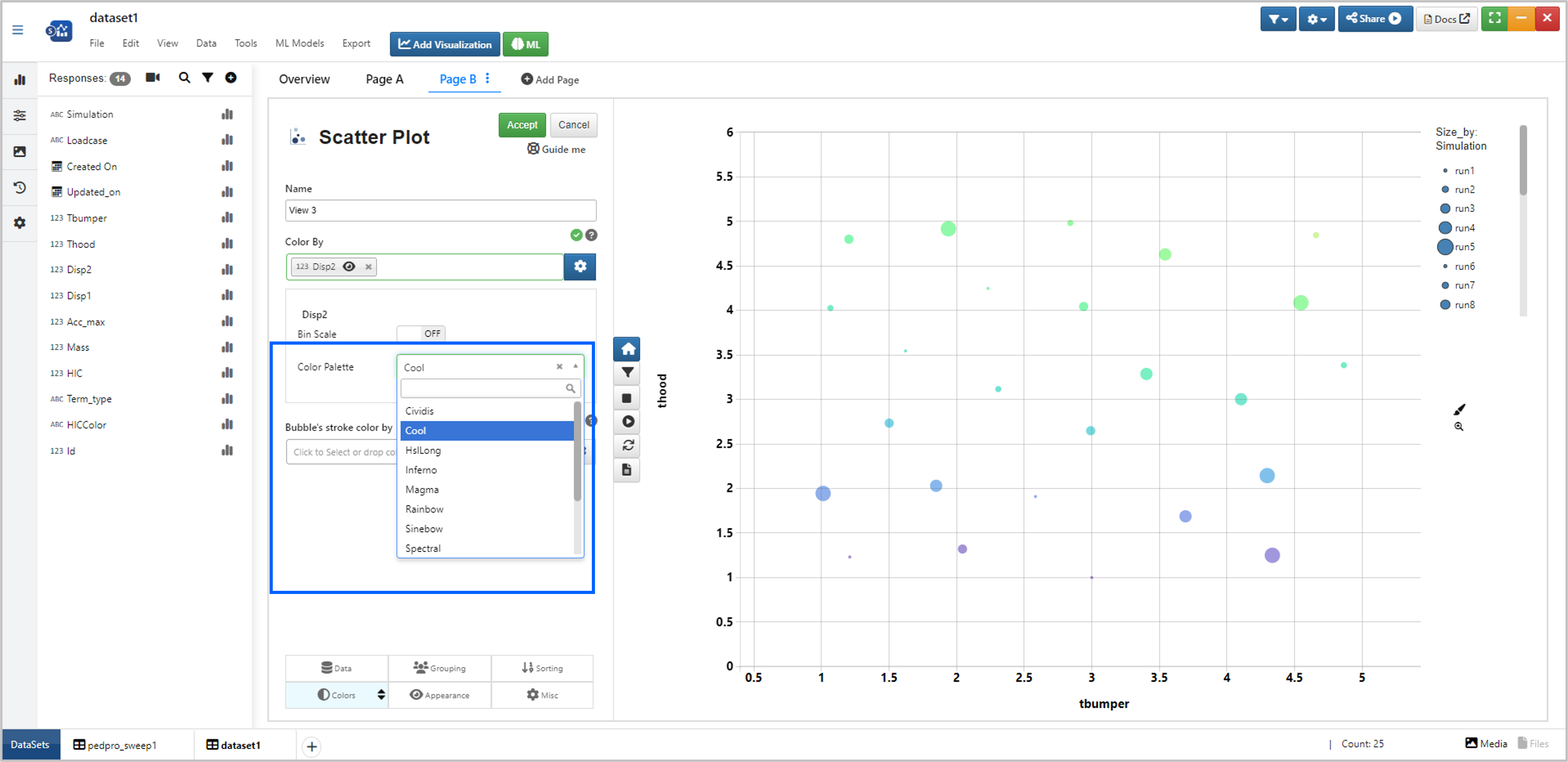
Figure : Numerical color palette
Bubble Chart Options
Bubble Chart (or Scatter Plot) has a variety of unique capabilities for exploring data. Here are a few important customizations and options.
Bounding Boxes
Under the appearance tab when editing your bubble chart, you can choose to create bounding boxes around specific nodes and color them respectively.
Curves By and Curve color by
New input features Curves By and Curve color by are added to scatterplot visualization in Simlytiks.
Bubble chart has an option under right-click to remove outlier nodes for a more balanced and contained chart. Newton Curve Plotter also has this option. Learn about it here.
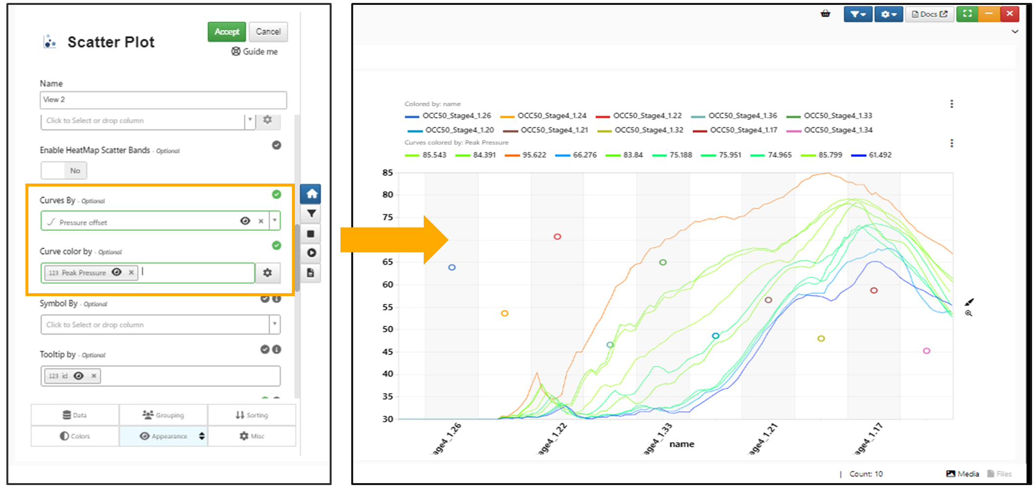
Curves By and Curve color by
The bounding boxes adjust accordingly when editing node placements on the chart.
Remove Outliers
Bubble chart has an option under right-click to remove outlier nodes for a more balanced and contained chart. Newton Curve Plotter also has this option. Learn about it here.
Figure 6: Remove Outliers
Multiple X and Y Data
When we have numerical values for an existing scatter plot, we can choose multiple X and Y data creating a must-scatter plot.
Label Visibility
When we have multiple labels on our bubble charts (via the Appearance tab when editing the chart), we can turn them on our off for individual nodes by clicking on the respected node.
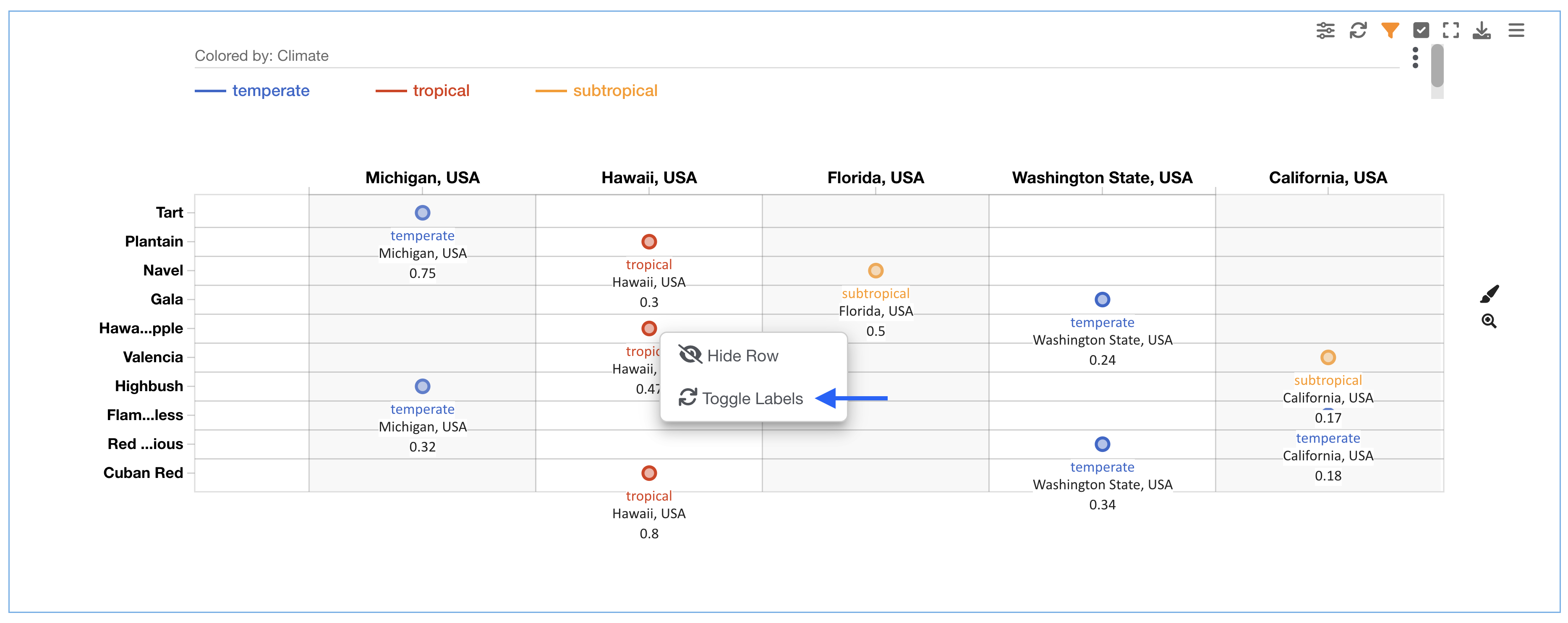
Figure 7: Editing Label Visibility
Watch the following video to see it in action as well as how to reset the visibility (chart right-click).
Envelopes
New as of September, 2022, we can add envelopes to our bubble charts. This allows us to groups certain aspects of our chart by highlighting them under an envelope. The option can be found under the appearance tab when editing a bubble chart and includes options to color the envelopes by a certain criteria.
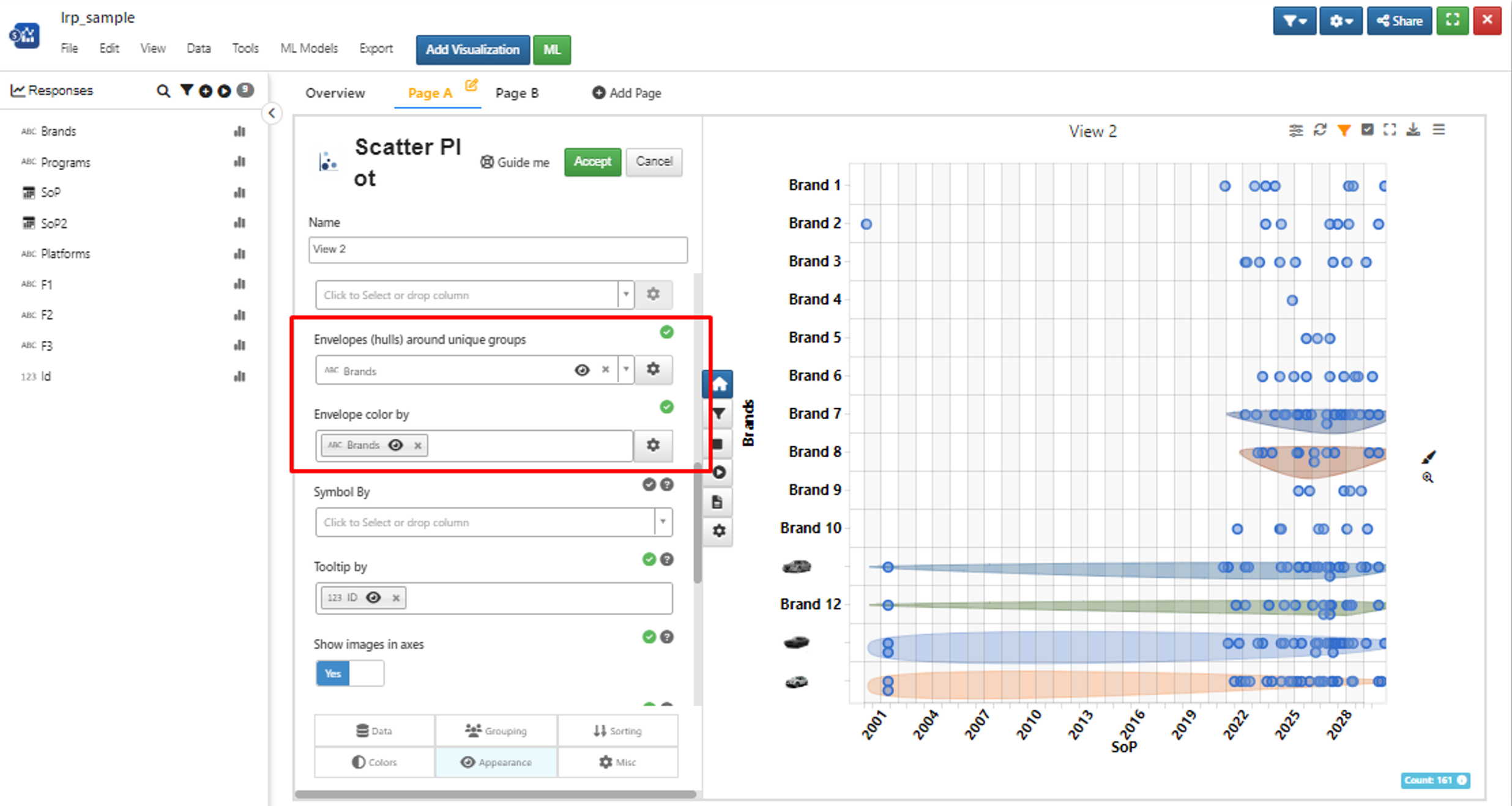
Figure 8: Envelopes
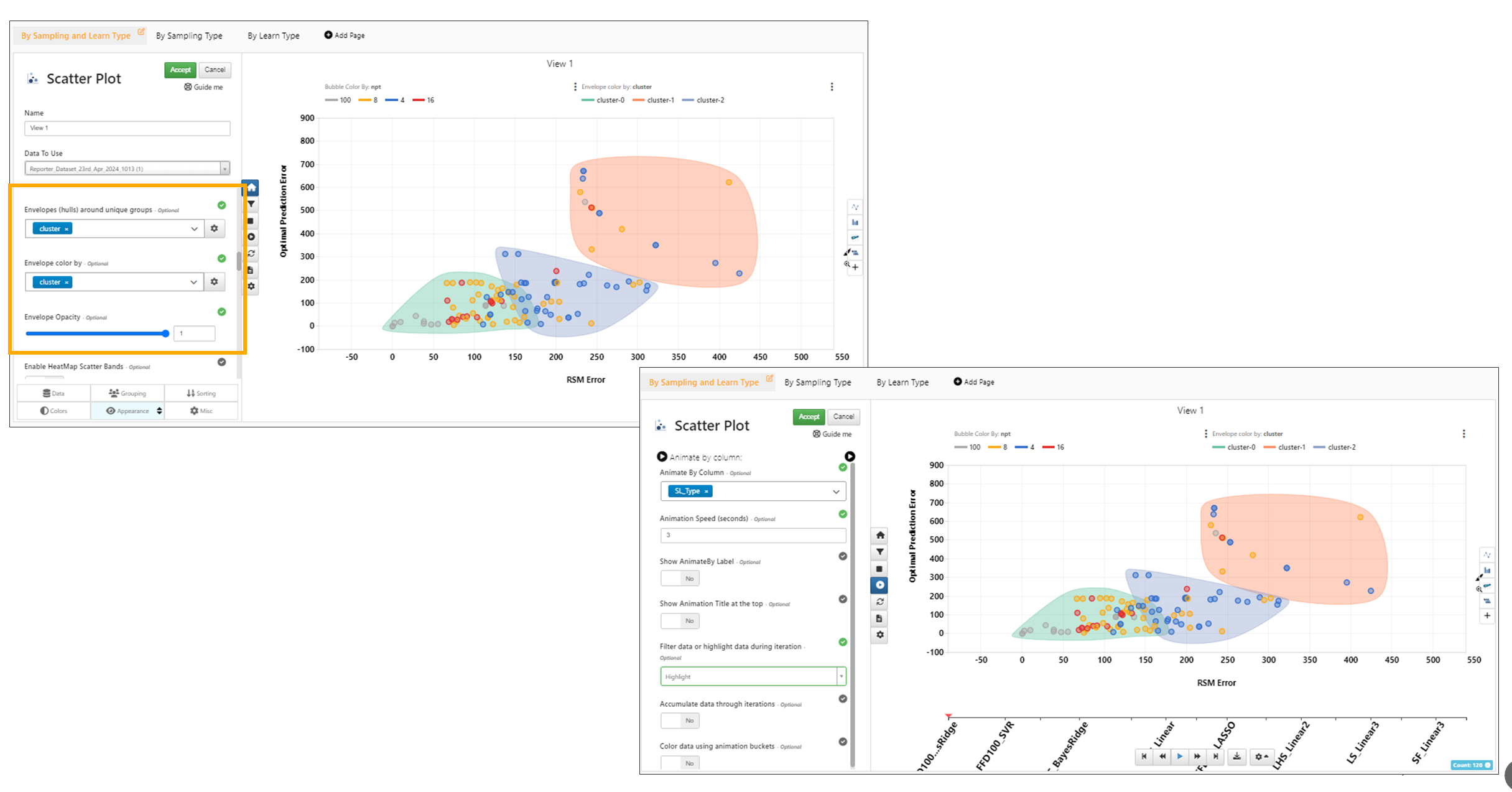
In Scattered plot, the Envelope by option now works in combination with the Animation option.
Envelopes
Added new option in Scatter plot visualization to control opacity of the envelopes using a slider in Simlytiks.
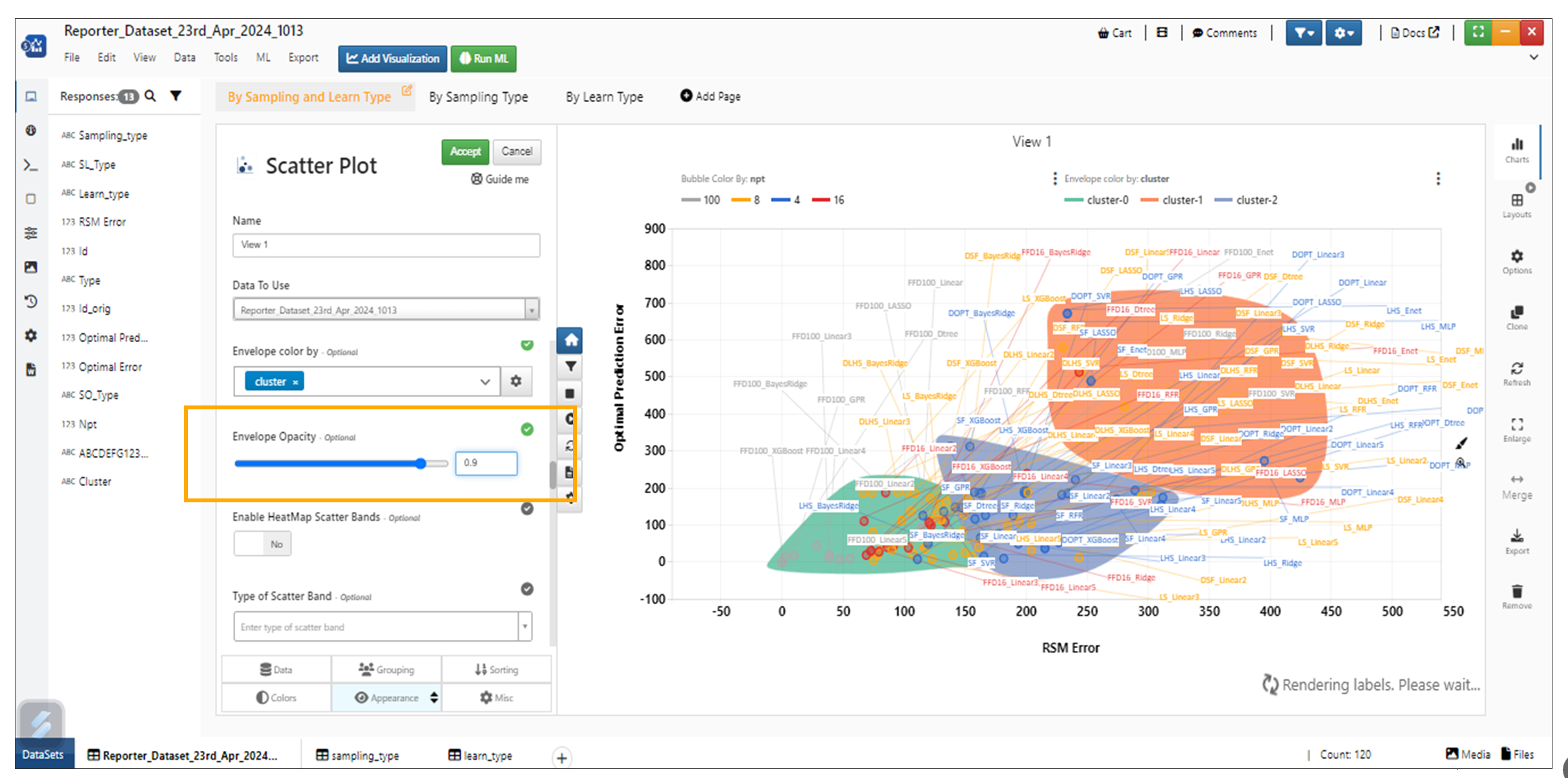
Envelope Opacity
New option is now available to change the position of the envelope label in Scatter plot visualization.
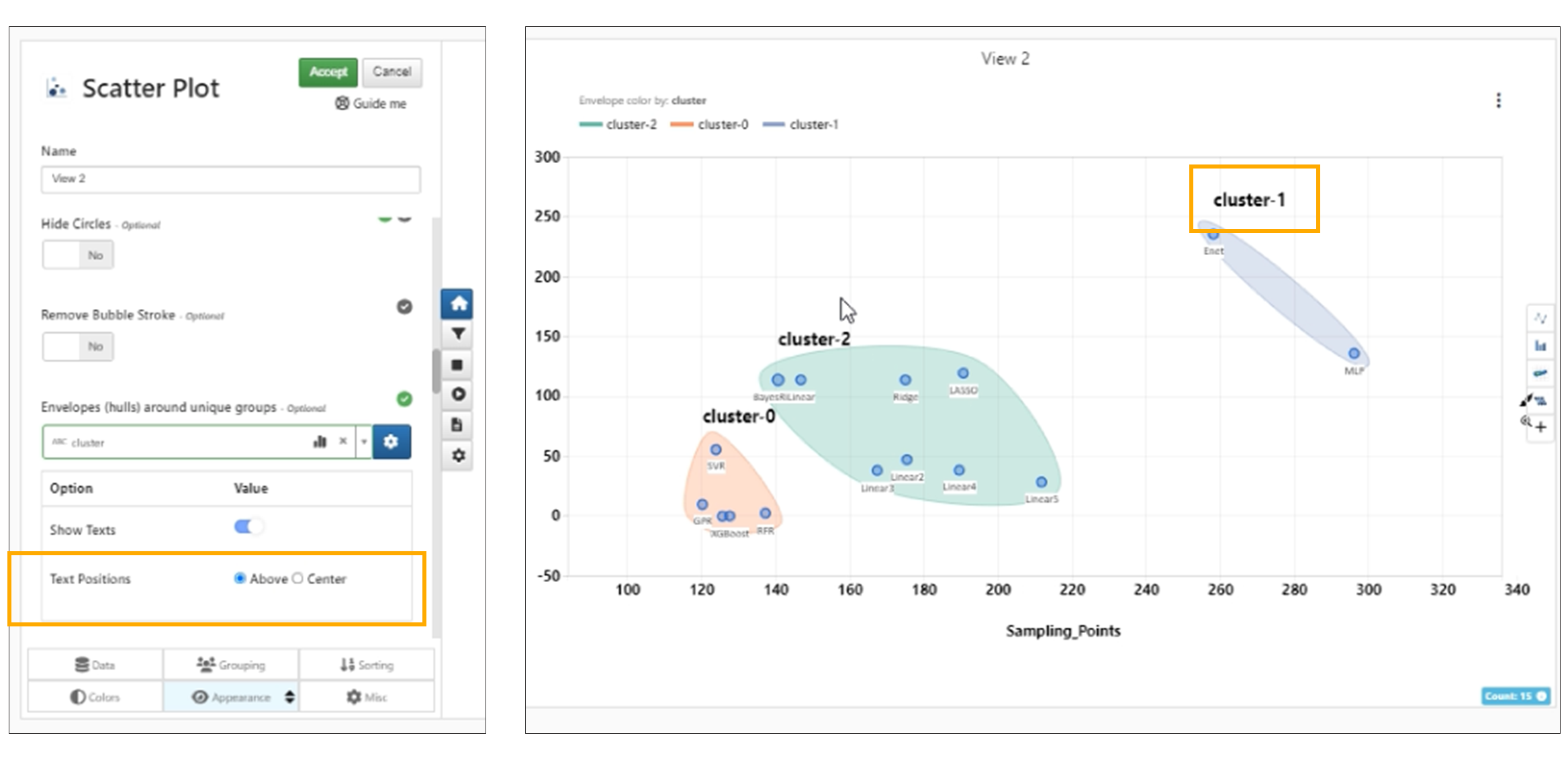
Envelope Text position
Envelopes (clusters) in bubble chart now have a new customization to show the centroid of the cluster which when clicked will show the cluster statistics in a modal in Simlytiks.
The centroids added to the Scattered plot visualization has a new option called ‘Fix complex polygon centroids by input positions’ which sets the centroid correctly to complex polygons in Simlytiks
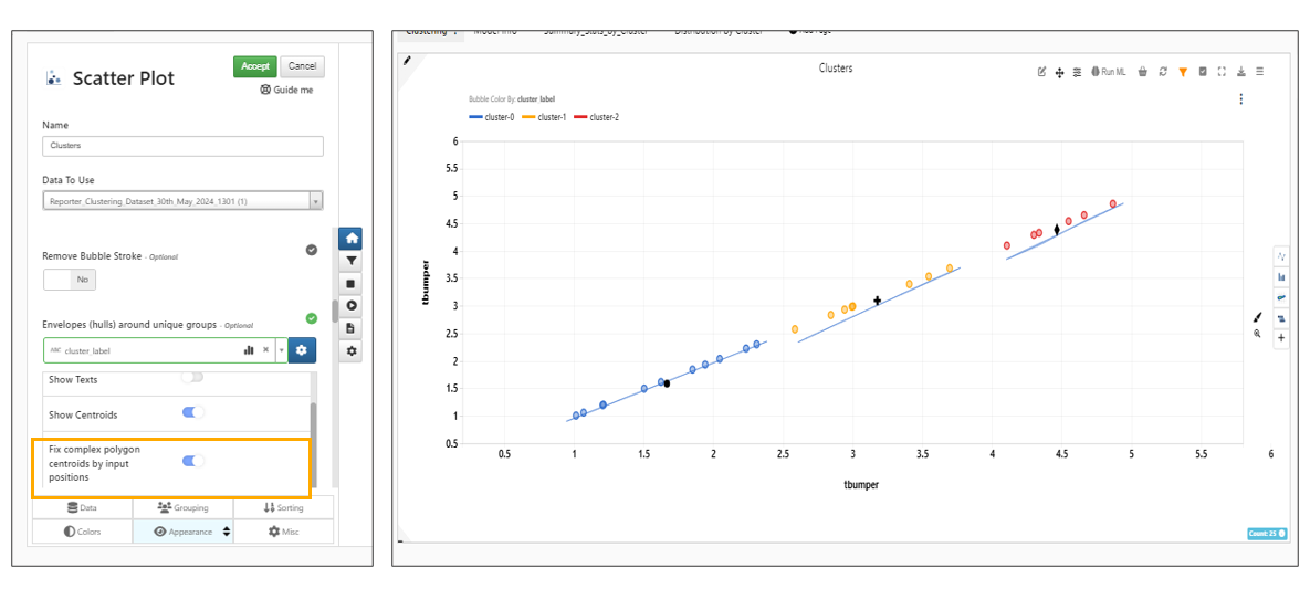
Fix complex polygon centroids by input positions
Enable Heat Map
New as of October, 2022, if we have a color scale enabled for a numerical color by, we can enable a heat map of the plot.
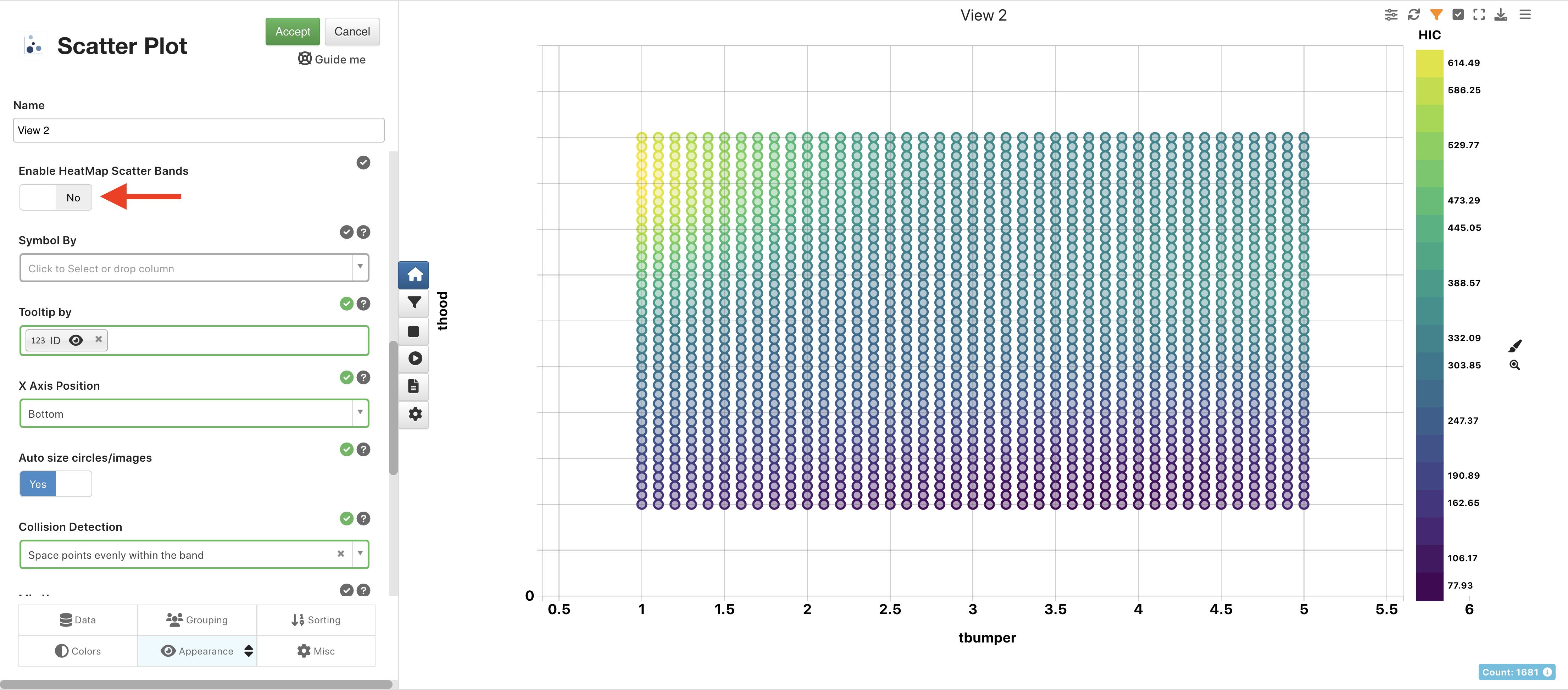
Figure 9: Enable Heat Map
Once the option is enabled, we’ll see the coloring behind the bubbles, shown as a gradient wall. This visualizes best when we have a tight bubble chart where the bubbles are closer together.
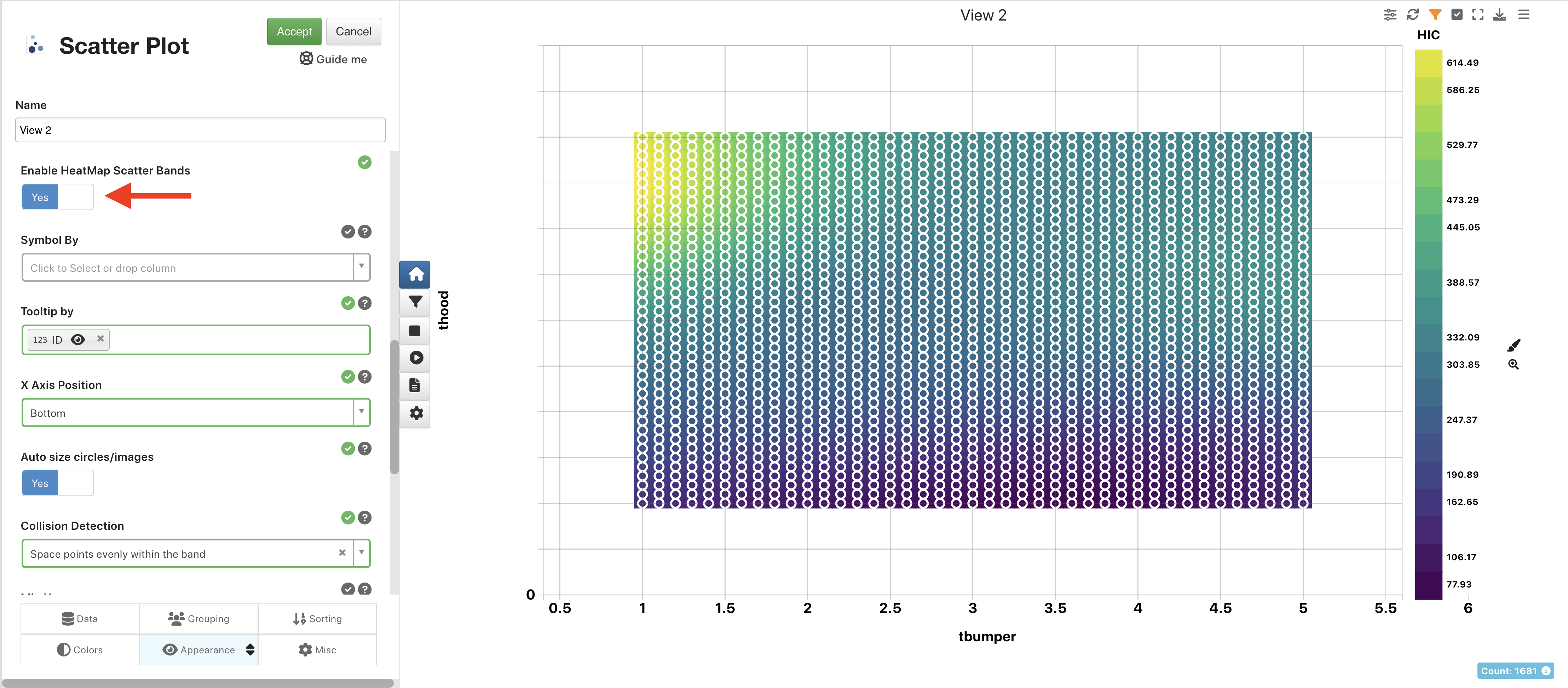
Figure 10: Heat Map Bubble Chart
Overlapping labels
Bubble chart with overlapping labels now have a new Overlapping Algorithm called Annealing which will go through 1000 iterations and find the best possible solution using a brute force method in Simlytiks.
Scattered Plot has new options added in Plot Area Formatter to overcome overlapping labels. Overlapping Algorithm has options such as Force Layout, Annealing and a Brute Force method with an extra option below it called Show Connectors to show connections between the bubbles and the label boxes.
Fill Circles
Added new options for Bubble Chart called Fill Circles and Fill Opacity in the colors tab.
Fill Circles option is removed in Scatter plot Visualization and the color By is shown by default. The fill opacity slider is available to change the opacity of the filled color in the Bubbles
Opacity
Image By
Scatter Plot Visualization ‘Image By’ option now shows only PNG, JPEG, GIF and SVG inputs in Simlytiks
Images
Bubble chart now supports Images in the axes and Images can be added in Tools -> Customize -> Media option in Simlytiks.
Remove Stroke
Scatter plot has a new option called Remove Stroke which disables the stroke of the bubble when this option is turned on in Simlytiks.
Highlight Bubbles
Scatter plot has new option to Highlight the bubbles in Simlytiks. The Highlighted bubbles can be given a new name, color and shape.
When bubbleShapeBy is enabled, the legends of the shapes are shown on the right hand side
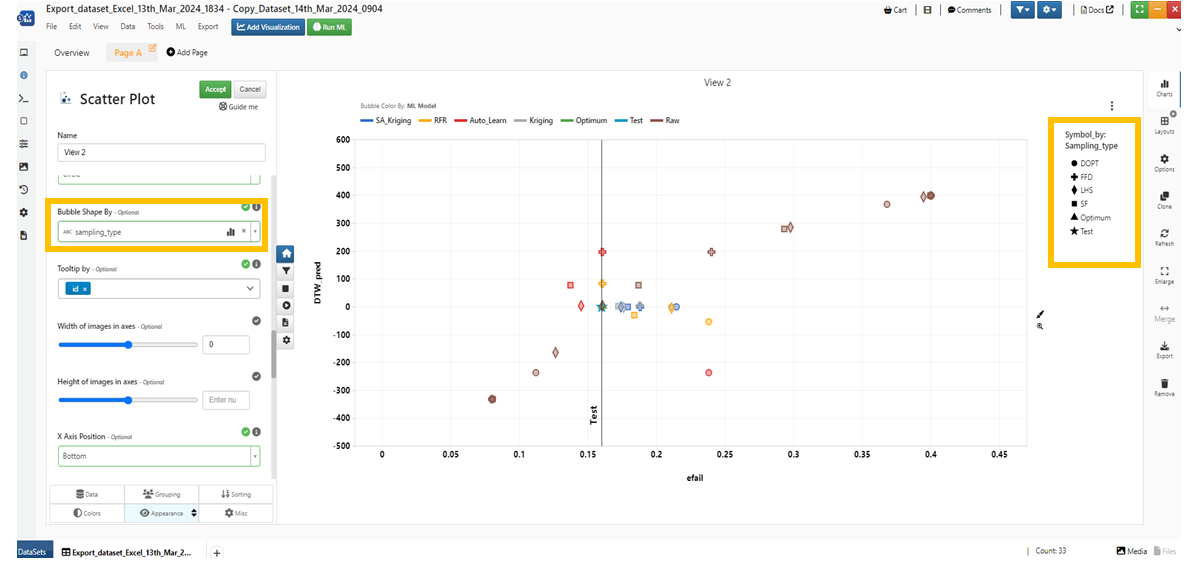
Bubble shape
Group Factors
Added a new option called Grouping Factors in the Grouping tab for Scatter plot Visualization in Simlytiks.
Local Grouping option is now available for Scatter plot visualization.
Scatter plots now include an option in the Grouping tab called ‘Do not use data groups for legend’ to ignore data groups for coloring.
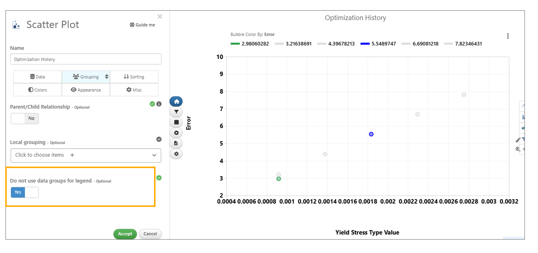
Do not use data groups for legend
Color orientation
Color Gradient chart is shown and can be edited when numerical column is added to Color By and bin scale is enabled in bubble chart. We can save these settings to the visualization using Save as option.
Color Gradients are available and can be edited or sorted when Categorical column is selected in Color By option for Bubble chart. We can add new color gradient edit them and save them to the visualization using the plus icon in Color Scheme.
Scatter plot now has new options such as colorRange, colorAboveRange and colorBelowRange when a numerical column is chosen for colorBy. These changes will change the colors of the bubbles and are also reflected in the color legends.
Simlytiks will now show alert message asking the user to either add the changes as a new color scheme or update the existing one when we rearrange the color legends or make changes for the colors in bubble chart visualization.
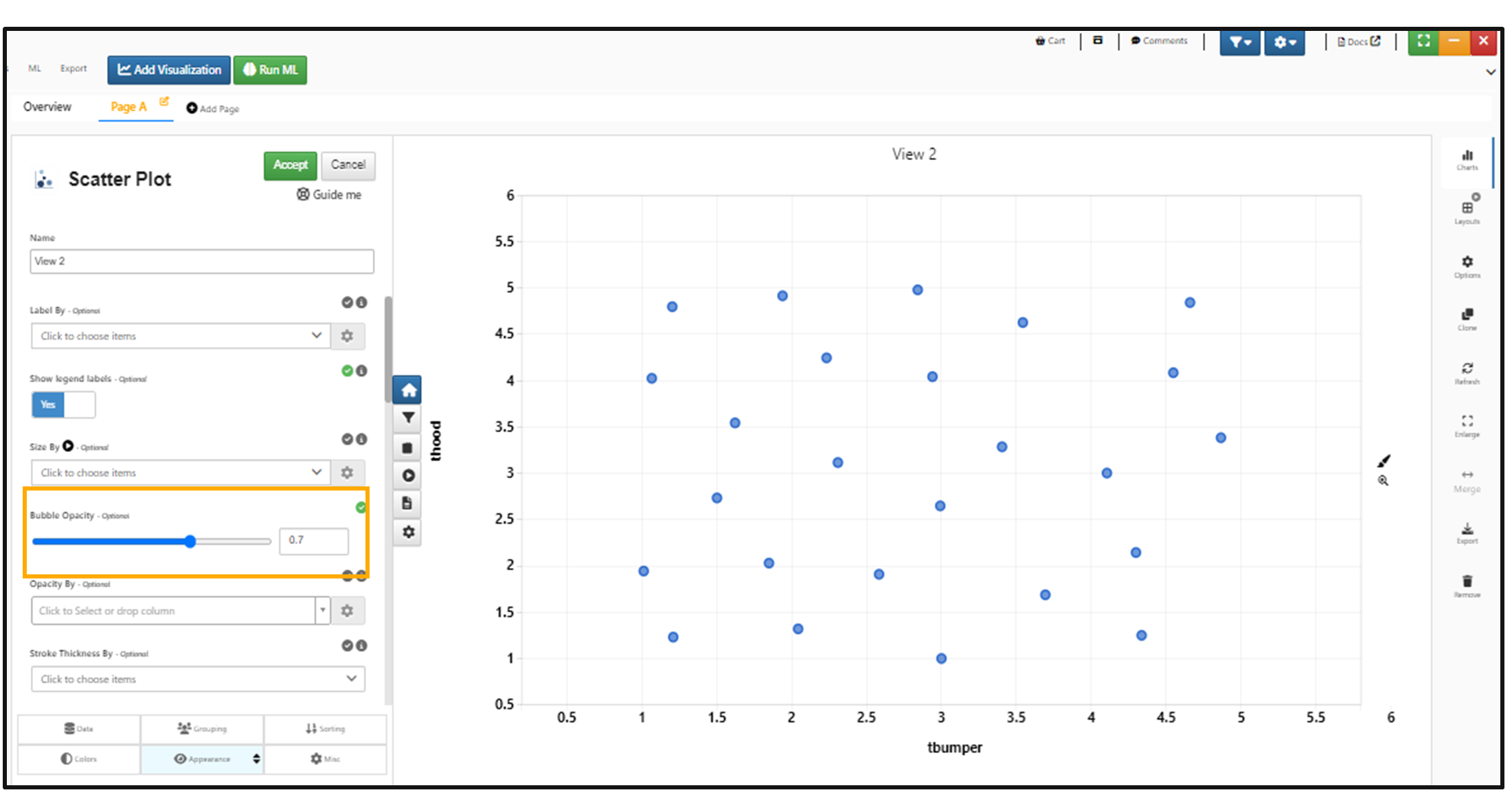
Opacity By
Scatter Plot -> Appearance option->Opacity By now has new customization options to make it reversed, add an opacity range, change colors for bubbles above & below opacity range.
When a numerical column is used for Opacity By in Bubble chart the customization settings has a new option called show Min Max Range which will display the opacity legends in the form of a min-max scale instead of bins like before
In Scatter plot visualization, bubble Opacity Min and Opacity Max are now in the Appearance tab and will show up when Opacity By is selected and Colors for bubbles outside of the opacity range are in Colors tab
Animate By Opacity
Scatter plot has a new option ‘Animate By Opacity’ in Appearance tab which is shown when opacity By is enabled. This will animate the bubbles opacity every second in Simlytiks.
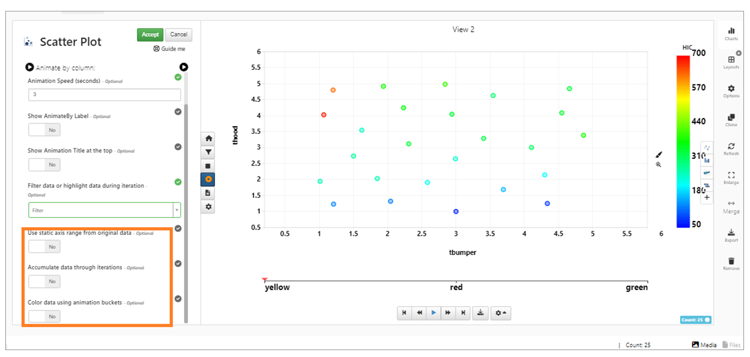
New option available to ‘use static axis range from original data’ when animate by is added to Scatter plot visualization. This option shows static range of axis for the filtered bubbles during animation iterations.
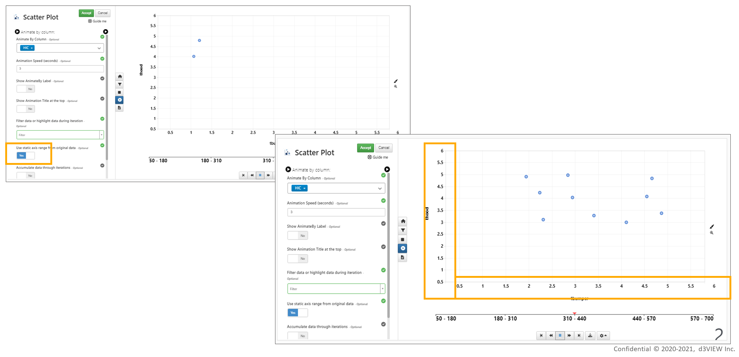
Use static axis range
Animate By feature in Scatter plot visualization has new option to Filter or Highlight the bubbles in visualization during animation iterations.
In Scatter plot visualization, all animate options are now available under the visualization preview.
Animate by options
We can now export the animation iterations of Scattered plot visualization into GIF in Simlytiks
‘Color data using animation buckets’ option is now available while animating the Scatter plot visualization which colors the bubbles based on the column name when enabled.
Use equal spacing ticks
New option ‘Use equal spacing in ticks on both X and Y axis’ is available in the appearance tab for the Bubble chart visualization in Simlytiks.
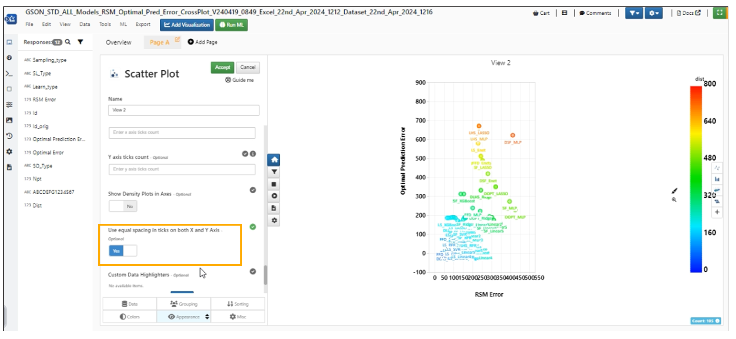
Use equal spacing ticks
Default Shape
Scatter plot has new option called Bubble Default Shape which is a list of different kinds of shapes that will replace the default circles in the visualization.
Custom Highlighters
Bubble Chart Visualization in Simlytiks has new option called Custom Highlighters. We can provide color and shape for a range of bubbles by selecting the column.
Scatter plot in Simlytiks has two new options to add the Confidence band and to change the Confidence interval under Appearance tab.
Bubble Chart has new option in the Appearance Tab to select the Type of scatter band in Simlytiks.
Hovering on Size By legends, Opacity By Legends or Thickness legends in Scatter Plot Visualization will now highlight the corresponding circles in the chart
Size By
In Scattered plot, when a numerical column is chosen for SIZE_BY and the number of unique values in that numerical column are less than 5, the legends are now shown as independent values instead of a color scale.
In Scattered plot, If a categorical column in size_by has numbers in it then the bins in size_by are sorted by that number.
Label By
In Scatter plot,If Label By option is selected where Bubble Color By is already picked, then the labels are colored by default with the same color chosen in Bubble Color By.
In Simlytiks, when images are used in the Label by, new options are available under settings of the label by to choose the Height and Width of the image.
Bubble chart visualization has new option in appearance tab called ‘Constrain Labels within Bounds’ which helps to bound the circles within the visualization chart.
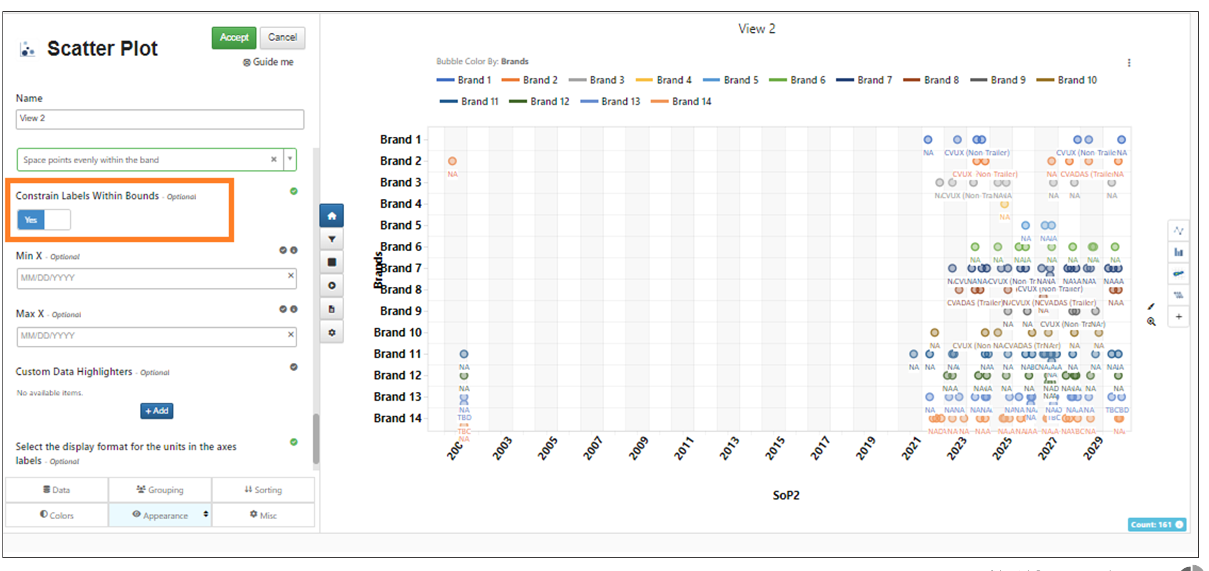
Constrain labels
In Scattered plot, the Label By in appearance tab now supports customization options to add filters and apply them to labels of the visualization in Simlytiks.
KDE By
Bubble Chart visualization has a new option called Show Axes KDE which will now show the X, Y axis Kernel Density plot along the axis in Simlytiks.
In Simlytiks, Bubble Chart has new option in appearance tab to change the position of the legends in the visualization.
Global Range
In Scatter plot visualization, new options to use global range is available in the colors tab which when enabled will use the global records to determine the colors of dataset in Simlytiks.
Custom Bins
In scatter plot visualization, custom bins can be added to color by options when numerical column is used in color by option with bin scale turned on. Once this setting is saved we can see the same custom bins for other visualization with same columns.
Bubble chart now has support to auto bin the X values using the customization option for binScale and specifying the number of bins (5 by default)
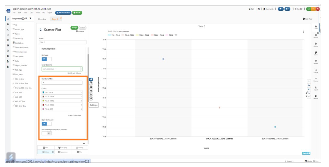
customization option for binScale
Color handles can be edited using context menu options in Simlytiks
Color by another
‘Color By another option’ is available in bubble chart where multiple values in yBy can be used to color the bubbles in Simlytiks.
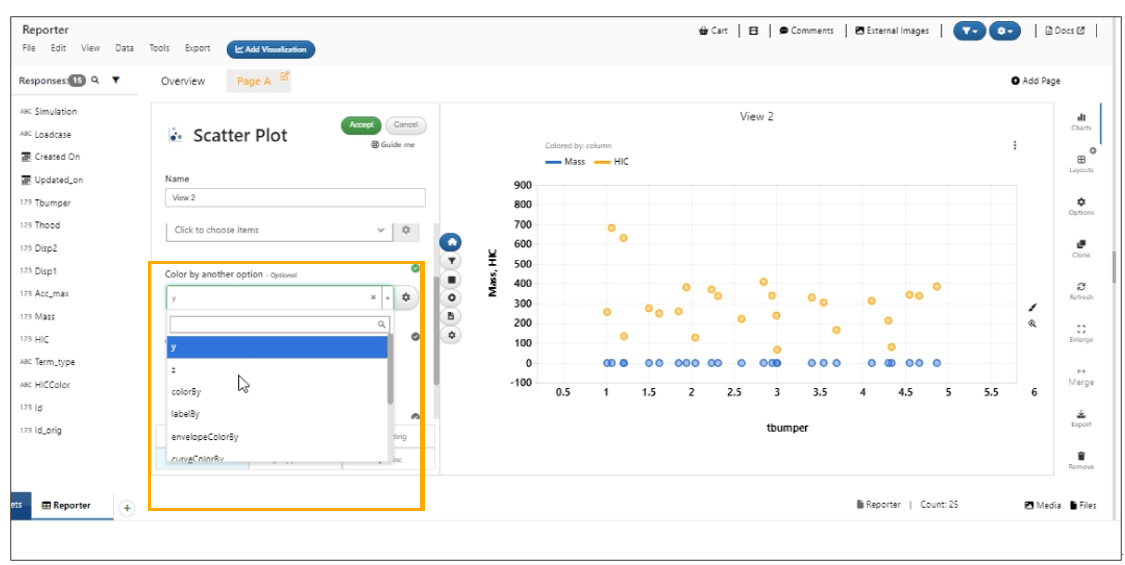
Color By another option
Trendline By
Scatter plot visualization will now support ‘TrendlineBy’ and ‘TrendLineName’ options in Misc tab under Simlytiks.
3d Scatter Plot
The 3D version of Bubble Chart, 3D Scatter Plot, allows you to view nodes in a 3D space with a 3D-surface plot option.
It has a matrix type edit panel within dynamic settings for ease of editing.
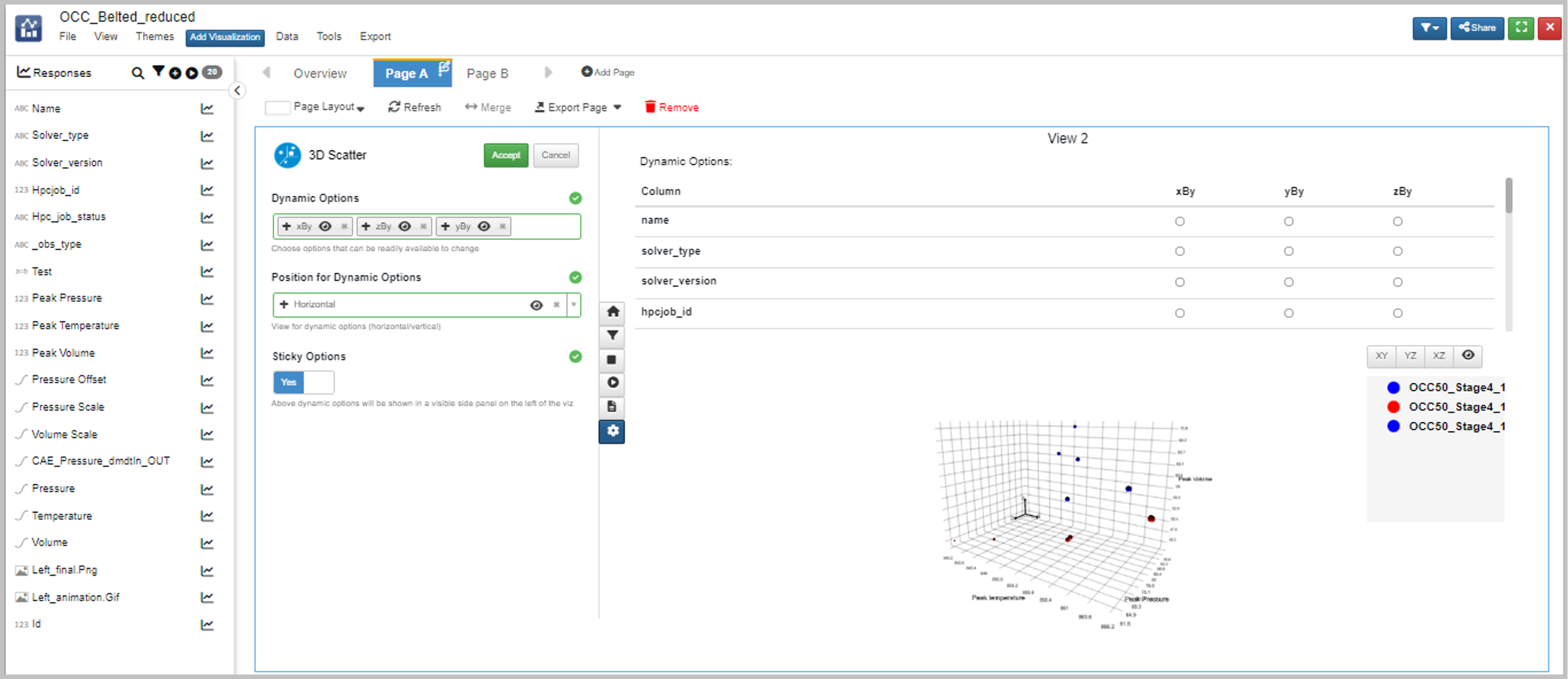
Figure 11: Matrix Type Edit Panel
3D scattered plot visualization can create a surface plot for the scattered plot in Simlytiks.
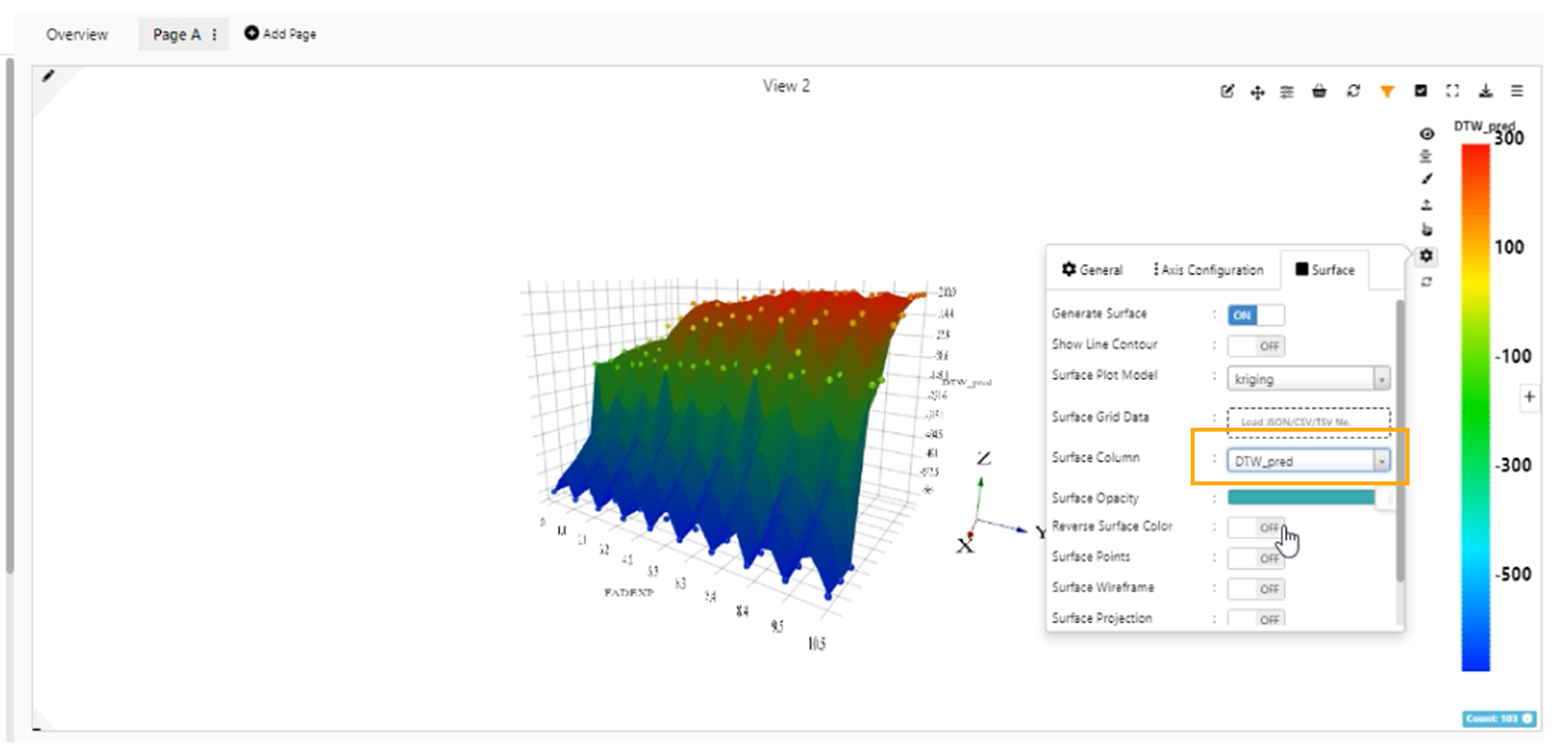
3D scatter surface plot
Tooltips are now available for bubbles in 3D scatter plot visualization in Simlytiks.
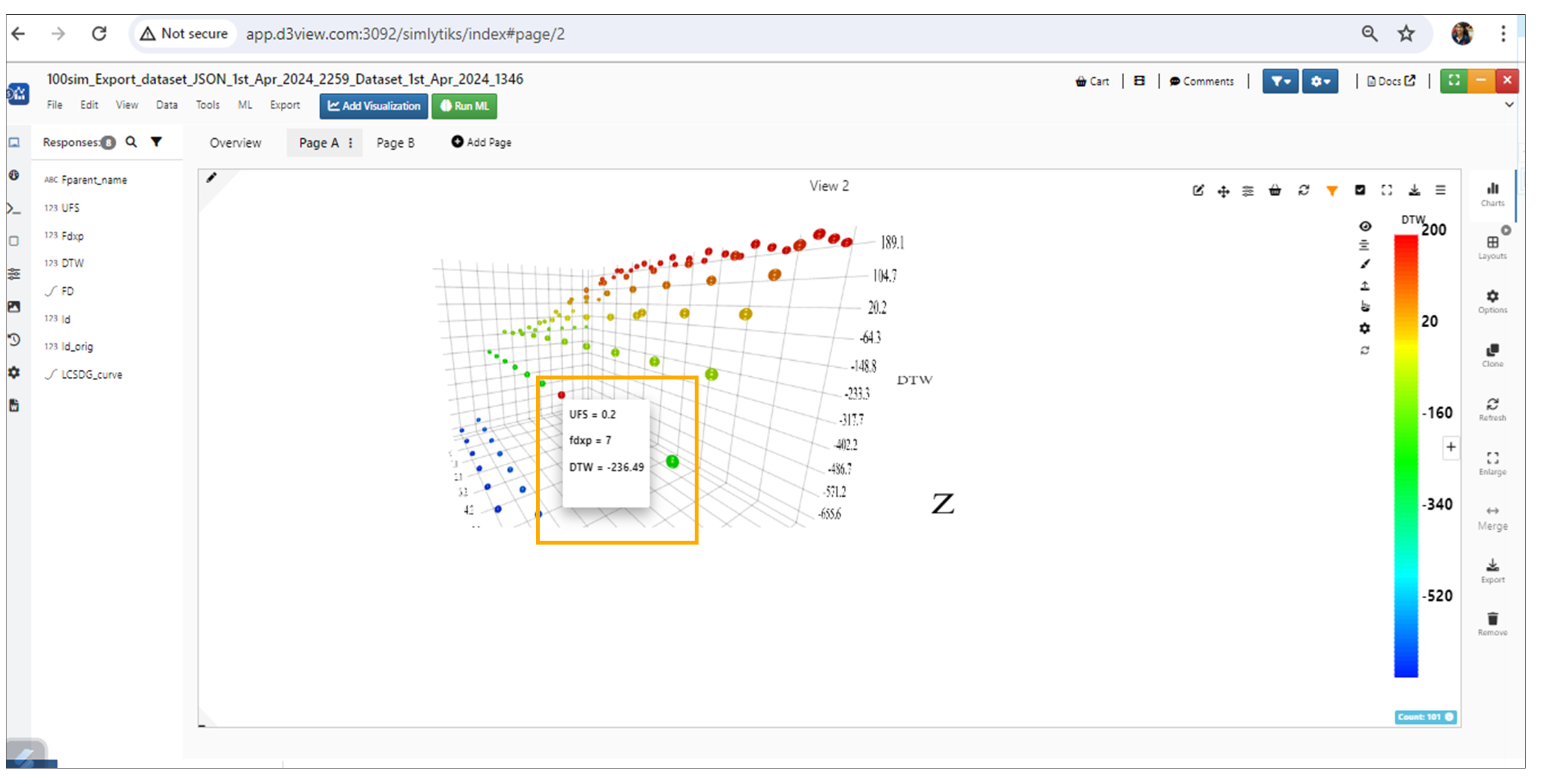
3D scatter Tooltips
In Simlytiks, 3D Scatter plot now supports labelBy option in the Appearance tab.
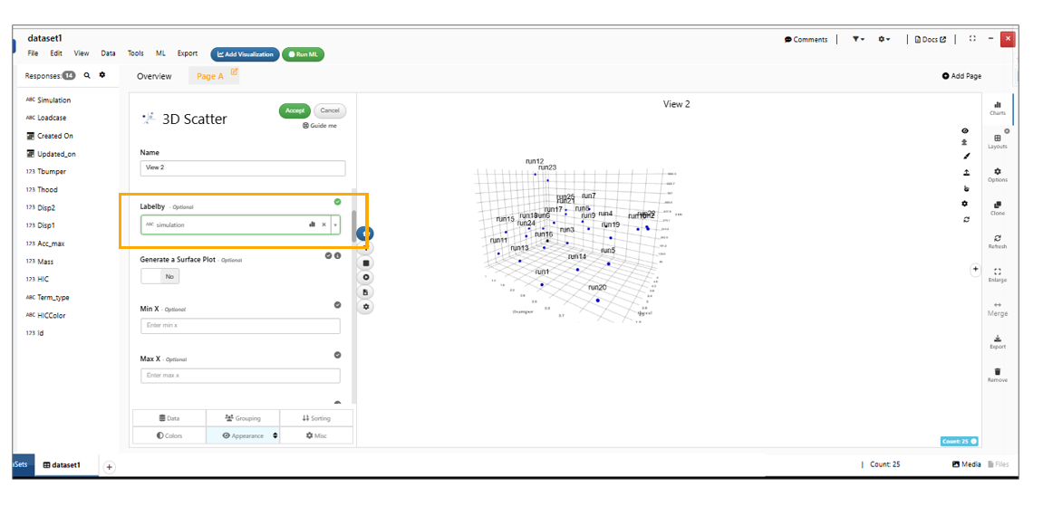
3D scatter Labelby
Pareto front line
Scatter Plot now includes a Pareto Front feature with a toggle to display the Pareto front line and shaded dominated region, a criteria selector for Minimize/Maximize, customizable line and fill colors, and a Show distance to Pareto Front option that draws dashed lines from non-Pareto points to the nearest Pareto-optimal point with distance value labels.
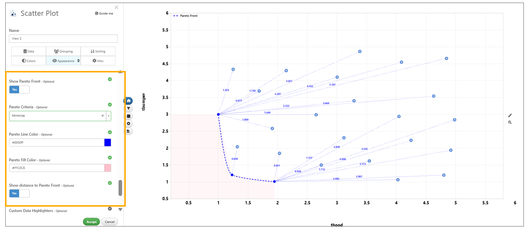
Pareto front line
Data Classifier
Data Classifier is Simlytiks’ Machine Learning visualizer that can predict data from one column into another.
Here is a video example of the chart:
Geo Map
Simlytiks’ Geo Map visualizer, new-and-improved with a built-in world map, takes location-based data and uses it to create a data map.
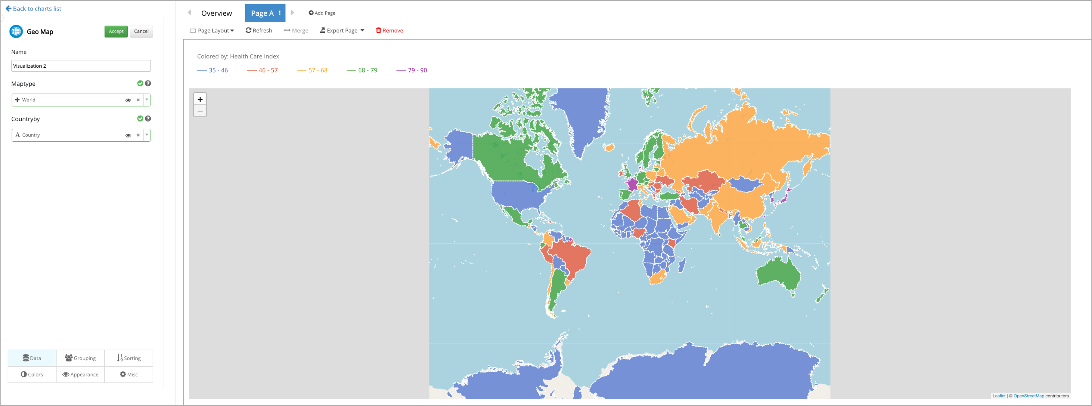
Figure 12: Geo Map Visualizer
Summary Table
Summary table supports all types of data in its cell in order to create a customized summary of the dataset.
Figure 13: Summary Table Visualizer
Add responses, specific data, curves, images and other types of data to the summary table’s cells.
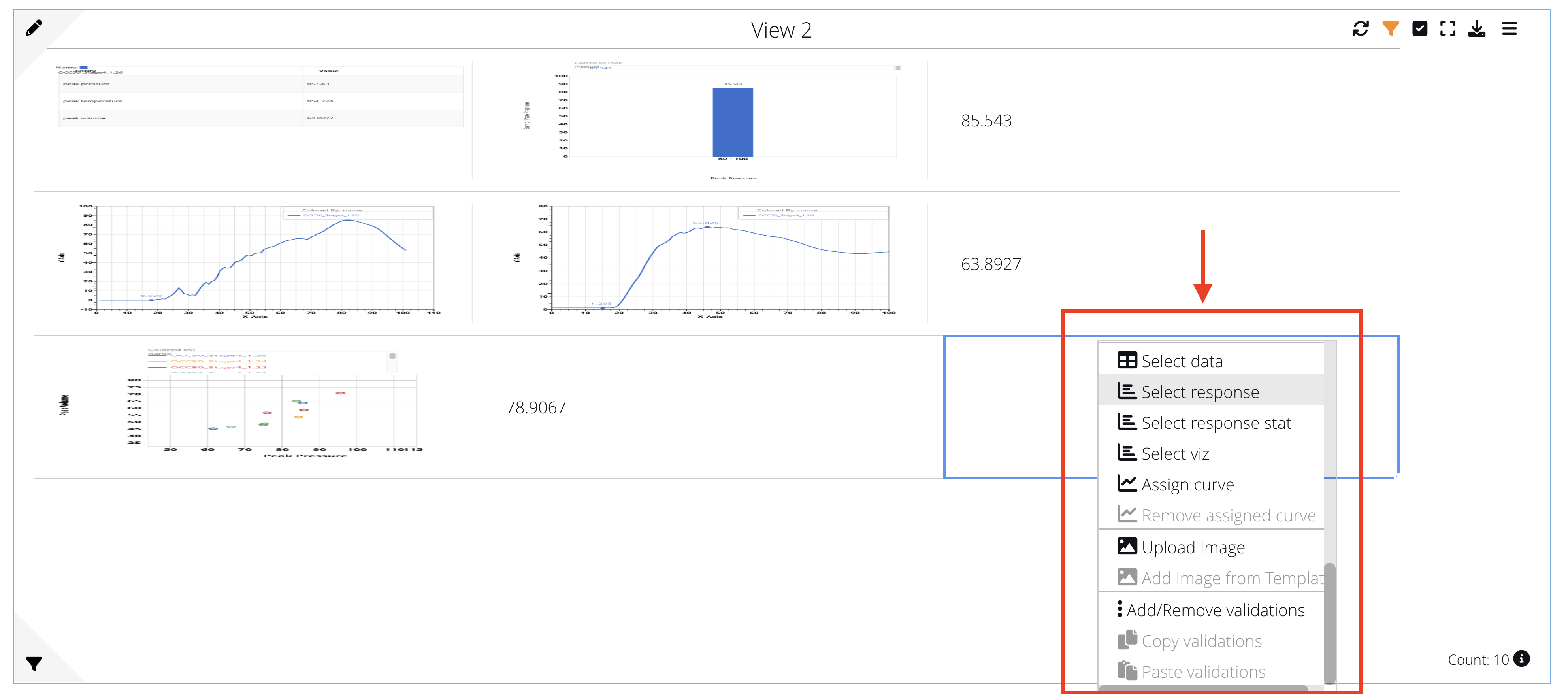
Figure 14: Add to Summary Table Cells
NEW as of June 10, 2022: Export merged cells from the Summary Table into a PPT table.
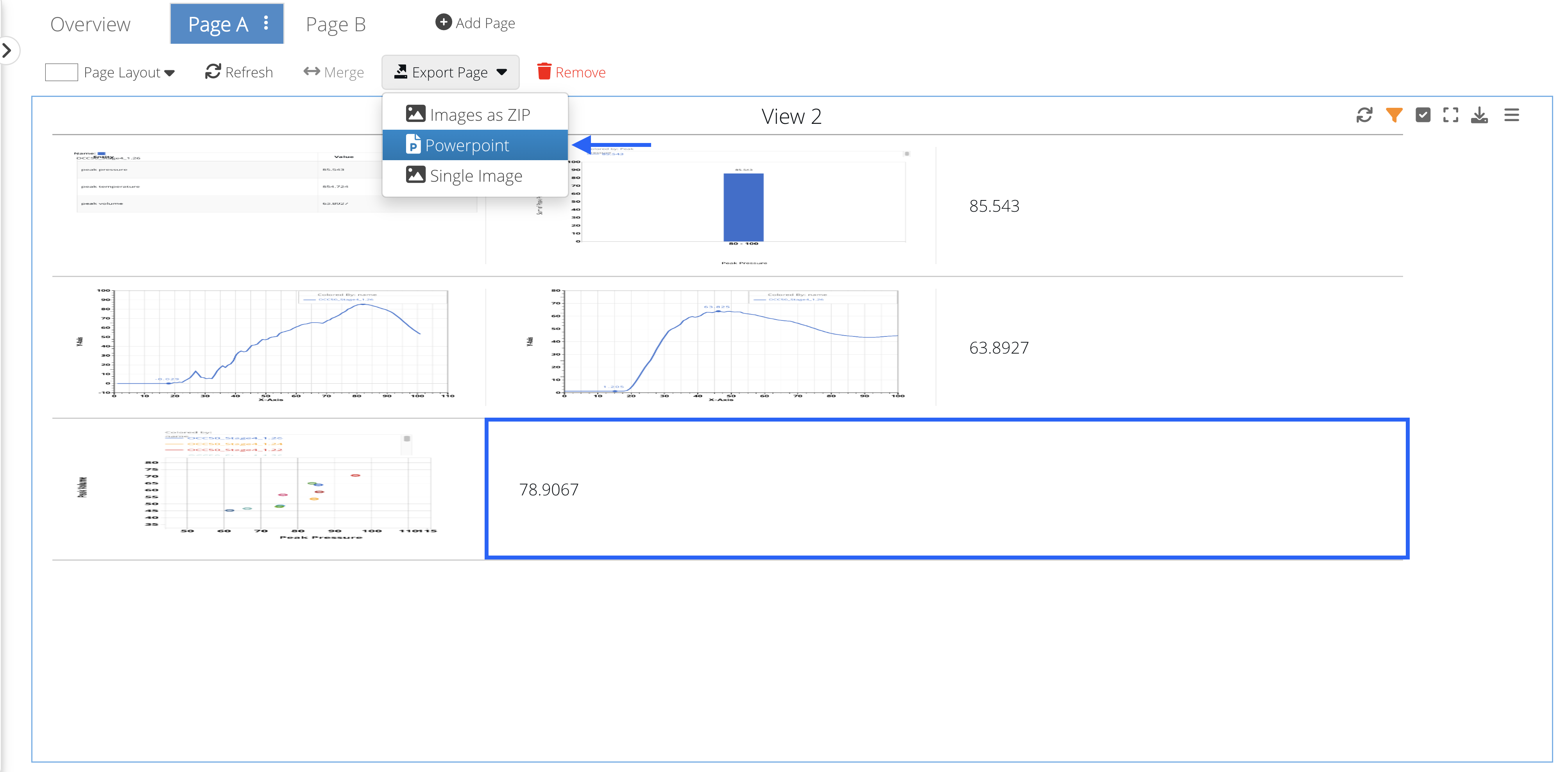
Figure 15: Merged Summary Table Cells
Summary Table visualization now has a new option to add an external Hyperlink which can be a static URL or can be fetched from a remote lookup chosen by the user.
Summary table visualization has a new font size option called Custom which will add another option to specify manual font size which will be carried over to Reporter.
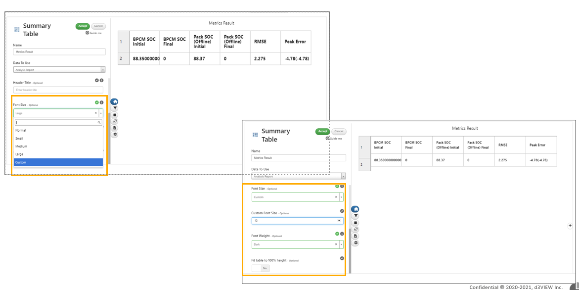
Custom
Added new option in Summary table visualization for the rows to take up entire height in Simlytiks.
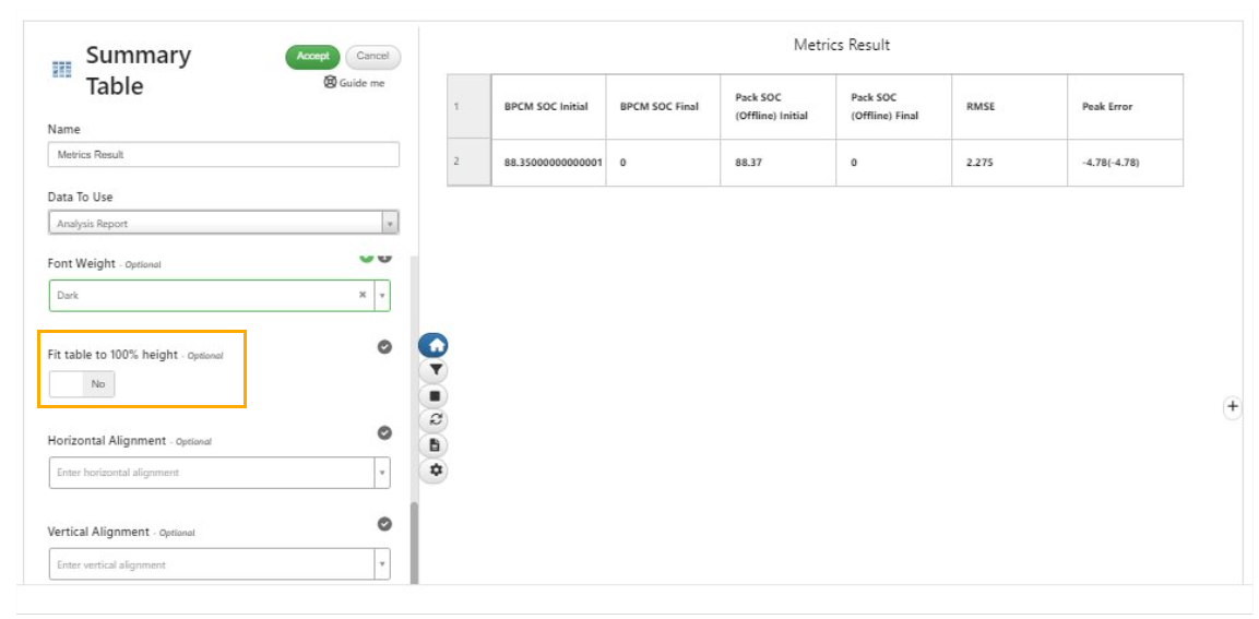
rows
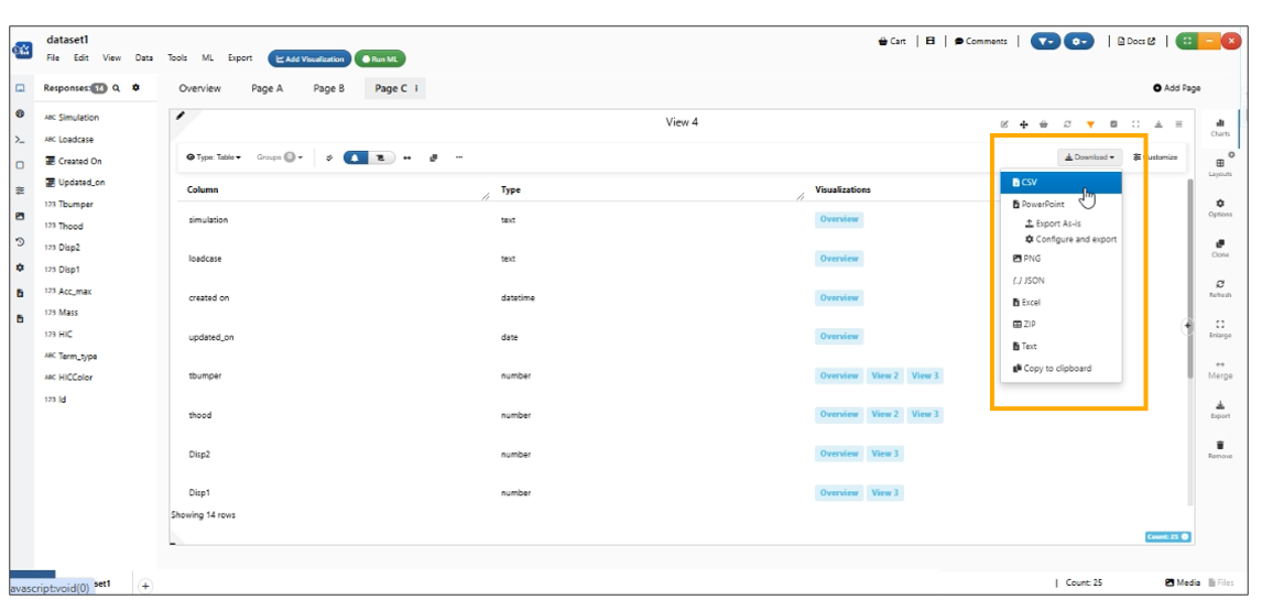
Export per page
Table visualization has new option in Misc tab called ‘Export per page’ and this option will export each sheet in the table as separate PPT slide.
Confusion Matrix
Confusion Matrix uses Machine Learning to predict performance via classification by learning from actual and predicted values. The result is a 4x4 matrix showing negative or positive in each cell to show performance level.
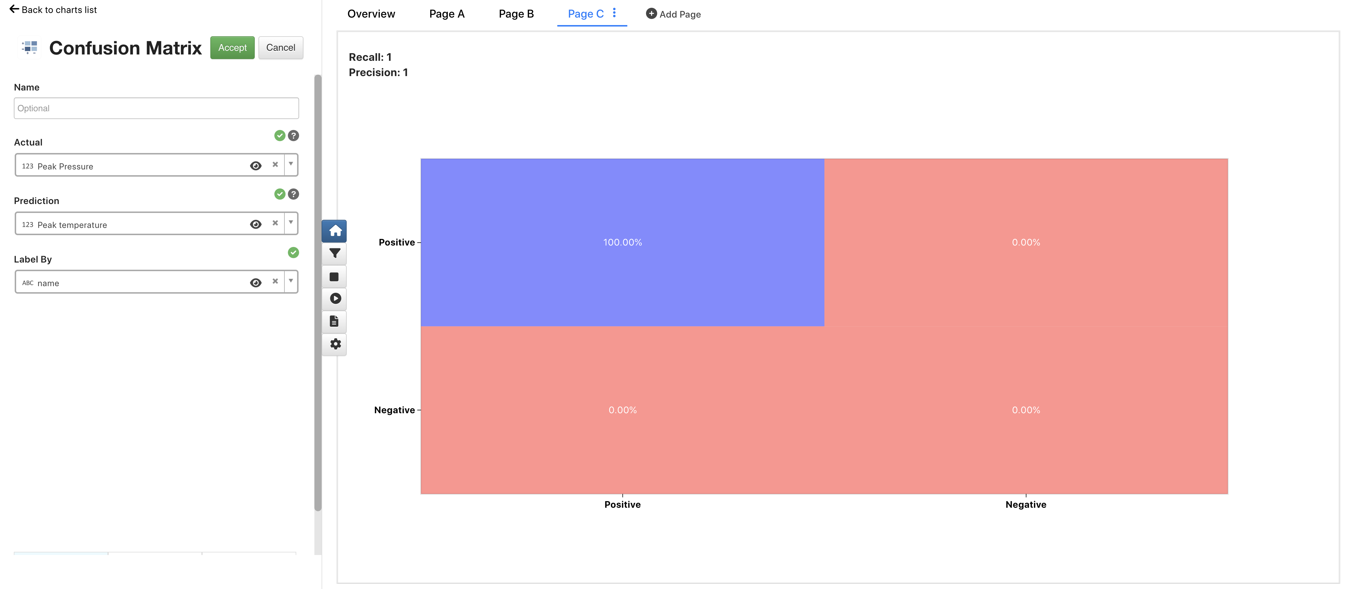
Figure 16: Confusion Matrix
Ped Pro Table
Ped Pro (short for Pedestrian Protection) Table presents a table of cells which map the HIC points on a car hood. The HIC values are placed in color ranges which determine the total score calculated at the top.
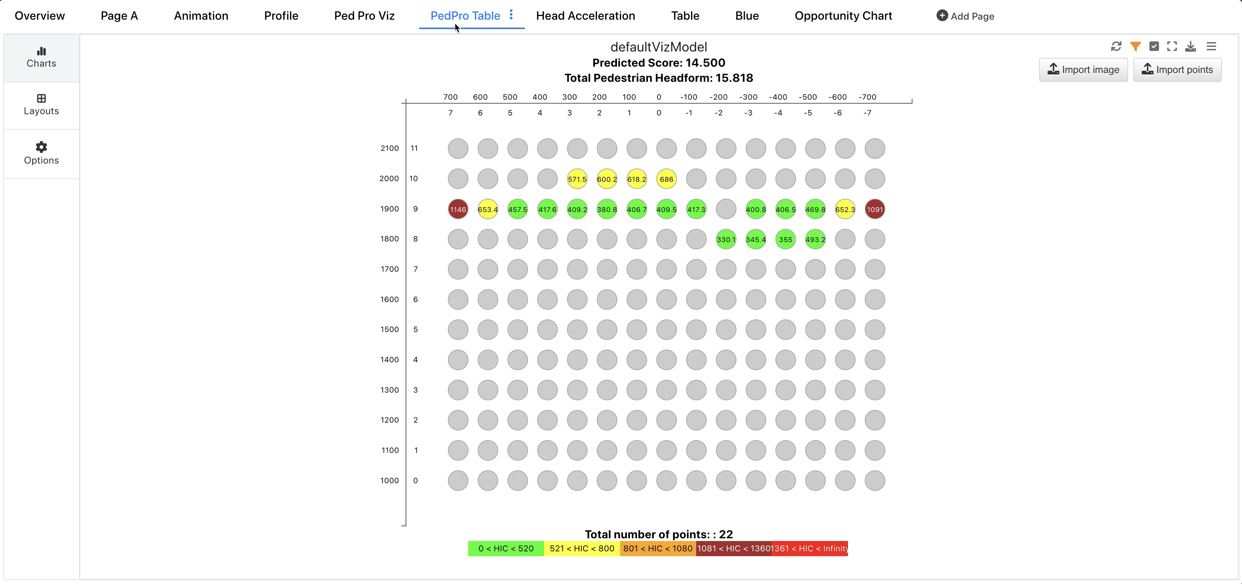
Figure 17: Ped Pro Table
Ped Pro Threshold
We can update the ranges, colors and factors for the Ped Pro HIC value thresholds under the Colors tab when editing the chart. Watch the following video to see how it is done.
Ped Pro Formats
Per Pro Table now supports custom formats aside from the Euro NCAP format. When custom is chosen, the y and x axes reflect the input data. We can then choose to change the minimum and maximum values for each as well as the step. Watch the following video to see how it’s done but make sure to read on for a step-by-step tutorial as well.
Start by clicking on the pencil icon to edit the Ped Pro chart (hover over the top-left corner of the chart to see the pencil).
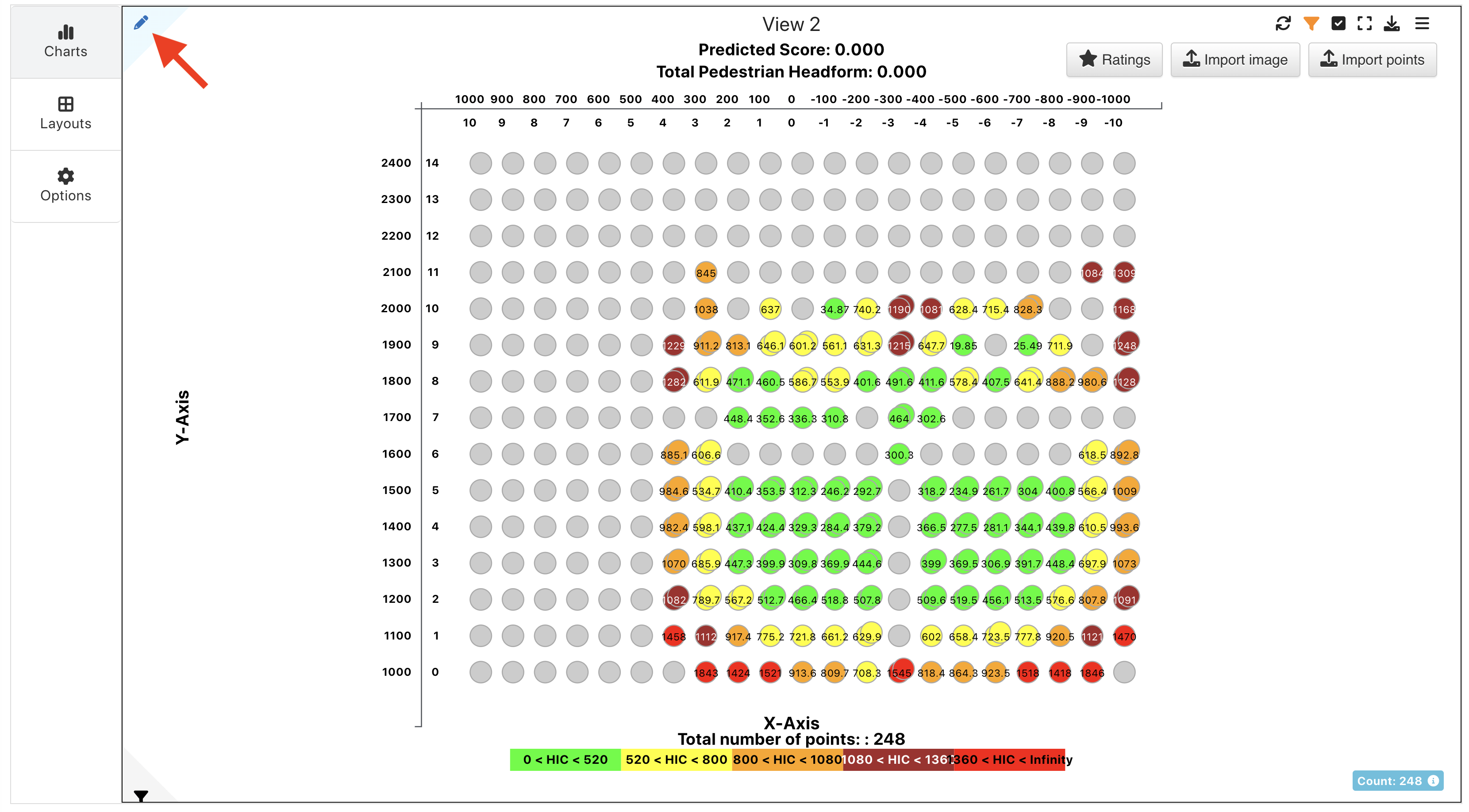
Figure 18: Edit Ped Pro Chart
Navigate to the Appearance tab (tabs are located at the bottom of the edit panel).
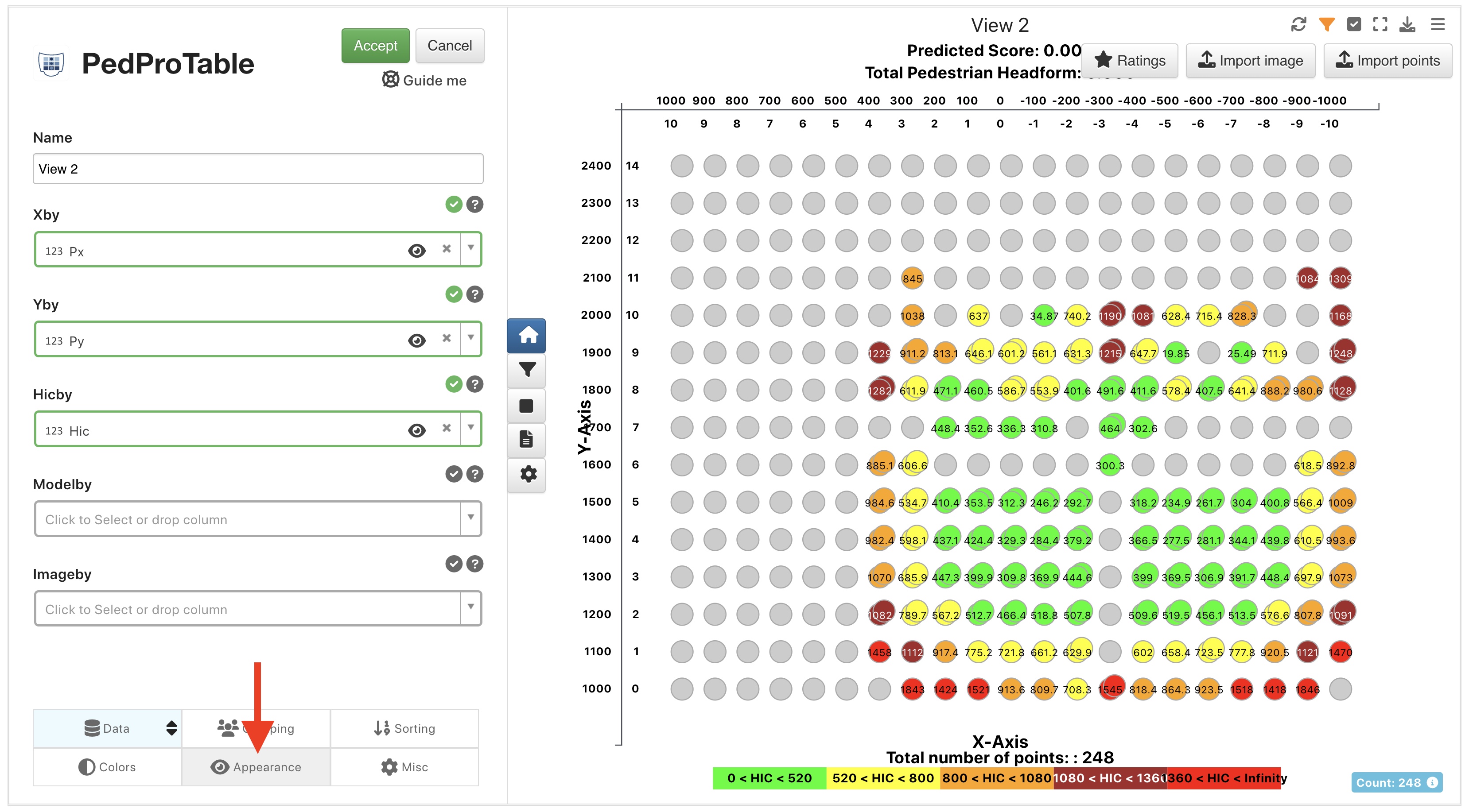
Figure 19: Navigate to the Appearance Tab
Under PedPro Standard, choose the Custom option.
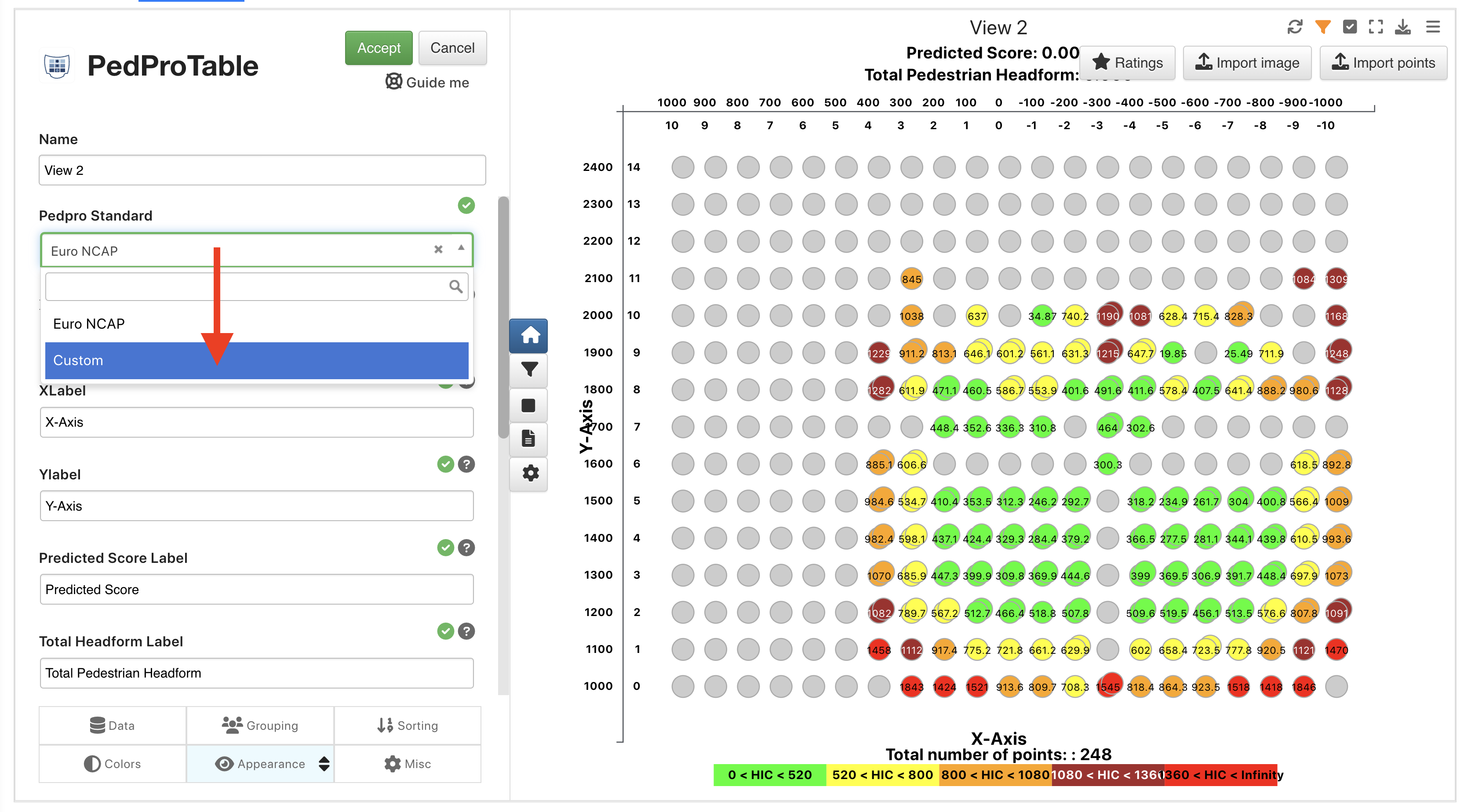
Figure 20: Choose Custom Option
Now under the same tab, we can edit the x min/max, y min/max and x-step as desired.
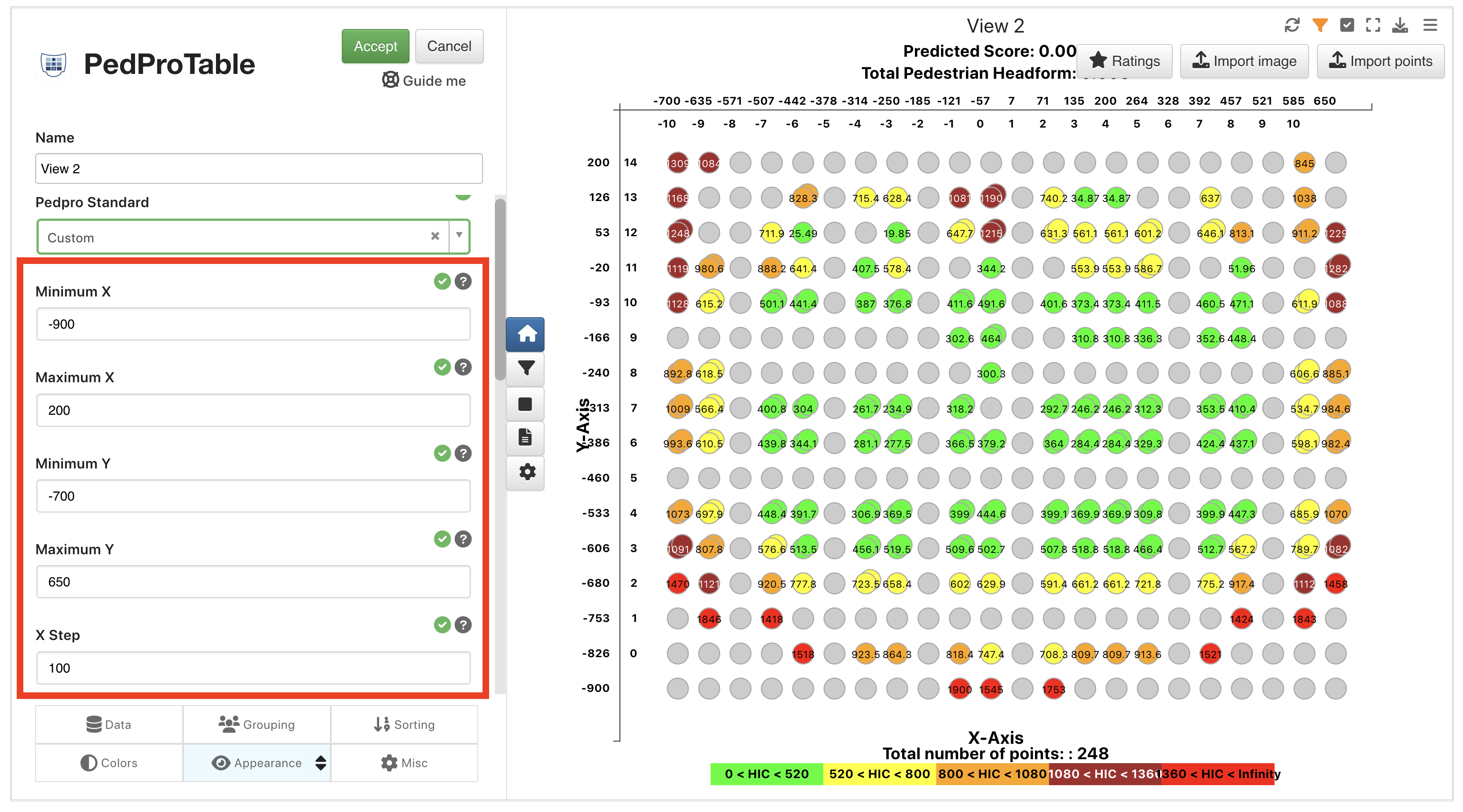
Figure 21: Edit X/Y Min/Max and X-Step
And under the grouping tab, we can edit the x bins, y bins and y-step as desired.
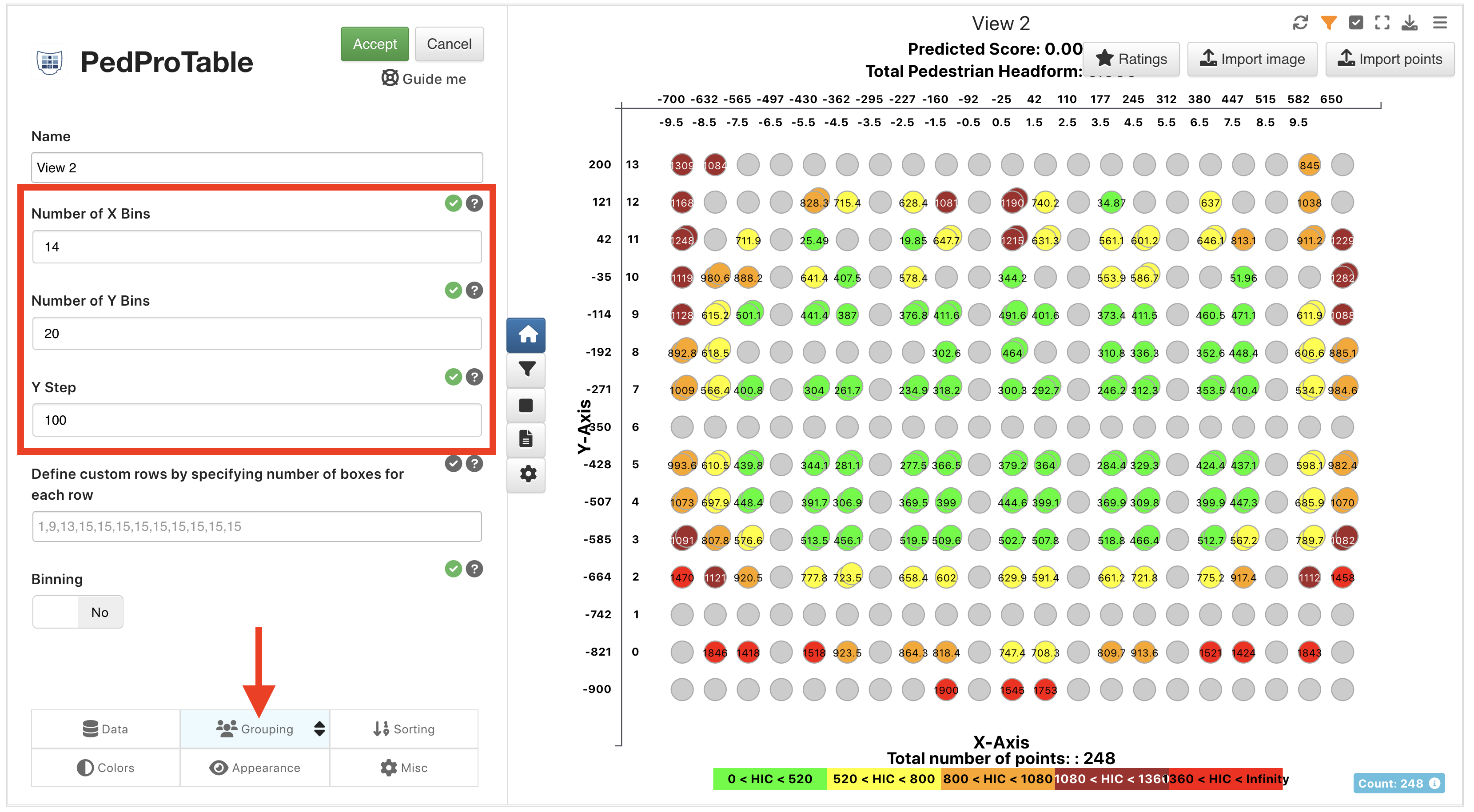
Figure 22: Edit X/Y Bins and Y-Step
Pedpro Table visualization has Condition Based Colors UI within color groups and also supports gradients.
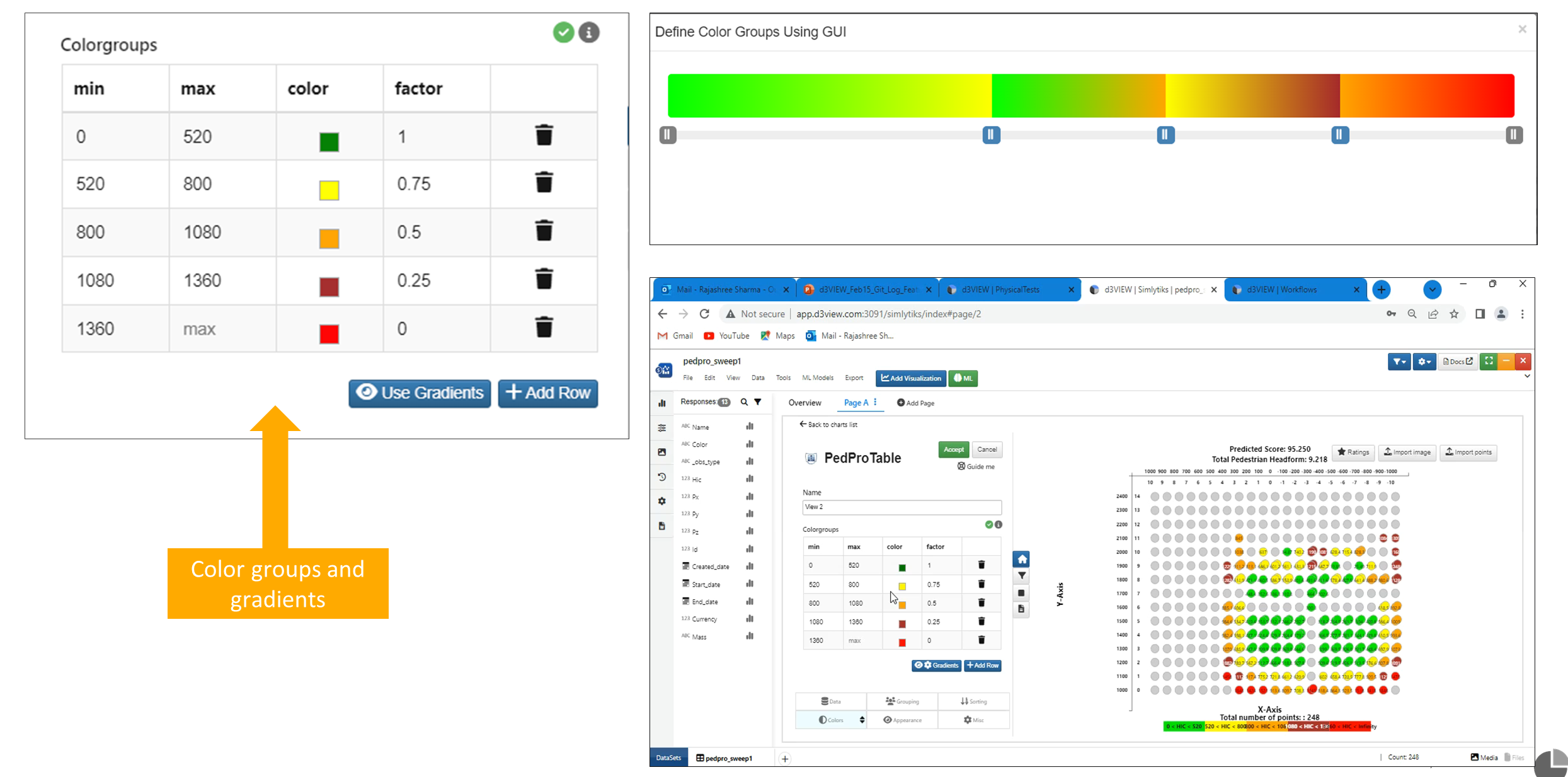
:sup: Condition Based Colors UI
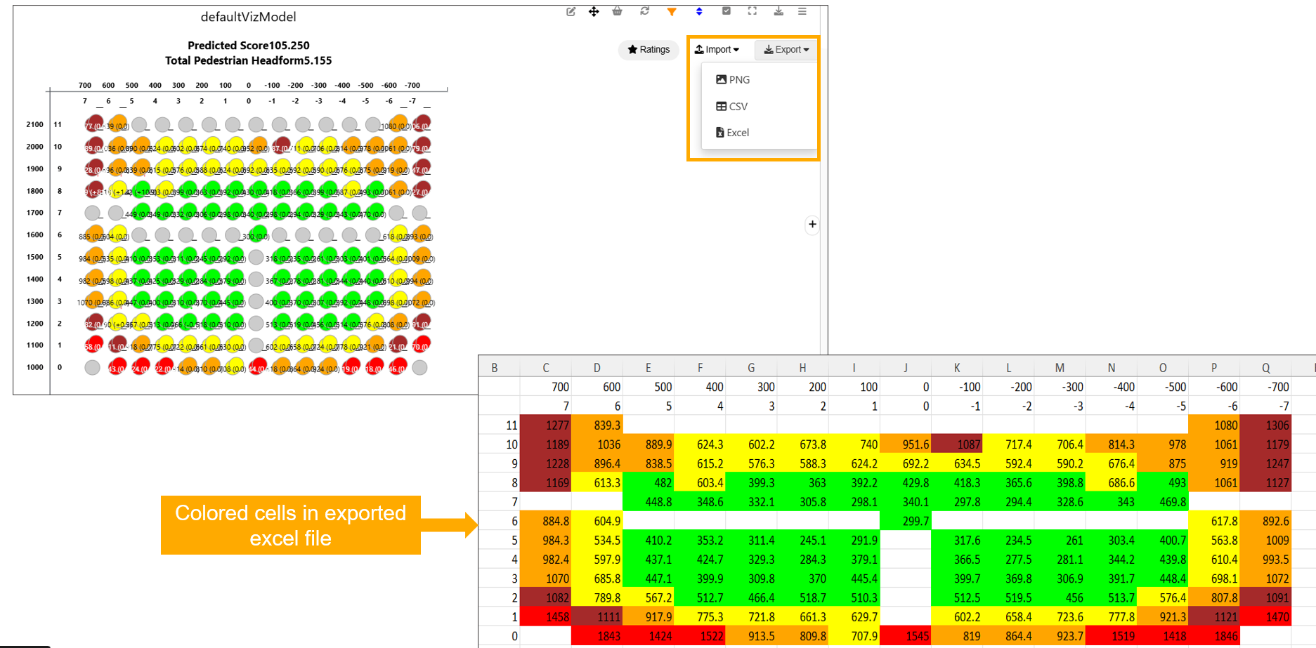
Pedpro export
Pedpro Visualization supports Export to Image, CSV and Excel with cell coloring in exported excel file.
Export options
Import options
New option called ‘Compare using Imported Points’ is available in PedProTable visualization under Appearance tab.
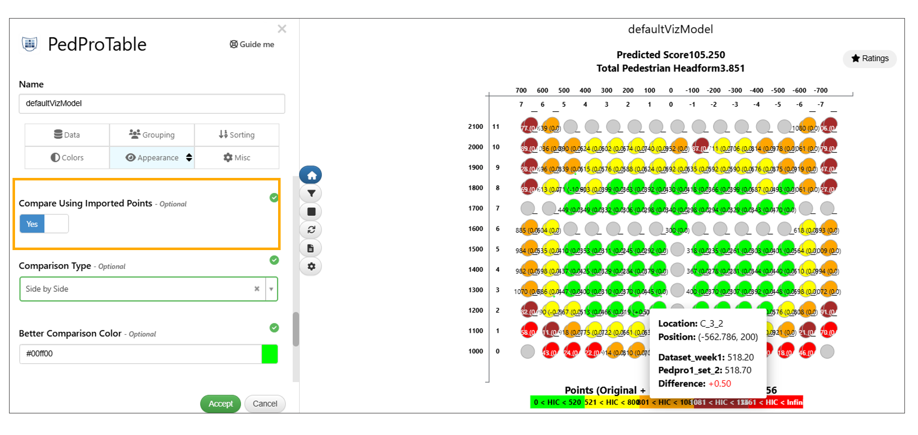
Compare using Imported Points
Pedprotable visualization supports importing of points from a file in Simlytiks.
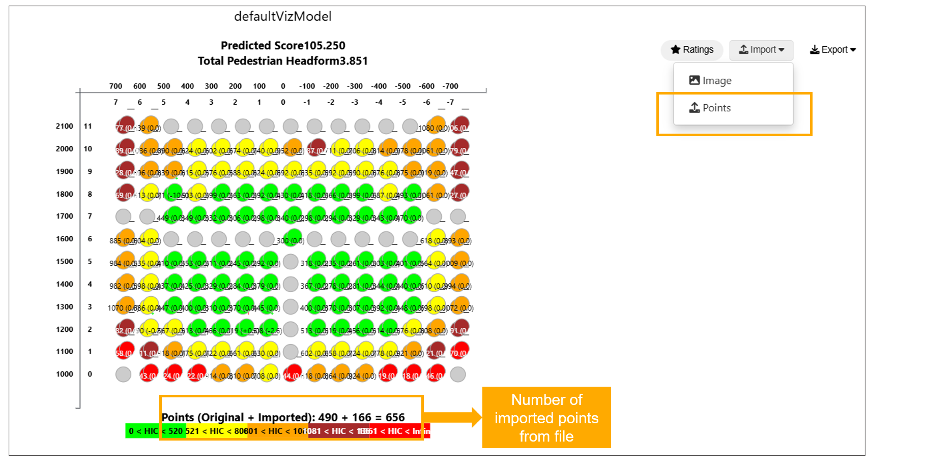
Compare using Imported File
Autofit (Scatter Plot)
Overview
The PedProTable visualization has been enhanced with a new Autofit (Scatter Plot) option, enabling precise rendering of Px/Py data points. In addition, scatter plot visuals have been improved with richer interactivity, including detailed tooltips and zone debugging capabilities.
These updates improve accuracy, usability, and data interpretation within PedProTable visualizations.
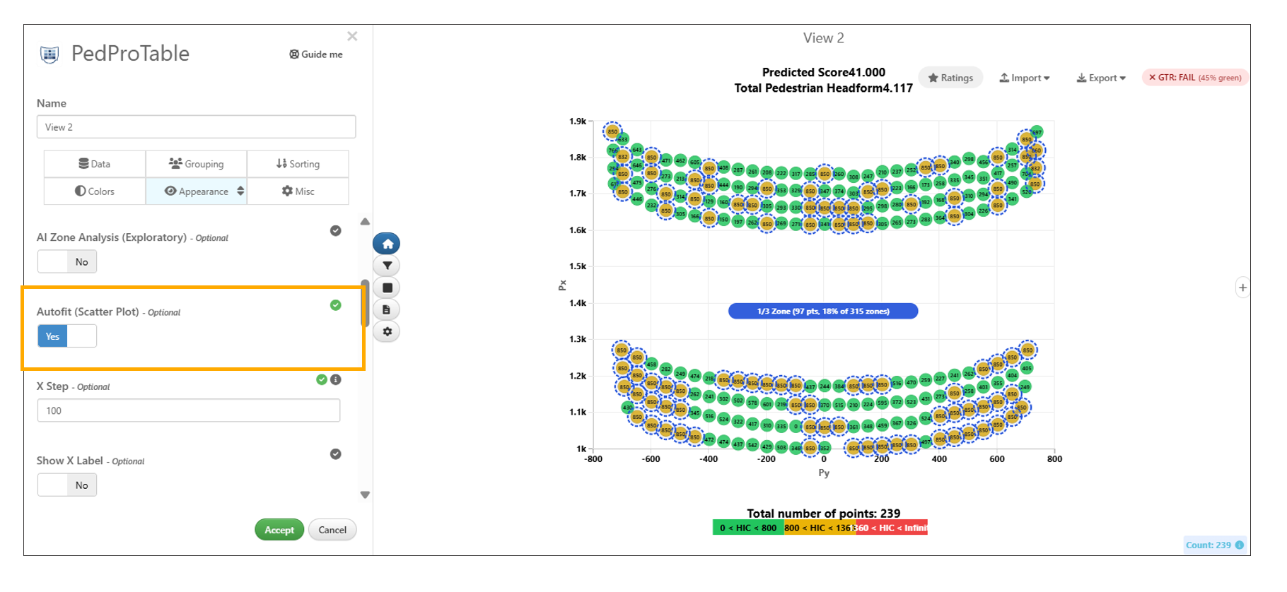
Autofit (Scatter Plot)
Timeline Chart
As of October, 2022, Simlytiks has a new visualizer called Timeline chart, similar to Gantt, which allows us to map time-sensitive data.
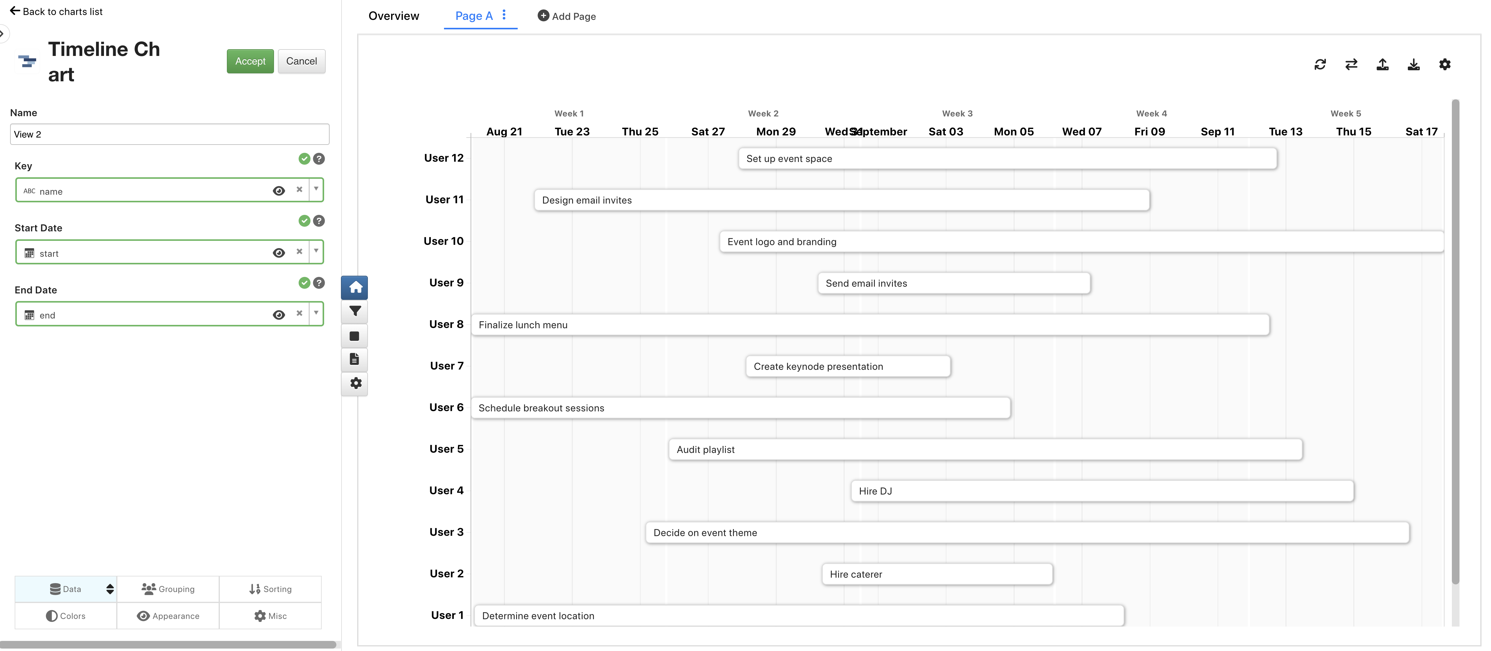
Figure 23: Timeline Chart
Dragging of Timeline blocks in Timeline visualization is saved to the settings
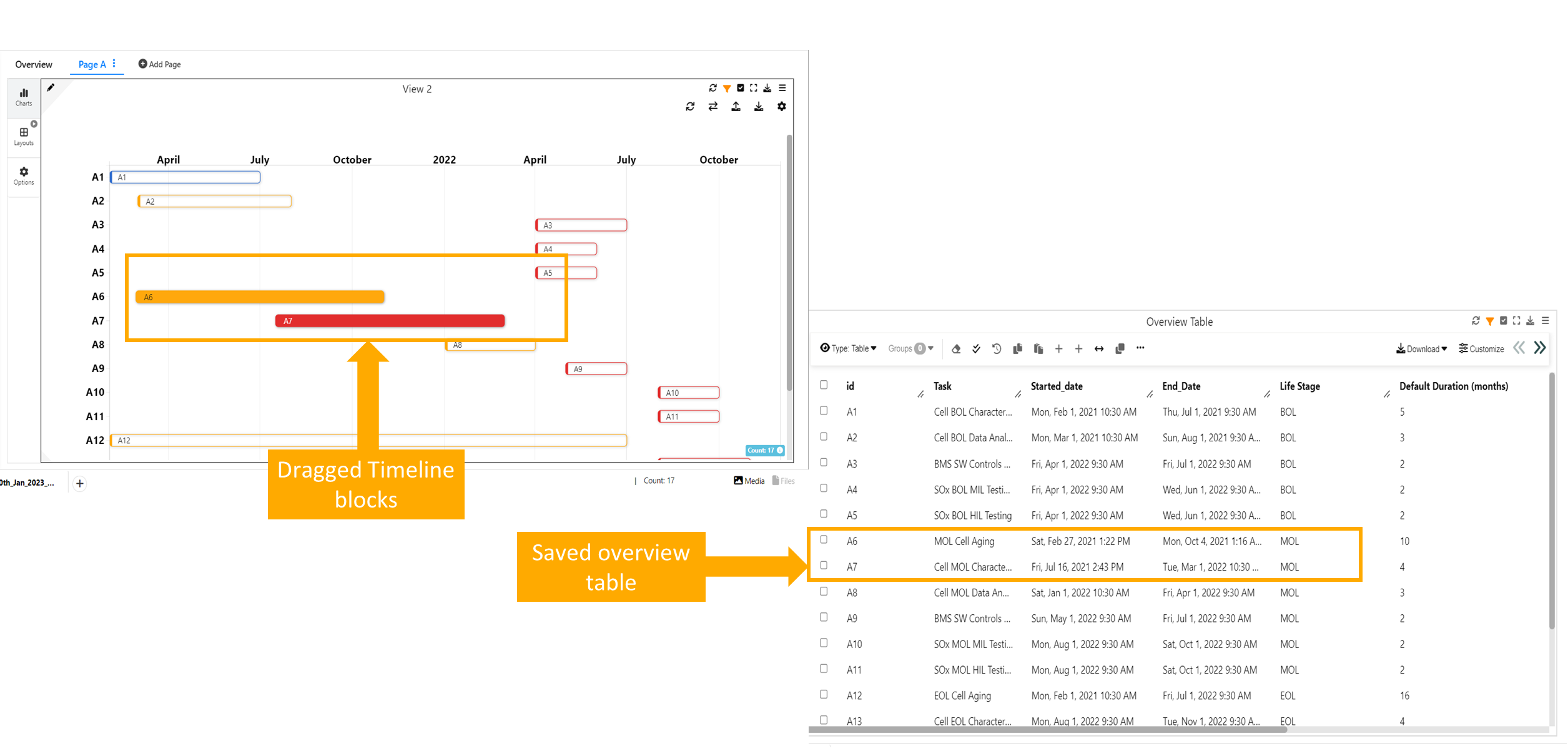
:sup: Timeline Blocks
If the number of dropdown options in Simlytiks visualization preview exceeds four, the dropdown appears on the right, similar to Outlook.
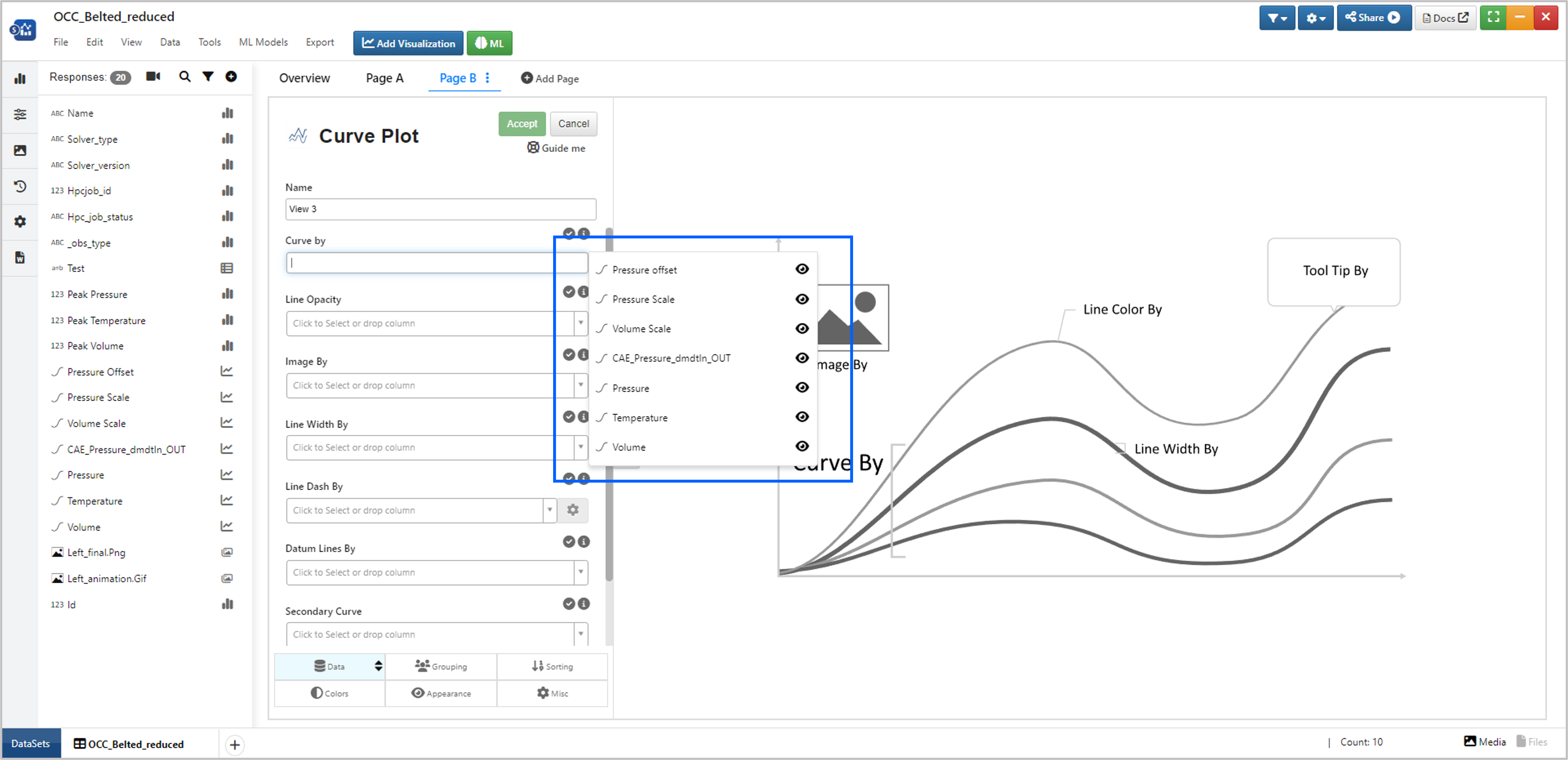
Figure 24: Dropdowns in Visualizations Preview
In Timeline chart- Dependent tasks are immediately updated when higher parent task is updated.
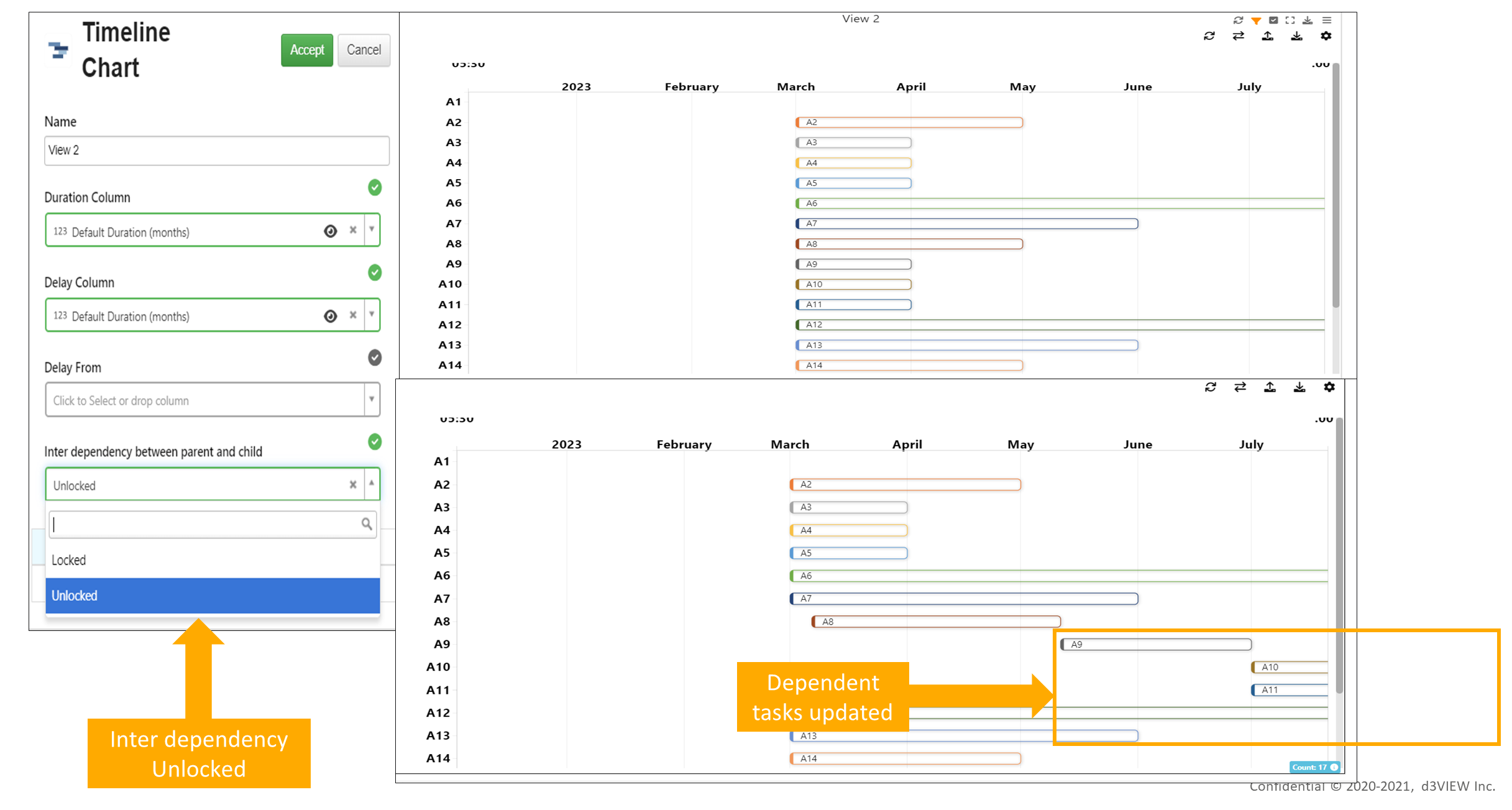
Figure 24: Dropdowns in Visualizations Preview
Timeline Chart visualization has new option to specify Delay column by days.
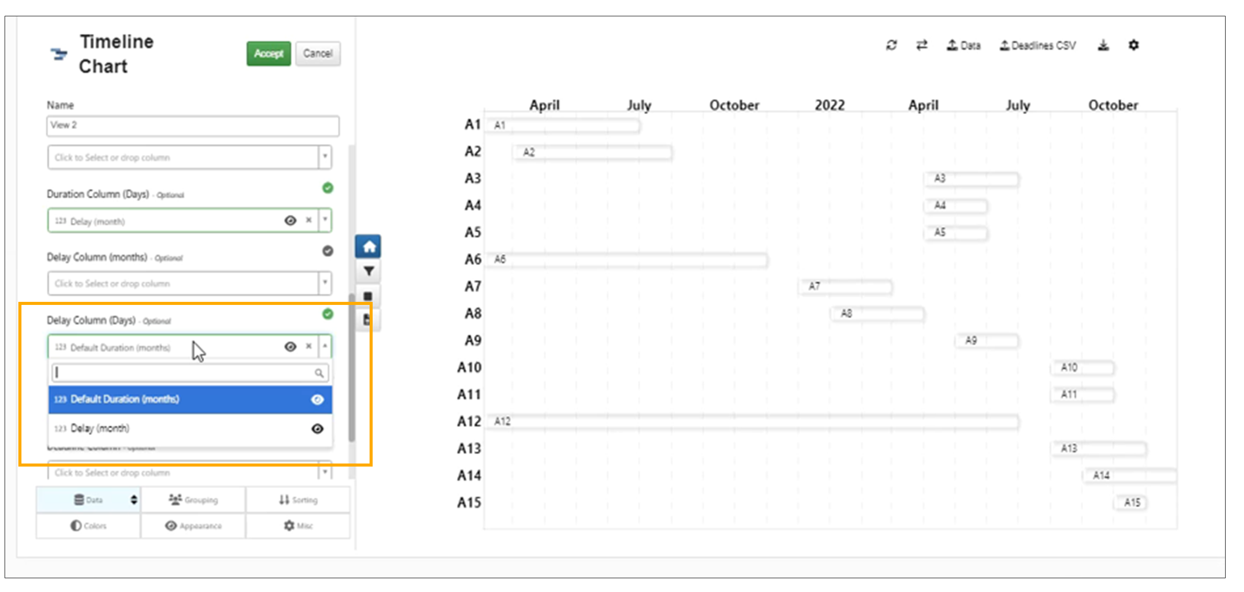
Delay By Day
In Timeline, Color Block By fills color to the Blocks and Color Label By adds color to Y- Axis Labels.
Label Color By has same color of Color By Legends in Timeline Chart.
Red arrows available when Deadlines are added to Gantt Chart, will change their fill color when Tasks that are dragged intersect with the arrows.
In Timeline chart , the dragging of the blocks to the previous date will color the blocks in orange and the dragging of Timeline blocks to next date will show the dragged blocks in green color.
In Timeline chart, the reset option has a dropdown menu with ‘Restore Initial Settings’ (i.e. settings/block drags with which the chart was first rendered ) and ‘Reset All’ which will erase all of the settings to go back to default view.
Deadlines in Gantt Chart
We can now import Deadlines to Timeline chart using CSV file and can be saved to settings in Simlytiks.
Deadline legend names and colors can be edited and saved to settings in Timeline chart visualization.
The Original date and the Modified date is available for Tasks in Timeline chart visualization when tasks are dragged and modified.
Partitions
Added new options called ‘Partitioned By’ to Timeline chart visualization under appearance tab in Simlytiks. This will partition the timeline blocks into percentages and also show the texts within the partitions based on the column chosen .
In Timeline visualization, new option is added in Appearance tab to enable a second axis at the bottom of the chart. This axis will be helpful when zoom/pan is enabled.
In Timeline chart, enable zoom option will support vertical zoom which will allow dragging/panning across vertical Y axis
The Partitioned timeline blocks in Gantt chart can now be right clicked and marked/unmarked as DONE which will also be saved to the settings in Simlytiks.
The colors of the timeline blocks are updated with green and yellow. When we drag the time line block to next date the blocks are colored in yellow and when we drag them to previous dates they are colored in green.
Table
Custom font size option is now added to Font size options in Table visualization.`
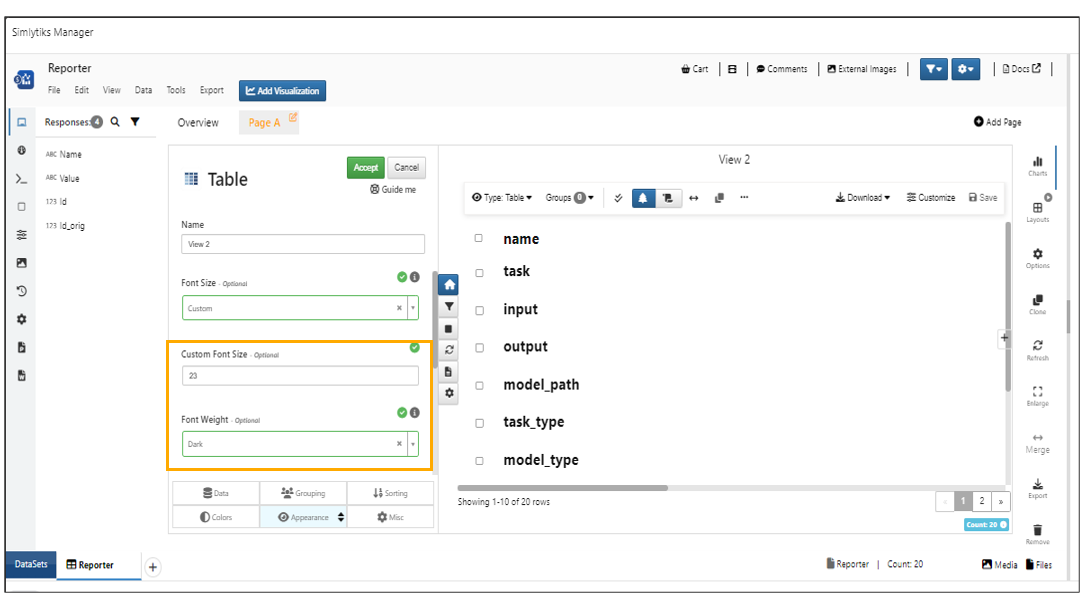
Font size options
In Simlytiks, the table visualization supports ‘Custom color scheme dataset’ option, allowing colors to be overwritten using key/color pairs.
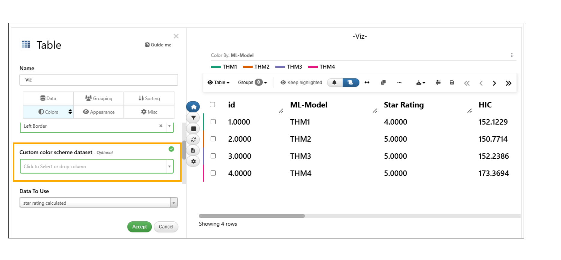
Custom color scheme dataset
In Table visualization, new option has been added under the Appearance tab to customize the legend font size when “Color By” is enabled.
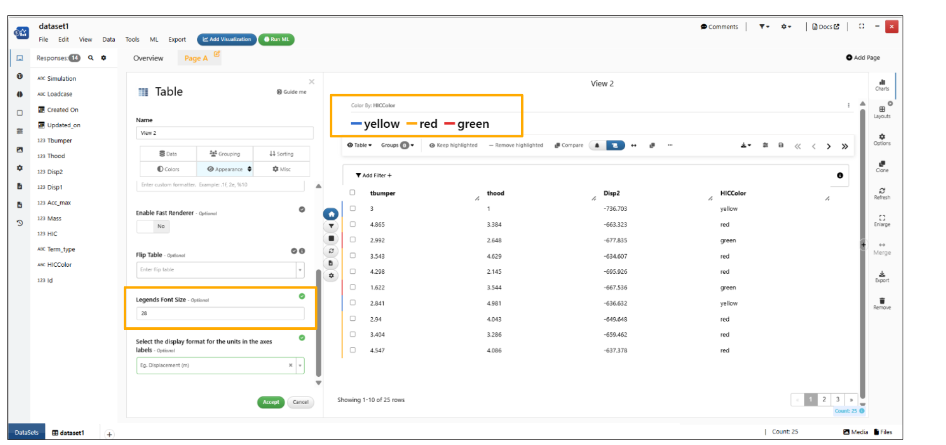
Color by legend
Radar plot Chart
Input columns in the radar plot can be viewed in distinct radar plots by clicking on “Small Multiples”. Each plot can be compared with these by overlaying another new column by choosing one from the “Choose a column to Overlay” dropdown.
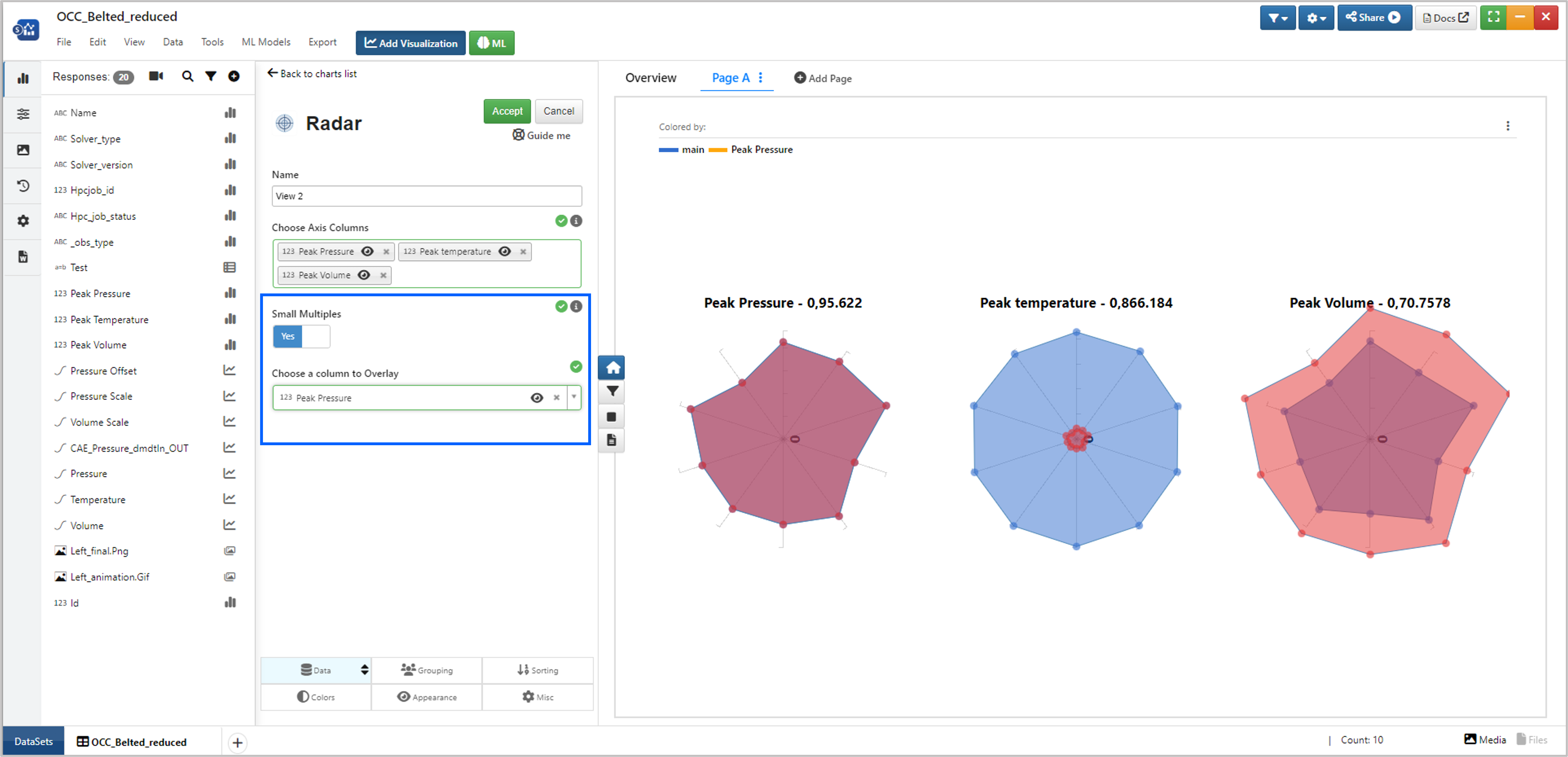
Figure 24: Multiple Radar Plots
You have option to overlay multiple plots in Radar plot.
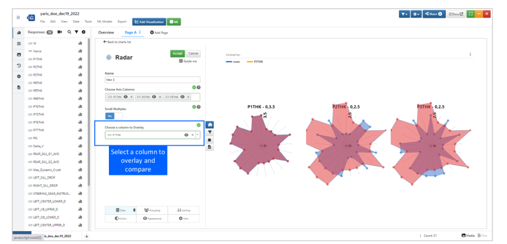
Overlay Radar Plots
Radar plot visualization has new option to normalize the values to between 0-1.
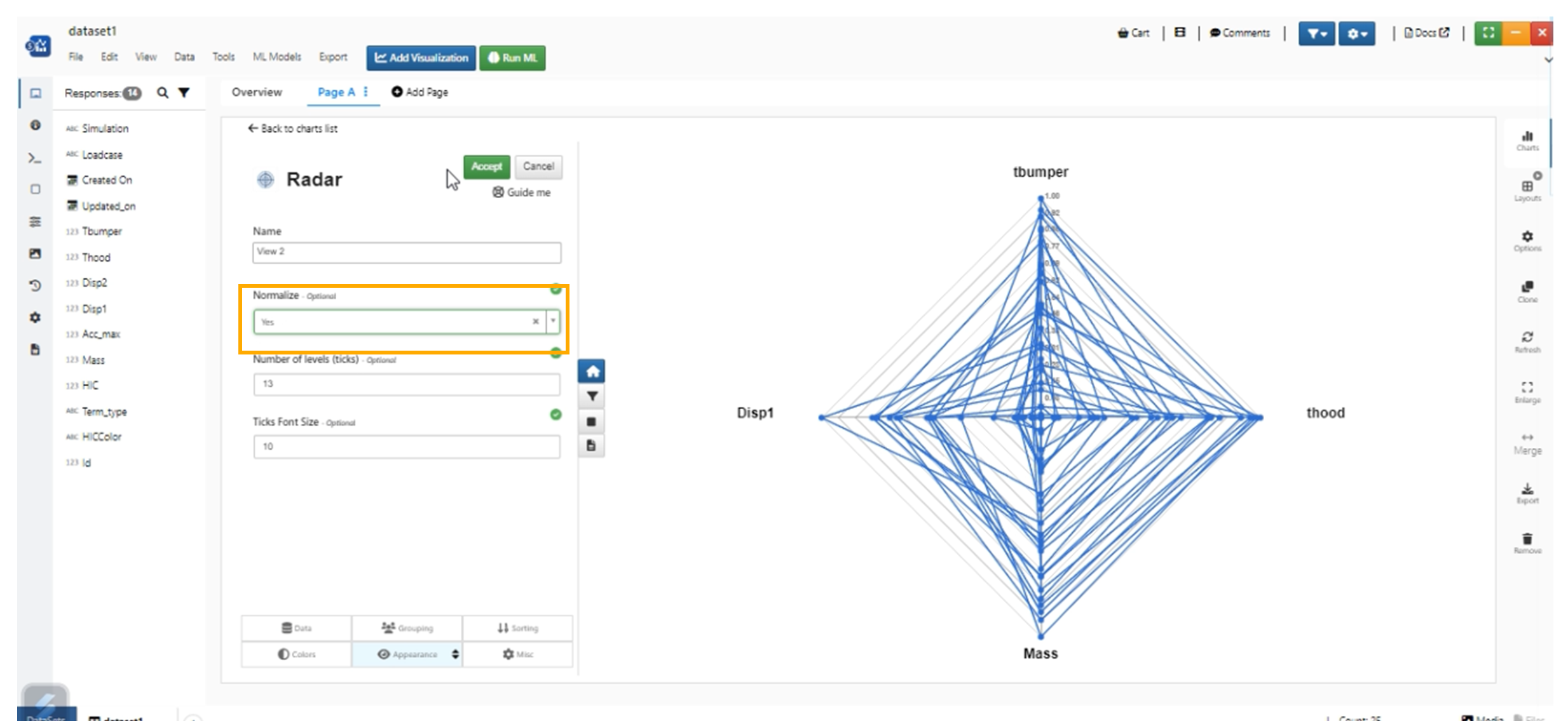
Radar Plot Normalize
Radar plot has new options in appearance tab to change No of ticks and Font size
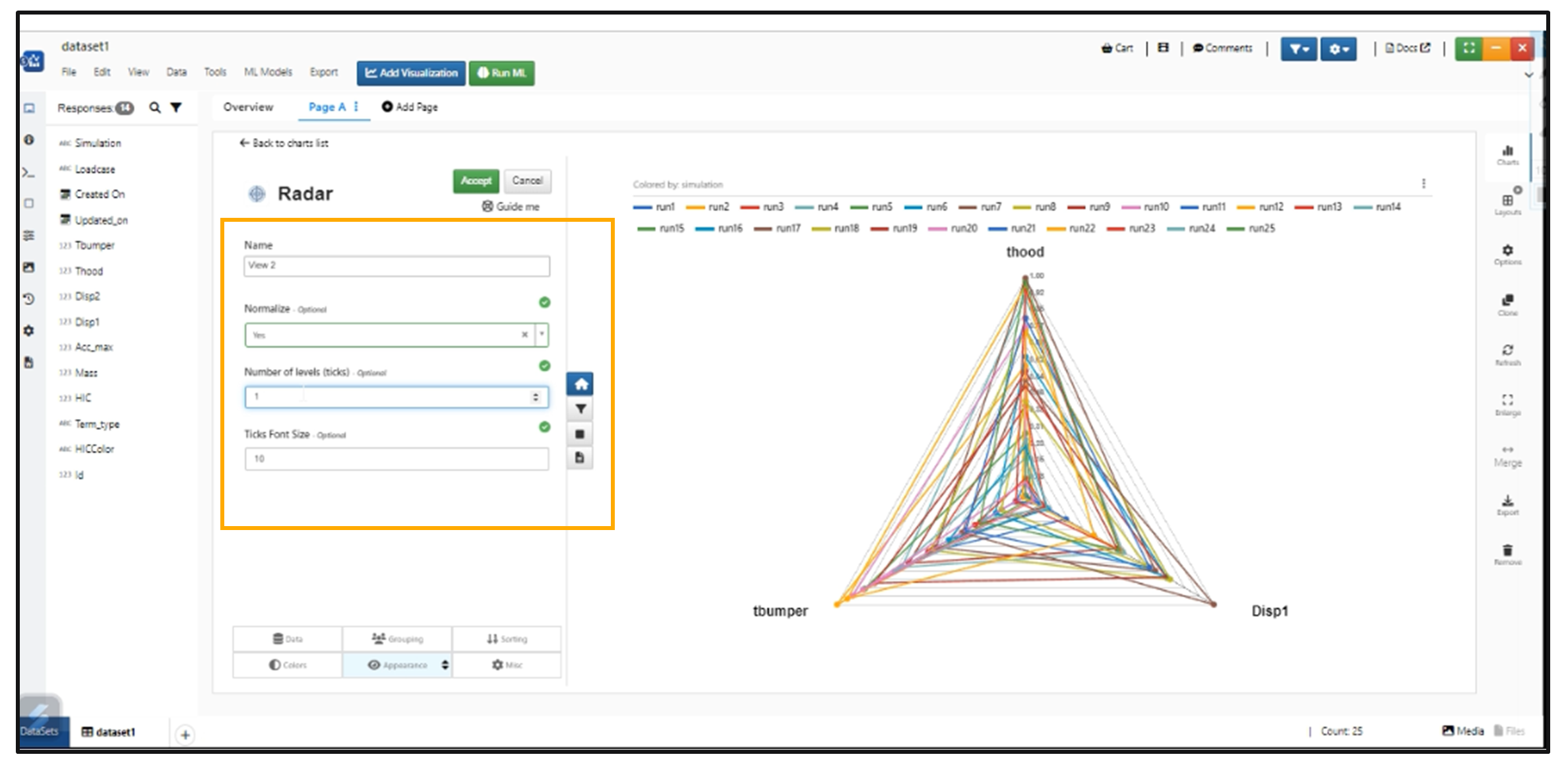
Radar Plot Number of Ticks
Outer circle
Radar plot has two new options: One to ‘Show Outer Circle’ and the other called ‘Outer circle color’ for the visualization in Simlytiks.
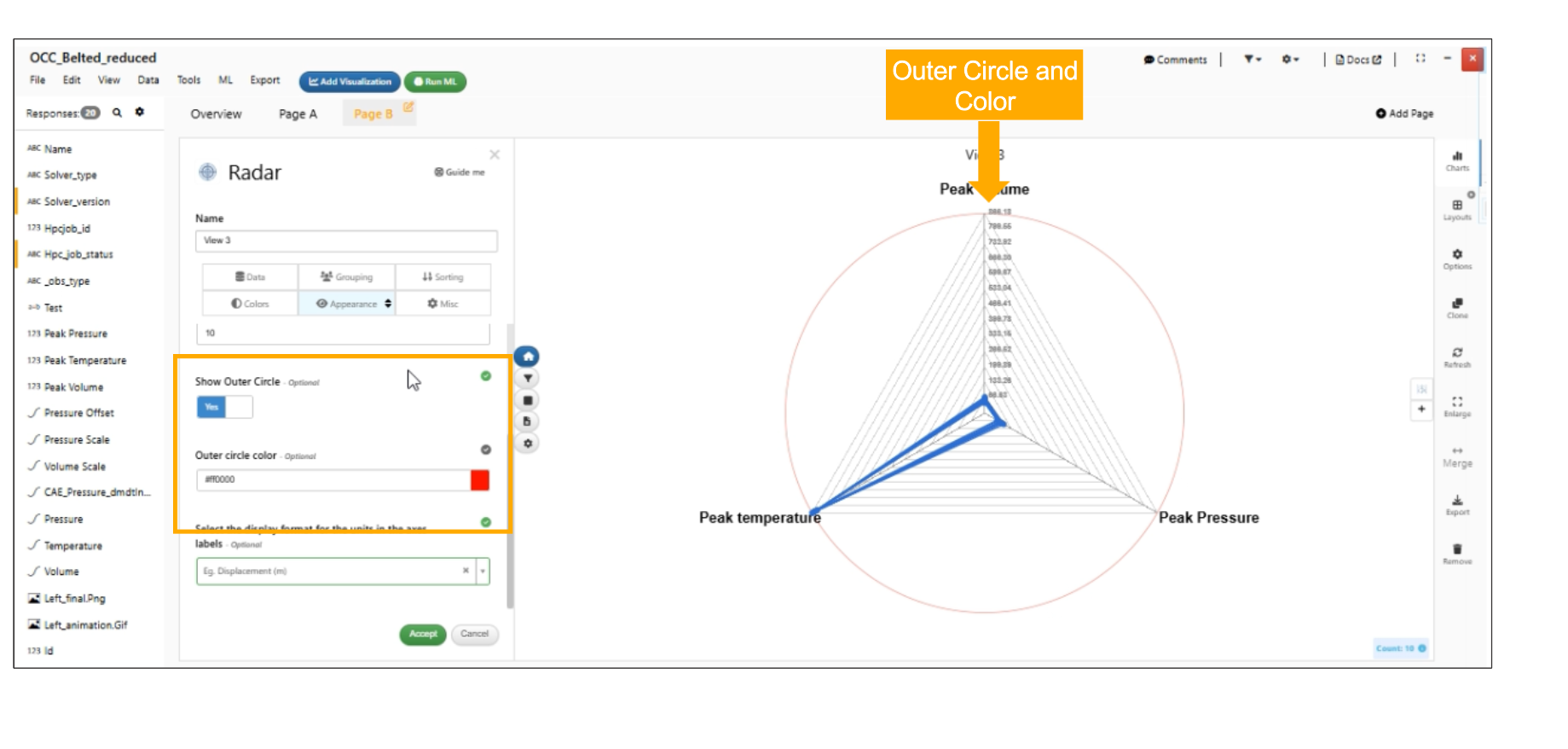
Show Outer Circle
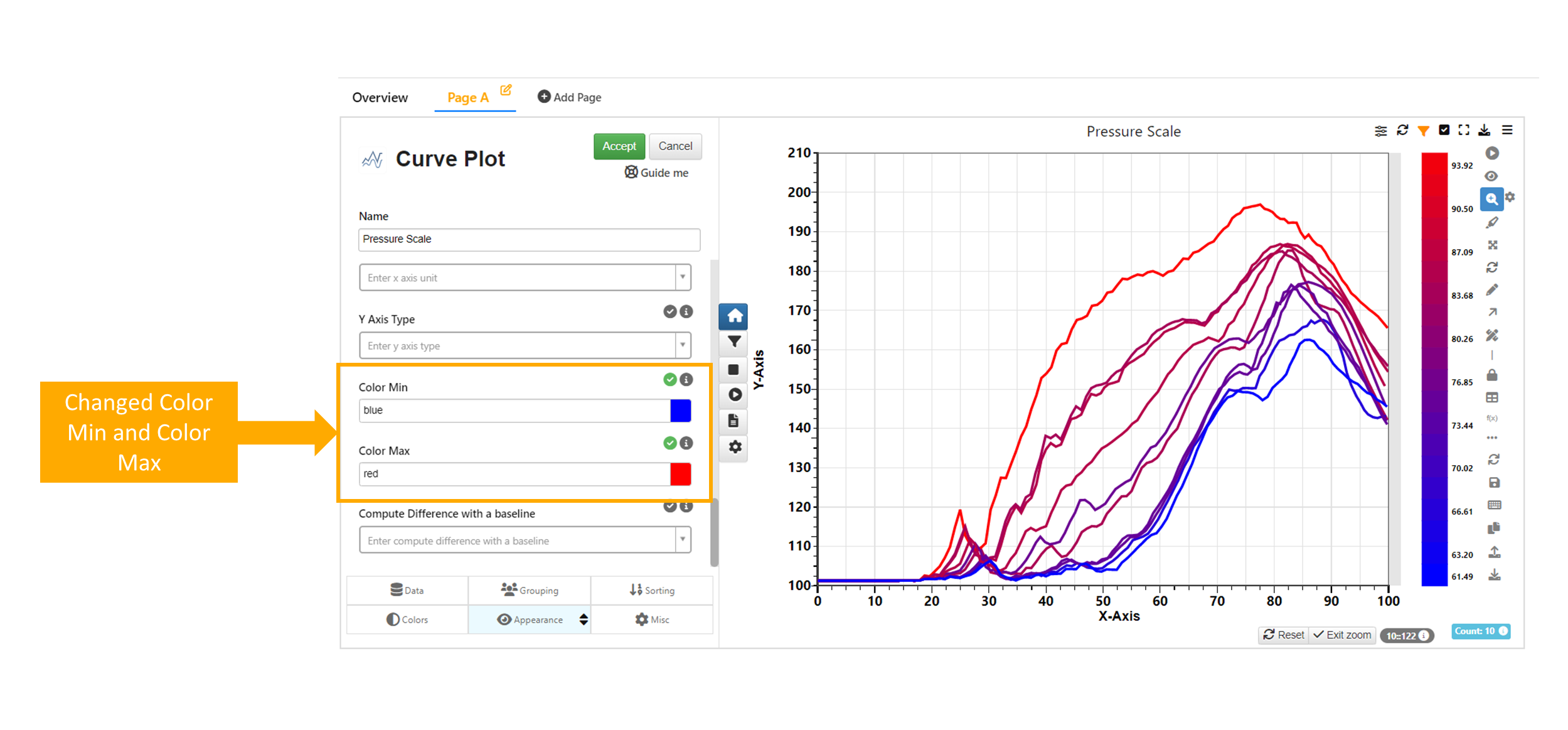
Color min and Color max for curves
Colors interchanged color Min to be blue and color Max to be red in Simlytiks.
:sup: Color Min and Color Max
Image Annotator
Image annotator allows us to annotate the images by importing the image. now we have support for annotations and polygons in Image annotator paint board.
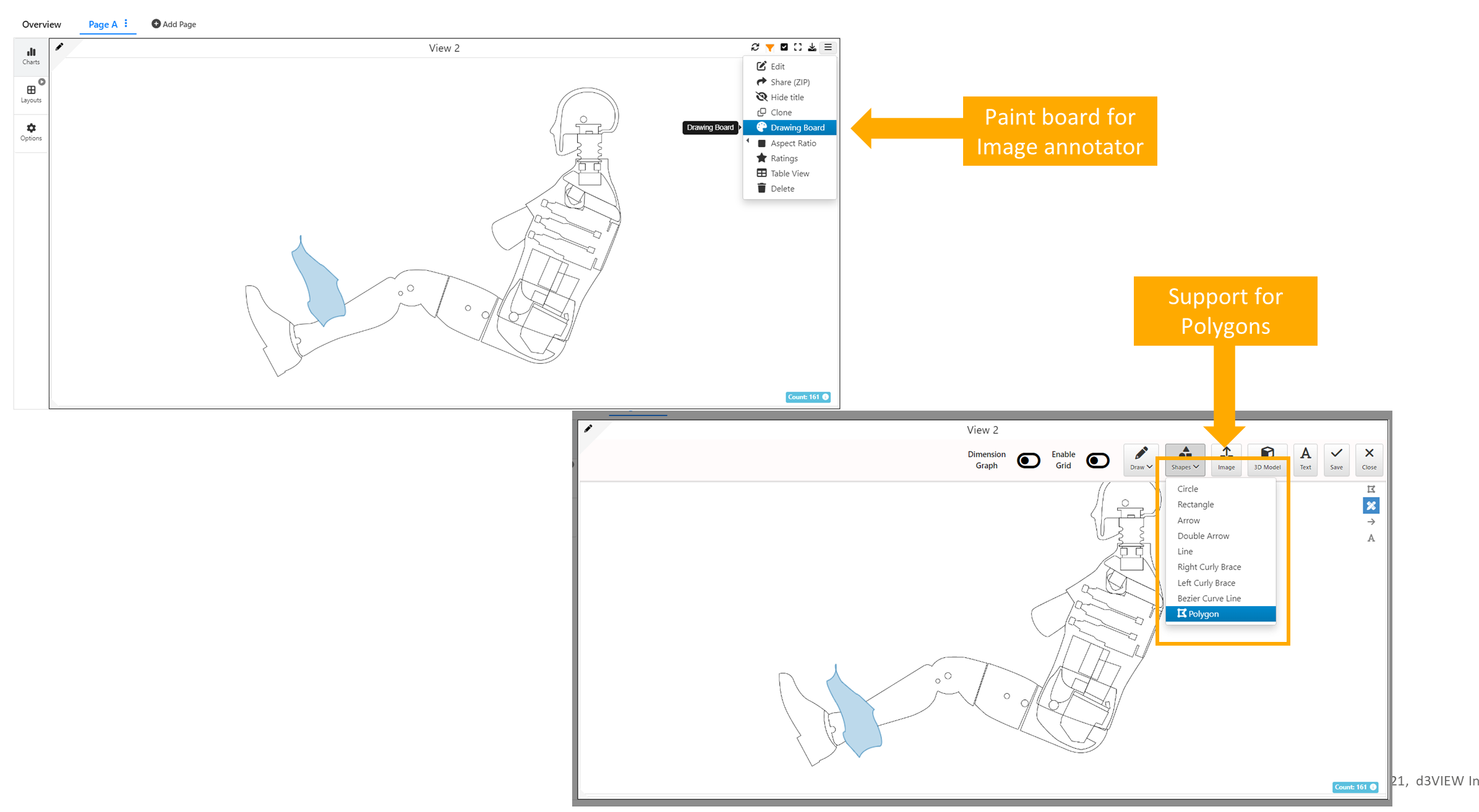
Image annotator Paint Board
We see image in the annotator for the column, If column is assigned an Image in customize option
Image annotator assigning Images
View mode is enabled in Image Annotator, where only enlarge option is showed in view mode for Annotator
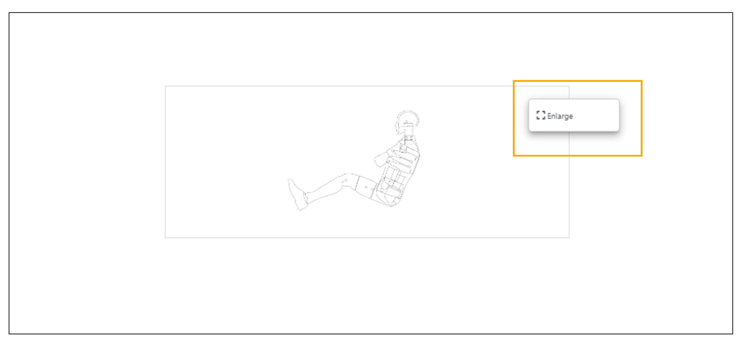
Image annotator enlarge option
In Image annotator - Adding of arrows, rotating them and resizing them is made simpler.
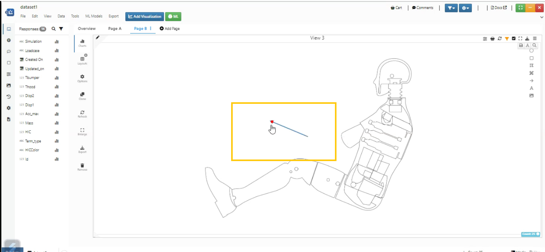
Image annotator Arrow
Annotations position in the Image Annotator is fixed in the enlarged view and we can disable/enable the annotations for Image Annotator in Simlytiks.
Annotation counters in Image Annotator can now be assigned curves and also the counters have a new option to show the assigned curves to counters in a table format (with sparkline curves)
Image Annotator has a new option to add/remove Taglines in Simlytiks. Right click any response annotation (the one dragged and dropped) and you will see a new option to Add/Edit Tagline which has its own font and text and sits below the response.
Image Annotator now has support to show Sparklines in Simlytiks Right click any curve response or any annotation that has a associated curve and you will see a Show/Hide Sparkline option.
Image annotator has new option to Show/Hide Distribution which will show a box plot for numerical columns.
Image Annotator Visualization has a new feature to add annotations in a Connection inside the visualization.This feature helps us to add responses and connections to the Image Annotator with box plots and analyze them.
Assign Curve option is working as expected in Image Annotator Visualization.
Shapes can be added and removed from Image annotator Visualization.
Visualizations on Imageannotator
Visualizations can be dropped onto Image Annotator chart which will show an option to add as an annotation instead of replacing the viz which will bring up VizPreview and allow adding an actual chart in Simlytiks.
In Simlytiks, the sparkline in Image Annotator visualization has a new option to Apply the number of points added to one sparkline to all of curves available in the visualization using the context menu options
Color by
Image Annotator visualization now supports new option called ‘Color by Columns’ under the colors tab in Simlytiks.
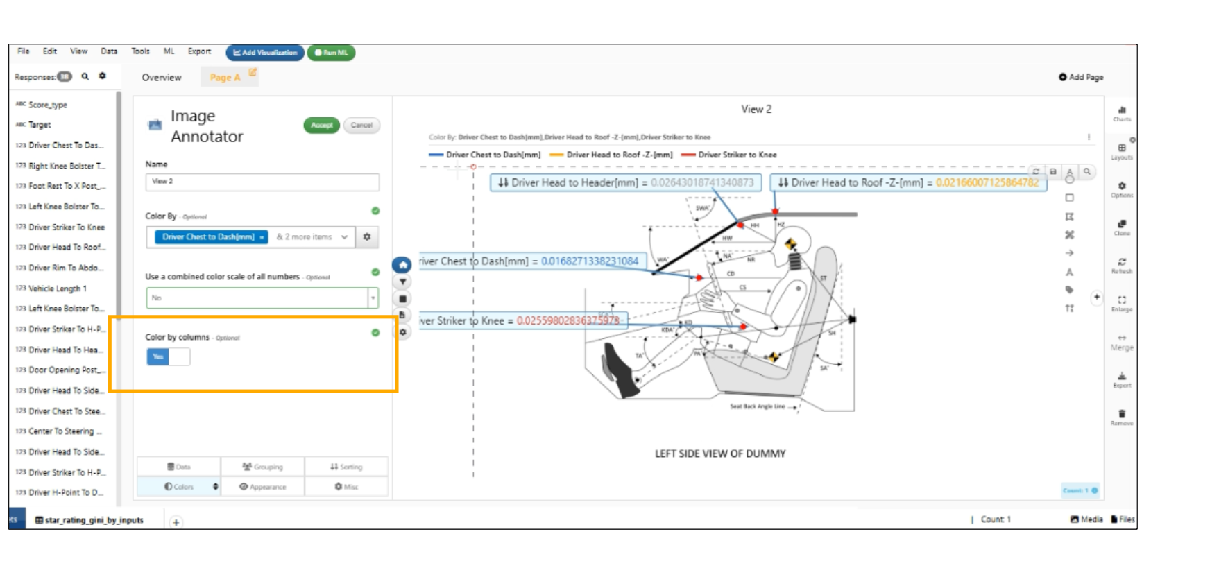
Color by Columns
Decimal format
Image Annotator visualization now supports ‘Decimal Format within Annotations’ which will add decimal points to numerical annotations based on the format in Simlytiks.
Fringes
Image Annotator visualization has new option called ‘Use smaller fringe legend’ under colors tab in Simlytiks. This helps user to view the fringe in smaller size on the visualization.
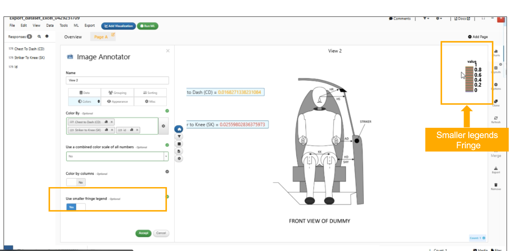
Use smaller fringe legend
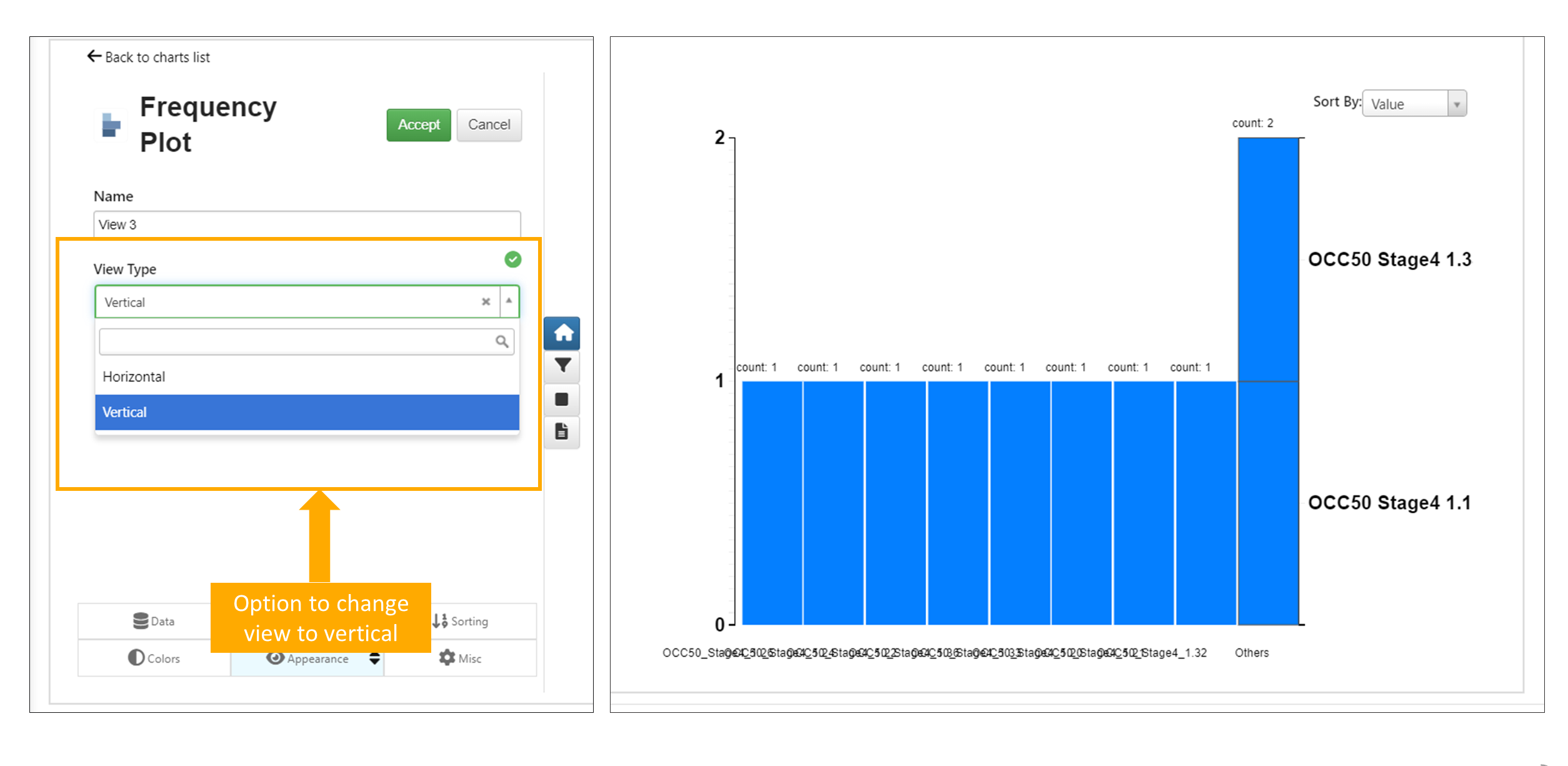
Frequency plot
Frequency plot now has option to change visualization to vertical in Simlytiks.
Frequncy Plot options
Frequency Plot visualization supports both Numerical and Categorical columns in Simlytiks.
vertical bar chart
Added Show groups option in vertical bar chart to group charts and to make charts look more clear and accurate.
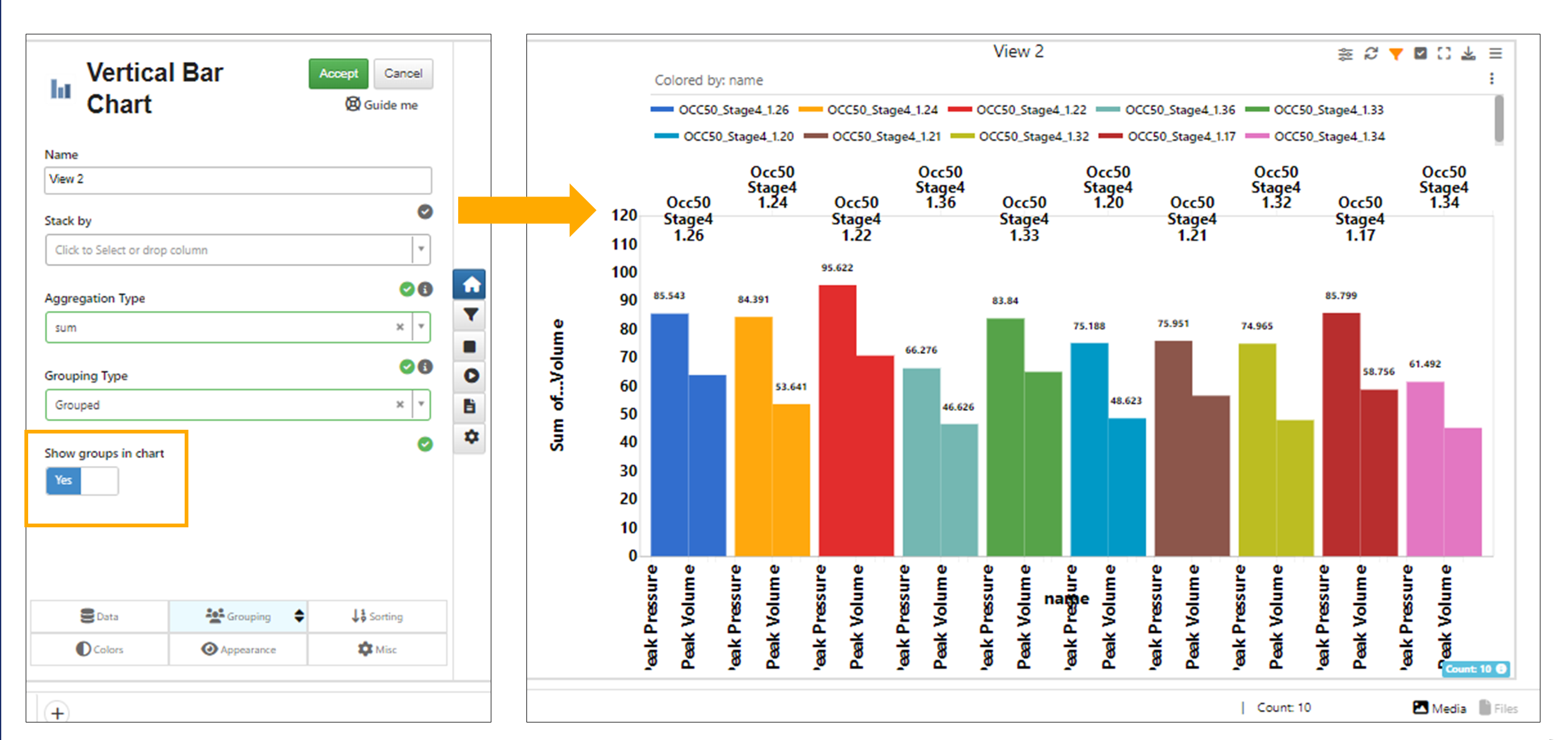
Vertical bar chart show groups
Vertical Bar Chart is now created correctly when Grouping type option is selected under Groups tab in Simlytiks
Vertical Bar chart now has a new option in the Grouping tab called Cumulative Bar Chart which will help display the bars in a cumulative fashion i.e. aggregation of each bar based on its previous bars.
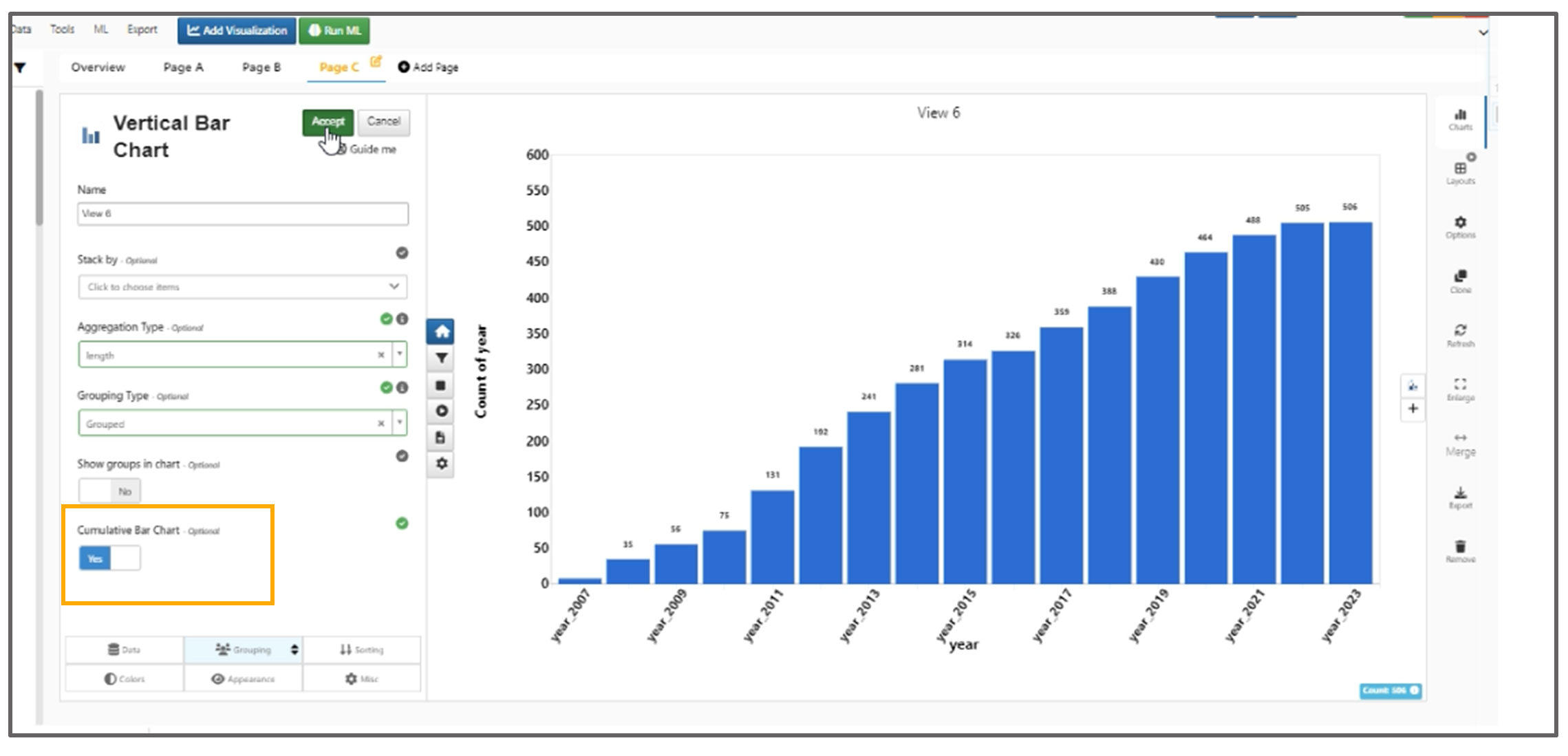
Cumulative Bar Chart
Vertical bar chart now supports Images in the axes and Images can be added in Tools -> Customize-> Media option in Simlytiks.
Vertical bar chart has a new option in Grouping tab called Grouping Limit which will limit the number of bars to specified value.
Vertical bar chart has new option under the grouping tab called Local Grouping in Simlytiks.
Vertical bar chart Local grouping when enabled shows a new option called Limit Local Groups which will show the top ‘n’ number of groups in the drilled down version.
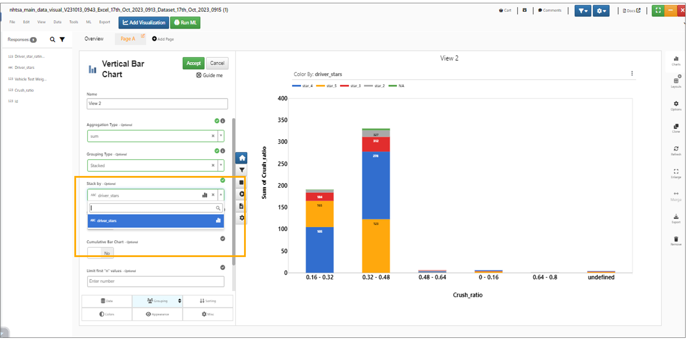
Stacked By option is added to Vertical Bar charts in Simlytiks.
Stacked By
Vertical Bar charts in Simlytiks now support Brushing. We can Select/Highlight the Bar charts and apply filters to them.
The axis option of the vertical bar chart now has a new feature called ‘Rotate ticks’ which helps in rotating the axis labels at a given angle.
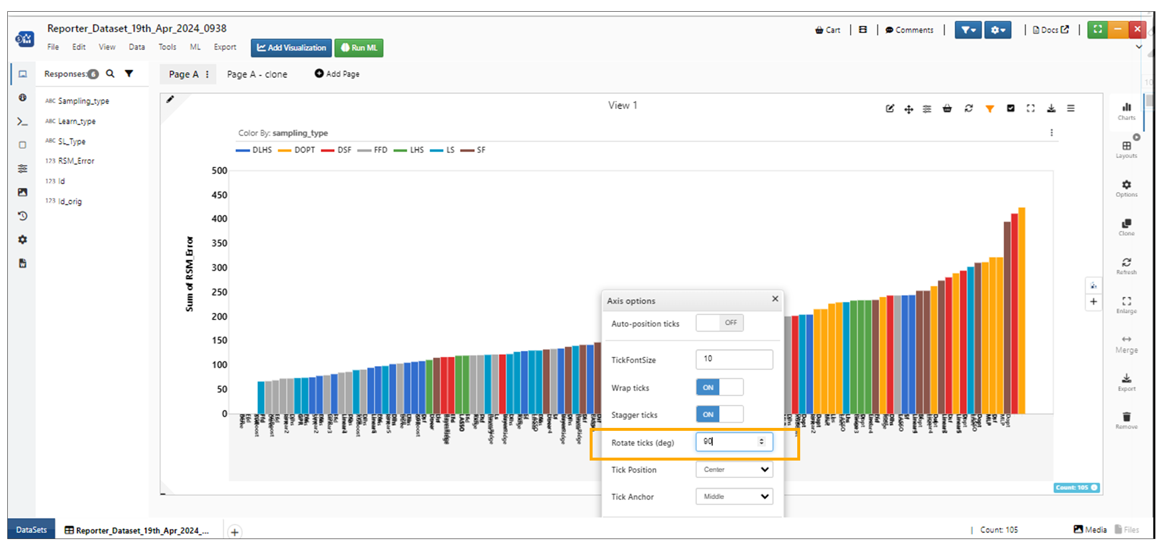
Rotate ticks
X bins
In Vertical bar charts, a new ‘Number of X Bins’ option is now available under ‘Grouping’ to manually set the number of bins.
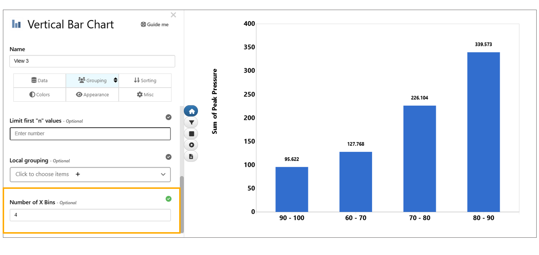
xBins
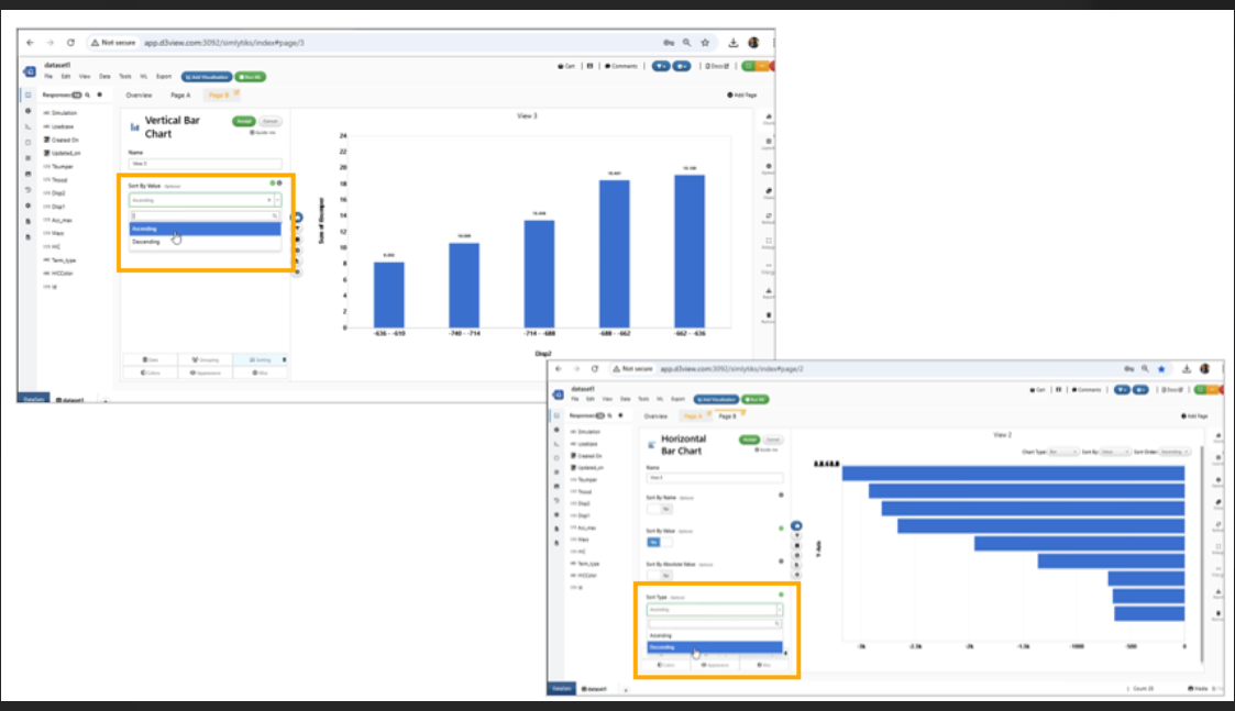
Sorting
Bins in vertical bar chart and horizontal bar chart are now sorted in ascending order by default and have the option to change the order within the VizPreview -> Sorting tab
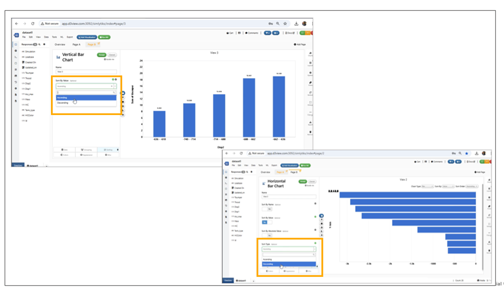
Sorting Vertical Bar charts
In Simlytiks, the Vertical Bar charts are sorted based on the order of the legends when stacked By and grouped By options for selected in the visualization.
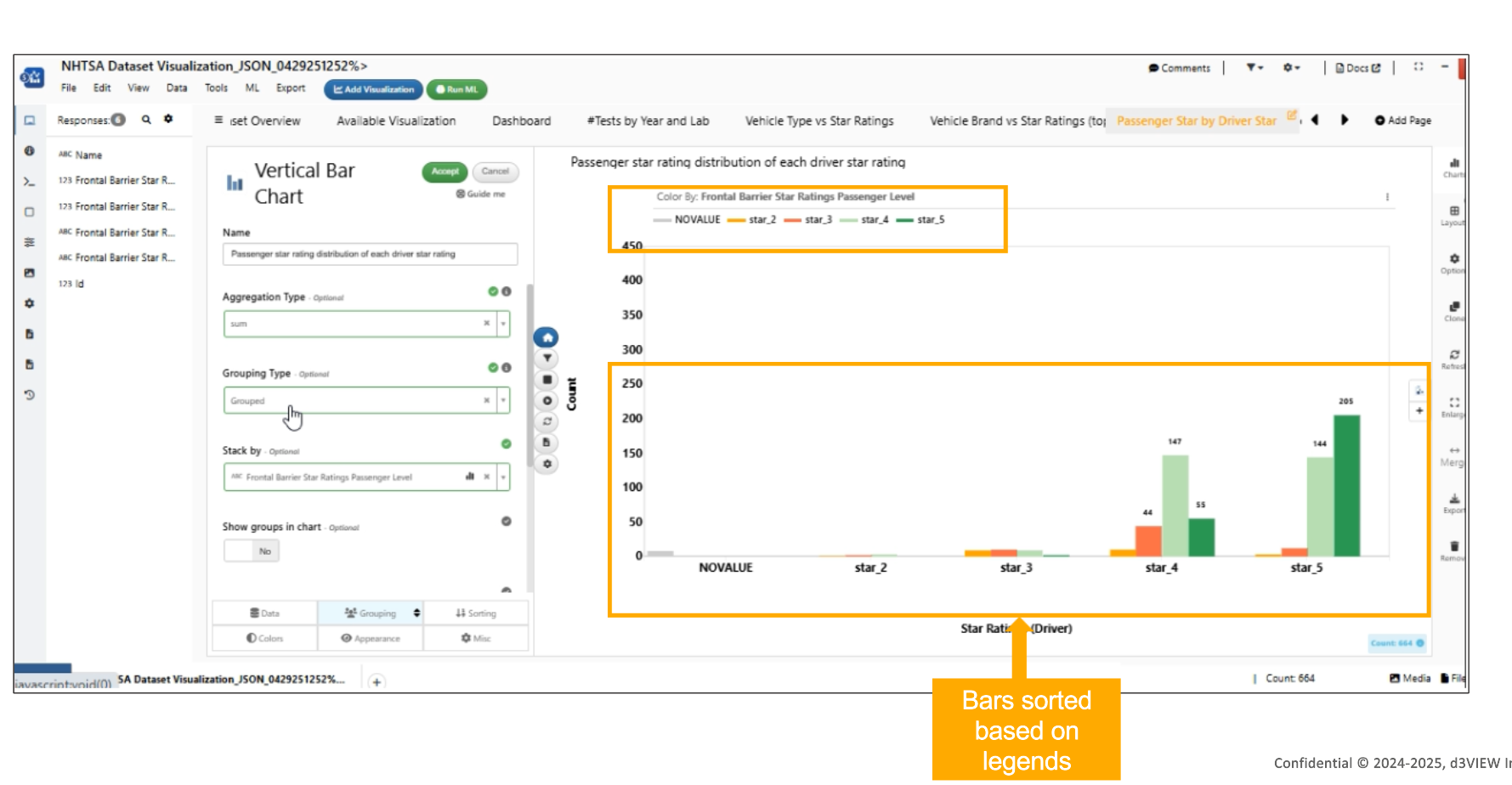
Legends Sorting
Ticks
Vertical Bar chart visualization is now updated with rotated ticks for the axes with more ticks in Simlytiks
Vertical Bar charts
Gallery Visualization
Support for an option called max Visible in Image Gallery in the appearance tab to let user have control on how many images are to be shown in one line (instead of the default 3)
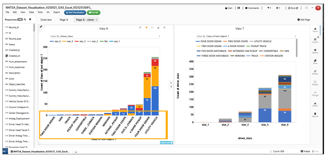
In Gallery visualization an alert message is shown with an icon that has a pop-up showing the URL of the image when image is either unavailable OR cannot be fetched.
alert message
QQPLOT Visualization
QQPLOT is added as new visualizer for Simlytiks datasets.
VIOLIN PLOT Visualization
VIOLIN PLOT is added as new visualizer for Simlytiks visualzations.
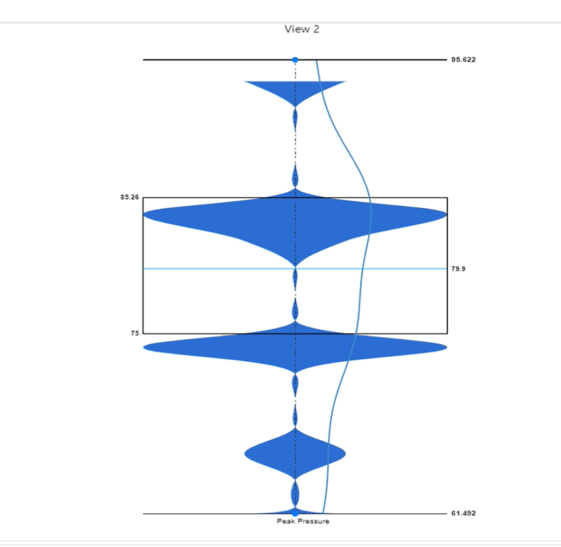
VIOLIN PLOT Visualization
CALENDAR HEATMAP Visualization
CALENDAR HEATMAP is added as new visualizer for Simlytiks visualizations.
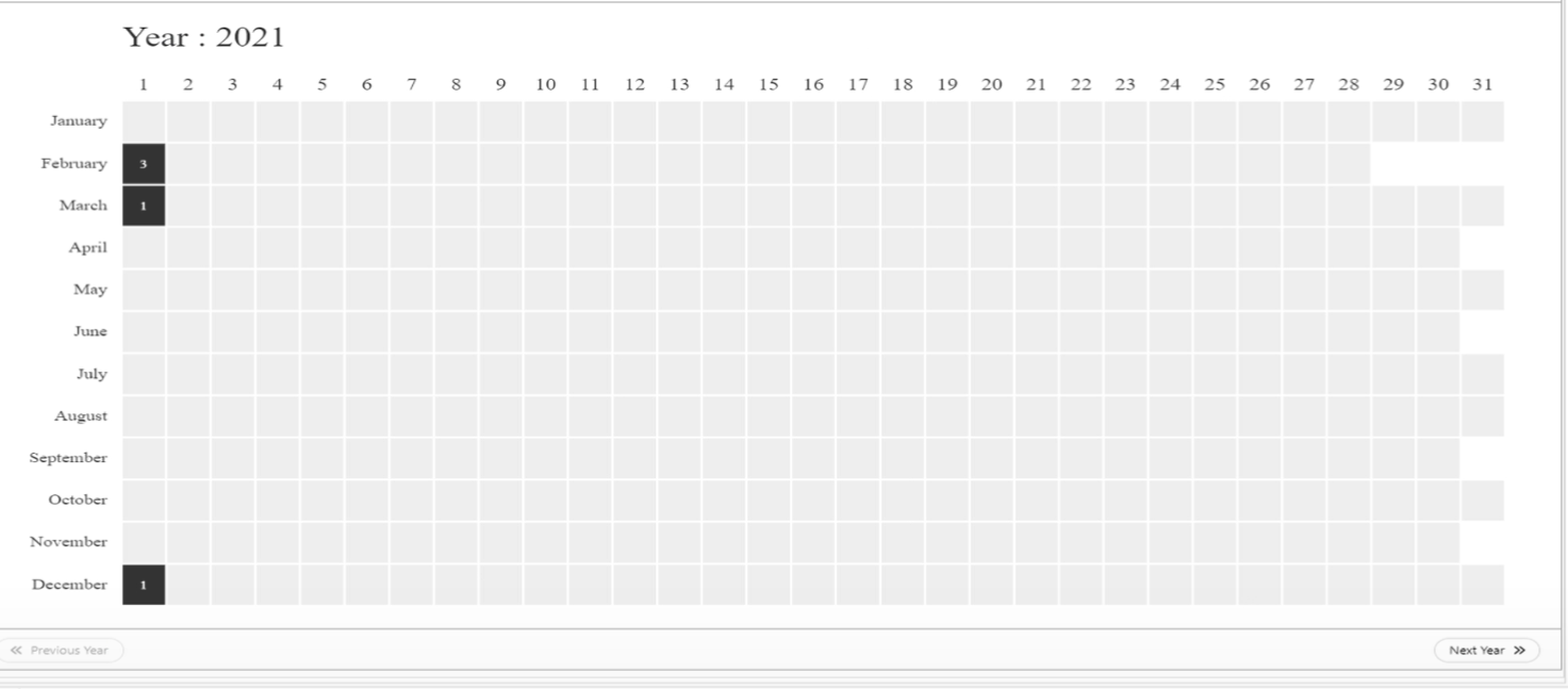
CALENDAR HEATMAP Visualization
Calendar Heatmap visualization has colorby support with Numerical Gradients.
Parallel chart Visualization
Parallel chart dimensions can now be dragged and re-arranged using a drag-handle at the center of each axis in Simlytiks.
Added new supporting features for Parallel chart visualization in Simlytiks.
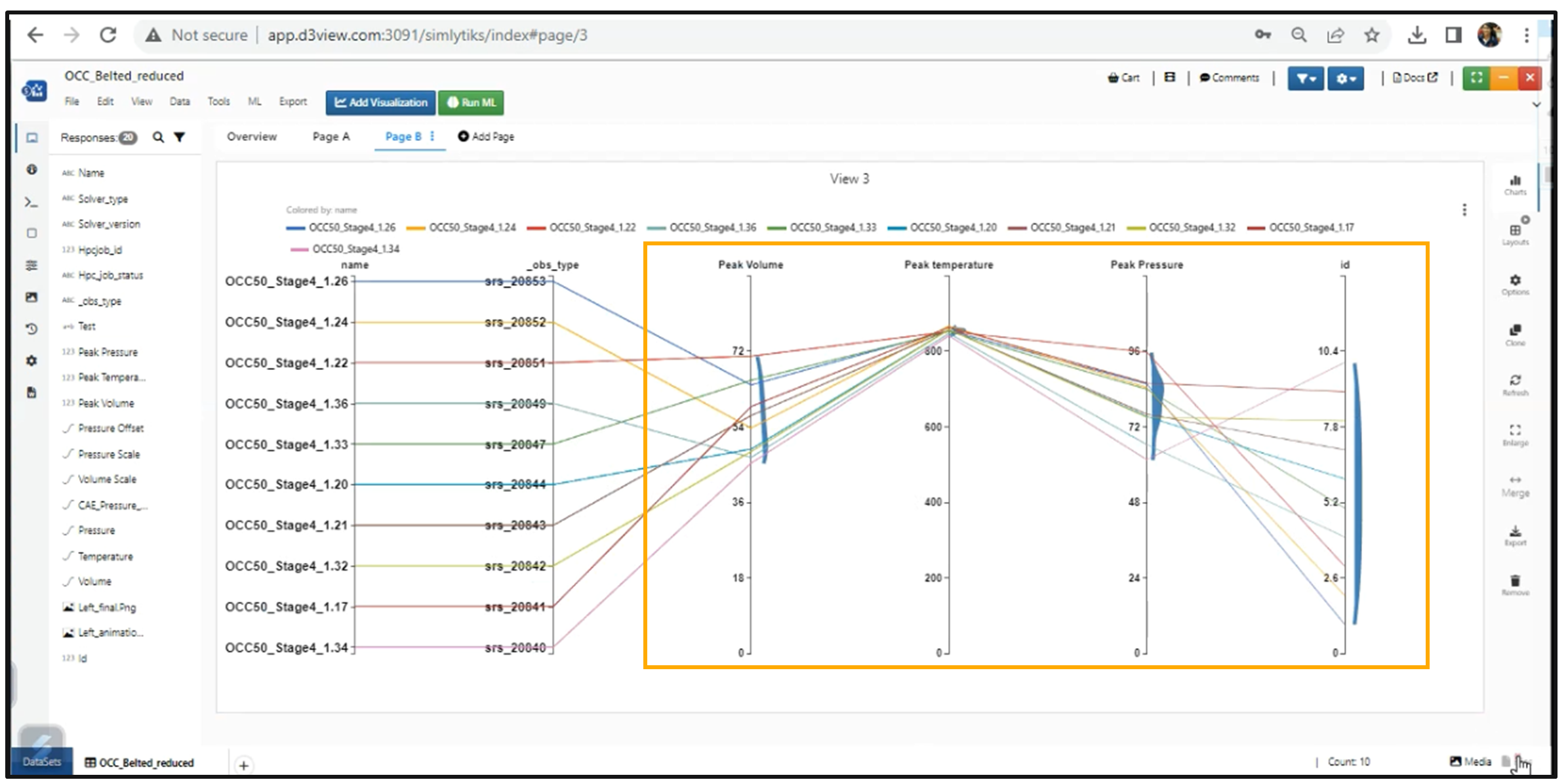
Parallel chart has new option to show KDE which adds a curve on the right side of all numerical dimensions.
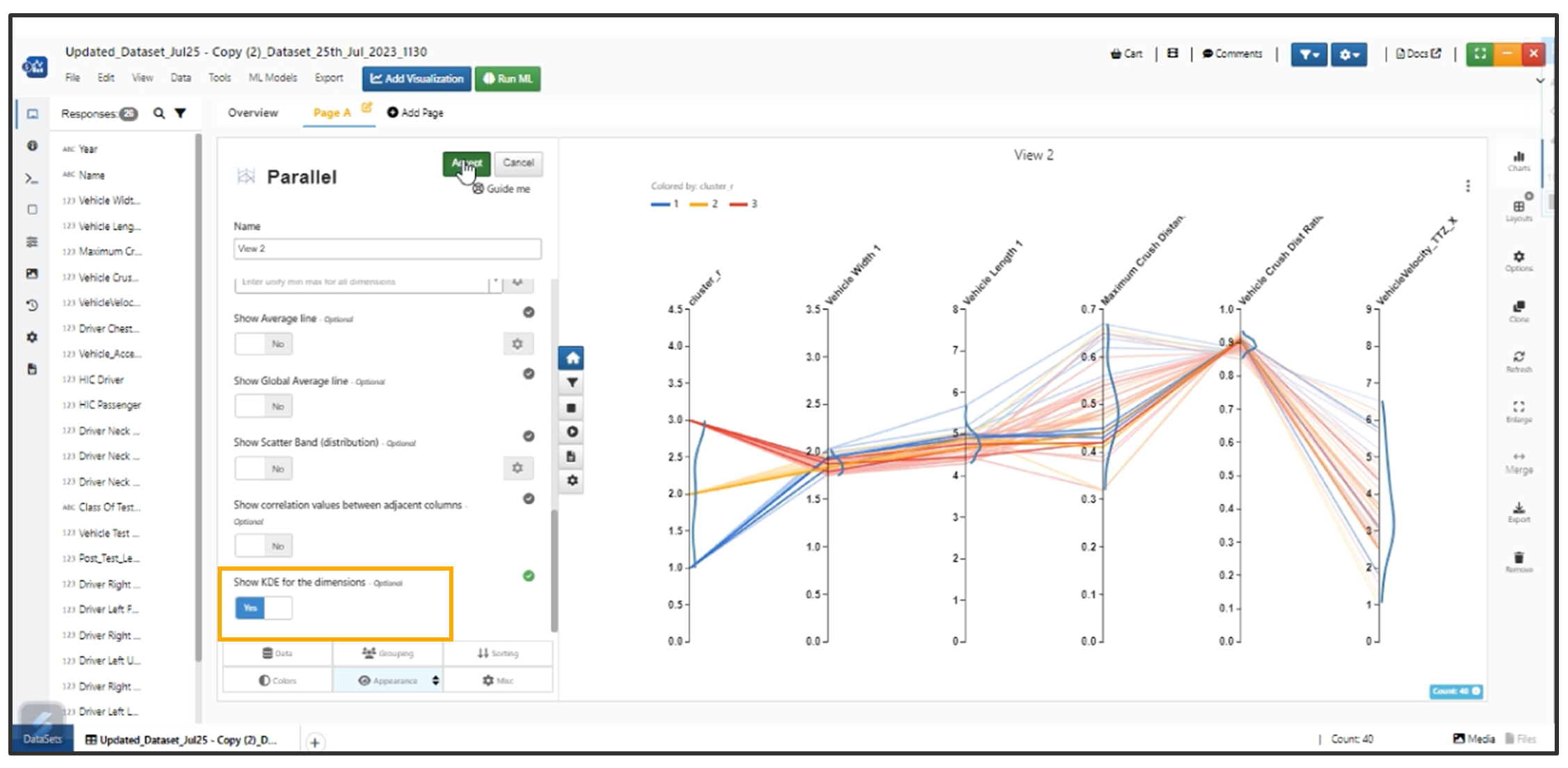
KDE option
Table view in Parallel chart visualization has Interactivity. When we highlight the curves in chart the corresponding values are viewed in the table.
New option added in Parallel Visualization to show correlation of all columns against one particular column in the Chart.
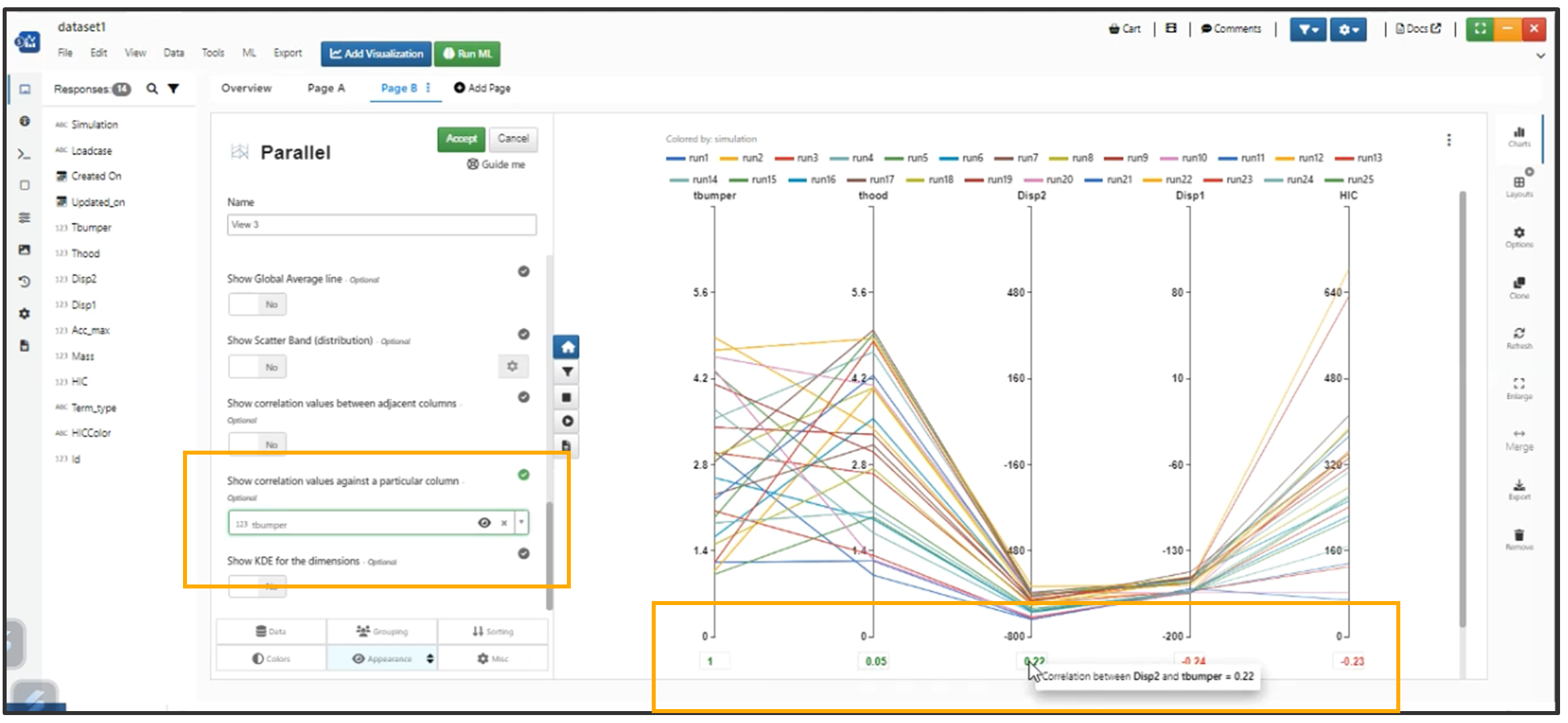
Correlation
Show KDE option in Parallel chart now fills up the Area instead of just a Curve in Simlytiks.
Show KDE
New option added to Parallel chart in Appearance tab to show Standard Deviations. It will show the values at the bottom of every numerical axis.
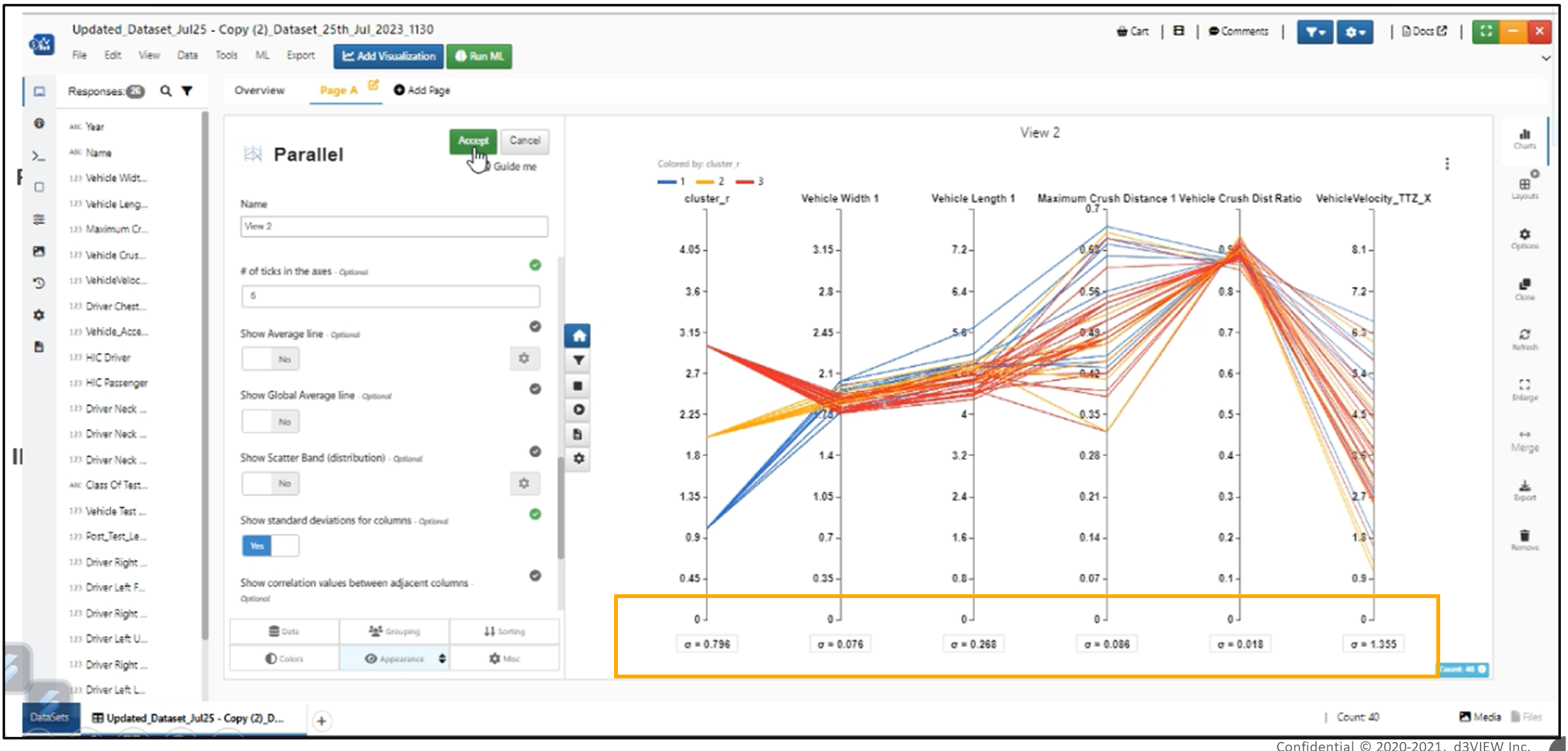
Standard Deviations
Parallel plot has a new option called Show Heatline (in Appearance tab) which will render heatlines in the axis based on the density.
Images are available in Dimensions and Table when Enabled in Parallel Chart Visualization.
If an image column is used in the dimensions of the Parallel Chart Visualization, new options show up in Appearance tab to control the height & width of Images.
Dragging of Responses or Columns to the input of the visualization while creating a Visualization is working as expected.
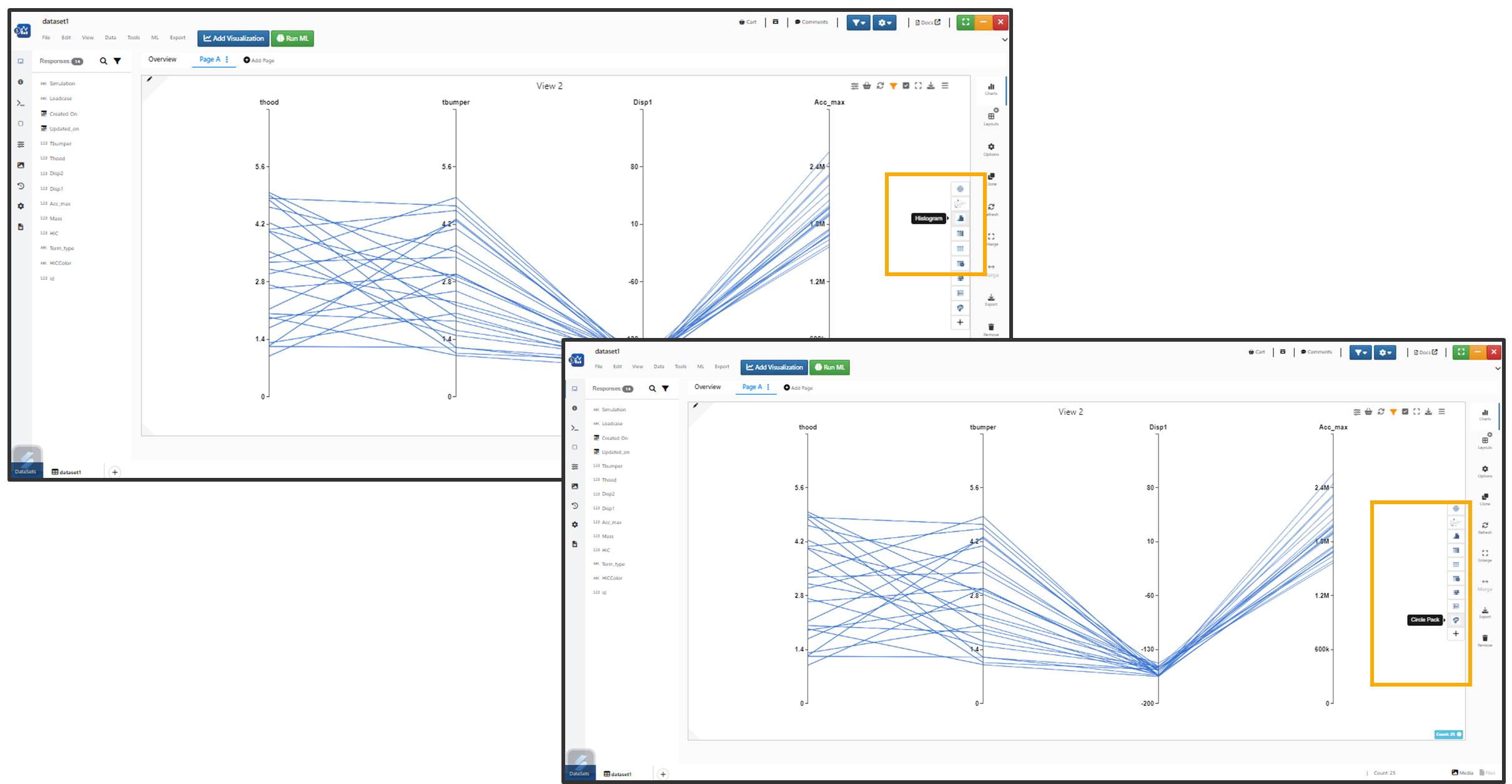
When a Visualization is dropped onto an existing Visualization, New option called Add to end along with Replace, Add on new page is shown and this option will make the page charts a carousel in Simlytiks.
New option Enable Smooth Lines is added to Parallel chart now renders the same lines in form of Bezier curves. We also have option to display both Linear & Smooth lines at once.
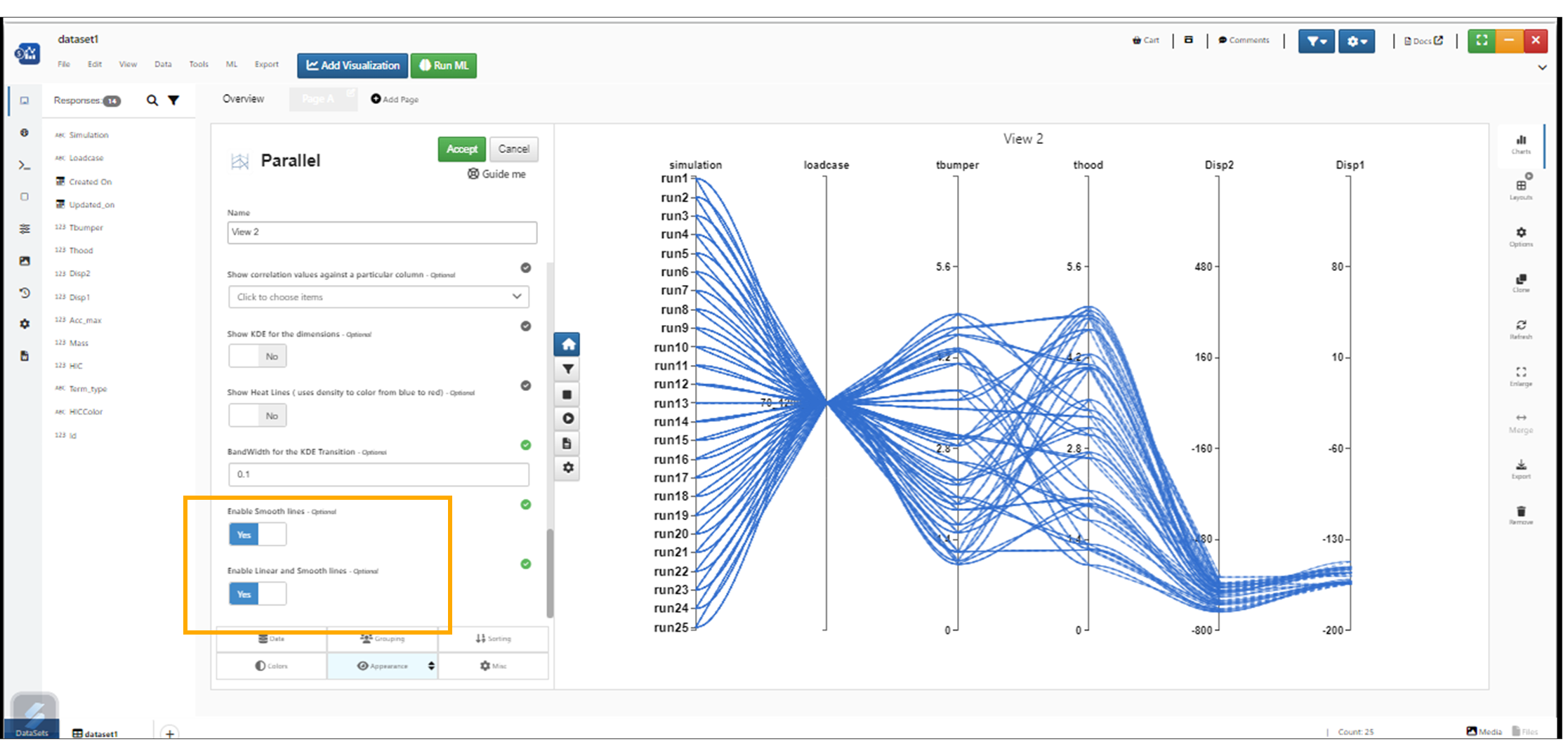
Enable Smooth Line
Parallel chart Visualizations now support sorting. Sorting tab has new options called Sort By Column and Sort Order.
Every dimension has Axis options to edit Min/Max values, Font size, Ticks in Parallel chart visualization.
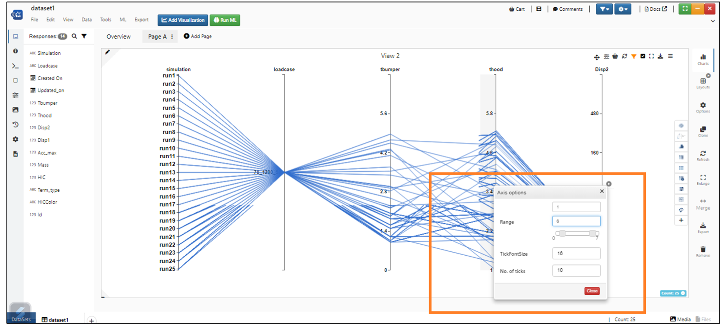
Axis Options
Appearance tab has a new option to change the legends font size in parallel chart visualization.
Parallel visualization now shows the name column values in visualization.
Name column
color By
Parallel visualization now supports Regular expression to get pattern in Color by or any data column when its categorical. This option is available in colorby tab.
In Simlytiks, ColorBy feature for categorical columns has option to color based on 5 default groups in visualization
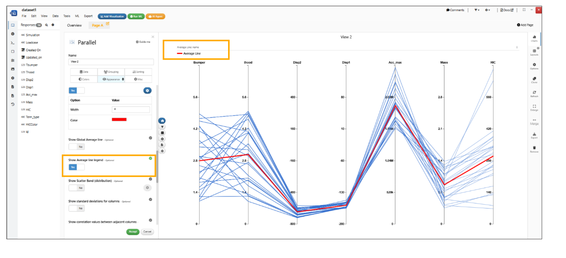
Average line
Added a new option to display legend lines for the Custom Average lines in Parallel chart visualization.
Average line legend
Decision Tree Visualization
New visualizer Decision Tree is added to Simlytiks when view type can be changed to Horizontal, Vertical and Radial and we can add the conditions to build a decision tree.
2D Contour Terrain Visualization
Added new visualizer 2D Contour Terrain to Simlytiks where we provide different columns to form a Matrix and create a visualization.
Density Contour Plot Visualization
Added new visualizer Density Contour Plot to Simlytiks where we provide X data and Y data to create a Visualization and we can also color the Density contour plot.
New option called Bandwidth is added to Density contour plot visualization.
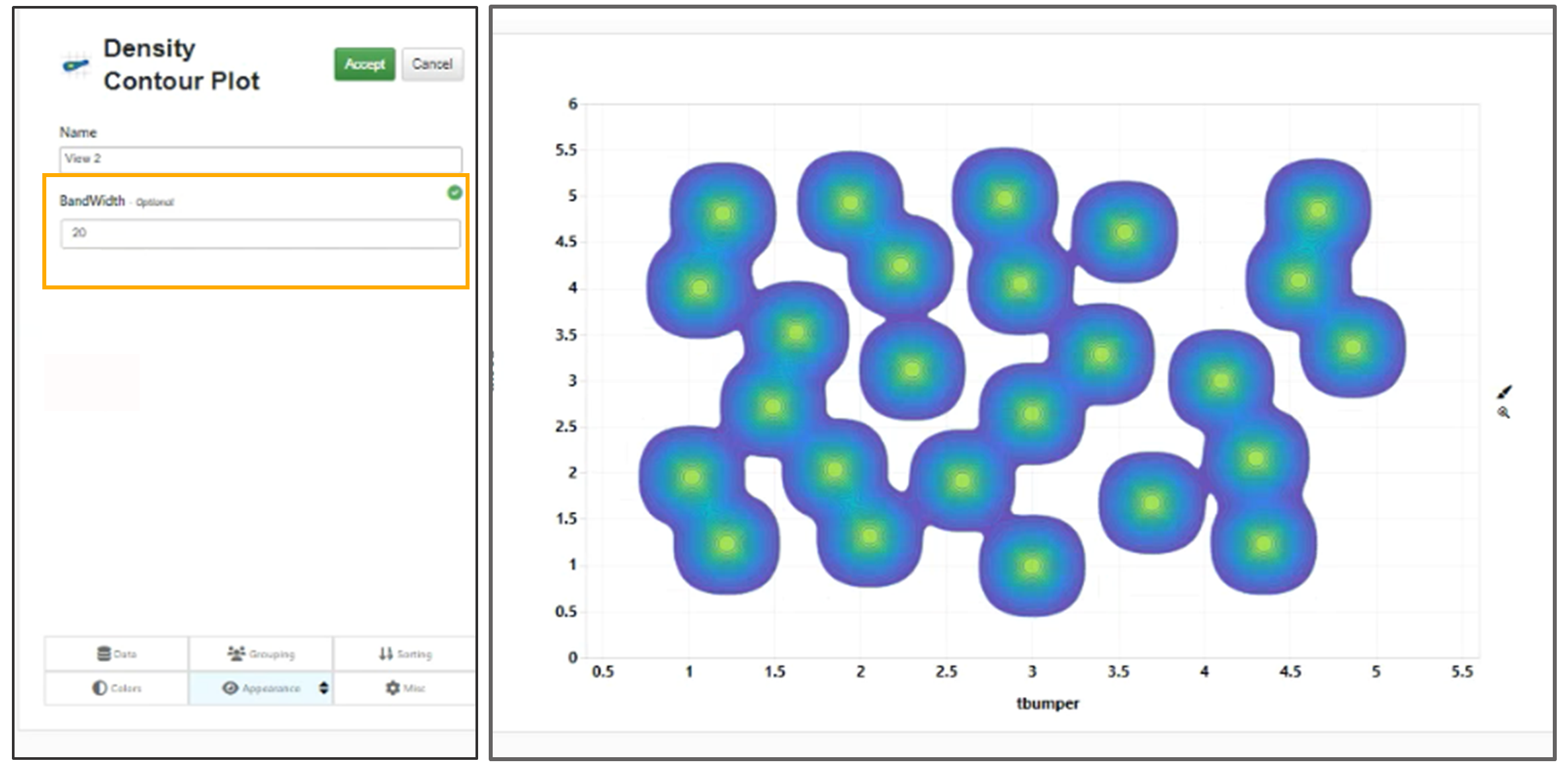
Bandwidth option in Density Contour Plot
Density Contour Visualization has a new option to set the Opacity of the contours.
Sparkline Matrix Visualization
Added a new chart Type along with Sparkline and Color panels called Y MIN/MAX which will show min/max Y values at time for each of the panels in Sparkline Matrix visualization
Sparkline Matrix has a new Peak Force Time Contour visualization type in Simlytiks.
Average
New view called ‘Average’ is added along with the min view and max view in Sparkline Matrix.
Average Values
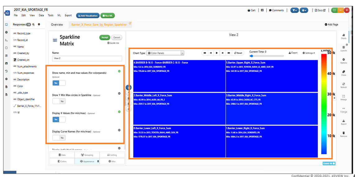
Sparkline Matrix now has option to show individual average values when comparing multiple records. Average values for individual records.
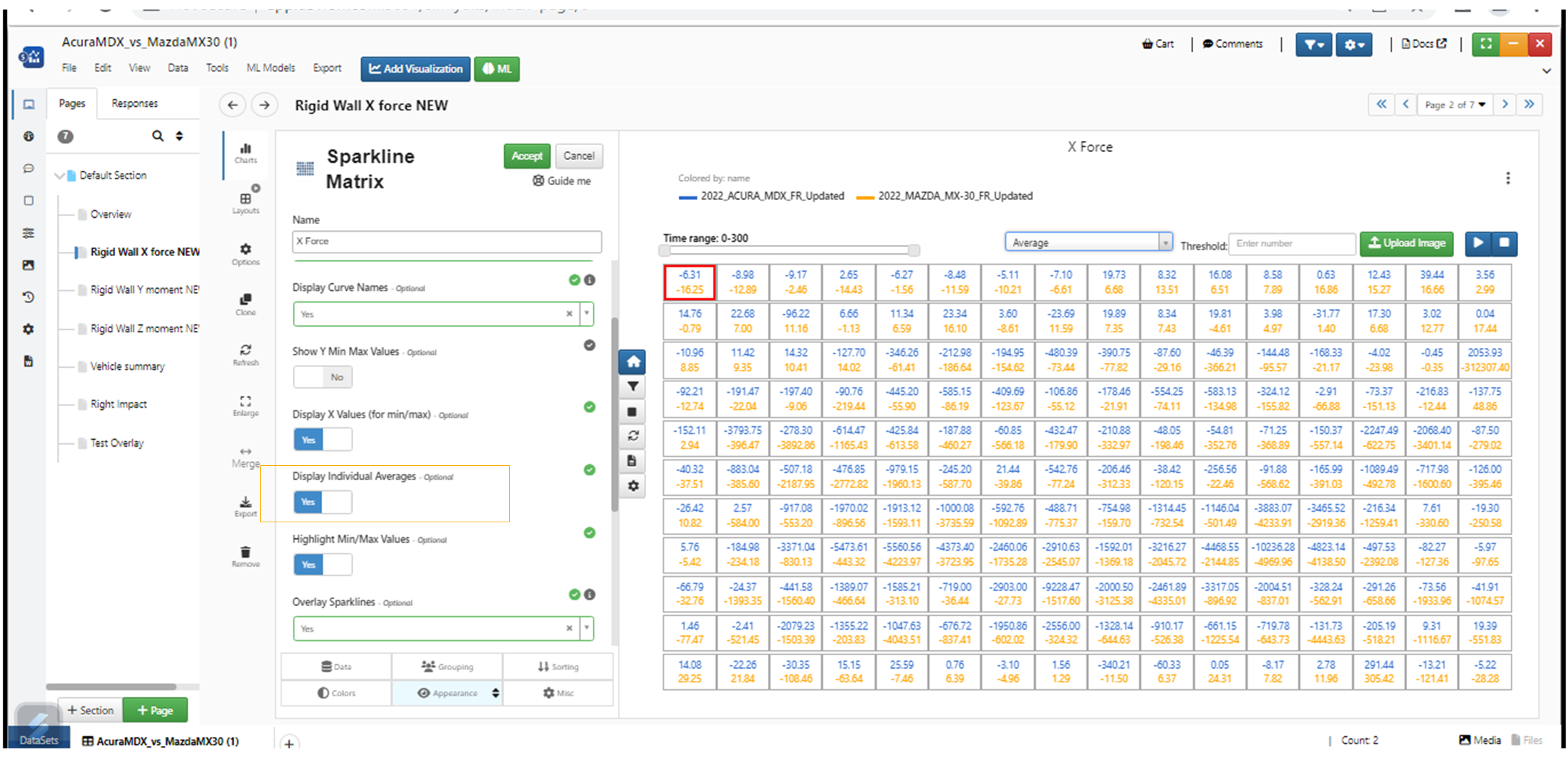
SHOW INDIVIDUAL AVERAGE
New option Show Moving Average is added to Sparkline Matrix visualization in Simlytiks.
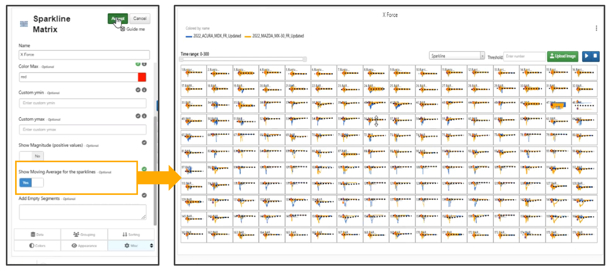
SHOW MOVING AVERAGE
Highlight min/max
New options are added to Highlight min/max values and to Display x values in Sparkline matrix.
Panel transparency
New option is now available to change opacity of the color panels in Sparkline Matrix. By default, the color panels are 100% opaque. With this new option, the panel opacity can be changed to go from 100% opaque to fully transparent. Following Video demonstrates this where we see the contour of the panels based on the max-acceleration and how we can change the opacity from 100% (opaque) to some level of transparency.
Color min and color max
In Sparkline Matrix, colorBy option now supports colorBy customizations with colorschemes etc.
Sparkline Matrix now supports both colorBy (name) and the fringe legend in the same chart
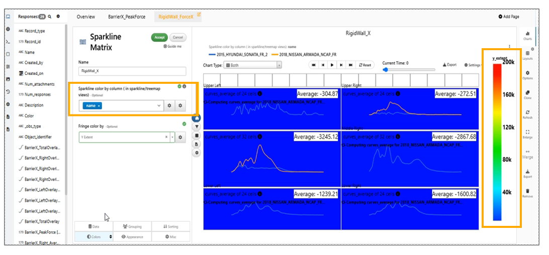
Colorbyfringe
Frames per second option is now available for Sparkline matrix visualization
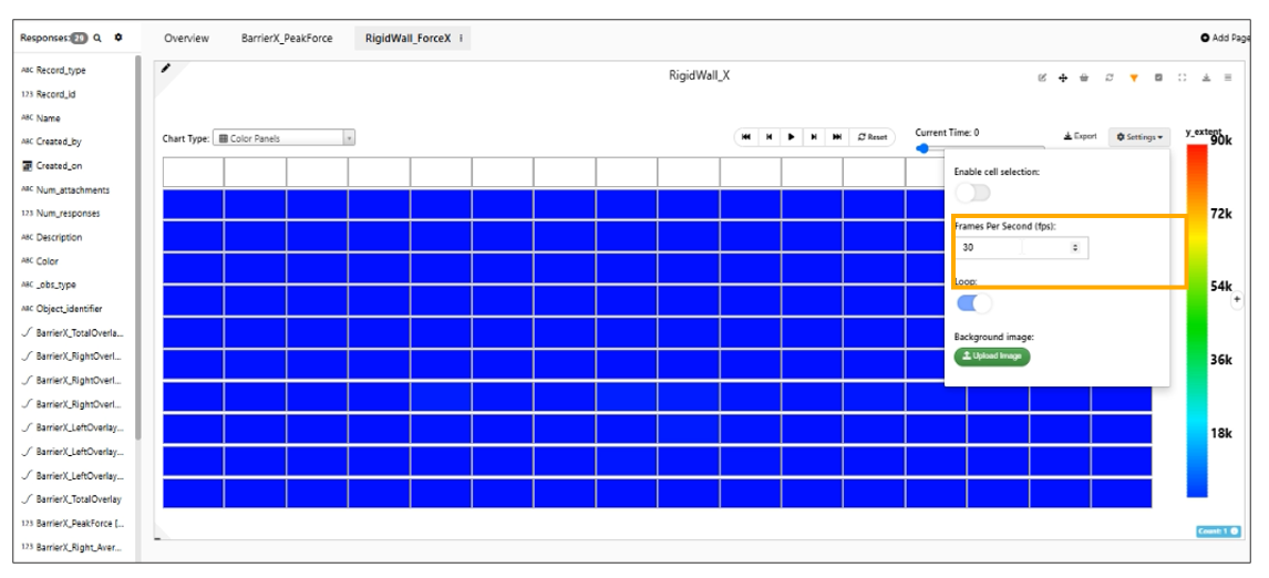
Frames per second
Ymin and Ymax in Sparkline Matrix visualization
We have options to specify Ymin and Ymax in Sparkline Matrix visualization, If any cell registers a value beyond the range, the data from that cell can be ignored for calculations
Sparkline Matrix has new option in Appearance tab to show names along with min/max/average values in Min/Max views.
min/max/average
Sparkline Matrix visualization has new option in Appearance tab to Show X, Y axes which will add axes in individual cells.
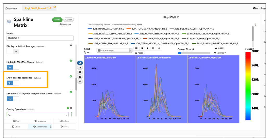
Show X Y axes
Magnitude
Added support to specify Magnitude and converts the curve data into Magnitude which start from 0 and extends to +max value in Sparkline Matrix
Selection of Cells
We can now drag and choose cells in Sparkline Matrix to select them and we can label them using right click options. Labels can be edited and Hidden.
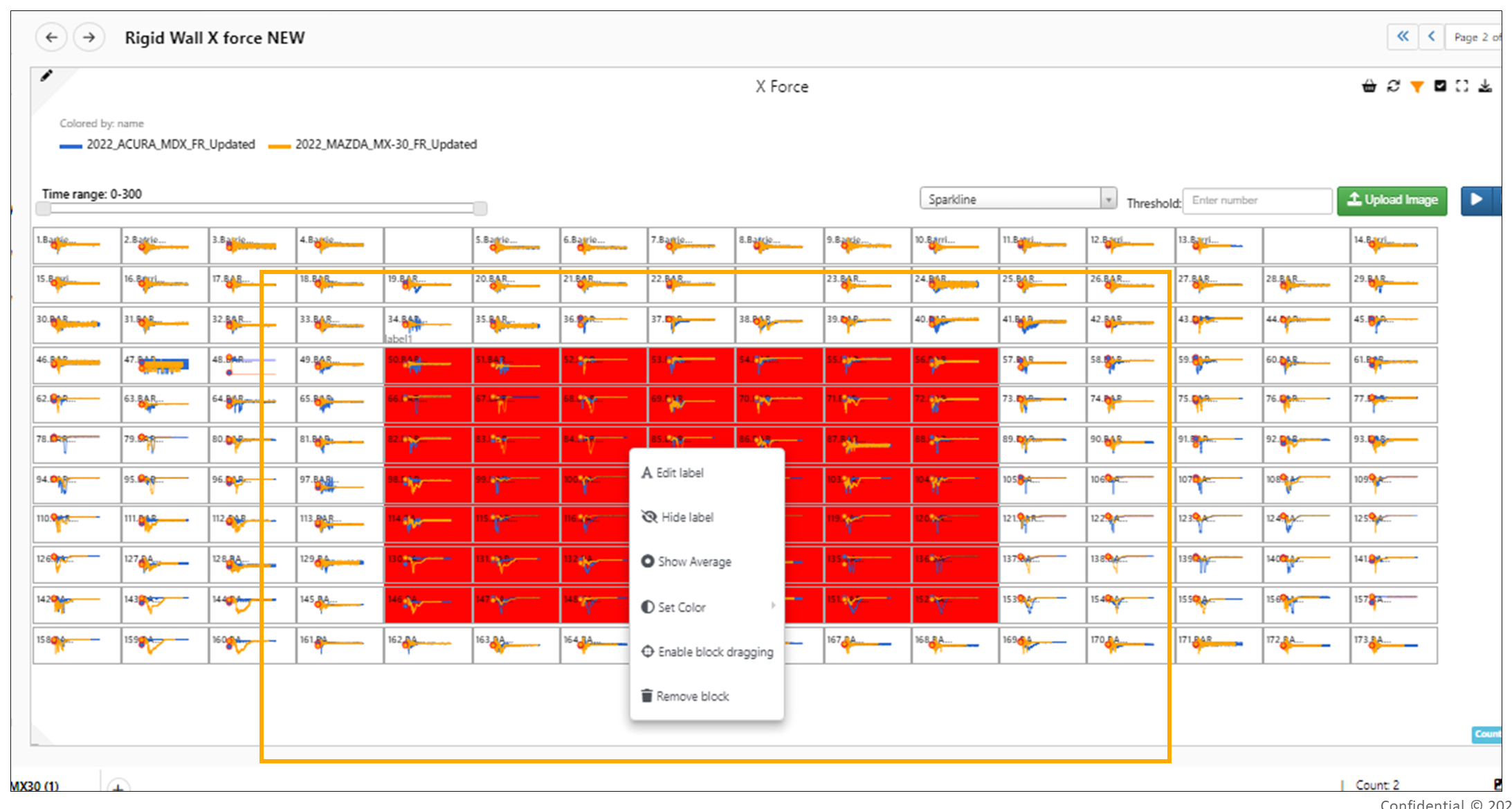
Selection of Cells
New option ‘Enable Container Drag and Resize’ is added to Sparkline Matrix visualization.
Add Empty Cells
Sparkline Matrix visualization allows us to add empty cell in the desired location of the Matrix. We can add multiple empty cells by adding commas in the option.’
Sliders
New slider is added in Sparkline Matrix on the right which will show the Y value at that X and accordingly color the panels in Simlytiks.
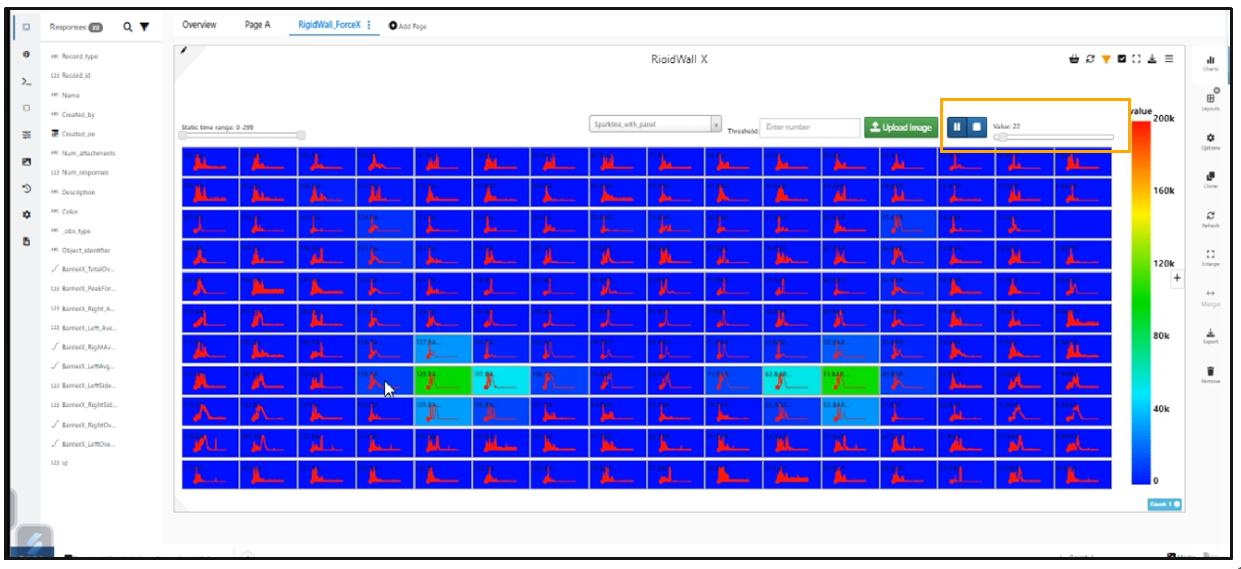
Slider
A new option is added to Sparkline Matrix in the Misc tab to Set X at Max Y called Slide to Max Y which shows where the Y value is the maximum.
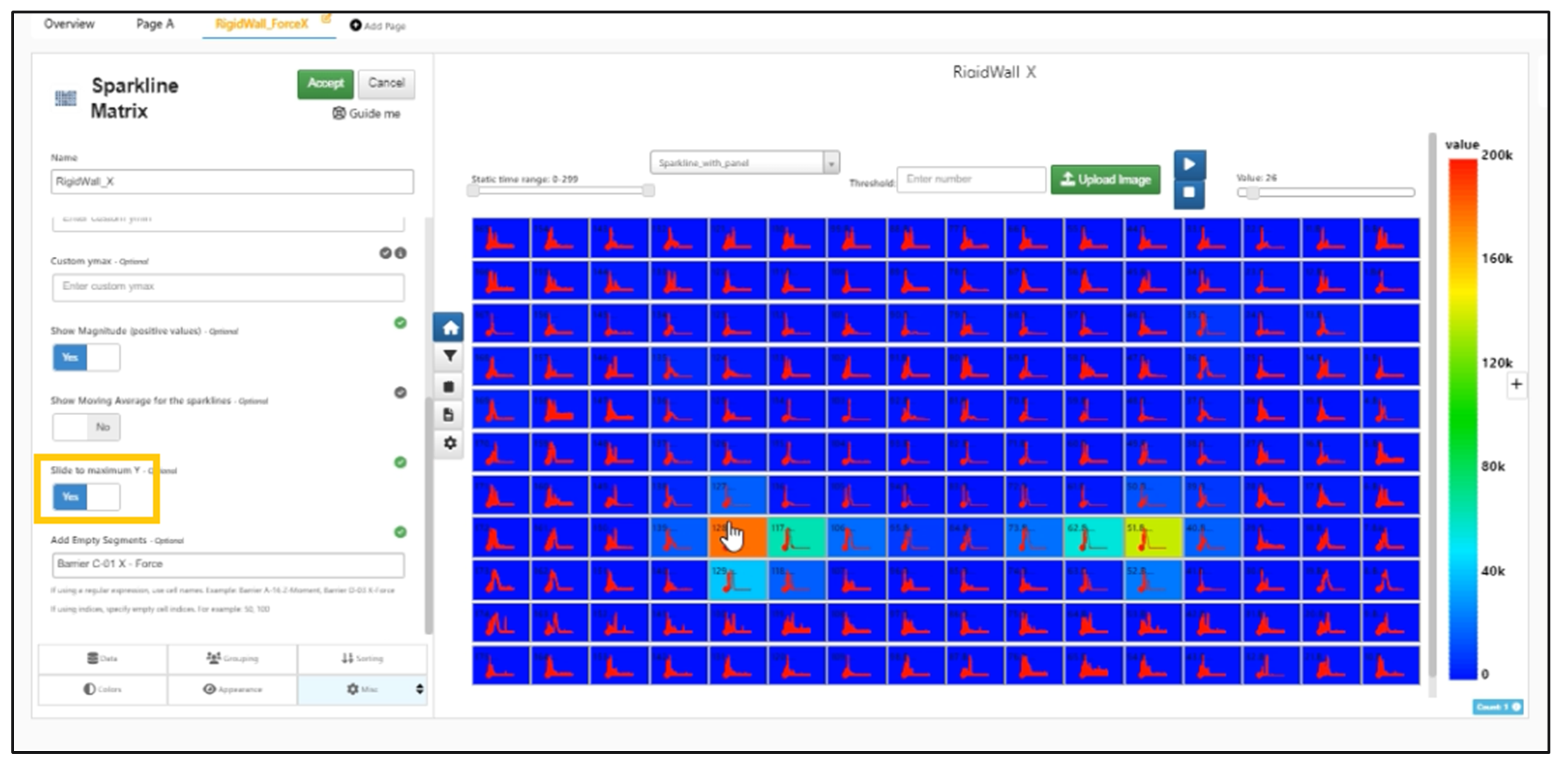
Slide to Max Y
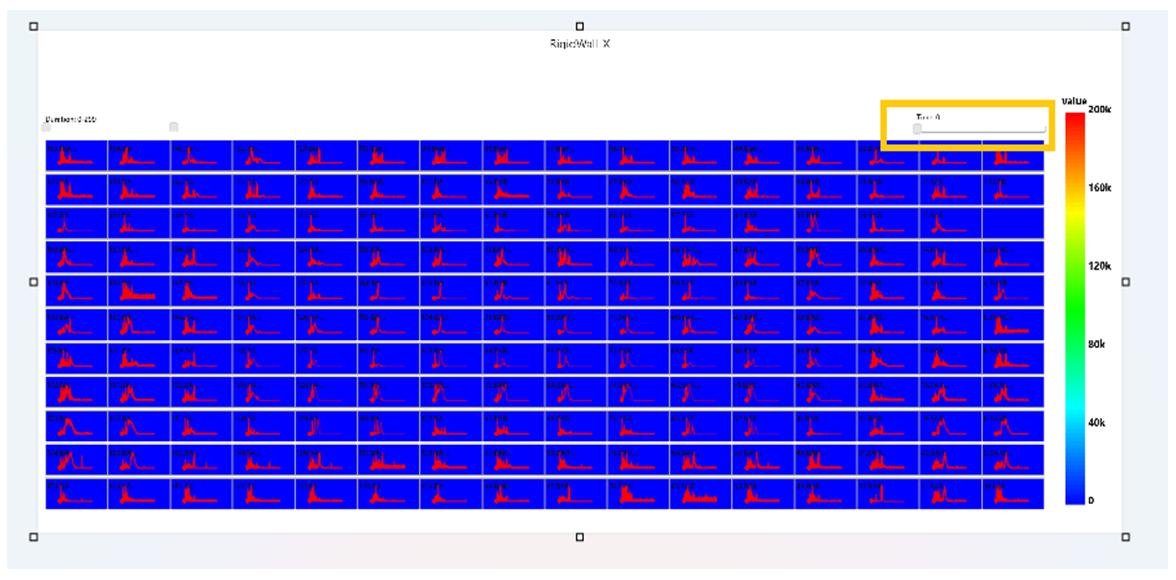
The Time slider values do not reset and remains the same when we switch to other chart types in Simlytiks.
Range slider
Range slider is added as Start time and End time in Appearance tab for Sparkline matrix visualization.
Options
Sparkline matrix has a new option called Image By which will allow the user to add a background image to the container in Simlytiks
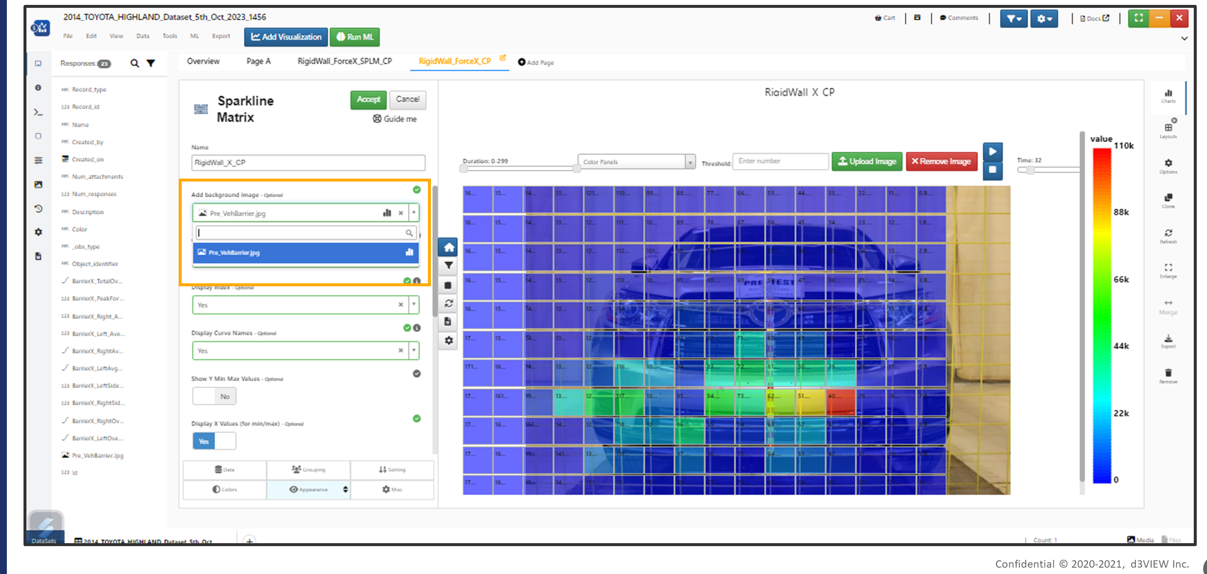
Background Image
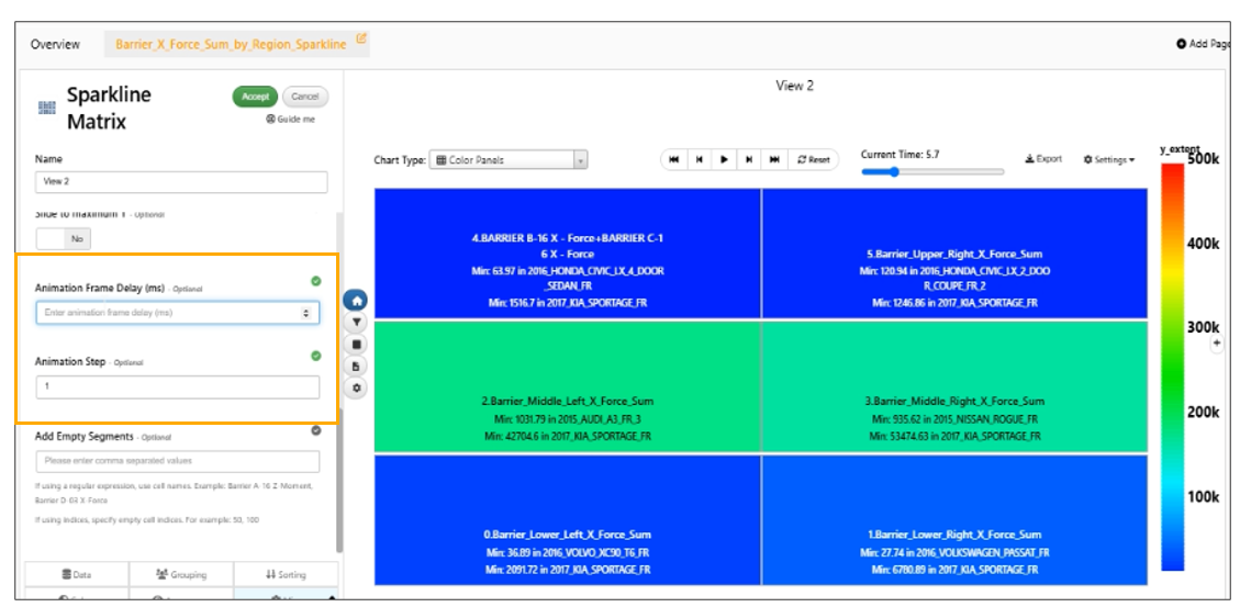
Two new options added in Misc tab called Animation Step and Animation Frame Delay which will change the timeout and the step of the animation slider for Sparkline Visualization
Sparkline Matrix has a new option in the Misc tab called Digitize points which will digitize the number of points in each of the curves which can help improve the overall performance especially if the dataset has some large curves.
The Animation Slider (time) is available in the exported screenshot of Sparkline Visualization.
Animation slider export
In Sparkline Matrix, new option is added in Appearance tab to control the position of labels in the color panels ( top left is default, top center, center, bottom left and bottom center)
In Sparkline Matrix, new option is added in Appearance tab to control the font-size of the labels in the color panels (FontSize for labels).
The number of columns for matrix option is available and columns can be edited by user in the Sparkline matrix visualization
Simlytiks datasets with sparkline matrix visualization can filter the curves and show curves based on the filters.
Export
Export button is added in the header for Sparkline Matrix visualization which exports the Sparkline matrix as GIF in Simlytiks.
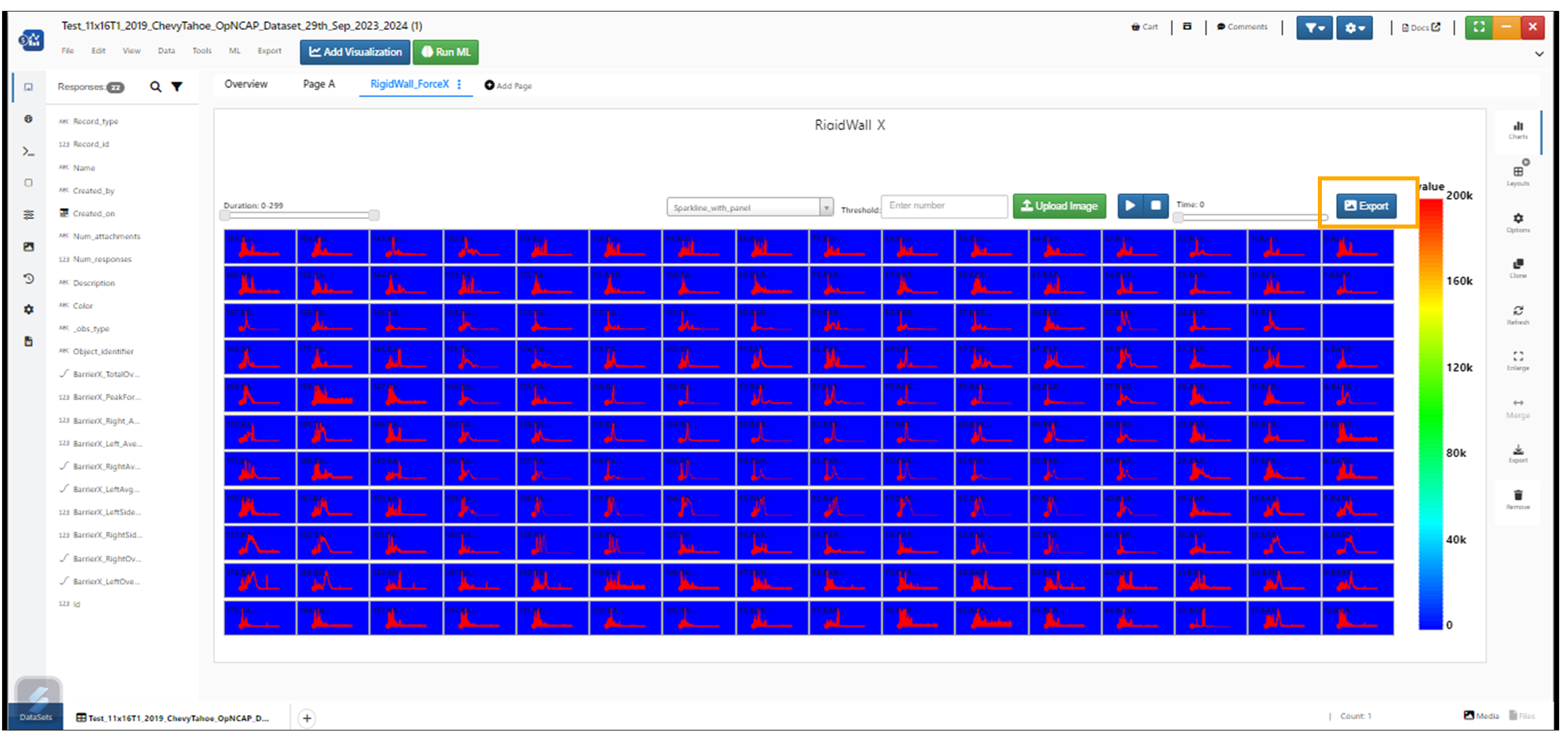
Export GIF
Baseline Option
New option added called baseline to support is added to Sparkline Matrix. When comparing two or more vehicles and their corresponding Matrices, we should be able to lock one of them as the baseline and identify the difference [Ymin, Ymax, average] of the other vehicle(s)
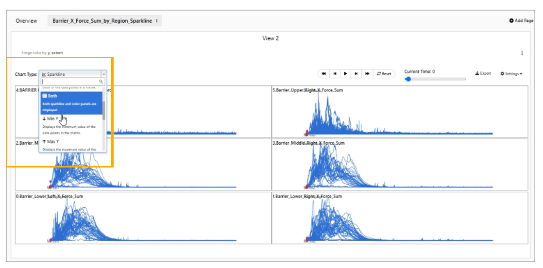
Chart type
For Sparkline Matrix in Simlytiks, the color panels is the default view and the texts on the color panels are now visible.
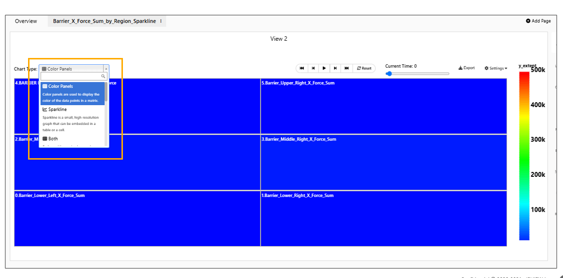
Chart type Color panels
In Sparkline Matrix, descriptions are available for all the chart types list.
Descriptions
Sparkline Matrix visualization has new TreeMap viz type showing vehicle panels within the color panels and during animation, the vehicle with min and max Y are colored with options.
Misc
Sparkline Matrix visualization has option to control the animation speed in the Misc tab called Animate Frame Rate (in milliseconds with default of 75ms).
Animate Frame Rate
Loop support ( with default = true ) is added in Settings dropdown.
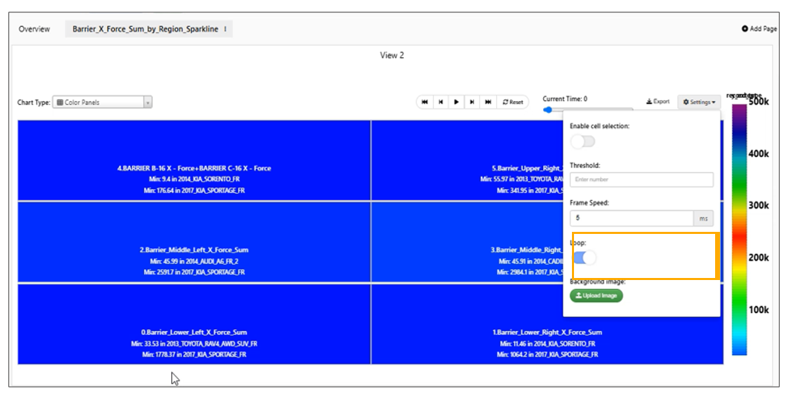
Loop
In Sparkline Matrix, we have support for curve digitize in Misc tab which will digitize the no. of curve points in each cell to the specified number.
We have new option to provide Animation step size in misc tab for Sparkline Matrix visualization in Simlytiks.
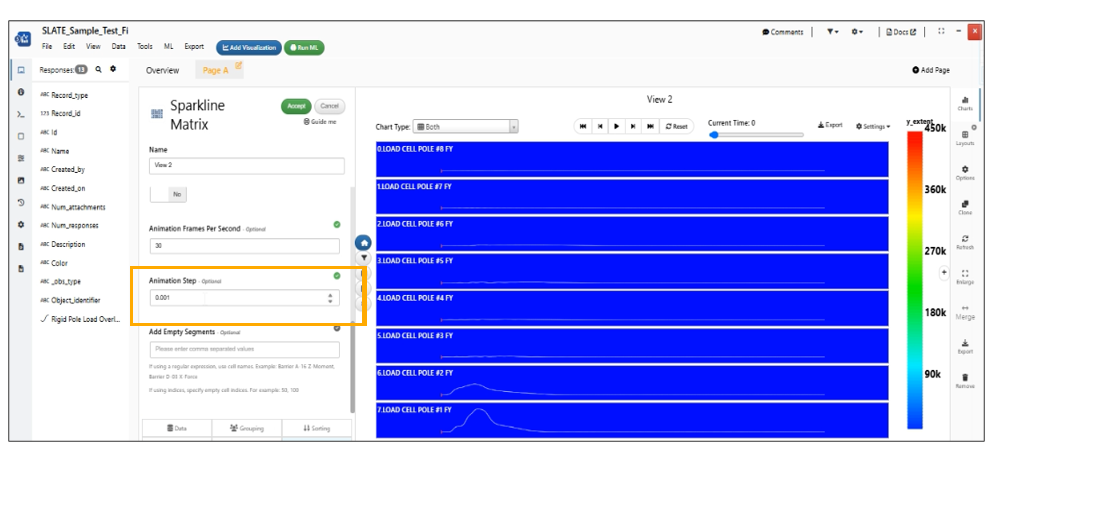
Animation step size
Selections
In Sparkline Matrix, the cell selection can now be toggled using Settings -> Enable selection where cells dragged and selected will now show context menu options for adding Curve Operations like curves_add or curves_average which will use the respective workers and add a single curve averaging all which allows tooltips, click to enlarge etc. This curve can be removed and switched back to block using the Remove option in the same context menu.
In Sparkline Matrix visualization, block curve operation will have a new option to compute Curve average per vehicle OR of all curves ( default ).
Blocks in sparkline matrix visualization that are generated using curves_average OR curves_add will now change their background color dynamically based on the slider as the animation is played.
In Sparkline Matrix, new option available in merged blocks to render X and Y Axis for the average/sum curves.
Sparkline Matrix now supports extracting the starting cell block using the specified regular expression pattern in Simlytiks
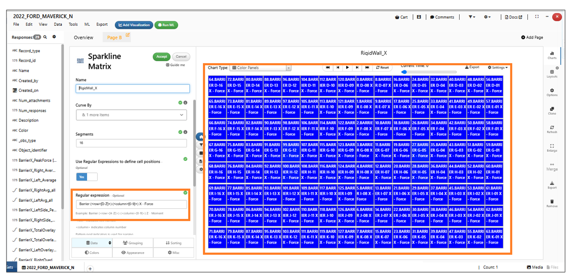
Regular expression pattern
Empty cells
Empty containers in the Sparkline matrix will remain white color during the animation in Simlytiks.
Empty Cells
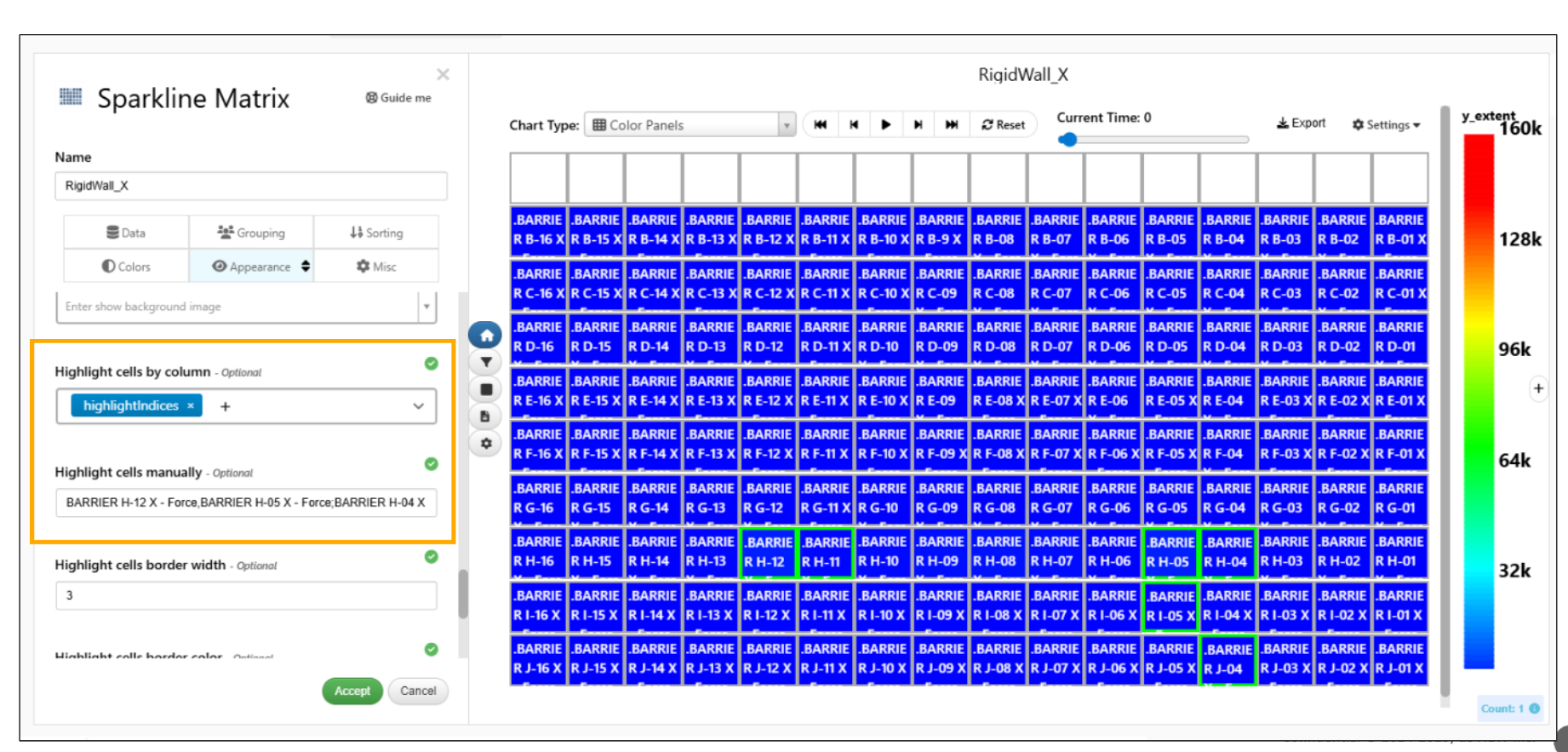
Highlight cells
In Sparkline Matrix visualization, new context menu option is available to highlight cells with configurable border style, color, and width. User can also unhighlight the cells from context menu. These settings are also available in the Appearance tab.
New option is available under appearance tab for Sparkline matrix called ‘Highlight cells by column’ which highlights based on values from another column.
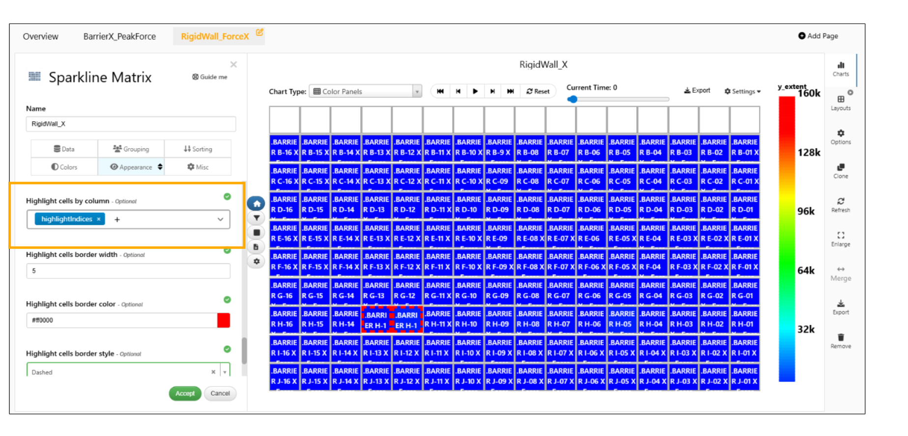
Highlight by column
Sparkline Matrix visualization has new options in appearance tab to ‘Highlight cells manually’ where users can manually provide a string to highlight cells and ‘Highlight cells by column’ where column in the dataset can be used for highlighting cells.
Highlight cells
Box plot Visualization
Boxplot now shows the ID of the outliers in the tooltip when hovered over any outlier in Simlytiks.
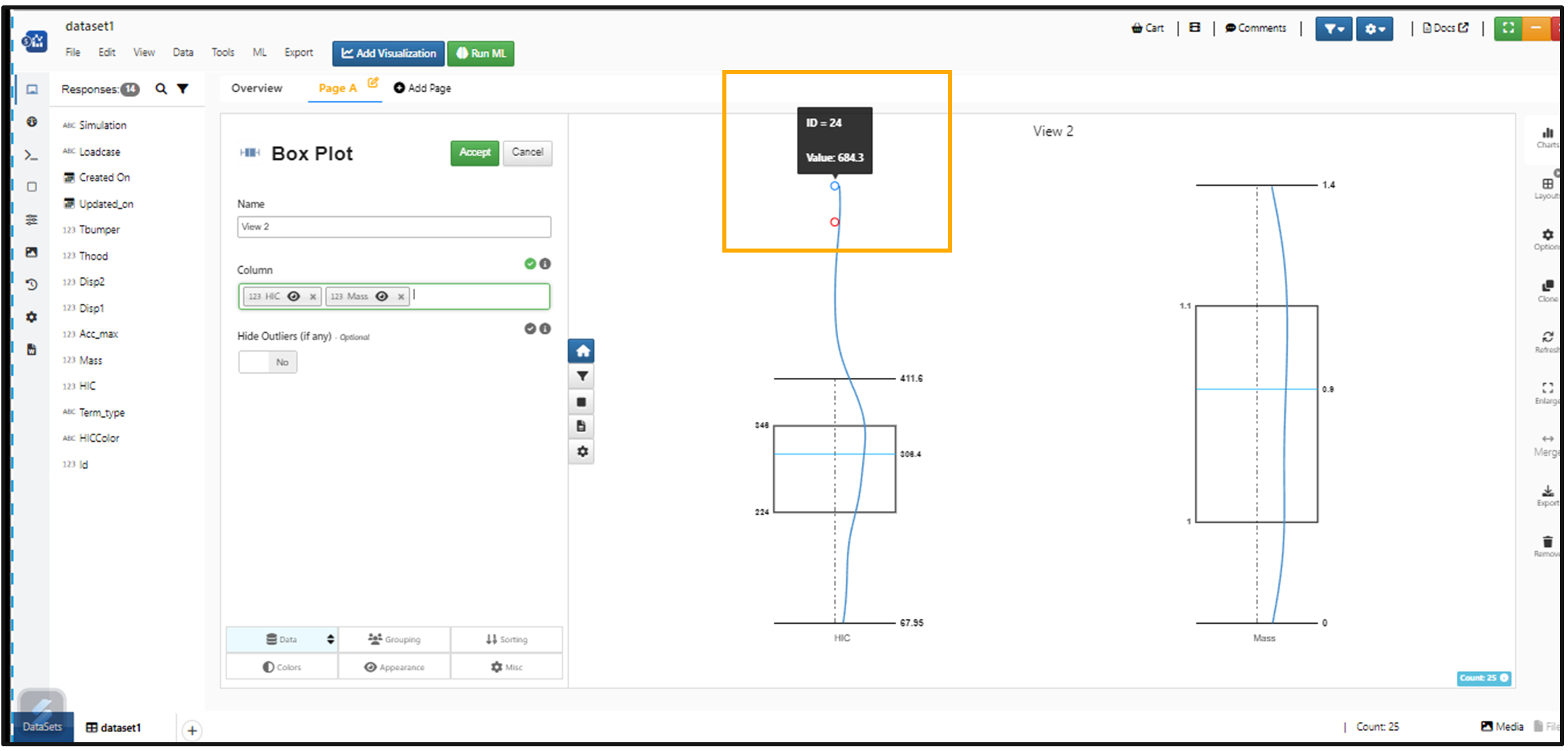
ID for Box plot
Boxplot has a new option called show Images In Header And Footer based on min max values of the column chosen for the box plot. The image column is shown in the box plot container which can be clicked to enlarge as well.
Sorting support is now added to the Box plot visualization in Simlytiks
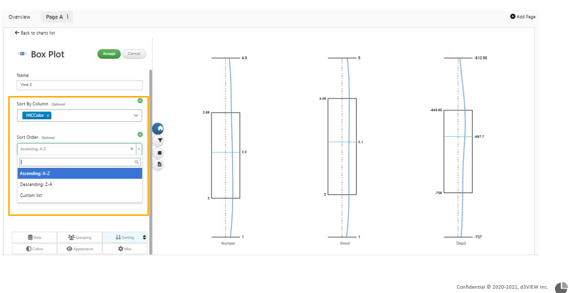
Box Plot Sorting
Box plots now support the generic legend font size option in the Appearance tab.
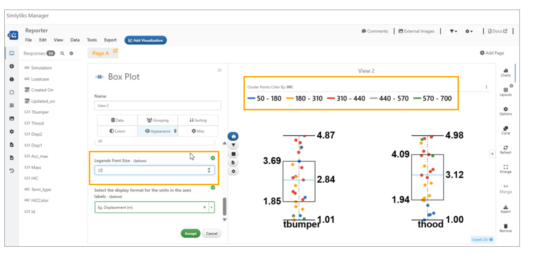
Legend font size
Multibox plot/Grouped box plot Visualization
Multiboxplot domains are rounded up to avoid out-of-bound points.
Added option to allow positioning of blocks based on curve name (using Regular expressions) and once available, add another option to add an Empty cell at a desired location in Sparkline Matrix Visualization.
Grouped box plots has new option in appearance tab that will show the count in the X-axis tick in Simlytiks.
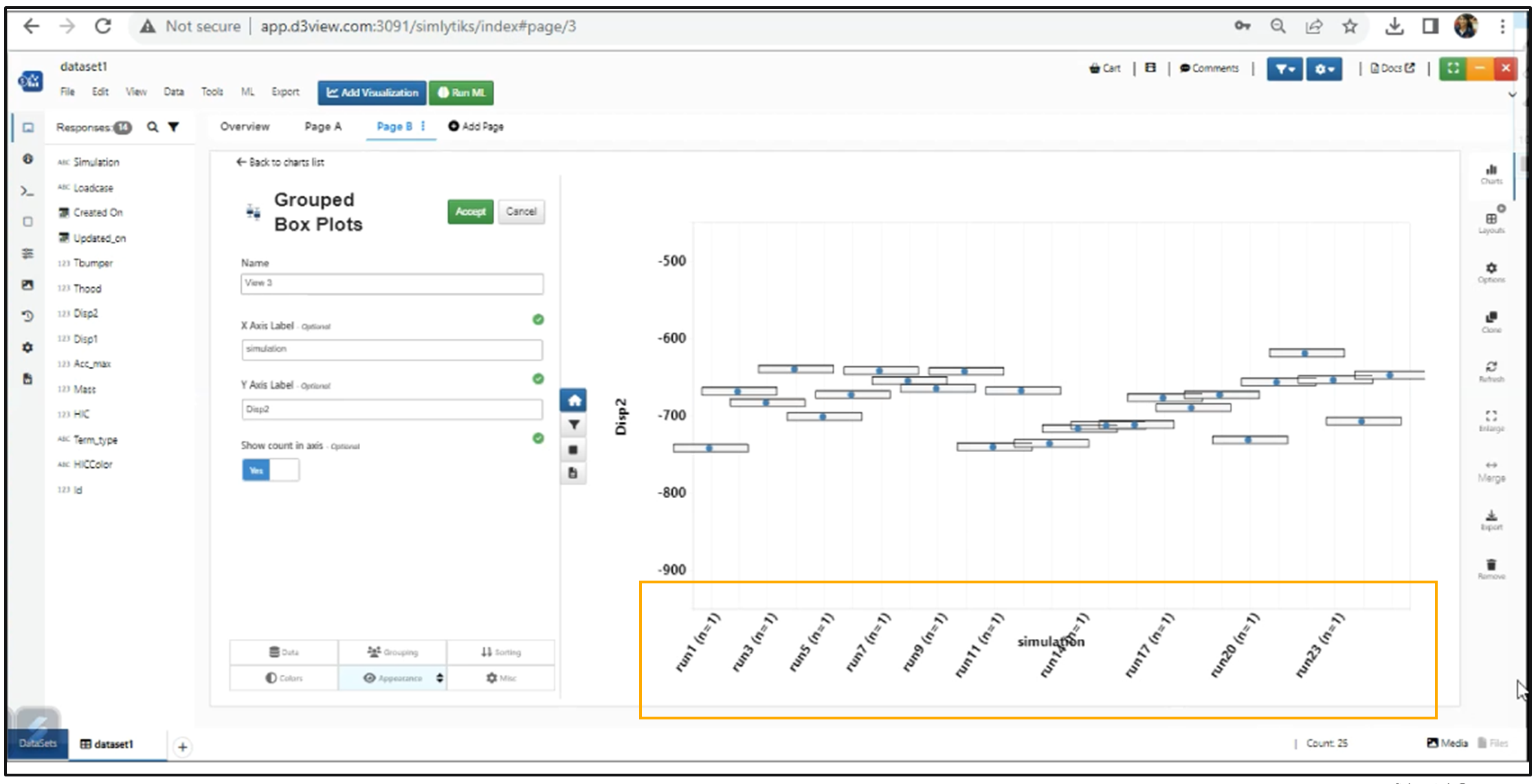
X axis ticks
Histogram Visualization
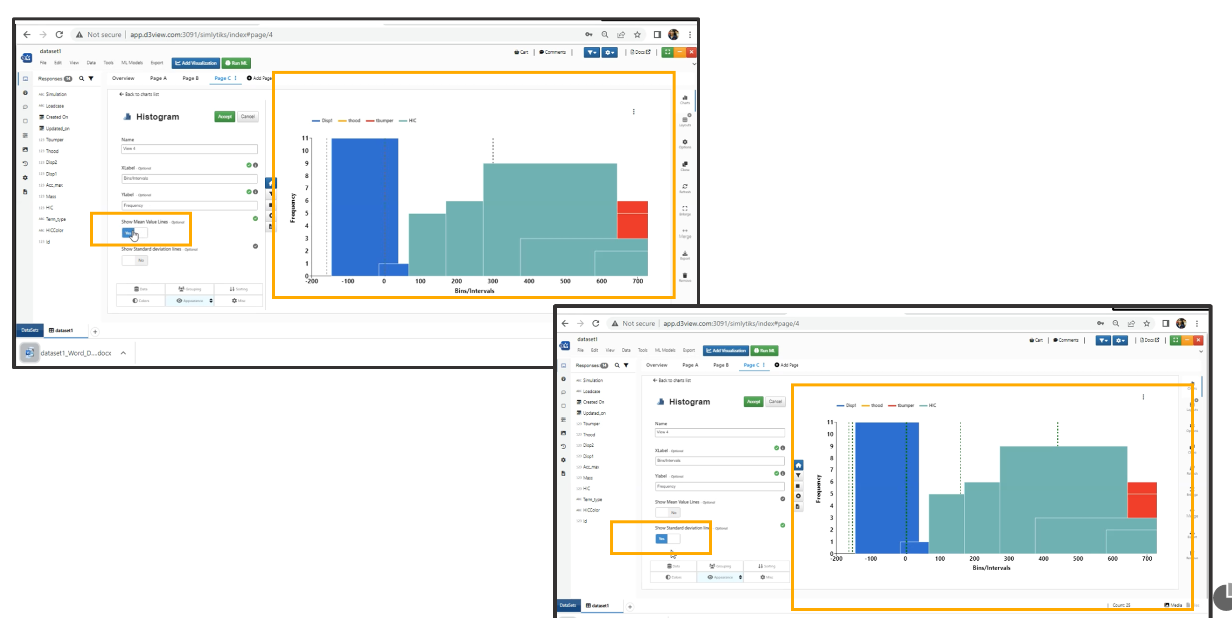
New options added to show Mean Value Lines and Standard Deviation Lines in Histogram Visualization Appearance tab.
Selection of Cells
Mean Value Lines and Standard Deviation Lines in Histogram Visualization now act as datum lines. Histogram visualization also supports adding Datum line anywhere on the chart.
Histogram Visualization now support options – 1/ Bins which decides the number of bins to use to plot and 2/ KDE to show the kernel density function for the chart.
Simlytiks Histogram visualization now supports user defined “Static X minimum” and “Static X maximum” options in the Appearance tab.
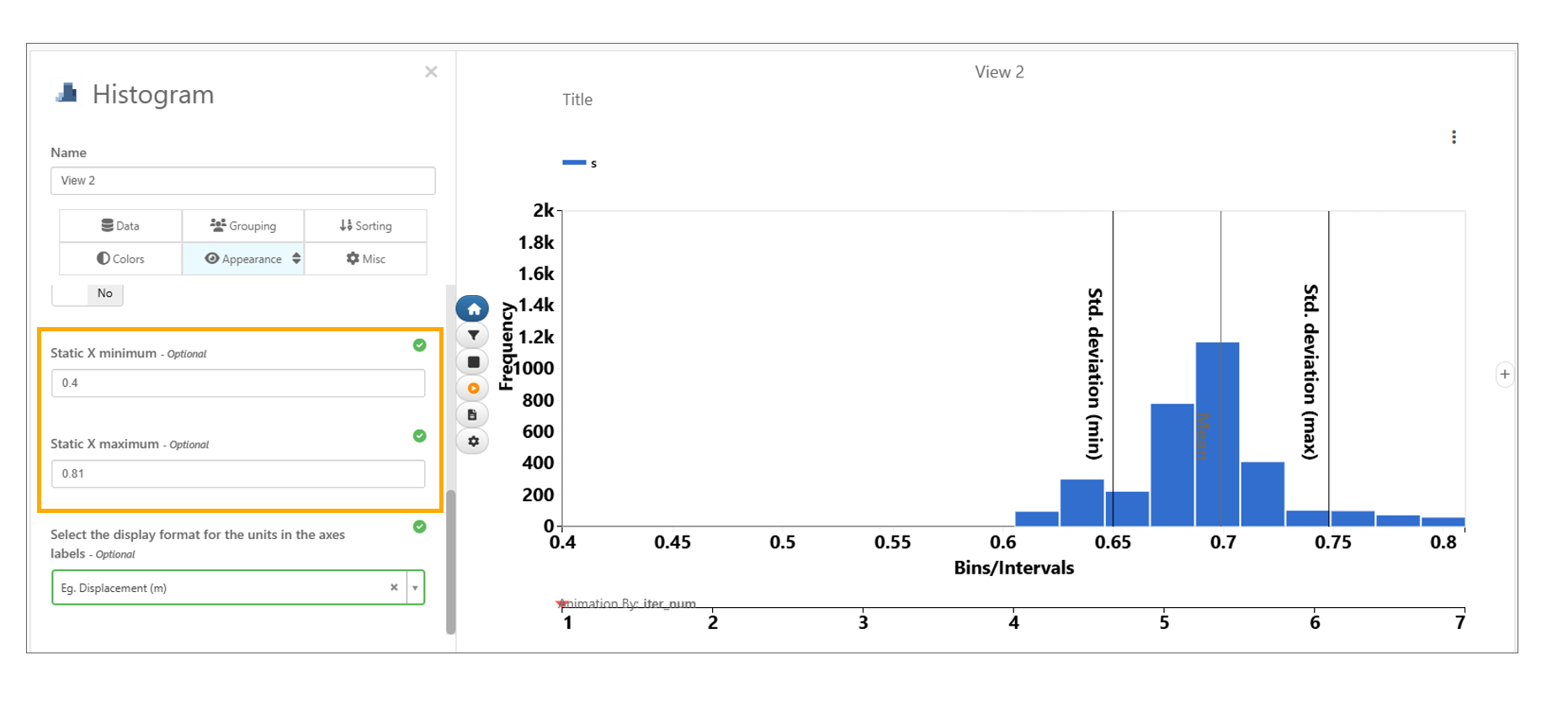
Static X minimum and maximum
Histogram visualization in Simlytiks now includes input options to enable Show mean and SD values, Show samples count, configure lower and upper bounds with Show colored areas and adjust sigma levels and bound colors.
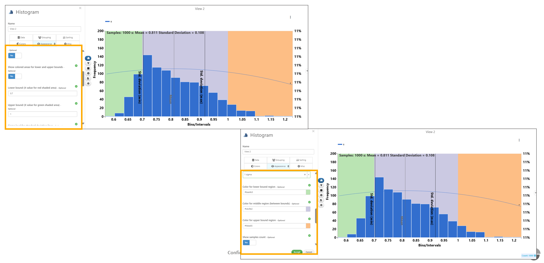
Show mean and SD values
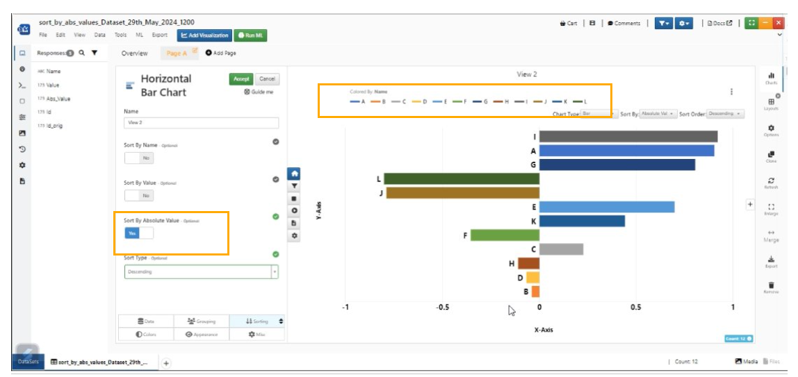
Horizontal bar chart Visualization
Horizontal bar chart in Simlytiks has a new option within Sort By dropdown at the top to sort by Absolute values. This will be useful when the chart has negative values.
Horizontal bar chart now supports Images in the axes and Images can be added in Tools -> Customize -> Media option in Simlytiks.
Horizontal bar chart visualization in Simlytiks now supports adding of Datum line to the visualization. We can add/remove or edit the datum line added to the bar chart.
Horizontal Bar chart visualization in Simlytiks has new sorting options in Sorting tab.
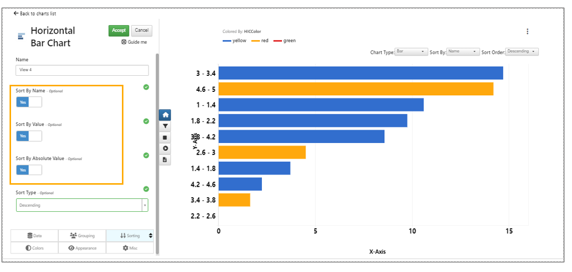
Horizontal sorting
Sort by absolute value in Horizontal bar chart visualization now sorts the chart values correctly and this sorting will be in sync with legend colors.
Sort by absolute value
Horizontal bar chart has new options ‘Stack by’ under ‘Grouping’ to stack the bars based on a column in Simlytiks.
Horizontal bar chart has new options in Appearance tab to display the bar values and also an option to rotate them (90deg).
Horizontal bar chart has a new option to define the bar values font size in Simlytiks.
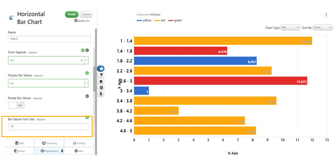
Bar values font size
Horizontal bar chart has a new option to define the legends font size in the Appearance tab.
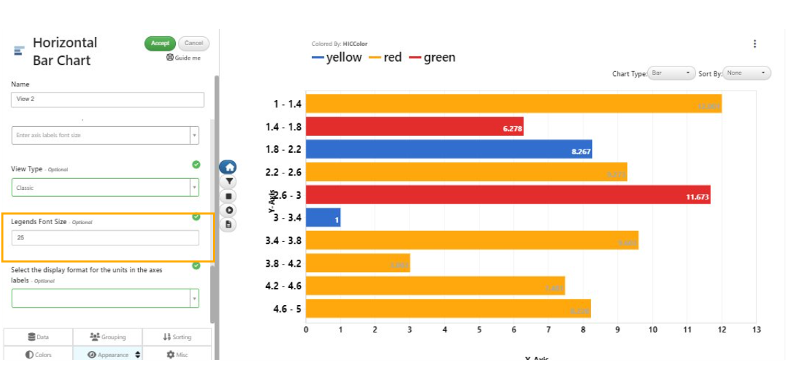
legends font size
Bins in vbarchart and hbarchart are now sorted in ascending order by default and have the option to change the order within the VizPreview -> Sorting tab.
Bins sorting
In Simlytiks, the Date/Year column is now supported in Horizontal bar chart visualization.
In Horizontal bar charts, new option is available in appearance tab to ‘Autofit y labels’ which when enabled will display the long labels on the Y axis.
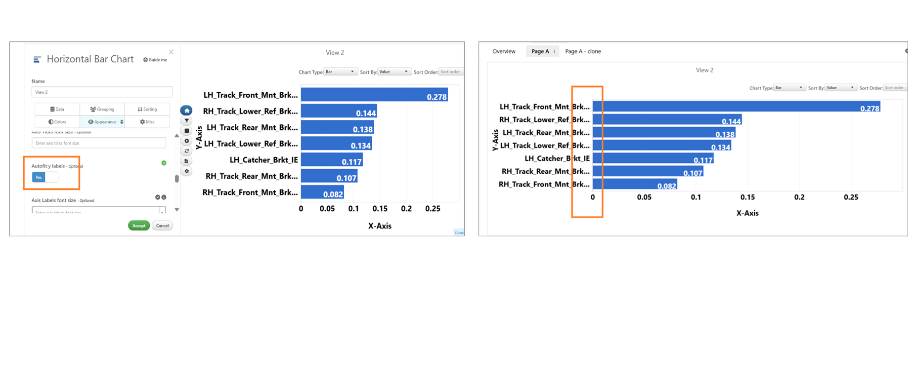
Autofit y labels
Text
The texts on the bars of the Horizontal bar charts are displayed in Simlytiks
Texts on the bars
Grouping
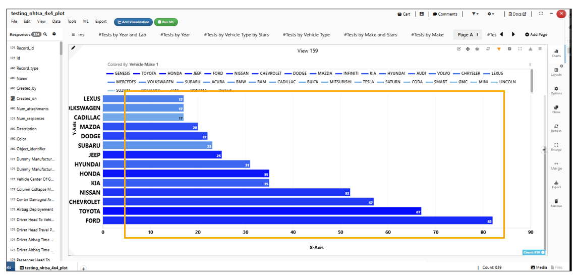
Horizontal bar chart has new option in Grouping tab to limit the number of bars to be displayed in Simlytiks
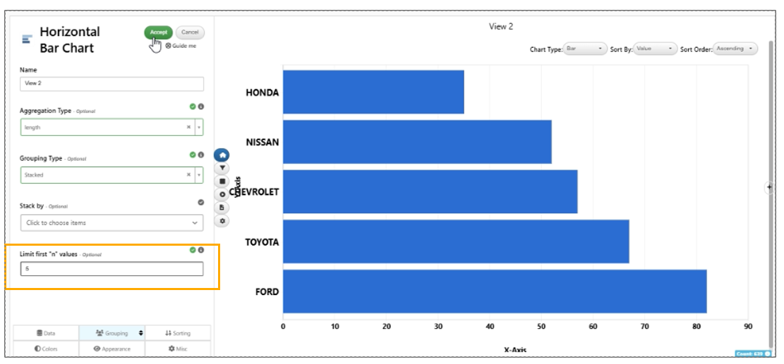
limit the number of bars
Images and texts
In Simlytiks, Horizontal Bar chart visualization now has option to show texts along with images in the axes.
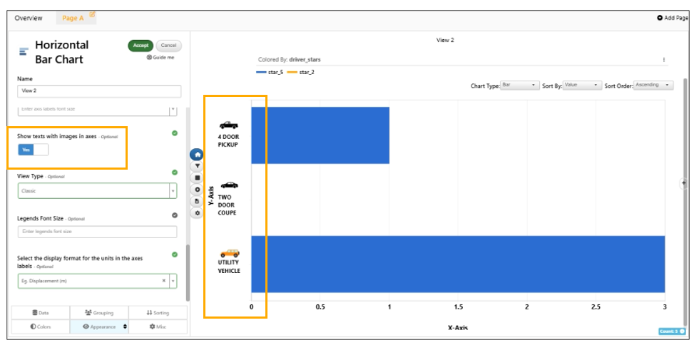
Images and Texts
Horizontal bar chart visualization supports dragging of the axes using a handle to adjust the margins which will be saved to the dataset in Simlytiks
In Horizontal bar chart, texts shown with images in the Axes can now be positioned top/left/bottom based on a new option in the Apperance tab.
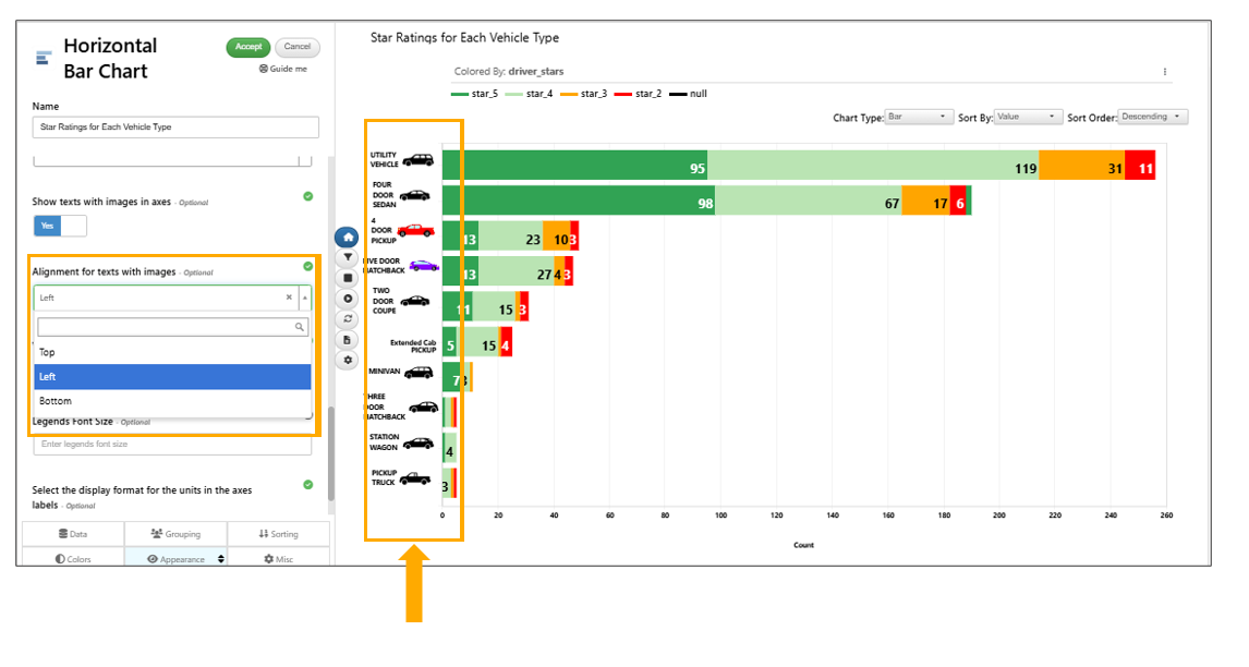
Top/left/bottom
Sort By
A new sortBy option in horizontal bar chart is available to sort by the column name which will also sort the legends on the visualization data in Simlytiks.
Horizontal bar chart now has two new options for sorting based on stackBy and a sorting oreder (asc or desc) for the stackBy based sort.
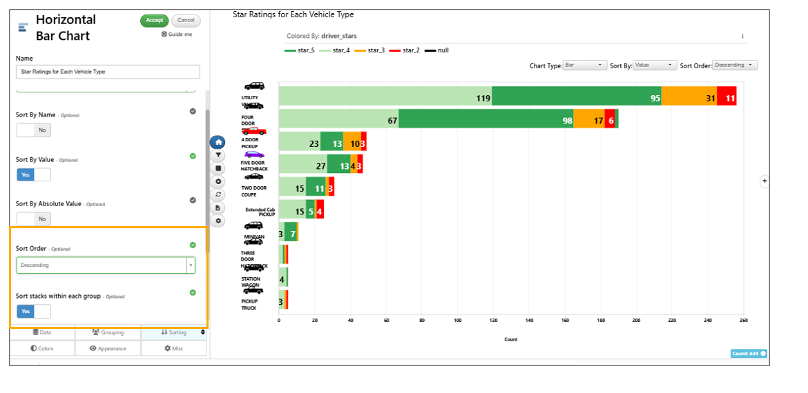
Sorting
Horizontal bar chart has a new option to sort the legends based on the sorted stackBy option.
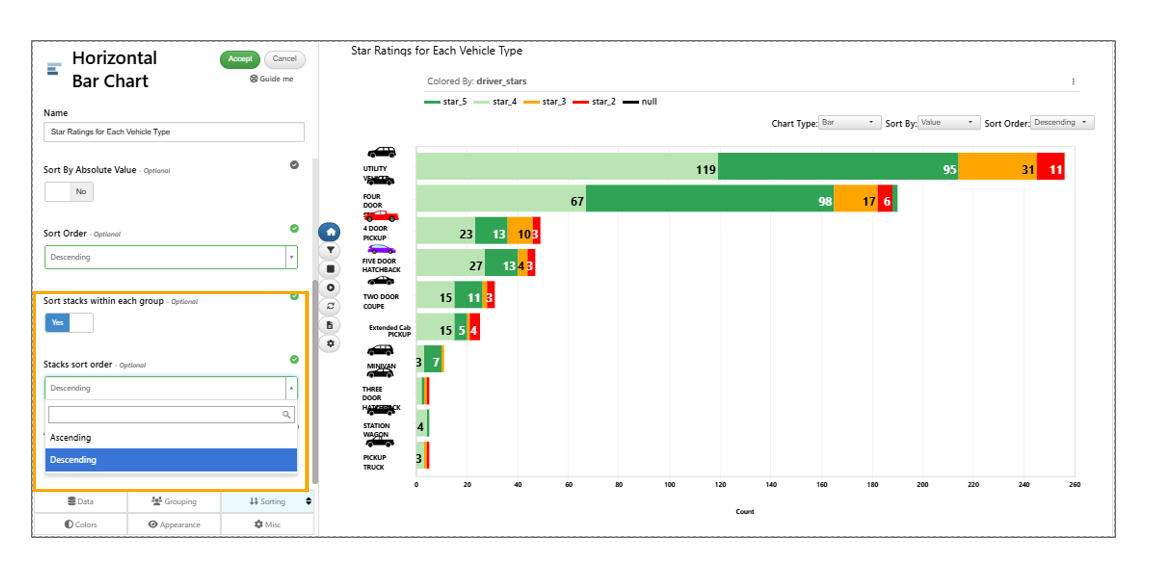
Sorting
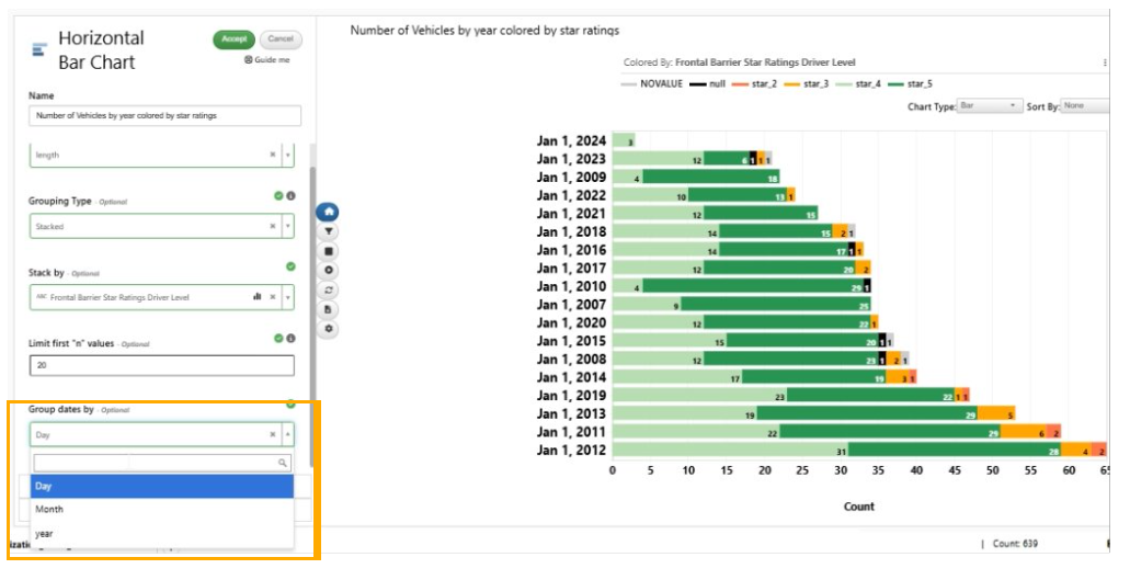
‘Group dates by’ option is available for Horizontal bar chart visualization when dates column is selected in Yby option.
Group dates by
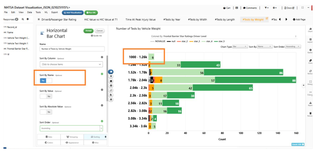
The ‘Sort By Name’ option in Horizontal bar chart will sort the bins based on their bin values and not the string. In Simlytiks when numerical columns are used.
Sort By Name
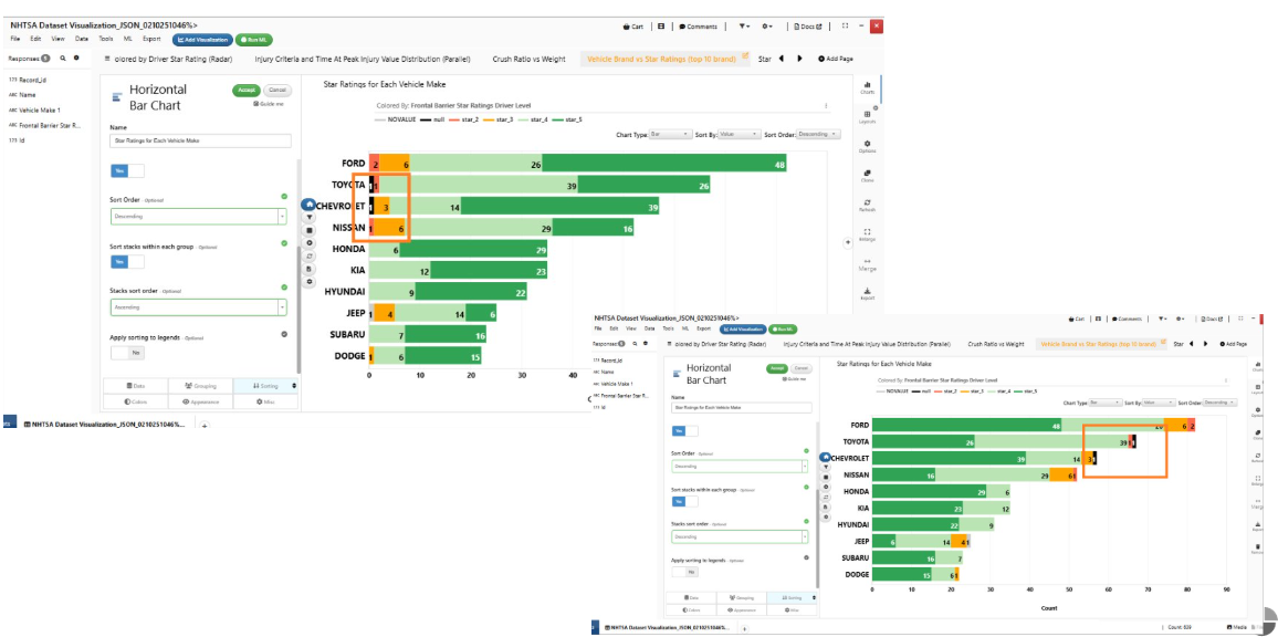
The null values in the Horizontal bar chart are now colored in black after sorting them correctly in Simlytiks
Null Values
Bin Extremes
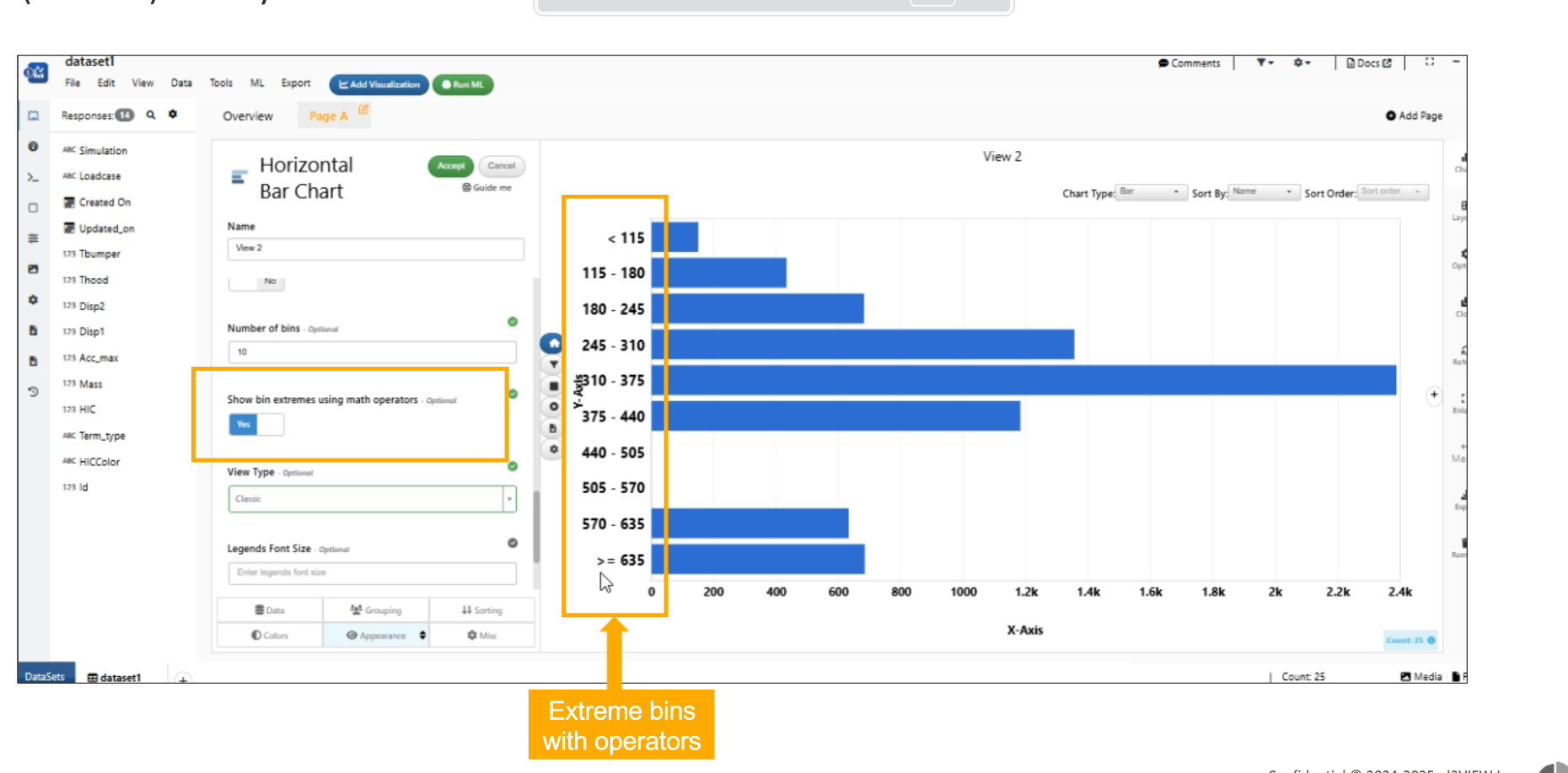
Horizontal bar chart has new option in Appearance to show the ‘Bin extremes’ using math operators (< and >=) in Simlytiks.
Bin extremes
Horizontal bar chart has new option in the Appearance tab to show the ‘Number of bins’ in the visualization.
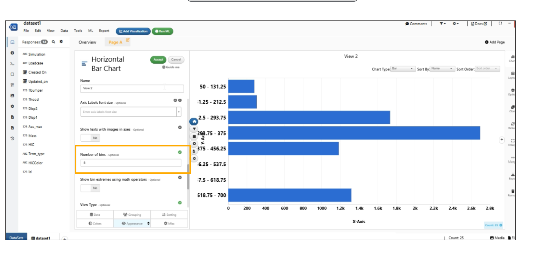
Number of bins
Fit all Bars within height
Horizontal bar chart has a new option in Appearance tab to ‘ Fit all bars within height’ which eliminates the scroll bar in the visualization.
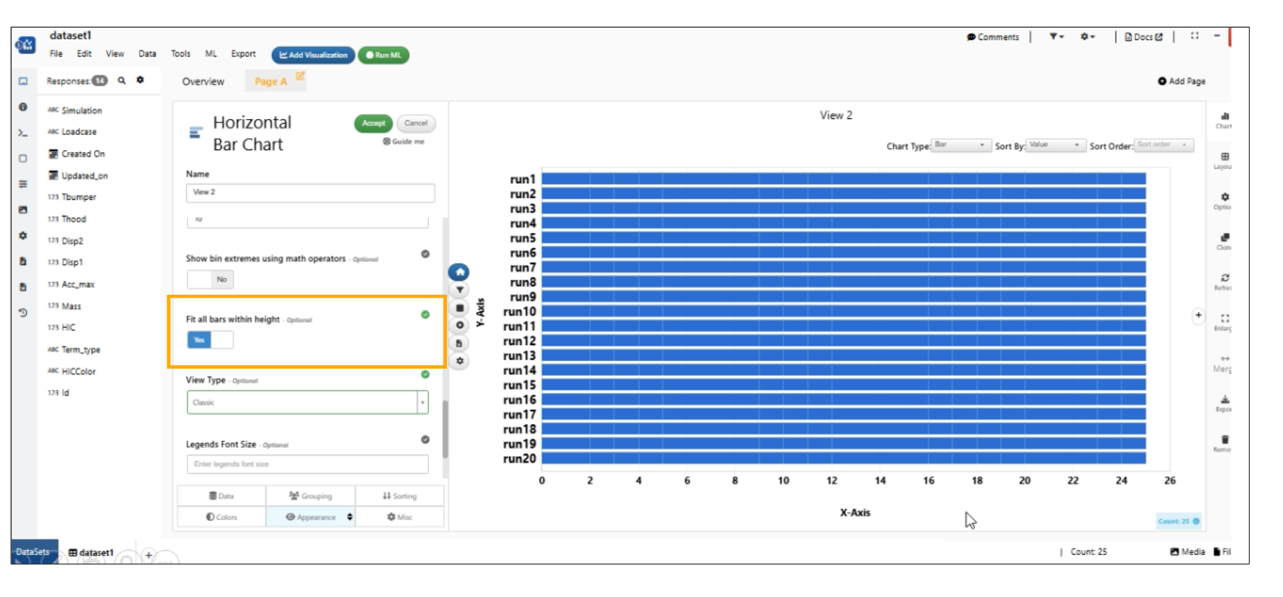
Fit all Bars within height
ML button in Scattered plot
ML Button in Scatter plot is added. It simply turns green on completion and has a cog icon beside it which will let the user open the entire Lucy ML Output in a modal that has its own visualizations and Outputs Tab
ML Button in Scatter plot when enabled, adds a sliding circle on X-axis which can be dragged across the X domain and on drag end, Lucy ML Predict is called which adds a prediction point to the scatter plot in red.
Pivot Chart
Pivot Table chart now supports for multiple values which will add them as columns just how Excel does.
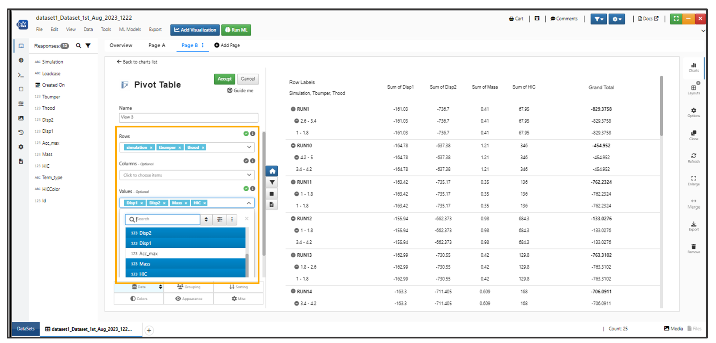
Pivot Chart
Scatter Matrix
Scatter Matrix has new options added in Appearance tab called Fill Color and Fill Circle’s Opacity slider in Simlytiks
New options added in Scatter matrix to show Histograms and KDE in the diagonal cells. These options will be activated when show Correlations option (in appearance tab) is enabled.
Hovering on Legends in Scatter Matrix Visualization will highlight the corresponding points in every cell.
Scatter Matrix visualization has new option called ‘Y columns’ which can be used to Cross Plot X vs Y columns in Workflows.
Chord Diagram
Added new option called ‘Image by’ in the Appearance tab for Chord Visualization in Simlytiks
New option added in the Appearance tab called ‘Font Size of the labels’ for Chord visualization in Simlytiks.
Schema Summary
New visualization added called ‘Schema Summary’ which will show a simple table of all the column stats with a search bar at the top. It also has an option called Tabletype which has a selection of Detailed statistics which will render the detailed table with all the numerical stats for each column.
Schema summary has a new option called design which takes default, modern, modern2 as the values which uses different views.
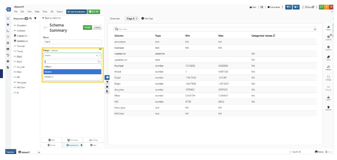
Schema Design
The visualization Schema Summary has new option called ‘Design’ in the appearance tab which has default, modern, modern2 views for the values of the visualization in Simlytiks.
Schema summary visualization has two new options: Font size (along with support for custom font size) and Fit to 100% height in Simlytiks.
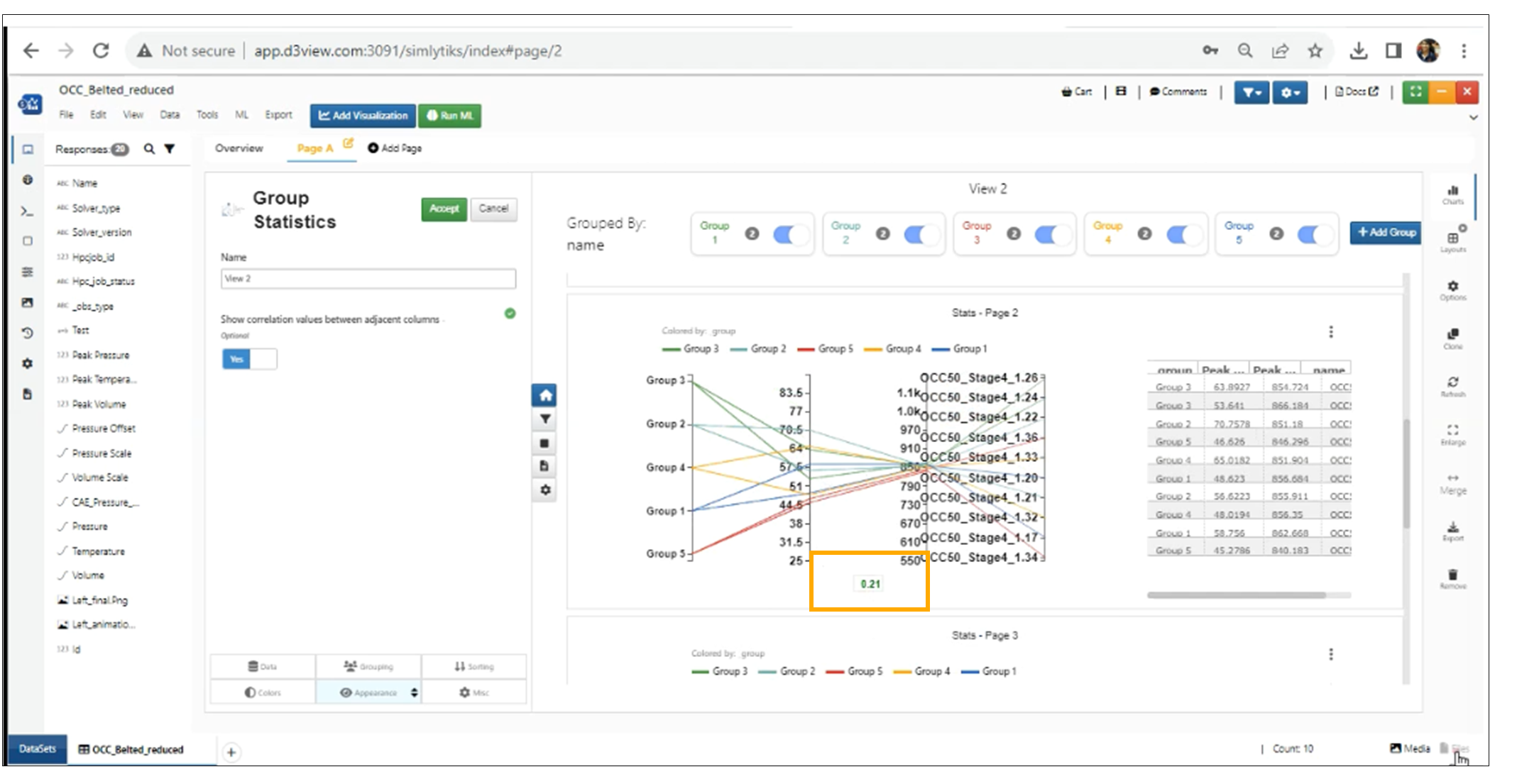
Group Statistics
New Visualization called Group statistics in Simlytiks which renders the group based charts and show the characteristics. The charts such as Pivot table, Single box-plot for each dimension and color by group for continuous and stacked bar chart for categorial color by group, Single parallel chart showing all dimensions and color by group, Single bubble chart and Circle pack showing the groups.
In Group Statistics visualization we can add correlation values to the Parallel chart from the appearance tab.
Correlation values
Group Statistics visualization has options to turn off/on the groups in Pivot table and the group names can also be edited by clicking on them
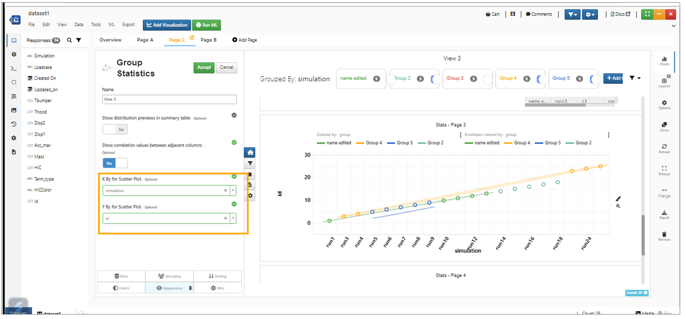
Group Statistics visualization has options to choose the X by and Y by for the bubble chart.
X by and Y by
New option called Baseline in added to Group Statistics Visualization which is nothing but a reference row with which numerical columns are compared with and relative standard deviations are shown in the table
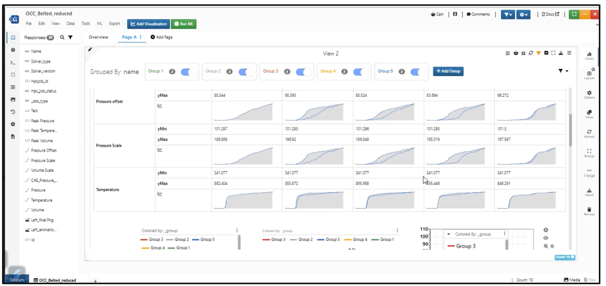
Group Statistics Visualization supports Curve columns. Sparklines are shown in the Pivot summary table when curve columns are selected.
Group Statistics Visualization header has a new Filter dropdown which will allow adding filters to the Group Stats chart.
Group Statistics Visualization has a new option in appearance tab called Sections which will allow the user to sort/remove/add the sections in the chart.
When Curve column is selected in Group Statistics visualization, we show Ymin and Ymax values in the Pivot table for the curves.
Curve Column
Sparklines generated in the small curves shown in the Group Statistics visualization are now about 70% accurate representation of the original curves.
KDE Plot
New Visualization called KDE plot is added to Simlytiks.
KDE Plot has a new option called bandwidth which will change the smoothness of the curves in Simlytiks.
KDE Plot now has a new option Group By which will group the density plots based on the column in Simlytiks
Line Chart
New option added for Line Chart Visualization in Grouping tab called Cumulative which will cumulate the values.
Line chart visualization now supports context menu for axes which has options to change ticks, formats, fonts, etc., in Simlytiks
‘Color by Y columns’ option is now available in Line Chart Visualization.
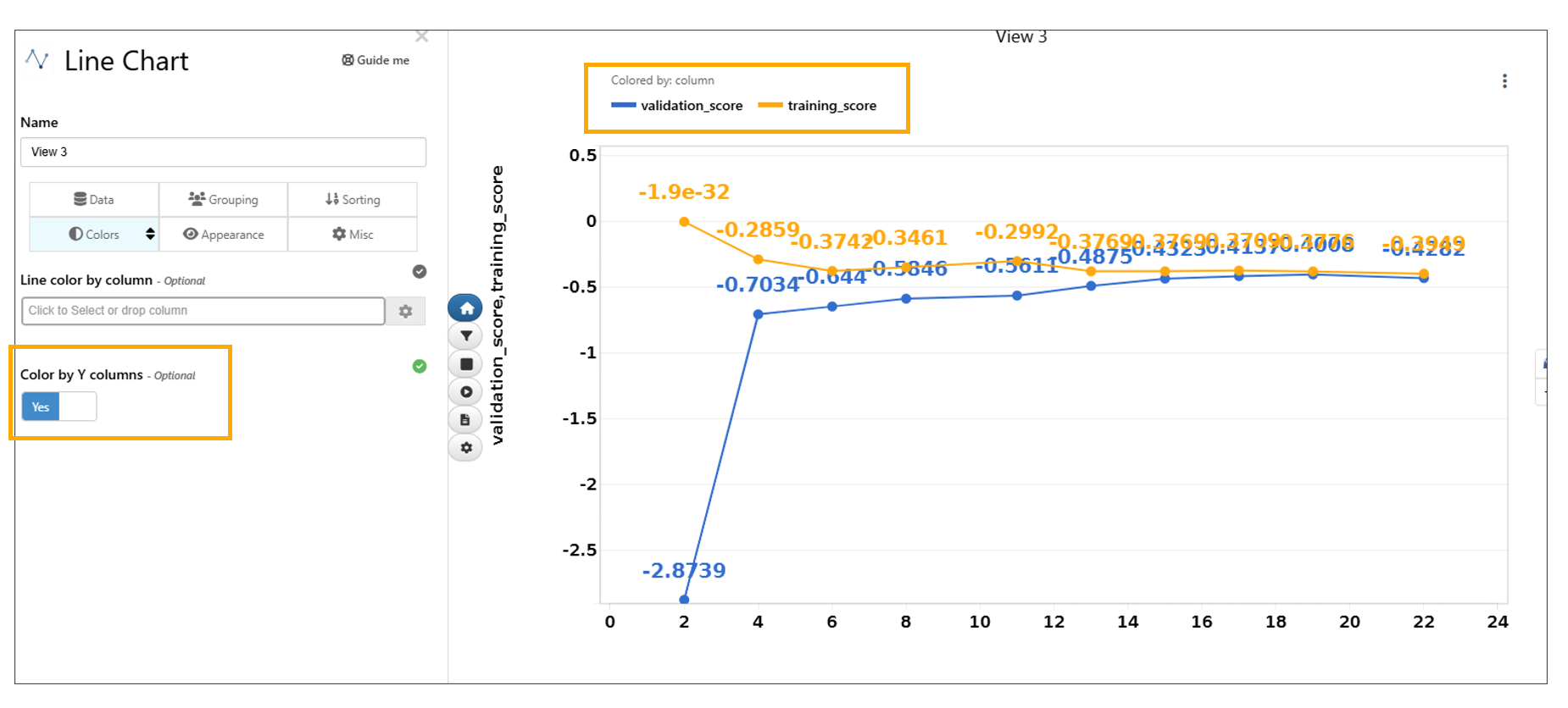
Color by Y columns
Scatter plot visualization now supports coloring by Y columns with an interactive legend for highlighting in Simlytiks for multiple Y columns.
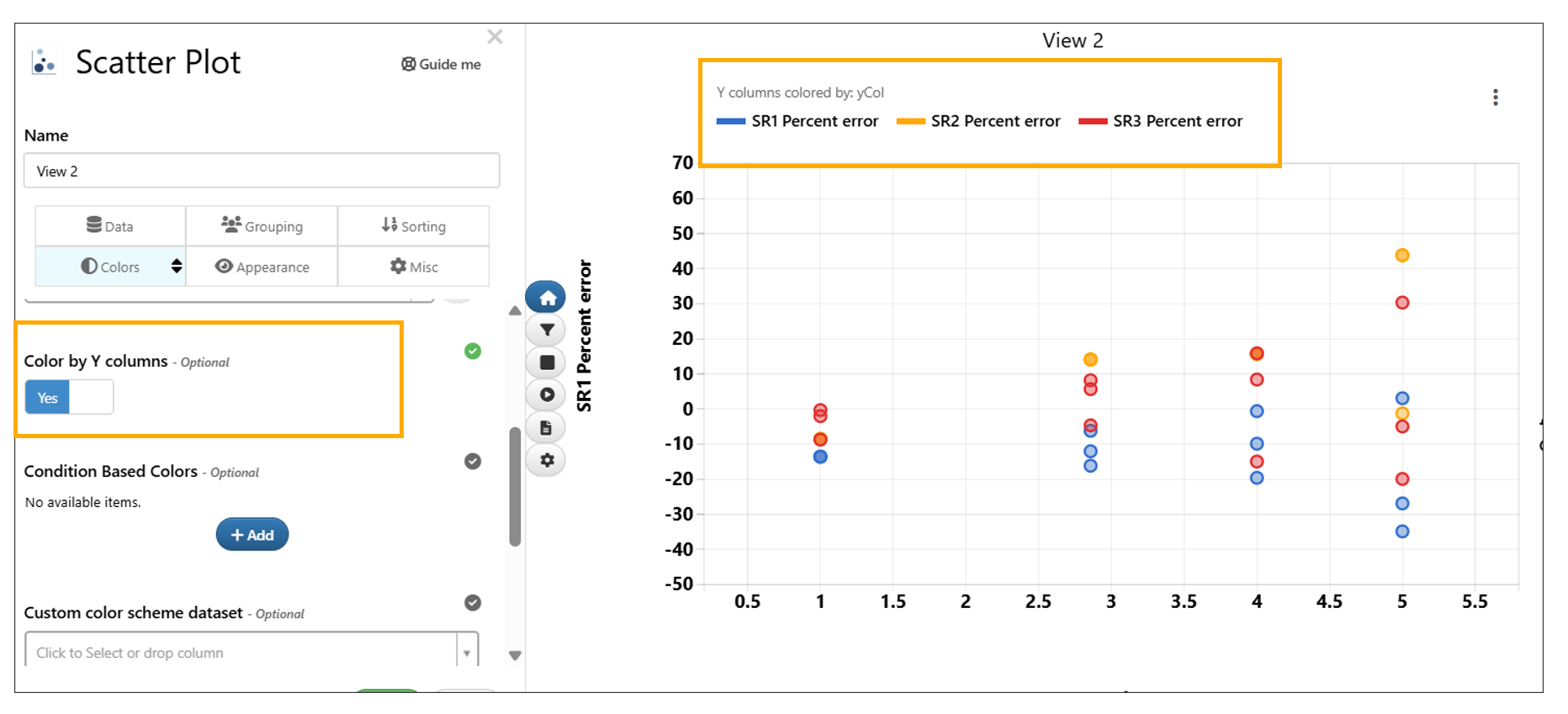
Color by Y columns
New options called ‘Show Tooltips’ and ‘Show Labels’ are available under Appearance tab in Line Chart Visualization.
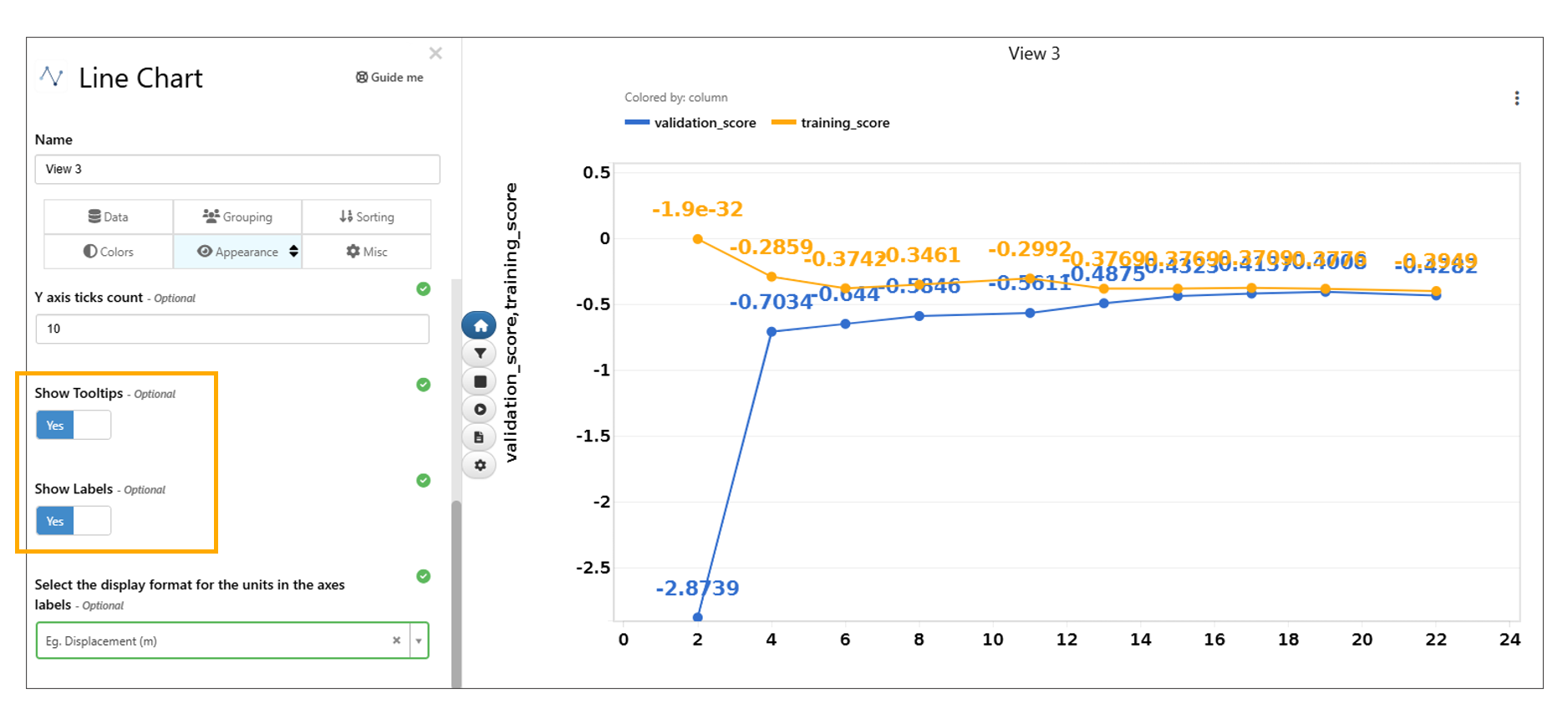
‘Show Tooltips’ and ‘Show Labels’
3D Model Sync
Multi model Sync feature is now available in Simlytiks for 3D model Visualization. Features like Rotation , Zoom , Animation , Camera view,etc., are in Sync
Grouped Box Plot
Added new visualization called Grouped Box Plot to Simlytiks. This visualization acts similar to the Grouped Bar Chart.
Grouped box plot Visualization has new options in the Appearance tab and the charts can also be viewed side by side in Simlytiks.
New option available for Grouped box plot visualization in colors tab to color the Box plots.
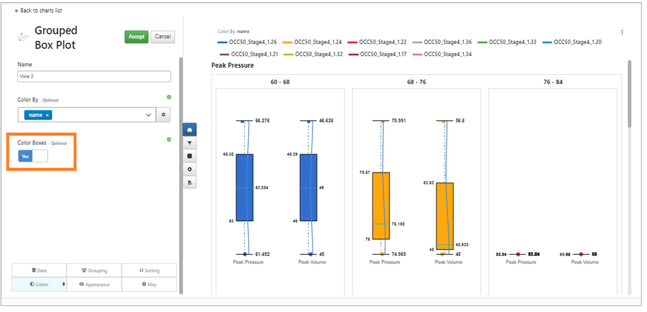
Color by for Grouped box plot
The Appearance tab in the Grouped Box plot visualization has new option to set a common min/max that is automatically calculated for each group.
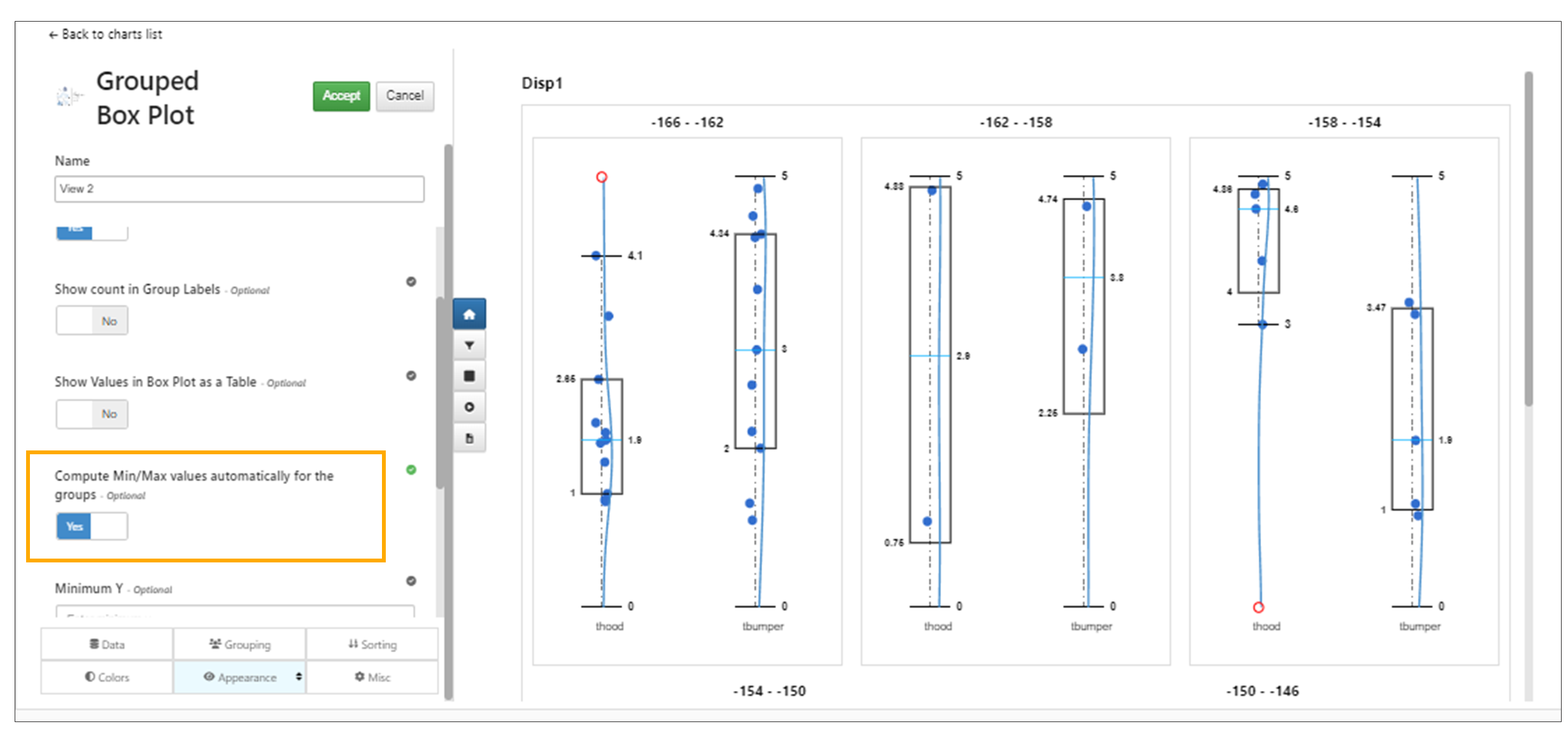
Set common min and max
Grouped box plot Visualization has new options in the Misc tab called ‘Export Individually’ which will export each column individually in an independent slide when exported to PPT in Simlytiks.
Grouped box plots in Simlytiks now have a Sort By column option in the Sorting tab which will group the unique values by that chosen column.
Text Difference Checker Visualization
New visualization called Text Difference Checker is adWSded to Simlytiks.
Grouped Bar Chart Visualization
New Visualization called Grouped Bar Chart Visualization.
Grouped Bar Chart
Transitions/Animate To
In Simlytiks we have new option called ‘Animate To’ for the Visualizations. The purpose of the Animate To/Transitions is to show the same data in different visualizations. For example :- We can show or Animate Parallel chart to Bar chart , Parallel chart to Radar chart , parallel chart to Scatter plot etc.
Below videos shows few examples how to Animate visualizations to other charts.
Visualization Animations
Visualization Animations are now visible on the right side of any viz container in the form of a sticky button group aligned vertically middle in Simlytiks
Visualization Animation Option
Parallel Chart Transitions
Visualization Transitions are available now from Parallel Chart to other charts.
Line Chart Transitions
Visualization Transitions are available now from Line Chart visualization to Area chart visualization.
Donut Chart Transitions
Visualization Transitions are available now from Donut Chart visualization to Pie chart visualization.
Bubble Chart Transitions
Visualization Transitions are available now from Bubble Chart visualization to other charts.
Vertical Bar Chart Transitions
Visualization Transitions are available now from Vertical bar Chart visualization to Scatter plot.
Added tooltips to the viz transitions button group on the right of any visualization container in Simlytiks.
Tooltips
Legend font size
Appearance tab has a new option to change the legends font size in Scatter plot visualization.
Keyvalue Dataset
Keyvalue dataset visualizer has a new option in Appearance tab to fit the table to 100% width in Simlytiks.
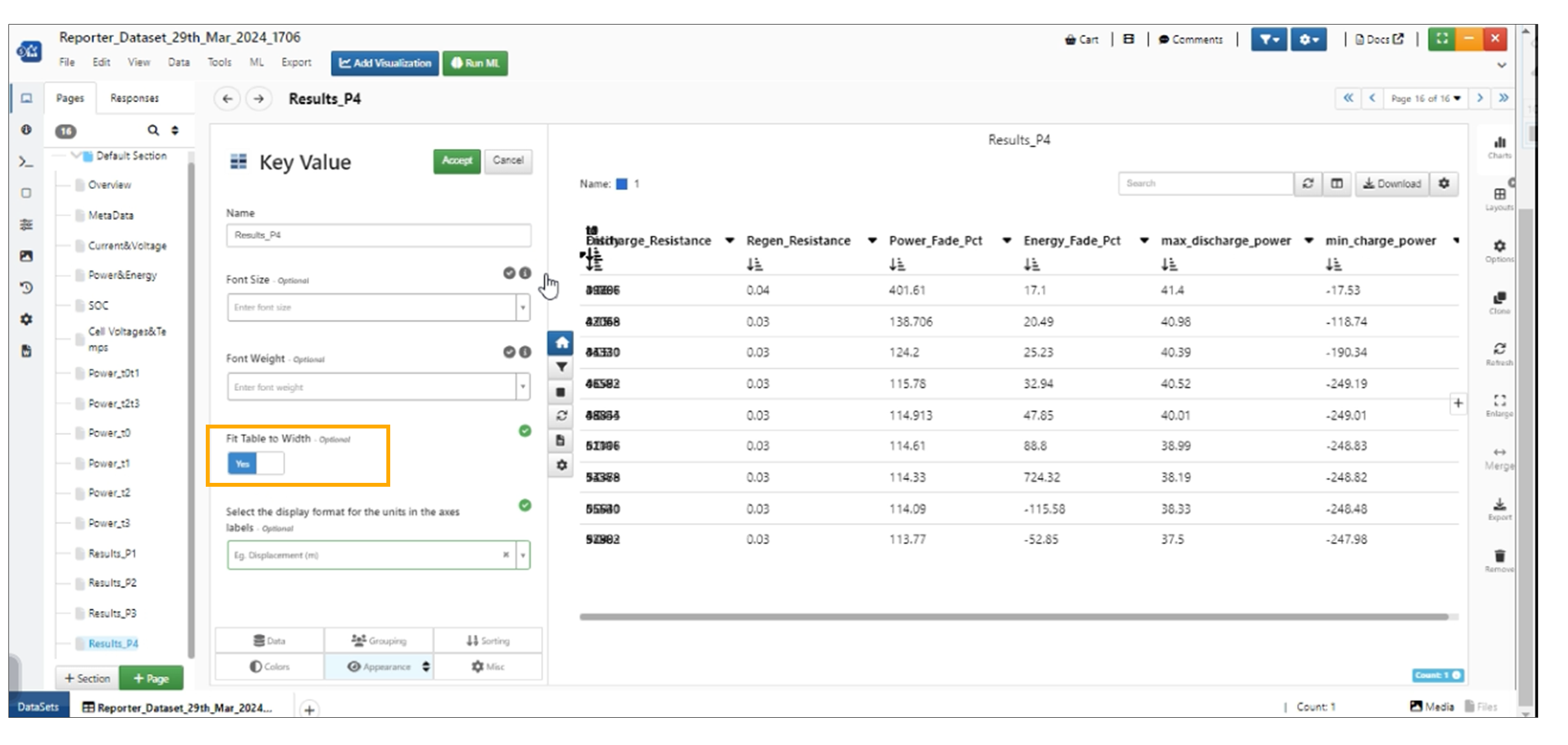
Keyvalue new option
Keyvalue dataset visualization has new option in the appearance tab to wrap the row columns. This option enables the Data table and opens the rows in the dataset.
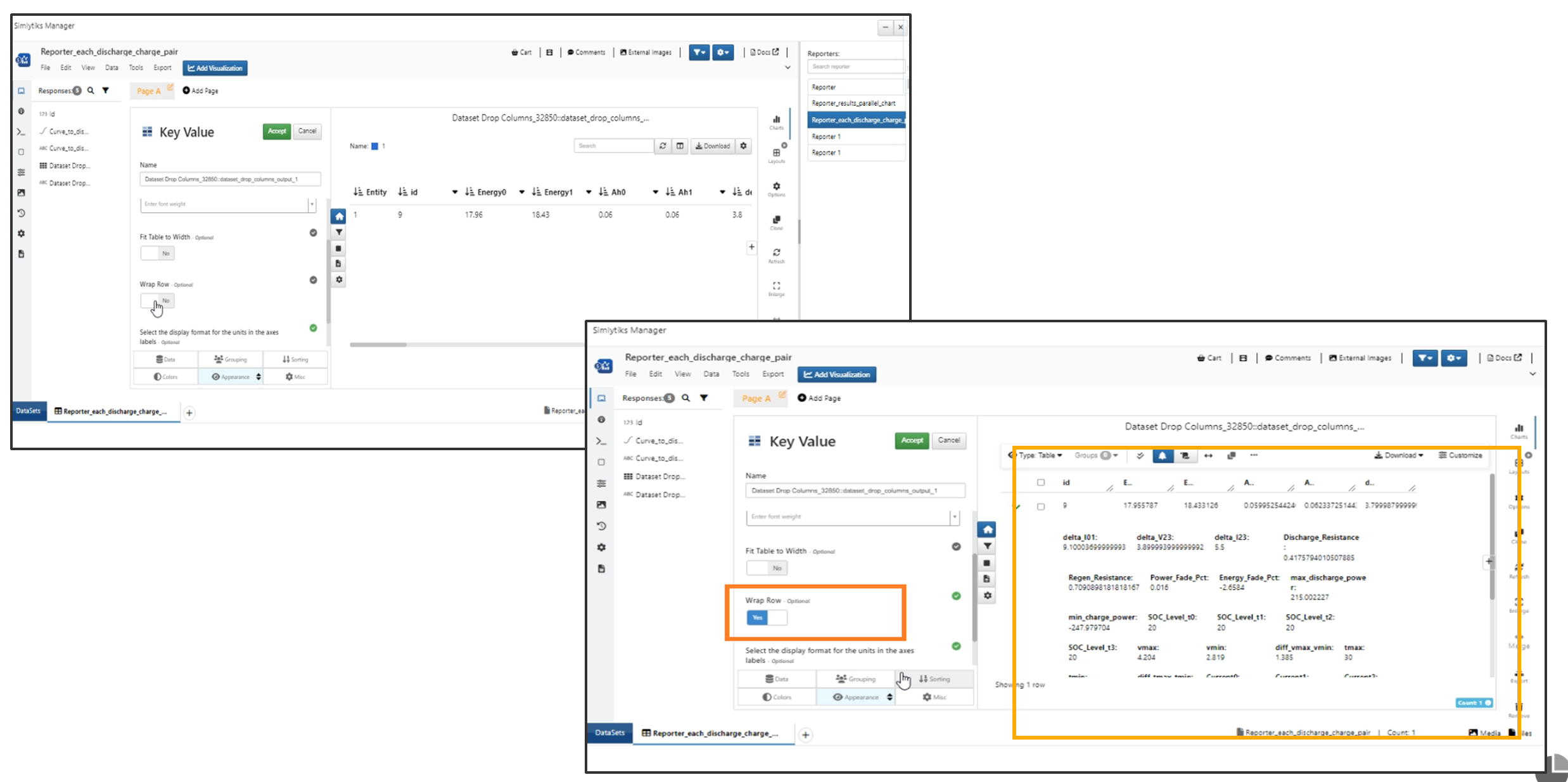
Keyvalue Wrap
New options ‘Borders and Zebra backgrounds’ are added to appearance tab in Keyvalue visualization.
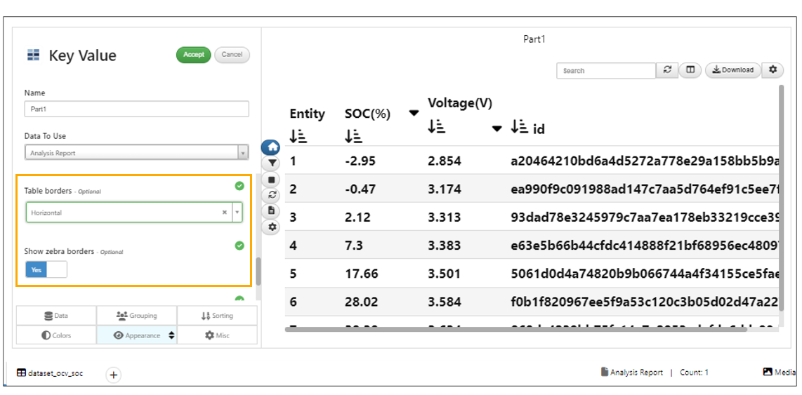
Borders and Zebra backgrounds
IIHS Chart
IIHS chart in Simlytiks has a new option ShapeBy which will add symbols to the curves and a new option to change radius of the shapes in the IIHS chart.
Simlytiks now supports editing of the attributes for the color by legends for IIHS charts.
IIHS chart in Simlytiks has a new option in appearance tab to enable the solid line for the baseline selected.
IIHS intrusion chart columns now supports axis options in Simlytiks
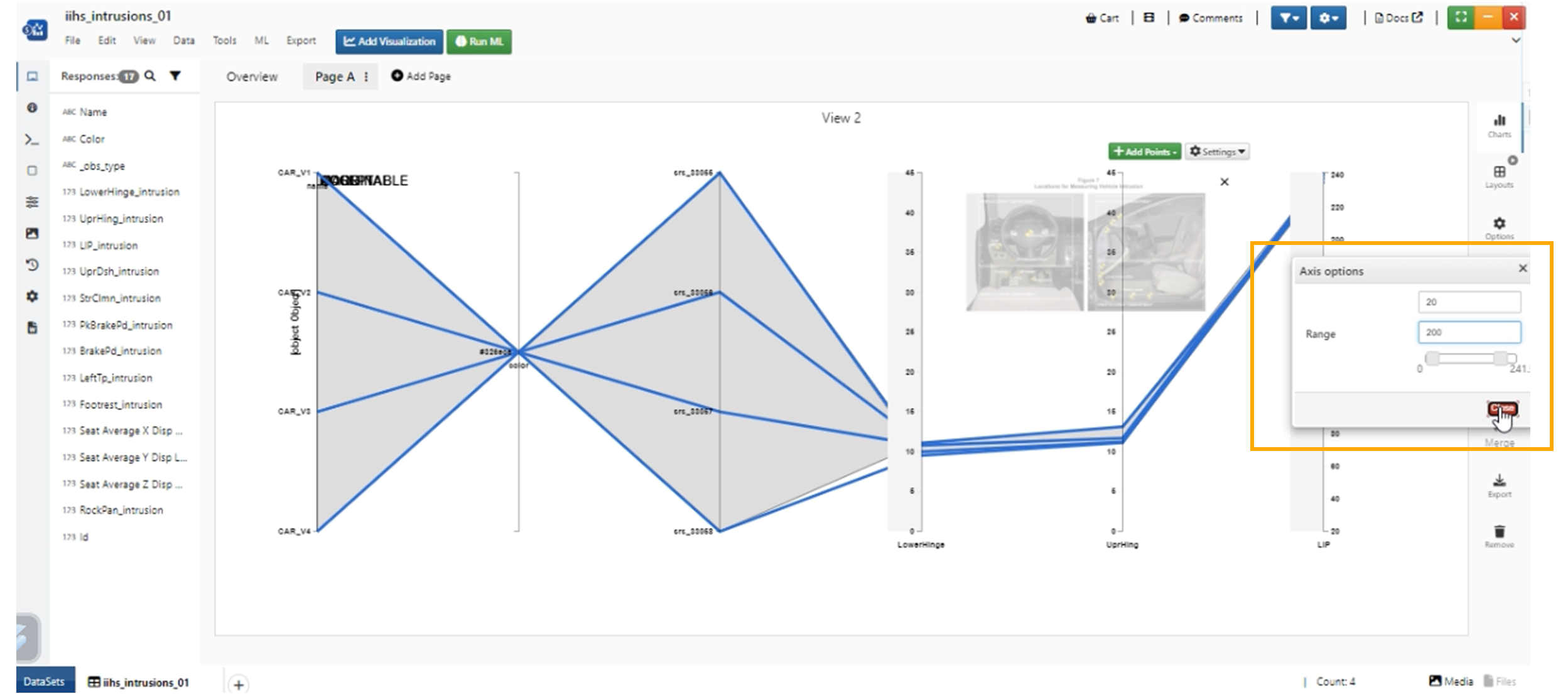
Axis options
In IIHS Intrusion chart, the Appearance tab now includes a ‘Show Values on Line’ option to display intrusion values and circles on IIHS chart lines.
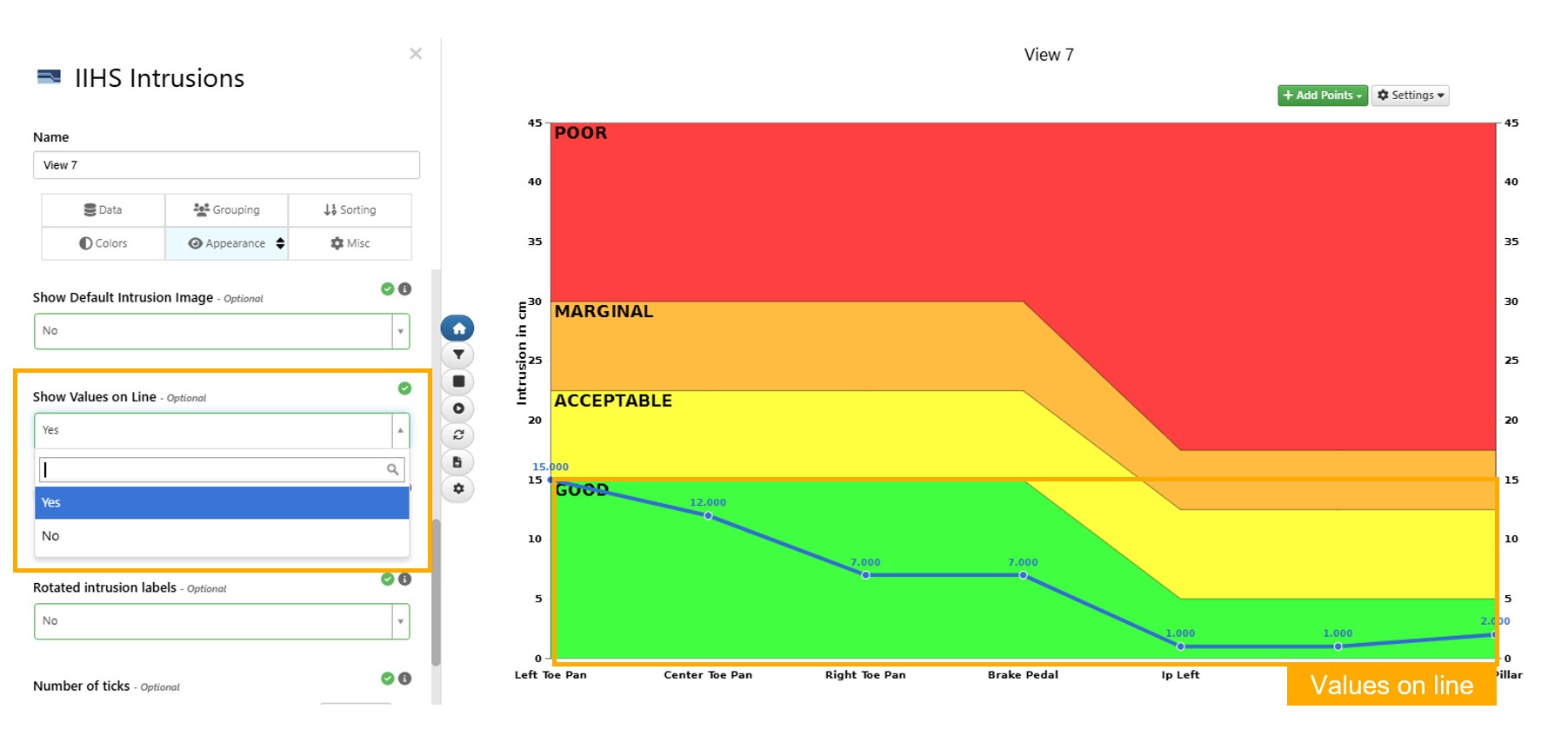
Show Values On Line
Column Summary
New visualization in Simlytiks called Column Summary supports both numerical and categorical values and has different viewing and design options (modern, modern2 and default).
3D Bar Chart
New visualization called 3D bar chart is now added to Simlytiks which will create 3D bars in the chart.
3D bar chart now support xby column binning and yBy column binning in Simlytiks.
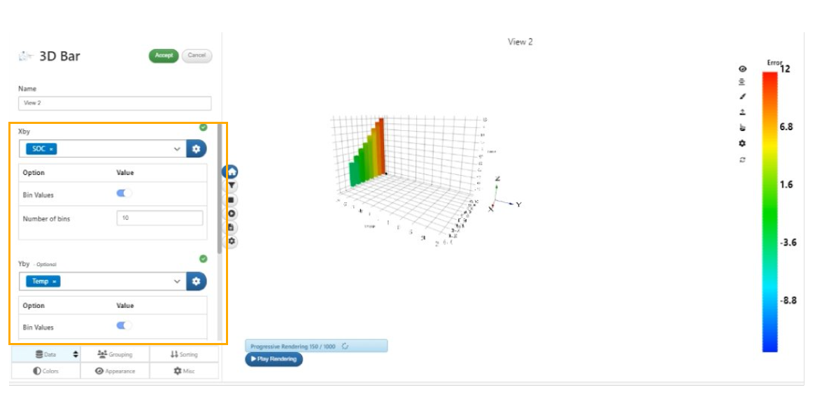
xby column binning and yBy column binning
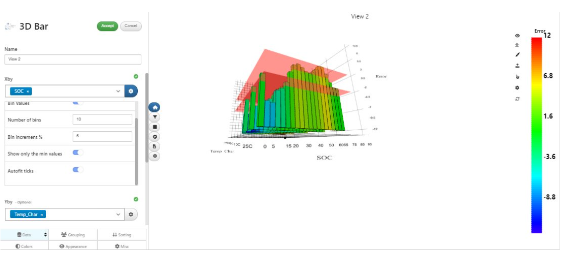
X binning will be computed based on a bin increment percentage option available in xby column under 3D bar chart.
X ordinal ticks supports autofit based on the width of the chart which will avoid overlapping of ticks in Simlytiks.
X ordinal ticks
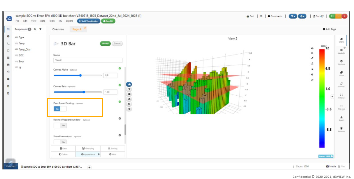
Initial support for negative bars to be shown below 0 when ZeroBasedScaling is turned on in 3D bar chart.
ZeroBasedScaling
3D Bar chart/3D Scatter plot have new options for xmin, xmax, ymin, ymax, zmin, zmax, xstep, ystep, zstep, tick font sizes, tick counts, x precision (decimals), y precision (decimals) in Simlytiks
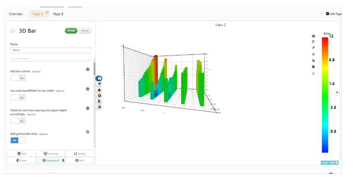
3D Bar/3D Scatter visualizations now support grid border lines which will add a black border to the axes bounding box in Simlytiks.
Grid border lines
3D Bar chart now supports binning for xBy and yBy with common options to provide increment in bins, showing only the min values, autofit, number of bins etc in Simlytiks.
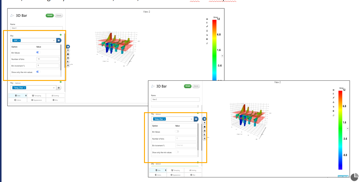
Increment in bins
3D Bar chart now supports adding datum surfaces at certain values with support for color, opacity etc in Simlytiks.
Categorical columns are now supported in 3D Bar chart for yBy in Simlytiks.
When xBy or yBy are binned in 3D bar chart, the number of data points will now be one for each of the bins averaging the z value instead of rendering all data points based on original data.
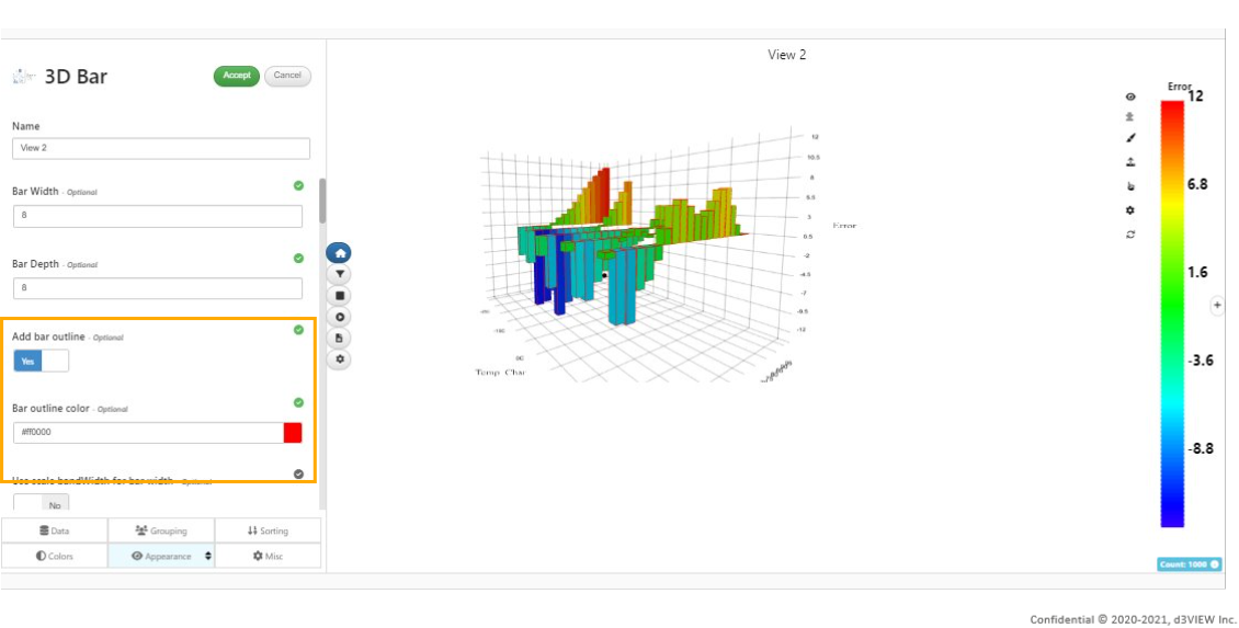
New option in Appearance tab od 3D bar chart to render an edge/outline for the bars and an option to choose a custom color.
Edge/outline
In 3D bar chart, the numerical color scales used for coloring a visualization will now support a new option called colorMid which when specified will be a color between colorMin and colorMax.
Color fringe extent in 3D bar chart will now respect the custom min-max values while determining the color bar.
New option is available in 3D Bar chart to show the positive and negative values starting from 0 in Simlytiks
Z scale domain in 3D bar charts will now be based on the average value of the nested data when binning is available in either X or Y and this range will also be used for the color extent.
In 3D bar charts, option is added in zBy customization to show min or max value to be an absolute value.
Annotations for min/max of zBy in 3D bar charts now has new options to change the default font size and also allows resizing and dragging of the container which will be saved to the settings
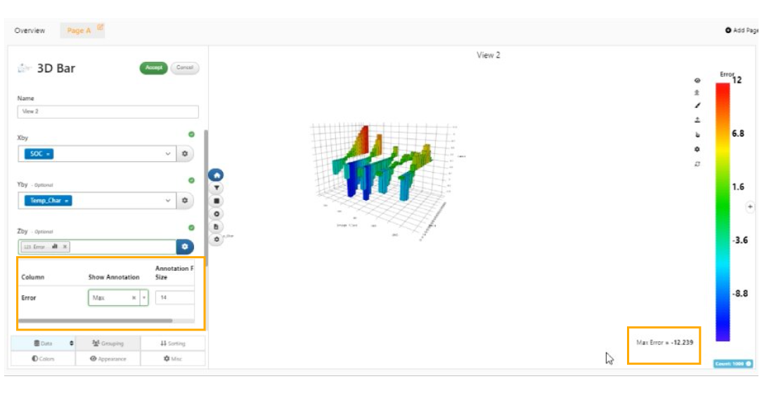
min/max of zBy
3D bar chart has a new option aggregation type in the Grouping tab to decide the rollup type to be used for nesting the bars.
3D Bar now supports a new aggregation type called Max Absolute which will render the bars with a height of max absolute of the zBy in each binned data.
3D Bar now supports a new option in Appearance tab to show the stats in the tooltips for the zBy in Simlytiks.
Datum surfaces in 3D Bar now support their names being added as texts and improved surface alignment with the grid.
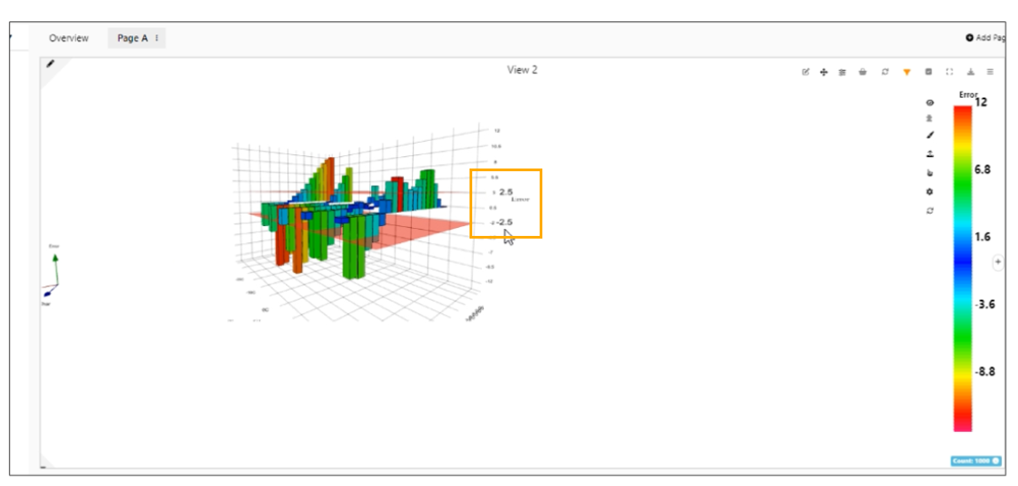
Datum surfaces in 3D Bar chart
In 3D Bar chart , ‘Xby’ supports a new option to show only the minimum bin value when a numerical column is chosen and is binned.
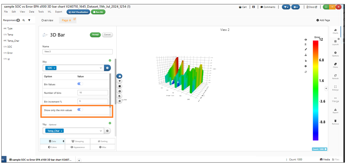
Show only the minimum bin value
The Datum surface option now can be added to 3D bar chart visualization with color in Simlytiks.
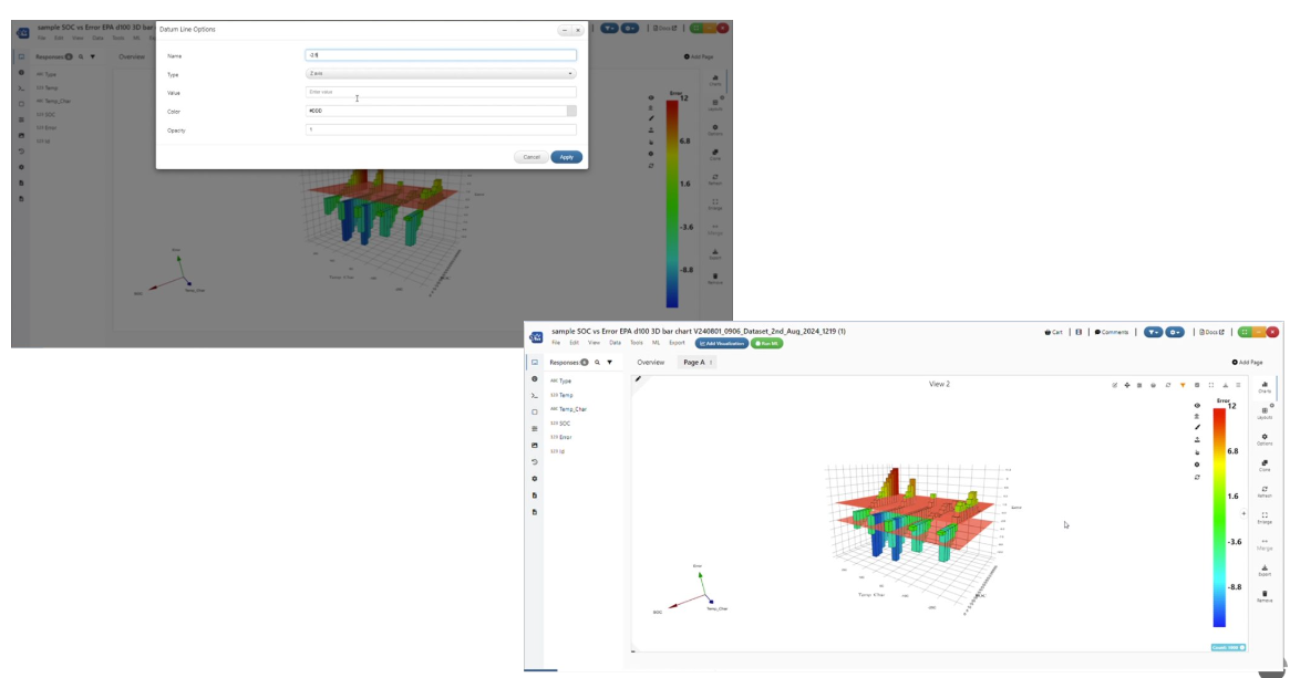
Datum surface
New option is available in 3D bar chart visualization in colorBy customizations for numerical columns to have the ‘color bar based on absolute value ‘ i.e. if the max value in the column is 10, then the color range will be -10 to 10 but the extent shown in the bar will still be based on the data.
Edge/outline
New option in Appearance tab of 3D Bar chart visualization is available to render an edge/outline for the bars and an option to choose a custom color in Simlytiks.
Multiline
New options like xmin, xmax, ymin, ymax, xTicksCount, yTicksCount are added in Multiline chart visualization.
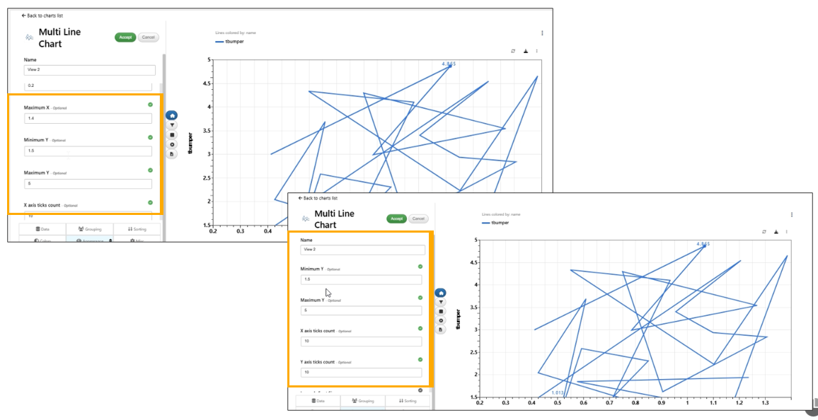
MultiLine
Pagelink Table
New visualization added called PageLinkTable which will automatically create a table with page links, visualization links, layout time, number of visualizations, description etc.
Adding pages/removing pages, adding viz, removing viz will update all PageLinkTable visualizations with the new pages and visualizations automatically in Simlytiks.
PageLink table visualization has a new column called ‘Viz Types’, which will show the visualization type used in the page along with its image.
Pagelink table visualization will have icons for both ‘Viz name’ and ‘Viz type’ columns and the color of the labels are black by default in Simlytiks.
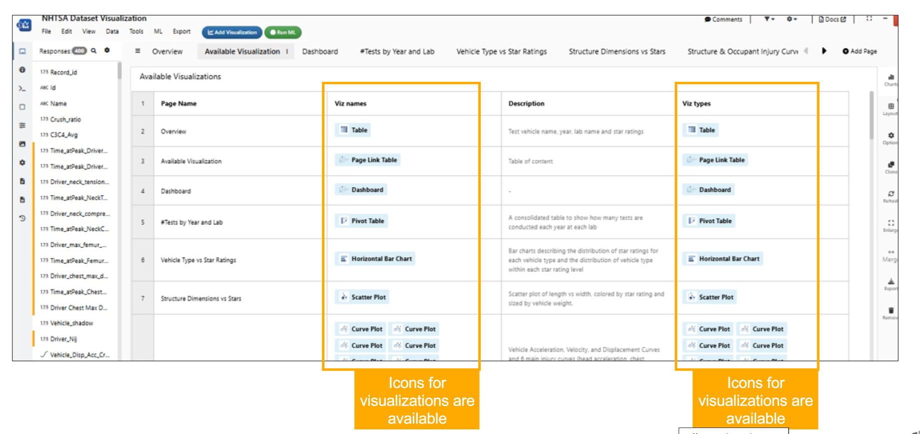
Viz type and Viz name
Responses Viz Map Table
New visualization called ‘Responses Viz Map Table’ is added which will show a simple table of schema responses along with type in Simlytiks.
New visualizer ResponsesVizMap Table now supports exporting the visualizations in Simlytiks.
Export table
Heatmap visualization
Heatmap visualization has new feature called ‘Use separate color scales for each column’ which allows multiple color by options for the visualization.
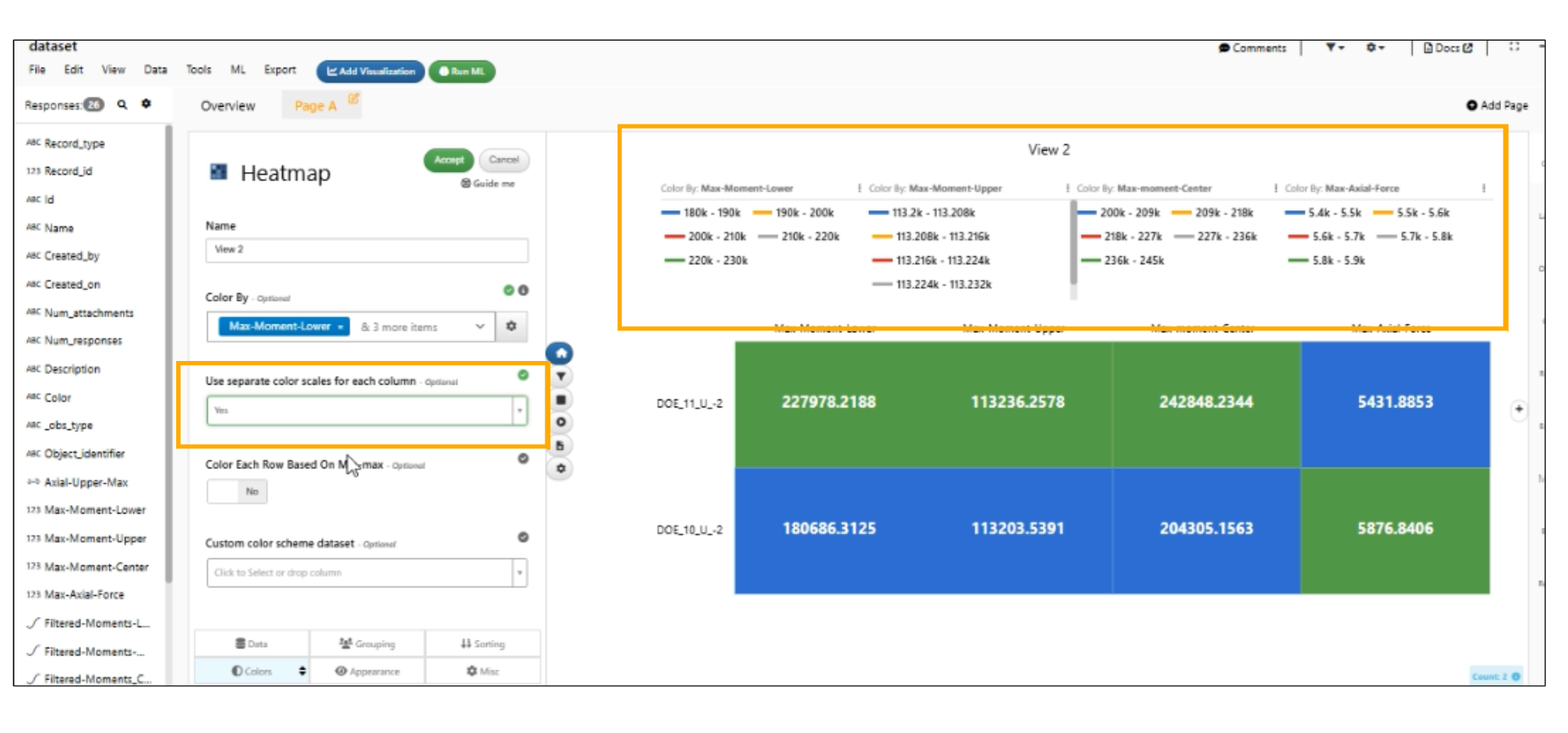
Use separate color scales
Taguchi plots
New visualization called Taguchi Plots is added to Simlytiks. This visualization is created by executing Dataset_taguchi_design_analyzer worker internally.
In Simlytiks, the Taguchi plots are updated to have visualizations created in carousel view.
Calendar Visualization
The Advanced view of the Calendar visualization now supports a new option called ‘Event name column’ in Simlytiks.
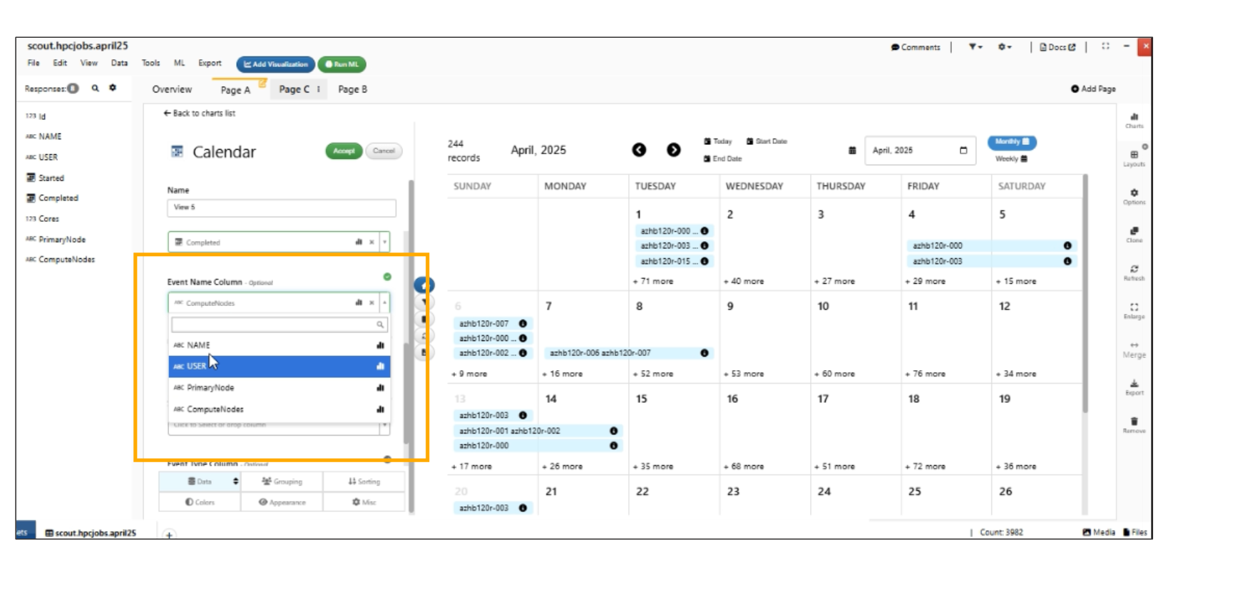
Event name column
AI Model
New visualization called ‘AI Model’ is added to Simlytiks which creates a math model with predictions.
In Simlytiks, the AI model visualization is now created with predict mode view and the user can change the view to full view in Appearance tab.
AI model visualizer now has a new input to use the Add Raw/Training Data which will be colored with its own in 3D scatter/curve plot in the Prediction.
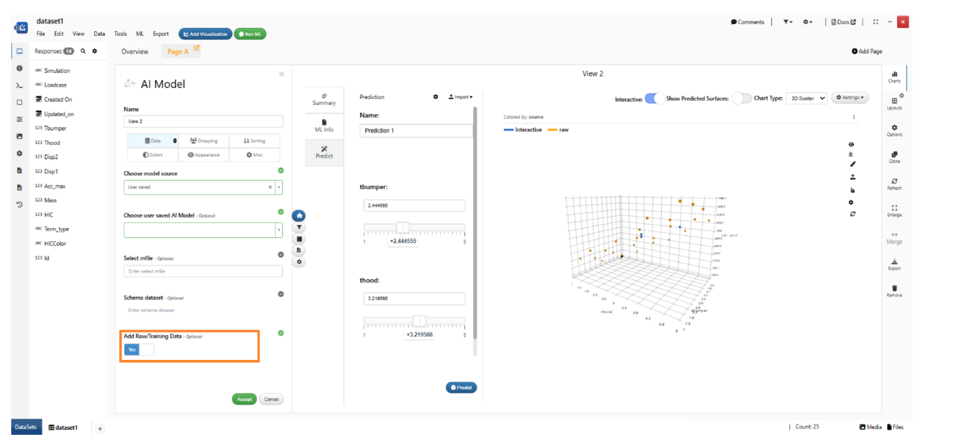
Add Raw/Training Data
BIO IMPACT
New visualization in Simlytiks called ‘Bio Impact’ is added, which will help visualize the LowerLegform impact visualization.
New options are available to modify the Bio Impact visualization under appearance tab in Simlytiks.
Threshold values can be edited and updated for Bio Impact visualization under colors tab in Simlytiks.
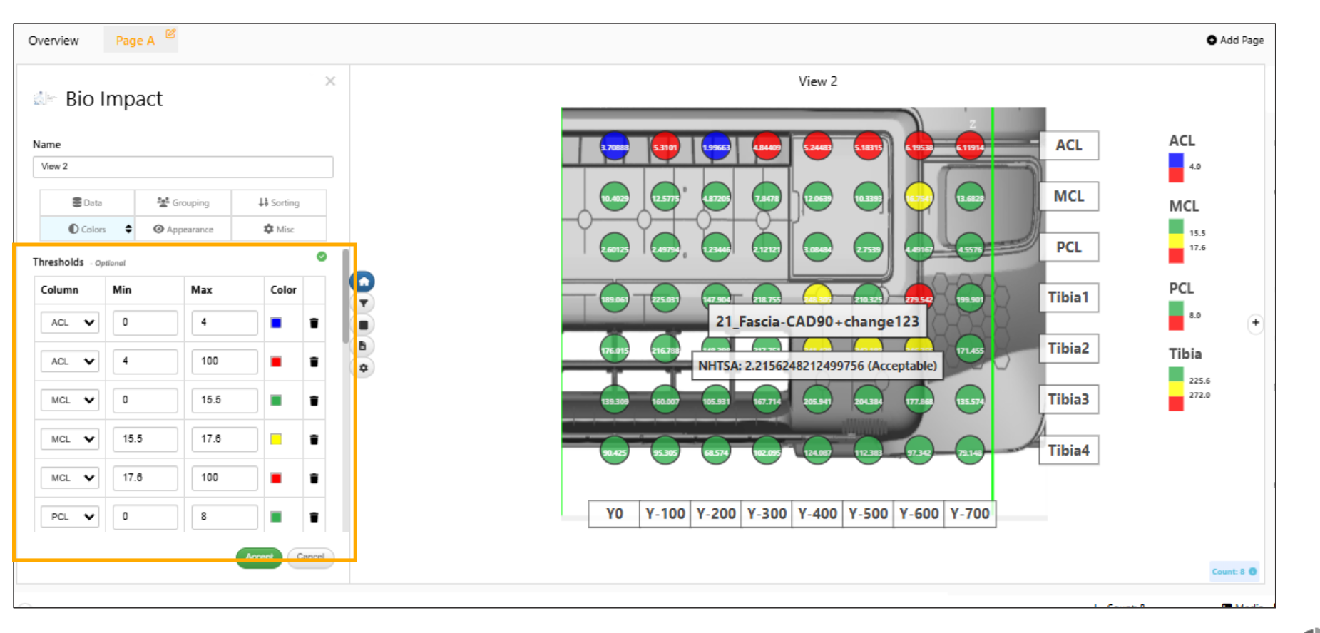
Threshold values
The legends in the Bio Impact visualization will now show the count for the group and highlight the circles when we hover on the legends from the groups.
Background image can be added to Bio impact visualization. Context menu options enable the image to be brought to the front or reset .
Newton Slider
New visualizer called Newton Slider is available in Simlytiks, which will support curve column (multiple) and generate a slider and a plot for each side-by-side and show a tooltip at that value.
Newton Slider: Datum lines are visible during slider interactions and accurately reflects values.
Silders
Newton slider visualization has inputs by default on left panel and the slider can be toggled to check the values in Curves.
Newton Slider: Improved container resizing to maintain correct layout proportions during adjustments.
Resize container
Newton Slider: Datatable updates dynamically when sliders are moved and displays the correct curve name along with the X co-ordinate.
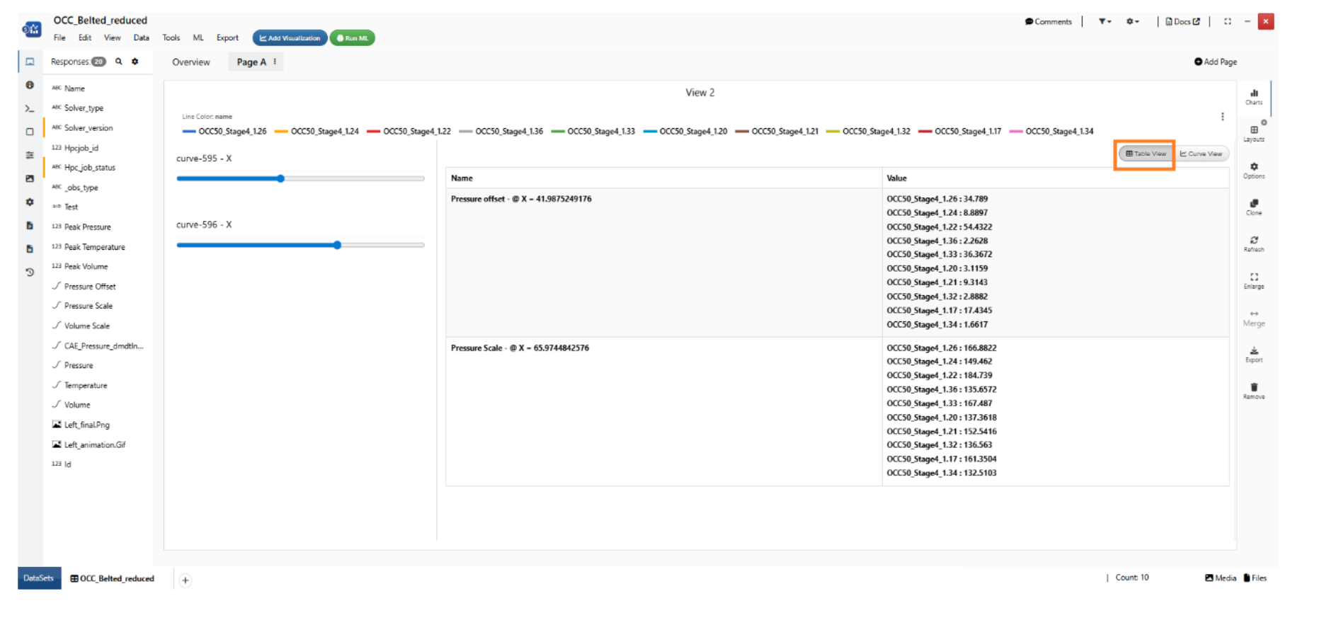
Newton sliders
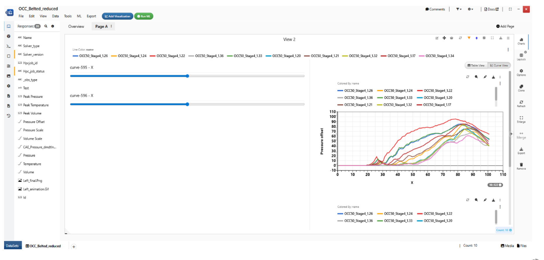
Views
Newton slider visualization can now be viewed in Table view or in Curve view.
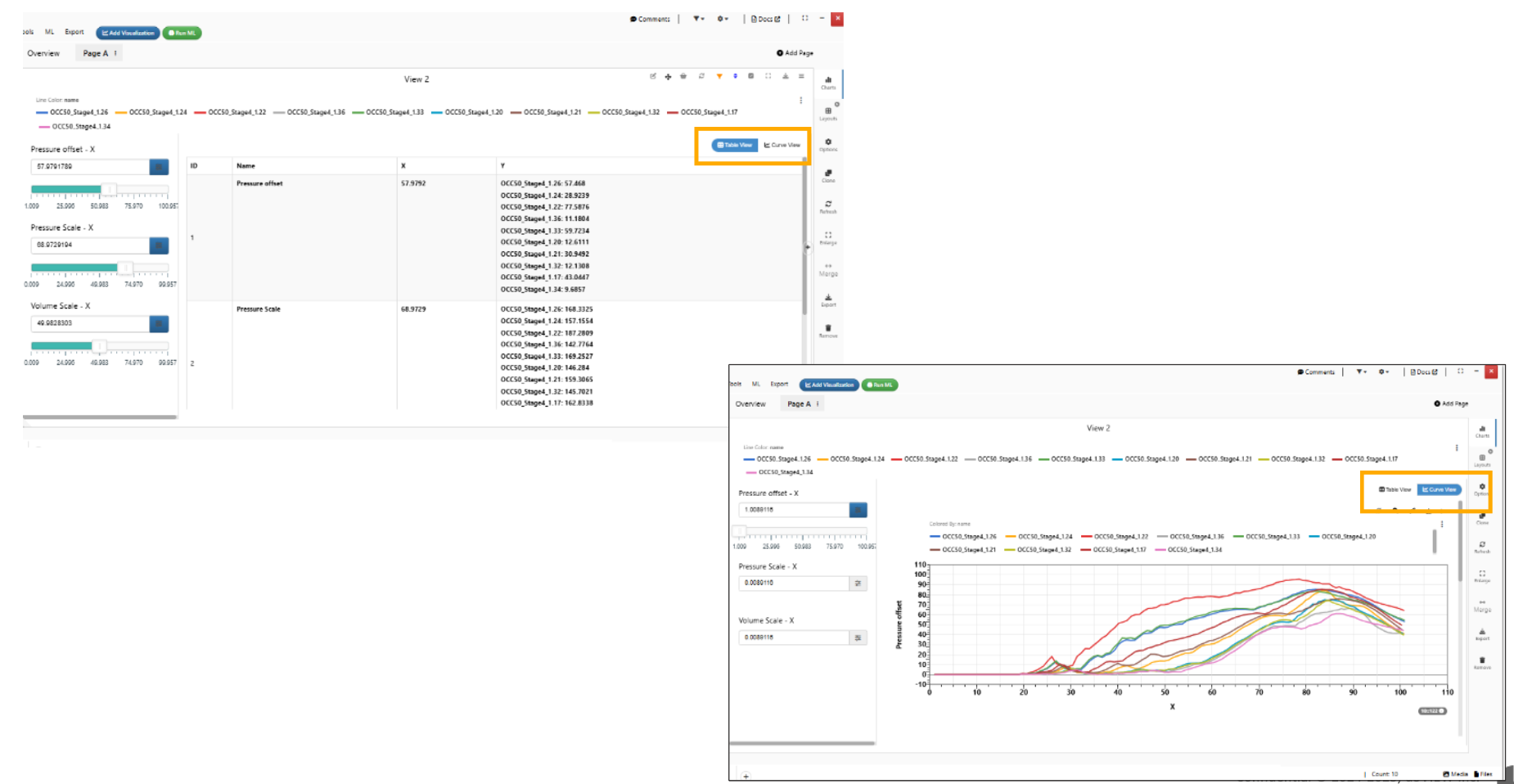
Newton sliders views
Orientation
In Newton Slider visualization, a new option called Orientation has been added to Appearance tab, allowing curves to be displayed horizontally or vertically.
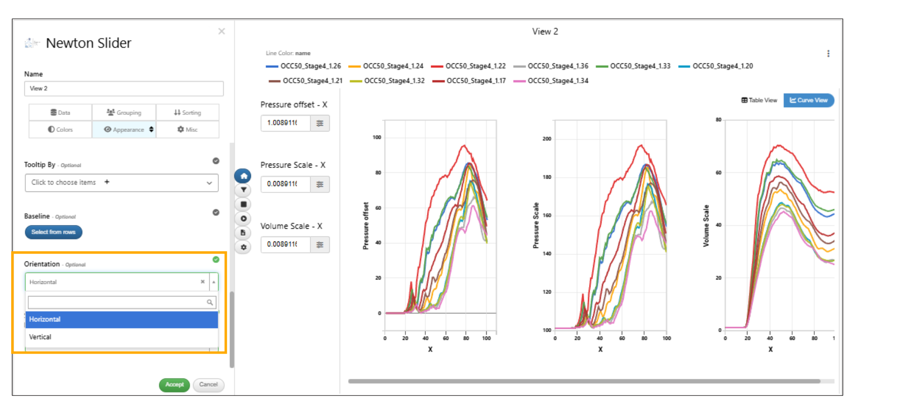
Orientation
Survival Space
Survival Space visualization has two new options in appearance tab: To add text along the paths in datum areas and to update Datum area label font size in Simlytiks.
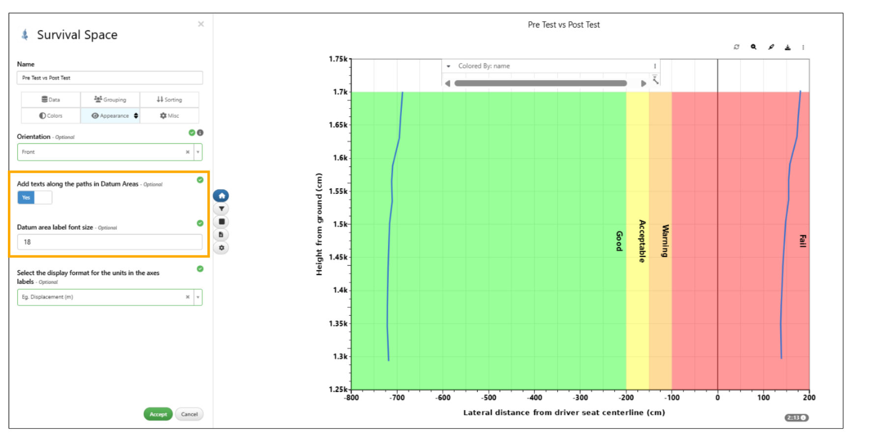
Survival Space
Load Path
New Load Path visualization is added in Simlytiks.
Load Path Visualization shows part ID on hover and has option to show part ID below name in Simlytiks.
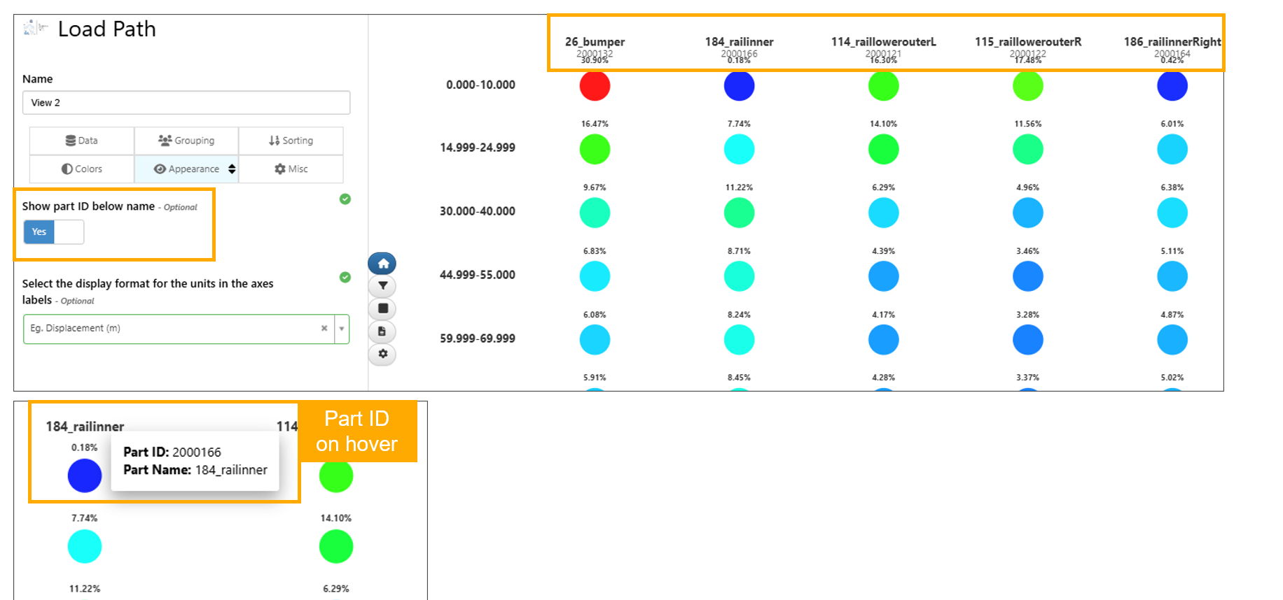
Part ID
ER Diagram
New ER Diagram visualization is available in Simlytiks and supports hierarchical data using a parent reference.
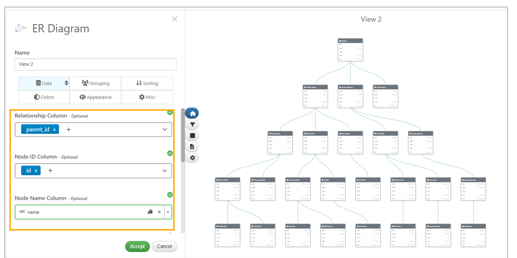
ER Diagram
Distribution Grid
New visualization called “DISTRIBUTION GRID” is now available in Simlytiks.
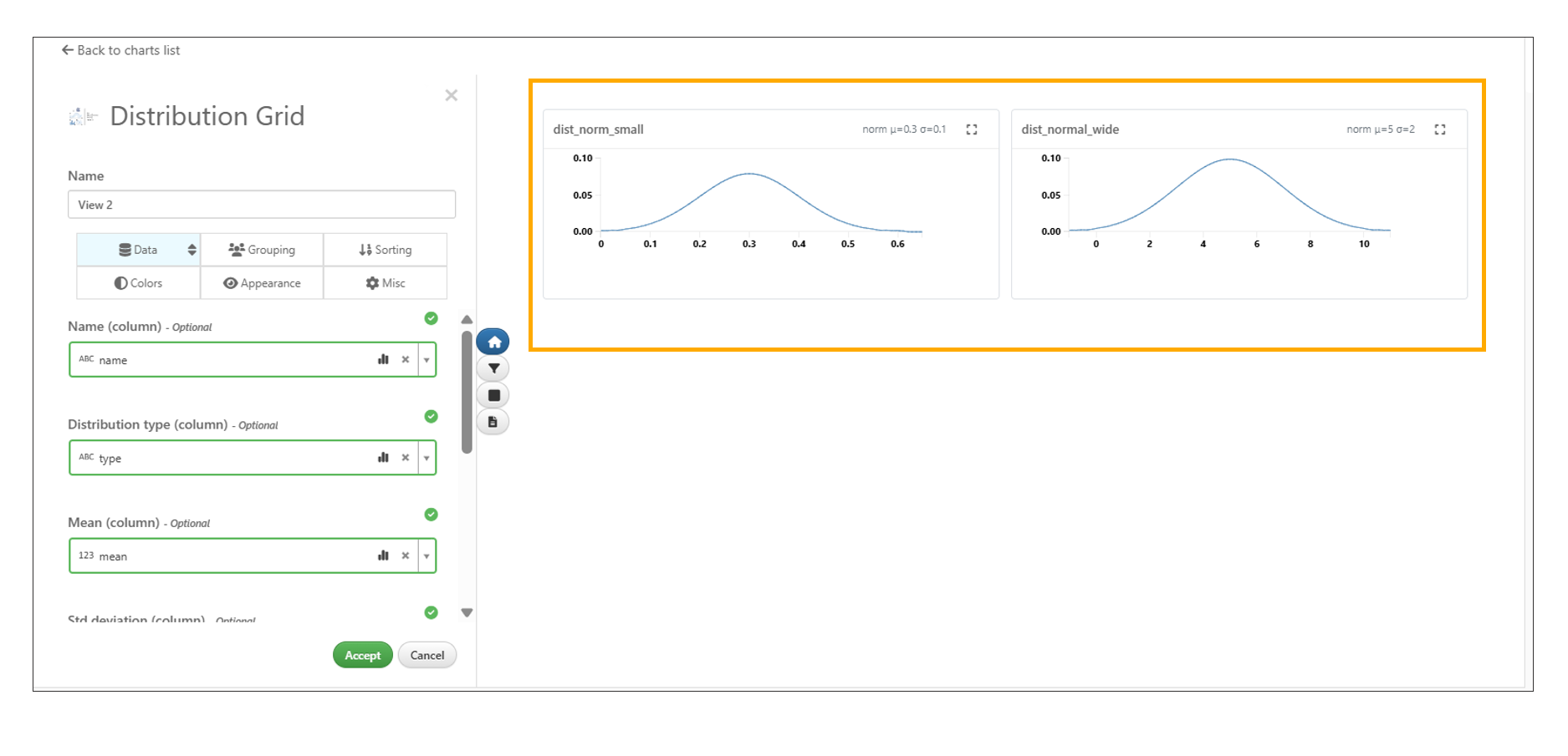
Distribution Grid
ML Sub Chart options
Simlytiks now includes a chart options edit button on ML sub-charts, enabling inline customization of chart properties. This enhancement allows users to quickly adjust visualization settings without leaving the current view.
- Edit button available directly on ML sub-charts
- Inline customization of chart settings
- Supports modification of axes, colors, and sorting
- Live re-rendering of charts with each change
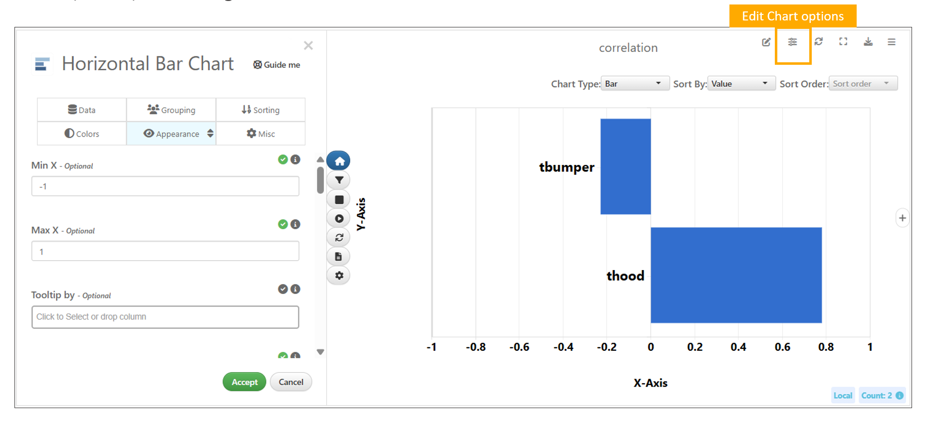
ML Sub Chart options