6. |Data Profiler|
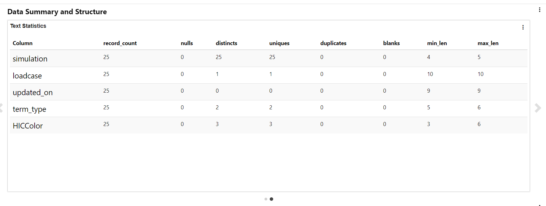
New feature Data profiler is added to Simlytiks which includes Data Summary Schema, Data distribution and frequency and Relationships
Now we have new mosaic view support for Image Gallery in Data profiler.
Heatmap in Data profiler shows scatterplot when we click on the values
We see cross plot matrix when we click on Heatmap cells in Data profiler and we have option to switch between scatterplot and QQ plot.
Coloring of a cross plot in data profiler will always be between 3 colors and ignore numerical binning.
Coloring cross plot
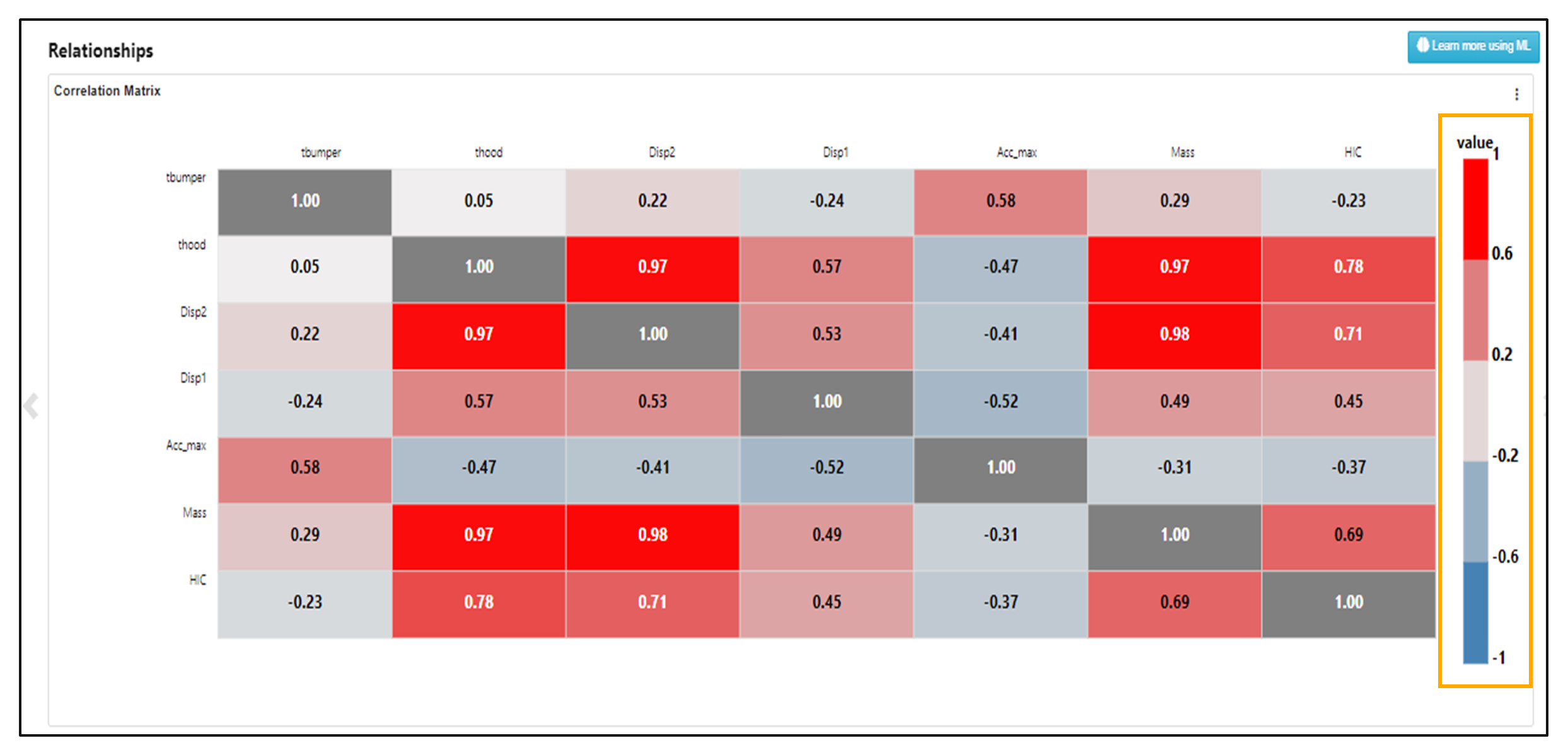
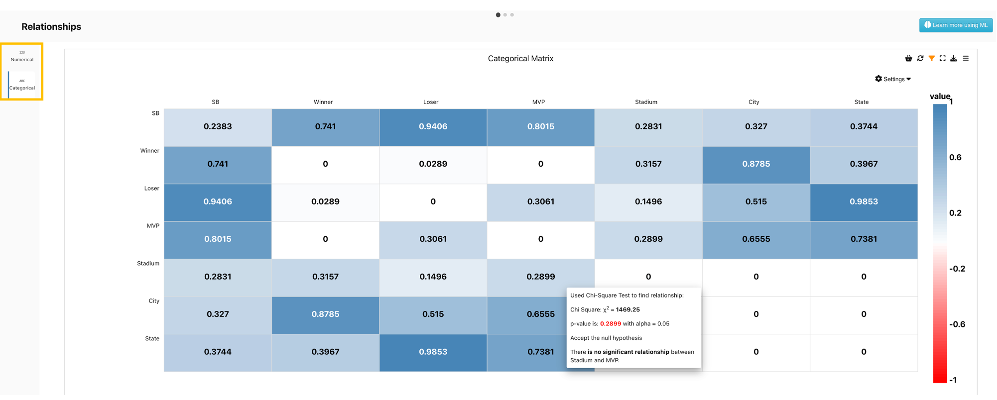
When there are categorical variables in the dataset, there will be an option to view the relationship among them. For numerical variables, Pearsons’s correlation coefficients are shown. For categorical variables, a Chi square test is conducted and the p-value from the test is returned for reference. When the cursor is hovered over the cells, a tooltip with more information on the test will be displayed. When the p-value is smaller than the significance level (a commonly used value is 0.05), we conclude that there is enough evidence to conclude that the two variables studied are not indepedent. That is, they are correlated.
QQPLOT MATRIX is created for all QQPLOTS in Data Profiler Heatmaps.
Data Profiler larger font-size for column names in schema table and data table.
Font size for Data Profiler
Data Profiler now has new representation for Inputs/Objectives and Targets.
Thresholds from targets are now grayed out based on an option (within Targets) and shown in the cross plots for Data Profiler.
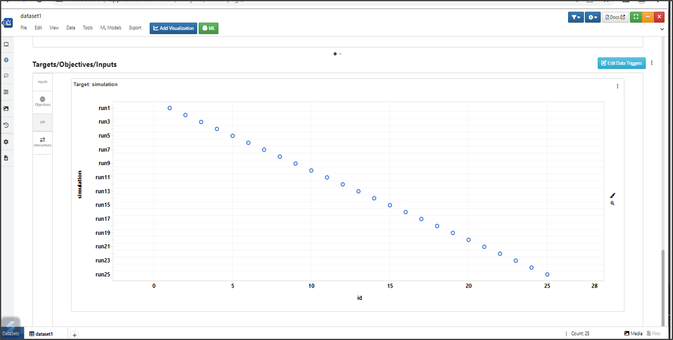
Cross plots for Data Profiler
In Data Profiler we can right click on the Heatmap and enlarge the QQ Plot Matrix.
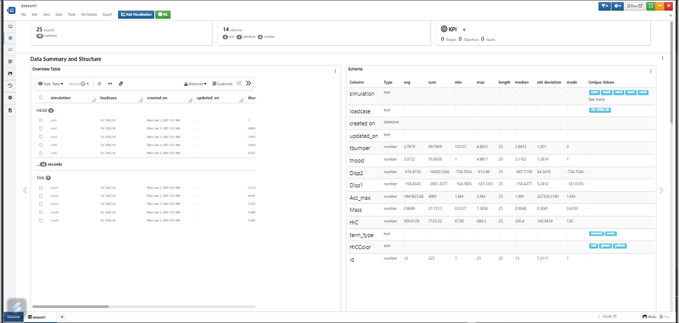
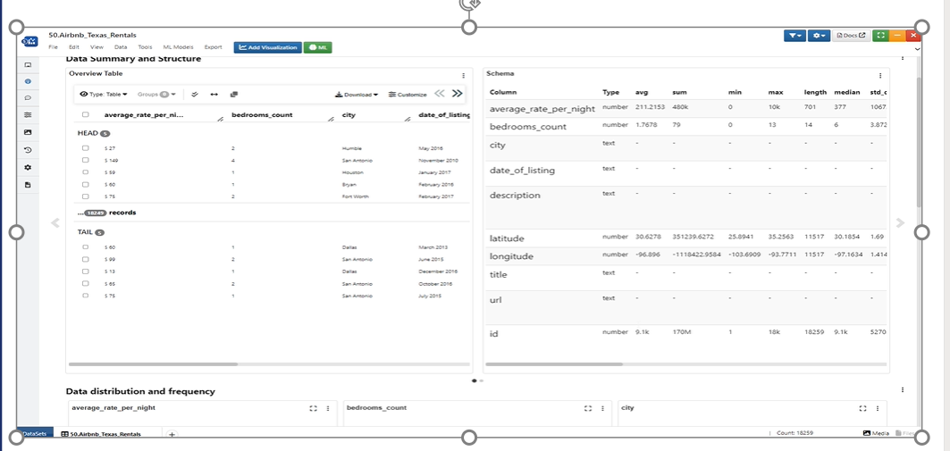
In Data Profiler we use summary visualization in Data Summary and Structure column.
Data Summary and Structure column
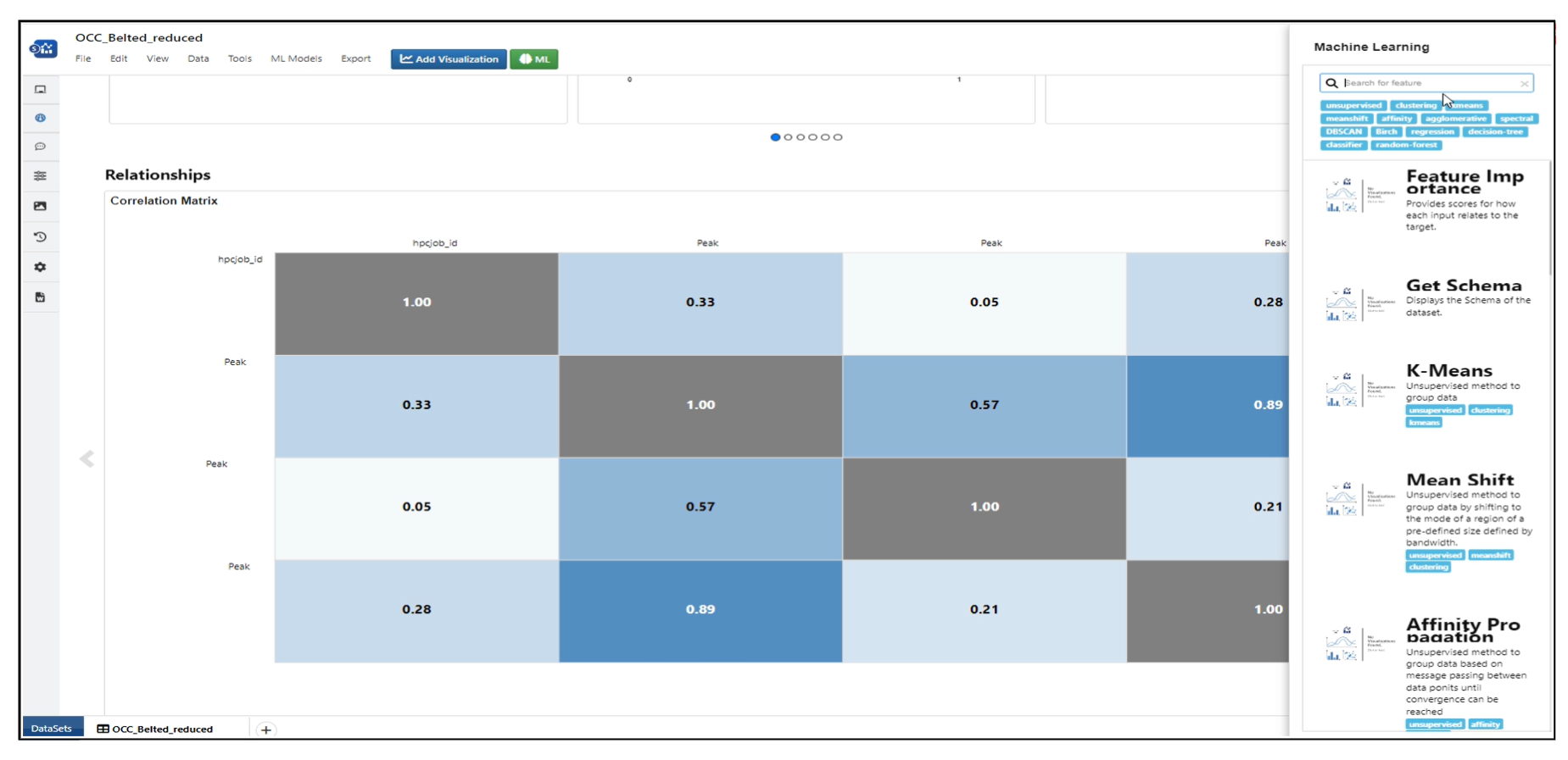
Workers can be searched using Machine Learning in Data Profiler.
Workers searched
In Data Profiler, Larger ML Datasets are rendered easily to view all charts
Data Profiler for Large ML Datasets
In Data Profiler, Larger column ML Datasets has pagination within Heatmap and Scatter matrix Plot.
In Data Profiler, We can enlarge the visualization in Data distribution
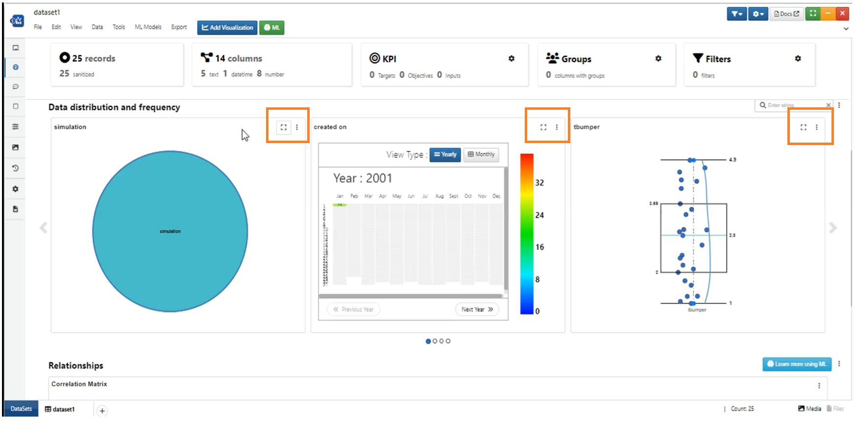
Enlarge visualization
In Data Profiler, We can change the chart type to Histogram and Violin chart for visualizations in Data distribution
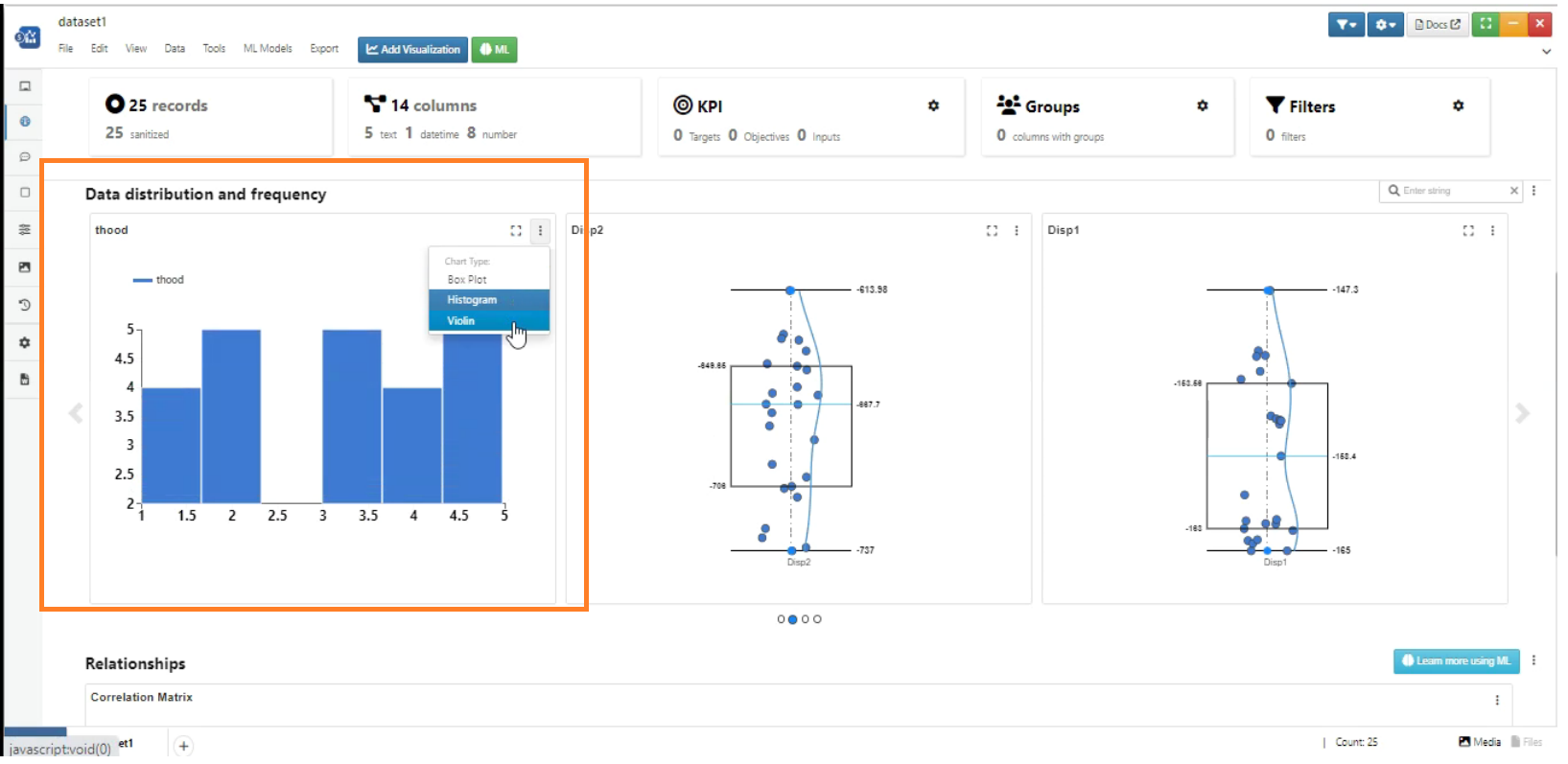
Chart Type for Visualization
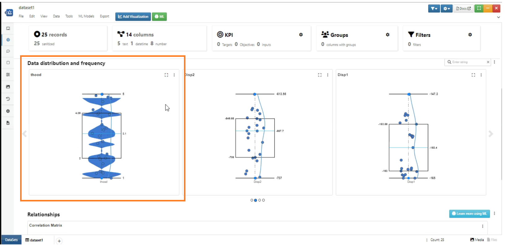
Chart Type for Visualization
Search filter is included for data distribution and frequency column
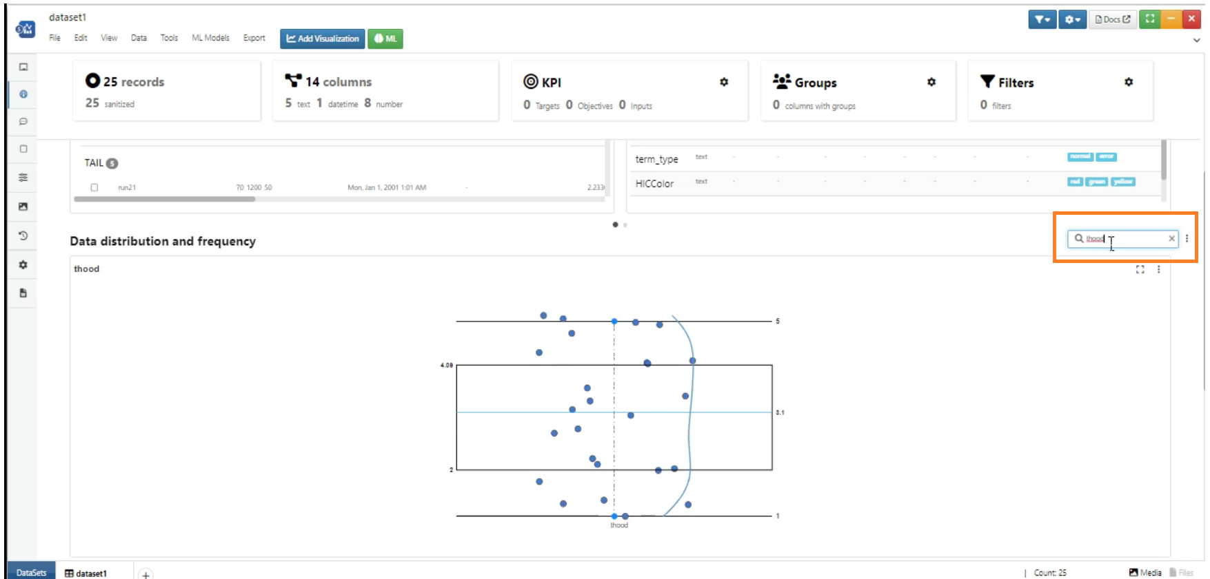
Search filter
Heatmap has several settings in header like view type , pagination, page size and filter by co-eff
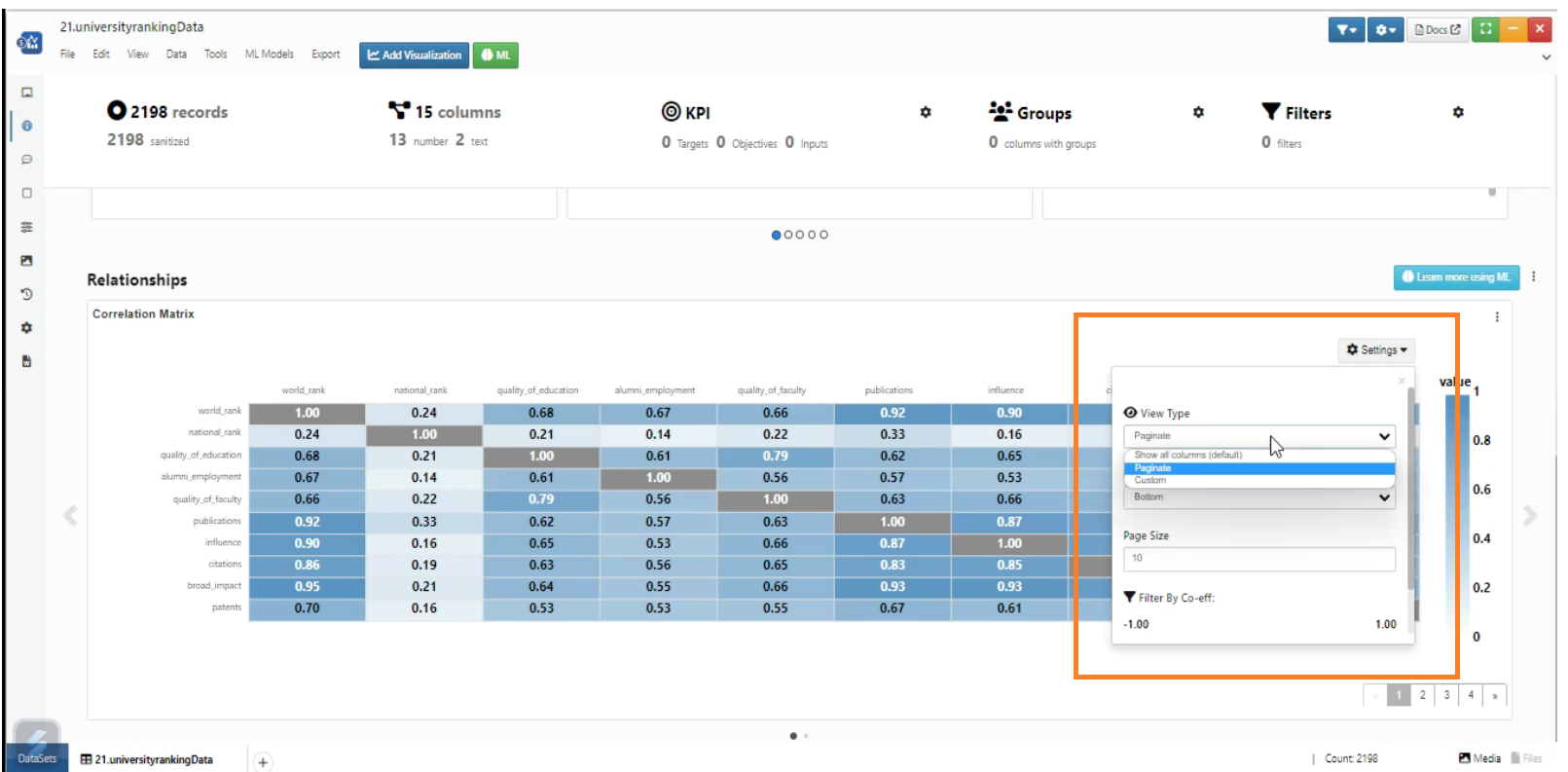
Heatmap Settings
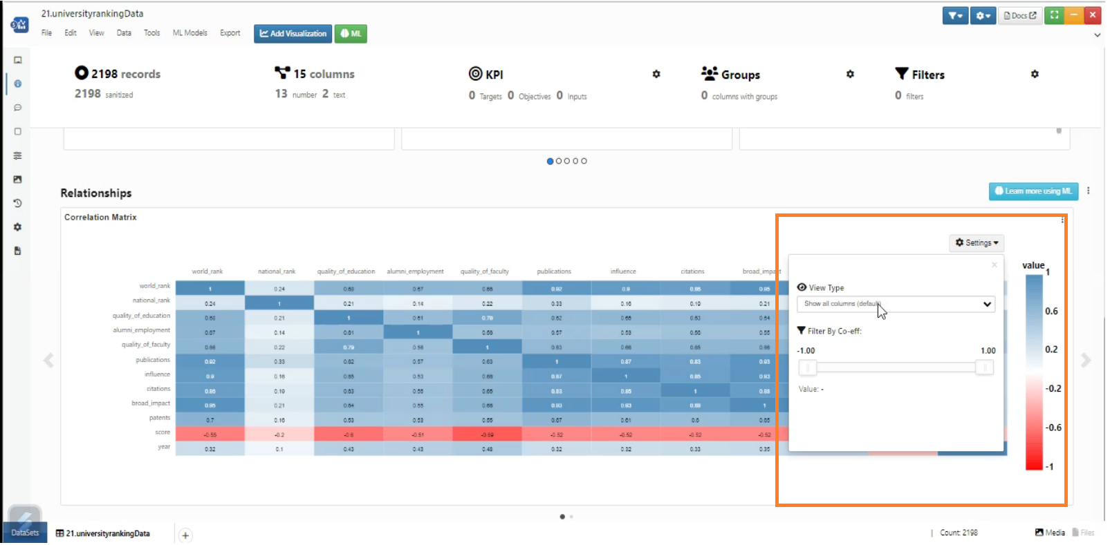
Heatmap Settings
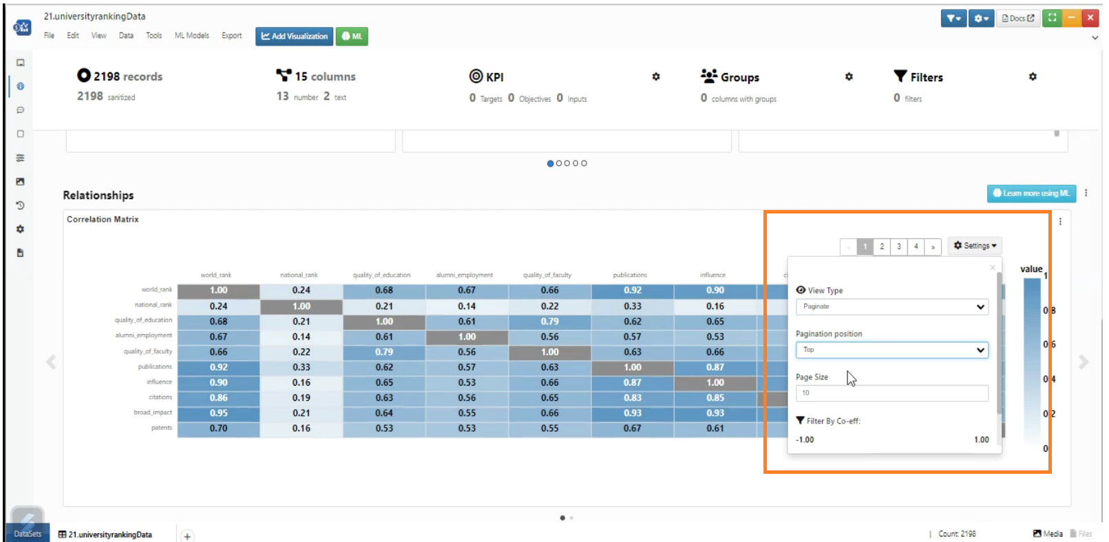
Heatmap Settings
We can add groups in Data Profiler using Groups option in Header
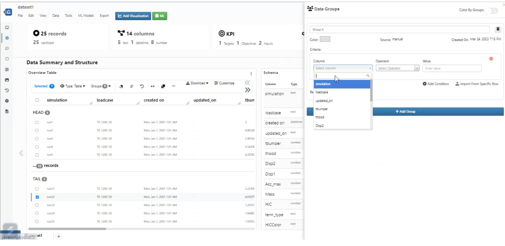
Groups
We can add Filters in Data Profiler using Filters option in Header
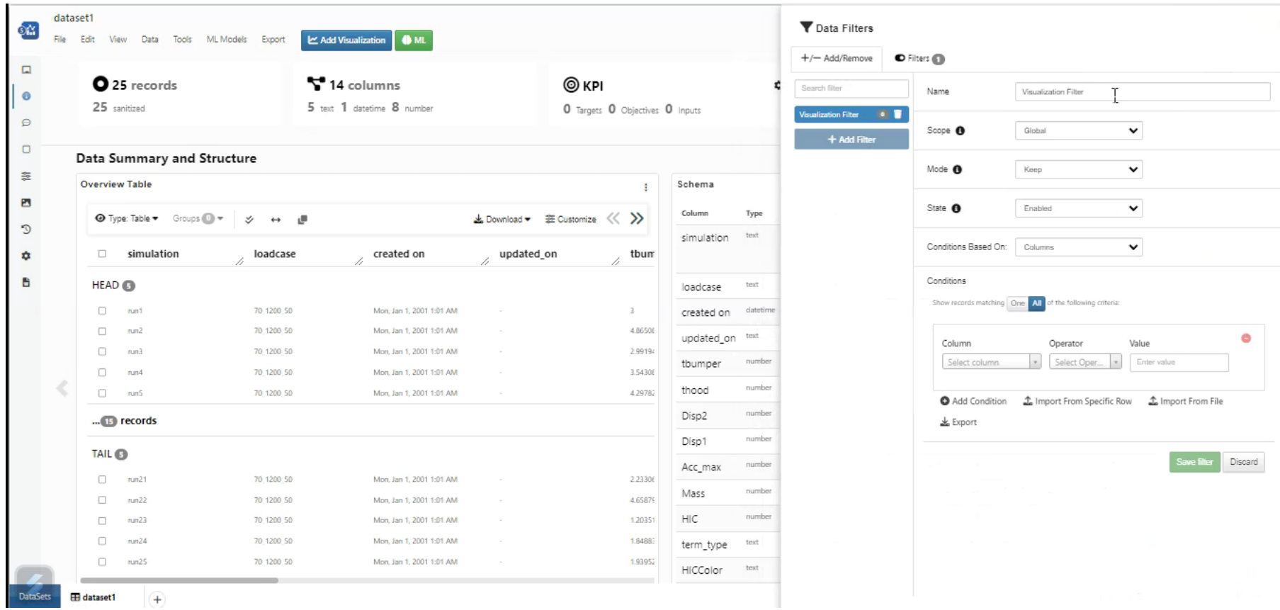
Filters
In Data Profiler, Data groups are created and now have support for coloring groups using Color by groups option
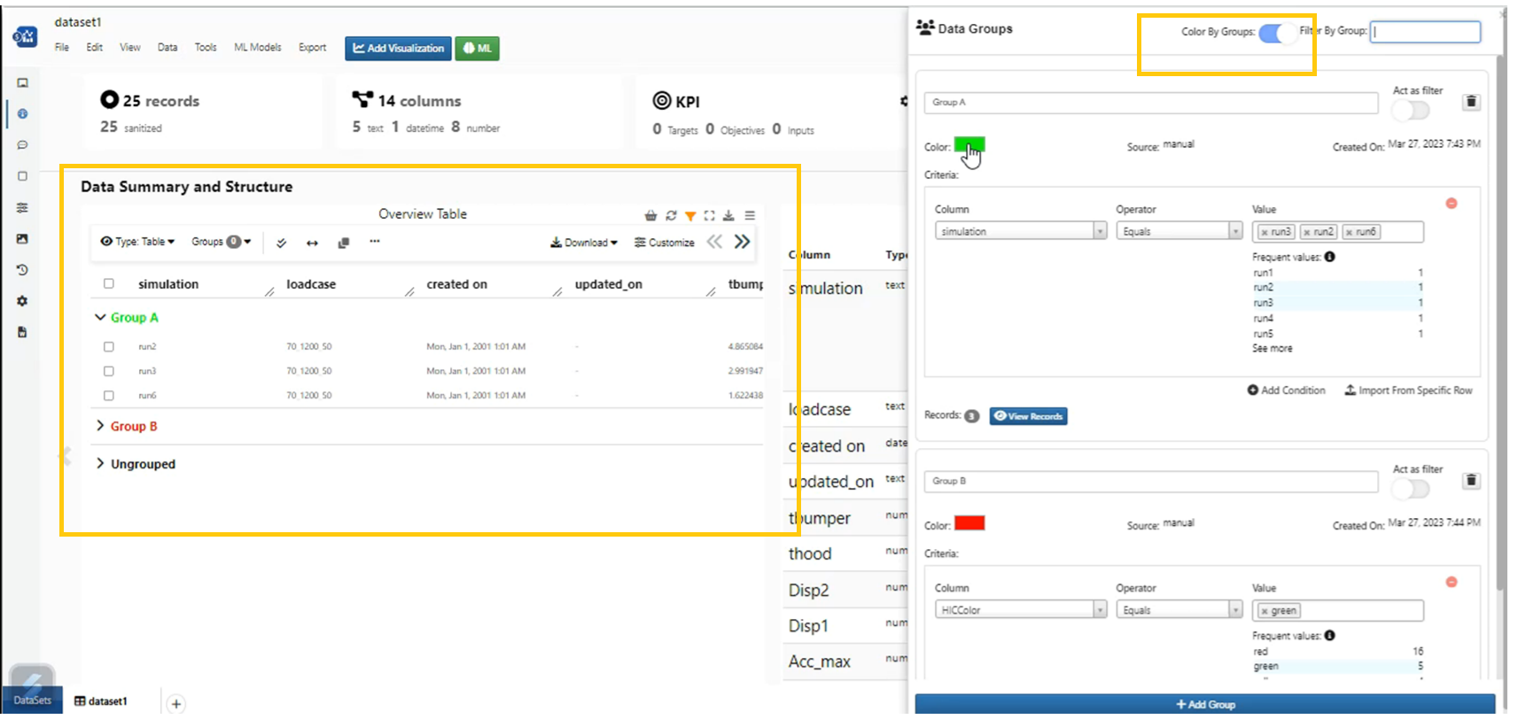
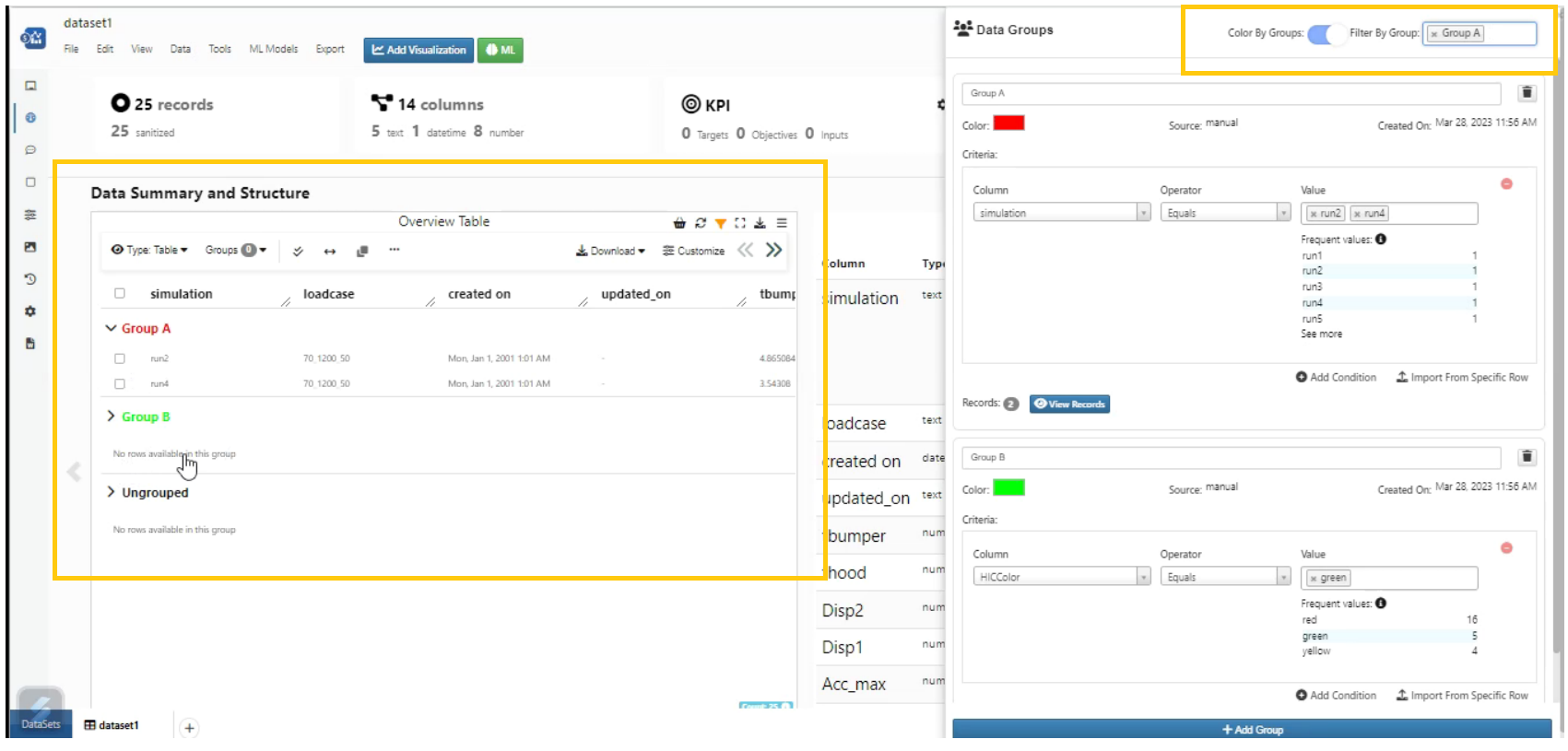
Color by groups and Filters
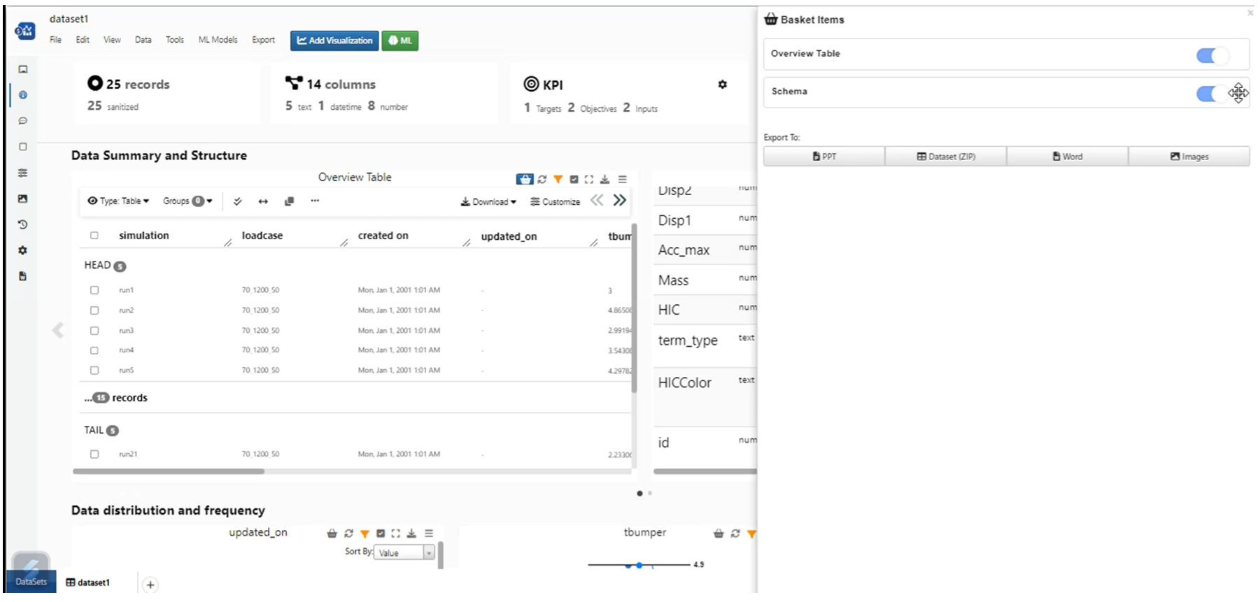
Sections in Data Profiler can be added to Basket and viewed as Basket items
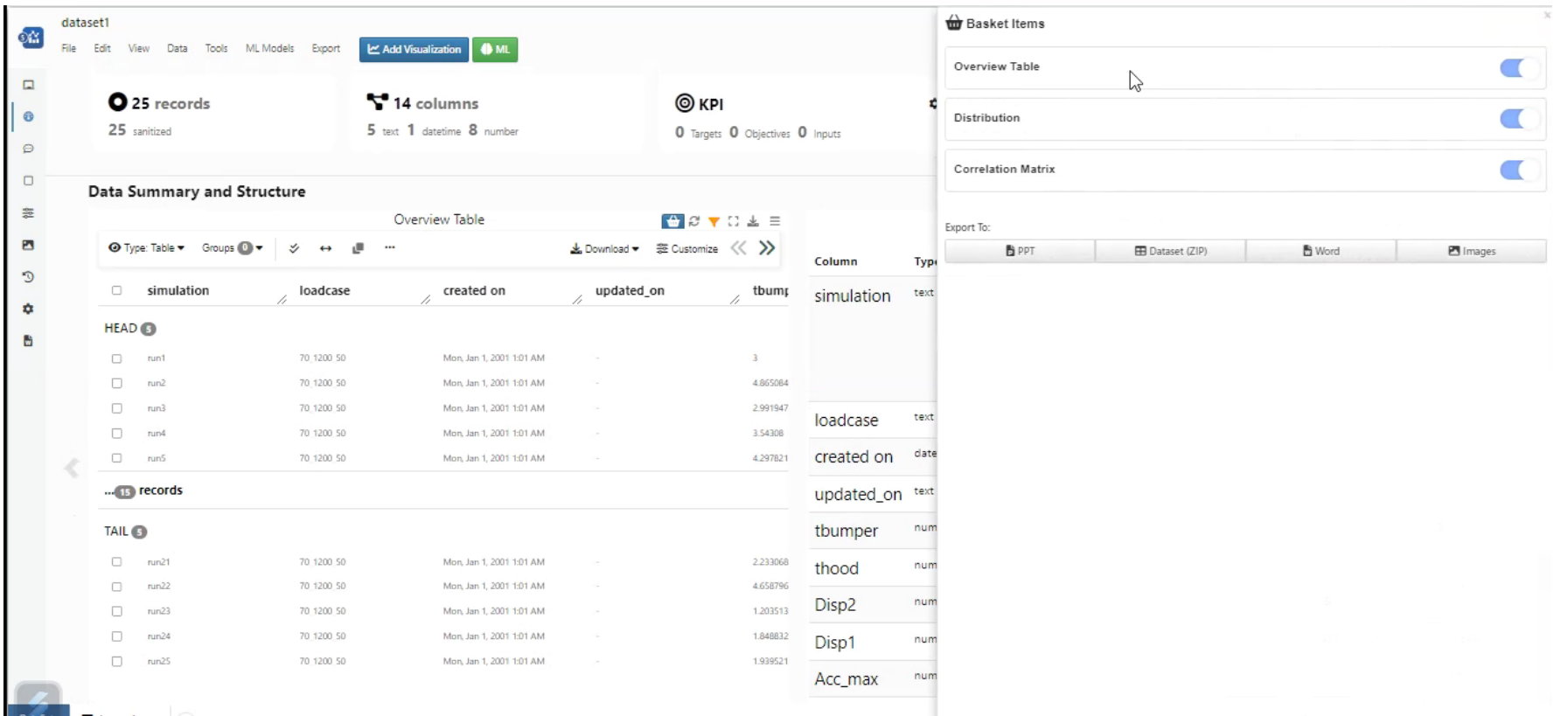
Add to basket
Sections in Data profiler can be exported as CSV and ZIP file
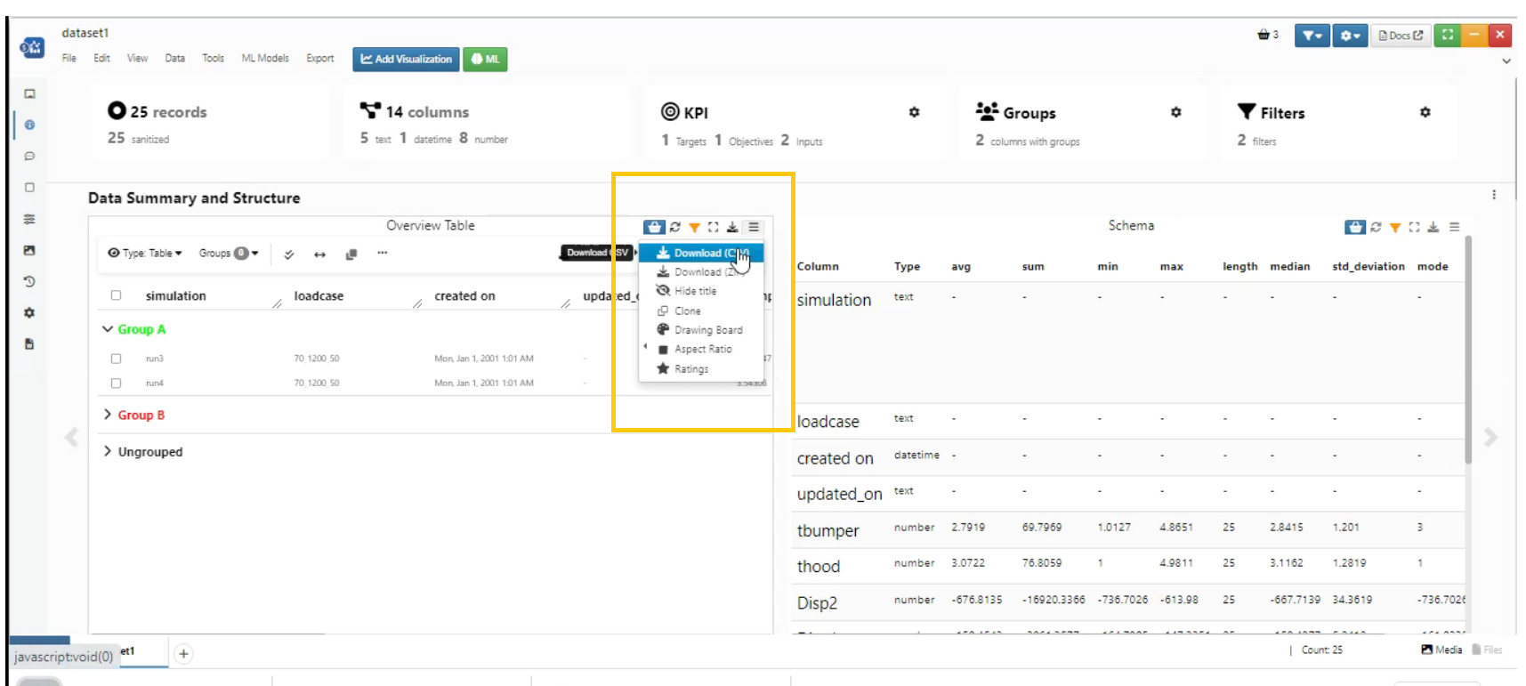
Export Sections
View 3D option is available for visualizations in Data Profiler
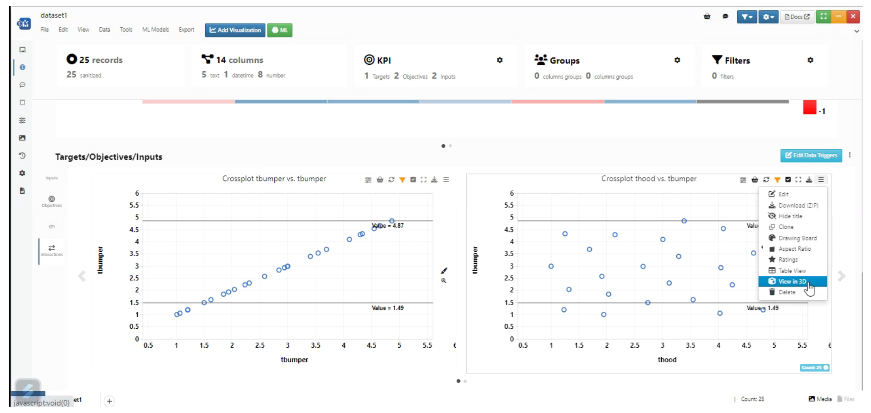
3D Option
In Data Profiler, We can clone the visualization and paste it on the new page in Simlytiks dataset
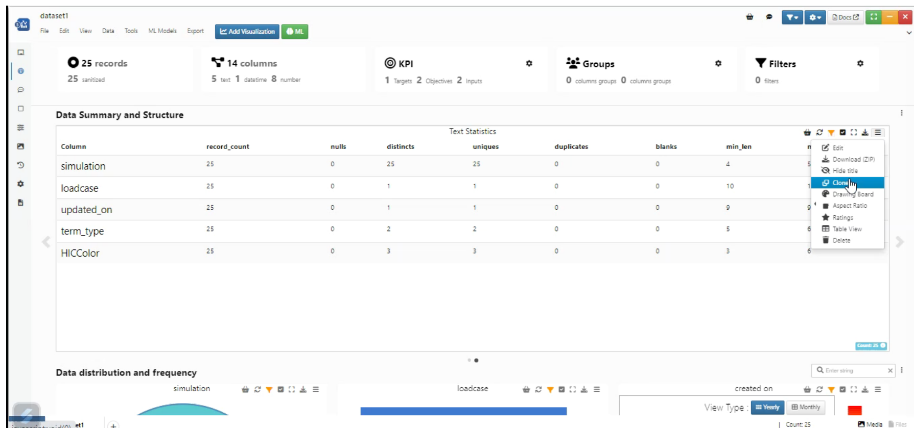
Clone and Paste visualization
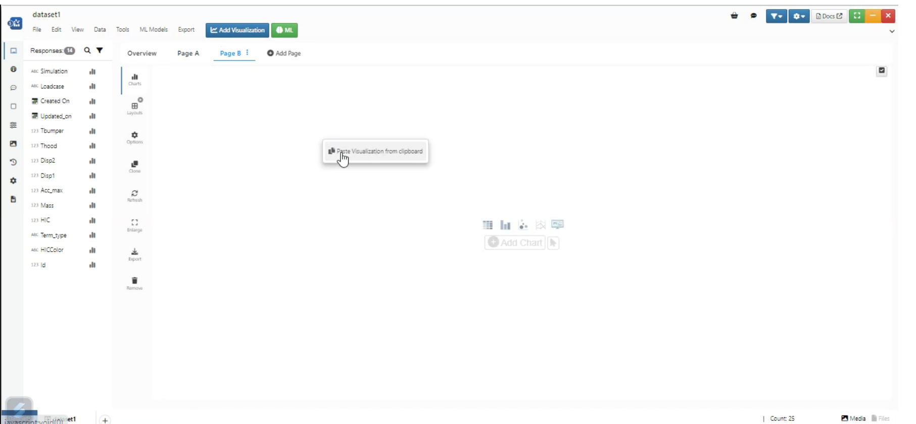
Clone and Paste visualization
Basket items are sortable now in Data profiler
Sort Basket items
We can Zoom in to the visualization and Highlight a part of visualization for sections in Data Profiler
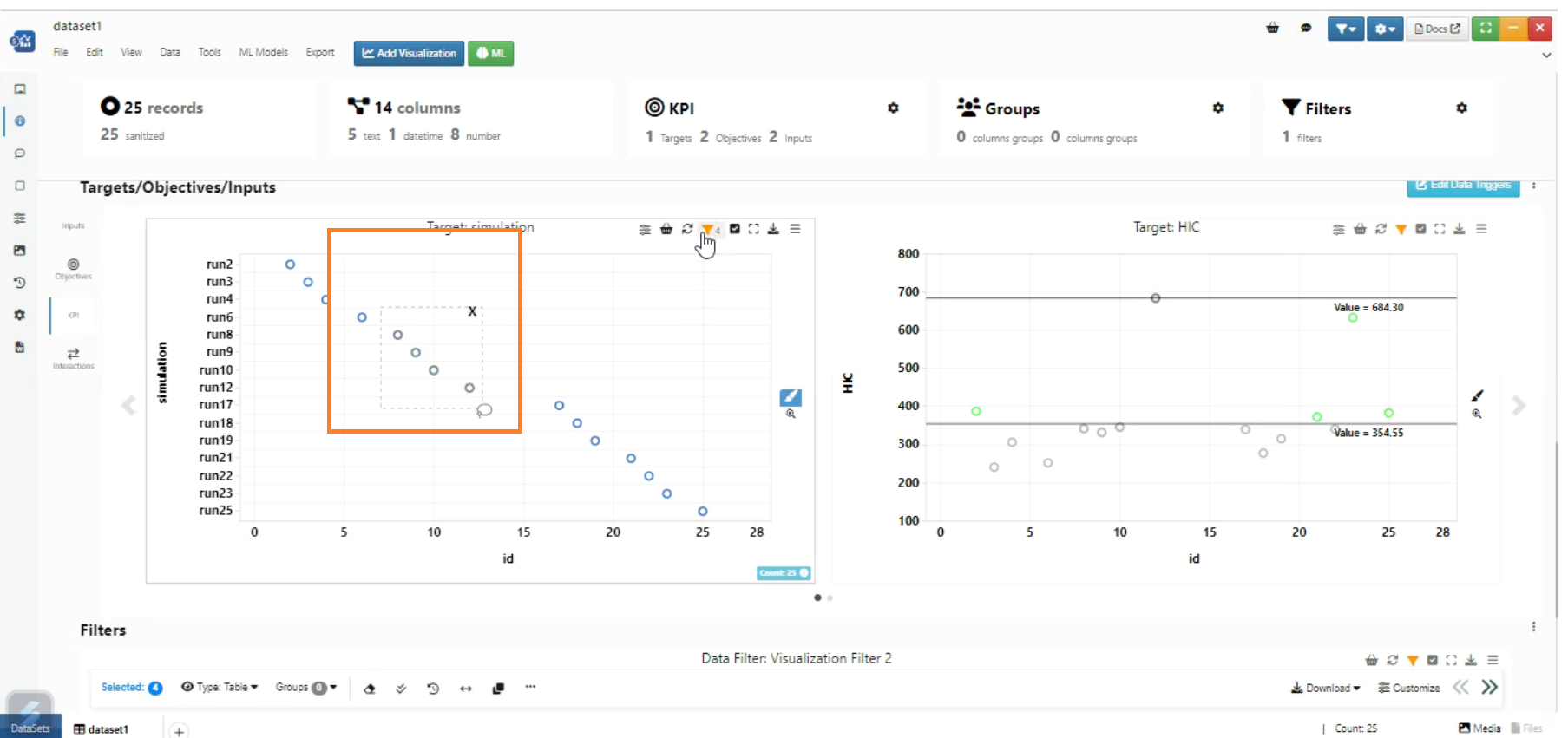
Zoom and Highlight
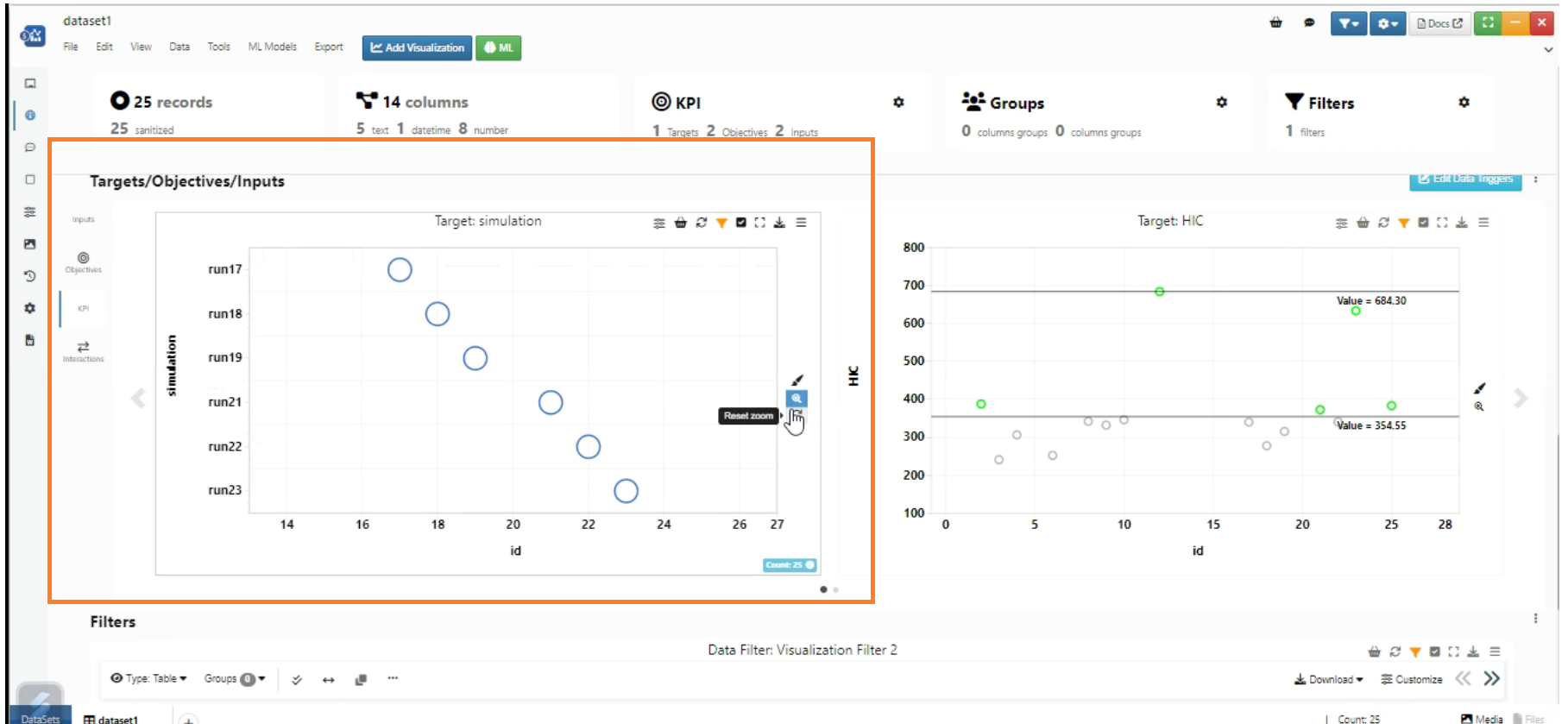
Zoom and Highlight
In Data Profiler, We are able to switch between Relationship matrix and Chord diagram.
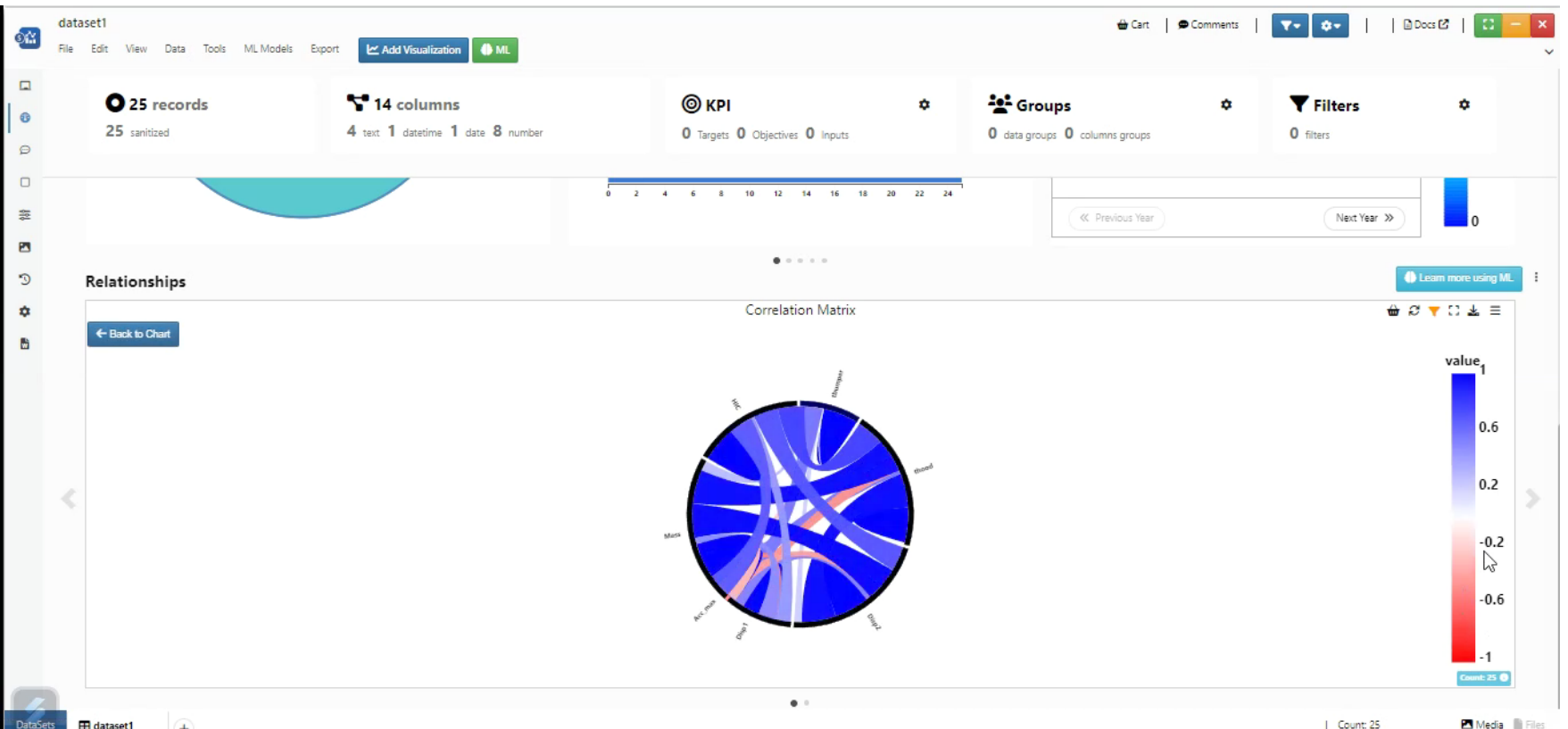
Relationship matrix and Chord diagram
Data Profiler Relationship section now shows a Categorical Relationship Matrix separately for categorical values.
Heatmap now has several settings in Header with filter like View Type, Pagination Position, Page Size and Filter by Co-Efficient.
In Data Profiler, assign colors for targets - KPI → Targets → add a new target, gray out the non-existing records and color the ones which are within the target range.
In Data Profiler, New Visualization Column Summary is added to summarize a numerical value.
In Data Profiler, View Lucy ML now shows the actual Lucy response page with primary and non primary responses.
Added kriging_interpolation with multiple inputs, targets and also added simulated_annealing output. Scroll down to see the visualizations created.
In Data Profiler, Visualizations added from the KPI tab along with provided inputs/objectives/targets can be easily removed.
When any Input, Objective or Target is changed, accordingly it re-renders the charts with new options to make charts responsive to the changes in the Data Triggers view.
In Data Profiler, Data Distribution and Frequency has inline search filters to view responses.
In Data Profiler Groups, new section for Groups is added that will be in sync with Tools.
In Data Profiler, new section for Filter is added that will help to filter the charts and the headers are fixed so they scroll down along with the page.
Relationships section in DataProfiler now has filters for search & dropdown list for response names which can be used to filter grouped box plots or stacked plots
Performance improvement in Data Profiler and Data table rendering for LARGE datasets.
In DataProfiler, the KPI tabs are updated with new UI which is more user friendly and has Execute with spinner and log container with default options in settings.
Data Profiler columns
Data profiler columns option in Tools -> settings is now supported to Data profiler visualization.