
20.  Time-Series
In this section, we’ll go over time-series charts and how to explore them.
Examples of Time-Series Charts
Watch this short video about Newton Curve Plotting to gain a general understanding of the application:
Curve Respones
For scientific datasets, time-series curves can be plotted and viewed easily by dragging-and-dropping responses.
This Barrier Crossmember dataset contains columns of curves with one column denoting time.
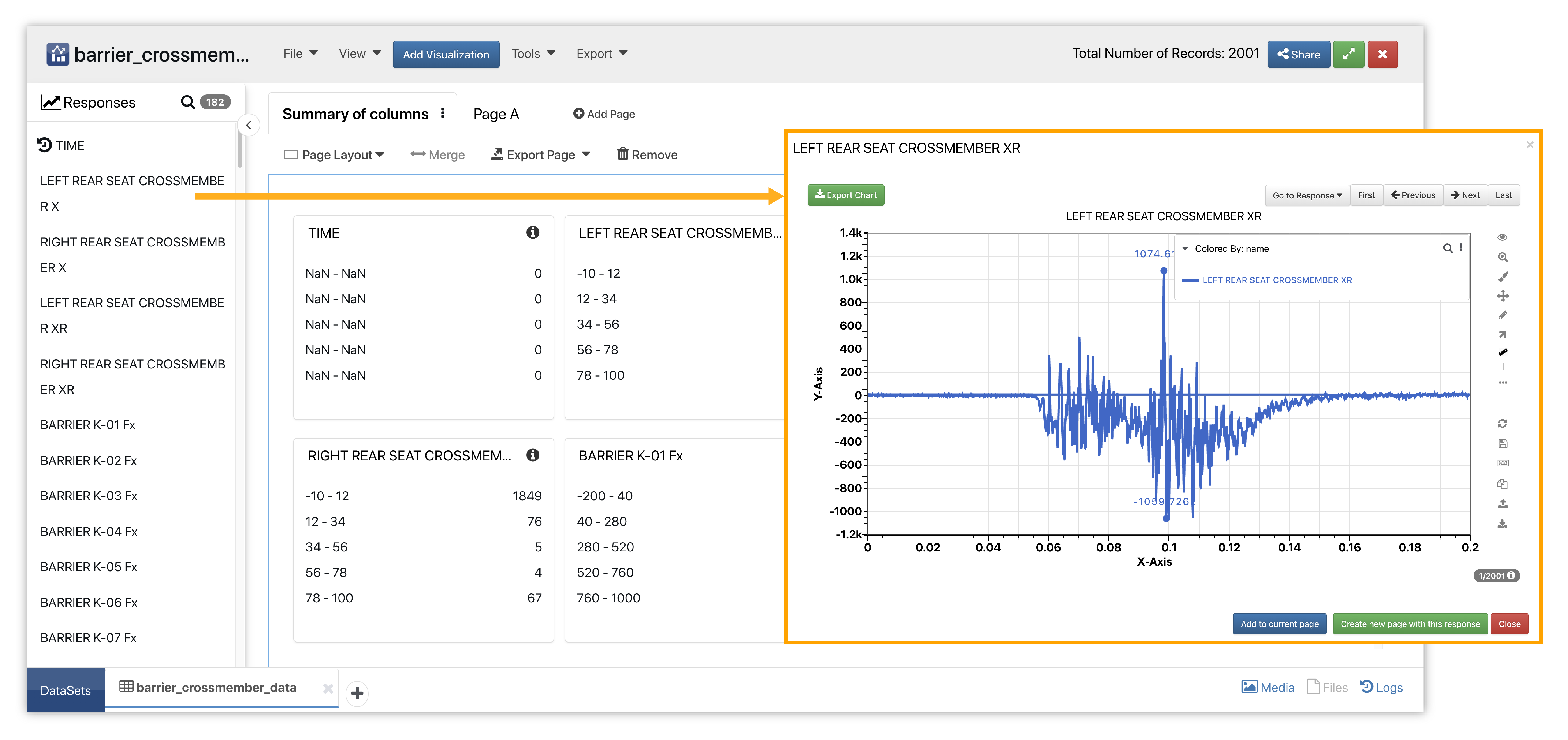
Figure 1: Barrier Crossmember Dataset
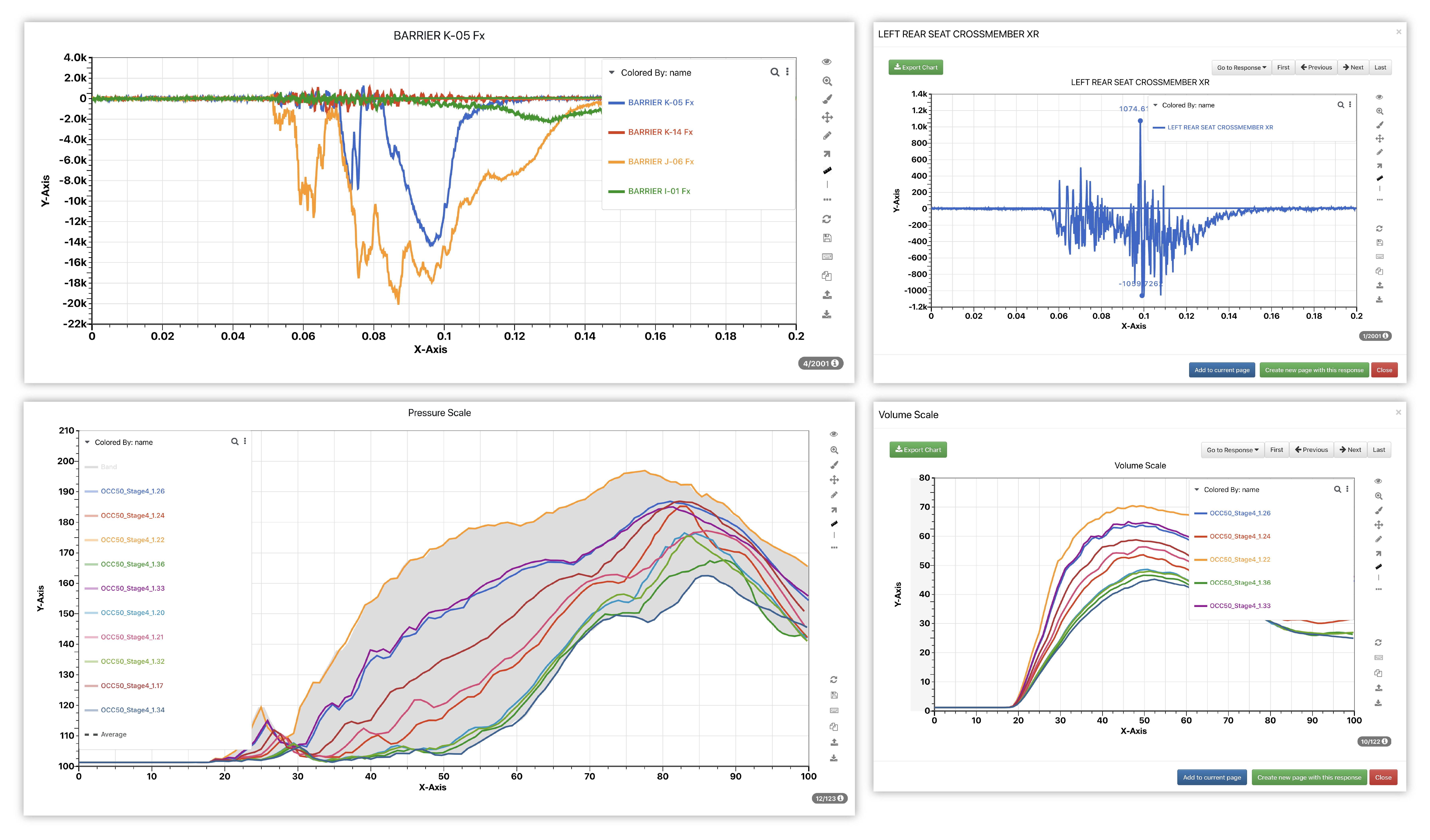
We’ll drag the curve columns into a new page to plot the curve quickly. We can drag other responses onto of the plotted curve to replace the curve it or choose to overlay as many other responses as we like for easy comparisons.
Here is the curve plot with overlaid time-series curve responses.
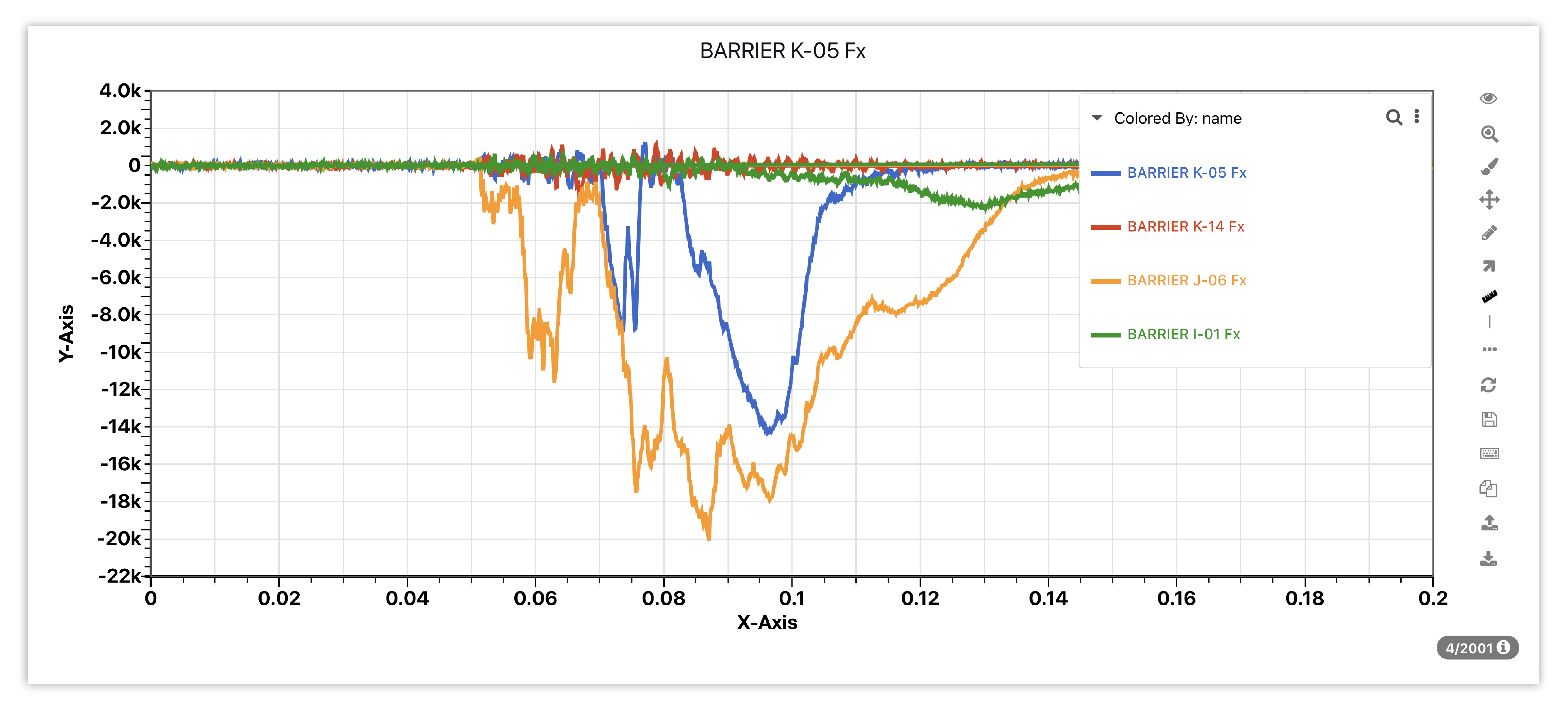
Figure 2: Barrier Crossmember Curve Overlay
The curve responses on the left side in Simlytiks now have default Color By to be name column and response can be enlarged and viewed.
Color By as Name
Sidebar responses list in Simlytiks is now sortable and any changes made in this list will be saved to the schema
Newton Visualizer
Newton Visualizer, also referred to as curve plotting and curve viewer, is Simlytiks’ main time-series chart. It can support up to 100 curves and millions of points in one plot. Newton is highly interactive and customizable; some useful features include zooming, scrolling, dragging, highlighting and filtering. It also integrates with other applications on d3VIEW aside from Simlytiks.
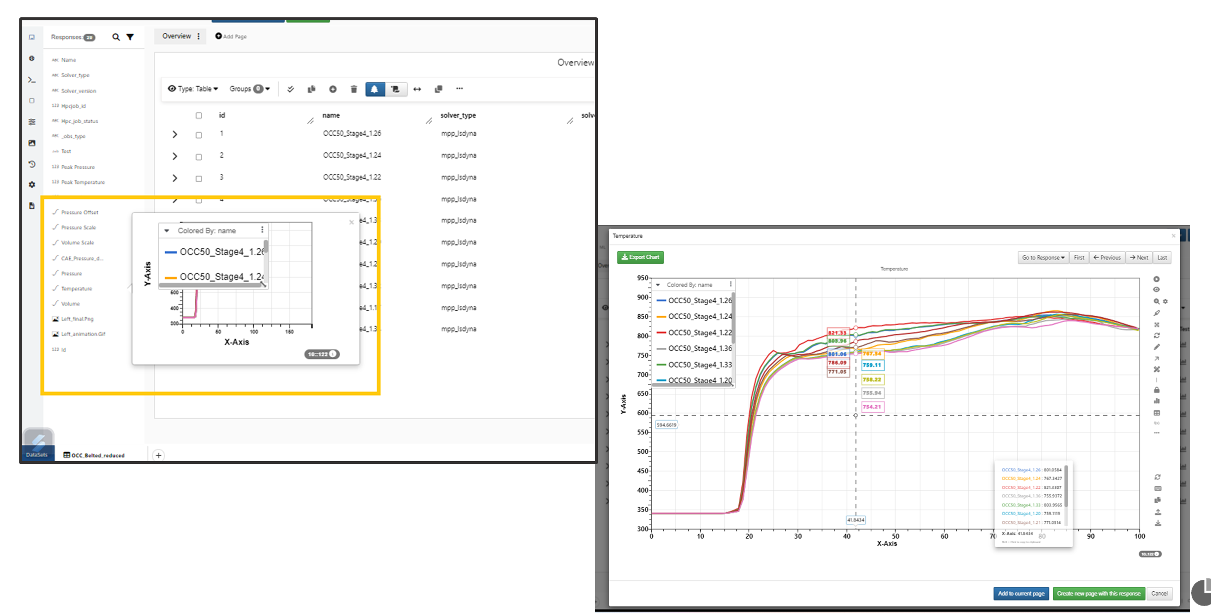
We’ll be using the Occupant Belted sample scientific dataset which has curve responses with time as the x coordinate to help explain Newton.
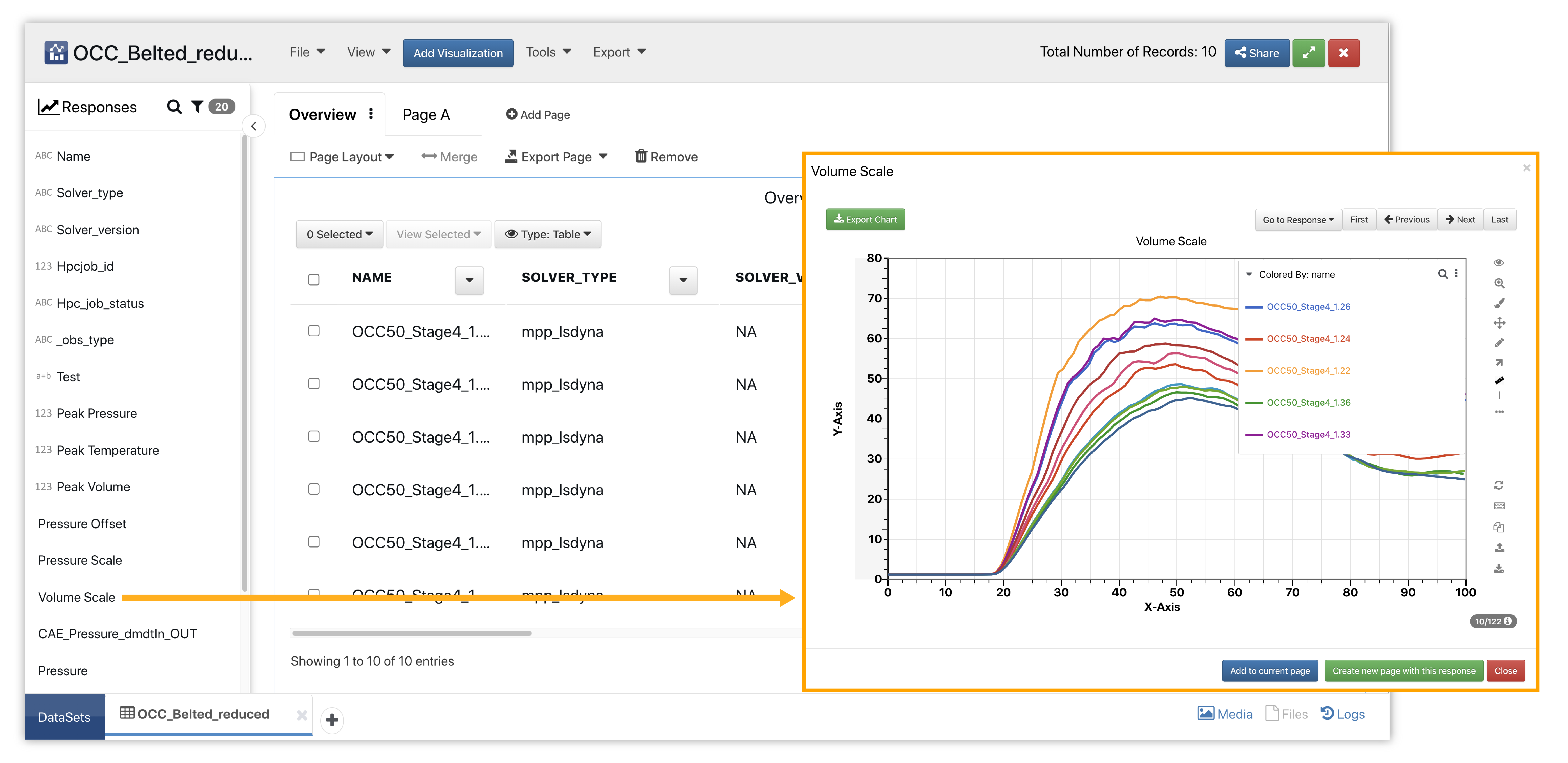
Figure 3: Occupant Belted Dataset
Simply drag-and-drop a curve response into a new page section or choose curve plot in the visualization menu and input data for the plot.
Line Dash By
New as of September, 2022, we can add a line dash property based on data. In this example, we’ve chosen name as our line dash condition which renders each curve a different dashed line type based on the simulation name.
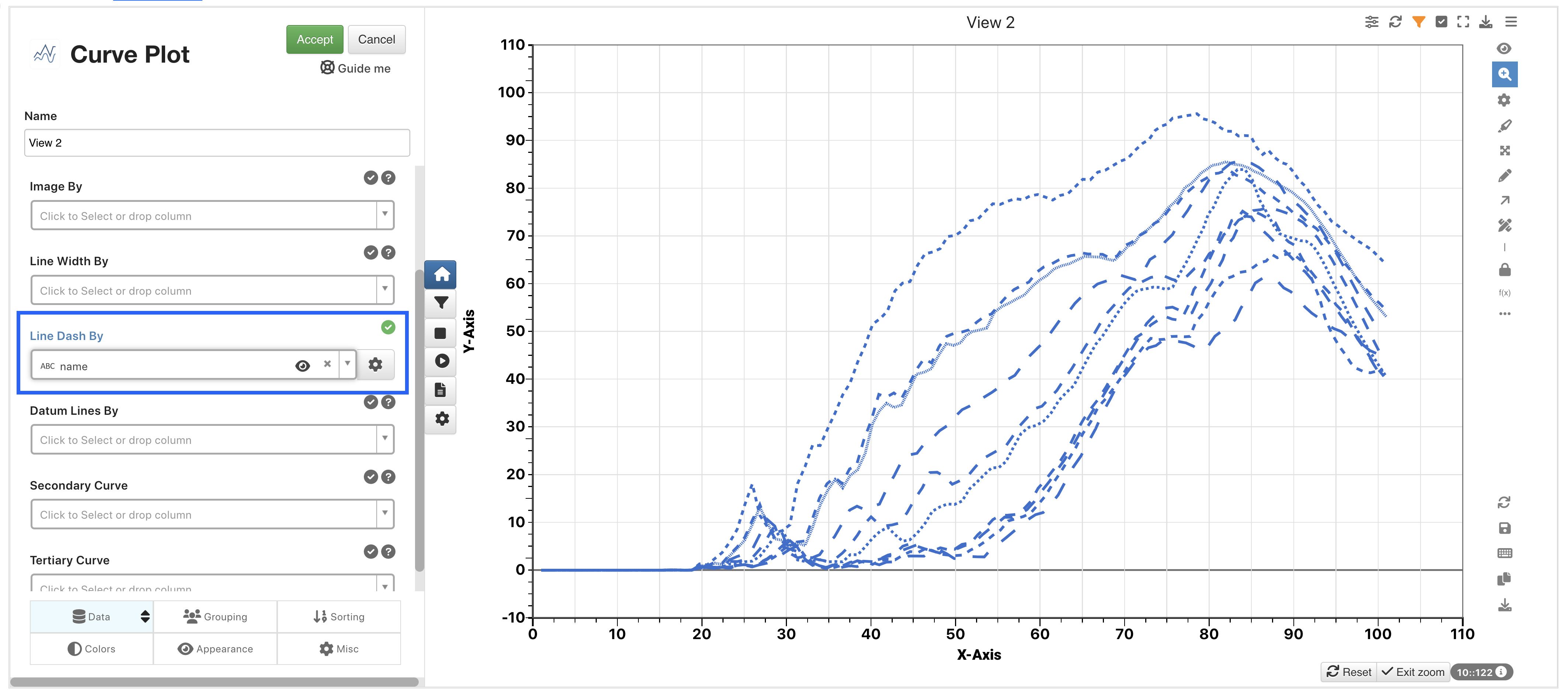
Figure 4: Line Dash By
Color By
Curve visualization now allows ‘Color By’ and ‘Force Individual Colors’ to be enabled simultaneously in Simlytiks.
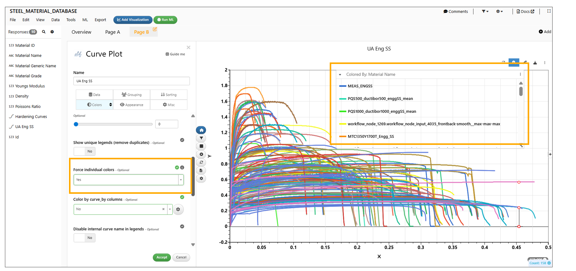
Color By and Force Individual Colors
Newton Tools
The following image gives an overview of the chart and maps out all its tools.
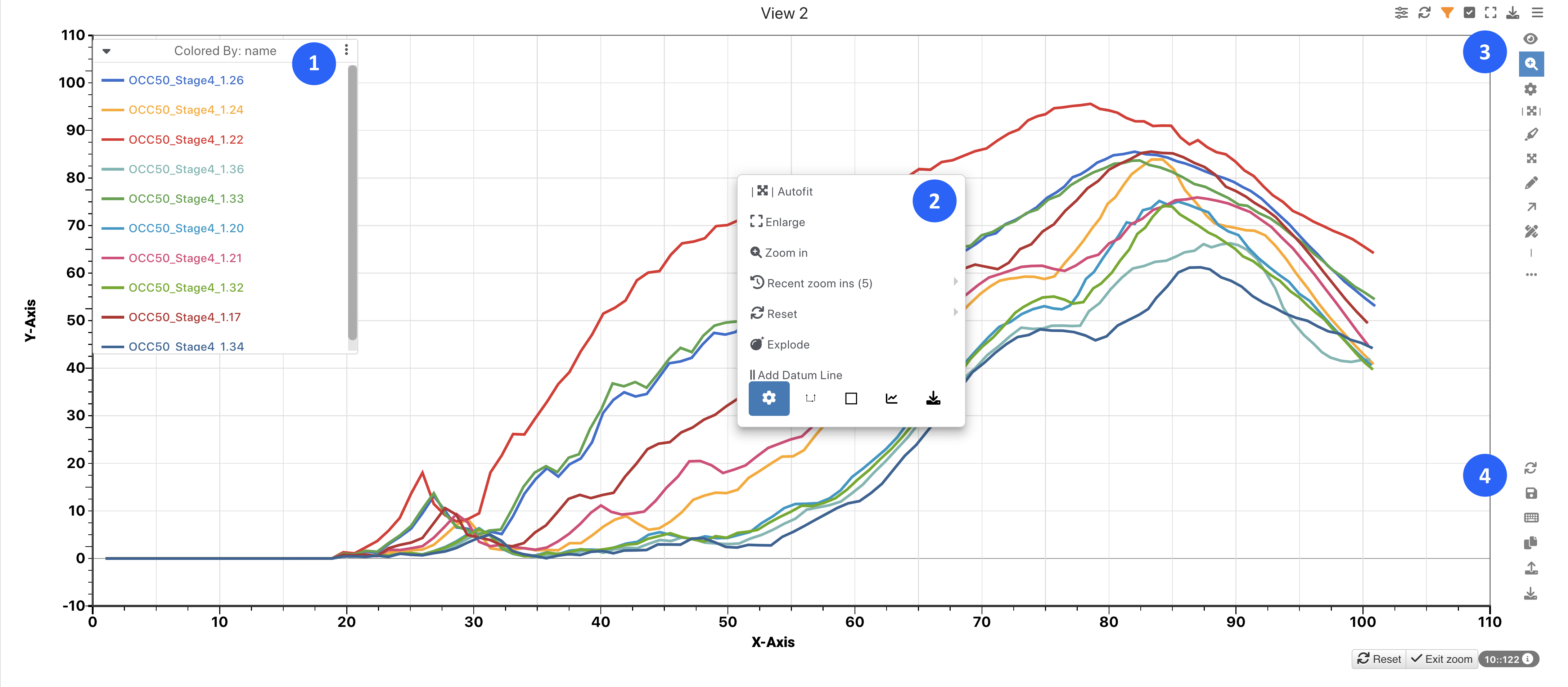
Figure 5: Newton Tool Bars
- Curve Legends: Shows names of all curves on the plot
- Right-Click Menu: Access these curve plotting options by right-clicking
- Top Right-Side Toolbar: Options include (from top to bottom) Chart Type, Zoom, Highlight, Drag, Add Text, Add Arrows, Measurement Tool, Free-form Datum Line
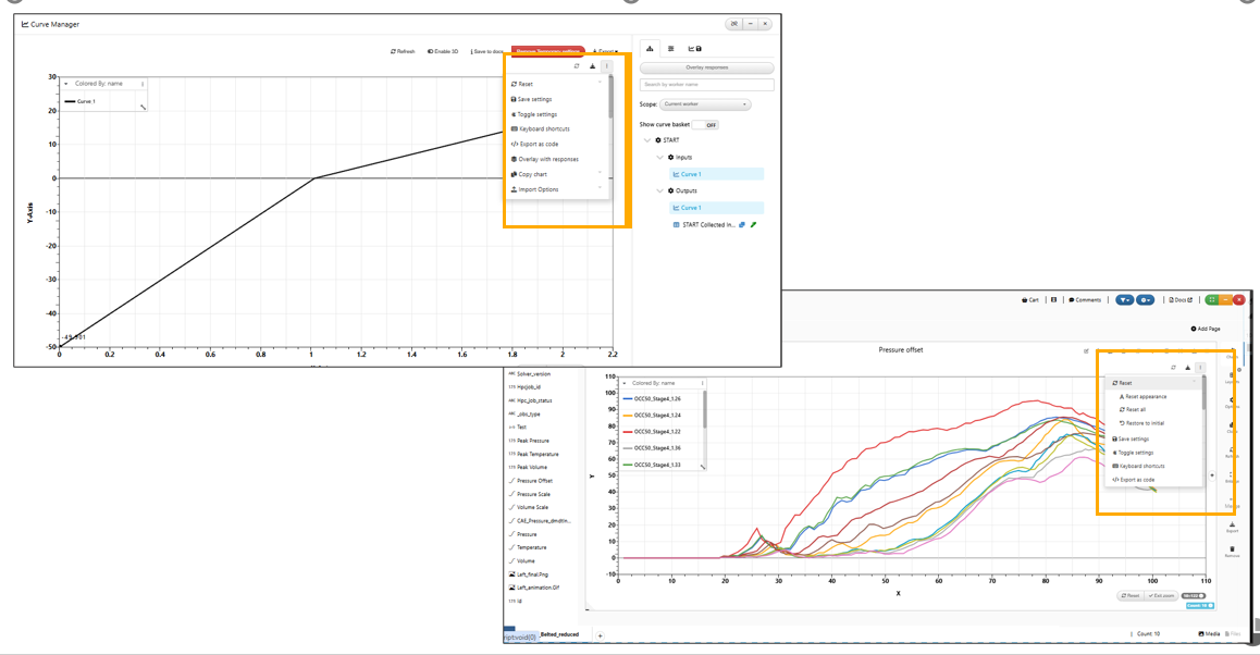
- Bottom Right-Side Toolbar: Options include (from top to bottom) Reset Options, Save Settings, Keyboard Shortcuts, Copy Chart, Import Curve(s), Export Options
Updated August 4, 2022, the right-menu click menu options are now grouped for a more organized experience:
Datum Lines
Create datum lines to better understand the curves by clicking on the line icon in the right-side toolbar or choosing the datum line option under the right-click menu. The toolbar option is free-from while the right-click option is axis based.
Datum values containers have Transparent background when y values are enabled in Datum lines.
A datum line in Newton visualization now shows an option called ‘Label Orientation’ which will allow the datum label to be oriented horizontally at the center of the datum line.
Datum lines in Newton having type as X or Y , will show an option to display the axis value within the label.
We can add custom Datum lines to Newton visualization in Simlytiks. This option is now available in the Misc tab in the visualization.
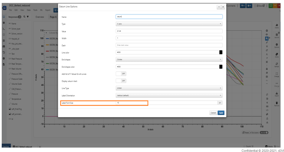
Datum lines now have a new option for Label Font Size in settings
Datum lines Label
New customization options are available for ‘Datum line By’ option in Newton visualization.
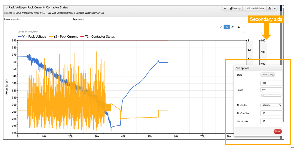
Added support for adding datum lines in Newton on the Y2 (secondary) or Y3 (tertiary axis). This option will be applicable only when there are curves on these respective axes.

Datum lines for Y1 and Y2
Datum lines in Curve visualization has additional type dropdown which will now display axis names instead of just X, Y, Y2 etc.
Datum configurations
Datum line configuration in Newton has new option to hide the values from the datum Y values table in Simlytiks.
Datum line label can be positioned using the new option ‘Label Y Percent’ . This will help position the datum label on the line in the visualization.
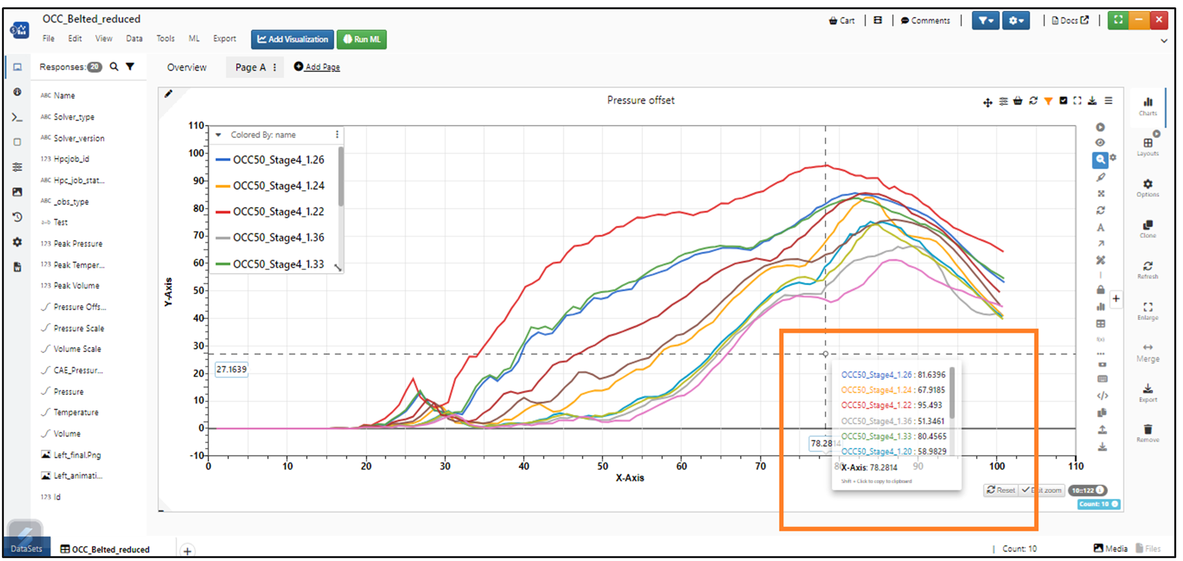
New option in Newton to show ‘Tooltip by position’ for the absolute max value in visualization.
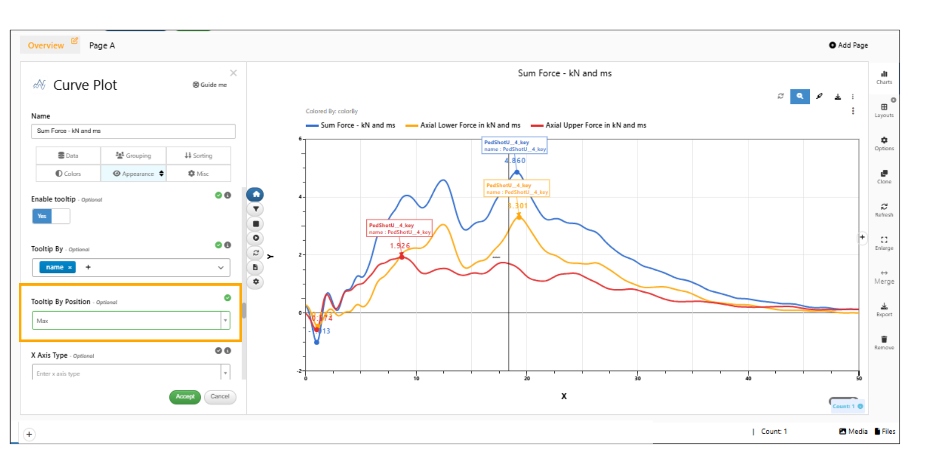
Tooltip by position
Y values table for Datum line can be dragged and positioned anywhere on the visualization.
Annotations
We can add annotations by adding text and arrows to our plot. Start by clicking on the A icon to add text. Then click on the arrow icon to add an arrow. Watch the following video to see how it’s done.
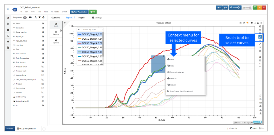
Highlighting & Filtering
We can highlight curves to filter them in out of the plot. Click on the brush icon and click and drag to select curves. Then, click on the orange filter icon to remove or keep the selected curves. Watch the following video to see how it’s done.
Measurement
To measure curves, click on the ruler icon and then click two points sequentially to measure. Watch the following video to see how it’s done.
Curve Dragging
Drag curves around the chart to compare with other curves by choosing the crossing arrows icon in the right-side toolbar. We can choose the drag the curve freely, vertically or horizontally.
Customizing
Customize curves under the 3 dots in the right-side toolbar.
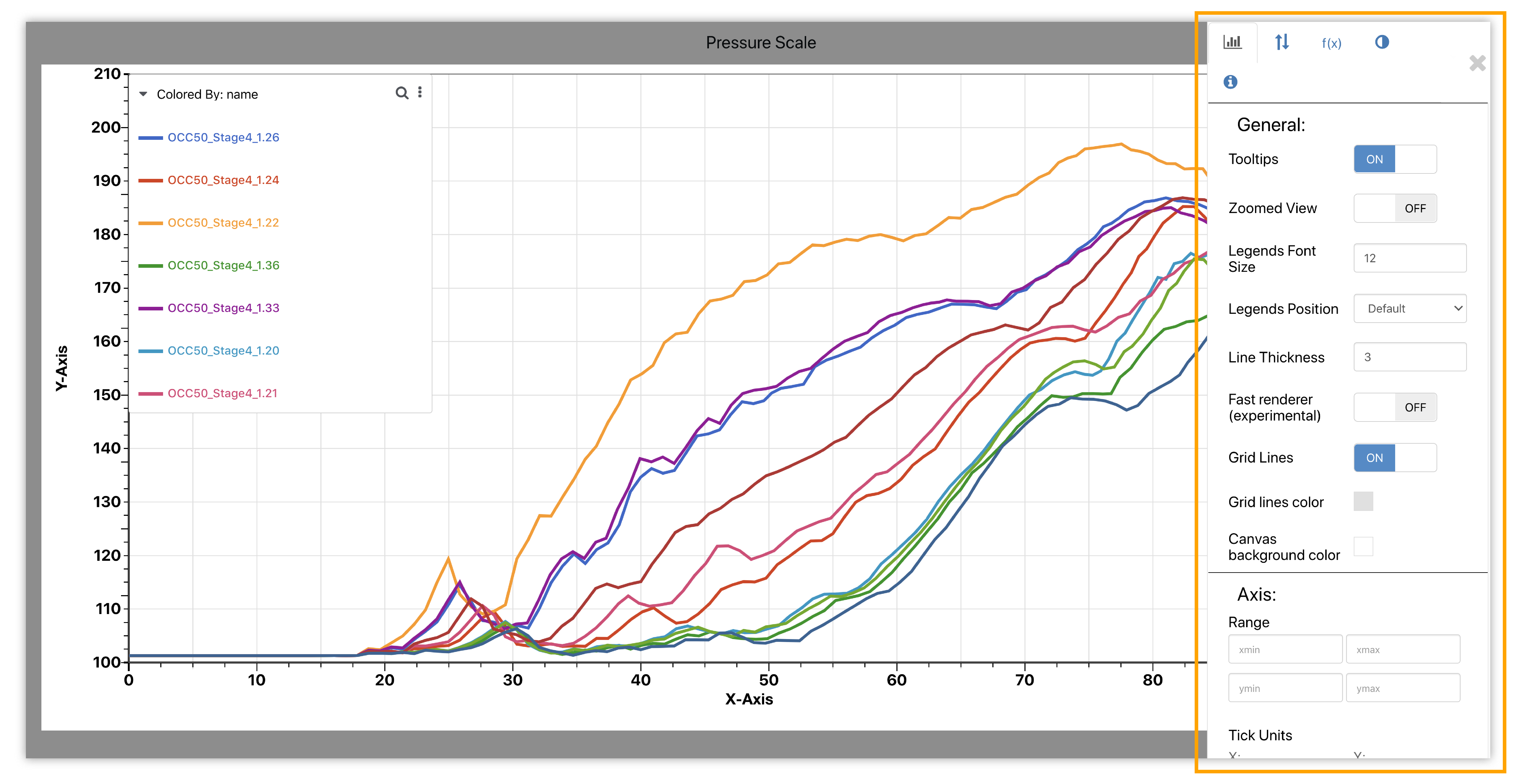
Figure 6: Newton Chart Types
Here, we can change font sizes, choose a different position for our legends, and make other modifications.
Reset changes anytime by using the reset options (circular arrows icon) in the toolbar.
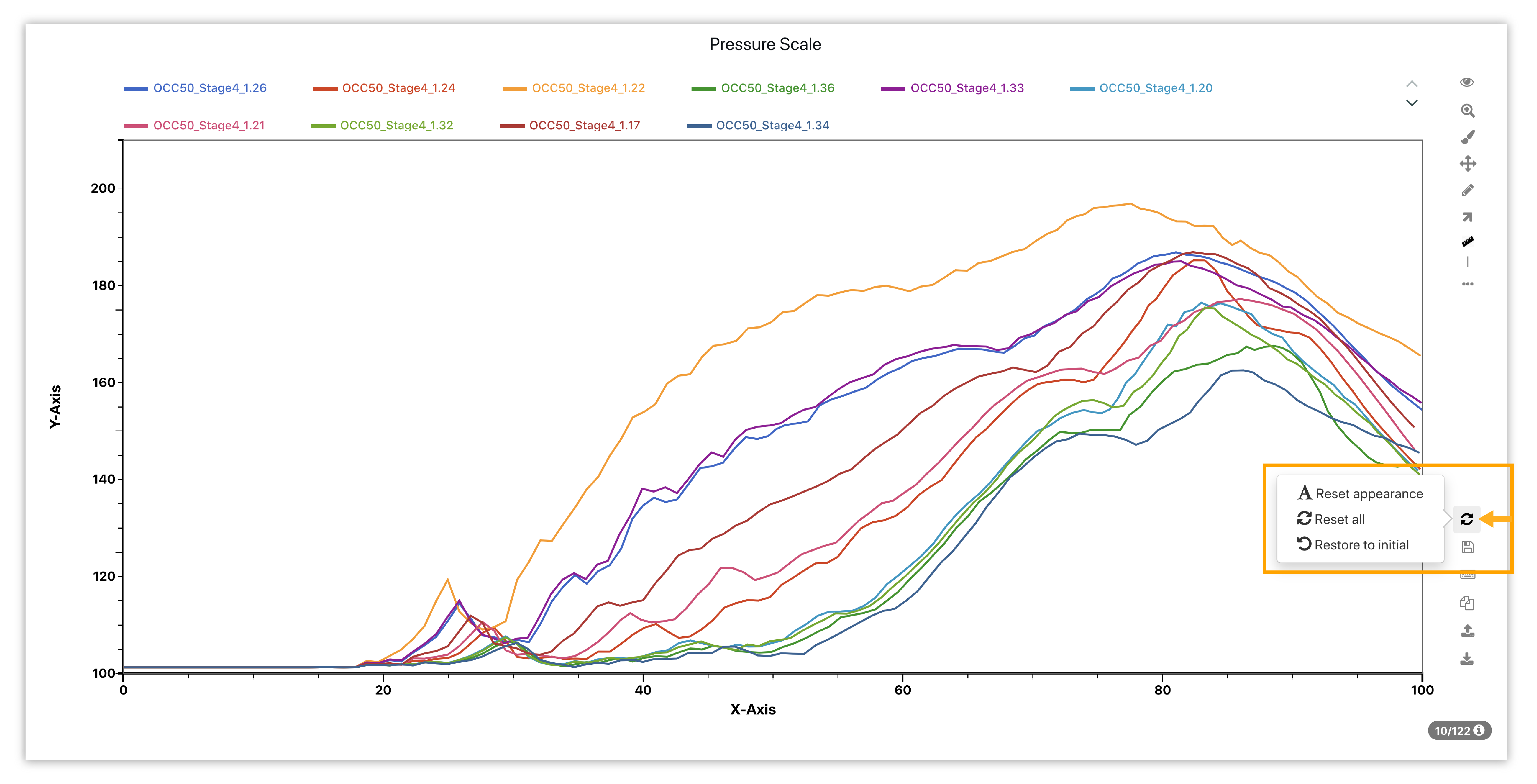
Figure 7: Reset Options
Curving Brushing
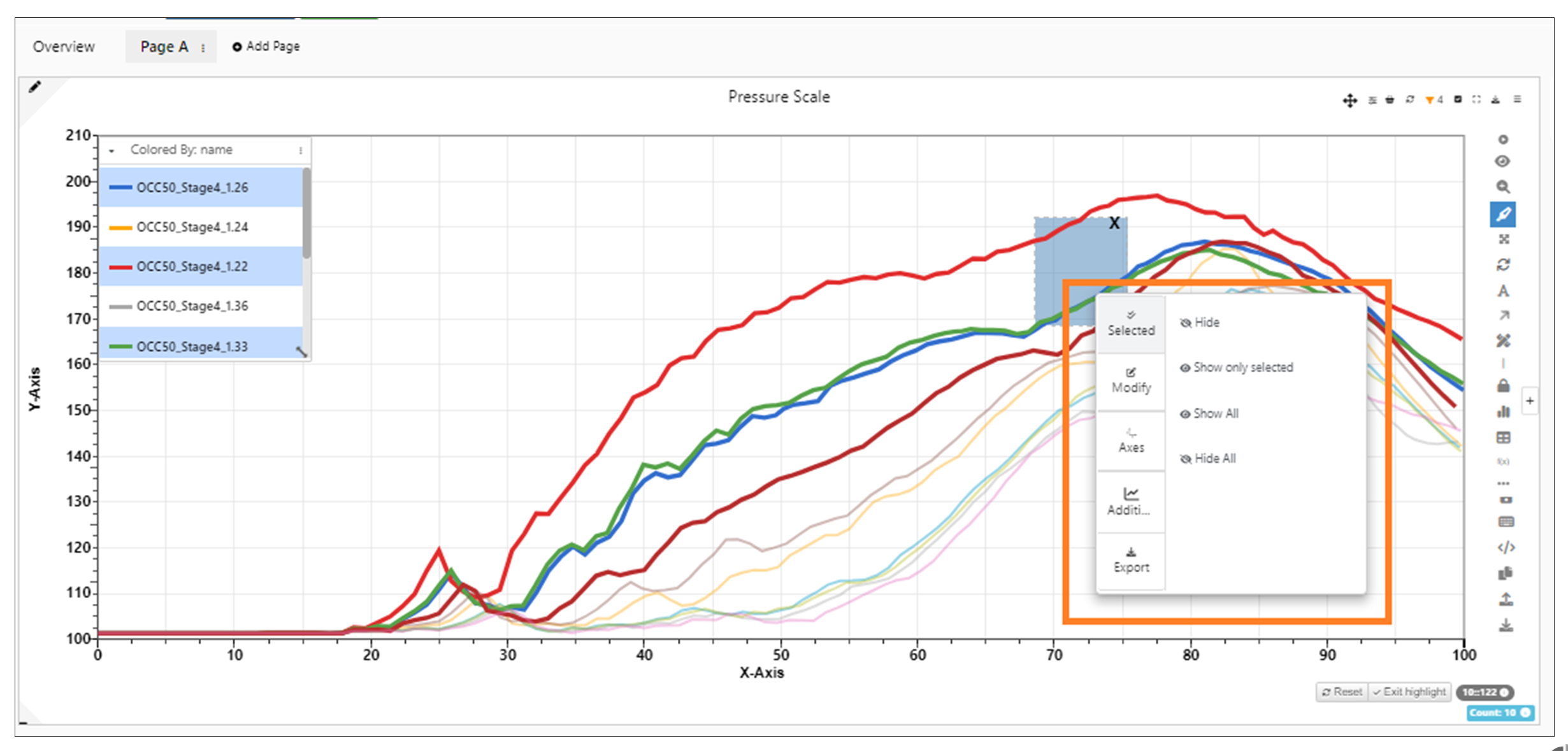
When using the highlighter tool, right click on the chart to keep, exclude or remove the brushed curves.
Figure 8: Curve Brushing Options
Remove Outliers
Under the Newton right-click menu, easily hide or show chart outliers.
Variance circles are displayed on the newton visualization when we enable the outliers using context menu of the visualization in Simlytiks
Event Mapping
Newton has a feature that allows you to map and detect events of curves. Watch the following video to see how its works:
Sync
Click on the sync option at the top of a Newton page to sync the current page’s visualization together.
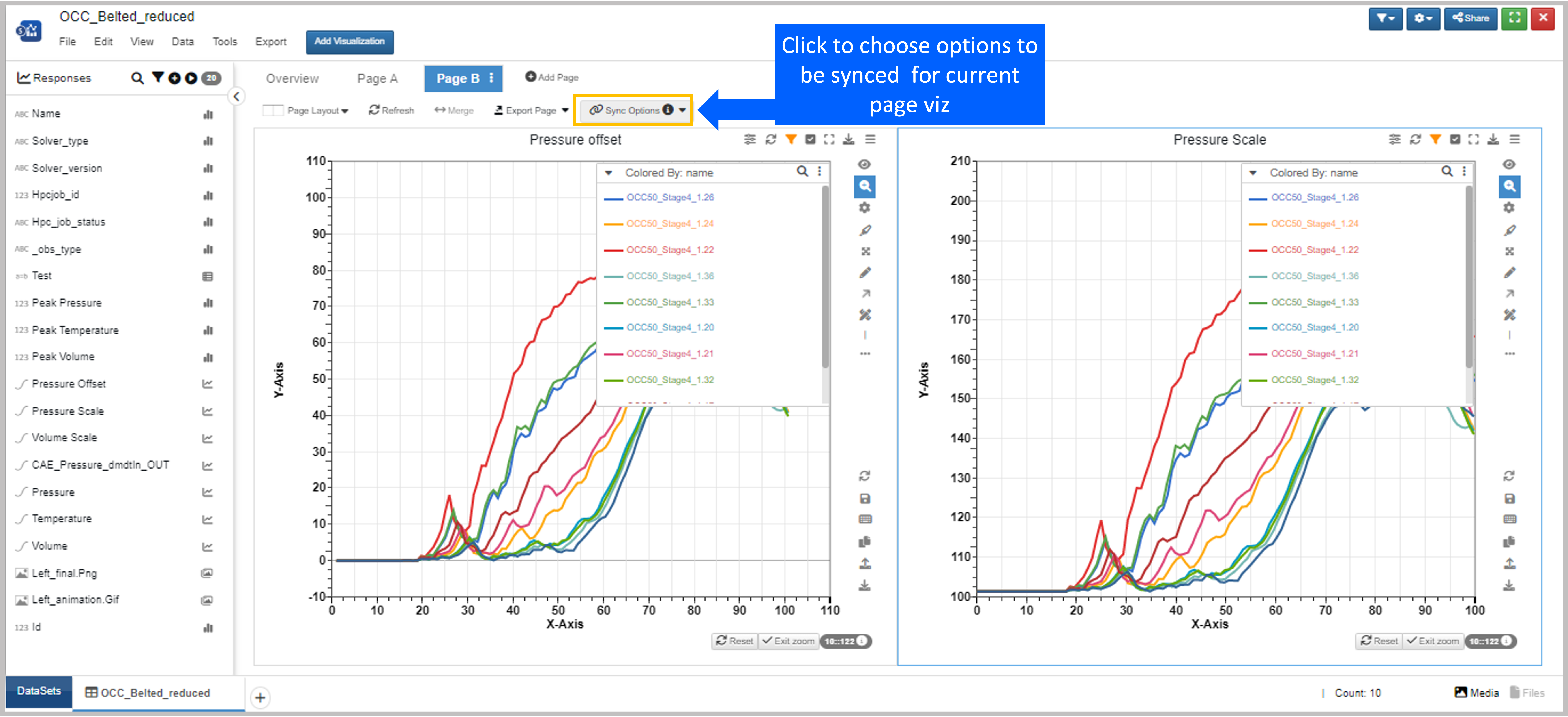
Figure 9: Newton Sync
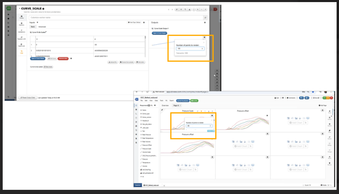
Progressive Rendering
Progressive view for complex curves computes the top 5000 points along with not missing out of min, max, 0, and important drops in the curve. Since Newton syncs with other applications, this applies to any other curve viewing throughout the platform aside from just Simlytiks.
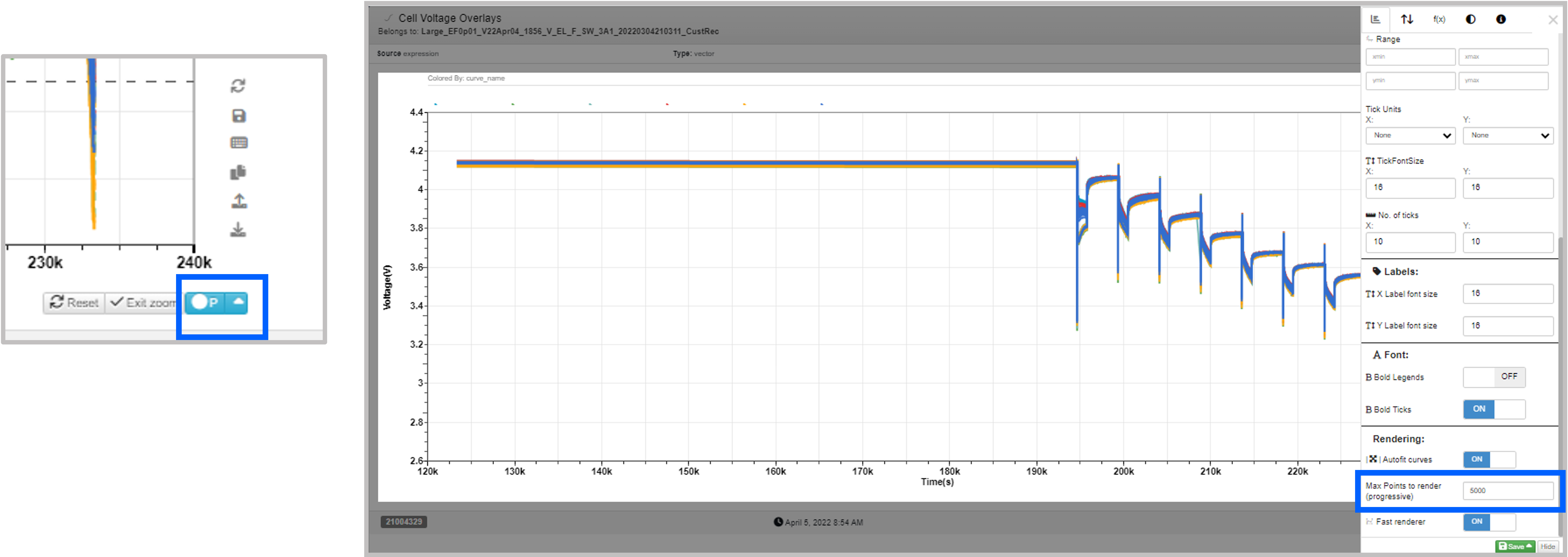
Figure 10: Progressive Rendering
Footer button in Newton having progressive/raw/downsized etc, will now have a tooltip with information regarding the number of curves, number of points, logic used and threshold.
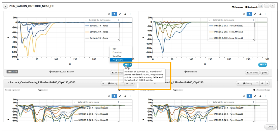
Tooltip with information regarding
Axis Ticks
Edit the axis ticks for both x and y axes by hovering over until the ticks are highlighted in gray and then clicking to pull up the edit options. Here, you can edit aspects such as the scale, unit and font size. Check out the following video to see how it’s done:
Editing Legends
In Newton Curve Manager, we can edit and use our legends to alter our chart. Hover over a legend name and click the pencil icon to edit it. The 3 dots on hover allows us to alter the particular record such as hiding it from the plot. We can also right-click on a record to see more visibility options such as hiding the record or deleting the curve all-together from the plot. Watch the following video to see how it’s done
Merged Show & Hide option available in the Legends right click for Curve Visualization in Simlytiks.
For Newton responses, selecting ‘add prefix’ option now adds a prefix to all curve responses in the legend.
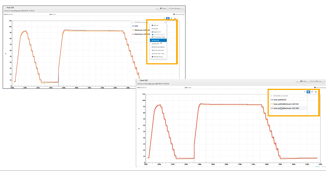
add prefix
Transformations
We can explore our curves deeper by mathematically transforming them under the Advanced Settings menu (3 dots). Choose from a long list of transformations to apply. Watch the following video to see how its works:
In Newton, the ‘Transformations’ while operating curves are now called ‘Functions’
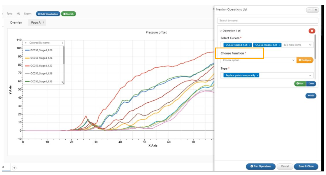
Transformations while operating curves are now called Functions
In Simlytiks, the curveplots that have transformations (Operations on the curves) can now be exported with transformed points in Newton export option.
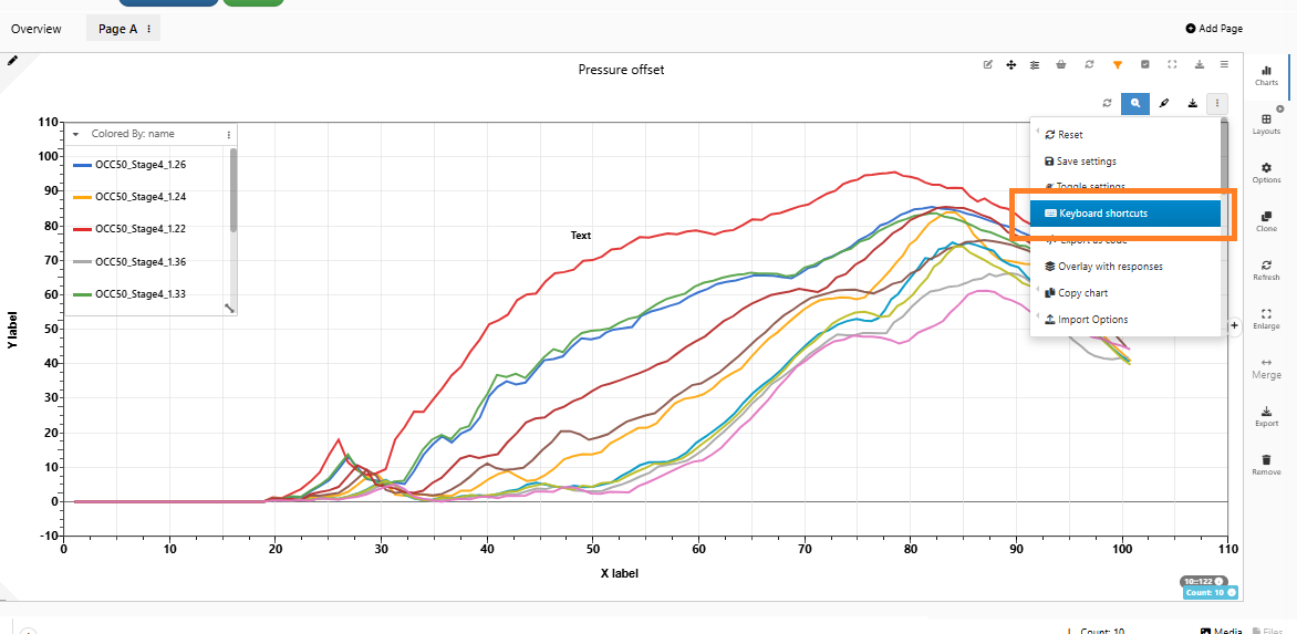
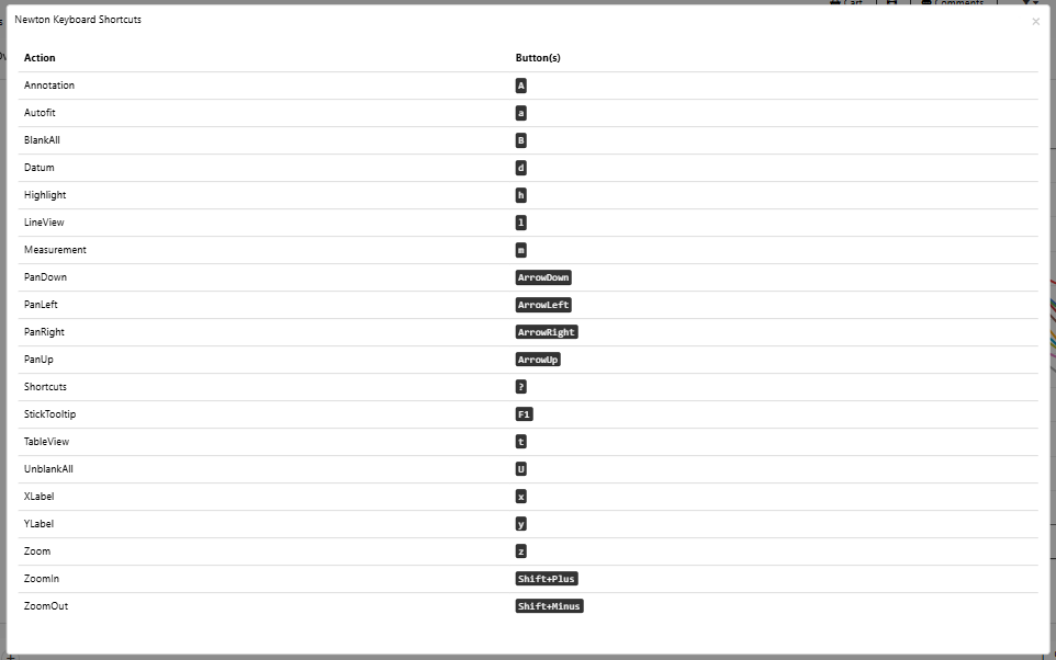
Keyboard Shortcuts
Newton has some keyboard shortcuts to perform basic actions more quickly instead of clicking them on the toolbar. Click on the keyboard icon on the bottom tool bar to see all the available hot keys.
Keyboard Shortcuts
Keyboard shortcut examples
Keyboard Shortcuts
Watch the following video to see how:
Background Image
For Newton curves, we can add a Background Image , edit background Image and remove Background Image accordingly.
ShapeBy
Newton visualization can now show the first and the last points in different shapes. This new option to show first and last point is available in the appearance tab of new visualization.
Selections
Newton visualization now supports selection mode. i.e when zoom/highlight options are disabled, the left click on the curve will hide the curve and the middle(scroll) button click on canvas will render the curve back to the visualization.
Arrow
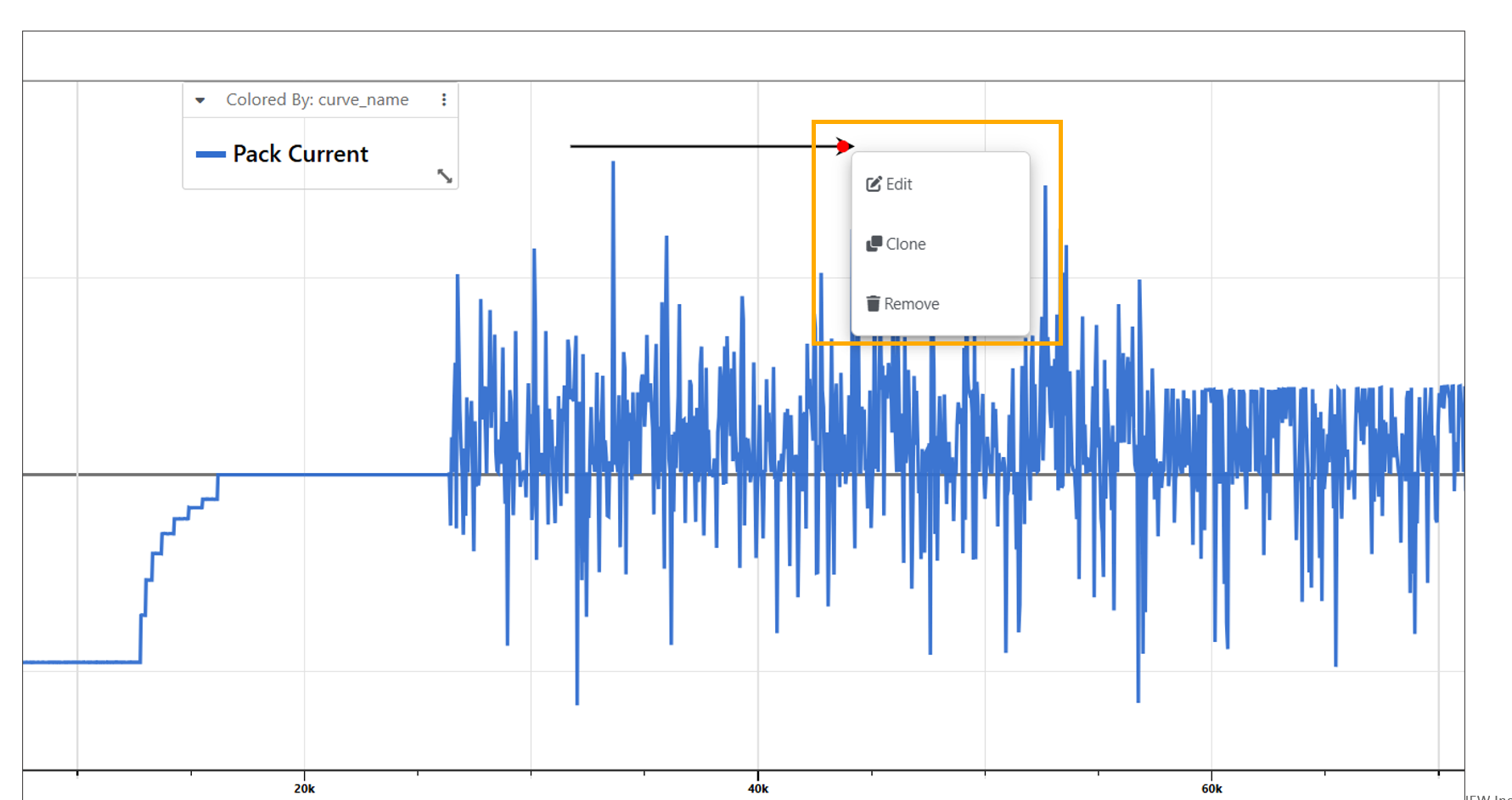
We can add arrows to Newton responses/visualization using context menu options.
In Newton response, the arrow head circle has context menu to edit, clone and remove the arrow.
Newton Add row
Newton Chart Types
Under the eye icon in the right-side toolbar, we can change the chart type of our time-series plot. Aside from the main plot type, there are 10 other ways to view our curves. Let’s review a few of them.
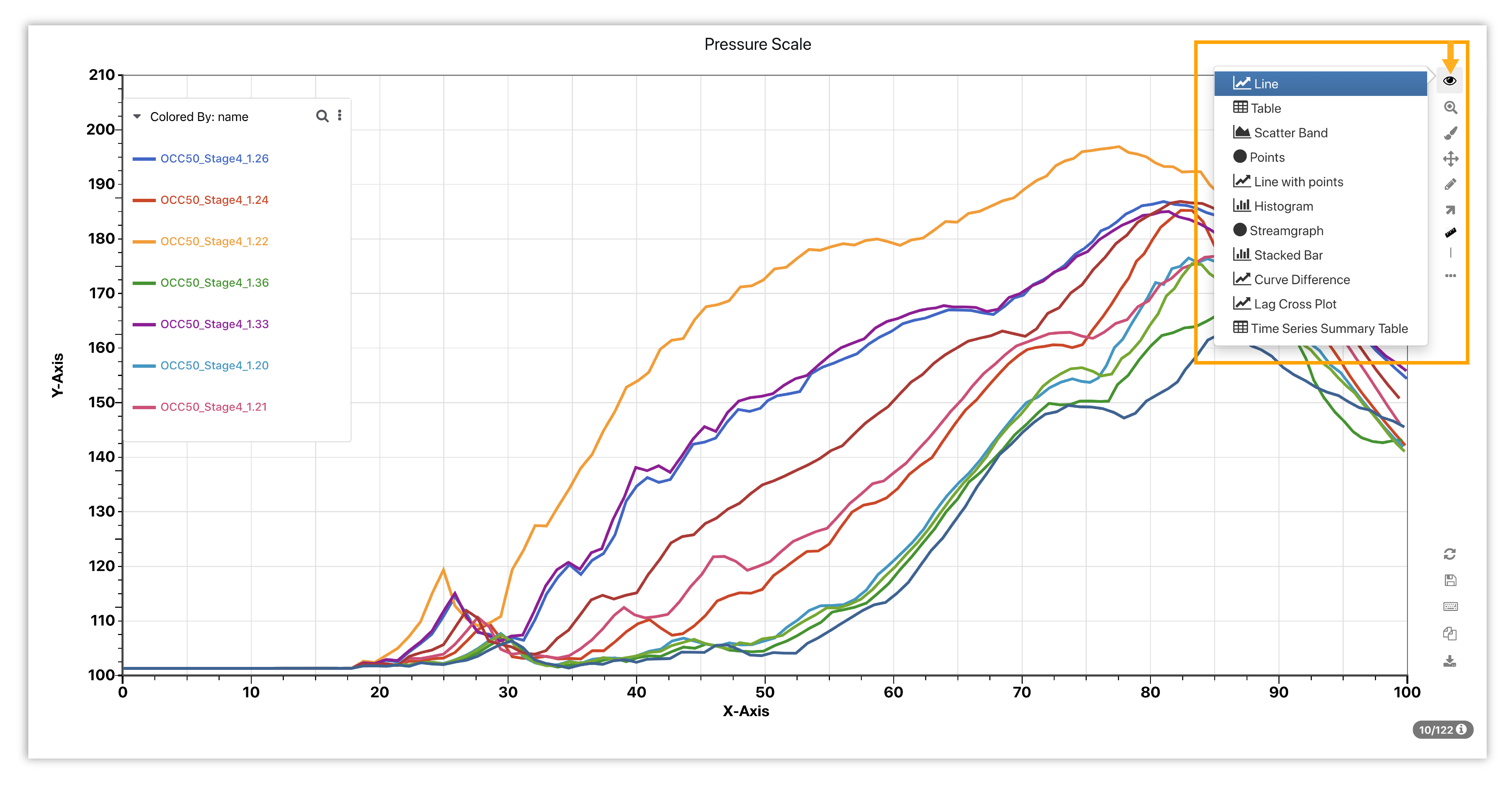
Figure 11: Newton Chart Types
Watch the following video for a preview of some of the chart types.
The datatable options for Curve visualizations in Simlytiks is updated and is similar to all the datatables across the platform.
Newton visualization has a new chart type to convert to Heatmap and also provides several options for bin size, color scheme to be chosen for the rendered heatmap.
Heatmap in Newton now supports new options to specify number of columns to use in the Appearance tab.
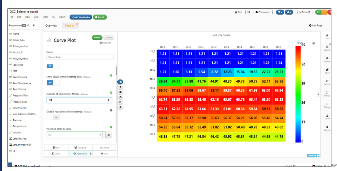
Number of columns to use
Heatmap in Newton now supports coloring the cells based on other curves when the option to color based on difference with other curves
Heatmap in Newton now supports several new options: fit entire heatmap within container, show/hide texts within the cells, show/hide row axis labels, bin scales ON/OFF for the colors, number of bins, allow bin scale to use colormin and colormax.
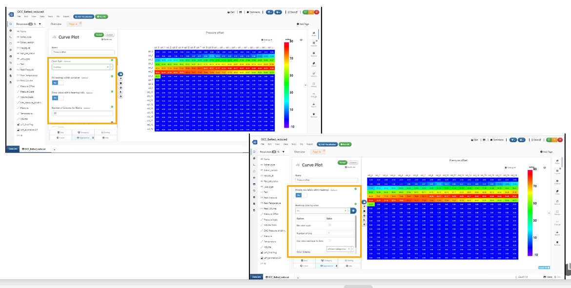
Fit entire heatmap within container
Scatter Band
The Scatter Band chart type shows the band area of the curves along with the average curve of all (shown as the dashed line).
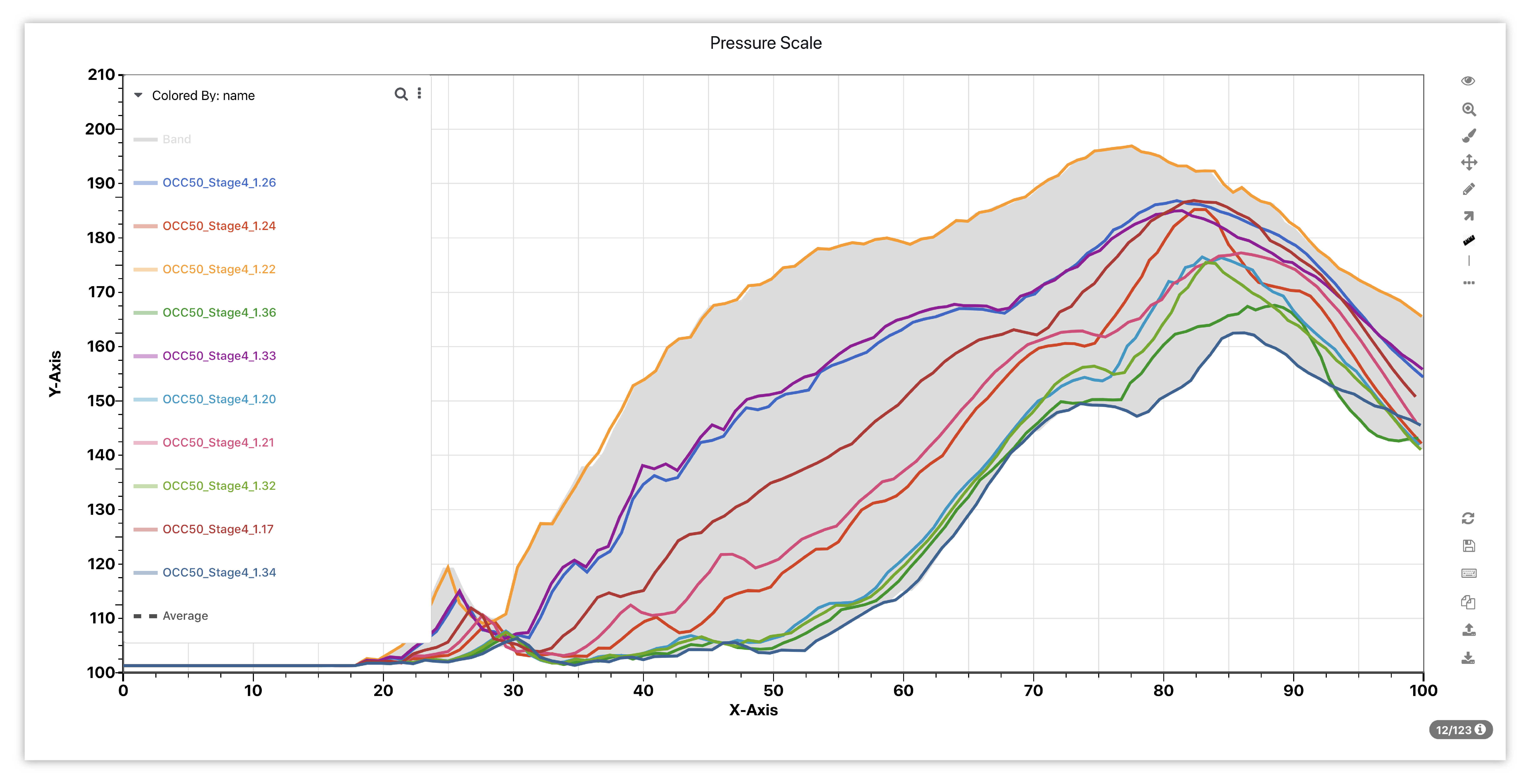
Figure 12: Scatter Band
Histogram
The Histogram chart type shows a distribution of data for each curve and how it relates to the others.
Curve Difference
The Curve Difference chart type takes the y current and subtracts the y previous to see where incremental variations are within each curve.
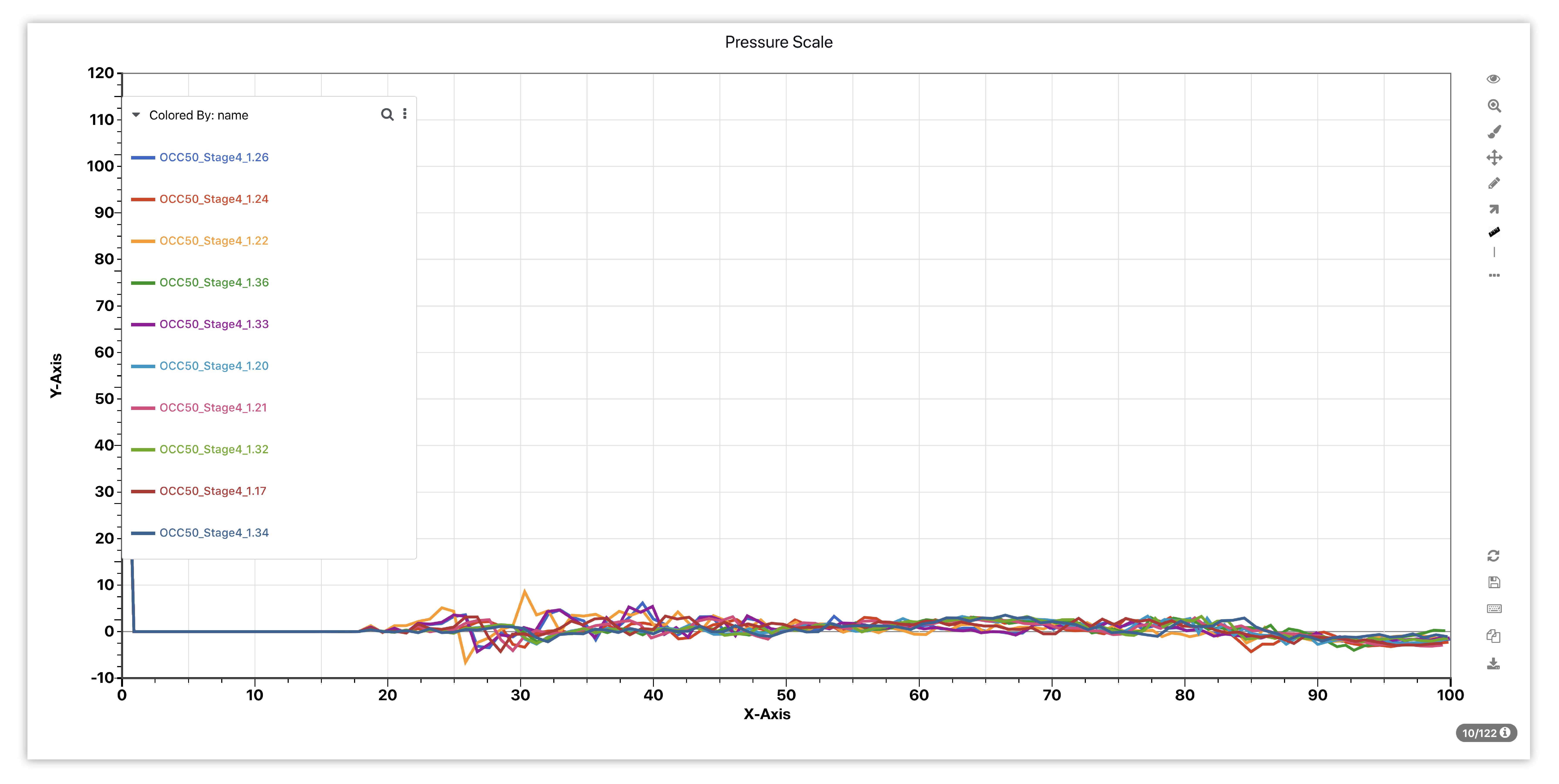
Figure 13: Curve Difference
Time-Series Summary Table
The Time-Series Summary Table chart type resents scientific data in the table cells including curves and histograms, as we see these respected columns.
Conversion of Cylindrical to Cartesian
Newton visualization has two new chart types: 1. Conversion of Cylindrical to Cartesian and 2. Conversion of Cartesian to Cylindrical in Simlytiks.
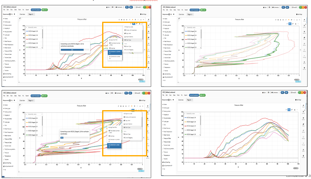
Conversion
Curve legends
Prefixes and suffixes can be added to legends in curve newton to make them more meaningful. Click on the ellipses for the legends, select either the prefix or suffix, then enter the text, and implement it.
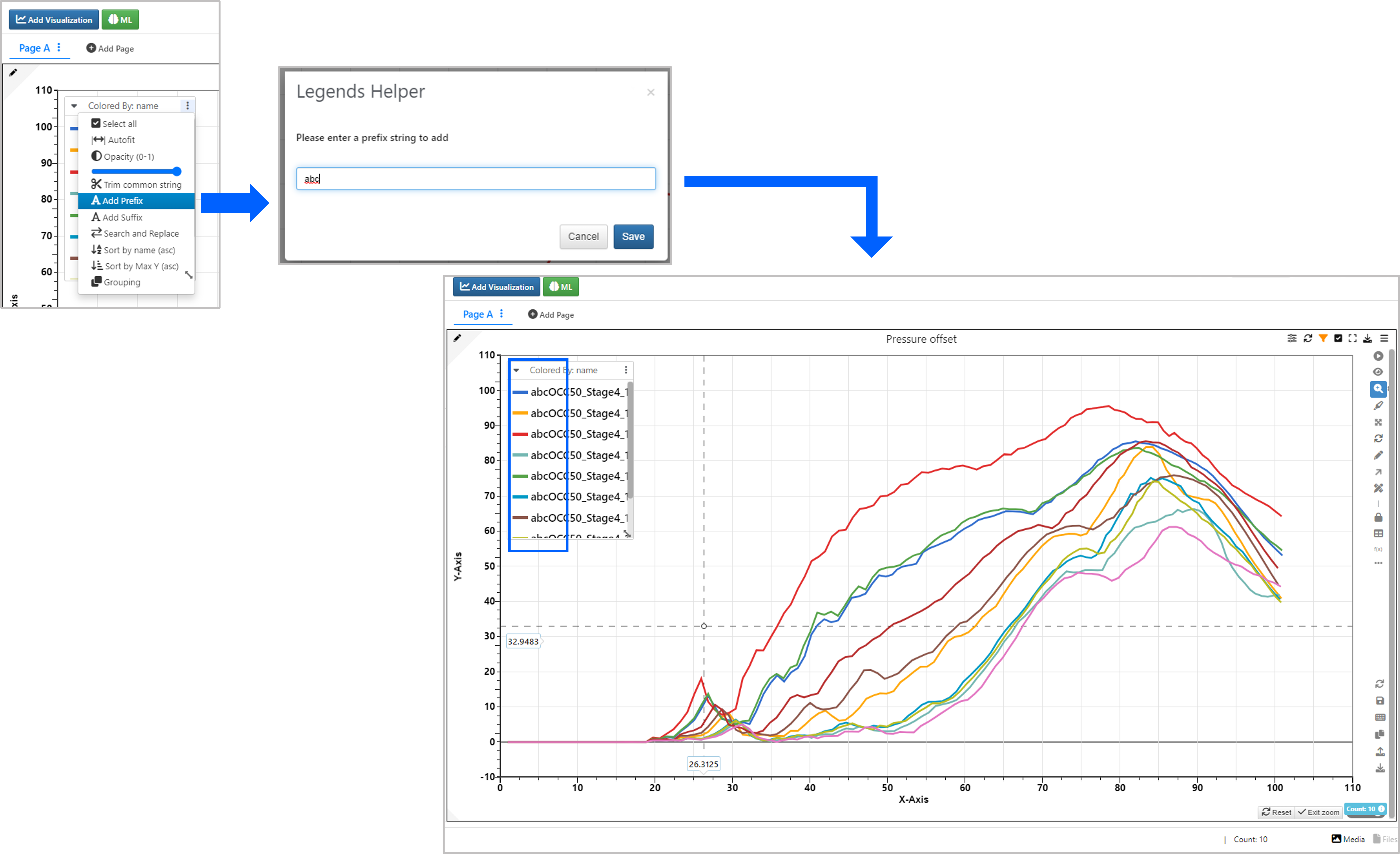
Figure 14: Prefix and Suffix for legends
Existing legends in curve plots can be replaced with the desired text. Click on the ellipses and select “Search and Replace”, enter existing text and then desired text, and implement changes.
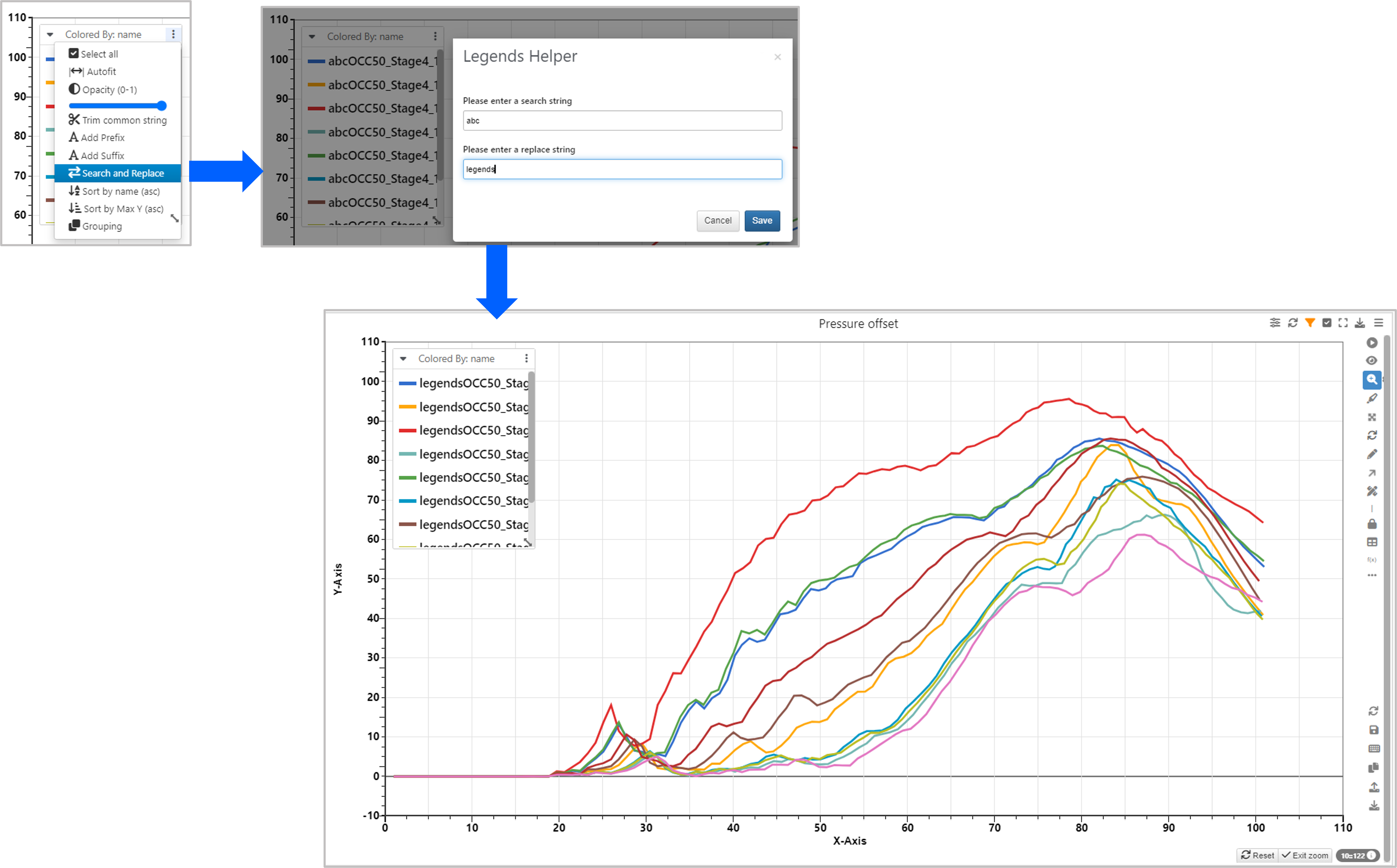
Figure 15: Search and Replace Legends
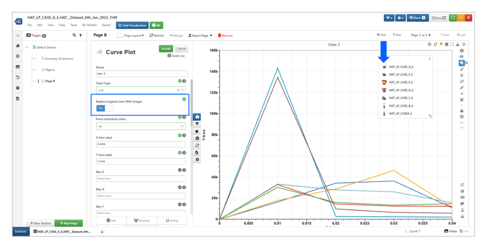
Legends in a curve plot can be replaced with images if the dataset has images in it as well; images will show up in the tooltip when hovered over the curve plots.
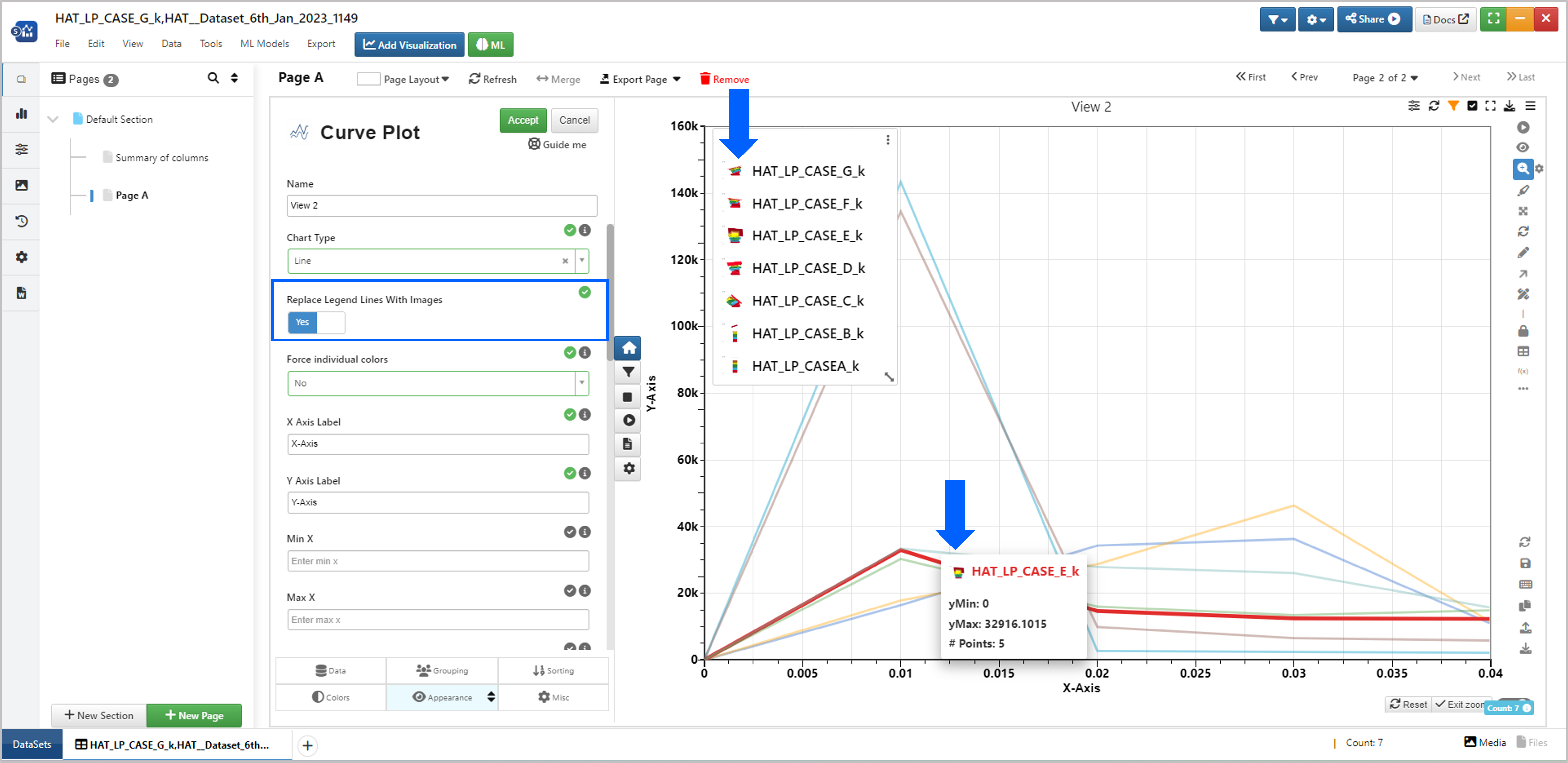
Figure 16: Replace legends with Images
Legends in a curve plot can be hidden and restored by clicking on the legend lines.
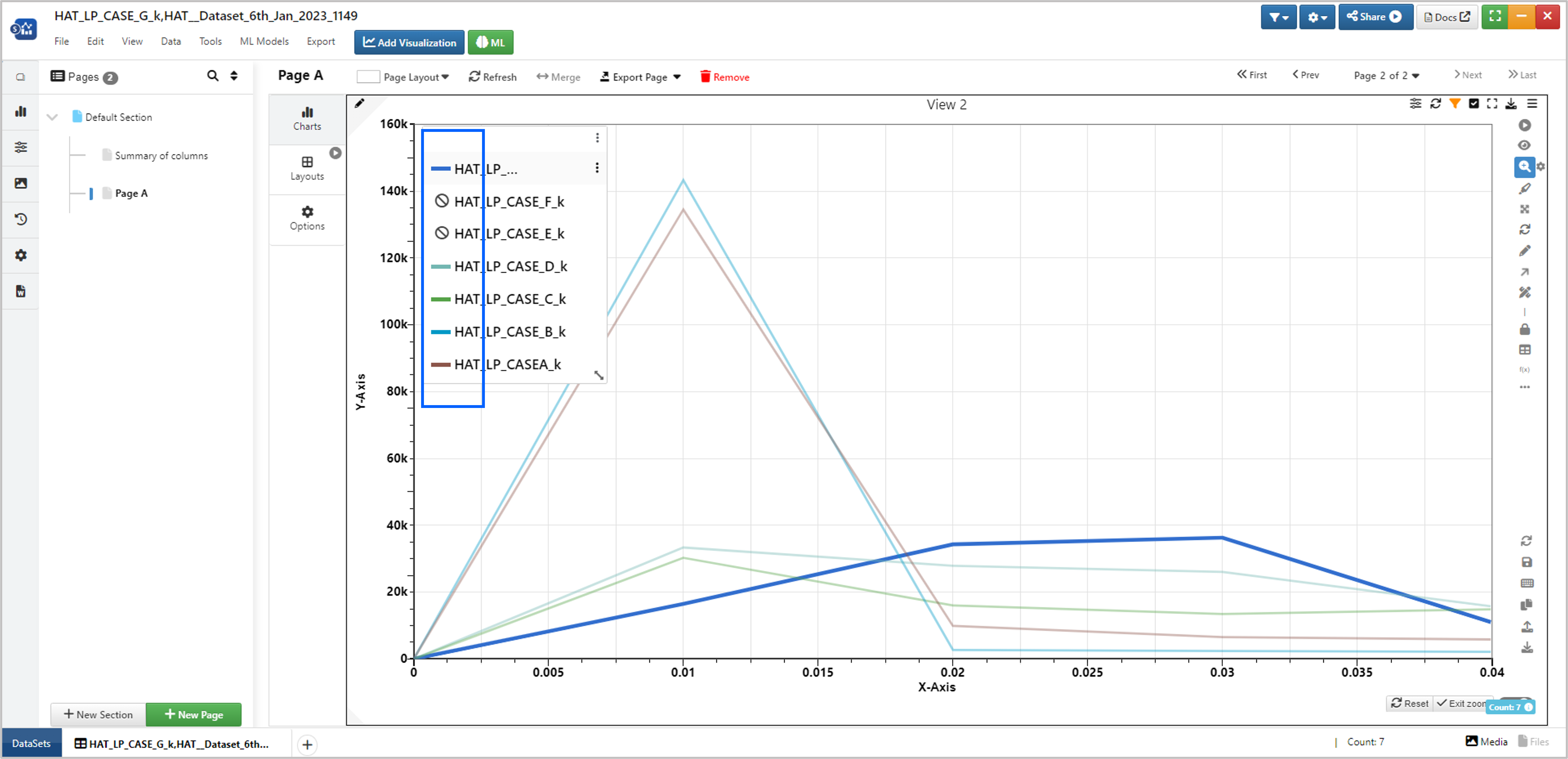
Figure : Hide and Show Legends
Added support to replace the legend lines with Images if imageBy is set.
Imageby
Tooltips are now available for Newton visualization when we hover on the visualization in Simlytiks.
Tooltip
Keyboard Shortcuts
Now we can use differnet keyboard shortcuts to switch to different tools such as ‘z’ for zoom , ‘a’ for autofit ‘s’ for selection and ‘Esc’ for zoom mode.
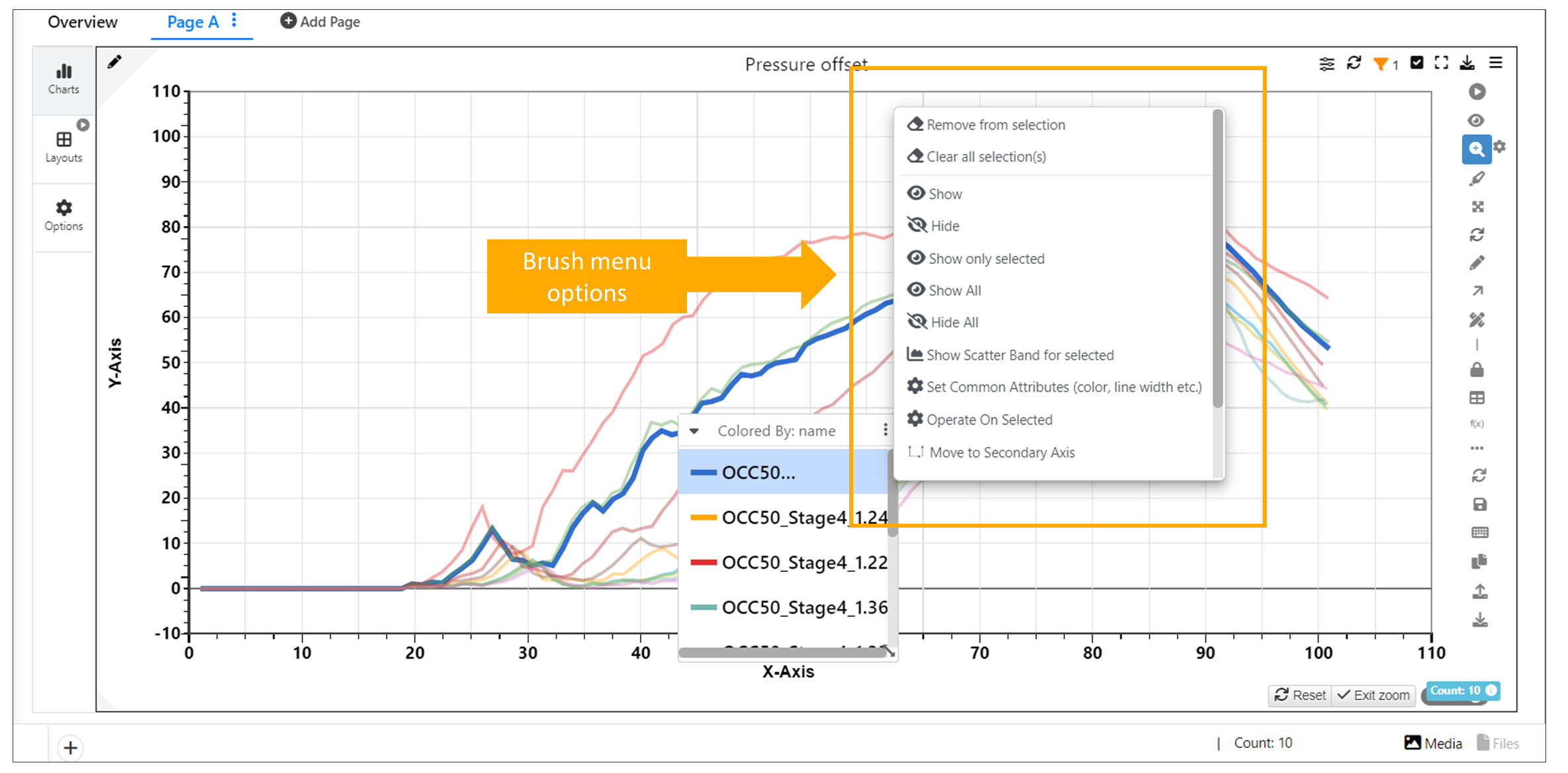
Brush Menu Options
In Newton chart, the legends and visualization context menu options are now available as Select and Modify options.
Modify
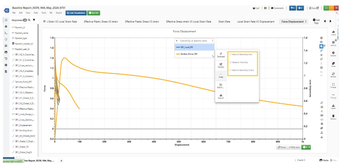
In newton - Legend options moved to brush menu, options like move to secondary axis ,Hide ,Show and Remove are available in brush menu.
Brush Menu Options
New option SYNC axis ticks is added to the context menu to to sync between primary and secondary axis in Newton
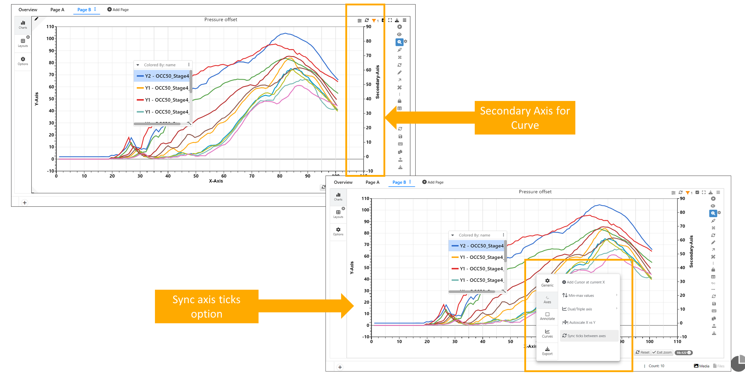
Sync Ticks option
Added some more context menu options on brushing curves for quick access.
Brush Menu Options
In Newton visualization , the distribution added from option ‘Show Distribution at X’ can be hovered and removed using context menu.
Newton Explode View
Newton explode view has new options such as Freeze axes, Show common axis, Items to show in line , Height and Noise.
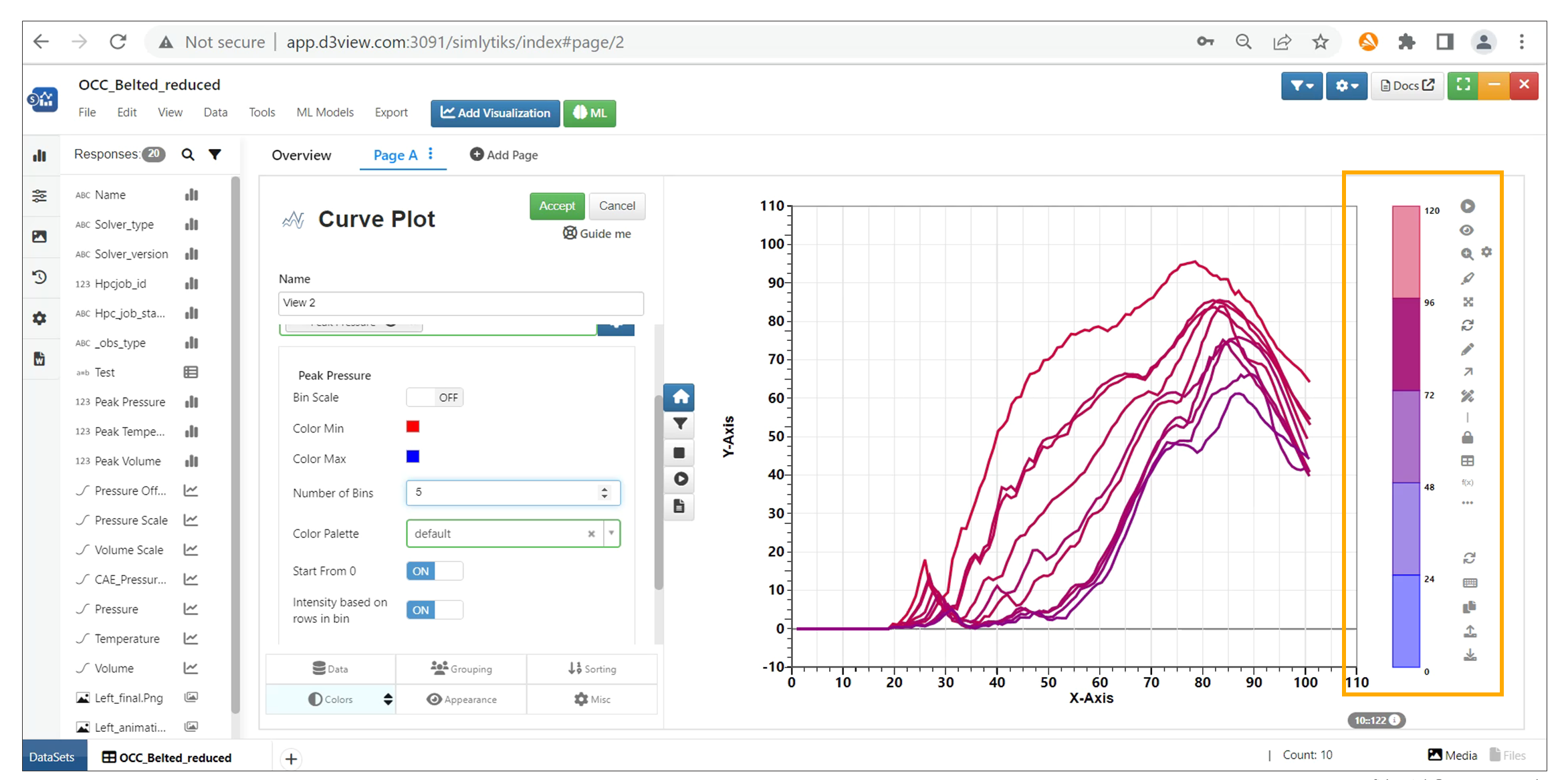
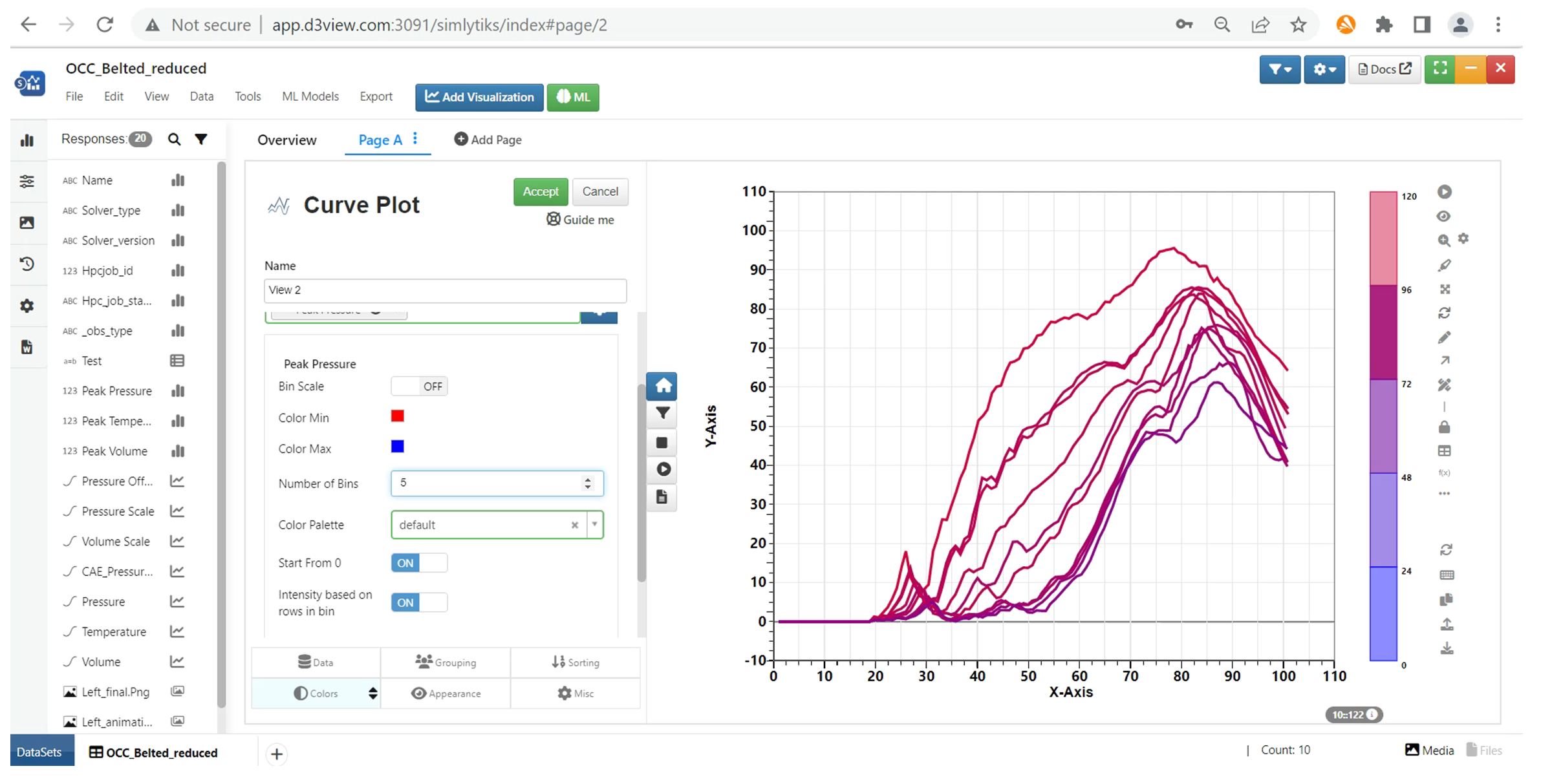
Coloring Curves by numerical values
When coloring curves by numerical values, the number of colors is now reduced to 5 by default. This change allows users to identify the colors easily.
Coloring Curves by numerical values
Now we have better color gradient from red to blue for numerical columns in Simlytiks.
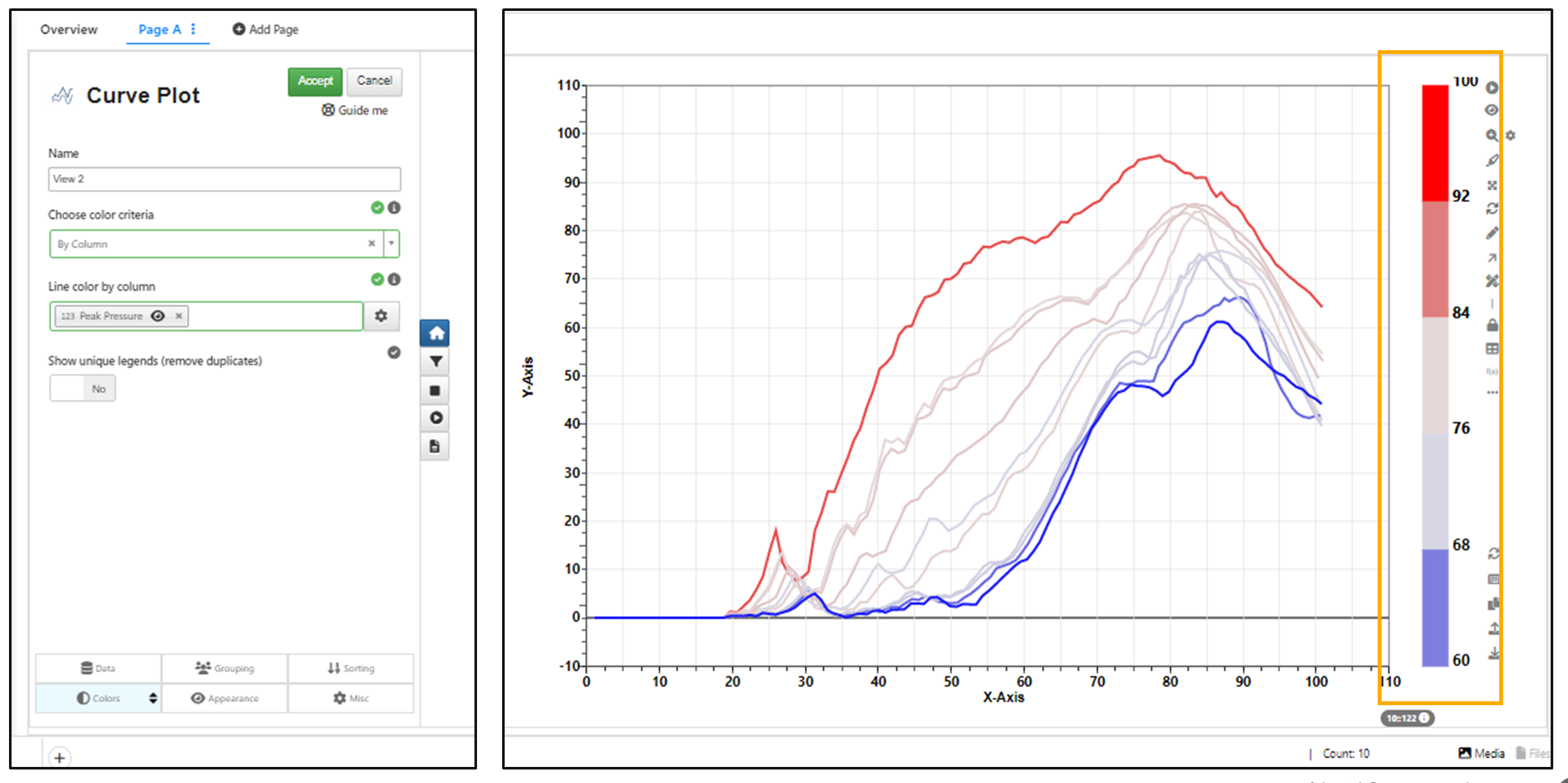
Color gradient
Click on legends to Hide and click again on blank curves to restore them.
Binsize and intensity of bins for curves
Binsize and intensity of bins can be changed for numerical color newton legends
Binsize and intensity of bins for curves
Disable usage of gradient colors
Newton has two new options in Colors to disable usage of internal curve name and disable usage of gradient colors for multicurved simulations.
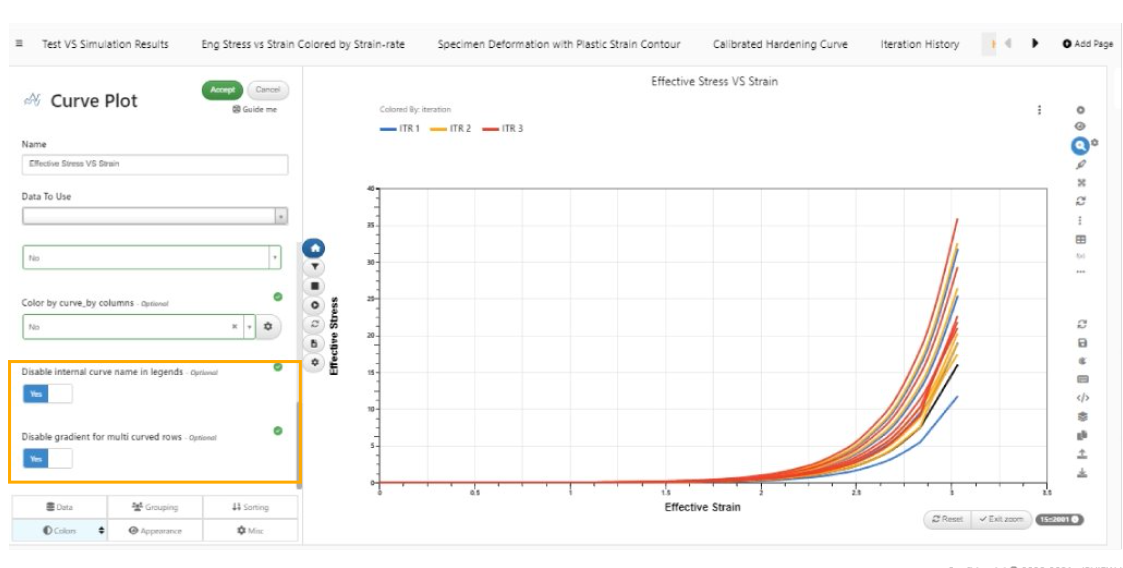
Disable usage of gradient colors
Indicators for Newton
We have Indicators for Newton Visualization to indicate the curves. New indicators have been added to the list of indicators that helps to indicate different values on the curves.
Check for overlapping curves
In Simlytiks, Newton has a new option ‘Check for overlapping curves’in context menu to check for any curve overlap and this overlap can be removed with ‘Remove dashed lines for overlapping curves’ option.
Newton Visualization has a new option to check for ‘Overlapping curves’ in the Misc tab and highlight the overlapping curves by line format to dash format in Simlytiks.
Enalrge/Wider view
Enlarged/Wider view is now supported for canvas-based sparklines and curve plots (Newton) within Data Distribution and Frequency.
Color Keys Text values
Now we have support for color keys which acts like text values if the number of unique value in the colorby column is < 5 for Newton Curve
Complex Curves
Complex curves are the combination of the Curves. We will be having the Real of Magnitude curve on the top and Imaginary Curve at the bottom and if choose Amplitude the second curve will be removed.
Below is the video which shows the different options available for the Complex curves.
Overlay Simulation with Physical test
We can Overlay and Compare responses from Simulation and Physical test. To do this, Compare a simulation with the template and add physical test records to it in the compare response tab and view them in Simlytiks after selecting Template required.
Below video shows how to Overlay or Compare Simulation and Physical test responses.
Compare Simulation Curves with already saved dataset using Import option
We can compare simulation curves with alreday saved dataset in Simlytiks.
Steps involved to Import the Dataset.
- Compare Simulation with template in Simlytiks and View them
- View Responses in Simlytiks page
- Now click on Files and select Import option
- Go to Existing and select the saved Dataset in Simlytiks to compare.
- Select Rows to be imported , mapping columns, action to be performed and click on apply to view the Responses.
Below video shows all the steps performed to compare responses of a simulation with the saved dataset.
Reference Row in Simlytiks
Simlytiks has ability to add a reference row under Tools → Settings option which will assign the chosen color to the reference row in the charts. We can test this feature by adding a reference row in the settings option and creating Curve Visualization. The Referenece row color is reflected in the Curves.
Below video shows how to add reference row to the Curve Visualization.
Set common Attributes
Added new attribute in Set Common Attributes to Curves called ‘Line Opacity’. This will change the opacity of the curves to the entered number.
Cumulative option
Curve plot now has a new option called Cumulative in the Grouping tab which when enabled will accumulate the Y values of the points and render the chart.
Create Curve Columns
Curve columns in the responses sidebar have a new option in called ‘Create Curve Columns’ which will internally call DATASET_CURVE_TO_COLUMNS worker and add new columns (with the specified prefix) to the Data Model which can further be used for visualizing in Simlytiks.
Grouping Factors
Grouping factors option in Curve Visualization under Misc Tab works as expected for drilled down state, when a Newton chart is created, and a categorical grouping factor is chosen.
Grouping Factors option is now renamed to Local Grouping and moved to the Grouping tab of the viz preview for Newton Visualization.
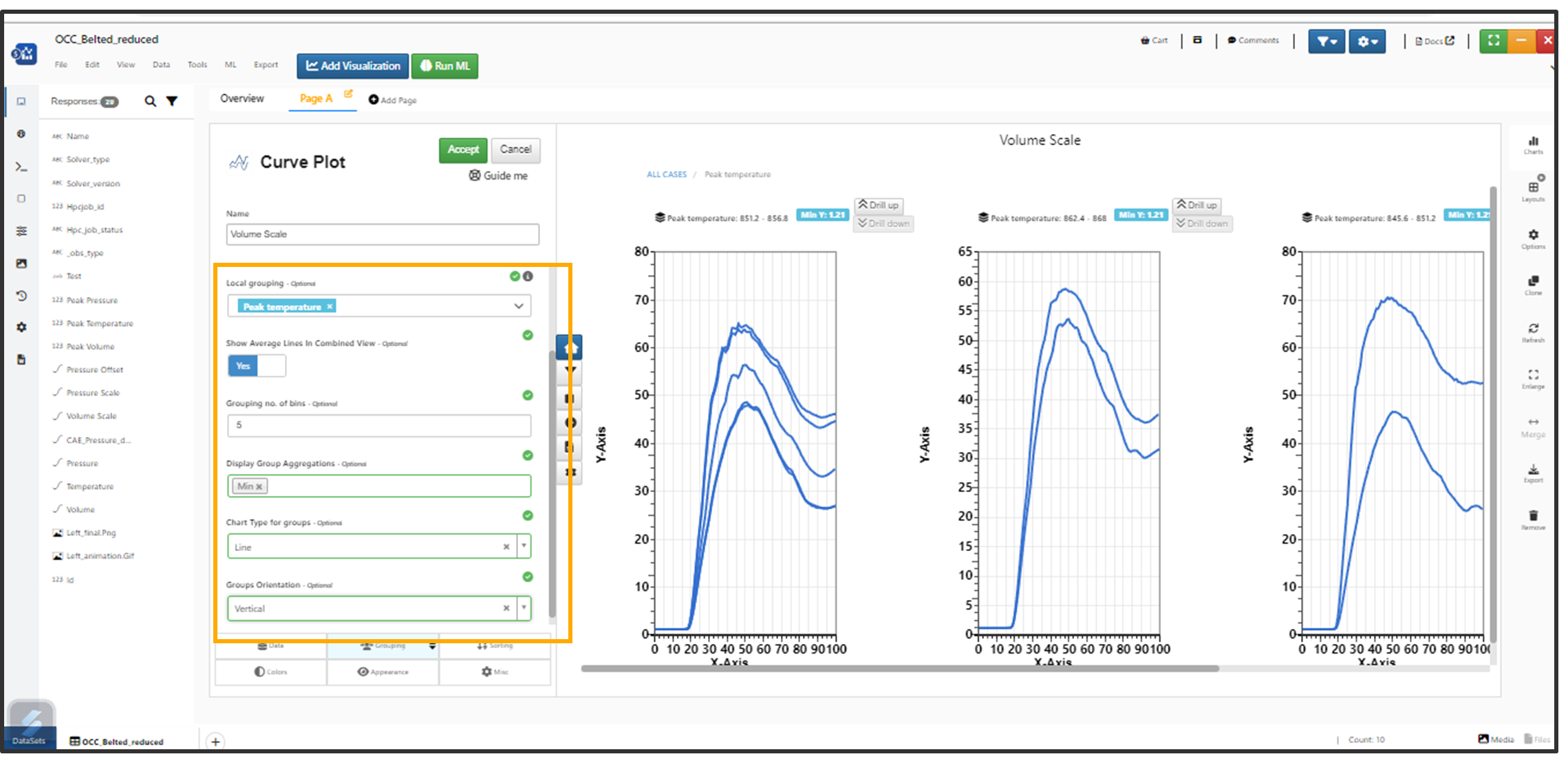
Local Grouping
Several new options are added to the Grouping factors for Newton Visualizer in Simlytiks.
Newton visualization which has local grouping and drill down to Grid or Vertical orientation can be Exported as PPT or Image.
New option for local grouping in Newton to hide the headers in the drilled down view.
Hide the header
In Newton, Drilled down charts now have enlarge option in their context menu to enlarge only the specific chosen viz.
Enlarge
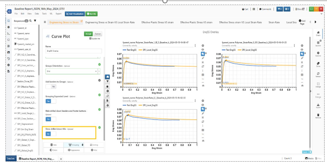
New option in Local grouping for Newton to only show the drilled down title.
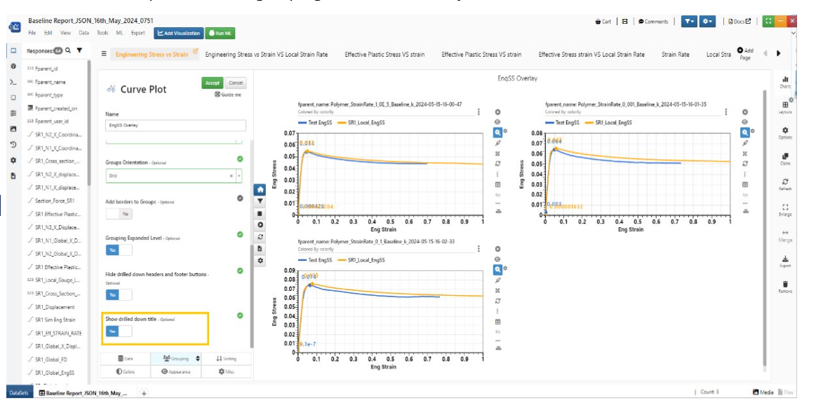
Title
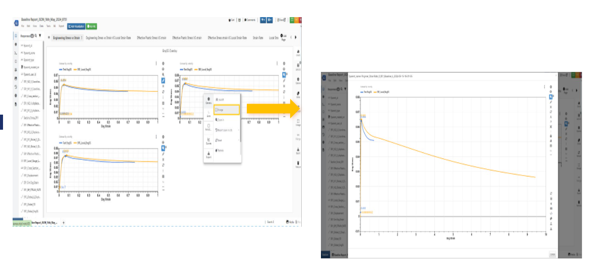
The local grouping in Curve plot visualization now has a new feature to hide the header and footer buttons (reset, zoom etc. buttons) of the drilled down visualizations.
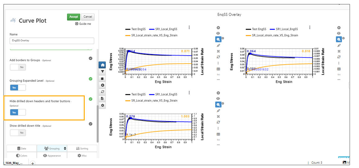
Hide Header
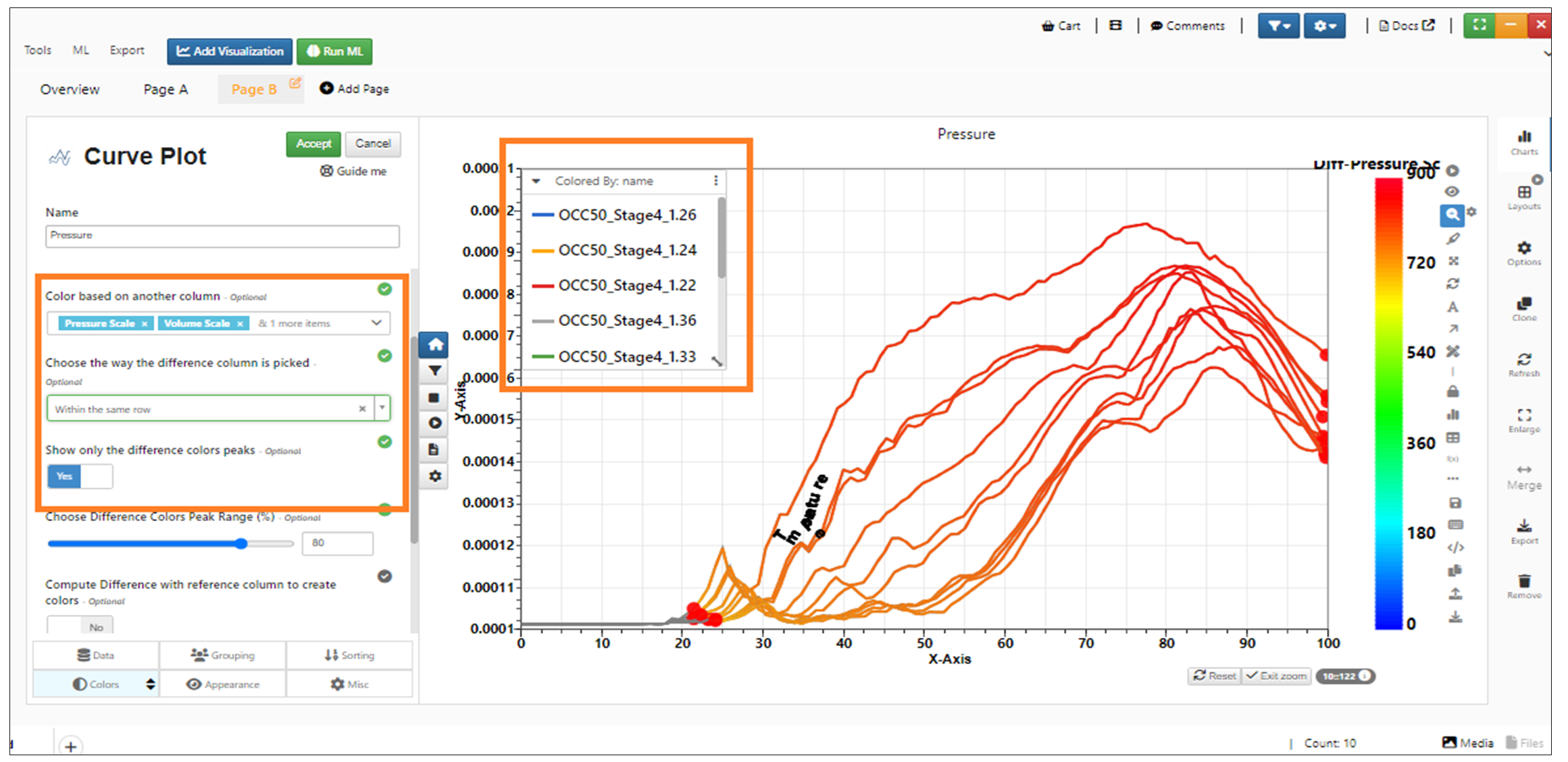
Color based on difference with
New input called Color based on other column is available in Newton Visualization and below that we have option to enable the compute difference with reference column to create colors.
New option ‘Color based on difference with’ is added to Newton Visualization. The value here is used to color the curves.
Color By Difference option in Newton Visualization now allows multiple columns to be chosen which will show multiple layers of differences and one legend for them.
Color By Difference
Added new feature support for placement of color difference labels within the regions in Newton visualization under colors tab
Added support for orientation of color difference labels along slope OR horizontal in Newton visualization under colors tab.
Added customization of color schemes support for ‘color by curve_by columns’
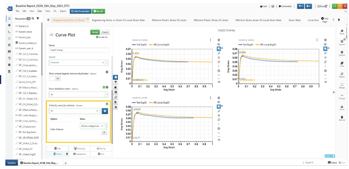
schemes
Appearance
In Newton Visualization, options like Opacity by, Image by, line Width by are moved to Appearance tab.
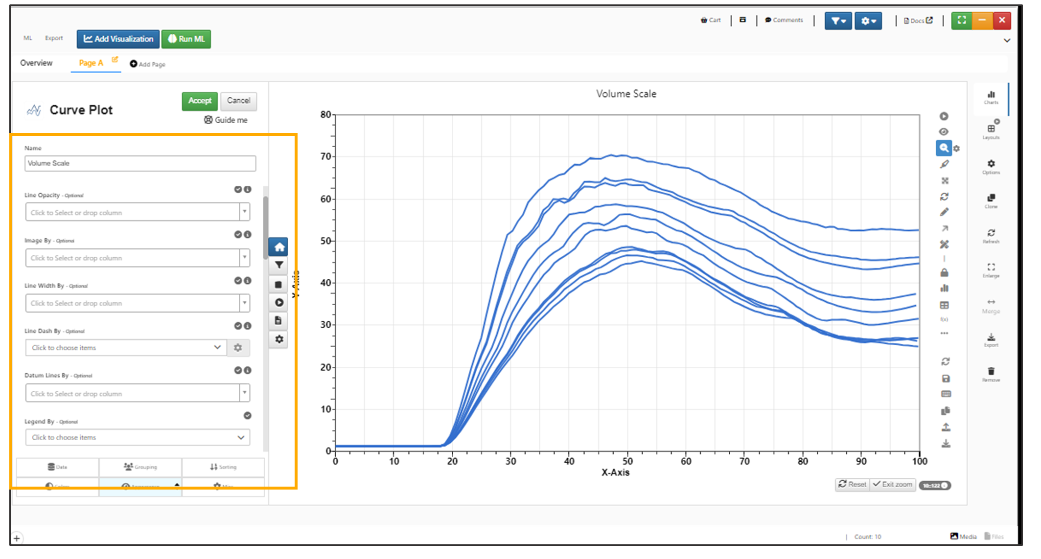
Appearance
Opacity By option in Newton Visualization now shows Opacity legends on the right side of the chart in Simlytiks.
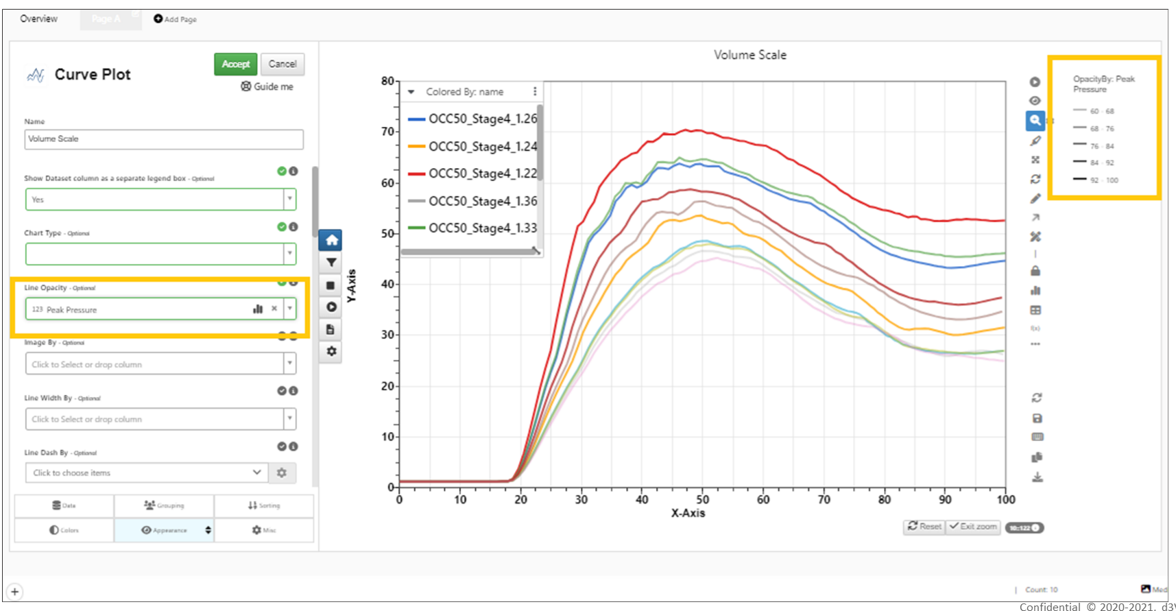
Opacity By
Opacity By and LineWidth By options in Newton Visualization have their own legends displayed on the right side of the chart container.
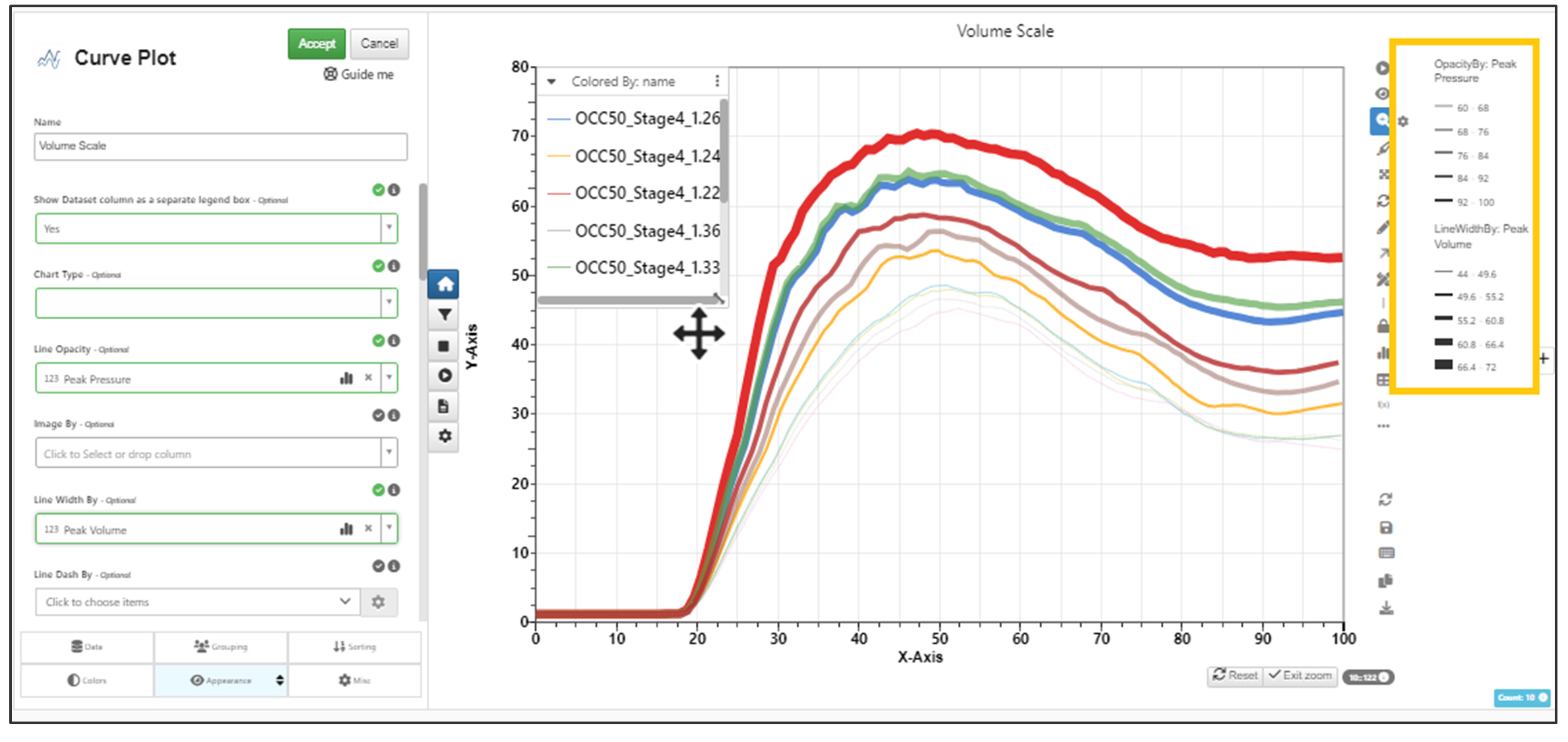
Opacity By and Line Width By
New options are available for Newton visualization in the Appearance tab to show curve axes in secondary and tertiary axes based on the scale factors provided in the options.
New option added in legends context menu options to download curve(s) as CSV/Excel. This is same as the normal export but the items will be pre-selected. Download is applicable when multiple curves are selected in legends.
The settings sidebar in Newton visualization has a new option to hide legend header.
Curve chart has new option to show distributions at any X for the visualization. This option can be added using right context menu or in the appearance tab.
Newton has new option in Appearance called Line shape by which will create symbols for each line and show them in legends in Simlytiks.
Shape By in Newton visualization now supports frequency of the symbols i.e. number of digitized points across x domain.
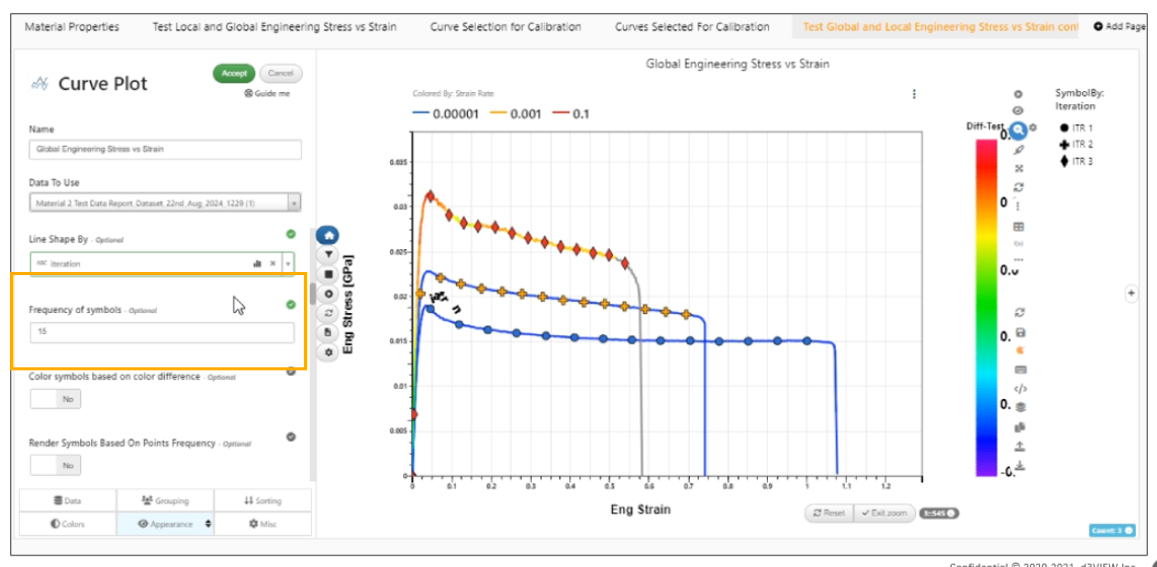
Number of digitized points
Newton has new option in Appearance to hide the lines and just show the symbols.
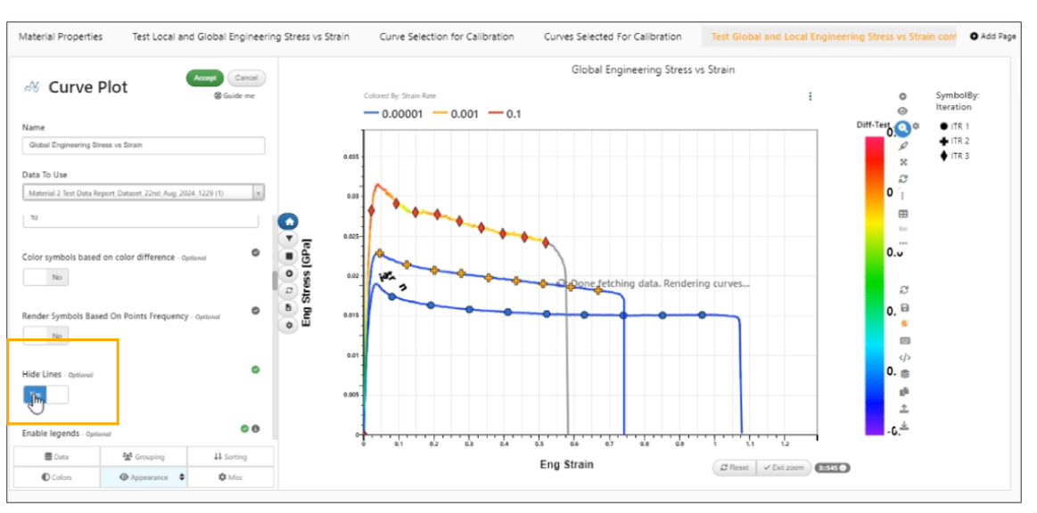
Hide the lines
New option in Newton’s Appearance tab to specify the ‘legends position’ which can be used from within Reporter to set automatically instead of the 3 dots settings within the chart.
New option added to Newton visualization to ‘Show Unique legends’ which will now remove the duplicates from the legends and show curves without duplicates.
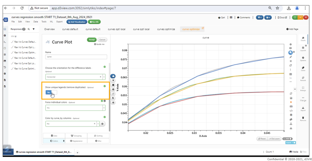
Show Unique legends
Newton visualization supports a new option to treat a numerical colorBy as categorical available in the Colors tab in Simlytiks.
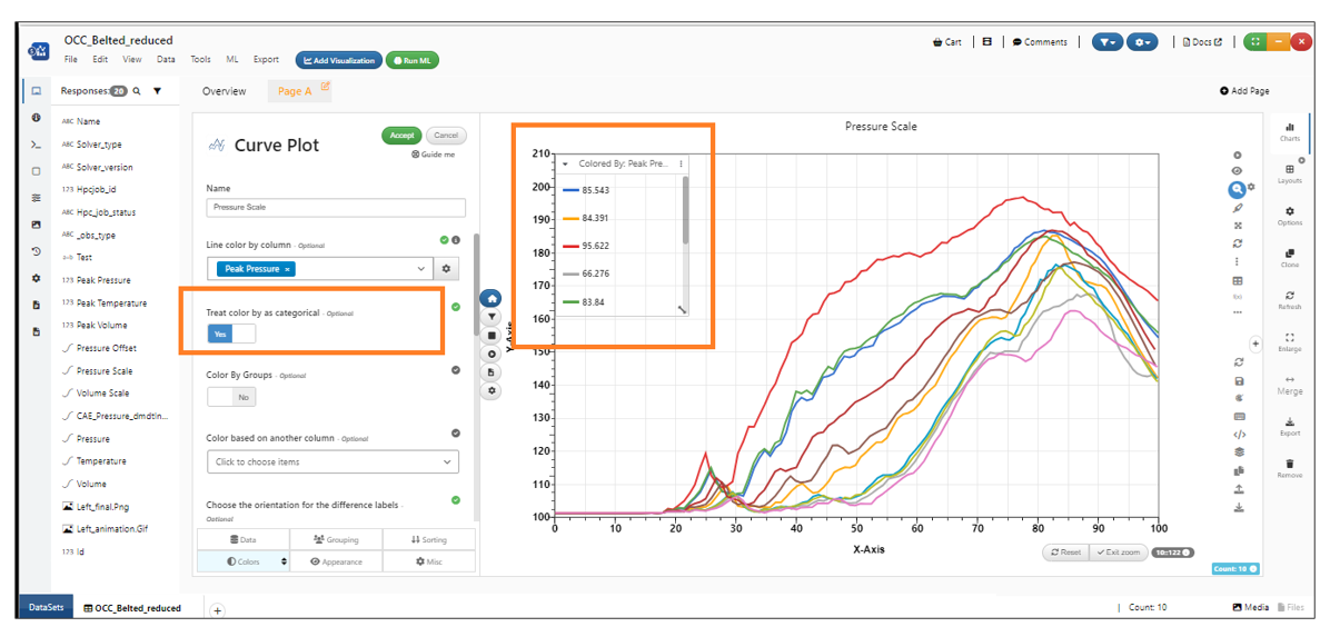
Numerical colorBy as categorical available in the Colors tab
Newton visualization has a new option in Appearance to mention bottom margin which can help with positioning of annotations outside of the canvas
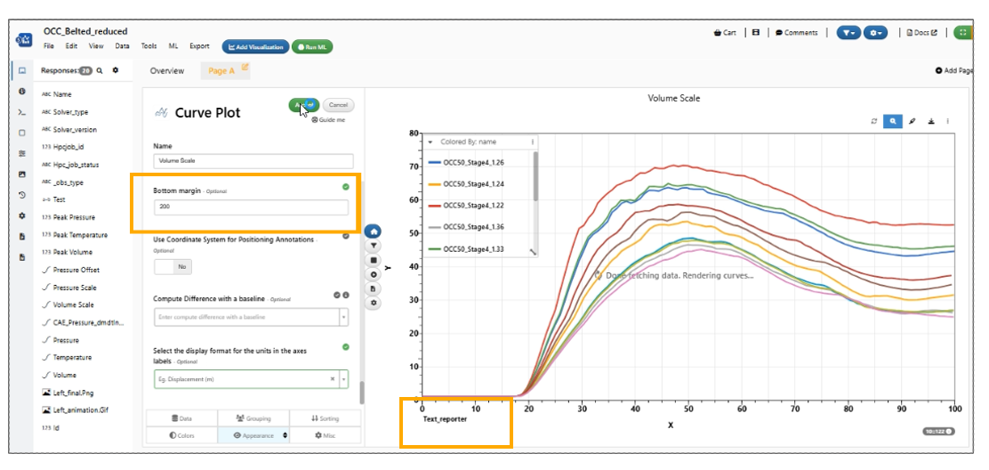
Bottom Margin
In Simlytiks, a new option ‘Show legends even in smaller containers’ is available in the appearance tab of Newton visualization.
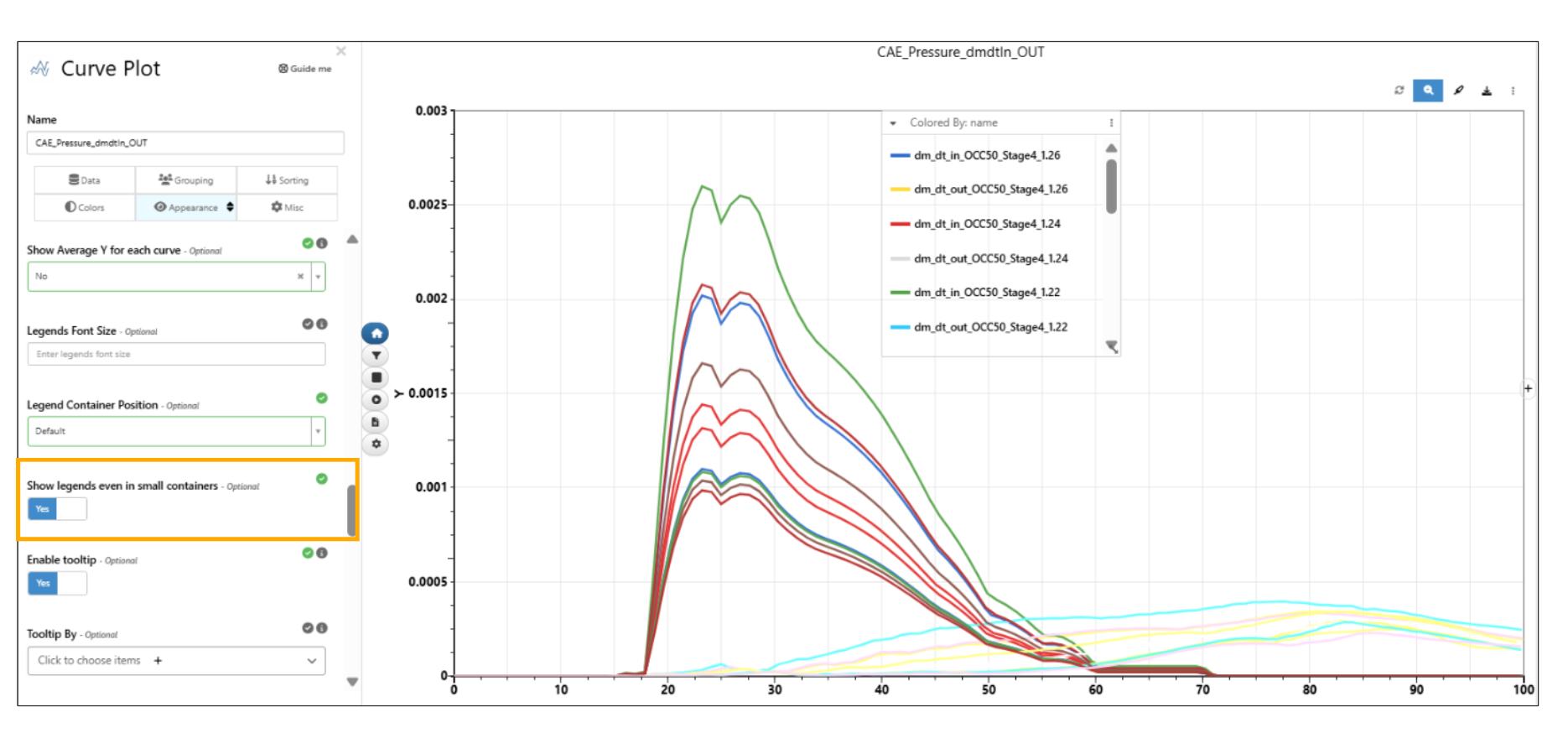
Show legends even in smaller containers
In Simlytiks, users can now toggle “Show data values on legend left“ option which will display values on the left of the legend for numerical color by charts. Curves will be highlighted when hovered on the values.
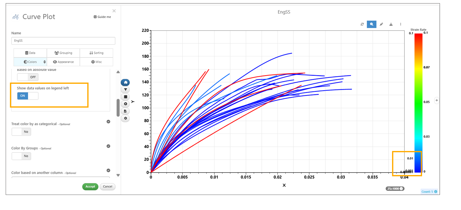
Show data values on legend left
Top 3 peaks
New option Show tooltips for top 3 diff peaks on hover is available in Newton visualization, displaying the three highest difference peak values when hovering over the curve.
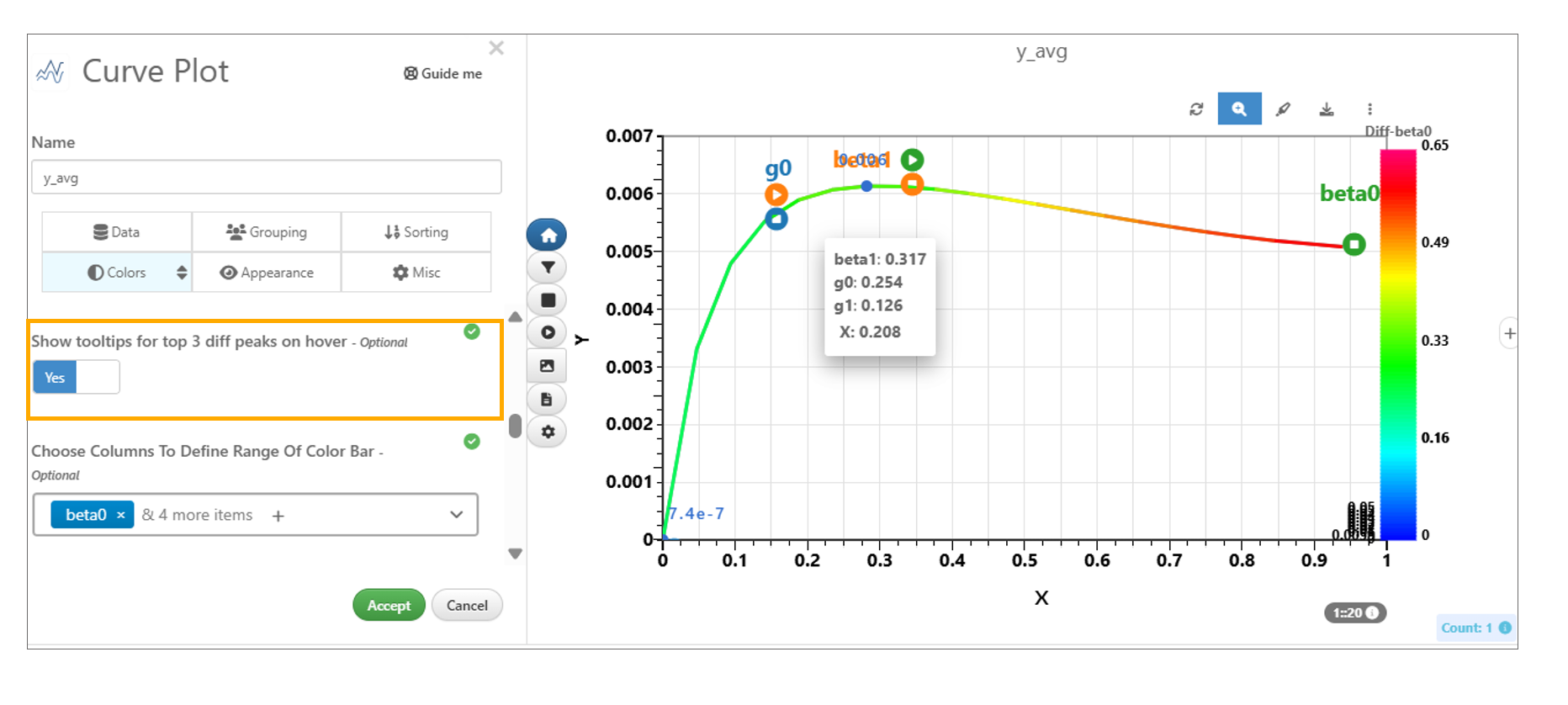
Top 3 peaks
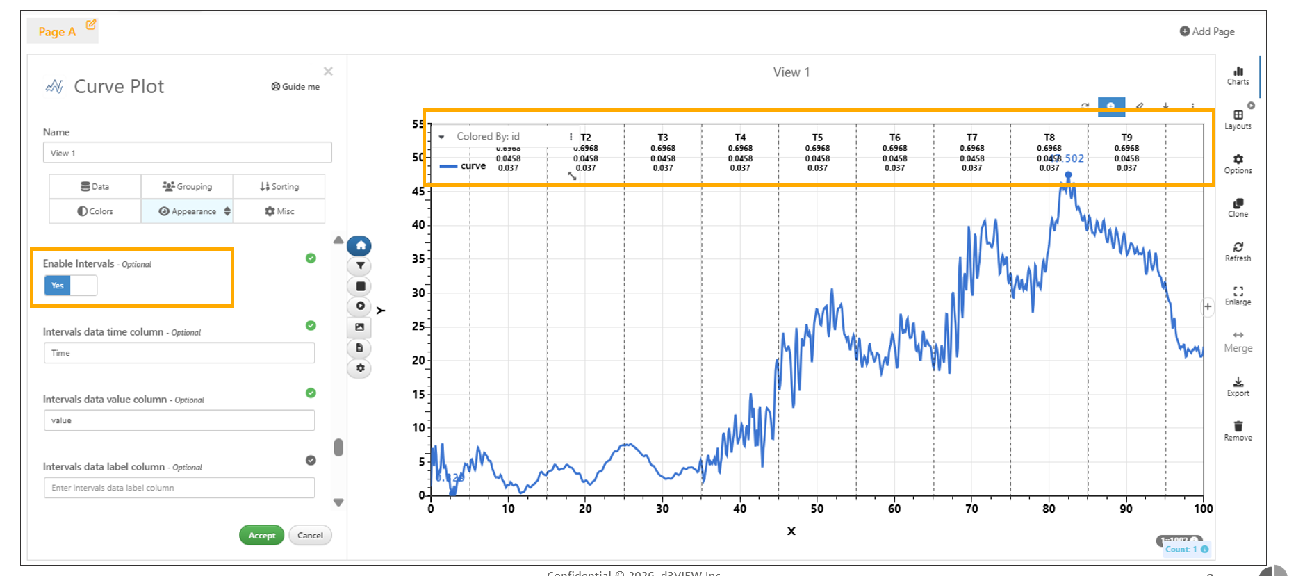
Enable Intervals
Newton Plots now include a new “Enable Intervals” option in the Appearance tab. When enabled in Curve Plot, users can configure interval data from a dataset, dataset column, or record columns; specify the time interval column along with optional value, label, and interval ID columns. Vertical lines are displayed at interval end times in the visualization.
Enable Intervals
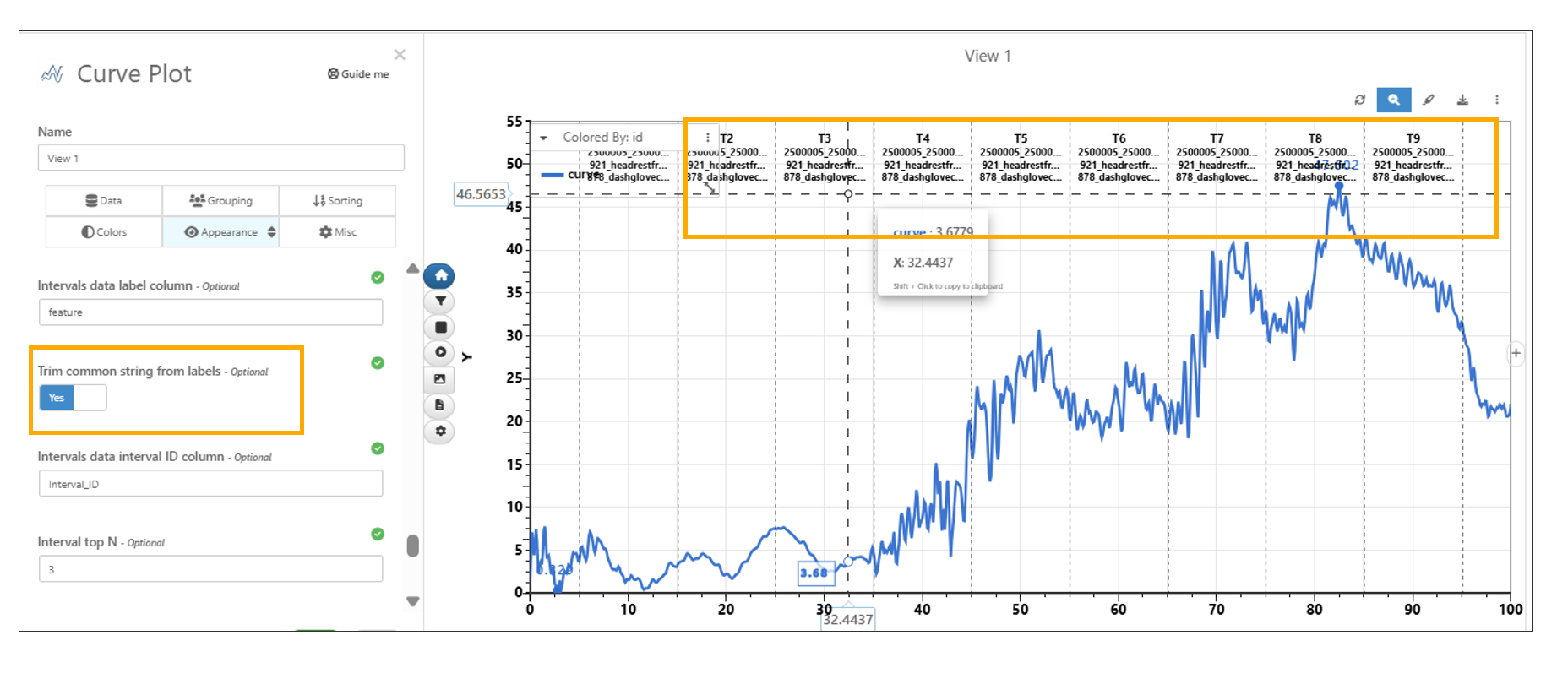
New option is added to the Interval feature for Newton plot that allows users to trim common strings from the displayed labels.
Enable Intervals
Band Reference Curve By
Newton Visualization has new options in appearance tab called ‘Band Reference Curve By’ and ‘Band Ratio Column’ in Simlytiks.

Band Reference Curve By
Zoom options
Added zoom support with center point /range and dataset formats in Newton visualization. The zoom center moves the plot to the specified point, and zoom range sets the offset from the center.
Custom Markers
Added support for custom markers with dataset format for labeled points in Newton visualization. This option is available under Appearance as “Custom Markers” with id, x, y, shape, size, and tooltip support.
Newton → Custom markers now support dynamic X and Y column names mapped from previous workers to the Reporter in workflows.
Dataset Import
Dataset Import for associations option in Newton now supports Excel, JSON and CSV files.
Import and Export options
Newton Import/Export options supports Import/Export within appearance settings in Simlytiks.
Newton Curve plot is now able to import a curve, when it has multiple Curve By.
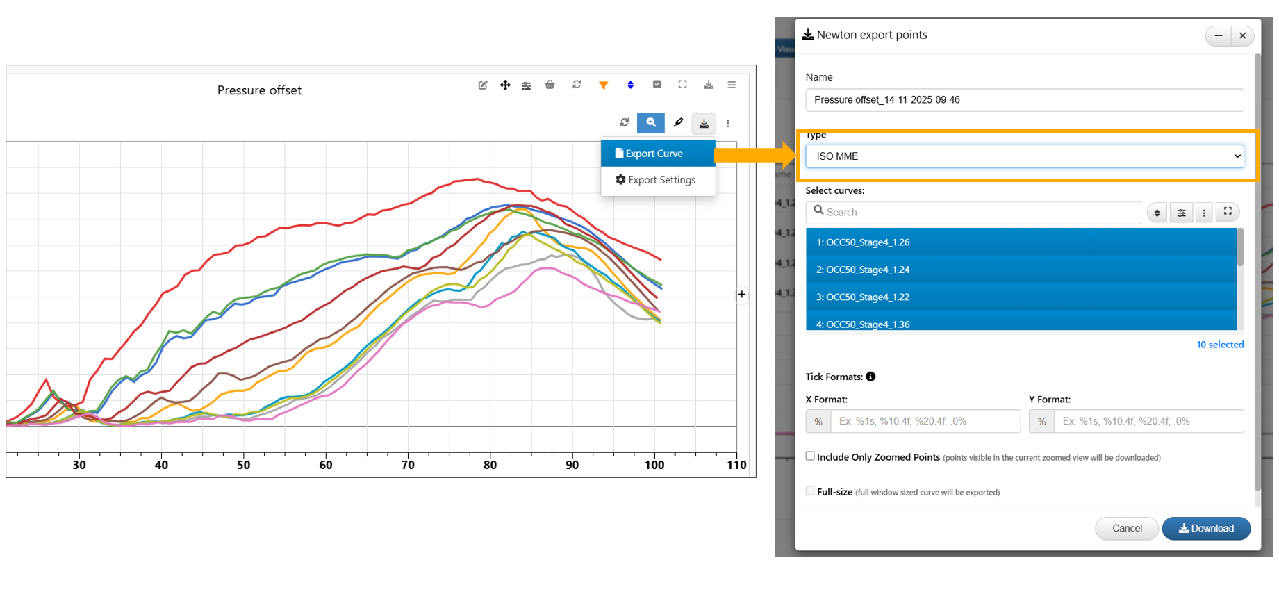
ISO MME export
Newton Visualization → The Export Curve option now supports ISO MME export of visualization curves in Simlytiks.
ISO MME export
Newton 3D
Newton visualization now supports a new column called 3D column in data tab which will enable 3D viewer of the curve visualization in Simlytiks.
New option ‘Line Width By’ is now available for Newton visualization when 3D columns is enabled in Simlytiks.
Newton visualization with 3D column now supports ‘Surface’ between the curves in Simlytiks.
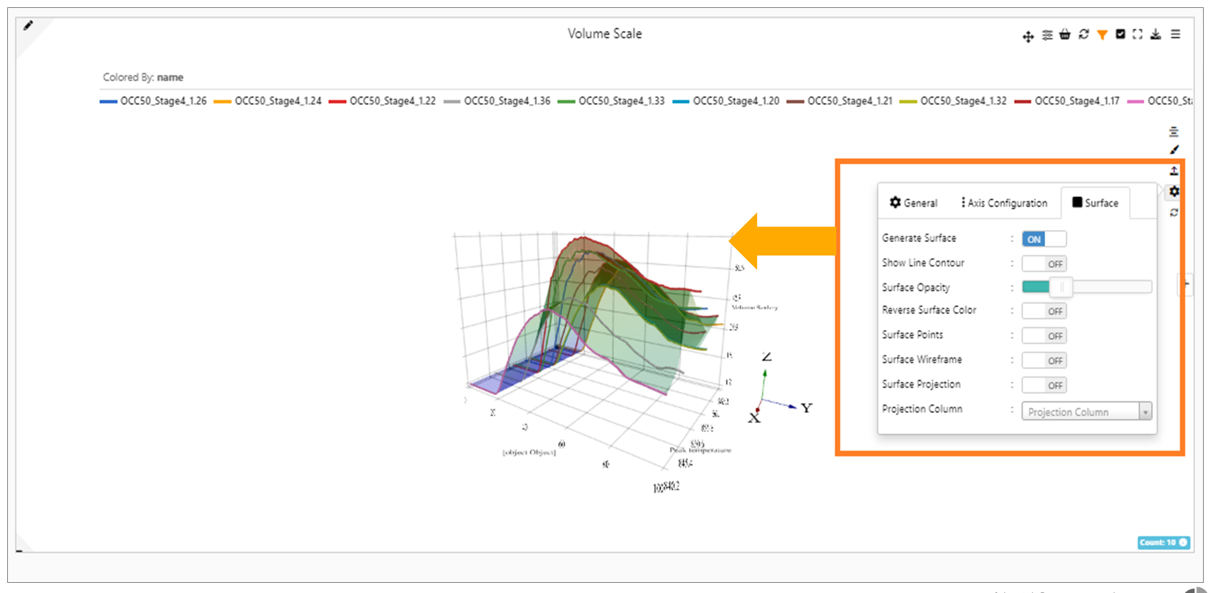
3D Surface
Newton visualization now supports multiple curves for Z axis when 3D column is enabled for curves in Simlytiks
Watch the following video for a preview of some of the chart types.
Context menu option
Curves can now be switched between secondary X Axis and primary X Axis using the legend context menu option.
Secondary X Axis and primary X
In Newton , context menu options can be accessed for secondary axes curves.
Secondary axes curves
Lock View
Zoomed view in Newton visualization can be locked and exported using right click context menu options. We should first enable the zoomed view in appearance tab.
Row selection and Column selection
Fetching curves from a database using row selection and column selection is now available in Newton chart.
Sparkline
For smaller layouts in Simlytiks, curve plots are now rendered as simple sparklines which can be clicked to enlarge.
Simple sparklines
All curve sparklines across platform ( workflow -> curve outputs, simlytiks -> small newton containers) will now render 25 points on initialize
Sparklines
X and Y values at axes
Moved X , Y values to the axes for the Newton visualization.
Moved X , Y values
Reference/Baseline/color
In Simlytiks, the settings reference/baseline/current rows are now mapped to Groups in Tools tab. Changes made to Groups will be reflected in settings and vice versa.
Contribution By
New option for newton visualization is available in Appearance tab called ContributionBy which will allow
- selection of a curve column
- Customizable number of points
- Customization values to show
- customizable order ( min or max). Feature works by computing Y values from the contribution Curve at every point.
Contribution By in Newton now has a new option to enable animation which will add controls in the legends which will help walk through the digitized points one by one in Simlytiks.
ContributionBy in Newton also has a new option to show a table of points vs curves ( with max values) right in the legends container.
ContributionBy in Newton now has a new option to filter out the curves using a single select list which will also be filtered out while computing max values to show and in the legends.
Contribution table now has a new customizable option to be shown either at the bottom of the legends ( default ) OR by replacing the main canvas.
Quadrants
In Newton visualization, new option called ‘Display by quadrant’ is available in Appearance tab to fit a curve in any of the 4 quadrants.
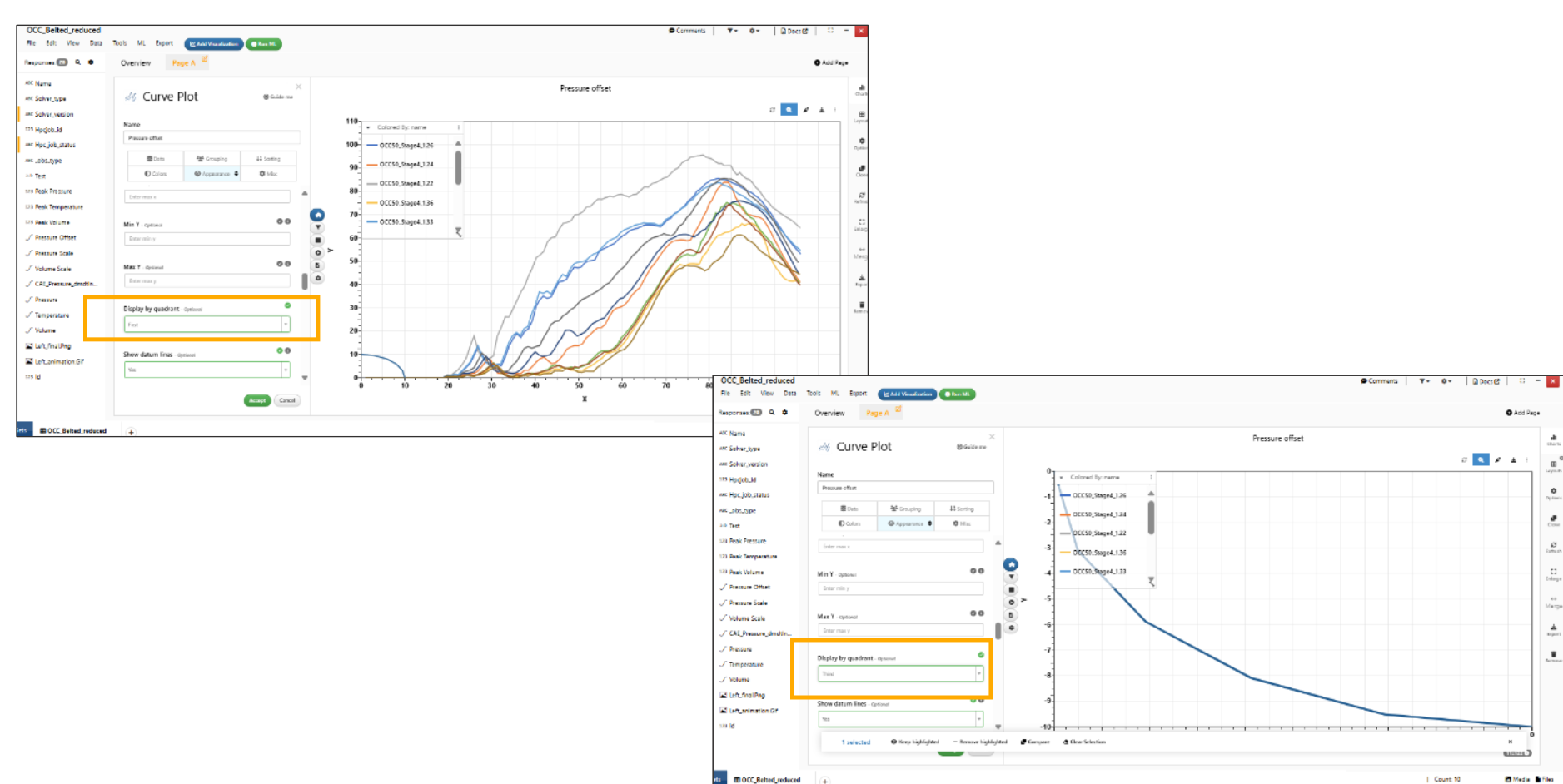
Display by quadrant
Smaller layouts
Y axis shows only 5 ticks for newton visualizations in smaller layouts
5 ticks for newton visualizations
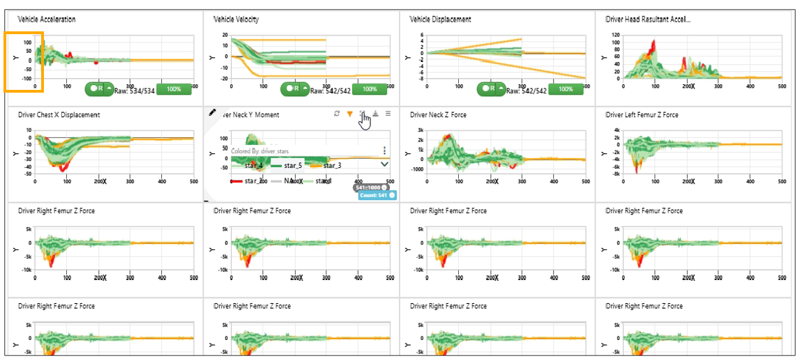
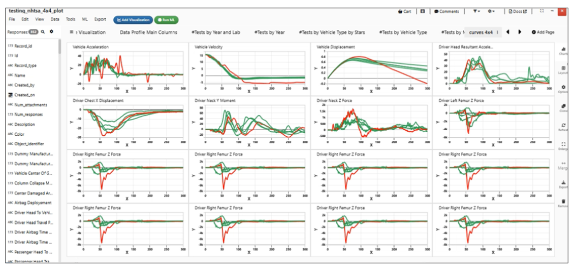
Newton visualization now renders all points and displays entire visualization in smaller layouts like 4x4 in Simlytiks
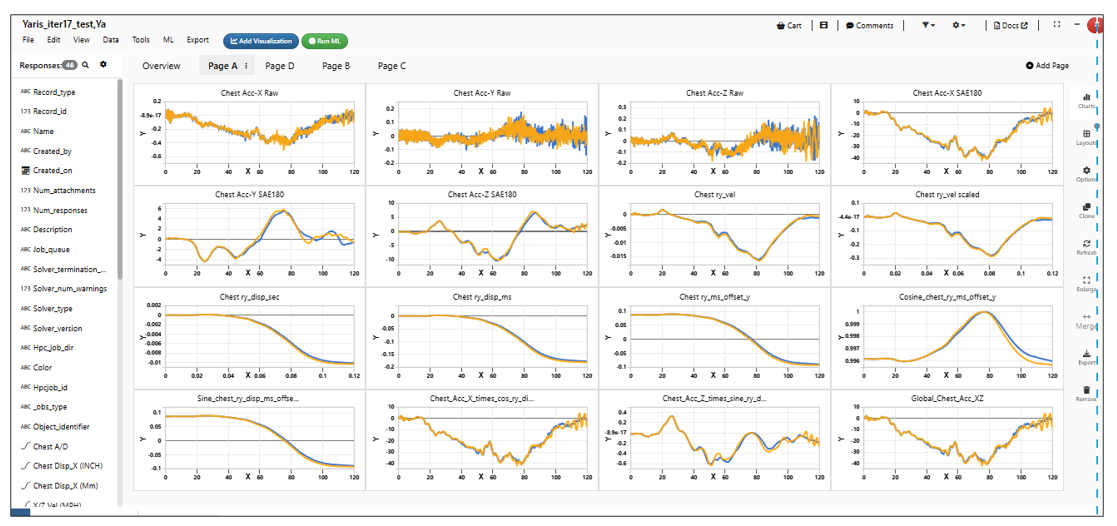
Newton visualization
The Curves in Simlytiks are updated to render faster which helps in improving the performance of the Curve plots
Newton visualization
Color curves in secondary and tertiary axes
Newton supports a new option in the ‘Color by’ tab to color the curves in secondary and tertiary axis.
Curve Options
Improved Curve Interaction in Multi-Curve Plots
The multi-curve plot interaction has been enhanced to provide more intuitive control over curve visibility.
Users can now easily manage individual curves directly within the plot:
- Hide Curves: Left-click on a curve to hide it from the plot.
- Restore Curves: After exiting zoom mode, use a middle-click to restore hidden curves.
This improvement allows for better data exploration by enabling users to focus on specific curves without permanently removing others from view.
Copy and Paste Visualization Settings in Simlytiks
Simlytiks now provides copy and paste functionality for visualization settings directly from the visualization panel header menu, enabling faster and more consistent configuration across visualizers.
This feature allows users to replicate specific settings efficiently:
- Category-Based Copy: Users can copy visualization settings by category:
- Grouping
- Sorting
- Colors
- Appearance
- Misc
- Flexible Paste Options: Copied settings can be applied to:
- The current visualizer
- All visualizers on the current page
- All visualizers across all pages
- Improved Consistency and Efficiency: This reduces repetitive configuration and ensures uniform styling and behavior across dashboards.
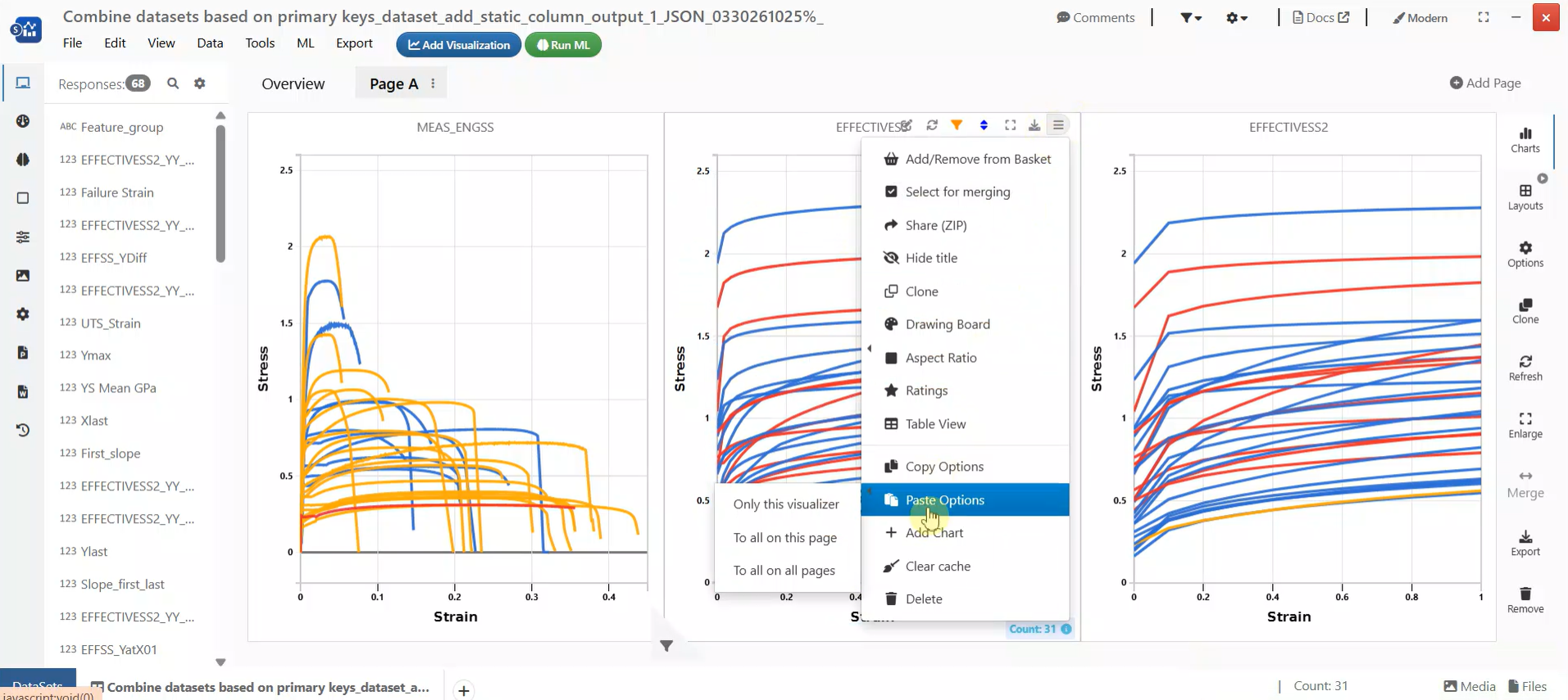
Copy and Paste Visualization
Dash by Curve_By Columns for Curve Plots
In Simlytiks, a new option Dash by curve_by columns has been added under the Appearance tab for curve plots.
This feature allows users to differentiate curves by applying distinct dash styles based on the selected curve_by columns. It enhances visual clarity when multiple curves are displayed, making it easier to distinguish between different data groups.
By leveraging this option, users can improve the readability and interpretability of complex curve visualizations.
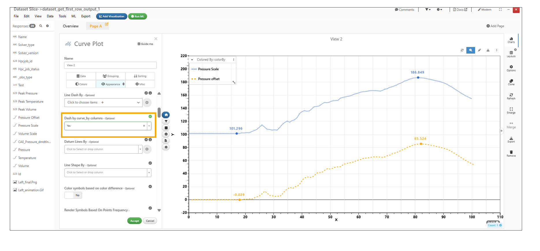
Dash by Curve_By Columns for Curve Plots
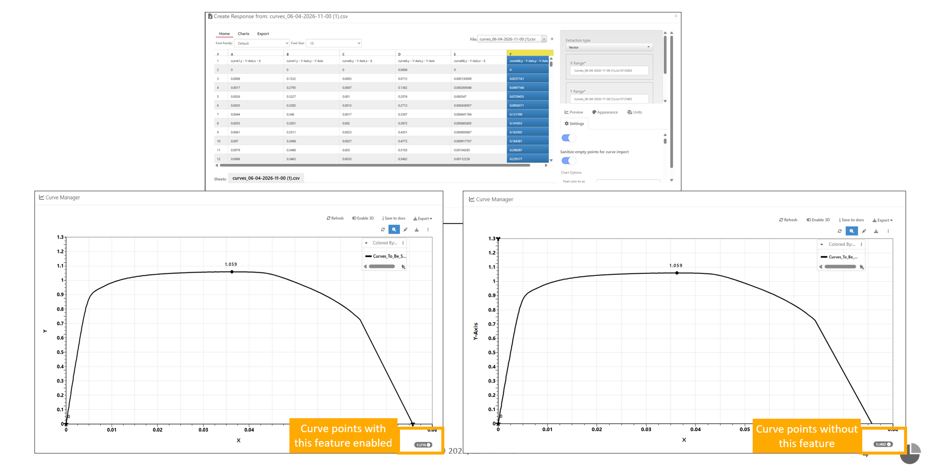
Newton Data Parser Enhancement
The Newton Data Parser now includes a new setting, Sanitize Empty Points, for curve import. This feature ensures cleaner data ingestion by removing empty or NaN values during the import process.
When enabled, the parser automatically filters out invalid data points, improving the quality and reliability of imported curves for downstream analysis.
- Sanitize Empty Points Setting Removes empty or NaN values during curve import.
- Improved Data Quality Ensures only valid data points are retained for processing.
- Seamless Integration Works automatically during the curve import process when enabled.
- Open the Newton Data Parser configuration.
- Locate the Sanitize Empty Points option under curve import settings.
- Enable the setting.
- Import the curve data.
- The parser will automatically remove empty or NaN values.
Sanitize Empty Points