27.  Visualizer Library
The following showcases each visualization on the platform with icons, descriptions and placeholders for each.
Table
This is the table view that helps to get a 2D view of the data. You can choose columns that are text or number.

The following is a list of Table options with their placeholder illustration:
| Option Name | Illustration |
|---|---|
| columns | 
|
| primaryKeys | 
|
| fontSize | 
|
| fontWeight | 
|
| summaryRowColumns | 
|
| staticRowAtTop | 
|
| computeDifference | 
|
| excludeColumns | 
|
| reverse_column_colors | 
|
| baselineType | 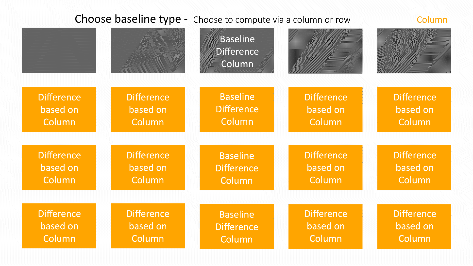
|
| baselineRow | 
|
| baselineColumn | 
|
| baselineCriteria | 
|
| differenceType | 
|
| curveDifferenceType | 
|
| digitizePoints | 
|
| normalize | 
|
| xmin | 
|
| xmax | 
|
| sync | 
|
| showDifferenceByArrows | 
|
| variableFontSizes | 
|
| showArrowsForNegativeValues | 
|
| colorTexts | 
|
| colorLessThanBaseline | 
|
| colorMoreThanBaseline | 
|
| baselineColor | 
|
| flipTable | 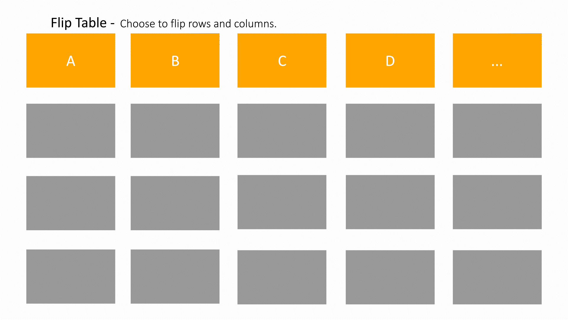
|
| thresholds | 
|
| useThresholdColors | 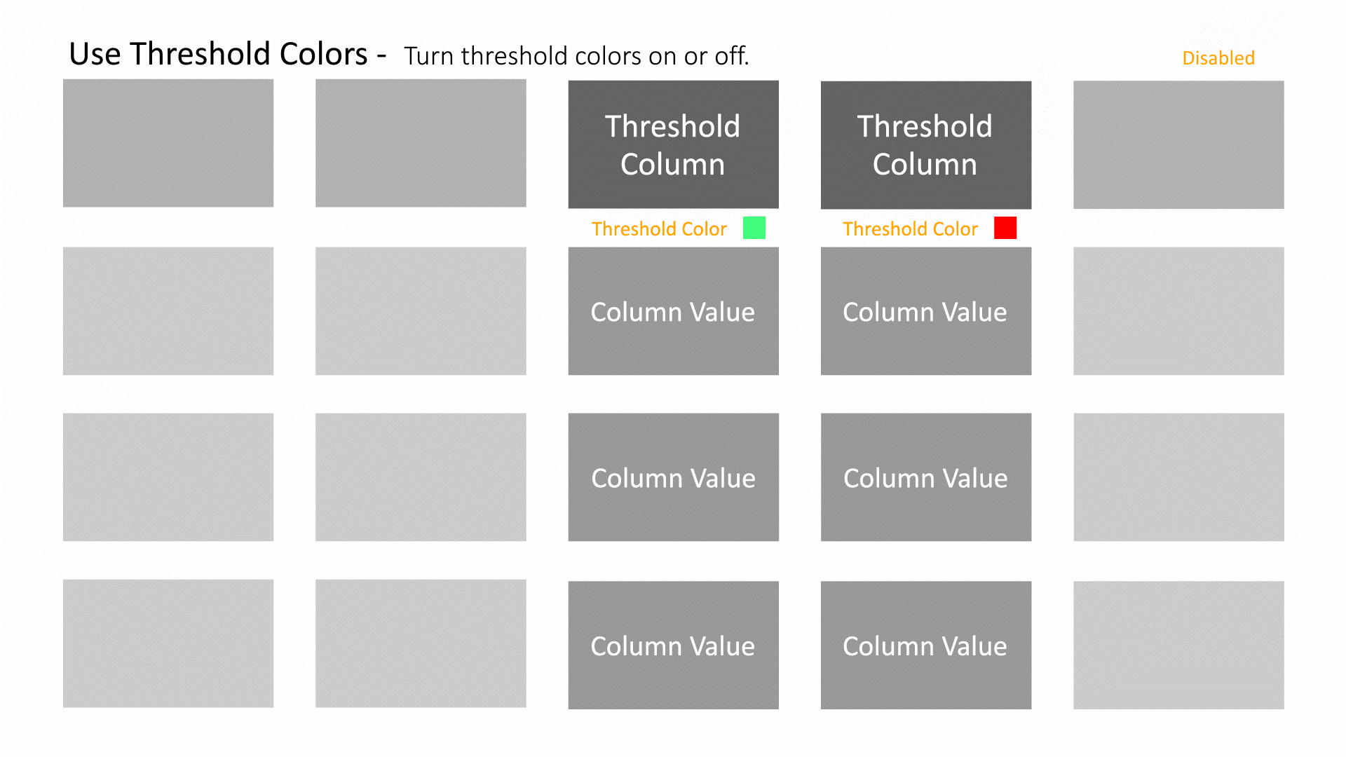
|
Vertical Bar Chart
A graph that visually displays data using vertical bars going up from the bottom, whose lengths are proportional to quantities they represent. It can be used when one axis cannot have a numerical scale.

The following is a list of Vertical Bar Chart options with their placeholder illustration:
| Option Name | Illustration |
|---|---|
| x | 
|
| y | 
|
| colorBy | 
|
| aggregationType | 
|
| groupType | 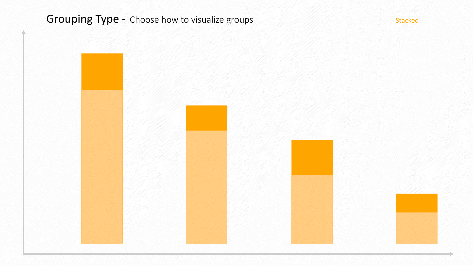
|
| ymin | 
|
| ymax | 
|
| showTooltip | 
|
| tooltipBy | 
|
| showLegends | 
|
| showBarLabels | 
|
| showDatumLines | 
|
| showAggregatePercent | 
|
| showImagesInAxes | 
|
| sortBy | 
|
| sortByValue | 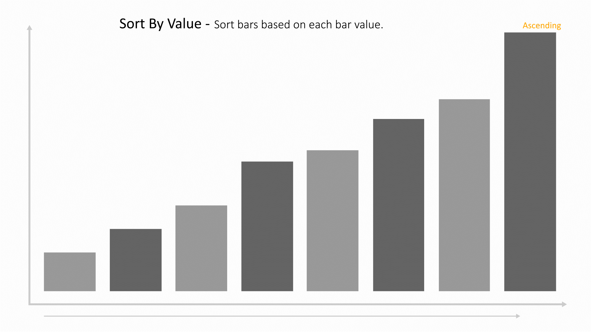
|
| sortOrder | 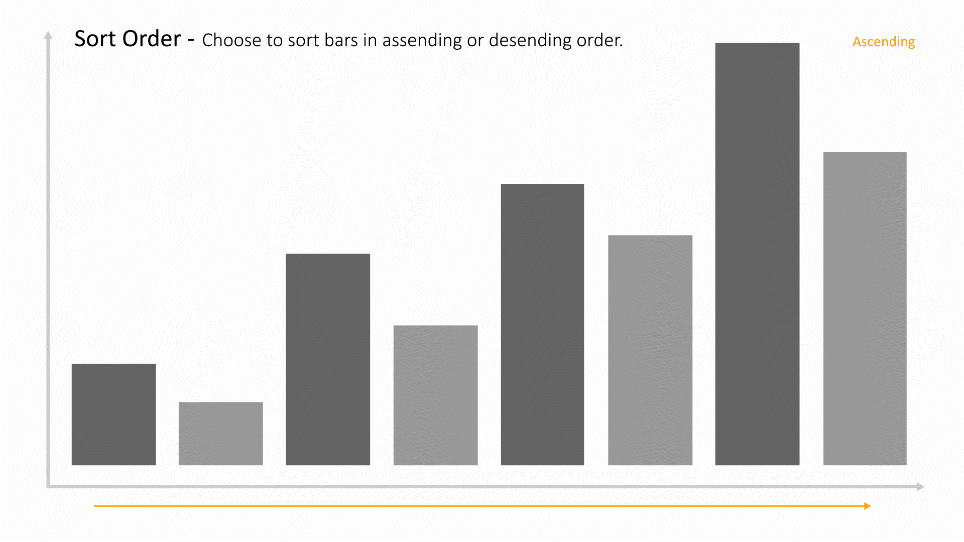
|
| binScale | 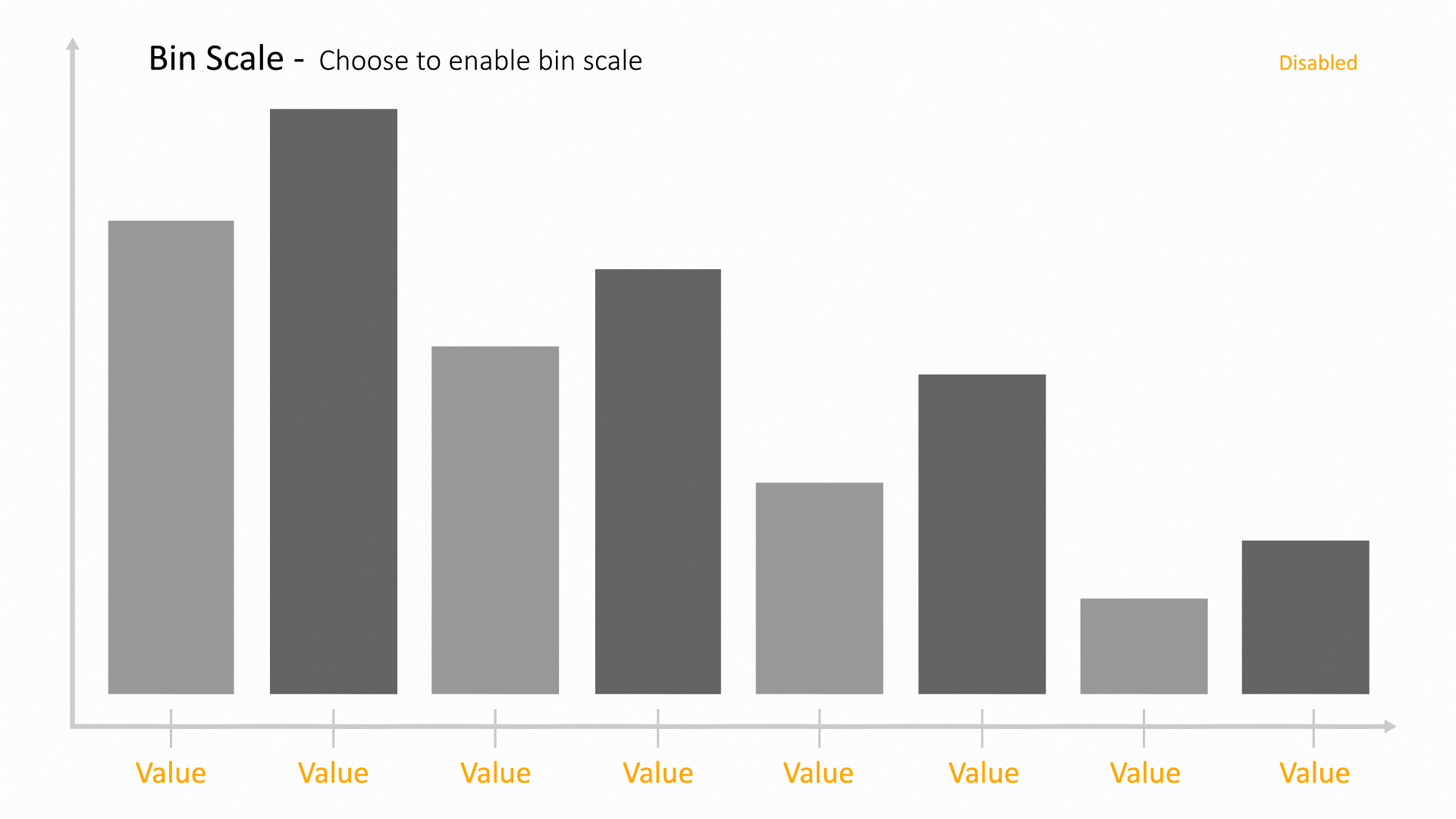
|
| showSummary | 
|
Bubble Chart
Scatter plots are used to plot data points on a horizontal and a vertical axis in the attempt to show how much one variable is affected by another. Each row in the data table is represented by a marker whose position depends on its values in the columns set on the X and Y axes.

The following is a list of Bubble Chart options with their placeholder illustration:
| Option Name | Illustration |
|---|---|
| x | 
|
| y | 
|
| colorBy | 
|
| separateColorScales | 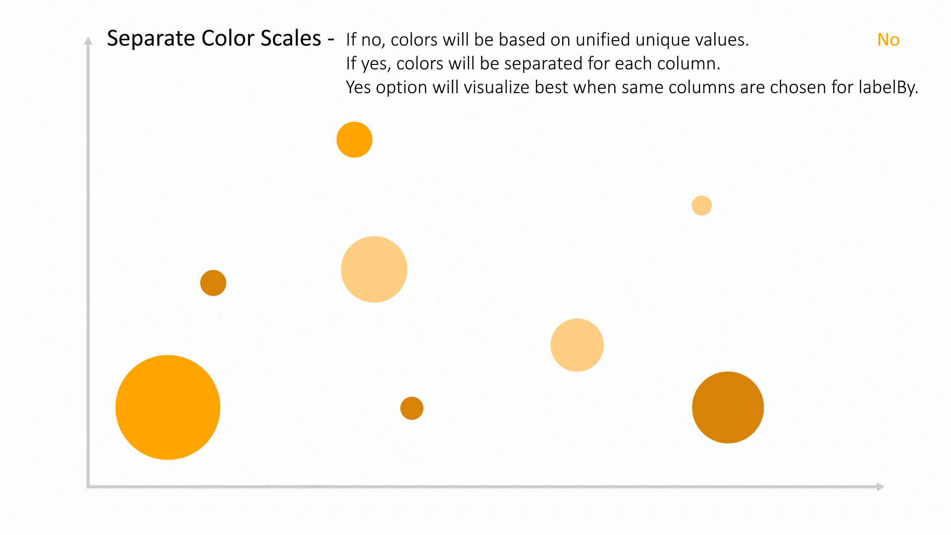
|
| strokeColorBy | 
|
| labelBy | 
|
| size_by | 
|
| opacity_by | 
|
| thickness_by | 
|
| imageBy | 
|
| imageW | 
|
| symbol_by | 
|
| tooltipBy | 
|
| showImagesInAxes | 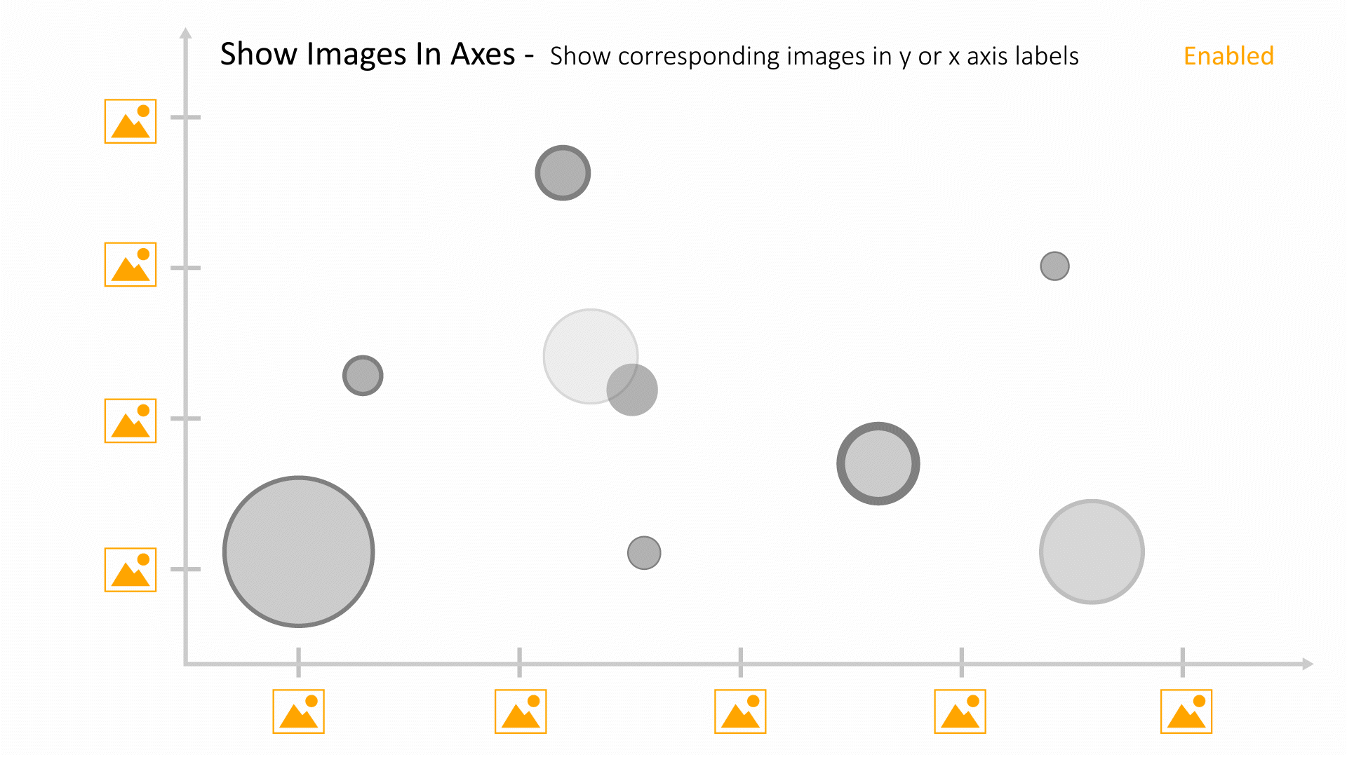
|
| xAxisPosition | 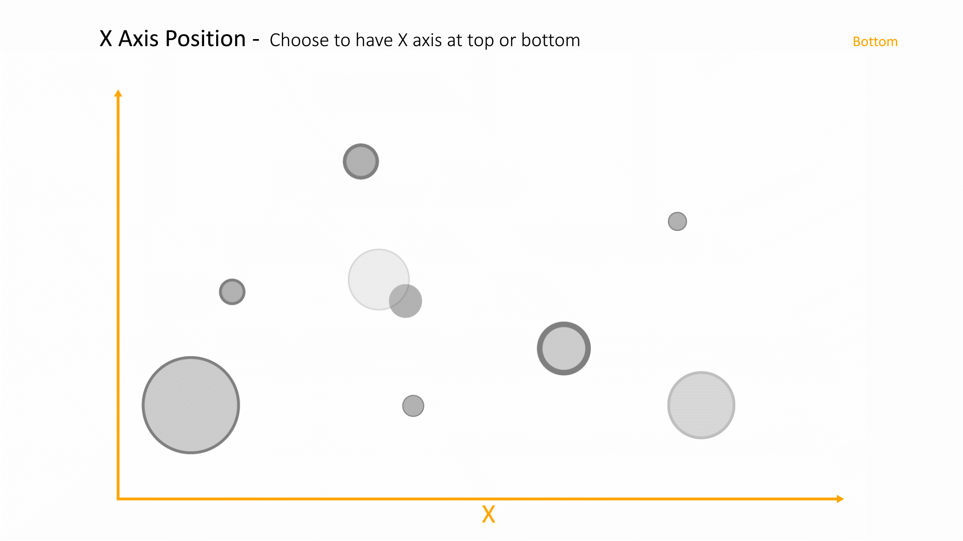
|
| tickCenterLabels | 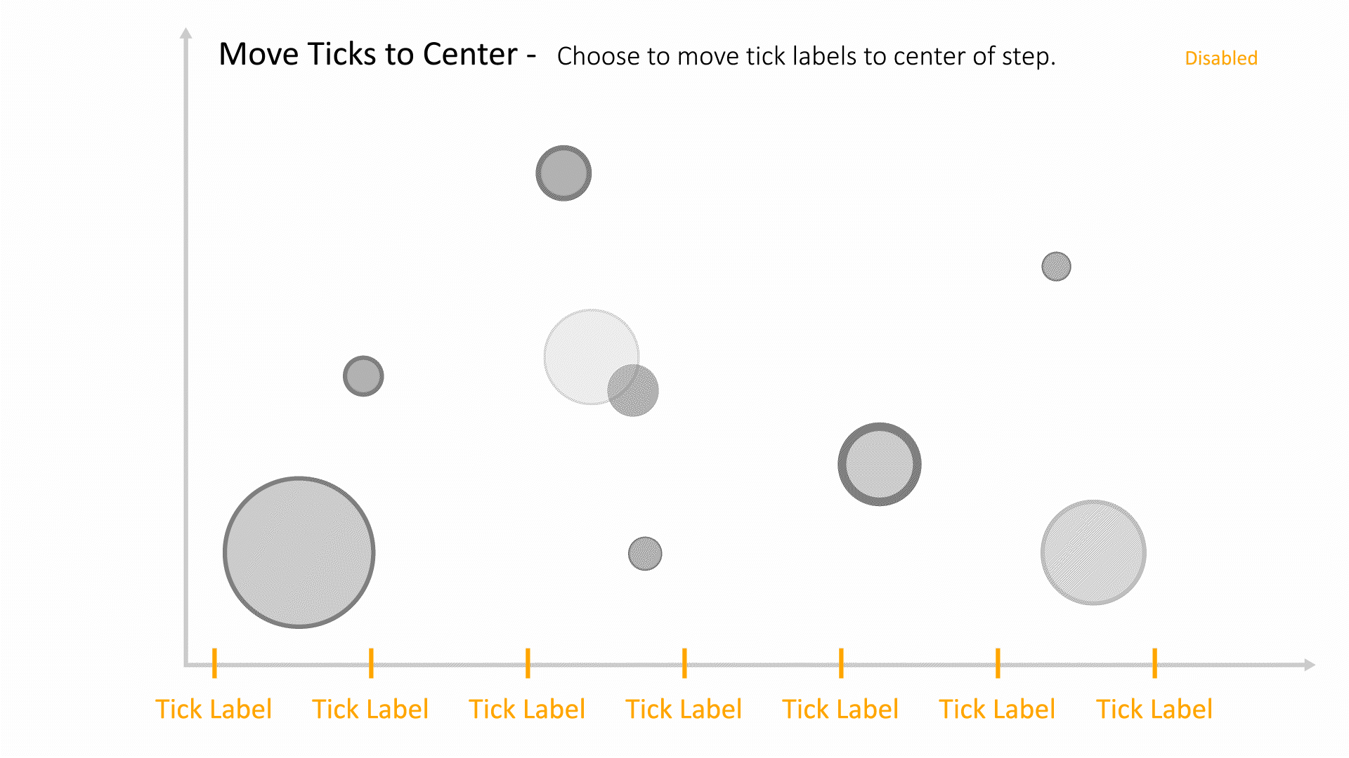
|
| set_min_to_zero | 
|
| trendLine | 
|
| order | 
|
| showImageLegends | 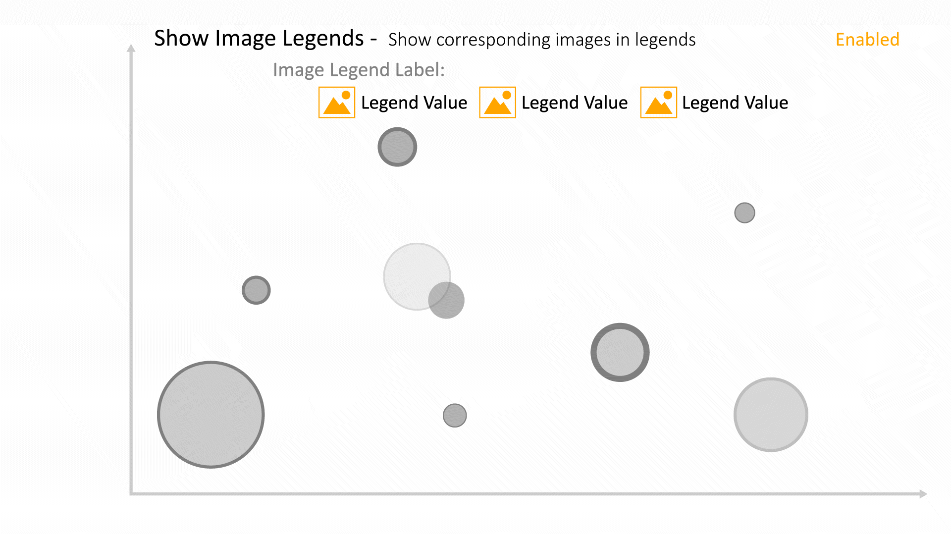
|
| showLegendLabels | 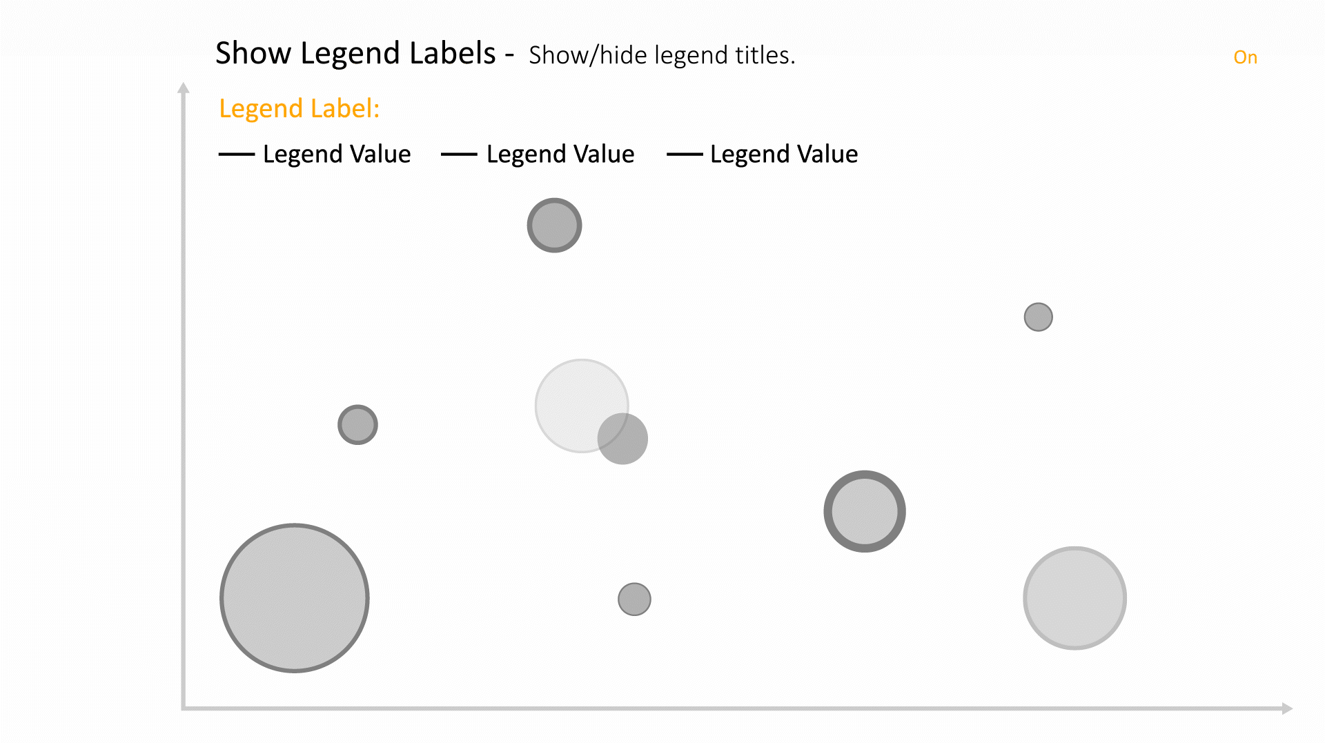
|
| showLegendLines | 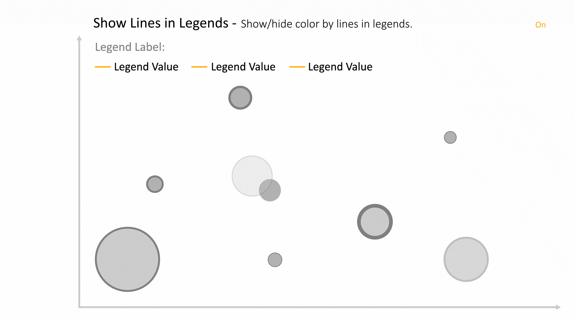
|
| autofit | 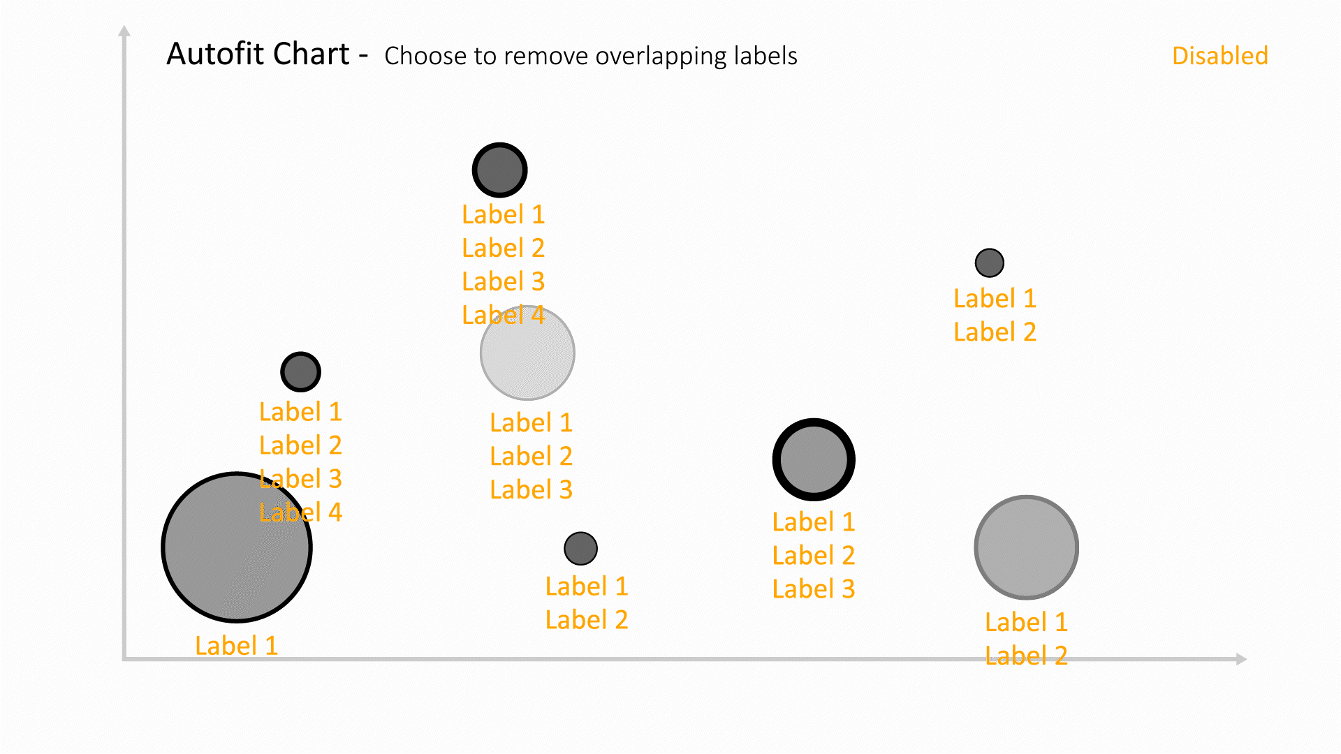
|
| labelsAroundBubbles | 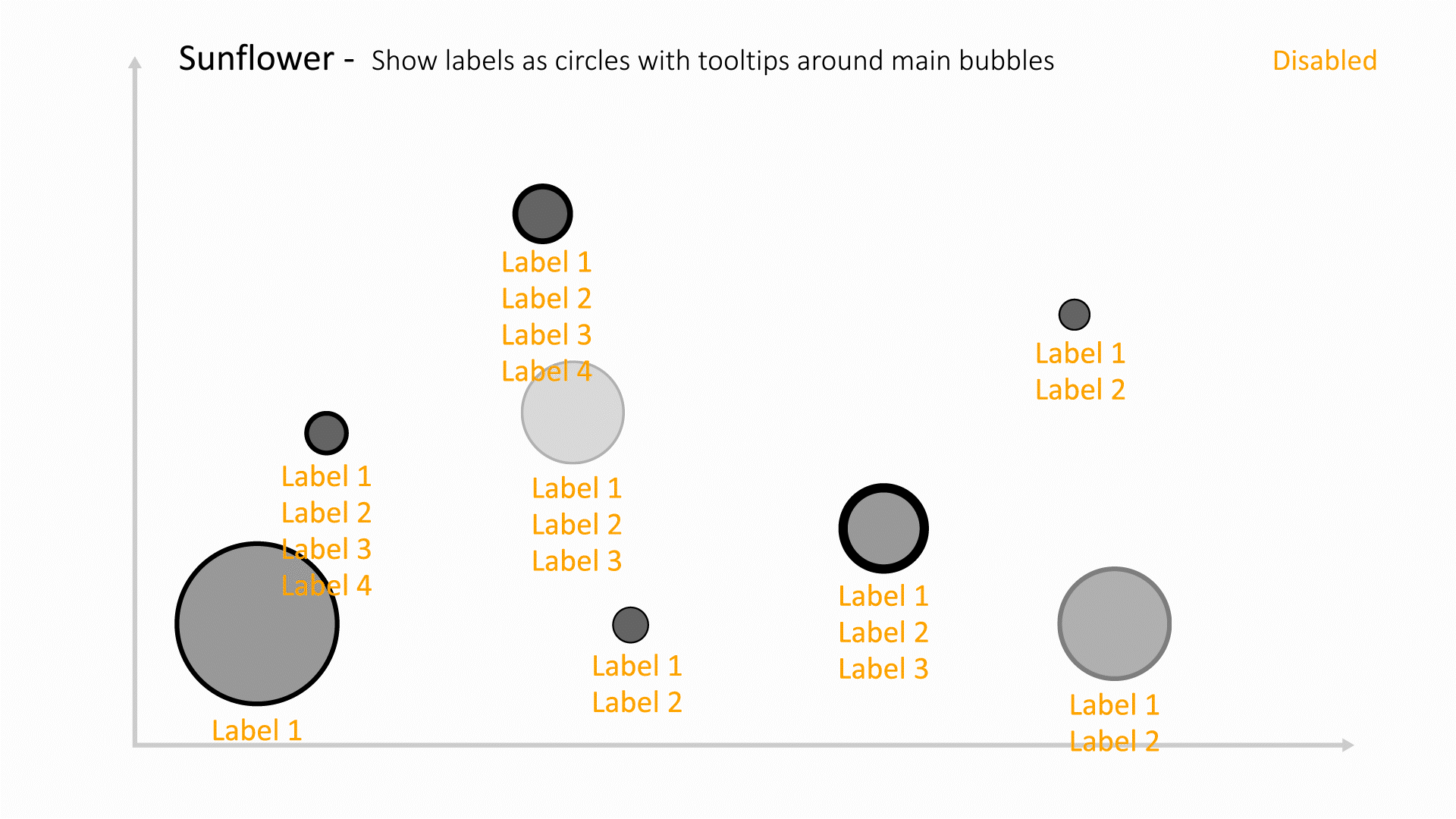
|
| labelsAsImages | 
|
| labelDateFormat | 
|
| hideCircles | 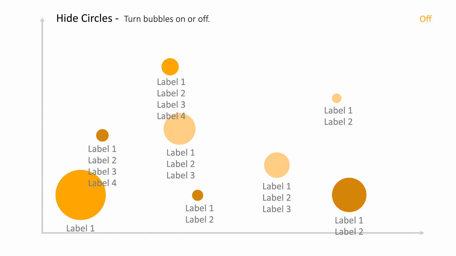
|
| boundingBoxes | 
|
| boundingBoxesColorBy | 
|
| minMaxIndicators | 
|
| xmin | 
|
| xmax | 
|
| ymin | 
|
| ymax | 
|
| xTicksCount | 
|
| yTicksCount | 
|
| showSummaryCount | 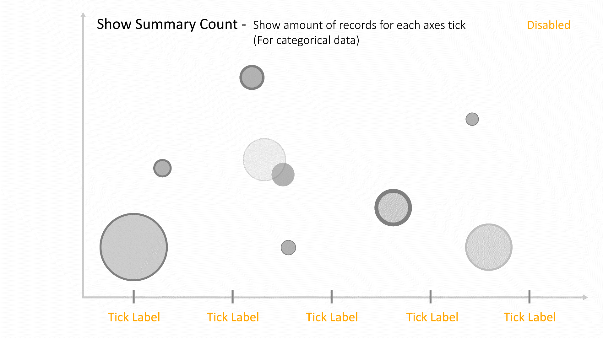
|
| autoSizeBasedOnZoom | 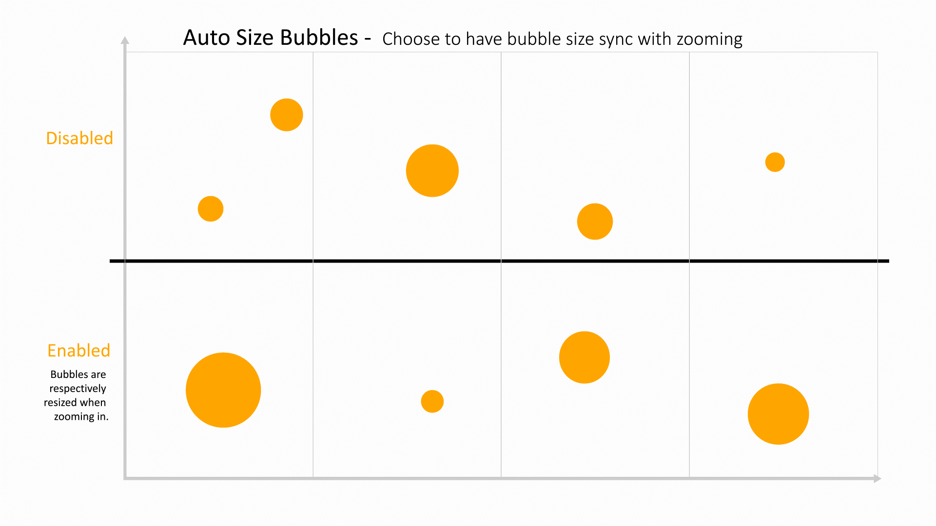
|
| collisionType | 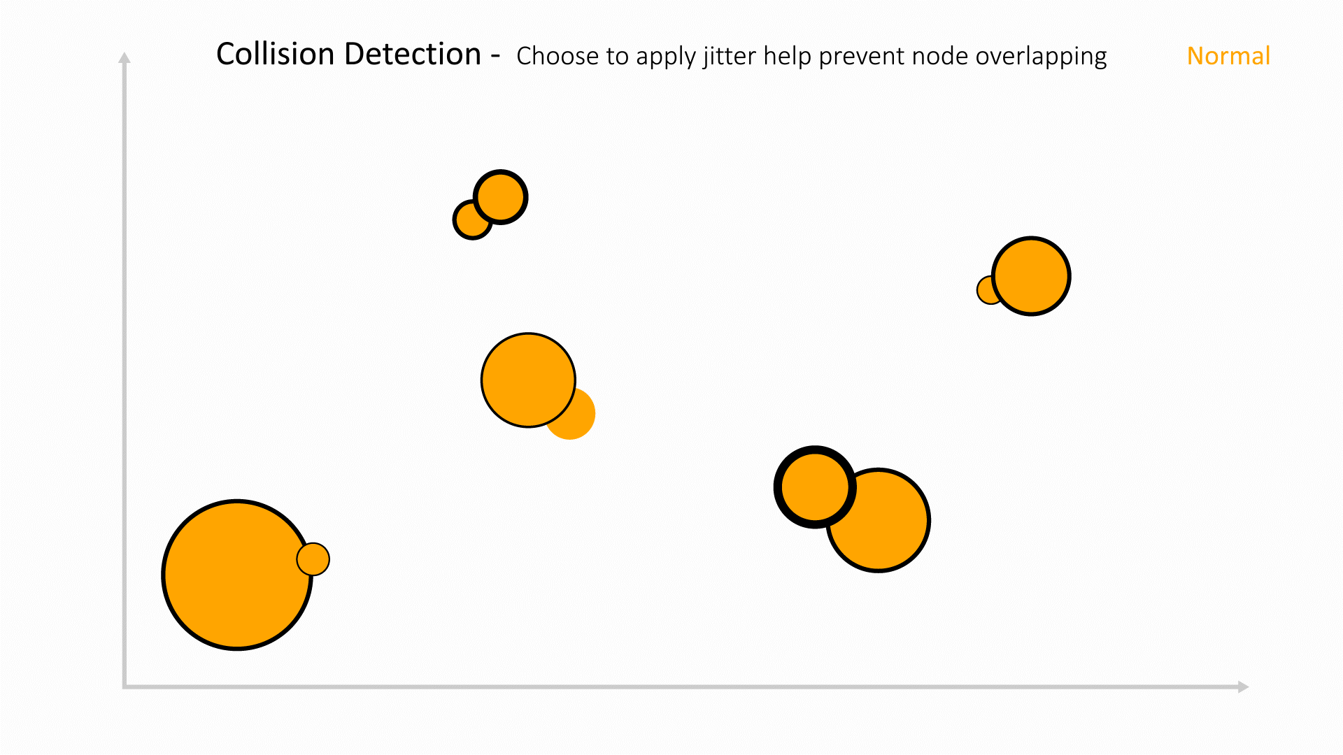
|
| sortBy | 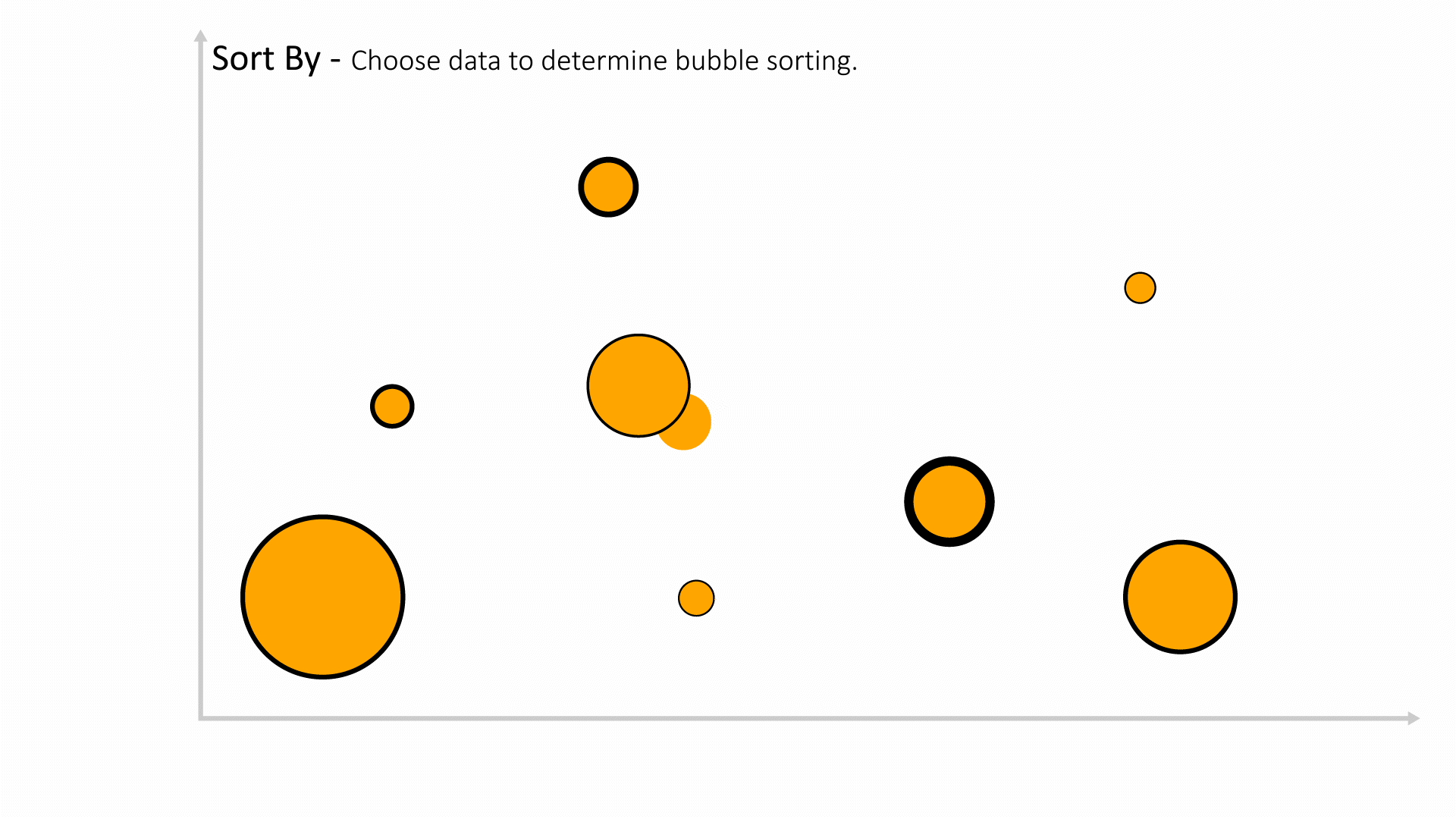
|
| sortOrder | 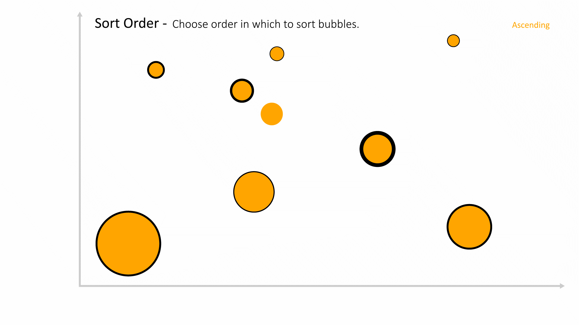
|
| groupDataBy | 
|
| groupLimit | 
|
| parent_child_relationship | 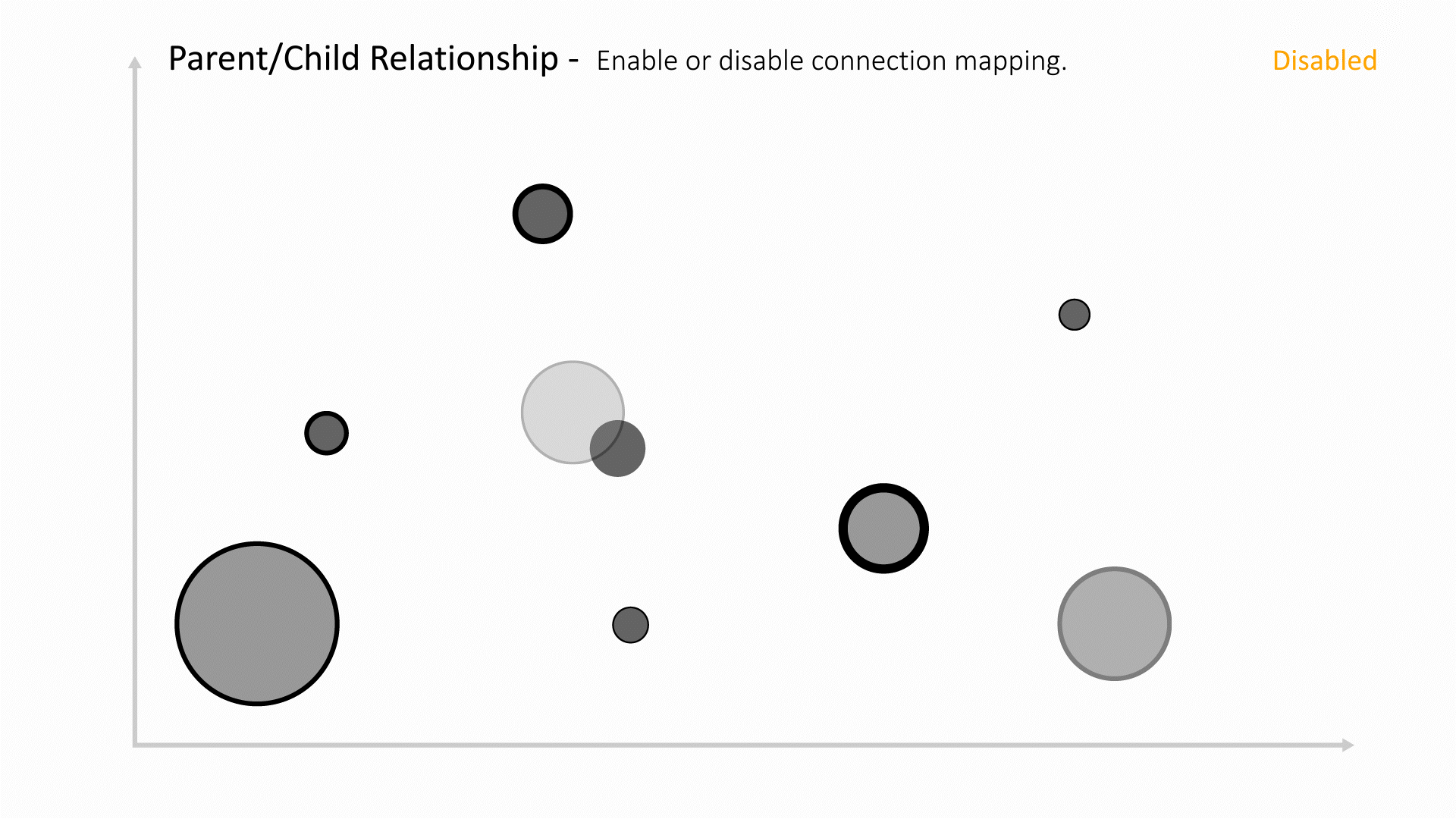
|
| groupingMiniView | 
|
| limitGroupingChar | 
|
| parentIdBy | 
|
| primaryKeyBy | 
|
| useOnlyUniqueValues | 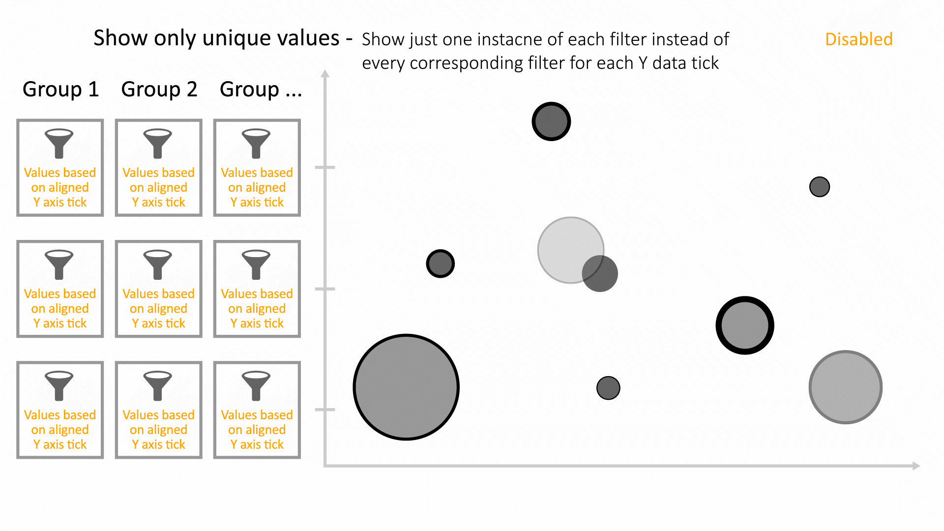
|
| grayOutFilteredData | 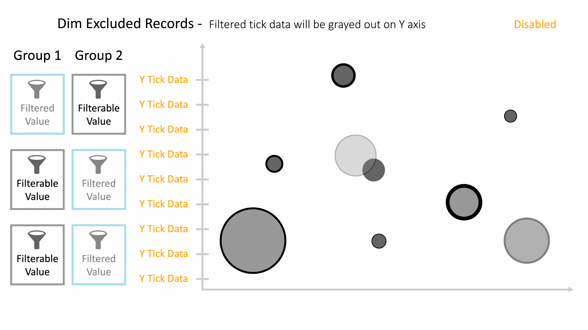
|
| updateDataOnGroupSelection | 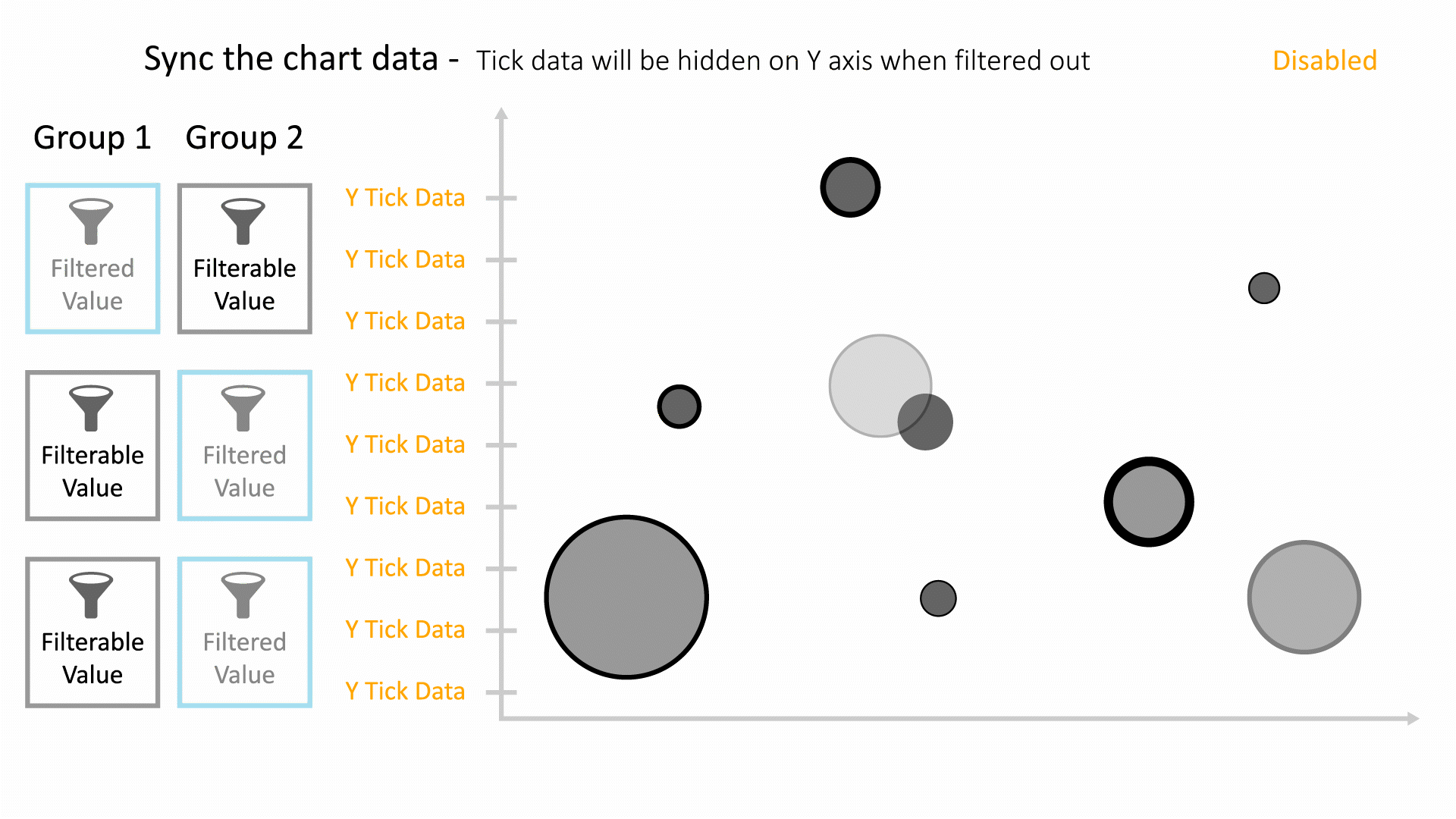
|
| dynamicGroupFiltering | 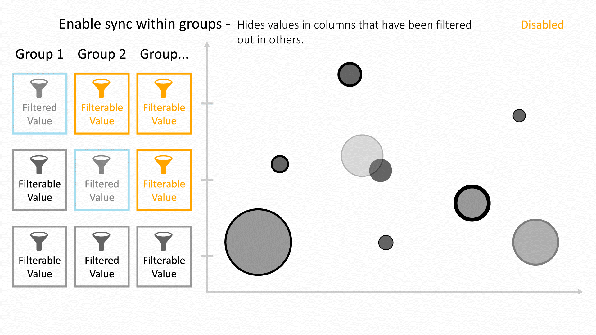
|
| showGroupingCount | 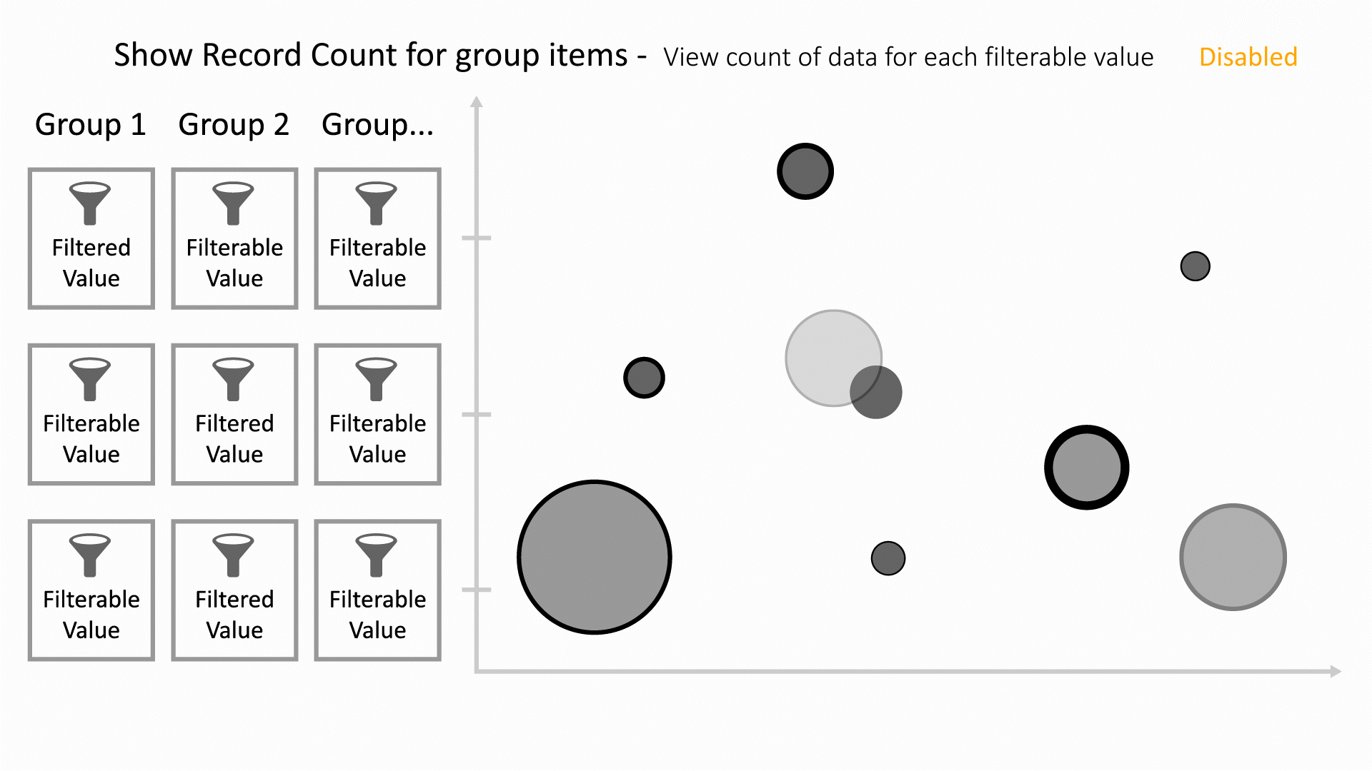
|
Parallel Coordinates
Parallel Coordinates shows how data columns and their values directly relate to one another, as each column in the chart represents a column from the dataset. Each line represents a data row which is linked between all its column values.

The following is a list of Parallel Coordinates options with their placeholder illustration:
| Option Name | Illustration |
|---|---|
| fields | 
|
| color_by | 
|
| imageBy | 
|
| line_width_by | 
|
| colorMin | 
|
| colorMax | 
|
| showTable | 
|
| set_min_to_zero | 
|
| normalize | 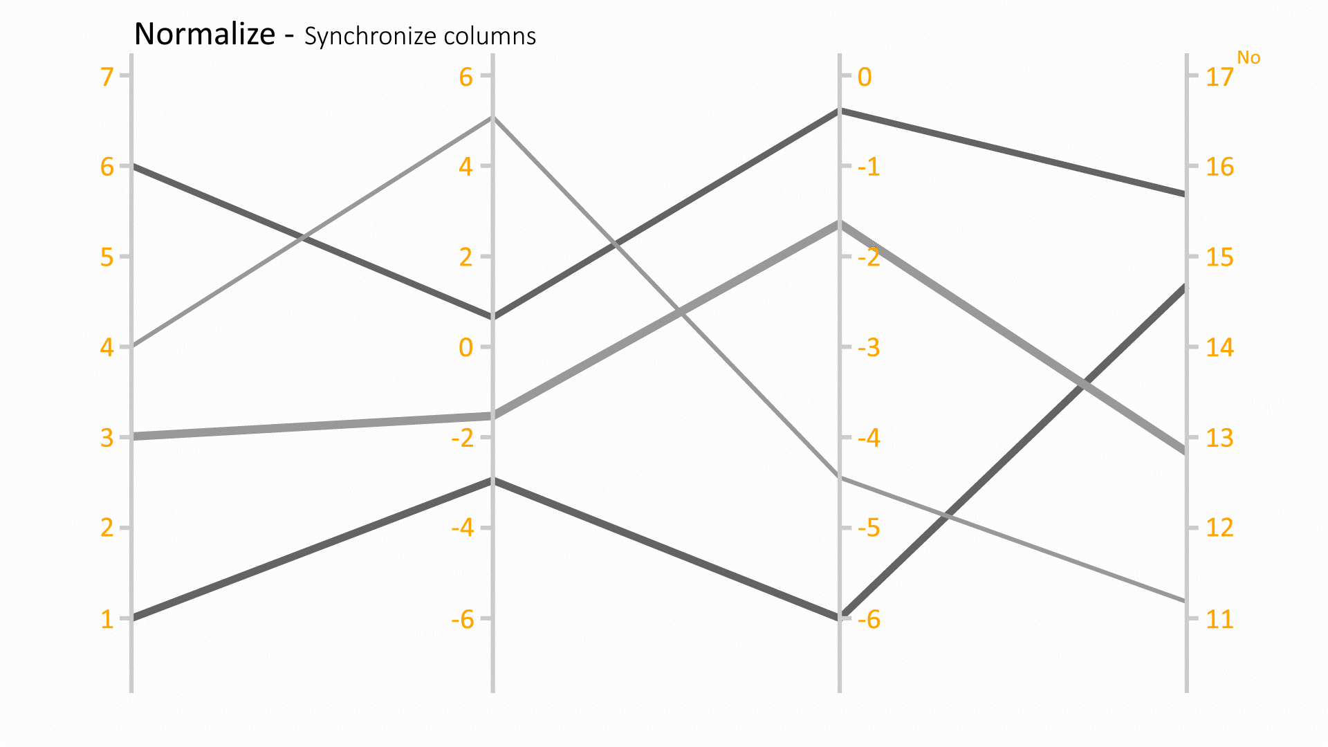
|
Line Chart
Line charts are best when you want to show how the value of something changes over time or compare how several things change over time relative to each other.

The following is a list of Line Chart options with their placeholder illustration:
| Option Name | Illustration |
|---|---|
| xBy | 
|
| yBy | 
|
| yAggregate | 
|
| groupDateBy | 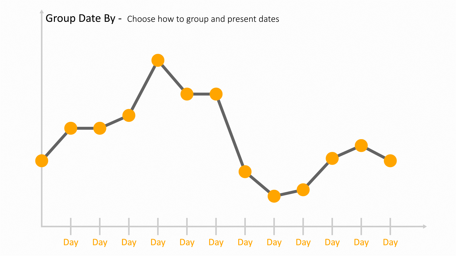
|
| ymin | 
|
| ymax | 
|
Donut Chart
Donut charts are used to show the proportions of categorical data, with the size of each piece representing the proportion of each category.

The following is a list of Donut Chart options with their placeholder illustration:
| Option Name | Illustration |
|---|---|
| groupBy | 
|
| valueBy | 
|
| groupType | 
|
| groupLimit | 
|
| nestedGroupBy | 
|
| sortBy | 
|
| sortOrder | 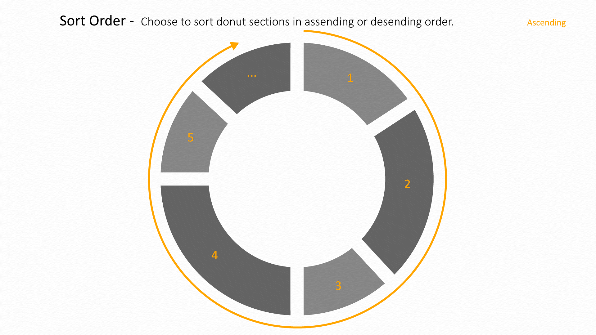
|
| polyLines | 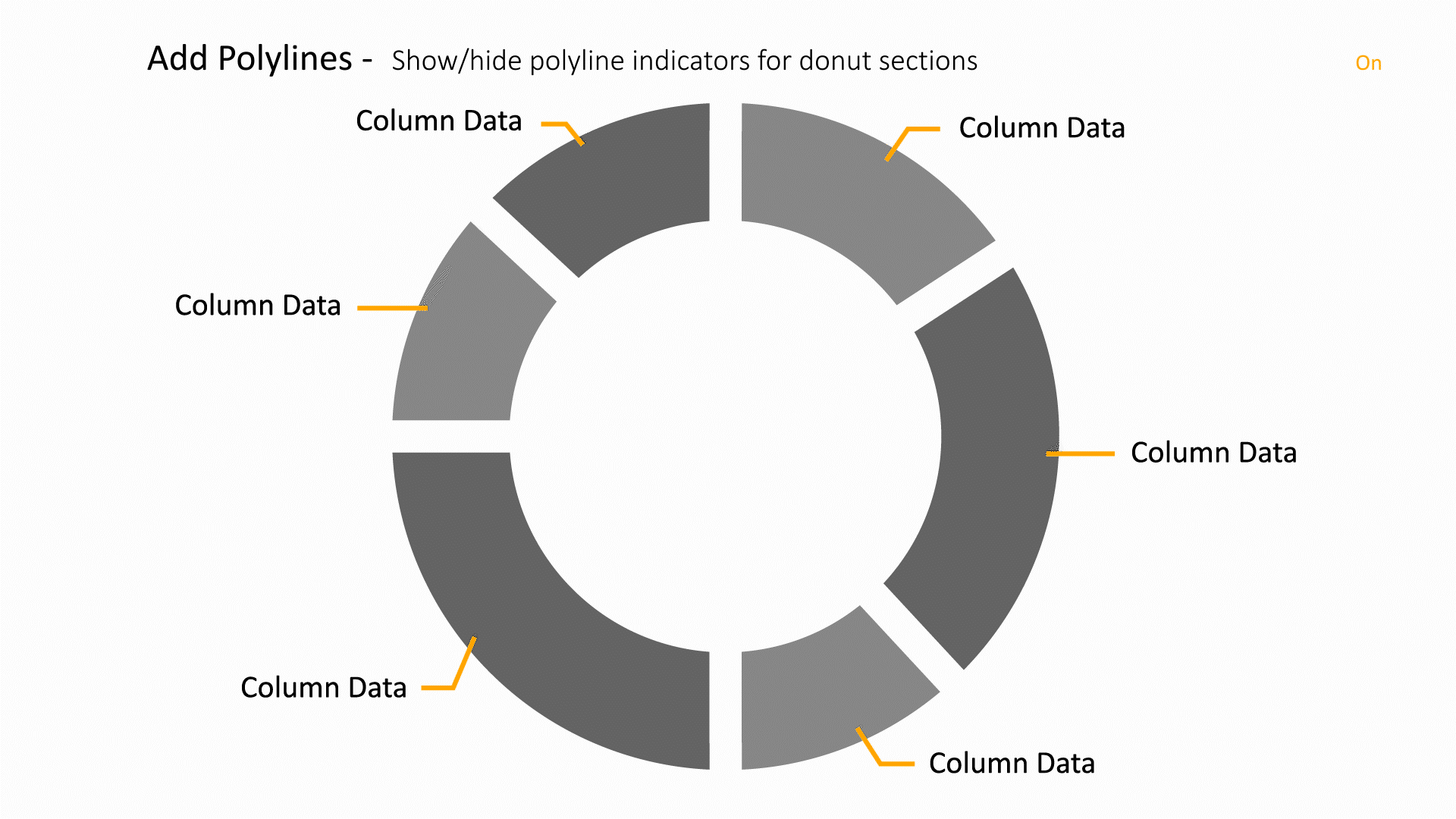
|
Curve Plot
The Curve plot displays a simple group of X-Y pair data such as that output by 1D simulations or data produced by Lineouts of 2D or 3D datasets. Curve plots are useful for visualizations where it is useful to plot 1D quantities that evolve over time.

The following is a list of Curve Plot options with their placeholder illustration:
| Option Name | Illustration |
|---|---|
| curve_by | 
|
| colorByCriteria | 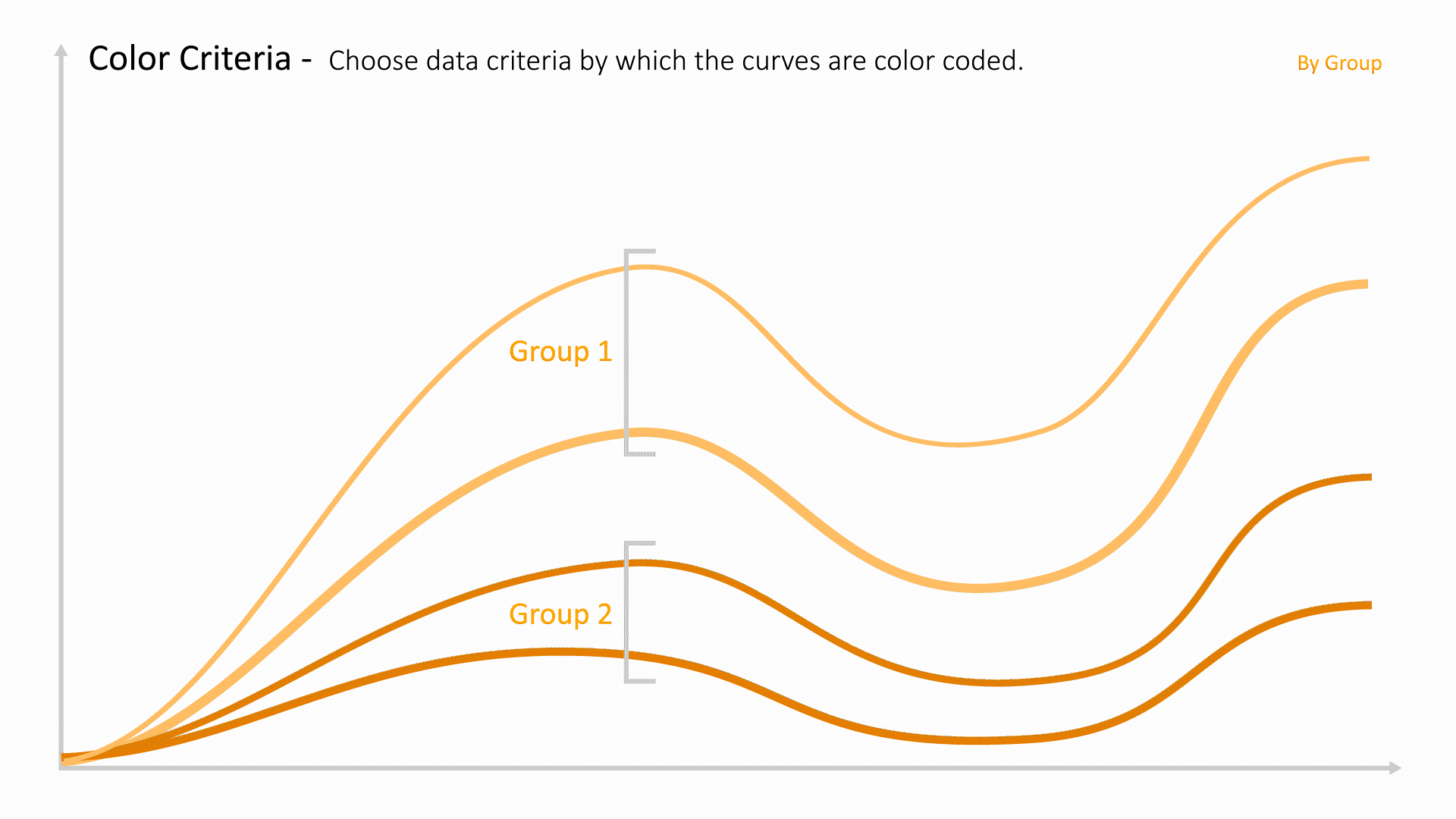
|
| colorBy | 
|
| datasetColumn | 
|
| showDatasetColAsSeparateLegends | 
|
| chartType | 
|
| opacityBy | 
|
| imageBy | 
|
| lineWidthBy | 
|
| datumLineBy | 
|
| curveBy2 | 
|
| curveBy3 | 
|
| differentiateMultiCurvesBy | 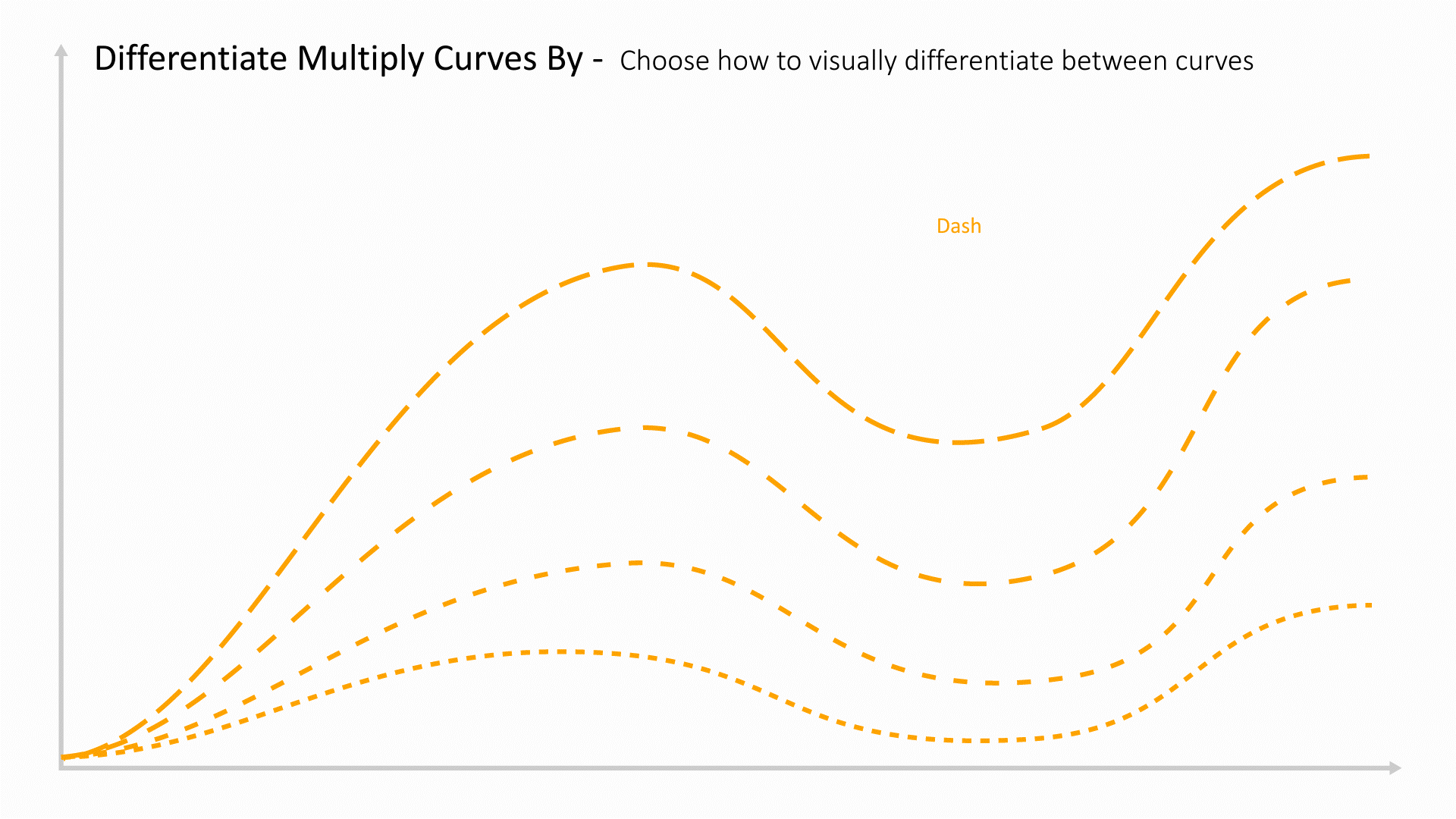
|
| forceIndividualColors | 
|
| forceSolidLines | 
|
| xLabel | 
|
| yLabel | 
|
| xSubLabel | 
|
| ySubLabel | 
|
| xmin | 
|
| xmax | 
|
| ymin | 
|
| ymax | 
|
| showLegends | 
|
| showDatumLines | 
|
| showAverageCircles | 
|
| legendsFontSize | 
|
| tooltip | 
|
| tooltipBy | 
|
| xType | 
|
| x_unit_type | 
|
| upperYType | 
|
| colorMin | 
|
| colorMax | 
|
| computeDifference | 
|
| baseline | 
|
| curveDifferenceType | 
|
| groupingFactors | 
|
| aggregation_mode | 
|
| datum_area | 
|
| average_lines | 
|
Box Plot
This visualizer helps to show the distribution of the data with quartiles and to aid in identifying the outliers

The following is a list of Box Plot options with their placeholder illustration:
| Option Name | Illustration |
|---|---|
| column | 
|
Multi Box Plot
This visualizer helps to show the distribution of the data with quartiles and to aid in identifying the outliers

The following is a list of Multi Box Plot options with their placeholder illustration:
| Option Name | Illustration |
|---|---|
| x | 
|
| y | 
|
Frequency Plot
This visualizer helps to show the distribution of the data with quartiles and to aid in identifying the outliers

The following is a list of Frequency Plot options with their placeholder illustration:
| Option Name | Illustration |
|---|---|
| column | 
|
| groupLimit | 
|
Summary Table
Customize the number of rows and columns for a table with customizable cells that support all forms of data

The following is a list of Summary Table options with their placeholder illustration:
| Option Name | Illustration |
|---|---|
| rows | 
|
| cols | 
|
| fixedRowsTop | 
|
| fixedColumnsLeft | 
|
| headerValue | 
|
| headerTitle | 
|
| itemView | 
|
| fontSize | 
|
| fontWeight | 
|
Decision Table
This is the table view that helps to get a 2D view of the data. You can choose columns that are text or number

The following is a list of Decision Table options with their placeholder illustration:
| Option Name | Illustration |
|---|---|
| columns | 
|
| primaryKeys | 
|
| baseline | 
|
| fontSize | 
|
| fontSize | 
|
| reverse_column_colors | 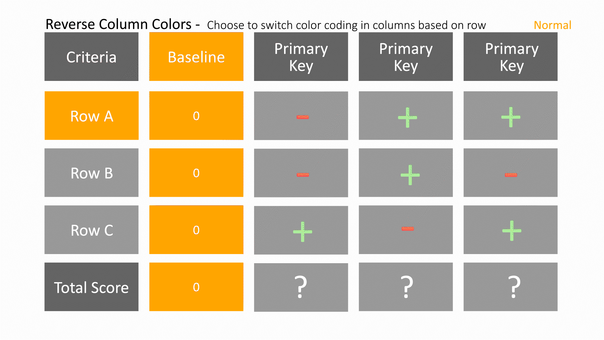
|
Filterable Table
This table view allows for creating custom filters based on data columns.

The following is a list of Filterable Table options with their placeholder illustration:
| Option Name | Illustration |
|---|---|
| columns | 
|
| filterableColumns | 
|
| primaryKeys | 
|
| fontSize | 
|
| fontWeight | 
|
Ranking Table
This is the table view that helps to rank a dataset based on weights assigned to numerical columns.

The following is a list of Ranking Table options with their placeholder illustration:
| Option Name | Illustration |
|---|---|
| columns | 
|
| primaryKeys | 
|
| weights | 
|
Difference Table
This visualizer helps to show the distribution of the data with quartiles and to aid in identifying the outliers

The following is a list of Difference Table options with their placeholder illustration:
| Option Name | Illustration |
|---|---|
| row | 
|
| col | 
|
| fontSize | 
|
| fontWeight | 
|
Distribution Plot
This visualizer helps to show the distribution of the data with quartiles and to aid in identifying the outliers

The following is a list of Distribution Plot options with their placeholder illustration:
| Option Name | Illustration |
|---|---|
| columns | 
|
| showMaturityTable | 
|
| showSimpleTexts | 
|
| useVerticalBarCharts | 
|
| limit | 
|
| sortBy | 
|
| sortOrder | 
|
Gallery
This visualizer helps to view images and movies (GIF, MOV, MP4) with ability to play, pause and overlay them at different states. Sorting, opacity and size can be controlled by other columns.

The following is a list of Gallery options with their placeholder illustration:
| Option Name | Illustration |
|---|---|
| path_by | 
|
| label_by | 
|
| color_by | 
|
| view | 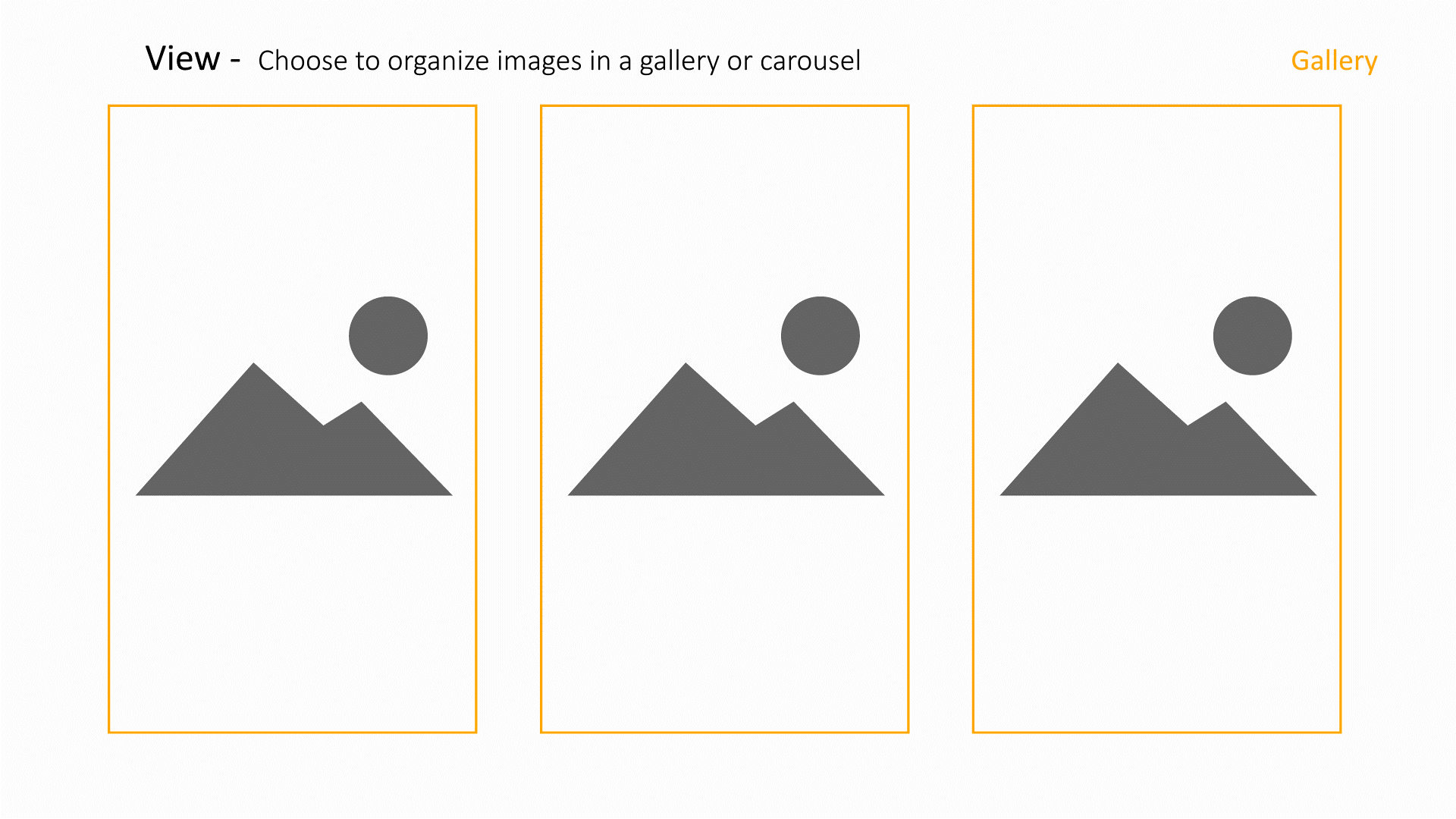
|
| sort_by | 
|
| opacity_by | 
|
IIHS Intrusions
This visualizer helps to visualize numbers based on certain criteria for each of the columns. The criteria can be a one or more.

The following is a list of IIHS Intrusions options with their placeholder illustration:
| Option Name | Illustration |
|---|---|
| columns | 
|
| color_by | 
|
| thresholds | 
|
| line_width_by | 
|
| lineWidth | 
|
| baselineRow | 
|
| baselineWidth | 
|
| baselineColor | 
|
| baselinePinned | 
|
| showDefaultImage | 
|
| normalize | 
|
| showLegends | 
|
| yLabel | 
|
| showGridLines | 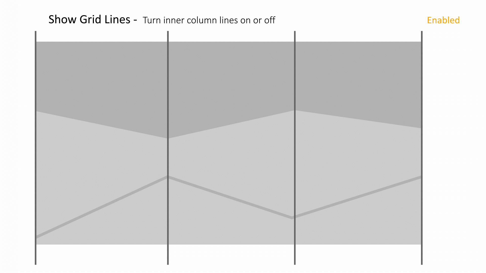
|
| ticksFontSize | 
|
| numTicks | 
|
| rotatedLabels | 
|
| lowerOcc | 
|
| upperOcc | 
|
Hexagonal Chart
This visualizer helps to visualize binned data. This is useful to visualize pattens in large datasets.

The following is a list of Hexagonal Chart options with their placeholder illustration:
| Option Name | Illustration |
|---|---|
| x_by | 
|
| y_by | 
|
| color_by | 
|
Gantt Plot
This visualizer helps to visualize binned data. This is useful to visualize pattens in large datasets.

The following is a list of Gantt Plot options with their placeholder illustration:
| Option Name | Illustration |
|---|---|
| key | 
|
| startDate | 
|
| endDate | 
|
| colorBy | 
|
Gantt Chart Guide
This user guide provides introduction to create and modify a Gantt Chart on d3VIEW.
Dataset for creating gantt chart with default rules
Here is an example of a dataset that we can use for creating a Gantt Chart. Among these columns, the columns “Default Duration”, “Parent”, “Delay”, “Delay From” and “ID” are used for generating the rules. An example of a “rule” : Task Y starts two months after task X ends. Here we know task Y(ID) depends on task X (Parent). Task Y only starts after task X ends (Delay From). And there are two months “waiting period” before task Y starts after task X is complete (Delay).After we have the dataset ready, we can start creating the chart on d3VIEW.
- Task
- Unique names for each task
- Start Date
- Start date of the task
- End Date
- End date of the task
- Default Duration
- Default task duration
- Parent
- ID of the parent task from which the current task depends on
- Delay
- Number of months to postpone the current task from parent task
- Delay From
- where we start to count the delay, either “start” or “end” (of the parent task)
- ID
- Unique ID for each task. ID will be used to refer to each task in Gantt Chart
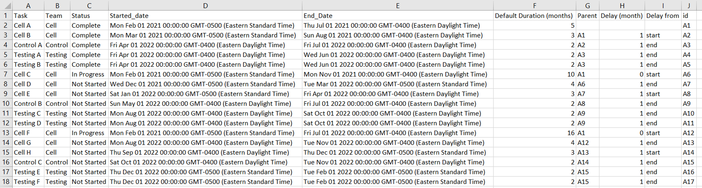
A sample dataset to be used for creating a Gantt Chart.
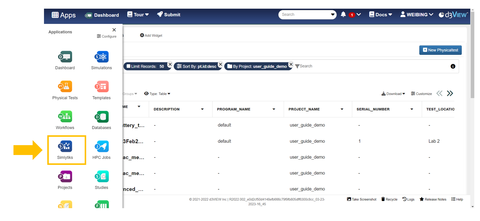
Login to d3VIEW and Open Simlytiks
Click on the link https://d3view-web.intra.chrysler.com/. Login with username and password.

After login, we are at the “Dashboard” application by default. The Dashboard shows the physical tests application, from where we see the tests published/uploaded under the current account. New users usually don’t have anything published at their account. There would no record to show.

Click on the Apps icon on the left corner and click on the Simlytiks app.
Upload the dataset
Create a new Simlytiks dataset with a csv file on our computer with either one of the approaches. After uploading the dataset, we have a new Simlytiks dataset to work with.
- Click on the designated area to choose the file to upload or directly drag the file and drop it at the same area.
- Click “New Dataset” on the top left corner and drop or click file.
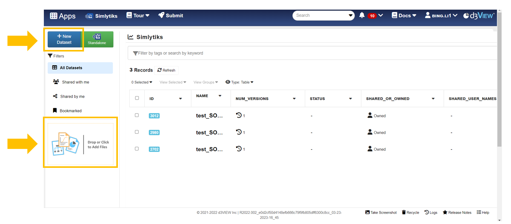
Two methods we can upload and create a dataset record on Simlytiks.
Create a Gantt Chart
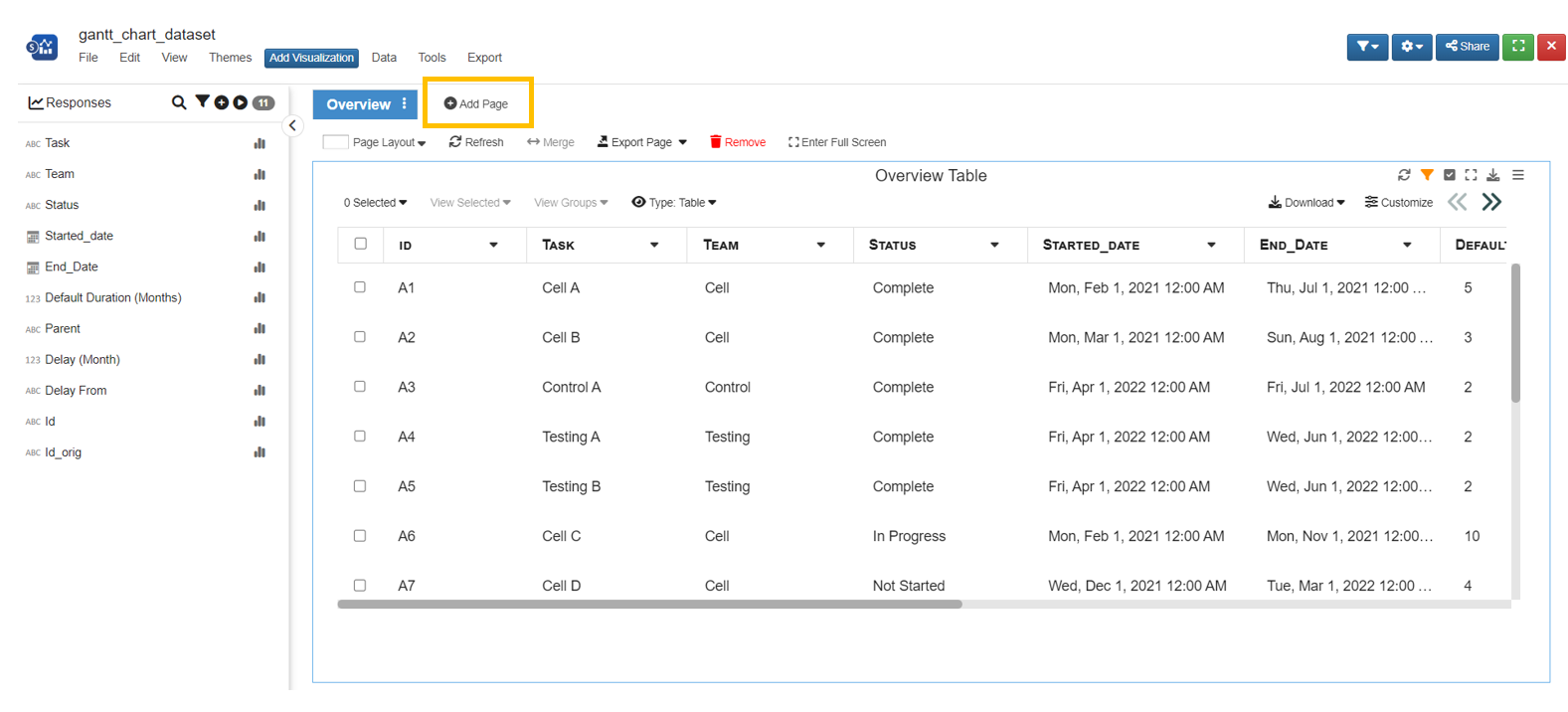
In the “Overview” page, we can see the dataset we are working with. Right next to it, we can click on “New Page” to place our Gantt Chart.
Click on “New Page” to create a new page
Click “Add Chart” and search for “Timeline Chart”
- Configurate required items for creating a Gantt Chart
- Build Data Using Different Columns
- By default, the timeline chart uses “start date” and “end date” to build the chart. Choose “yes” to configurate the rules.
- Inter dependency between parent and child
- By default, when we modify any task, the other tasks will NOT update. Choosing “unlocked” allows the rules to be applied to the current task we are editing and all its child tasks. The chart will automatically update.
- Click on “color” tab and congifure rate the color for task bars and the y axis labels
- In order to fill the block with color, click on the “appearance” tab and choose “yes” for “Fill Blocks with color”
Click the green “Accept” icon to complete setting
A new Simlytiks dataset with the dataset we uploaded. Click on “New Page” to create a new page for our Gantt Chart.
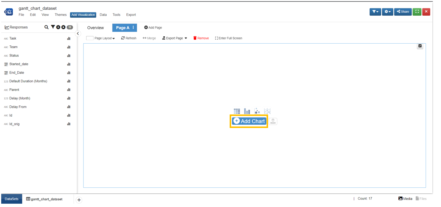
Click “Add Chart”.
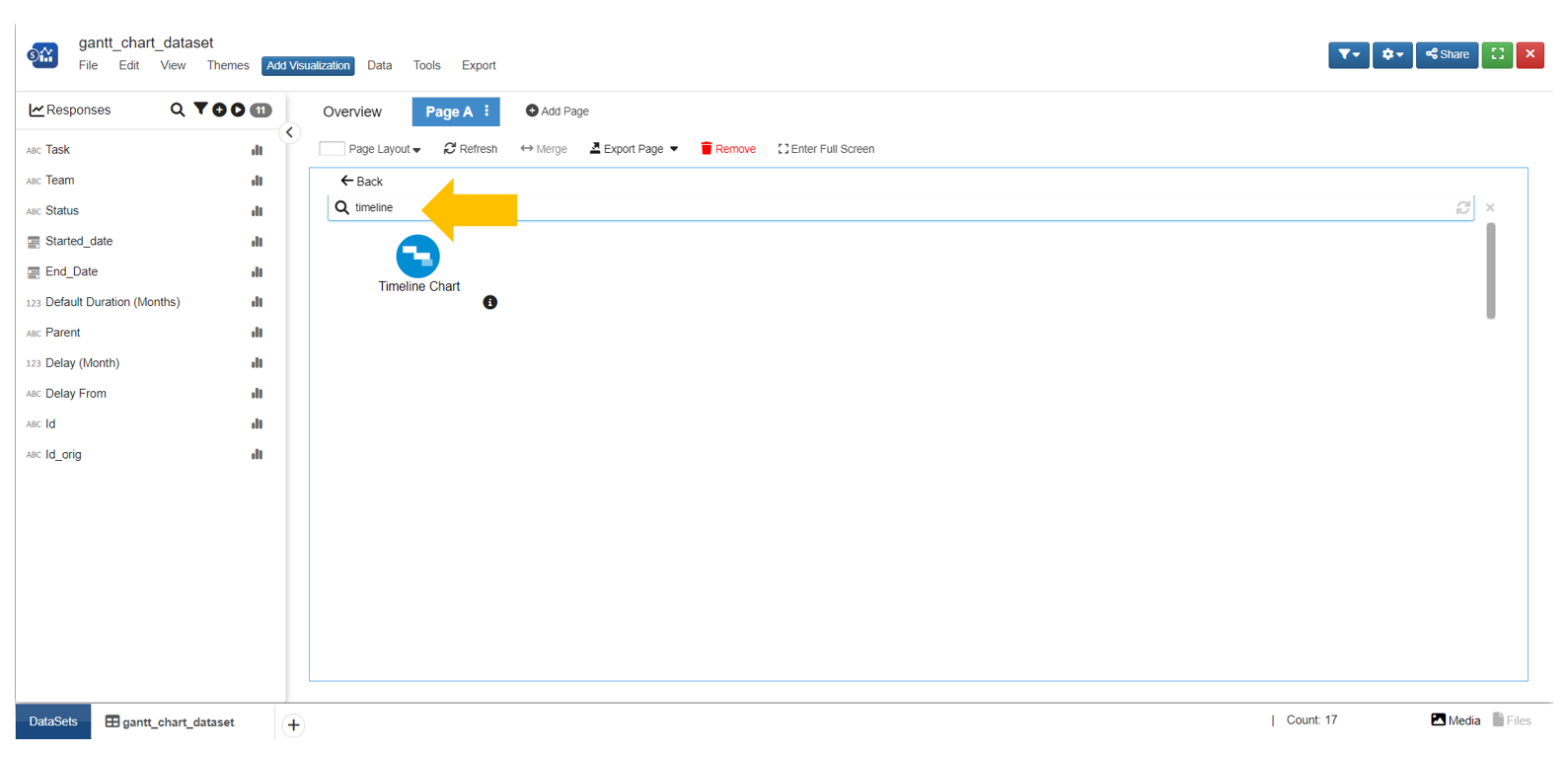
Search “Timeline Chart” and Click on the “Timeline Chart” icon.
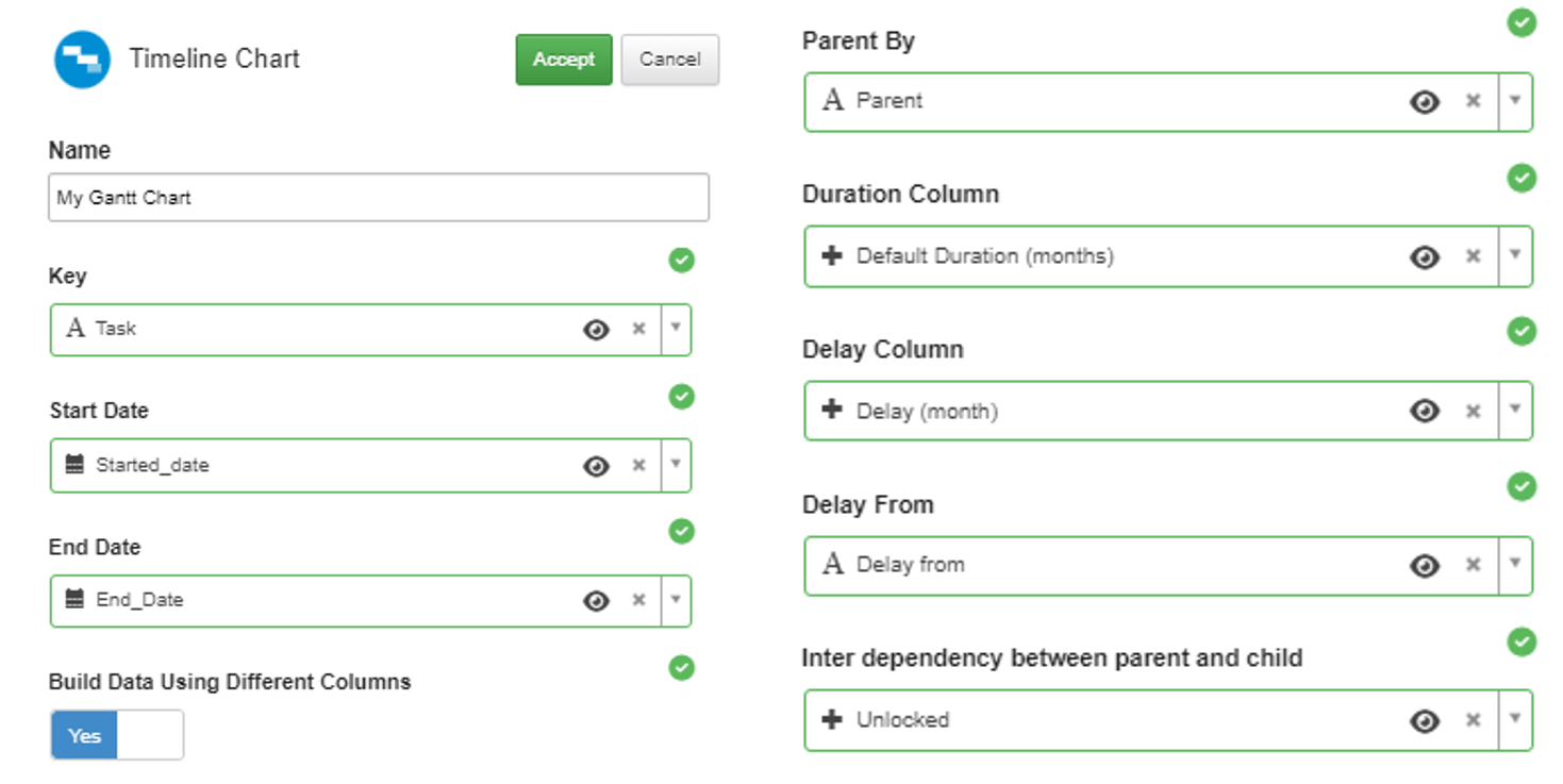
Settings required for creating a Gantt Chart with rules.
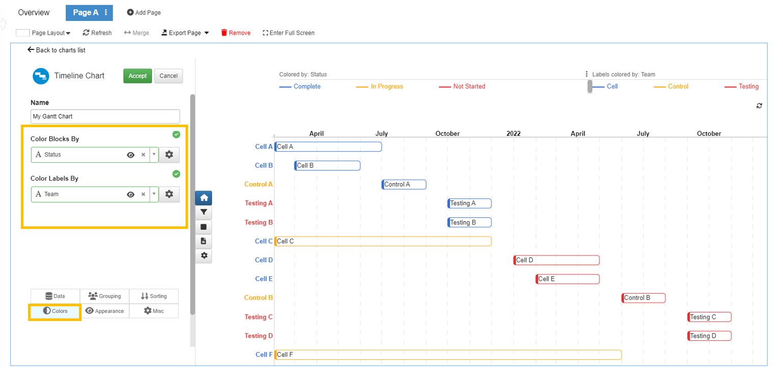
Choose the columns to color the task bars and the y-axis labels.
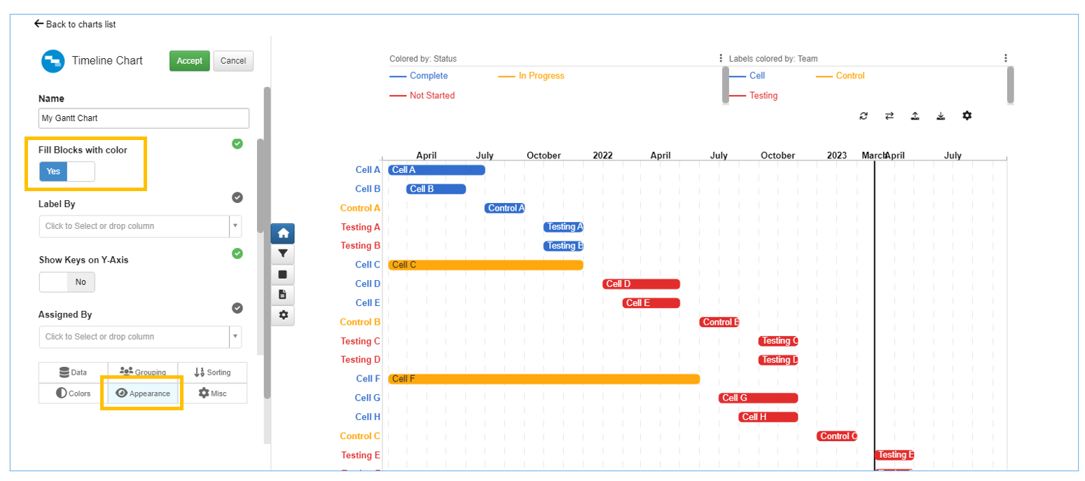
Click on the “appearance” tab and choose “yes” for “Fill Blocks with color”.
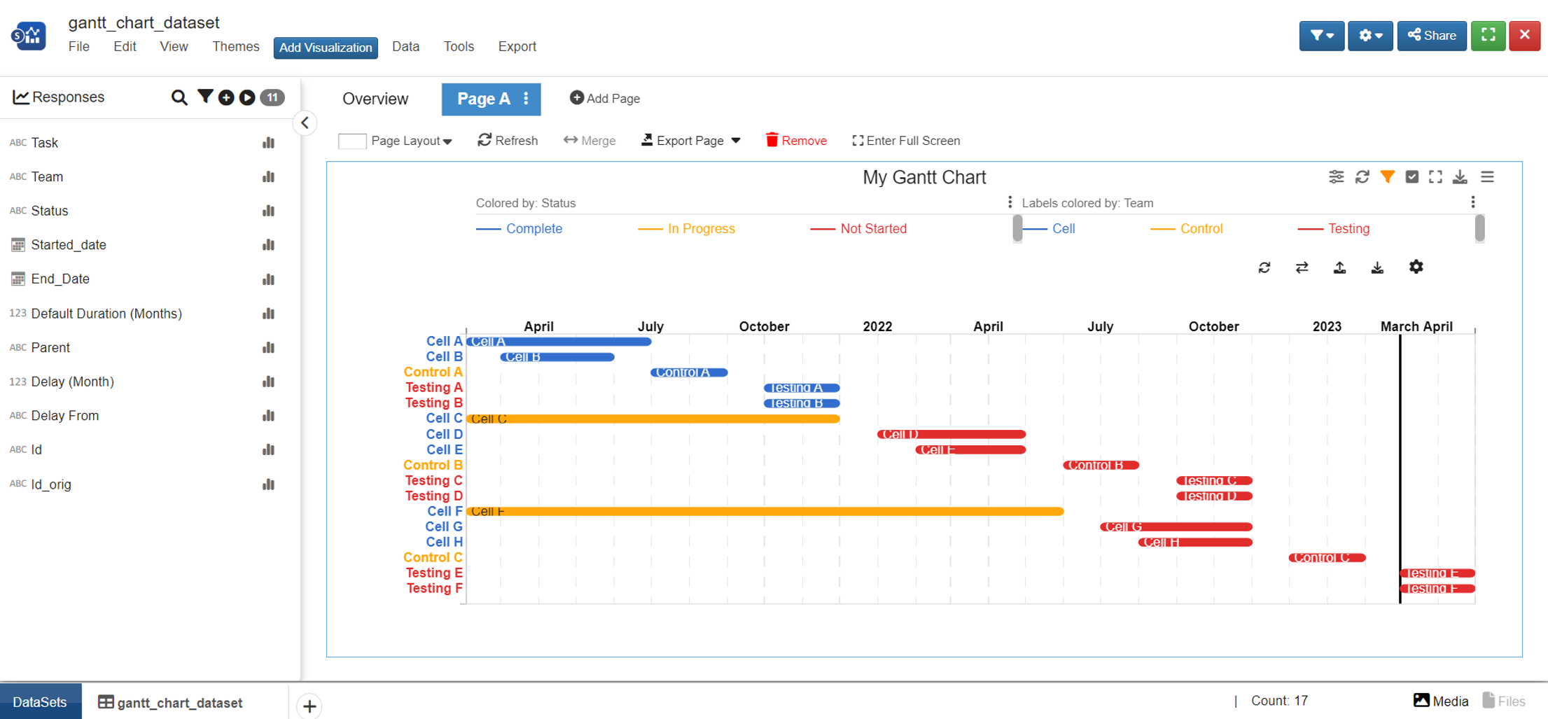
After “Accept” the settings, the Gantt Chart is complete.
Make Modifications
When we want to make additional changes, we can move our mouse to the chart. Then, we can see a pencil icon on the left corner of the chart area. Click on the icon to make changes on the settings and click “Accept” or “Cancel” after we are done.
Click on the pencil icon to make changes on settings.
Drag the tasks to move it and drag the start or end of the task bar to edit the start and end dates. NOTE: if “unlocked” is chosen, any child tasks will reset based on the rules set up by the dataset.
Add Comments
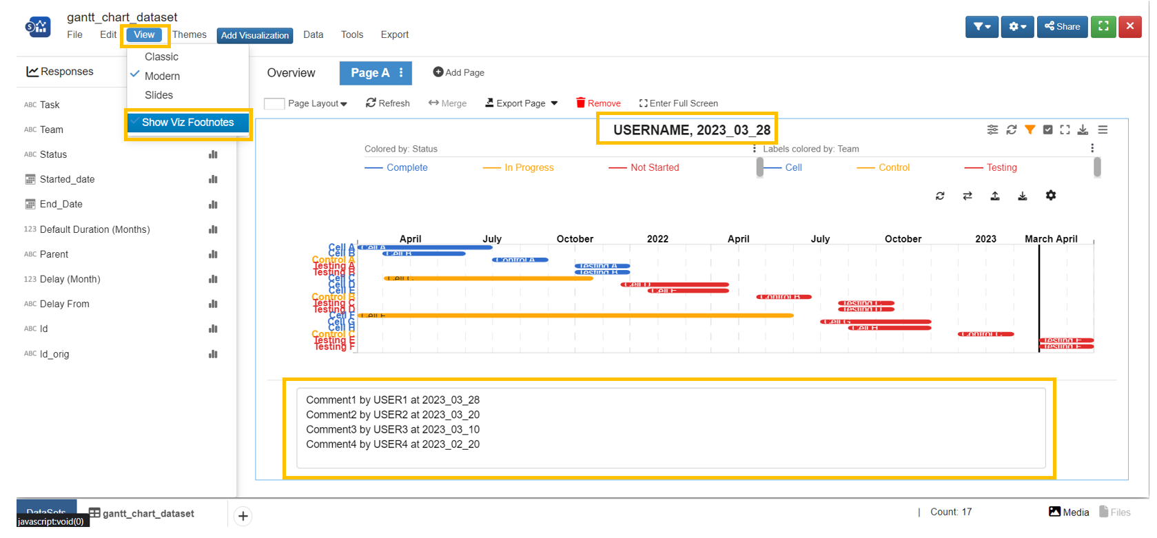
- Click on “view” and choose “Show Viz Footnotes”
- Resize the text area at the bottom of the chart and enter any comments
- Click on chart title to edit
Modify Dataset
If we want to make changes in the dataset, go back to the “Overview” page.
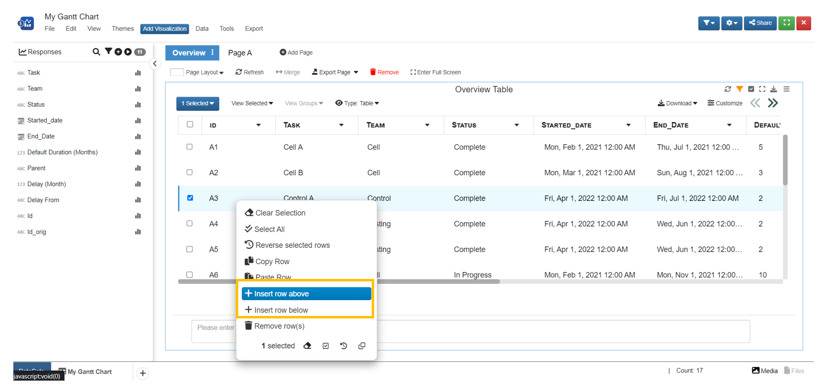
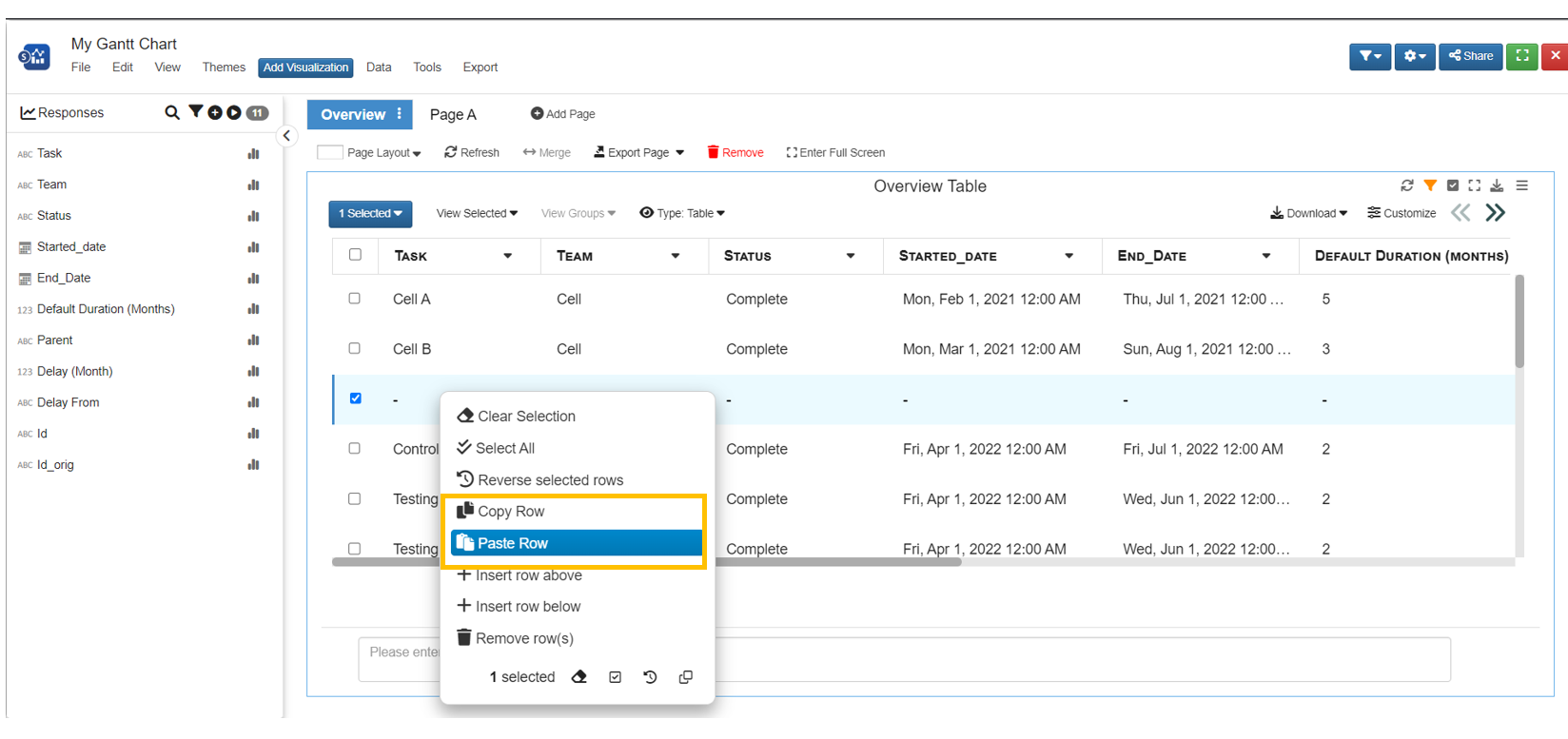
Click on any cell to make changes on the cell values
Right click and choose “Insert row above/below” to add a blank new record
Right click on a record to copy its information
- Right click on a record to paste copied information
- NOTE: “Paste row” will overwrite cell values from current row. It does NOT automatically create a new row
Right click on a record and choose “remove row” to remove the record from the dataset
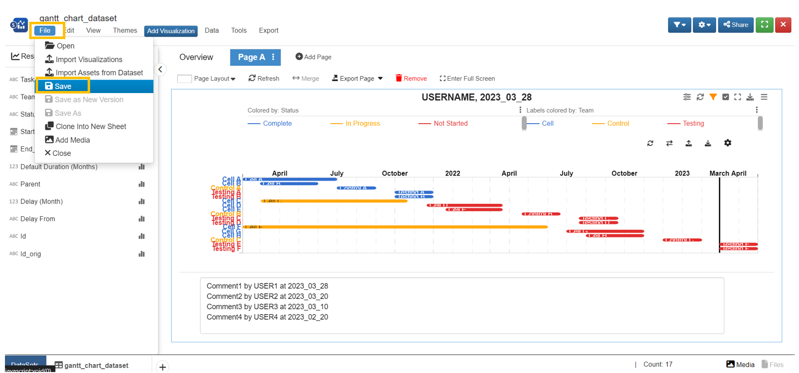
Save
Click on “File” and choose “Save” to save the work on Simlytiks.
Saved Simlytiks dataset will show up as a record in the Simlytiks app.
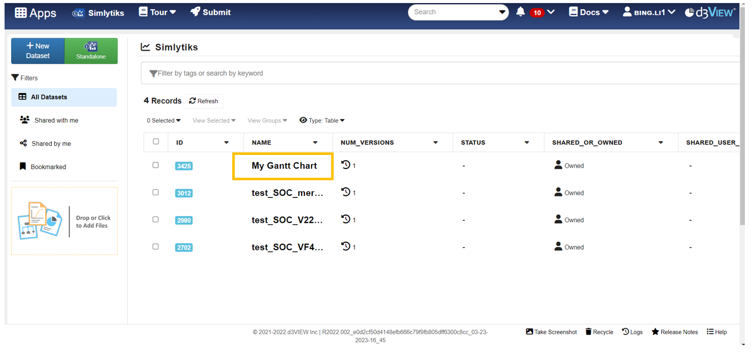
Saved Simlytiks record. In case the record saved is not showing up, try 1) Click “All Datasets” on the left panel; 2) Remove any filters in the search bar; 3) Refresh the page.
Radar Chart
This multi dimensional plot explores layers of data based on the area between data columns.

The following is a list of Radar Chart options with their placeholder illustration:
| Option Name | Illustration |
|---|---|
| fields | 
|
| colorBy | 
|
| fillArea | 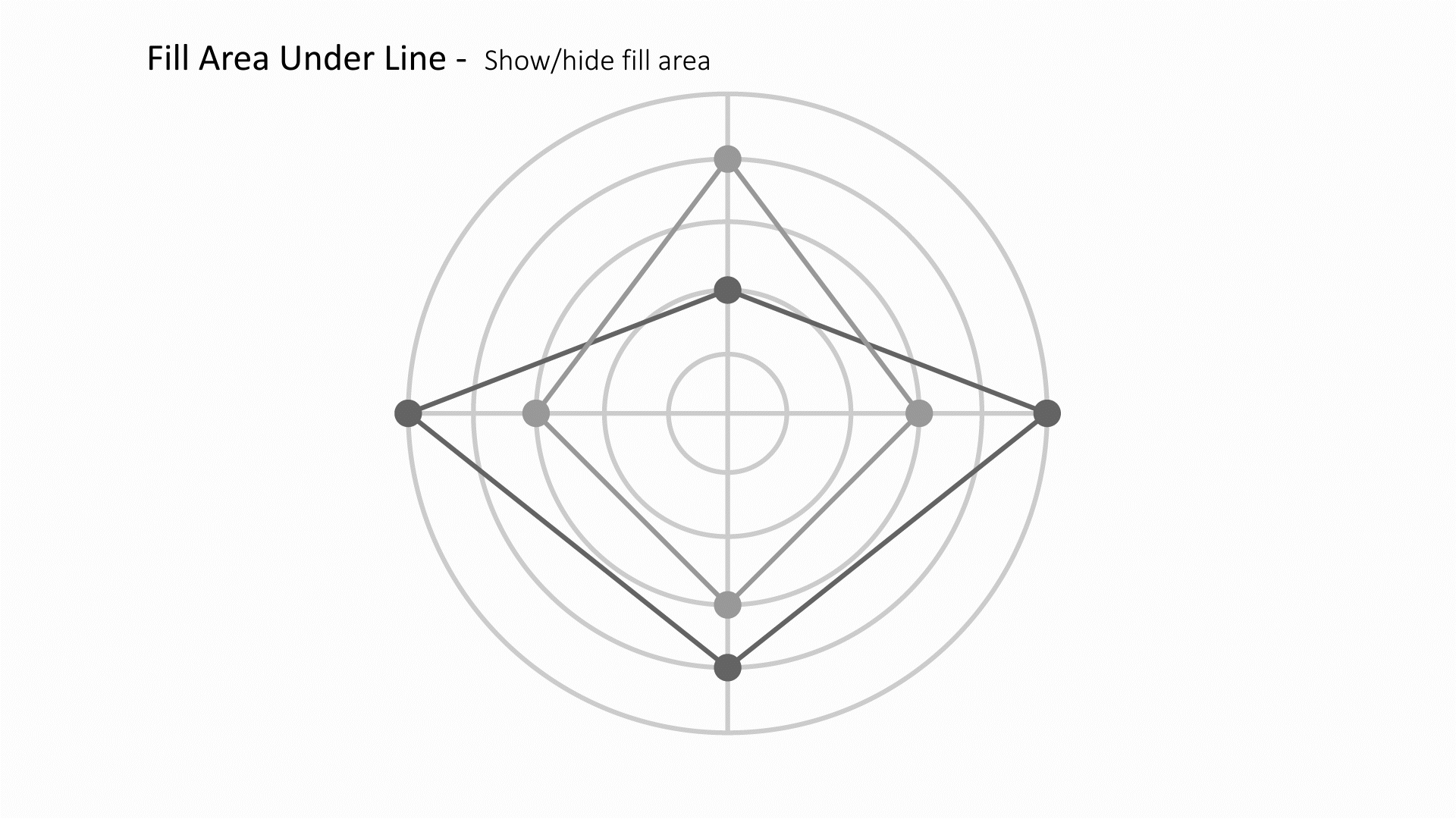
|
Calendar
This visualizer plots the calendar within a range and the color of the days are by another column

The following is a list of Calendar options with their placeholder illustration:
| Option Name | Illustration |
|---|---|
| date_by | 
|
| color_by | 
|
| color_mode | 
|
3D Model
View and explore a model file in 3D via the Peacock application.

The following is a list of Peacock options with their placeholder illustration:
| Option Name | Illustration |
|---|---|
| nameBy | 
|
| modelBy | 
|
Geo Map
Geo-mapping is the process of taking location-based data and using it to create a map.

The following is a list of Geo Map options with their placeholder illustration:
| Option Name | Illustration |
|---|---|
| mapType | 
|
| countryBy | 
|
| colorBy | 
|
| groupType | 
|
Key Value
This visualizer helps to visualize binned data. This is useful to visualize pattens in large datasets.

The following is a list of Key Value options with their placeholder illustration:
| Option Name | Illustration |
|---|---|
| field | 
|
| fieldtype | 
|
| ignoreColsWithSameValue | 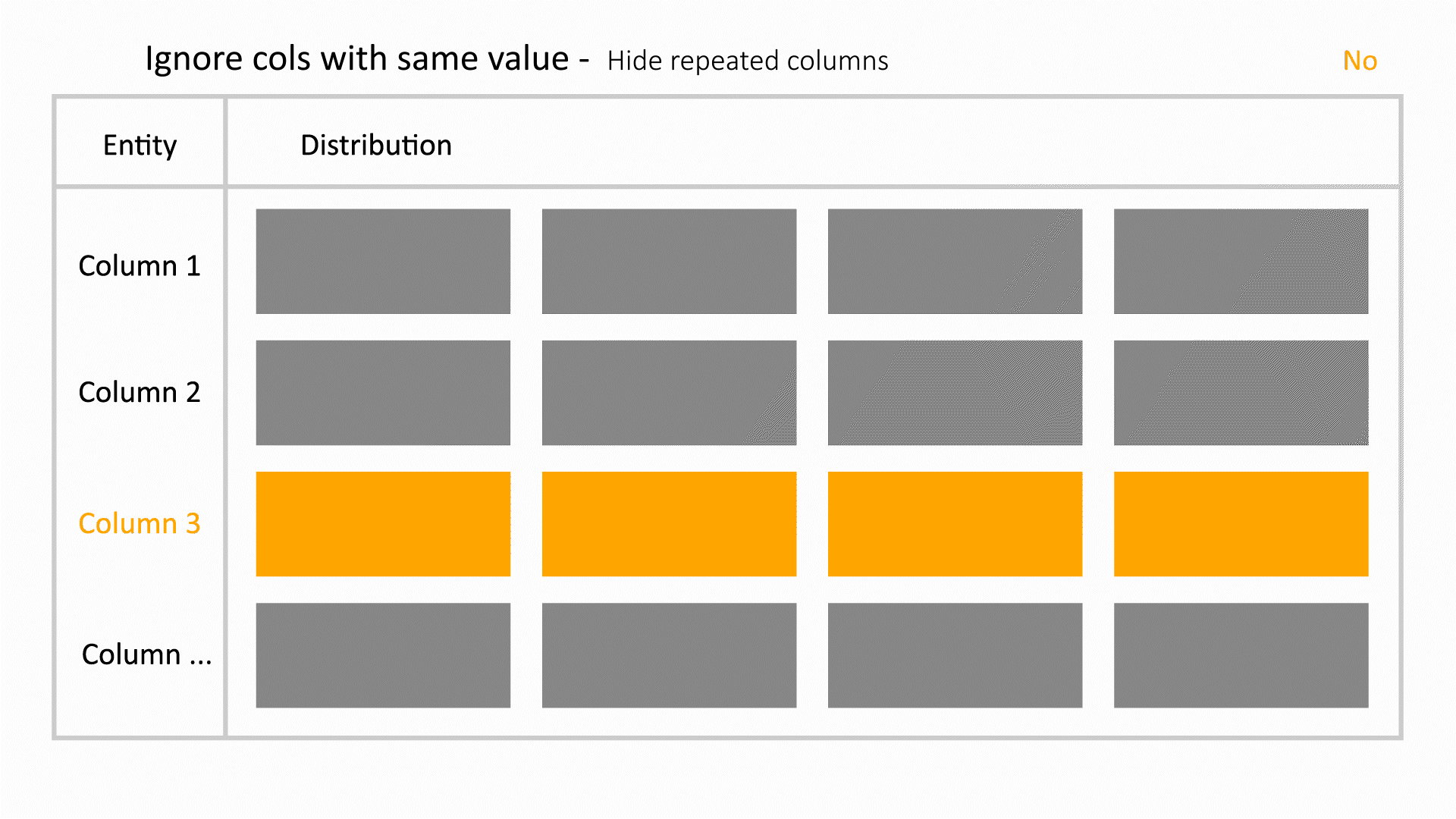
|
| ignorePartsWithSameValue | 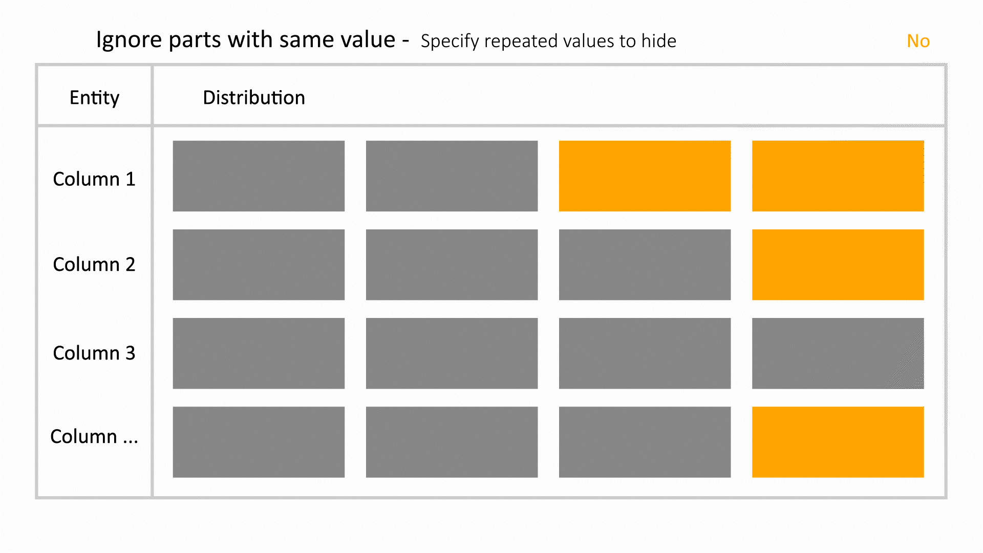
|
| thresholdValue | 
|
| thresholdMin | 
|
| thresholdMax | 
|
Tree
This parent-child relationship chart explores and tracks connections between a tree of nodes in reference to a timeline.

The following is a list of Tree options with their placeholder illustration:
| Option Name | Illustration |
|---|---|
| parentIdBy | 
|
| primaryKeyBy | 
|
| useSingleColumnData | 
|
| separator | 
|
| dateColumn | 
|
| timeline | 
|
| enableTracker | |
| trackingAttrs | |
| colorBy | 
|
| viewType | 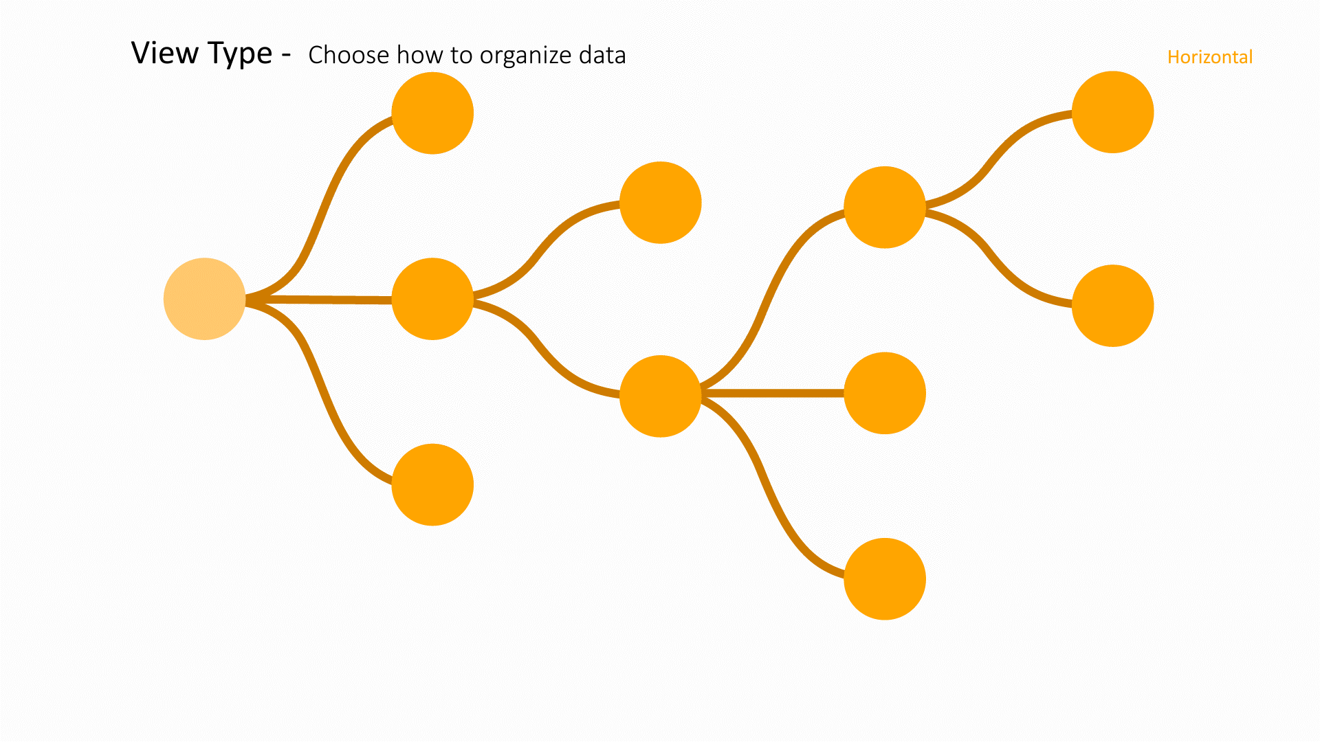
|
| labelBy | 
|
| labelsAsImages | 
|
| imageBy | 
|
| imageW | 
|
| sizeBy | 
|
| strokeWidthBy | 
|
| lineWidthBy | 
|
| tooltipBy | 
|
| highlightNodes | 
|
| expansionLevels | 
|
Treemap
This visualizer uses groups to explore multiple layers of data in a drill-down fashion.

The following is a list of Treemap options with their placeholder illustration:
| Option Name | Illustration |
|---|---|
| groupingFactors | 
|
| value_by | 
|
| aggregation_mode | 
|
| id_by | 
|
Force Directed Graph
This parent-child relationship chart explores connections between a web of nodes.

The following is a list of Force Directed Graph options with their placeholder illustration:
| Option Name | Illustration |
|---|---|
| parentIdBy | 
|
| primaryKeyBy | 
|
| useSingleColumnData | 
|
| separator | 
|
| colorBy | 
|
| sizeBy | 
|
| lineWidthBy | 
|
Card
This parent-child relationsip chart shows a summary along with the node web to explore connections between nodes.

The following is a list of Card options with their placeholder illustration:
| Option Name | Illustration |
|---|---|
| parentKey | 
|
| childKey | 
|
| useSingleColumnData | 
|
| separator | 
|
| colorBy | 
|
| sizeBy | 
|
| strokeWidthBy | 
|
| lineWidthBy | 
|
| parentImageBy | 
|
| childImageBy | 
|
| imageW | 
|
| labelBy | 
|
| tooltipBy | 
|
Survival Space
This visualizer plots the curves for pre and post crash data.

The following is a list of Survival Space options with their placeholder illustration:
| Option Name | Illustration |
|---|---|
| preCrashBy | 
|
| postCrashBy | 
|
| isSample | 
|
| orientation | 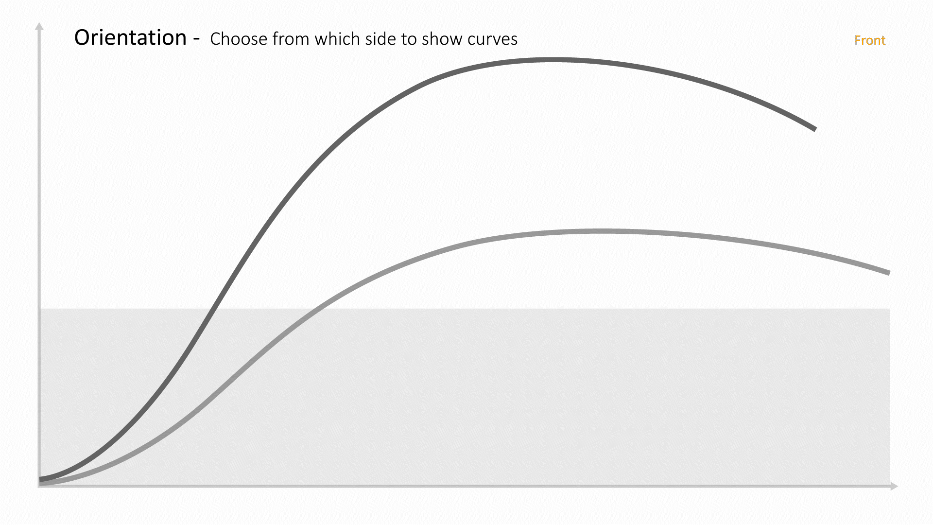
|
| datumareas | 
|
Whiplash
Whiplash illustrates if passenger and driver sensors meet thresholds based on a body map.

The following is a list of Whiplash options with their placeholder illustration:
| Option Name | Illustration |
|---|---|
| color_by | 
|
| nameBy | 
|
Heatmap
A heat map is a data visualization technique that shows magnitude of a phenomenon as color in two dimensions. The variation in color may be by hue or intensity, giving obvious visual cues to the reader about how the phenomenon is clustered or varies over space.

The following is a list of Heatmap options with their placeholder illustration:
| Option Name | Illustration |
|---|---|
| y | 
|
| x | 
|
| colorBy | 
|
| bins | 
|
| circularHeatMap | 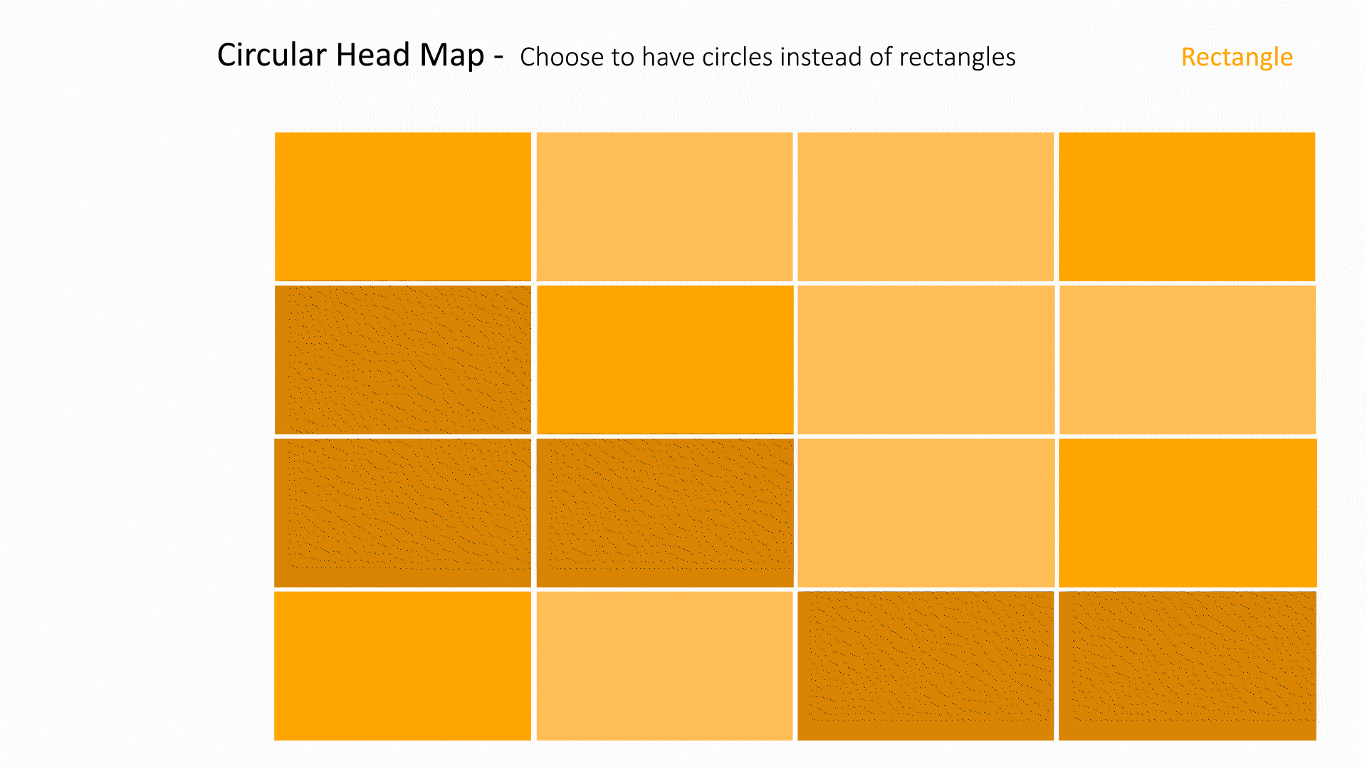
|
Pivot Table
A PivotTable is an interactive way to quickly summarize large amounts of data. You can use a PivotTable to analyze numerical data in detail and answer unanticipated questions about your data.

The following is a list of Pivot Table options with their placeholder illustration:
| Option Name | Illustration |
|---|---|
| rows | 
|
| columns | 
|
| values | 
|
| stopLevel | 
|
| aggregationType | 
|
PedPro
PedPro includes the means to export your pedigree data for transfer to other programs or for display as a table.

The following is a list of PedPro options with their placeholder illustration:
| Option Name | Illustration |
|---|---|
| useSampleData | 
|
| titleBy | 
|
| XcoordBy | 
|
| YcoordBy | 
|
| hicBy | 
|
| accCurveBy | 
|
| t1By | 
|
| t2By | 
|
| peakAccBy | 
|
| leftSectionAnimationBy | 
|
| sizeBy | 
|
| reflection | 
|
| colorGroups | 
|
PedPro Table
PedPro includes the means to export your pedigree data for transfer to other programs or for display as a table.

The following is a list of PedProTable options with their placeholder illustration:
| Option Name | Illustration |
|---|---|
| xBy | 
|
| yBy | 
|
| hicBy | 
|
| modelBy | 
|
| imageBy | 
|
| xmin | 
|
| xBins | 
|
| x_step | 
|
| xmax | 
|
| ymin | 
|
| yBins | 
|
| y_step | 
|
| ymax | 
|
| customBinRows | 
|
| xLabel | 
|
| yLabel | 
|
| binning | 
|
| predictedScoreLabel | 
|
| headFormLabel | 
|
| showBinAxes | 
|
| showHicValues | 
|
| showLocation | 
|
| shape | 
|
| trimCommonString | 
|
| showNullValuesAsBlanks | |
| showPointsTable | 
|
| colorGroups | 
|
Circle Chart
Circle chart visualizes different aspects of data into different groups based on a timeline.

The following is a list of Circle Chart options with their placeholder illustration:
| Option Name | Illustration |
|---|---|
| primary_name | 
|
| columns | 
|
| primary_key | 
|
| date | 
|
3D Scatter Plot
3D scatter plots are used to plot data points on three axes in the attempt to show the relationship between three variables.

The following is a list of 3D Scatter Plot options with their placeholder illustration:
| Option Name | Illustration |
|---|---|
| x_axis | 
|
| y_axis | 
|
| z_axis | 
|
| color_by | 
|
| radius_by | 
|
| opacity_by | 
|
Image Analyzer
Analyze and compare two images to explore similarities and differences.

The following is a list of Image Analyzer options with their placeholder illustration:
| Option Name | Illustration |
|---|---|
| component | 
|
| valuerange | 
|
Pie Chart
Pie charts can be used to show percentages of a whole and represents percentages at a set point in time.

The following is a list of Pie Chart options with their placeholder illustration:
| Option Name | Illustration |
|---|---|
| groupBy | 
|
| highlightArcs | 
|
| radiusBy | 
|
| radiusAggregateBy | 
|
| nestedGroupBy | 
|
| groupLimit | 
|
| innerRadius | 
|
Scatter Matrix
A scatter plot matrix is a grid of scatter plots used to visualize bivariate relationships between combinations of variables. Each scatter plot in the matrix visualizes the relationship between a pair of variables.

The following is a list of Scatter Matrix options with their placeholder illustration:
| Option Name | Illustration |
|---|---|
| columns | 
|
| color_by | 
|
Vector Scatter Matrix
A vector scatter matrix is a grid of vector plots used to visualize bivariate relationships between combinations of curves. Each curve plot in the matrix shows the relationship between a pair of vectors.

The following is a list of Vector Scatter Matrix options with their placeholder illustration:
| Option Name | Illustration |
|---|---|
| columns | 
|
| colorBy | 
|
| pearsonCoeffInTable | 
|
Multi Line Chart
A multi-line graph shows the relationship between independent and dependent values of multiple sets of data. Usually, multi-line graphs are used to show trends over time.

The following is a list of Multi Line Chart options with their placeholder illustration:
| Option Name | Illustration |
|---|---|
| lines | 
|
Filtered Line Chart
A filtered line chart is used to depict two or more variables that change over the same period for specifically filtered data.

The following is a list of Filtered Line Chart options with their placeholder illustration:
| Option Name | Illustration |
|---|---|
| xBy | 
|
| yBy | 
|
| lines | 
|
| yBy2 | 
|
| duplicateLinesForDatasets |
|
| sortdata | 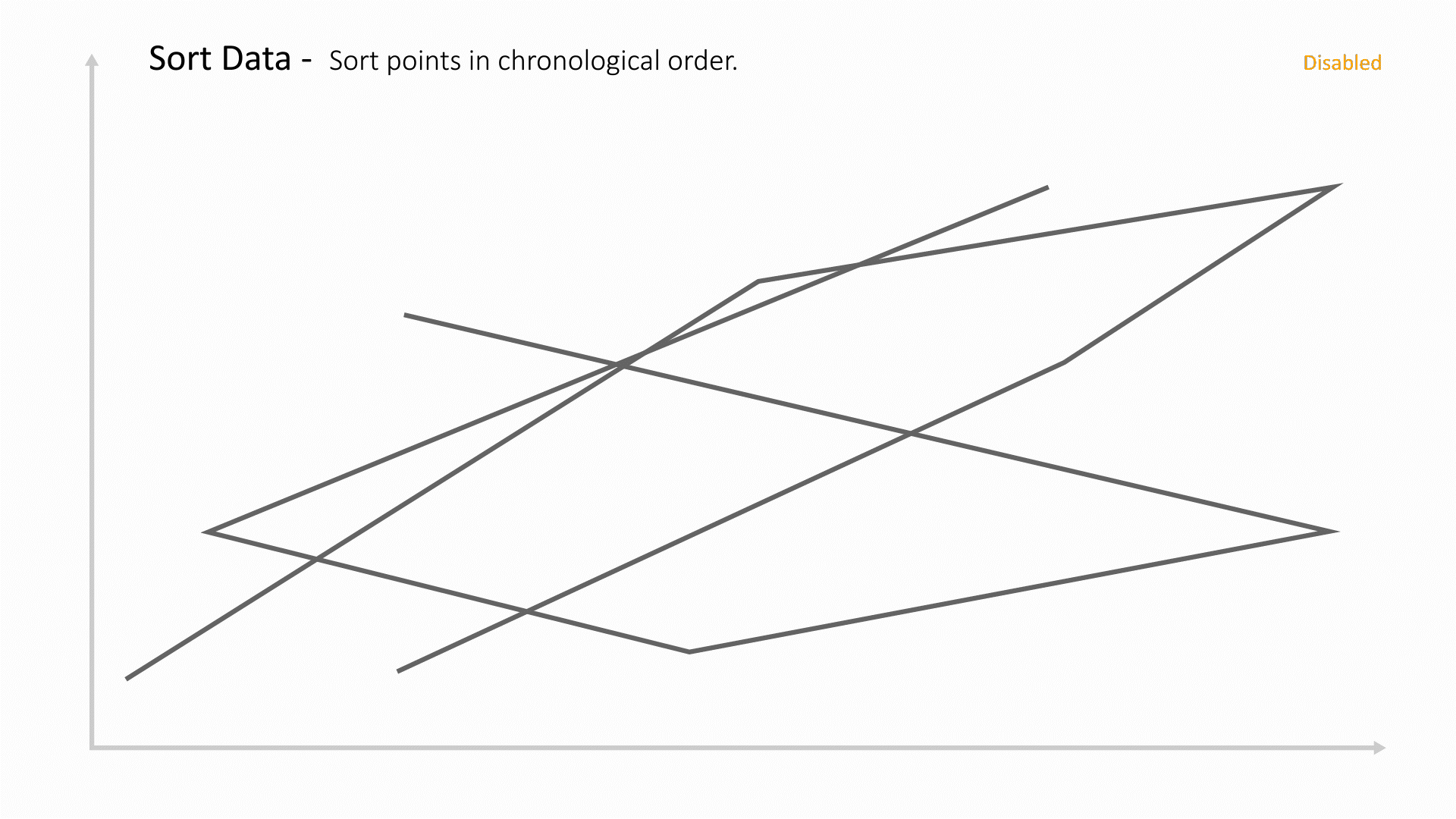
|
| ignoreX | 
|
| xScaleType | 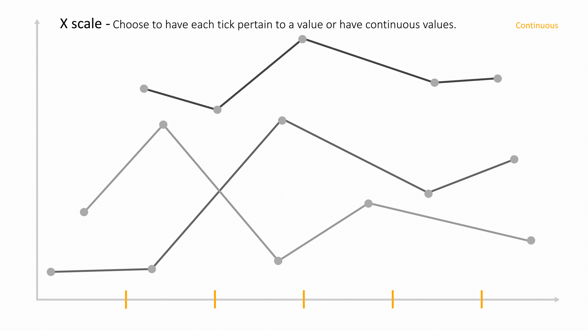
|
Text Compare
Compare text-based data side by side.

The following is a list of Text Compare options with their placeholder illustration:
| Option Name | Illustration |
|---|---|
| nameBy | 
|
| textBy | 
|
Horizontal Barchart
A horizontal bar graph shows comparisons among discrete categories. One axis of the chart shows the specific categories being compared, and the other axis represents a measured value.

The following is a list of Horizontal Barchart options with their placeholder illustration:
| Option Name | Illustration |
|---|---|
| y | 
|
| x | 
|
| colorBy | 
|
| aggregationType | 
|
| grouping | 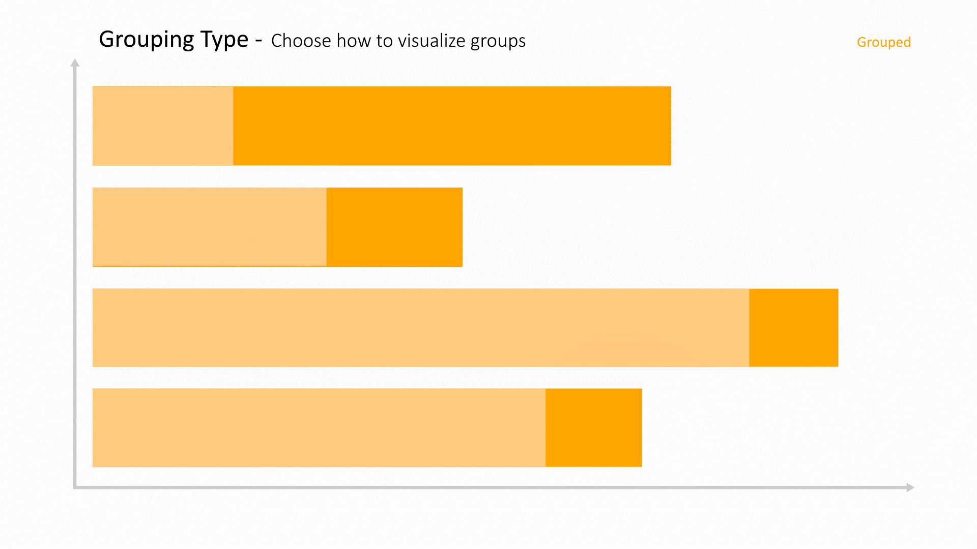
|
| xmin | 
|
| xmax | 
|
| nestedGroupBy | 
|
| groupLimit | 
|
| tooltipBy | 
|
| showLegends | 
|
| axisTicksFontSize | 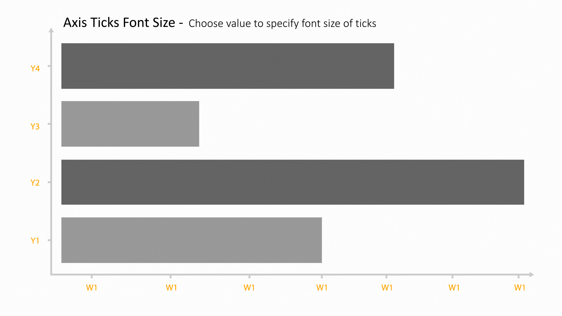
|
| axisLabelsFontSize | 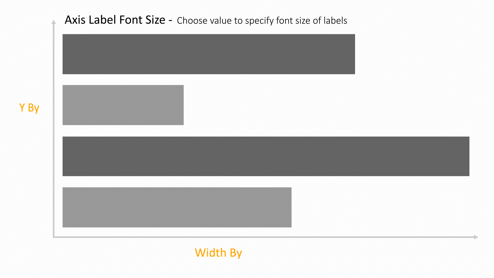
|
Newton Manager
This visualizer plots time-history data and is helpful when both X and Y data are numbers. The color, line and opacity of the curves can be based on other columns which allows visualizing up to 5 dimensions.

The following is a list of Newton Manager options with their placeholder illustration:
| Option Name | Illustration |
|---|---|
| curveBy | 
|
| colorBy | 
|
| opacityBy | 
|
| imageBy | 
|
| lineWidthBy | 
|
| curveBy2 | 
|
| xLabel | 
|
| yLabel | 
|
| xmin | 
|
| xmax | 
|
| ymin | 
|
| ymax | 
|
| tooltipBy | 
|
| baseline | 
|
Histogram
A histogram is an approximate representation of the distribution of numerical data. It can also help detect outliers or any gaps in the data.

The following is a list of Histogram options with their placeholder illustration:
| Option Name | Illustration |
|---|---|
| columns | 
|
| colorBy | 
|
| xLabel | 
|
| yLabel | 
|
Sparkline Matrix
Explore a grid of vectors or a grid of vector groups with color ranges or panels. This matrix is generally used for time series data and allows for animation of time via the sparklines and color panels.

The following is a list of Sparkline Matrix options with their placeholder illustration:
| Option Name | Illustration |
|---|---|
| column | 
|
| segments | 
|
| colorMin | 
|
| colorMax | 
|
| xDigitize | 
|
| ymin | 
|
| ymax | 
|
| threshold | 
|
| wrap | 
|
| displayNames | 
|
| displayIndices | 
|
| overlay | 
|
| initBox | 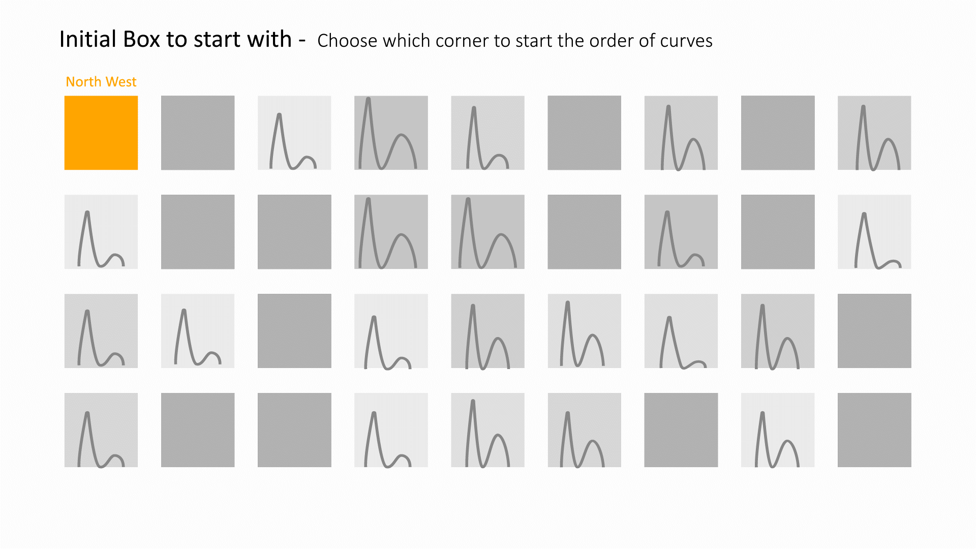
|
| initDirection | 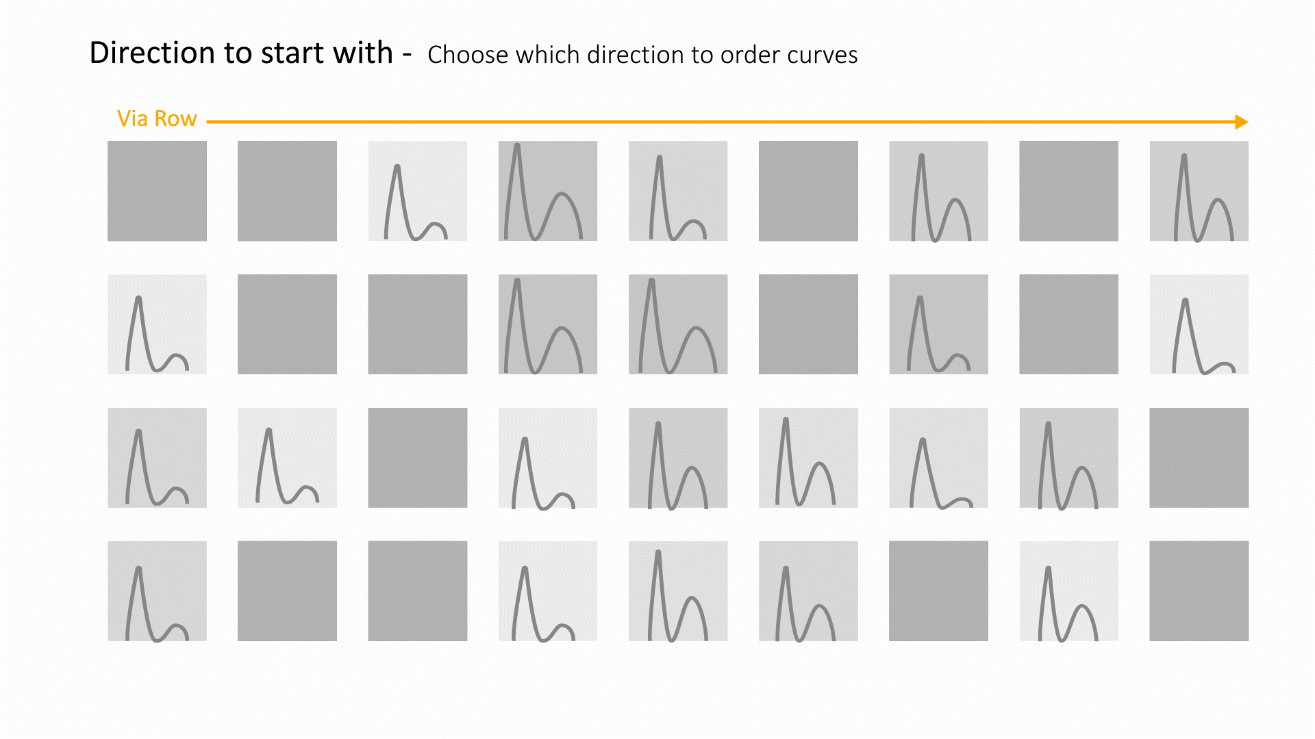
|
| displacementColumn | 
|
| colorBy | 
|
| showImage | 
|
Occupant Rating
Visualize the marginal color values for driver and passenger test analysis directly on a body sketch.

The following is a list of Occupant Rating options with their placeholder illustration:
| Option Name | Illustration |
|---|---|
| occupantType | 
|
| headColorBy | 
|
| neckColorBy | 
|
| chestColorBy | 
|
| rightThighColorBy | 
|
| rightLegColorBy | 
|
| rightFootColorBy | 
|
| leftThighColorBy | 
|
| leftLegColorBy | 
|
| leftFootColorBy | 
|
Area Chart
Diplay the evolution of value for a column of data based on another.

The following is a list of Area Chart options with their placeholder illustration:
| Option Name | Illustration |
|---|---|
| x | 
|
| y | 
|
| yAggregate | 
|
Stacked Area Chart
A stacked area chart is the extension of a basic area chart. It displays the evolution of the value of several groups on the same graphic. A stacked area chart can show how part to whole relationships change over time.

The following is a list of Stacked Area Chart options with their placeholder illustration:
| Option Name | Illustration |
|---|---|
| x | 
|
| y | 
|
| yAggregate | 
|
| sortByLimit | 
|
Circle Pack
Circle Packs represent hierarchical data sets, showing both each level in the hierarchy and how they interact with each other. They are used for identifying patterns of performance, and outliers within peer groups.

The following is a list of Circle Pack options with their placeholder illustration:
| Option Name | Illustration |
|---|---|
| nodes | 
|
Chord Diagram
Chord diagram shows dependencies amongst chosen columns

The following is a list of Chord Diagram options with their placeholder illustration:
| Option Name | Illustration |
|---|---|
| columns | 
|
| groupLimit | 
|
| sortBy | 
|
| sortOrder | 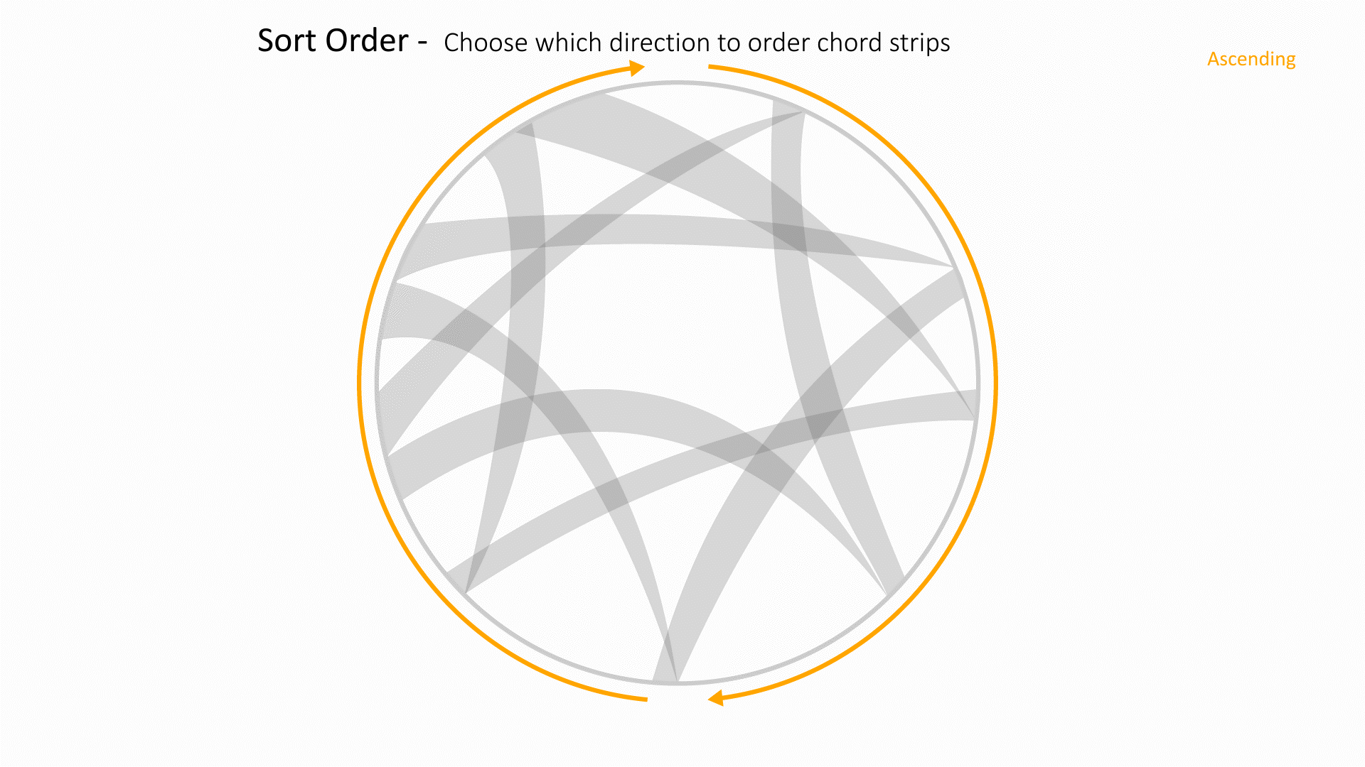
|
| colorBy | 
|
| offset | 
|
| offsetBy | 
|
| highlightNodes | 
|
Sankey Plot
This chart explores connections of values from one data collumn to other data columns.

The following is a list of Sankey Plot options with their placeholder illustration:
| Option Name | Illustration |
|---|---|
| columns | 
|
| useClassifier | 
|
| sortBy | 
|
| sortOrder | 
|
| colorBy | 
|
Arc Diagram
This chart explores connections between individual values from different columns.

The following is a list of Arc Diagram options with their placeholder illustration:
| Option Name | Illustration |
|---|---|
| columns | 
|
| sortBy | 
|
| sortOrder | 
|
| colorBy | 
|
Gauge
A gauge chart is a type of data visualization often used to display a single data value with a quantitative context. This chart aims to track the progress of a KPI in comparison to a set target or to other time periods.

The following is a list of Gauge options with their placeholder illustration:
| Option Name | Illustration |
|---|---|
| column | 
|
| value | 
|
| numBins | 
|
| colorMin | 
|
| colorMax | 
|
K-Means Cluster
The K-means cluster is used to find groups which have not been explicitly labeled in the data.

The following is a list of K-Means Cluster options with their placeholder illustration:
| Option Name | Illustration |
|---|---|
| num_clusters | 
|
| fields | 
|
Data Viewer
View any data files associated with the dataset.

The following is a list of Data Viewer options with their placeholder illustration:
| Option Name | Illustration |
|---|---|
| files | 
|
Image Annotator
This visualizer helps to upload images and annotate them

The following is a list of Image Annotator options with their placeholder illustration:
| Option Name | Illustration |
|---|---|
| base64 | 
|
| annotation | 
|
Image Positioner
This visualizer helps to overlay images and animate them simultaneously.
The following is a list of Image Positioner options with their placeholder illustration:
| Option Name | Illustration |
|---|---|
| column | 
|
Data Classifier
This plugin helps with search predication based on categories and classification of the dataset. This plugin uses Machine Learning to produce the results.

The following is a list of Data Classifier options with their placeholder illustration:
| Option Name | Illustration |
|---|---|
| learn_columns | 
|
| predict_columns | 
|
| min_max | 
|
Text Viewer
This plugin helps view large text-based data.

The following is a list of Text Viewer options with their placeholder illustration:
| Option Name | Illustration |
|---|---|
| column | 
|