11.  Charts Examples
In this section, we’ll go over a few datasets and show how to create a specific chart for each, with an example of a full dataset exploration in the last section.
Examples of Finished Charts
NFL Teams
This first dataset has basic football team statistics for the NFL.
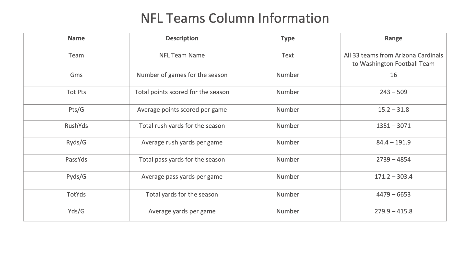
Figure 1: NFL Teams Dataset
Table

We’ll create this simple table to focus on game points to compare them between teams.
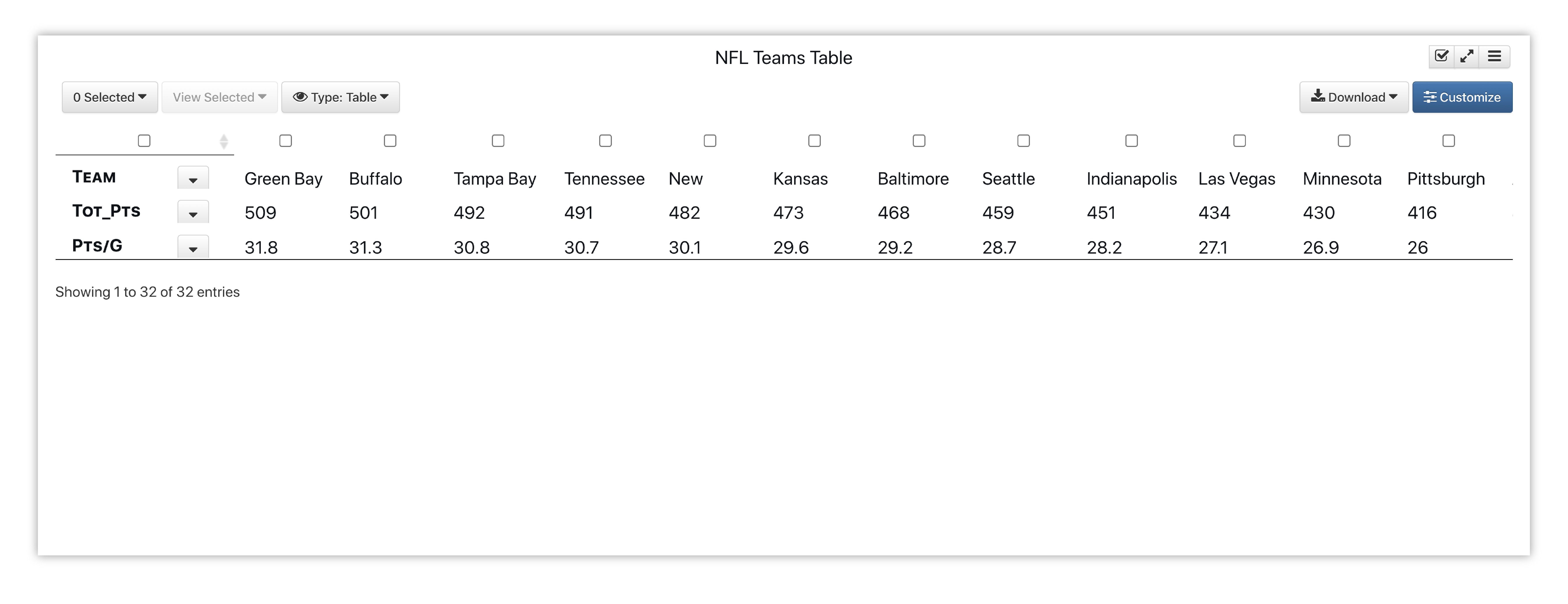
Figure 2: NFL Teams Game Points
Here is our initial view when opening this dataset. Data columns are shown under the Responses panel.
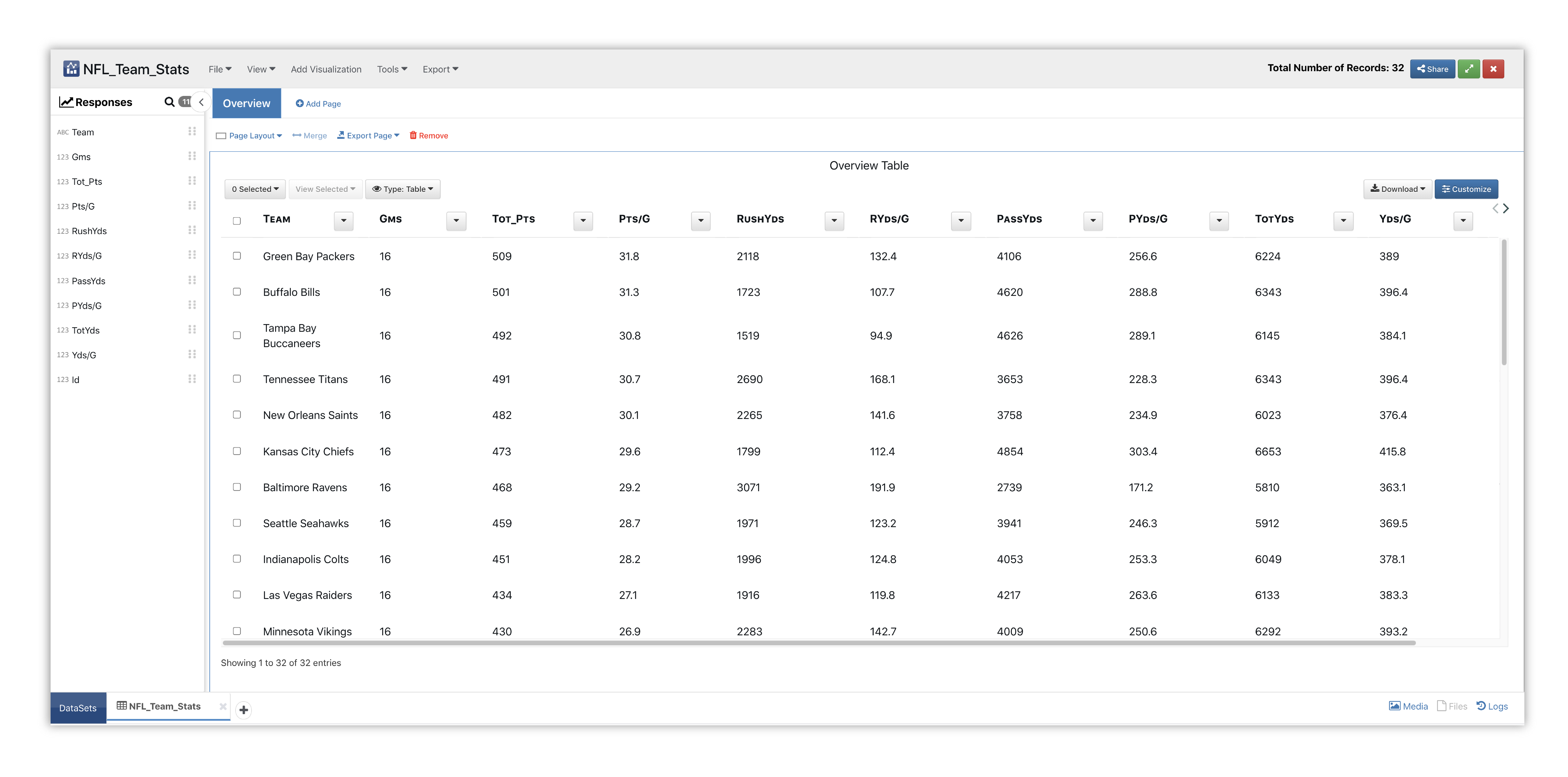
Figure 3: Table NFL Dataset
We’ll start by adding the Table visualizer to a new page section.
Please check out section Adding and Editing Pages and Adding Charts to learn how to create new pages and charts respectively.
This visualization presents a 2D view of data and is the first visualization presented for smaller datasets. Text and number columns are chosen for this chart.
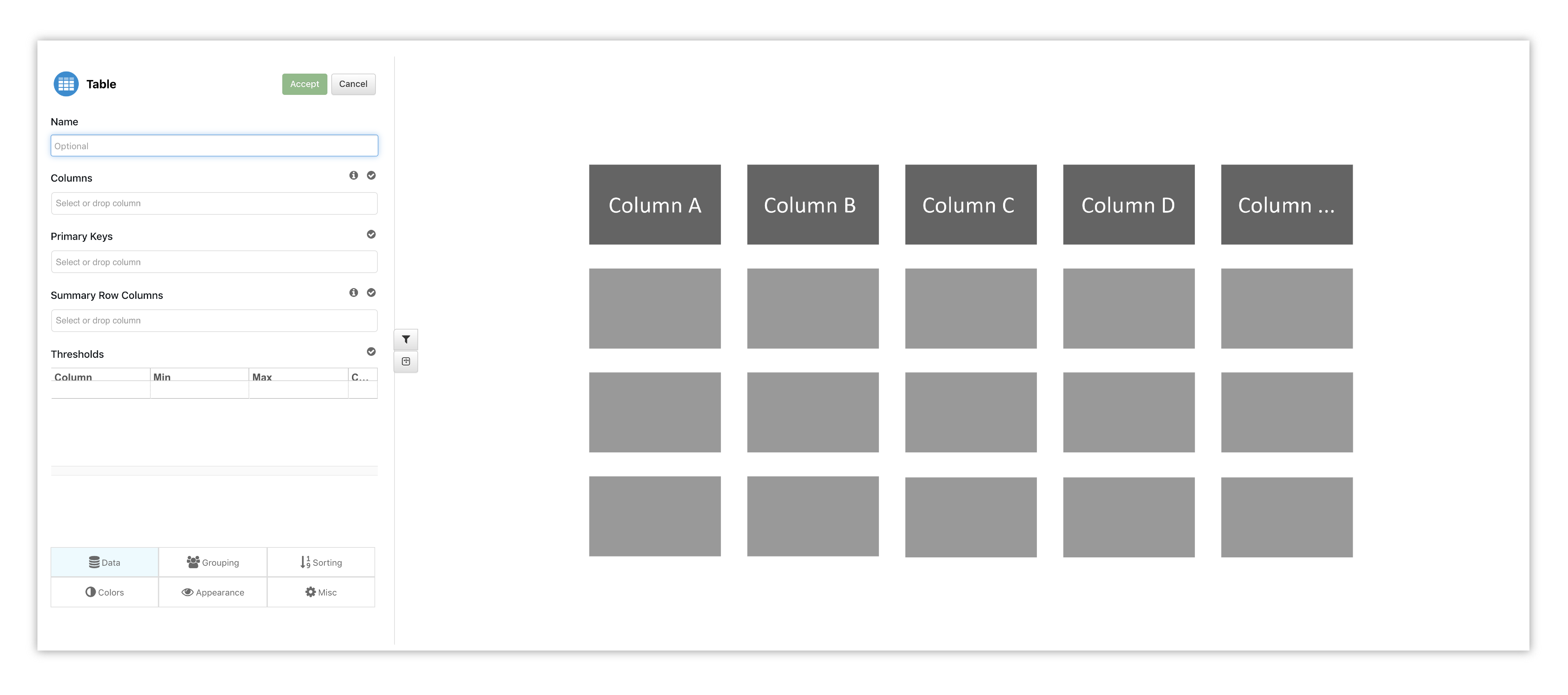
Figure 4: Table Options & Placeholder
Choose Team Name, Total Points, and Points Per Game for our data columns.
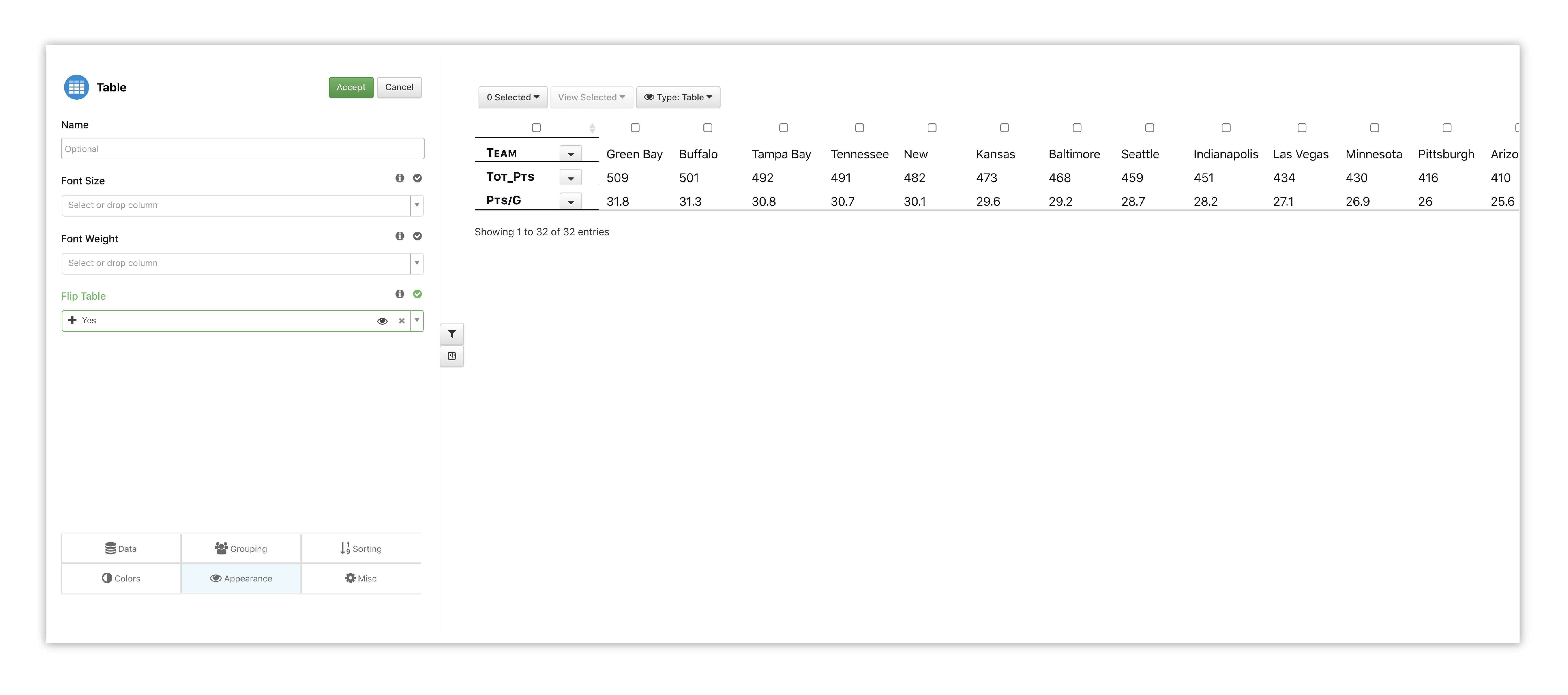
Figure 5: Table Options
To get a different view of our table, we’ll choose to flip it under the Appearance tab.
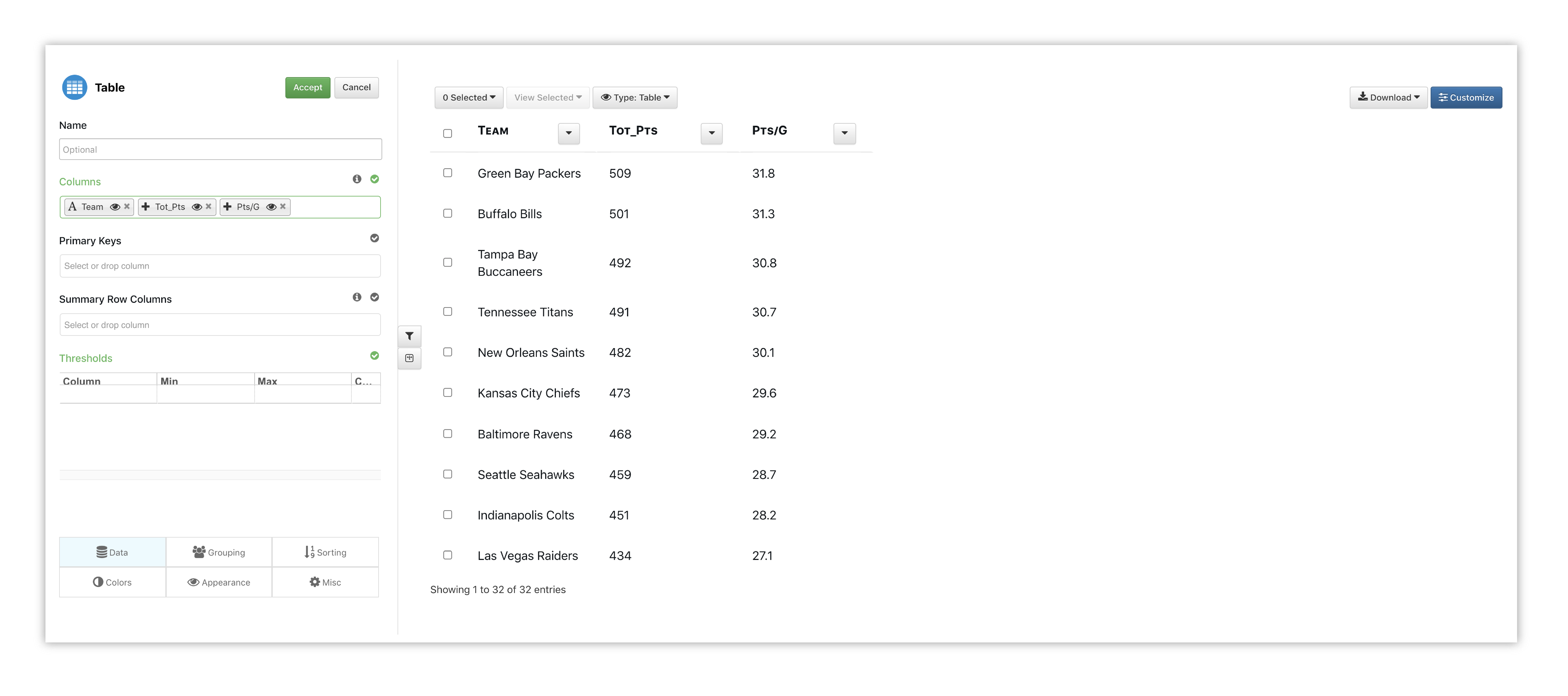
Figure 6: Table Options
Watch the following full example of adding Table for this dataset.
Line Chart
Here is some other information from this dataset viewed in a line chart. This chart shows the correlation between NFL Teams and their total yards, rush yards and pass yards.
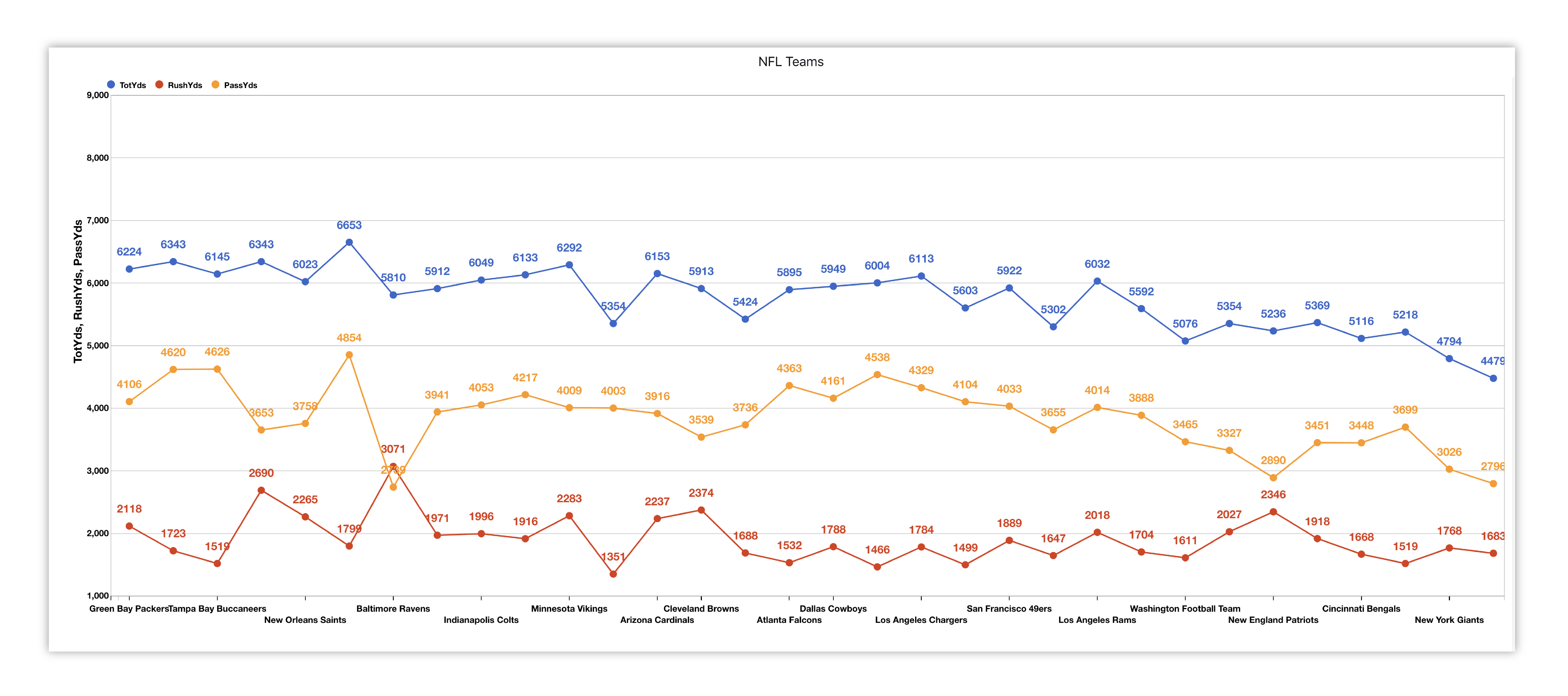
Figure 7: NFL Teams Total, Rush and Pass Yards
QQ Plot
Here is some other information from this dataset viewed in a qq plot. This chart shows the correlation between NFL winner points and loser points.
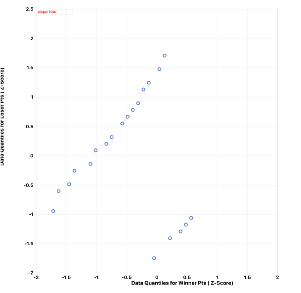
Figure 8: NFL Teams Winner and Loser Points
QQ Plot
Here is some other information from this dataset viewed in a qq plot matrix. This chart shows the correlation between NFL winner points and loser points.
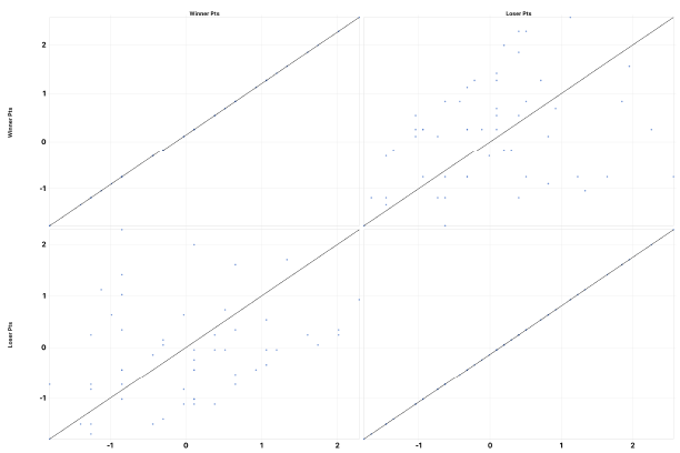
Figure 9: NFL Teams Winner and Loser Points
UFO Sightings
For our next dataset, we’ll explore some UFO sightings documented in North America.
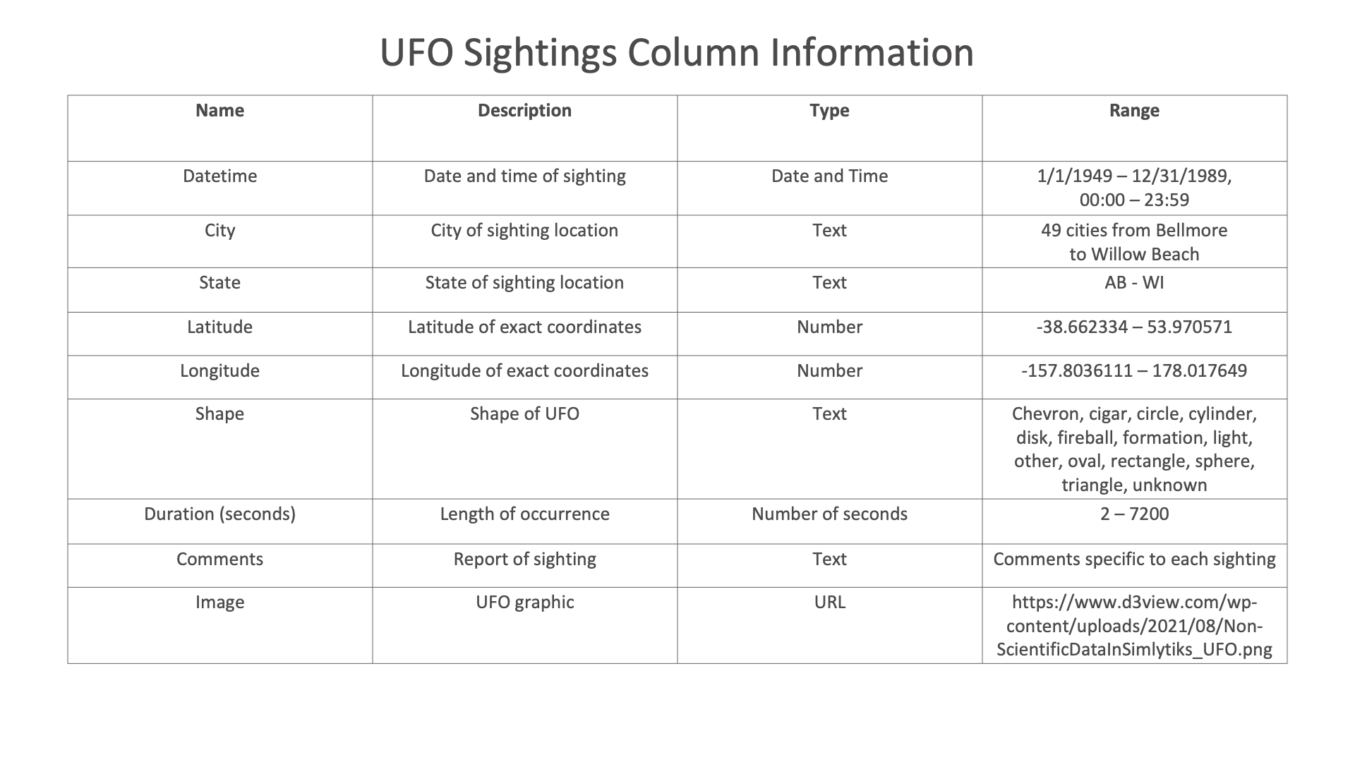
Figure 8: UFO Sightings Dataset
Bubble Chart

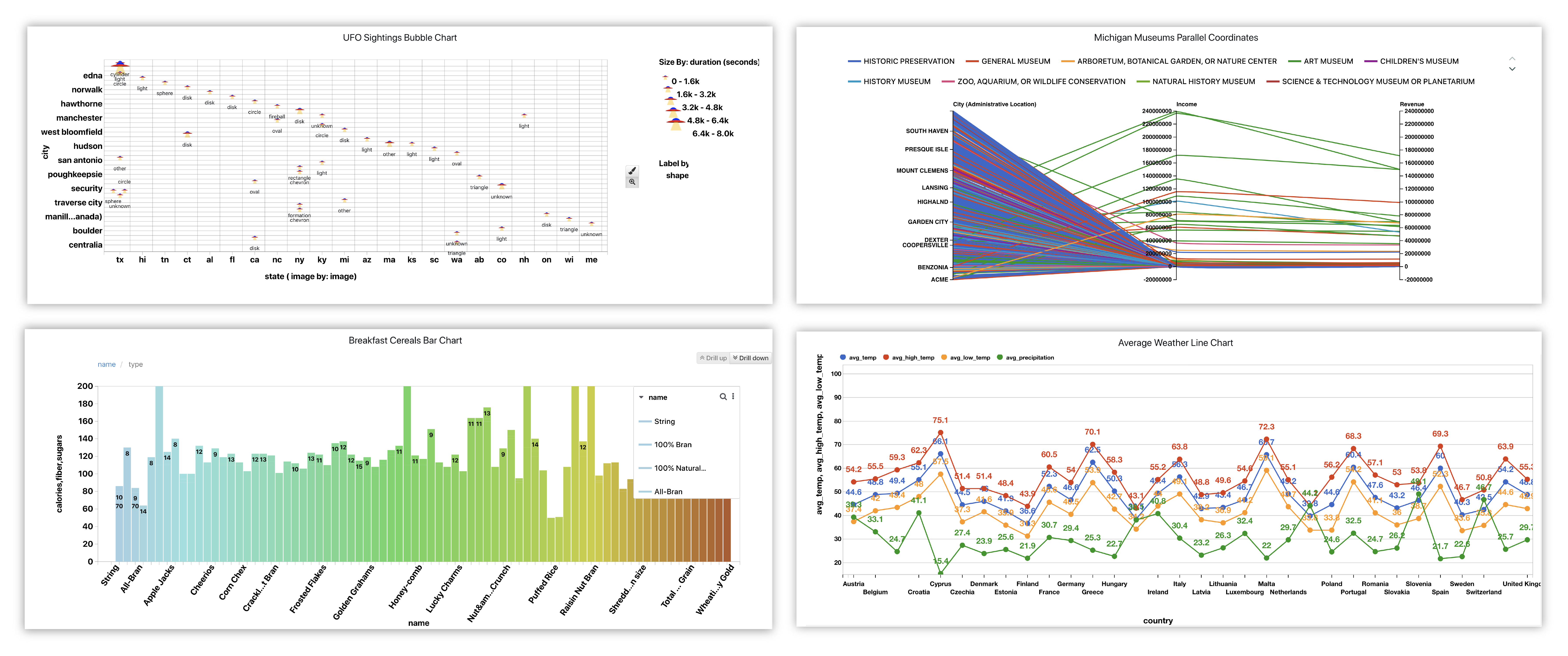
We’ll create a bubble chart showing UFO sightings based on location, correlating cities with states, indicating the duration of sighting based on bubble size, and adding the sighted shape as the label.
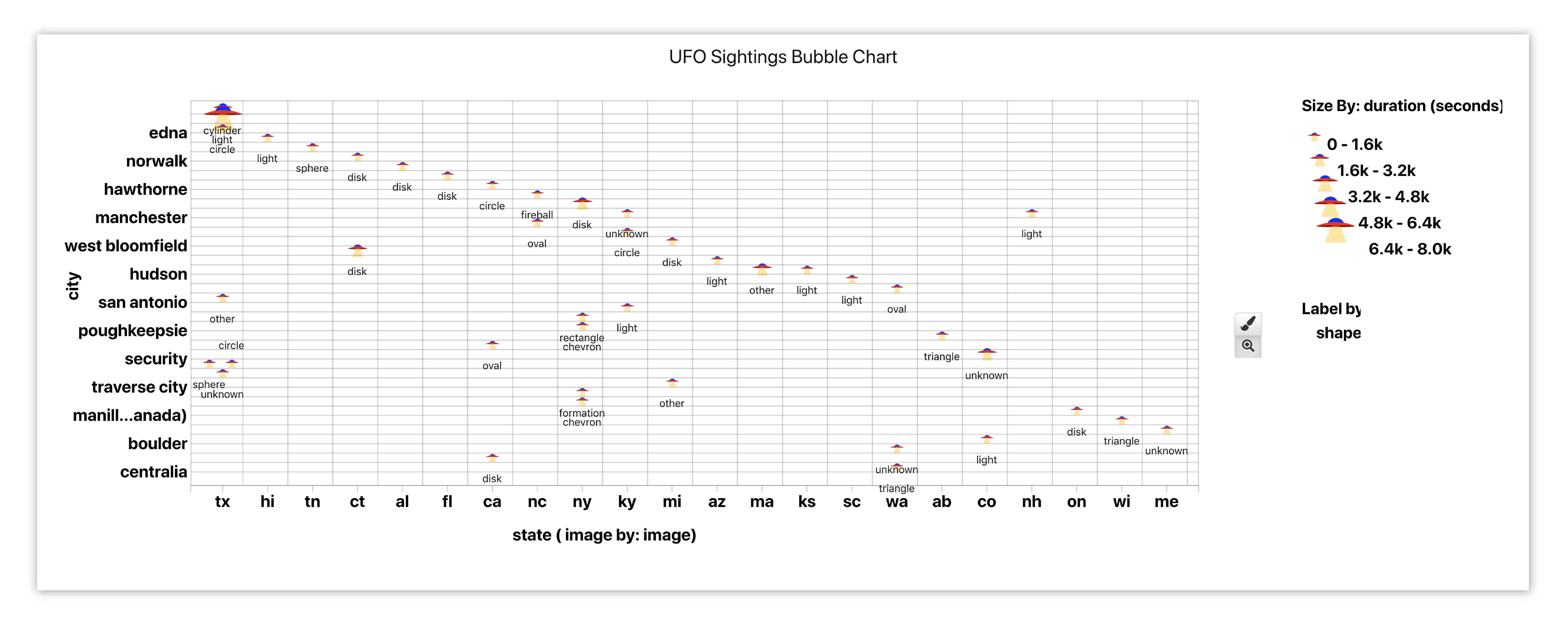
Figure 9: UFO Sightings By City and State
Here is our initial view when opening this dataset. Data columns are shown under the Responses panel.
Figure 10: Bubble Chart UFO Dataset
We’ll start by adding the Bubble visualizer to a new page section.
Please check out section Adding and Editing Pages and Adding Charts to learn how to create new pages and charts respectively.
This Chart, called Scatter Plot under Add Visualization, has many options for detailing which include setting data columns to visualize bubble size, stroke thickness and opacity. Each bubble or node in the chart represents a dataset row as it relates to data columns set on the X and Y axes.
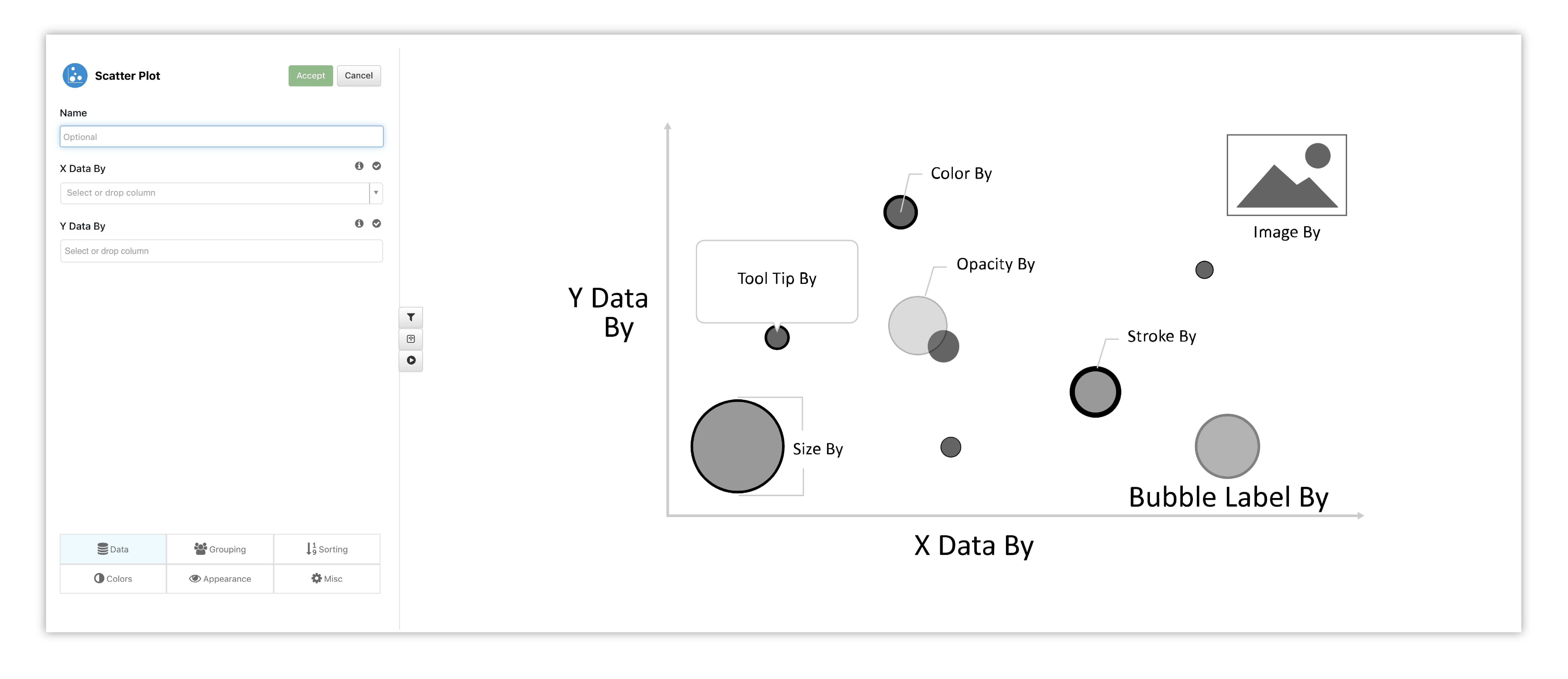
Figure 11: Bubble Chart Options & Placeholder
Let’s start by choosing our X data and Y data to get a real-time preview.
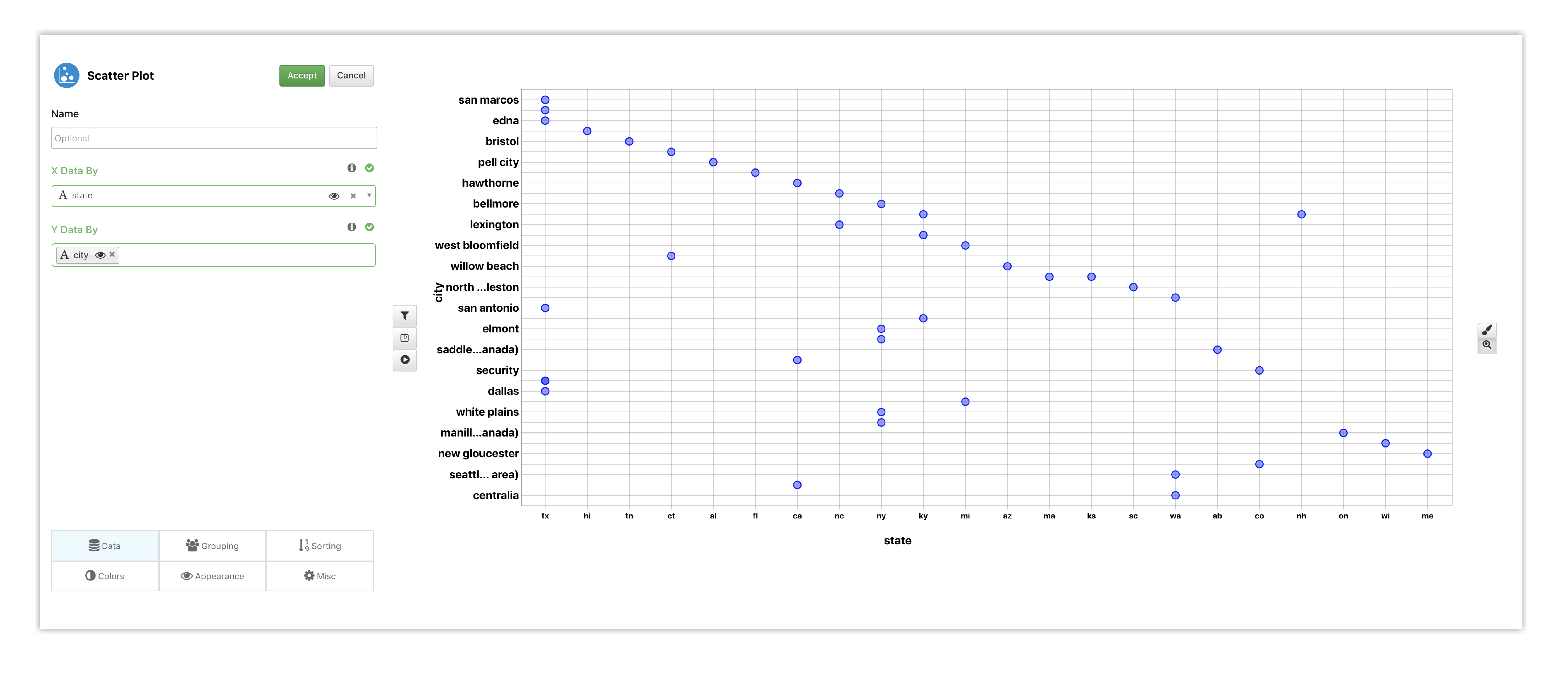
Figure 12: Bubble Chart Options
Under Appearance is where we can find those details mentioned above. Here, we’ve chosen data to indicate the bubble size and label, and added an image for our bubble nodes.
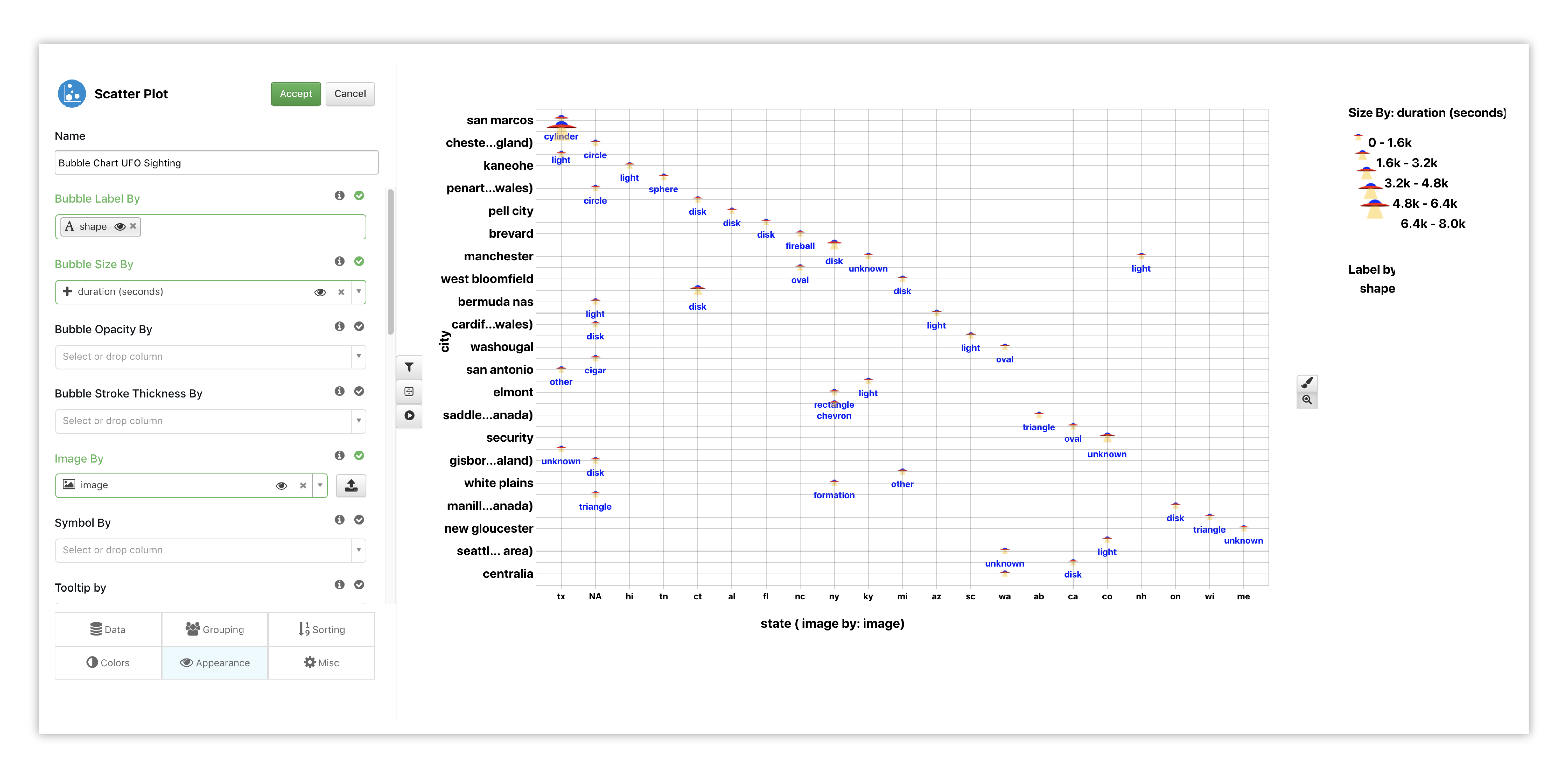
Figure 13: Bubble Chart Options
Watch the following full example of adding Bubble Chart for this dataset.
Pie & Donut
Here is the UFO dataset explored in a different way using Pie and Donut Charts. Pie shows which UFO shapes were reported more or less compared to the others, while Donut presents which US states had more or less sightings than the others.
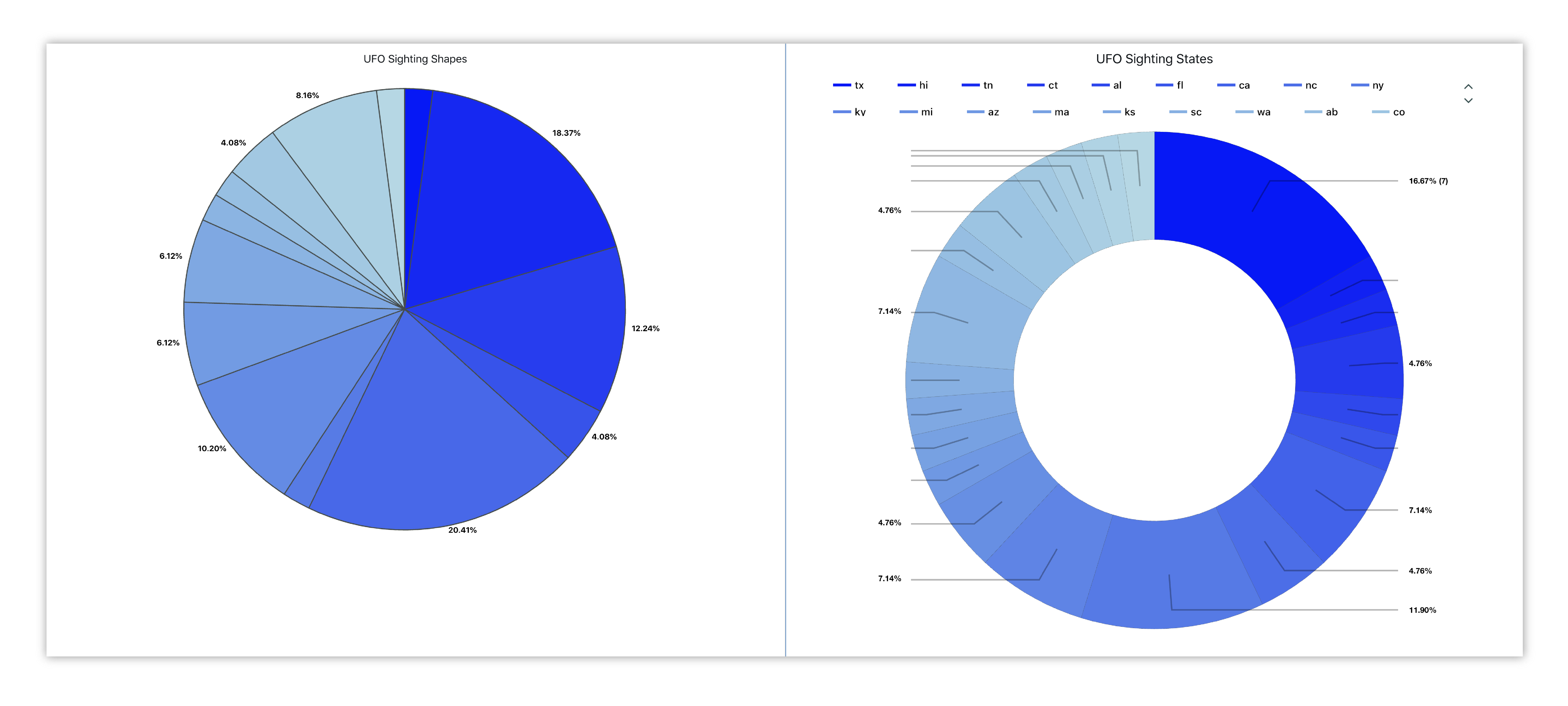
Figure 14: UFO Shapes and States
Box Plot
Here is the Iris data explored with a box plot showing estimated kernel density, viewing the violin plot distribution, circles, etc.
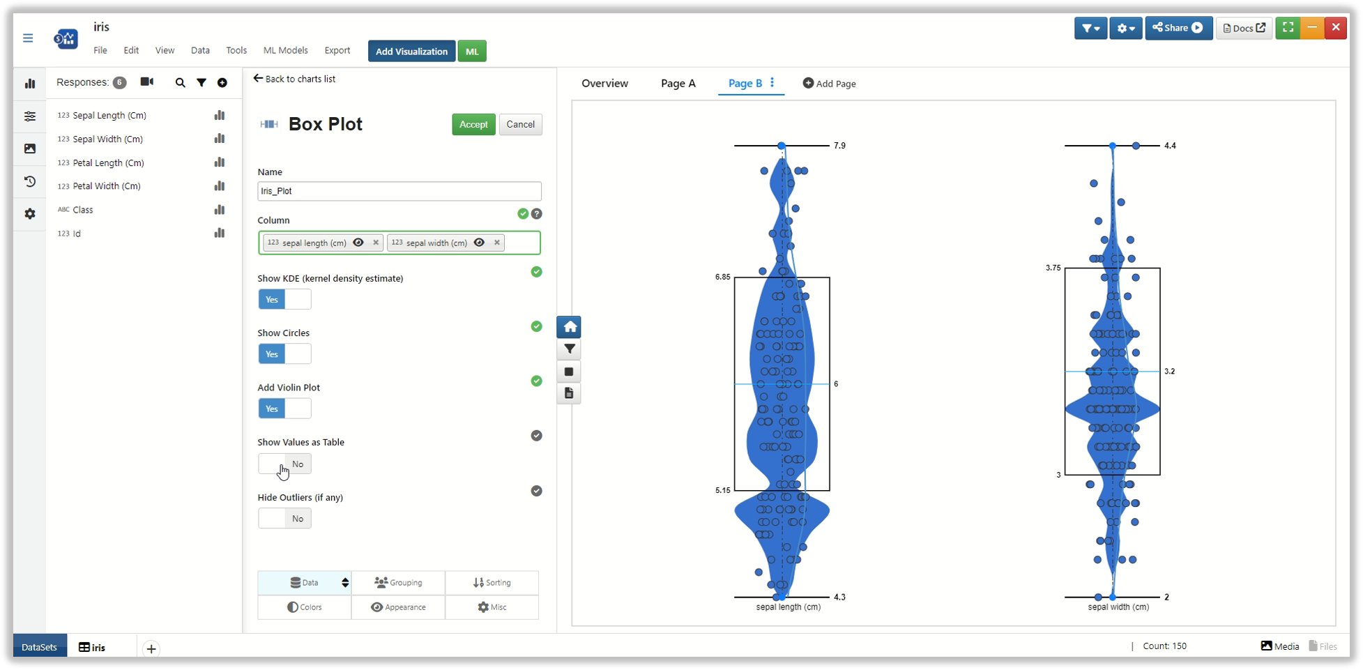
Figure : Box Plot
Watch the following full example of adding Box Plot for this dataset.
Breakfast Cereals
For our third dataset, we’ll be exploring breakfast cereal nutrition facts.
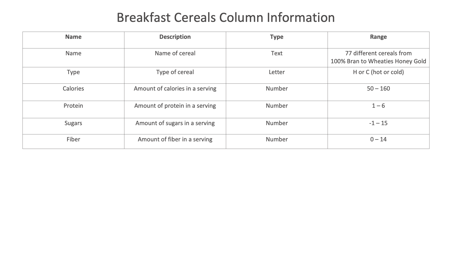
Figure 15: Breakfast Cereals Dataset
Bar Chart
We’ll create a vertical bar chart showing the differences in nutritional values, such as protein and sugar, between popular breakfast cereals.
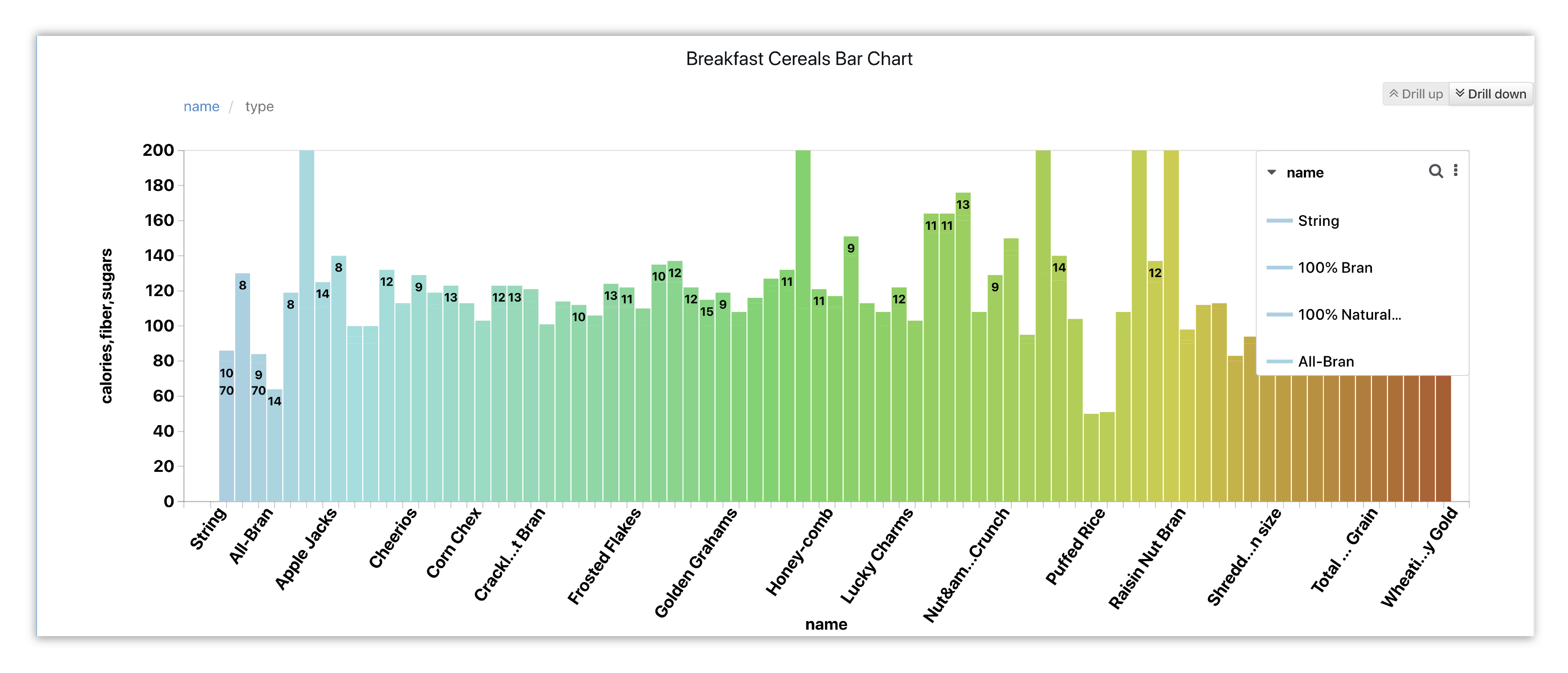
Figure 16: Breakfast Cereal Nutrition Comparison
Here is our initial view when opening this dataset. Data columns are shown under the Responses panel.
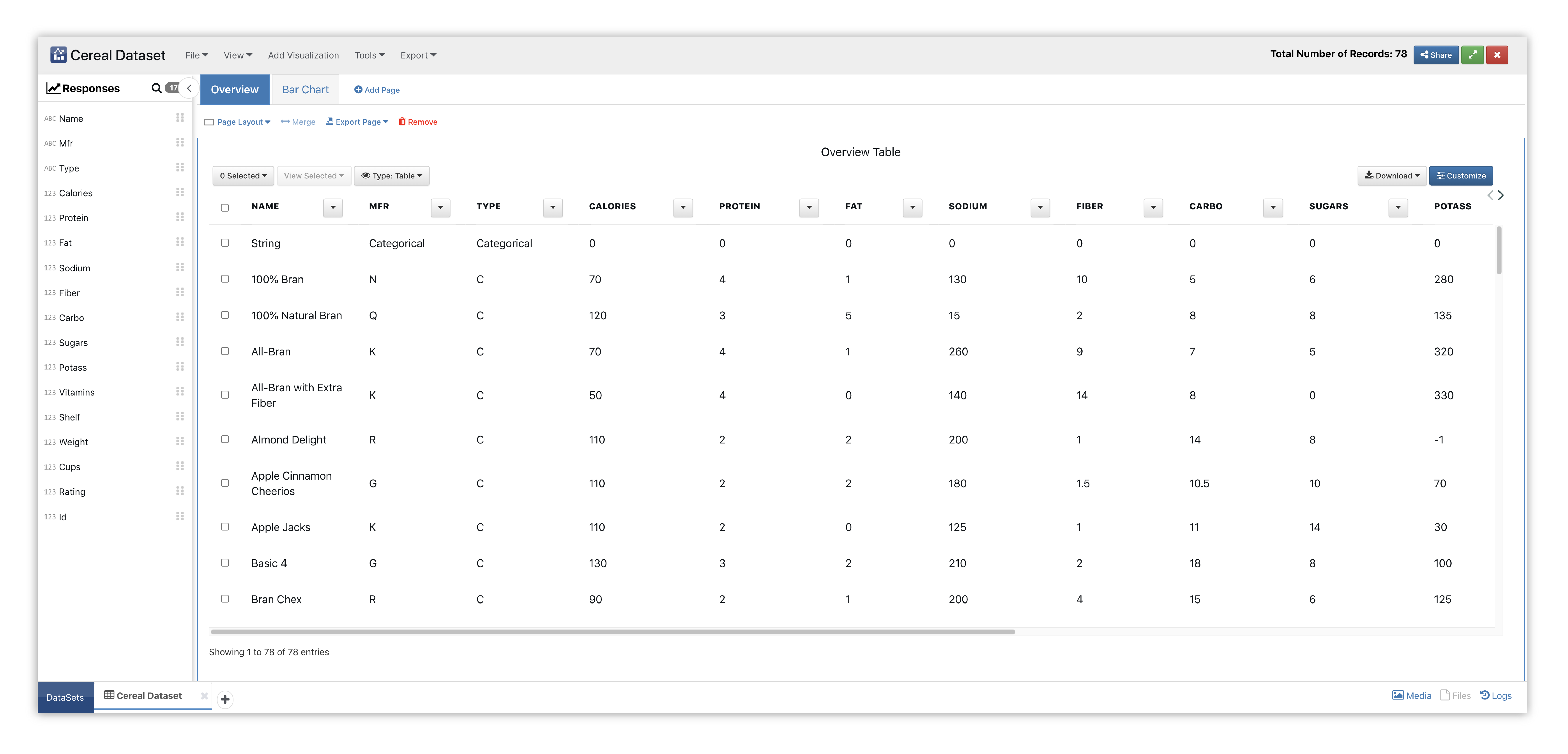
Figure 17: Vertical Bar Chart Cereal Dataset
We’ll start by adding the Vertical Bar visualizer to a new page section.
Please check out section Adding and Editing Pages and Adding Charts to learn how to create new pages and charts respectively.
This chart provides a simple, universal way for visualizing data with options to drill-down between different X data. It visually displays data using vertical bars starting at the bottom whose lengths are proportional to quantities they represent, but can still be used with one axis as non-numerical.
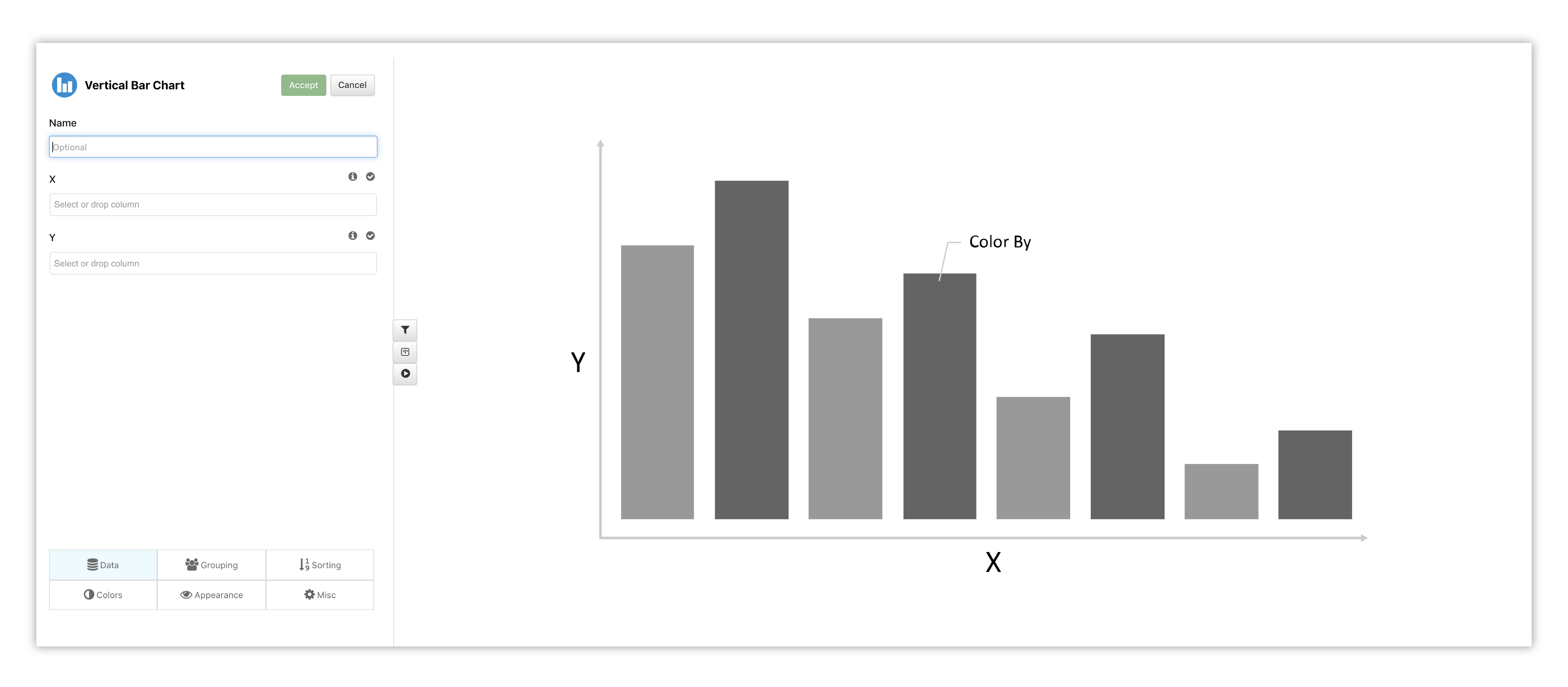
Figure 18: Vertical Bar Chart Options & Placeholder
Let’s choose our X data and Y data to get a real-time preview. Here, we’ve chosen two data columns for Y and two data columns for X, which can be drilled-down.
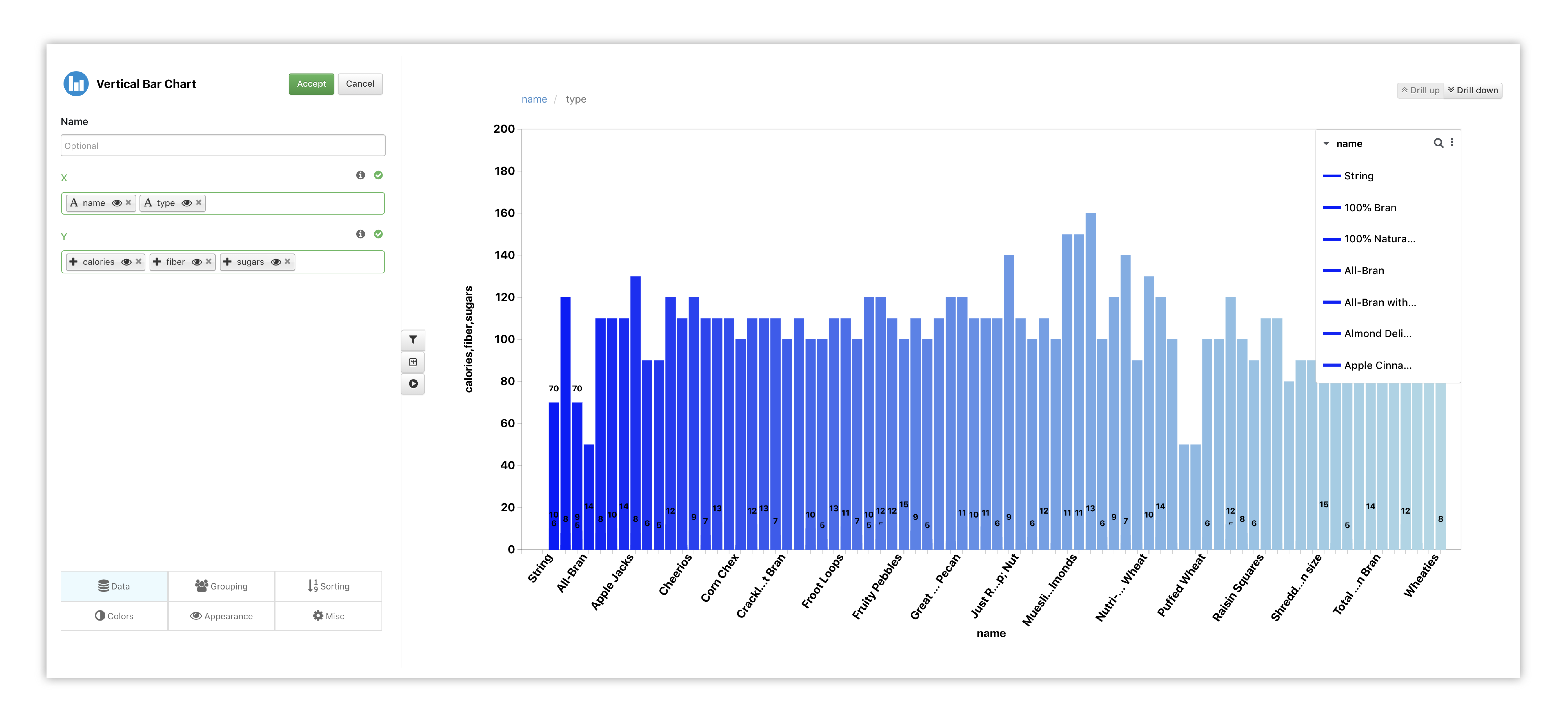
Figure 19: Vertical Bar Chart Options
In the Grouping tab, we’ll change the grouping type to stacked to see bars with the same X overlaid on top of each other.
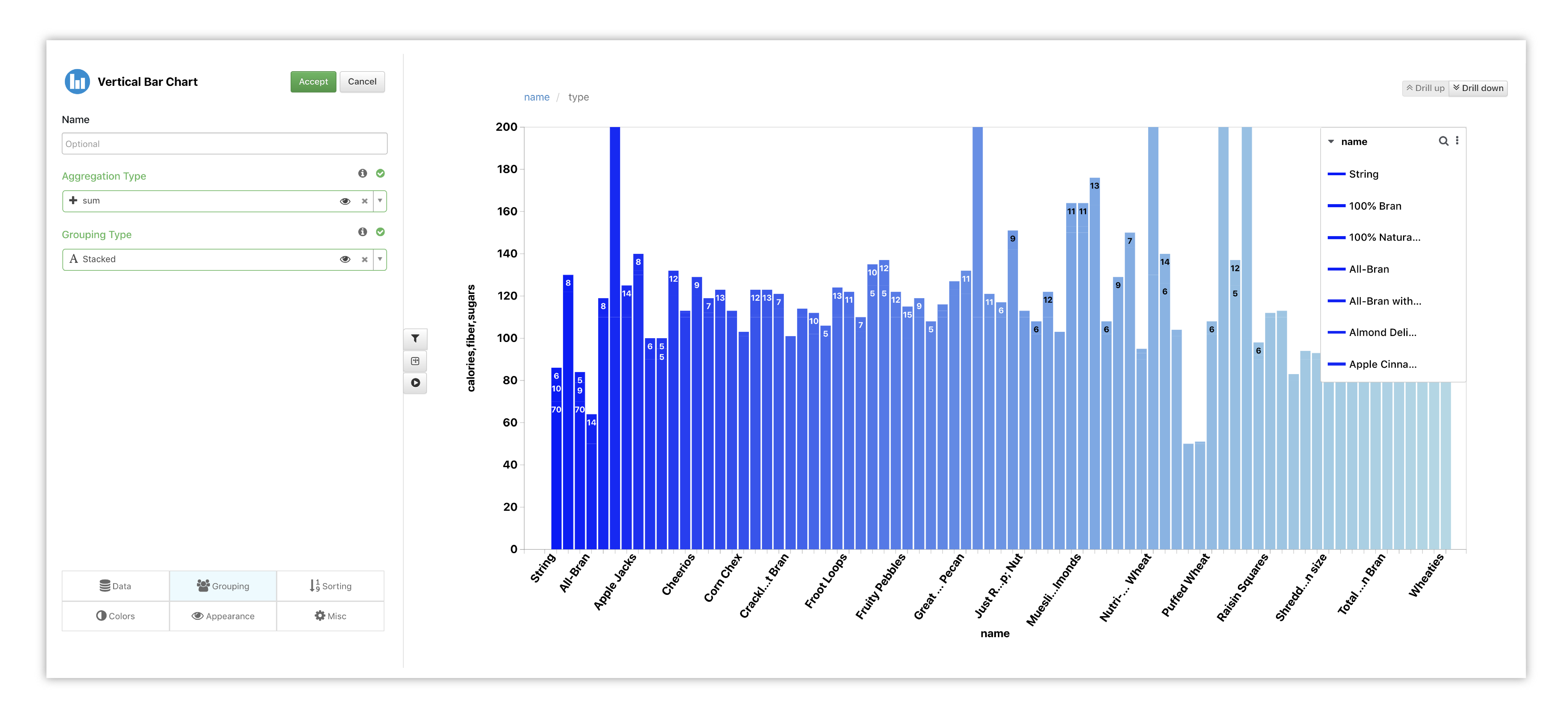
Figure 20: Vertical Bar Chart Options
Under the colors tab, we’ve chosen Type as our data and also picked a different color scheme by clicking on the color wheel next to the option.
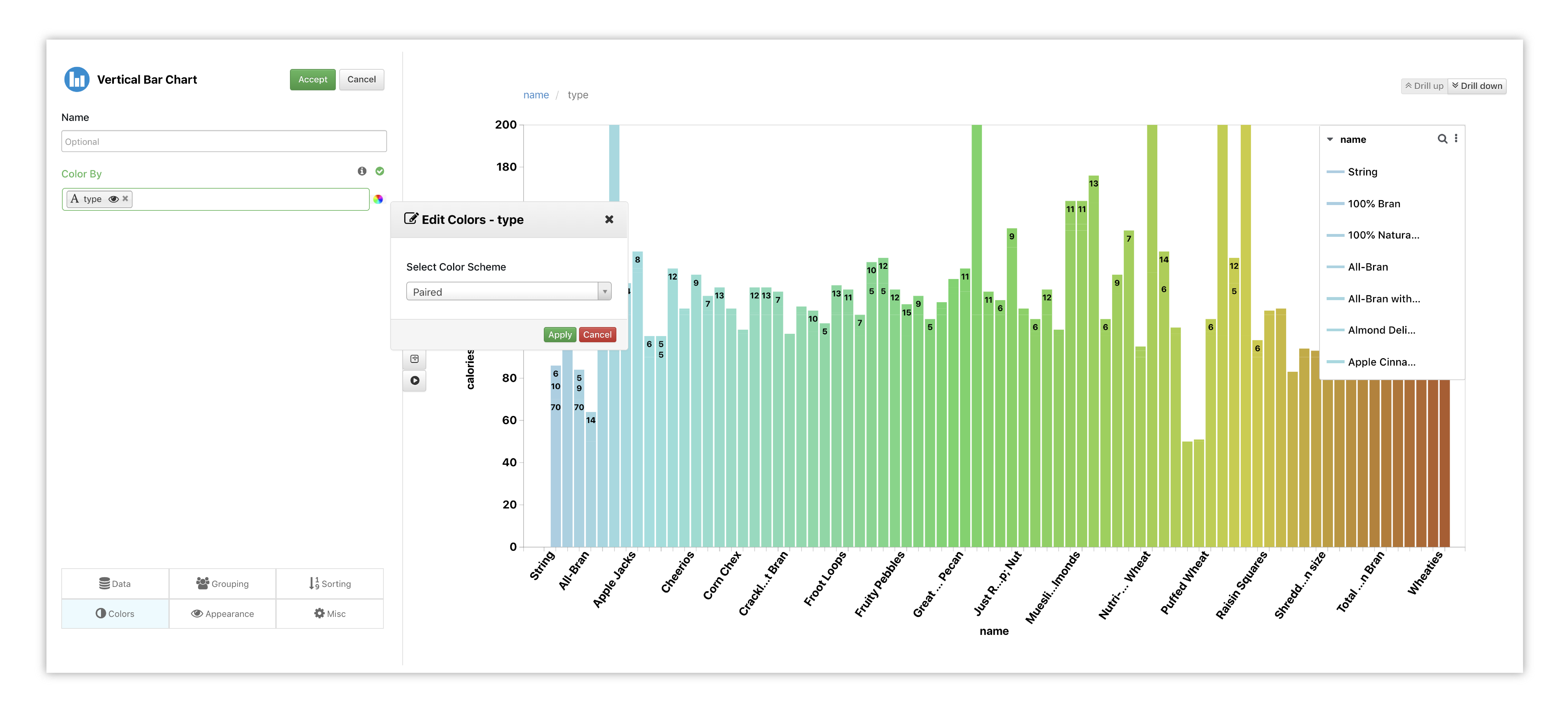
Figure 21: Vertical Bar Chart Options
Watch the following full example of adding Vertical Bar Chart for this dataset.
Parallel Coordinates
In this chart example, we’ve explored the cereals in a different way with a parallel coordinates chart. Here, we can view how the nutritional values of each cereal correlates with one another and how their correlations differ with other cereals.
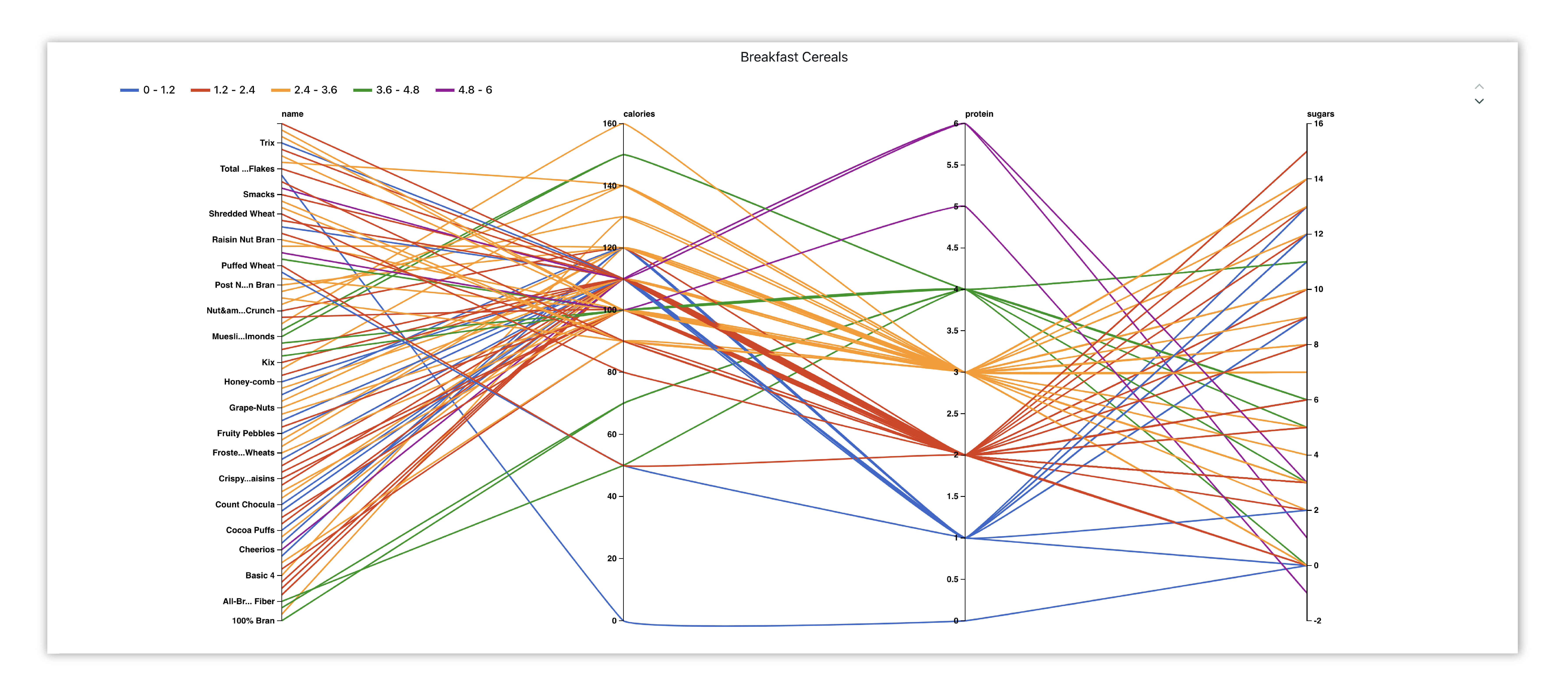
Figure 22: Breakfast Cereals Nutritional Correlations
The table position in the parallel plot can be customized by selecting any one of the positions in the dropdown.
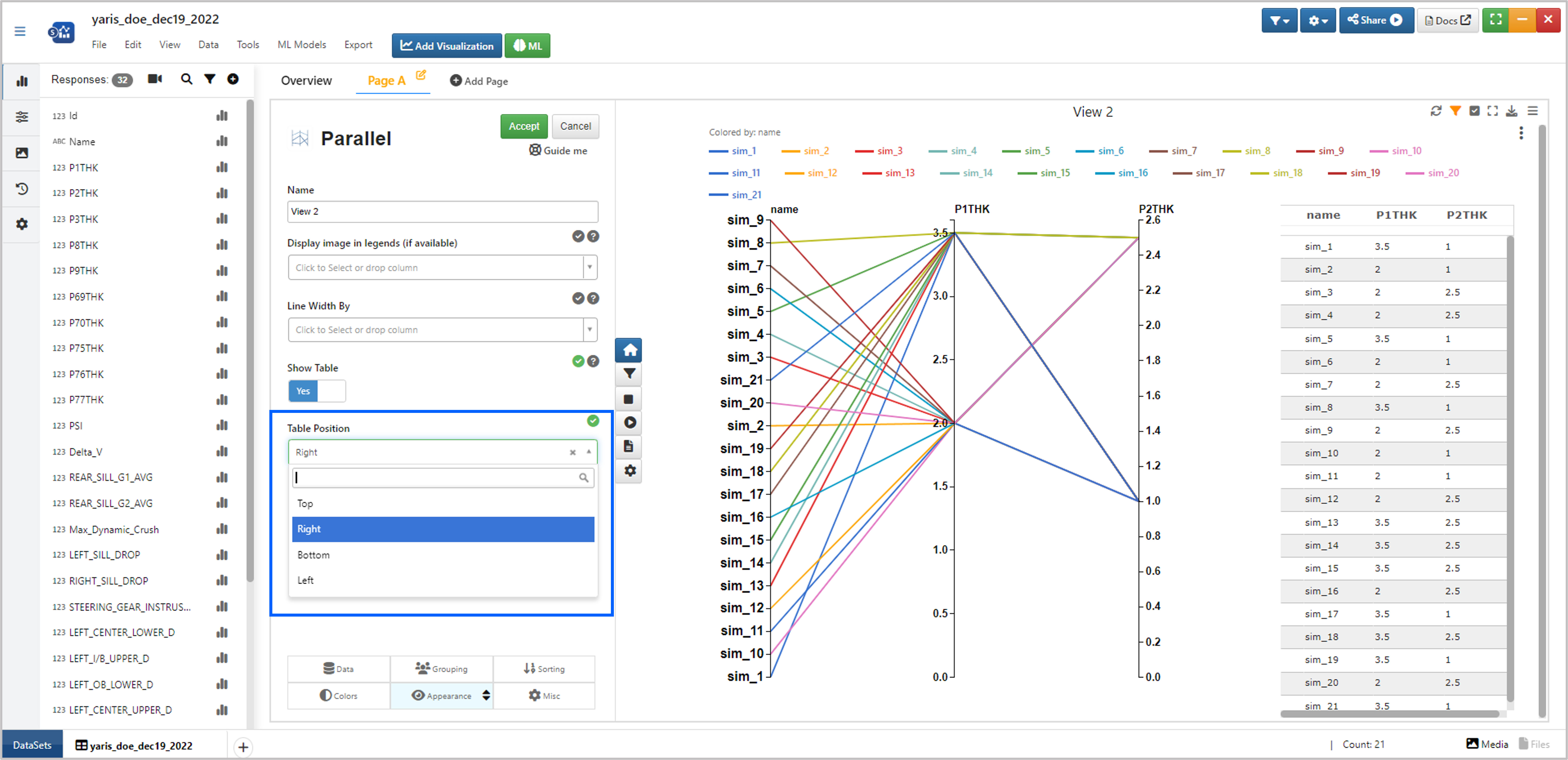
Figure : Parallel Coordinates Table Position
Min-Max range in the parallel plot dimensions can be edited by right clicking on them.
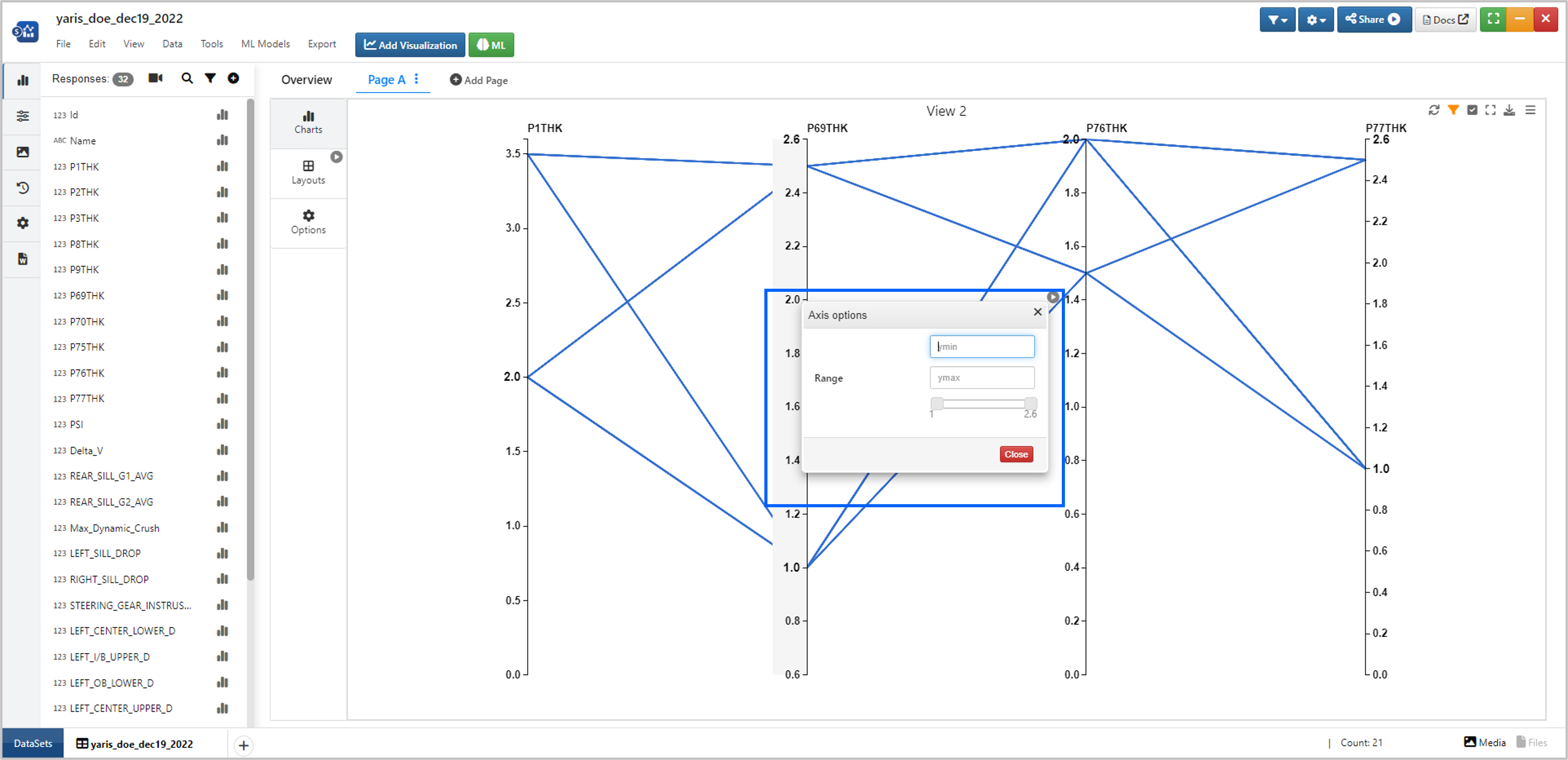
Figure : Parallel Coordinates Min-Max Dimensions
Michigan Museums
For our next dataset, we’ll take a look at the income and revenue of Michigan Museums.
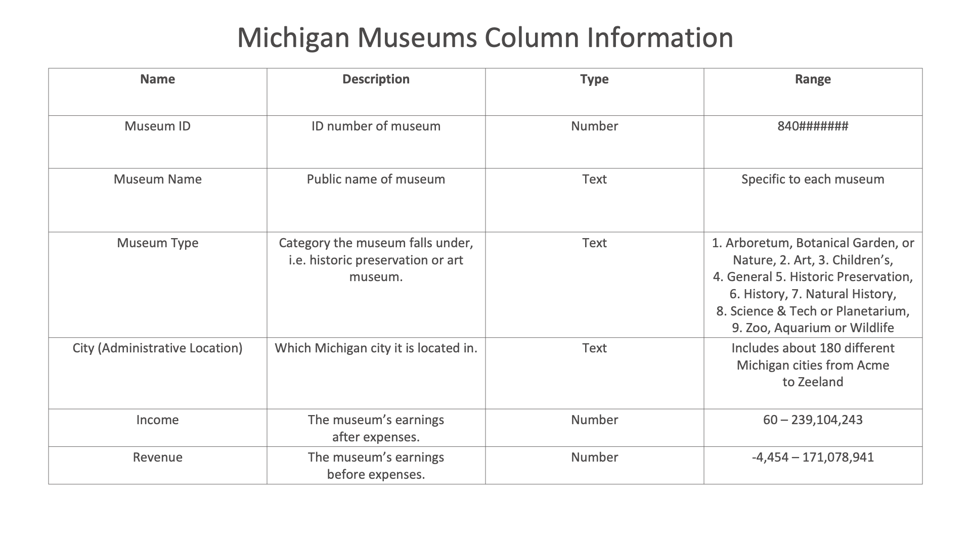
Figure 23: Michigan Museums Dataset
Parallel Coordinates

We’ll create a parallel coordinates chart showing how the income and revenue of museums in a Michigan city compares with others.
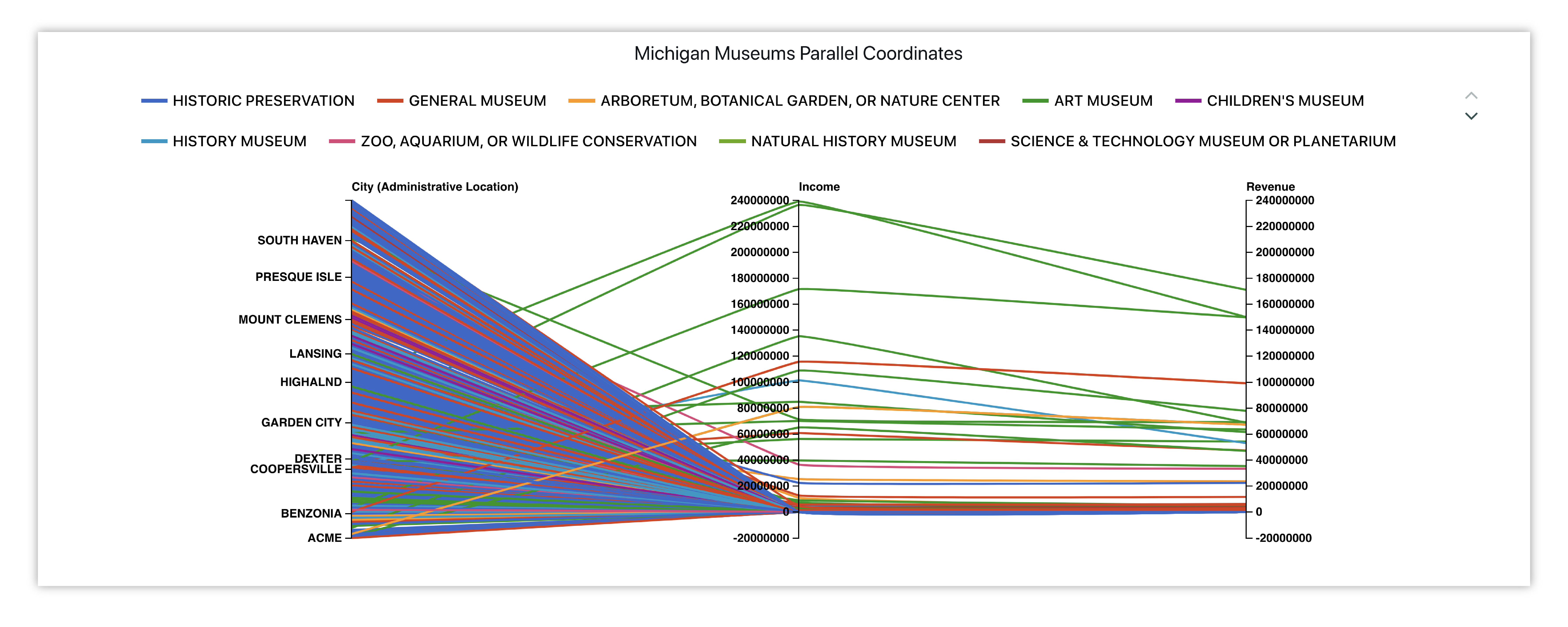
Figure 24: Michigan Museums Incomes and Revenues
Here is our initial view when opening this dataset. Data columns are shown under the Responses panel.
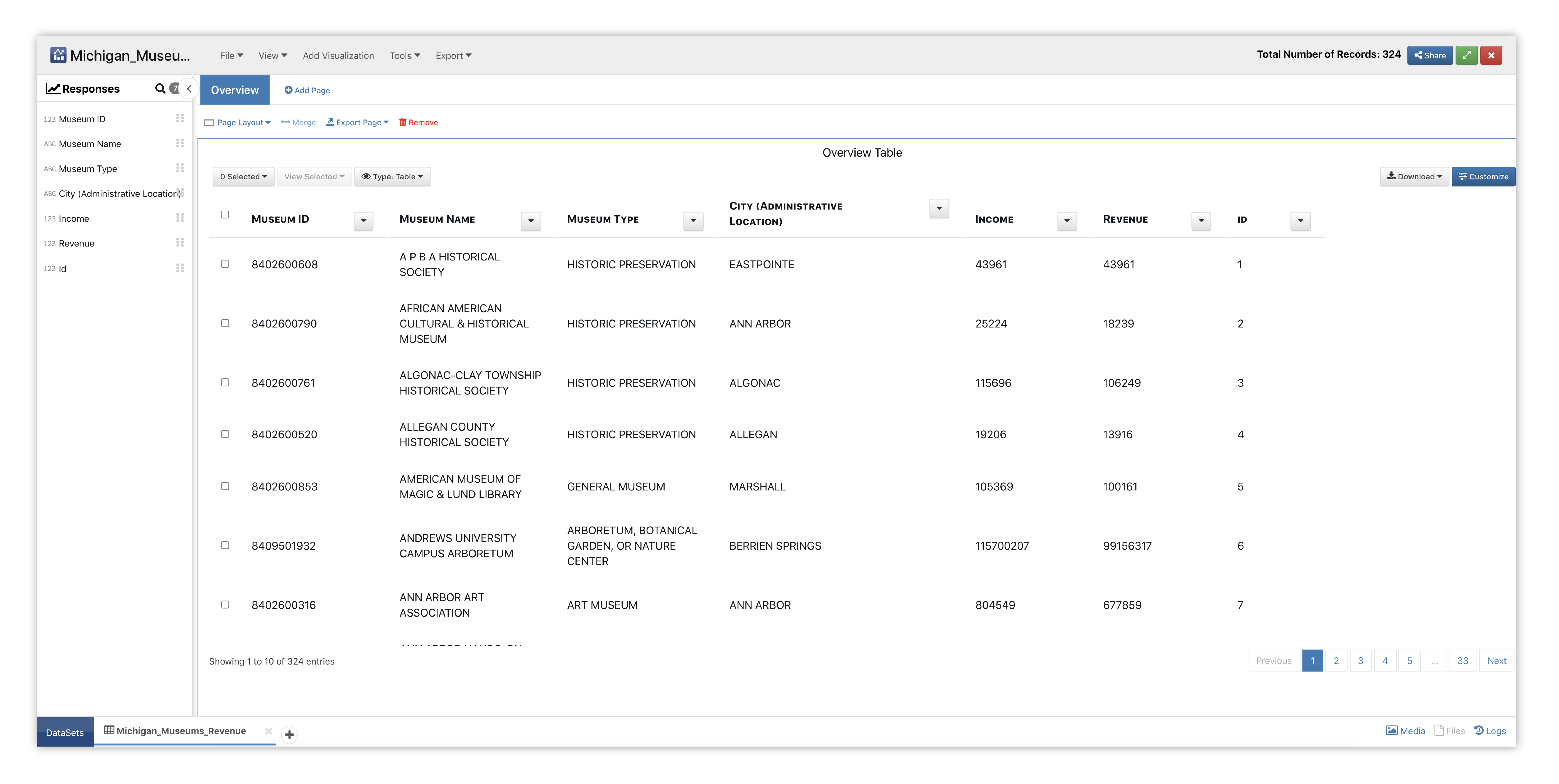
Figure 25: Parallel Coordinates Museum Dataset
We’ll start by adding the Parallel Coordinates visualizer to a new page section.
Please check out section Adding and Editing Pages and Adding Charts to learn how to create new pages and charts respectively.
This chart shows how data columns and their values directly relate to one another, as each column in the chart represents a column from the dataset. Each line represents a data row which is linked between all its column values.
Figure 26: Parallel Coordinates Options & Placeholder
To get a real-time preview, we’ll choose data for our columns. As we add data, a new column is inserted into the graph, connecting values between each pillar accordingly.
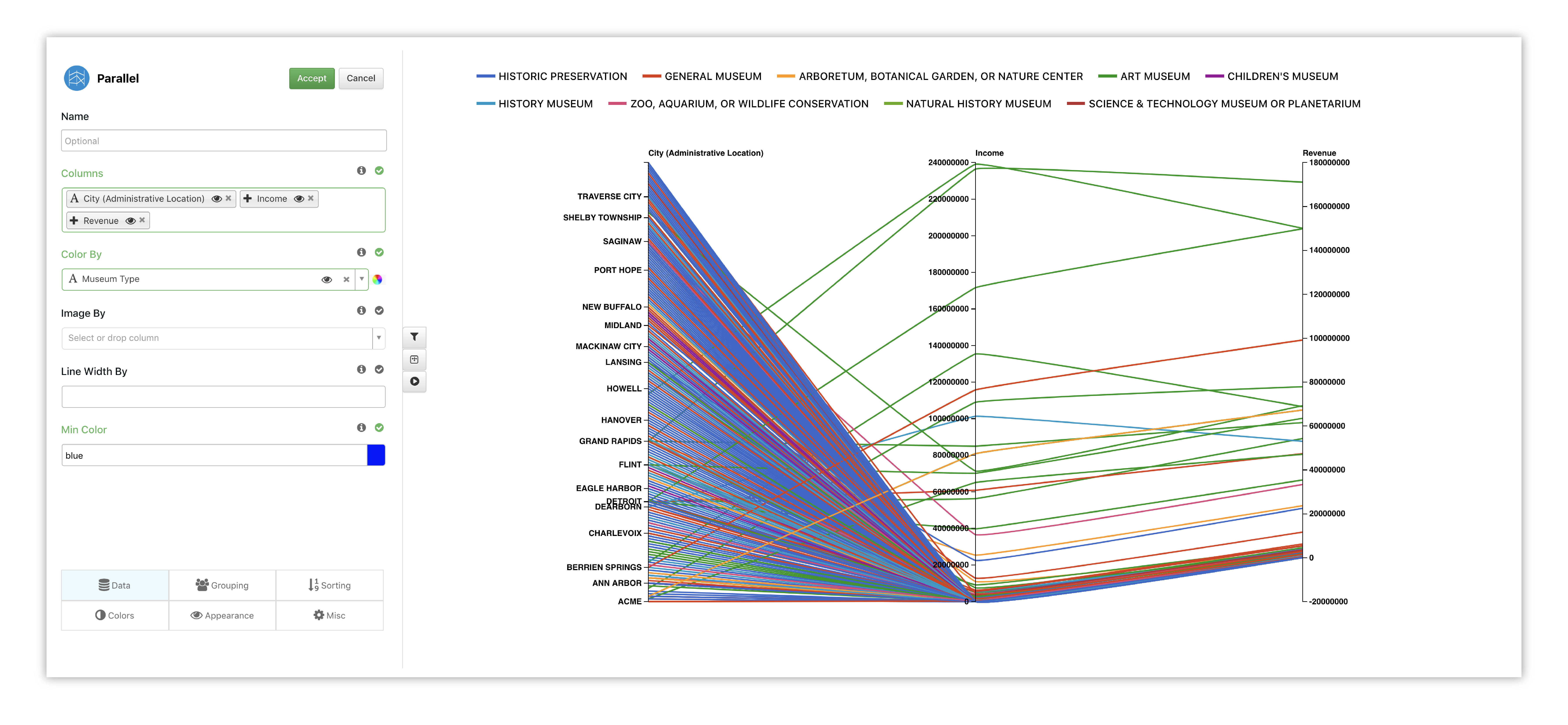
Figure 27: Parallel Coordinates Options
Since we have a lot of Museums that make lower income and revenue, we’ll choose to normalize the graph. This way, the values are a little bit more evenly spaced over the graph.
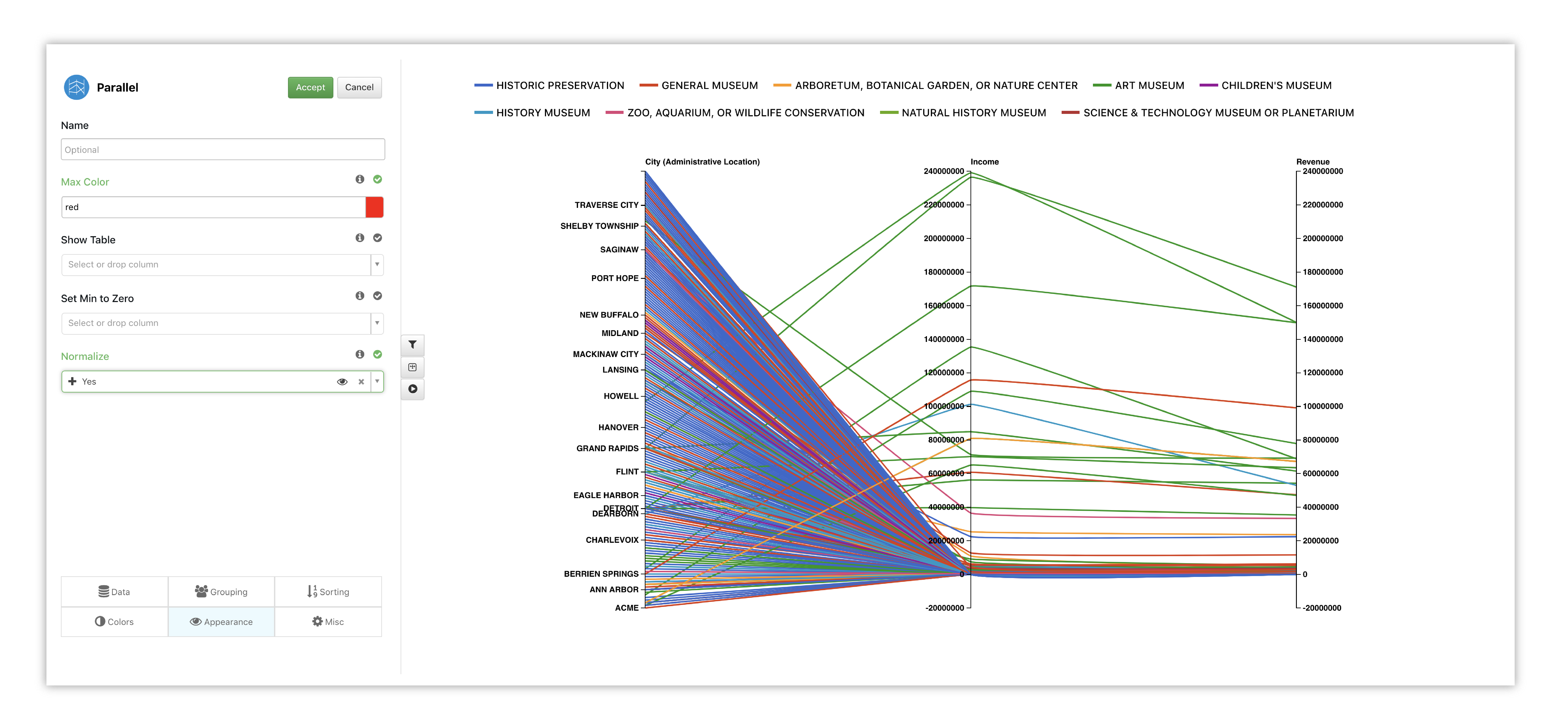
Figure 28: Parallel Coordinates Options
Watch the following full example of adding Parallel Coordinates for this dataset.
Pivot Table
Here is another example of Museum incomes and revenues visualized in a pivot table. The first level encompasses the type of museum, then the city and finally the specific museum’s name. The columns refer to the Museums income while the values show the revenue, so we can compare the income-revenue difference between similar museums in similar locations.
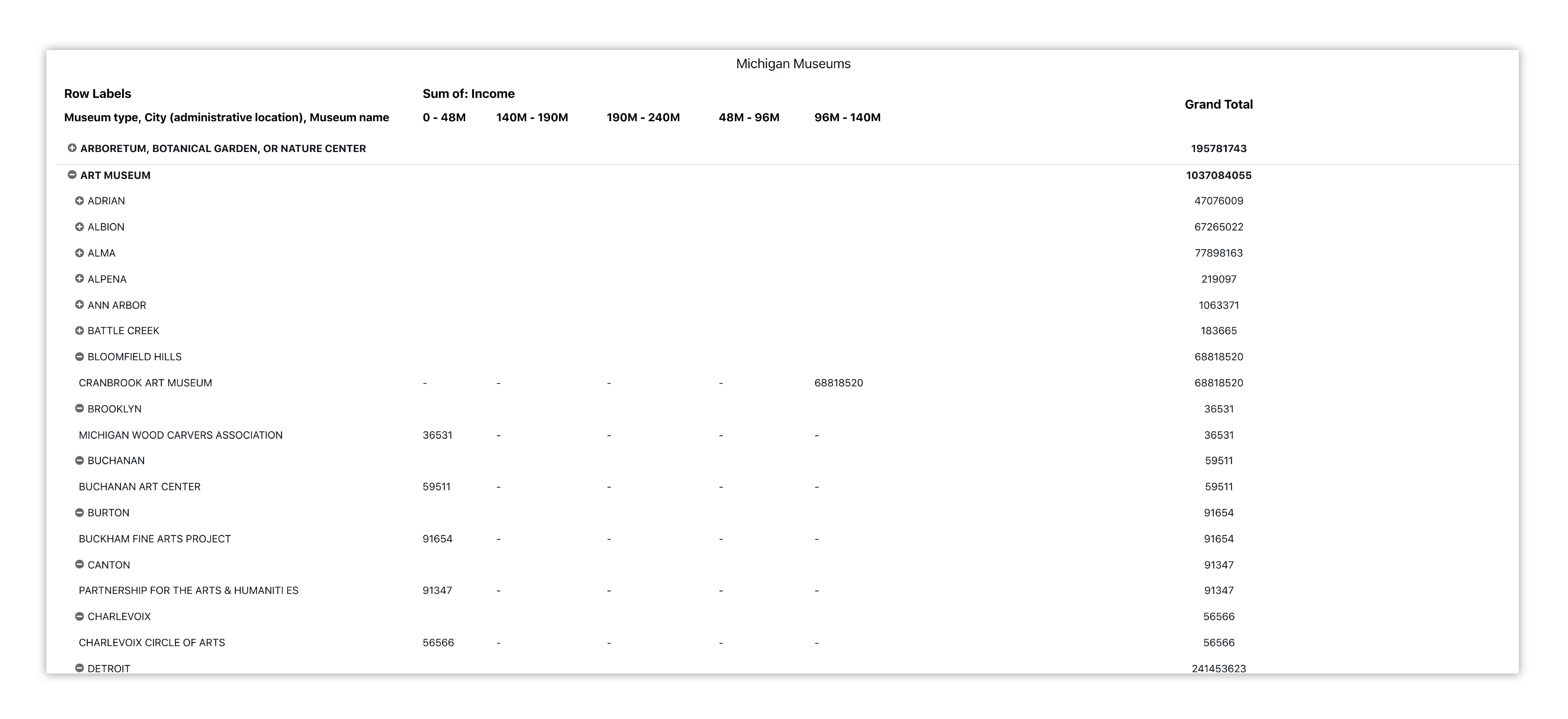
Figure 29: Michigan Museums Income-Revenue Summary
Weather
For this exploration, we’ll be using a dataset on average yearly weather for some European countries.
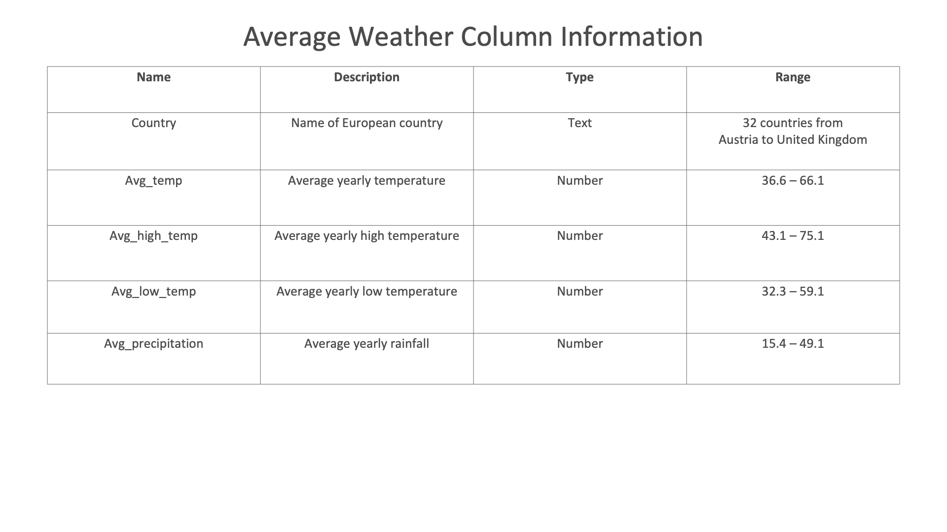
Figure 30: Weather Dataset
Line Chart

We’ll create a Line Chart showing how yearly average precipitation, average temperature, average high and average low changes between country to country.
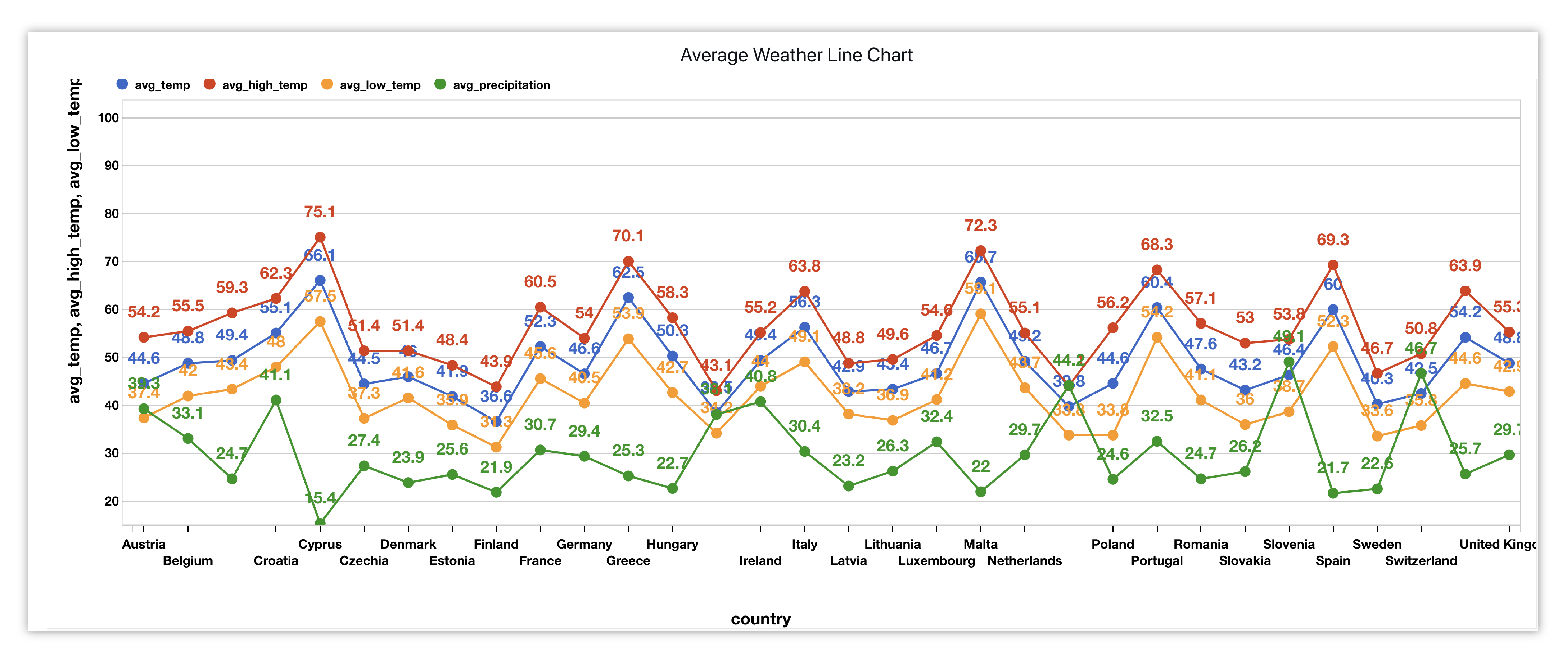
Figure 31: Average Weather in European Countries
Here is our initial view when opening this dataset. Data columns are shown under the Responses panel.
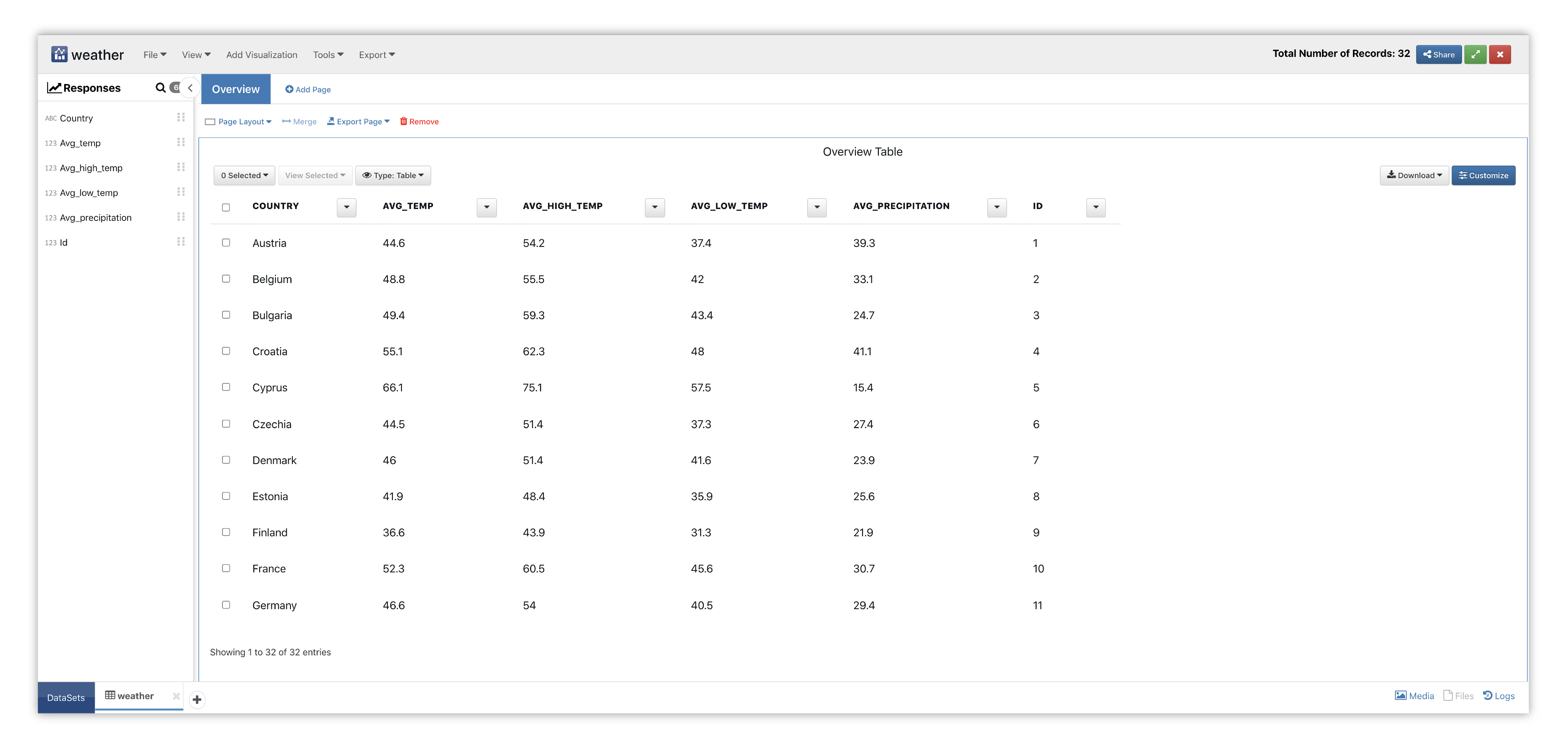
Figure 32: Line Chart Weather Dataset
We’ll start by adding the Line visualizer to a new page section.
Please check out section Adding and Editing Pages and Adding Charts to learn how to create new pages and charts respectively.
This chart specializes in showing how the value of something changes over time or how several things change over time relative to each other.
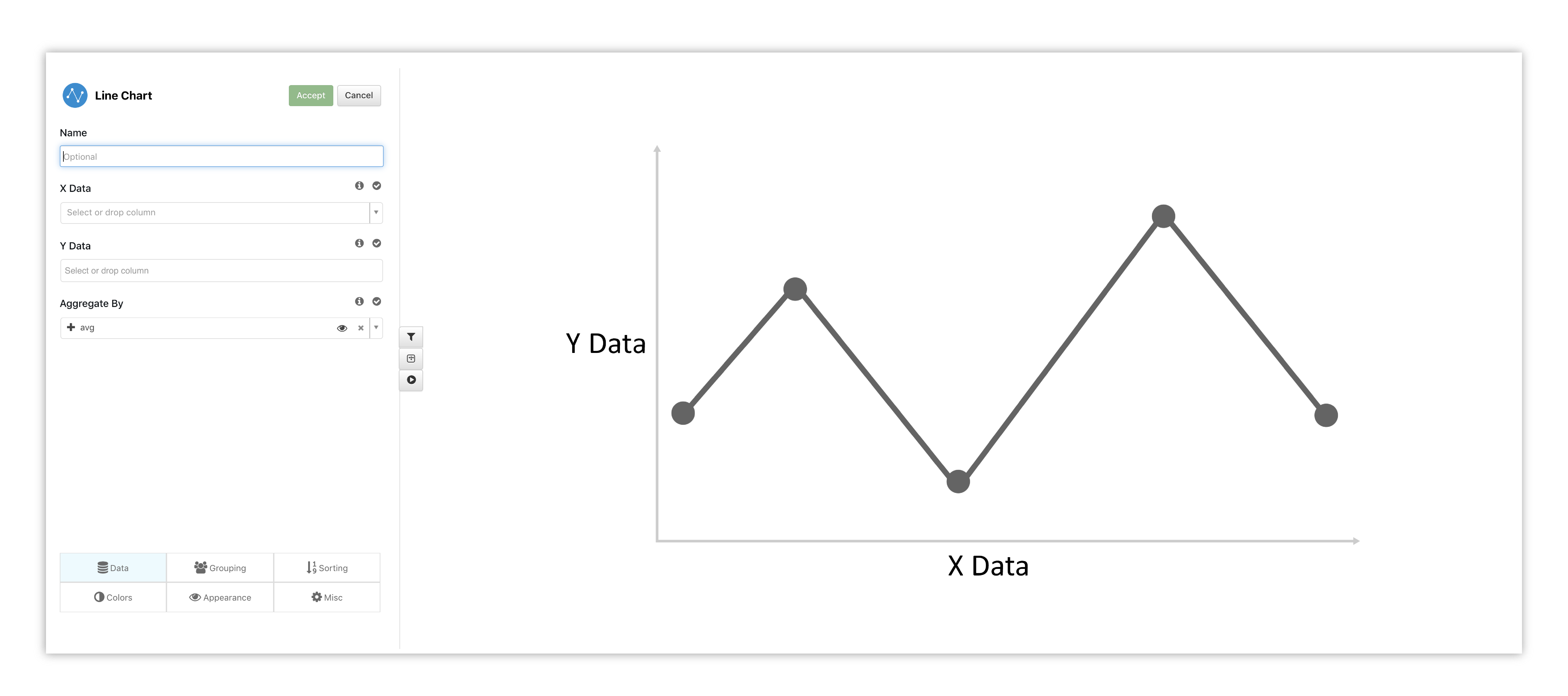
Figure 33: Line Chart Options & Placeholder
To get a real-time preview, we’ll choose our X data and Y data. We can add more Y columns to compare different data columns. Here, we’ve added all average weather values to our Y axis while the X axis pertains to the countries.
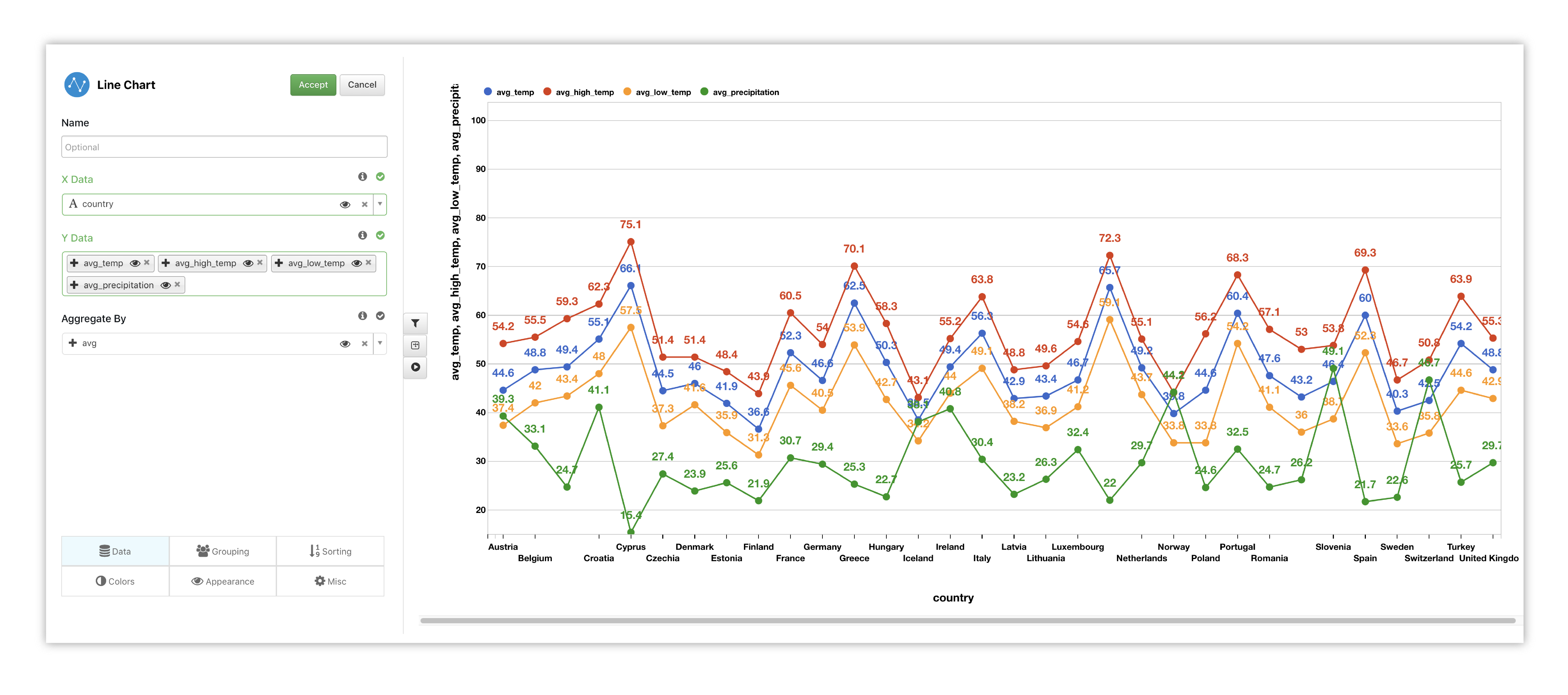
Figure 34: Line Chart Options
Watch the following full example of adding Line Chart for this dataset.
Bar Chart
Here is another chart example, vertical bar, showing average temperatures for each country for comparison.
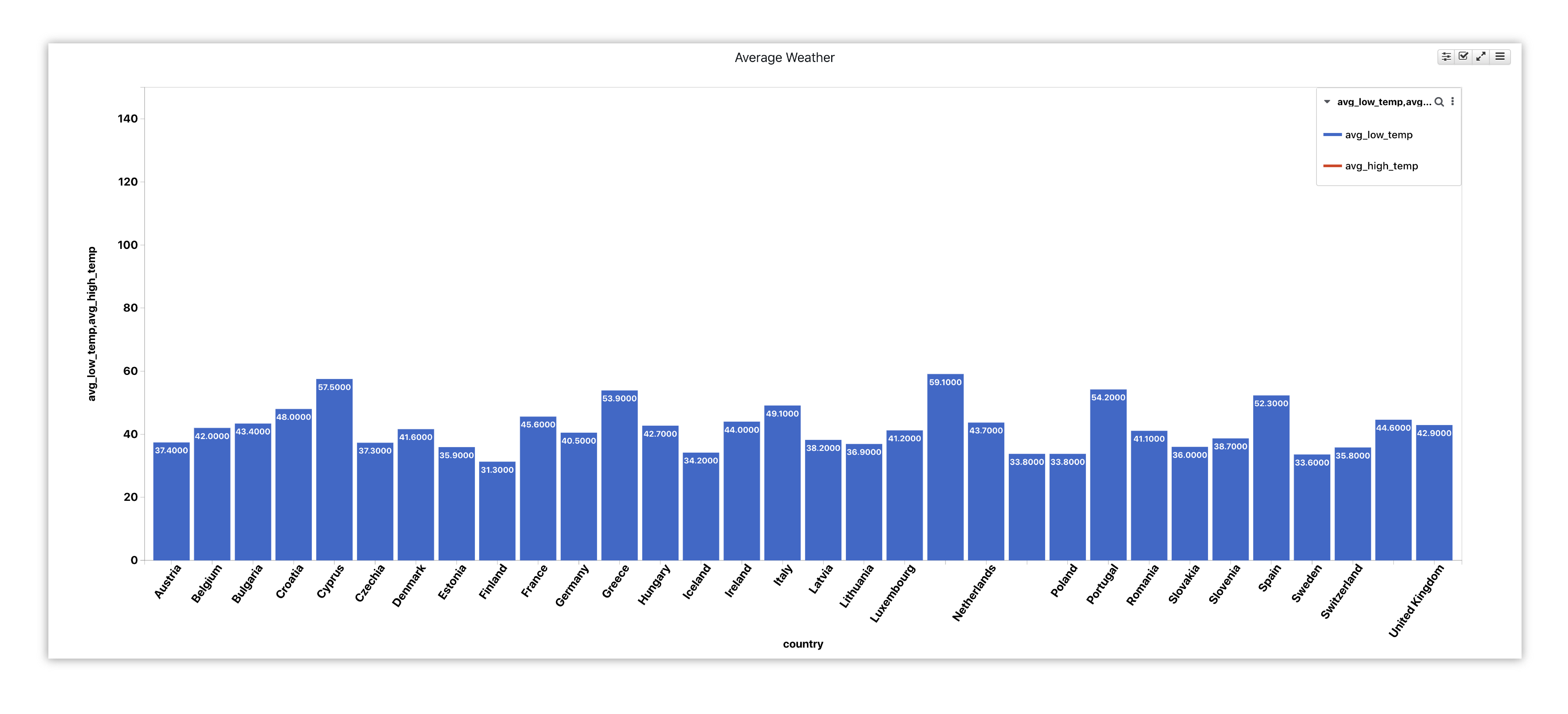
Figure 35: Average Weather in European Countries
Titanic
For this dataset, we’ll explore Titanic passengers statistics such as gender and survival status.
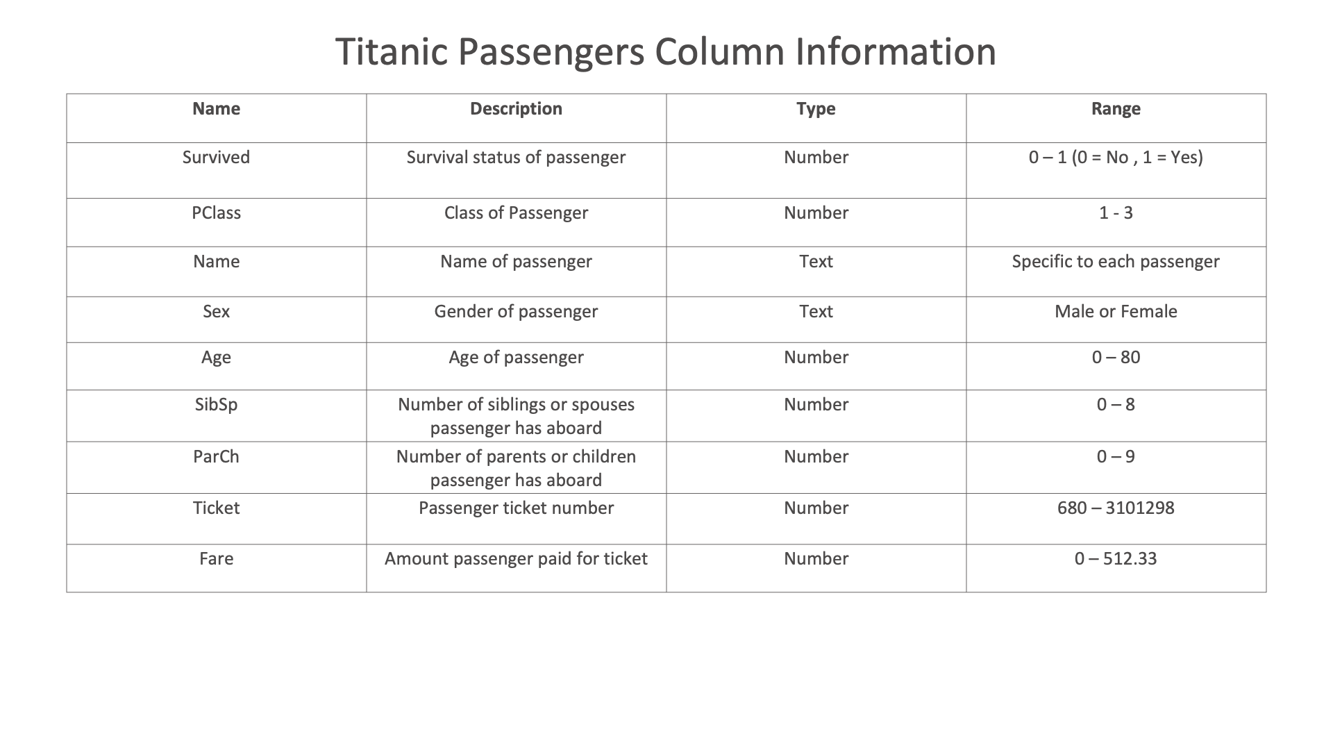
Figure 36: Titanic Dataset
Pie & Donut

We’ll create a pie and donut chart to compare gender as well as survived and lost-to-sea passengers in reference to the whole.
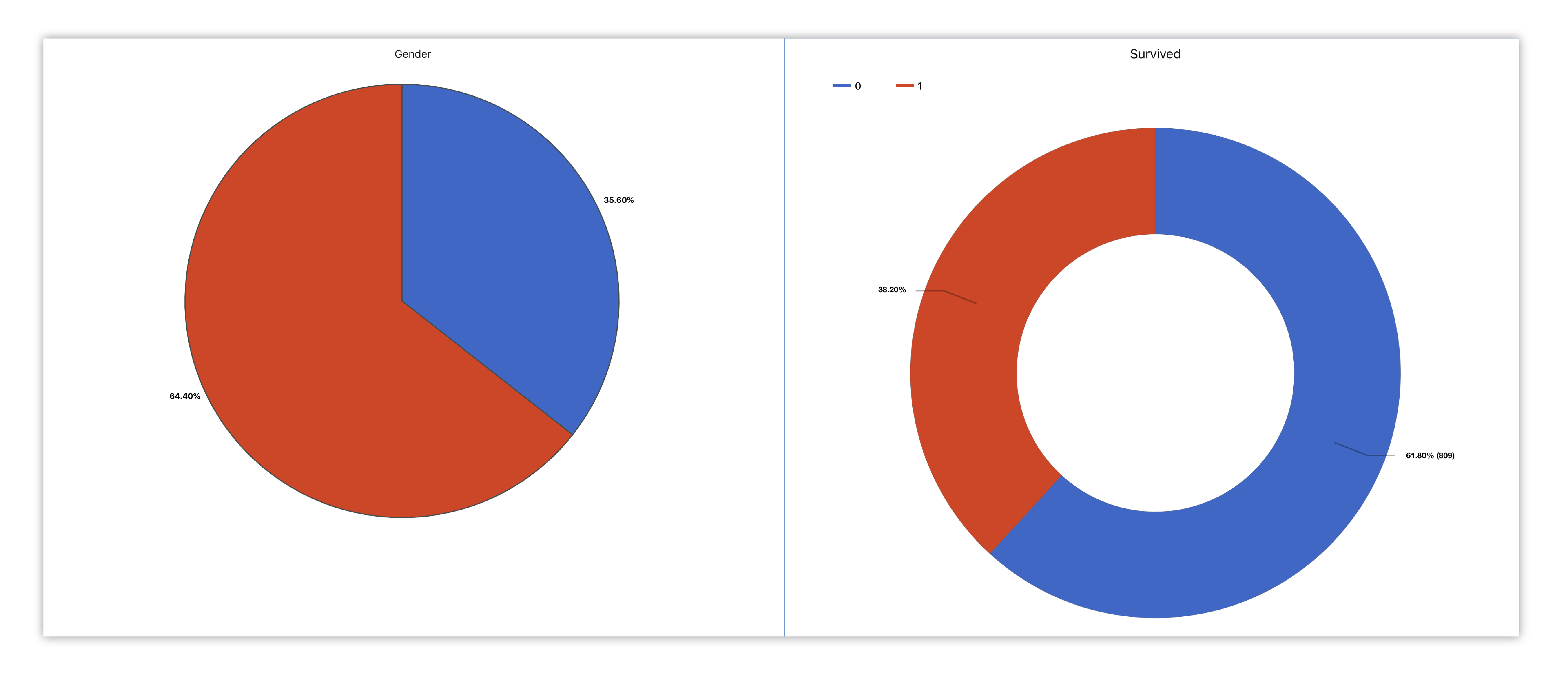
Figure 37: Titanic Passenger Gender & Survival Status
Here is our initial view when opening this dataset. Data columns are shown under the Responses panel.
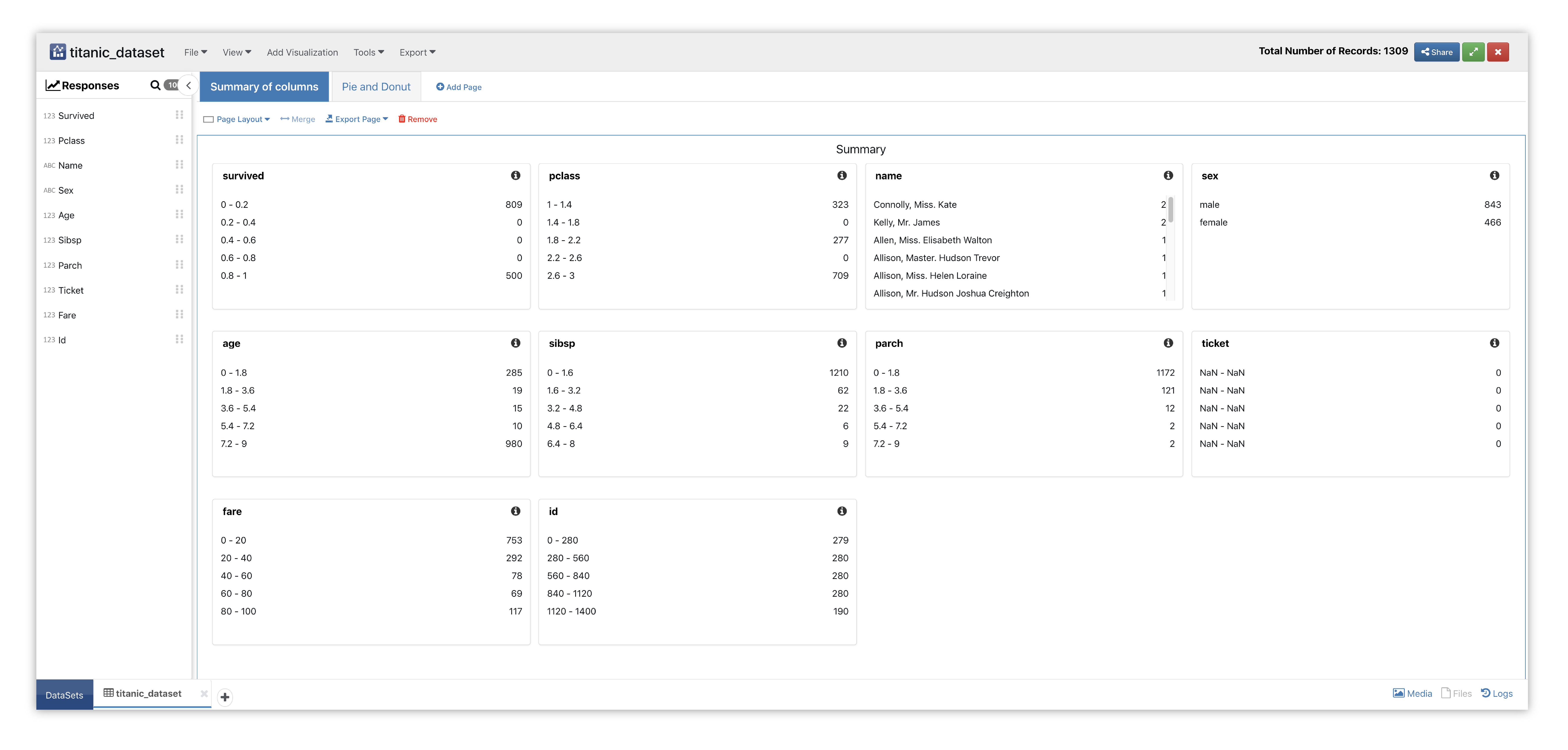
Figure 38: Pie and Donut Dataset
We’ll start by adding the Pie visualizer to a new page with two sections.
Please check out section Adding and Editing Pages and Adding Charts to learn how to create new pages and charts respectively.
This chart shows percentages of a whole and represents percentages at a set point in time.
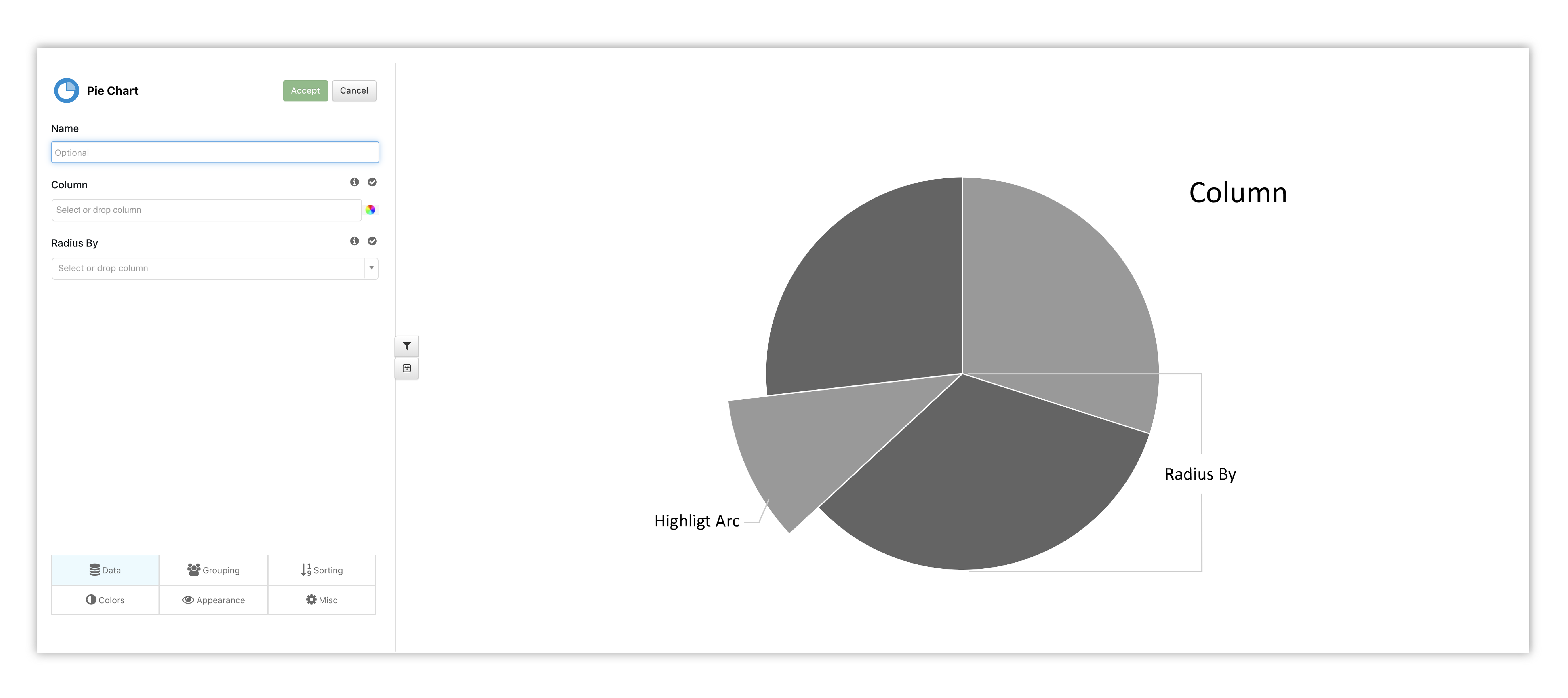
Figure 39: Pie Chart Placeholder
We’ll pick sex (gender) as our column to see the ratio between women and men aboard the Titanic.
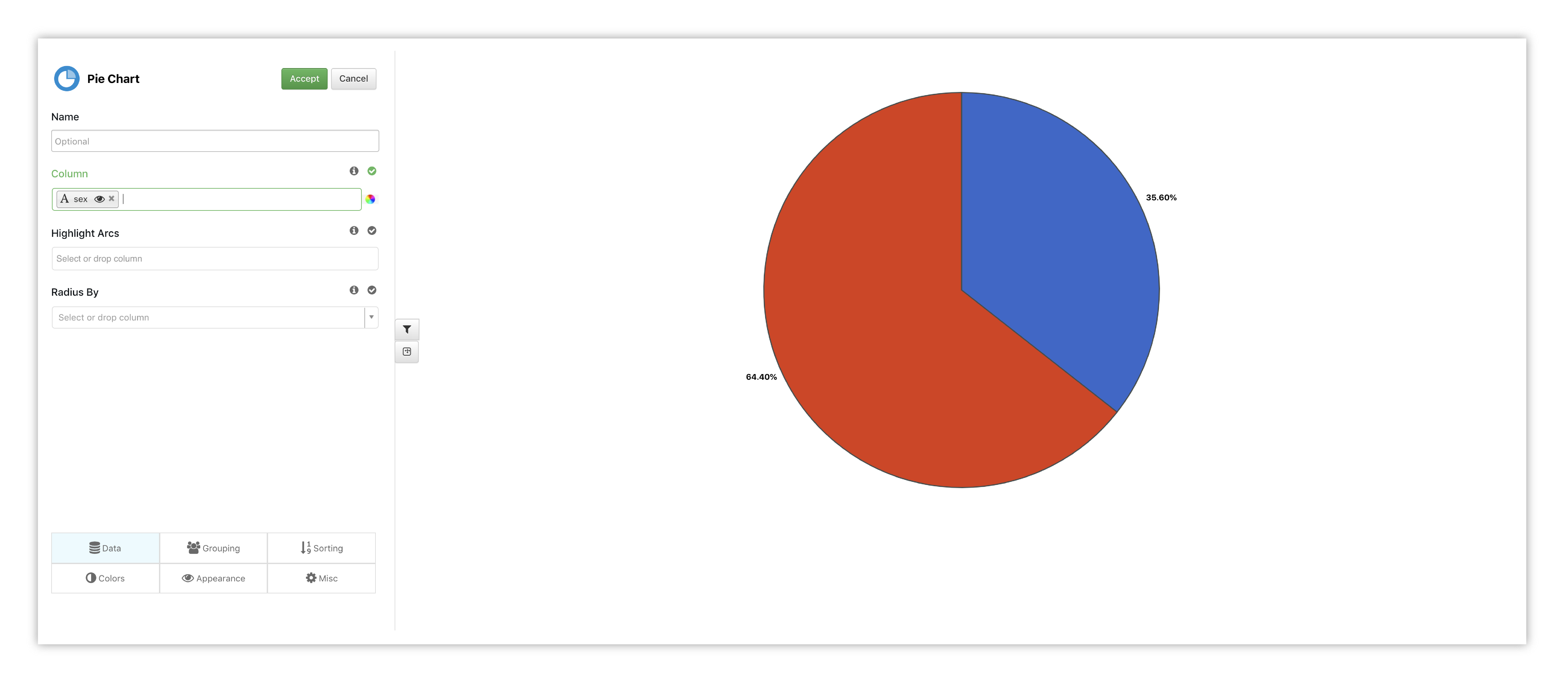
Figure 40: Pie Chart Options
Next, we’ll add Donut to the other page section. This chart shows the proportions of categorical data, with the size of each piece representing the proportion of each category.
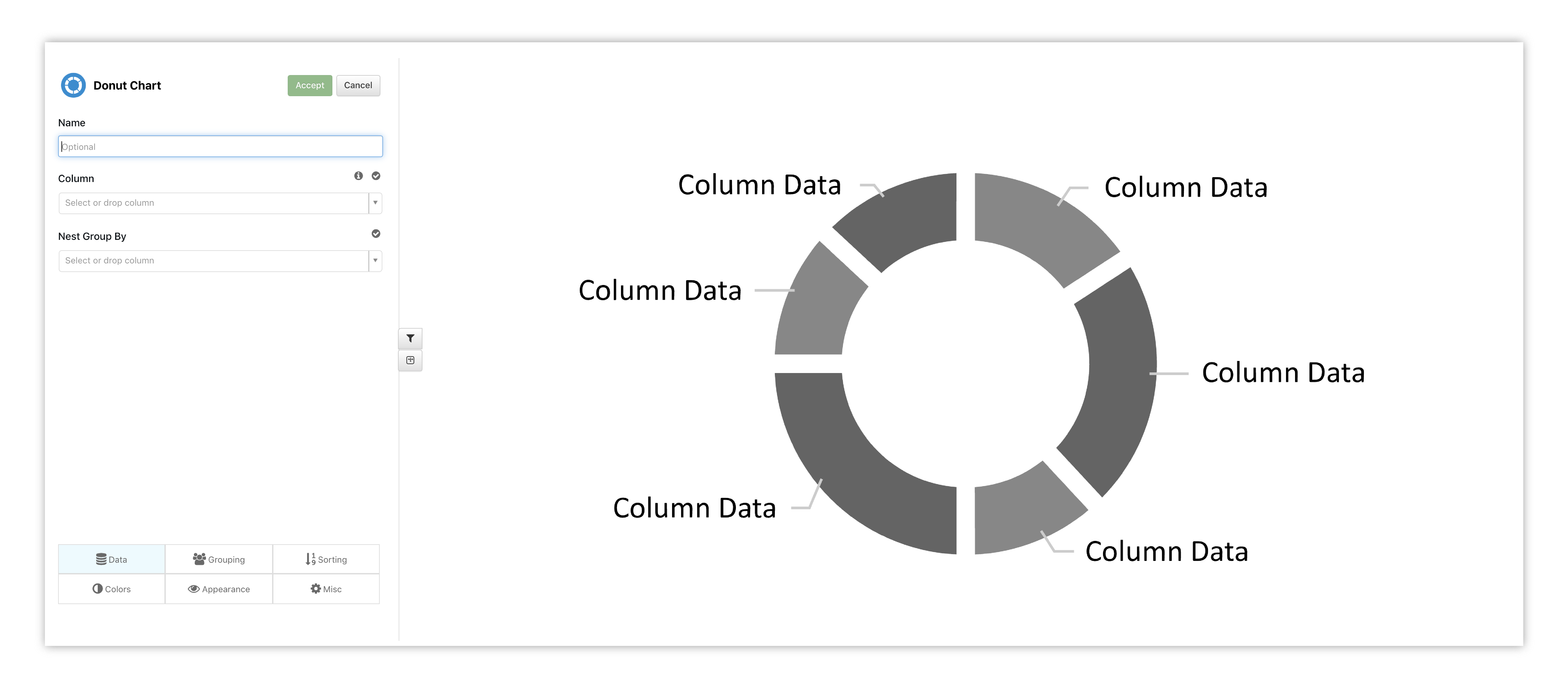
Figure 41: Donut Chart Placeholder
We’ll pick Survived to see the ratio between those who made it and those who sank with the ship.
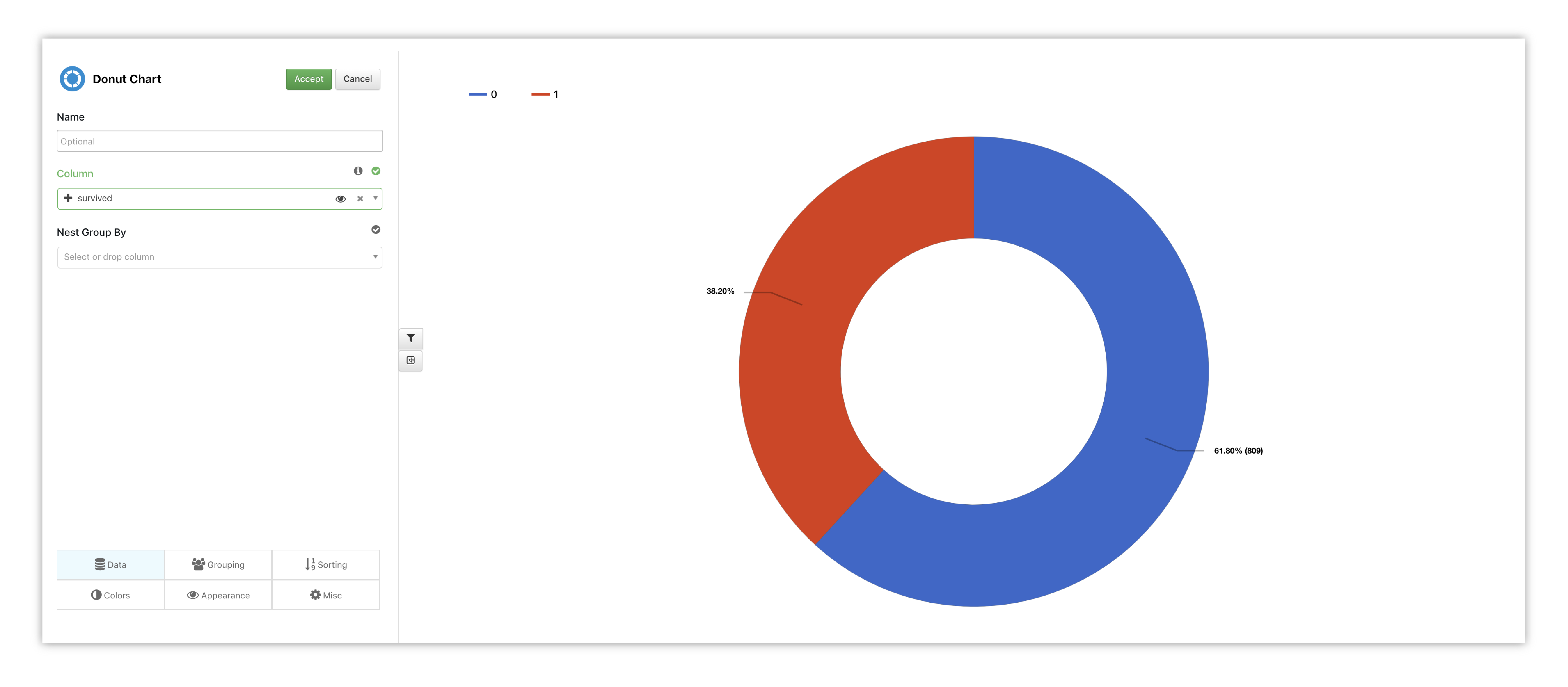
Figure 42: Donut Chart Options
Table
Here is another chart example of the passengers in a simple table. We’ve flipped the table to show the categories as rows, so we can sift through all the passengers to explore their stats in a different way.
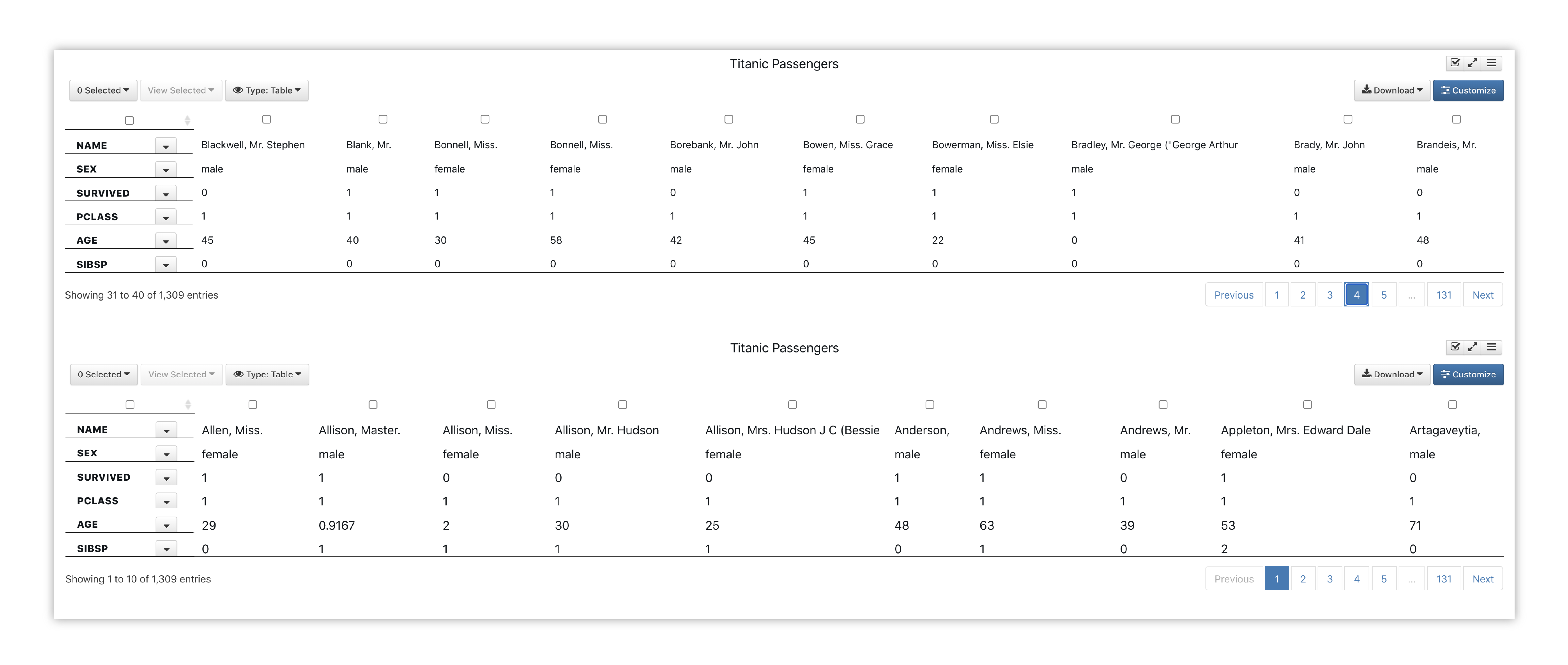
Figure 43: Titanic Passengers Stats
Craft Beers
For this example, we’ll be looking at American Craft Beers, their styles and ABV%.
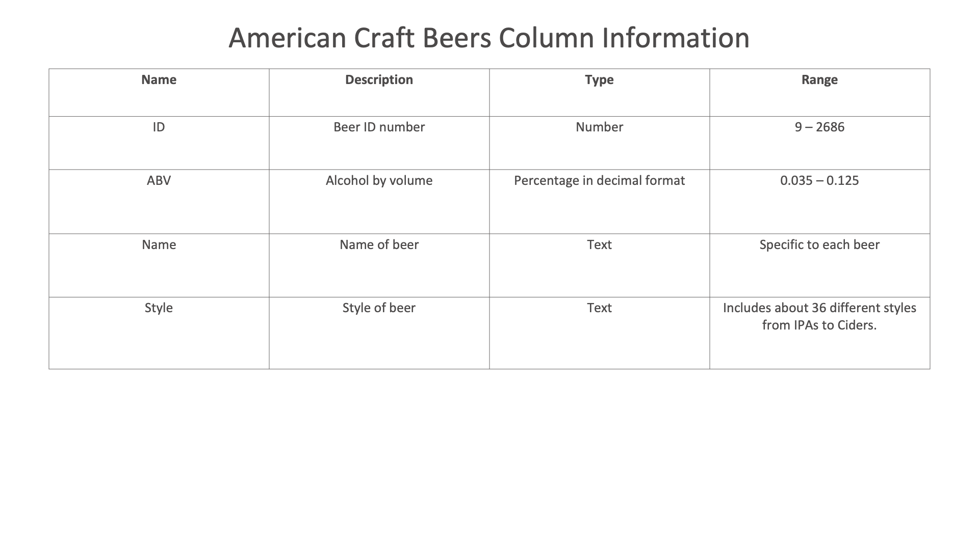
Figure 44: Craft Beers Dataset
Pivot Table

We’ll create a pivot table to summarize the ABV content of different beer styles.
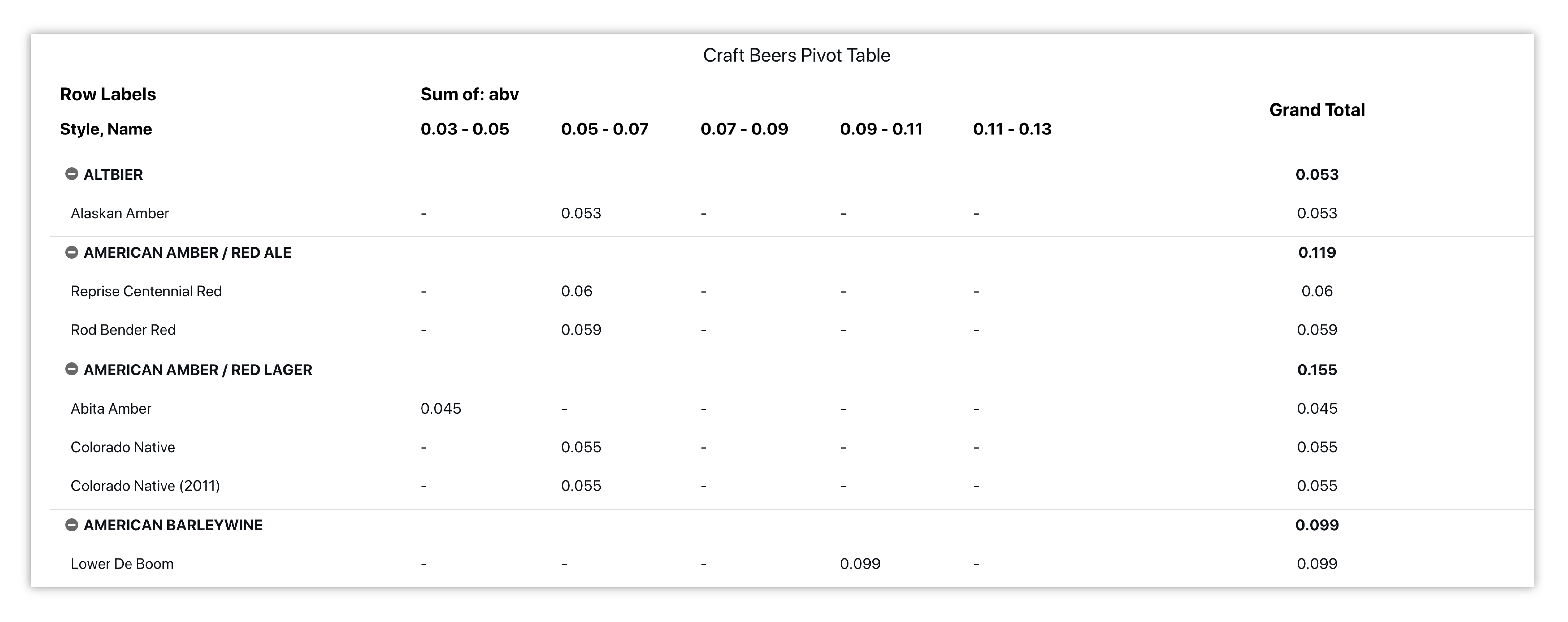
Figure 45: American Craft Beer Styles & ABV%
Here is our initial view when opening this dataset. Data columns are shown under the Responses panel.
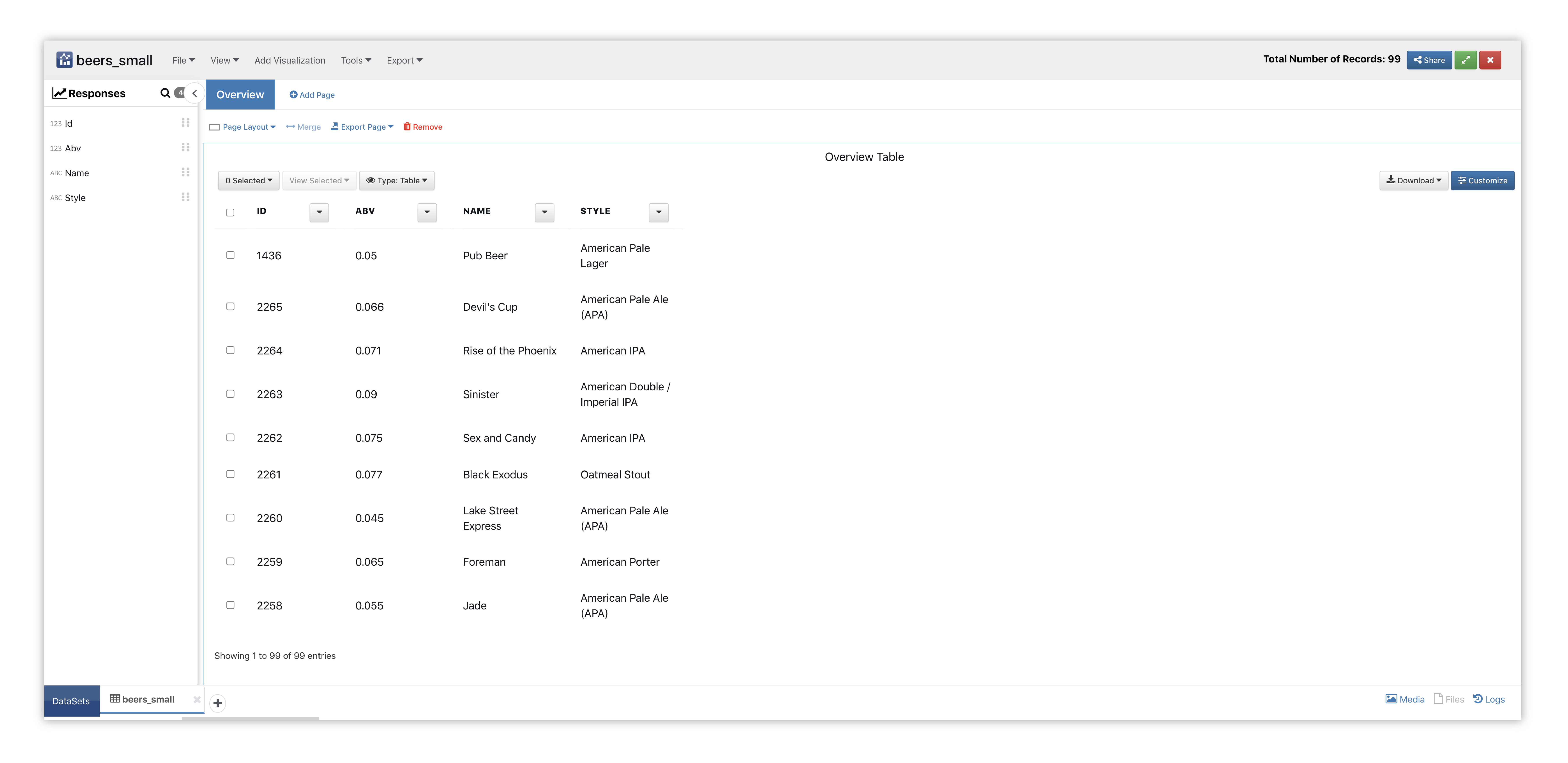
Figure 46: Pivot Table Beers Dataset
We’ll start by adding the Pie visualizer to a new page with two sections.
Please check out section Adding and Editing Pages and Adding Charts to learn how to create new pages and charts respectively.
This chart quickly summarizes large amounts of data is an interactive way. It analyzes numerical data in detail and answers unanticipated questions about the data.
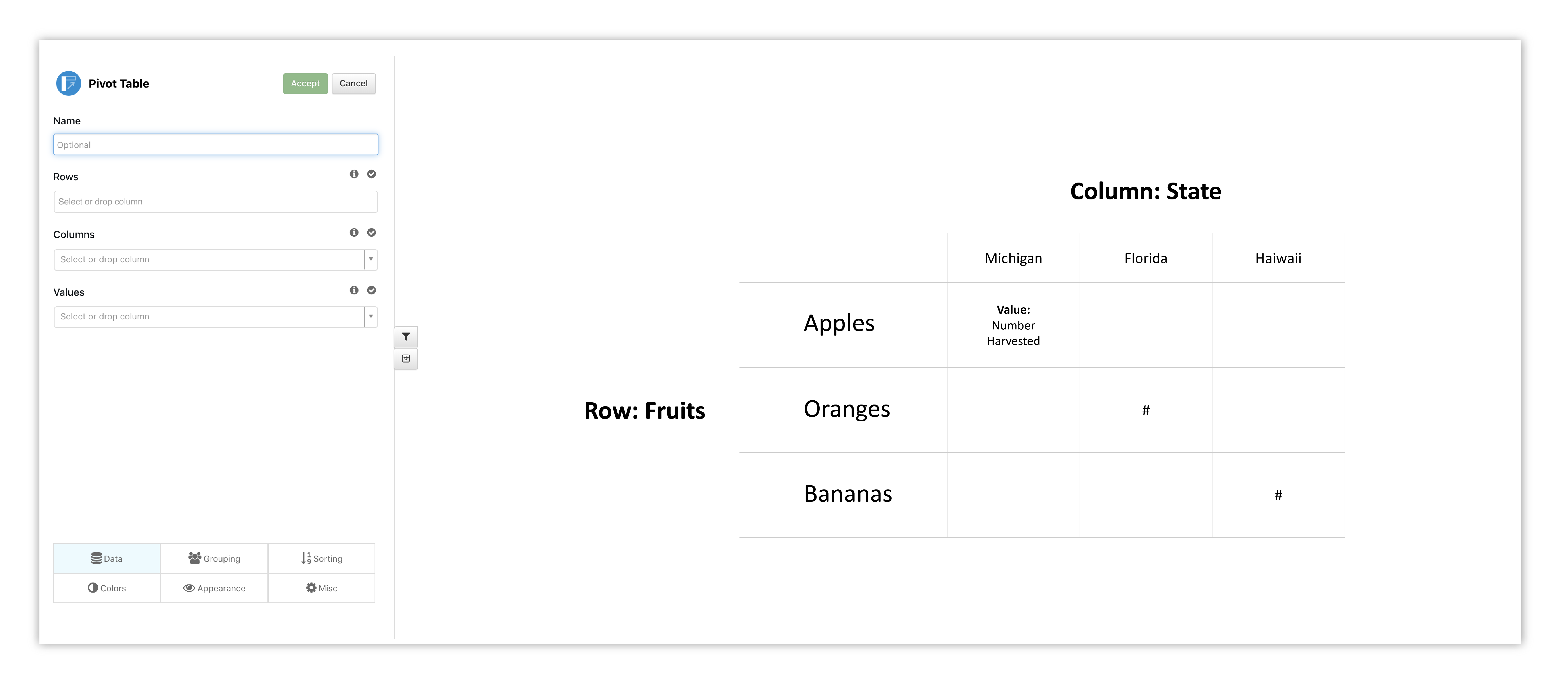
Figure 47: Pivot Table Placeholder
Data for rows will show up in the table as they are chosen. Here, we have picked style of beer first, then beer name. Each top row reflects a beer style which encompasses the beers of that style; the style pivots in or out to hide or reveal the beer names. ABV % has been chosen for our columns and column values. The last column shows our totals for each secondary row then the total for the main row.
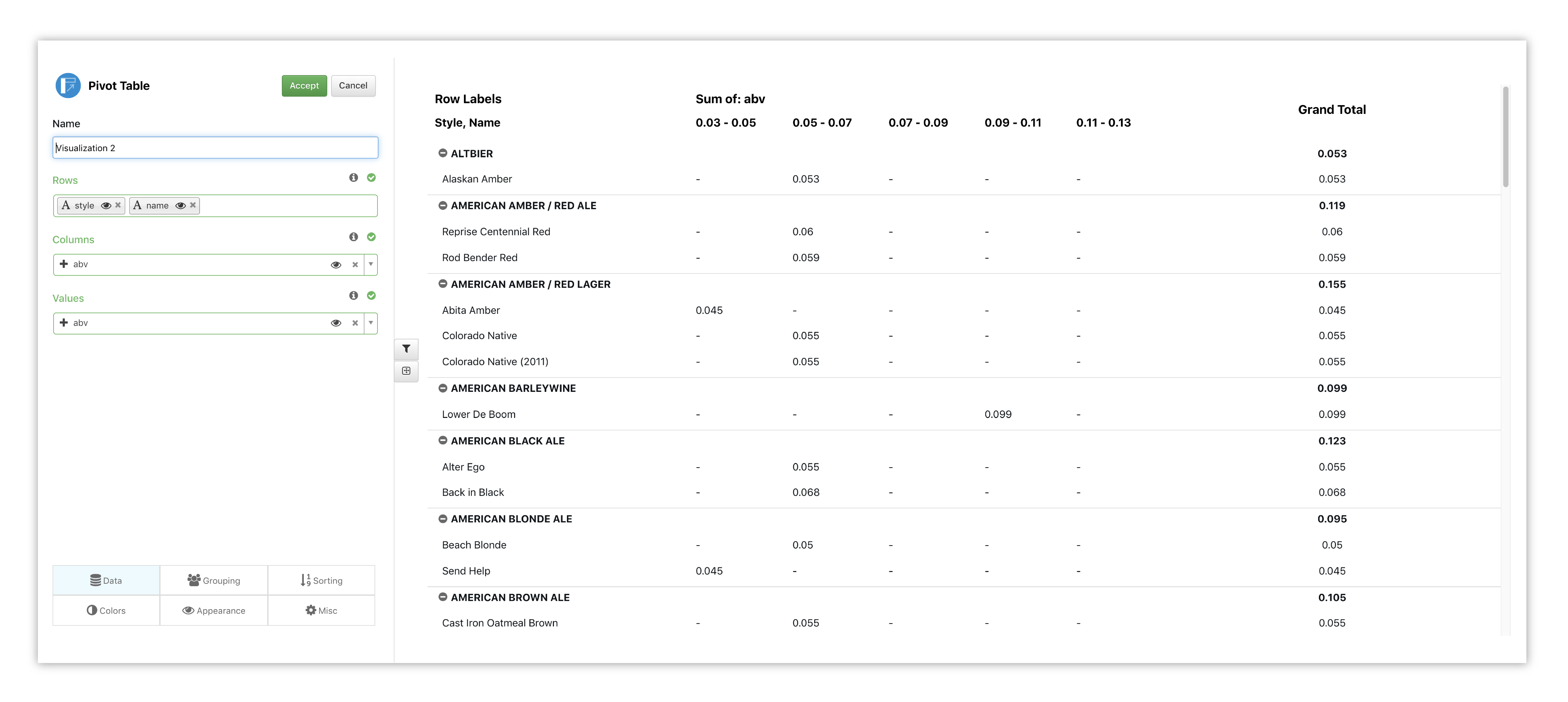
Figure 48: Pivot Table Options
Watch the following full example of adding Pivot Table for this dataset.
Bubble Chart
Here, we’ve created a bubble chart for comparing the beers’ ABV content. The node size is based on the beer style, while the coloring emphasizes the ABV content.
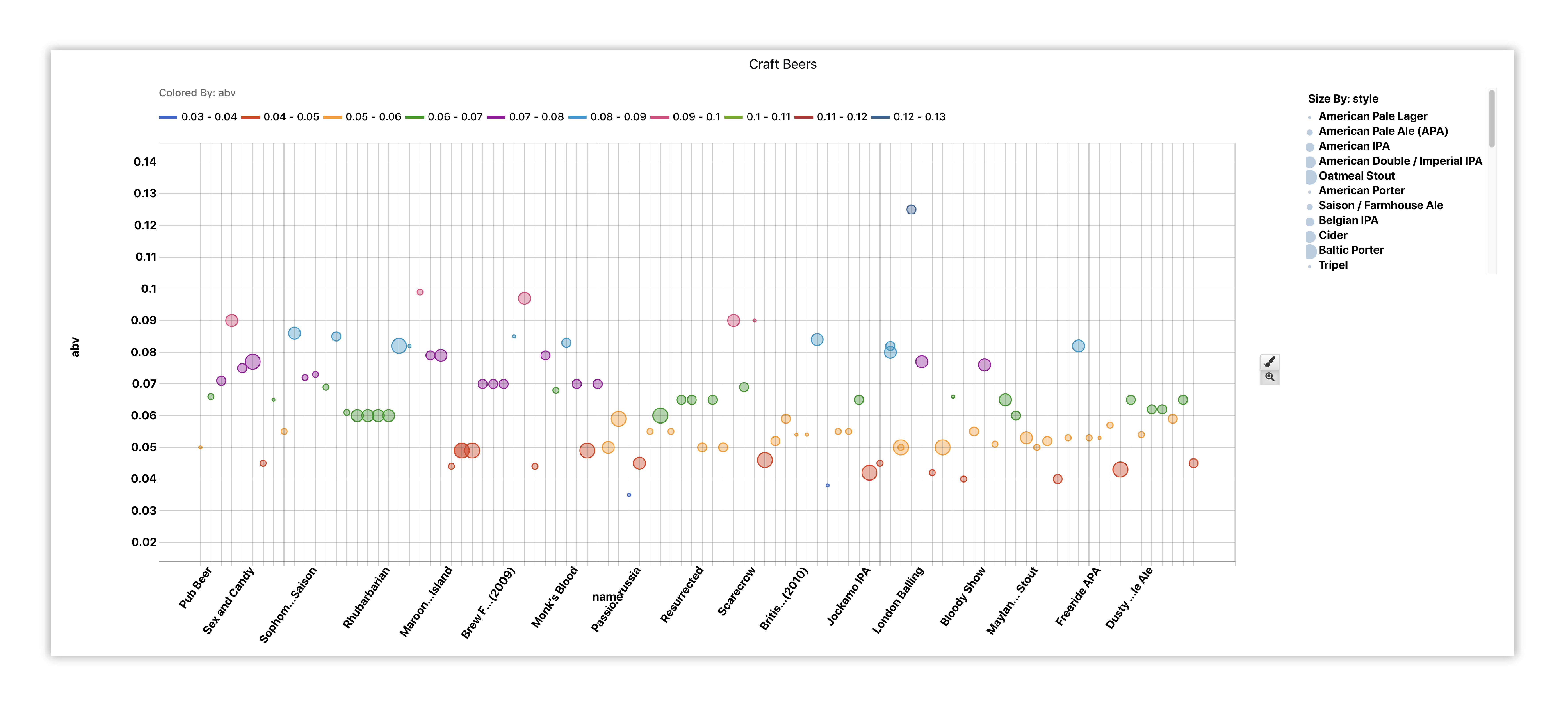
Figure 49: American Craft Beers ABV%
Diamonds
For this example, we’ll be looking at value characteristics of different diamonds.
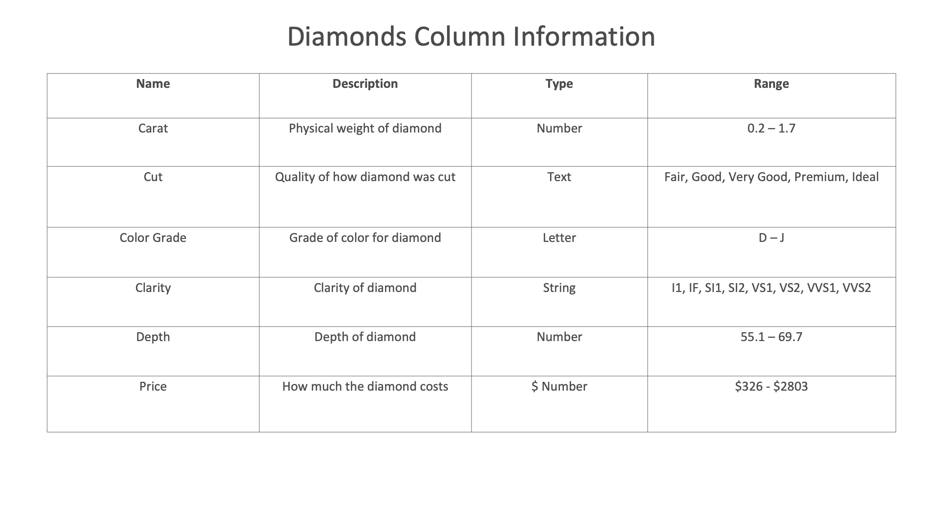
Figure 50: Diamonds Dataset
Filterable Table

We’ll create a filterable table to summarizes different aspects of these diamonds.
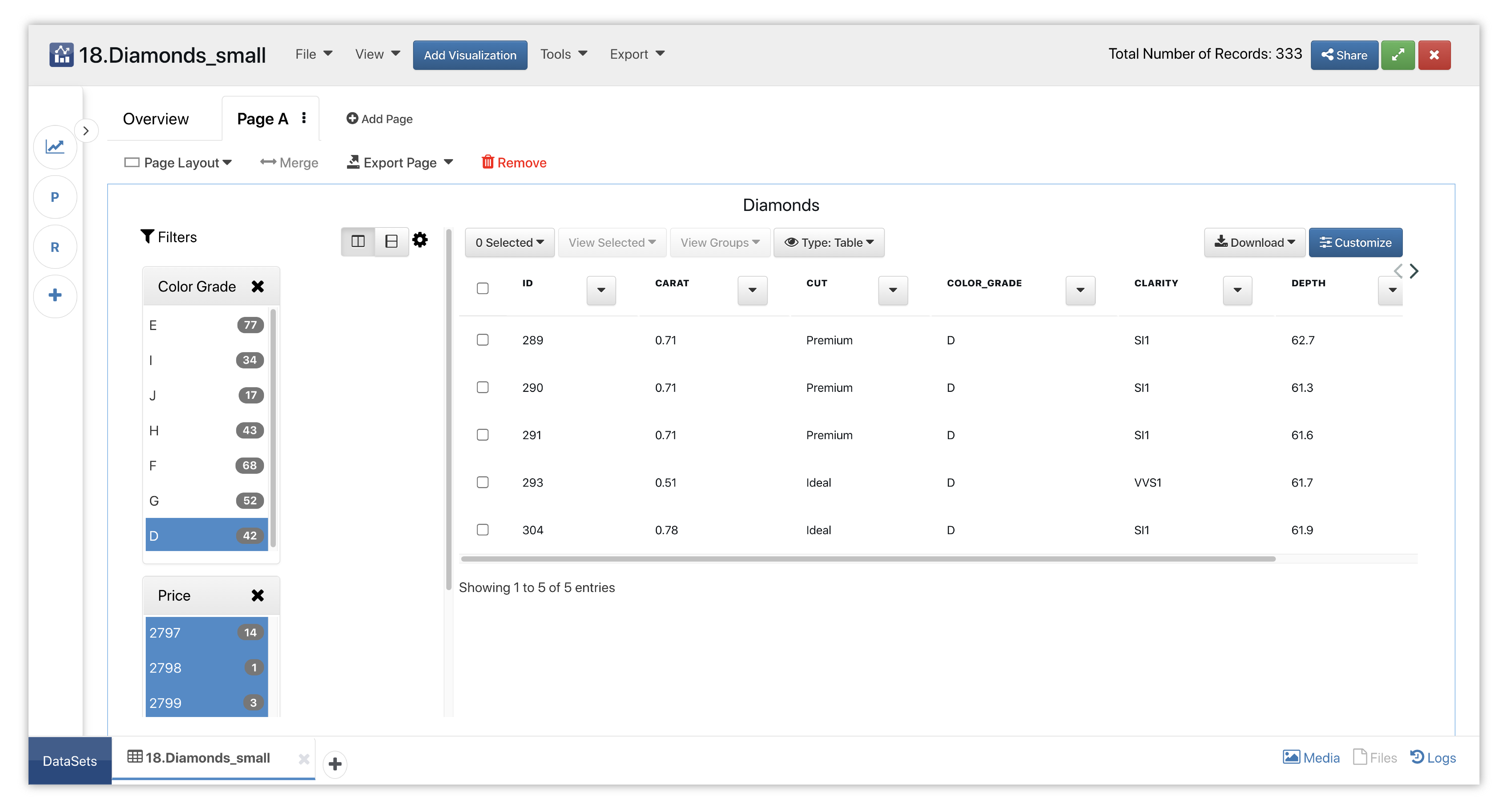
Figure 51: Diamonds
Here is our initial view when opening this dataset. Data columns are shown under the Responses panel.
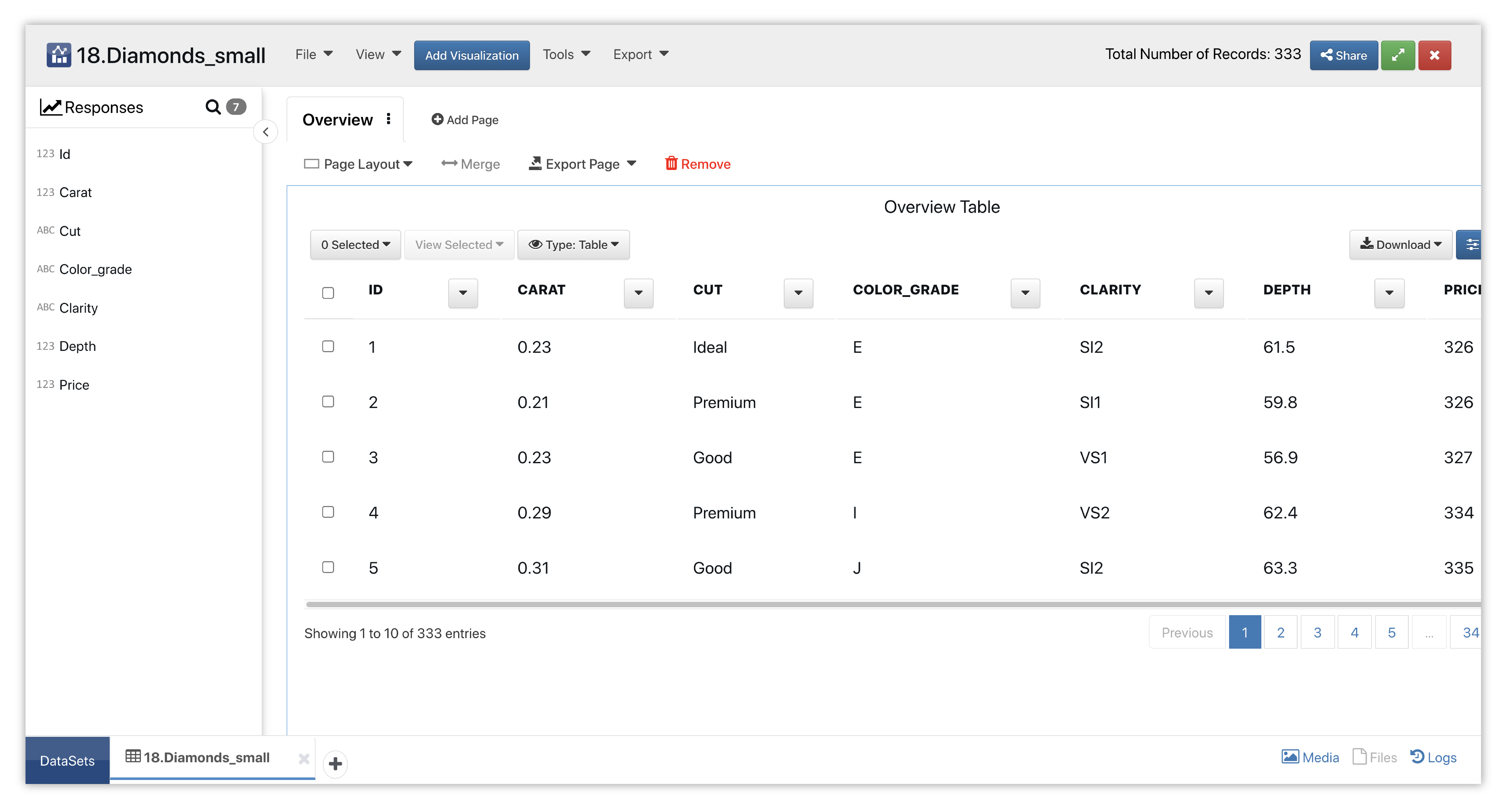
Figure 52: Filterable Table Diamonds Dataset
We’ll start by adding the filterable table visualizer to a new page with a single viz layout.
Please check out section Adding and Editing Pages and Adding Charts to learn how to create new pages and charts respectively.
This chart lets up have easily clickable filters so we can sift through different areas of data.
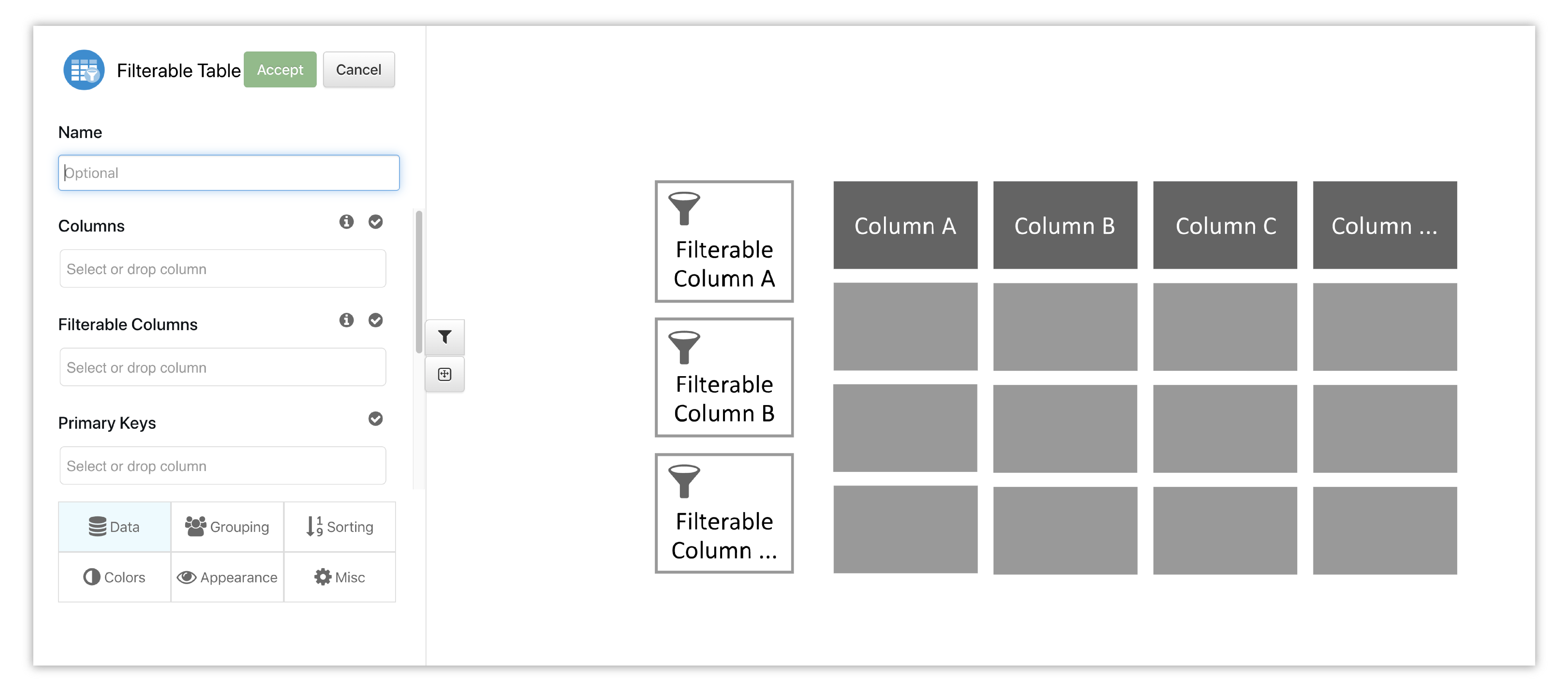
Figure 53: Filterable Table Placeholder
Data for rows will show up in the table once we choose our main and filterable columns, the later of which we have chosen price and color grade.
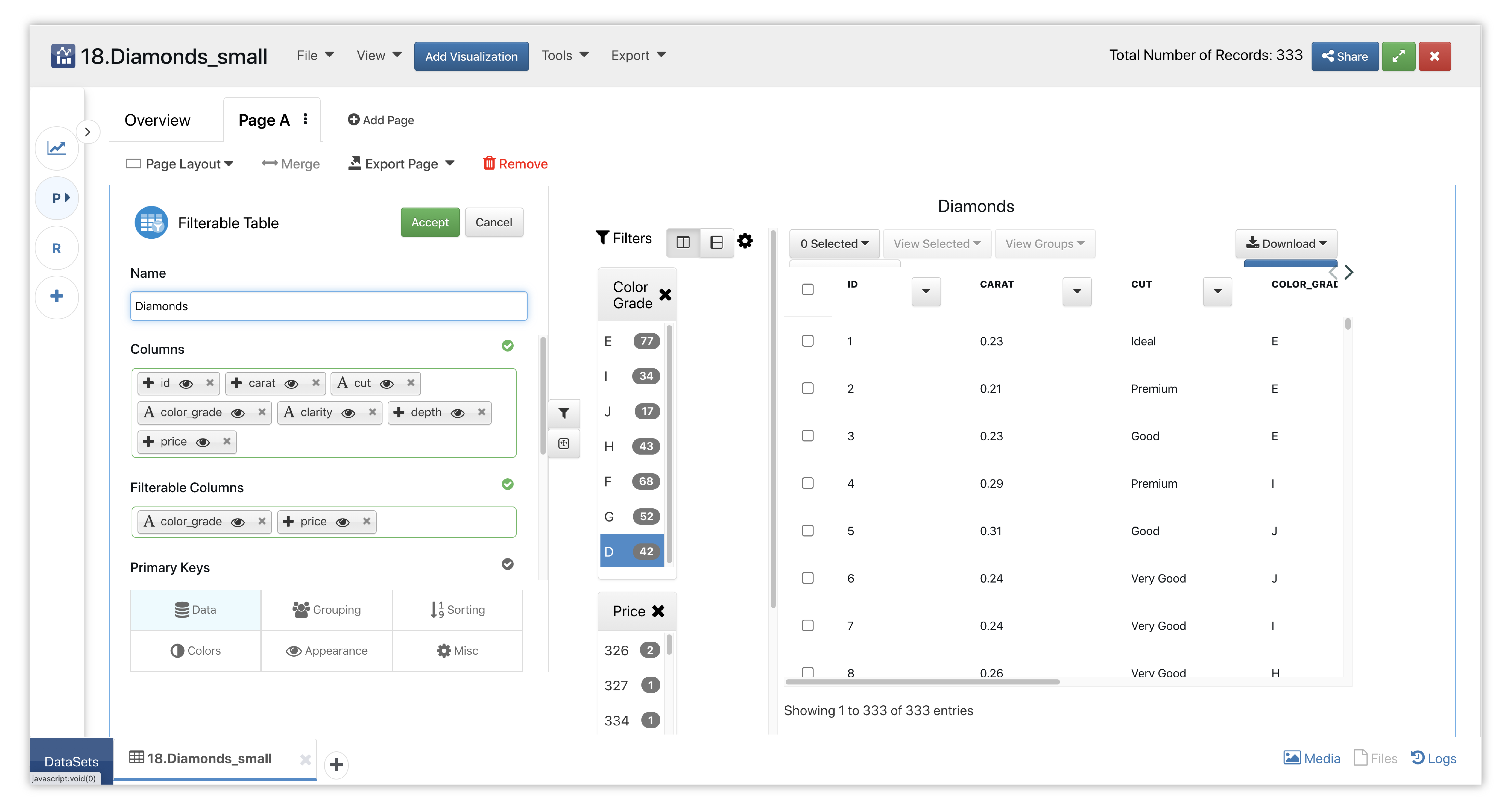
Figure 54: Filterable Table Options
We can select, de-select and multi-select the filters for this table however we like for our data mining necessities. Here, we’ve chosen high price and high color grade filters to see what high quality diamonds are available in this dataset.
Figure 55: Filtered Diamonds Table
Watch the following full example of adding Pivot Table for this dataset.
2020 Happiness
The following images showcases chart examples using a dataset on Happiness Factors in 2020. Each chart reviews specific parts of the dataset in order to analyze happiness.
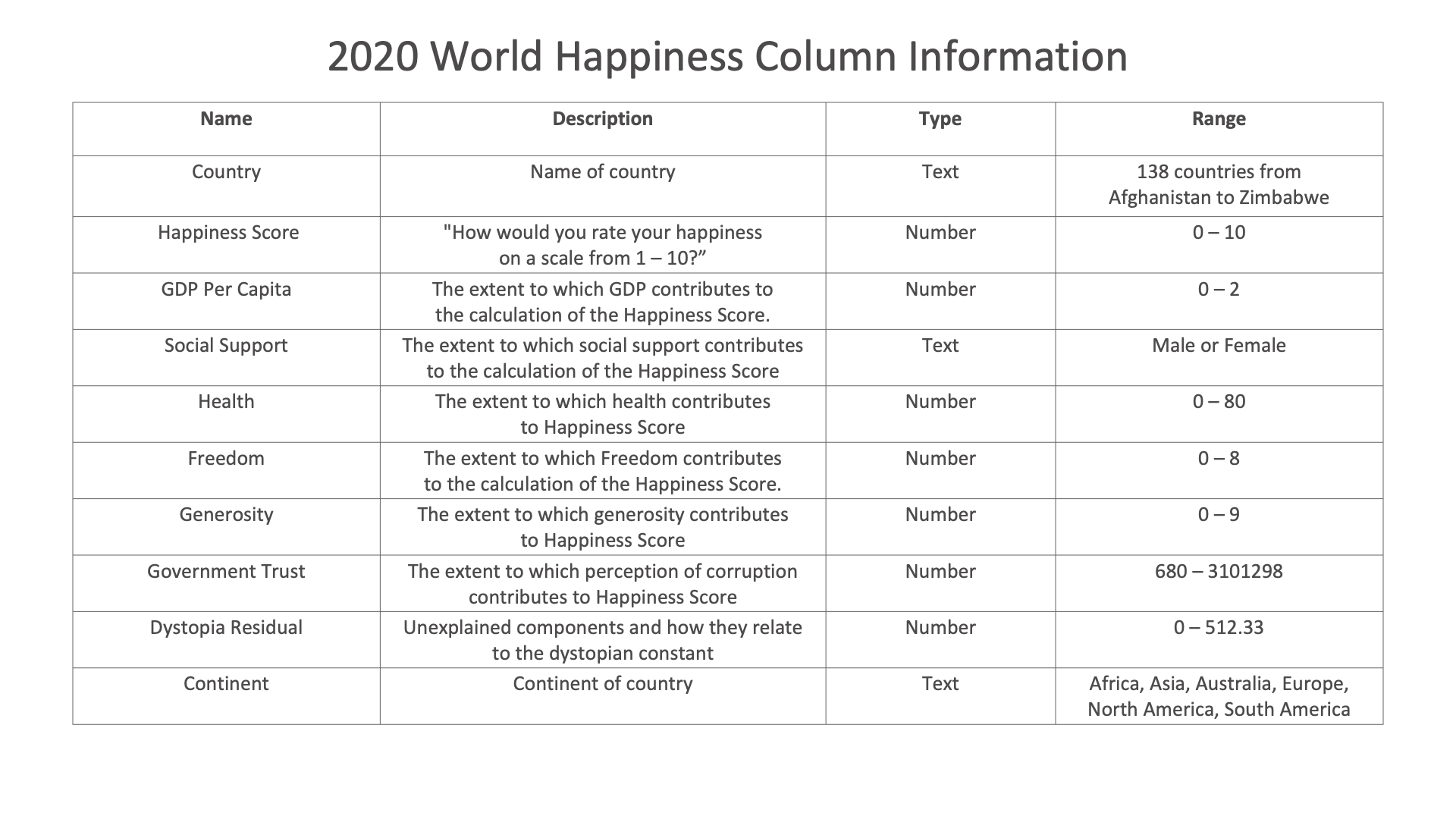
2020 Happiness Dataset
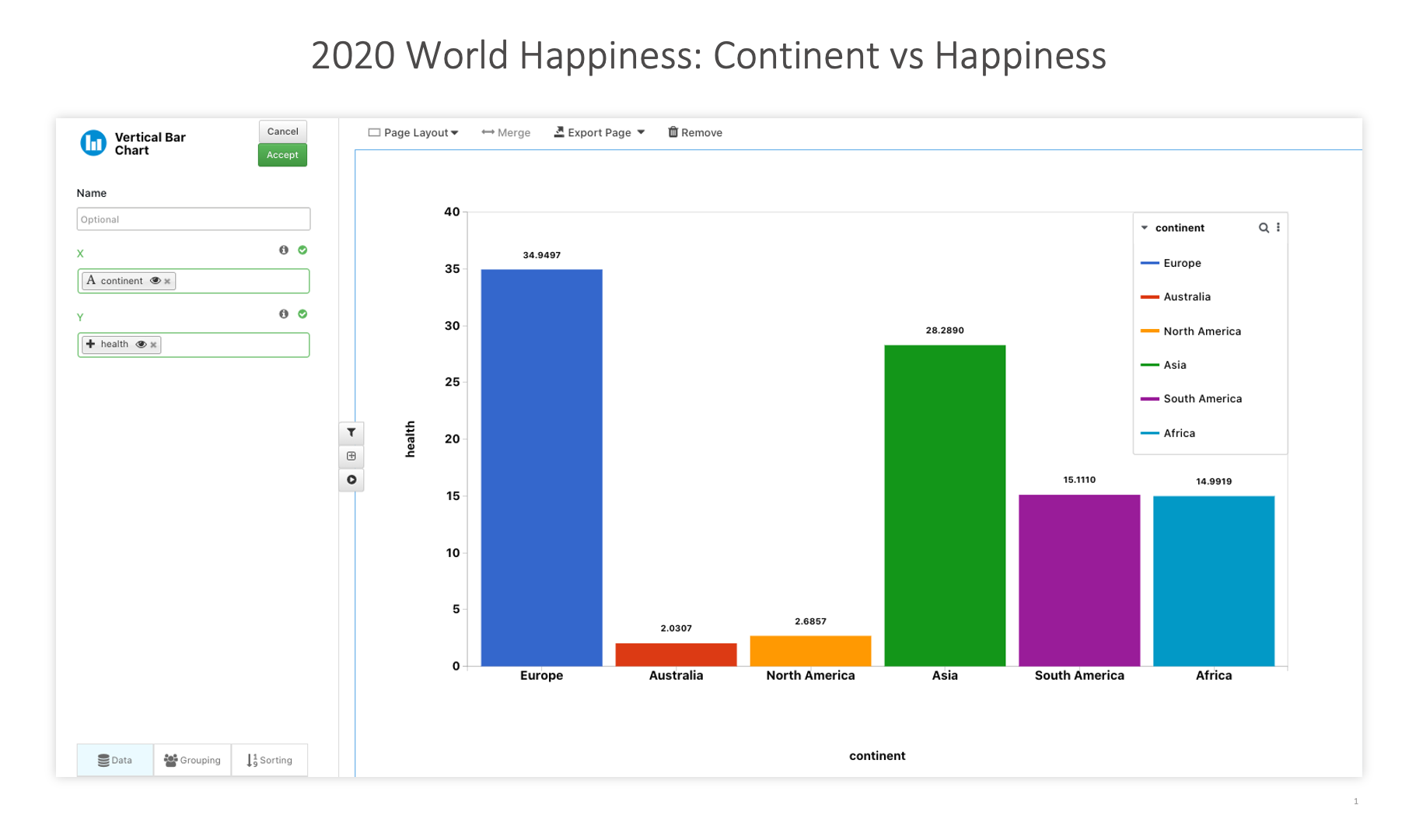
2020 World Happiness: Continent vs Happiness
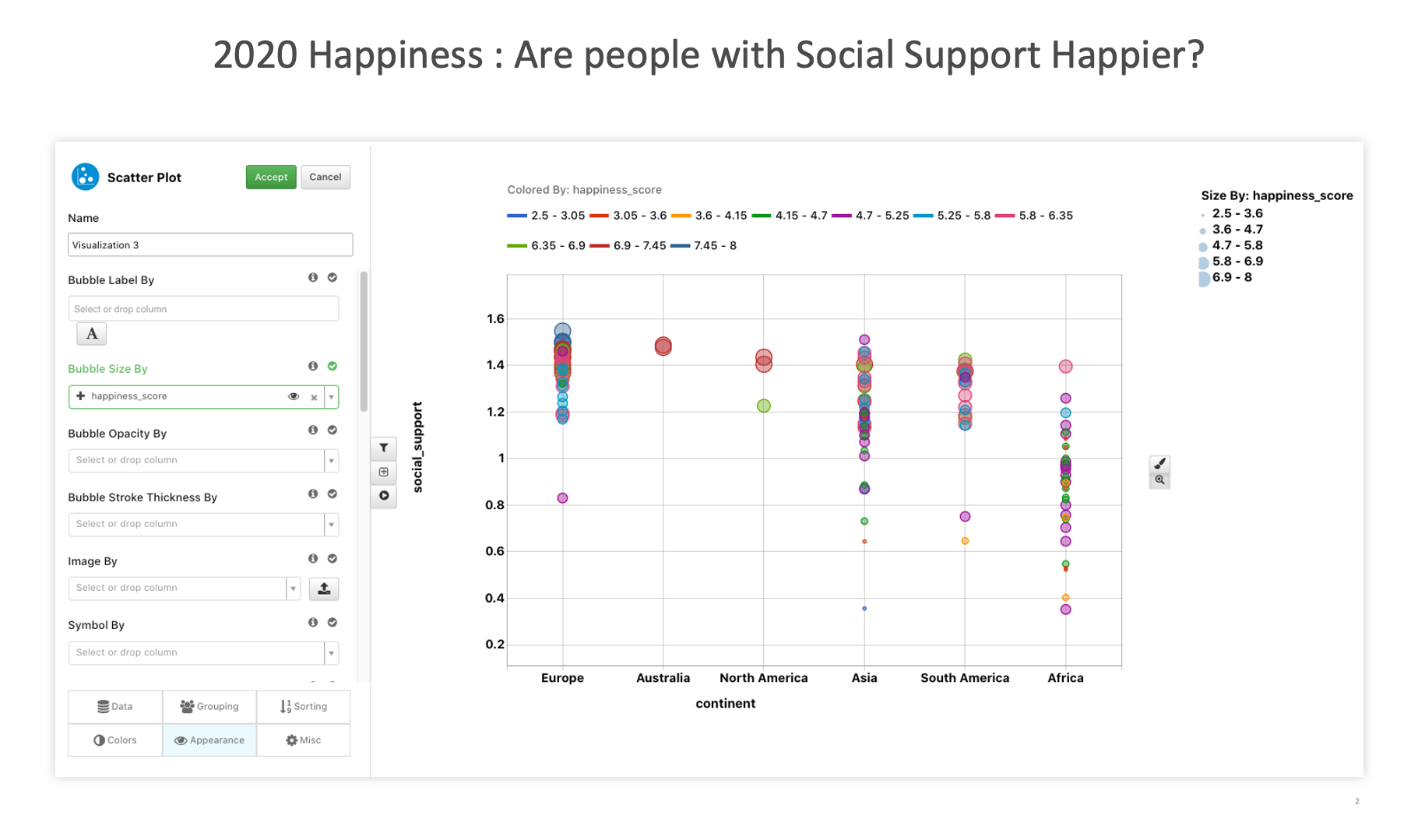
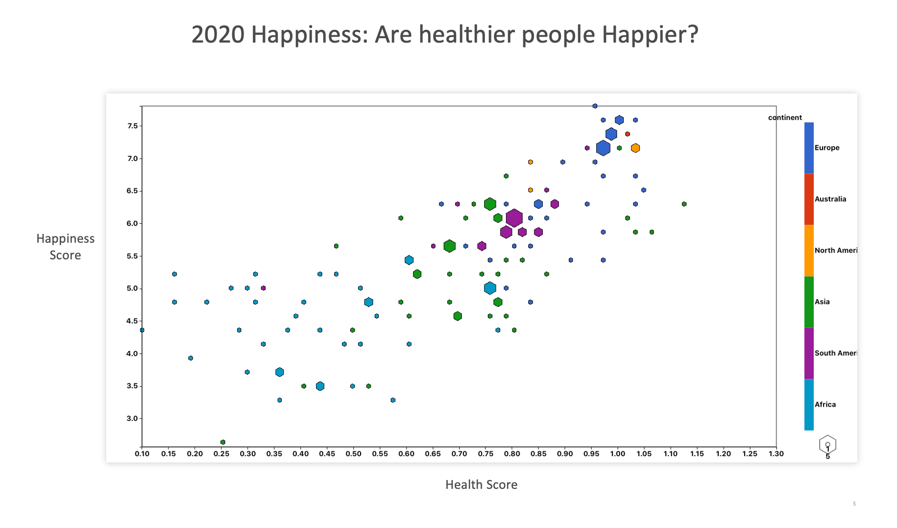
2020 Happiness : Are people with Social Support Happier?
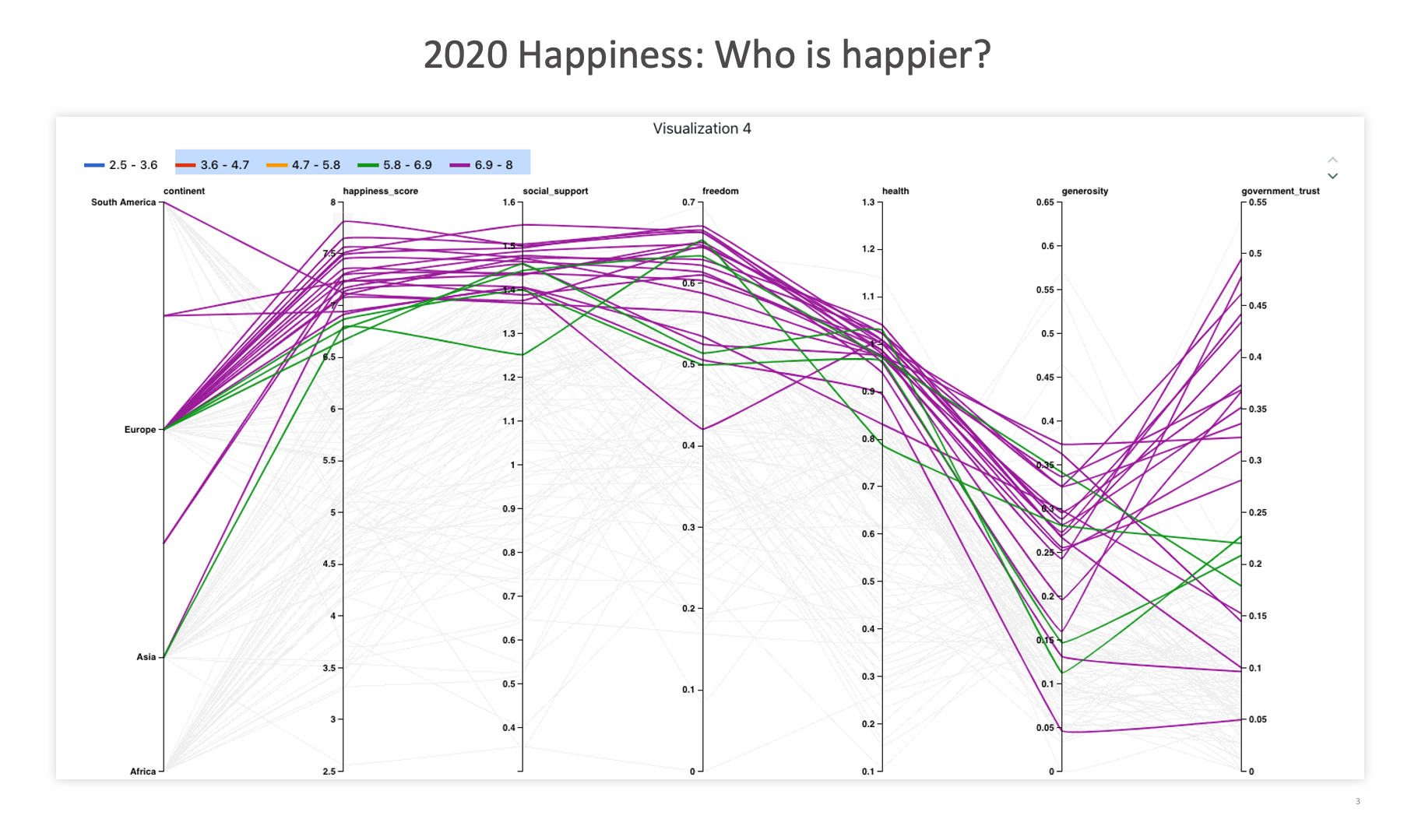
2020 Happiness: Who is happier?
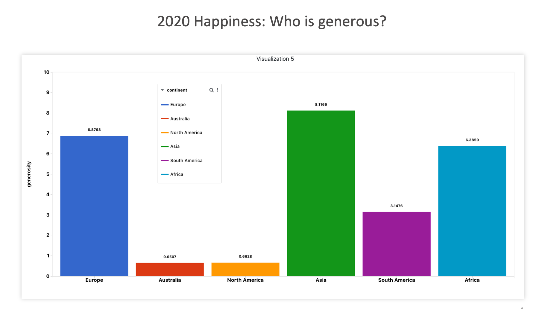
2020 Happiness: Who is generous?
2020 Happiness: Who is generous?
Head Impact
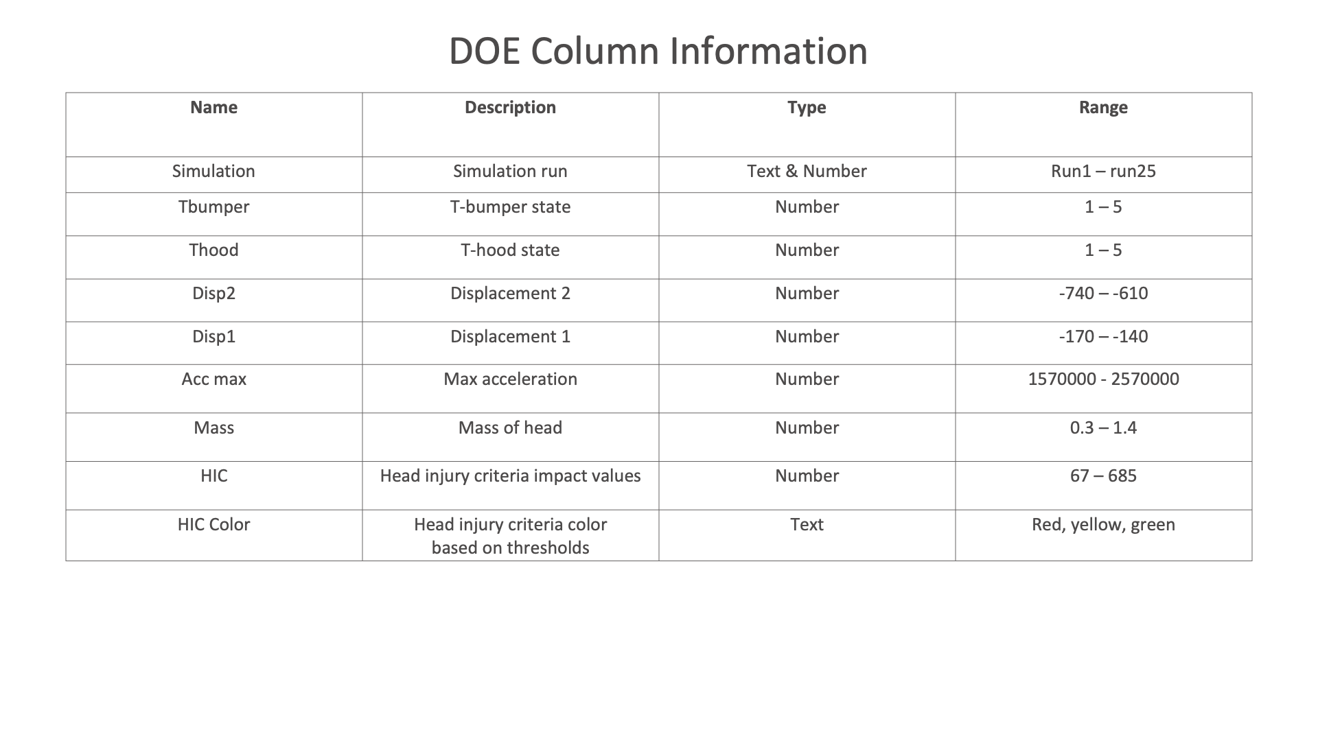
The following images presents chart examples using a the DOE sample dataset available in Simlytiks. The charts explore this basic head impact dataset reviewing HIC, t-bumper, t-hood and mass.
The following chart shows the HIC value influence on T-bumper.
Head Impact
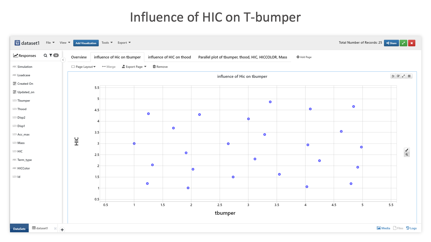
Influence of HIC on T-bumper
The following chart shows the HIC value influence on T-hood.
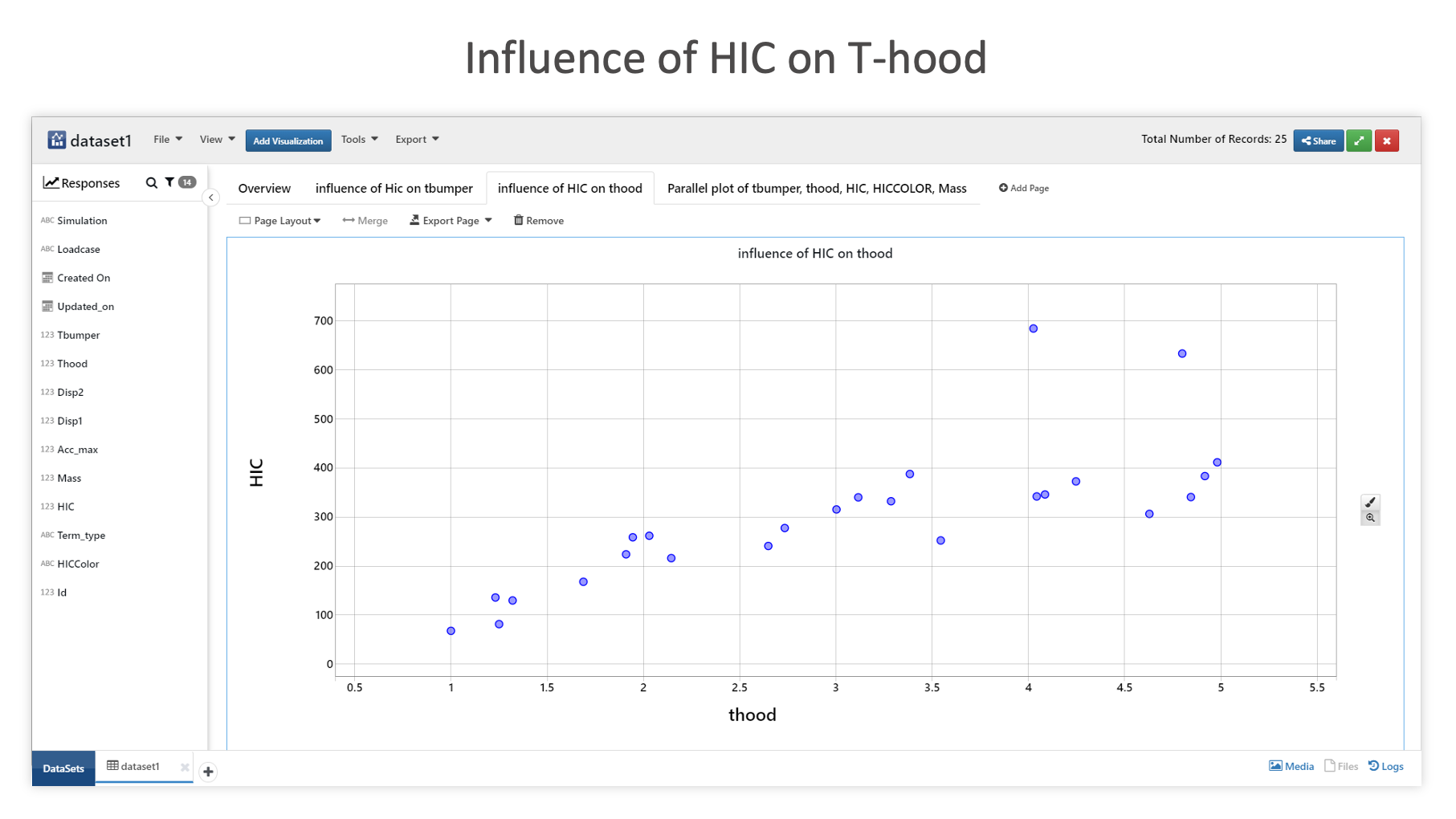
Influence of HIC on T-hood
This next bubble chart depicts the relationship between HIC and T-bumper, with Mass as the bubble size, HIC color as the label, and a built-in car image as the node symbol (image by).
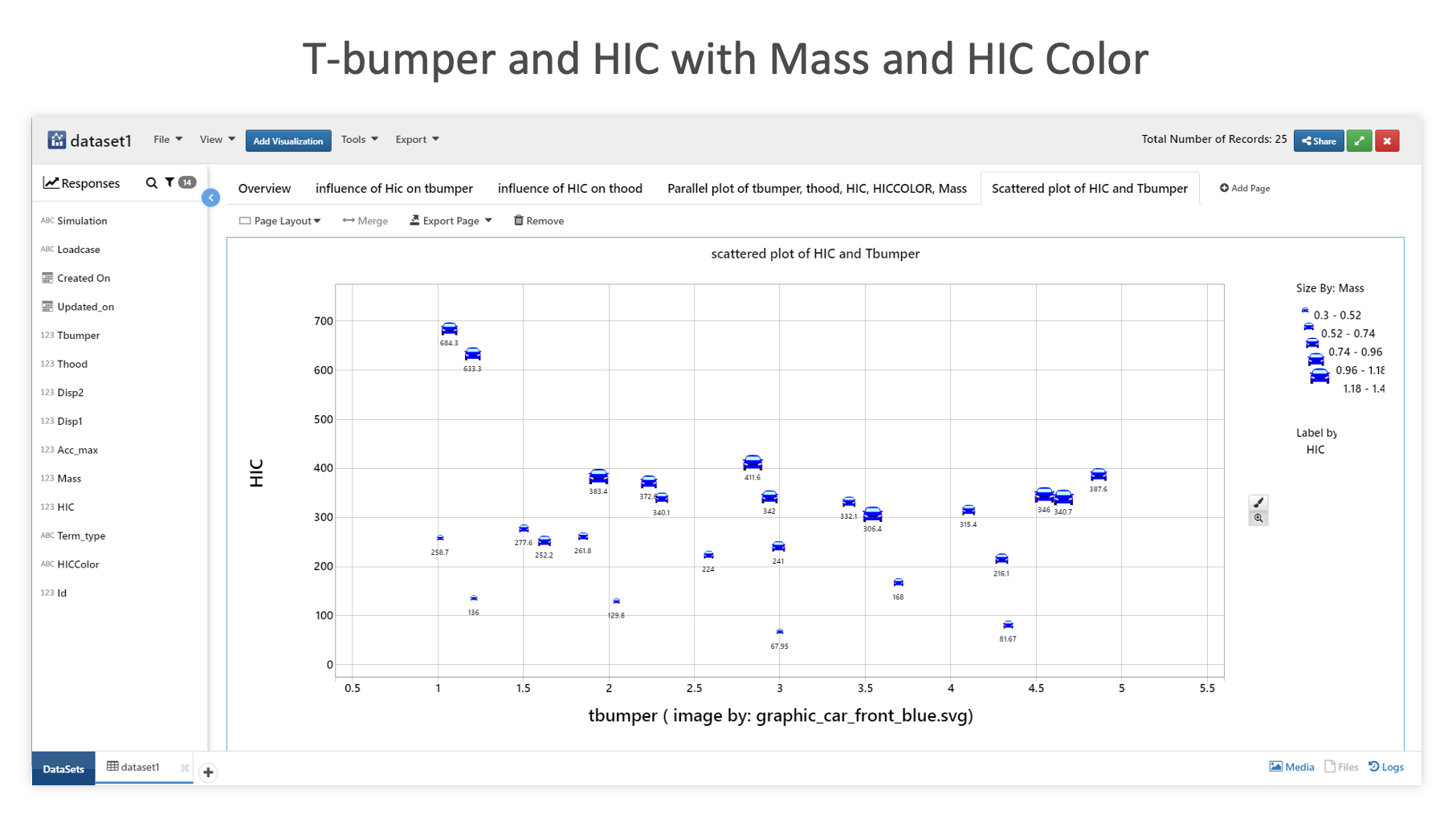
T-bumper and HIC with Mass and HIC Color
This parallel coordinates graph illustrates the relationship between the data columns of name, t-bumper, t-hood, HIC, HIC color and mass.
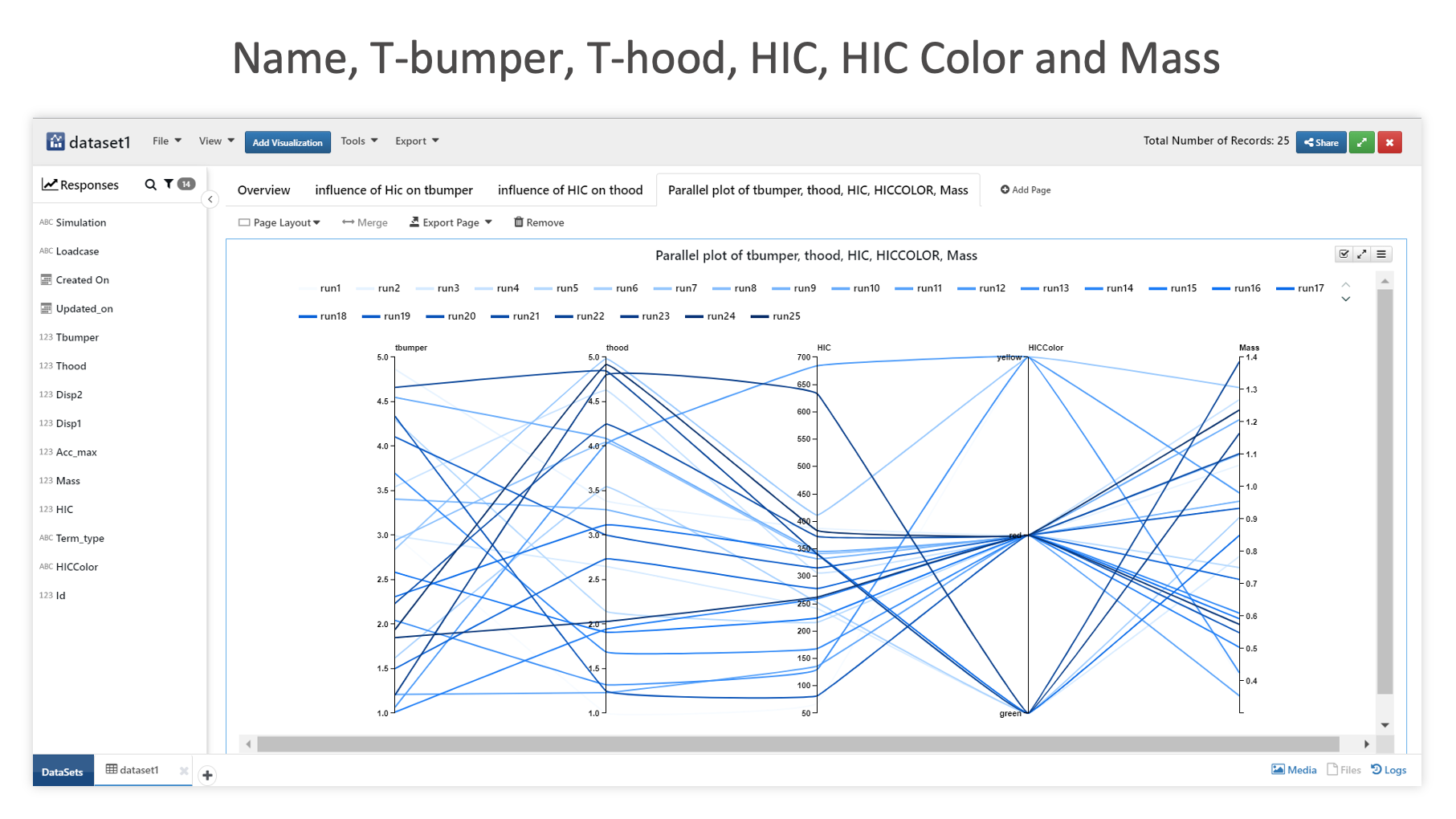
Name, T-bumper, T-hood, HIC, HIC Color and Mass
Health & Fitness Datasets
Diabetes
The following images showcases chart examples using a dataset on Diabetes. The charts explore the pedigree function or likelihood of having diabetes.
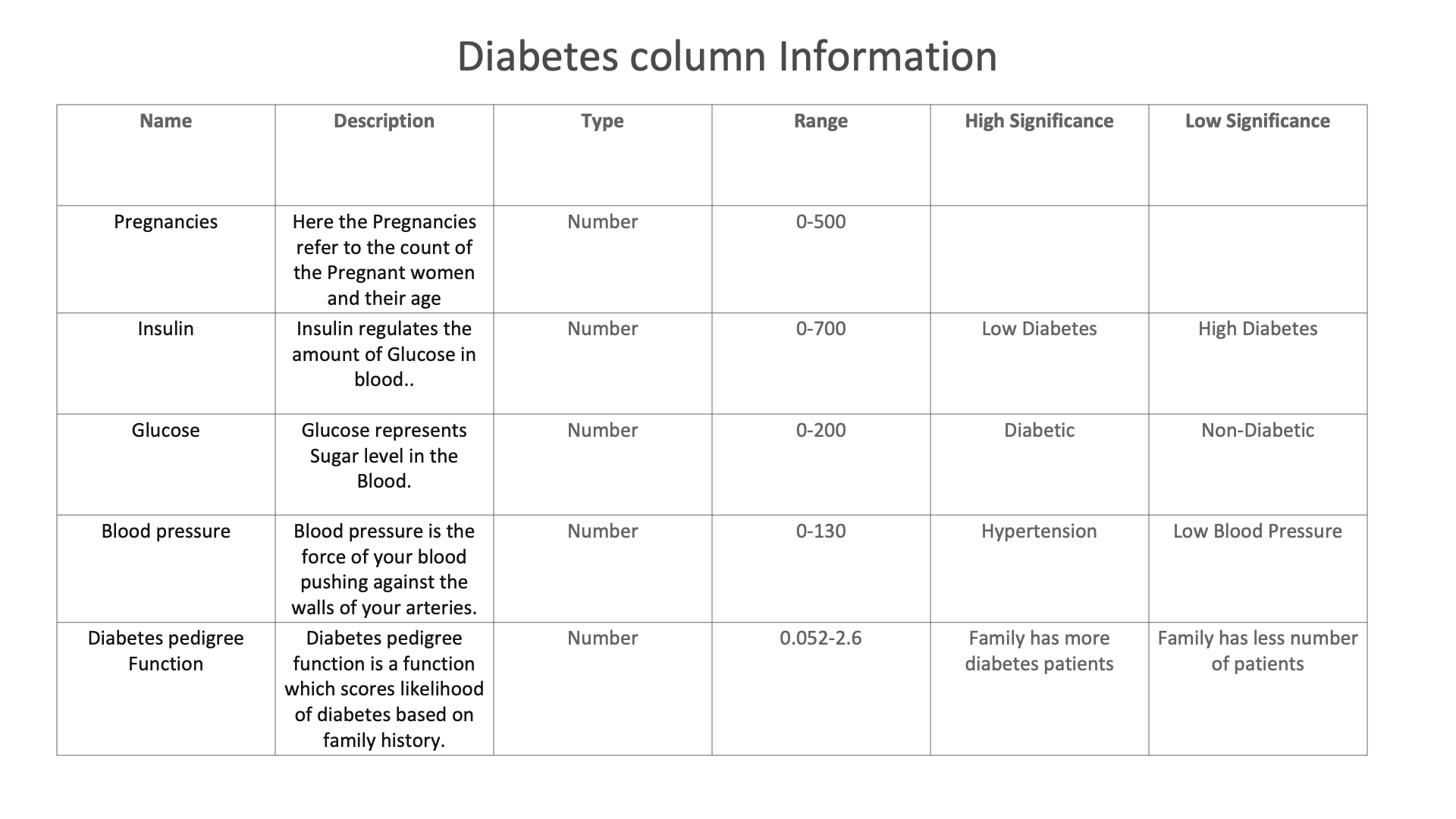
Diabetes column Information
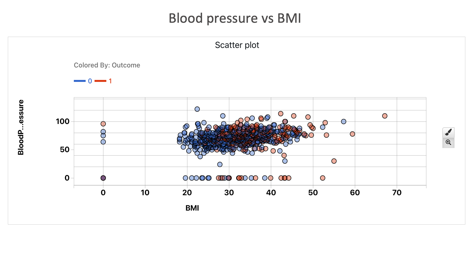
Blood pressure vs BMI: We can see that people are more diabetic to the top right hand corner of the plot than the bottom left corner. Which tells us people with high blood pressure and high BMI are more likely to be diabetic.
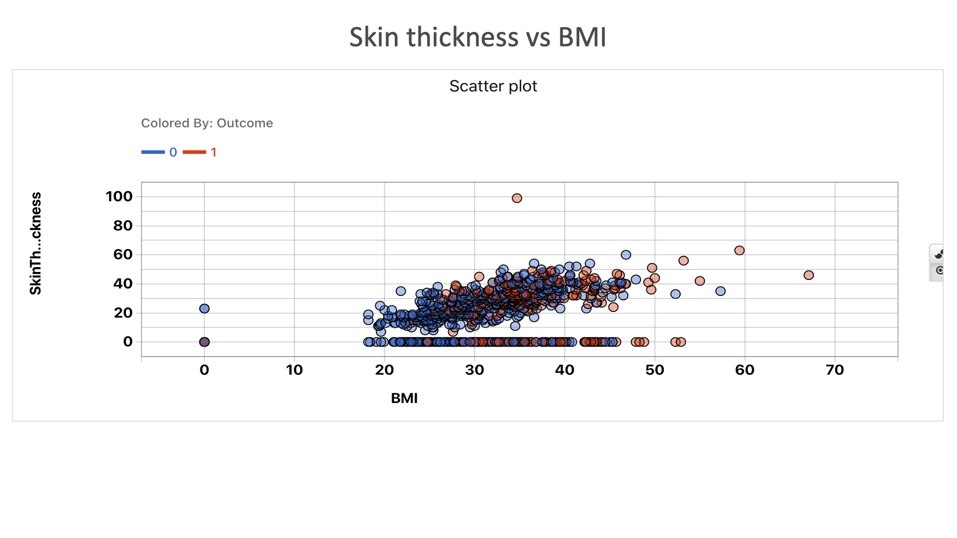
Skin thickness vs BMI: We can see that people are more diabetic to the top right hand corner of the plot than the bottom left corner. Which tells us people with high skin thickness and high BMI are more likely to be diabetic.
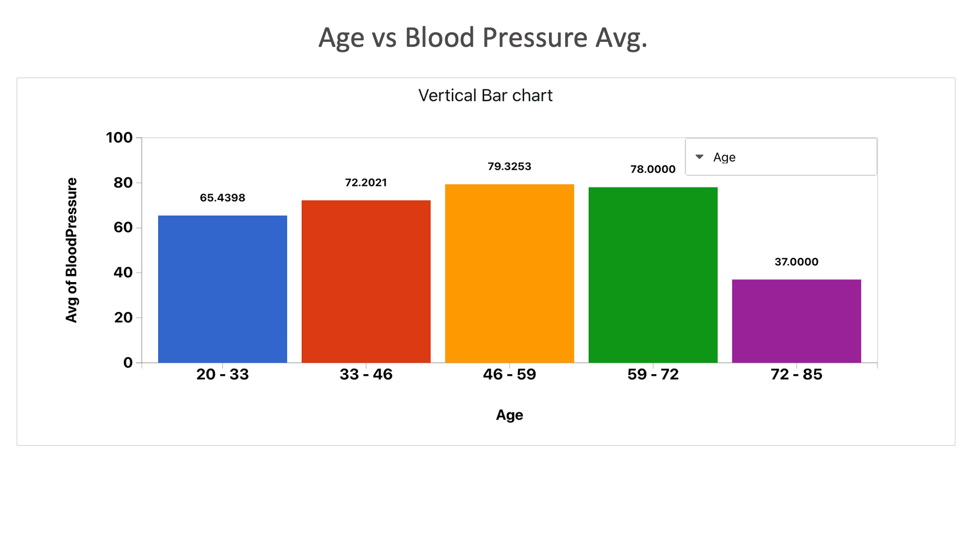
Age vs Blood Pressure Avg.: We can see that the ages between 46 and 72 have higher blood pressure average.
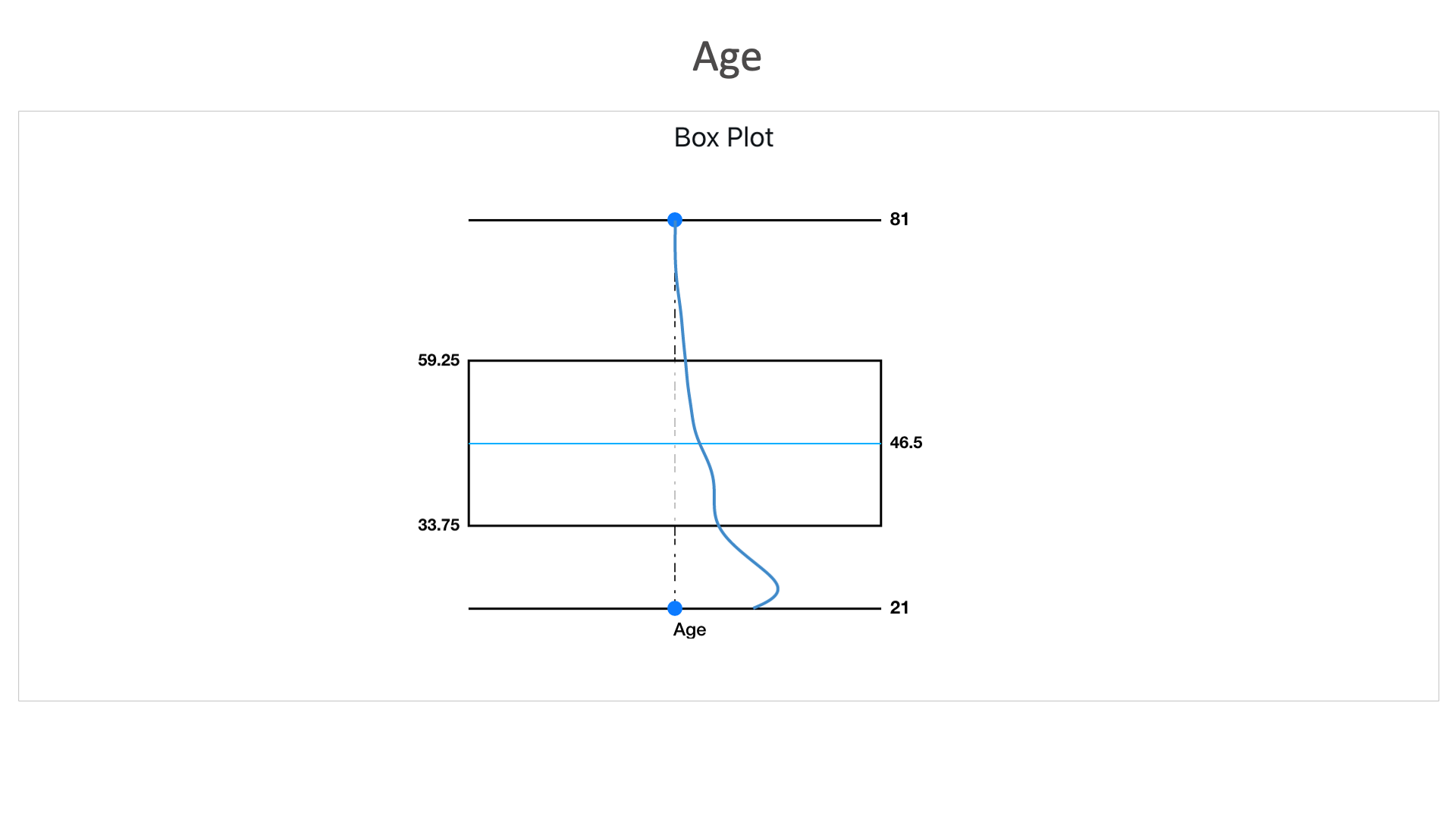
Age: Here in this box plot, we can see that this dataset consists higher number of records between the age of 33.75 and 59.25. With an average age of the data set as 46.5.
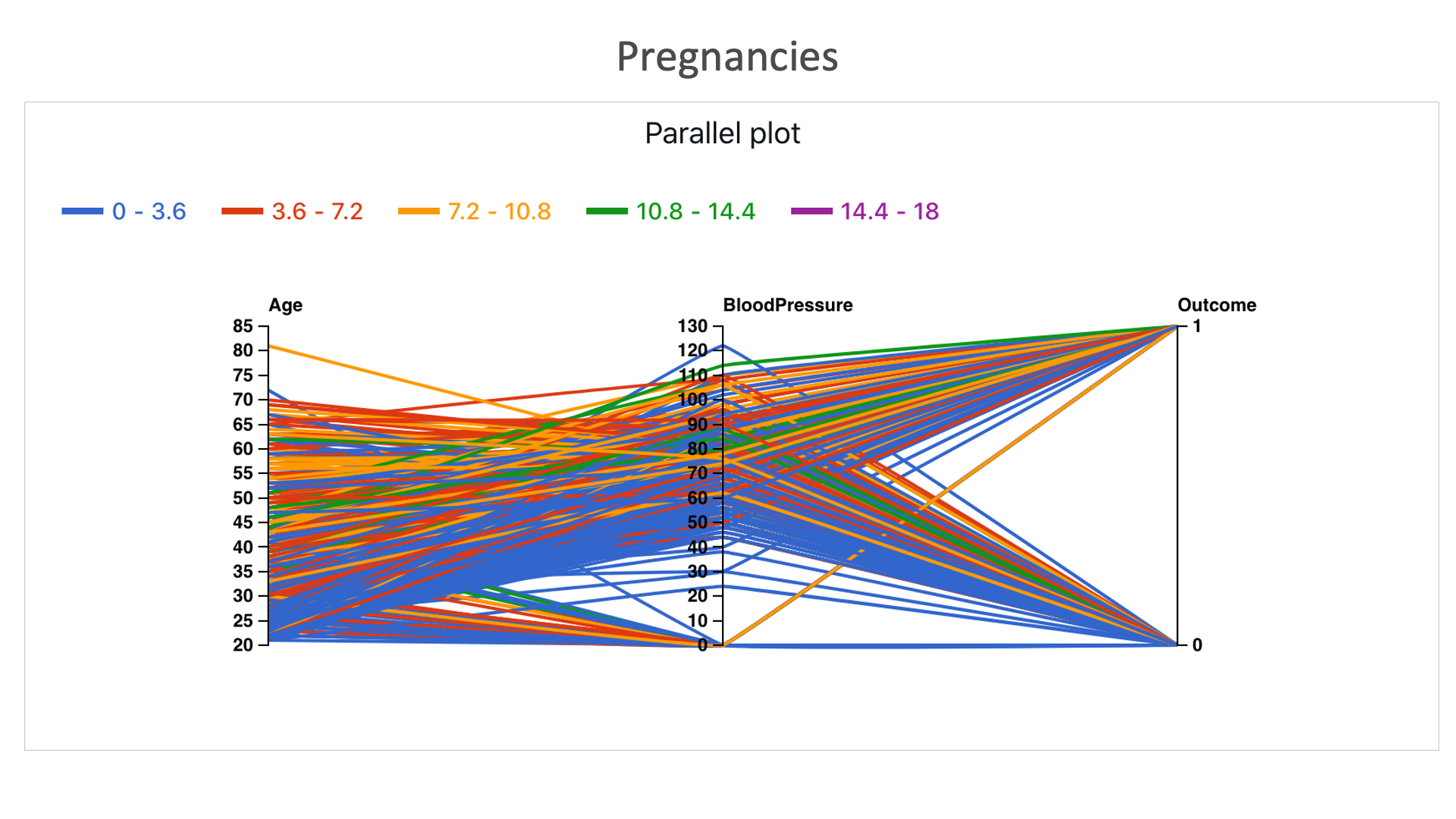
Pregnancies: Here more colored lines reach outcome 1 than 0 (comparatively more blue lines reach 0) , indicating that the number of pregnancies also play a part in determining a person to be diabetic or not.
Heart Disease
The following images showcases chart examples using a dataset on Diabetes. The charts explore the pedigree function or likelihood of having diabetes.
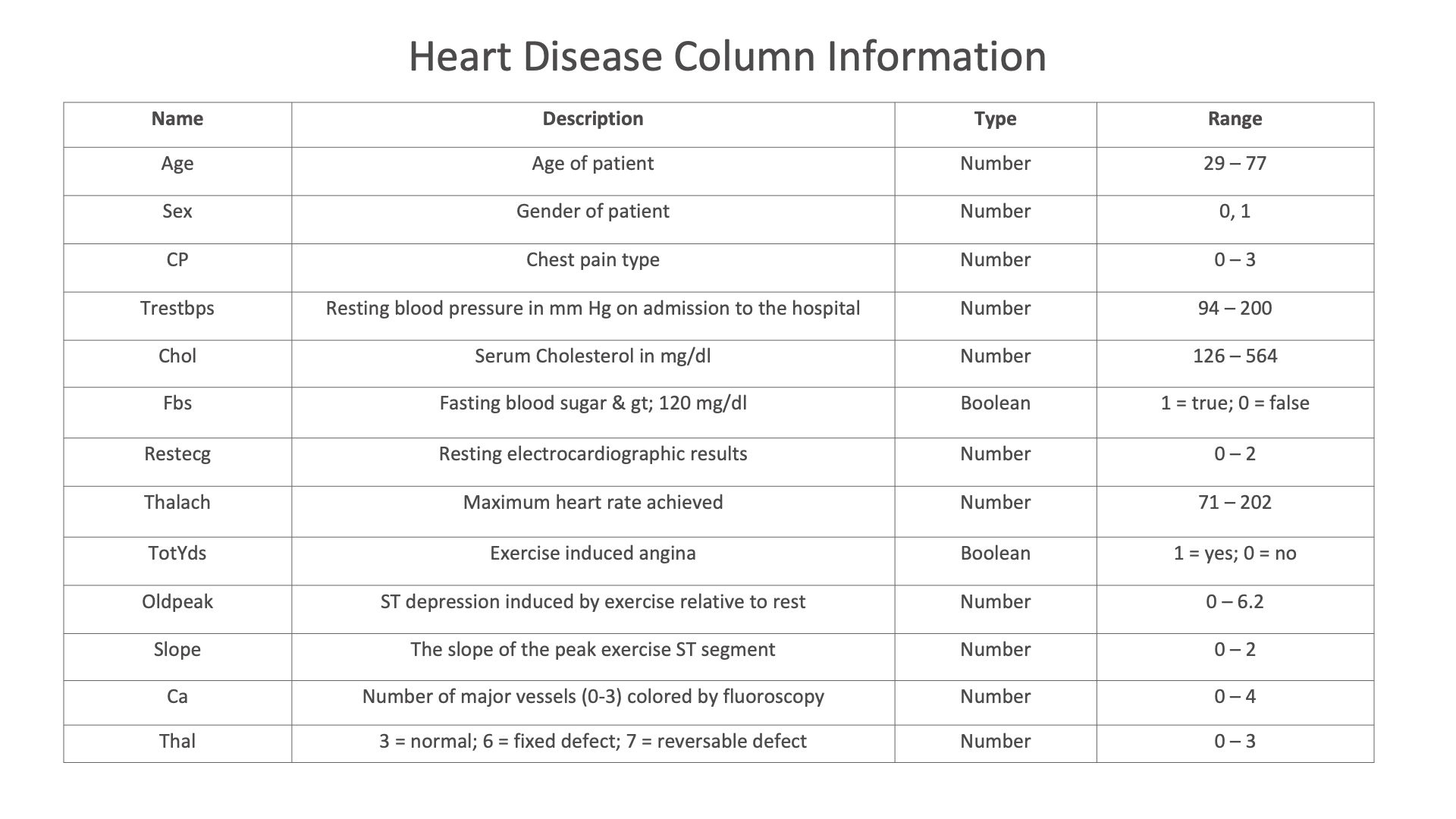
Diabetes column Information
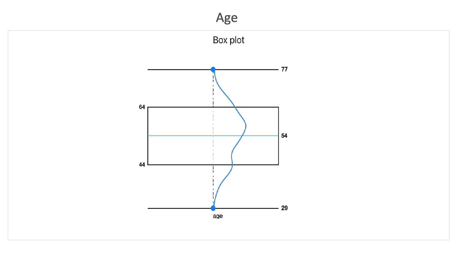
Age: This dataset contains more number of records between the age of 44 and 64, with an average age of 54.
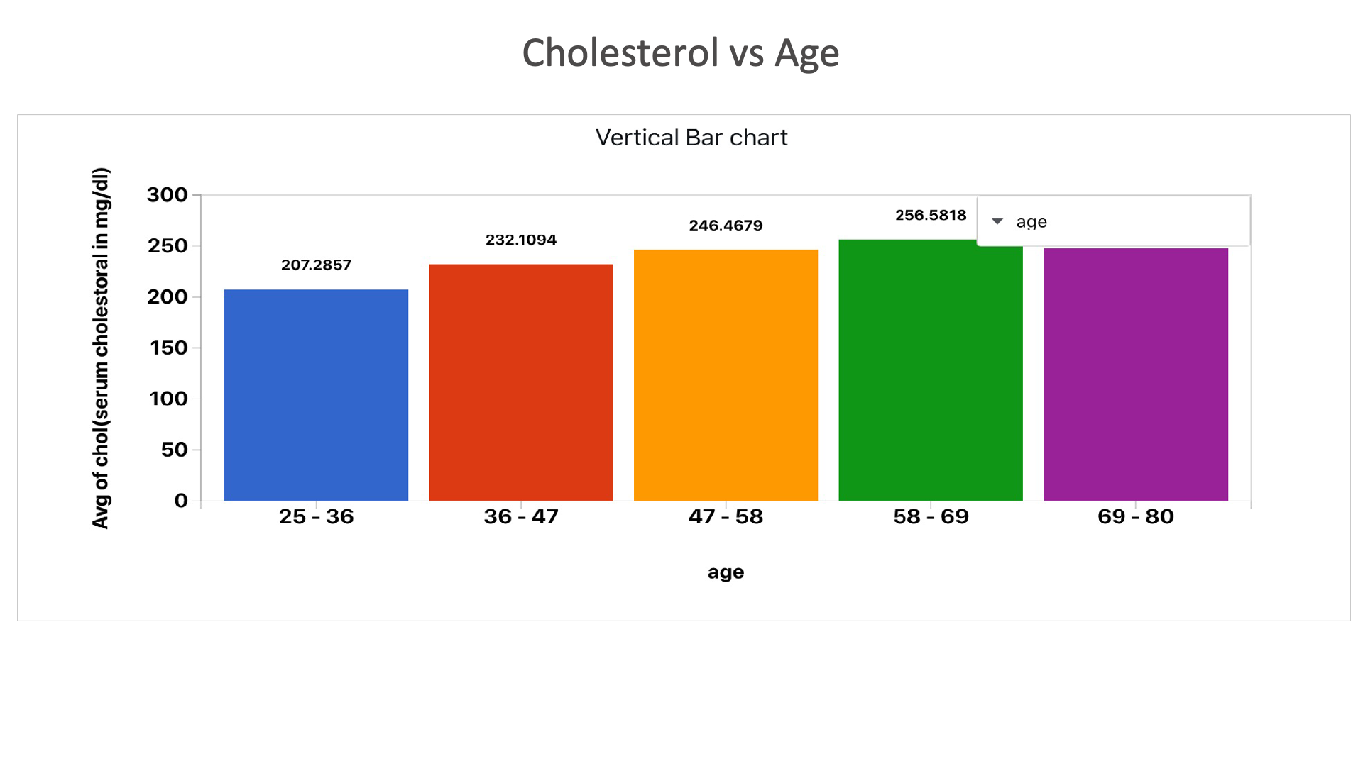
Cholesterol vs Age: This chart shows cholesterol levels in different age groups. Cholesterol increases as age increases.
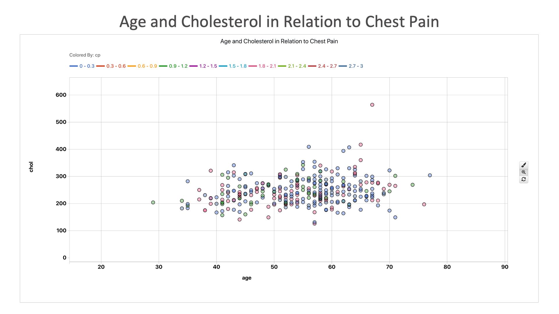
Age and Cholesterol in Relation to Chest Pain: It seems that age and cholesterol does not have a big impact of chest pain, as most heart disease patients have higher chest pain regardless. This means chest pain is a bigger indicator of heart disease than age or cholesterol.
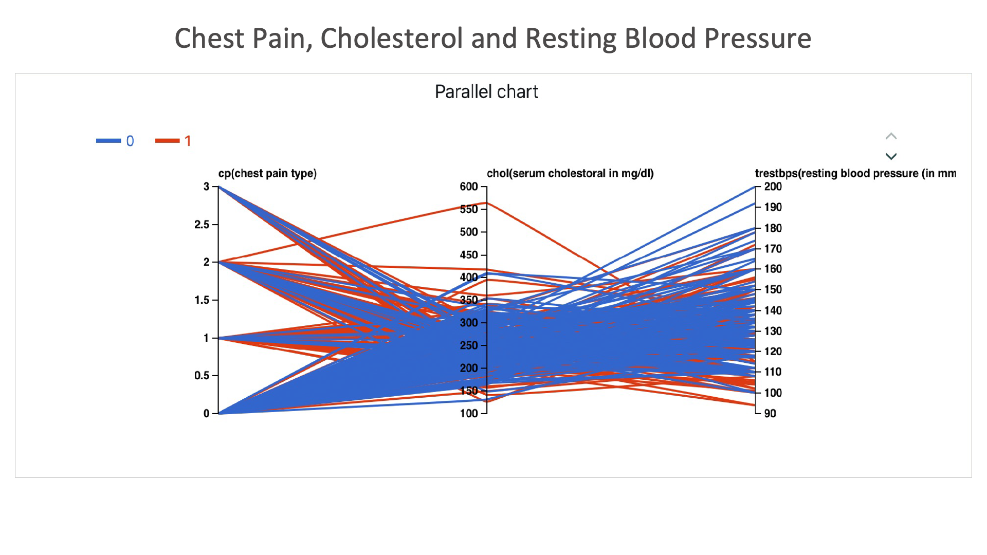
Chest Pain, Cholesterol and Resting Blood Pressure: Here we can see that, individuals with chest pain level 1 and above, with BP and cholesterol high are diagnosed with heart condition.
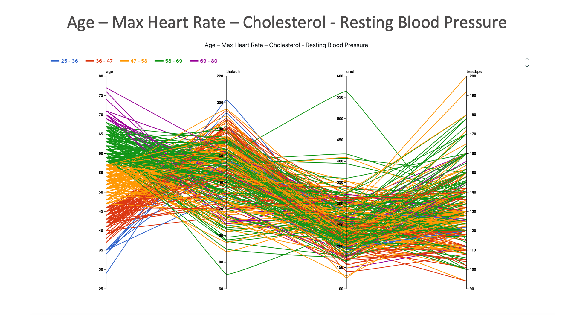
Age – Max Heart Rate – Cholesterol - Resting Blood Pressure: Age seems to has a low correlation to these heart disease factors.
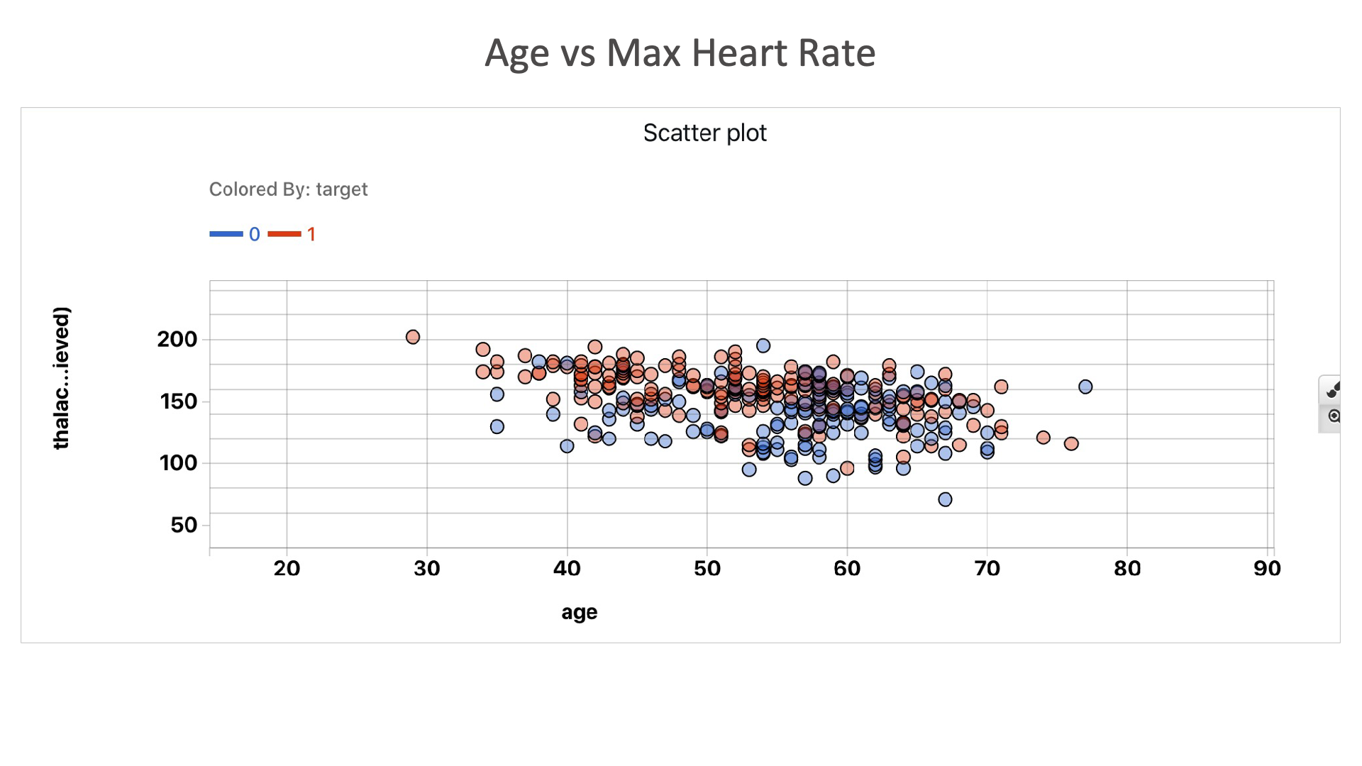
Age vs Max Heart Rate: Irrespective of age group, as thalach increases, there is a higher chance of having a heart condition.
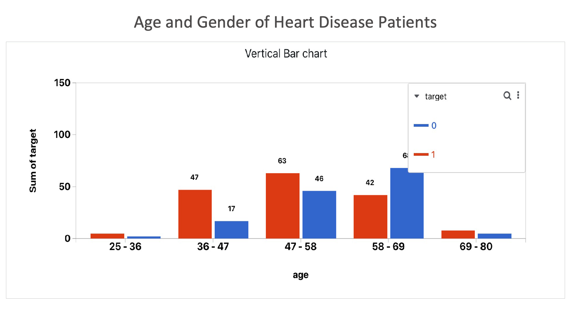
Age and Gender of Heart Disease Patients: This chart shows that heart disease is most common in males between the age of 58 and 69.
Heart Failure
The following images showcases chart examples using a dataset on Diabetes. The charts explore the pedigree function or likelihood of having diabetes.
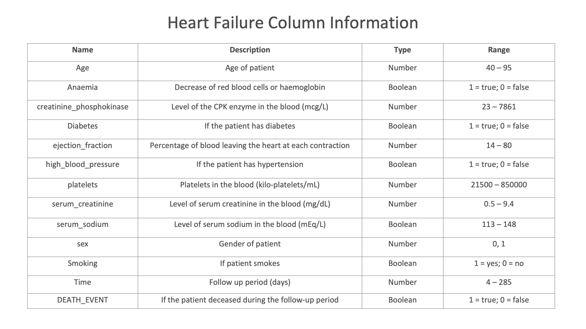
Diabetes column Information
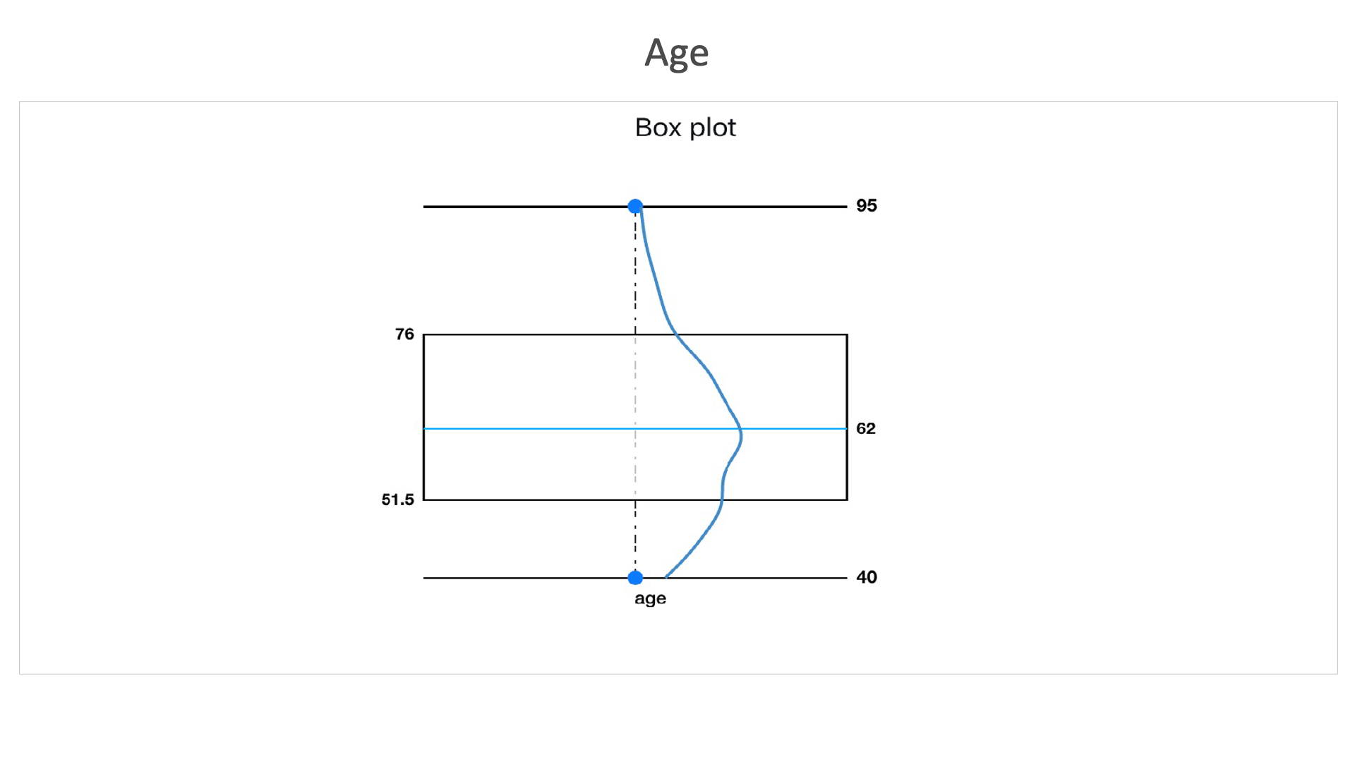
Age: This dataset contains more number of records between the age of 51.5 and 76, with an average age of 62.
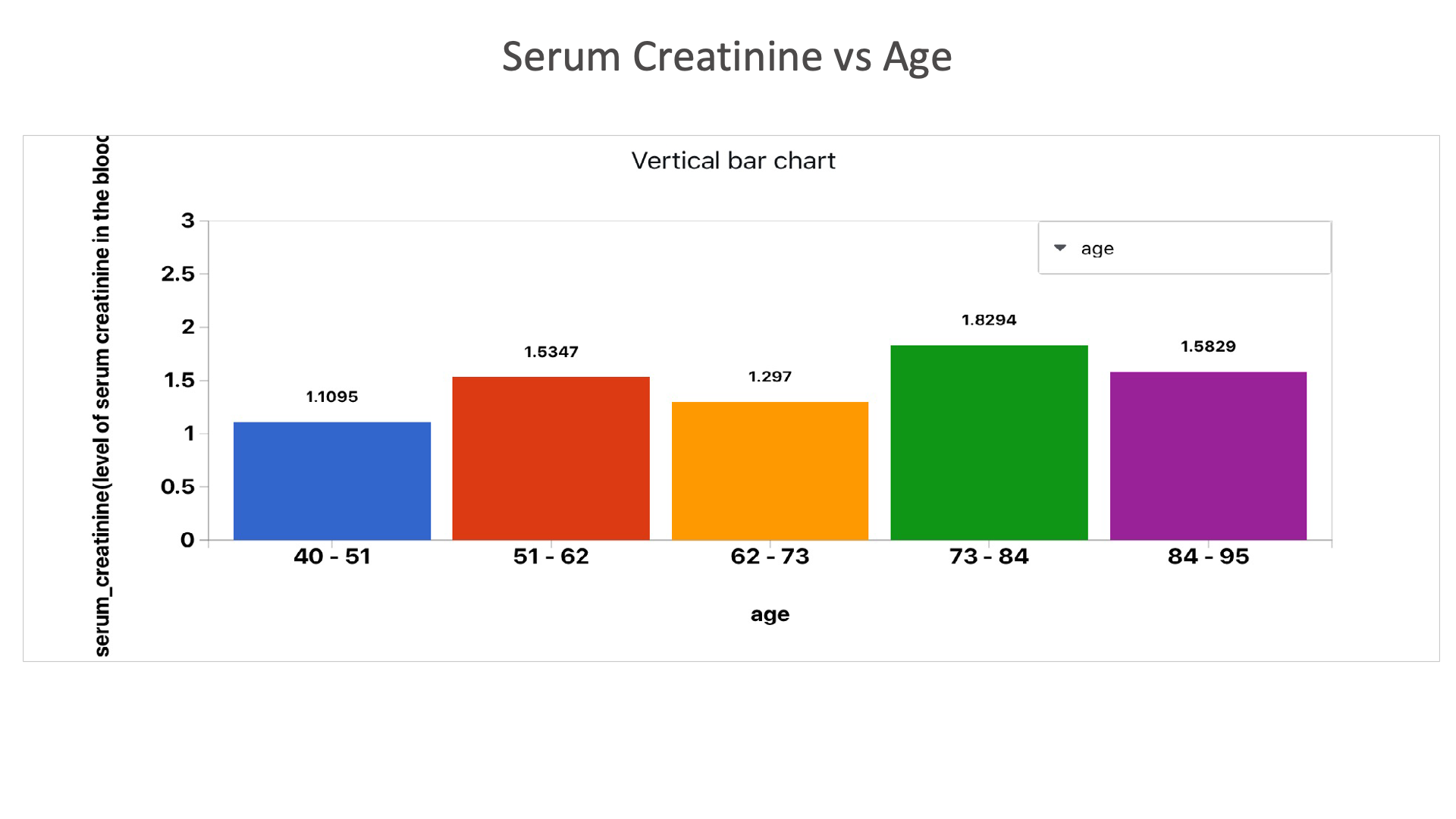
Serum Creatinine vs Age: This chart shows the serum creatine levels in different age groups.
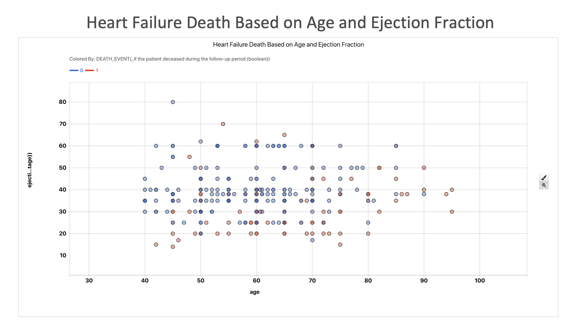
Heart Failure Death Based on Age and Ejection Fraction: Here we see that individuals with lower ejection fraction are more likely to end up dead.
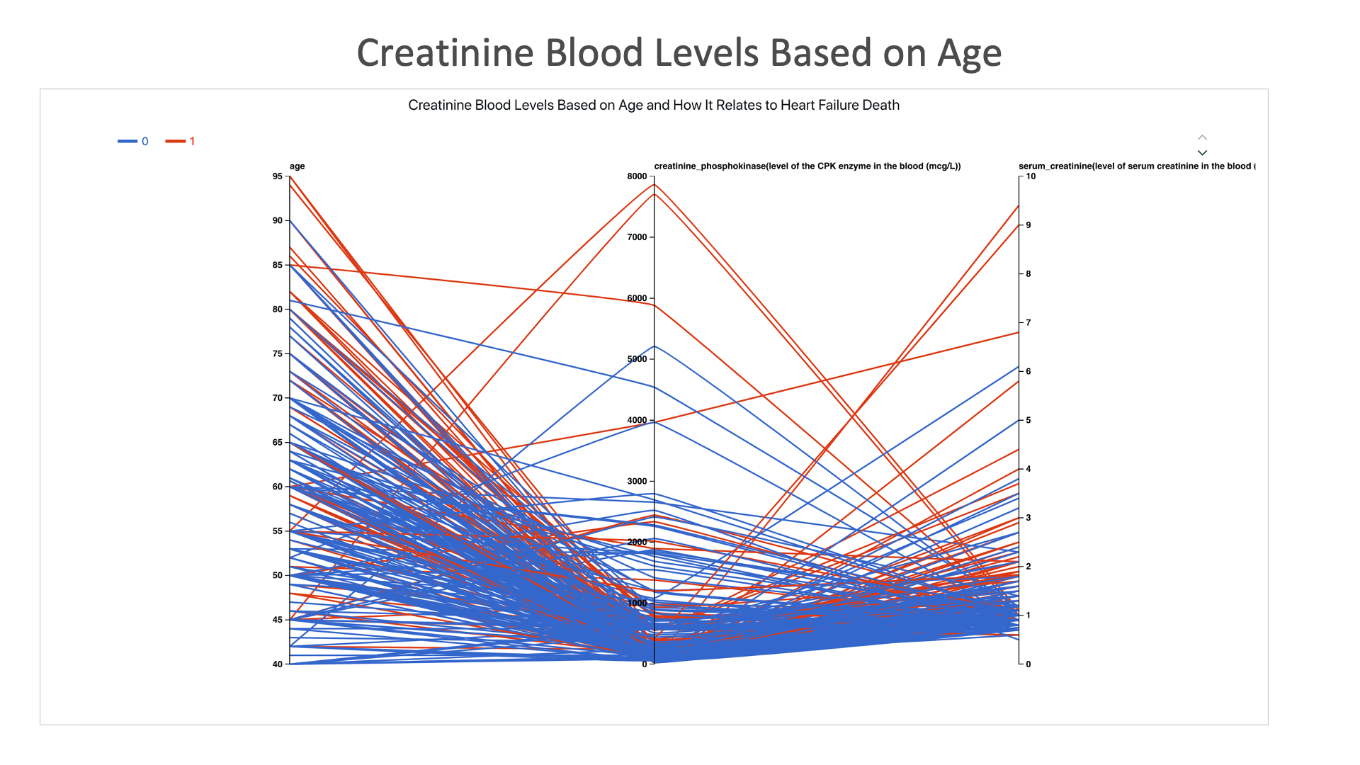
Creatinine Blood Levels Based on Age: Heart failure is more likely to result in death with higher creatinine levels in the body regardless of age, though older people tend to have higher creatinine levels.
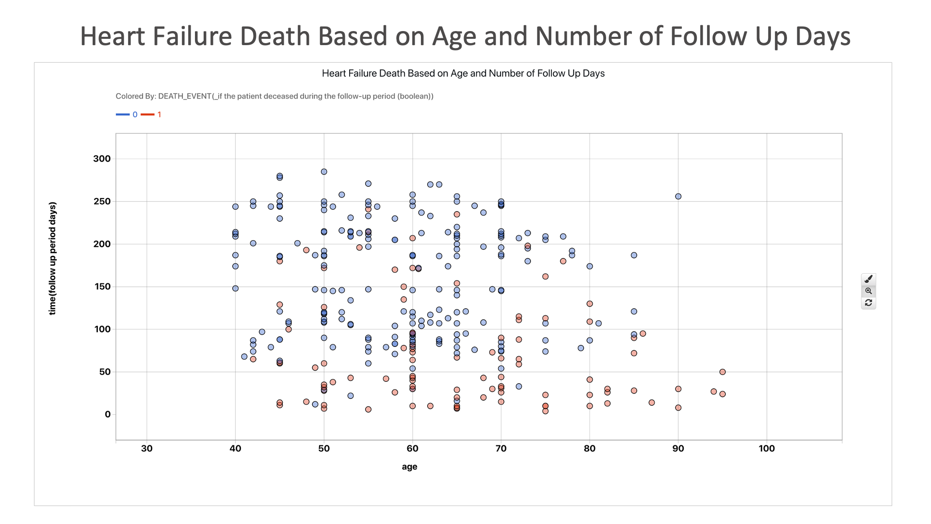
Heart Failure Death Based on Age and Number of Follow Up Days: This chart shows us that death from heart failure tends to happen sooner rather than later, as those who survived had a longer follow-up period.
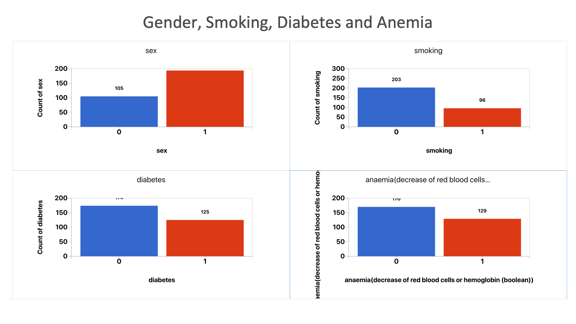
Gender, Smoking, Diabetes and Anemia: Here, we see how many people with heart failure have pre-existing conditions.
Insurance
The following images showcases chart examples using a dataset on health Insurance. The charts explore the insurance effect on certain groups of people.
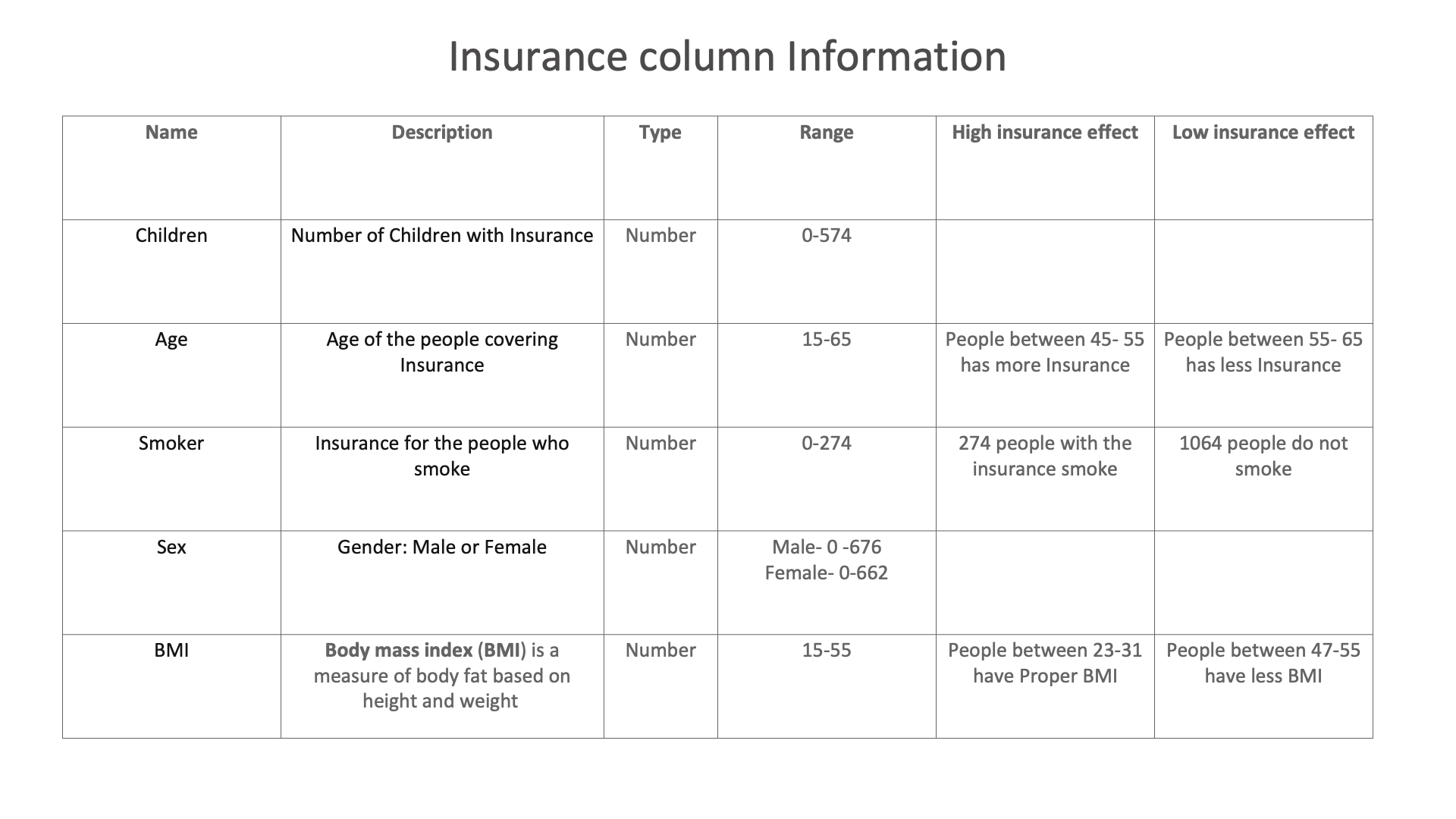
Insurance column Information
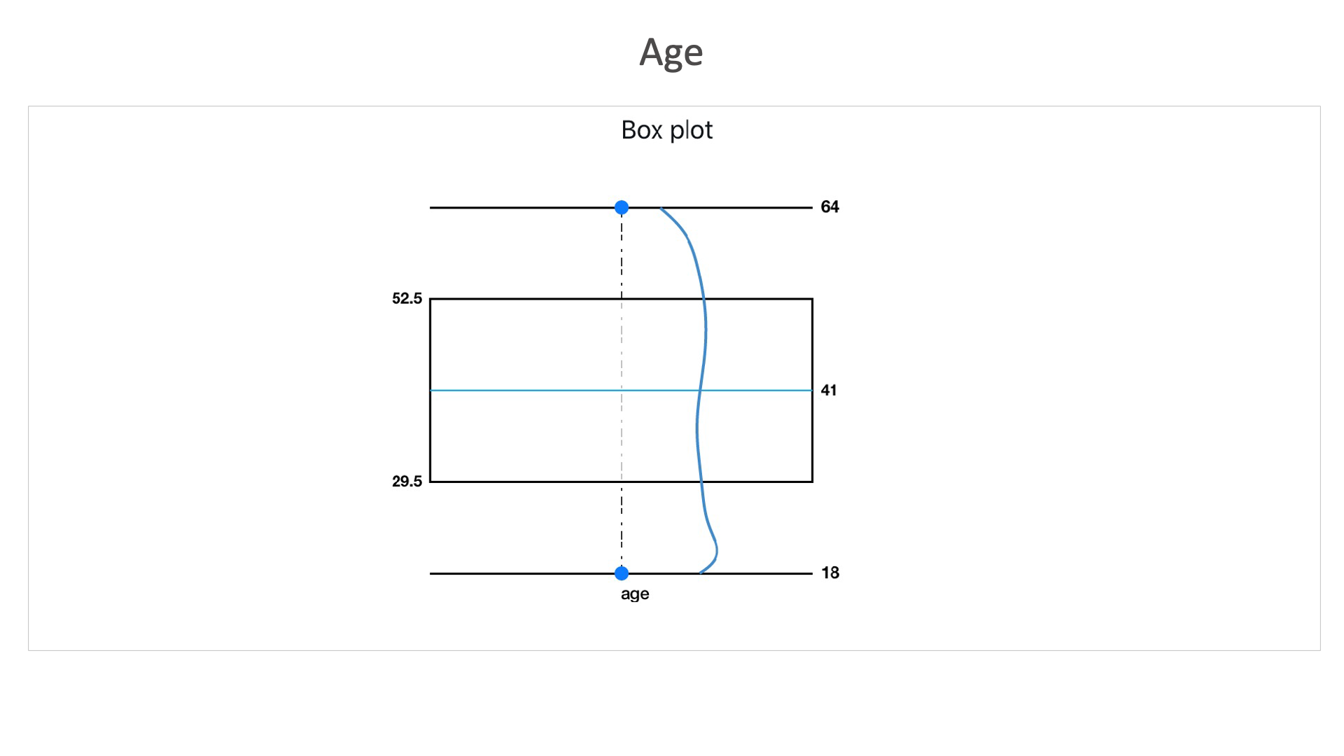
Age: Here in this box plot, we can see that this dataset consists higher number of records between the age of 29.5 and 52.5. With an average age of the data set as 41.
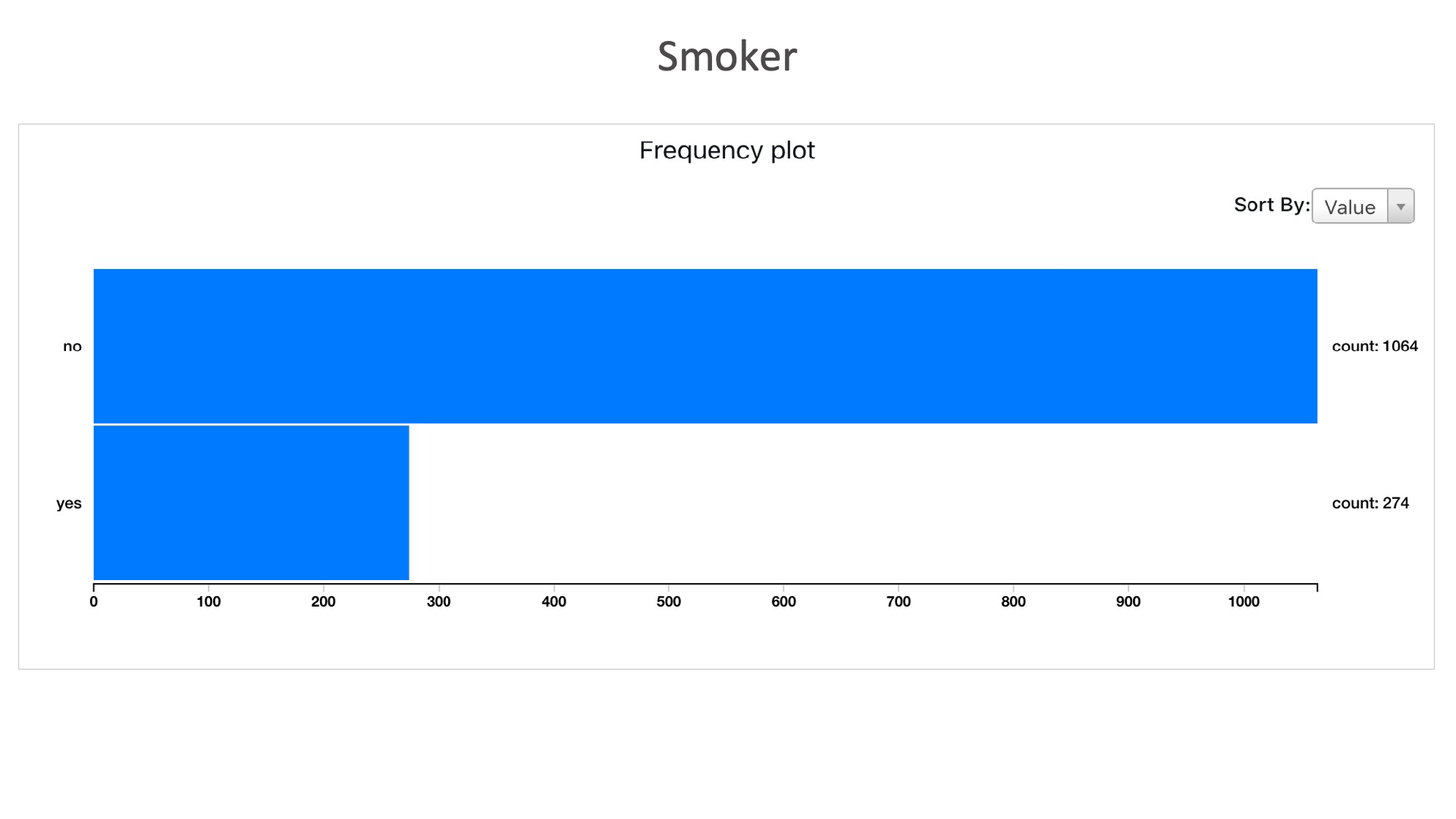
Smokers: Here we can see that, 1064 individuals are non smokers and 274 are smokers in the entire dataset.
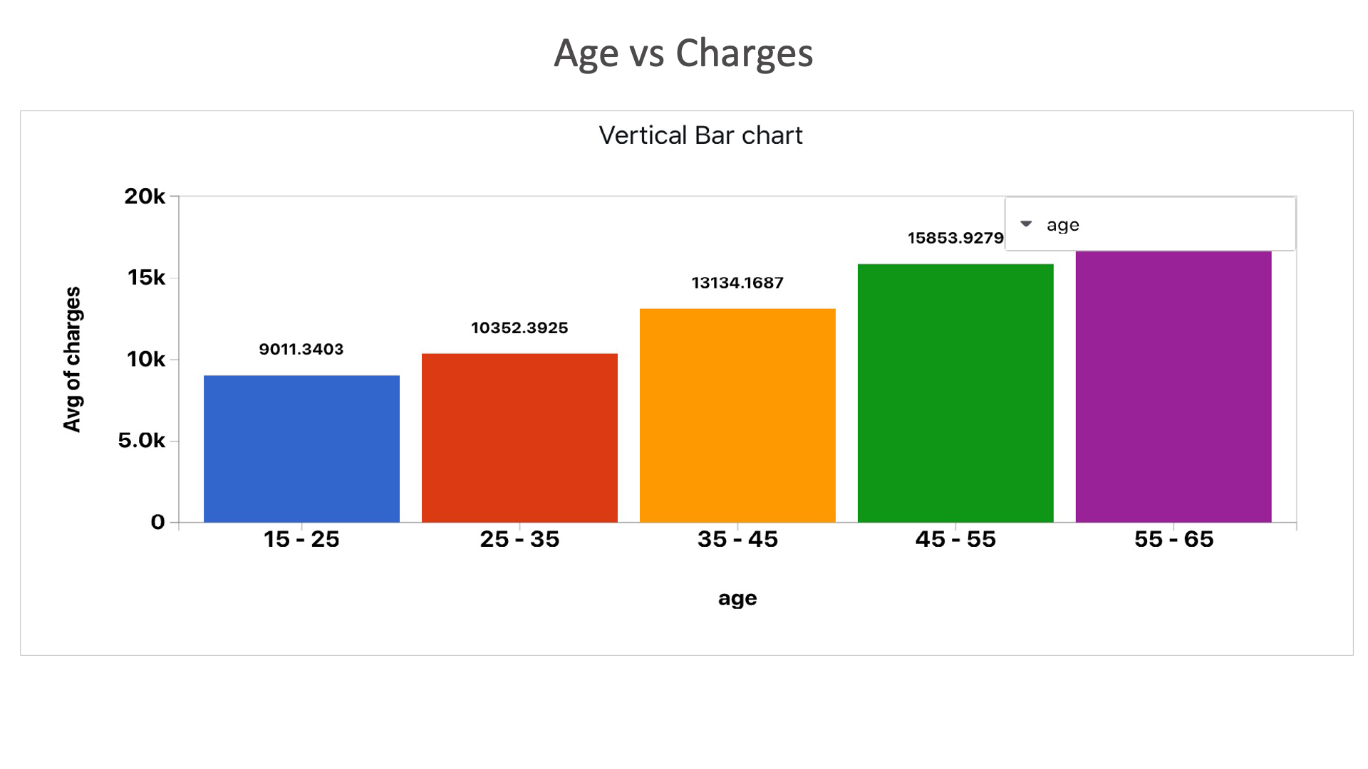
Age vs Charges: Here we can see that as the age increases, the charges on the insurance also increases.
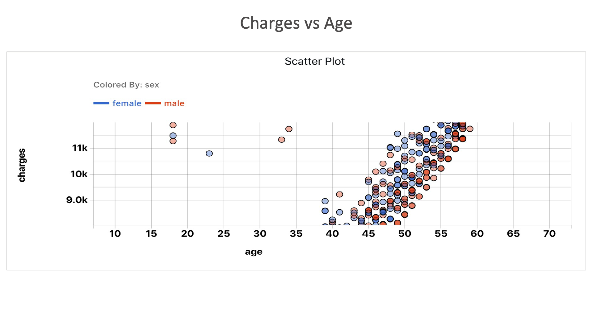
Charges vs Age: Here we can see that the charges for insurance increases as the age increases.
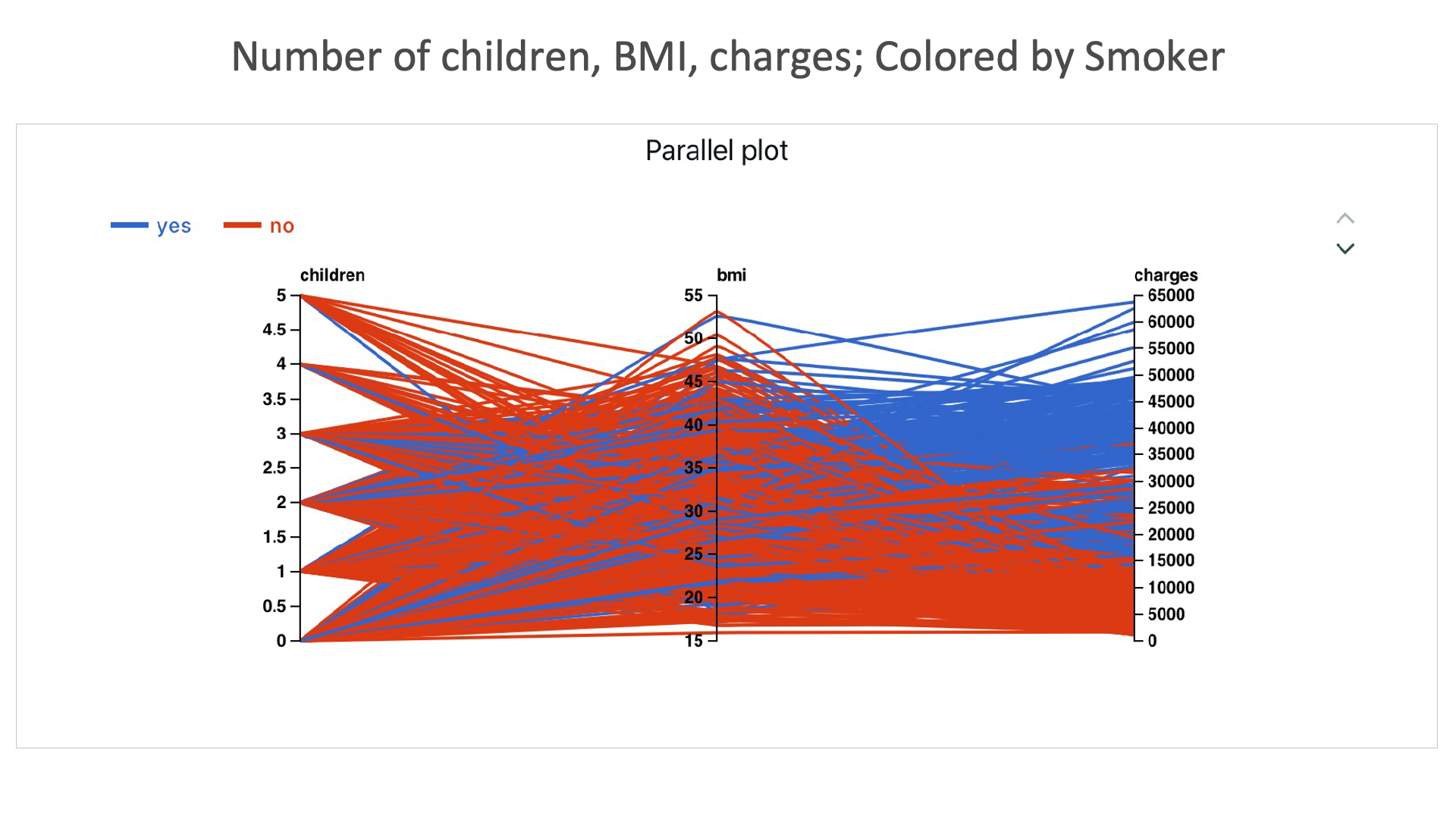
Number of children, BMI, charges; Colored by Smoker: Here we can see that the charges for smoker is higher.
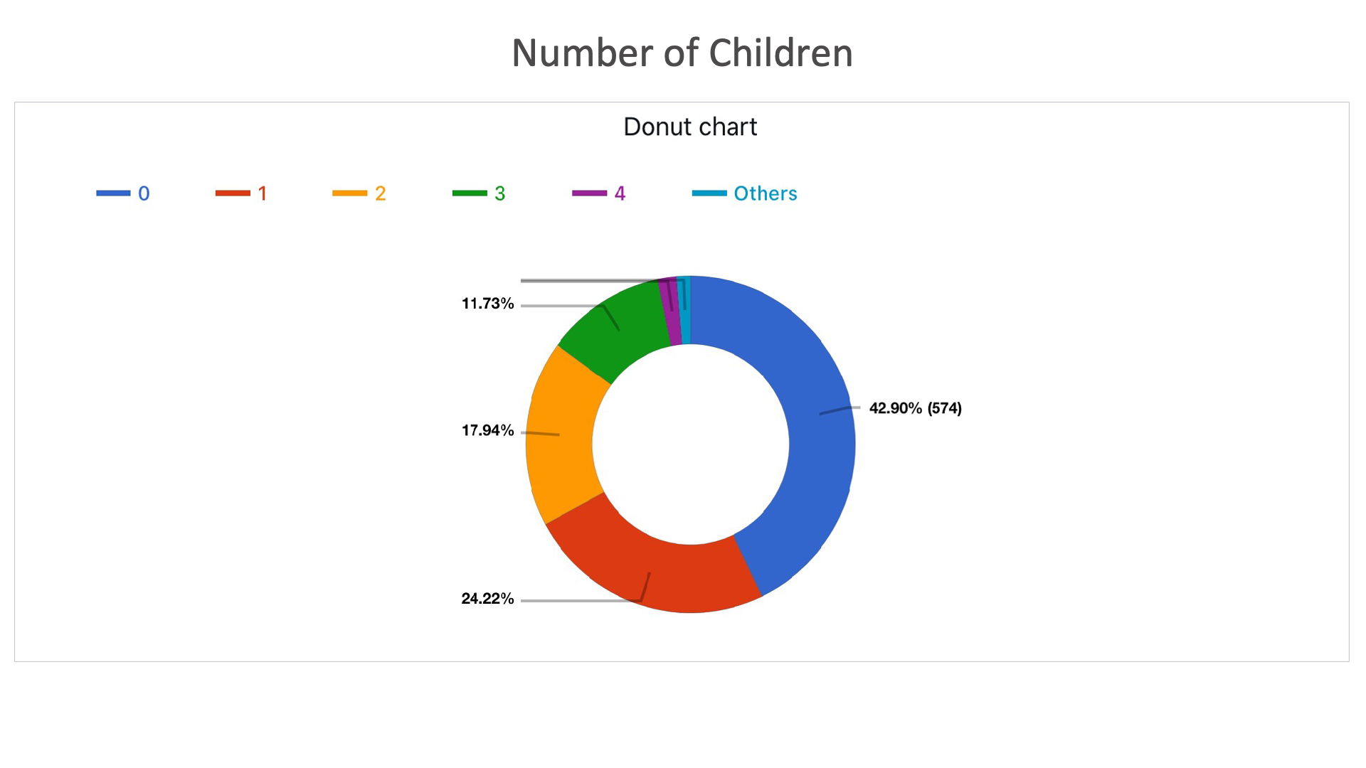
Number of Children: Here it shows the percentage of people with number of children.
Automobile
The following images showcases chart examples using a dataset on Automobiles. The charts explore the car statistics such as acceleration and horsepower.
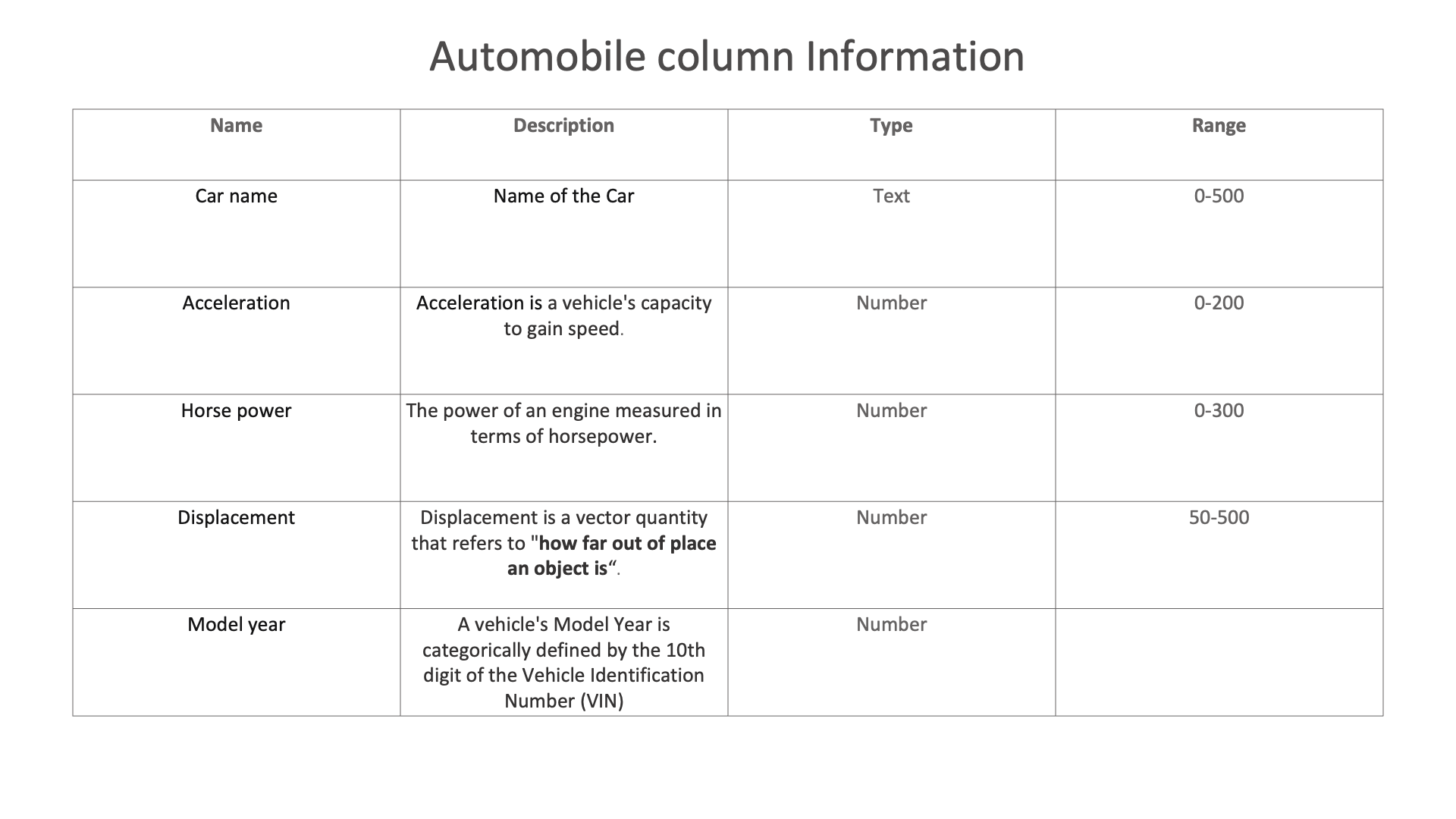
Automobile column Information
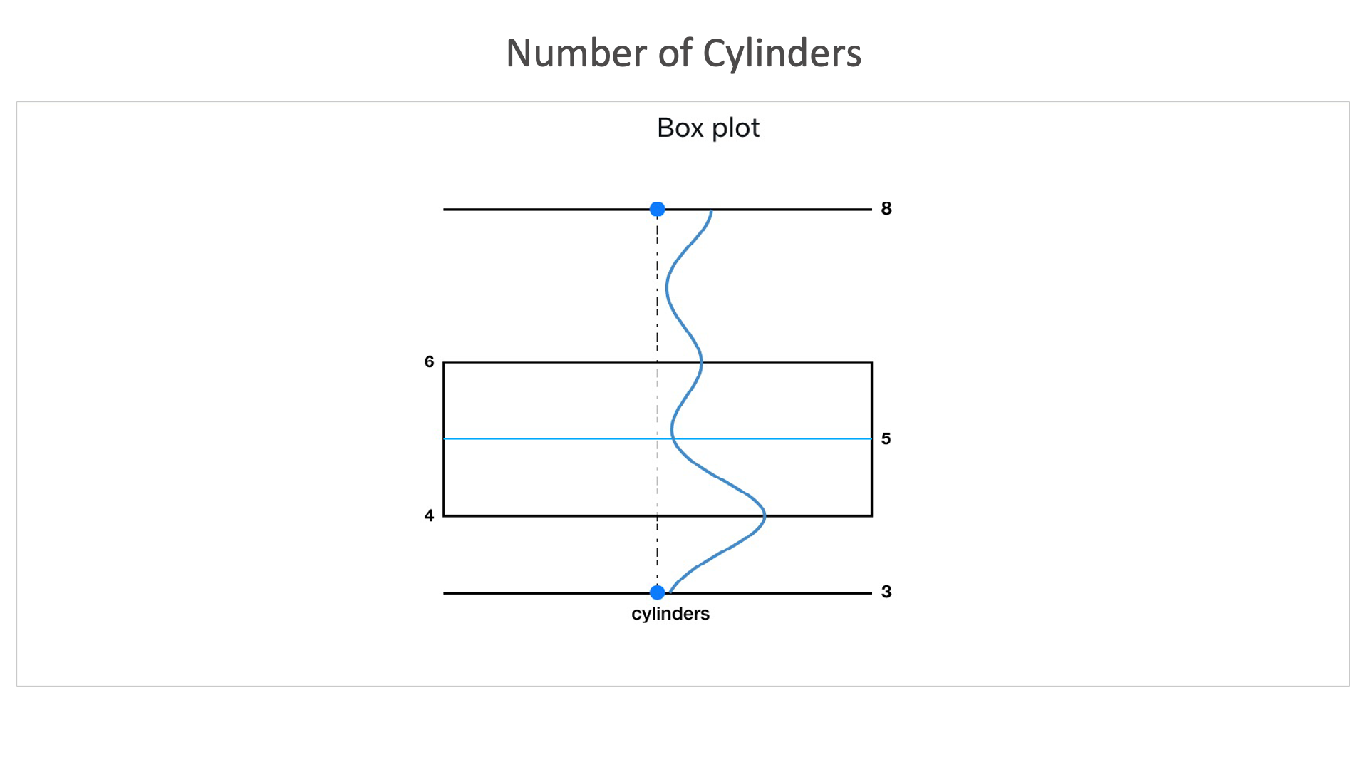
Number of Cylinders: It shows that this dataset contains majority of cars with cylinders between 4 and 6.
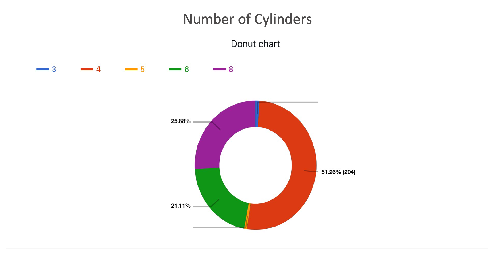
Number of Cylinders: Shows the percentage of cars with particular number of cylinders.
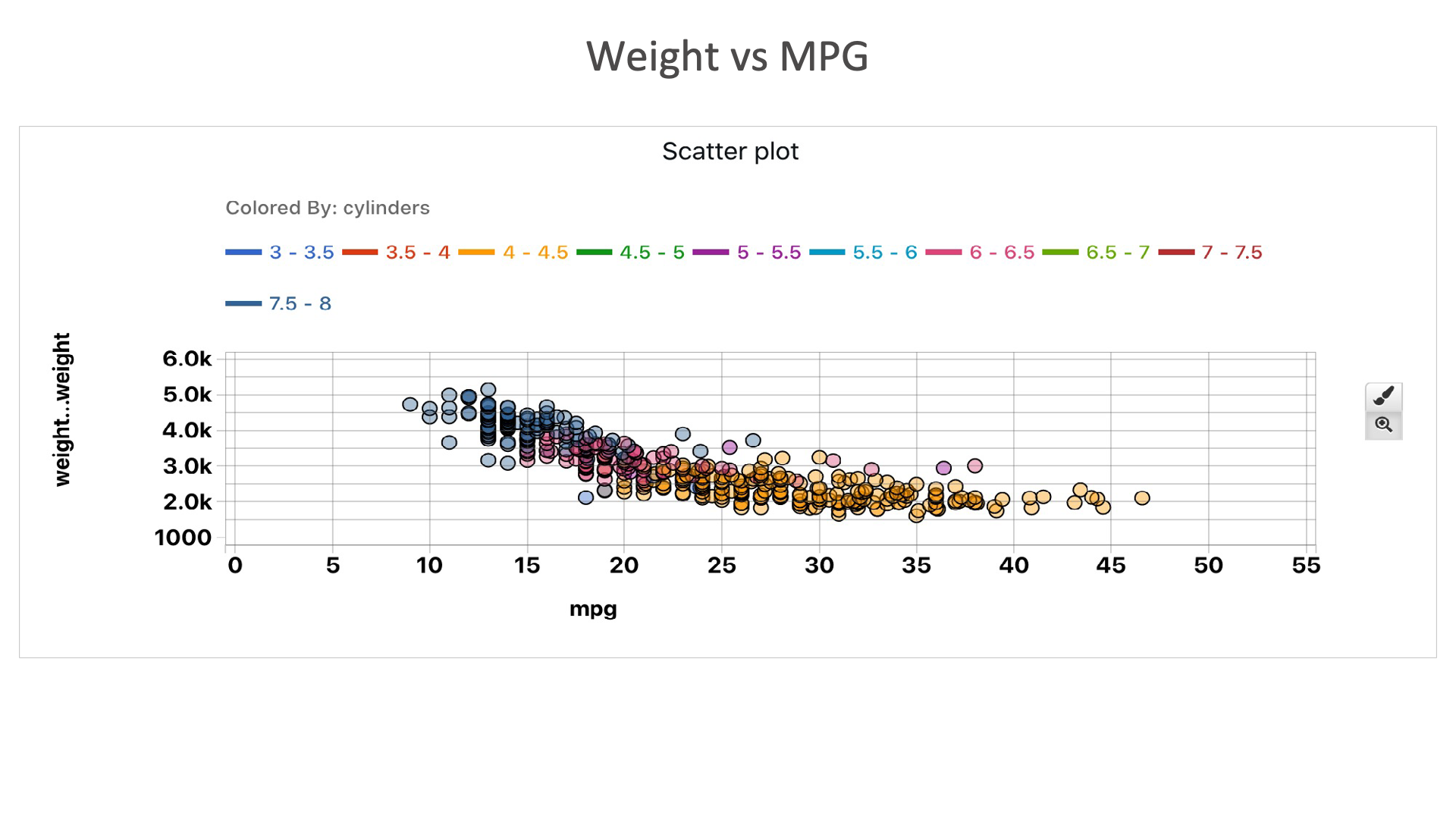
Weight vs MPG: From this plot, we can see that as the weight of automobile increases, the mileage decreases. We can also see that as the number of cylinders increase, the mileage decreases.
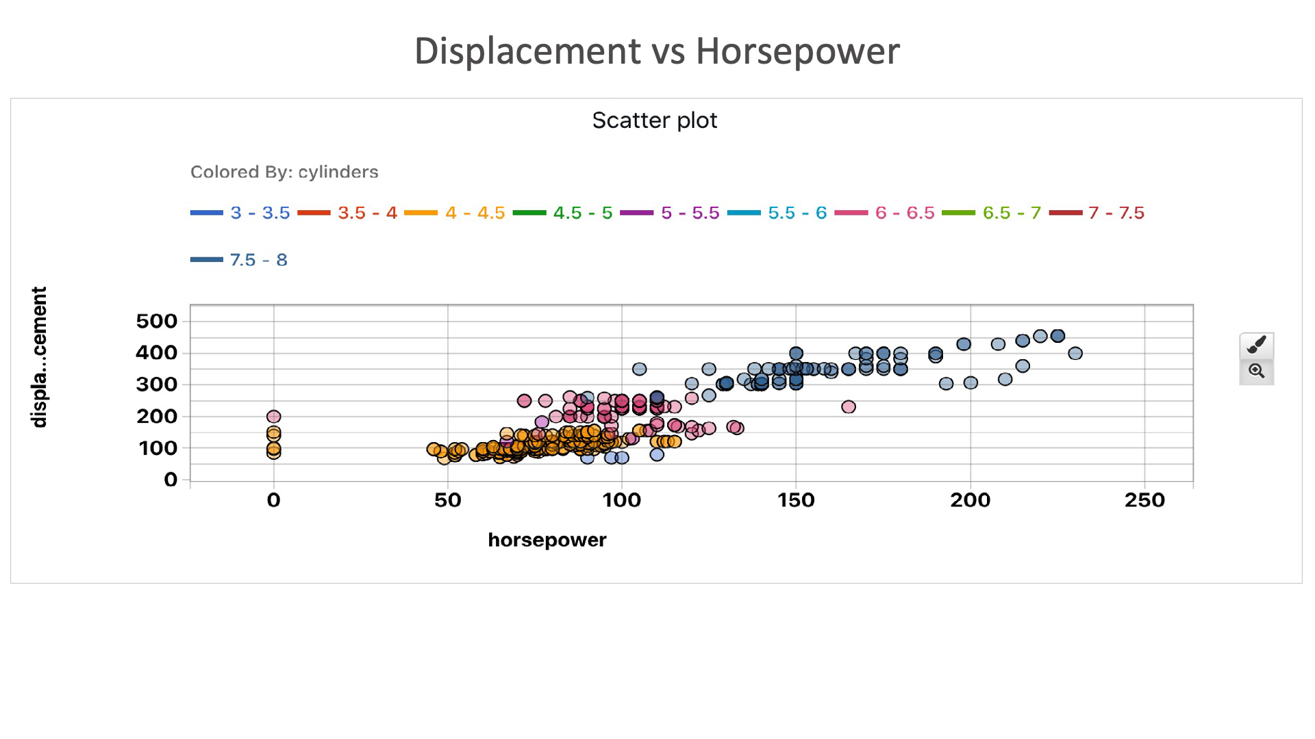
Displacement vs Horsepower: This plot shows that as the as the horsepower increases, the displacement also increases. We can also see that, higher number of cylinders is required for higher horsepower and displacement.
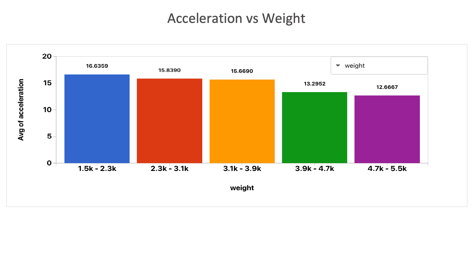
Acceleration vs Weight: We can see that as the weight increases, acceleration decreases.
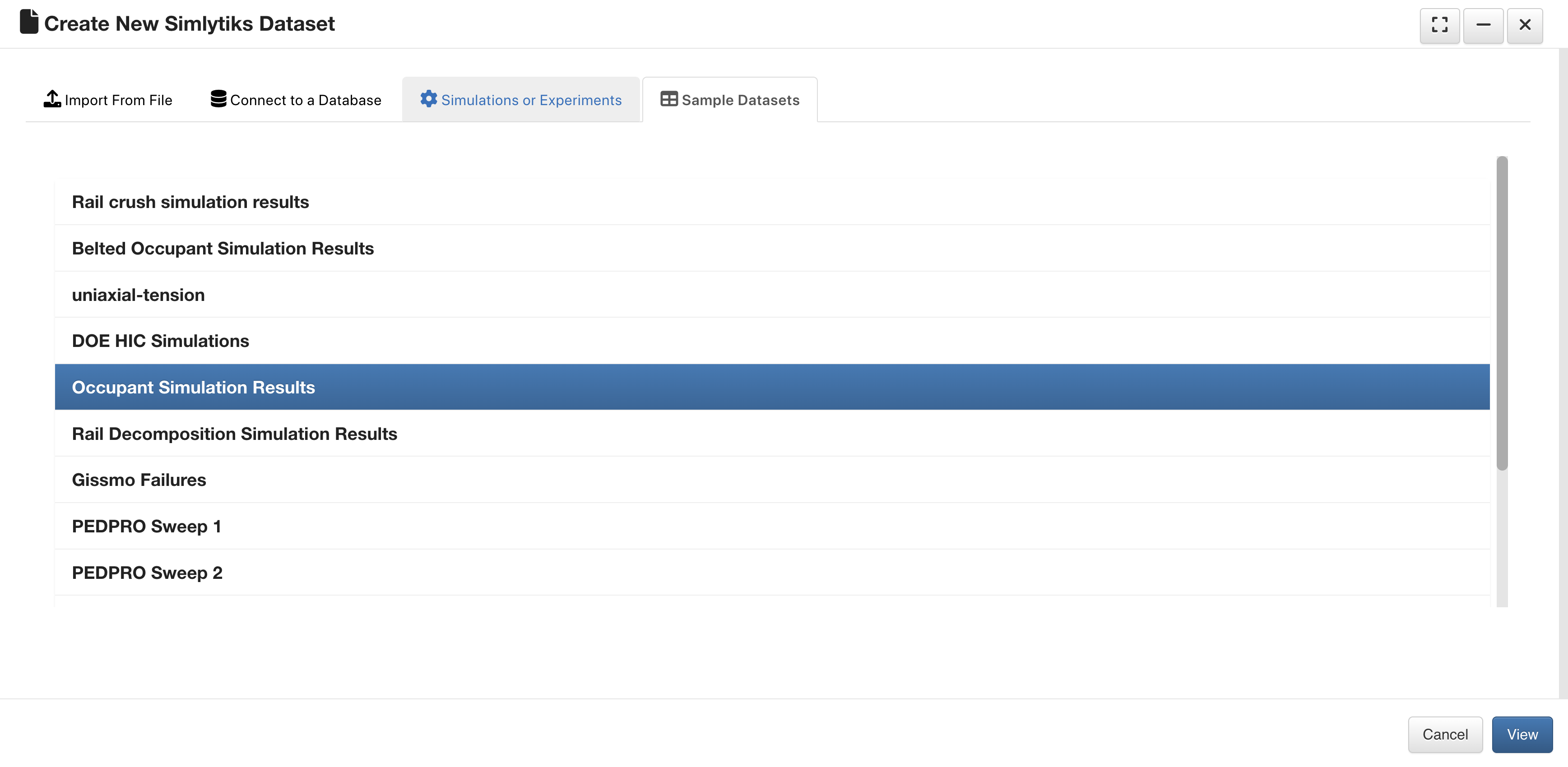
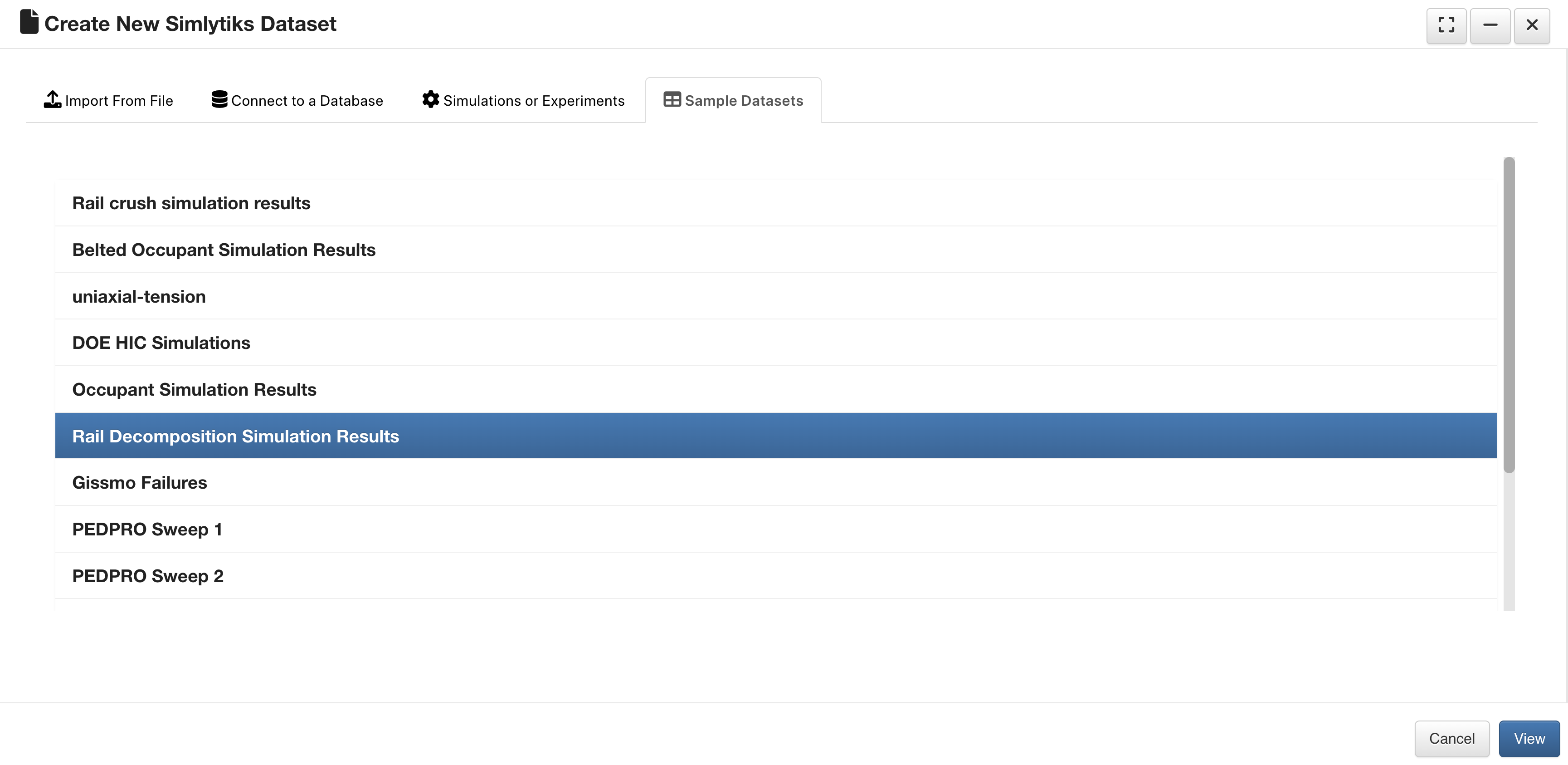
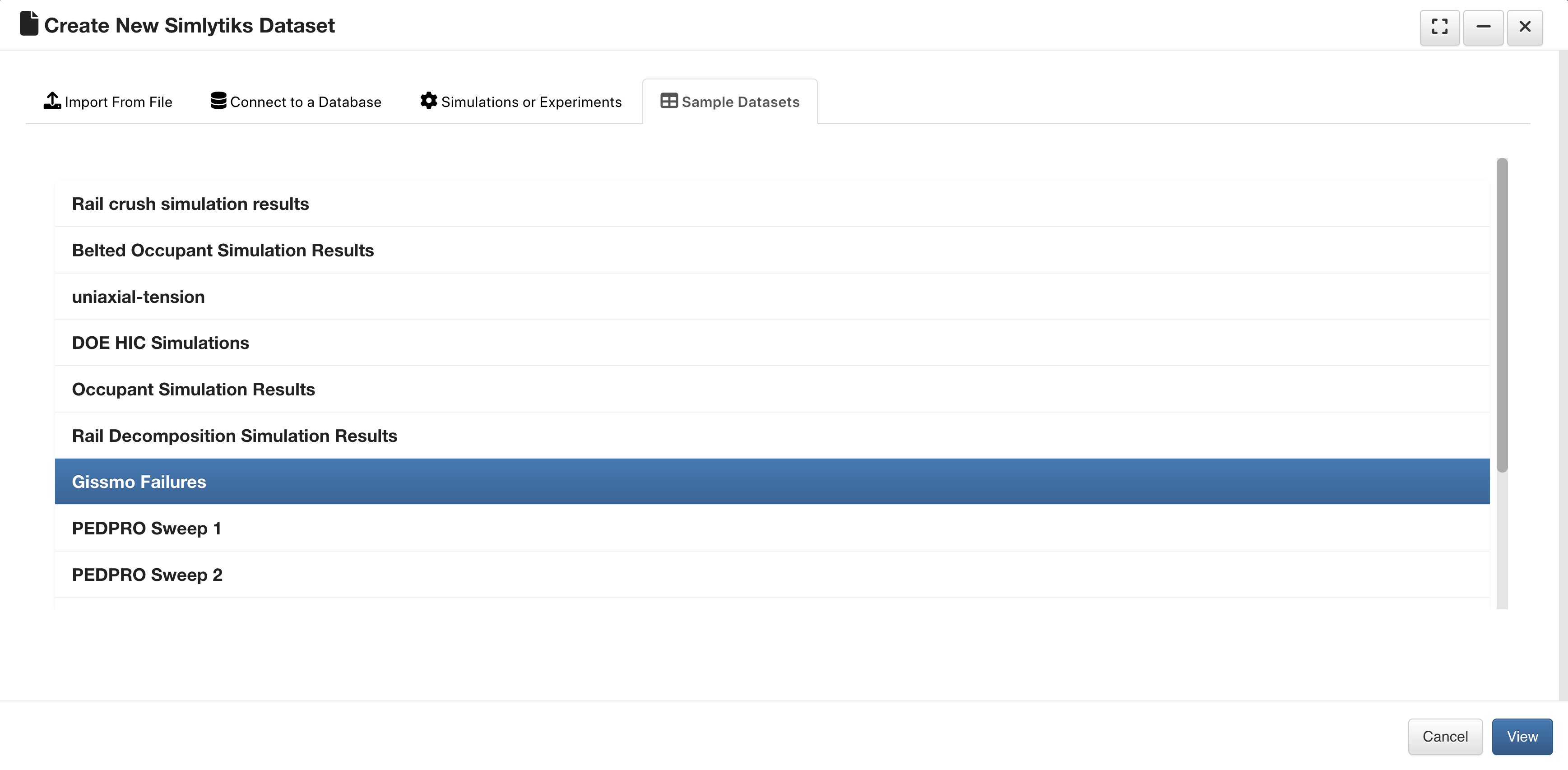
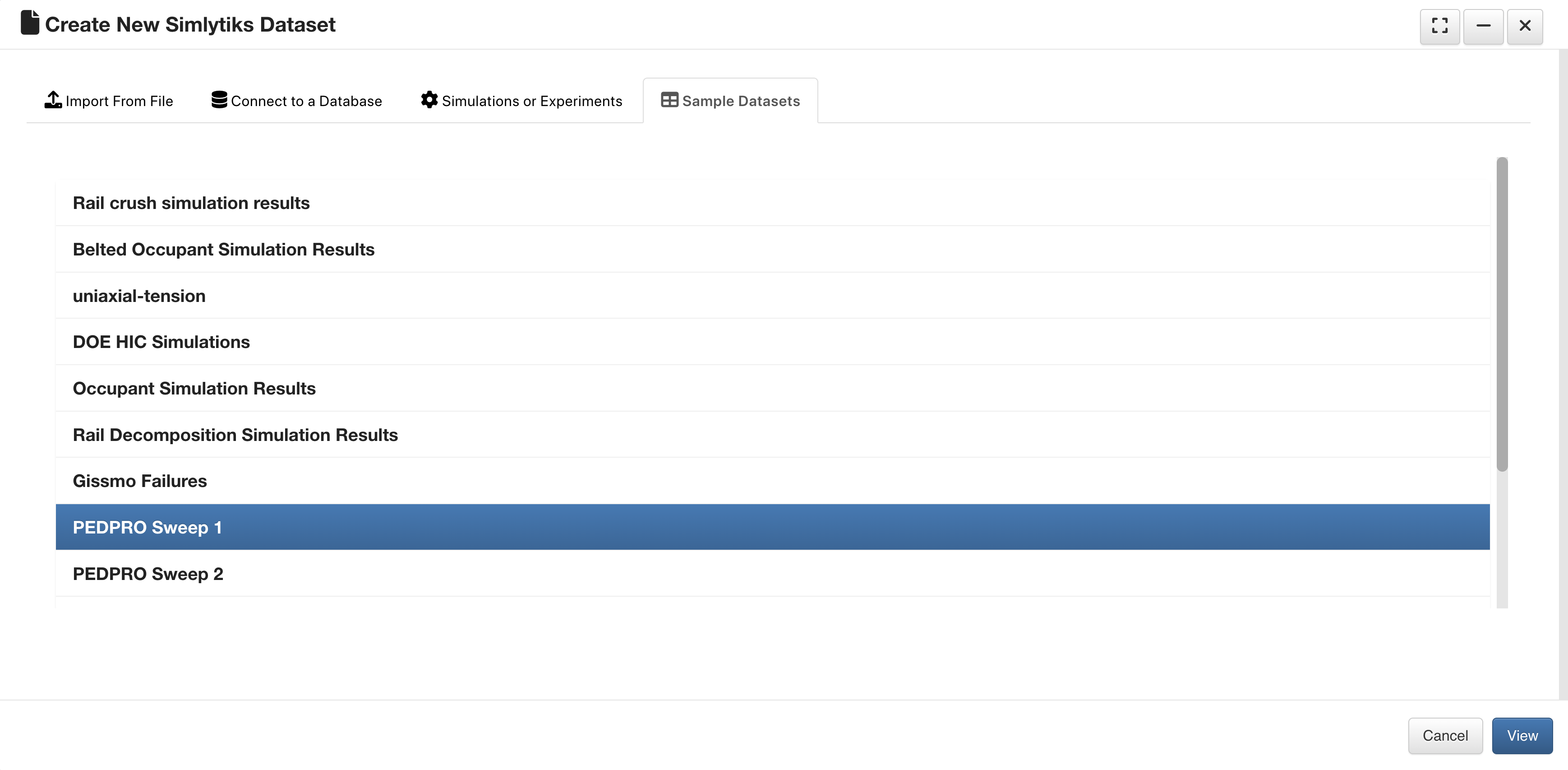
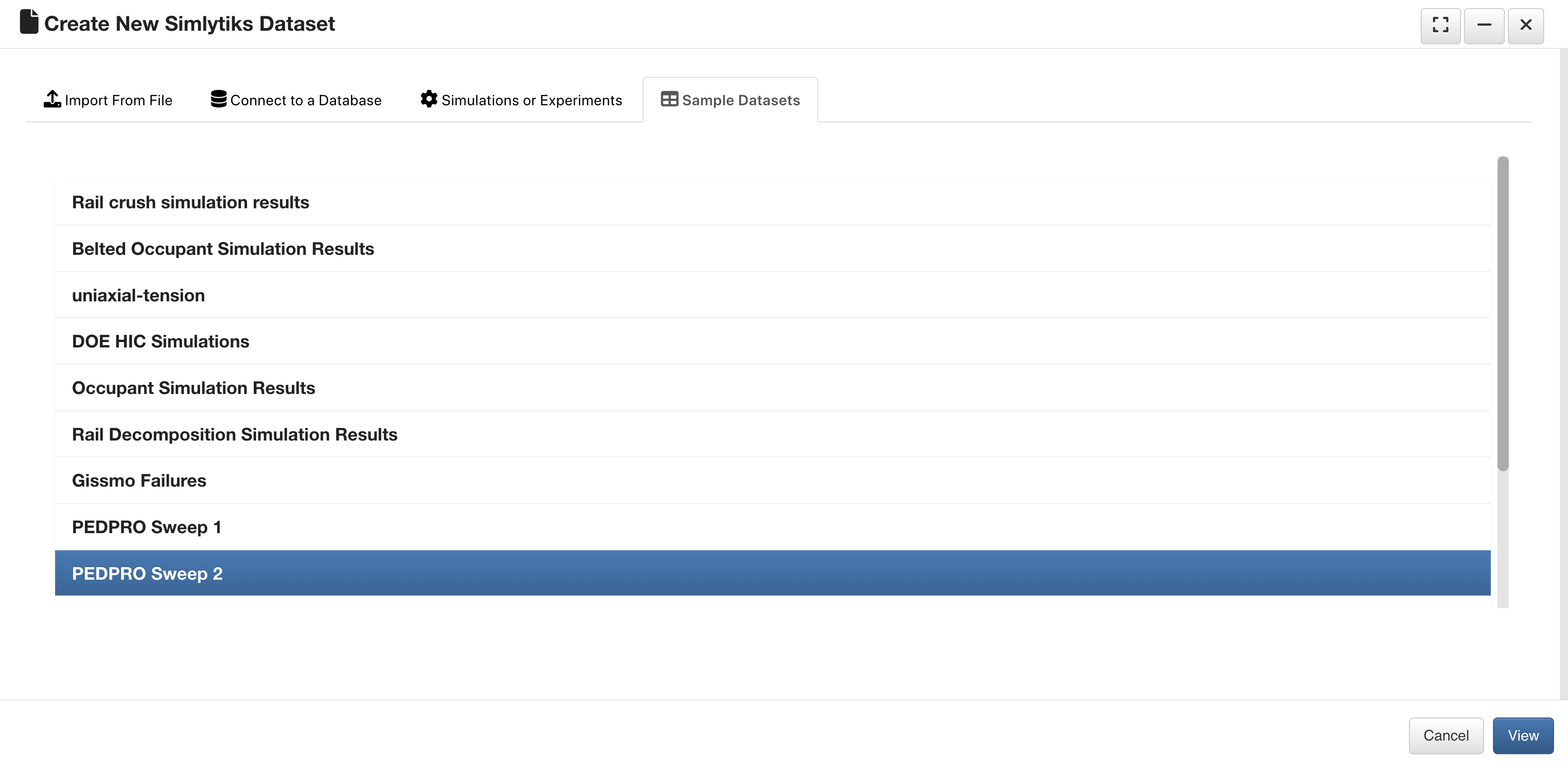
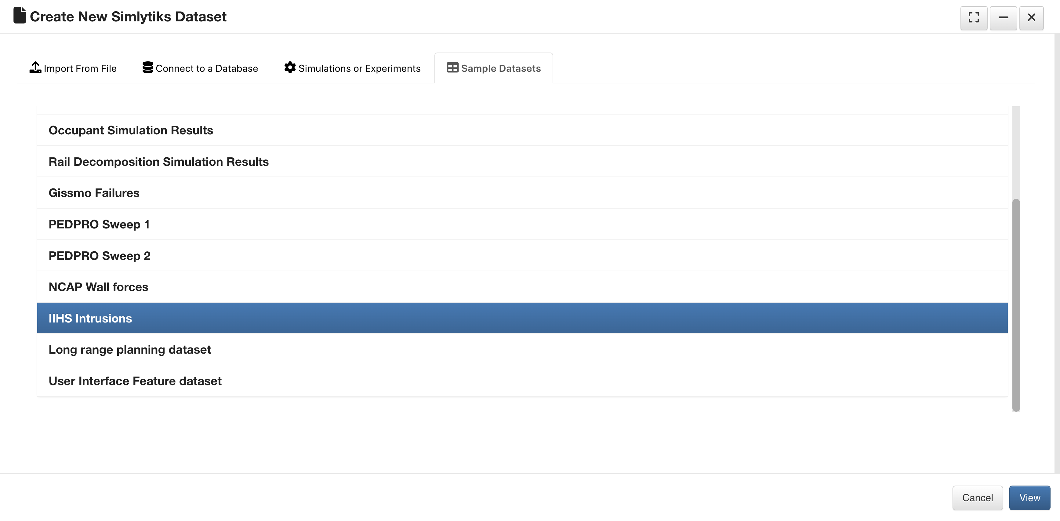
Sample Datasets
There are a variety of sample datasets to explore in Simlytiks which can be found on the last tab of the upload window.
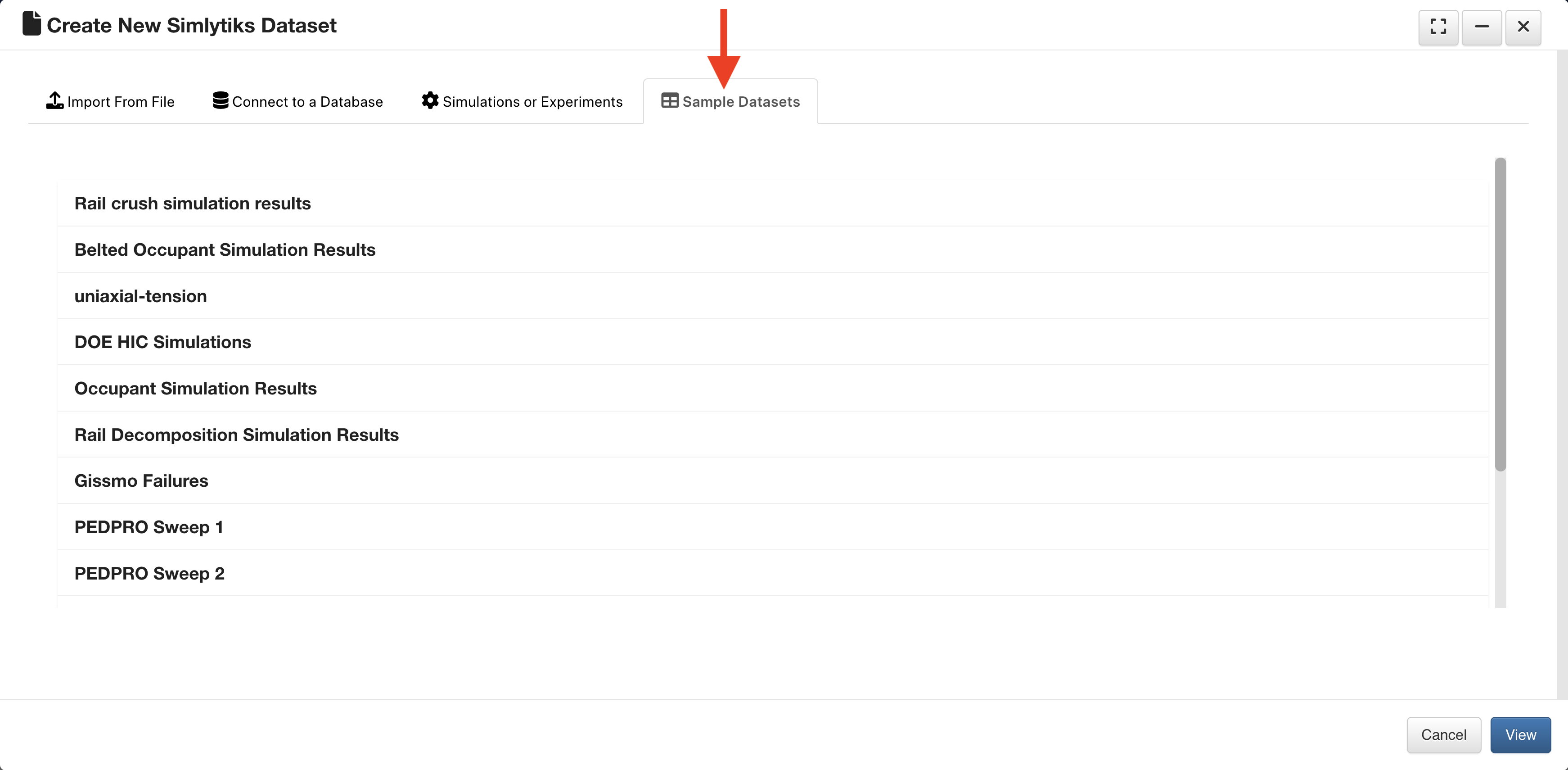
Sample Datasets Tab
Let’s review them.
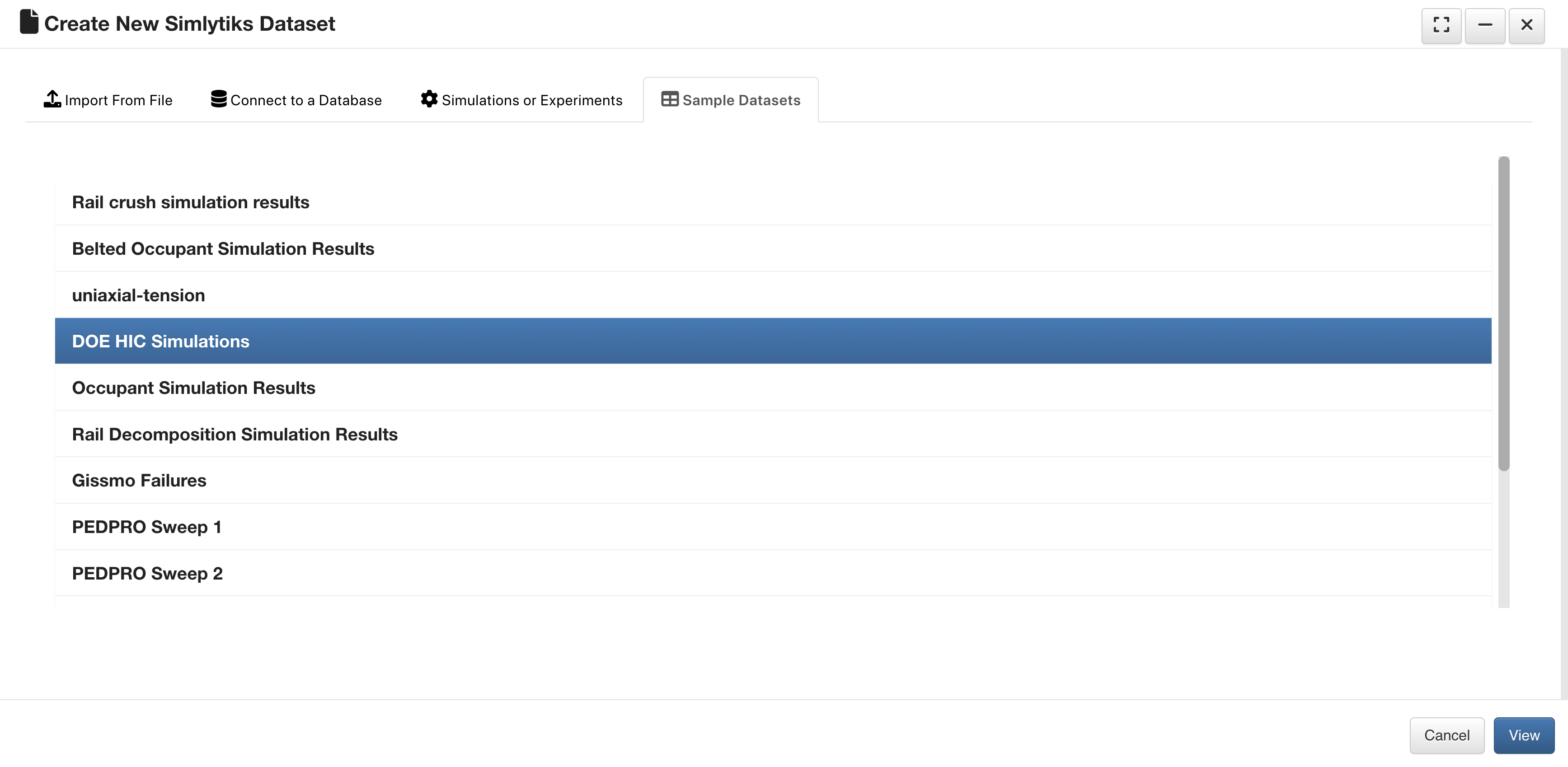
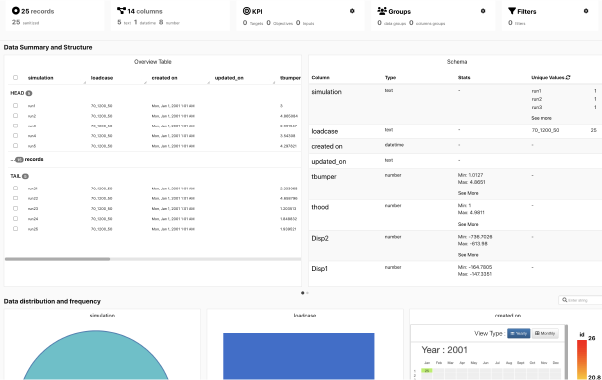
DOE HIC Simulations
This dataset contains Design-of-Experiments simulations.
DOE HIC Simulations
Upon opening, we’ll see an overview table of its data.
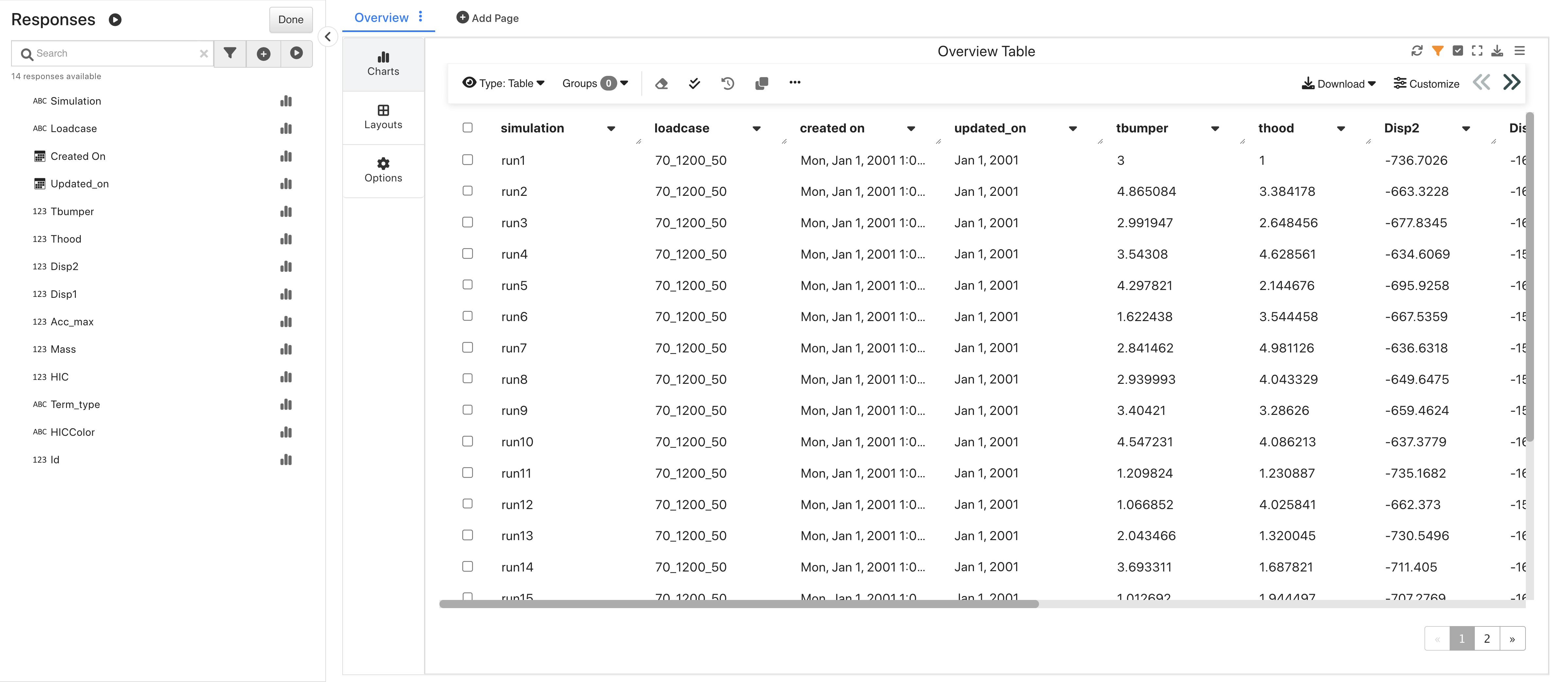
DOE HIC Simulations Overview
This dataset is great for exploring how T-Bumper and T-hood relate to Head Injury Criteria.
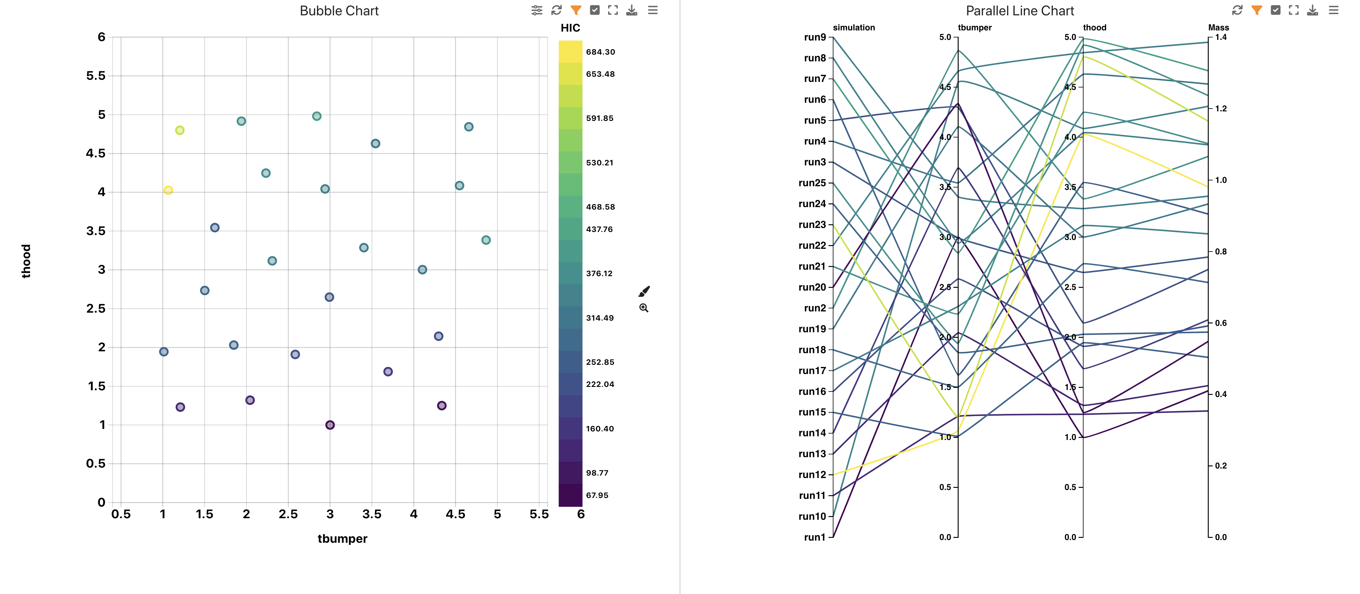
DOE HIC Simulations Bubble and Bar
We can also explore how HIC is affected by T-Bumper and T-hood using a Machine Learning regression model.
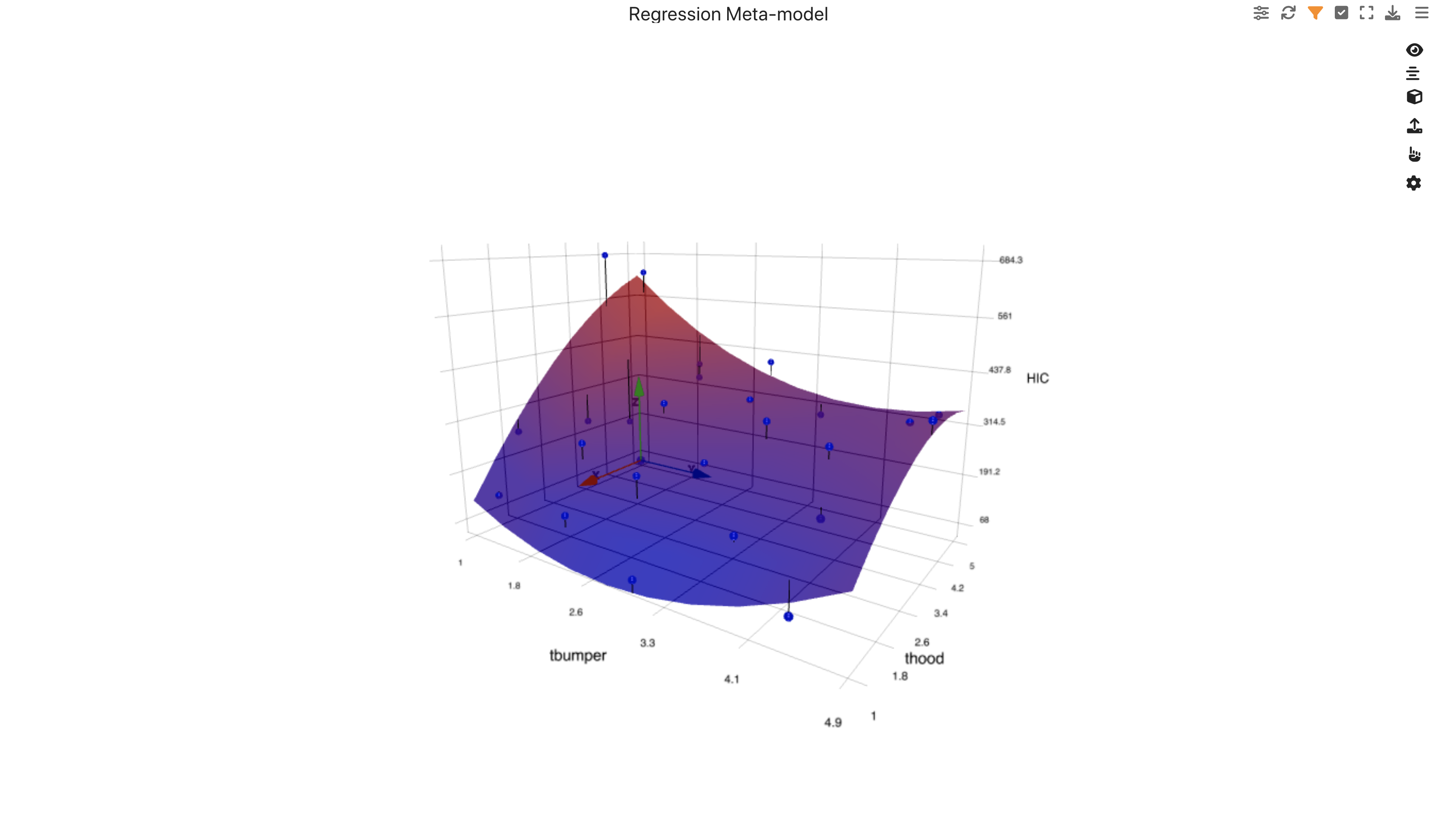
DOE HIC Simulations ML Linear Regression
We can see when the data was created with a Calendar Heat Map.
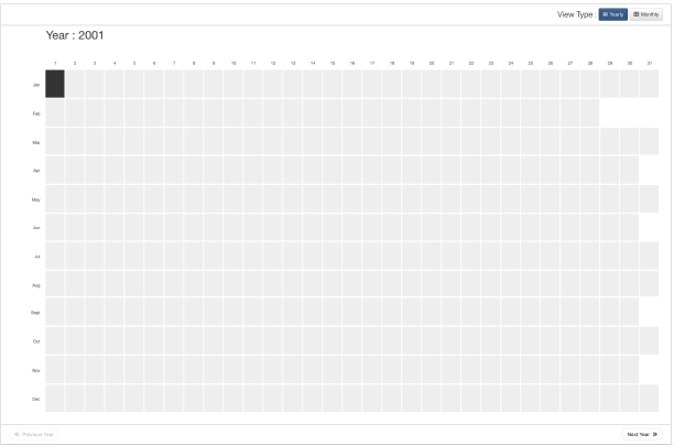
DOE HIC Simulations Calendar Heat Map
We can also explore how HIC is affected by T-Bumper and T-hood using a 2D Contour Terrain model.

DOE HIC Simulations 2D Contour Terrain
We can also explore how HIC is affected by T-Bumper and T-hood using a Density Contour plot.
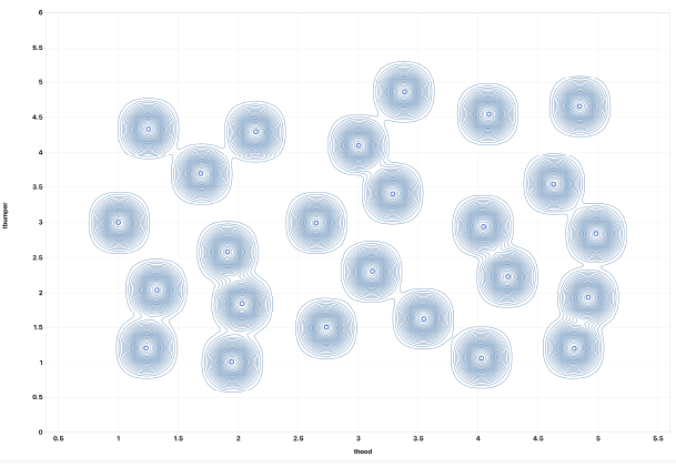
DOE HIC Simulations Density Contour Plot
We can also get a 2D view of the data using the Data Profiler.
DOE HIC Simulations Data Profiler
Occupant Simulation Results
This dataset contains multiple Occupant Belted crash simulations.
Occupant Simulation Results
Upon opening, we’ll see an overview table of its data.
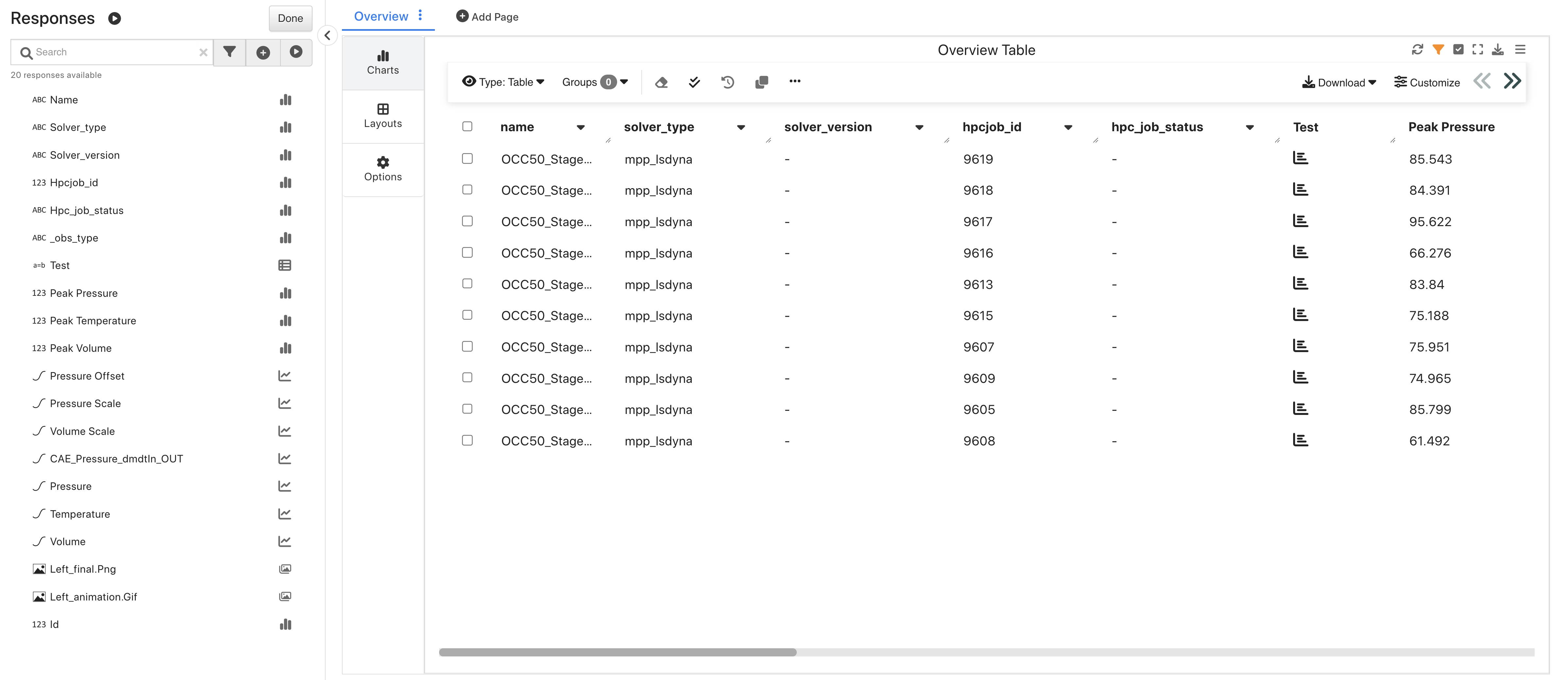
Occupant Simulation Results Overview
This dataset is great for exploring multiple curves in Newton.
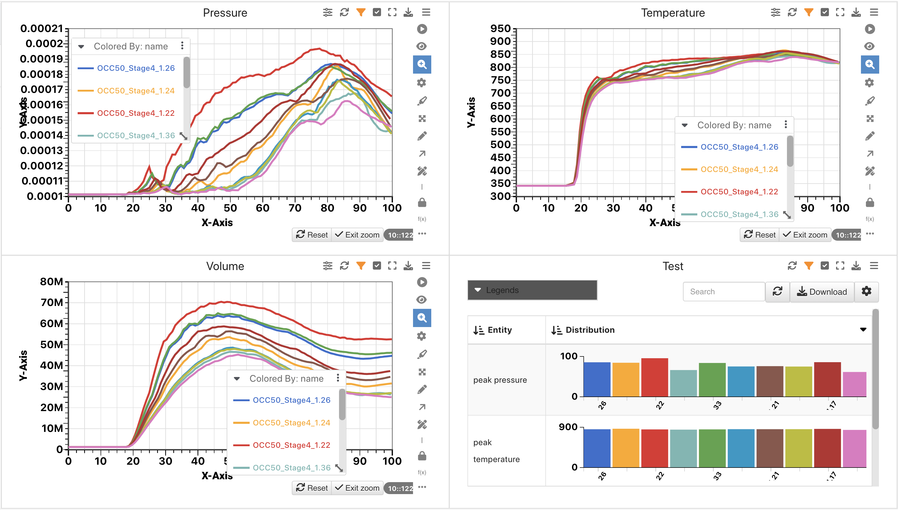
Occupant Simulation Results Curves
Rail Decomposition Simulation Results
This dataset contains multiple rail decomposition simulations for material calibration exploration.
Rail Decomposition Simulation Results
This dataset has a dedicated layout with multiple pages of visualizations including this gallery view of these decomposition images.
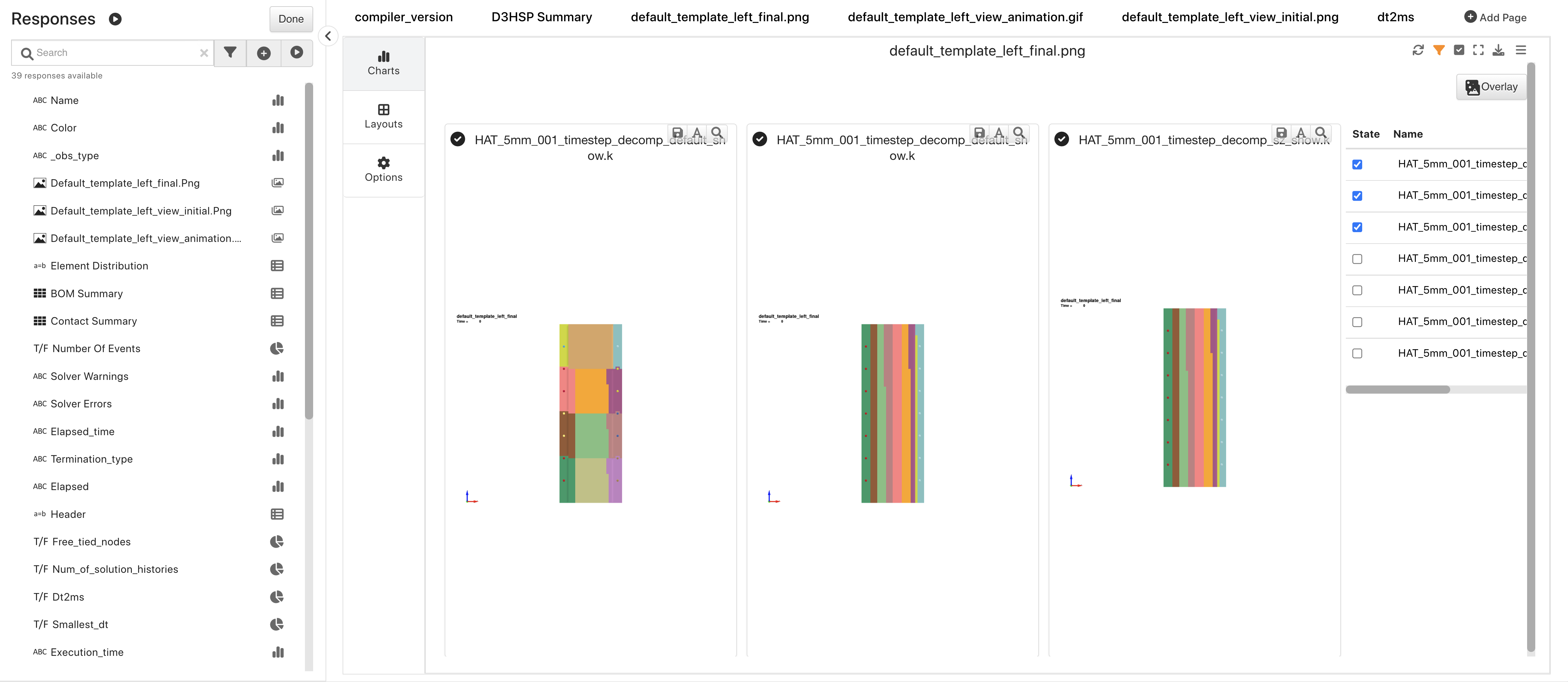
Rail Decomposition Simulation Results Overview
Gissmo Failures
This dataset contains gismo material calibration data.
Gissmo Failures
Upon opening, we’ll see an overview table of its data.
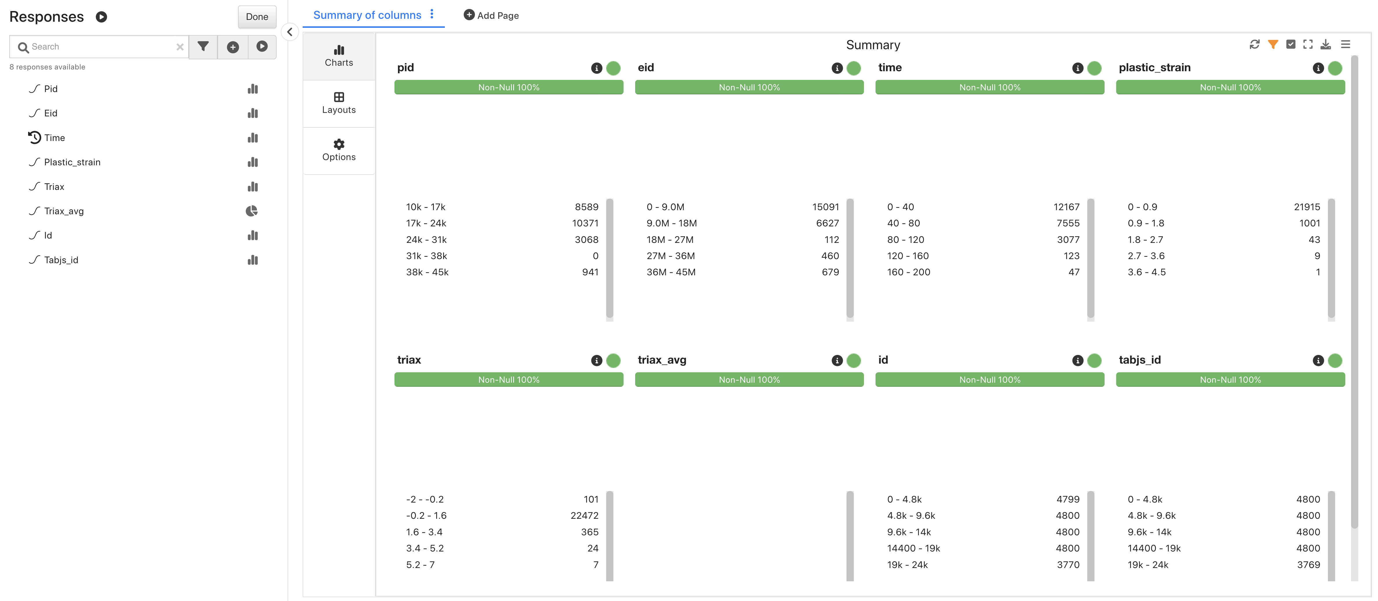
Gissmo Failures Overview
This dataset is great for exploring time series data.
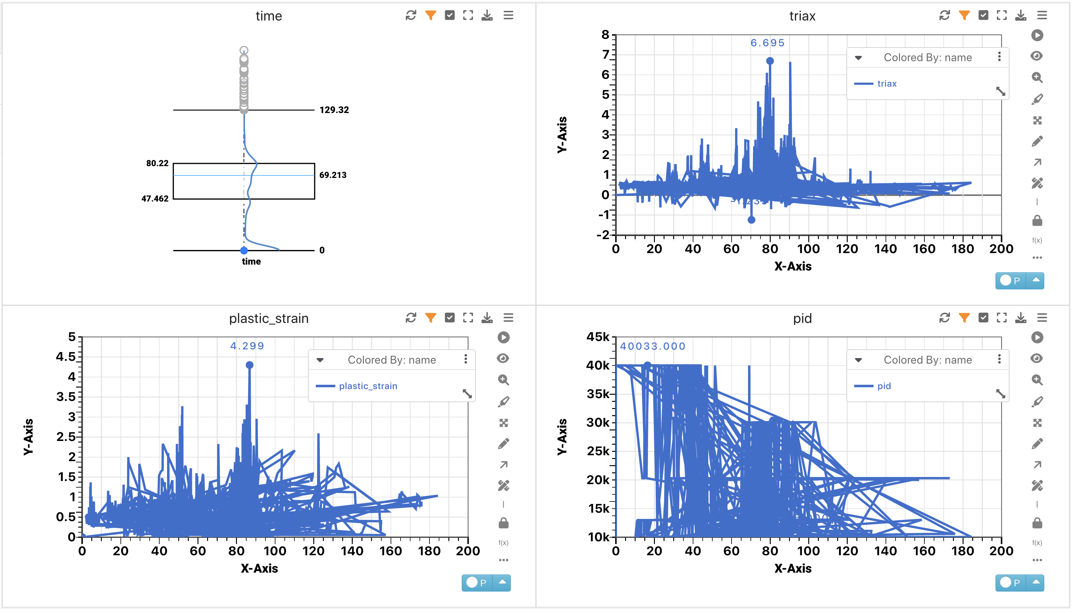
Gissmo Failures Curves
PEDPRO Sweep 1
This dataset contains Pedestrian Protection data.
PEDPRO Sweep 1
Upon opening, we’ll see an overview table of its data.
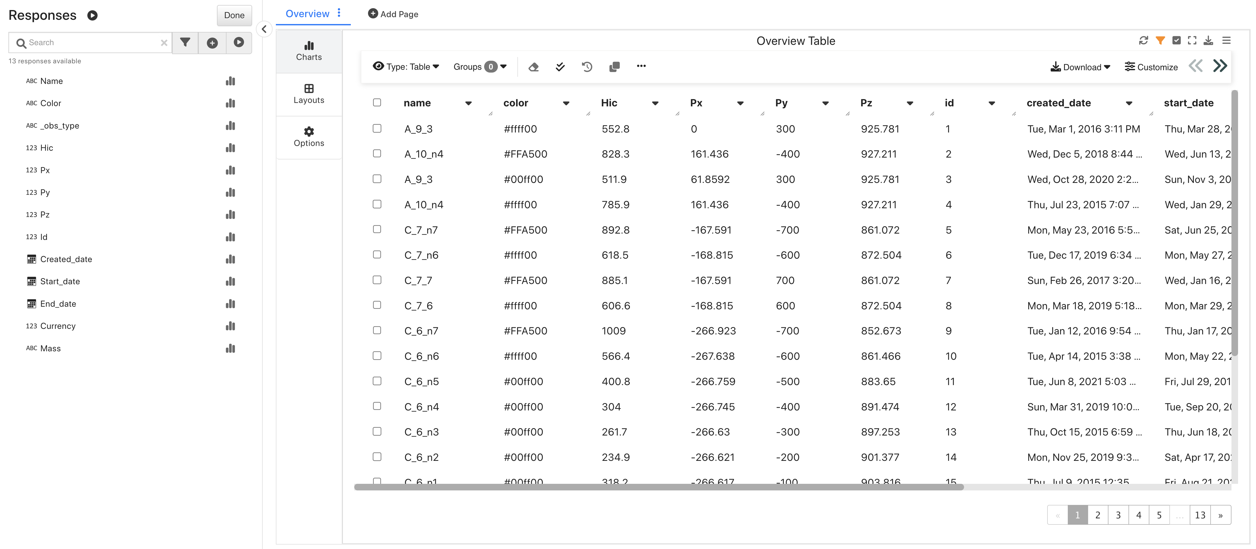
PEDPRO Sweep 1 Overview
This dataset is great for exploring how to predict scores via the PedPro Table.
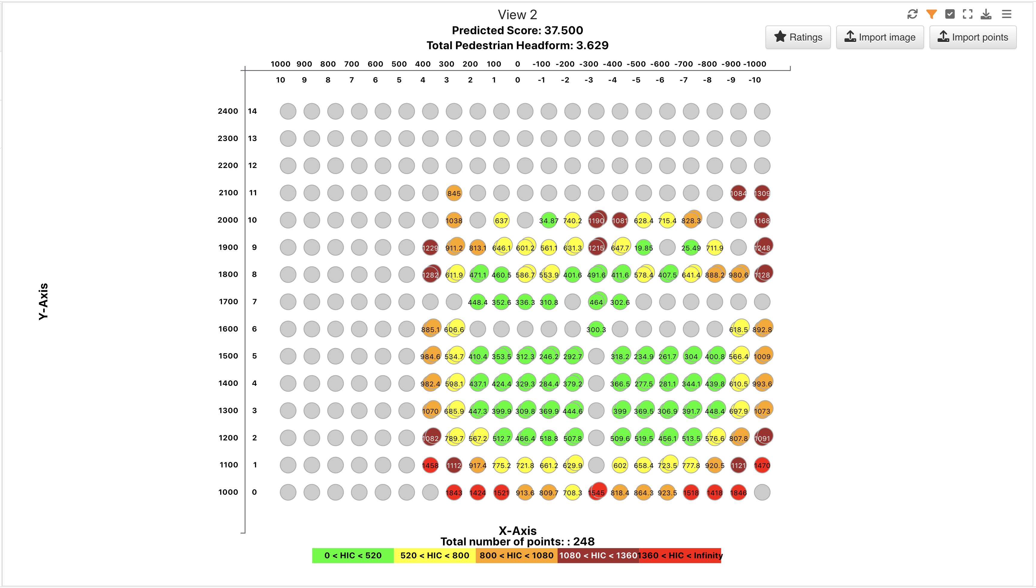
PEDPRO Sweep 1 Table
PEDPRO Sweep 2
This dataset contains Pedestrian Protection data.
PEDPRO Sweep 2
Upon opening, we’ll see an overview table of its data.
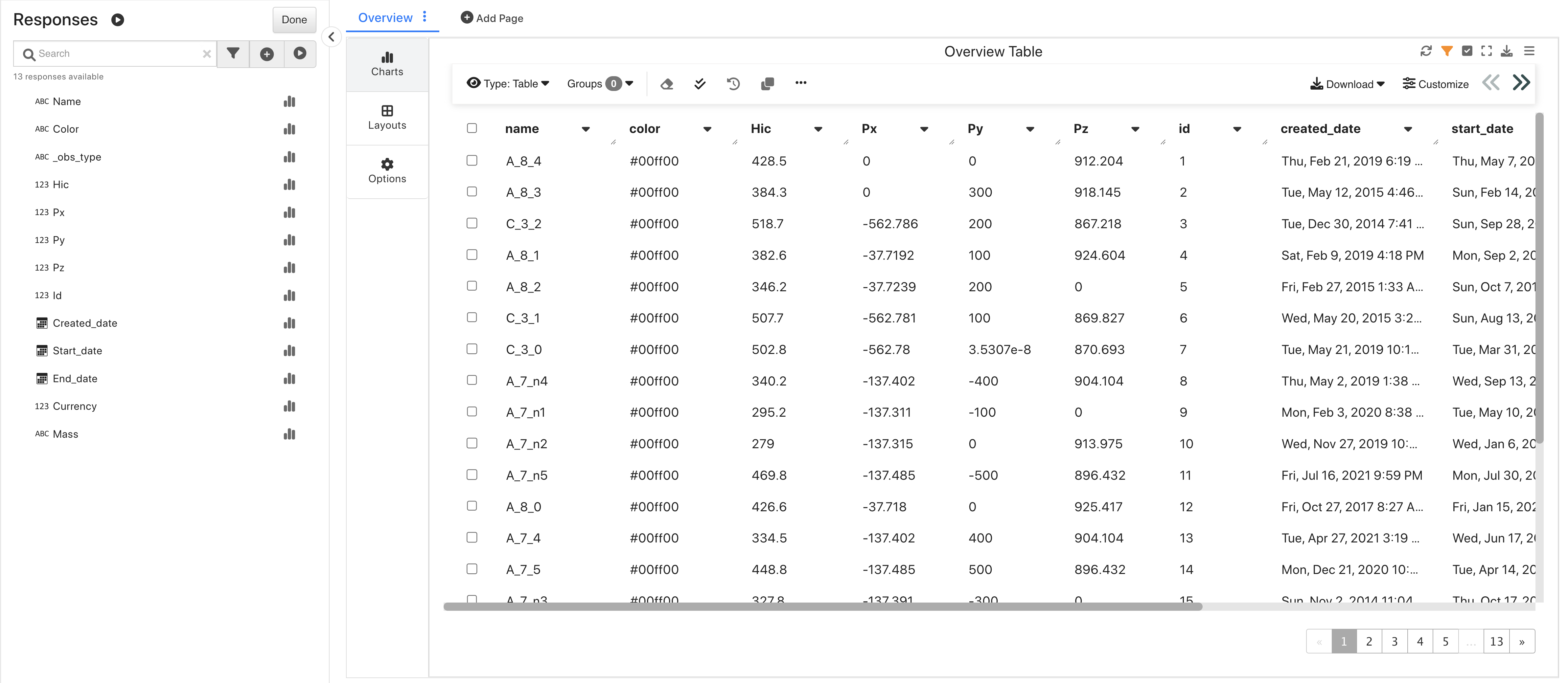
PEDPRO Sweep 2 Overview
This dataset is great for exploring how to predict scores via the PedPro Table.
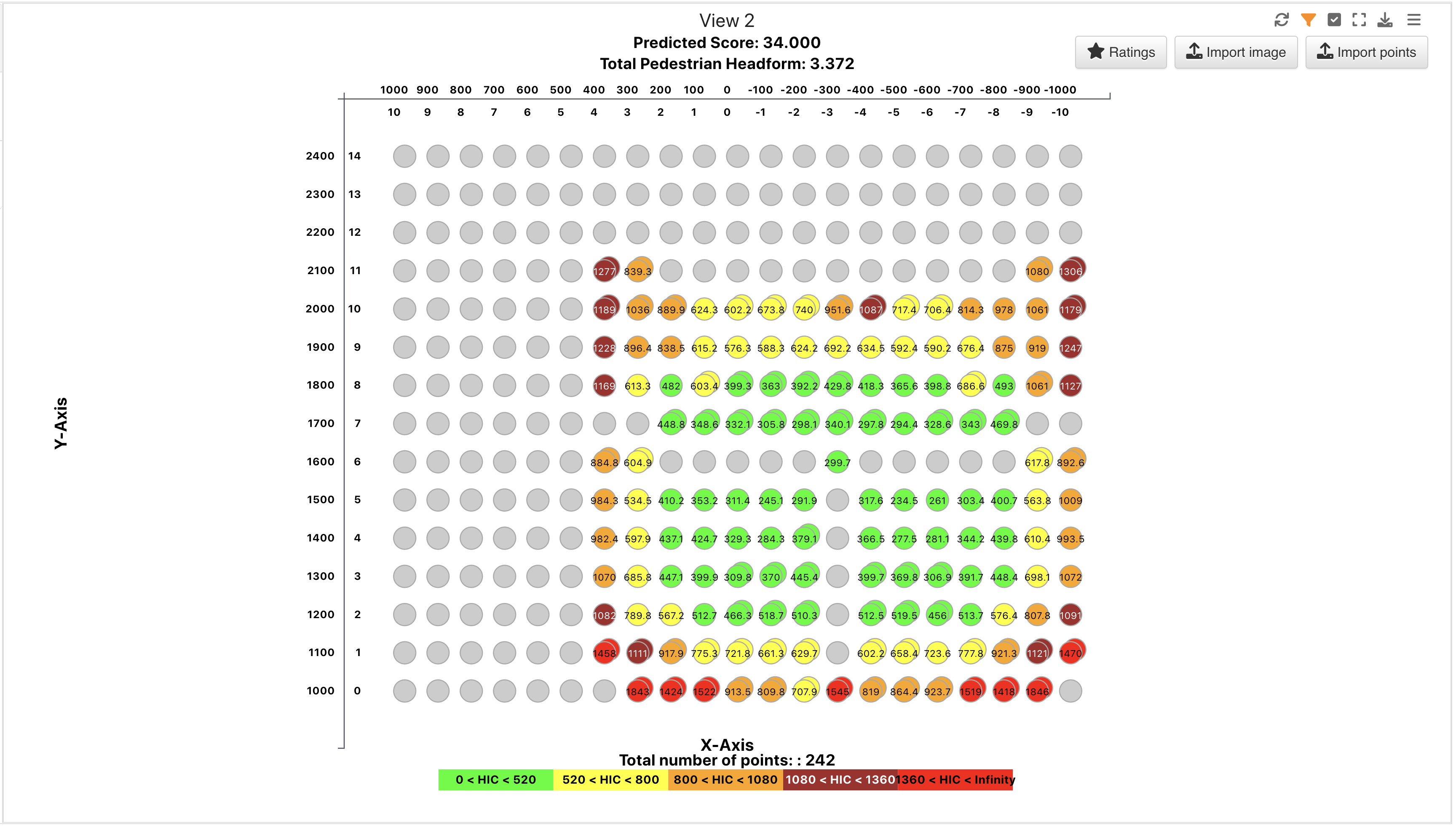
PEDPRO Sweep 2 Table
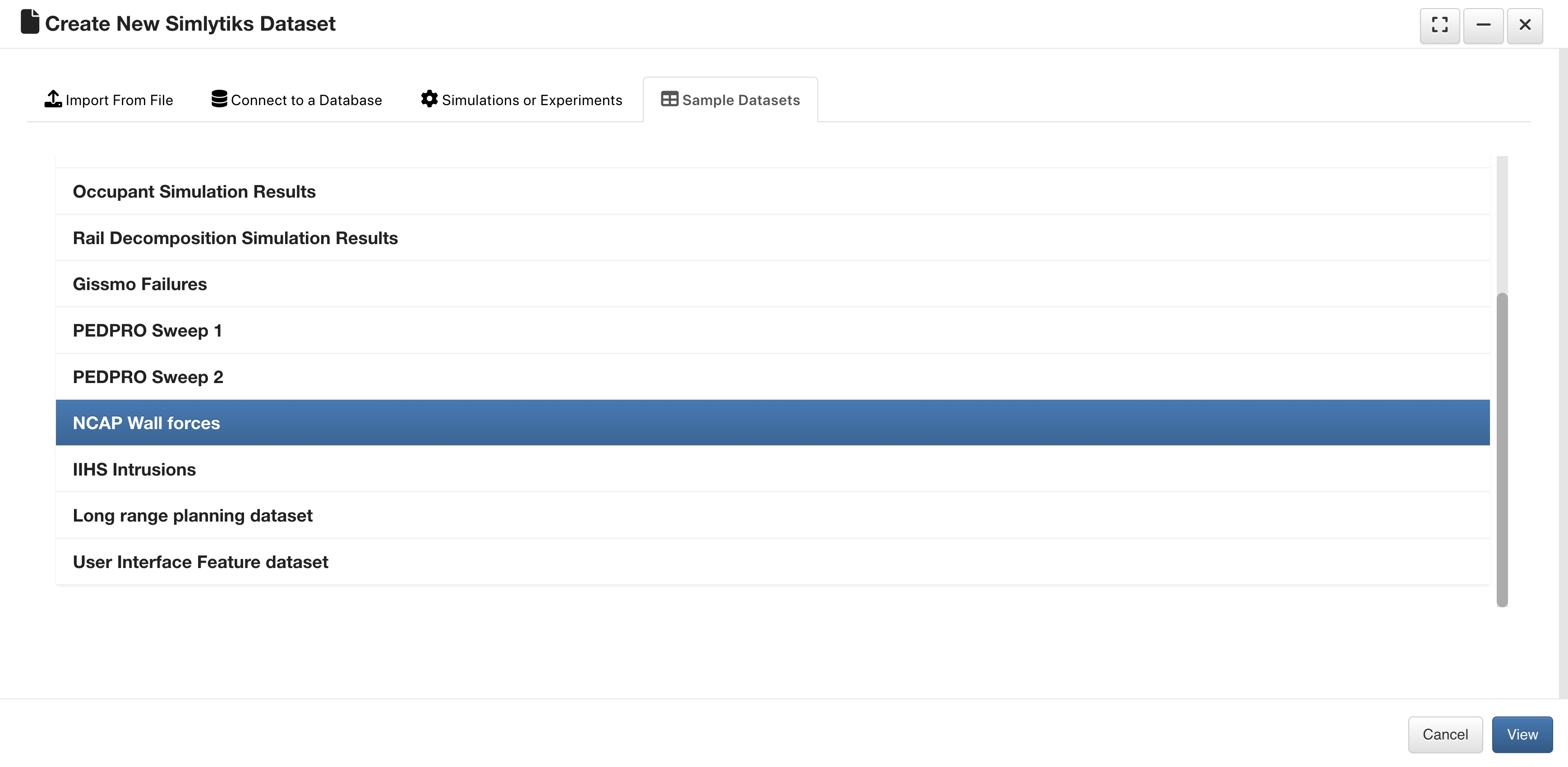
NCAP Wall Forces
This dataset contains wall forces of an NCAP crash test.
NCAP Wall Forces
Upon opening, we’ll see all wall forces visualized in a Sparkline Matrix. We can use this dataset to learn and explore this visualizer.
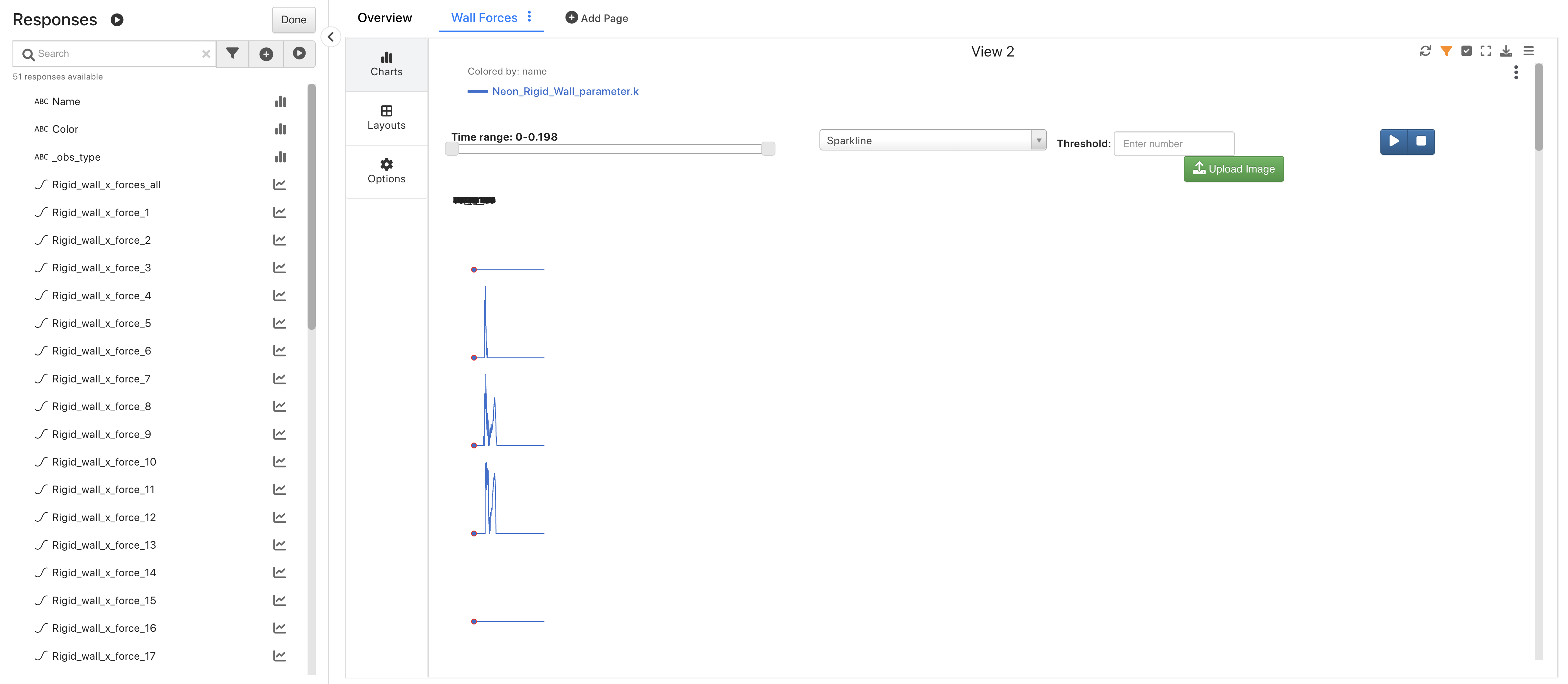
NCAP Wall Forces Overview
IIHS Intrusions
This dataset contains IIHS intrusion data for a car interior.
IIHS Intrusions
Upon opening, we’ll see an overview table of its data.
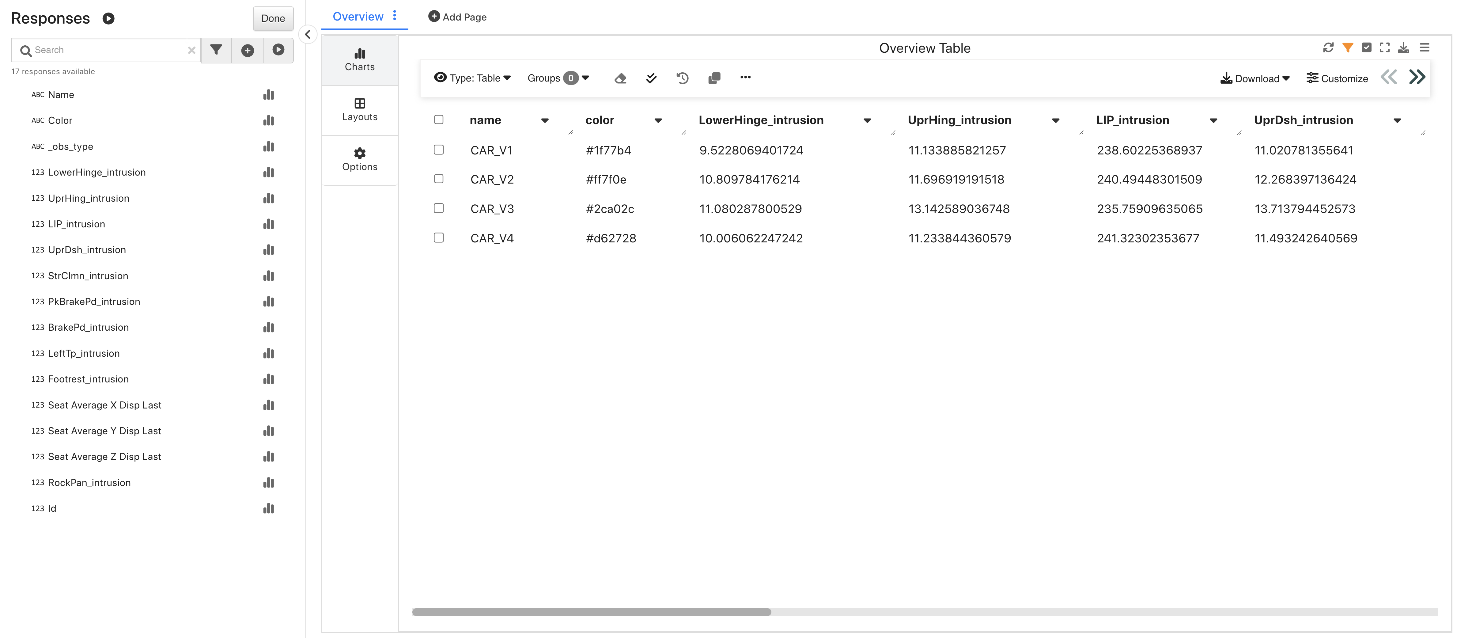
IIHS Intrusions Overview
This dataset is great for exploring the dedicated IIHS Intrusions Visualizer.
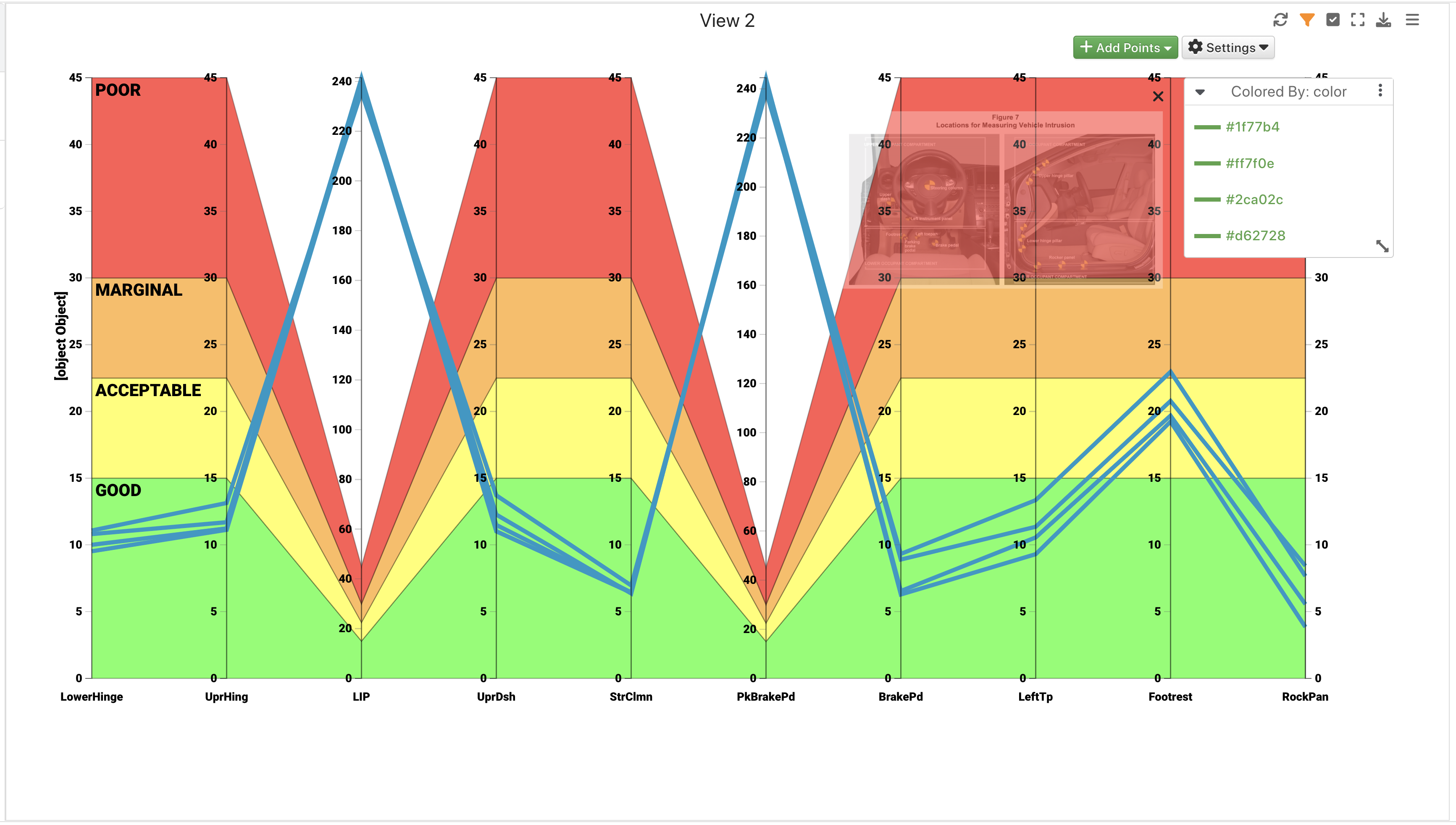
IIHS Intrusions Chart
Long Range Planning Dataset
This dataset contains generic data on car brands and their release dates.
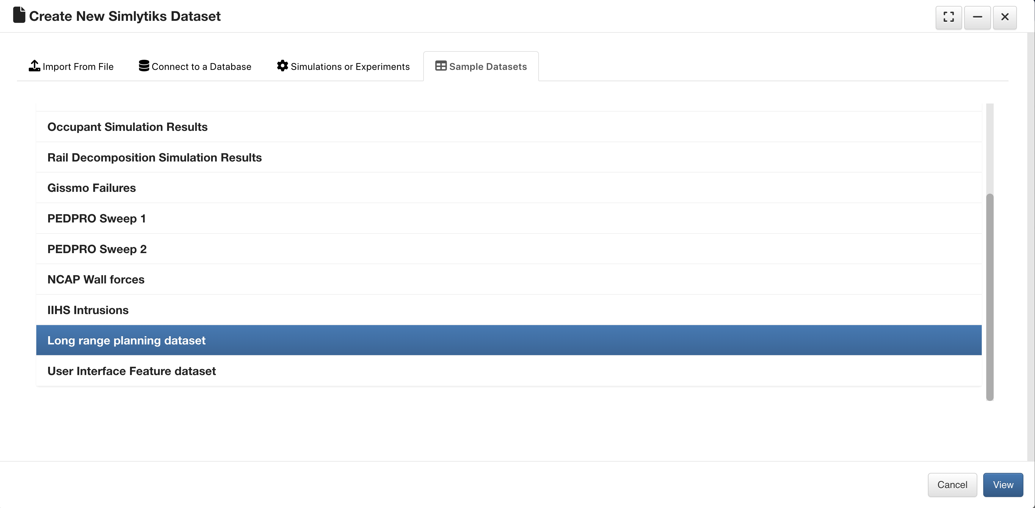
Long Range Planning Dataset
We’ll be prompted to choose which data to import. Click “Select All” for quick selection.
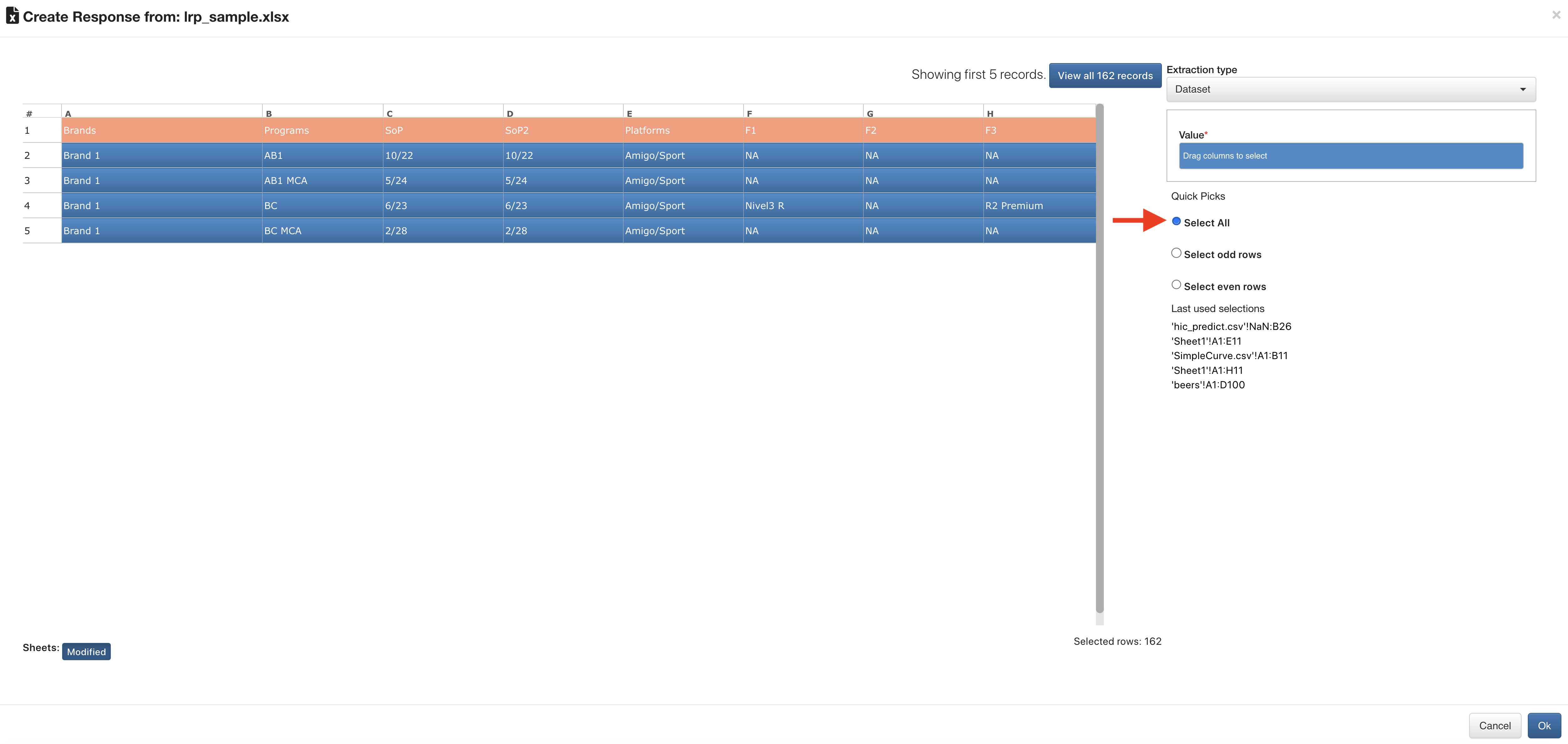
Long Range Select Data
Upon opening, we’ll see an overview table of its data.
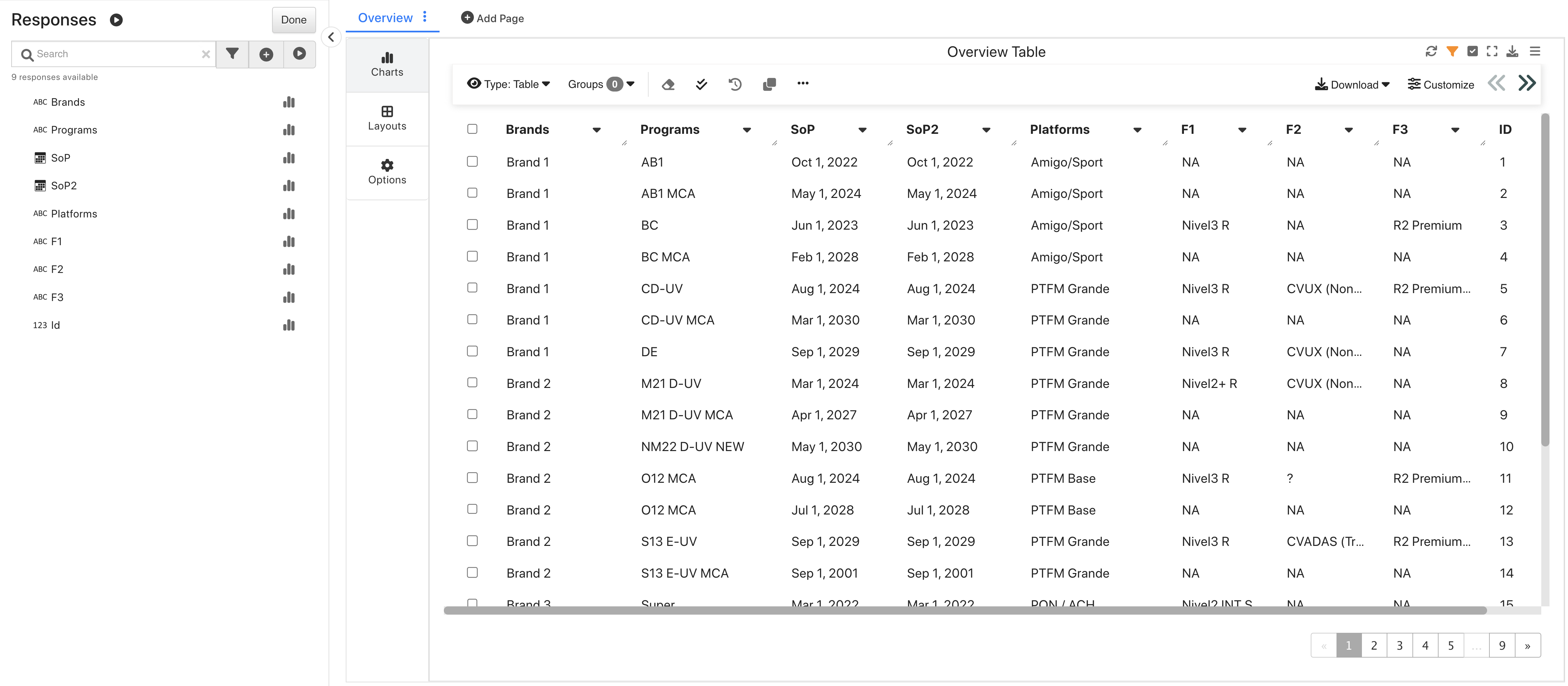
Long Range Overview
This dataset is great for exploring all the capabilities of the bubble chart visualizer.
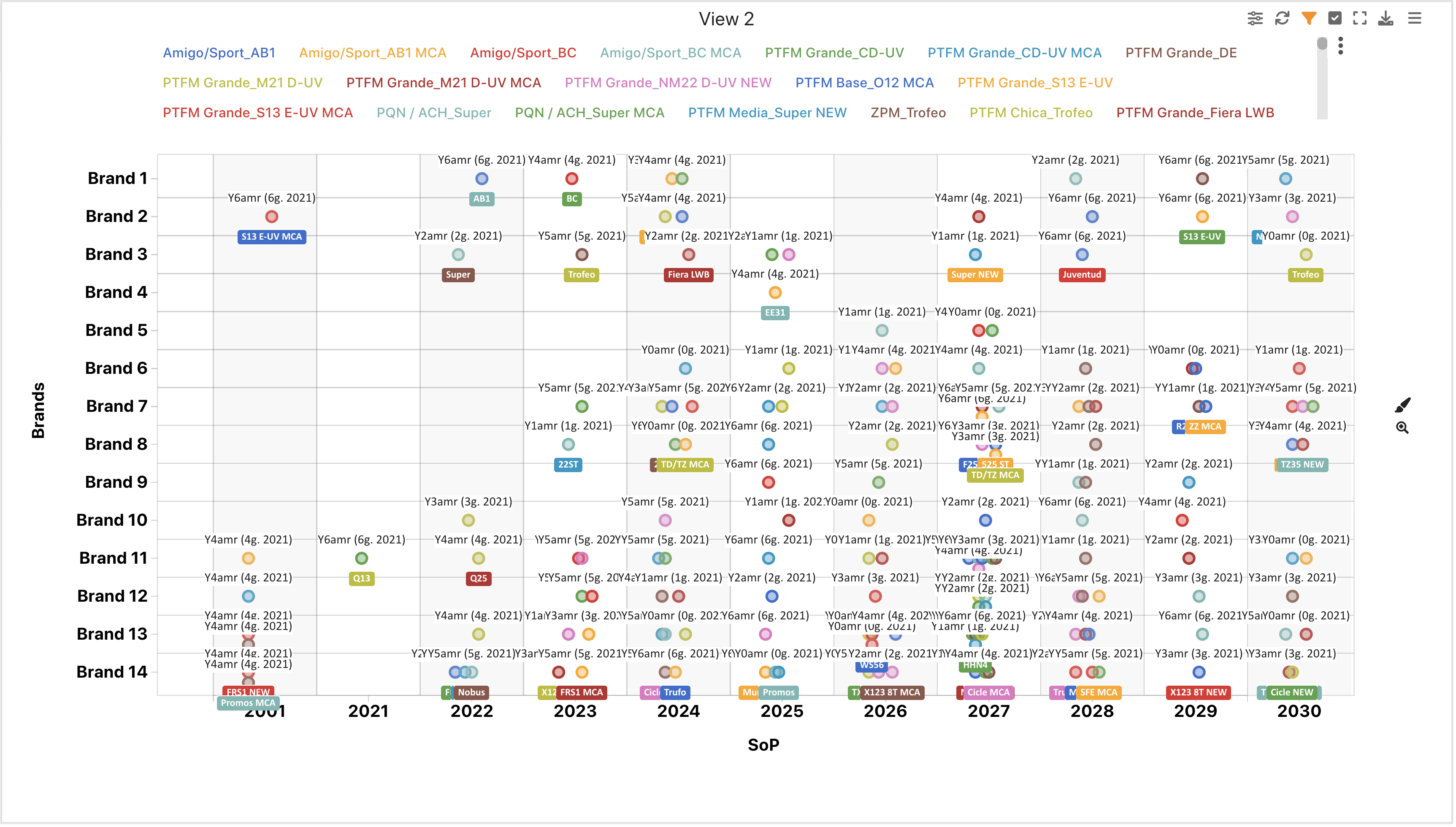
Long Range Bubble Chart
User Interface Feature Dataset
This dataset contains generic data for user experience features.
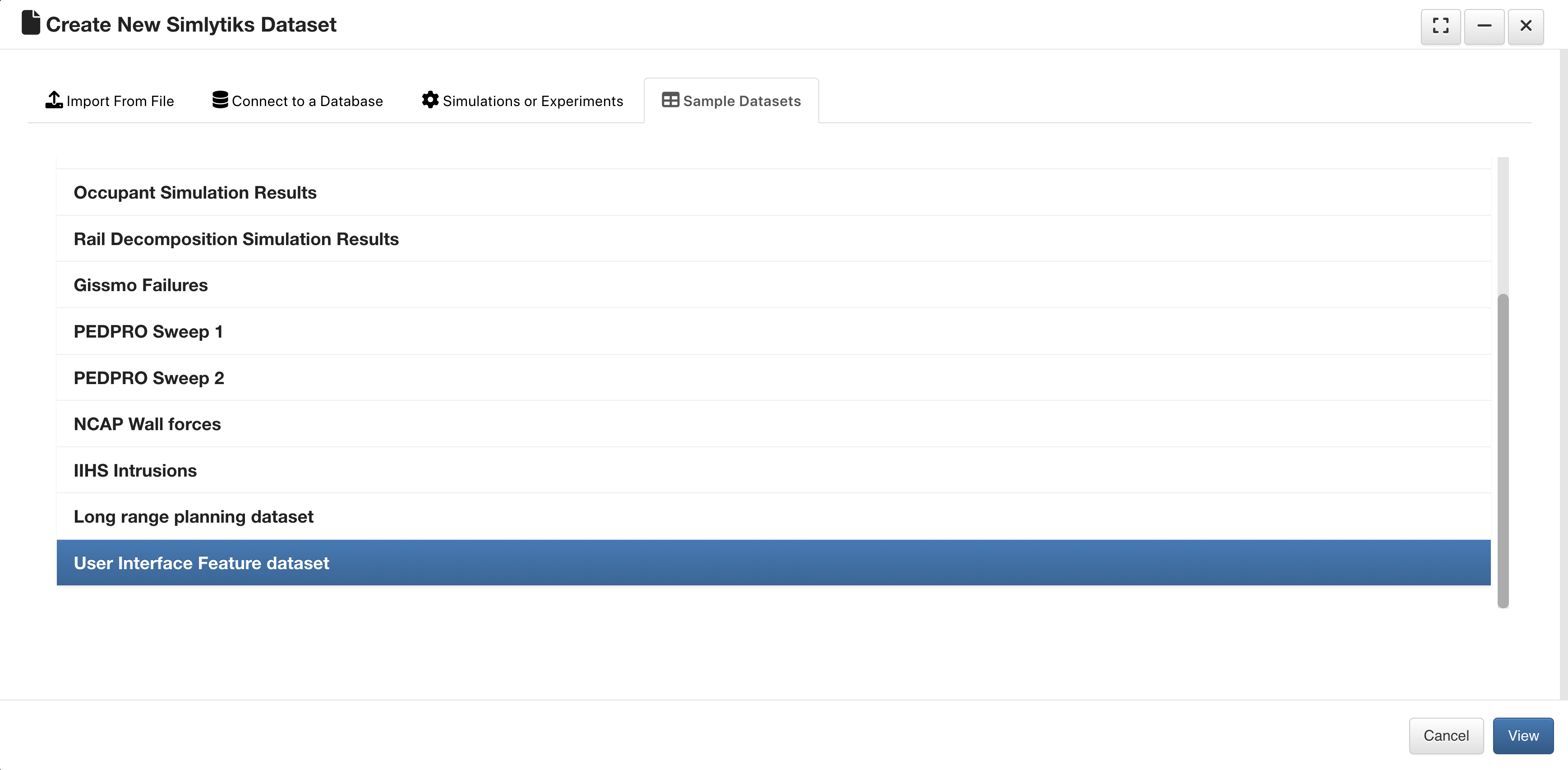
User Interface Feature Dataset
Upon opening, we’ll see an overview table of its data.
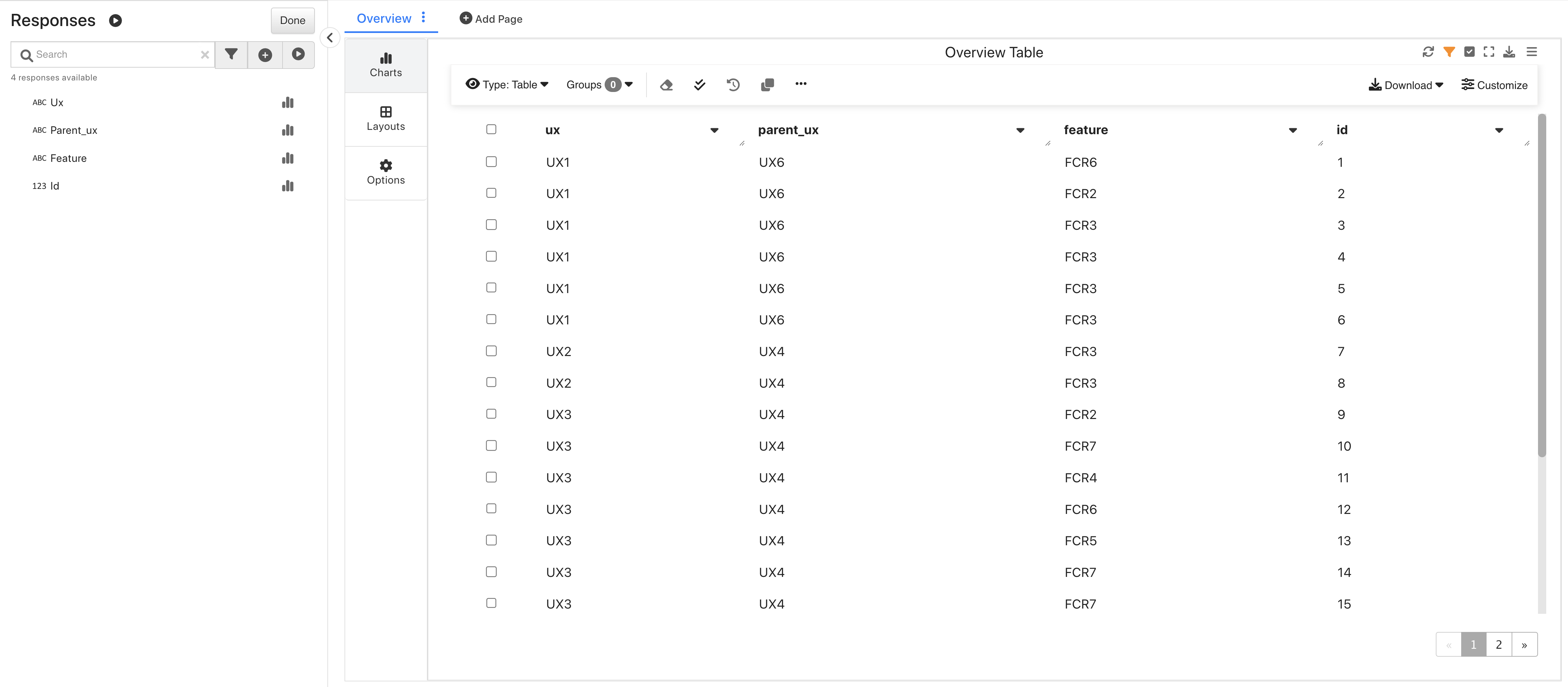
User Interface Feature Overview
This dataset is great for exploring simple and quick visualizations.
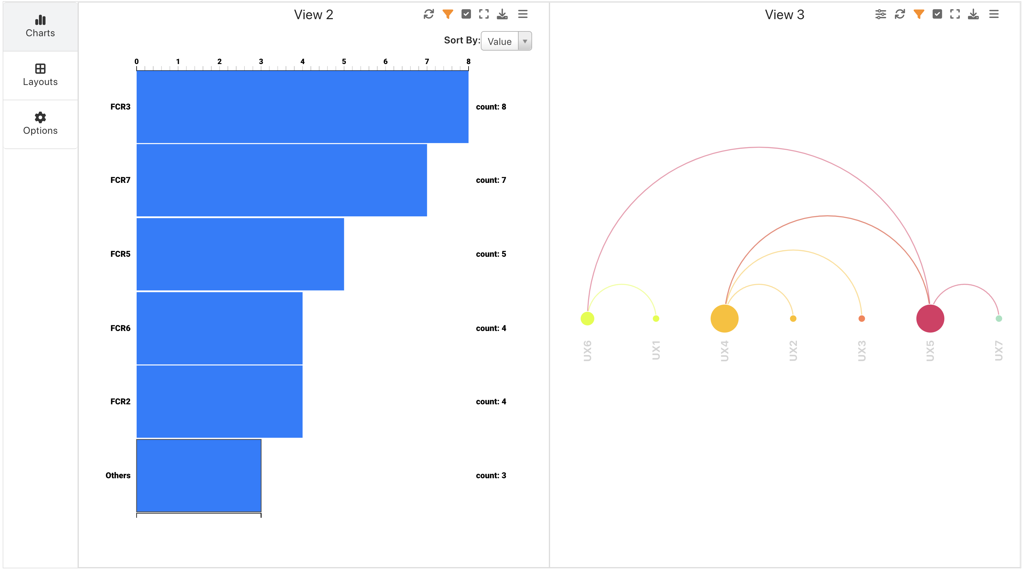
User Interface Feature Frequency Chart and Arc Diagram