30. Machine Learning
30.1. Overview & Types
Simlytiks now has Machine Learning integrated for exploring data, allowing us to predict results and patterns. The ML features review inputs and outputs to data in order to learn how to predict another output. d3VIEW’s Simlytiks application offers three main types of machine learning: Regression, Classification and Clustering. As shown in the following image, regression and classification fall under supervised learning as they are task-driven, while clustering falls under unsupervised learning as they are data-driven.
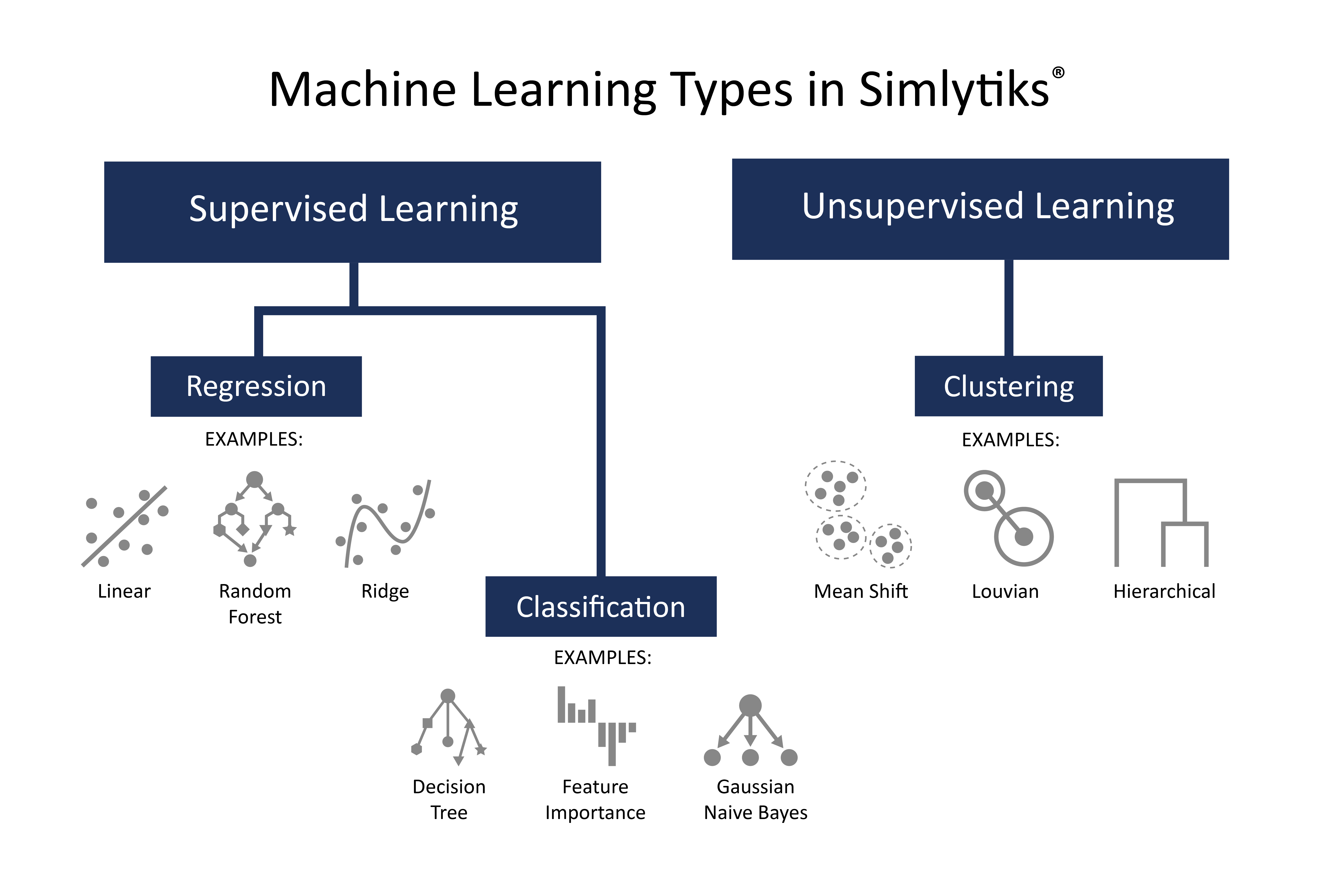
Figure 1: Machine Learning Types in Simlytiks
Simlytiks has a wide variety of ML algorithms to employ. Let’s review the three main types of Machine Learning that can be utilized along with their specific algorithms in the application. To learn more about the Simlytiks application, please navigate to the Simlytiks Documentation at this link.
Regression Types
Supervised Regression ML types, aside from Logistic Regression, learn and predict numbers to plot out correlations between labels and data points. Here are the available regression algorithms in Simlytiks:
Icon |
Name |
Description |
|---|---|---|
|
Linear Regression | Uses Linear Regression to build a model whose target is numeric. |
|
Lasso Regression | A type of Linear Regression. Lasso is often used when there is a large number of features as it automatically does feature selection. |
|
Ridge Regression | A type of Linear Regression, Ridge reduces the model complexity by sending coefficients to 0. |
|
Support Vector Regression | Uses Support Vectors to build a model whose target is numeric. |
|
Random Forest Regression | Uses a Random Forest to build a model whose target is numeric. |
|
Decision Tree Regression | Uses a Decision Tree to build a model whose target is numeric. |
|
Gaussian Process Regression | Uses a Gaussian Process to build a model whose target is numeric. |
Classification Types
Supervised Classification ML types, which include Logistic Regression, learn and predict text or a category by fitting the data into a statistical model. Here are the available classification algorithms in Simlytiks:
Icon |
Name |
Description |
|---|---|---|
|
Feature Importance | Provides scores for how each input relates to the target. |
|
Get Schema | Displays the Schema of the dataset. |
|
Decision Tree Classifier | Uses a decision tree to build a model whose target is categorical. |
|
Random Forest Classifier | Uses a Random Forest to build a model whose target is categorical. |
|
Gaussian Naive Bayes | Uses a Gaussian Naive Bayes to build a model whose target is numeric. |
|
Logistic Regression | Uses Logistic Regression to build a model whose target is categorical. |
Clustering Types
Unsupervised Clustering ML types learn and predict features/patterns in data via the classifying and grouping of data points. Here are the available clustering algorithms in Simlytiks:
Icon |
Name |
Description |
|---|---|---|
|
K-Means | Groups data based on a pre- defined number of groups. |
|
Mean Shift | Groups data by shifting data to the mode of a region of a pre-defined size. |
30.2. Creating Machine Learning Models
In this section, we’ll go over the basics for creating Machine Learning models in Simlytiks.
Check out this video to see the whole process of creating and predicting a model in action using linear regression. Make sure to read on for a more in-depth explanation.
Adding Algorithms
Access all the Machine Learning algorithms by clicking the green ML button at the top. Then, drag-and-drop or click to add one to the page.
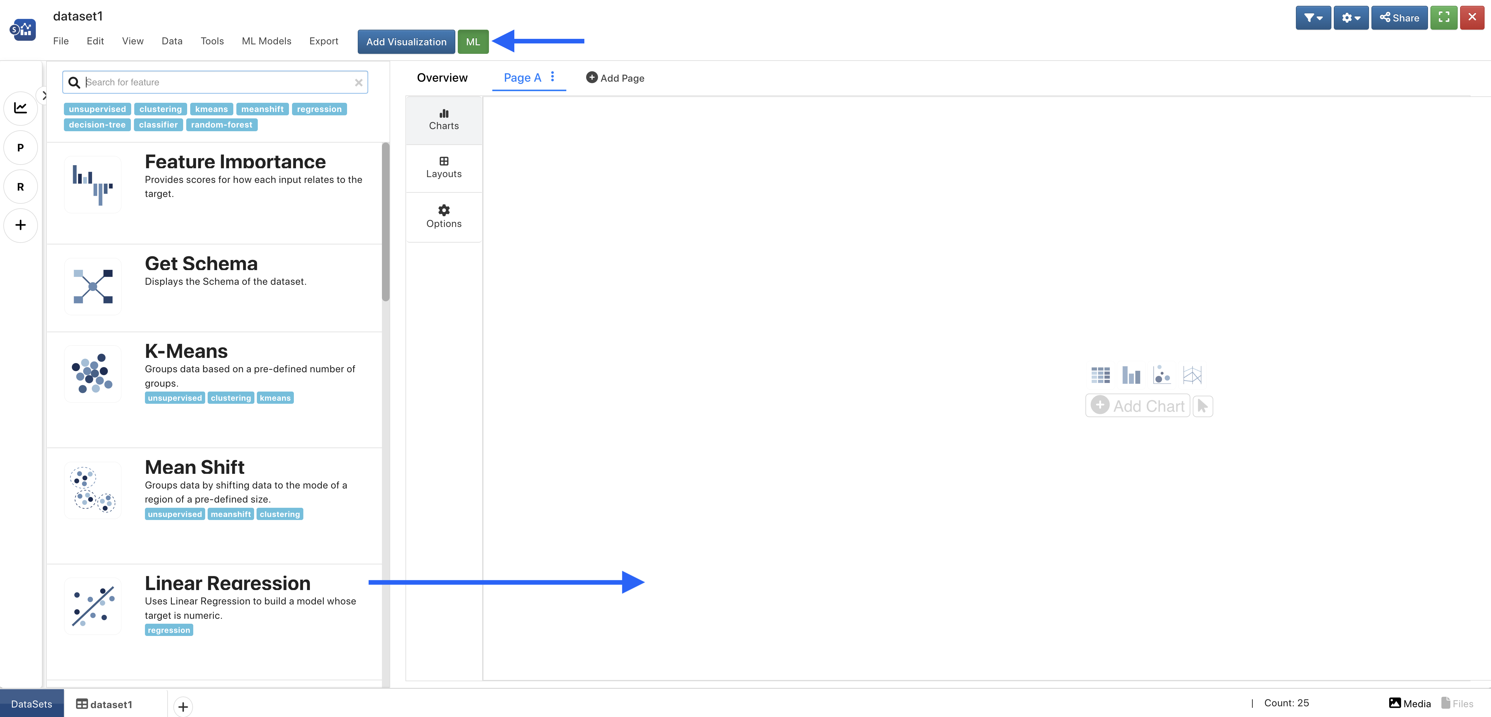
Figure 2: Access a Machine Learning Algorithm
Setting Up an Algorithm
For Regression Types such a Linear Regression, required inputs include our Target Column (1 - what we are predicting) and our Input Features (2 - what we are learning from).
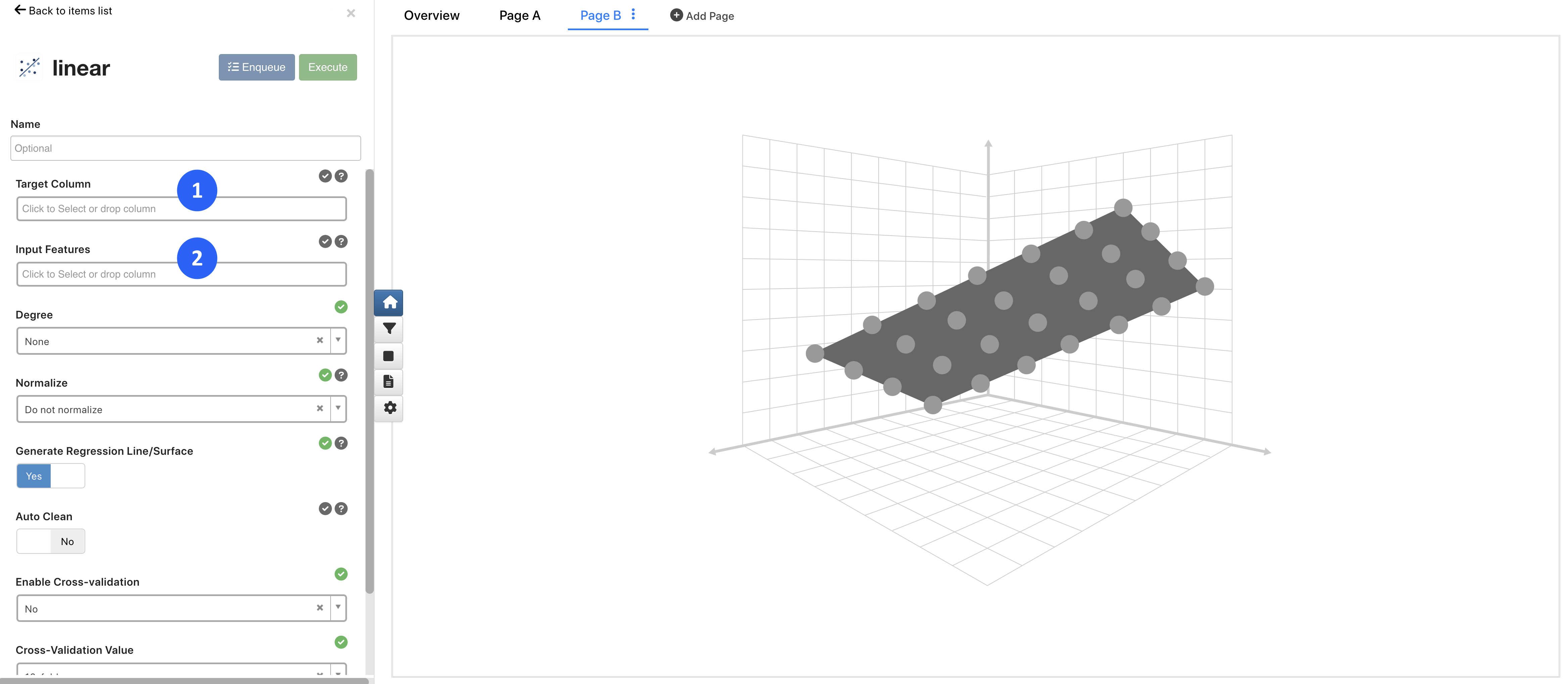
Figure 3: Setting Up Regression Types
For Classification Types such as Decision Tree Classification, required inputs also include our Target Column (1 - what we are predicting) and our Input Features (2 - what we are learning from).
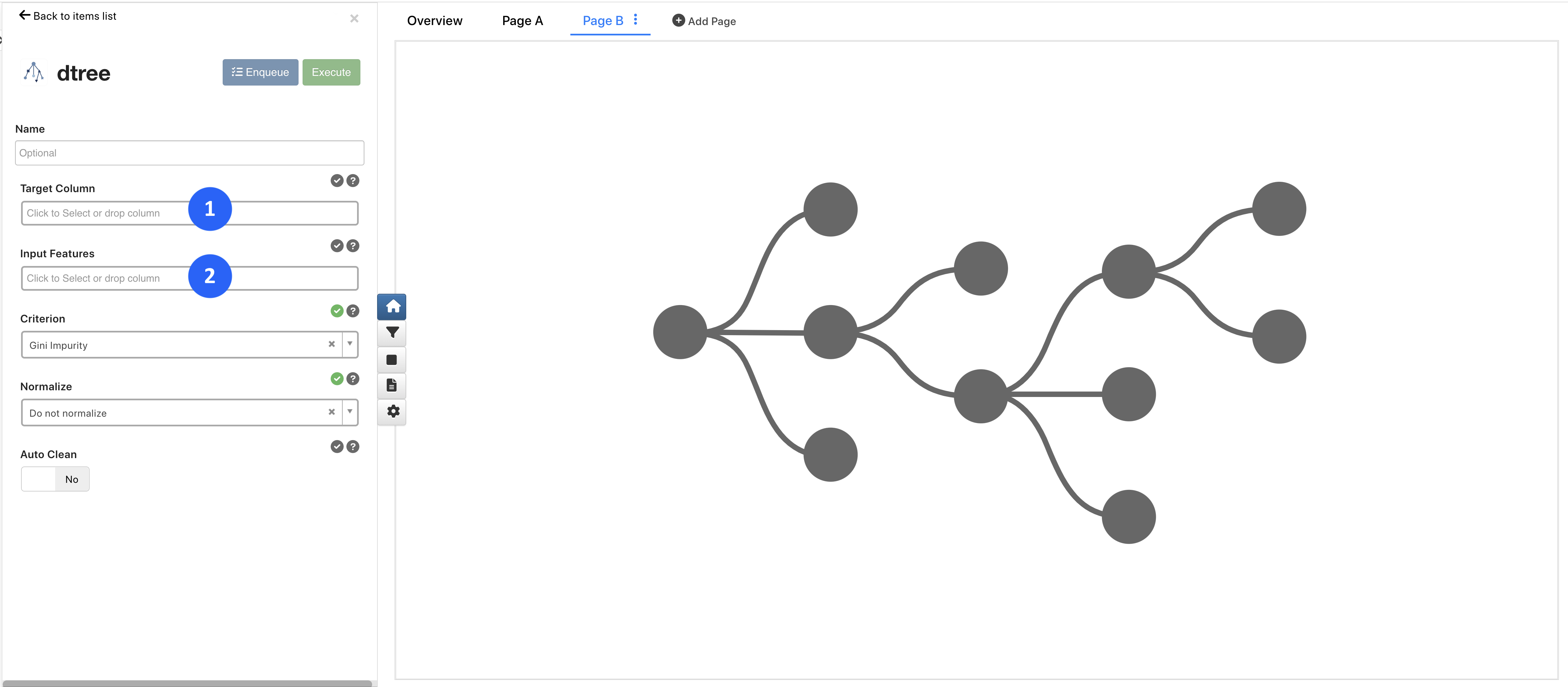
Figure 4: Setting Up Classification Types
For Clustering Types, such as K-Means, required inputs include our Input Features (1 - what we are learning from) and our clustering parameters (2).
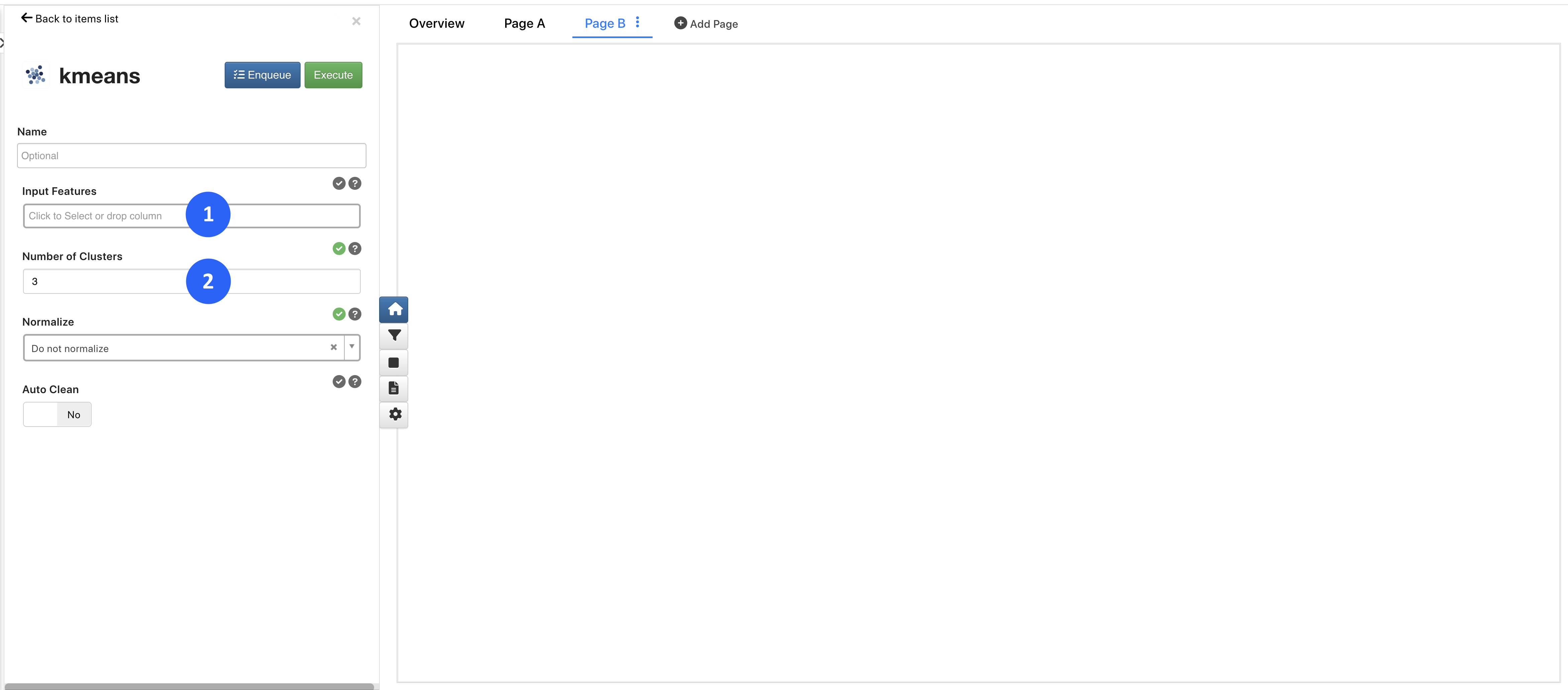
Figure 5: Setting Up Clustering Types
Live Data Table
When adding our inputs, we’ll see them highlighted and updated in a table to the right, with the orange being our target and green our features, as shown in this video with Linear Regression:
Executing an Algorithm
Once we have our required inputs set, we can execute our algorithms one-by-one by clicking on “Execute” (1) or all at once by adding each algorithm to the “Enqueue” (2).
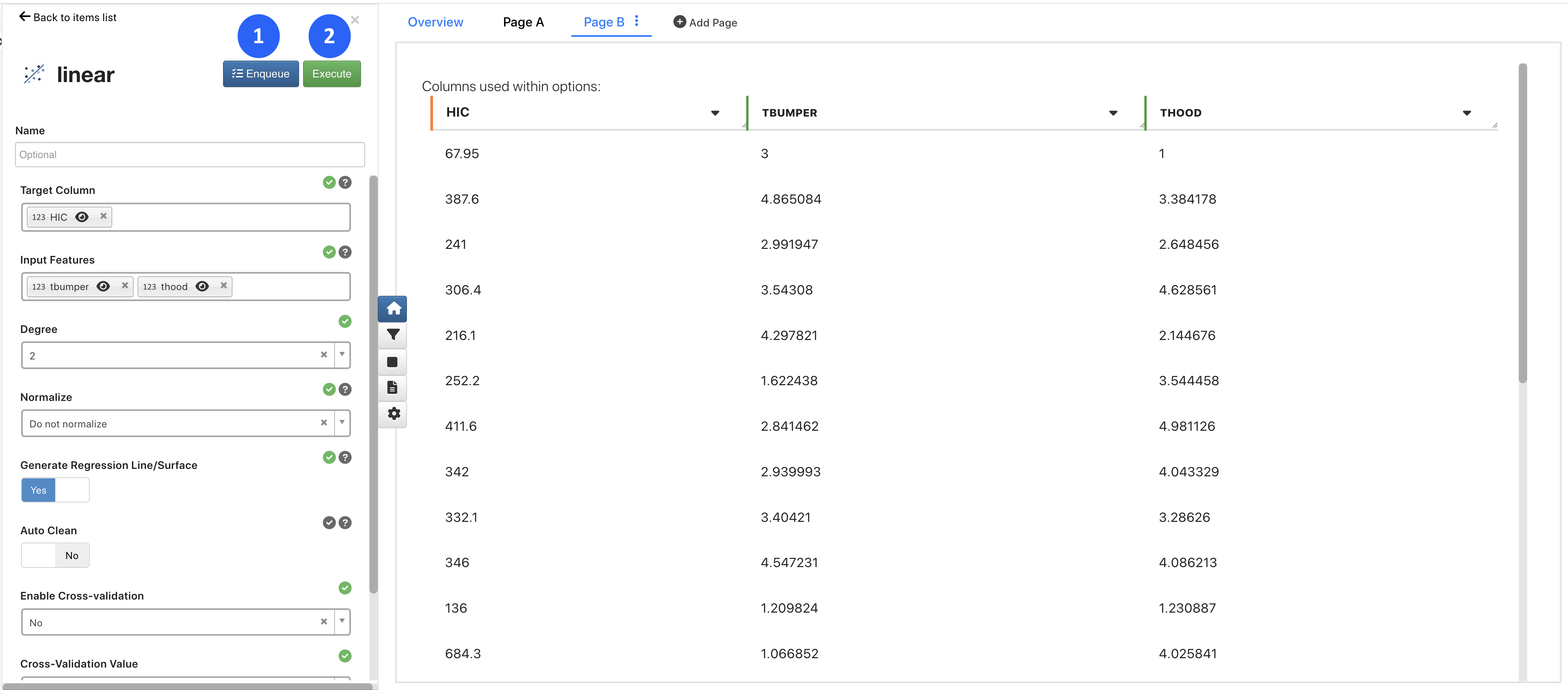
Figure 6: Execution Options
For the Enqueue option, after we’ve added algorithms to it, we’ll see a button appear next to the green ML button called “ML Queue” (1). We’ll click it to see the available ML algorithms to run. Here, we can view or delete any of them (2), run them (3), or clear them (4).
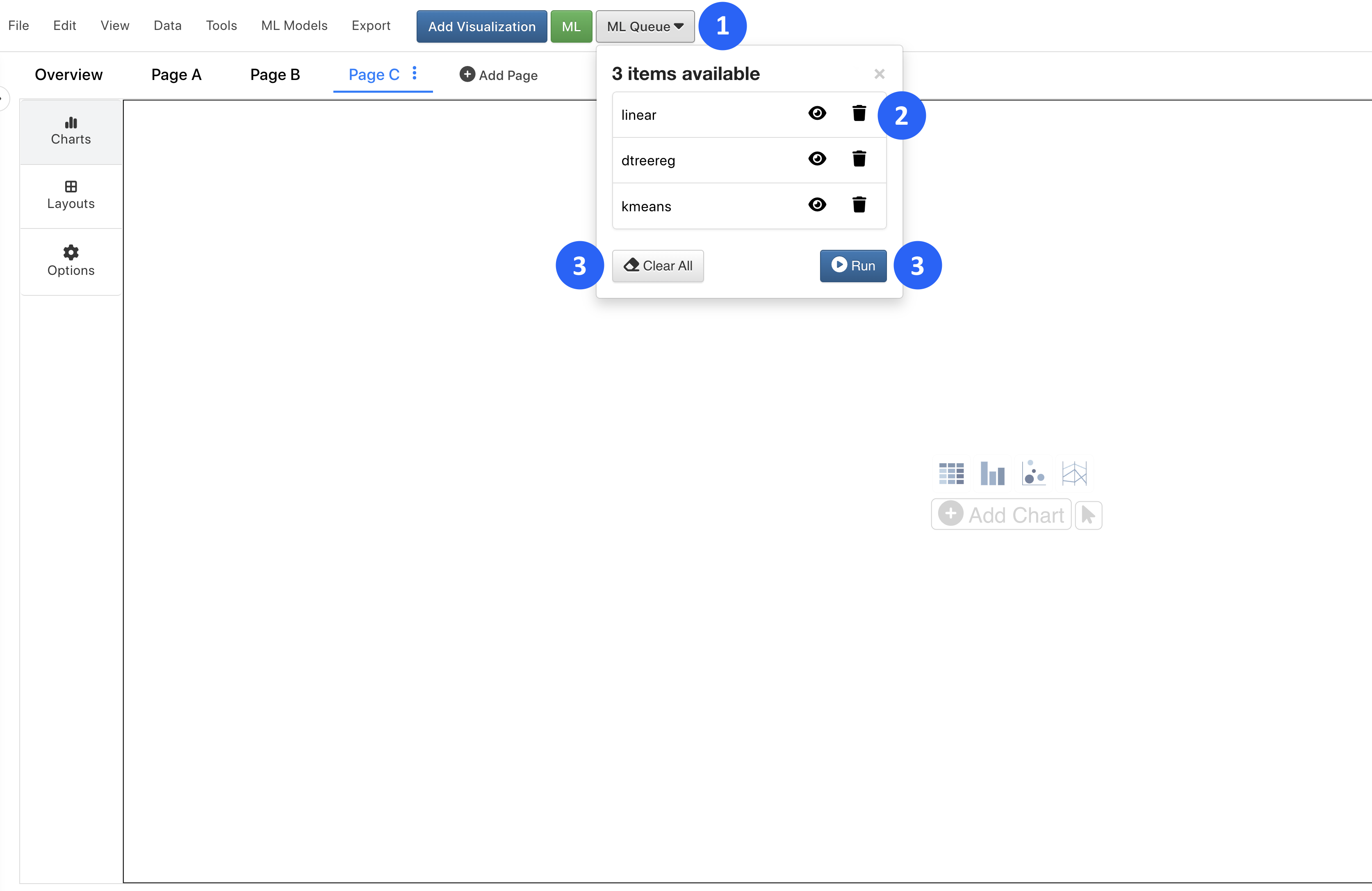
Figure 7: Execution Enqueue
With this option, we’ll get meta-model of all the algorithms in one.
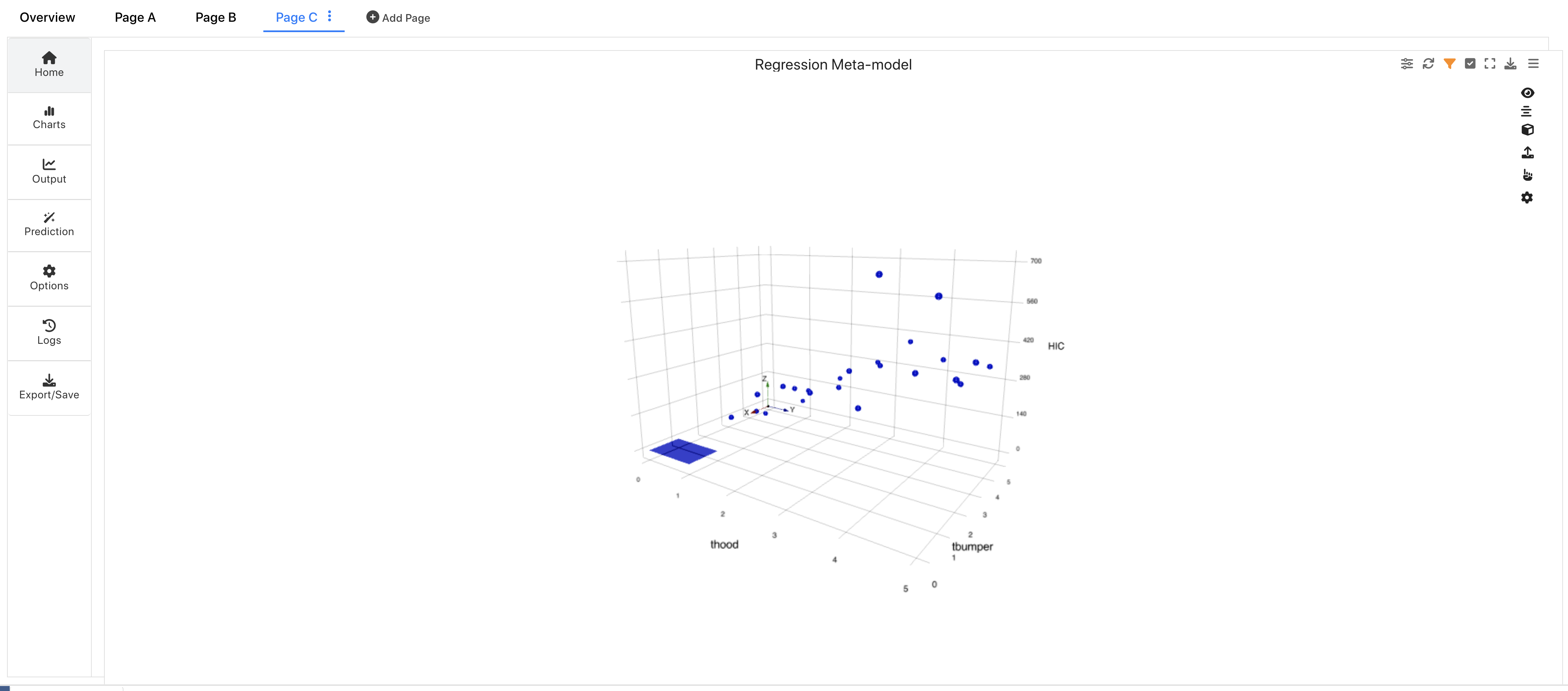
Figure 8: Regression Meta-model
ML Features
An executed algorithm will have multiple tabs of options to explore.
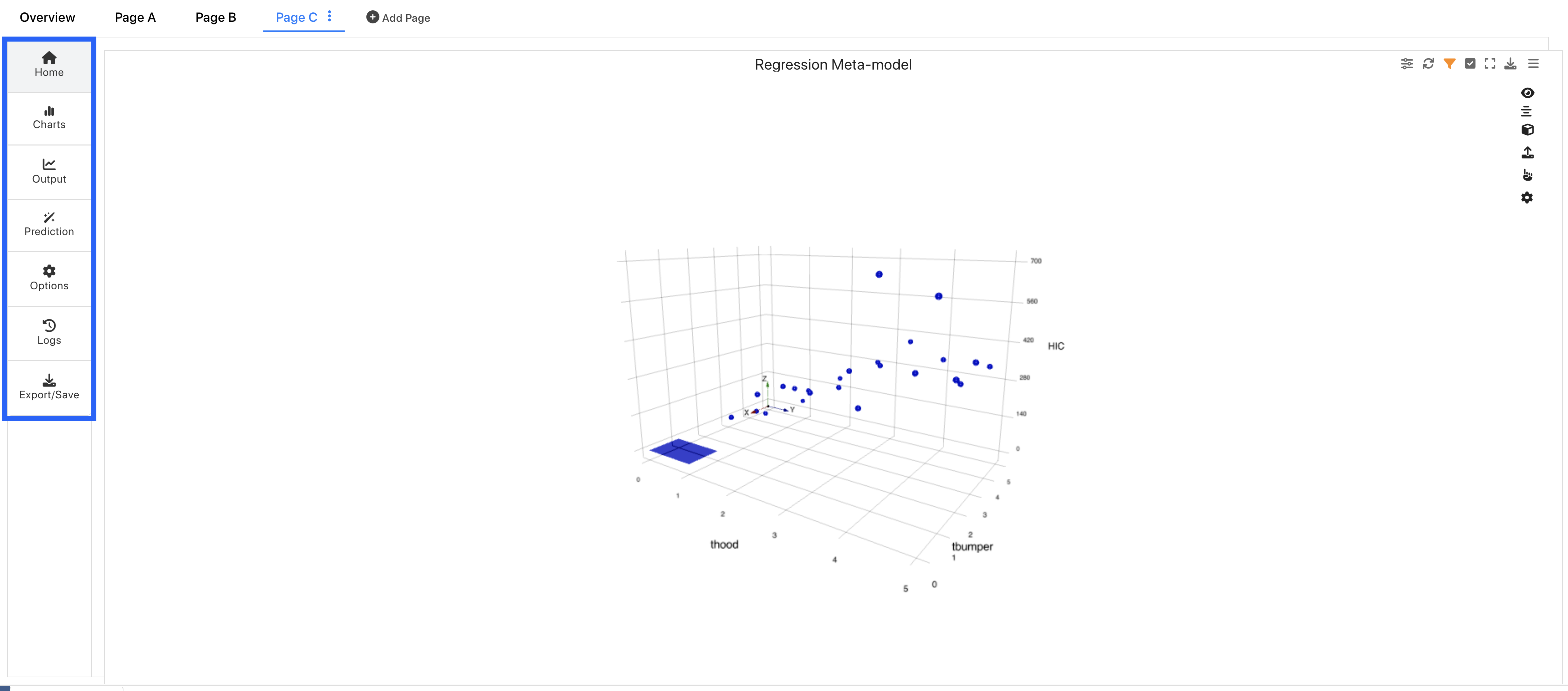
Figure 9: Machine Learning Tabs
Charts
We can view our charts in the Home and Charts Tabs.
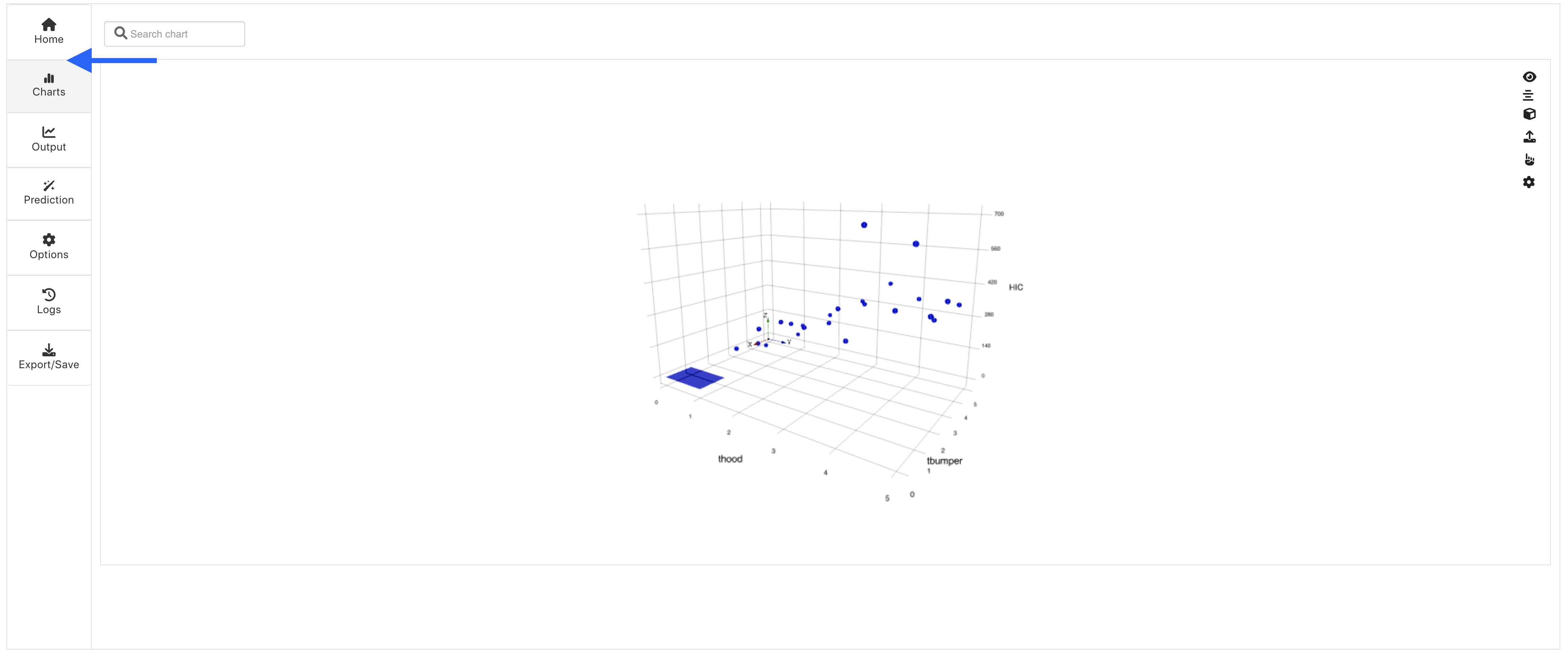
Figure 10: View Charts
Here, we can use the pointing hand icon to pick a point on the chart to predict.
Or, we can use the upload icon to predict points from a CSV file.
We can also predict under the Prediction tab which we will go over shortly.
Predictions
Under the Predictions tabs, we can input values manually (1) or upload a CSV (2) of values of our input features to predict our target column:
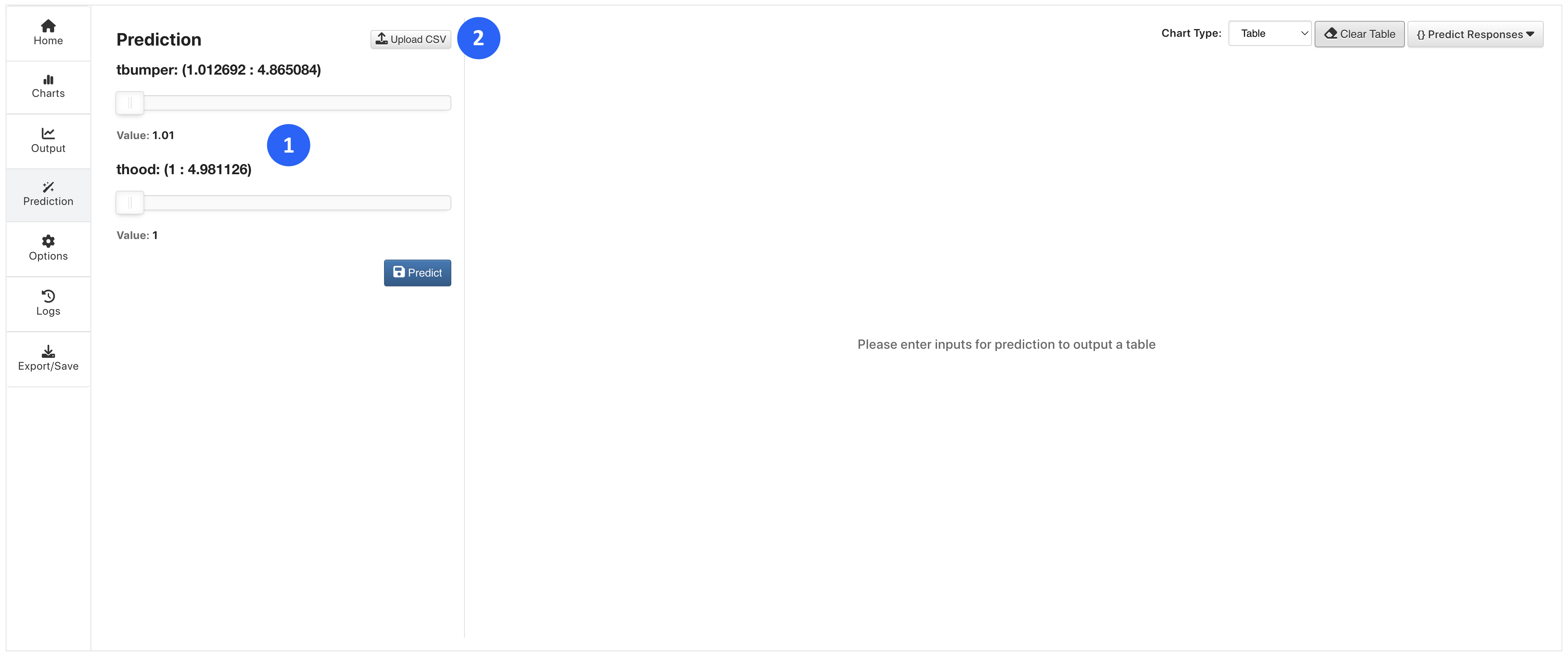
Figure 11: Predict Values
Predictions will populate and accumulate in a table to the right.
The prediction table has options to change the chart type (1), clear the values (2) or view the predictions via a JSON response (3).
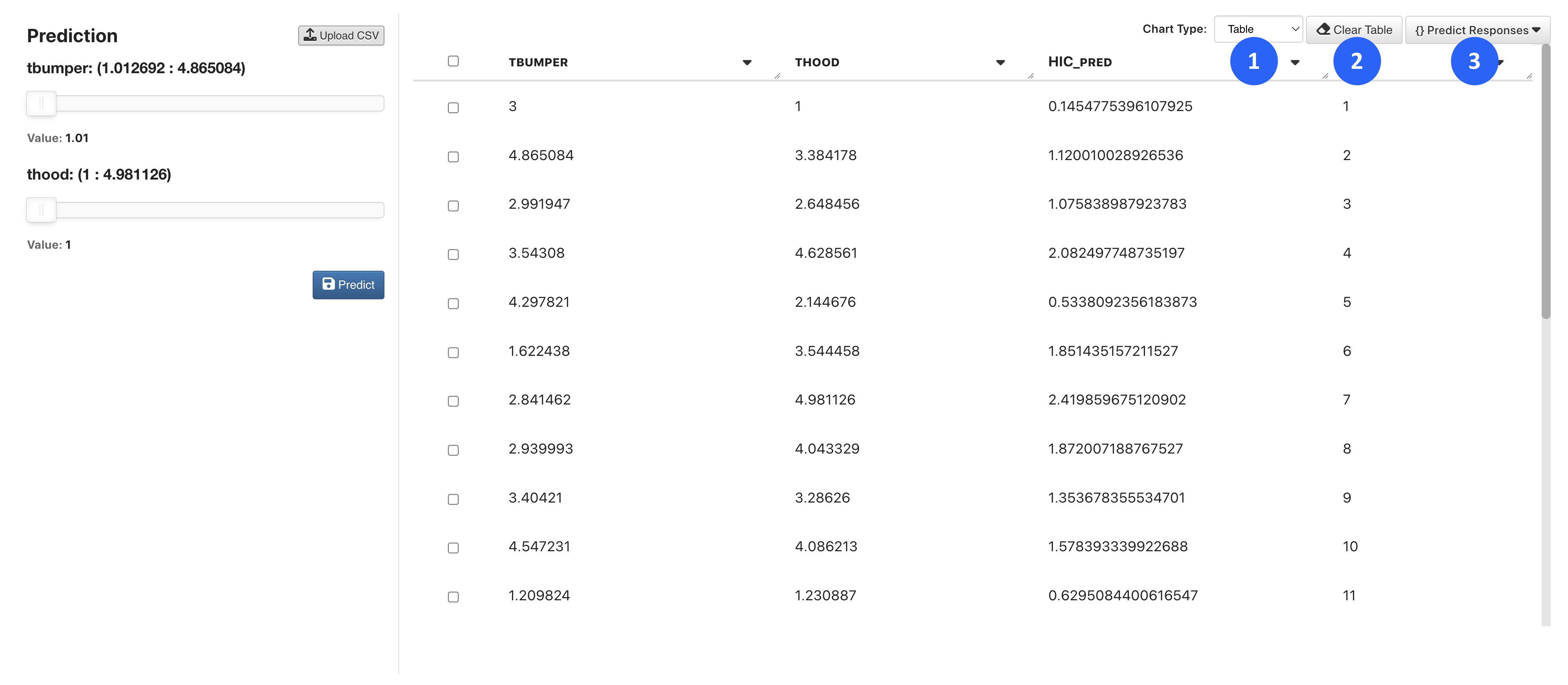
Figure 12: Prediction Table Options
Chart Types aside from a table include Parallel Line and 3D Scatter:
30.3. ML Examples
In this section, we’ll go over some examples of how to predict data using specific datasets.
Predicting HIC Value
For this example, we’ll be predicting the HIC value of a DOE simulation by learning from its t-bumper and t-hood values.

Opening the Dataset
To get started, navigate to the Simlytiks application.
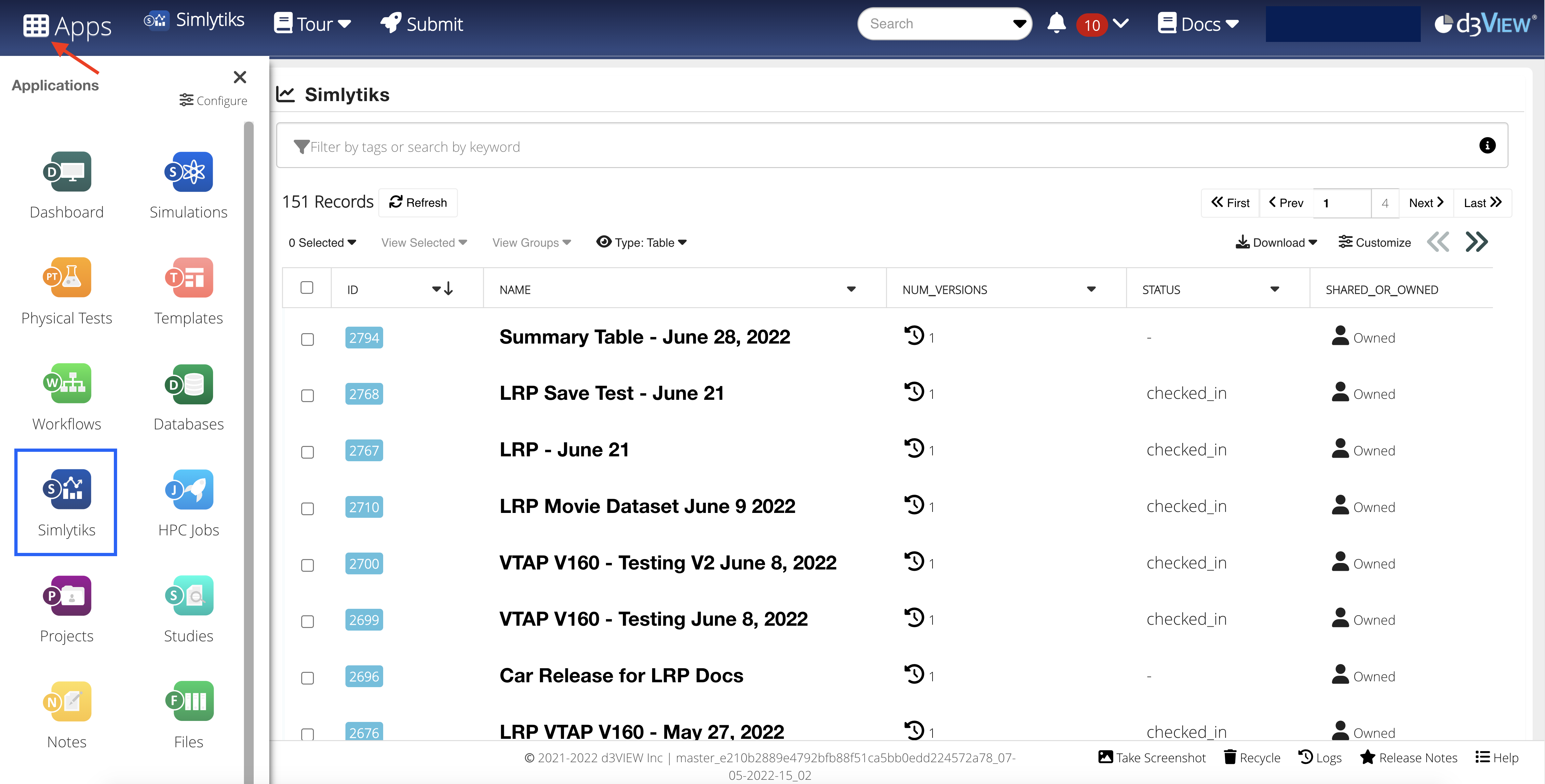
Figure 16: Access Simlytiks
We’ll be using the Simulation DOE Results sample dataset. Open it under New Dataset -> Sample Datasets.
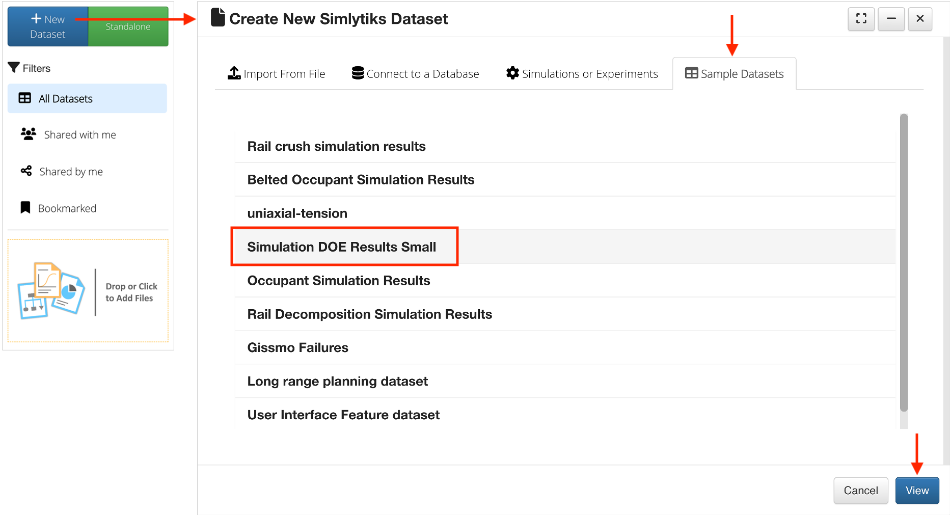
Figure 3: Open Simulation DOE Results Sample Dataset
Upon opening, we’ll see an overview table of all the data.
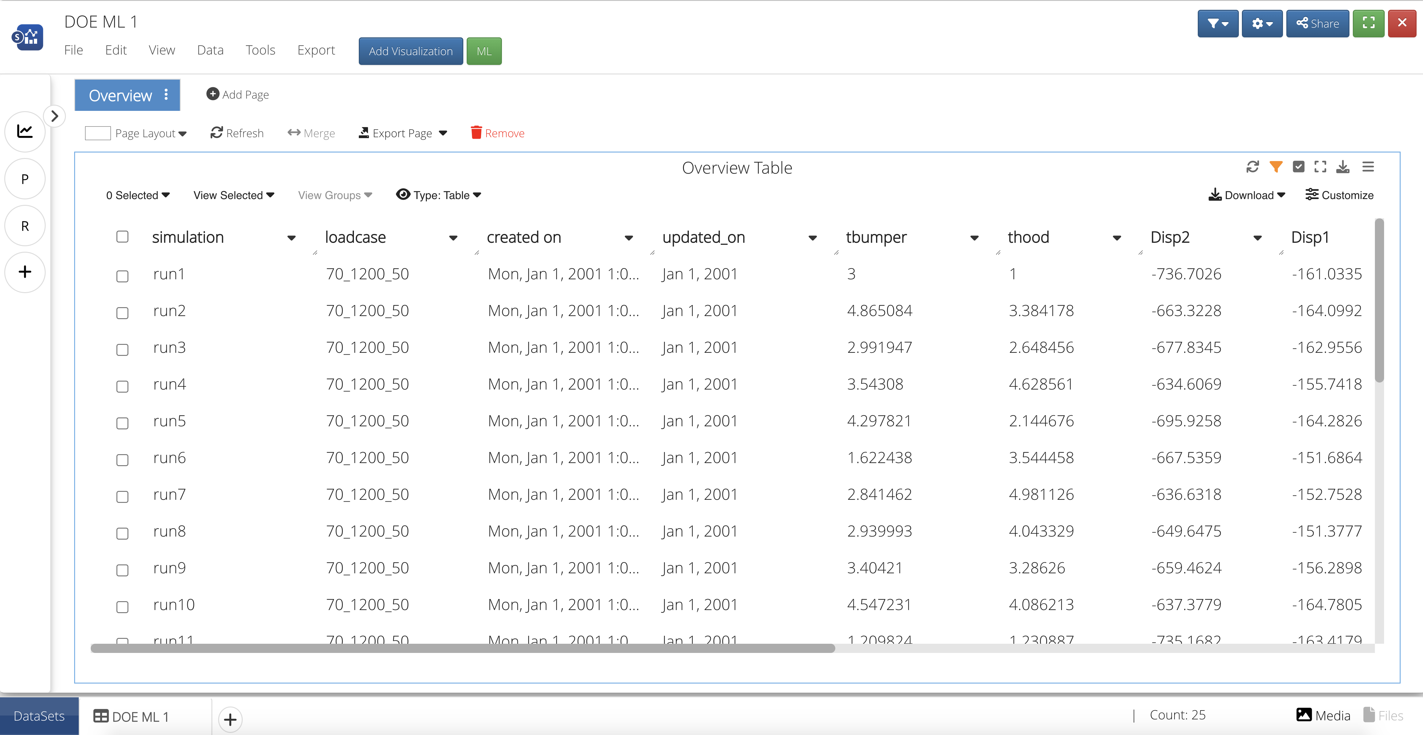
Figure 17: Overview Table
Add a Visualization
Let’s create a visualization to gain a better understanding of the relationship between the HIC, t-bumper and t-hood values in our dataset. We’ll need to add a visualization by first creating a new page.
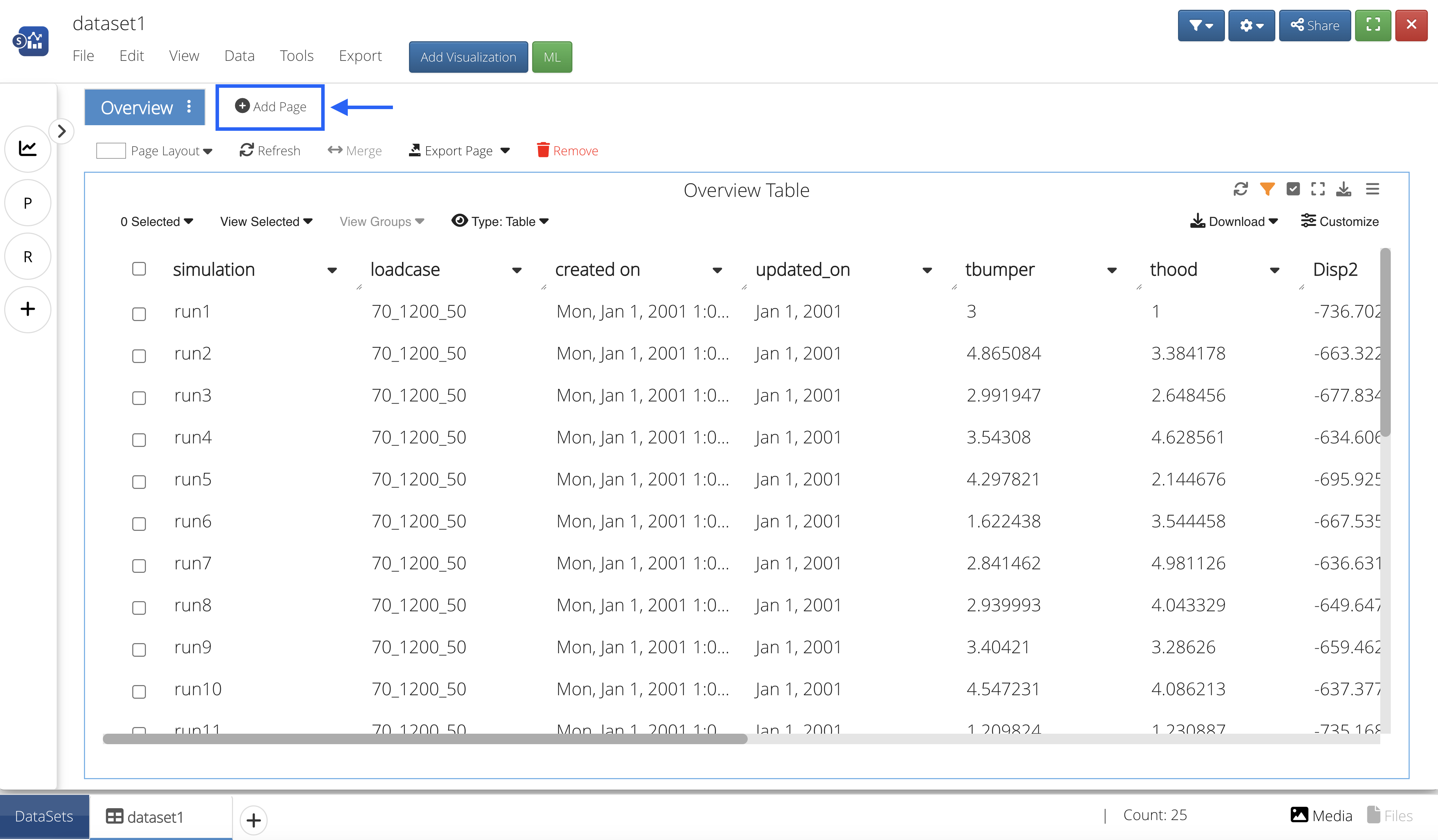
Figure 18: Create a New Page
Then, we’ll click the blue button at the top that says “Add Visualization” and drag-and-drop or click to add the Scatter Plot Visualizer onto the page.
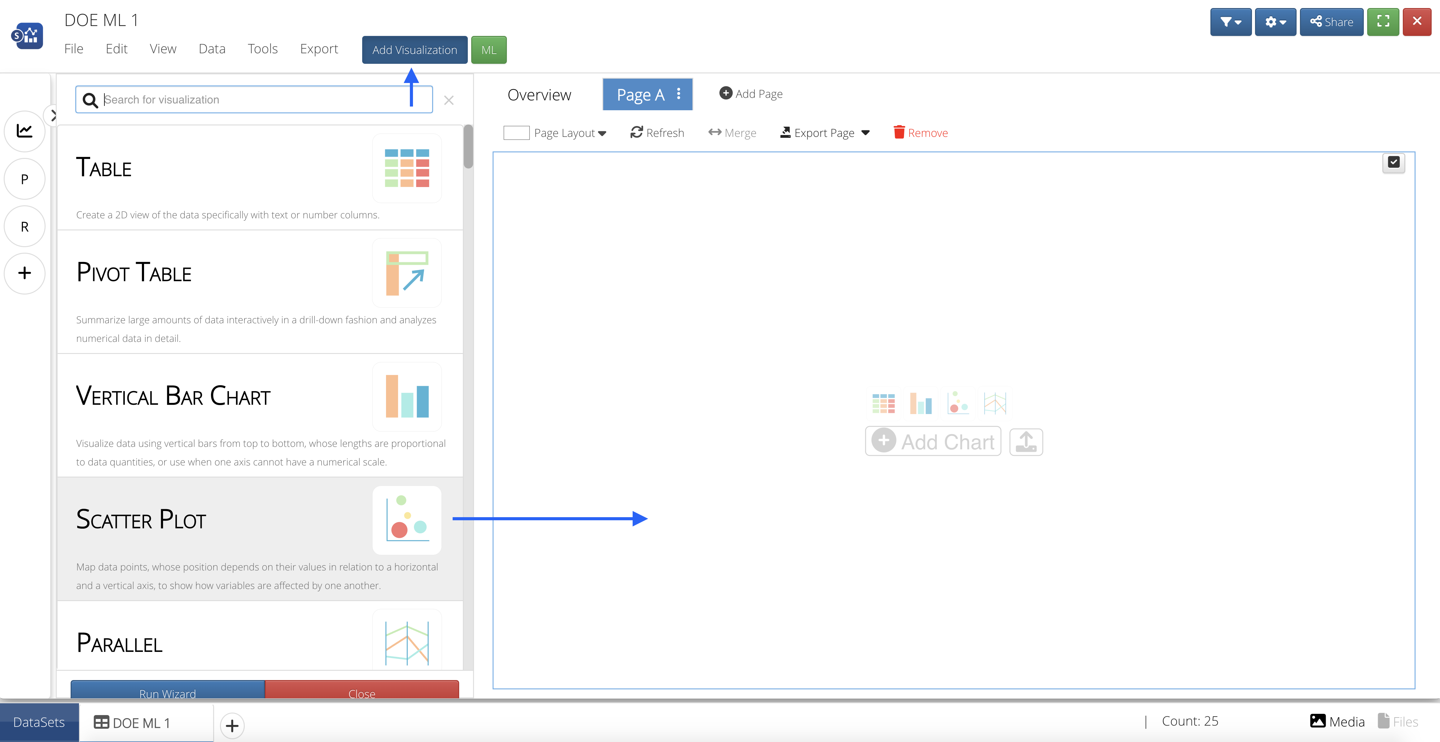
Figure 19: Add Scatter Plot Visualization
Choose HIC for our X Data By; then choose t-bumper and t-hood for our Y Data By, and press accept.
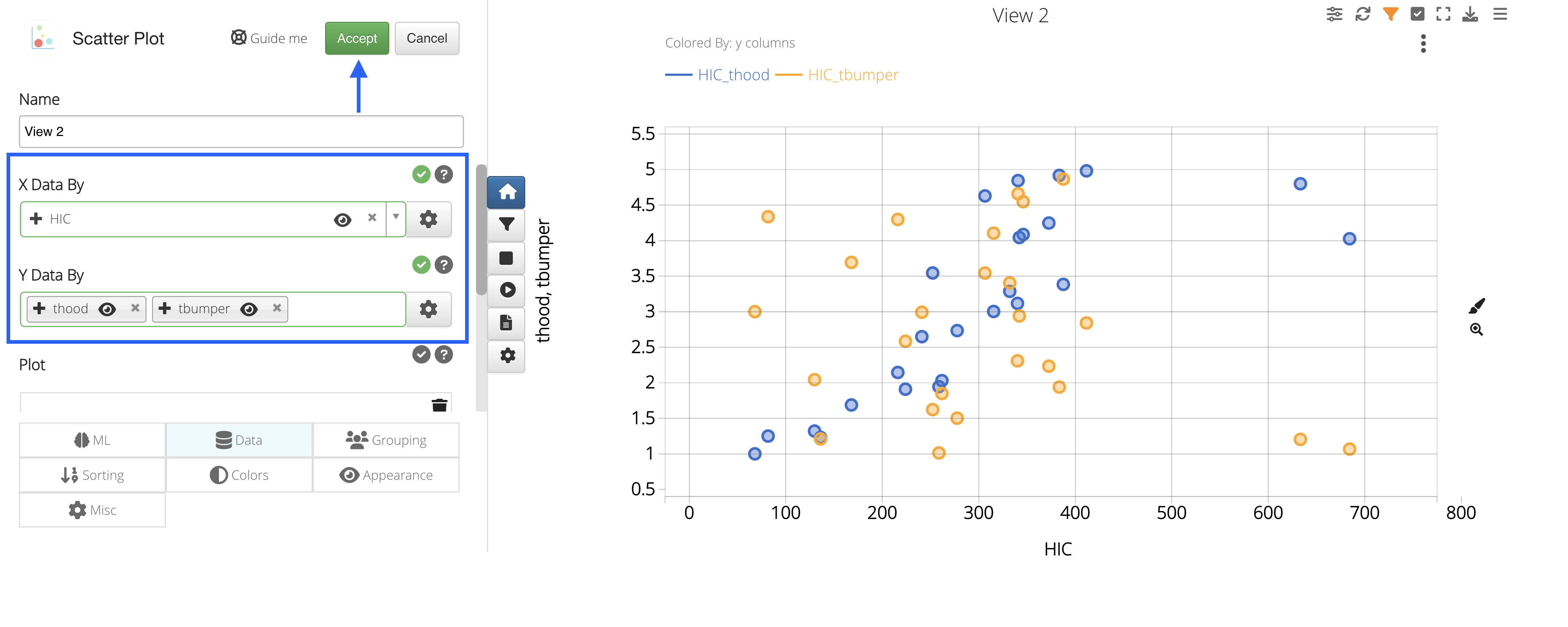
Figure 20: Choose X and Y Data By
We can see that our t-hood values seem to increase when our HIC values increase, while the t-bumper values are a bit more scattered.
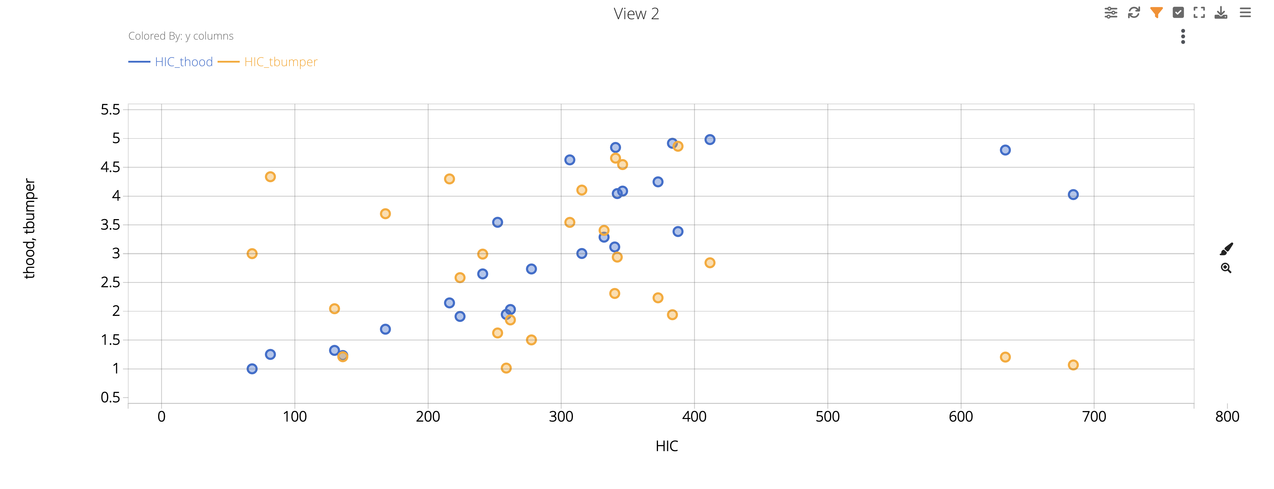
Figure 21: HIC Vs. T-Bumper and T-Hood
 Add Linear Regression ML Algorithm
Let’s create another page and add the linear regression ML feature from the list by clicking on or dragging-and-dropping the feature.
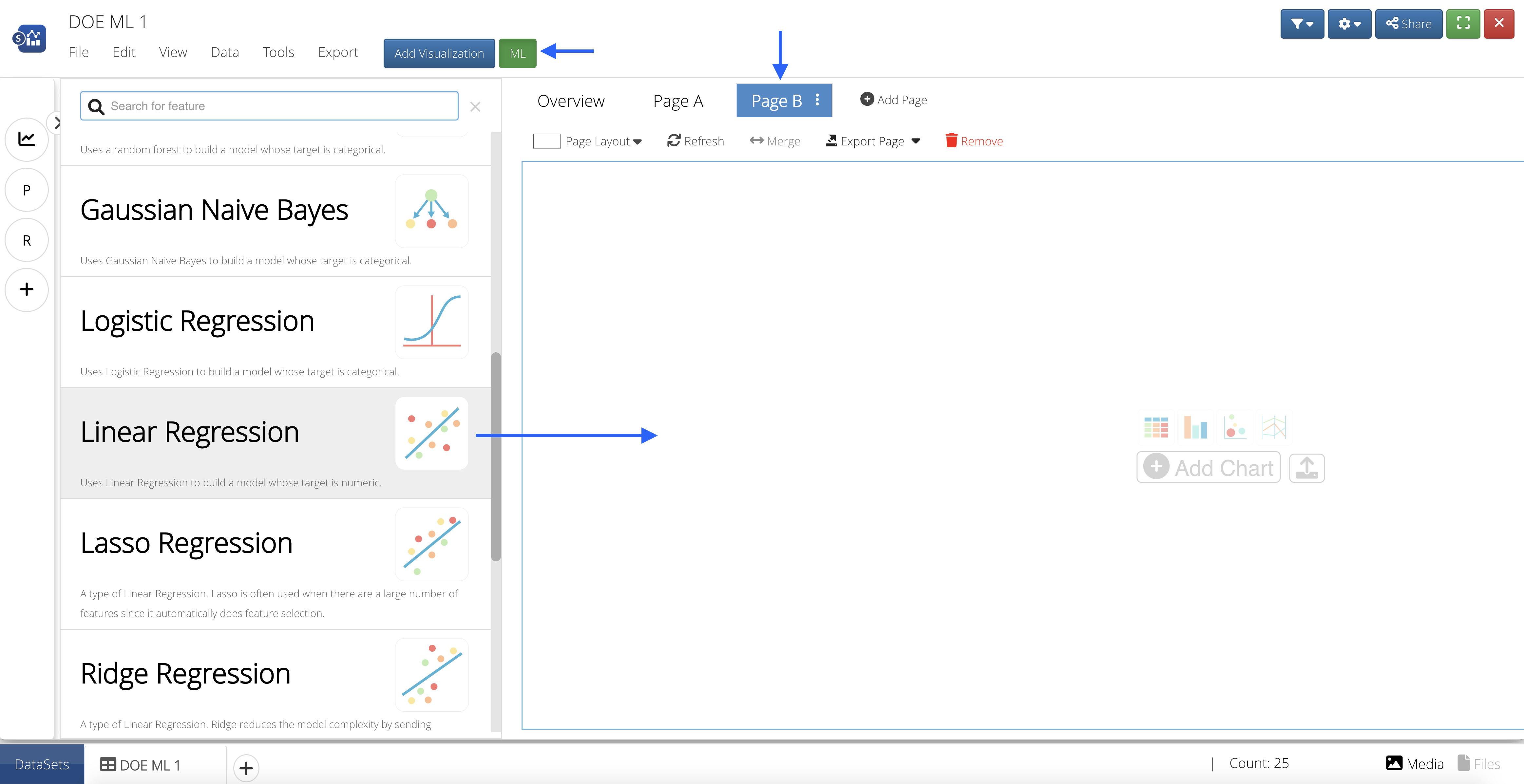
Figure 22: Add ML Feature to Page
 Input Features
Our Input Features will be the column(s) we would like to learn from.

We’ll choose t-bumper and t-hood for our learning columns.
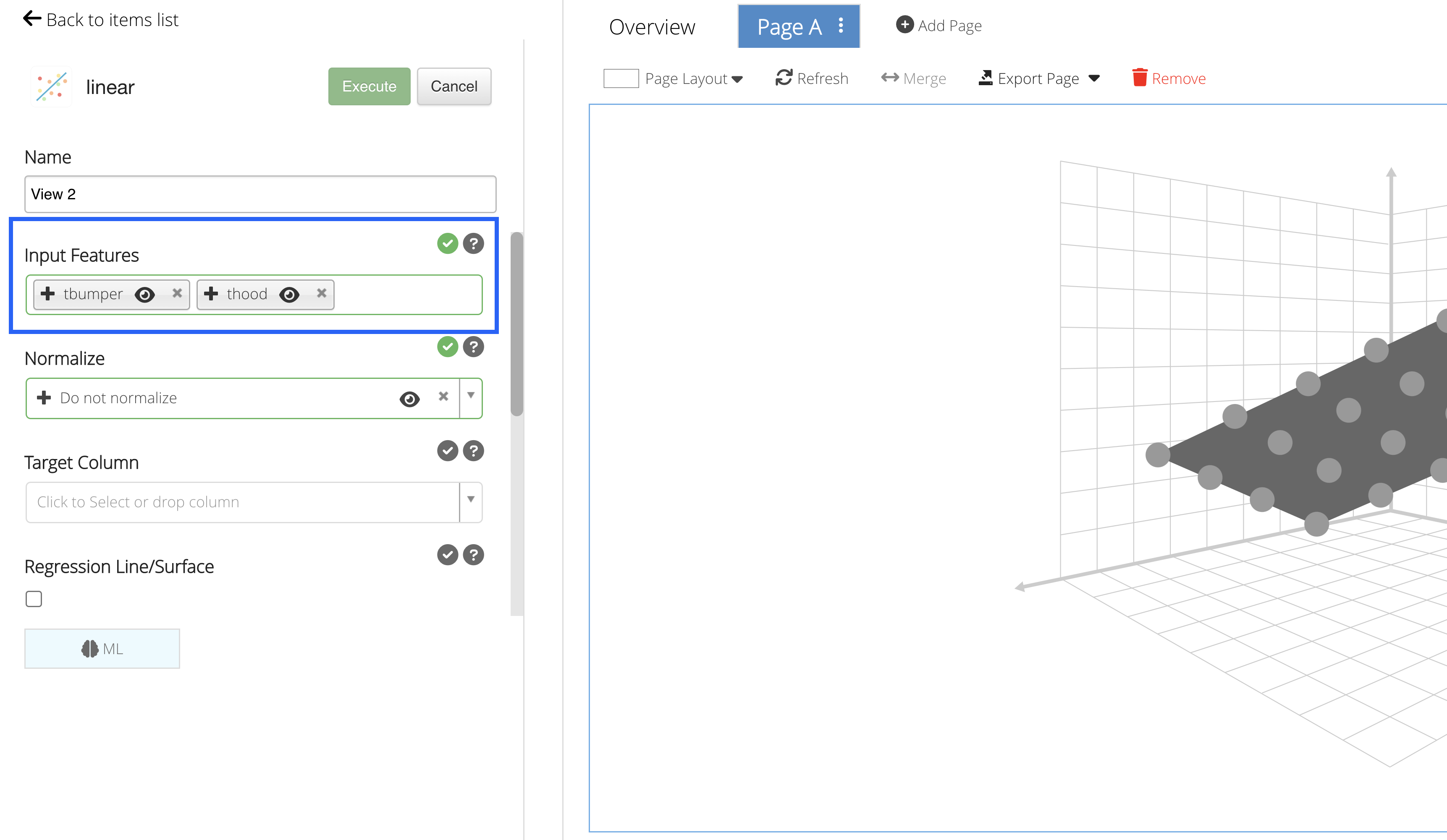
Figure 23: Input Features
 Target Column
Our Target Column will be the column we would like to predict.

In order to generate the predictions correctly using a regression type algorithm, we’ll only be able to add a numeric Target Column to predict data. We’ll choose to predict HIC and check the regression line/surface option as it will produce a 2D and 3D graph for the predictions.
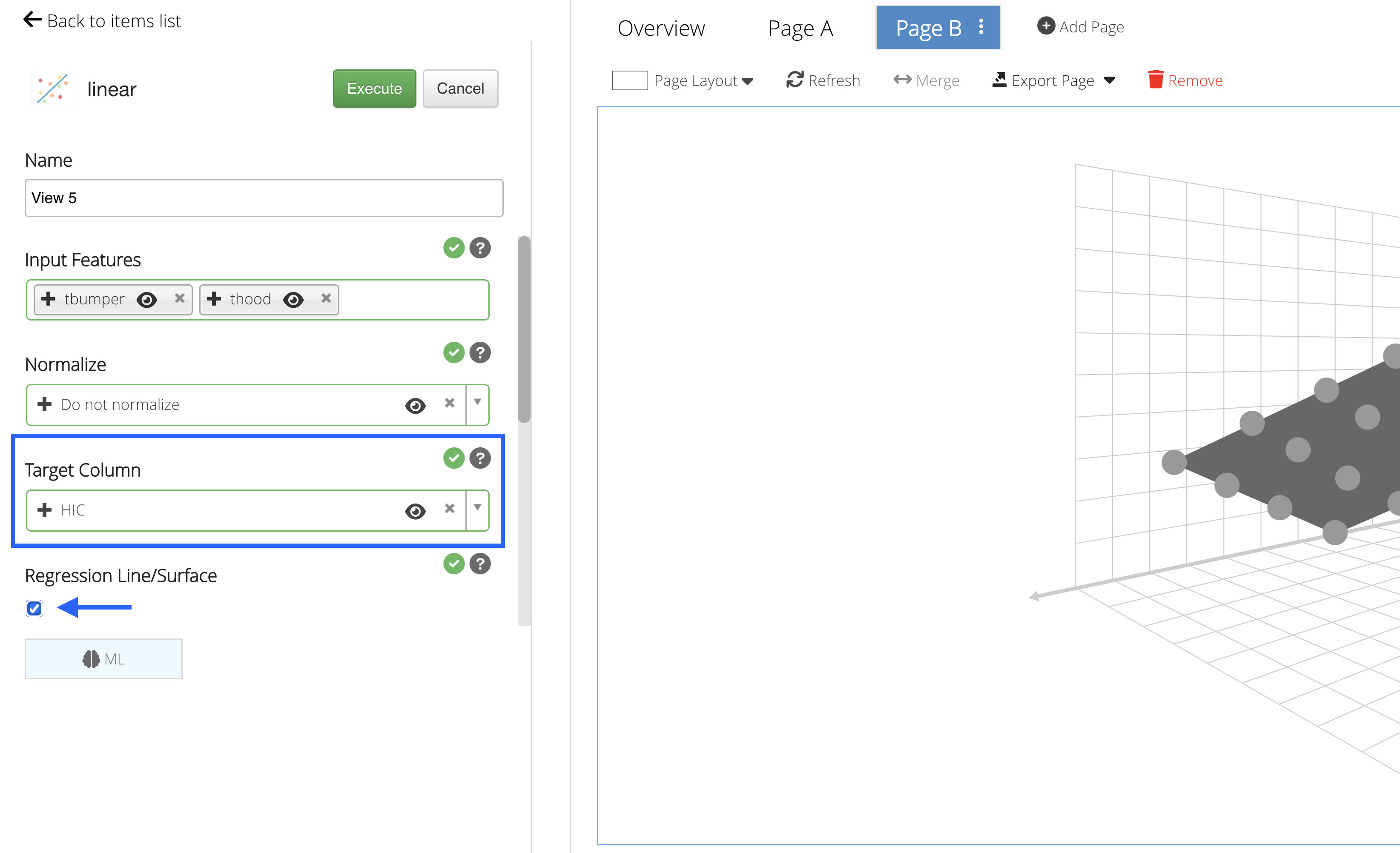
Figure 24: Target Column
 Predictions
Click on “Execute” to see the Machine Learning predictions for the data.
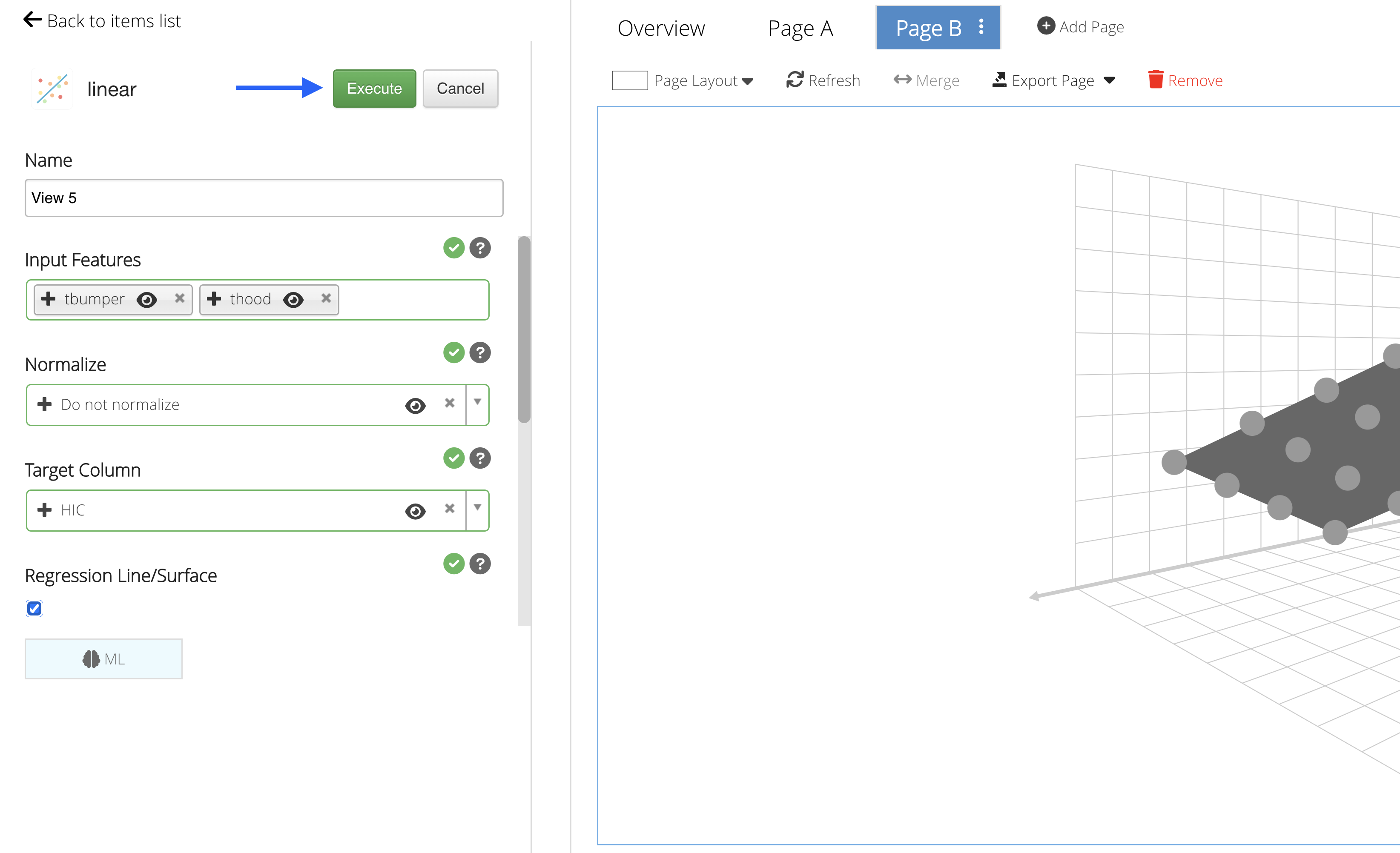
Figure 25: Execute Machine Learning
In this example, we are given three graphs to explore: a table, a surface linear regression graph and a parallel line chart.
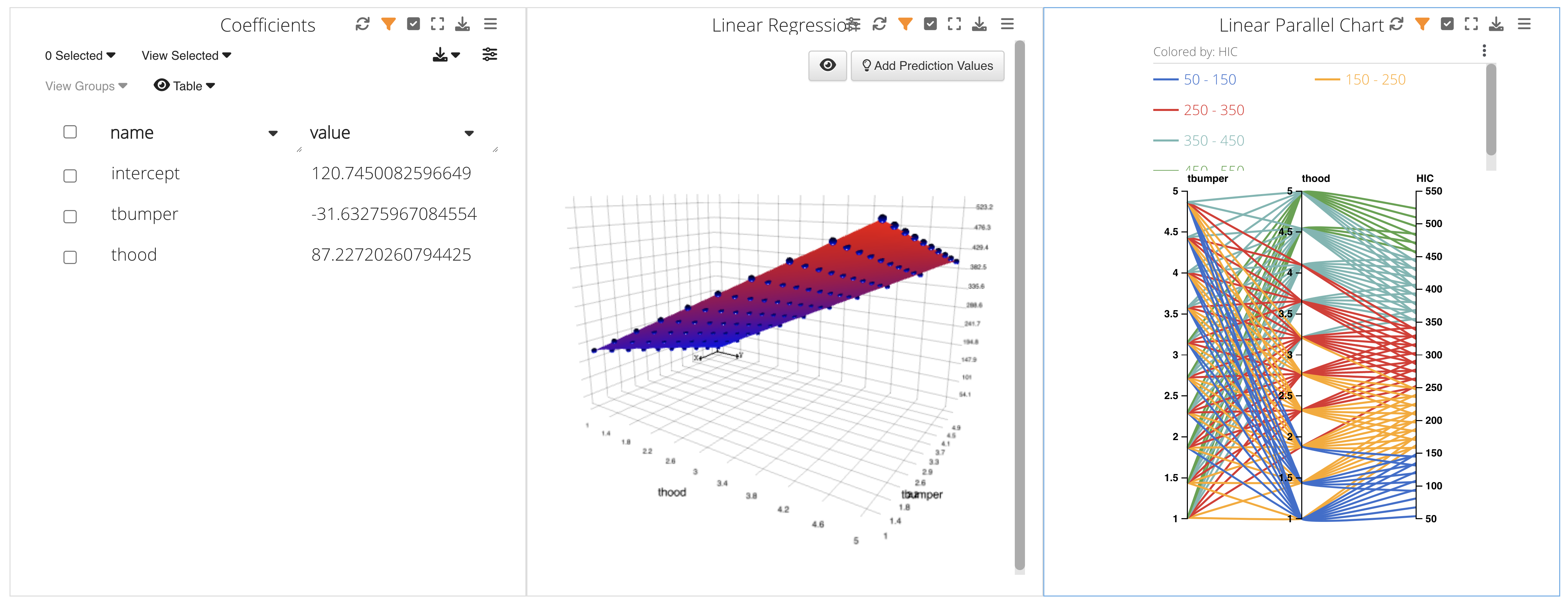
Figure 26: Prediction Charts
 Add Feature Importance ML Algorithm
Again, we’ll create another page and add the Feature Importance ML feature from the list by clicking on or dragging-and-dropping the feature.
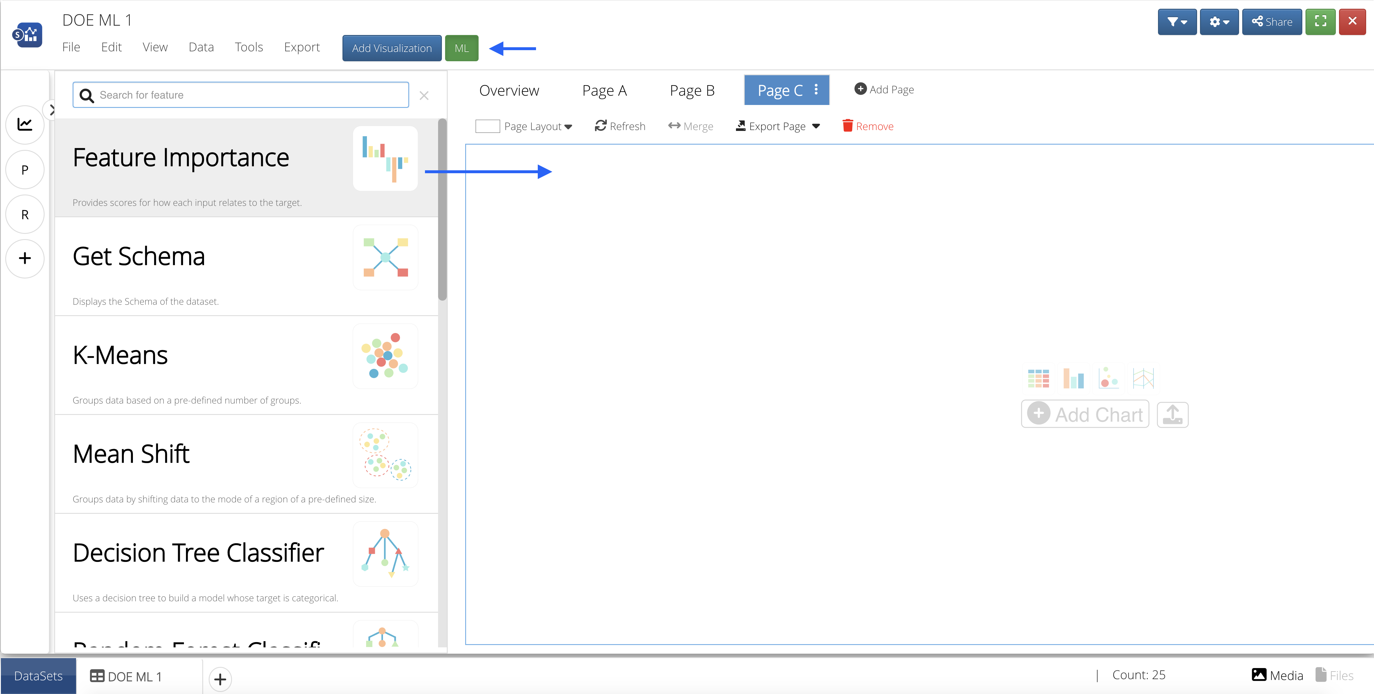
Figure 27: Add ML Feature to Page
Target Column
Our Target Column will be the column we would like to predict.
With classification type algorithms, we can add any text or number column as the output will be categorical. As before, we’ll choose to predict HIC.
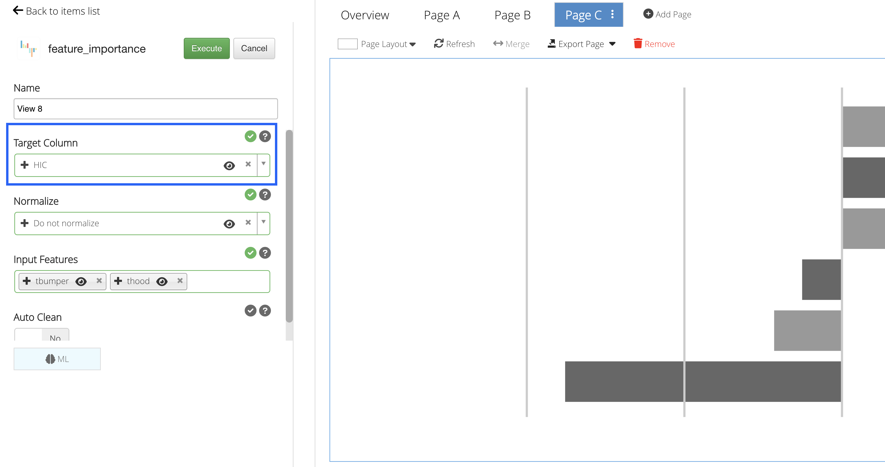
Figure 28: Target Column
Input Features
Our Input Features will be the column(s) we would like to learn from.
We’ll choose t-bumper and t-hood for our learning columns.
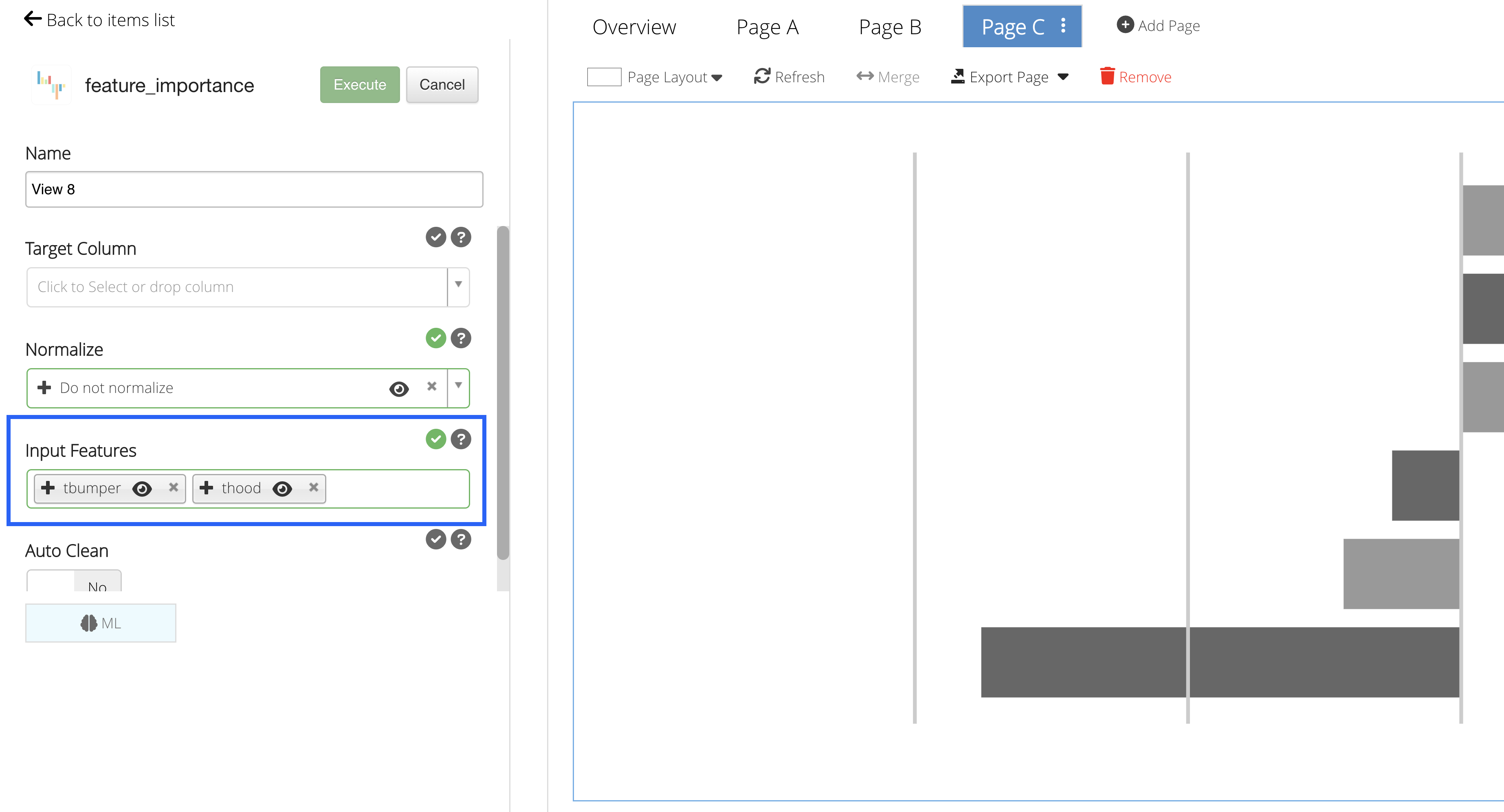
Figure 29: Input Features
Predictions
Click on “Execute” to see the Machine Learning predictions for the data.
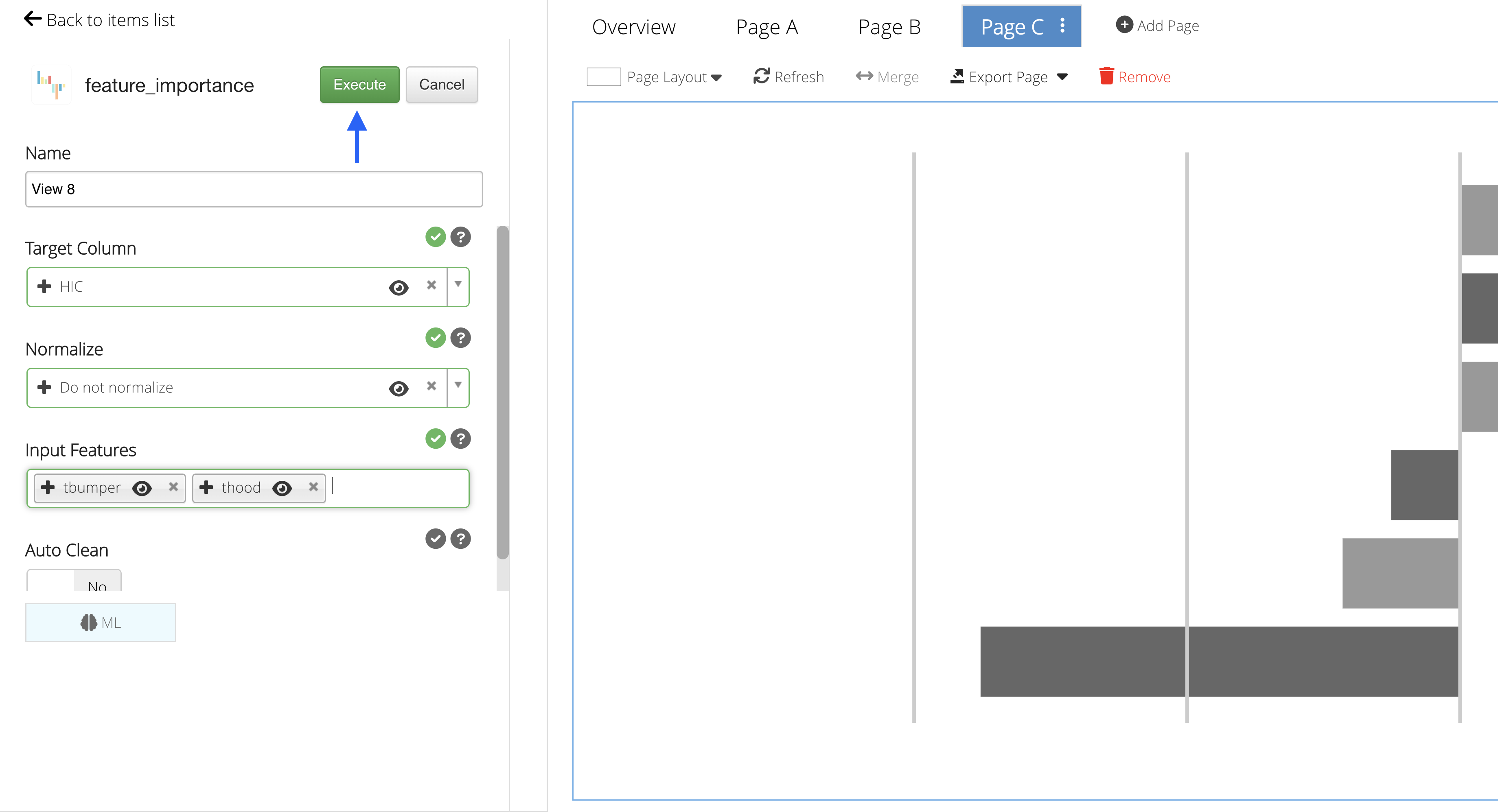
Figure 17: Execute Machine Learning
In this example, we are given two graphs to explore: two bar charts showing importance and correlation between t-hood and t-bumper in reference to HIC value.
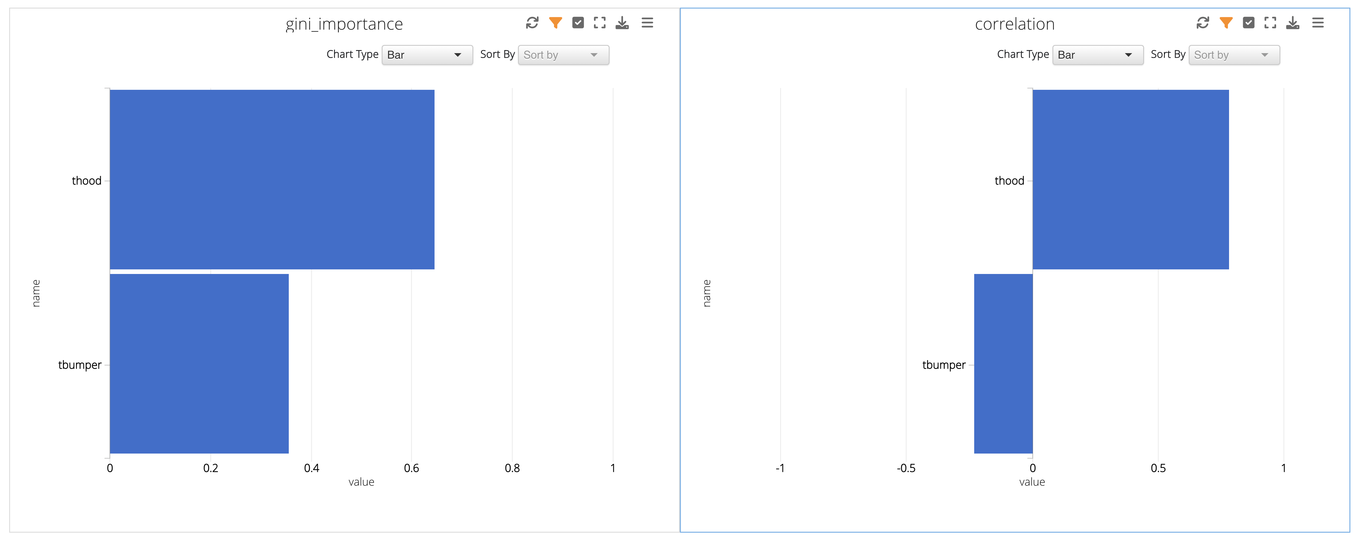
Figure 30: Prediction Charts
 Add K-Means ML Algorithm
Let’s create yet another page and add the K-Means ML feature from the list by clicking on or dragging-and-dropping the feature.
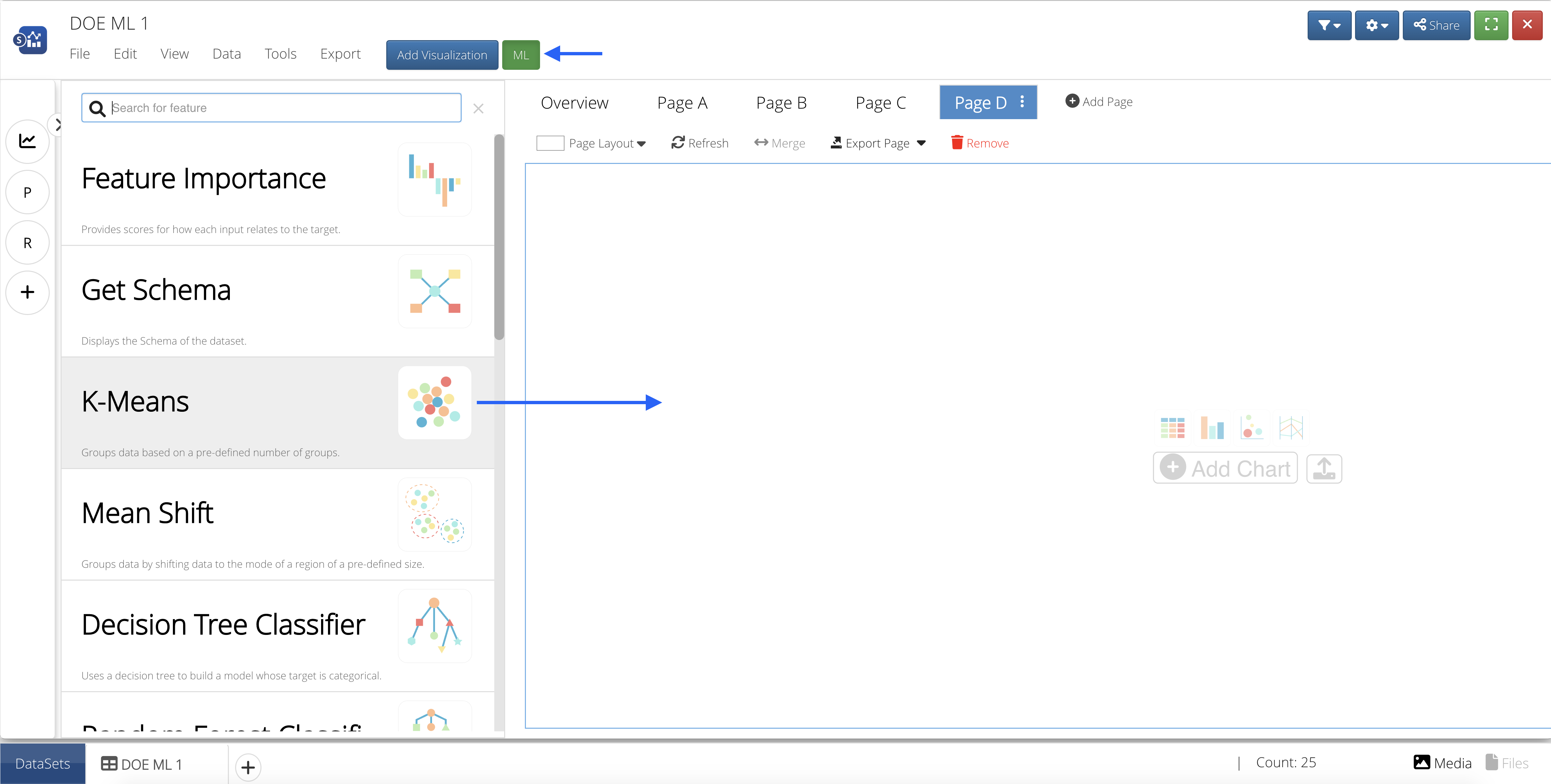
Figure 31: Add ML Feature to Page
 Number of Clusters
Since K-Means is an unsupervised clustering type, we won’t be inputing a Target Column but instead deciding on the amount of clusters for grouping the data points.

Let’s take a look back at our scatter plot from earlier to decide on the number:
Figure 32: HIC Vs. T-Bumper and T-Hood
We could split the above graph into three sections or three groups, with the middle group being the most populated; so, we’ll choose to have three clusters for our K-Means algorithm.
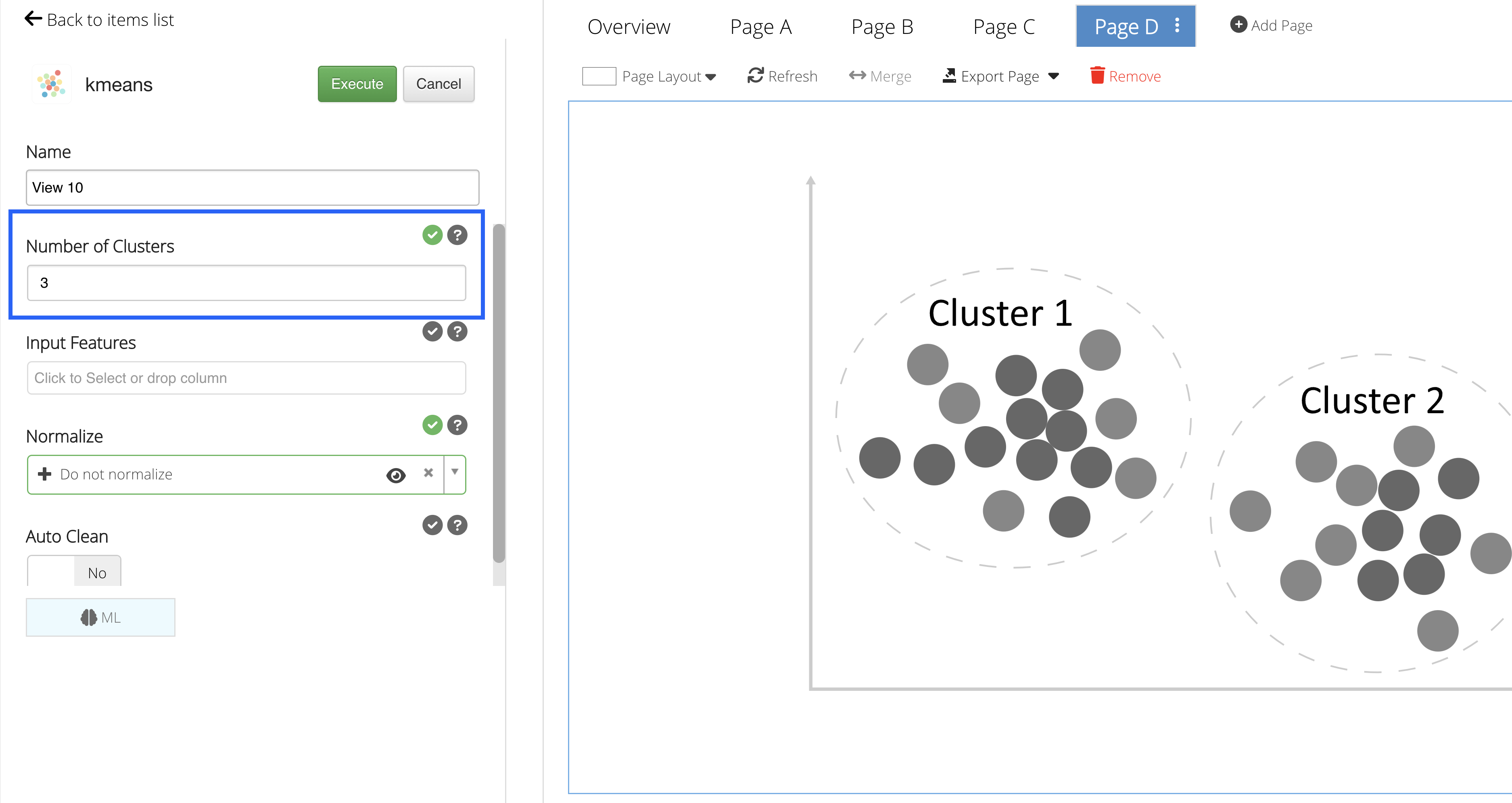
Figure 33: Number of Clusters
Input Features
Our Input Features will be the column(s) we would like to learn from.
Not only will we choose t-bumper and t-hood, but we’ll also add HIC for our learning columns, since we are still exploring the predictions for HIC value.
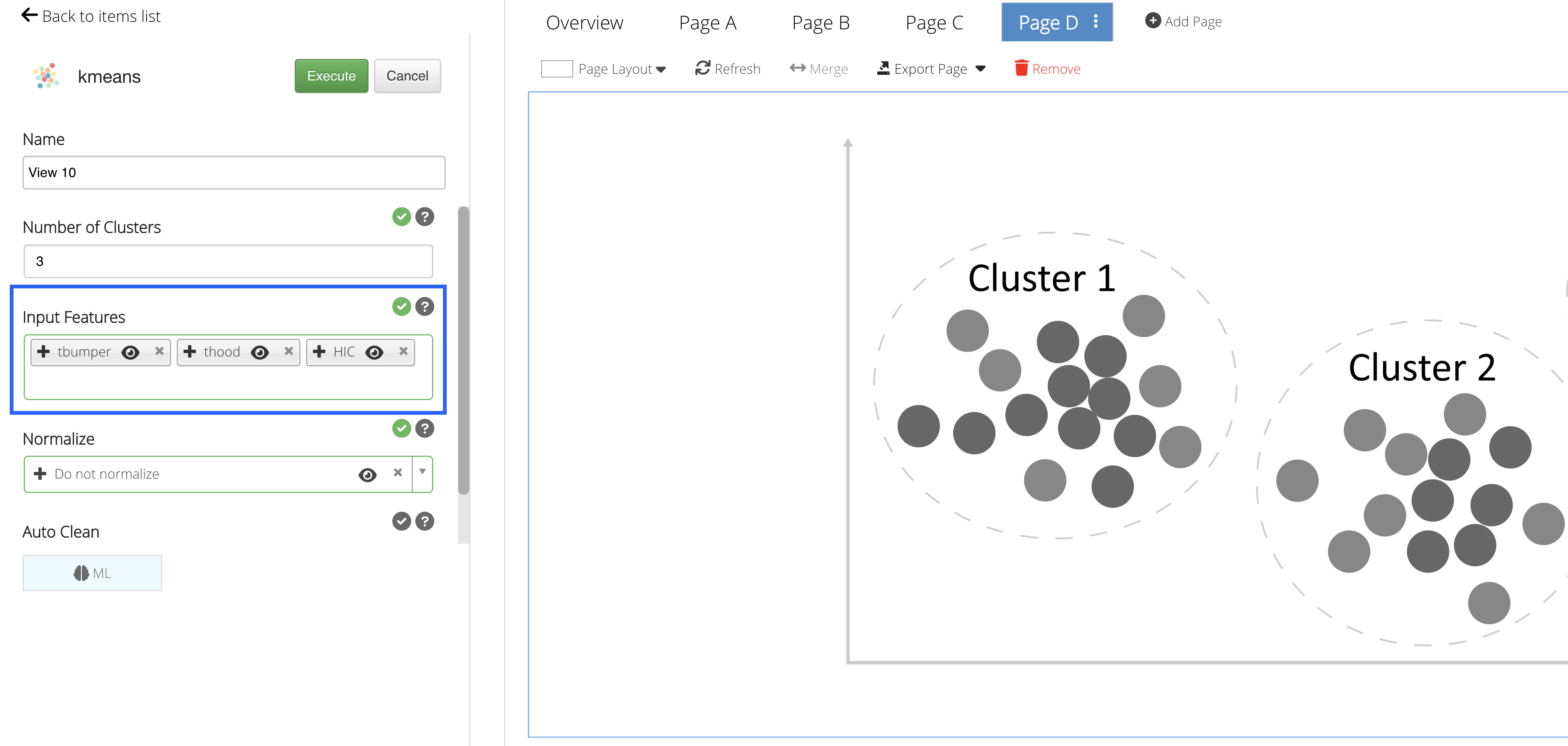
Figure 34: Input Features
Predictions
Click on “Execute” to see the Machine Learning predictions for the data.
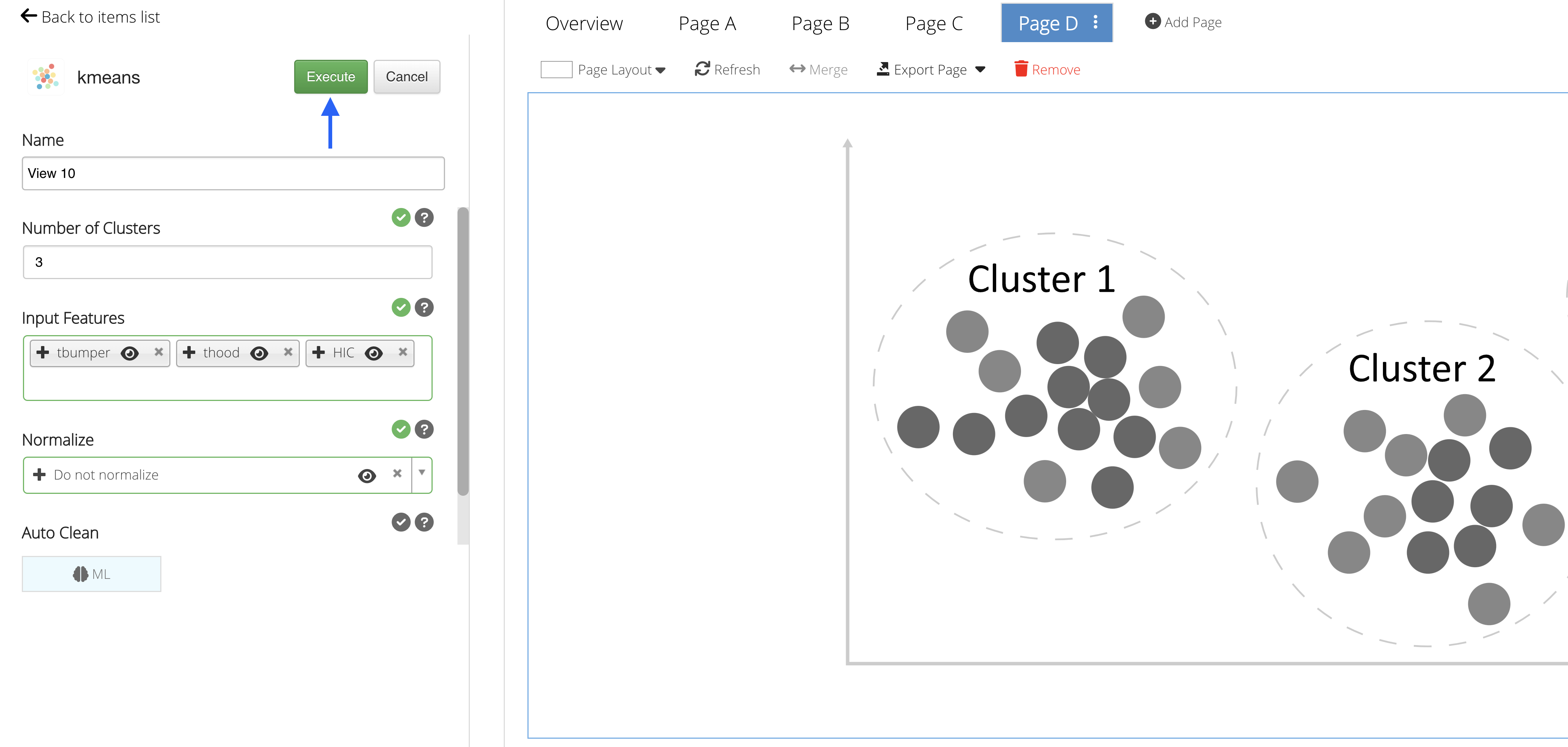
Figure 35: Execute Machine Learning
In this example, we are given a scatter plot with three differently colored clusters or groups, mapped as t-hood vs t-bumper but clustered based on the HIC value as well.
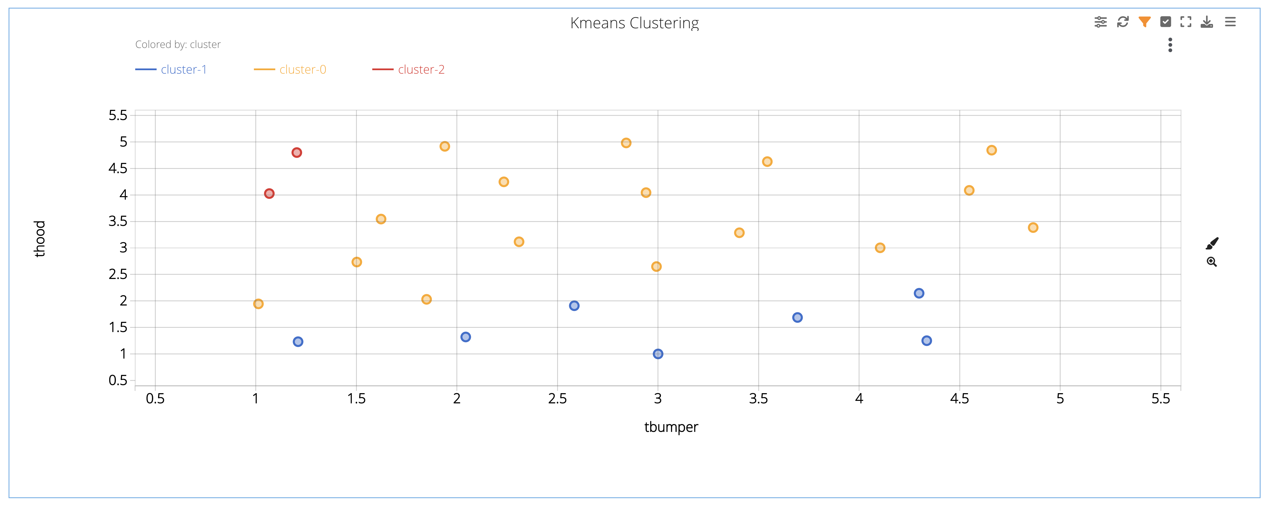
Figure 36: Prediction Chart
Predicting Iris Flower Class
For this example, we’ll be predicting Iris flower class by learning from sepal and petal widths and lengths.
Opening the Dataset
To get started, navigate to the Simlytiks application.
Figure 37: Access Simlytiks
We’ll be using the Iris dataset that can be found at UCI’s Machine Learning Repository or by following this link. Drag-and-drop the dataset file onto the orange drop zone located on the left side panel of the Simlytiks main page.
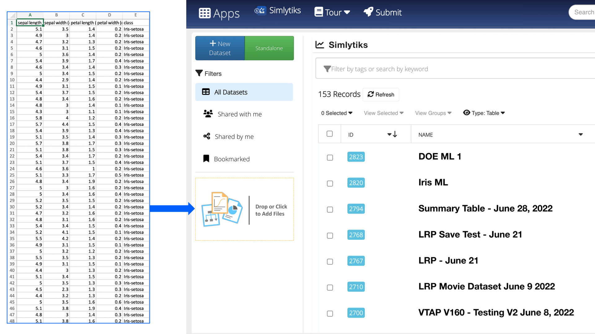
Figure 38: Open Iris Dataset
Upon opening, we’ll see an overview table of all the data.
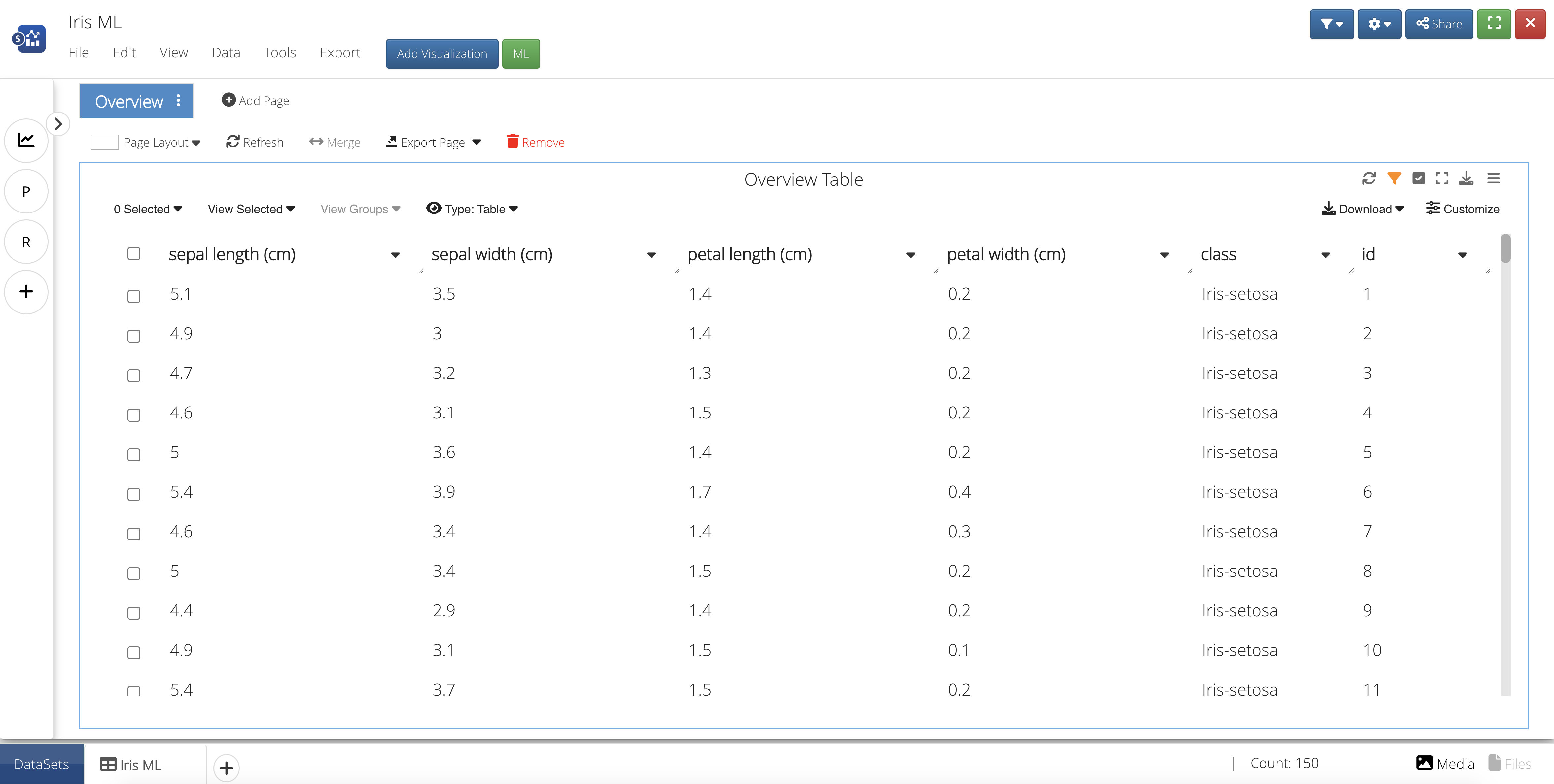
Figure 39: Iris Overview Table
Add a Visualization
Let’s create a visualization to gain a better understanding of the relationship between Iris class and petal/sepal dimensions. We’ll need to add a visualization by first creating a new page.
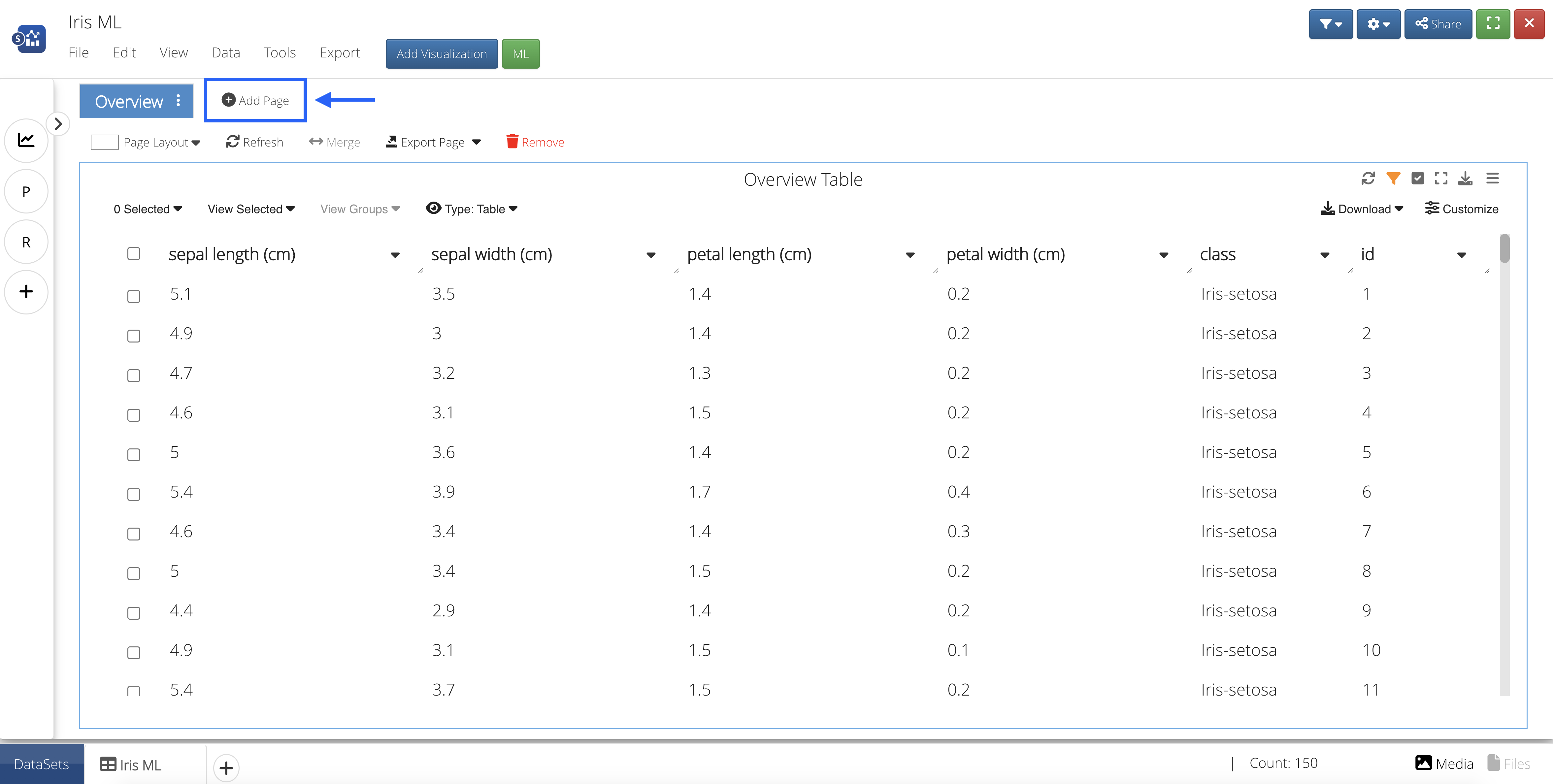
Figure 40: Create a New Page
Then, we’ll click the blue button at the top that says “Add Visualization” and drag-and-drop or click to add the Parallel Line Chart Visualizer onto the page.
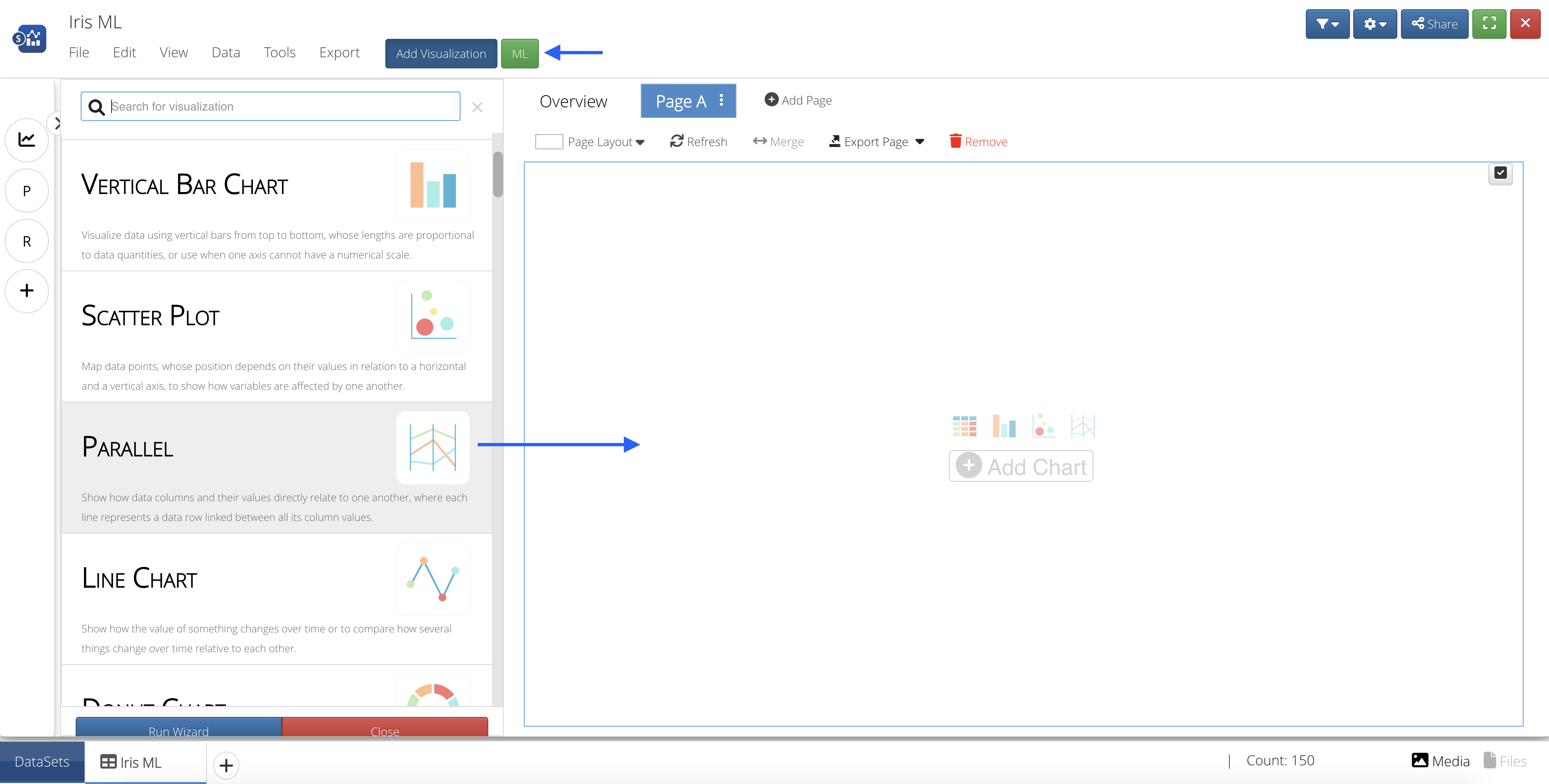
Figure 41: Add Parallel Line Chart Visualization
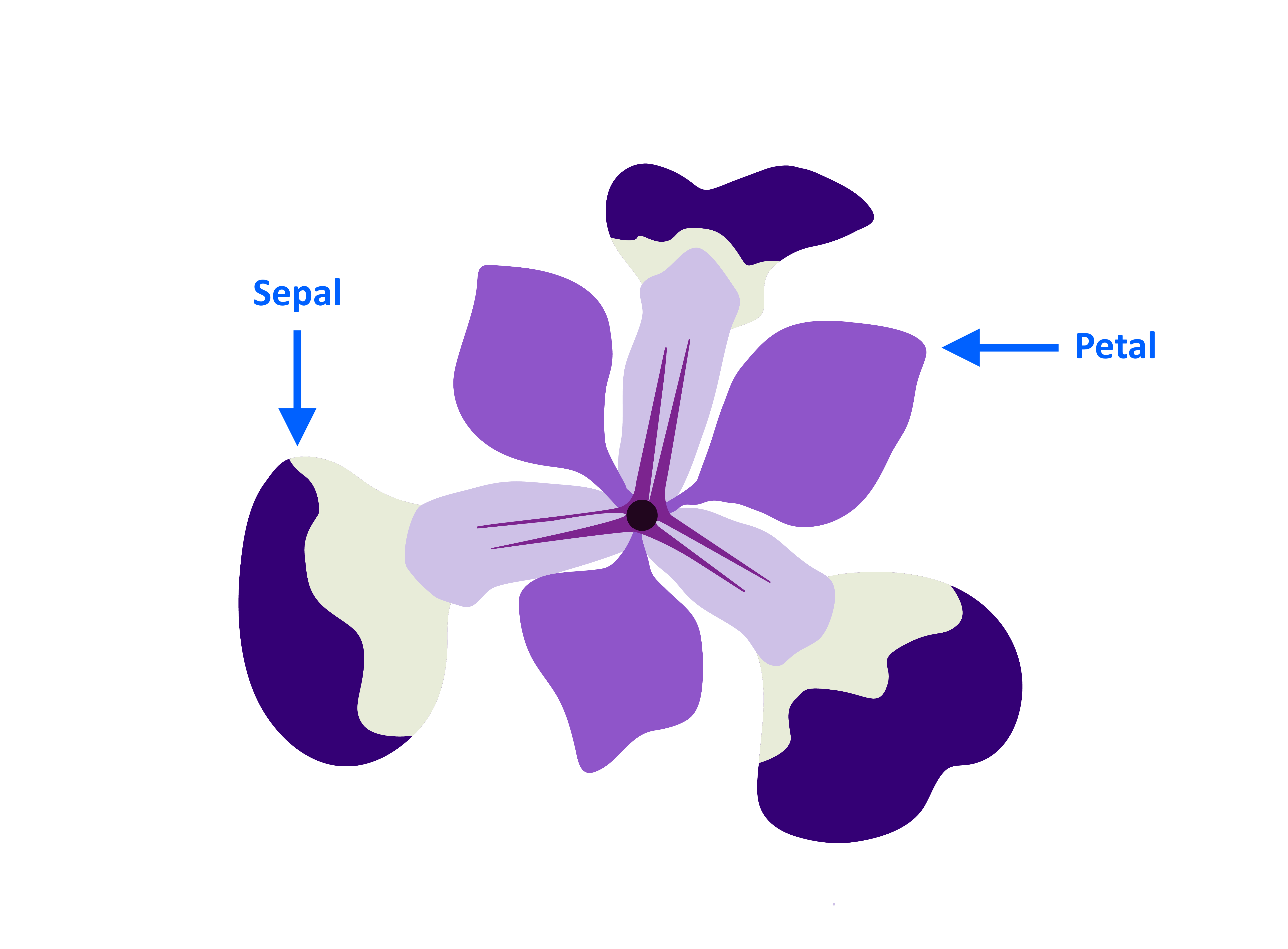
For the Columns, choose class, petal width, petal length, sepal width and sepal length in that order, then click Accept.
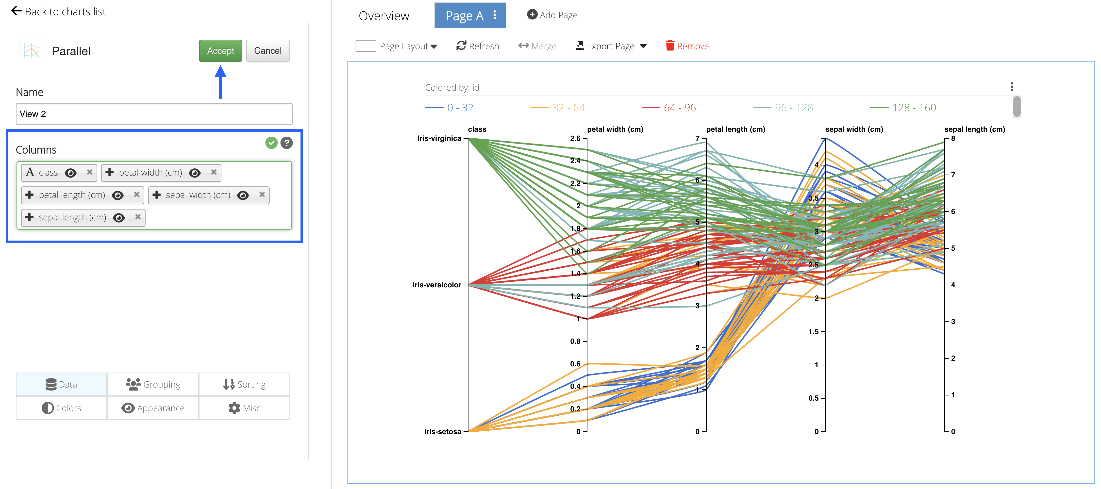
Figure 42: Choose Columns
We can see that for each class the widths and lengths of the petals and sepals follow a similar trajectory.
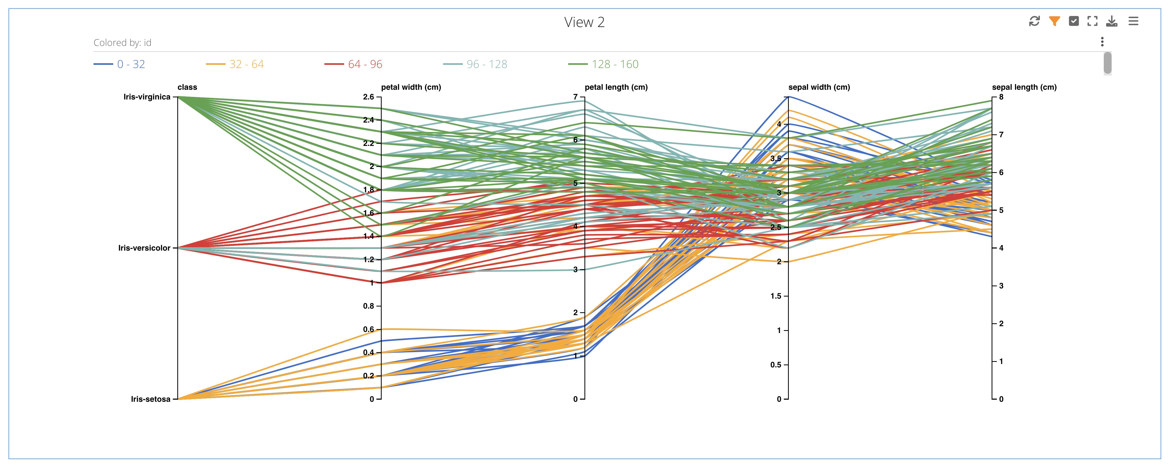
Figure 43: Class, Petal Width & Length, Sepal Width & Length
 Add Decision Tree Classifier ML Algorithm
Let’s create another page and add the Decision Tree Classifier ML feature from the list by clicking on or dragging-and-dropping the feature.
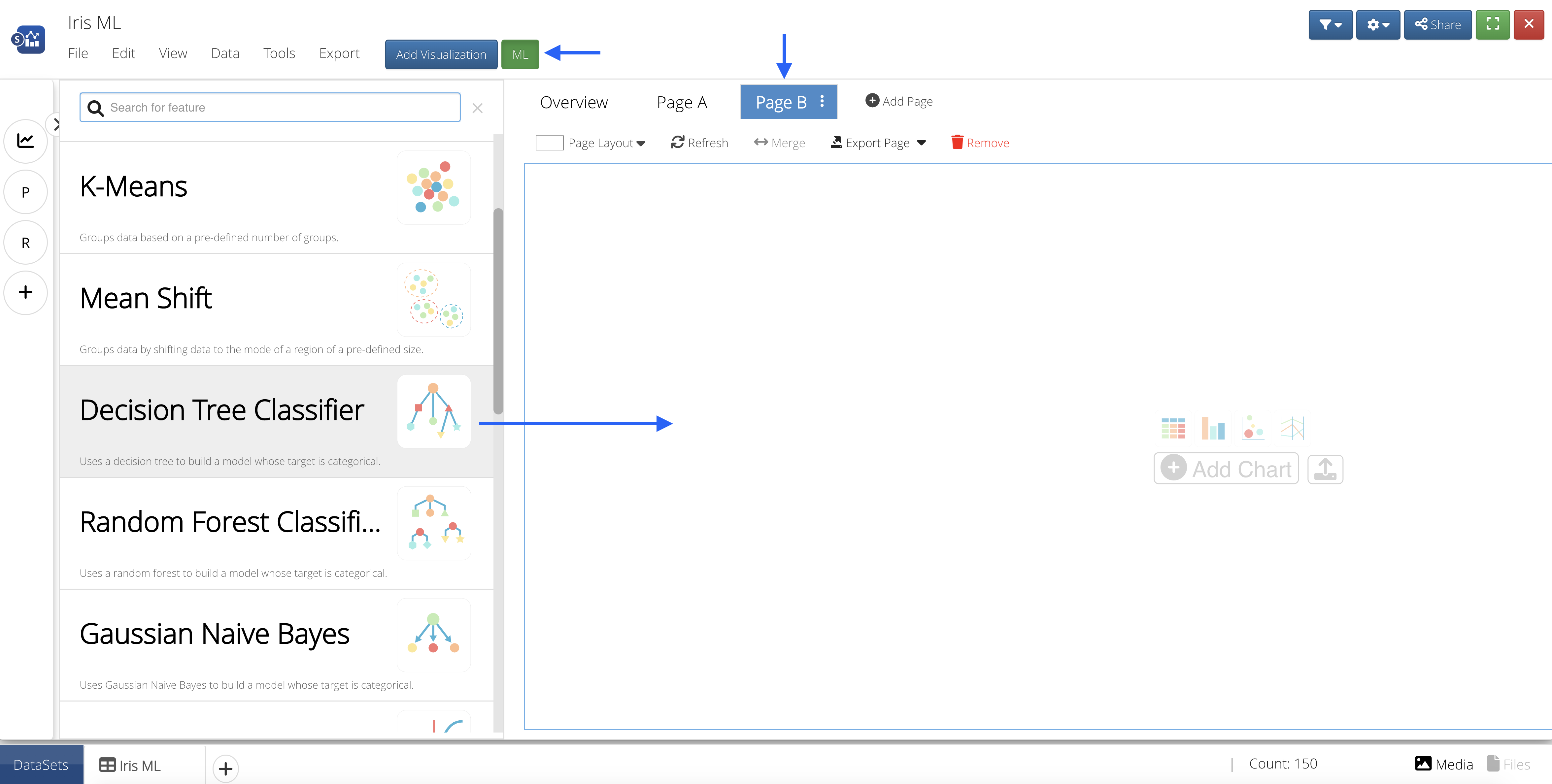
Figure 44: Add ML Feature to Page
Input Features
Our Input Features will be the column(s) we would like to learn from.
We’ll choose the petal width, petal length, sepal width and sepal length as our learning columns.
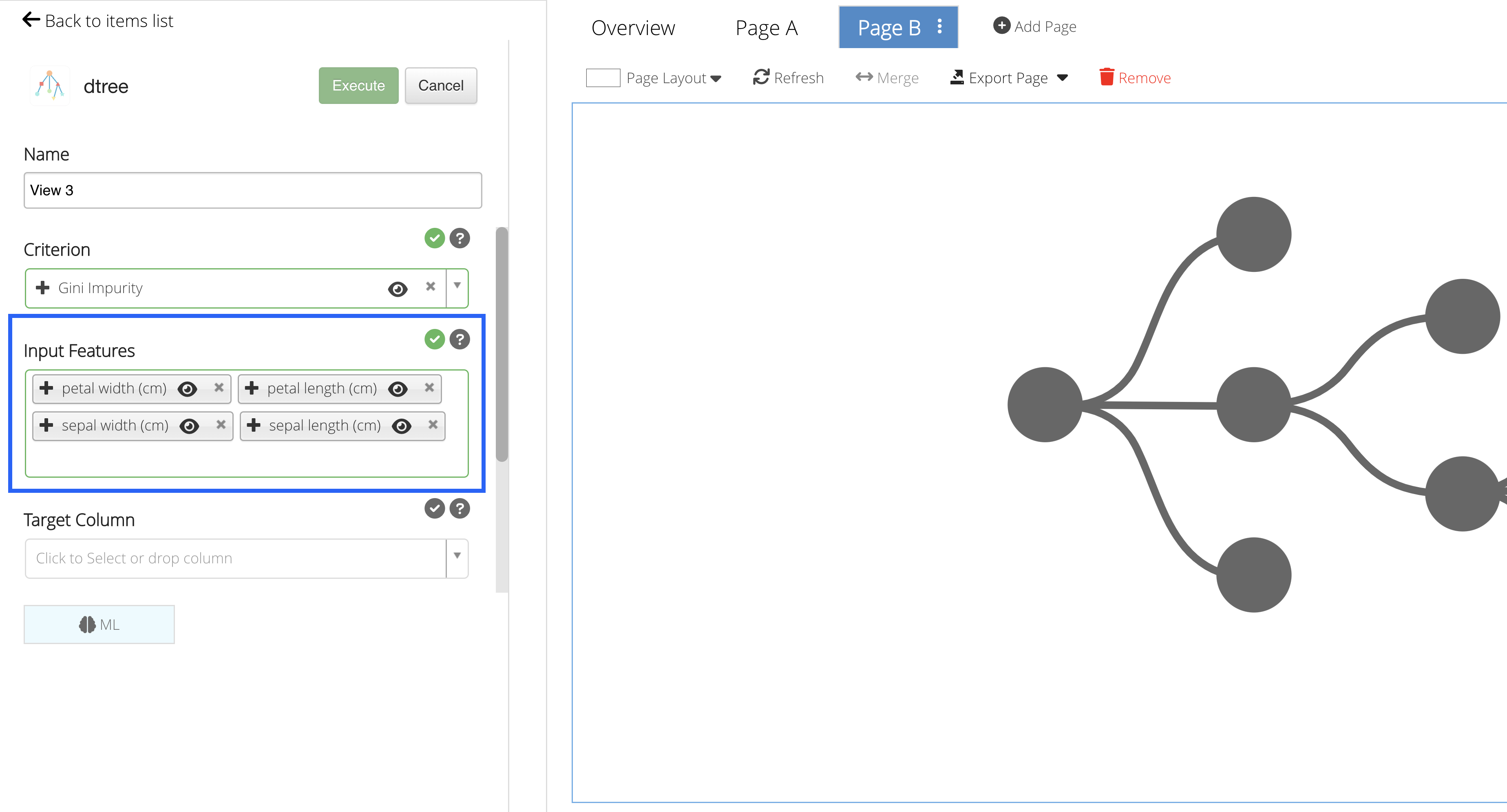
Figure 45: Input Features
Target Column
Our Target Column will be the column we would like to predict.
We’ll choose to predict the Iris class.
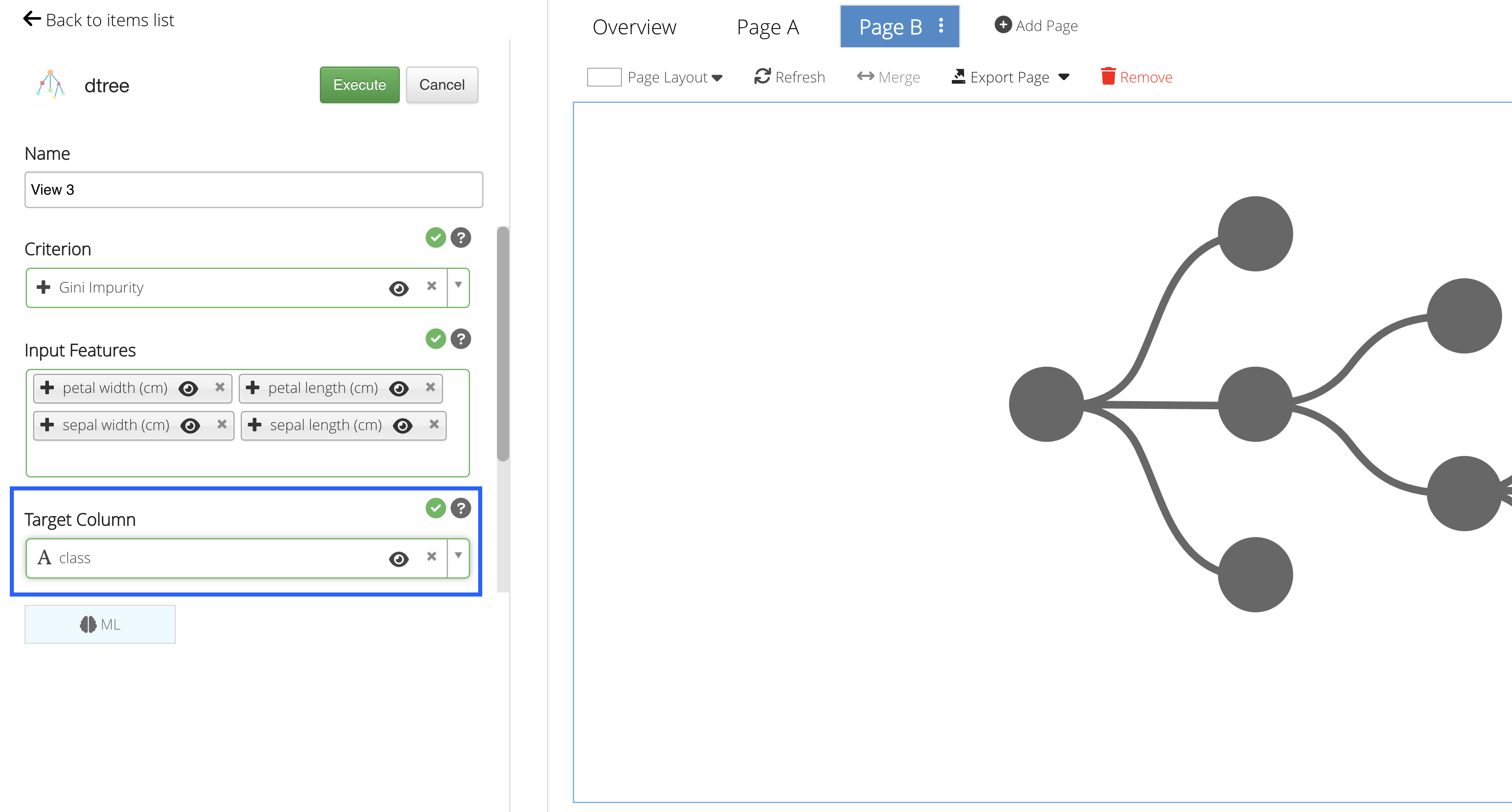
Figure 46: Target Column
Predictions
Click on “Execute” to see the Machine Learning predictions for the data.
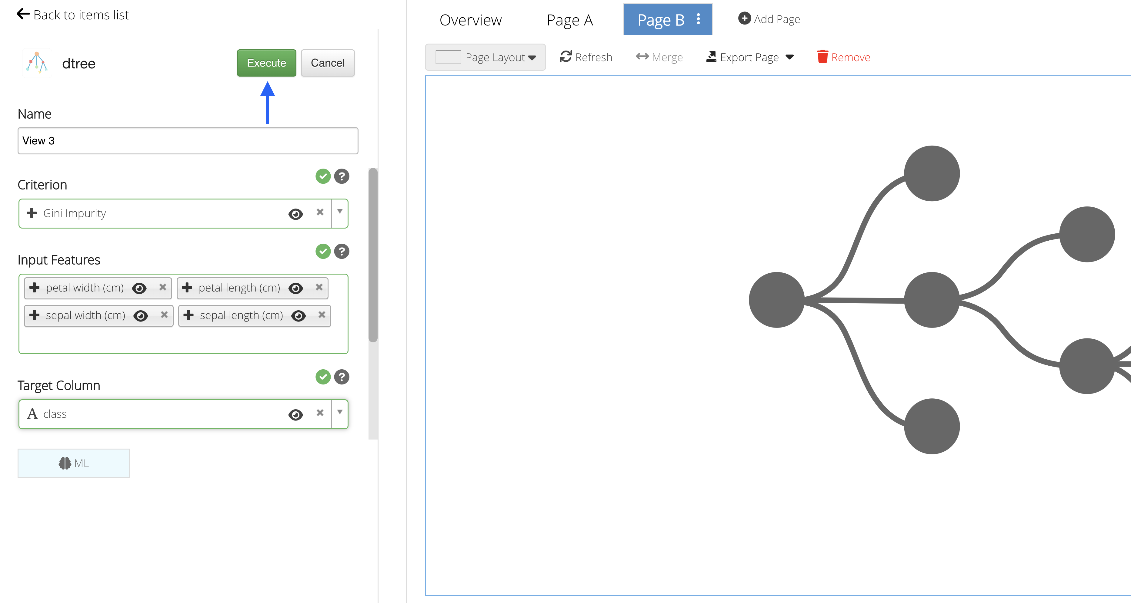
Figure 47: Execute Machine Learning
In this example, we are given two graphs to explore: a table and a decision tree.
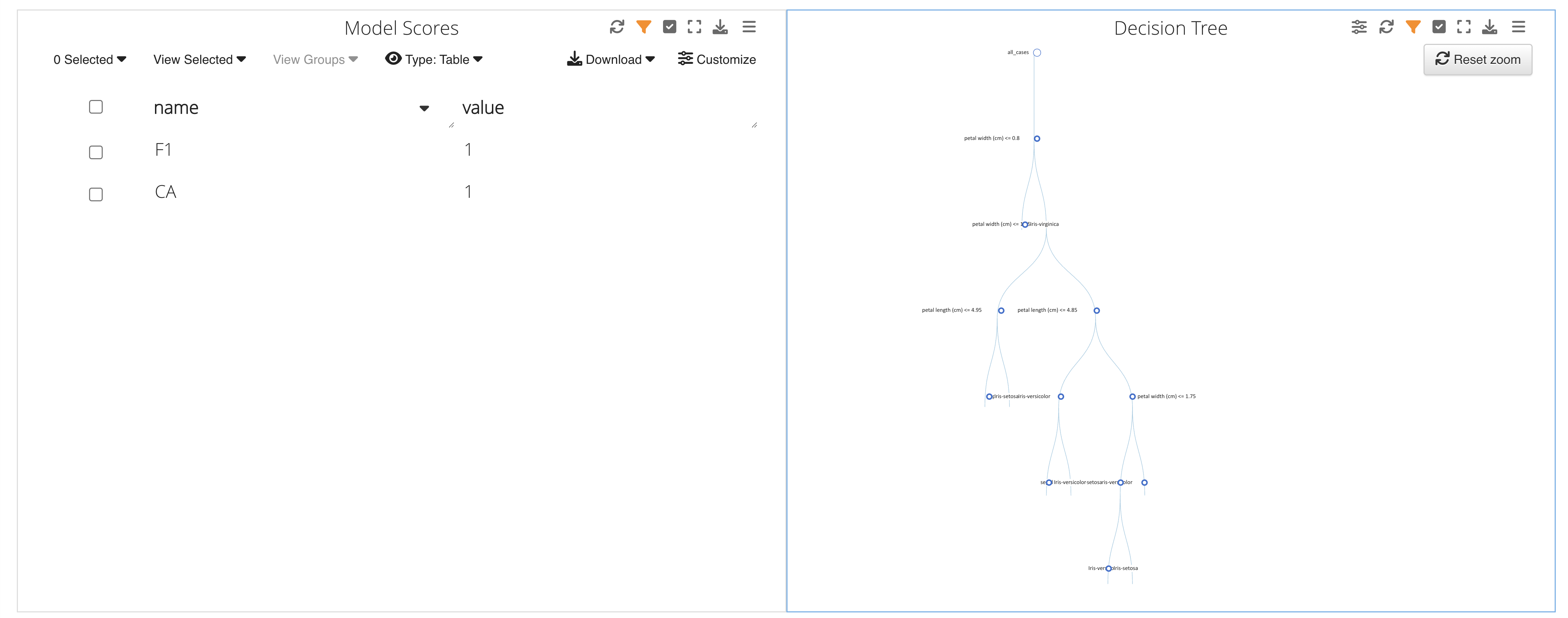
Figure 48: Prediction Charts
The decision tree helps us decipher the class by following the attributes down the branches.
Predicting World Happiness Score
For this example, we’ll be predicting World Happiness Score by learning from gdp per capita, social support, health, freedom, generosity, government trust and dystopia residual.
Opening the Dataset
To get started, navigate to the Simlytiks application.
Figure 49: Access Simlytiks
We’ll be using the World Happiness 2020 dataset that can be found at the World Happiness Report website. Drag-and-drop the dataset file onto the orange drop zone located on the left side panel of the Simlytiks main page.
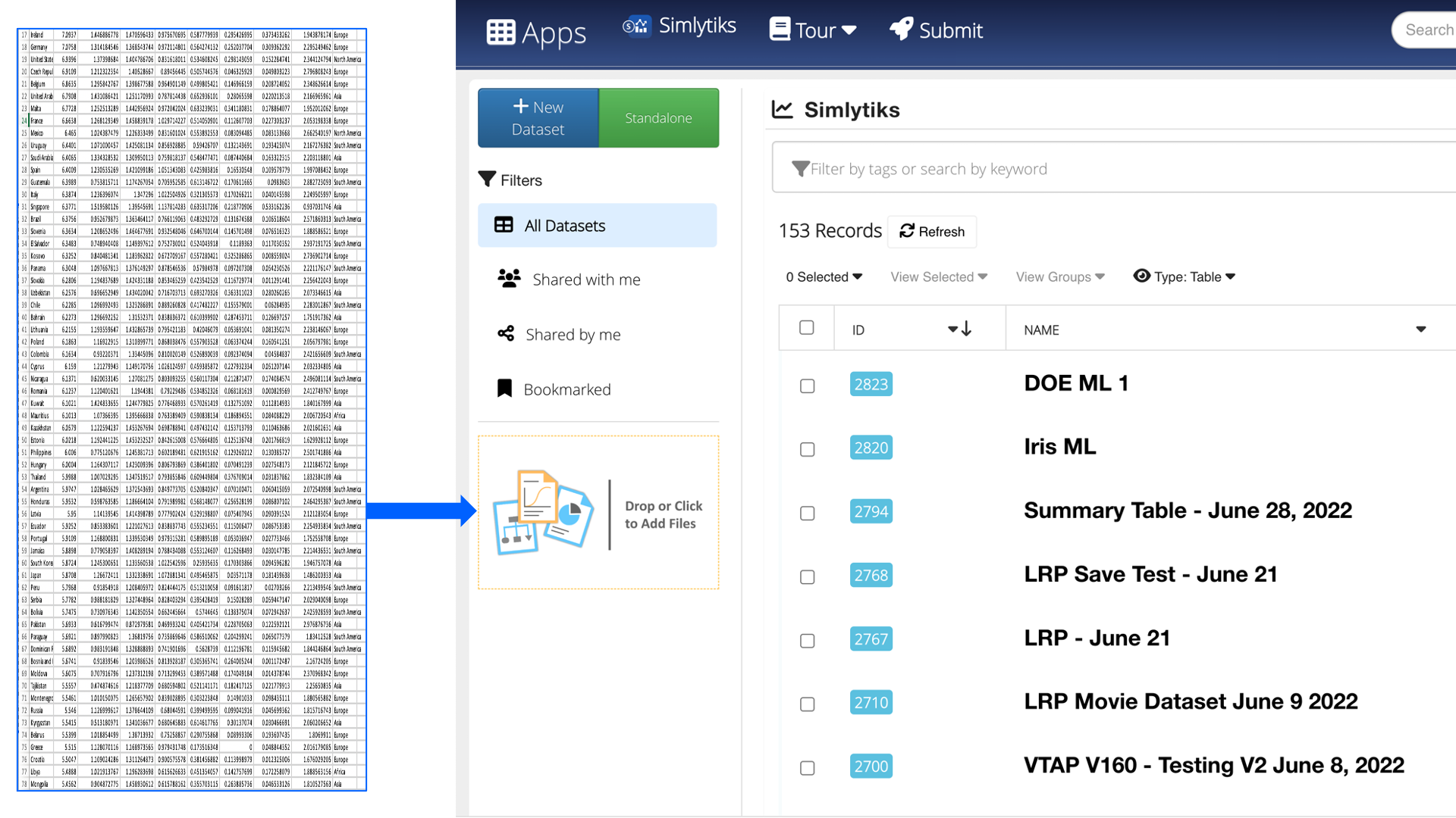
Figure 50: Open World Happiness Dataset
Upon opening, we’ll see an overview table of all the data.
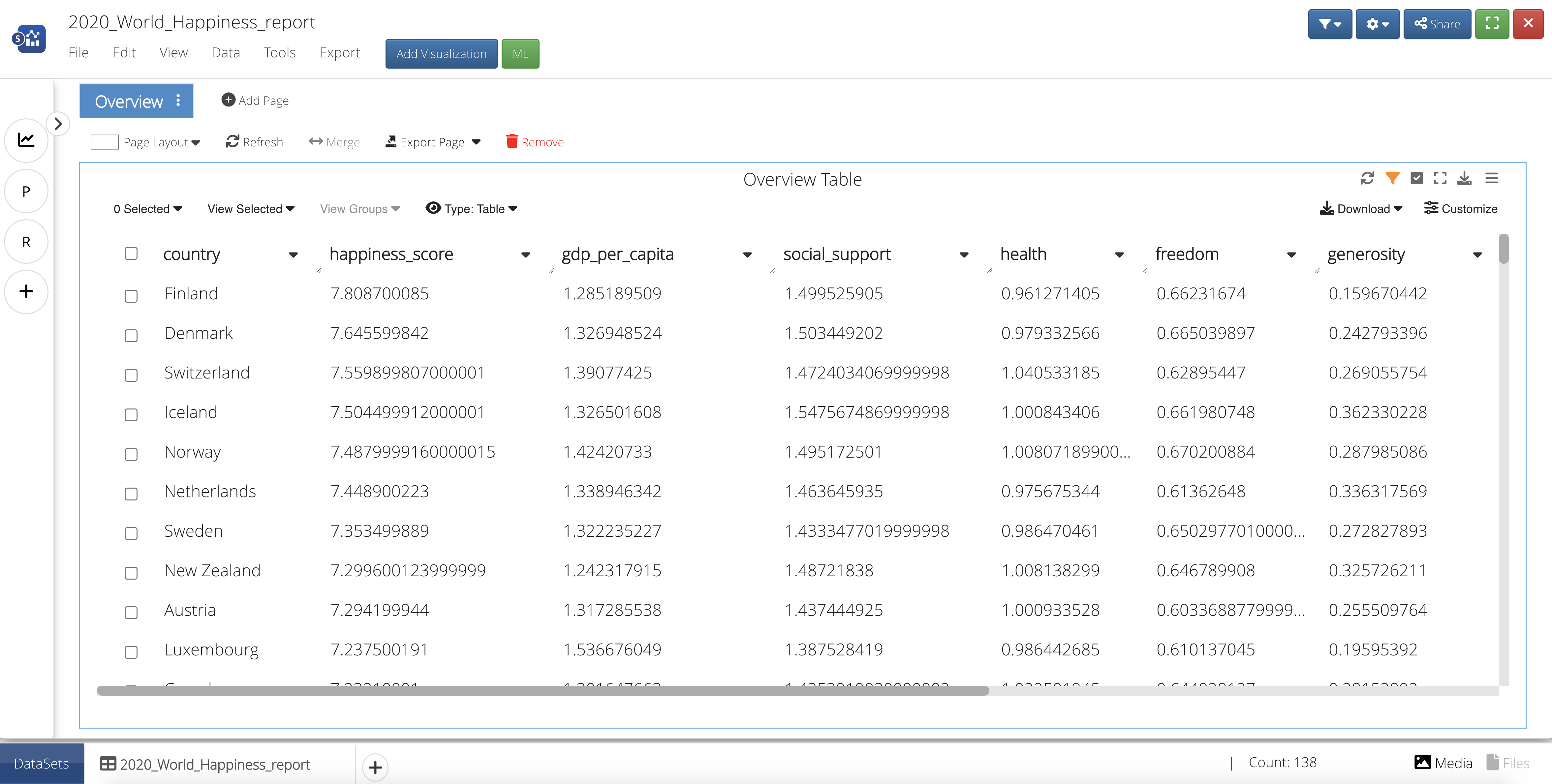
Figure 51: World Happiness 2020 Overview Table
Add a Visualization
Let’s create a visualization to gain a better understanding of the relationship between World Happiness Score and all the score variable columns. We’ll need to add a visualization by first creating a new page.
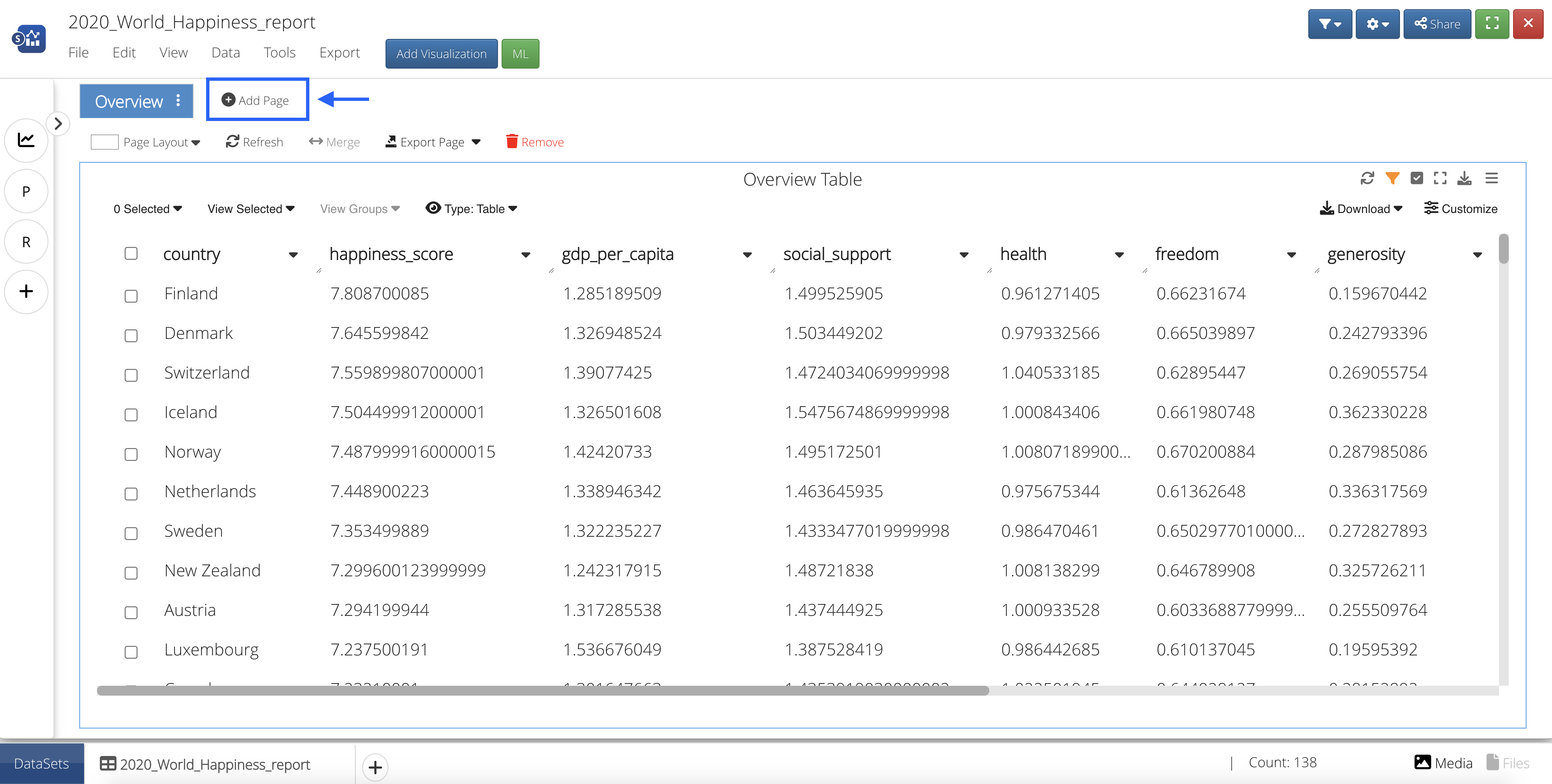
Figure 52: Create a New Page
Then, we’ll click the blue button at the top that says “Add Visualization” and drag-and-drop or click to add the Ranking Table Visualizer onto the page.
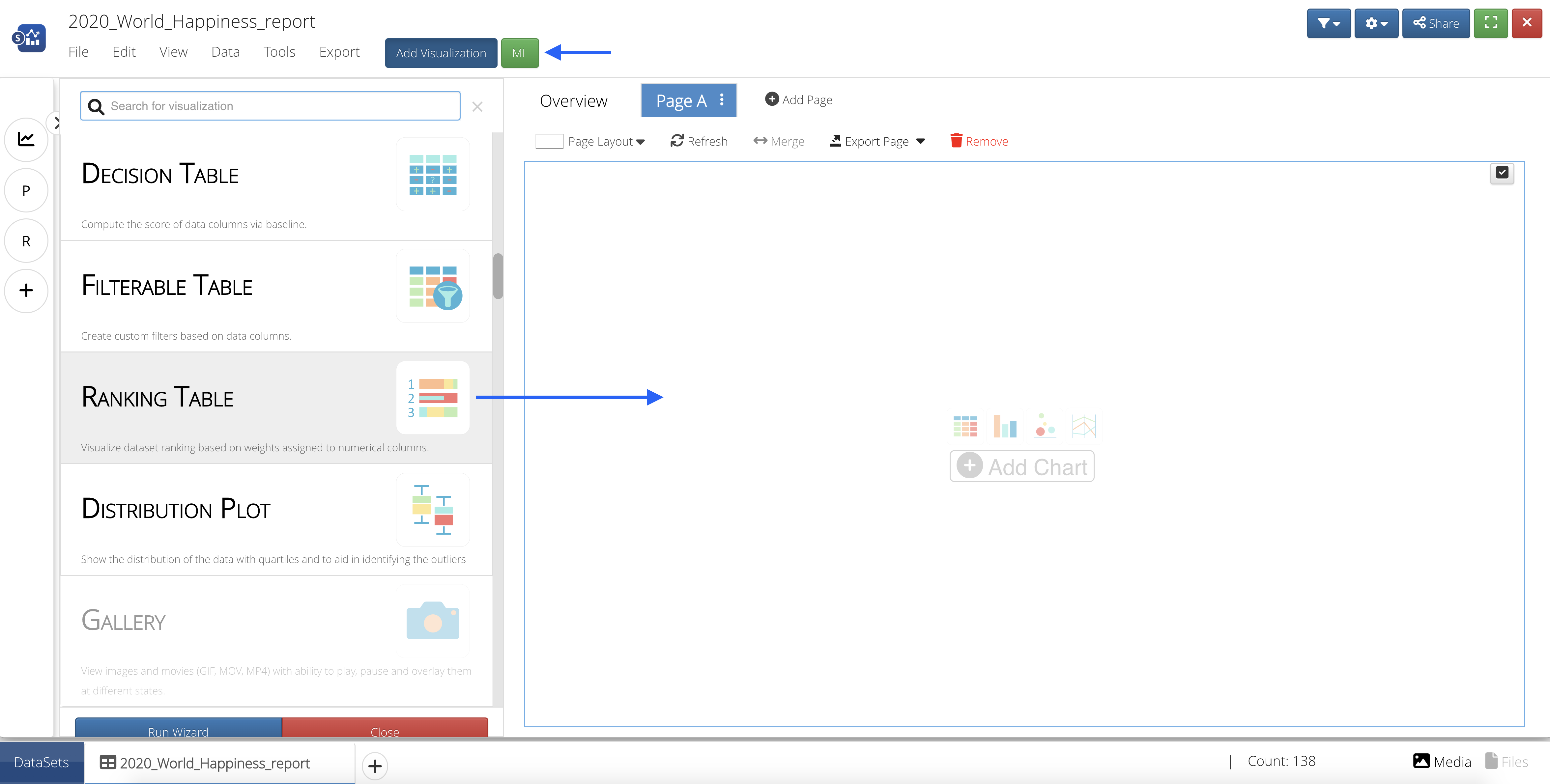
Figure 53: Add Ranking Table Visualization
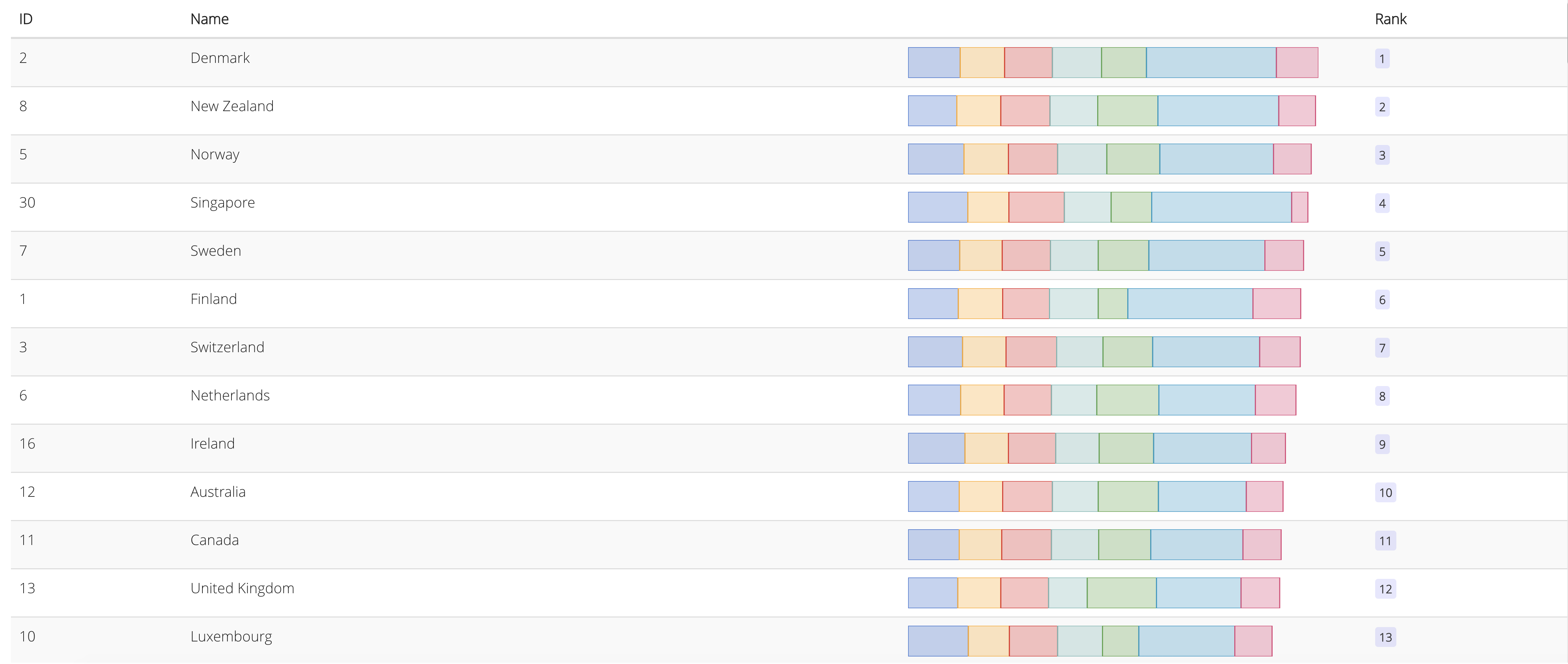
For the Columns, choose gdp per capita, social support, health, freedom, generosity, government trust and dystopia residual. For the Primary Key, choose happiness score; then click Accept.
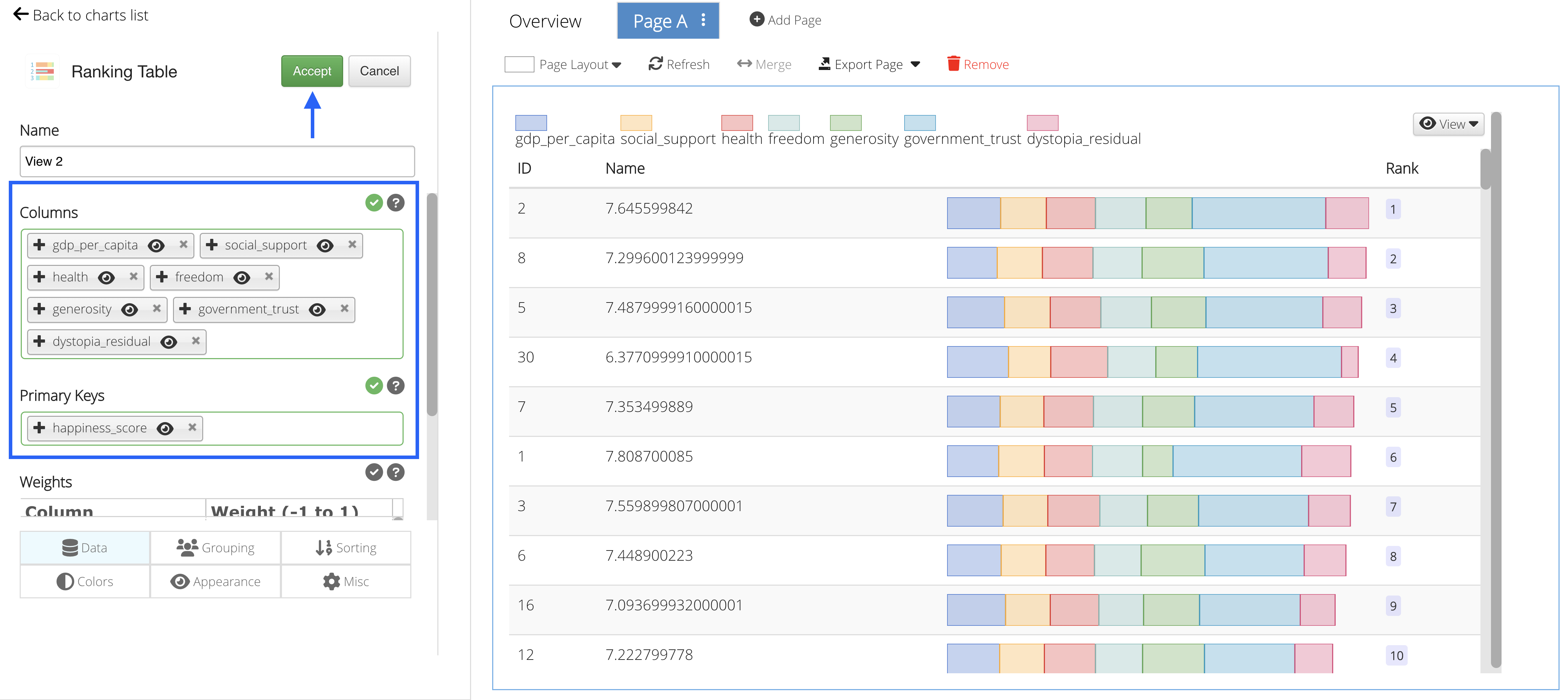
Figure 54: Choose Columns and Primary Key
We can see that the higher ranked countries with the higher ranked score variables (ranking blocks) generally have the highest happiness score (Name).
Add Decision Tree Classifier ML Algorithm
Let’s create another page and add the Decision Tree Classifier ML feature from the list by clicking on or dragging-and-dropping the feature.
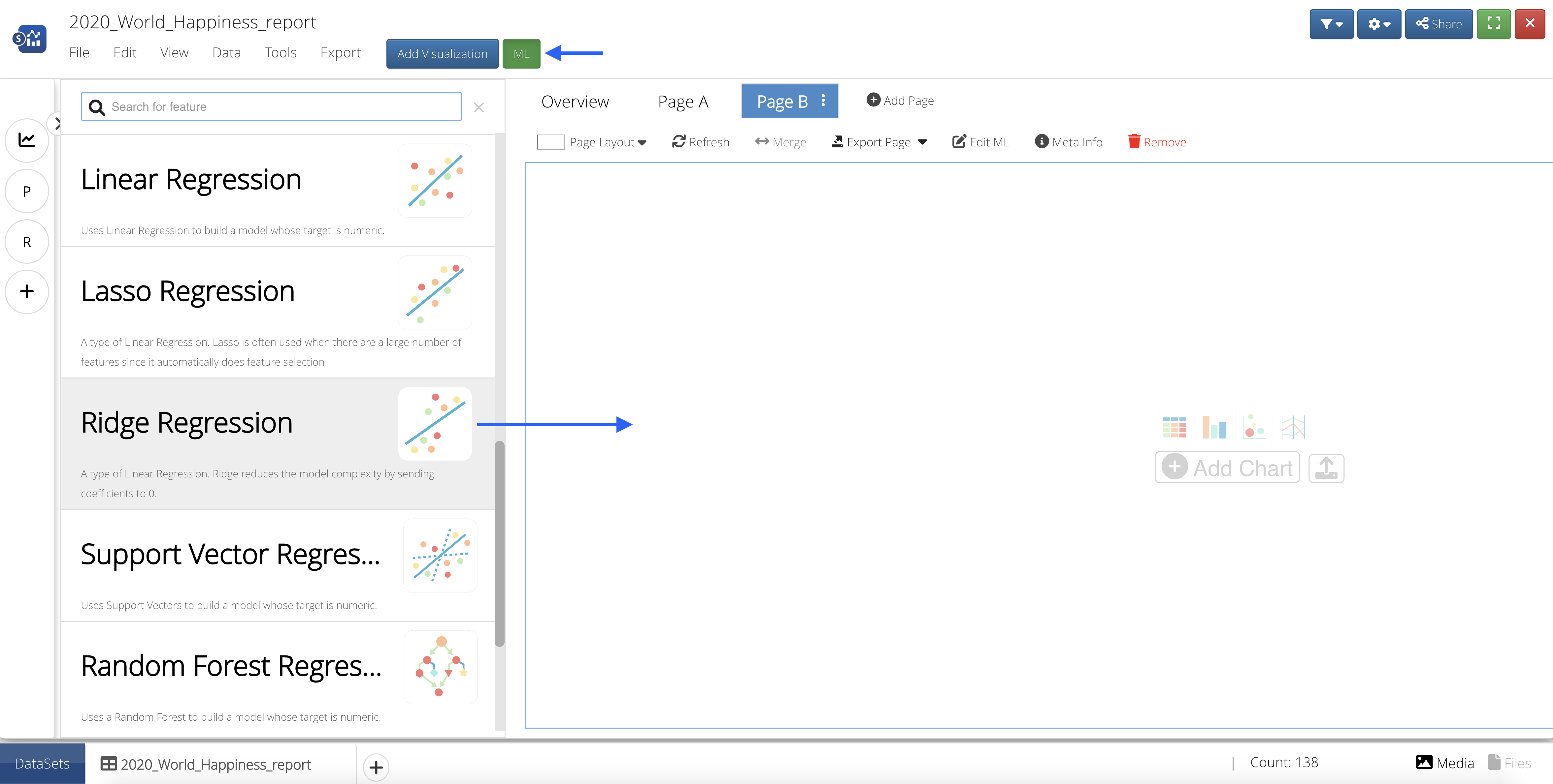
Figure 55: Add ML Feature to Page
Input Features
Our Input Features will be the column(s) we would like to learn from.
We’ll choose gdp per capita, social support, health, freedom, generosity, government trust and dystopia residual as our learning columns.
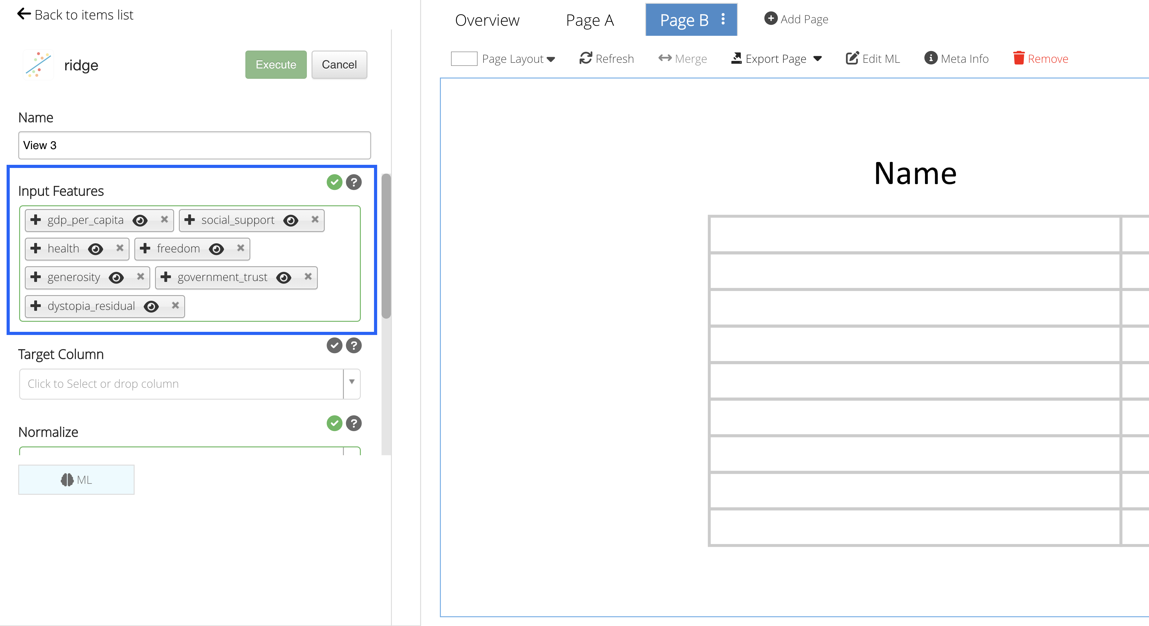
Figure 56: Input Features
Target Column
Our Target Column will be the column we would like to predict.
We’ll choose to happiness score as our target column.
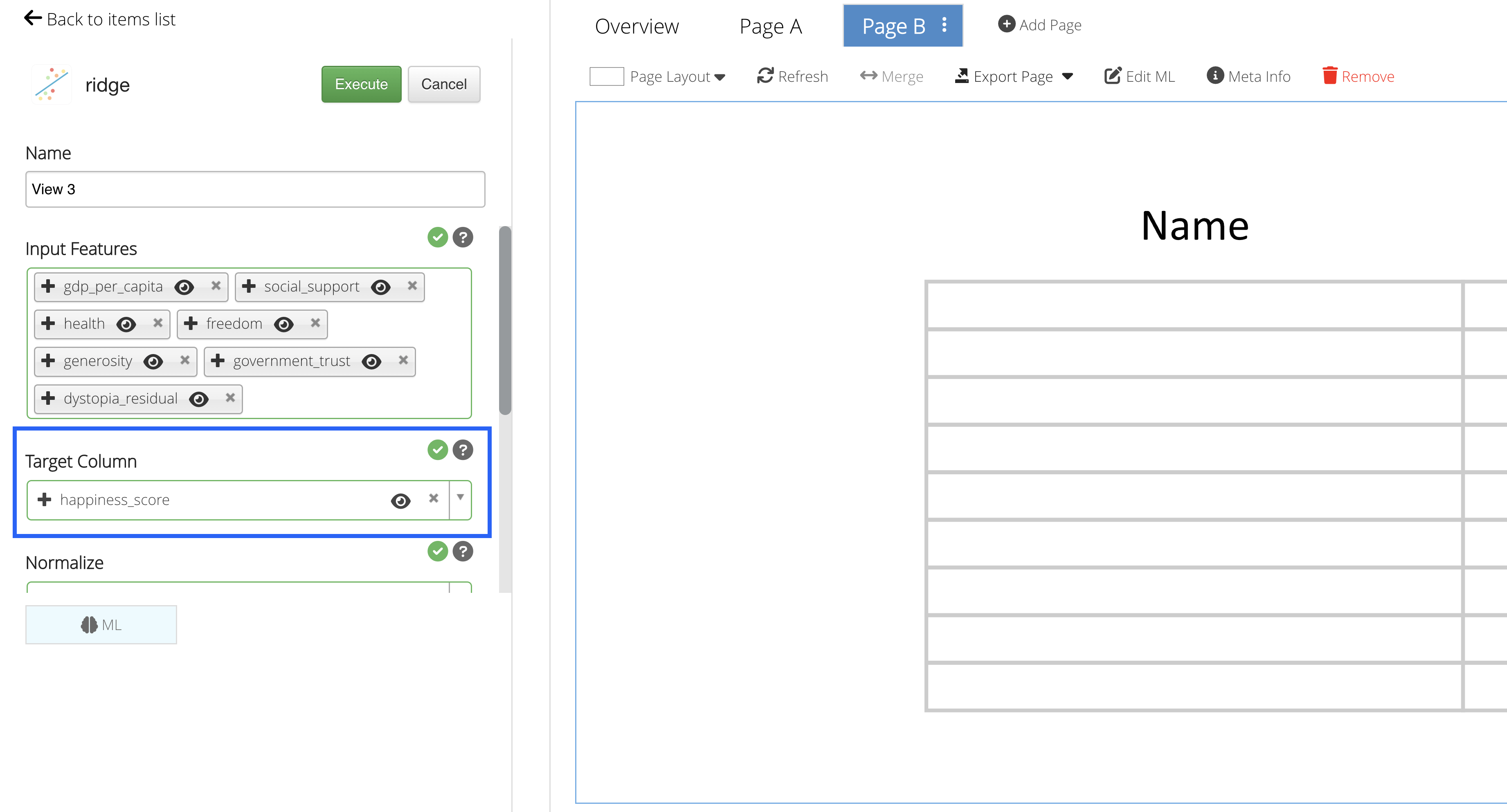
Figure 57: Target Column
Predictions
Click on “Execute” to see the Machine Learning predictions for the data.
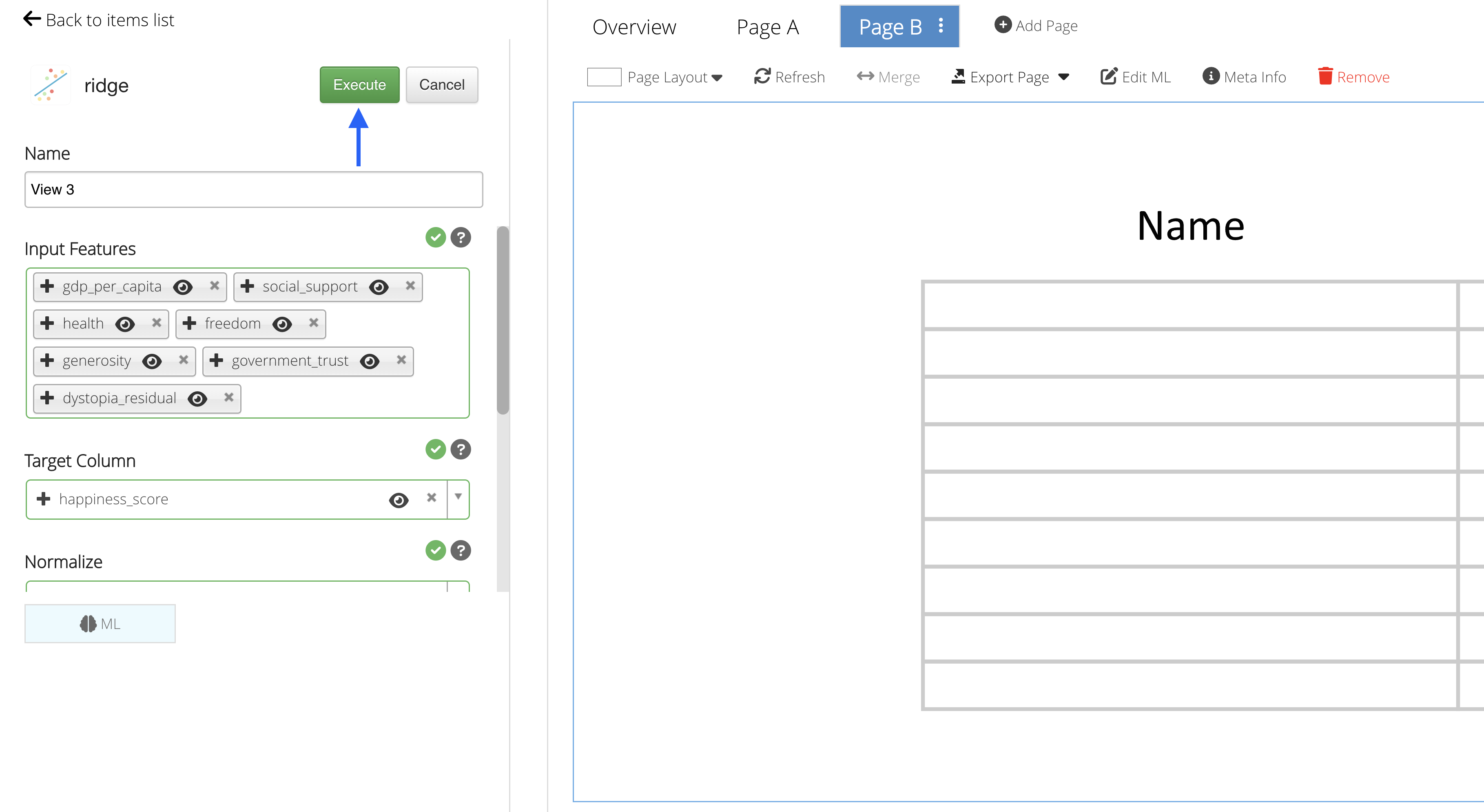
Figure 58: Execute Machine Learning
In this example, we are given a table of numeric values to explore. Our ridge regression model gives us a more precise correlation between the score variables to the happiness score (intercept) than would a normal linear regression model.
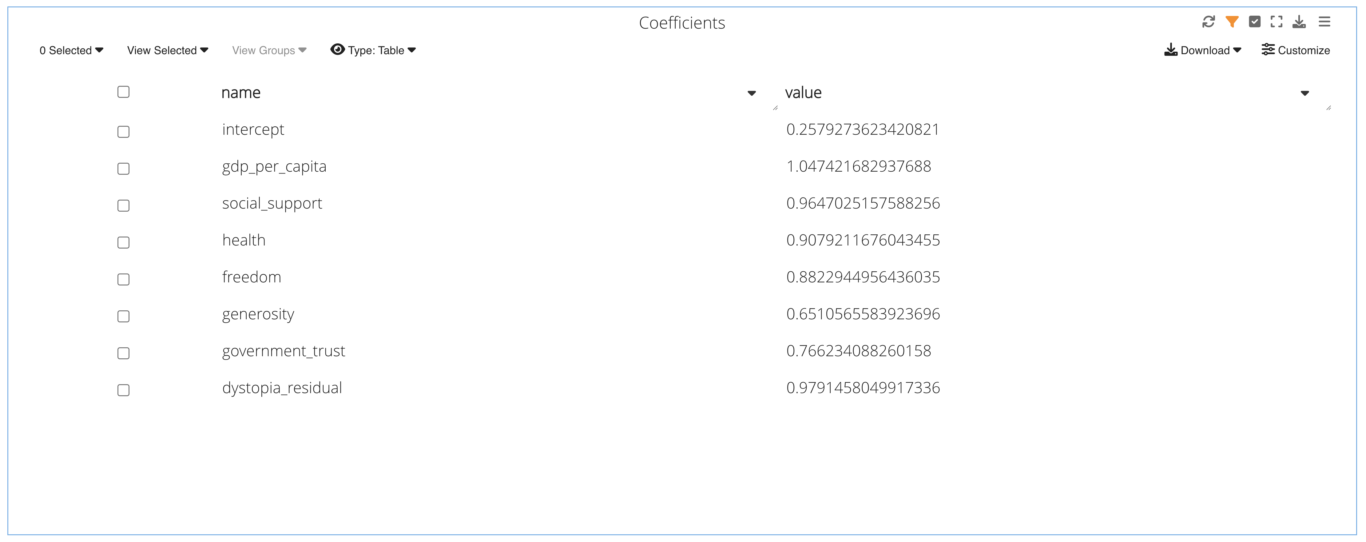
Figure 59: Prediction Chart
30.4. Tutorial Videos
Skip to this section to see some Machine Learning in action.
Live Data Table
When adding our inputs, we’ll see them highlighted and updated in a table to the right, with the orange being our target and green our features, as shown in this video with Linear Regression:
Predicting from the Chart
Here, we can use the pointing hand icon to pick a point on the chart to predict, or the upload icon to predict points from a CSV file.
Predictions Tab
Under the Predictions tabs, we can input values manually or upload a CSV of values of our input features to predict our target column. Predictions will populate and accumulate in a table to the right.
The prediction table has options to change the chart type which include, aside from a table, Parallel Line and 3D Scatter.
Iris Prediction
The decision tree helps us decipher the Iris class by following the attributes down the branches.
Happiness Score Prediction
We can see that the higher ranked countries with the higher ranked score variables (ranking blocks) generally have the highest happiness score (Name).