23. Turings
The Turing application presents an extensive summary and visualization of your servers, how they are being used, which users are using them and much more.
What Will Be Covered
- Server Utilization and Server Utilization Settings
- Calendar Button and Moving the Time Frame
- Job Utilization, Job Utilization Chart Type and Weekly Report
- Summary and Summary Settings
- Reports, Top 5 Users and Peak Utilized Days
- User Logs
- Exporting
23.1. Getting Started
To access the application, go to the HPC Servers section under the administration menu and click on “Utilization” on the Turings Server.
Figure 1: Open Turings Under Admin Menu
The app can also be accessed on the New Simulation window, by clicking on ‘View Status’ and going to the Turings tab in the next window.
Figure 2: Open Turings from New Simulation Window
Here is a breakdown of how the application is set-up.
Figure 3: Turings Application
23.2. Server Utilization
This first tab, Server Utilization, gives a visualized breakdown of what jobs, cores and solvers are being run on the server.
Click the settings icon on the top right corner to explore the visualization.
Figure 4: Server Utilization Settings
General
Use the General Settings to visualize the graphs differently by changing aspects like the chart type or utilization range. Here is how a change in visualization may look.
Figure 5: General Settings
These settings also affect the top time chart, which can be viewed on all tabs.
Solvers
Turn solvers on and off or change their colors under this section of the settings. In the image below, the ‘down’ and ‘idle’ solvers have been turned off and are no longer present on the graph.
Figure 6: Turn Solvers On and Off
Thresholds
Rename, delete and change colors of Thresholds under this section of the settings. This will implement changes into the top time chart. The image below shows the Peak Threshold color changed to a dark grey. The peak utilization in the top time chart is now a grey instead of a red.
Figure 7: Turn Solvers On and Off
Profile
Rename and turn Brush History on and off under this section of the settings. This will also implement changes into the top time chart.
Figure 8: Edit Brush History
You won’t have much of a brush history if you haven’t used the brush calendar tool yet. We’ll go over this in the next section
23.3. Calendar Settings
Click on the calendar button at the top right to change the time frame for viewing. This, the brush section, is implemented on the time chart at the top, which is present on all tabs and determines what information is shown on each tab.
Figure 9: Calendar Settings
Once you choose a time frame, you can drag it along to the time chart to compare different areas. You can also increase or decrease the brush size by using your curser to drag one side of it across the timeline.
Figure 10: Brushing the Timeline
23.4. Job Utilization
The Job Utilization tab presents a visualized summary of how jobs are running on the server. The default view of Job Utilization is the gantt plot, but it can be changed under “Chart Type” on the right side of the chart. You can also change filters for whichever chart you choose on this panel.
Figure 11: Job Utilization and Chart Type
The following image shows Job Utilization as a table.
Figure 12: Table Visualizaton
The last chart option, the Weekly Report view, shows the entire duration of the brushed range divided into weeks. A table is rendered showing Cores allocated, Elapsed time (hours), Wait time (hours) and Core Hours for every week.
Figure 13: Weekly Report
23.5. Summary
The Summary tab allows for visualizing all server elements – users, solvers, queues, cores, jobs, etc. The default bar graph shows dates, jobs and thresholds. Click on the settings icon at the top right corner to see how you can change graph elements to view it differently.
Figure 14: Summary
General
Under the General Settings, change elements to visualize on the bar graph. Here is how the bar graph may look after changing the x-axis and stack views.
Figure 15: General Settings
Users
Turn users on and off for the summary chart or change their colors under this summary settings section.
Figure 16: User Settings
Solvers
Change solver colors and turn them on or off for the summary graph under these settings.
Figure 17: SolverSettings
Queues
Lastly, the queues colors and visibility can be changed for the summary as well here.
Figure 18: Queue Settings
23.6. Reports
The Reports tab allows you to explore top users/queues/solvers and peak/minimum utilization days. Either graph’s settings can be changed by clicking on the respected button on the top right corner of their boxes.
Figure 19: Reports
Top 5 Users
Change the Top 5 Users graph to Top 10 or All, a table instead of a donut or queues and solvers instead of users.
Figure 20: Top 5 Users to All Users
Peak Utilized Days
Change your peak utilization to a bar or table, view top 10 or all, and change to see the least utilized.
Figure 21: Peak Utilized Days to Least Utilized
23.7. Logs
The last tab shows all the actions that have been performed on the Turings app by users on the server.
Figure 22: Logs
23.8. Export
Finally, you can export any tab as a PNG, CSV, PDF or PPT under ”Export” in the upper right corner.
Figure 23: Export
For additional questions about how to navigate the d3VIEW platform, please feel free to email our team at: support@d3view.com.
23.9. NEW Turings
A new Turings view is now available, featuring Cluster Metrics, Job Flow Analysis, Performance Insights, User Utilization, and System Ontology for enhanced system insights.
NEW Turings
Enhanced Turings dashboard by ensuring full visibility of all HPC entities in the Data Graph, complete ontology representation in the ER Diagram, and improved widget management with persistent add/remove functionality on refresh.
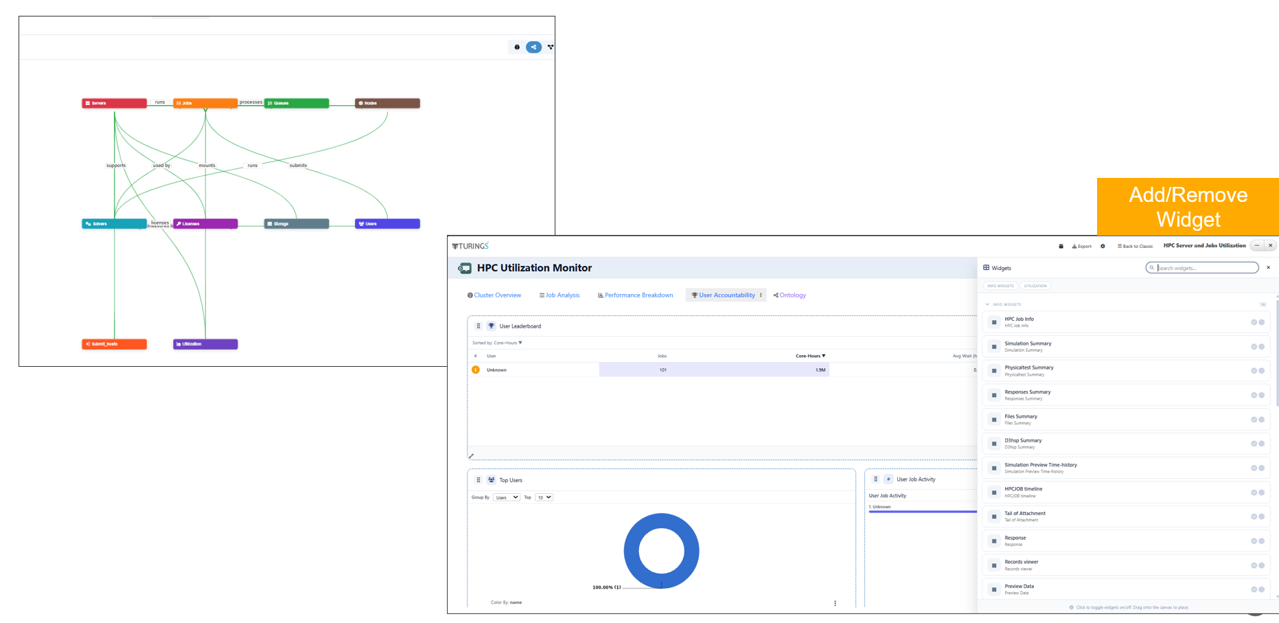
Turings