7. d3VIEW Dashboard System Overview
7.1. Introduction
The dashboard provides an overview of key performance metrics and system activities. It highlights important indicators such as total records, workflow execution status, recent updates, and overall performance trends. Users can quickly monitor progress, identify issues, and analyze results through visual charts and summarized data, enabling faster decision-making and improved operational efficiency.
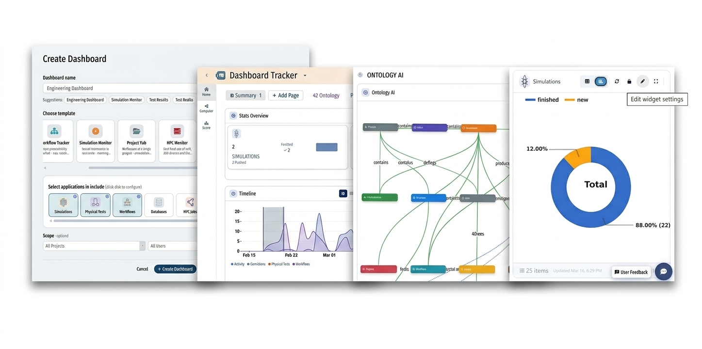
Dashboard
7.2. Dashboard Creation
Users can initialize a new dashboard through a guided setup process.
Create Dashboard Configuration
Dashboard Name: Custom identifier (e.g., Engineering Dashboard).
- Templates: Pre-defined layouts including:
Workflow Tracker
Simulation Monitor
Project Hub
HPC Monitor
- Data & AI Lab
- Custom
Application Integration: Support for linking Simulations, Physical Tests, Workflows, Databases, and HPC Jobs.
Scope Control: Filtering by specific projects or users.
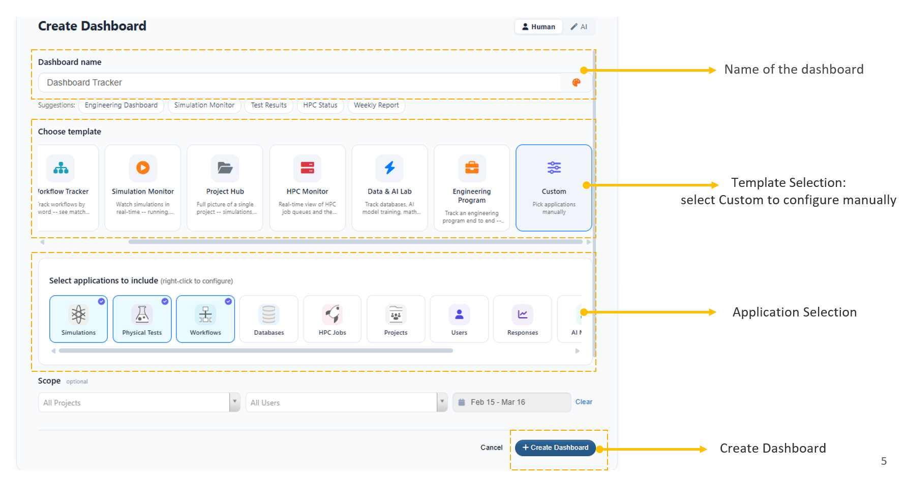
Dashboard Create
7.3. Key Modules
The platform is divided into several specialized views:
1. Dashboard Tracker (Summary)
The Summary View provides a high-level “Stats Overview” and timeline.
- Stats Overview: Tracks total counts and status (e.g., 25 Workflows, 2 Simulations finished).
- Timeline: A graphical representation of activity frequency over a set date range.
- Activity Log: Real-time updates on recent system actions.

Dashboard Summary
2. Ontology AI
This view visualizes the relationship between different data entities.
- Graph Structure: Maps how different objects (People, Workflows, Results) are connected.
- Relationship Types: Defines “contains,” “produces,” “feeds,” and “configures” links.
- Schema Management: Direct access to edit the underlying data ontology.
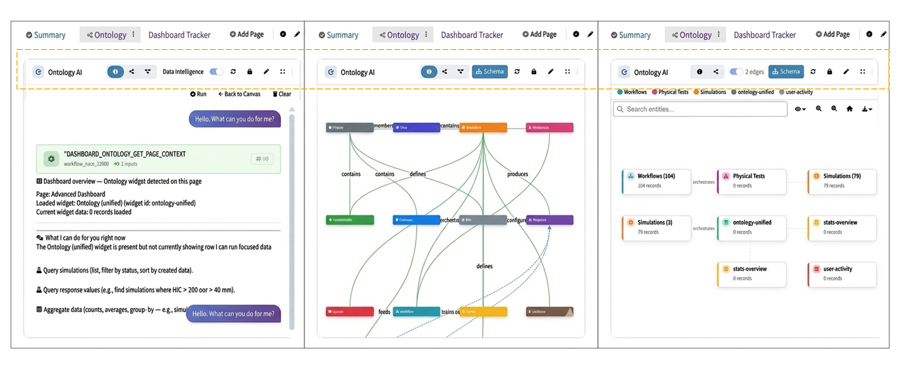
Dashboard Ontology
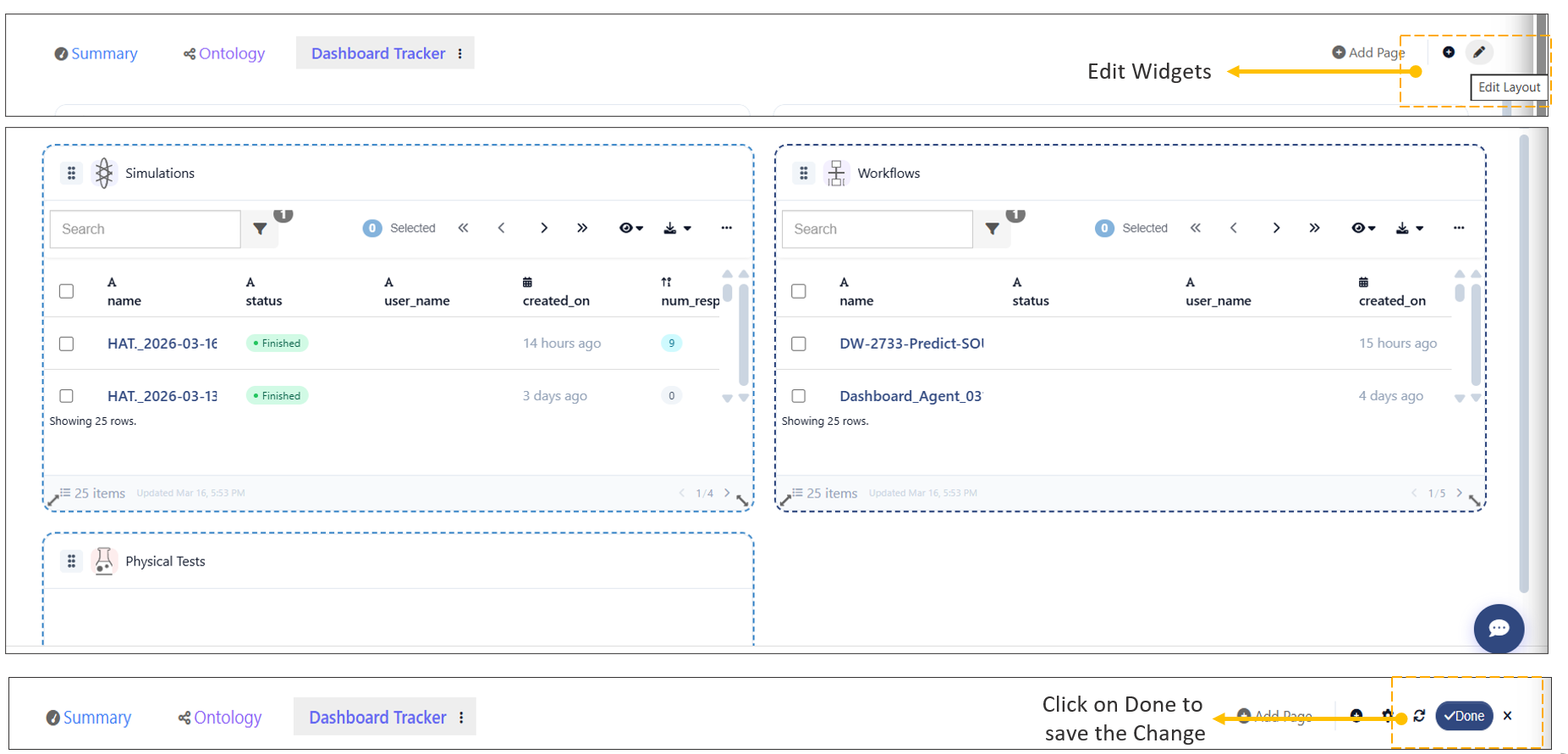
7.4. Dashboard Widget Customization
Users can customize application widgets on the Dashboard to better suit their needs.
Steps to Adjust Widgets:
- Click the Edit icon available in the top header of the Dashboard.
- Once in edit mode:
- Resize widgets as needed.
- Reposition widgets by dragging them to the desired location.
- After making the required changes, click Done to save the layout.
Note
All changes made during edit mode will be saved only after clicking Done.
Dashboard Widget Customization
7.5. Dashboard Page Creation
Users can create new pages on the Dashboard to organize and visualize different types of information.
Steps to Add a New Page:
- Click on the Add Page option available on the Dashboard.
- Provide a name for the new page.
- Open the newly created page.
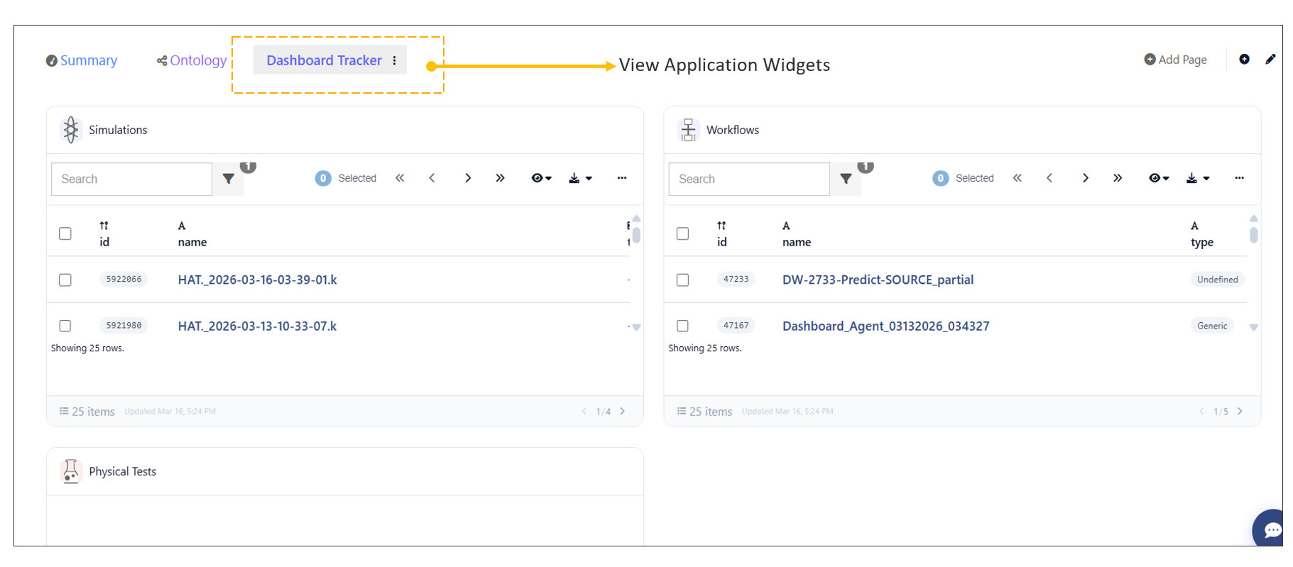
Adding Widgets to the Page:
- Add widgets to display relevant information such as:
- HPC Jobs
- Simulation details
- Configure each widget based on the required data and view.
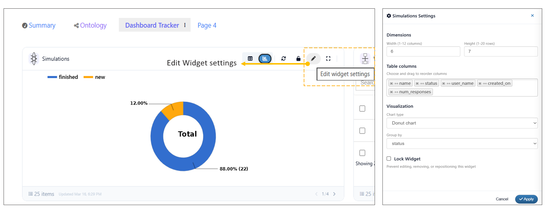
7.6. Widget Settings Configuration
Users can modify widget settings directly from the Dashboard.
Steps to Edit Widget Settings:
- Locate the widget on the Dashboard.
- Click the Edit icon available in the widget header.
- Update the required settings as needed.
- Save or apply the changes.
Dashboard Widget Customization
7.7. Dashboard Settings Configuration
Users can modify key Dashboard properties using the Settings option available in the top-right header.
Editable Dashboard Properties:
- Name: Update the Dashboard name.
- Description: Modify the description to provide more context.
- Scope: Define or adjust the scope of the Dashboard.
- Style: Customize the visual style of the Dashboard.
Steps to Edit Dashboard Settings:
- Click the Settings option in the top-right header.
- Update the required fields (Name, Description, Scope, Style).
- Save the changes to apply updates.
7.8. Timeline Filtering in Summary Tab
Users can filter the Timeline in the Summary tab to focus on specific time ranges and analyze corresponding data.
Steps to Filter Timeline:
- Navigate to the Summary tab.
- In the Timeline widget, click and drag over a specific time range to apply the filter.
- The Stats Overview will automatically update based on the selected timeline range.
Resetting the Selection:
- Click the Reset Selection button in the Timeline widget to clear the applied filter and return to the default view.
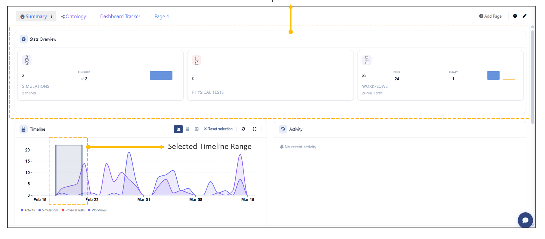
TimeLine Filter
7.9. Performance Summary Matrix Widget
The Dashboard now supports the Performance Summary Matrix widget, enabling users to analyze and compare data efficiently.
Key Features:
- Select a data source:
- Simulation
- Physical Test
- Build a matrix using selected records.
- Visualize responses in multiple formats:
- Table view
- Timeline view
- Curve view
Steps to Use the Widget:
- Add the Performance Summary Matrix widget to the Dashboard.
- Choose the desired source (Simulation or Physical Test).
- Select the required records.
- Build the matrix to analyze the data.
- Switch between Table, Timeline, and Curve views to explore responses.
In Dashboard: the Performance Summary Matrix widget now has an option to Apply Template, allowing users to search, select, apply templates to all or specific simulations and view the corresponding responses.
7.10. Comapre Dashboards
The Dashboard now includes an option to Compare multiple dashboards in Simlytiks; or by creating a comparison dashboard or by using GrapViewer.
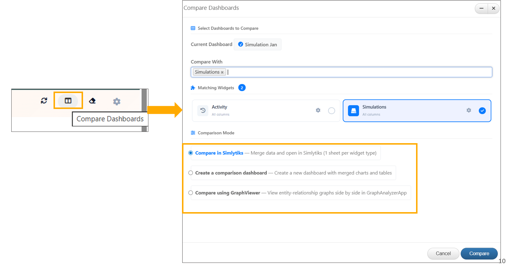
Comapre Dashboards
Dashboards containing common widgets can now be compared in Simlytiks, with responses displayed across multiple visualization types.
Dashboards containing common widgets can now be compared to create a comparison Dashboard with information widgets.
7.11. Addtional Features
Enabled multi-card selection on the Dashboard: drag-selecting two or more cards highlights them and displays a floating bar with the count and a Compare button
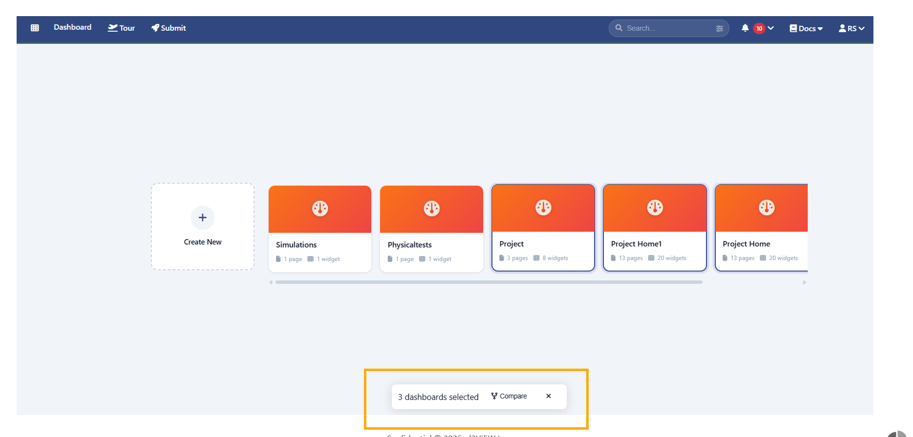
Dashboard Seelection
The Dashboard Settings now include a Page Navigation Layout option, allowing all tabs to be displayed vertically on the left side of the page when enabled.
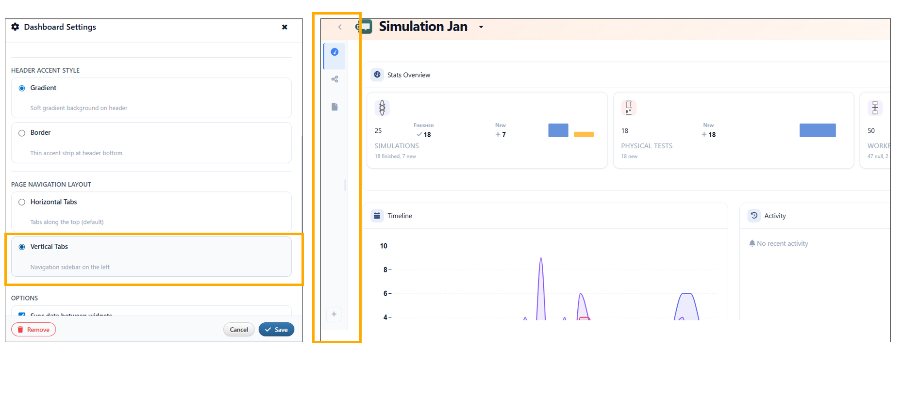
Dashboard Navigation layout
Widget Addition
Improved Dashboard widget interactions by introducing Carousel stacking: dragging a widget onto empty canvas adds it without affecting others, while dropping onto an existing widget enables stacking with confirmation in carousel view.
Dashbord Templates
The dashboard now includes a new Project Home template, featuring an Overview page with simulation summary cards, team member views (cloud and table toggle), and HPC server cards displaying real utilization data.
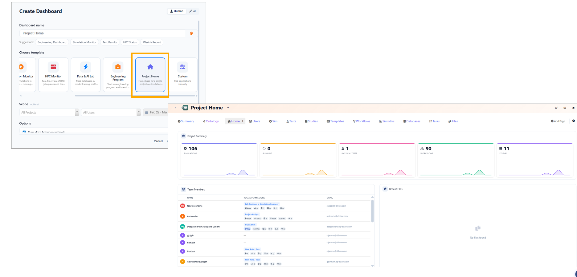
Project template
Below is the Demo video available for Dashbaord creation with examples.